#CSS Image Hover
Explore tagged Tumblr posts
Visit Tumblr Blog
Explore Tumblr blogs with no restrictions, modern design and the best experience.
Last Seen Tumblr Blogs


Fun Fact
Tumblr was acquired by Yahoo for $1.1B in 2013.
Text
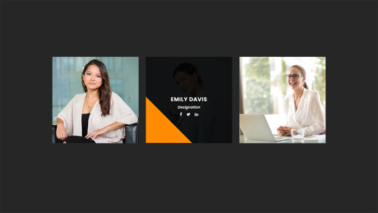
CSS Animated Text Overlay
#css animated text overlay#css animation tutorial#html css animation#css animation#html5 css3#html css#neduzone#CSS Image Hover#frontend#css#html#frontenddevelopment#webdesign#css animation examples
7 notes
·
View notes
Text

CSS Hover Caption Overlay
#css image hover#css image hover overlay#css animation#divinectorweb#html css#code#css animation examples#frontenddevelopment#css#html#css3#webdesign#css tricks
1 note
·
View note
Text

CSS Hover Overlay Animation
#css image hover overlay#html css#codenewbies#html5 css3#css#css animation examples#pure css animation#css animation tutorial#frontenddevelopment#webdesign#css animation snippets#css3#html5
5 notes
·
View notes
Text
8 CSS & JavaScript Snippets for Awesome Reveal Effects
New Post has been published on https://thedigitalinsider.com/8-css-javascript-snippets-for-awesome-reveal-effects/
8 CSS & JavaScript Snippets for Awesome Reveal Effects

Not everything on a website has to be displayed straightforwardly. Sometimes, it’s prudent to hide an element. We can then reveal it automatically or via user interaction.
That’s what makes reveal effects so compelling. They can serve dual purposes. The first is to keep our layouts nice and tidy. The second is to add a bit of flair to the user experience (UX).
And there are many intriguing options for web designers. Using CSS and JavaScript offers a path to creating high-end effects. They not only look great, though. There are ways to build features that are performant and accessible as well.
Want to explore some possibilities? Check out our collection of fantastic reveal effects. They run the gamut in terms of use cases and technology.
Scratch Card CSS Reveal by Nicolas Jesenberger
This reveal effect mimics a real-world experience – using a scratch card. Use your finger or pointing device to “scratch” off the silver foil. You’ll find a little surprise underneath. It’s both clever and well-executed.
See the Pen Scratch Card by Nicolas Jesenberger
Magic Wand Reveal by Kalis Network
Here’s a snippet that takes web magic to the next level. Move the magic wand from left to right to reveal the image gallery underneath. There’s also a subtle effect for nearby images. They’re blurry and displayed with a lower opacity.
See the Pen Magic Reveal by Kalis Network
Circular Reveal Animation by Liza Shermayster
You don’t need to go overboard with reveal effects. This simple presentation reveals more of the image upon hover. And it also adds a classy text animation. It would work well on a portfolio or About Us page.
See the Pen circular reveal animation by Liza Shermayster
Text Reveal Animation by Owlypixel
How about a reveal effect that happens automatically? This animated headline is beautiful and sure to get a user’s attention. It’s also powered by CSS. That means there are no messy scripts to slow down your page load times. The JavaScript used in the snippet refreshes the demo.
See the Pen Text Reveal Animation by Owlypixel
Ink Transition Reveal by Ryan Yu
These scroll-based animations are incredible. The artwork appears to be drawn on your screen as you scroll. The effect creates a mood to enhance the UX. It’s a case of special effects fitting the content to a tee.
See the Pen Ink transition effect with PNG sprite by Ryan Yu (@iamryanyu)
Movie Poster Interaction Reveal by Ethan
Card UIs are a popular design element these days. But there’s only so much content they can hold. This snippet offers a solid workaround. Hover over a card to reveal further content. The layout remains neat while adding a bit of interactivity.
See the Pen Movie Poster Interaction by Ethan
Page Reveal Effect by Kevin Levron
Yes, you can use reveal effects for an entire page! And this tool can help you create the perfect fit for your project. Choose from several animation types and other options to build a beautiful presentation. Plus, it’s just plain fun to experiment with.
See the Pen Page Reveal Effect (CSS/VueJS) by Kevin Levron
Accessible Offcanvas Reveals by Vasileios Mitsaras
Offcanvas elements are a handy place to store extra info. They’re often used to hide mobile navigation so that users can focus on content. This demo uses jQuery to add elements that can be revealed in multiple ways.
See the Pen Accessible Offcanvas by Vasileios Mitsaras
A Revealing Way to Build a UI
Reveal effects can take many forms. They’re suitable for everything from a corporate website to an online game. Their potential is vast and varied.
It’s still important to consider the impact on users, though. The best implementations feel natural and add to the UX. Therefore, it’s best to avoid effects that get in the way of accessing content.
Thankfully, CSS and JavaScript provide plenty of leeway. You can use the combination that works best for your project.
Want to see even more reveal effects? Check out our CodePen collection!
Related Topics
Top
#animation#animations#attention#content#CSS#CSS Animation#CSS Snippets#Design#designers#effects#Features#focus#Forms#game#hover#how#Image Gallery#images#impact#Ink#interaction#interactivity#it#JavaScript#JavaScript Snippets#JQuery#layout#Mobile#natural#navigation
1 note
·
View note
Text
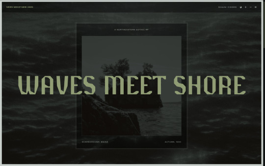
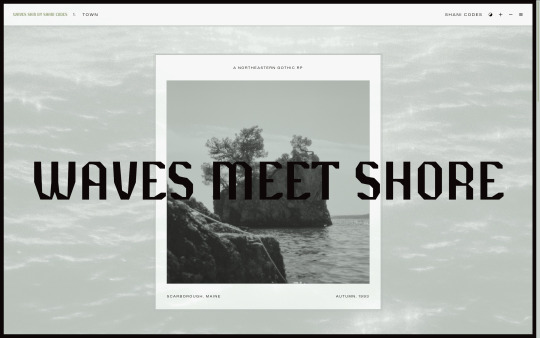
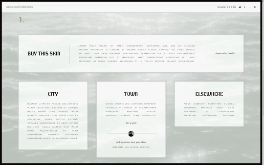
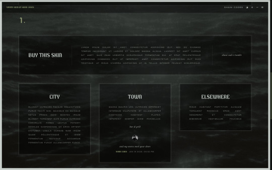

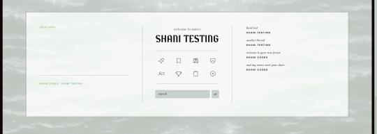
Waves Skin ($70, Unlimited) by Shani Codes
WAVES is a responsive skin for JCINK forums and is optimized for Google Chrome. If you have questions about the skin, or seeing a full preview, feel free to join my support discord: discord[DOT]gg/G9zb4sQxdp
SKIN INCLUDES:
A light/dark mode toggle,
A font size toggle,
Custom forum layouts,
Pop-out with navigation, about section, and user links,
Full responsiveness for various screen resolutions, supporting both mobile and smaller screens,
Easy to edit member group variables,
CSS variables for fonts, colors, images, etc. for easy customization,
Post row with a sticky, hover mini profile,
A tabbed, main profile with sections for a freestyle and shipper, and FizzyElf's automatic thread tracker,
A filterable, searchable, and sortable isotope member list with counts,
And an included installation guide PDF with comprehensive instructions.
PURCHASE LINK: ko-fi[DOT]com/s/ce01265c57
40 notes
·
View notes
Text

🧡 Tuesday Tips #3 🧡
Your website is more than just a collection of pages—it’s your digital home. It should reflect you, your interests, and your personality. But with so many sites out there, how do you make yours stand out?
Here are 25 ways to make your website feel more personal, unique, and personalized to you!
........................................................................................................
🎨 Design & Aesthetics
1. Custom Color Palette – Pick colors that resonate with your personality and aesthetic.
2. Unique Typography Choices – Use a mix of fonts that match your vibe.
3. Handwritten or Doodle Elements – Add personal sketches or notes.
4. Custom Cursor – Let visitors use a fun, themed cursor on your site.
5. Personalized Favicon – A tiny but powerful detail that makes your site feel complete.
6. Themed Layouts for Different Pages – Make each page visually distinct but cohesive.
7. Custom Backgrounds – Textures, gradients, or even a personal photograph.
8. Retro or Experimental CSS Styles – Go wild with unique styles that make your site stand out.
9. Create a Custom Hand-Drawn Logo – Instead of a standard logo, try sketching one yourself for a unique touch.
10. Add Subtle Animations – Small hover effects, background animations, or cursor trails can bring your site to life.
11. Play With Layering Elements – Overlap images, text, and shapes for a more dynamic look.
12. Design a Personalized Loading Screen – A custom loading animation or message adds a fun detail visitors will remember.
13. Add Your Own Handwriting as a Font – Convert your handwriting into a web font for a truly personal touch.
14. Design a Seasonal Theme Switcher – Let visitors toggle between different seasonal or mood-based color palettes.
........................................................................................................
📜 Content & Personality
15. Create a Behind-the-Scenes Page – Show how your website was built, share your thought process, or include fun bloopers.
16. Add a "The Making Of" Section – Share drafts, sketches, or early concepts behind your creative works.
17. Include a Personal Dictionary of Words You Love – A list of favorite words, phrases, or slang you frequently use.
18. Design a "Things That Make Me Happy" Page – A simple, uplifting page filled with personal joys.
19. Show Your Progress on a Learning Goal – Track and share your journey in learning a new skill, language, or hobby.
........................................................................................................
💾 Interactivity & Engagement
20. Add a Clickable Mood Indicator – Let visitors see your current mood with an emoji or phrase that changes over time.
21. Create a Dynamic Banner That Updates Automatically – Display different messages depending on the time of day or special occasions.
22. Add a "What I'm Listening To" Widget – A live-updating display of your current favorite song or playlist.
23. Embed a Poll or Voting Feature – Let visitors vote on fun topics or help you make creative decisions.
24. Introduce a Mini Personality Quiz – Something quirky like “Which of my favorite books/movies are you?”
25. Make an "Ask Me Anything" Page – An interactive page where visitors can submit questions for you to answer.
Closing: Make It Yours!
Your website should be you in digital form—fun, unique, and engaging. Whether you add just one or all 25 ideas, the most important thing is to have fun and make it your own.
If you try any of these ideas, let me know—I’d love to see what you create!
-----------------------------------------------------------------
Want to help the Small Web movement grow?
Join us on other platforms. ♥
FB Page & Group:
facebook.com/thesmallweb
facebook.com/groups/thesmallweb
Twitter/X:
x.com/smallweblove
Tumblr Community:
tumblr.com/communities/thesmallweb
Mastodon:
indieweb.social/@thesmallweb
#small web#indie web#web revival#old web#blog#neocities#2000s web#decentralized social media#decentralizedfuture#old internet#decentralization
17 notes
·
View notes
Text
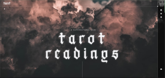
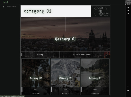
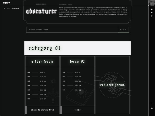
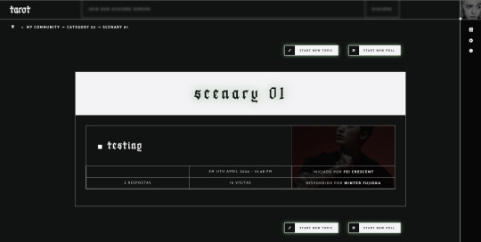
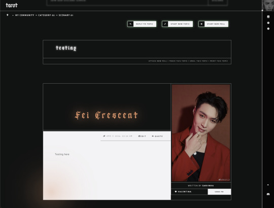
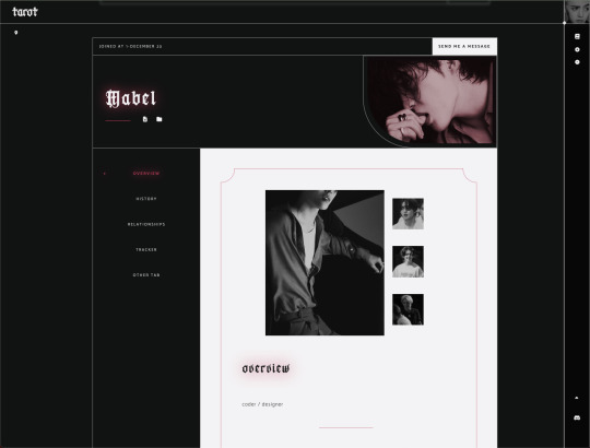
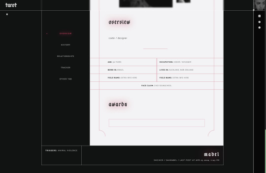
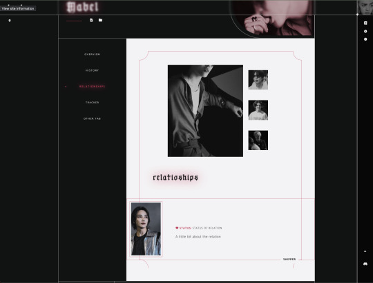
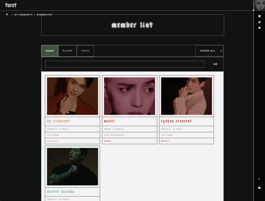
Tarot Readings Skin ⸻ $65 (by mabel skins)
Live Preview / Purchase / Discord Support
Tarot Readings is a responsive skin for JCINK forums and is optimised for Google Chrome.
The Skin Features:
— Side Navigation Bar — Hideable Navstrip — 8 Easy to edit member group variables — CSS variables for fonts, colors and images for easy customization — Medium colour skin featuring black and white with focus on readability Responsiveness — Option to Increase and Decrease font sizes — 3 different category styles — Post row with a sticky, hover mini profile — A tabbed main profile featuring aesthetic images, sections for freestyle and shipper, and automatic thread tracker (by fizzyelf) — A filterable, searchable, and sortable isotope member list — Installation guide PDF with comprehensive instructions. Text Styles — Heading and text styles — Face Claim and Reserves — Generic Admin Template
Extras: — Socials Pack $10 — Guidebook and Thread Templates $10
Up to 1h support for installation and help on my discord server.
Purchase link: https://ko-fi.com/s/0a71ca8387
45 notes
·
View notes
Text
neocities heracles trials: from a chaotic newbie
okay so i want to actually start posting here and i finally got it through my thick skull that this is LITERALLY A BLOG. i'm supposed to blog. so here's a blog post.
anyways, for context, i've been working on my neocities for a while now, recently started over to make things more original and more me. another thing to note is that i'm using VScode.
the issue here is that i have zero well not exactly zero but i lack any professional/academic background experience with making websites. the html isn't the issue (thankfully) but holy shit dude...css+javascript implementation . basic styling with css is no biggie, right? absolutely, however...may i introduce: smooth transitions + the absolutely tragic fact that the <marquee> tag is deprecated an accessibility issue.
so, my first goal day one was to recreate a marquee animation through css. so i tried to simply implement this incredibly useful bit of code into my site (in which if you're interested i totally think my failure to get it working was user error so please check it out it works great if you're not me) but, lo and behold, despite me getting it to work in my V1 project, i could not, for the life of me, get it to work. so i, not too familiar with css animation and completely lost when it comes to javascript, started grasping at straws. i ended up finding this tutorial and, with some improvisation since the tutorial is for webflow and i'm manually writing everything, managed to make my own css recreation of a marquee effect essentially from scratch, and even learned about the animation-play-state css attribute so i could pause the effect when the marquee is hovered over! victory, basically.

then, i looked around the many cool and absolutely awesome sites on neocities to get inspiration, and then i was like "hey what if i made a custom button background image" and with some trial and error, made myself a pretty decent base (for now) with aseprite, and learned more about the program in the meantime which is always a plus.
then i decided that i wanted to do more with the buttons. i wanted to make it animate on hover. not too hard right? you'll...you'll see why i struggled...in a moment...
anyways, i settled on a simple shrink animation. which THIS i could do with ease, messed around a bit, got the keyframes, assigned that to the button:hover and all of that and all was good!...until i realized that once i stopped hovering over it, it snapped back to its original scale instead of transitioning smoothly again. THIS is where the "fun" began.
see, although i can wrap my head around things easily when it comes to css, i have to constantly look up what the proper syntax for everything is because otherwise i'll mess everything up. and through my research i had conducted (aka surfing through multiple blogs and reddit posts alongside other things on random forum websites) i had discovered the very neat transition attribute.
but we'll have to return to this because i have adhd, and i ended up getting distracted during this process. see, originally i had decided that the button would change it's visual to appear like it was pressed when the user's mouse hovered over it. then i was like "i don't think this makes sense" so i changed it so that the button wouldn't change its background image unless the user actually clicked on it. so i did that. then i had to make sure that the button wouldn't magically scale up again so i had to transform the styling and blah blah blah those details aren't really that important ANYWAYS the actual important bit about this is that if you use the transition attribute and there's a change in background images that change will also be transitioned unless you set the transition to only apply to a specific change. and i didn't know that originally. so every time i tried to fix things up with a transition so the button wouldn't snap back to it's original size out of nowhere the background would slooowly change as well and i actually got so frustrated with this that i wanted to burn something down because that's a totally normal reaction i guess. anyways, then i started frantically searching for answers on the topic and EVERY. SINGLE. THING. THAT I FOUND. INCLUDED JAVASCRIPT.
i do not know javascript. i have not learned anything about it unlike css and html. it SCARES me and it is FRUSTRATING. but i thought i'd try it anyways. news flash that shit didn't work at all and i almost thought about scrapping the animation entirely especially when it randomly stopped working when i made certain changes, but i ended up eventually figuring out what i mentioned earlier (CSS transitions and the fact that you can assign them to only affect a specific change instead of everything) so with some dabbling here and there i eventually managed to finally figure out how to make everything smooth through pure css and although it still snaps if the element hasn't finished animating i'm happy with it.

moving on to another thing, i wanted to then make a sound effect play when you click the button. yes, we are still talking about buttons. THIS i could not do with css, like, at all. javascript admittedly is for interactivity and i had already been bending the rules quite a bit with the animations since those teechnically should've been done with javascript as well but this? this was impossible without javascript. so i found a free mp3, and searched up a nice little tutorial on the very basics of javascript.
little did I know that apparently, this would be my own personal little hell.
see, no matter how many times i tried a different script, the sound just would not work like at all. i'd do everything in what i assumed to be the correct way, and no matter what, it would not play. knowing that i'd just have to revisit this, i decided it was best to just sort of put it on the back burner.
and this is where i wish i could say this is the end of my absolutely gobstopping rant. however, i cannot.
see, one thing that i really like that i've seen in a lot of other people's sites is draggable windows. i think they're sick. but this ALSO requires javascript, but i didn't think this could POSSIBLY be that bad since so many people did it.
...right?.......right? guys. right?
MOTHERFUCKER I WAS SO WRONG.
see, it turns out that a lot of people do this sort of thing with jQuery, specifically for user interfaces. but vscode doesn't have a "user friendly" way to get jquery to work with it. and because i don't want to mess with program files, i decided that logically speaking jquery just makes writing things in js scripts less complicated and doesn't introduce things that are impossible in vanilla javascript so i decided i could suffer a little bit and try and do things without jquery.
this led me to looking at many sites with draggable windows to look at their own scripts, in which every single time i tried replicating things i FAILED.
i eventually stumbled upon a nice code that worked. but the issue with it - in which unfortunately i can't find it, else i'd link it - is that it works with not only element classes but also a specific ID. see, this would be fine if i only wanted ONE draggable element. but i want multiple. and i thought that maybe if i just duplicated the script and dedicated it to a different ID and changed function names it would work but nooo life cannot be this easy apparently. so after setting up my webmaster status window, getting that to work, i tried doing the aforementioned method for what will eventually be a guestbook of sorts. it failed.
so i decided, "hey i'll revisit this later!!" and i went on to finding a way to implement a status widget into my site. this honestly was really easy as i ended up stumbling upon status.cafe . so i registered, eventually got my account activated, and i got it working in my live port of vscode just fine!! all is good in the world.
well that's what i thought until i found out that since i had created my neocities account in march of 2024, and i'm unemployed since i'm still in high school hence i have a free account, that i could not. use the widget. in neocities. so i tried finding a work around, found this handy guide (which is genuinely useful by the way) and set up things through a RSS feed instead which is essentially just a work around that complies with the security restrictions of neocities that i'm bound by. anyways, this works great but i literally just can't customize it to how i want so this is another fail. then i find imood.com which, although is NICE, doesn't suit what i want on its own. so i'm at a loss here too.
so, again, another thing to put to the side i suppose.

so i started working on getting my guestbook, browsed through people's homepages again, and found chattable . and you probably think i have another paragraph complaining about this but honestly i can't write about something when i can't figure out how to even create a chat to implement onto my site in the first place so...y'know.
plus, i honestly have no clue if it'll work on my site either due to security restrictions so this is fun!!
anyways, after dealing with all of this, i finally decided it was about time i ported what i had so far over onto my neocities account. which isn't actually that hard i just had to wipe all of my files, overwrite the content in my index.html file there and paste in what i have now, and then upload my new files. but for some god awful reason after i went through all of this chrome just. kept depending on my old stylesheet??? so i had to clear some of my browsing data and eventually everything was loading properly for me.
and THIS is finally the end of my ridiculous documentation concering my neocities adventure so far.
i have no doubts i'll end up ranting here AGAIN about all of this but for now this is all i have on my plate...besides finally caving and learning javascript for real and continuing to learn more about html and css. hopefully one day i'll stop having such frequent issues but now is not the time and i doubt that'll be anytime soon either.
moral of the story, if you want to start something new and pick up a new hobby, please for the love of all that is of substance in this world don't go in completely blind like i've done if you're going to be making a project of some sorts. it will only lead to many misfortunes.
anyways you can see what i currently have done in my neocities here, make suggestions or give advice in the notes and whatnot i don't know.
#neocities#rant post#rant#coding#web development#geocities#html#html css#htmlcoding#css#javascript#losing my mind#holy shit#send help
6 notes
·
View notes
Text
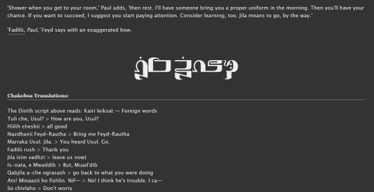
Since we don't know the chakobsa for translation or vocabulary, I got help creating "kairi leiksat" - foreign words. Created it in dinlih...
Then embedded it as an image at the end of every chapter before the hard copy of all the chakobsa used in the chapter, for the rare girlies out there who'll download the fic to read offline.
Because if you read it online, there's a CSS skin at work to translate all (currently 37) instances of chakobsa in the text as you hover your mouse over it, or tap it on your screen.
But to further satisfy my unhinged self, the chakobsa is only translated in CSS when the POV character understands the words!
With the awesome help of the folks on the Chakobsa Translation server, I have managed to refine an absolute banger :
So ojaaha ukrinash hi akraagash noqcha!
I initially suggested "How good are your vibes = how clean is your rhythm" so having a discordant rhythm (or rather, too even in this case) means you have offputing vibes and don't fit in the community.
The sentence above means "Your rhythm is weak and attracts the worms" and is intended to mean "Your vibes are rancid"
Not is:strong-it rhythm-your and attract-you worms, as doughenningjr crafted it.
Stilgar says this to Feyd's face, and leaves Gurney to explain the meaning of it ( ꈍᴗꈍ)
All of this work and for what??? Do you know how many fics live in the feydgurney tag? That's right, only mine!! It doesn't even exist officially yet!! You can't filter for it.
I don't think any of the girlies diving in the fic care for accurate chakobsa, and the chakobsa fans son't care for my fic. I do all of thise for the pleasure of one person :
ᕦ( ˙꒳˙ )ᕤ me
But looook it's so pretty!! Use it if you want!

#chakobsa#dinlih#conlang#dune#dune 2#dune part 2#dune part two#dune conlang#fremen#fremen language#chakobsa server invite#chakobsa server#conlang server#come join#my fic#security detail
22 notes
·
View notes
Text
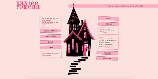

next version of my website is set to be the most self-indulgent one yet. doing just so many overly complicated things that only i actually care about and having fun with it!
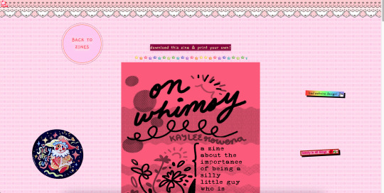
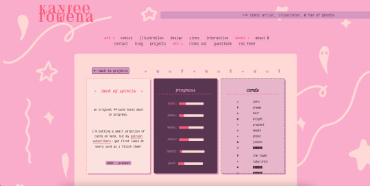
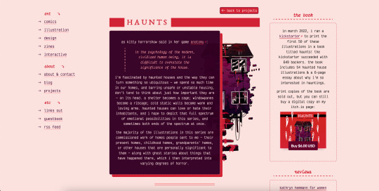
highlights from these pages: the whimsy zine page picks random colors for each zine page + each text element on load (from a select palette so it'll still be readable and etc). the deck of spirits page is formatted so all the text bits are laid out like cards, and the card previews are overlapping (as shown) but if you hover over one it'll come to the front of the pile. the haunts page i'm mostly just really pleased with how i replicated the title styling in css instead of just using an image for the title
#kaylee.txt#kaylee.html#i'm ALMOST done with this site revamp. i'm gonna have to tidy up some of this css though because there's. a lot of it. too much some may sa#but aside from that i just have my links page + blog page + some details on my about page to finish
34 notes
·
View notes
Text
Toi aussi, tu veux une jolie balise TW ? Ouais vous savez, ce truc qui permet de cacher un texte mais pas vraiment; et qui aide à ne pas trigger les personnes concernées par les sujets concernés. Pour ça, on va juste utiliser un "hover", c'est à dire un truc qui se passe au passage de la souris sur un élément. Rien de bien difficile, on va juste suivre le petit tuto suivant. Mais avant tout, voilà ce que c'est censé donner avant :

Et au passage de la souris :
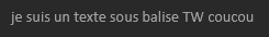
Voilà maintenant qu'on a le visuel, on va expliquer le truc. Quand vous voulez cacher un texte, vous allez le mettre sous cette balise : <tw></tw> Exemple : <tw>je suis un texte sous balise TW coucou</tw>
Maintenant que c'est fait, c'est bien joli mais il se passe rien ? Pas de panique ! Vous allez juste rajouter un petit quelque chose dans le CSS de votre forum (Panneau d'administration > Affichage > Images et Couleurs > Couleurs & CSS > l'onglet "feuille de style CSS") et vous allez ajouter n'importe où ceci : tw { transition: all 500ms; /**permet que la transition soit fluide**/ background: #ccc; padding: 2px; border-radius: 5px; /**l'arrondi du fond**/ position: relative; /**permet que ça passe par-dessus le texte**/ z-index: 99; /**ça c'est comme un calque Toshop, ça veut dire que ça va passer par-dessous tout le reste**/ color:#ccc; } tw:hover { transition:all 500ms; background:transparent; position:relative; }
Et voilà c'est tout. En gros, on a appliqué la même couleur de fond que la couleur du texte, ce qui rend le tout "invisible", dans le sens qu'on a un texte qui n'apparaît pas et une couleur visible pour montrer qu'il ne faut pas passer sa souris si on ne veut pas (on ne le répétera jamais assez, mais si y'a un trigger qui vous choque, ne lisez simplement pas sinon venez pas vous plaindre). Et quand on passe sa souris ? Le fond disparaît simplement pour laisser le texte en couleur derrière. Et voilà ! Une petite balise TW facile et rapide qui permet de pouvoir cacher ce qui doit l'être ! (merci de penser à me créditer au passage svp)
#forumactif#ressources#balise tw#ça peut servir on sait jamais#svp me faites pas dessus c'est juste un partage comme ça#forum#forum ressources#libre-service
15 notes
·
View notes
Text

CSS Animated Text Overlay
#css animated text overlay#css animation examples#html css animation#css animation tutorial#html css#codingflicks#frontend#css#html#css3#frontenddevelopment#learn to code#webdesign#animation#css image hover effects
11 notes
·
View notes
Text

CSS Image Hover Effect with Overlay
#css image hover effect#css image hover#image hover overlay css#css animation tutorial#css animation examples#css animation#pure css animation#css3#css#html#html5#animation#cool css effects#html css#divinector#frontenddevelopment#learn to code
1 note
·
View note
Text

CSS Hover Animation
#css hover animation#codenewbies#html css#frontenddevelopment#html5 css3#css animation examples#css animation tutorial#pure css animation#css#code#webdesign#css image hover text animation#css cards
4 notes
·
View notes
Text
Tarot Readings Skin ⸻ $65 (by mabel skins)

Live Preview / Purchase / Discord Support
Tarot Readings is a responsive skin for JCINK forums and is optimised for Google Chrome.
The Skin Features:
— Side Navigation Bar— Hideable Navstrip— 8 Easy to edit member group variables— CSS variables for fonts, colors and images for easy customization — Medium colour skin featuring black and white with focus on readability Responsiveness— Option to Increase and Decrease font sizes— 3 different category styles— Post row with a sticky, hover mini profile— A tabbed main profile featuring aesthetic images, sections for freestyle and shipper, and automatic thread tracker (by fizzyelf)— A filterable, searchable, and sortable isotope member list— Installation guide PDF with comprehensive instructions. Text Styles— Heading and text styles— Face Claim and Reserves— Generic Admin Template
Extras:— Socials Pack $10— Guidebook and Thread Templates $10
Up to 1h support for installation and help on my discord server.
Purchase link: https://ko-fi.com/s/0a71ca8387
From Mabel Skins
#mabelskins#price: 51-100#dark#multi sale#skins#templates#skin and templates#additional templates for purchase#responsive#font size toggle
7 notes
·
View notes
Text
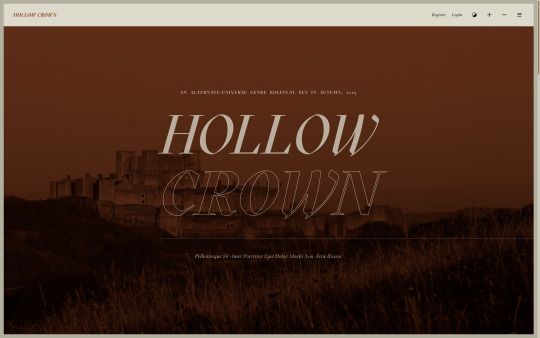
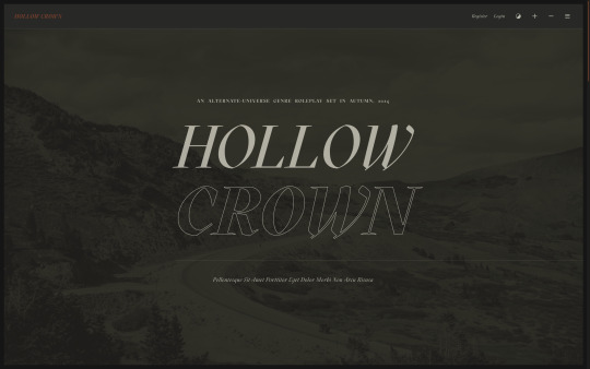
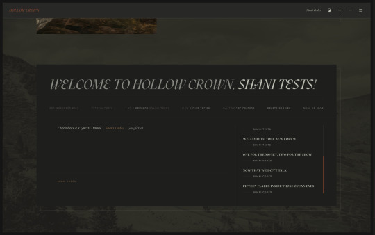
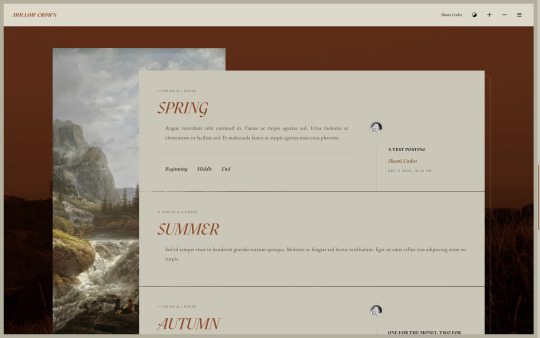
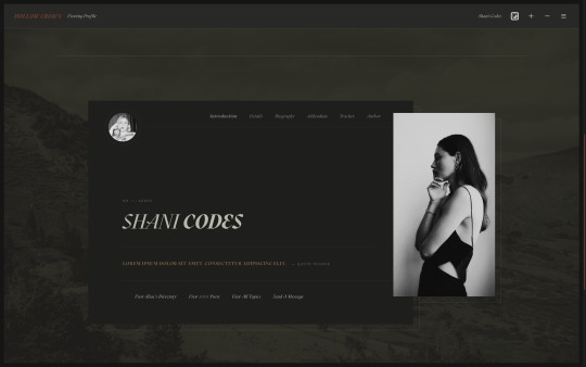
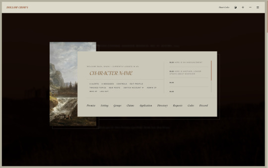
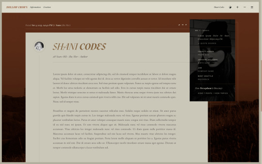
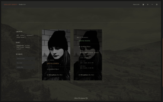
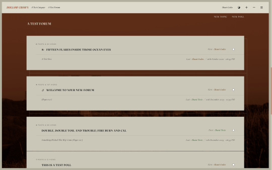
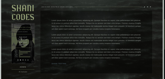
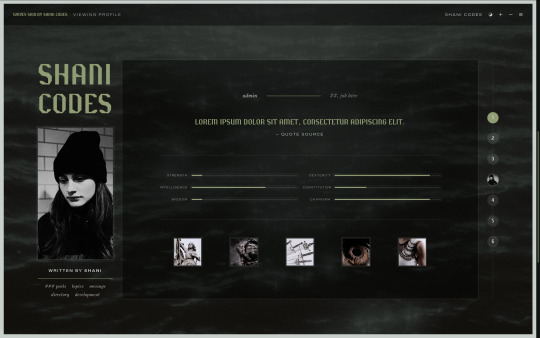
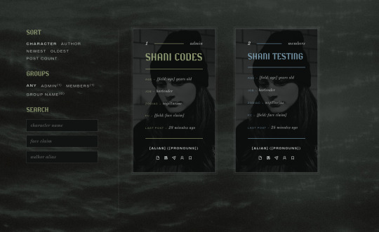
Hollow Crown Skin ($65, Unlimited) by Shani Codes
HOLLOW CROWN is a responsive skin for JCINK forums and is optimized for Google Chrome. If you have questions about the skin, or seeing a full preview, feel free to join my support discord: discord[DOT]gg/G9zb4sQxdp
SKIN INCLUDES:
A light/dark mode toggle,
A font size toggle,
Custom forum layouts and category images,
Pop-out with navigation, updates, about section, and user links,
Full responsiveness for various screen resolutions, supporting both mobile and smaller screens,
Easy to edit member group variables,
CSS variables for fonts, colors, images, sizes, etc. for easy customization,
Post row with a sticky, hover mini profile,
A tabbed, main profile with sections for freestyle and shipper, and FizzyElf's automatic thread tracker,
A filterable, searchable, and sortable isotope member list with counts,
And an included installation guide PDF with comprehensive instructions.
PURCHASE LINK: ko-fi[DOT]com/s/e65d3a5664
94 notes
·
View notes