#css page transition
Explore tagged Tumblr posts
Visit Tumblr Blog
Explore Tumblr blogs with no restrictions, modern design and the best experience.
Last Seen Tumblr Blogs


Fun Fact
There are dozens of funny blogs to kill time on Tumblr.
Text
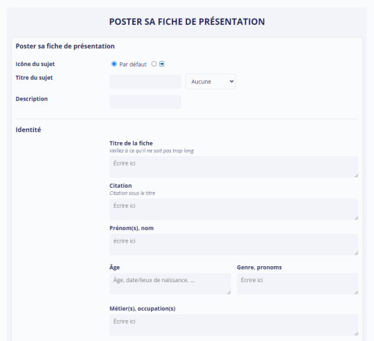
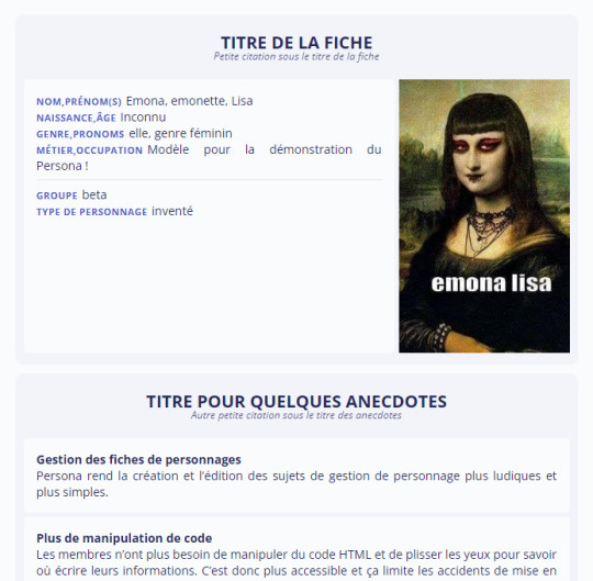
Plugin Persona en bêta !
C'est dans les larmes, la sueur et le sang que je vous annonce enfin la sortie du générateur de fiche : Persona ✨
Persona est un plugin pour les sujets de gestion de personnage (fiche de présentation, fiche de lien, scénarios, ��). Il remplace les codes de mise en page à copier/coller dans un sujet par un formulaire à la création et à l’édition d’un sujet.
Essayez le plugin
Documentation
Phase de bêta
Pourquoi en bêta ?
Et bien parce que c'est un sacré morceau et qu'il a besoin encore de faire ses preuves dans différents forum et dans les mains de plusieurs personnes pour qu'on soit sûr de sa solidité.
Qui peut tester la bêta ?
Tout le monde ! Mais, il est vivement conseillé de l'essayer sur des forums tests ou sur des catégories de test sur vos forums. Vous pouvez par exemple essayer d'adapter vos fiches actuelles avec le plugin et demander à vos membres de reproduire leur fiche. Si le plugin rencontre un succès, vous pourrez alors faire la transition.
N'hésitez pas à me faire vos retours et me transmettre ceux de vos membres !
Est-il difficile à installer ?
L'installation de base est très simple. Elle se déroule en trois étapes mais elle demande d'installer du code un peu partout (template, CSS, javascript). Si vous n'avez jamais ouvert un panneau d'administration d'un forum, ce n'est peut-être pas le meilleur code avec lequel commencer.
C'est l'édition du plugin (pour créer vos propres mise en page etc) qui peut s'avérer plus poussé. En réalité, c'est beaucoup de manipulation HTML avec notions qui seront peut-être nouvelles pour beaucoup.
Ne vous laissez pas impressionner par la taille du tutoriel !
La première partie suffit à réussir à installer le plugin et le faire fonctionner. La suite est à but explicatif et elle parcours toutes les possibilités qui s'offrent à vous avec ce plugin (promis ça vaut le coup).
Un énorme merci aux membres du serveur La Piscine qui ont participé à l'élaboration de ce plugin ces derniers mois 🙏 et un merci tout particulier à Poumon et Christa Lostmindy ❤
Ca a été un projet hyper passionnant mais extrêmement prenant. J'espère sincèrement qu'il deviendra aussi ""game changer"" que le Blank Theme parce que je suis convaincue qu'il peut grandement améliorer notre confort de vie de rpgiste 👏
Je me rends disponible pour tout ceux qui souhaiterai l'essayer, sur leur forum test ou sur leur forum, afin de les aider à installer le plugin et le faire découvrir à leur membre !
Enjoy !
#forumactif#french rpg#rpg#blanktheme#forum rpg#rpg français#plugin persona#persona#fiche de presentation#libre service#dsl pour les fotes je fatigue
111 notes
·
View notes
Text


A Dark Mode guide - with CSS variables and JS
This was first published January 2022, but has been completely rewritten and updated in 2024!
This guide is aimed to make displaying dark mode more accessible and stable. I had a long talk with a user of one of my themes, who has some eyesight difficulties, I wanted to improve on accessibility in my themes - beginning with a better dark mode experience.
What we want
When selected, dark theme to stay dark when refreshing a page
To prevent default (light) theme from flashing before displaying dark mode when browsing
If a visitor has dark mode on their computer/device, honor their preference and display dark mode with the option to turn on light mode
a snappy transition(!) - with a way to override it though!
[View guide]
#tumblr resources#theme hunter#dark mode#resourcemarket#supportcontentcreators#plugins#codes by me#other
258 notes
·
View notes
Text

Day 1 - 100 Days CSS Challenge
Welcome to day 1 of the 100 Days CSS Challenge! In this challenge, we'll bring a design to life using only CSS. Our goal is to recreate the image we're provided with on the challenge page using HTML and CSS.
On the challenge page, we see:

A small preview of the design we need to replicate.
A starter HTML template.
A submission form to showcase our work alongside others who have taken on the same challenge.
Let's dive into the process step by step.
Step 1: Screenshot the Image
The first thing I always do is take a screenshot of the target design. Even if the design includes animation, having a static reference helps me focus on the basic structure and colors. Here’s the screenshot of the design we’re aiming for:
Step 2: Extract the Color Palette
Next, I identify the color palette that we'll need. This helps ensure that we maintain consistency with the original design. Here’s the color palette I’ve created:

Step 3: Identify and Create the Image Elements in HTML
Now that we know the colors, I break down the elements in the image:
Background: This is a linear gradient.
The 100 number: This is the main challenge, and it will require some work.
Text: “days css challenge,” which we’ll place to the left of the number.
Here’s the HTML structure for these elements:
<div class="frame"> <div class="center"> <div class="number"> <div class="one-one"></div> <div class="one-two"></div> <div class="zero-one"></div> <div class="zero-two"></div> </div> <p class="sentence1">days</p> <p class="sentence2">css challenge</p> </div> </div>
Now that the elements are in place, CSS will bring them to life.
Step 4: Bringing the Elements to Life with CSS
Linear Gradient
To create the background, we’ll use a linear gradient. Here’s a basic syntax:
background: linear-gradient(to <direction>, <color-stop1>, <color-stop2>, ...);
Parameter 1: Direction/Angle
This defines the starting point of the gradient. You can either specify a direction (e.g., to top, to bottom) or an angle (e.g., 90deg, 180deg).
Direction options:
to top
to bottom
to left
to right
If you want more precision, you can specify angles:
0deg: Gradient starts from the top.
90deg: From the right.
180deg: From the bottom.
270deg: From the left.
You can also combine two directions, specifying both horizontal and vertical movements, like to left top or to right bottom. This means:
The first keyword (left or right) controls the horizontal movement.
The second keyword (top or bottom) controls the vertical movement.
For example:
background: linear-gradient(to left top, red, blue);
This gradient starts at the bottom-right corner and transitions toward the top-left.
Parameter 2: Color Stops
Color stops define how the gradient transitions between colors. Each color stop specifies a point where a color starts or ends. Here's an example:
background: linear-gradient(to right, red 10%, blue 90%);
This means:
The element starts at 0% fully red.
By 10%, the transition from red begins.
Between 10% and 90%, there is a smooth blend from red to blue.
At 90%, the transition to blue is complete, and the remaining part is fully blue.

Once we understand the concept, we can apply the background we need. In our case, the gradient flows from the bottom left to the top right, so the code will look like this:
background: linear-gradient(to right top, #443DA1, #4EC3C9);
Bonus: Stacking Multiple Linear Gradients
You can also apply multiple gradients on top of each other:
background: linear-gradient(180deg, #f00, #0f0), linear-gradient(90deg, #ff0, #f0f);
Step 5: Making the "100" Number
Creating the Zeros
We start with the zeros. These are simply circles created using CSS. To make a full circle, we use border-radius set to 50%.
The white border gives it the appearance of the number zero.
.zero-one, .zero-two { position: absolute; height: 100px; width: 100px; border-radius: 50%; border: 24px solid #fff; box-shadow: 0 0 13px 0 rgba(0,0,0,0.2); }
This gives us a nice circular zero. We adjust their positions using properties like left and top, and manage the z-index to make sure the zeros stack correctly.
.zero-one { z-index: 8; left: 17px; } .zero-two { z-index: 6; left: 100px; }

Now both zeros are positioned, and they overlap in the way we want.
Creating the "1" Number
The number "1" is made of two div elements:
One-One: This part represents the slanted part of the "1".
One-Two: This is the straight vertical part of the "1".
What make the one-one element slightly slanted is
transform: rotate(50deg);)
the one-two is created simply with a little height and width nothing too particular then it is placed directly on top of the slanted part, giving us the full "1". Its z-index tho has to have a higher value than the slanted part of our 1 to ensure it stays above the slanted one.
Step 6: Adding the Text
For the two sentences “days” and “css challenge,” the styling is basic CSS. You can achieve the look with just a few font changes, some padding, and adjustments to font size. It’s as simple as:
.sentence1,.sentence2{ text-transform: uppercase; margin:0; padding:0; } .sentence1{ font-size:82px; font-weight:700; } .sentence2{ font-size:25px; font-weight:700; margin-top:-20px; }
And just like that, we’ve completed day 1 of the 100 Days CSS Challenge! Each part of the design is carefully crafted using CSS, giving us the final result.
Happy coding, and see you tomorrow for Day 2!
#100dayscssChallenge#codeblr#code#css#html#javascript#java development company#python#studyblr#progblr#programming#comp sci#web design#web developers#web development#website design#webdev#website#tech#html css#learn to code
16 notes
·
View notes
Text
There is something very weird about the relatively short nature of the culture surrounding website creation. As in, like, internet-user-created websites have been around for like 30-31 years at this point, and the culture surrounding them has changed so very much.
People used to create websites left and right for their own needs, their little shops and their little blogs about what they liked. Some websites of course housing horrible content since their dawn, and some being as mundane but as unique as the person behind its code. I have seen older sites, archived, that promoted creating your own site, and that was interesting to see. That culture of creating your own website and of sharing that knowledge on a still-growing facet of communication.
And then at some point social media appeared, and that was interesting, because now everyone was able to quickly present themselves without the need of a website, but that didn't mean people stopped making websites. I mean, hell, Geocities died in 2009, so a lot of people were creating their own websites for free before that time, no need to pay for domain names or hosting. And even without Geocities, there were other website hosting things that yes, while not as customizable, were still a resource for people to work with them. There's still a website floating around that I made when I was a kid using one of these services. Cool stuff.
All this to say that I do feel a weird sense of dread looking back and cross-referencing with the present and seeing things like "website creator powered by AI" and shit like that, because just ?? How did it go plummeting so quickly. There is a weird feeling of having lost a developing culture to corporations making quick access to posting things that, as corporations' nature dictates, are used to sell data or to train models or what have you. Similarly, we get pretty same-y looking pages because of the need to be slick or whatever with designs that just leaves everything looking the same. ALSO, the loss of spaces for kids, or just the gradual lowering of them in favor of cocomelons and whatever else the devil's machine has spawned is like watching an apple decay before having ripened. I do feel like there is this phenomenon in which how to make a site has been lost in the notion of "making a website falls into the realm of evil and scary coding and I could never be a programmer, plus who would look at it, plus we have tools to make them," etc etc etc. Here is a little secret: website creation is not exactly hard to pick up at all. You might say it's very similar to using a rich text editor like Word or a notes app or whatever you use. Similarly, have you used markdown for things like messages or D iscord messages, you know, with the asterisks for bold text and the likes? Markdown is based on html's structures. And truly, you do not have to even learn to code using Javascript if you don't want to, you can just go full html + css and structure your things as you go, adding your little images and your updates. Because guess what !! Html and css are not programming languages, they're a markup language and a stylesheet language respectively, which is a fancy way to say "you make the structure of your page with the first one and make it pretty with the second one". This includes cool stuff like tables, lists, grids, colors, transitions, etc. All of that without any programming. (That being said, if you are interested in programming, Javascript isn't too bad to pick up. The language itself *is* kind of evil, but using it in conjunction with html is not too difficult). I do have to say though, I am glad that there is a push to making your own websites and things, especially with Neocities sprawling a huge community of avid website creators, as well as the huge amount of tutorials and stuff making the push forward with making sites and online spaces and experiences more widely available. Hopefully this becomes a trend that keeps going up, considering the state of seemingly every single social media that has existed since the 2000s- 2010s.
#web#website#old web#dog discourse#ramblings#internet#computer#tech#but for real what the fuck#it's very bizarre to see this just pop in and out
7 notes
·
View notes
Text
Web Designer vs Web Developer : Quelle carrière choisir ?

Avec l’évolution rapide du numérique, les carrières en conception et développement web restent très demandées. Bien que ces deux professions jouent un rôle clé dans la création de sites modernes, elles impliquent des compétences, des responsabilités et des perspectives différentes. Si vous hésitez entre ces deux parcours, ce guide vous aidera à comprendre les différences en termes de rôles, de potentiel de rémunération et d’opportunités à long terme afin de choisir la carrière qui vous convient le mieux.
Que fait un Web Designer ?

Responsabilités principales
Un web designer se concentre sur l’apparence, l’ergonomie et l’expérience utilisateur (UX) d’un site web. Ses tâches incluent :
• Créer des mises en page visuellement attrayantes et des wireframes.
• Sélectionner la typographie, les palettes de couleurs et les éléments de branding.
• Concevoir des sites responsifs et adaptés aux mobiles.
• Utiliser des outils comme Adobe XD, Figma et Sketch.
• Collaborer avec les développeurs pour assurer une bonne transition entre le design et le code.
Compétences clés pour un Web Designer
• Connaissance des principes UI/UX et des meilleures pratiques en ergonomie.
• Maîtrise des logiciels de design graphique (Photoshop, Illustrator, Figma).
• Notions de base en HTML & CSS pour le prototypage.
• Compréhension du branding et de la psychologie des couleurs.
Avantages d’être Web Designer
✔️ Travail très créatif avec une grande liberté artistique.
✔️ Moins de programmation que dans le développement web.
✔️ Forte demande pour l’expertise UI/UX.
✔️ Nombreuses opportunités en freelance, notamment sur des plateformes comme Upwork.
Défis du métier de Web Designer
❌ Rémunération souvent inférieure à celle des développeurs.
❌ Nécessité de suivre en permanence les tendances du design.
❌ Certains clients sous-estiment la valeur du design par rapport au développement.
Que fait un Web Developer ?
Responsabilités principales
Un développeur web est chargé de concevoir et maintenir des sites fonctionnels en utilisant des langages de programmation et des frameworks. Ses missions incluent :
• Écrire et corriger du code pour implémenter des fonctionnalités web.
• Optimiser la vitesse, la sécurité et la scalabilité des sites.
• Gérer les systèmes backend, les bases de données et les API.
• Corriger les bugs et améliorer l’expérience utilisateur.
• Travailler aussi bien sur les technologies front-end que back-end.
Les différents types de développeurs web
• Développeur Front-End : Se concentre sur les aspects visuels et interactifs du site (HTML, CSS, JavaScript).
• Développeur Back-End : Gère la programmation côté serveur, les bases de données et les API.
• Développeur Full-Stack : Maîtrise à la fois le front-end et le back-end.
Compétences clés pour un Web Developer
• Maîtrise de HTML, CSS et JavaScript.
• Connaissance de langages de programmation comme PHP, Python, Ruby.
• Familiarité avec des frameworks comme React, Angular, Vue.js.
• Gestion des bases de données (MySQL, MongoDB).
• Compétences en débogage, tests et gestion de versions.
Avantages d’être Web Developer
✔️ Forte rémunération, en particulier pour les développeurs full-stack et back-end.
✔️ Demande croissante avec de nombreuses opportunités d’évolution.
✔️ Possibilité de travailler sur des projets complexes et de grande envergure.
✔️ Opportunités de travail à distance et en freelance.
Défis du métier de Web Developer
❌ Apprentissage continu indispensable en raison des évolutions technologiques rapides.
❌ Travail très technique avec peu d’aspects créatifs.
❌ Peut impliquer de longues heures de débogage et de résolution de problèmes.
Conclusion
En résumé, si vous aimez la créativité et le design, le métier de web designer pourrait vous convenir. Si vous préférez la programmation et la résolution de problèmes techniques, le développement web est une meilleure option. Quelle que soit votre décision, les deux carrières offrent de nombreuses opportunités dans l’univers du numérique !
Je suis hermane junior Nguessan developpeur web &mobile
Liens linkedIn 👉 : https://www.linkedin.com/in/hermane-junior-nguessan-2a9a05324?utm_source=share&utm_campaign=share_via&utm_content=profile&utm_medium=ios_app
https://www.linkedin.com/in/hermane-junior-nguessan-2a9a05324?utm_source=share&utm_campaign=share_via&utm_content=profile&utm_medium=ios_app
2 notes
·
View notes
Text
Universal Scroll Button(Autochange Direction) For Any Host
Hey, do you have a site with a lot of forums? Does your host allow you to use Javascript? Boy does this weirdo have a deal for you! For the low low price of free, you can get right now access to a scroll button that swaps directions when you scroll automatically, as well as changing the target & title on hover! Act fast, this deal won't last! I kid, but enough of the ShamWowery. In reality, this is a very simple script that reads how far you have scrolled a window, & applies or removes a class to your scroll button, as well as changing the target of said scroll button & adjusting the title to reflect which way it will take you!
It's so simple, crediting me seems superfluous but if you want, feel free to credit with a link to my blog <3 I hope the new verse of our song is eminently kind to everyone!
See it In Action(Click, or look Below):
I currently use this code on two different WIPS, so feel free to check out some gifs;
To Begin
Before the end of your </body> tag in your wrappers(for Jcink) or wherever the HTML templates go on other sites, you want to place this script:
<script> $(window).scroll(function() { if ($(this).scrollTop() > 800) { $('#scroll').attr("title","To Top?").attr("href","#Top").addClass('totop'); } else { $('#scroll').attr("title", "To Bottom?").attr("href","#Bottom").removeClass('totop'); } });</script>
This seeks out an id of Scroll to adjust the href & title as needed depending on the scroll position within the relevant window. The scroll amount is in px, so to change how quickly it changes the button, alter the number 800 to whatever you desire, fiddle with it; one size never fits all.
The Styling
Once you've saved that, move to your CSS, or wherever your Style tag is to add styling for the link itself. Keep in mind the link should be contained within a container that handles its positioning for it as otherwise the script will fuck with the positioning as well as the transformation & you really just want it to spin upwards.
The styling for the link should be as follows;
#scroll { display: inline-block; positioning: relative; transform: rotate(0deg); transition: transform .5s ease-in-out; /*** ^ change the .5s to alter duration or the ease-in-out to alter the timing of the transition between button states ***/ }
#scroll.totop { transform: rotate(180deg); }
The first statement defines the default state (linking to the bottom) of the scroll button on the load of the page, the second defines the change of position once the window has been scrolled far enough to activate one's script.
The HTML
Now you've got the behaviour defined via JS & the styling defined via CSS, it's time to input the HTML, or the bone structure of the code itself. In your wrappers, template, or wherever HTML goes on your host, locate three places;
One, where you want the TOP scroll location to be. This is where the scroll button will take you once it has changed states on scrolling a certain distance. Here, you place an anchor span as follows;
<span id="Top"></span>
Two, Where you desire for the BOTTOM or BODY scroll location to be, as in where the scroll button will take you on click initially. This could also be a scroll to the start of content, in which case I recommend changing #Bottom & id="Bottom" respectively to reflect the syntax, it's entirely up to you. Here, you place an anchor span as follows;
<span id="Bottom"></span>
Finally, It's time to add the scroll button. Keep in mind, where you put it is a function of utility & design choice. Some like it persistently hovering in a fixed position, some like it in a sidebar or on userlinks, some prefer it in the navigation bar.
Wherever you place it, try to ensure that it's easily accessible on any device, screen size, & matches the User Interface logic you've used everywhere else. If you have all text buttons, don't use just an icon, if you have all icons, don't suddenly use just text. Match your action calls, so users don't feel confused while using your site.
Once you've decided where you want it, place the following code, NOTING that there should be a container for this code that positions it for you. I've provided two options; the Icon Font option (courtesy of Phosphoricons -- a free & reliable Icon Font I recommend -- As well as one which includes text, so both UI/UX design philosophies are accommodated.
Note the option with text will only rotate the caret from downwards to upwards, so the scroll text shouldn't need editing unless you want to add or supplement flavourtext.
Please choose the appropriate option for yourself;
Icon Font
<a id="scroll" class="ph-fill ph-caret-down"></a>
Icon Font with Text
<span>Scroll <a id="scroll" class="ph-fill ph-caret-down"></a>?</span>
Some Notes:
I just want to add a bit of info:
If your browser isn't scrolling smoothly to your anchors? Check your settings, & be sure the root of your CSS has scroll-behaviour: smooth; in it.
If you use this guide & have problems getting it to work, please let me know! I will troubleshoot this for you & tumblr has strange coding, I may have futzed something up, I want this to be as accessible as possible, so don't be silent; questions help!
If you are not using Jcink, or another host with a Jquery library pre-loaded, be aware that one is needed for this script to work. Most hosts will have a default Jquery library, but if yours doesn't or you're self hosting, any should do. The Jcink file is below, however, if you want to just use that.
10 notes
·
View notes
Text
DIVINE INTERFERENCE: COSMIC EXERTION
Ah, it’s a good sign when the literal second page of the fanadventure does something wild with CSS. That’s when you know. Hey. This person knows how to use CSS, and that means I should be on alert for things.
Okay already off to a confusing yet compelling start. Who is this mysterious kid, with no face, strange wild hair, and powers beyond imagination, and the power to talk and interact with the author themselves? Those are the questions I am asking myself, btw.
AHHHHH I should’ve know. GUY DIAN. Guardian. They are the first guardian, and they are now playing sburb. Which is. Certainly a premise, I guess? Interesting, this will be somewhat comparable to, like, Immortal Man in terms of “how do I get readers to care about this guy who, by all rights, should not have any problems with anything?” Well, I guess Immortal Man does have a problem, being Immortal, but. You get what I mean.
AND ARE THESE LEPRECHAUNS I SPY? So far, all the signs are congealing to be a good fanadventure! Now, I guess, it’s time for it to pay off. Come on. Show me something cool or interesting or neat.
Throwing in Of Mice And Men as like, a paratextual resource is a wild move. Imagine if somebody said that they had to read all of “Crime and Punishment” to truly get some of the thematic symbols in the story. Okay maybe that’s not really comparable to Of Mice and Men, which is more Novella sized, but. Still. It’s close to it.
Ahhh, the silly, “here’s all the cool stuff” times are over, and now I am in a typical trollian SBURBventure. But it’s interesting, and probably obvious, that I am now being compelled to read more, even though I would ordinarily tune out of this part of the fanadventure. Why? Because I have seen the cool stuff, the interesting things this fanadventure wants to do, and how cool it can get with it’s presentation style. But…uh…I don’t think is compelling forward momentum is going to last for long.
I would call this fanadventure, pretty good? I mean, it was. Good enough? I don’t know. The first part was interesting, and I was like, oh shoot, where is this going. And then. It just transitioned into an oridinary, average, bog standard Troll Sburbventure. Which kind of killed the momentum, and my tolerance for, like. Getting back to all the cool stuff. And then I didn’t have the interest to finish the story, much like this sentence or this review. So. Yeah. There you have it, I guess.
2 notes
·
View notes
Text
20+ CSS code examples for smooth page flows 📜. From classic fades to 3D flips & interactive effects, keep visitors engaged. → https://freefrontend.com/css-page-transitions/
2 notes
·
View notes
Text
Seamless Transition: Best Practices for Website Migration to Shopify
In the ever-evolving landscape of e-commerce, staying competitive requires not just a robust online presence but also adaptability to emerging platforms. As businesses strive to enhance user experience, streamline operations, and optimize sales, many are turning to Shopify for its user-friendly interface, extensive customization options, and powerful marketing tools. However, migrating an existing website to Shopify can be a daunting task if not approached strategically. In this comprehensive guide, we'll delve into the best practices for a seamless transition to Shopify, ensuring minimal disruption to your online business.
Thorough Planning and Preparation:
Before embarking on the migration process, it's crucial to conduct a thorough assessment of your current website. Identify all existing content, including product listings, images, blog posts, and customer data. Take inventory of any custom features, integrations, or third-party apps that may need to be replicated or replaced on the new platform. Establish clear goals and timelines for the migration process to keep it on track.
Choose the Right Shopify Plan:
Shopify offers a range of plans tailored to different business needs, from startups to enterprise-level corporations. Assess your requirements in terms of product catalog size, expected traffic volume, and desired features to select the most suitable plan. Consider factors such as transaction fees, credit card rates, and additional services offered within each plan.
Data Migration and Integration:
Transferring your existing data to Shopify accurately is crucial for maintaining continuity and avoiding disruptions to your business operations. Utilize Shopify's built-in migration tools or third-party apps to seamlessly import product listings, customer information, and order history. Ensure compatibility with any existing integrations or third-party services your business relies on, such as payment gateways, shipping providers, and accounting software.
Design and Customization:
One of the key advantages of Shopify is its customizable design options, allowing you to create a unique and visually appealing storefront. Choose a Shopify theme that aligns with your brand identity and offers the features you require. Customize the design elements, layout, and color scheme to reflect your brand's personality and enhance user experience. Leverage Shopify's drag-and-drop editor and CSS customization capabilities to fine-tune the design to your liking.
Optimize for SEO:
A successful website migration should not only maintain your existing search engine rankings but also provide opportunities for improvement. Prioritize SEO best practices throughout the migration process, including:
Properly redirecting old URLs to their corresponding new URLs using 301 redirects to preserve link equity and prevent 404 errors.
Updating meta tags, headers, and image alt texts to optimize for relevant keywords and improve search engine visibility.
Submitting updated sitemaps to search engines to ensure they crawl and index your new Shopify site efficiently.
Implementing schema markup to enhance the appearance of your site's search results and provide rich snippets to users.
User Testing and Quality Assurance:
Before making your Shopify site live, conduct thorough testing to identify and address any issues or inconsistencies. Test the functionality of all features, including product pages, navigation menus, checkout process, and payment gateways, across different devices and browsers. Solicit feedback from beta users or employees to uncover any usability issues or bugs that may have been overlooked.
Launch and Post-Migration Optimization:
Once you're confident in the stability and functionality of your Shopify site, it's time to go live. Monitor closely for any post-migration issues, such as broken links, missing images, or discrepancies in data. Implement tracking tools such as Google Analytics to monitor site traffic, user behavior, and conversion rates. Continuously optimize your Shopify site based on performance metrics and user feedback to maximize its effectiveness in driving sales and achieving your business objectives.
In conclusion, migrating your website to Shopify can be a transformative step in enhancing your online presence and driving business growth. By following these best practices and approaching the migration process with careful planning and attention to detail, you can ensure a seamless transition that preserves your existing assets while unlocking the full potential of the Shopify platform.
2 notes
·
View notes
Text
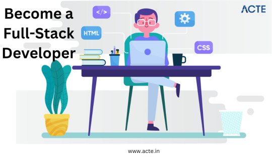
Becoming a Full Stack Developer: My Roadmap to Mastery
Embarking on my journey to become a full stack developer has been nothing short of a thrilling adventure. It's been filled with moments of incredible learning, personal growth, and a profound passion for creating digital solutions that truly make a difference. From the fascinating world of front-end design to the intricate workings of back-end development, let me take you through my personal roadmap to mastering the art of full stack development.
Defining Full Stack Development
At its core, I see a full stack developer as a tech-savvy magician who possesses the unique ability to bring both the user-facing magic of the front end and the powerful machinery of the backend to life. It's not merely about coding; it's about the art of crafting seamless user experiences while skillfully managing the complex infrastructure that makes it all possible.
Self-Assessment
Like any journey, mine began with self-awareness. I took a close look at my existing skills and knowledge. I uncovered my strengths to build upon and identified the areas where I needed improvement. This self-assessment became the bedrock upon which I constructed my roadmap, allowing me to set clear, focused goals for my full stack development journey.
Front-End Development Skills
Mastering front-end technologies proved to be a thrilling challenge. Moving from the foundational HTML and CSS, which provide structure and style to web pages, to delving into the captivating realm of JavaScript with its dynamic interactions, each step forward brought its own set of revelations and challenges. My journey was marked by moments of both frustration and triumph as I evolved from crafting basic layouts to creating intricate user interfaces that sprung to life at the simple click of a button.
Back-End Development Skills
Transitioning to the backend was like stepping into a whole new world of data management, server intricacies, and complex logic. Learning languages like Python, diving deep into databases like MySQL, and exploring frameworks such as Flask and Django became the building blocks of my backend journey. The sheer satisfaction of watching my code efficiently manage data and orchestrate complex operations fueled my determination to keep pushing forward.
Bridging the Gap
The leap from front-end to back-end wasn't a smooth one. Bridging this gap required not only the acquisition of new technical skills but also a shift in mindset. The challenges were numerous – learning to handle data securely, optimizing performance, and orchestrating intricate processes. I adopted various strategies to make this transition seamless, eventually allowing me to unite my front-end and back-end skills into a unified full stack approach.
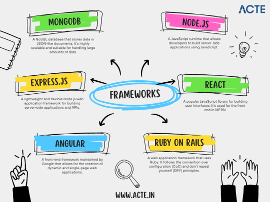
Full Stack Development Frameworks
The full stack development world introduced me to a plethora of frameworks designed to streamline the entire process. Frameworks like MEAN (MongoDB, Express.js, Angular, Node.js) and MERN (MongoDB, Express.js, React, Node.js) became my trusted companions. They not only accelerated development but also offered valuable insights into the best practices of full stack architecture.
Building Projects
Knowledge truly gains momentum when it's put into practice. Building projects became an essential part of my journey. These projects provided the practical experience necessary to solidify my skills. Whether it was crafting dynamic e-commerce platforms or developing interactive web applications, each project served as a canvas for innovation, experimentation, and continuous improvement.
Continuous Learning
Full stack development is an ongoing journey without a defined finish line. The ever-evolving landscape continually demands learning and adaptation. To stay updated with emerging trends and technologies, I relied on online platforms, coding communities, and valuable resources like full stack developer course and blogs provided by ACTE.

Challenges and Rewards
This journey had its fair share of difficulties, of course. Debugging cryptic errors, optimizing code for performance, and keeping pace with rapid technological advancements were just a few of the hurdles I encountered. However, the rewards far surpassed the struggles. The ability to transform ideas into functional applications, the satisfaction of solving intricate puzzles, and the sheer joy of witnessing my work in action were the driving forces that kept me moving forward.
Networking and Community
In today's digitally connected world, networking is an invaluable asset. Engaging with developer communities and attending meetups opened doors to fresh perspectives, exciting collaborations, and invaluable insights. The support and camaraderie of fellow developers served as a constant reminder that I wasn't alone on this journey.
Becoming a full stack developer is about more than just acquiring technical skills; it's a transformative journey of self-discovery, overcoming challenges, and embracing growth. To all those aspiring full stack developers out there, my advice is to wholeheartedly embrace each challenge as a learning opportunity. Your roadmap may take unexpected turns, but with dedication, resilience, and a deep passion for innovation, you too can navigate the path to mastery. The world of full stack development awaits – so go forth and code boldly!
6 notes
·
View notes
Text
Quickly Build Professional Webpages With The Tiny.css Classless Framework
tiny.css is an ultra-lightweight CSS framework for quickly styling web pages by overriding default browser styles. It embraces minimalism with a framework that demands no class-based customization. With Tiny.css, your HTML stays neat and focused, ensuring rapid development cycles and cleaner codebase. Thanks to the CSS prefers-color-scheme media query, Tiny.css seamlessly transitions between…

View On WordPress
3 notes
·
View notes
Text
Understanding Progressive Web Apps (PWAs) and Why Agencies Build Them
In a world dominated by mobile-first experiences and fast-loading websites, Progressive Web Apps (PWAs) have emerged as a powerful solution for businesses that want the best of both web and app functionality—without doubling development efforts.
Built using standard web technologies like HTML, CSS, and JavaScript, PWAs offer an app-like experience right from the browser. They’re fast, reliable, and engaging—traits that are crucial for any modern digital product. Today, a skilled Web Development Company is likely to recommend PWAs as a forward-thinking option for brands that want to scale their digital presence while optimizing performance.
But what exactly are PWAs, and why are agencies increasingly building them for clients across industries? Let’s break it down.
What Is a Progressive Web App?
A Progressive Web App is essentially a website that behaves like a mobile app. It works directly in the browser, doesn’t require installation from an app store, and can function offline or on low-quality networks. PWAs blend the accessibility of a website with the immersive experience of a native mobile app.
Key features of PWAs include:
Responsive Design: Seamless experience across desktop, tablet, and mobile
Offline Capability: Content and functionality even without internet (via service workers)
App-Like Navigation: Smooth page transitions, intuitive interactions
Push Notifications: Engage users directly like a mobile app
Installability: Users can “add to home screen” without going through an app store
Why Web Development Agencies Build PWAs
Agencies recommend PWAs because they solve multiple pain points for modern businesses. Here’s why this approach is gaining traction:
1. Fast Load Times and Better Performance
PWAs are built to load quickly—even on slower networks. Thanks to caching and service workers, they deliver content almost instantly after the first load. This reduces bounce rates, improves SEO, and creates a smoother user experience.
For businesses, that translates to higher engagement and better conversion rates—especially in markets with unstable mobile connectivity.
2. Lower Development and Maintenance Costs
Instead of building and maintaining two separate codebases (one for iOS and one for Android), companies can now develop a single PWA that works on all platforms. This significantly reduces development time, ongoing maintenance, and QA efforts.
A Web Development Company can help businesses maximize their ROI by delivering a product that performs like an app without app store dependencies.
3. Improved Mobile Experience Without an App Store
Many users are reluctant to download apps, especially for brands they don’t interact with regularly. PWAs bypass this friction. Users can access your PWA via a browser link and then choose to “install” it to their home screen—no app store required.
This frictionless approach has been adopted by companies like Starbucks, Twitter, and Pinterest—boosting engagement without requiring massive development budgets.
4. Offline Functionality for Continuous Access
Thanks to service workers, PWAs can cache key content and data, enabling limited or full functionality even when users are offline. For industries like eCommerce, media, or travel, this means users can still browse content or add items to their cart—even without a network.
This functionality improves user satisfaction and extends your reach to users in areas with poor internet coverage.
5. Native-Like Features on Web
PWAs can send push notifications, access device hardware (like camera and GPS), and run in full-screen mode. This creates an immersive user experience similar to native apps but delivered entirely through the web.
It’s particularly valuable for eCommerce, fintech, and service-based platforms that want to keep users engaged and returning.
6. SEO-Friendly and Discoverable
Unlike native apps, PWAs are websites at their core, which means they can be crawled and indexed by search engines. That gives businesses a discoverability advantage—your app-like experience can show up in search results just like any other webpage.
A development partner can ensure the right technical SEO practices are in place to help your PWA rank well on Google while still performing like a mobile app.
Conclusion
Progressive Web Apps are no longer just a trend—they're a smart, scalable solution for businesses that want to improve performance, reduce costs, and deliver seamless digital experiences across devices. PWAs combine the discoverability of websites with the interactivity of mobile apps, making them ideal for today’s users and tomorrow’s innovations.
If you’re looking to upgrade your digital product without the overhead of native app development, consider working with a Web Development Company that specializes in PWAs. With the right team and strategy, you can deliver a fast, engaging, and cost-effective solution that delights users and drives business growth.
0 notes
Text
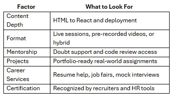
Top Picks for the Best Courses for Front-End Development in 2025

In the age of digital-first experiences, the way users interact with apps and websites has never been more important. Companies, from tech startups to global enterprises, are constantly on the lookout for skilled front-end developers who can turn creative designs into functional, engaging interfaces.
If you're planning to enter tech or transition within it, enrolling in one of the best courses for front end development can set the foundation for a rewarding and future-proof career.
Let’s break down what front-end development entails, what skills you'll need, and which front end developer best courses can get you there in 2025.
What Does a Front-End Developer Do?
Front-end developers are the bridge between design and technology. They take static mockups and breathe life into them using code, ensuring websites and apps are not just visually appealing but also interactive, accessible, and responsive.
Key responsibilities include:
Converting UI/UX designs into code
Ensuring responsiveness across devices
Improving page load speed and user interactions
Debugging and maintaining front-end functionality
Collaborating with back-end teams and designers
To excel in this role, you’ll need to master a suite of tools and technologies.
Skills You’ll Learn in a Front-End Development Course
A good front end developer best course will teach you:
HTML, CSS, and JavaScript – The core building blocks
Responsive Design – Using media queries and frameworks like Bootstrap
JavaScript Frameworks – Such as React, Angular, or Vue.js
Version Control – Using Git and GitHub
APIs – Integrating with RESTful services
Testing Tools – Like Jest or Cypress
Dev Tools – Chrome DevTools, Postman, VS Code
More advanced programs also introduce deployment techniques, performance optimization, and accessibility best practices.
Why Take a Front-End Development Course?
With self-learning resources widely available, many wonder: why invest in a course?
Here’s why a structured program still matters:
Learning Path: Courses guide you from basics to advanced topics in a logical order
Project Work: Build real-world applications for your portfolio
Mentorship: Resolve doubts and get code reviews from experienced developers
Career Services: Resume help, mock interviews, and job connections
Consistency: Learn without getting overwhelmed by scattered resources
Top Platforms Offering the Best Courses for Front End Development
Here’s a curated list of the most career-oriented and practical learning options available in 2025.
1. NIIT Digital – Full Stack Product Engineering Program (Front-End Focus)
While designed as a full stack course, NIIT Digital’s program provides a robust front-end foundation ideal for beginners and upskillers alike.
Why it stands out:
Covers HTML, CSS, JavaScript, React, Git
Includes live mentor-led sessions and hands-on projects
Offers access to capstone projects and job support
Flexible learning schedules with a job-readiness focus
Aligned with the latest hiring trends in India
For those serious about entering the job market quickly, NIIT Digital provides one of the best courses for front end development with practical skills and support systems in place.
2. freeCodeCamp – Front End Development Certification
A great option for self-learners, this course covers:
Responsive web design
JavaScript algorithms
Front-end libraries like React
Projects to earn certification
3. Coursera – Meta Front-End Developer Certificate
Offered in partnership with Meta (Facebook), this program teaches:
HTML, CSS, JavaScript
React and UX principles
Front-end testing and final project
Industry-grade training with flexible timelines
4. Udemy – The Complete Front-End Web Developer Bootcamp
Popular for affordability, this includes:
30+ hours of on-demand video
Real-world exercises
Lifetime access
While less structured, it's a good option for budget-conscious learners looking to experiment.
How to Choose the Right Course for You
Here’s a quick checklist to help you select the front end developer best course for your goals:
Platforms like NIIT Digital score high across all these criteria, especially for learners who value guided instruction and career support.
Career Outcomes After Front-End Courses
Once you’ve completed a front-end course, you’ll be ready to apply for roles like:
Front-End Developer
UI Developer
Web Developer
React Developer
Junior Software Engineer
Final Thoughts
Becoming a front-end developer in 2025 is not just about learning to code—it’s about learning to create digital experiences. A high-quality program gives you the edge to stand out in a crowded job market.
Whether you’re just starting out or reskilling mid-career, investing in one of the best courses for front end development can accelerate your growth and job readiness.
Platforms like NIIT Digital bring together structure, community, and mentorship—all essential ingredients for success in tech. Choose a course that doesn’t just teach you to build web pages—but to build a career.
0 notes
Text
Weekly News for Designers № 719
New Post has been published on https://thedigitalinsider.com/weekly-news-for-designers-%e2%84%96-719/
Weekly News for Designers № 719
Figma AI Updates to Elevate Your Design Workflow Figma has shared some prototypes for platform updates that integrate AI. This Tuts+ article covers each of them to explore their possibilities.
State of Brand Report 2023 Discover key insights into the trends, challenges and strategies of branding this year.
Internet Artifacts Explore artifacts from the early days of the internet right up until the present day.
Naming Variables In CSS Some collected thoughts from Jonathan Dallas related to naming CSS Custom Properties.
The Negative Impact of Mobile-First Web Design on Desktop Mobile-first web designs cause significant usability issues when viewed on desktop.
Free T-Shirt Mockup Templates for Photoshop These free realistic iPhone mockup templates are perfect for showcasing the UI or UX of your mobile app design or responsive website.
Introducing Learn Performance Course This is new and free course is intended for those that care about web performance, but may be just beginning to get familiar with it.
It’s 2023, Here is Why Your Web Design Sucks Heather Buchel explores the reasons why we no longer have web designers.
State of React 2023
Let’s Reinvent the Wheel
The 2023 Design Tools Survey This survey gathers usage data from thousands of designers each year and many of the design companies you know use this data to better understand and improve the design tools industry.
CSS & JavaScript Snippets for Creating Notification UIs A collection of CSS and JavaScript code snippets for creating unique notification and alert systems and UIs.
Image Layer Animations with Clip-Path Some ideas for speedy page transition animations with layered images using clip-path.
Common Questions About Interpreting Page Speed Reports Take a closer look at how various performance tools audit and report on performance metrics, such as core web vitals.
Geist Font A new and free typeface that has been specifically designed for developers and designers.
Photoshop Action Sets for Cinema & Movie Effects A collection of one-click cinema & movie effect Photoshop action sets that will take your photos to the next level.
#2023#ai#amp#animations#app#Article#audit#Branding#clip-path#code#Companies#course#CSS#custom properties#data#Design#Designer News#designers#desktop#developers#effects#figma#how#Ideas#images#Industry#insights#Internet#iPhone#issues
2 notes
·
View notes
Text
Part Time Jobs Nagpur -381600 Part Time Job Vacancies Nagpur
Part Time Jobs Nagpur
We are seeking a PHP Developer to join our growing team in the Netherlands. You should know object orientated php programming, be familiar with MVC pattern, php/frameworks and have some experience of client side technologies such as HTML5, JavaScript & CSS3. Below are the characteristics we seek. Part Time Jobs Nagpur

Constructing Web Applications with Code
Developing web applications using code involves a multifaceted process that a diverse skillset. Developers leverage programming languages like JavaScript, Python, and Ruby to construct the logic and functionality of websites. They also utilize frameworks and libraries to streamline development, optimize performance, and ensure cross-browser compatibility. A fundamental aspect of web application development is the creation of user interfaces (UIs) using technologies such as HTML, CSS, and sometimes JavaScript. These elements work together to design interactive and visually appealing experiences for users.
Additionally, developers often incorporate databases to store and retrieve data, enabling dynamic content and user interactions.
Quality assurance is crucial throughout the development cycle to identify and resolve bugs, ensuring a stable and reliable application.
In conclusion, building web applications with code presents a challenging yet rewarding journey for developers who are passionate about creating innovative and impactful online experiences.
Master Front-End Development
Stepping into the realm of front-end development is a daunting task. But with dedication and the right approach, you can evolve from novice to expert. Mastering this craft involves exploring into the intricacies of HTML, CSS, and JavaScript, crafting interactive and visually engaging user interfaces. It's a journey that rewards immense fulfillment as you shape your ideas to life on the web.
Launch your journey by acquiring the fundamentals of HTML and CSS. These building blocks provide the structure and style for any web page.
Utilize JavaScript to add responsiveness to your websites, creating truly engaging user experiences.
Implement consistently. The key to mastery lies in applied experience. Build projects, experiment with new techniques, and strive feedback to refine your skills.
Mastering the Art of Responsive Design
Responsive design presents a crucial facet of modern web development. It ensures that websites conform seamlessly to different screen sizes, providing an optimal user journey despite the device being used. This involves a deep understanding of HTML, CSS, and innovative design strategies. By implementing fluid grids, flexible images, and media queries, developers build websites that navigate beautifully on smartphones, tablets, desktops, laptops. Responsive design not only optimizes user satisfaction but also increases SEO rankings and as a result drives online growth.
From Pixels to Functionality
The transformation from pixels to functionality is a fascinating process. Developers craft intricate code architectures, bringing life Web Developer to static digital elements. A simple pixel, on its itself, can't perform anything. But when assembled with programming, it becomes part of a responsive system that enables user experiences. This transition from visual representation to functional reality is what truly elevate the digital world.
#sarkari_naukri#Jobs#Naukri#Indeed#Career#Online Jobs#Work From Home#SEO#Digital Marketing#Web Developer#Job Vacancies
0 notes
Text
Understanding the Responsibilities of a Freelance Web Designer
In today’s digital-first world, businesses of all sizes recognize the importance of having a professional online presence. This demand has significantly elevated the role of a Freelance Web Designer. Whether you’re a small business owner in need of a new website or a company looking to revamp your digital interface, a Freelance Website Designer can be an invaluable partner. In regions like Singapore, where digital innovation is rapidly advancing, the expertise of a Freelance Web Designer Singapore professional is especially in demand.
But what exactly does a Freelance Web Designer do? How are they different from a Freelance Web Developer? Let’s explore the key responsibilities, expectations, and skills required in this dynamic freelance career.
1. Consultation and Requirement Gathering
The first responsibility of any Freelance Website Designer is to understand the client’s needs. This begins with an initial consultation, where the designer discusses the project’s goals, target audience, preferred aesthetics, and functional requirements. For example, a Freelance Website Designer Singapore might cater to local businesses who need bilingual content or region-specific features like e-payment systems compatible with local banks.
This stage is critical because it lays the foundation for the entire design and development process. The designer must ask the right questions to ensure they fully understand the scope of work, branding guidelines, and timeline expectations.
2. Wireframing and UX Design
Once the project scope is defined, the Freelance Web Designer moves on to creating wireframes — basic layouts that outline the structure of each web page. During this phase, the focus is on User Experience (UX) design. This involves planning intuitive navigation, responsive layouts, and functional interactions.
Especially for a Website Designer Singapore, understanding the local user behavior, such as mobile-first browsing habits and preferences for minimalistic design, plays a crucial role in shaping a user-friendly interface.
3. Visual Design and Branding
After the wireframes are approved, the next step is crafting the visual design. This includes selecting color schemes, typography, imagery, and other visual elements that align with the client’s brand identity.
A Freelance Web Designer Singapore must ensure that the website’s aesthetics resonate with local cultural sensibilities while remaining globally appealing. High attention to detail is crucial, as every design element must contribute to a cohesive and visually engaging experience.
4. Front-End Development
Some Freelance Web Designers also take on the role of a Freelance Web Developer. In this case, they are responsible for turning static designs into interactive web pages using coding languages like HTML, CSS, and JavaScript. A Freelance Web Developer Singapore needs to be particularly adept at optimizing websites for speed, performance, and mobile responsiveness.
Whether working as a Freelance Website Developer or collaborating with a separate developer, the designer must ensure the transition from design to development is seamless.
5. Back-End Integration
While not all Freelance Web Designers handle back-end development, many Freelance Website Developers and Freelance Web Developers are proficient in integrating databases, user authentication systems, and CMS platforms like WordPress or Shopify.
A Freelance Website Developer Singapore might be required to implement e-commerce functionality or integrate with local services like SingPass or regional logistics providers. These tasks demand a deep understanding of back-end development and server-side scripting languages like PHP, Python, or Node.js.
6. Content Management and SEO
Another key responsibility of a Freelance Website Designer is to help clients manage content effectively. This may involve installing and configuring a content management system (CMS), training clients on how to use it, or even populating the site with initial content.
SEO (Search Engine Optimization) is equally important. A Website Designer Singapore needs to ensure that the site is built with clean code, fast load times, and SEO-friendly structures to help clients achieve better search engine rankings.
7. Testing and Quality Assurance
Before launching a website, it must undergo thorough testing across different browsers, devices, and screen sizes. A Freelance Web Developer ensures that every element functions correctly and that there are no bugs or usability issues.
In Singapore’s competitive digital market, a Website Developer Singapore must deliver a flawless user experience. This includes testing for mobile responsiveness, cross-browser compatibility, and compliance with data protection regulations.
8. Website Launch and Post-Launch Support
Once the website is ready, the Freelance Website Developer assists with launching the site. This can include domain setup, hosting configuration, and migrating the site from a staging environment to the live server.
Post-launch, many Freelance Web Developers Singapore offer maintenance services. These may include updating software, fixing bugs, optimizing performance, and providing technical support. This ongoing relationship is particularly beneficial for businesses without an in-house IT team.
9. Project Management and Communication
Freelancers must also be good project managers. Whether working as a Freelance Web Designer or a Freelance Website Developer, they need to manage deadlines, communicate progress regularly, and coordinate with other stakeholders such as copywriters, photographers, or marketing teams.
In places like Singapore, where punctuality and professionalism are highly valued, a Freelance Web Designer Singapore must be proactive in communication and transparent about any potential project roadblocks.
10. Continuous Learning and Adaptation
The digital landscape is constantly evolving, with new design trends, technologies, and tools emerging regularly. A top-tier Freelance Web Developer Singapore or Freelance Website Designer Singapore must invest in continuous learning to stay relevant and competitive.
Whether it’s mastering a new CMS, learning about AI in web design, or exploring progressive web apps (PWAs), staying updated is part of the job description.
Final Thoughts
Hiring a Freelance Web Designer offers businesses flexibility, creativity, and cost-efficiency. Whether you're looking for a Freelance Web Developer Singapore to build complex back-end systems or a Website Designer Singapore to craft a stunning front-end, freelancers offer tailored solutions to meet specific business needs.
As the digital economy continues to grow, the role of the Freelance Website Developer will become even more integral to business success. With the right skills, dedication, and understanding of both design and development, these professionals can help transform a simple online presence into a powerful digital asset.
#freelance web designer singapore#web design singapore#web designer singapore#web developer singapore#freelance web developer singapore
0 notes