#datatools
Explore tagged Tumblr posts
Visit Tumblr Blog
Explore Tumblr blogs with no restrictions, modern design and the best experience.
Last Seen Tumblr Blogs


Fun Fact
BuzzFeed published a report claiming that Tumblr was utilized as a distribution channel for Russian agents to influence American voting habits during the 2016 presidential election in Feb 2018.
Text
Designing Eye-Catching Dashboards in Power BI: Best Practices
In today’s data-driven world, turning raw numbers into meaningful visual insights is more important than ever. Power BI has become one of the leading tools for business intelligence and data visualization, enabling users to create powerful, interactive dashboards. But what makes a Power BI dashboard not just functional—but truly eye-catching?
In this article, we'll explore best practices for designing visually appealing and user-friendly dashboards using Power BI. Whether you're just starting with Power BI training or you're a seasoned pro, these tips will help elevate your data presentation skills.

Why Dashboard Design Matters
A well-designed dashboard improves decision-making by highlighting the right data at the right time. It enhances user experience, reduces cognitive load, and ensures that insights are quickly and clearly understood. Bad design, on the other hand, leads to confusion, missed insights, and ultimately poor decisions.
Best Practices for Designing Eye-Catching Dashboards in Power BI
1. Know Your Audience
Before diving into Power BI, identify who will be using the dashboard. Are they executives, analysts, or operations teams? Different users have different data needs. Tailoring the dashboard content and complexity to your audience is key.
2. Keep It Simple and Clean
Less is more. Avoid clutter by only including essential visuals. Use whitespace effectively to create breathing room between elements. A clean design ensures better readability and quicker insights.
3. Use Consistent Colors and Fonts
Maintain a consistent theme throughout your dashboard. Use your brand colors or predefined color palettes. Stick to 1–2 font styles and sizes for uniformity. This enhances professionalism and visual harmony.
4. Choose the Right Visuals
Bar charts, pie charts, line graphs, cards, maps—Power BI offers a range of visuals. Choose the one that best represents your data. Avoid fancy visuals just for aesthetics; ensure they serve a purpose.
5. Leverage Filters and Slicers
Interactive slicers allow users to slice and dice the data based on specific criteria. Filters improve usability and make the dashboard dynamic and personalized.
6. Highlight Key Metrics
Use KPIs and cards to draw attention to critical values. Place these visuals prominently so decision-makers can quickly scan the dashboard and identify performance indicators.
7. Use Tooltips and Drill-Throughs
Tooltips provide additional context without cluttering your visuals. Drill-throughs allow users to click on visuals and view detailed reports—offering both high-level overviews and deep dives.
8. Test on Multiple Devices
Power BI dashboards can be accessed on desktops, tablets, and mobile devices. Always test your design on various screen sizes to ensure responsiveness and usability.
Bonus Tip: Stay Updated with Power BI Training
Power BI is continuously evolving. Staying updated through Power BI training courses will help you explore new features, advanced visuals, and performance tips. Continuous learning is essential to remain competitive in the field of data analytics and business intelligence.
FAQs
Q1: What is Power BI? Power BI is a Microsoft business analytics tool that provides interactive visualizations and business intelligence capabilities with an interface simple enough for end users to create their own reports and dashboards.
Q2: Who can benefit from Power BI training? Anyone from business analysts to data scientists, marketing professionals to finance managers can benefit. Whether you're a beginner or looking to advance your skills, Power BI has something for everyone.
Q3: Is Power BI suitable for small businesses? Absolutely. Power BI offers scalable solutions for small to large businesses with flexible pricing and robust features.
Q4: How long does it take to learn Power BI? With dedicated Power BI training, most users can become proficient within a few weeks, depending on prior experience and commitment.
Q5: Where can I get expert Power BI training? You can visit our website for structured Power BI training programs designed by industry experts. Our curriculum covers everything from the basics to advanced dashboarding techniques.
Conclusion
Designing eye-catching dashboards in Power BI isn't just about aesthetics—it's about delivering the right insights in the most efficient way. By following these best practices, you’ll create dashboards that not only look great but also empower better business decisions.
Ready to master the art of Power BI? 👉 Visit our website for hands-on Power BI training, tips, and expert support!
#powerbi#dataanalytics#BusinessIntelligence#data#DataInsights#python#DataDrivenDecisions#tableau#DataTools#sql#dashboard#DataReporting#onlinelearning#analytics#courses#dynamics#bi#software#nareshit
0 notes
Text

🧠 QUIZ TIME!
Think you know Excel? Let’s find out!
🔍What is a Pivot Table used for in Excel?
A) Fixing Typos B) Drawing Shapes C) Summarizing Data D) Encrypting Files
📊 Pivot Tables help you quickly understand and summarize big data in Excel. They’re an important skill for anyone learning data analytics!
👇 Comment your answer below!
👉 Join our Data Analytics Masters Program today!
📞 +91 9948801222
🌐 www.dataanalyticsmasters.in 📍 Location: Hyderabad
#ExcelTips#PivotTable#DataAnalytics#ExcelSkills#LearnExcel#DataTools#AnalyticsMadeEasy#ExcelForBeginners#StudyTips#UpskillNow#DataScienceBasics#MasterExcel#ExcelTraining#DataAnalyticsMasters#OnlineLearning
0 notes
Text
Enhancing Data Collection: Advanced Methods and Tools
Enhancing data collection involves adopting advanced methods and tools that improve accuracy, efficiency, and the depth of insights. Techniques such as machine learning, real-time data capture, and IoT sensors allow for more dynamic, scalable, and precise data gathering. Tools like advanced survey platforms, big data analytics, and AI-driven data processing enable faster analysis and decision-making. By leveraging these technologies, organizations can transform raw data into valuable, actionable intelligence Read More..

1 note
·
View note
Text
Key Elements of an Effective Data Strategy
A successful data strategy comprises several critical components, including data governance, technology infrastructure, and analytics capabilities. This article outlines each element, explains its role, and provides practical tips for implementation. Learn how to align your data strategy with organizational objectives to unlock the true potential of your data. For more info:
https://www.datastoryhub.ai/what-is-data-strategy/
0 notes
Text
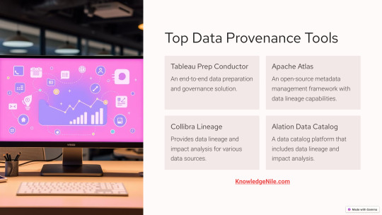
Top Data Provenance Tools: Power Your Data Governance Game
Take control of your data with these powerful tools featured in our infographic. Discover Tableau Prep Conductor for governance, Apache Atlas for metadata management, Collibra Lineage for tracking, and Alation Data Catalog for holistic insights. These tools ensure accuracy, security, and compliance, making them indispensable for businesses in today’s data-driven world.
Love this infographic? Learn more about these tools and their benefits on KnowledgeNile’s blog!
#DataTools#DataGovernance#MetadataManagement#TableauPrep#ApacheAtlas#CollibraLineage#AlationDataCatalog#DataProvenance#KnowledgeNile#Infographic
0 notes
Text
#Tableau#DataVisualization#BusinessIntelligence#DataAnalytics#DataScience#DataDriven#DataTools#DataAnalyst#BusinessAnalyst#DataVisualizationTools#DataExploration#DataInsights
0 notes
Text
0 notes
Text
🇲🇾 Generate Malaysia Addresses Need an address for your project? Try our Random Malaysia Address Generator! 👉 randomgenerator.ai/random-malaysia-address-generator
0 notes
Text
Tips and Tricks for Making the Most of Ai2sql
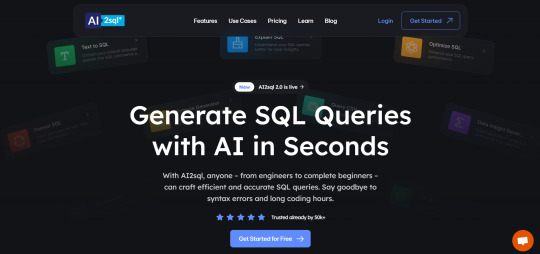
Ai2sql is a powerful tool for generating SQL queries, but there are a few ways to make sure you're getting the best results. Here are some tips and tricks to help you use Ai2sql effectively.
Tip 1: Be Specific in Your Prompts
Explanation: The more specific you are in describing your data needs, the more accurate the generated SQL query will be. Include details like date ranges, product categories, or conditions to get precise results.
Tip 2: Review and Customize Generated Queries
Explanation: While Ai2sql provides a great starting point, always review the generated queries and customize them if needed. This ensures the query perfectly fits your requirements and helps you learn more about SQL syntax.
Tip 3: Utilize Query Optimization Features
Explanation: Use Ai2sql's query optimization feature to generate efficient queries that minimize database load and improve performance.
Tip 4: Learn SQL by Analyzing Generated Queries
Explanation: Ai2sql is also a great learning tool. By reviewing the generated SQL code, you can better understand how different commands work, helping you improve your SQL skills over time.
Tip 5: Experiment with Different Databases
Explanation: If you work with multiple databases, try using Ai2sql across different platforms like MySQL, PostgreSQL, or SQL Server. This helps you get a feel for how SQL syntax may vary and how Ai2sql handles different database types.
Use these tips to get the most out of Ai2sql and make your data analysis process smoother. Visit aiwikiweb.com/product/ai2sql/
#Ai2sql#SQLTips#DataTools#NaturalLanguageSQL#DataAnalysis#BusinessIntelligence#SQLAutomation#LearningSQL#DatabaseManagement#AIinData
0 notes
Text
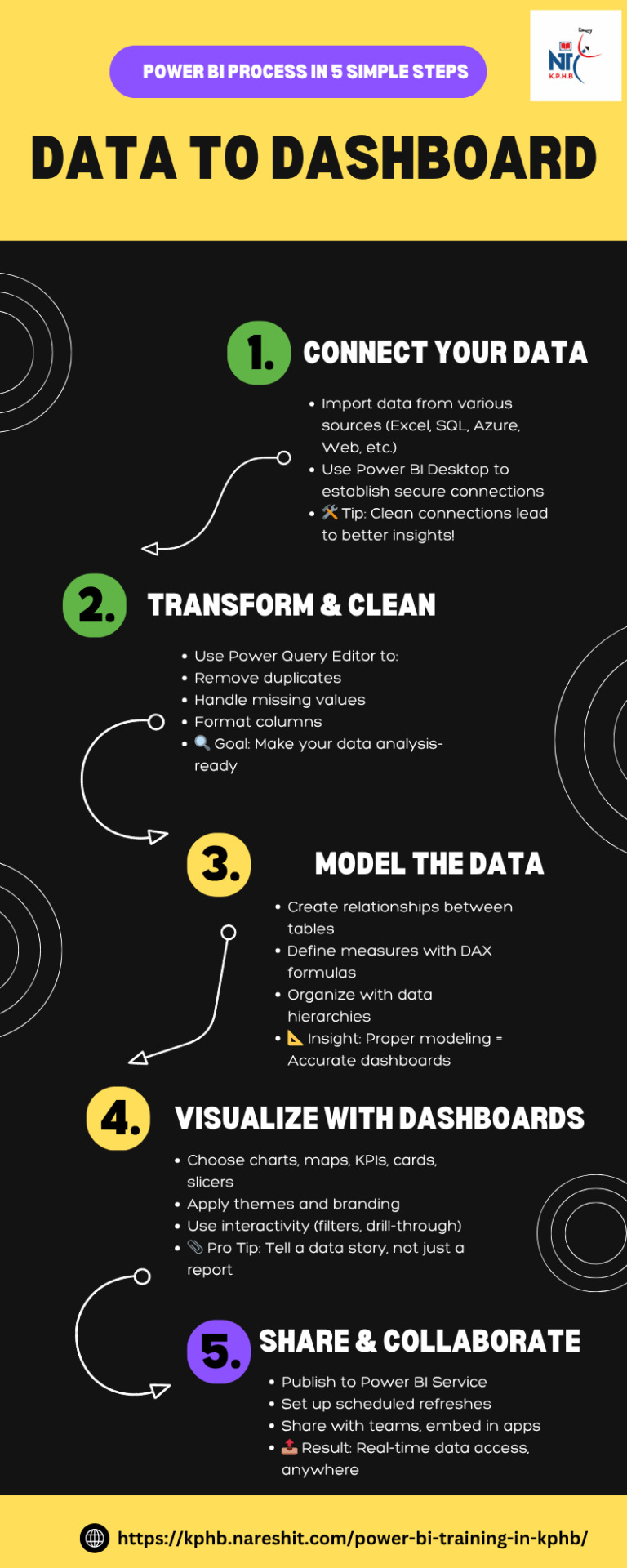
Data to Dashboard: Power BI Process in 5 Simple Steps
#powerbi#dataanalytics#BusinessIntelligence#data#DataInsights#python#DataDrivenDecisions#tableau#DataTools#sql#dashboard#DataReporting#onlinelearning#analytics#courses#dynamics#bi#software#nareshit
0 notes
Text
Tech Tip Tuesday - Tableau Dashboard
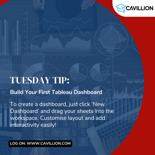
Mastering Tableau starts with the basics—try this tip out and take your data skills to the next level!
#tableau#Tableau Dashboard#data visualization#techtips#technology#tuesdaytips#software#datatools#datascience#data#big data#data analytics#tech#tableau certification#tableaudesktop#tableau online training#tableau course#Cavillion#Cavillion Learning#salesforce
1 note
·
View note
Text
JSON to TSV Converter - Your Go-To Tool
Convert JSON files to TSV format instantly with our easy-to-use tool. Perfect for data professionals and enthusiasts alike!
0 notes
Text
Explore the essential tools and software used in data analytics, from data visualization to machine learning platforms. This comprehensive guide covers the top technologies driving data-driven decision-making. ..
#DataAnalytics#DataScience#DataTools#BigData#DataVisualization#MachineLearning#AnalyticsSoftware#DataDriven#TechOverview#BusinessIntelligence
0 notes
Text
Top Tools and Software for Data Analysis by Andrew Gordon Massachusetts
In this insightful blog, Andrew Gordon Massachusetts explores the top tools and software essential for effective data analysis. From the versatile Microsoft Excel to the powerful programming languages Python and R, and leading visualization tools like Tableau and Power BI, discover how these tools can transform raw data into actionable insights. Learn about the key features and applications of each tool, and find out how mastering them can enhance your data analysis capabilities across various fields.
#DataAnalysis#DataTools#DataSoftware#AndrewGordonMassachusetts#DataScience#BusinessIntelligence#Python#R#Excel#Tableau#PowerBI#SAS#SPSS
0 notes
Text

Free Virtual Event-Reserve a spot (end in 19 hours)
Data Analytics - Unlocking Career as an Analyst
#dataanalyticscareer#datatools#advancedanalytics#reportingskills#problemsolving#dataskills#careersuccess
0 notes
Text

📊 Dive into the world of data visualization with our guide to the best tools for the job!
Whether you're a data analyst, business owner, or simply curious about your data, these top visualization tools will help you turn numbers into insights.
KPH Trainings offers comprehensive courses in data visualization tools, including Tableau, Power BI, Python libraries empowering learners to create impactful visualizations and communicate data insights effectively.
For Further Details walk-in to our Institute KPH Trainings.
Flot No.315, Annapurna Block, Mythrivanam, Ameerpet, Hyderabad.
Map Direction Link: https://goo.gl/maps/MQwYQs9BWa2mTFDG9
Contact us Now to Know more!
Mobile Number: 91217 98535
WhatsApp: https://wa.link/te14su
Email: [email protected]
Visit Our Website: https://www.kphtrainings.com
Follow on us: https://www.facebook.com/profile.php?id=100083418515493 https://twitter.com/kph_it https://www.linkedin.com/in/kph-trainings-373aa7239/ https://in.pinterest.com/kphitraining/
#VisualizationTools#PowerBICourse#TableaucourseinAmeerpet#DataVisualization#BItraining#LearnPowerBI#PowerBIinAmeerpet#DataAnalytics#DataTools#SkillDevelopment#CareerBoost#TableauCourse#Ameerpet#TableauTraining#BusinessIntelligence#CareerDevelopment#LearnTableau#TableauCertification#SkillBuilding
0 notes