#design update
Text
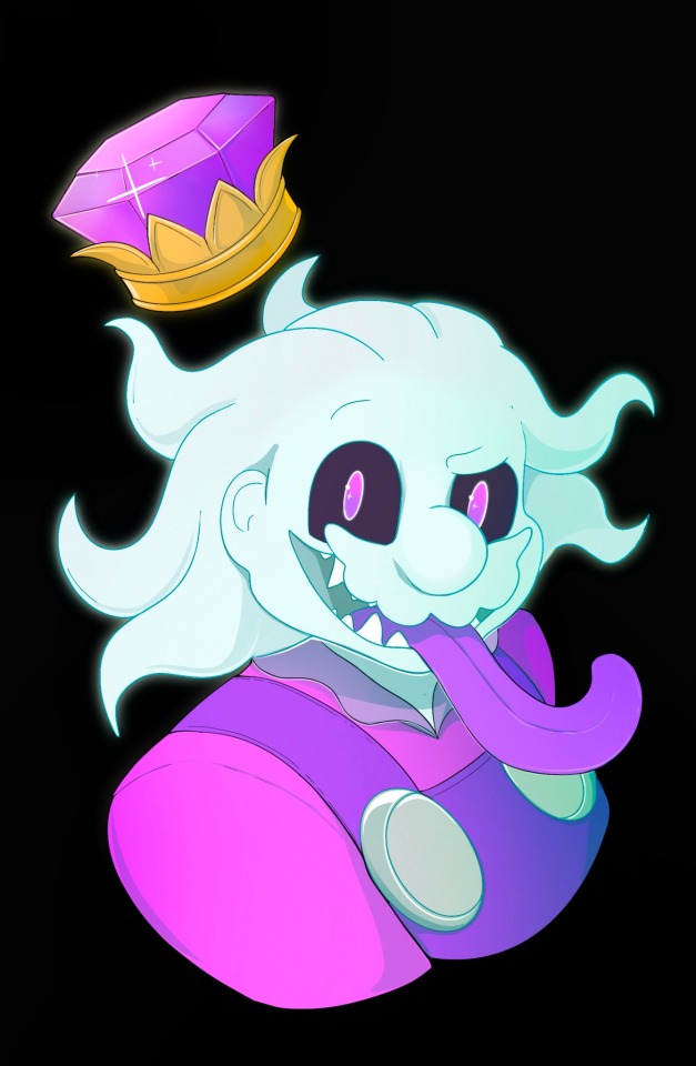
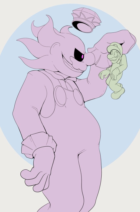
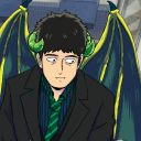
King Booario again! This time with an updated design.
#Been a while since I drew this guy#the old look needed some serious tweaking but I'm proud of the outcome#I'm still firm in the idea that possession in the Mario universe alters one physically a la Bowletta#so this is the result: a king boo who's bigger and badder than ever#King Booario#Luigi#King Boo#my art#design update#piano can art
197 notes
·
View notes
Text


Radagon the Order
Design Diagram Ver2.0
Concept art 1.0
Design diagram Ver1.0
I changed a part of style. Here are more clothes and belts now.
Perhaps it looks more ornate and formal than previous version as daily clothing. Anyway I hope it could be comfortable and casual for him.
#elden ring fanart#elden ring#radagon of the golden order#radagon#costume design#original design#design#from the ashes#radagon the order#I can't stand that terrible previous design any longer#headcanon#design is always so attractive and torturous#design update
96 notes
·
View notes
Text

Hi, I decided to make a Needlessly Elaborate REF for Auri because the other one was like a year and a half old, and I wanted to update his design. I'll probably be doing this for like, several other characters because I want to change outfits and designs for my AU.
Apologies for my chicken scratch. I pray it is legible to other people vhyfgjhjhgjygf
Original REF (for art comparison sake) under the cut.
I think I drew this in like April of last year or some shit. Been a long time. :]
#Auri <3#he <3#the pale king#hollow knight#hollow knight au#au#hollow knight art#character reference#redraw#sort of#elaborate ref sheet#character info#design update#I really am SO GLAD I managed to keep his signature Triangle shape#hope to keep my title as that One Guy who draws freaky mouths on HK characters#that is my legacy here on Tumblr I stg#nyctophobia au#rot's art
117 notes
·
View notes
Text

Spot design updates
Spot limbs it’s not attach together but it’s have a black goop to between limbs. He can stretch his limbs very far and the goop help him to not lose it. Spot face also can open to show the “real face” inside and his real goop body probably hiding under white parts and all the black parts is a portal
He’s actually don’t need clothes to disguise because Spot can shape shift himself back to Jonathan but it’s funny to think him in disguise clothes like in atsv
#marvel#spider sona#spider sona villain#the spot#jonathan ohnn#design update#procreate#procreateart#procreatedrawing#drawing
56 notes
·
View notes
Text
🌟SAINT SEIYA FLUFFY AU🌟
[🦂MILO DESIGN UPDATE🦂]
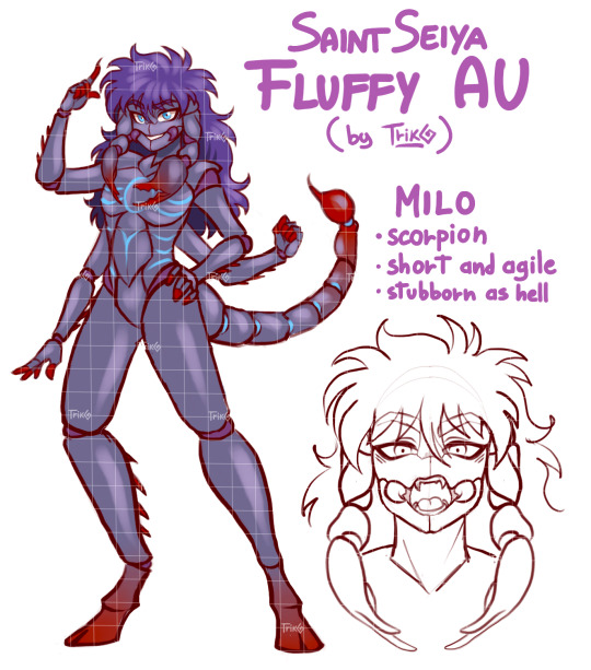
UPDATE!!!! The bug boy got more jaw and a more esoscheletrical face!! I wasn't satisfied with his original face because it looked too human and I wanted to give him more because he deserves it. uwu
#fanart#art#saint seiya#saint seiya fanart#furry#saint seiya fluffy au#scorpio milo#scorpio#milo fanart#milo#furry fanart#furry sfw#furry anthro#furryart#furry art#sfw furry#furry fandom#charcater design#redesign#design update#update#fursona#bugsona#bugs#trikomics
31 notes
·
View notes
Text
Made my first sketch of my own version of Nicole from the visual novel game Class of 09

#my art#stylized#fanart#class of 09#class of 09 the re up#class of 09 game#class of 09 nicole#nicole#sketch#character design#character fanart#possible redesign#stylized design#design update#design
40 notes
·
View notes
Text
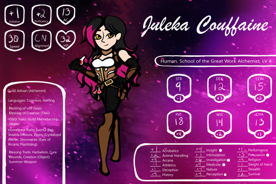
Alright, I have a very slight update to Juleka for Scions after the first chapter

Her design does stay the same, but her lilac hair will be red violet after being blessed by Creation while Luka got Destruction (his design won't change from what I have already as I had that one planned)
And her adjusted character sheet:
#miraculous#miraculous ladybug#miraculoustalesofladybugandcatnoir#miraculous au#au#alternate universe#fanart#miraculous fanart#design#digital art#update#design update#character sheet#dnd#miraculous dnd#scions au#scions#juleka#miraculous juleka#juleka couffaine#mlb juleka
20 notes
·
View notes
Text

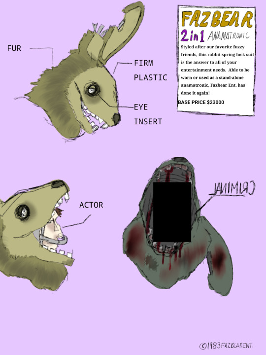
Updated springtrap design! Shrunk the cowl, kept the rabbit shaped profile fixed his front view
First ever springtrap drawing underneath
#art#lets ignore that art#fnaf#five nights at freddy's#horror art#william afton#fnaf 3#springtrap#springtrap art#design update
106 notes
·
View notes
Text
Lee update cuz he deserved better

That is all I love himb :3
#art#oc art#oc#uhh idfk#tags tags tags#traditional drawing#design update#idk i just felt like sharing my silly guy<3#idk he was pretty much inspoed off gorefield
7 notes
·
View notes
Text
Little life update accompanied by a minor design update for my sona!
My honey proposed last week!!! ❤️💕
We have been engaged since I proposed last year, but we decided that we would each get the chance to do it. So now we both have a ring!! <3
(Yes, the ring is now part of the design)
8 notes
·
View notes
Text
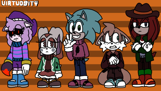
Forgor to announce MUCH sooner, but - design updates for the Virtuosity gang!
Listing off the more specific tweaks:
Tweaks to the outfits - mostly in how they're drawn, but also have actual changes to some of them.
The "curse" marks got changed to match their bearer's talents (minus Virtuosity!Cream - her musical note was tweaked to a simpler shape) - Virtuosity!Sonic has a pencil quill, Virtuosity!Tails has a sculpture hammer, Virtuosity!Knuckles has a comedy theater mask.
Advance trilogy visual inspiration became more apparent - mainly in Knuckles' tweaked color palette and Cream's eye shape.
I'm probably gonna reserve it for future posts and/or reblogs, but might make individual bios for each of them + extra details.
#sonic the hedgehog#sonic.exe#sonic.exe au#virtuosity.exe#amy rose#amy the hedgehog#miles tails prower#tails the fox#sonic#knuckles the echidna#cream the rabbit#cream the bunny#design update
23 notes
·
View notes
Text
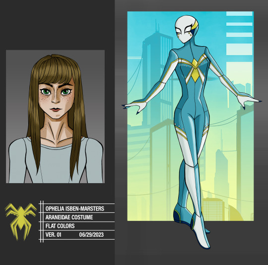
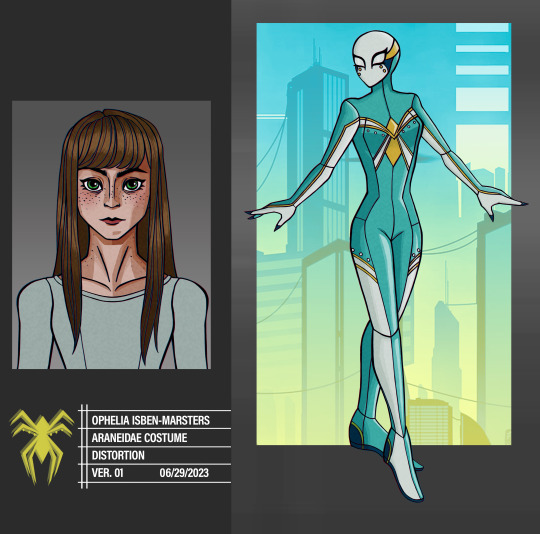
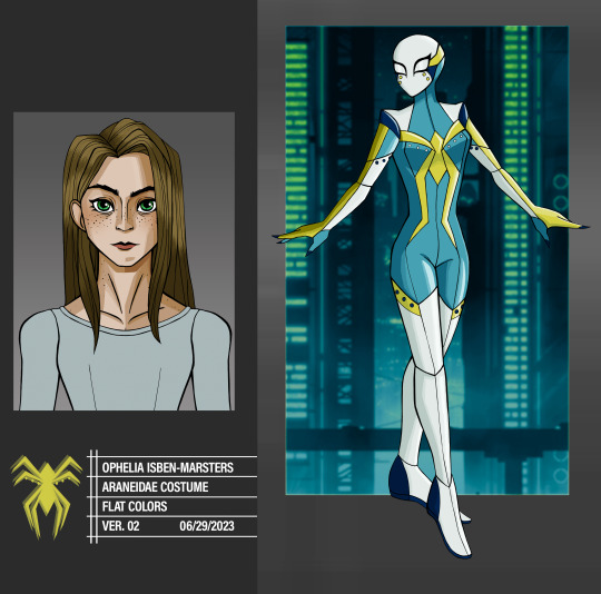
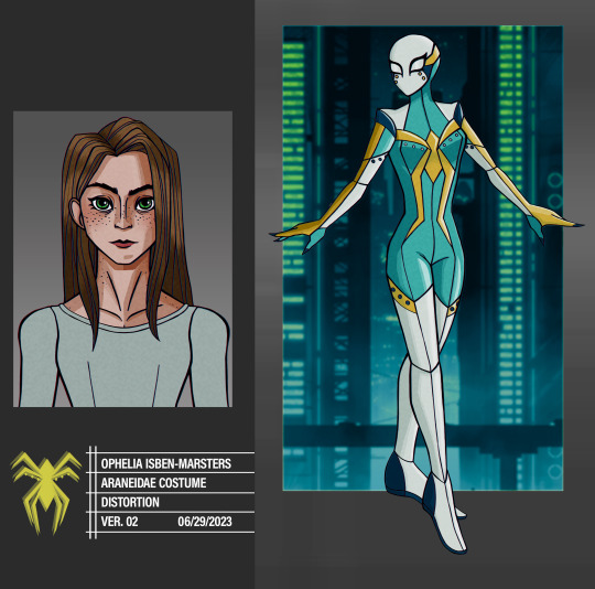
Spider-Sona update 2023
Araneidae Into the Spider-Verse vs Across the Spider-Verse design comparison.
All of the main cast got an outfit update between Into the Spider-Verse and Across the Spider-Verse. I felt my spider-sona, Ophelia, deserved a upgrade too. A visual way to show the passage of time and such.
Her aesthetic has taken a bit of a shift. When making her I was heavily inspired by thriller and sci fi 1990s anime. The harsh shadows, the warm tint, and CRTV halo effect really appeals to me. That never really "came through" in her earlier art. I think this time I was more successful channeling those influences.
Oh and yes, she does still have her web cape. Included as alts so as not to obscure her suit design.
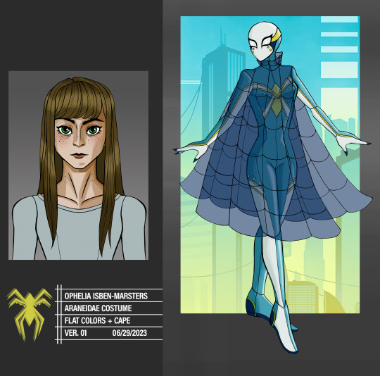


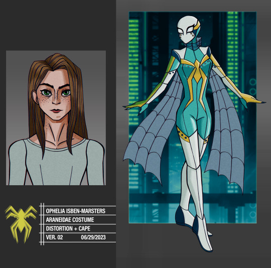
#spidersona#across the spiderverse#spider man across the spider verse#spidersona art#spider man oc#spiderverse oc#spider oc#spider sona#spider man: across the spider verse#original character#marvel oc#character design#character illustration#90s anime aesthetic#vintage anime aesthetic#redesign#character redesign#redraw#design update#illustration#artists on tumblr#character inspiration#character art#original story#araneidae#the atomic magical girl#ophelia isben marsters
17 notes
·
View notes
Text
seraphim dust sketch
16 notes
·
View notes
Text
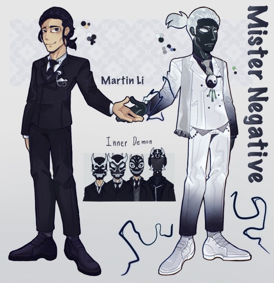
Martin Li AKA. Mister Negative the youngest crime lord
In Chinatown Martin is the owner of the F.E.A.S.T he is a very famous person and a lot of people know him as a rich philanthropist but that’s the only thing most people know. In the world of crime he is also known as Mister Negative, one of the powerful crime lords with his minion The inner demon. His power just likes his name. Negative power has the ability to switch people personally from good to bad or bad to good and he also can control people who get corrupted by the negative power too. It’s not all bad because on the Martin Li side he has a light power that can heal people even with cancer. All of this power is from the mystery antiques he found long ago when he was a child it’s more than just giving him a power.. it’s giving him a second personality it’s later on call himself Mister Negative
#marvel#spider sona#spider sona villain#design update#mister negative#martin li#inner demon#procreate#procreateart#procreatedrawing#drawing#sometimes I call Martin Mister positive#LOL#he’s another character with Dissociative Identity Disorder just like green goblin and moon knight in this universe#the full lore will come later (?)#maybe if I’m not forgot it
25 notes
·
View notes
Text

A fun little thing I decided to do showing the history of all of Luna’s designs.
If you’re curious, here is a bit more details about each one:
1: This of course was the first ever design. I believe I drew her on paper first after deciding I wanted a Pokémon oc. I took out a Pokémon Pokédex book and picked out a mew as it was within my limited drawing skills. The first digital drawing I ever did was of Luna in Microsoft Word, until it crashed on me before I could save it. Thankfully I took a picture of it with my 3ds
2-4: I really got more into digital art and drawing in overall during these design phases. They are probably when I made the most improvements and their designs show that.
5: This was when I really got into zelda, hence the hat, and was the final design of the 2-4 phase. Mostly just getting rid of the face spots as they were a pain to draw and were never the same (I hated drawing them again, cute as they might look)
6: I had realize the S shaped marking weren’t working and was hard to keep the same each time so I switched it to the way you see it there. Really this design is 5.2 honestly. This was the design I kept the longest, and unfortunately it was also the phase where I was going through a rough time and I almost got rid of Luna because of the reminders. However we know that isn’t the end
7: The most different of all the designs and a turning point for me. I needed a whole new look to move on from that rough patch and take Luna back. I had planned to keep this design for longer than I did but then I got some other ideas.
8: She’s just fluffy now, it makes me happy and I plan on keeping this one around for a long time
Which design was your favorite?
#pokemon#mew#art#pokesona#mew oc#character#designs#character design#updates#design update#oc history#I’d love to see others you’ve done something like this
17 notes
·
View notes
Text
Updated my Final Space sona ^0^
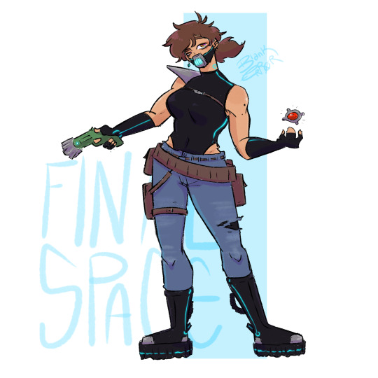


#final space#sona#kevin van newton#gary goodspeed#self ship#oc#original character#design update#sketch
18 notes
·
View notes
Last Seen Blogs
166hours
i love killian jones

shaokahntier
Trump Wears Givenchy

sourdough-seal
i want adventure in the great wide somewhere
akiransh
AkiraNishijima
acekindaneat
mp100 brainrot