#desktop layout change which is currently being tested but we all know it’s just them copying twitter’s desktop layout
Text
sick and tired of tumblr rearranging the furniture in the house (pushing updates that no one (generally speaking) wants to see)
#tumblr#desktop layout change which is currently being tested but we all know it’s just them copying twitter’s desktop layout#mobile media player change because WOW it’s annoying to try and watch videos people post now#algorithms#‘for you’ being the default for new users because apparently they can’t find stuff they like on their own#tumblr live (derogatory)#the potential collapsing of reblog chains despite that being a literal KEY factor in tumblr’s existance#literally every single popular post or meme came from reblog chains and now they want to stifle it#potential removal of duplicate reblogs#the list goes on and on
9 notes
·
View notes
Text
Behind the Scenes of System76: Industrial Design

Since moving into a factory space in 2018, System76 has delved deeper and deeper into manufacturing hardware in-house. Three years later, we’ve introduced five Thelio desktops, fine-tuned the hardware, developed our fully configurable Launch keyboard, and optimized our production processes. Helming the design process is Mechanical Engineer John Grano, who wears a number of different hats here. We sat down with John this week to discuss industrial design and the team behind our beautiful open source hardware.
How would you describe industrial design for people unfamiliar with the term?
To me, industrial design is basically the art of making something into a usable product. In industrial design, you have to balance looks and function, and that drives your form. It’s kind of like hardware UX in that it’s really important to have the right feel. If you can make the system connect better with people, they’ll like it more. Adding that softness we do with Thelio, like slightly rounded edges and darker wood, it makes it a little more approachable to have a semi-natural looking system and not something that’s blinking at you with red lights all the time.
System76 itself is a group of hardcore programmers and people that are really into Linux, but I think the idea of trying to democratize Linux is extremely important. If you can create something that doesn’t have that robotic aesthetic, it will provide people with something that feels more familiar and usable. No one really wants to go sit in a car that looks like a square with wheels on it. They want something that makes them feel something, maybe openness or comfort, when they’re in it.
What inspired you to get into mechanical engineering, and how did you end up at System76?
The way my brain works lends itself well to engineering, for better or for worse. There’s a lot of really solid engineers who don’t have much creativity, and then there are a lot of people who have great creative ability, but can’t do math. I kind of fluctuate in the middle; I wouldn’t say I’m the best at math or the most creative person in the entire world, but I have enough of each that the combination pushed me towards mechanical engineering. I like working with my hands, and it’s more of a study of how things work in the real world versus computer science, which is a purely digital and nontangible practice.
During school I worked mainly as a bike mechanic, and that helped me to think about how to build things better. That led me to my first internship at a bike company working in a wind tunnel, which was really fun. Realizing that I could probably never get a job there—or at least one that would pay me enough to live—I started working at an environmental engineering company, where I prototyped scientific sampling systems for R&D that would process materials with all these gasses at really high heat and tried not to die. It was kind of fun making these large-scale systems that were basically just gigantic science experiments, but I didn’t really have the creative outlet I wanted in terms of making something that looks good.
One of the main things that drew me to System76 was being able to have a solid influence on what tools we were able to use and how we were going to push the design. In the past three years, it’s pretty wild to see what we’ve been able to accomplish coming from a completely empty warehouse to being able to crank out parts.
I had also previously, while working at these scientific instrument companies, been working with a local company to design and develop a cargo bicycle, so I had that experience as well in terms of consumer product development with overseas manufacturing. I think that helped get me in the door here.

Let’s talk a bit about your team. Who do you collaborate with on a typical day?
It’s a very small team and everyone does a lot. I pretty much lead the mechanical engineering team slash design team...slash manufacturing team. Being a small company, we are all wearing a bunch of different hats. Aside from doing the initial design work on all of our Thelio desktops and the Launch keyboard, I also program our laser-punch machine and our brake press and run through all of the design for manufacturing hang ups that show up. Those changes tend to be a result of our current tools, and internal capabilities.
Crystal came on last August as our first CNC Machinist. She heads up all of the machining, trains our operators, makes sure our parts are coming out in a nice clean fashion, and has done a lot of work on minimizing machine time and maximizing the parts we can get out. She also provides really great feedback on what's possible and what kind of special fixtures or tools we'll need to make for a specific part. Around the same time we picked up our first Haas 3-axis CNC mill to start working on the Launch project. That led to some other opportunities to make parts for Thelio and improve the feel of some of the parts that we were pumping out.
We just hired Cary, who came from a similar background as me in consumer product development, as well as low-scale scientific machine development. He’s going to help build manufacturing tools for us, and he’s only been here now for two or three weeks. Going forward, Cary will be heading up the Thelio line long-term, and I’ll be moving to some interesting R&D work.
And Zooey?
Zooey doesn’t really do much. She just kind of sits there and waits for people to feed her their lunch. I take her out for walks during the day so she can get away from everyone petting her. She doesn’t like when they do that.

What was the R&D process like for Launch?
Launch is a less complicated product in that we don’t have to deal with things like cooling. Even dropping a PCB into aluminum housing deals with multiple processes, like using the laser and CNC machine. This was a start to looking at those processes to see how much time it takes to produce parts, the costs going into making them, and monitoring the cutting quality. You have to be familiar with the machines and know what you’re looking for when you see a tool going dull.
We first let the software experts do their thing and optimize a layout they wanted for their programming life. Then I was given that template, built a couple of sheet metal chassis that we wired up to test that layout, and made a bunch of little changes to that to get that right secret sauce for our keyboard-centric workflow in Pop!_OS. Once we got a sheet metal product that we were sure was going to be usable, we decided officially that we were going to pursue making a keyboard. That came with a whole new set of manufacturing requirements that we would have to look into.
We spent a ton of time working on pocket profile. When you look at a Launch, you’ll see that it’s not a perfect rectangle. That’s because when you’re using a mill, you have a round tool, so you can go through and get close to a pretty small radius on the corner, but you can never make it exact. If we wanted to get a very small, tight pocket, we’d have to use a very small cutter that takes an extremely long period of time.
We’re taking raw billet, which are these huge 12-foot-long sticks of aluminum that we cut down to get our final product. We went with a rounded rectangle so that we could use our cutter and decrease the overall time to machine that part. There was a lot of work in that and making sure the pockets were all 13.95mm versus 13.9mm versus 14.1mm.

We also did a lot of R&D on how we go about putting the angle bar on. Magnetic assembly seemed to be a good idea. We went from trying to glue magnets in to doing what's called press fitting. The bars come right out of powder coating while they’re nice and warm, when the aluminum is slightly larger than when it cools down. Those magnets aren’t actually adhered to anything in the bars; they’re squeezed in nice and tight from the aluminum cooling and contracting around them. That’s called a press fit, and doing that makes the process faster and less expensive.
It’s similar with the bottoms of Launch; we have steel plates that we press fit into that part as opposed to gluing or screwing, but that we do before powder coating; steel rusts, and we don’t want someone opening up their keyboard in a year and finding a little bit of rust floating underneath their super high-end PCB. So we do that, sand it down, use our media blaster to clean off the surface from the tool paths you see from the mill, and then we powder coat it through and through.

Word on the Denver streets is that Thelio Major is getting a redesign soon. What does that entail?
We’re bringing Thelio Major a lot more in line with Thelio Mega in terms of a different PCI mount for graphics cards, because we know that’s been a pain point for a lot of our users. We want to provide a little bit more robust installation for these graphics cards, which continue to increase in size and weight. The NVIDIA 3000-series cards are almost a pound heavier in some instances, and that’s a lot of weight to be shipping across the country.
We also want to continue to make Thelio Major cooler and quieter when it’s running with these new GPUs. Our new brake press allows us to make radius bends on parts, so we’re starting to run through R&D of a laser-welded external. It’s a wholesale departure from us using custom brackets and 3M VHB tape. That will provide a nicer finished product to our end user, and it’ll allow us to make our product faster with less material and less steps.
What qualities do you look for when adding someone to the team?
Creativity is extremely important. As a small manufacturing company, our priorities can shift on a day or in an afternoon where we don’t have the full line of product anymore. There are all sorts of examples in the past few years of times where you have to react pretty quickly. The motherboard’s been EOL’d, or we have to change our sheet metal design, build a new part, things like that. Making sure that someone can adapt to those changes on a moment’s notice is one of the key parts of the job.
We also want people who get excited about a new challenge and have the desire to keep improving something. I look for people who like to make things and go back in and refine it and not hold it up on this pillar. It’s good to not look at something like it’s perfect.
You have a lot of love for your Audi. What do you love about it over other options?
I like German cars. We have a family of them. They’re high-performance and not too expensive if you do all the work on it yourself. There’s a huge after-market community that tunes and changes these cars, which is pretty fun. Plus I prefer the metric system. Having a standard system drives me nuts, because what the [REDACTED] are fractions?
My real love, though, is bikes. I love tuning and riding bikes, and I love that more than I like to work on cars. It comes out of tinkering. I work with carbon fiber, I’ve done a lot of repairs on bikes over the years—there’s a certain sense of freedom you get from riding a bike that you can’t get from anything else. Not motorcycles, not cars.

#Launch#keyboard#mechanical keyboard#Thelio#desktop#System76#linux#open source#manufacturing#us manufacturing#industrial design#mechanical engineering#Pop!_OS#Ubuntu#desktops#laptops#servers#hardware#software#firmware#motherboard#metric#magnets#dog#press fit#prototype#art#Denver#Colorado
42 notes
·
View notes
Text
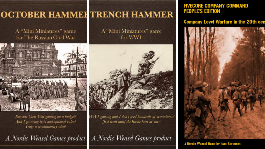
Epoch Xperience Interviews Nordic Weasel Founder, Ivan Sorensen
Mr. Sorensen needs no real introduction to many miniature wargamers. His company, Nordic Weasel Games, has taken the historical miniatures gaming world by storm, and he’s become the force on Wargames Vault. His formula of “substance over flash” has produced good games for a very reasonable price, and he has taken full advantage of PDF technology to produce a quality product one can buy and have in your (virtual hands) the next day.
Without further ado, I give you Ivan Sorensen:
Biography
My name is Ivan Sorensen, and I am a game designer and self-publishing writer of miniatures games, as well as the odd role-playing game. Under the moniker of Nordic Weasel Games, I have worked as a game writer for close to 7 years.
I am an avid player of board games, miniatures games, role-playing games, video games, and anything else I can get my hands on. I have spent half my life on this planet in Denmark, where I was born, and half in the United States, where I currently reside. I am married, have one kid and two cats named Scruffy and Lancelot.
Unlike a lot of historical games writers, many of my formative miniatures gaming experiences actually came from science fiction games, so I suppose that has given me a little bit of a different perspective.
So, how did you get started in writing rules? Was there an “aha” moment, or did you fall into it?
At the risk of sounding cheesy, I have basically always created little dice and board games for myself, using Lego pieces or other things that we had available, usually based on video games I had read about in magazines or other ideas like that.
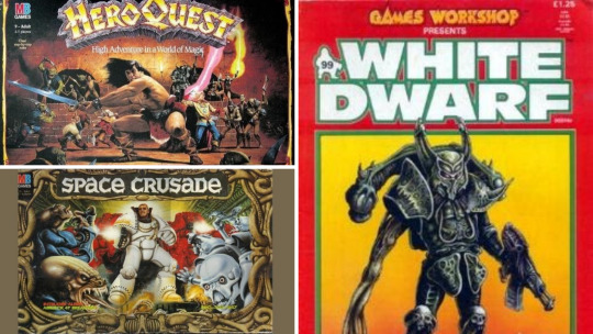
When I was 12 or so, I remember getting a copy of White Dwarf magazine from a local gaming club I had joined, and it blew my mind. We had some limited exposure to the idea of space marines and all these things from the Milton Bradley Hero Quest and Space Crusade board games, but the idea of battle games played without a board, using miniatures and dice was too much to resist. I knew I had to get into this, and as I had no money for it, I sat down to write a game I could play with my Space Crusade figures, which would look as much like what I imagined Warhammer 40.000 would be like.
Since then, I had pretty much always been the “rules guy” in the gaming groups I was part of, whether we were playing miniatures games or RPG’s, so it just came naturally over time, I suppose. As I got access to the internet and later got access to ordering things from the UK or US, I devoured every game I could get my hands on and was even remotely interested in.
The start to writing games that were any good was my own attempt at creating a World War 1 game system (titled Trench Storm). I had shared it online, and to my great surprise, it began catching people’s attention and got a (very) small following, with people even purchasing miniatures to play it. Eventually, I was contacted by the US distributor for IT Miniatures, who offered to print it to promote their 20mm figure range. The rest is, as they say, history. Once in a great while, a copy of that game still pops up on eBay, it seems!
How did Nordic Weasel Games come to be?
So that story took place right around the time I moved to the United States. After moving, I had a lengthy period where I did not have my work permit yet, so game writing seemed like an obvious distraction, resulting in Fast and Dirty, a sci-fi rules set that you still see mentioned online here and there.

As the years went on, I kept tinkering and building things but mostly for my own enjoyment. Sometime during the fall of 2013, I started seriously working on a new game system for WW2 skirmish actions that I felt had some real potential to go places. At the time, I worked at a relatively dead-end middle management job at an incredibly toxic information technology company. You know the sort of job, where you have been there for too long, and you hate every minute of it.
Come the spring, I decided to take a gamble that I could make enough money from game sales to make it worth pursuing and quit. I figured if I could find a way to do it without putting money on the line, then if it all bombed, I could just walk away and find something else to do in life.
Consequently, Five Men in Normandy was released on June 15, 2014, and as of today, we are still here!

What is in the future for Nordic Weasel?
Hopefully, many big things! The biggest priority for 2021 specifically is to get into print books, though there are a lot of stumbling blocks in terms of layout requirements and so on.
I always keep a list of projects I would like to do, though I try not to talk about them too much in case they fall through. I am the sort of guy who always starts with 20 ideas, so by the time the unworkable ones have been weeded out, there are 2 or 3 left.
What I can say is that I am actively looking at fantasy miniatures battles, and I would love to do more WW1 and Black Powder era gaming material.
The real big question is that I am also very much at a point where there are just too many things to do it all alone. I cannot write 4 or 5 new games, support an entire back catalogue, and update old titles all by my lonesome, so I look forward to trying to solve that in the future. I suppose this is a good problem to have, but it is certainly also an intimidating one!
Is there a period of history you want to write rules for but have not?
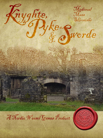
We have worked extensively with the two world wars and the black powder era in general, as well as 20th century-to-modern era battles, and with Knyghte, Pyke and Sworde we even delved into medieval warfare.
The one that stands out as something that would be fun to do is World War 1 air combat, complete with goggles and scarf flapping in the wind. A little romanticized sure, but great fun, and there is a lot of fantastic models available.
For a historical era I have not touched on at all, I would say that while I have done games that cover it among other 19th century conflicts, a dedicated American Civil War set is something I would be very keen to do.
There are a lot of fantastic rules out there for the period, of course, but I feel like the “Weasel” approach of being solo-friendly and campaign-oriented could carve out a nice space of that market. Plus, I find the era quite fascinating. Growing up in Denmark, I was never really raised with a particular view of the conflict, but having married into a proud Vermont family, it is, of course, unavoidable.
Can you tell our readers what goes into rules writing?
I think this is something that is intensely personal, and the rationale for writing something can be varied: It may be due to sensing an opening in the hobby space that does not seem to be catered to currently. It may be that I have a personal passion for a given setting or era, or it may simply be that I have a clever game mechanic and want to build a game around it.
The process for me usually starts with sketching out a page or two of keywords, mechanics, and things I’d like to hit on a notepad. Then I work on building it out with simple sketches for the main areas of the mechanics: Activations, movement, shooting, morale, and so forth. Basically, carving out the cornerstones of the game system. At this stage, it is entirely possible it feels like it’s not going anywhere, and it goes in the bin.
If the core idea seems to have merit in this skeleton form, it’s time to test it out with some generic troops and see if it actually feels fun on the table. From there, you just build out from it: Get other people to read and play it, read it out loud to yourself, etc. Figure out what parts need ironing out and improving and which are good.
It is really all an iterative process. Once I know the game has legs to stand on, I start writing out the table of contents in advance, so I can “fill in the blanks” as I go. If I know I am going to have a section later for off-map support, I can keep that in mind when I am developing each piece of the mechanics and so forth.
Eventually, any project hits “The Suck (TM).” This is whatever part you hate doing the most, whether it is layout or proofreading or points systems or whatever. For me, it is terrain rules, funny enough. I never read that section of a rulebook, and I never enjoy writing it, but you must. “The Suck” is where your game will probably die because if you let it overcome you, you will put the book down, and every time you click on the word processor, you will immediately be faced with it. The best way to defeat “The Suck” in my experience is caffeine and not letting up: When it starts rearing its ugly head, it is time to keep going and don’t stop until you are through with it.
Has desktop publishing and PDF only supplements changed the face of the hobby? Has it affected the quality of the product we see today?
Absolutely yeah. It’s not that long ago that a game being available in PDF was a novelty, whereas today, if a game is NOT available in PDF, you are going to lose sales.
I think the barrier of entry has also dropped dramatically. Even a basic word processing package can churn out a PDF document that you can distribute online or sell. Of course, with proper page layout software, you can achieve much greater results (as some of my friends are rarely missing a chance to tell me), but you need to examine what your skill limit is. Any tool has a skill cap, to borrow a video game term. If you are not currently good enough at what you do to push up against the limitations of your software, burning 200 dollars on new apps will not make your books any better.
It is funny, though, because the wargaming field is so diverse in the type of things we see. You can pick up relatively big-name games that are incredibly plain-looking: Black and white, no art, rudimentary layout. Then right next to it, you see a PDF that is full-color, original artwork, and gorgeous. And the two can be viewed as equal value to the audience.
Of course, eye candy DOES sell, but I think once you are beyond the Warhammer circles, gamers become a lot more content-focused.
What are your favorite historical periods and why?
The 19th Century, the two world wars and the Russian Civil War.
Really, the whole era from circa 1910 to 1925 or so is fascinating to me: It is, of course, the transition of the old, romanticized world to the world of modern warfare, as well as being incredibly diverse in the sort of things you can see. The Russian Civil War sees tanks and armored cars, partisan bands, nationalist militias, Red and White guards, Cossack cavalry armies, Anarchists, and anything else you can shake a stick at. It is really a wargamers heaven for finding odd units to model up on the gaming table.
Honestly, my love of history, in general, comes from one source: “All Quiet on the Western Front.” I think anyone with a passion for history has that moment where they realize that history is not about abstract concepts and kings and dates but is about real people who lived and breathed and had dreams and hopes. “All Quiet” was that for me, and it left a life-long impression on me when I read it as a teenager a few years from the age of the characters in the book.
What do you see for the future of historical miniature wargaming?
Oof, that is a dangerous question. I think I managed to predict the rise of “Warband” level games (games where you play a small force in skirmish actions and with some level of character progression between games). Right now, that idea has set the fantasy and sci-fi miniatures scenes on fire, with everyone churning out their own version of the concept.
In historical gaming, there are elements of it, but it has not been embraced to the same extent, possibly due to the grognard bias against skirmish games. I think if I had to put money on something, I would say watch out for historical skirmish games with campaign aspects or character progression in the next year or three.
I also think solo gaming is going to continue to gain in popularity and respectability, with more games developed primarily or even specifically for solo play. I am super excited to see this field because there is a lot of things that can be done here with how enemies arrive on the table, fog of war, and so forth, which is not possible in a conventional opposed game.

Playtesting, how important is it?
Very, but it’s also very misunderstood. I see people post all the time on forums about how they have been testing their game rules for 5 years. That sounds very impressive, but if you are only getting together 3 or 4 times a year in that time frame, you are basically starting over each time. Additionally, just playing the game with your own group is fine to iron out the basic problems of a game, but it will lose its value very quickly.

To get actual feedback, give the game to people who cannot ask you questions and let them figure it out. Now your text must stand on its own feet and must work without you being there to explain the intentions. That is the real test. I would say three games played by strangers is worth more than ten games with your usual Saturday group.
Of course, tracking down people who can understand the rules, will play the game, [and] report back to you, AND aren’t crazy is a challenge. If you post online, 50 people will say they would love to, and of those, two will read the book. Once you find reliable people who can give you good feedback, cling to them for dear life.
What are the benefits and pitfalls of self-publishing your own wargaming rules?
The biggest advantage is, of course, that you are in charge. What you want in the book goes, if you want a supplement, it will happen, and so forth. Additionally, your game will reflect what you wanted it to be. I think in [self-publishing], you get a lot clearer creative visions and indie gamers tend to gravitate towards that: A game that has something to say on the topic is extremely attractive, even if you disagree with a particular conclusion.
I try to do as much myself as I can, though, of course, I do rely on outside sources for things like artwork, feedback, etc. Part of that is that this way, I know I can support the product down the road: If I want to fix a rule where we came up with a better way of doing it, or I want to add a new section, I can do that.
The downside, of course, is that you are on your own: Your art is as good as your own wallet can make it, your book looks as good as you can make it (unless you pay for it), and so forth. You also must promote it yourself. If you are writing for something like Osprey, they have marketing power and money to put behind the project.
Anything else you would like to say to our readers?
Before you write a game, ban yourself from reading any game on the same topic for a few months. If you are writing a WW2 tank game, put all your WW2 games in a box and do not open it. You should be spending that time immersing yourself in the topic in the form of books, music, documentaries, or anything else. Never ever another game.
Also, it cannot hurt to blast some metal albums, at least in my experience.
--
At Epoch Xperience, we specialize in creating compelling narratives and provide research to give your game the kind of details that engage your players and create a resonant world they want to spend time in. If you are interested in learning more about our gaming research services, you can browse Epoch Xperience’s service on our parent site, SJR Research.
--
(This article is credited to Jason Weiser. Jason is a long-time wargamer with published works in the Journal of the Society of Twentieth Century Wargamers; Miniature Wargames Magazine; and Wargames, Strategy, and Soldier.)
1 note
·
View note
Text
Of Rising Calamities Beyond the Cosmos: Chapter 10
A/N: And now we have arrived at the final chapter guys! This one is a bit special because it serves as both a regular epilogue (NOTE: There’s a bit of time-skip in here just to let y’all know) and a Halloween chapter, so it’s a half-and-half kind of deal if you want to look at it that way.
So, with that out of the way now, I hope you guys enjoy the chapter! Happy Halloween everyone!
Droplets of water fell from the air and onto the rocky floor below, which was littered with puddles in every direction Jane looked. And the young woman took care to avoid stepping in one as she walked deeper and deeper into the darkness, a single blue flame lit in the palm of her hand to light her path up ahead.
“[Tell me again why are we exploring this dingy and damp dungeon?]”
“[Jane said she wanted to investigate this place a little bit more thoroughly this time.]”
“[Then why did she send a clone in place of herself and have the three of us accompany it?]”
“[Maybe she thought the monsters and wild animals wouldn’t dare approach her at the sight of us being by her side? I don’t know! I’m not exactly a mind reader or know the woman’s thoughts like you two think I do just because I spend more time with—]”
“Raiden! Gale! Inferno!” the three great spirits went quiet at the sharp voice of the clone and looked up. “I can hear you three you know...despite your whispering,” the trio sweat-dropped and turned their heads away from the moody half-spirit.
‘Finally...’ Jane let out an inaudible sigh when her great spirit companions switched to a different topic. Thank god for that. She didn’t have to listen to either of them complain anymore—even though most of it came from Raiden.
But she wasn’t focused on that. Right now, she just wanted to pass this section of dungeon and get to the next level.
And sure, it’s been a while since she’s last been down here, but it’s not like Jane had forgotten the layout of the cavern.
The floor above her, she knew by heart now. This one, however, not so much.
‘All the more reason to check it out.’
When the young woman found this cave two months ago and started to explore it, she made sure that she memorized all of the pathways and secret crevices in this area—well this floor at least, before she left. But now that there weren’t any pressing issues at hand here or any type of commotion happening outside of the cave, she was free to investigate this place without worry for the time being.
There was just so much energy she could feel in here, and so many shiny objects she could see around her, twinkling within the cracks embedded into the walls, and ceiling. All of them had an iridescent glow to them, and all of them were glowing a different color—from golden white, seafoam green, and baby blue to periwinkle, alexandrite, and coral pink. Any one of these could a rare item or ingredient for something; however, Jane wasn’t so sure about that.
‘Maybe I should take a look first.’
The young half-spirit stopped to pull out an empty transparent container with a handle on the top, and set it on the ground. She kneeled, and with her free hand, Jane tapped on it. A small section of the container glowed white and opened up with a chilling swoosh. Then she carefully stuck her fireball inside before pulling her hand back out, watching the hole close up and disappear.
Satisfied with her work, she moved away from her makeshift lantern and stood halfway up, making sure to crouch on the balls of her feet. And once she did, the clone of Jane bounded high into the air with just a single leap and latched onto one of the stalagmites hanging from the ceiling.
‘Wow!’ her eyes turned into stars at the sight of many items and gems staring at her right in the face. ‘There’s so stuff...huh?’ she trailed off with a silent gasp. But that didn’t last long as the look of excitement entered her golden brown-amber eyes, and replaced her awe.
‘Oh my god! Is that what I think it is?!’
She was in heaven right now, and rightfully so because she could see a bunch of stuff on the ceiling and higher end of the walls ranging from bottle based items:
Holy Bottle, Dark Bottle, Life Bottle, Panacea Bottle, and Syrup Bottle
To tool based items:
Banrea, All-Divide, Hourglass, Spectacles, Dried Peels, and Goat Horn
And medicine based items:
Lemon Gel, Melange Gel, Miracle Gel, Pine Gel, and Elixir
It was hard to believe that she was seeing all of this in one place since they would normally be spread out throughout the cave, or just be hidden in some obscure spot no one would bother to check, especially if it’s not sticking out in the open. But Jane wasn’t like others, and she wasn’t the type to pass up on stuff like this just sitting out here.
She was like a collector of sorts, and sometimes she likes to stock up on these items for future use. And whatever’s left that she doesn’t use, she mixes them together—much to the surprise of her friends who thought she was crazy for doing something potentially dangerous like that.
To her and everyone else’s shock, the mixed components come out looking totally different. They become a completely new item, medicine, or tool. One with brand new properties that changes after each use. It was something her and her friends had never seen before, and Jane loved it—so did Tony, Bruce, Peter, Shuri, and Strange (to some extent), who were like scientists in their own way as they, too, tended to experiments with things from time to time, magic or not.
Plus, it’s not like she can help it. She was a scientist—and a brilliant one who won the Nobel Prize many years ago at that!
And as such, Jane felt obligated to mix components with others and see what comes out of it. If the experiment turned out to be a successful one, then the next logical step would be the test the bad boy out and see what it does. If she likes the results of her fruits of her labor, she will keep the finished product and think about making duplicates in the future—which, nine times out of ten, she does.
However, if the whole thing turned out to be a failure in the end, then Jane saw no reason to continue working with the components. She would just dispose of them in the biohazard bin she keeps in her lab.
‘It’s a good thing I found these things. I was just beginning to get low on all of this stuff,’ the clone said as she proceeded to pick them all out of the cracks of the walls and ceilings with her telekinesis.
Two minutes later after gathering all sixteen items and arranging them in a giant ball, the young half spirit took out a black-light blue accented bag that had a star shaped zipper on it, and unzipped the thing. The pile fell neatly inside, and Jane zipped the bag up before making it vanish back into her pocket dimension.
“[Are you done with collecting items, Jane?]” she heard Gale ask, and looked down at him and the other two great spirits, who were all patiently waiting on her.
“Yeah!” she answered and let go of the stalagmite. “For now I am,” the young woman quickly added once she landed safely on the rocky ground.
Raiden pinched the bridge of his nose while Inferno and Gale sighed to themselves.
The clone gave them an apologetic smile before she picked up her lantern, turned on her heel, and took off with a light dash, then heard the three flying after her seconds later.
XXXXXXXXXXXXXXX
Thousands upon thousands of miles away from Snow Lunar Island, and somewhere in London, two animals sat on the front lawn of a huge two-story, thirty-eight hundred square-foot home that had a large walkway area leading over to the garage on the other side, and leading down to the sidewalk where a mailbox stood in place.
The first animal was a large midnight blue and pale yellow dog with extra fur that was colored black on its back and fluffy tail, which was tipped magenta at the end, black hind paws, black tipped pointy ears, and magenta eyes while the second animal was a large royal purple and white bird with teal colored markings on the sides of its cheeks, the inner lining of its wings and the tips of its feathered tails, which were also tipped white, yellow talons, and teal eyes.
The two were currently playing a game of fetch with Darcy, who decided to come out here and play with Jane’s pets. No offense to her friend or anything, but she got tired of waiting in the lab on Jane to finish streaming the mini expedition her clone, Inferno, Gale, and Raiden were on.
As exciting as it was to see what the inside of that mysterious cave was like on one of the three twenty-four inch screen desktop computers of Jane’s, she got really bored thirty minutes into the video when nothing of interest was happening. And so, she told Jane that she’ll be outside with Luna and Raymond, who is called Ray for short, sometimes—but only by his owner and her closest friends.
And that happened an hour ago.
“Luna!” she shouted, grabbing the dog’s attention, “Fetch!” and tossed a red ball with a white strip filled with black diamonds on it up in the air.
Luna barked and ran after it; however, Raymond, who she thought of like a little brother to her, swooped down and quickly yet carefully caught the ball with his talons. She stared in disbelief at the bird, who gave her a bird-like cry of laughter, and flew over to the human woman.
Darcy sweat-dropped and caught the ball Raymond dropped in her right hand. “Sorry Luna! I guess Ray beat ya to it!” she said to dog and almost rolled her eyes at the display of Ray puffing his chest out in pride. “Wanna try again?”
Luna narrowed her magenta eyes and nodded in determination.
“Woof!”
Before she could get ready, however, her ears perked up at the sound of an engine from a vehicle pulling up in front of the house. When she turned around and saw a dark haired man and light haired woman get out of a red SUV, her eyes lit up at the sight of them and three other people climbing out from the backseat.
“Woof, woof!” she ran over to them with Raymond flying overhead not too far from her.
Darcy looked up to see the two getting petted by Kagome, Sota, Morgan, Pepper, and Tony. Then all of a sudden, she remembered what today was and what was supposed to take place at the Devil May Cry shop tonight.
‘Oh shit! I totally forgot about that!’ she panicked a bit on the inside, and before she could say anything, the Stark family walked up to her with Luna and Raymond in tow.
“Hello Darcy. How are you doing this evening?” Pepper, who was dressed up in a modest-looking devil costume, greeted her with a small smile.
“Splendid,” she answered part truthfully before looking down to see Morgan, who was in a cute little fairy costume. The little girl ran up to her and hugged her. “Oh you look adorable, Morgan!” she cooed.
“Thank you Auntie Darce!” the little six year old said with a big smile on her face.
The young woman grinned down and patted the young girl on her head with her left hand. Though she laughed when Morgan pulled back and gave her a pout before deciding to turn away in the other direction, as if she was saying “don’t look”, to fix her hair.
“So are you, Jane, and Lady ready for the Halloween party yet?” Tony, who was dressed up in a handsome pirate costume, asked, raising a brow at her casual state of her appearance.
Darcy sweat-dropped. “Eh, not exactly,” she said with a slow shrug until she brightened up and waved her hand in reassurance. “But you guys can wait inside the living room while Jane, Lady, and I go get ready.”
The Stark family looked at each other then back at the young woman.
“That’s fine with us,” Pepper replied.
Darcy nodded and led the family along with Jane’s pets up the walkway to the house.
XXXXXXXXXXXXXXX
Jane stared at her desktop monitor, watching her clone and the three great spirits arrive inside of a brightly lit room filled with shiny gems that were embedded in the stalagmites hanging from the cavern ceiling. There was also some kind of runes, black in color, etched onto the walls, giant potholes that were either filled up with water or had a large glowing gem stuck inside of it on the ground, and a bunch of floating platforms gathered around a circle of sharp pillars that contained an unidentified rune inside.
“I sense a large amount of mana and some other kind of energy in this room,” she heard her clone speak.
“[Yes, I sense it too. And it seems to be coming from both the rune behind those pillars and further down the path I see up ahead.]”
‘In that case...’ Jane narrowed her eyes before pressing a button on the side of the wireless headphones she had on her head. “Alright, listen up you four!” she spoke into the built-in mic of her headphones. “Inferno, I want you and my clone to stay there and check out the rune. Run an analysis on it with the Magi Analyzer Spectro-Rod. And in the meantime, Raiden and Gale can go further into the cave and check the other sections out with the other six MASRs. Got it?”
“Yeah! / [Yes!]”
The young half spirit watched her clone pull out twelve intricate-looking silver and violet colored rods with shiny red gems on top of them, and distribute the items amongst her companions evenly.
With their equipment in hand, the group fanned out and got to work.
‘This will take a while.’
Jane pushed away from her computer desk and leaned back in her rolling chair. Seeing as the young woman had no further instructions to give to the group, she was in the mood for a little break. Maybe she can sneak in a small nap while she was at it too?
“Hey Jane!”
Well so much for that idea.
‘Aw screw it! I’ll just have another me take over.”
With a few simple gestures of her hand, Jane summoned another clone, making it appear by her side in a flash of red flames. Then she took off her headphones and turned to face the second clone. “Since there’s a high chance that Darcy is calling me to either come do something for her or drag me out of the house with her somewhere, stay here and watch the video and the other desktop monitor. Give more instructions to the group if you have to, okay?” she told her and handed them over to her.
Her second clone nodded and took the headphones, putting them on right away.
“Jane!”
A small sigh left the young astrophysicist’s mouth as she rolled around in her chair and faced her ex-intern and best friend, who was standing in the doorway of her lab and panting out of exhaustion.
“I thought you said you were going to be outside with Luna and Ray for a while? And why in the world do you look so out of breath?” she frowned at her.
“I was at first but then Tony and his family stopped by, so I told them they can wait in the living room while I come get you,” Darcy answered. “Oh and the reason why I’m so tired is because I ran up the stairs to put your pets in your room then ran back downstairs and came over here.”
Jane sat up. “Huh? Why didn’t they call—oh...” she leaped from her chair, her eyes wide in shock. “Oh god! They came to pick us up for the party at Dante’s place tonight, right?” the young woman grabbed her clone, who was looking so puzzled by what was going on, and sat her down in the chair. “Darcy! Why didn’t you remind me?” she moved away and rushed past her best friend.
Thankfully, Darcy moved out of the way in time to avoid getting ran over by her former boss who already bolted out the door and into the hallway.
“Hell if I know! Look, how the heck was I supposed to remind you if I forget about the whole thing myself?” she whined at the older woman and ran after her, but not before shutting the lab door closed.
“That’s surprising to hear coming from someone like you who loves parties,” Jane said over shoulder at Darcy, who caught up with her.
Darcy rolled her eyes.
“Yeah, yeah, I know. Let’s just hurry up and get dressed in our rooms then see if Lady’s up yet—”
“There’s no need for that,” came the muffled voice of Lady.
The two women looked up to see their other roommate standing at the end of the hallway, already decked out in an elegant kitsune costume she was wearing for the night. And to complete the look, she had a mask on her face that came with it too.
“You two are the only ones that are not ready. We have three hours until the party starts at seven. I suggest you hurry up on upstairs to your rooms and get dressed so that all eight of us can leave the house and get there on time,” she continued and turned around. “I’ll be waiting in the living room with Tony and his family in the meantime.”
Then she was gone.
“Let’s go before she comes back here and yells at us.”
“Yeah, good idea.”
The two quickly made it out of the hall, passing through the lobby area, and headed up the long stairs.
XXXXXXXXXXXXXXX
Two hours have gone by since Lady had last seen her two roommates on the first floor hallway, and she was starting to get a little anxious now. They were starting to run out of time. Sure the drive from here to the shop wasn’t far—just a thirty minute drive...if you don’t count running into any traffic along the way, but she rather be safe than sorry, and show up at the party on time. It was a routine of sorts she got into since she started working as a devil hunter all those years back and had to meet up with her clients at the destination on time, something that they —and even Vergil, who teamed up with her a few times in the past on missions, and he always made a point to meet up with her halfway so that they can head over to their client’s destination together— appreciated her greatly about.
‘Unbelievable...what are those two taking so long for?’ Lady thought to herself in irritation as she sat on the couch in between Kagome and Sota, who were watching and laughing in joy at their little sister standing in the middle of the living room, posing for the pictures that Pepper and Tony were taking on their phones.
Just when the devil huntress was thinking about getting up from the couch to check up on Jane and Darcy, she felt both of their presences walked into the room.
“Okay guys, we’re ready!”
Everyone stopped what they were doing and turned to look at the two, a collective gasp leaving their mouths at the sight of them.
First up was Jane. The young woman wore a long dark robe with pale yellow accents and a star symbol on the hood over a midnight bluish-black skin tight sleeveless tunic that had a glowing white star (with a black diamond inside of it) marking on top of an upside glowing white crescent moon sitting on her chest, which had a few stars scattered about. She also wore a full lavender and glowing white accented waist cape-like cloth —that had a slit in the front, back, and both sides— with an intricate pale yellow metallic belt on top, some black tights that were tucked into her tall brown heeled boots, and a long light purple vest with a pale yellow accented high collar that also had a transparent vest in the form of a cloth attached to it on top, and it stopped just a few inches above her ankles.
Then finally, to top the whole look off, Jane wore some large curled dark horns on top of her long stylized white wig, pale yellow contacts over her eyes, and fake elven midnight blue ears over her real ones. She also painted her eyebrows white, painted both her face and whole body midnight blue, and painted some white stars on her bare arms, hands, cheeks, and the bridge of her nose.
“So, what do you think?”
Up next was Darcy. She wore modest-looking one-piece black tube top and purple tights outfit that had small violet bat symbols on her legs, brown arm warmers with white fluff over her bare arms, and some black high-heeled boots on her feet.
Then to top the whole look off, Darcy wore some black-purple bat wings on the sides of her long stylized green wig and her waist, and green contacts over her eyes.
“Beautiful / Pretty costumes!” Pepper and Morgan cooed in unison.
Sota, who was dressed up in a jester costume, and Kagome, who was dressed up in a witch costume, looked at the two with impressed eyes.
“So cool! You nailed that one star-touched dude from The Dragon Prince down pretty well, Auntie!” Sota said with a grin.
Kagome rolled her eyes at her brother, “His name was Aaravos I believe, Sota...” and turned to her other aunt with a smile. “Anyway, your Morrigan looks wonderful, Auntie Darcy.”
The two said nothing as they beamed under their praises and compliments.
“Well...” Lady began as she and the Starks stood from the couch. “I think it’s about time we head out now.”
They all nodded and headed out of the living room, making their way over to the front door. Jane opened it, letting everyone else out first before stepping outside herself and locked the door behind her. Then she ran to catch up with the others who were waiting for her by Tony’s rental SUV.
It only took a few minutes for everyone to pile in the vehicle and buckle themselves in before taking off down the road.
XXXXXXXXXXXXXXX
The made it to Devil May Cry, which had been heavily remodeled since anyone’s (except for Lady) last been there, with two minutes left to spare. And the group met up with Nero along with Jude, Elize, Teepo, and Alvin, who were all wearing costumes, inside.
Then after walking further into the shop, they came across the Sparda twins, Trish, Patty, Nico, Nero’s wife: Kyrie, Jude’s childhood friend: Leia, Kagome’s friends: Shippo, Miroku, and Sango, Clint and his family, Bruce, Bucky, and Peter hanging out in the huge living room.
And since everyone was here now—at least the ones who were invited and able to attend, music started blasting through the speakers that were set up by the wall, signifying that the party has begun. It was also at this time the kids and teenagers went upstairs on the second floor to have their own party in one of the back rooms while the adults stayed downstairs and had their own.
Throughout the whole night, Jane and all the other adults played many games:
First, they bobbed for apples. And Dante was the only one out of everyone else that was able to snag the most apples from the bucket with Nero coming in second place, Clint in third, Tony and Jane tying in fourth, and everyone else following up after.
Second, they had a drinking contest. And surprisingly enough, Jane and Lady —who weren’t really casual drinkers compared to some of their friends— along with Bucky drank those who participated (Nico, Nero, Alvin, Clint, Tony, Miroku, Sango, Leia, and Trish) under the table.
Third, they all participated in a dance off competition that was held in one of the rooms next over after drinking some water and eating some snacks, which were laced with magic, that sobered them up. Too bad the whole dance thing ended up being awkward for some since they weren’t dancers; however, Dante, Darcy, and Sota slayed the competition with their smooth moves. So in the end, they ended up out dancing them and the ones who already knew how to dance.
And finally, they held a quick costume competition to see who had the best one of them all. It was no surprise that Jane ended being first place winner with Lady coming in second place and Darcy coming in third place.
The party started winding down near ten o’ clock, and by the time eleven o’ clock rolled around, everyone started cleaning up their mess. Due to their combined efforts, the whole group finished putting everything back where they belonged twenty minutes. Then everyone said their goodbyes to each other, and the Sparda twins along with Trish escorted their friends out the door.
XXXXXXXXXXXXXXX
“Hey Jane...”
The young woman stopped in her tracks, letting Darcy and Lady walk past her towards their home, and turned around to see Tony rolling the passenger window down.
“Yes?” she asked, walking up to the vehicle. Then she blinked in shock when the man picked up a metallic case and held it out to her out the window. “What’s this?” the young half-spirit took the case and looked at it curiously. “What’s in here—” Jane trailed off with wide eyes when she felt the familiar presence of a certain infinity stone inside.
“Think of it as a “trick-or-treat” from me. I want you to look after the thing from now on—at least for a little while until we find a better place to stash the stone...” at Jane's confused look, Tony went ahead and told the woman point blank, “Reindeer Games’ been looking for it. Well, only after he left that morning before you and the others did and came back two weeks later.”
“I see...” Jane mumbled, taking a look around the area to make sure there weren’t any lurkers nearby. When she sensed none, she vanished the case away and asked, “Has he been causing you guys any trouble or bothering you?” in a serious voice.
Pepper frowned from her spot in the driver’s seat. “Other than the few unannounced visits he’s made here and there at our home, no. He’s been strangely compliant with us after Tony and I discovered him playing with Morgan out in our front yard, disguised as a black cat with green eyes no less, one day. Then, we sat him down before he could make his escape and had a nice, long chat with him after that,” she explained.
“That is strange,” Jane looked down with a muse.
“We haven’t heard anything “disastrous” on the news this past month-and-a half, so we assume the guy isn’t causing any trouble,” Tony added. “Then again, as long as Rock of Ages isn’t trying to cause chaos anywhere, take over a city, or kill anyone, Pep and I don’t care what he does in his free time. He can stay here on Earth without any complaints from us. And we won’t take any action against him either as long as he doesn't do any of those three things I listed there.”
Jane nodded. “Do the other Avengers know? And did they agree with this decision?”
Tony gave her a sly smile. “They do now. I told them during our little “get together” kind of meeting we held at the Tower last week, but that was only after the guy appeared and played a little harmless prank on us before disappearing. The gang weren’t too happy about it in the beginning, which I can understand. But in the end, they reluctantly agreed with my wife and I’s decision,” he explained. “I have no idea what Reindeer Games wants with the Tesseract—which the team also knows about too by the way. But anyhow, that’s not the point! From what Nero, Lady, and Kagome told me, he seems to gets along with you pretty well...” there was something in his tone of voice that made Jane want to glare at him.
But before she could do so, Tony continued on—and in a normal voice this time. “So, if you happen to run into him in the future, can you try to get an idea of what his motives for the stone are?”
Jane looked up. “I was already thinking about doing that actually,” she replied, repressing a sigh back.
“Oh good!” he sighed in relief. Then he cheered up and gave her a grin. “Well, have a good night Jane!”
“You too! And thanks for dropping me and the girls off, Pepper!” she waved at them both with a smile on her face. “Have a safe trip back to the hotel!”
The two waved back before the window rolled up and the SUV took off.
Three minutes passed by with nothing but serene silence. And once she no longer saw her friend’s rental vehicle in the distance, Jane turned around and started walking towards her home, the one she shared with Lady and Darcy.
XXXXXXXXXXXXXXX
The clone slowly looked up at the sound of door opening up behind her, and she turned around to see Jane, who was still in her Aaravos costume, standing in the doorway of the lab.
“Did you capture anything good?” she asked, watching over to her.
Without saying anything, the second clone nodded and stood up from the chair, removing the headphones from her head as she did so with a sleepy look on her face.
Jane took the headphones from her then walked right past the clone and stopped in front of the desk. She raised a brow and leaned down to take a closer look at her screen monitor. Even though there was no video showing now, she could see that it had been downloaded and saved right to her desktop along with a new file that she never seen before right next to it. “Hmm...” her eyes narrowed at the title typed on it. “Data Findings from The Cave on Snow Lunar Island,” she quietly read out loud.
‘This will be interesting to look through...’
The young woman placed her headphones down before straightening herself back up. And she stood there with her arms crossed over her chest, slowly going over what she read in her head. ‘But I’ll do that another day. Too damn tired at the moment to do really anything productive,’ she said to herself while covering up a yawn. ‘Now then...’ she uncrossed her arms and turned her attention back on the silent clone. “Since I felt my first clone dismiss herself about an hour ago, I’m gonna assume that Inferno and the other two went home already. Am I right?” at her nod, Jane continued. “Alright then, nice work. I don’t need you anymore for the night,” she said to the clone before sending her off as well.
Once she vanished, Jane shut her computer down and turned it off. “Time to go shower now then head to bed,” she mumbled, sleepily, and walked away.
However, in the midst of her wanting to hurry up and leave the room, there were a few strands of black fur and faint claw marks left behind on the floor, sitting oh-so innocently next to the computer desk that she completely missed earlier.
CLICK!
The door shut closed.
#lokane#fanfic#chapter ten#jane foster#half-spirit!jane#the stark family#darcy lewis#lady#kagome higurashi#sota higurashi#ocs (original characters)#marvel#mcu#dmc#tox#inuyasha#au verse#multiple crossovers#a tale of new beginnings gallery#of rising calamities beyond the cosmos
7 notes
·
View notes
Text
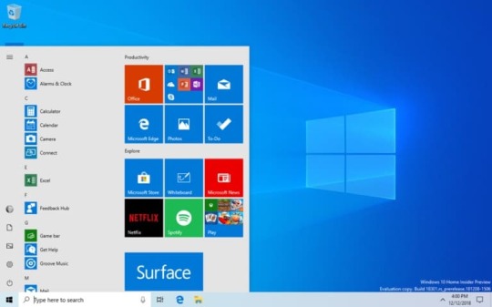
Windows 10 Insider Preview Build 18305 released

Windows 10 Insider Preview Build 18305 released.
A simplified Start layout
Tt=he simplified Start layout is part of an ongoing effort designed to enhance your Start experience in the upcoming release of Windows.
Windows Sandbox
Windows Sandbox is a new lightweight desktop environment tailored for safely running applications in isolation.
How many times have you downloaded an executable file, but were afraid to run it? Have you ever been in a situation which required a clean installation of Windows, but didn’t want to set up a virtual machine?
An isolated desktop environment where you can run untrusted software without the fear of lasting impact to your device. Any software installed in Windows Sandbox stays only in the sandbox and cannot affect your host. Once Windows Sandbox is closed, all the software with all of its files and state are permanently deleted.
Windows Sandbox has the following properties:
Part of Windows – everything required for this feature ships with Windows 10 Pro and Enterprise. No need to download a VHD!
Pristine – every time Windows Sandbox runs, it’s as clean as a brand-new installation of Windows
Disposable – nothing persists on the device; everything is discarded after you close the application
Secure – uses hardware-based virtualization for kernel isolation, which relies on the Microsoft Hypervisor to run a separate kernel which isolates Windows Sandbox from the host
Efficient – uses integrated kernel scheduler, smart memory management, and virtual GPU
To install Windows Sandbox, go to Settings > Apps > Apps & Features > Programs and Features > Turn Windows Features on or off, and then select Enable Windows Sandbox.
Windows Security app improvements
New Protection History experience: The new Protection History experience still shows you detections by Windows Defender Antivirus, but it’s now updated to also give more detailed and easier to understand information about threats and available actions. We have also added Controlled folder access blocks to history, along with any blocks which are made through organizational configuration of Attack Surface Reduction Rules. If you use the Windows Defender Offline scanning tool, any detections it makes will now also show in your history. Additionally, you will see any pending recommendations (red or yellow states from throughout the app) in the history list. We hope you like the changes we’ve made!
Introducing Tamper Protection! Tamper Protection is a new setting from Windows Defender Antivirus, available in the Windows Security app, which when on, provides additional protections against changes to key security features, including limiting changes which are not made directly through the Windows Security app. You can find this setting under Windows Security > Virus & Threat Protection > Virus & Threat Protection Settings.
Symbols and Kaomoji are now just a hotkey away!
When you press WIN+(period) or WIN+(semicolon), in addition to emoji the picker that appears will now include symbols and kaomoji too!
You may ask, what is kaomoji? Translated literally from Japanese, it means “face characters” – basically, it’s a way to create faces using only text. You may already use them, for example the one mentioned above is relatively popular: (╯°□°)╯︵ ┻━┻
This experience, originally introduced for Chinese (Simplified) during RS5 development, started rolling out to Insiders across all languages with Build 18252 – as of today’s it’s now available to all Insiders in Fast!
Clipboard history gets a new look
We originally opted to show bigger entries so there was space to show an image preview nicely, but when we looked at our data, we found 90% of items in the clipboard history were text. Based on that and your feedback, we now optimizing the design for text snippets – shrinking the height of each entry and thus giving you access to more entries without needing to scroll the view.
Hope you like the change we made! Copy some text and press Windows logo key + V to check out the updated design.
Signing in to Windows with password-less Microsoft accounts
If you have a Microsoft account with your phone number, you can use an SMS code to sign in, and set up your account on Windows 10. Once you’ve setup your account, you can use Windows Hello Face, Fingerprint, or a PIN (depending on your device capabilities) to sign in to Windows 10. No password needed anywhere!
Creating a password-less phone number account
If you don’t already have a password-less phone number account, you can create one in a mobile app like Word to try it out. Simply go to Word and sign up with your phone number by entering your phone number under “Sign in or sign up for free”.
Add your password-less phone number account to Windows
Now that you’ve created a password-less phone number account, you can use it to sign in to Windows with the following steps:
Add your account to Windows from Settings > Accounts > Family & other Users > “Add someone else to this PC”.
Lock your device and select your phone number account from the Windows sign-in screen.
Since your account doesn’t have a password, select ‘Sign in options’, click the alternative ‘PIN’ tile, and click ‘Sign in’.
Go through web sign in and Windows Hello set up (this is what you’ll use to sign in to your account on subsequent sign ins)
You can now enjoy the benefits of signing in to Windows with your password-less phone number account.
Note: This experience is currently only available for Insiders on Home edition. We’ll let you know when it expands to more editions
Streamlined Windows Hello PIN reset experience
We know remembering a PIN can be tricky, so we wanted to provide our Microsoft account users with a revamped Windows Hello PIN reset experience with the same look and feel as signing in on the web. Check it out in today’s build by clicking the ‘I forgot my PIN’ link when signing in to Windows with a PIN.
Note: This experience is currently only available for Insiders on Home edition. We’ll let you know when it expands to more editions.
Keep your device running smoothly with recommended troubleshooting
For example, we may recommend turning off a setting that sometimes causes an app or feature to crash unexpectedly until an update is available. We’ll let you know when we can help, and you can choose to run the troubleshooter or ignore it. You can also change how recommended troubleshooting is run on your device by opening Start > Settings > Privacy > Diagnostics & Feedback.
You may see recommended troubleshooting from us while we test the feature. These tests, marked as “sample recommended troubleshooter”, are safe to run and will not make any changes to your device. The tests help to ensure that the feature is working as designed and give you an opportunity to give feedback, so we can help keep your device working at its best.
Automatic Restart and Sign On (ARSO) for Enterprises
Are you tired of seeing these flashing screens after every update?
ARSO is a feature that automatically signs-in a user after an update to finish setting up and then locks the PC. This feature is part of our Seamless Update Story for Windows, and its goal is to reduce customer pain points around updates, including things such as post logon set up time and not being able to pick up where you left off.
This feature will be enabled on Cloud Domain Joined devices that meet certain security requirements:
BitLocker is enabled and is not suspended during the upgrade
TPM 2.0
SecureBoot
To check if your device will get ARSO go to Settings > Accounts > Sign-in options > Privacy:
If the toggle is switched “On” and is not grayed out, then the device meets the security requirements for ARSO, and is enabled by default.
If the toggle is grayed out and Enabled, this means that your IT Admin has explicitly enabled ARSO for you, irrespective of your device’s security requirements.
If the toggle is grayed out and disabled, this means that you do not meet the minimum security requirements for Enterprise ARSO, or your IT Admin has explicitly disabled ARSO for you, irrespective of your device’s security requirements.
Set a default Task Manager tab
You can set your preferred tab via Options > Set default tab.
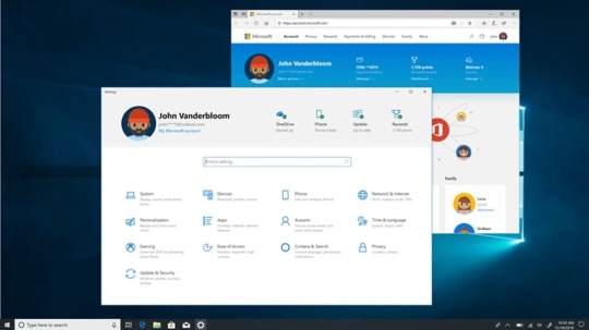
Updated Settings Homepage
Inspired by the Microsoft account homepage, the Settings home page now has a header at the top allowing you to take quick action for things like signing in and managing your Microsoft account, making the Windows and Microsoft experience better. It also gives you an easy to glance at system status, such as when updates are available.
Friendly Dates in File Explorer
Based on your comments, in Build 18305, we’re making it a bit easier to turn off if it’s not your thing – you no longer have to dig through settings, you can now just right-click on the date modified column and toggle friendly dates on and off from there.
Friendly dates isn’t yet available for everyone, so don’t worry if you don’t see it just yet – we’ll let you know when it’s live for all.
Shadows are back!
Shadows are part of our long-term vision of the evolution of Fluent Design, and we’re excited to bring them back to you today after addressing some of the feedback you shared with us following the initial rollout.
Re-releasing the new Japanese IME
The latest version of the IME has enhanced key customization options and improved candidate window reliability (fixing an issue where it wouldn’t show), and we’re looking forward to you trying it out. Because we want to ensure the best possible typing experience, this will be a staggered rollout – some Insiders will get it today, and we will carefully review both metrics and your comments before pushing the IME out to everyone.
Note: We are aware of compatibility issues with some game applications and the team is working on them – we’ll let you know when this has been addressed.
Introducing the Office app for Windows 10
The app is a great starting point for Office that helps you easily find all your files in one place or easily access any Office solution available to you. It knows to connect you to the Office rich clients if they are installed on your computer or it will send you to the web version of Office if they’re not. IT will also appreciate the ability to customize the app by integrating other line of business applications that use Azure Active Directory into the experience and apply corporate branding to the app.
Get more done with Cortana and Microsoft To-Do
Want just one to-do list that works twice as hard for you? Save time and stay organized – Cortana helps by adding your reminders and tasks to your lists in Microsoft To-Do with this feature preview, so you can stay on top of what matters most. Use your voice, your PC, your phone – your choice.
Streamline your tasks – your lists and reminders from across Microsoft To-Do, Cortana, and tasks in Outlook can now become one, centrally located in your Microsoft To-Do app. Use Microsoft To-Do anywhere: on your Android or iPhone, with Cortana, or on your Windows 10 PC. You can also access it from the web. It’s automatically synced so you never miss a beat.
With this integration, we are furthering efforts to seamlessly sync your to-do lists across Microsoft To-Do, Cortana, and your tasks in Outlook.
Read the full article
1 note
·
View note
Text
For technical SEO practitioners and site developers, news from Google I/O
The announcements made by the Chrome team on the availability of technologies and extensions to their current products in the “What’s new for The Web Platform” presentation have a lot of value for technical SEO practitioners and site developers alike.
The Google Chrome Team made announcements on the availability of technologies in a session titled. “What’s new for The Web Platform” at Google I/O last week. It’s no surprise that the session’s two main speakers, Ben Galbraith and Dion Almaer, co-wrote an early book about AJAX and Web 2.0.
The Web Platform is made up of open web technologies that allow the web to act as a virtual operating system enabling browsers to deliver application-like experiences. As users have grown to expect from Google and others. Other key seminars, such as the “What’s new in Web Vitals” session, have been covered. We’ll go through key aspects from any session that pertains to SEO development.

Chromium
As a top Web browser, Google’s Chromium is more powerful than Chrome alone. It also runs Microsoft Edge and other programmes. Chrome’s browser market share lead over competitors is now comparable to Google Search’s lead over competitors. Internet Explorer is being phased out by Microsoft. Chrome has become the primary browser for which developers write code, with a fallback for unsupported features or a focus on technologies that are also supported by Safari and Firefox.
Safari is the only rival browser that isn’t in the single digits in terms of user market share, thanks to WebKit, which powers iOS’s in-app WebView. It’s worth noting that Google’s most recent development achievements, which were disclosed at Google I/O, coincide with unparalleled rises in browsing activity.
Coronavirus multi-market study (GlobalWebIndex) predicts strong growth in July 2020, a key milestone.
Time spent on cell phones has increased by 70%.
Laptop users spend 47% more time on them.
On average, people spend 33% more time on their computers or desktops.
New security features
Security.
The first announcement from the Chrome team is a new security sandbox feature that isolates inline frame instances. That is, cross-site iframe> material embedded within a website, such as a YouTube widget, now operates as a distinct process from the process that handles the embedding page itself. Through V8 to Chrome, the isolation security architecture is meant to prevent data leakage from heart bleed and malicious JavaScript.
Cookies.
Google also announced that the previously disclosed change to its default cookie handling behaviour for third-party website access is now available in Firefox. After previously being available only in Chrome and Edge. Unless you don’t access third-party cookies or provide third-party websites access to your own site’s cookies. If you haven’t heard about SameSite cookie requirements for operational third-party cookie access. Now is the time to find out. The browser handling behaviour is governed by SameSite directives.
APIs.
Given the widespread usage of third-party cookies, the Chrome Team unveiled a new “family of APIs” including federated login, tailored advertisements, and conversion tracking that can enable alternative paths for use cases that previously required the usage of a third-party cookie. For example, the “Attribution Reporting” API proposal would shift conversion monitoring from cookies monitoring visitors across websites to the browser itself.
Tracking prevention.
Transmissions from the Attribution Reporting API contain time delays and noise to prevent trackers from linking together personally identifying data with conversion event timing. Making it difficult for anyone to successfully trace specific users and conversions that way. The API, along with a few other APIs, are accessible in origin trials. Which you may use to test with your own website before they go live.
New progressive web app features
Context menu and badges.
Progressive web apps now allow you to develop “shortcuts” that expose “fast actions” as context menu items (right-click or two-finger tap) with supporting operating systems such as Android, Chrome OS, Windows, and macOS once they’ve been installed with an icon on home screens and desktops. A new Badging API also allows you to add a notification number to your app’s icon.
Declarative Link Capturing.
The origin trial version of a proposed “Decorative Link Capturing” API will be available soon. The proposed API allows links from outside the PWA context to open the PWA. Similar to how clicking a link to a YouTube video URL opens an installed YouTube app. Rather than a browser tab with the YouTube website. This is similar to deep-linking but in an app context.
The manifest file.
Chrome on desktop and Android web app installation user interfaces are receiving snazzy new dialogues and information panels to provide users more information and guidance to make the process go more smoothly. Custom text and graphics can be specified in the manifest file of a web app by developers.
Multi-Screen Window Placement API.
This new API allows progressive web programmes to find and adjust the location of the window on all connected monitors. This functionality is said to be useful for web-based presentations and video conferencing. These trends, once again, are in line with the substantial increases in browsing activity that will begin in 2020.
File System Access API.
Finally, online programmes now have access to the user’s file system. What could possibly go wrong? You’ll be able to deal with existing files and save state to disc using your app. A new File Handling API allows you to register your web app as a file type handler. Allowing users to open files and have them handled by your web app, exactly like a native app. Later this year, an experimental release will be available.
At least theoretically, the Web Platform is quickly becoming the “web as operating system,” with application-like experiences as envisioned. Expect early encounters to be a little strange, with a steep developer learning curve and a lot of effort to put in place. However, these are exciting times for web developers who want to experiment with cutting-edge web technologies.
Web Assembly news
Web Assembly (Wasm) promises to compile code into binary executables that can be run in JavaScript engines. Performance difficulties, one of the most common concerns, maybe improved now that V8 supports contemporary CPUs with SIMD instructions for better multimedia performance.
Wasm’s best feature is that it allows you to develop web apps in nearly any language, not just JavaScript, by compiling down to the binary specification. There are some notable Rust projects, for example. It builds to JavaScript binaries that can be run in current browsers. Knowing what you’re limited to when using a language like Rust. On the other hand, is crucial for staying within the Wasm standard.
Core Web Vitals
The most significant Core Web Vitals announcement is that performance gains from enhancing web vitals will benefit both mobile and desktop rankings later this year. It was always strange to believe that damaged rankings would simply apply to mobile searches, given that PC users often surf under sporadic network conditions.
Rankings.
We’ve gotten some clarification on lab test results. The rankings will be adjusted based on the data collected in the field. Lighthouse is “calibrated to be indicative of a user in your high percentiles,” which is good news. That means that if you get good lab results, users in the field will, nine times out of ten, send Google even better results for your User Experience ranking factor adjustment.
Background images.
It’s been difficult to figure out what your Largest Contentful Paint element is. Lighthouse will soon give you a thumbnail and will be updated for better accuracy. When dealing with backgrounds and carousel pictures, thankfully.
Layout shifting.
Changes to how Cumulative Layout Shift is calculated are another nagging issue that is being addressed. It was the case that the shifting accumulated during the course of the page browsing session. Because some users load and leave while others explore and scroll up and down. The score did not indicate the level of precision required to account for a change in your rankings as a result. Google now takes a 5-second sample and adds it up to get the highest shift score.
Content visibility.
With the value set to auto, the relatively new content-visibility CSS attribute can now be used to boost performance ratings. This allows the browser to forego rendering the contents of that element if it isn’t currently visible in the user’s display. Resulting in greater performance when compared to the quantity of material in those elements.
Prerendering.
While several browsers have implemented prerendering capabilities, allowing developers to signal URLs in, say, your top navigation to be stored in the browser cache for quick loading on the click, there are some issues with cross-site security, multimedia that may suddenly playback, and even unintentionally logging users out of authentication. Later this year, Google expects to release an updated prerendering API.
Why we care
There are a number of things to look forward to from Google as it expands browser and API support for Web Platform technologies. Many of these technologies are already available, and several of these announcements state that more will be accessible this year. All of the updates discussed here will either help you improve your rankings or give you new methods to engage your site’s visitors.
Don’t forget to join up for our SEO for Developers Workshop at SMX Advanced on June 15th and 16th. As well as our workshops on June 17th and 18th, to stay up with the rapid pace of these changes in website construction, web app authoring, and technical SEO work for rankings!
The post For technical SEO practitioners and site developers, news from Google I/O appeared first on Soft Trending.
from Soft Trending https://ift.tt/3dJp8rv
via softtrending
0 notes
Text
For technical SEO practitioners and site developers, news from Google I/O
The announcements made by the Chrome team on the availability of technologies and extensions to their current products in the “What’s new for The Web Platform” presentation have a lot of value for technical SEO practitioners and site developers alike.
The Google Chrome Team made announcements on the availability of technologies in a session titled. “What’s new for The Web Platform” at Google I/O last week. It’s no surprise that the session’s two main speakers, Ben Galbraith and Dion Almaer, co-wrote an early book about AJAX and Web 2.0.
The Web Platform is made up of open web technologies that allow the web to act as a virtual operating system enabling browsers to deliver application-like experiences. As users have grown to expect from Google and others. Other key seminars, such as the “What’s new in Web Vitals” session, have been covered. We’ll go through key aspects from any session that pertains to SEO development.

Chromium
As a top Web browser, Google’s Chromium is more powerful than Chrome alone. It also runs Microsoft Edge and other programmes. Chrome’s browser market share lead over competitors is now comparable to Google Search’s lead over competitors. Internet Explorer is being phased out by Microsoft. Chrome has become the primary browser for which developers write code, with a fallback for unsupported features or a focus on technologies that are also supported by Safari and Firefox.
Safari is the only rival browser that isn’t in the single digits in terms of user market share, thanks to WebKit, which powers iOS’s in-app WebView. It’s worth noting that Google’s most recent development achievements, which were disclosed at Google I/O, coincide with unparalleled rises in browsing activity.
Coronavirus multi-market study (GlobalWebIndex) predicts strong growth in July 2020, a key milestone.
Time spent on cell phones has increased by 70%.
Laptop users spend 47% more time on them.
On average, people spend 33% more time on their computers or desktops.
New security features
Security.
The first announcement from the Chrome team is a new security sandbox feature that isolates inline frame instances. That is, cross-site iframe> material embedded within a website, such as a YouTube widget, now operates as a distinct process from the process that handles the embedding page itself. Through V8 to Chrome, the isolation security architecture is meant to prevent data leakage from heart bleed and malicious JavaScript.
Cookies.
Google also announced that the previously disclosed change to its default cookie handling behaviour for third-party website access is now available in Firefox. After previously being available only in Chrome and Edge. Unless you don’t access third-party cookies or provide third-party websites access to your own site’s cookies. If you haven’t heard about SameSite cookie requirements for operational third-party cookie access. Now is the time to find out. The browser handling behaviour is governed by SameSite directives.
APIs.
Given the widespread usage of third-party cookies, the Chrome Team unveiled a new “family of APIs” including federated login, tailored advertisements, and conversion tracking that can enable alternative paths for use cases that previously required the usage of a third-party cookie. For example, the “Attribution Reporting” API proposal would shift conversion monitoring from cookies monitoring visitors across websites to the browser itself.
Tracking prevention.
Transmissions from the Attribution Reporting API contain time delays and noise to prevent trackers from linking together personally identifying data with conversion event timing. Making it difficult for anyone to successfully trace specific users and conversions that way. The API, along with a few other APIs, are accessible in origin trials. Which you may use to test with your own website before they go live.
New progressive web app features
Context menu and badges.
Progressive web apps now allow you to develop “shortcuts” that expose “fast actions” as context menu items (right-click or two-finger tap) with supporting operating systems such as Android, Chrome OS, Windows, and macOS once they’ve been installed with an icon on home screens and desktops. A new Badging API also allows you to add a notification number to your app’s icon.
Declarative Link Capturing.
The origin trial version of a proposed “Decorative Link Capturing” API will be available soon. The proposed API allows links from outside the PWA context to open the PWA. Similar to how clicking a link to a YouTube video URL opens an installed YouTube app. Rather than a browser tab with the YouTube website. This is similar to deep-linking but in an app context.
The manifest file.
Chrome on desktop and Android web app installation user interfaces are receiving snazzy new dialogues and information panels to provide users more information and guidance to make the process go more smoothly. Custom text and graphics can be specified in the manifest file of a web app by developers.
Multi-Screen Window Placement API.
This new API allows progressive web programmes to find and adjust the location of the window on all connected monitors. This functionality is said to be useful for web-based presentations and video conferencing. These trends, once again, are in line with the substantial increases in browsing activity that will begin in 2020.
File System Access API.
Finally, online programmes now have access to the user’s file system. What could possibly go wrong? You’ll be able to deal with existing files and save state to disc using your app. A new File Handling API allows you to register your web app as a file type handler. Allowing users to open files and have them handled by your web app, exactly like a native app. Later this year, an experimental release will be available.
At least theoretically, the Web Platform is quickly becoming the “web as operating system,” with application-like experiences as envisioned. Expect early encounters to be a little strange, with a steep developer learning curve and a lot of effort to put in place. However, these are exciting times for web developers who want to experiment with cutting-edge web technologies.
Web Assembly news
Web Assembly (Wasm) promises to compile code into binary executables that can be run in JavaScript engines. Performance difficulties, one of the most common concerns, maybe improved now that V8 supports contemporary CPUs with SIMD instructions for better multimedia performance.
Wasm’s best feature is that it allows you to develop web apps in nearly any language, not just JavaScript, by compiling down to the binary specification. There are some notable Rust projects, for example. It builds to JavaScript binaries that can be run in current browsers. Knowing what you’re limited to when using a language like Rust. On the other hand, is crucial for staying within the Wasm standard.
Core Web Vitals
The most significant Core Web Vitals announcement is that performance gains from enhancing web vitals will benefit both mobile and desktop rankings later this year. It was always strange to believe that damaged rankings would simply apply to mobile searches, given that PC users often surf under sporadic network conditions.
Rankings.
We’ve gotten some clarification on lab test results. The rankings will be adjusted based on the data collected in the field. Lighthouse is “calibrated to be indicative of a user in your high percentiles,” which is good news. That means that if you get good lab results, users in the field will, nine times out of ten, send Google even better results for your User Experience ranking factor adjustment.
Background images.
It’s been difficult to figure out what your Largest Contentful Paint element is. Lighthouse will soon give you a thumbnail and will be updated for better accuracy. When dealing with backgrounds and carousel pictures, thankfully.
Layout shifting.
Changes to how Cumulative Layout Shift is calculated are another nagging issue that is being addressed. It was the case that the shifting accumulated during the course of the page browsing session. Because some users load and leave while others explore and scroll up and down. The score did not indicate the level of precision required to account for a change in your rankings as a result. Google now takes a 5-second sample and adds it up to get the highest shift score.
Content visibility.
With the value set to auto, the relatively new content-visibility CSS attribute can now be used to boost performance ratings. This allows the browser to forego rendering the contents of that element if it isn’t currently visible in the user’s display. Resulting in greater performance when compared to the quantity of material in those elements.
Prerendering.
While several browsers have implemented prerendering capabilities, allowing developers to signal URLs in, say, your top navigation to be stored in the browser cache for quick loading on the click, there are some issues with cross-site security, multimedia that may suddenly playback, and even unintentionally logging users out of authentication. Later this year, Google expects to release an updated prerendering API.
Why we care
There are a number of things to look forward to from Google as it expands browser and API support for Web Platform technologies. Many of these technologies are already available, and several of these announcements state that more will be accessible this year. All of the updates discussed here will either help you improve your rankings or give you new methods to engage your site’s visitors.
Don’t forget to join up for our SEO for Developers Workshop at SMX Advanced on June 15th and 16th. As well as our workshops on June 17th and 18th, to stay up with the rapid pace of these changes in website construction, web app authoring, and technical SEO work for rankings!
The post For technical SEO practitioners and site developers, news from Google I/O appeared first on Soft Trending.
from Soft Trending https://ift.tt/3dJp8rv
via IFTTT
0 notes
Text
What Exactly is Mobile-first Web Design?

Are you reading this on a mobile device? If so, you aren’t alone. With close to 87% of internet users owning smartphones, it stands to reason that more and more people are doing their internet browsing and research through mobile means.
Mobile-first web design is the practice of designing and developing websites to be viewed on mobile devices first, before working on a desktop view. By optimizing your website for mobile viewing, you can ensure that if anyone happens upon your website while using their smartphone, they won’t be turned away by unreadable text or unclickable links.
The History of Mobile Devices
The term smartphone has been around since 1995, but the first smartphone to feature modern touchscreen technology was the iPhone, which came out in 2007. With this, websites were launched into the mobile world, forever changing web design and development best practices.
Since then, technology has continued to give us more devices that are capable of accessing the internet, including, but not limited to; Smart TVs, gaming consoles, and smartwatches. With so many platforms that people can view websites on, it’s more important than ever to design for more than just the standard desktop view.
So, why practice mobile-first web design? Why not tablet-first, or smartwatch-first design? The term mobile, while typically used to refer to phones, is not exclusive to smartphones. The principle behind mobile-first web design is that you design for the smallest possible screen first, and scale your way up to larger sizes. The smallest possible screen size may change over time, but the mobile-first method applies regardless of what screen resolution or device you start out with.
In this article, we’ll cover what different website elements feel like in a mobile environment, how to implement them using both responsive and adaptive design, and what to remain aware of when working with mobile devices and small screens.
Website Elements and Mobile Devices
Most of us are familiar with the various elements that are found on a webpage – logos, navigation, sliders, headers, copy, footers, etc. But in order to learn how these should work on mobile devices, you’ll need to take a closer look at the base elements of a website – text, buttons, and images.
Text
One of the most common elements of any website is text. Text is located all over traditional webpages, from headers and copy, to links and descriptions. The most common problem encountered on a mobile device is that text is too small to read, forcing users to zoom in on your website in order to view it. However, text that is too large can also cause problems – if only a small amount of text can fit on the screen at a time, this is just as poor an experience for mobile users.
Paying close attention to the font sizes used on your website at different screen resolutions can go a long way towards ensuring mobile compatibility. There are four different ways to set the size of your text – pixels, points, ems, and percents. Pixels and points are fixed units that tend to appear on the web and in print documents, respectively. Ems and percents are relative units that change based on browser settings and screen resolution.
So, which one is better to use for mobile-first web design? Best practices indicate using percents for the best all-around experience, but any of these sizing methods can work with the help of media queries. The best way to find out what works for you and your website is to simply test it out!
Note: Having the right text for a mobile experience is about more than just selecting the proper font size. Font family, weight, color, text decoration and transformations, line heights, and letter spacing can also play a large part in readability on both mobile and desktop devices.
Buttons
If you have visited any website recently, you’re sure to have seen a call-to-action button encouraging you to explore other parts of the website, or a submit button for a form. They’re an essential part of any site, and yet one of the more problematic elements for anyone new to mobile-first design.
Buttons, similar to text, can have readability issues that are related to font size. But they also can have issues with providing too small of a clickable area for mobile users, and being too close to other clickable elements on a website.
The most important part of making buttons mobile-friendly is ensuring that users are able to comfortably tap on the button while scrolling on their mobile device, which means allowing a space for the user’s entire finger or thumb to touch the button. You can give users this space on the button height, the button width, or the margin surrounding the button.
The average width of an adult index finger is 2cm, which is approximately 57 pixels, while the average width of an adult thumb is 1 inch, which is approximately 72 pixels. This means that at it’s smallest size, a button should always have a height of 72px and a width of 144px, in addition to a margin of error that gives at least 10 pixels of additional space on either side.
Images
While websites are not usually constructed entirely from images as they were back when the internet was still young, they are still one of the most prevalent elements of webpages, showing up in large sliders and carousels, attached to product and page descriptions, and scattered across pages as icons or visual cues.
Unlike text and buttons, images can be scaled to fit anywhere with the same aspect ratio. This is the proportion of an image’s width compared to its height, with the most common ones being 16:9, 4:3, and 3:2. As your image scales in size, the aspect ratio should remain the same, giving your image relatively the same appearance across all screen sizes.
Because images are used in so many different places on websites, the way they should be displayed on mobile devices depends heavily on their intended usage, and what other elements of a website they have been paired with, if any. The most popular use of images these days is in sliders.
Image Sliders
Many websites feature a large image slider, or carousel, on their homepage. They provide an immediate visual representation of products or services, and tend to grab a user’s attention as soon as they land on a page.
Sliders in particular tend to challenge design best practices as we know them. Here are a couple considerations when implementing sliders for a mobile device:
If the aspect ratio of the image is large, and you intend the user to be able to scroll on the website, then the entire slide cannot link somewhere. A button should be used instead so people do not go to a different page on accident. However, if the aspect ratio of the image is small, then a button does not necessarily need to be used.
The text located on your slider must be able to scale proportionately to the image, while still keeping with current mobile text standards. If you cannot appropriately scale the text, you may need to cut down on the amount of text or eliminate it altogether.
When on mobile, the text you have on your slider must not cover the entire image in a such a way that the purpose of the image becomes lost. If the message conveyed via text is more important than the image itself, you may need to remove the image or replace it with a more generic image.
Sliders are also one of the places on websites where we can clearly see the impact of mobile-first design. Before mobile-first design was popular, most sliders were a single, linked image with an area reserved for text. Now, because of mobile-first design, they usually feature only a small amount of text, and a button to prompt users to scroll down or reach a new area of the website.
Note: You might be tempted to use a small image when using mobile-first design, but don’t forget to save a high resolution copy of your image for desktop use. Large images typically scale down just fine, but scaling up a small image can cause a loss of quality that makes your website look unprofessional.
Implementing Designs on Mobile Devices
Most web developers don’t get the chance to preview their work on a mobile device right away – many use a small browser window to view, test, and debug code at small screen sizes. When you go to make any mobile-friendly website, make sure to include the following meta tag in the head of your HTML:
By including this meta tag, you are telling any device that loads your website to base the width your website is shown at on the physical width of the device’s screen, and that the initial view of your website should not be scaled either up or down from the intended view.
In addition to the meta tag, you will also need to add this code snippet to your CSS to ensure compatibility on any devices running Windows 8 and using IE10:
Neither the meta tag nor the CSS rule will assist you in actually writing your code for mobile devices, however – they will only make sure that code works as expected when implemented. In order to write your code, you’ll need the help of media queries – and in order to know what media queries to write, you may need the assistance of one of the following popular web design approaches.
Responsive Design
Responsive design is a web design and development process that responds to the size of the viewport. As the size of the viewport changes, elements on the webpage will increase or decrease in size or fall into place accordingly.
This approach is often used in conjunction with fluid layouts, as both feature a seamless transition between various viewport sizes. The main difference that sets responsive design apart from a true fluid layout, however, is that the elements can change at different times, and in different ways than a fluid layout would allow. If you’re concerned that you are not tech-savvy enough to design a mobile-friendly site for your company, fear not! Web Designing Company Salt Lake City, UT can design, build, and then manage high-performing websites for businesses.
0 notes
Text
The Ultimate Guide to Email Design and 13 Best Practices
New Post has been published on https://tiptopreview.com/the-ultimate-guide-to-email-design-and-13-best-practices/
The Ultimate Guide to Email Design and 13 Best Practices

By 2022, the number of email users around the world is expected to hit 4.3 billion.
Among all of those users are members of your target audience, a.k.a. quality leads and prospects you can work to reach and convert via email.
To ensure your emails stand out and grab the attention of these audience members, your email design needs to be on point.
In this guide, we’ll talk about what email design is, cover 13 best practices, examples of successful email design, and offer some tools you may be interested in experimenting with. Let’s get started.

Email Design
Email recipients often scan information and abandon emails that don’t offer them value or simply appear to be too dense. That’s why having great email design is so important — it’ll help you capture the attention of, and engage, your email recipients.
What is email design?
Email design is the process of strategically designing and creating an email that resonates with your business’s target audience, specifically your current email subscribers and customers.
Your email design should be attention-grabbing, aesthetically-pleasing, and on-brand, among other things — let’s dive into those things next with these 13 best practices for email deign.
Email Design Best Practices
Craft a strong subject line.
Write an attention-grabbing pre-header.
Be concise.
Keep your email on-brand.
Think about your layout.
Personalize every email.
Incorporate unique visual content.
Don’t be afraid to use emojis.
Use a responsive design.
Optimize your email with calls-to-action.
Add an “unsubscribe” button.
A/B test your design.
Design an email signature.
1. Craft a strong subject line.
Your email subject line is the first thing anyone sees when you send them an email. It’s the brief statement that’s supposed to pique the interest of your recipients. It should capture their attention so they want to open your email and continue reading.
Here’s what a subject line looks like in your email inbox:

Here’s what a subject line looks like in your mobile device’s email inbox:

A great subject line will have these characteristics:
Grab the attention of your readers in as few words as possible (remember: less is more).
Provide value for the recipient that makes them want to open the email.
Summarize what recipients are going to read and/ or see once they open the email.
2. Write an attention-grabbing pre-header.
Your email pre-header is a preview of what the email is about, similar to the meta description of a web page. It’s the second thing recipients see.
Rather than rewriting the first sentence of your email, you can customize the pre-header to provide an inside look into what your recipients are about to read in your message.
Here’s what a pre-header looks like in your email inbox:

Here’s what a pre-header looks like in your mobile device’s email inbox:

3. Be concise.
How many times throughout the day do you find yourself opening an email thinking, I can’t wait to sit down and take the next 5-10 minutes to really dive into this email from Business X!
If you’re anything like me, your answer is likely rarely or never.
Give email recipients the information they want and need from you without getting into the weeds. This will show them you value their time which has the potential to help you improve email subscriber retainment.
4. Keep your email on-brand.
When your email recipients open your message, they should know the email was sent from your company. Meaning your email should be branded.
To keep your email on-brand, consider using the following tactics:
Use a tone in your emails that complements your other content and marketing materials (like your website and social media).
Incorporate the same colors and fonts that you use in your other branding and marketing materials.
Include your logo, a link to your website, links to your social media accounts, and calls-to-action (CTAs) that are relevant to your products or services. This is a great way to increase brand awareness while also boost conversions.
5. Use the layout to enhance your email’s user experience.
Nobody wants to read a cluttered and unorganized email — this makes recipients feel overwhelmed and can lead to increased abandonment.
Instead, organize your layout with user experience (UX) in mind — meaning, leave empty/ white space and strategically place your written and visual content so it’s organized and easy to consume and navigate.
6. Personalize every email.
When you customize an email and tailor it to your recipient, it’ll feel more thoughtful, professional, and personal. Email personalization also helps you humanize your brand. This touch helps you foster a relationship between your business and email recipients and boost retention rates.
7. Incorporate unique visual content.
If recipients open an email and only see paragraphs of information, it’s likely going to be difficult to hold their attention and keep them interested in your message. Rather, incorporate on-brand and engaging images, videos, GIFs, animations, etc. to break up the written content and create a memorable experience.
And speaking of incorporating creative and unique visual content in your emails, let’s talk emojis.
8. Don’t be afraid to use emojis. 🧡
At first, emojis may seem like an unnecessary or unprofessional addition to an email. While this may be a fair assumption, it’s actually untrue in a number of scenarios.
In fact, when you add emojis to your email subject line and/ or email copy, you can increase your open and click-through rates. But remember: When using emojis for marketing purposes, make sure you know the meaning and connotation of the specific one(s) you incorporate. 😃
9. Use a responsive design.
A responsive design means your email changes format to fit the screen it’s being viewed on, whether it’s on a desktop, laptop, or mobile device. Recipients will be able to read your emails with ease no matter where or how they’re viewing them. By incorporating a responsive design, you’ll be able to enhance UX and improve email retention across all devices.
10. Optimize your email with CTAs.
Calls-to-action (CTAs) are used to convert your email recipients. For instance, you can use a CTA to get recipients to follow you on social media, visit your website, chat with a sales rep, or become paying customers.
CTAs should be visible, enticing, and clearly show why they’re valuable to click. Additionally, you might choose to personalize your CTAs to tailor them towards specific recipients — this tactic has been proven to increase conversions.
11. Add an “unsubscribe” button.
Email marketing is highly effective as long as you’re providing relevant content to your recipients. The unfortunate but true reality of email marketing is that your recipients and customers change over time — especially as your business grows and evolves. Therefore, your content may not always be relevant to certain audience members.
For this reason, allow your recipients to leave (or unsubscribe from your emails) on a good note so they can remember your business in a positive light — who knows, they may need your email content, products, or services again in the future. To do this, simplify their lives with an easy-to-use and visible “unsubscribe” button.
In addition to offering a better experience for users, you’re actually required by law to add that unsubscribe button.
According to the Federal Trade Commission and CAN-SPAM Act, you’re legally required to include a “clear and conspicuous explanation of how the recipient can opt-out of getting emails from you in the future”. Meaning, that unsubscribe button isn’t an option.
(If you need some inspiration, check out these effective unsubscribe pages.)
12. A/B test your design.
Similar to most marketing efforts, email design is an iterative process. You might determine you need to make changes and updates to get the most out of your email design.
Whether it’s modifying your CTA, colors, images, layout, or tone, don’t be afraid to A/B test designs to determine which one works best in terms of ability to reach, resonate with, and convert the greatest number of recipients.
13. Design an email signature.
Great email signature design is another way you can establish a professional and personal feel over email. Email signatures shouldn’t just include your name — they should contain other defining and memorable characteristics about you, your role, contact information, and company.
Here are some specifics you can include in your email signature:
First and last name
Contact information (and secondary contact information)
Job Title / Role
Company Name
Link to your meeting calendar
Social media links (e.g. LinkedIn profile)
Pronouns
Photo
Industry disclaimer or legal requirements
And here’s a free email signature generator tool to help you design your signature.
A great way to streamline the process of working on and incorporate all 13 of the above best practices is to use email design tools and software.
In fact, many of the best practices we reviewed will come up naturally while you’re designing, writing, and planning your messages with email design software.
Email Design Tools
There are a number of email design tools with a wide range of capabilities (some completely unrelated to email design!) — here are some popular examples.
1. HubSpot
HubSpot’s Email Marketing software allows you to create, design, personalize, and optimize all of your emails. You don’t need any IT or coding knowledge, and you can easily customize mobile-friendly emails. The software allows you to A/B test emails to determine which designs work best.
2. BEEPro
As a BEEPro user, you can design responsive emails in just minutes. Smart design tools provide you with a quick way to format your emails and ensure your layout complements your content. You can also customize and save various email design templates so your messaging and branding is consistent.
3. MailChimp
With over 100 templates offered, MailChimp allows you to customize your email design for your target audience. If you’re someone who does have coding experience, and you want to take your design a step further, MailChimp offers you the ability to code your template as well.
4. Stripo
Stripo requires no HTML knowledge to create and design professional email templates. All of their pre-made templates are responsive so readers can easily view them via any device. You can also sync your current email service provider (ESP) with the software to access all of your email and contact information from a central location.
5. Chamaileon
As a collaborative email builder, Chamaileon gives you the ability to invite members of your team to collaborate on your designs. The software ensures your emails will have a responsive design and automatically comes with over 100 pre-made templates to customize for specific recipients.
Email Design Examples
Let’s take a look at some successful email designs to inspire your work.
HubSpot Marketing Blog
HubSpot sends subscribers Marketing Blog emails every day. These include a few blog marketing-related articles to read and learn from. If recipients choose, they may also subscribe to HubSpot’s Sales Blog and Service Blog emails.

The emails are branded so readers immediately know who the email is from and what it will include. To make the daily emails engaging and unique, they include previews of the articles and an occasional quiz.
Starbucks Rewards
Starbucks customers and members may have seen this email, or something similar, in their inbox before:

The email complements Starbucks’ marketing and branding, and there’s plenty of white space separating the written information from the engaging imagery. And the CTA that recipients can click on to activate the offer is clearly placed.
Vital Proteins Email Design
Although Vital Proteins’ email design contains many images and a lot of information, it’s neatly organized so it doesn’t feel overwhelming to recipients. The email’s colors, font, and visuals are on-brand and feature the company’s products.

There’s an obvious CTA that redirects recipients to their Instagram page — in turn, this type of CTA helps the company increase their follower count and brand awareness on the social platform.
Get inspired with 15 free and downloadable email templates designed for marketing and sales with previously written copy to save you time.
Grow Better With Really Good Email Design
With great email design, you’ll reach and resonate with your audience members more effectively, allowing you to grow better. Eye-catching and impactful emails will help you build long-lasting relationships and convert more people into paying customers and brand advocates. So, begin designing your emails while keeping the best practices and examples we reviewed in mind.
Editor’s note: This post was originally published in August, 2017 and has been updated for comprehensiveness.

Source link
0 notes
Text
WordPress 5.5 is here! 5 things you need to know

Joost de Valk
Joost de Valk is the founder and Chief Product Officer of Yoast. He’s a digital marketer, developer and an Open Source fanatic.

It’s here! The official release of WordPress 5.5, a major update stuffed with new features and improvements. Not only does this release come with improvements to the block editor, it also allows you to edit inline images, gives you an improved content preview and much (much!) more. To give you an idea of what this means for you, we’ve listed the most important features and changes in this blog post. Enjoy!
Table of contents
1. Improvements to the block editor
With WordPress 5.0 we were introduced to a new block-based editing environment, which is called the block editor (also known as Gutenberg). Since the introduction of the block editor, every WordPress release has come with improvements to this editing environment and the release of 5.5 is no exception. Besides a few noticeable changes in the user interface, this release introduces us to block patterns and the new block directory.
Block patterns are quite handy when it comes to more routine elements of your pages or posts. These patterns, which you can find when you add a new block, are ready-made blocks with commonly used settings. Think of two buttons next to each other or a column layout on your page. Block patterns help you quickly set up the layout of a page. And although the number of patterns is limited right now, this number will probably keep growing in the coming years.
The Block Directory
Now the block directory needs some explaining, as it’s a pretty cool feature that can definitely enhance your writing experience. To put it simply, this directory contains WordPress plugins that can add new blocks to your editor. And, at the moment, you can already find lots of new blocks available.
An easy way to use this directory is by adding a new block. When you click ‘add block’, just use the search field above and type in a feature or type of block you want to use. If there is no current block that matches this search, the editor will show other results from the block directory that might match your search. Opens up a world of possibilities right?
2. Edit images inline
The improvements in image editing are something we’re quite excited about. Yes, WordPress has always given you lots of options to edit your images, but this release makes it possible to do so in the editor itself. Which means you won’t have to open the image in the media library, you can simply rotate, resize, crop (and so on) the image right where you are. And see the effects of it right away, in relation to the rest of your content. This saves you time and, in our opinion, enhances the user experience quite a bit.
However, I should note that this might not work for all your images (yet) as this feature is mainly focused on the standard image block. If you add in an image within another block, for example our FAQ block that also lets you add images, you’ll have to edit this image by opening it in the media library.
Lazy-loading images
Also worth mentioning is that images will be lazy-loaded by default from now on. Which essentially means that the images on your page will not all be loaded at the same time, but when they come into viewing range. This saves time in loading your page altogether and needless to say, this will make for some very happy site visitors. As they won’t have to wait that long to view your page.
3. Improved content previews
Writing a post or page in the block editor gives you a pretty good idea of what this page will look like. Nonetheless, the content preview is a great feature to safely preview your content before you publish (or update) it. And this release comes with additional device previews, which makes it possible to preview your content on desktop, tablet and mobile screen sizes. That way, you can make sure your content is more accessible and readable for everyone visiting your site. Which is definitely something you want to check, as mobile traffic has grown quite a lot over the years making your mobile site more important than ever.
4. Automated updates for plugins
Another feature of WordPress 5.5 is the possibility to enable auto-updates for your different plugins and themes. Please note, if this is something you want to use, you do have to enable it yourself. This can be done by going to your admin dashboard, clicking on “Plugins” in your menu, and clicking on “Enable auto-updates” next to every plugin you want to have automatically updated from now on:

Enable auto-updates in the column ‘Automatic Updates’
Want to enable the auto-updates for your theme? Simply click on “Appearance” in your side menu, choose “Themes” and click on “Enable auto-updates” link that you can find under your theme’s name.
When you’re in doubt about whether you should use this functionality, keep the following in mind. It’s good practice to test new versions of plugins in a safe environment like a staging website, before using them on your live site. But we realize that in the real world, many site managers don’t (or can’t) do this. In some of those cases, you might decide that you’re better off keeping your plugins up-to-date to avoid any security issues and avoid missing out on new features, versus the risk of an update introducing bugs or faults. But that’s something that each site manager will need to decide on a case-by-case basis, for each plugin. We always recommend testing when possible, and keeping an eye on changelogs to make sure that you understand what might be new or different in an update.
5. Default XML sitemaps
With this release, WordPress generates its own XML sitemaps. This is a file that gives search engines directions to all of the content on your site. This helps them discover and index your pages and posts, which is quite important for SEO Company. Now that XML sitemaps are a core feature of WordPress, more than 1 in 3 sites out there will have these enabled by default. That’s kind of awesome!
That being said, if you’re a user of Yoast SEO Company, your site already has an XML sitemap generated by our plugin. So, what happens then? Are two sitemaps better than one? Don’t worry, we’ve thought about this. While it’s great news that millions of sites will now improve their chances of ranking thanks to this core feature, we’re confident the XML sitemaps in Yoast SEO Company are richer, better, and more powerful. This means that, although WordPress enables their new XML sitemap by default, Yoast SEO 14.7 automatically disables this default sitemap. Our sitemap is simply more advanced and you won’t run the risk of confusing search engines by having two sitemaps. You can read more about this in our FAQ about XML sitemaps in WordPress 5.5 and Yoast SEO.
Welcome to WordPress 5.5!
In this post, I discussed a few highlights of WordPress 5.5. And although there’s way more to this release than the features mentioned, I hope it gave you some more insights into the improvements of the block editor, inline image editing, the improved content previews, automated updates for plugins, and the new XML sitemaps that WordPress offers. If you have any questions, or other features about this release you’re excited about, let me know in the comments!
Read more: posts about WordPress »
SEO Company by DBL07.co
source http://www.scpie.org/wordpress-5-5-is-here-5-things-you-need-to-know/
source https://scpie.tumblr.com/post/626230803376029696
0 notes
Text
WordPress 5.5 is here! 5 things you need to know

Joost de Valk
Joost de Valk is the founder and Chief Product Officer of Yoast. He’s a digital marketer, developer and an Open Source fanatic.

It’s here! The official release of WordPress 5.5, a major update stuffed with new features and improvements. Not only does this release come with improvements to the block editor, it also allows you to edit inline images, gives you an improved content preview and much (much!) more. To give you an idea of what this means for you, we’ve listed the most important features and changes in this blog post. Enjoy!
Table of contents
1. Improvements to the block editor
With WordPress 5.0 we were introduced to a new block-based editing environment, which is called the block editor (also known as Gutenberg). Since the introduction of the block editor, every WordPress release has come with improvements to this editing environment and the release of 5.5 is no exception. Besides a few noticeable changes in the user interface, this release introduces us to block patterns and the new block directory.
Block patterns are quite handy when it comes to more routine elements of your pages or posts. These patterns, which you can find when you add a new block, are ready-made blocks with commonly used settings. Think of two buttons next to each other or a column layout on your page. Block patterns help you quickly set up the layout of a page. And although the number of patterns is limited right now, this number will probably keep growing in the coming years.
The Block Directory
Now the block directory needs some explaining, as it’s a pretty cool feature that can definitely enhance your writing experience. To put it simply, this directory contains WordPress plugins that can add new blocks to your editor. And, at the moment, you can already find lots of new blocks available.
An easy way to use this directory is by adding a new block. When you click ‘add block’, just use the search field above and type in a feature or type of block you want to use. If there is no current block that matches this search, the editor will show other results from the block directory that might match your search. Opens up a world of possibilities right?
2. Edit images inline
The improvements in image editing are something we’re quite excited about. Yes, WordPress has always given you lots of options to edit your images, but this release makes it possible to do so in the editor itself. Which means you won’t have to open the image in the media library, you can simply rotate, resize, crop (and so on) the image right where you are. And see the effects of it right away, in relation to the rest of your content. This saves you time and, in our opinion, enhances the user experience quite a bit.
However, I should note that this might not work for all your images (yet) as this feature is mainly focused on the standard image block. If you add in an image within another block, for example our FAQ block that also lets you add images, you’ll have to edit this image by opening it in the media library.
Lazy-loading images
Also worth mentioning is that images will be lazy-loaded by default from now on. Which essentially means that the images on your page will not all be loaded at the same time, but when they come into viewing range. This saves time in loading your page altogether and needless to say, this will make for some very happy site visitors. As they won’t have to wait that long to view your page.
3. Improved content previews
Writing a post or page in the block editor gives you a pretty good idea of what this page will look like. Nonetheless, the content preview is a great feature to safely preview your content before you publish (or update) it. And this release comes with additional device previews, which makes it possible to preview your content on desktop, tablet and mobile screen sizes. That way, you can make sure your content is more accessible and readable for everyone visiting your site. Which is definitely something you want to check, as mobile traffic has grown quite a lot over the years making your mobile site more important than ever.
4. Automated updates for plugins
Another feature of WordPress 5.5 is the possibility to enable auto-updates for your different plugins and themes. Please note, if this is something you want to use, you do have to enable it yourself. This can be done by going to your admin dashboard, clicking on “Plugins” in your menu, and clicking on “Enable auto-updates” next to every plugin you want to have automatically updated from now on:

Enable auto-updates in the column ‘Automatic Updates’
Want to enable the auto-updates for your theme? Simply click on “Appearance” in your side menu, choose “Themes” and click on “Enable auto-updates” link that you can find under your theme’s name.
When you’re in doubt about whether you should use this functionality, keep the following in mind. It’s good practice to test new versions of plugins in a safe environment like a staging website, before using them on your live site. But we realize that in the real world, many site managers don’t (or can’t) do this. In some of those cases, you might decide that you’re better off keeping your plugins up-to-date to avoid any security issues and avoid missing out on new features, versus the risk of an update introducing bugs or faults. But that’s something that each site manager will need to decide on a case-by-case basis, for each plugin. We always recommend testing when possible, and keeping an eye on changelogs to make sure that you understand what might be new or different in an update.
5. Default XML sitemaps
With this release, WordPress generates its own XML sitemaps. This is a file that gives search engines directions to all of the content on your site. This helps them discover and index your pages and posts, which is quite important for SEO Company. Now that XML sitemaps are a core feature of WordPress, more than 1 in 3 sites out there will have these enabled by default. That’s kind of awesome!
That being said, if you’re a user of Yoast SEO Company, your site already has an XML sitemap generated by our plugin. So, what happens then? Are two sitemaps better than one? Don’t worry, we’ve thought about this. While it’s great news that millions of sites will now improve their chances of ranking thanks to this core feature, we’re confident the XML sitemaps in Yoast SEO Company are richer, better, and more powerful. This means that, although WordPress enables their new XML sitemap by default, Yoast SEO 14.7 automatically disables this default sitemap. Our sitemap is simply more advanced and you won’t run the risk of confusing search engines by having two sitemaps. You can read more about this in our FAQ about XML sitemaps in WordPress 5.5 and Yoast SEO.
Welcome to WordPress 5.5!
In this post, I discussed a few highlights of WordPress 5.5. And although there’s way more to this release than the features mentioned, I hope it gave you some more insights into the improvements of the block editor, inline image editing, the improved content previews, automated updates for plugins, and the new XML sitemaps that WordPress offers. If you have any questions, or other features about this release you’re excited about, let me know in the comments!
Read more: posts about WordPress »
SEO Company by DBL07.co
source http://www.scpie.org/wordpress-5-5-is-here-5-things-you-need-to-know/
source https://scpie1.blogspot.com/2020/08/wordpress-55-is-here-5-things-you-need.html
0 notes
Text
Considerations when designing for Phoenix Web Sites
Greater Phoenix is one of the hottest growth regions in the United States. The Valley of the Sun is a place where companies come for not only a better shot at success but to grow. According to Inc. magazine, Phoenix is the ninth in the nation as the best city to start a business. They analyzed data to create its "2020 Surge Cities” index and report that Phoenix's low cost of living and low regulations allows new businesses to thrive.
Phoenix is home to many of the top companies and brand names in the world. At least 140 big names are found here. However, the really big business in Phoenix is small business. According to the Greater Phoenix Chamber of Commerce, small businesses are an economic powerhouse for the region.
There are thousands of these small businesses, 95% with 50 employees or less. For new small business owners trying their luck in Phoenix, such as those escaping the high taxes of California, they can face a lot of competition. As most small businesses are local businesses, they will have to have a local strategy and plan to survive.

Phoenix web design
One of the key things that decide whether the visitor will stay on a site and ultimately buy or whether they will leave without converting, is the design of the website. Website design has more influence on sales than you might realize. It has shown that website design can make as much as a 30% difference in conversions.
When we talk about “Phoenix web design” we are talking about websites that are created with a local design and development understanding. One that is branded for the greater Phoenix area and designed with the target market in mind and search engine optimized for the target market.
Considerations for companies in Phoenix that want to improve their websites are not only about placing the right elements at the right places or having the right colors. It’s about web design that produces optimum results through learning about the users and marketers that go through a continuous improvement process.
Here are 4 web design fundamentals to consider when your Phoenix business wants to have a website that is more competitive in the rapidly changing economy.

1. Search Engine Optimization considerations
There is no existence on the internet without search. Your website exists in a void, nowhere, unseen, without anyone being aware of it, unless a search is initiated at some point.
Someone may search directly from Google or they may find it indirectly in a post on social media. This is why Search Engine Optimization is the be-all and end-all of digital marketing.
If your website is not properly optimized, for both desktop and mobile users, you will have a difficult time getting organic traffic.
Every aspect of a website must be designed and developed from the beginning with SEO in mind to rise to the top of the search engine results page. The information architecture, the back end, the front end, the content, keywords, metadata, how it connects to the web, off-page SEO, so many things to consider.
Local search – For the many larger companies in Phoenix their search engine optimization coverage is very wide both nationally and internationally.
As a local Phoenix business, you need to consider focusing on maintaining your keywords and content on a particular geographic location. It will be much more profitable to target specific neighborhoods rather than compete with those promoting similar services to the whole state of Arizona.

For any business that relies on a local customer base—such as dental clinics, cleaning, or other home services businesses, local search is very important. When consumers search online for businesses based on their location, they will use search phrases like “dentist near me” or “dentist in Phoenix, AZ.”
Local search is important to business owners because people looking for local businesses have a high intent to purchase. Many people who search for a local business on their smartphones visit a business the same day. If your Phoenix website doesn’t rank high in local search results, you’re not being exposed to these profitable customers.
Besides the design factors, make sure you have your business in local search directories such as Google My Business and review sites like Yelp, which are today’s Yellow Pages. If your business isn’t listed there, customers won’t discover your website. Learn more about local search directories.

2. Mobile-first strategy considerations
To ensure that your business is visible to most customers, make sure you have a responsive Phoenix web design.
With so many people in the valley of the sun using Smart Phones, IPads, Laptops, and other wireless mobile devices for their internet activities, it has become very important for your website to be viewable on those devices to get the maximum exposure.
If your website only targets PC’s and notebooks, then you could already be missing up to 40% of potential visitors. Having a responsive website design is not just some nice enhancement for your current website. It is now a CRITICAL component of your online marketing and internet presence.
Navigation: 2-3 items could be included in a simple menu. Use a single icon for drop-down for multiple items.
Image: In responsive design layouts, create an optimized image for each layout.
Limit Text: Don’t reproduce the desktop site content for mobile. Only use what’s necessary.
Consider Google Design Standards: Follow the best practices for responsive design recommended by Google.
Test Templates and Components: Ensure your website doesn’t perform slow. Test all the components’ loading speed and optimize as needed.
Implement Google AMP: AMP stands for Accelerated Mobile Pages, a Google-backed project to optimize load time for mobile devices. Learn about AMP.

3. User Interface and User Experience design considerations
When a visitor comes to your website, the way they can navigate your website is with the “user interface.” This includes navigation bars, arrows, buttons, and many others that represent actions that can be taken by the user to convey information.
The user interface (UI) design, the look and feel, and the presentation of the visual elements must be easy to use. Interfaces that are too complicated or confusing will drive your site visitors away.
User experience (UX) design is focused on the overall feel of the experience, how effective and enjoyable a website is to use. For example, if you have an ecommerce site, how easy it is to find and buy your products online?
Web design has evolved to the point where Phoenix web designers are becoming an active part of the overall user experience design. They work hand-and-hand with UX designers and UI designers to create websites that deliver the best results.
Learn more about UI and UX design.

4. Content considerations
Educate your visitors - Today’s consumer is smart when it comes to purchasing decisions. They're researching more than ever before. Most won’t even make a purchase or reach out to you without doing some research, either looking at other companies or learning about a product.
Make sure that you're providing educational content that can help the consumer take that decision to the next level.
People want to make sure that they not only understand your product or service, but they also want to do comparison shopping and know what the most cost savings would be or what the most energy-efficient product would be. Everyone wants to save money.
As a professional, you know your product or craft. When a consumer looks at your business, don’t assume they understand the technical aspects of what you’re offering. Find a way to educate them and provide searchable content that can be shared on social media.
Give them the knowledge to help them make the best decision. However, you want to be sure that you’re not speaking too deep into the technical specs, you want to speak at a level that they can understand. Speak from a consumer's voice.
0 notes
Photo

New Post has been published on https://warmdevs.com/are-chinese-websites-too-complex.html
Are Chinese Websites Too Complex?
Foreigners often say that Chinese websites are overly complex and busy in their design. However, since they usually can’t use the sites — not being able to read Chinese — such impressions, formed purely by looking instead of using, are not a valid user experience assessment. To understand whether Chinese web design is indeed too complicated and whether Chinese users are in some way specially equipped to deal with this complexity, we turned to a more appropriate usability methodology: emprical testing with the target audience. Our research had also a secondary motivation: in the current world of responsive design, we’ve seen a trend towards insufficient information density and simplifying sites so that they work well on small screens but suboptimally on big screens. We were curious whether this trend has reached China, and how it will play in with the purported local tradition of complexity.
As a twist, we tested with both native Chinese users and expatriate foreigners living in China. The expatriates worked with English versions of Chinese desktop sites, while the Chinese used the Chinese versions. The Chinese and English versions of the sites were generally equivalent in terms of design complexity. In total, 12 users participated in this research, 6 people in each of our two segments.
The sessions were conducted with the think-aloud method, with each user asked to complete two tasks on 8 websites from a list of 14 websites chosen to span a range of design complexity from simple, one-column responsive patterns to busy, high-density portal-like ones. The Chinese users verbalized their thoughts in Mandarin, whereas foreign users spoke English. All used desktop computers to perform their tasks.
China News was one of the sites we tested. Its crammed homepage is typical of the designs that many foreigners have characterized as busy and complex.
Teambition is another website that was part of our test; the site was responsive and used an information-sparse, minimalist design style (complete with flat buttons, menus, and icons).
Yes, Chinese Sites Are Often Complex
Even our modest study demonstrated that complexity is a reality of the Chinese web and that Chinese participants were tolerant of complicated sites. This design style was considered to be “common,” “normal,” and even “traditional.” An appreciation for information density was especially prevalent for portal sites and news sites.
The foreign participants also acknowledged that complex design was common in China and claimed that they mainly saw this design style on Chinese websites. Some foreigners appreciated the busy designs and thought that piling up information was a way to present it honestly and straightforwardly. Others thought that the Chinese sites were overly hard to use. Foreign users were generally less likely to be annoyed with usability issues experienced on simple websites than with problems encountered on complex sites.
On the other hand, the Chinese users were less accepting of the simple sites that we tested. As one Chinese user said about a low-complexity site, “From a pure design perspective, like icons, pictures, layout, the site is great and matches what people, at least young people, love. It’s simple, clean, with no ads, and no useless information. But the problem is, while it doesn’t have any useless information, it also has less useful information — I can find nothing useful in these simple links. All this introduction of the functionality is just playing with words, with no real meat, no real content at all.” (All quotes from Chinese participants were translated into English by one of this article’s authors.)
No, Chinese Sites Should Not Be Complicated
Even though the Chinese study participants were used to complexity and felt able to deal with it, the truth is that they did encounter many usability problems on complex sites and had difficulty interacting with them. They often commented unfavorably about specific designs that they found to be too complicated.
For example, one Chinese user commented about China News (shown above), “When I’m reading news, I only read through the pages at the top, within these pictures and the links that are highlighted here. I will definitely not scroll down to read anything else. There are so many things happening and I only care about the top news, at most 10 of them, especially with pictures and videos.” On many complex sites, advertising was interspersed with editorial, making the design more complex and harder to use and further aggravating users. To quote a Chinese participant, “All news sites are like this, and this one [China News] is even worse with ads at the top of it! I don’t like it.”
When testing the site of the Industrial and Commercial Bank of China’s site, we got the following comment from a Chinese user: “I thought the whole site is not so cleanly designed. The information designed here is not related to us, the normal users. I will never use most of the information here, which makes it too much.” One foreign user said, “I feel like the banking websites, they are not user friendly at all. They are for banking people.” Another foreign user said, “They just make you be confused, so that they can get money from you.”
The Industrial and Commercial Bank of China (ICBC) is the biggest bank in the world. Chinese study participants found its site to be too complicated.
Usability Problems = Bad Site (In Any Language)
Overly complex design often caused people to miss features. For example, many users were unable to share an article by email on sites with the JiaThis’s social-sharing popup — partly because the popup was accessed through a “plus” icon (low icon usability for a sharing icon) and partly because it was too crammed with features.
Our study participants had difficulty locating the email-sharing option in JiaThis’s crowded popup.
A Chinese user said, “Where is the share via email button? I don’t know… there are too many options.” Echoing the point that complexity is widely spread on the Chinese web, a foreign user’s comment on the same site was, “I guess this is a Chinese website because they have so many options to share. Yeah, I found the Mail but it should be the first one.”
Many usability problems in this China study duplicated findings from our testing of Western sites with Western users. For example, users had trouble with the carousel on Tsinghua University’s website. As one Chinese user said, “On the page with different pictures from Tsinghua, I didn’t know this group of photos could move and thought there was only the one [photo] of the [university] library.”
In another example, the United Nations website violated the guidelines for universal navigation: We asked users to find information about the secretary-general, but after arriving at the subsite with information about this official, users could not find their way back to the main UN site. (We tested both the Chinese and English versions of the UN site, and found the same design flaw.)
Some other examples of well-known web usability problems that hurt Chinese users on the Chinese sites in our test:
“Related articles” links led to articles that users felt were not actually related to the current article.
Search box was not on the top of the page.
Search box was replaced by an icon — something we’ve long known to be highly detrimental to website usability.
Navigation changed as users moved through the site. (#8 on the well-established list of top-10 IA mistakes.)
Partially hidden navigation was made fully visible only after hovering.
The illusion of completeness in a shopping cart made users overlook shipping options placed below the fold.
Insufficiently user-centric content didn’t address users’ key concerns. For example, one Chinese user said about Tsinghua University: “If I’m here on this site, I must be looking for things related to admission or other useful information. However, there are too many ads and clichés about how great the school is. It’s hard to find the detailed information that is really useful. The site is for tourists, not for students.” (A virtual echo of what we heard when testing 57 other university sites outside China.)
Non-standard user interface elements were ignored, as shown in the following screenshot.
On the Chinese site for the Overwatch computer game, not a single one of the 5 Chinese users who tested the site used the nonstandard navigation area with a vertical list of buttons in the right margin of the page.
In many ways it’s comforting to see that so many of the usability problems documented through two decades of testing with Western users repeated in our new study in China. First, it shows that Chinese people are people and not some kind of superhumans who violate the laws of user interface psychology and easily master designs that stump users in the rest of the world.
Second, our research shows that web designers targeting a Chinese audience are well advised to pay more attention to usability and dial down their complexity setting a bit. Yes, Chinese users are more used to complexity and complain less about it, but our test participants spent more time finding things on the more complicated websites and exhibited more hesitation and anxiety when navigating.
Third, while simpler, responsive design is a raising trend in China, it does have to fight the expectations established by a solid high-complexity design tradition. Low information density on a page does not make for good usability, and Chinese users, maybe even more than Western users, are quick to reject too sparse designs. Simpler design, but not oversimplified or minimalist, will benefit Chinese users and likely increase revenue for businesses.
0 notes