#due to differences in how their color/media is constructed
Note
Hello! May I ask your advice on a crafting project? I have a neon sign that I love but it is way too bright. I'm thinking of painting over the neon tubes or putting translucent paper over them or something to dim the light. Do you have any suggestions?
If it's true neon, I'd be hesitant to put anything on it. While well-made glass tube neon shouldn't get hot, it's not impossible for that to happen. There are some heat-rated materials you could look into--lighting gels*, like those made by Rosco, for example, are intended to be used safely with potentially high-temp theatrical/film lights. They can be a little hard to get your hands on though, and I'd still hesitate to apply them directly to the neon; better safe than sorry. They're heat resistant, not heat proof.
If it's LED "neon"--plastic, not glass--you can pretty much use whatever. Alcohol inks are interesting with light coming through them; you can get color-tinted transparent vinyl, even mod-podge'ed tissue paper would be fine to glue over the 'tubes', because LEDs don't heat up. Might be worth testing some stuff--you can try materials on plastic wrap and cover the tubes to see how it effects the light.
*Lighting gels are transparent sheets of plastic that tint light to specific colors. You can layer sheets for custom colors but they manufacture them in a huge range of hues and sizes.

#for translucency inks/dyes are generally going to be better than paints just FYI#due to differences in how their color/media is constructed
172 notes
·
View notes
Note
Hii, I feel like this isn’t really a great idea but I’m blank right now😭 I was wondering if a request of a Kenji sato and an assistant reader who reminds him of his meetings and does things for him. I thought it was pretty interesting like how sort Mina is
Like they are pretty flirty towards each other, maybe they celebrate a game win, and go to a bar and end up getting drunk and maybe get a bit touchy? It can be nsfw or not 😭
°•𝑲𝒆𝒏𝒋𝒊 𝒙 𝑨𝒔𝒔𝒊𝒔𝒕𝒂𝒏𝒕 𝒓𝒆𝒂𝒅𝒆𝒓
WARNINGS: A bit NSFW in the end. Ken had to hire a new assistant while Mina is under construction/repair, but he turns out to grow fonder of you than he expected. (He's not going to fire you when his AI is back, lol) Enjoy, hope you like it! 💖

Kenji Sato has been working alongside his assistant for some time now. Although your relationship is professional on the outside, you can't help the chemistry that arises between both of you due to the trust you both have in each other, especially in the moments of working together. You're always by his side, reminding him of his meetings, coordinating his schedule and making sure everything is in order, but between those formal exchanges, there are smiles, lingering glances and a slight tension that both of you pretend not to notice.
It's hard for you to ignore your boss's endless charms and not just physical but also in his way of being. You always work with quality and professionalism making Kenji congratulate you very often, he's even given you some gifts on occasion as a thank you. Like that expensive jewelry set with gems of your favorite color or that set of rings that was surely worth 5 of your salaries together. Even so, you did everything not for the material rewards but to feel that you were someone important to him, coming to share a closer friendship.
Kenji loved the way you worked, how you had already scheduled his important meetings with sponsors before he asked you or kept reminding him of things he forgot. You informed him about his comments in the press, on social media and from time to time you also managed his accounts. Kenji's whole life was perfectly organized because it was in your hands. You make him feel very calm and he trusts you completely.
After an impressive victory in one of his baseball games, Kenji invites his assistant to celebrate with him. He has already had a celebration with the whole team so now he was thinking of a more private date with one of his favorite people and at the same time it was the perfect excuse to ask you out. Although you usually keep a low profile, this time you gladly accept, delighted to see him so happy.
Just seeing you wearing a pretty tight dress instead of your usual formal clothes and your hair styled differently is enough to make his heart race and he can't help but tell you how different but beautiful you look, once again having another one of those chemistry moments between you two.
You two end up in a neon-lit bar, where the relaxed atmosphere and alcohol begin to loosen your inhibitions. The jokes and laughter you shared in the office now feel more intimate, and the barriers between the professional and the personal begin to blur. Neither of them were drunk, but the environment they were in definitely made them feel more confident with each other, hanging out as friends and not as assistant and boss.
As the night progresses, and after rounds of drinks, Kenji becomes more open and playful. He can’t help but tell you how much he appreciates your company, and his words become more and more personal and close. Feeling drawn to the vulnerable side you rarely see in him, you respond with equal warmth.
Laughter mixes with silences filled with tension as your hands begin to meet casually on the table, only to stay there longer than they should. Finally, in a moment of sincere connection, your eyes meet and the atmosphere between you becomes electric. You lean towards each other, and the contact becomes more than just flirting. When you finally feel your lips on his you close your eyes to kiss him, you think of a short kiss for fear of losing your job but you are surprised by his determination when he prolongs the kiss by taking your waist, making it slower and more passionate, letting his tongue come into contact with yours as you decide to cup his face.
Amidst the music and the bustle of the bar, his hands begin to explore, finding a comfort and closeness that both had desired but never admitted. The intensity of the moment makes it clear that what both feel for each other goes beyond simple physical attraction. His hands move down to your legs, caressing your thigh softly where the opening of the skirt of your dress meets. At this point you fight not to sit on his lap, lost in your thoughts until feeling his hand on your ass makes you gasp in the middle of the kiss.
“I need you…” he admits, letting his breath caress your neck.
"Me too..."
The date at the bar moves back to his huge house where your heels click as you enter without having taken them off, being so busy surrounded by his arms in the middle of another heated kiss while he takes off his shirt on the way to his room, lying you down on his soft sheets, feeling how the whole environment smelled of his perfume. His kisses were more desperate as he caressed your legs under the dress and got rid of it as well as your heels.
You appreciated the sight of his worked naked torso on top of you, now not repressing yourself from running your hands over his broad shoulders and strong arms while he kissed your neck and collarbones. His hands played with the lace of your panties as he showered you with compliments until he slowly slid them down your legs until he took them off and then began to get rid of the clothes he still had on.
The night ends with both of you in the middle of a mess of kisses and sweaty bodies, closer, more aware of what you could be for each other. Although you don't say much to each other, you both know that something changed that night and that the next time you meet, everything will be different.
#kenji sato x you#kenji x reader#kenji sato#kenji sato x reader#ken sato#ultraman rising x reader#ultraman rising#ultraman ken#ultraman netflix#ken sato x reader
177 notes
·
View notes
Text
Buck & Eddie: Buck's role in Chris' life
The color gray (Eddie's first couch and the shirts Eddie, Buck and Chris have worn over the seasons) has been in play since season 2 and it appears it relates to the role of Chris' second parent or the person who's coparenting him with Eddie.
I think I found something else regarding the Buckley-Diaz Family's attire and it all has to do with the color gray.
Before I delve into this, please note these are my observations and interpretations and it's ok if someone doesn't agree. As I mentioned in my "15 Constructive Criticisms" posts, everyone interprets media differently and it's ok when two people don't agree because both ideas can coexist.
Now back to the regularly scheduled programming...
Last year, when I completed my couch META (linked here), I wondered why Eddie's first couch in season 2 was gray and it was replaced with a blue couch in season 3.
In 2x7, SD sat on Eddie's gray couch after he invited her over to discuss Chris' admittance into Durand.
But in 3x10, Chris was sitting in front of a blue couch while him, Buck and Denny made gingerbread houses and Eddie sat at the dining room table giving Buck huge heart eyes.
At the time I didn't think too much of it because I wasn't looking for a connection to anything except the couches and I didn't realize it plays a role with Chris' other parent or the person Eddie's coparenting him with until I noticed the color of Buck's shirts in season 6 when I completed several posts about him. The first one was about his "Looking for ANSWERS" uniform (linked here), another one involved his ill-fitting clothes (linked here), also I completed one about his search for happiness (linked here). Several weeks ago, I completed a post about how Chris was looking for Dad!Buck in Buck's coma dream (linked here). After I noticed the gray shirts that Buck wore in seasons 4-6, I got curious and started researching it.
IIRC, Eddie wore the first gray shirt in 3x10 while Buck and Chris were sitting on the floor making gingerbread houses with Denny.
Reminder, he was looking at Buck with their his son and he smiled and lowered his head. This HAPPENED AFTER THE KITCHEN SCENE in 3x9 (the night Eddie met Buck 1.0 linked here) but it was BEFORE he updated his will and named Buck to be Chris' legal guardian in 3x15. Another reminder, Eddie's couch in season 2 was gray and SD sat on it but after she died in 2x17 and the season ended, the gray couch was replaced with a blue one and it's the same one he has now. It's his family's couch, the family he chose and it's for him, Buck and Chris.
Here's a reminder from the kitchen scene in 3x9 just in case someone needs a reference.

In 4x8, Chris got upset and ran away to Buck's loft because Eddie started dating again. Buck was wearing a black and white jacket that looked gray due to the way the colors were blended together. While he was there, Buck promised him he wasn't going anywhere after Chris said everyone leaves.
As the season progressed, Buck wore more gray ESPECIALLY IN 4x13 AND 4x14 WHEN HE WAS AT THE SHOOTING AND WHILE HE WAS TAKING CARE OF CHRIS.
In 4x13, his shirt was white with gray stripes and his pants were gray.
In 4x14, while he was taking care of Chris, his hoodie was light gray not white and Chris will be wearing a similar one at the end of season 6 but I'll circle back to that.
In 5x10, Buck was wearing a dark gray jacket and this is the only time him and Chris were shown in CANON together during that episode. Three reminders, first Eddie talked to Buck about Chris' nightmare that he had about SD when they were at the firehouse. This is important because before 5x10, Buck spent Christmas with Eddie and Chris in 2x10 and 3x10 (there wasn't a Christmas episode in season 4). Second, this was the day Eddie announced he was leaving the 118 and third Buck was dating TK.
In 5x13, Buck was wearing a white shirt with gray stripes and it's similar to the one he wore the day of the shooting. Why is his shirt important? It's important because later in the episode his son Chris called him because something was wrong with Eddie. After Buck answered the call, Chris said, "Buck! Something's wrong with dad!" It was just like 4x13 when something was wrong with Eddie after he had been shot. Chris called his other parent. He didn't call Pepa, Isabel or 9-1-1.
In 5x14, Buck was wearing another gray shirt which is almost exactly the style shirt Chris will be wearing in season 7. Reminder, while Eddie was in therapy, Buck was caring for Chris the same way he did in 4x14 but this time Buck was in a relationship and Eddie wasn't. Also, Chris wasn't questioning Buck's role in his life because Buck was there taking care of him while Eddie was getting better.
In 5x17, Buck was wearing another gray shirt while he was sitting in Chris' room with Eddie as Eddie packed Chris' suitcase. Buck was in a relationship then too but Eddie wasn't.
In 6x1, Buck's and Chris' shirts were blue, gray and white. They were different styles but they had the same colors. This is the scene when Eddie and Chris joked with Buck about him not having a couch (relationship/family) when in actuality he did because it was with them.
At the end of 6x1, Buck was in another white shirt with gray stripes but the stripes were bigger than they were in 4x13 and 5x13. Reminder, this is when he began his search for a couch, family happiness, basically it was the time he started taking inventory of his life like Bobby suggested and well... everyone who watched 6x18 knows how it ended with him making the same mistakes.
In 6x12, Buck was wearing all gray and he went to Eddie's house because he couldn't get any rest at the loft. He fell asleep on his family's couch while Eddie was in the kitchen. Also, notice how Eddie's preparing their son's Chris' lunch when Buck enters the kitchen. They're coparents.
In 6x13, Buck was wearing a different gray sweater while he was baking cookies with Chris. This is significant for two reasons, reminder Chris was NOT shown baking muffins with AF but he was shown baking cookies with Buck. Also, Chris was wearing their family's color, navy-blue (posts linked here and here) which means he wasn't questioning Buck's role in his life as his other parent but Buck was still unsure because Eddie hasn't told him. After Buck laid out all his ingredients, he said doing that makes him feel like an actual chef ("dad") and Chris said that made him Buck's sous chef ("son").
In 6x15, while they were at SD's grave, Chris was wearing a gray and white striped hoodie underneath his blue jean jacket. This is important because it's when he started questioning the role of his other parent since SD is deceased and Eddie started dating again in 6x14. Reminder, Buck had just baked cookies with Chris in 6x13 and Eddie wasn't there.
In 6x18, Chris was wearing a green shirt underneath his gray hoodie (the same color shirt Eddie wore in 5x3 when he broke up with AF).
Why is any of this significant?
Well... if Chris' clothes are telling the story like they might be, then Eddie won't be with M long because Chris' clothes in 6x18 illustrate how he's not happy with Eddie dating again. They've already built a family with Buck and for Eddie to be dating someone Chris doesn't know (reminder he knew AF because she used to be his school teacher) then his comment about why Eddie was so bad at it was saying something different than his clothes.
At the end of the episode, I wondered why the show had him appear to be happy with Eddie dating again when he ran away to Buck the first time. The difference between the two times is Buck was single in 4x8 but by the end of season 6, Buck and Eddie were barely talking to each other again and Buck was doing whatever he was doing with ND while Eddie tried to ask M out on a date.
TM (showrunner) released the photo above a couple of weeks ago and please notice the shirt Chris is wearing is gray and it looks almost identical to the one Buck wore while he was in Chris' room with Eddie in 5x17.
Buck was wearing a gray hoodie in 4x14 and Chris was wearing one in 6x18. Eddie was dating AF in 4x14 but Buck was taking care of Eddie's heart, his son after the shooting. In 6x18, Buck was doing whatever the "F" he was doing with ND and Chris didn't have anyone to call since Eddie was trying to date M.
Please look at the pictures above. The one of Eddie is from 3x10 and the one of Buck is from 4x14. They're sitting in the same seat in the dining room and they're both wearing gray. It's the head of the table and while Eddie was in the hospital, Buck sat there. SD and AF never sat there and it's likely M won't either.
What could all of this mean?
If their clothes really are telling the story then Eddie might break up with M quickly since Chris is not happy. Should he be looking for someone for himself and following his heart like Carla said? Yes! But Eddie has a son too and whoever he dates has to want to be a coparent as well and so far the only person who fits that description is Buck.
I said it in my multi-chapter fanfic that I don't believe M wants to have kids. I think she's the opposite of AF because she doesn't look like the type who wants to bake cakes, cookies or muffins like AF did since she's a DIY'er. She was also doing the work on her own house which could mean she's not looking for someone (other than her brother) to help her do anything. She didn't want his help either.
In season 7, Buck's shirt shows he's looking for ANSWERS and Chris' shows he's looking for his other parent 👀.
It appears M will be in the way the same way AF was but the difference is based on the gray shirt Chris is wearing in the still from season 7, he might be questioning Buck's role in his life the same way Buck's been doing for the last three seasons. If he is then Eddie's the one who has to solidify Buck's role in their family.
If the color gray isn't significant, then why were all three of them wearing it?
#buddie#eddie diaz#evan buckley#christopher diaz#the buckley diaz family#buckley diaz family#911 on abc#911 abc#911 season 7 speculation#911 season 7#911 meta#911 speculation#911 spoilers#anti eddiemarisol#anti shannon diaz#anti bucktalia#anti natalia dollenmeyer#anti marisol#anti taylor kelly
126 notes
·
View notes
Text
Yellow is a Collective: An Analysis on John's shirt in "Elephant"
Disclaimer: This analysis is limited only to commentary and analysis as a means to reflect and understand the characters and the internal and external factors that affect their decisions and actions, this is true rationality. Just like all of my posts, I am detached from the media I write about and solely focus on the characters to understand their backgrounds and psychology, for others to gain insight. There is no room for me to romanticize anything I write because I am only here to explain in my understanding. Thank you.
Gus Van Sant's movie leaves a lasting impression on its viewers through the use of simple and complex symbols that generate layers upon layers of interpretation. A particularly interesting symbol in the film for me is John's shirt. To some, it may seem like a normal shirt chosen by the stylists to make John stand out more as a character, but I believe it carries a more profound meaning. This stylistic choice can be interpreted differently when considering various aspects of the film and John's character.
On the surface level, yellow is a color symbolically tied to youth, representing the naivety and confusion of navigating a world painted with unsightly colors of upset, terror, anger, hatred, and pain. Throughout the film, John is consistently confused. From start to finish, he is confused by his personal life, the events about to unfold, and the events that have already transpired. He reacts in ways where it seems as if he doesn't fully comprehend anything, yet he still tries to make sense of them because, as humans, it is innate for us to seek solutions to our problems and an answer to all our questions. This drive gives us a sense of purpose in a seemingly pointless world, which is where the aspect of optimism comes in.
Yellow is a complex color with connotations related to various emotional states, symbolizing either happiness or shock. It represents the line between humanity's optimism and its terror and confusion when disrupted. John embodies humanity itself and how it copes with everyday mundanity by using shallow optimism to mask the fear of uncertainty. When faced with the reality of its own cruelty, humanity withdraws in terror and recoils from the pain it has inflicted upon itself. It becomes confused, shocked, and horrified by its own selfish capabilities, finally becoming aware. It is now awake.
Moving unto the bull symbol on John's shirt where it is double entendre. The bull represents not just violence and power, but also resilience and sacrifice. It embodies humanity's vulnerability to succumb to cruelty and brutality due to its innate selfishness, driven by its insatiable desire to consume. This desire is rooted in both the deprivation and misunderstanding and a yearning to be understood. The bull symbolizes the relentless pursuit of power, driven by societal constructs that perpetuate these selfish desires. Though despite facing cruelty, people still show resilience amidst the challenges, remaining steadfast despite disruptions. However, this resilience often directs us to sacrifices, as humans tend to fulfill society's selfish pleasures, which they have systematically created for themselves.
With this, John's shirt is a complete epitome of humanity and it's attraction to both chaos and peace.
#analysis#film#film analysis#elephant#alex frost#eric deulen#johnmcfarland#elephant 2003#zero day#andre kriegman#calvin gabriel
22 notes
·
View notes
Note
Are the Vees just hot air and edgy or do they actually have the power to start a fight with all the other overlords?
[Vox I consider a real power. His abilities and natural business savvy make him quite a player in the industry.]
[But let's see what the others can do. Starting with Velvette's wiki which is limited due to her low amount of screen time to show off.]
Abilities
Clothing Manipulation - Velvette is able to instantly produce and change the clothing of others in various styles and types by swiping her fingers like she swipes on a phone screen. Her hand is seen glowing while she performs this.
Skillset
Wide Intellect - She correctly deduced that Carmilla was responsible for the demons' first murder of an Exorcist Angel based of her body language and silence during the Overlords' meeting.
Potion-making - Velvette is said to be good with food and skilled in preparing potions. An example of this would be the love potion being advertised under Valentino's brand shown on posters and billboards in "Radio Killed the Video Star" and "Masquerade."
Cooking - TBA <- (I don't eve know why this is here honestly)
Musical Talent - She is capable of singing and even rapping.
Technological Skill - As someone who uses her phone and social media all the time, she has vast skill in technology.
[And now onto Valentino.]
Abilities
Strength - Valentino's strength appears to be greater than the average demon, being able to slam a door so hard a cupboard got knocked down in "Masquerade", and was able to tear demons into pieces with his bare hands in "Radio Killed the Video Star" when Velvette recounts how he "tore up her best model", despite presumably not having any weapons on him. One display of his strength is when he ruthlessly physically abuses Angel Dust by choking him and slamming him around with a single hand.
Charisma - Valentino possesses a flamboyant and vivacious charm that allows him to persuade others of his authority.
Wings - Valentino has a pair of moth wings shown to be able to produce powerful gusts of wind that can easily put out a large fire. These wings can cover his body to form his coat or can be hung down like a cape. It is possible his wings can form coats of various designs as he is seen in "Welcome to Heaven" wearing an alternate styled coat.
Multitasking - Valentino can multitask with his extra arms, such as holding his drink while he's decorating one of his guns.
Typhokinesis - In the "ADDICT" music video, Valentino exhales a red, heart-shaped, smoke from his cigarettes that has the ability to twist and form different shapes, entering the bodies of other demons, as Valentino directs it. However, a similar smoke is also present in a cigarette Angel smokes indicating that this is both from a specific cigarette he owns and also a natural ability of Valentino, since, in "Masquerade," he smokes a cigarette Angel was smoking and the color of the smoke changes when he blows it into Angel's face.
Smoke Constructs - Valentino can manipulate his pink smoke into specific shapes that are physically solid, as shown in "Masquerade" where he formed a chain and manacles to bind Angel Dust and show his dominance over him.
Skillset
Weapon Proficiency - As shown in the prequel comic, Valentino is easily able to shoot a moving target with accuracy from a notable distance away.
Bilingualism - Valentino can fluently speak Spanish, as well as English.
Contracts - Like all Overlords, Valentino amassed his power and influence by "owning" souls. The method he uses to accomplish this is by having his victims sign their souls away to his ownership through the contracts he conjures, as shown in his ownership of Angel Dust, where the latter had willingly signed his real name in his contract to "work" for Valentino. However, in some cases, there are loopholes that makes them untouchable under certain circumstances, such as Angel being free from him and his influence outside his studio. It is possible for Valentino to willingly render the contract null and void and release Angel from his control if he chooses to do so.
Artistic talent - According to the "Clocktower Countdown to Premiere" livestream, Valentino is actually a talented artist.
Singing and dancing - Valentino has shown to be a good singer and exceptional dancer, being able to performing a duet and dance with Vox.
Weaponry
Guns - Valentino has a collection of guns, such as a pink and zebra print revolver called "Moneyshot", and a gold and black half pistol. He sometimes decorates them with glue, gemstones, and glitter, such as when he added "Valentino" to Moneyshot in "Radio Killed the Video Star".
#ask op#hazbin hotel vox#hazbin hotel velvette#hazbin hotel valentino#vox#velvette#valentino#hazbin vox#hazbin velvette#hazbin valentino
20 notes
·
View notes
Text
I am very glad a post I made about social contagion and Steam Powered Giraffe is finding its audience.
BUT.
Even though this was intended as a joke, I have thought about it since and did see some things in tags that made me want to clarify what I mean by “social contagion” versus what I called “the station” in my tags. Someone used “gateway drug,” which is also apropos. Because there is a very crucial difference between the two, I think, and I want to make sure nothing I said gets misconstrued by the wrong people.
When cishet people say being queer is due to social contagion, what they’re saying is that were it not for exposure to queerness, or deviance, in media or in public life, people would default to Straight. That’s why they’re working so hard to scrub queerness, or any hint of queerness, from the public sphere.
But the thing is, they wouldn’t be so afraid of queer exposure if cishetness was that ingrained, right? It’s not that people are being exposed to lgbtq+ people or content and suddenly becoming queer, they already were or it was through that exposure that they realized they were. Those are completely different things.
It’s like going through your life being told you only have to be options A or B. There’s no other options, you’re A or B. But then one day you see option C and you’re like “woah, nobody told me about C, that looks way more comfortable/authentic” or “woah, I’m totally C, why did nobody tell me about that? If I don’t have to try so hard to be A or B anymore, I won’t.”
The humor for me is just how, to me, blatantly obvious, like it is a verifiable, Googleable fact that gender, sex, and sexuality are complex and largely social constructs and that binary gender is a pretty recent Western phenomenon, and yet conservatives (and centrists, even some Dems I hate to say!) are acting like social media is creating queerness, and it’s like no, more people are just more likely to see option C, D, and Etc. these days.
And it’s the type of things they’re trying to ban. Like, if the cisheterosexual institution can’t hold its own against a short haircut, certain colors, people kissing, or, in the case of my post, 2-4 singing robot mimes, perhaps the institution was not that strong to begin with!!! That’s just how people found their option C, and that’s a good thing!! More of that!! That they can’t see how obvious this is, that’s what’s absurd to me.
The thing is, before social media, people found ways before. They found their stations in other people, people whose genders they felt more aligned with their own, in spiritual centering, in nature, in everything. They wrote secret notes, experimented in private, tried new clothes on, and gave each other secret names. Queer people, trans people, nonbinary people, everyone else, have always been here.
Even if they ban queer lit from every public school (I hope they don’t, and they most definitely shouldn’t, but this is a catastrophic example), we will continue to find our ways out of this sour little cage of cisheteronormativity. Whether they like it or not.
#lgbtq#lgbtqia#lgbtq rights#lgbtq community#trans#nonbinary#enby#genderfluid#genderqueer#queer thoughts#down with the cistem#and real talk#idk if spg was my gateway drug#but something was cracked I’m sure lol
13 notes
·
View notes
Note
Hi hello I just popped by to tell you just how much I absolutely LOVE your art. The dynamic poses, the color, your shapes, you’re very much an inspiration to me for my own art. I was curious if you’d be willing to share your own inspirations/process in drawing? No need to if you don’t feel like it though. Again, thank you for sharing your art with the world.
Gosh, I'm not sure where I'd even start for that...
I don't think I can get into process atm because it changes so much in such tiny ways all the time. I have a basic skeleton of a process, but the rest is all over the place.
As for insperations:
I follow many many artists online and have picked up many small things just from looking at their work and trying to "reverse engineer" their process in my head.
I've noticed I tend to subconsciously "study" artists just by thinking "how do I draw this? Oh this artist drew it that way! Lemme try..." and I do that many many times while drawing.
Example: I look at the way an artist draws hands, then I look at my own hand and try and mimick the position in the artwork.
I study both and try to connect the dots between them. I feel the way my hand moves and the way the bones and muscles flex and relax.
I try and draw broad shapes, then the underlying mechanics of the hand, then I finish things by drawing what we actually end up seeing on the surface.
I dont draw the bones and muscles of a hand and then the skin just to be clear! I just try and keep them in mind as a draw the outlines.
Like a sculpture having a "skeleton" made of two bits or wire. I don't draw the skeleton, I draw the rough blueprint of where everything goes in quick simple lines. Then I build the "clay" on top.
I don't go that in depth every time but it helps to stop and "be more considered" if you have the time and energy.
Now that I think about it, watch sculpting videos!
It's a very similar process to drawing but 3d instead of 2D! I recommend clay sculpture but I'm sure 3d modeling has similar principles too, even if a very different approach overall.
Here are some channels I recommend:
For cute character dioramas with ridiculous fidelity while being very stylised
For impressive fake food that really shows just how much of an illusion art is
For amazing Dino statues with an eye for detail and convincing naturalism
For 2d artists I follow current professional and/or hobby artists, or even old masters who's work is archived in artbooks and social media accounts. All ranging a wide variety or styles, cute, horror, cartoon, realist, ect... and most importantly, the styles wich aren't as easily definable.
The variety of influences is great! As long as you figure out how to pick and dissect the elements that drew you to the work and how to apply your findings to your own work.
My biggest inspirations as a kid where animation (Disney, pixar, ghibli, ect...), manga, Belgian/French comics my dad had as a kid.
I didn't have the patience or means to learn to animate, but these comics had so much life and motion in their panels! I always found American comics really stiff and more difficult to read because of the detail and "realism". I know American comic art can be very expressive and fluid, but for my undiagnosed eye/brain issues...
This:
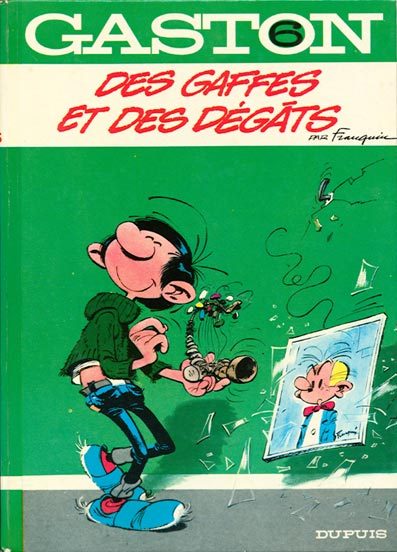

Was leagues more "readable" than:
They where literally easier to read.
That comic cover takes me a good few seconds to dissect and process, whereas the two examples above it are instant.
I'm terrible at studying from life due to my poor eyesight and spacial awareness issues, also I have ADHD so, not only is the information my eyes are giving to my brain suboptimal, but my brain is also terrible at processing and reconstructing that information.
Also tracing is a valid way of studying btw, that's how I learnt as a tot and it can be great to try and reverse engineer a finished peice and break it down to it's construction.
Obviously it's not the same as building something from scratch but we're talking within the realms of practice.
I also started trying to "re-learn" some art fundamentals in ways that work better for me, and it's been massively helpful.
I'm already working with fuzzy simplified abstractions of the world around me, so it's horrible trying to see accurately and THEN re-simplify it onto paper.
So something that has helped a lot and I mean A LOT with teaching my brain art basics in a digestible, step by step way, has been:
ART ACADEMY for the DS!
It's great for walking you through art fundamentals in a way that is digestible and no where near as overwhelming as just jumping straight in to a massive, complex, digital art programme.
It gets all the fuss of materials and subject and reference out of the way and let's you just focuse purely on the process of making art itself.
THIS:
WAS MADE WITH THIS:
This is the first drawing lesson:
This is the lesson after that:
This is all with the original DS version!
On a tiny screen with very primitive approximations of pressure sensitivity and no opacity or pen size options.
It mimics traditional art making in the sense that you make what you can with what you have and that limitation allows you to focuse on practice rather than get overwhelmed and over correct everything digitally.
These where tiny, crunchy, microcosmic, simplifications of digital art making back in 2009!!!
It's so refreshingly accessible and manageable.
I haven't even started the newer 3ds game that came out.
So if anyone reading is struggling with their art I highly recommend this little art exercise giver! It's helped me a lot.
OK hope that's readable and helpful. ^^
27 notes
·
View notes
Text
Critical Television Analysis: The Good Place

On the surface, The Good Place is well-loved, hilarious, and surrounds a diverse cast with characters that differ from identity-related stereotypes. The show surrounds Eleanor, who wakes up in heaven, referred to as the “Good Place,” alongside Tahani, Jason, and Chidi (who is labeled her soulmate). Michael is the supposed leader of the “Good Place,” but we later discover that–in alignment with Eleanor’s selfishness–he is actually a devil and this is the “Bad Place.” The characters’ out-of-placeness (except for Tahani and Chidi, who initially think they belong) is meant to be their eternal torture, but Eleanor’s repeated solving of this mystery results in endless reboots and failures. The series ends when the humans team up with Michael and they realize that the entire system is off, as everyone is being sent to the “Bad Place” based on its unattainable, binary measures of morality. They successfully reform the system, resulting in Michael’s transformation into a good being–and living out his fantasy of being a ‘human’ on Earth–and Eleanor, Chidi, and Jason transforming into blissful nothingness while Tahani helps to design a better afterlife.
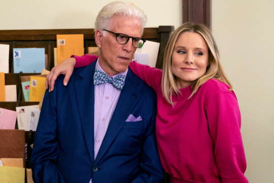
Photo: Michael and Eleanor.
Although we eventually learn that everyone is being sent to the “Bad Place,” the show’s group of focus is diverse (through their sexuality, gender, or race), generalizing “Bad” people to be those who defy hegemonic norms. This mirrors our current society, especially with those in control being white men (like Michael & the other Devils, and one white female judge) with outdated ideology–I explore this further in my video essay. While the final message of the show recognizes this point system as flawed, revealing the lack of a binary good/badness (the main point of my video essay), it doesn’t at all explore the sexual, gendered, and racial aspects of the characters’ intersectional experiences, making the show more hegemonic than not. I analyze the portrayal of specific characters and how these may be negatively interpreted by viewers despite this show’s positive overall message.

Photo: Tahani, Jason, Eleanor, and Chidi as they stand before the judge and request the chance to 'start' life--and their "Good" vs "Bad" point count--from scratch.
I critique responses to The Good Place that commend its progressiveness based on the fact that its cast is racially diverse and they don’t align with traditional stereotypes, and instead suggest that in this case, “not all representation is good representation” (Hsu, 2021). The show fails to reconstruct intersectional identities in a positively ‘different’ way due to its “color-blind” approach, which disregards, rather than reconstructs, gendered and racialized oppression throughout history. The non-hegemonic aspects of characters’ racial or gender identities are dampened through their adoption of traits that reinforce hegemonic ideology; this is particularly prominent among the female characters, however I address the male characters prior to my conclusion. Primarily, each female character represents an atypical, but similarly problematic form of femininity that continues to reflect the male gaze; Eleanor’s narrative control as a woman is dampened through her alignment with hegemonic masculinity–this is heightened by Chidi’s femininity (perpetuating an innate gender binary), Janet’s non-binary identity is overridden by their similarity to the ideal, domesticated woman (reasserting heteronormativity as the norm), and Tahani’s Pakistani background is misportrayed through her assumption of a privileged white-washed identity (making racial histories invisible) (Kaplan, 2010). Kaplan, Shohat, and Diawari note that the significance of media’s portrayal of gender and race lies in its influence on the minds of its viewers; what media constructs is perpetuated and eventually, realized within our own reality, pointing to the significance of recognizing ideological media as such before its perpetuation. While the presence of three female characters in the show’s main ensemble provide us with the illusion of gender equality, upon closer analysis it is clear that each reinforces problematic stereotypes surrounding race and gender.

Primarily, the protagonist is a white woman–the show opens with a shot of her face, bright and glowing, and follows her perspective throughout the narrative. Eleanor’s non-feminine, general indifference is framed as the essence of her personality, and resultantly, the reason behind her punishment. Kaplan notes that attempts to reconstruct female characters in defiance to gender norms can fail through their consistent creation of a male/female binary; “our culture is deeply committed to clearly demarcated sex differences.” Eleanor illustrates Kaplan’s point that emerging female “representation” remains binarized, as she adopts a specifically masculine position that is characterized by her lack of “traditionally feminine traits,” particularly, her “cold and manipulative” personality (Kaplan, 2010). Flashbacks of Eleanor’s life on Earth revealed that everyone hated her because of her manipulative ways and carelessness surrounding others’ feelings. On Earth, Eleanor used to get drunk before going out with her work colleagues on the night she was designated driver, just to joke that the only place she’d be driving was through the “loophole” she found in the system… When she’s (finally) forced to stay sober and drive, she pretends to be doing it out of care for her friends to get the bartender’s attention, and later chooses going home with him while stranding her drunk friends at the bar. Needless to say, Eleanor isn’t invited to go out with her colleagues again.

This careless emotionlessness is counteracted by Chidi’s “kindness, humaneness, and motherliness,” evident in the fact that his personality surrounds his nervous awkwardness and indecisiveness based on a desire to make the most moral, utilitarian decisions possible (Kaplan, 2010). Many viewers think Chidi illustrates “positive masculinity,” but his emotionality and indecisiveness–alongside a resulting inability to “take action” in the way Eleanor does–suggest he may align with the feminized role as described by Kaplan (Kaplan, 2010). Moreover, Chidi is used to counteract Eleanor’s masculinity and keep the gendered binary “structure intact” despite the supposed stray from hegemonic gender norms (Diawara 2014, Kaplan, 2010).
The idea of Eleanor’s defiance of traditionally feminine gender norms is directly framed as related to her “badness” through her narrative arc, in which her transformation into a “good person” directly aligns with her acceptance of hegemonic femininity; she adopts “kindness, humaneness, and motherliness” and heteronormativity (Kaplan, 2010). When the humans are given the chance to live again and restart their point count, Eleanor struggles; as soon as Chidi kisses her and they recognize their feelings, she finally does better on Earth and becomes “good.” While one could argue the arc’s alignment with heteronormativity is purely coincidental, it contrasts with the show’s previous focus on Eleanor’s bisexuality, aka, its queerbaiting of Eleanor. Throughout early seasons, Eleanor frequently commented on Tahani’s attractiveness, and even came close to kissing Simone (Chidi’s gf at the time); the usage of her bisexuality is, in itself, framed inappropriately comically, and coincides with her previously “masculine” traits– carelessness, moral indifference, and lack of romantic interest in Chidi–suggesting non-heteronormativity to be similarly negative. Moreover, the fact that Eleanor is a woman does not necessarily mean she’s a progressive character, as is evident in her adoption of a non-feminine, but similarly binary form of masculinity, the presence of Chidi as a feminine counterpart , and the show’s aligning of her bisexuality with “badness.”
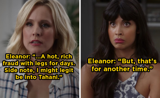
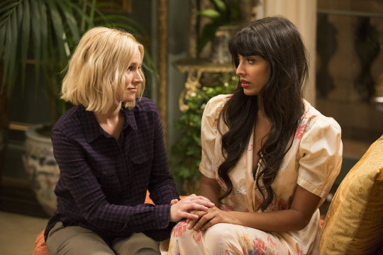
Photo: Eleanor and Tahani
Janet, a white character, is framed as the perfect woman, which is problematic due to their identification as non-binary, both because it is transphobic and frames servitude (her main purpose) as innately feminine. Primarily, I noticed that Janet mirrors our assignment of femininity to technological sources of servitude: Siri, Alexa, GPS navigation, “the number you have dialed is not in service…” Like these objects, Janet’s “servitude and obedience” are viewed as innately feminine, and are thus assigned a feminine identity (James, 2018). Despite Janet’s attempts to reclaim their lack of alignment with societal labeling norms through the consistent assertion that they are not female, but rather a vessel of knowledge (equating themself to AI), characters always call them a “girl.” Janet never argues with this misgendering, and instead responds with a smile and a kind, “Once again, I’m not a girl” (Beck, 2023). While Janet’s character could have been an opportunity to explore a non-hegemonic perspective, the show harms non-binary identities more than it supports them, by enabling characters to misgender Janet and using their feminine appearance (always fresh, made-up, and in a dress) and feminine subservience to justify this assumption as comically obvious and justifiable (Beck, 2023). The show actually perpetuates their femininity so much that their character is referred to as a girl both within and out of the narrative (among characters and audience members). In the end, Janet is framed as a woman in nature despite their assertion of being non-binary, both aligning femininity with object-ness and servitude and framing non-binary identities as lacking personhood. The show uses Janet as a diversity point without truly questioning binarized views of gender; Janet’s consistent positivity and agreeability disregard the harm of misgendering, and actually works to justify the characters who misgender her by framing Janet’s “femme” physicality and personality as evidence of their ‘obvious’ femininity (Beck, 2023).

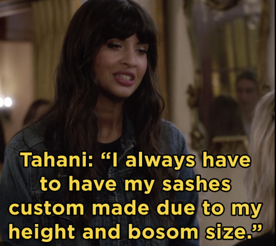
Just as Janet’s intersectionality is subdued through their over feminization, the only other intersectional identity (and the only non-white woman) of focus–Tahini–is made palatable through the show’s white-washing of her personality. While Tahani is a first generation Pakistani in the United Kingdom, her struggle-free experience in white-dominated high society disregards a perspective representative of non-white culture, and instead hides it with a British accent and Tahani’s infinite wealth. Tahani’s lack of race-related struggles are completely disregarded through her defining trait: selfishness. Even her greatest deeds, such as organizing charities on Earth, were all based on selfish intentions surrounding her parents’ validation. Her biggest struggle is framed as her sister’s fame, specifically, her parents’ heightened love of her sister, which aligns with Tahani’s inherent self-focused attitude. In this way, UK’s historical colonization of Pakistan and the current othering of British Pakistani are made invisible. (Aljazeera, 2023). As noted by Shohat, attempting to re-frame gendered and racial history (patriarchy and colonialism) is not always done in an “unproblematic” way, just as The good Place’s color-blindness to Tahani’s racial history actually perpetuates social ignorance of historical oppression. In alignment with Shohat’s explanation of the “mark of the plural,” in which any “negative behavior” (Tahani’s personality-defining selfishness) is viewed differently based on the characters’ race, Tahani’s characterization is more likely to be generalized to Pakistani people than Eleanor’s would be to white people (Shohat, 2014). Tahani’s obliviousness to her culture’s oppression projects a falsely generalized idea of this racialized history as insignificant among Pakistani despite its continued prevalence.
While I mainly focus on female identities (complicated by Janet), The Good Place frames the experiences of Jason, and Chidi (in addition to Tahani) as completely unaffected by their race. Jason’s ability to pass as a Taiwanese monk due to him being Asian–despite the fact that he’s from Florida and is not a monk–perpetuates essentialist ideology surrounding sameness based on race, and his heightened lack of intelligence is a poor choice for the only Asian representation throughout the show. Chidi’s violation of hegemonic masculinity (through his emotionality, indecisiveness, etc.) being framed as the reason he resides in the Bad place aligns with problematic characterizations of Black characters “playing by hegemonic rules and losing” (Diawara, 2014). More broadly, the fact that Chidi, Jason, and Tahani are supporting characters for a white woman–like many other characters of color–repaints white-washed film narratives in which POC don’t hesitate to “protect” the “same order that has punished and disciplined” them (Diawara, 2014).

The afterlife’s similarity to Earth suggests its culture as to be reminiscent of our own, however, the color-blind attitude of the main characters disregards the rampant racism that we still work to subdue. Unfortunately, The Good Place’s opportunity to explore an array of perspectives and lived experiences through characters’ diverse backgrounds is lost, even just based on the nature of their show; they do not take into account that the negative representations assigned to each of its characters have a different impact on their community. The fact that a white man created “The Good Place” isn’t surprising, and points to Shohat’s recognition of the necessity for “historically marginalized” groups to “control their own representation” to avoid reproducing something from a white audience’s lens of “pleasure” (Shohat, 2014).
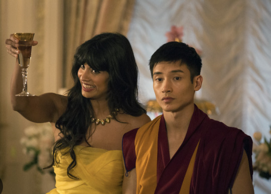
Photo: Tahani and Jason.
Works Cited:
Beck. “‘I’m Not a Girl’: Janet, Nonbinary Representation and ��The Good Place.’” The Spool. Accessed December 12, 2023.
Diawara, Manthia. "13 Black Spectatorship: Problems of Identification and Resistance." Black American Cinema (2012).
Hsu, Leina, Ruchi Wankhede, Ayan Omar, and Jennifer Ammann. “No, the Good Place’s Jason Mendoza Does Not Defy Asian Stereotypes.” Women’s Republic, March 1, 2021.
James, et al. “The Other Secret Twist: On the Political Philosophy of the Good Place.” Los Angeles Review of Books, October 13, 2018.
Kaplan, E. Ann. "Is the gaze male?." (2010).
Shohat, Ella, and Robert Stam. Unthinking Eurocentrism: Multiculturalism and the media. Routledge, 2014.
Staff, Al Jazeera. “Braverman Words on British Pakistani Men Discriminatory: Pakistan.” Al Jazeera, April 5, 2023.
@theuncannyprofessoro #oxyspeculativetv #speculativetvanalysis
11 notes
·
View notes
Text
The (absent) demise of the "Riot Grrrl" genre!
Disclaimer: this text was created for an essay submission, so the prose may not be similar to my other blog posts. Nonetheless, it is still incredibly important to me, along with being one of the best pieces of work I have ever had the honour of constructing. Thank you for reading.
What essentially birthed the genre of 'Riot Grrrl' music was the exclusion of women in musical spaces regarding the punk-rock persuasion and punk movement throughout the 1970s. Although the involvement of women began to become prevalent during the second wave of feminism, with bands like X-Ray Spex and The Slits being formed, punk-rock was still seen as ‘cock rock’, a loud and predominantly male genre. It seemed as if there was no room for the inclusion of female artists within the genre of punk-rock. That is, until the start of the 1990s and the third wave of feminism, where the formation of a specific band called Bikini Kill began the rise of the Riot Grrrl movement, dedicated to tackling feminist issues and providing a focus on the political, social, and economic disenfranchisement faced by women. These weren't bands consisting of heavily skilled musicians, for half of Bikini Kill's members played their instruments without any prior experience or knowledge. This wasn't entirely unspoken of, for there were many boy bands who were getting up on stage without knowing how to really play a note. The difference is, Bikini Kill believed possessing musical talent within skill wasn't important; the true talent lied in using their music as a tool for activism. This is why one of the most influential aspects of the Riot Grrrl movement was the usage of zines to spread the feminist manifesto and the rise of these upcoming bands, for zines were the perfect tool of visual art that best emphasised the 'do it yourself' persona attached to the Riot Grrrl and punk movements. By creating sources of media that highlighted issues of sexism, patriarchy, abuse, sexuality and rape, especially through the female gaze, the Riot Grrrl movement was further strengthened by the formation of bands such as Bratmobile and Heavens to Betsy along with Bikini Kill. Although incredibly influential for women's liberation and shining a light on the issues they face, Riot Grrrl is infamously known for its exclusion of intersectionality within visual representation: there were issues of racism disclosed and explored in Riot Grrrl zines, however Emmanuelle Mphuthi reiterates that 'none of the revered figures of (the) movement were Black or women of color.' Despite this, there is a huge question surrounding whether the movement has died or if there is a resurgence occurring in contemporary society for the 'Riot Grrrls' of this generation.
Replacing the "i" with three r's, allowing a growl paired with "girl", "Grrrl" is a forceful reclamation of girlhood, by reiterating it in the stance of female anger perfectly paired with the genre's howling vocals in a bid to reject female subordination and accept female animosity. Along with this, it is the re-establishment of the naughty, confident and curious personalities young girls possess before they begin their venture in society as young women, demonised and degraded by the patriarchy to stop being loud and to stop playing with boys and to concentrate on learning how to girl. Due to the genre's innate rejection of gender stereotypes, it is no surprise that it is filled with aggressive displays of women empowerment and girl power. Arriving at the end of the second wave of feminism, where the debate regarding the legalisation of pornography was existent due to anti-pornography feminists wanting to limit the porn industry as it catered only to men and encouraged violence towards women, some feminists deemed this as repressive as there were women who chose sex work, and to limit the porn industry would be to limit their work. Already, before the start of the third wave of feminism, there is debate regarding a woman's choice. With the third wave of feminism beginning with the 1991 Anita Hill testimony, a sense of liberation is tied with intersectionality for the first time, this new wave of feminism focusing on race and gender and political representation and equality for women.
This only helped prompt an emphasis on reproductive rights for women, much like the second wave, hence the brutal honesty surrounding female empowerment through punk rock to begin discussions of patriarchy and body image for the female youth. Thus, the Riot Grrrl movement is constructed and strengthened, paving a way for the female youth to be involved within the punk movement; for youth has always been a motif in the punk milieu because its attitude naturally rebels against authority. Best depicted in the genre's lyrics, there is an obvious distinction between the male perspective and the female perspective: Blink-182 writes 'I want a girl that I can train' in one of their songs; the Ramones write 'well, you're a loudmouth, baby / you better shut it up! / I'm gonna beat you up', perpetuating elements of physical violence and harmful hegemonic-masculine attitude towards female subordination. In contrast with this, Bikini Kill writes 'Just cause my world, sweet sister / Is so fucking goddamn full of rape, / Does that mean my body / Must always be a source of pain?', highlighting the normalisation of rape culture and the issues regarding the female body. In doing so, along with the use of the word "sister" to address their female audience and the brutally explicit drop of the word "rape", Bikini Kill emphasises the fact that Riot Grrrl is all about being raw and not being afraid to have those conversations. It is this unfiltered, gritty and brave attitude of Riot Grrrl bands that allows the movement to be influential and inspiring for (young) generations of women.
In accordance with themes of feminism and girl power, the usage of zines in the nineties helped convey a tinge of individuality to the Riot Grrrl movement. In its entirety, the movement was a personal and brutally honest conception, best depicted in zines' manifesto-like nature, emphasising the youthful framework attached to what these zines were highlighting with their messy hand-written font and eccentric colours, such as hot pink paired with black. One of the zines published by Bikini Kill featured a hand-written flier, acting as a feminist manifesto, with lines such as 'Resist the temptation to view those around you as objects and use them' and 'Burn down the walls that say you can't' - the latter underlined aggressively in black marker juxtaposed with a crimson red background. This further highlights Riot Grrrl's ambition to focus on the individual's responsibility not to perpetuate the system of oppression and how to tackle the personal in political terms. With the use of a crimson red paired with black, there is a sense of feminine urgency attached, depicting the nature of a woman celebrated through her menstruation.
Another reason why zines were the perfect tool for the Riot Grrrl movement is because when analysing the movement now, there is a sense of nostalgia attached: in the age of no advanced internet or technology, zines were the best tool for quickly and locally disseminating information beyond and before web content, especially in youth culture. Along with this, zines had a unique way of portraying a confrontational style of in-your-face politics, which was perfect for the third wave of feminism, portraying a sense of belonging for the individual as anyone could make a zine about anything. The entire essence of the Riot Grrrl movement was that it was an opposition of the mainstream, best conveyed with the use of zines as they helped capture a culture in a way that mainstream, conventional and often exclusionary models of publishing couldn’t.
As influential as Riot Grrrl was for advocating for women’s liberation and sexual freedom, one of the strongest criticisms of the movement was that it lacked the emphasis on women of colour entirely. Highlighting female anger, it is no coincidence that the movement gained a large fanbase after the 1991 Anita Hill testimony, for female thought was provoked and encouraged by the case’s emergence; a movement that was kick-started by the abuse of a Black woman possessed so few Black representatives at its helm. Furthermore, the punk-rock genre was deemed a predominantly white, male genre - a common misconception due to the silencing of many Black musicians. Dating back to the early 1900s, music composed and released by Black individuals was categorised as 'race music' in order to profit off communities of color whilst also restricting the music played on white radio stations.
In terms of the punk-rock genre, however, many believe it has become whitewashed; there were Black punk bands pioneering the punk movement with their fresh new ideas long before The Clash and the Sex Pistols, such as Death, a band composed of three young black brothers who have gained a large cult following today. Retrieving attention back to the Riot Grrrl movement, there is also X-Ray Spex, with the frontrunner being a young Black woman, refusing to adhere to society's objectification of her body. Yet, despite this, it is a sad fact that although X-Ray Spex paved the way for the Riot Grrrl movement long before it was constructed, Bikini Kill is the band connected to the movement the most. In addition to this, there is the inclusion of Courtney Love’s band Hole as one of the most influential bands within the Riot Grrrl Movement, with a discography full of songs that advocated for badass and unapologetic feminists. Despite this, Love has been heavily criticised by many intersectional feminists for her racist comments, where she previously demanded the crowd at one of her concerts to 'scream the n-word', along with asking a Black woman whether she really does enjoy rock music, for she is Black and that would be synonymous with Love, a white woman, 'being into Lil Wayne.' Highly detrimental to the nature of the Riot Grrrl movement, Love has also been criticised for her victim-blaming comments, where she asked a woman who had been raped why she didn’t expect it to happen. It is often a shock for many Hole fans when reminded of this altercation, for Love wrote the feminist anthem ‘Asking for It’, a song highlighting the brutal nature of rape and the long-term effects of assault on victim-survivors; many victim-survivors refuse to acknowledge Love as a feminist icon, for her comments surrounding victimhood and victim-blaming remain harmful.
Further supported by Bikini Kill’s Kathleen Hannah, Love was called out by the queen of the Riot Grrrl movement, only to be met with physical violence by the hands of Courtney Love. This best highlights the damaging notion the Riot Grrrl movement advertised that if a woman is strong and opinionated then she is, by default, the poster girl of feminism even if her so-called feminism ignores racism, transphobia, ableism, classism and so on. On the other hand, what frustrates many women of colour who are consumers of the Riot Grrrl genre is the lack of representation within the movement for themselves. Described as a movement for the 'young, white, suburban and middle class' women in society, many feminists would wholeheartedly disagree, for that is only what the media focused on. The real riot Grrrls were those of all ethnicities, especially the black women that participated in (and out of) the movement. These black women carved their own feminist pathways into the hard core scene solely because they were rendered invisible by the movement itself, such as Ramdasha Bikceem, a young Black woman who constructed a Riot Grrrl zine in the perspective of a black Riot Grrrl. It is an inspiring and influential notion tied to the nature of Riot Grrrl, yet it is also heart-breaking, for no woman of colour's contributions to the movement should be swept under a rug of whiteness and should instead, be at the forefront of the movement along with their white peers.
Embedded within the celebration of all women and unapologetic female anger, the Riot Grrrl genre would thrive in contemporary society – or would it? The movement itself is as relevant today as it was back when it was formed, especially tied with the #MeToo movement, however the entire essence of the Riot Grrrl movement is an opposition to the mainstream, and with the rise of pop music towards the end of the nineties, therein occurs the loss of interest by the media and the 'death of Riot Grrrl' in 1995 and 1996. Yet, despite this, many believe that Riot Grrrl never truly met her demise, visiting a resurgence within the music of Alanis Morissette, igniting a celebration for angry women, along with the brutal lyrics of 'Bitch' by Meredith Brooks, and the ‘howling vocals' of Fiona Apple. This label of ‘angry woman rocker’ attached to the aforementioned female artists within pop music originated with the Riot Grrrl movement, especially as their songs helped espouse feminist values and protest violence against women.
Along with this, female rage was selling music and magazines, which coincides with the obsession contemporary society has with celebrating the rejection of female subordination and the right to rage. Gone are the days of asking women to be gentle and kind, to avoid overt displays of negative feelings such as rage and aggression in fear of appearing “unfeminine”, for there is now a rejection of this societal conception that women who defend themselves, hold strong opinions and are competitive and verbally self-assured are “rude” or “belligerent”. The themes circulating why the Riot Grrrl movement was made are still present today, hence why the movement is still very much alive. What’s perhaps the most exciting aspect of this is that there are now women of colour at the forefront, such as Olivia Rodrigo, Willow Smith, and the band The Linda Lindas, conveying Riot Grrrl's uniform 'over-it attitude' and the 'howling vocals' aforementioned. The best example of Riot Grrrl being present today is through The Linda Lindas’ song ‘Vote!’, written and released as a public expression of the young women's dissatisfaction with the Trump administration.
Stripping the movement of its white-feminism and retrieving all art that was pushed under the rug of whiteness, the Riot Grrrl movement is essentially at the strongest it has ever been in today's age, due to the easy-access of the internet, along with the fact that there is now an inclusion of women of colour: Alice Bag, a Mexican-American punk singer, being one of the opening gigs for Bikini Kill's recent tour, along with Shamir, a black indie-rock musician. These artists have one thing in common: the hunger to defeat oppressive powers, highlighting the essence of Riot Grrrl. As society progresses, we see a shift in the Riot Grrrl movement - it isn't as explicitly referenced as it was in the nineties, but the mentality remains because feminism remains, in all its layers of intersectionality.
Although the Riot Grrrl movement possesses its criticisms embedded within racist connotations, the sudden shift into intersectional feminism in contemporary society allows a resurgence of the genre. First constructed to allow a space for women to essentially rock out and meet the horrors of girlhood in brutally explicit lyricism, by reconstructing the label of 'SLUT' in a female gaze to allow sexual liberation and autonomy after decades of being stripped the choice to, Riot Grrrl helped highlight the importance of placing taboo subjects like rape out in the open. Essentially, the movement celebrated the idea of women loving women, warning one another about dangerous people and providing community and support to survivors. To take part in the movement, there is the acquisition of being vocal about other important issues that were once rare or invisible such as gender variance and racism, issues that are visited today.
Although the movement is seen through a new lens with today’s digital age, there is still the usage of zines in terms of blogging and creating graphics on Pinterest and Tumblr, especially using the app Shuffles, which takes your pins from Pinterest, cuts them out, and clips them together. Along with this, there is also the use of zines on Instagram, paired with online activism and blogging – further implemented by feminist scholars and blogs. This new age of zine culture can be traced back to the pandemic, where it has been an outlet for those dealing with boredom and extra free time in quarantine. With zine culture being reborn in the age of intersectional feminism, there is a fresh new face for the Riot Grrrl movement, one that tackles the many criticisms it first faced during the nineties. Due to possessing similarities to how it was first conveyed in the nineties in contrast with today, there is an inclusive space for women of all ages and all ethnicities to erase the “i” in “girl”, and replace it with three r’s, as a celebratory growl within their liberation. With the rise of upcoming girl bands and women artists who are unapologetically unafraid of being raw and brutal, the Riot Grrrl genre (and movement) experiences an absent death, in the sense that it never truly died.
#blog entry 1.#riot grrrl#riot grrrl essay#riot grrrl music#music review#music essay#bikini kill#hole#feminism essay
4 notes
·
View notes
Text
Beauty, dress codes, and fashion: Examining twenty fictional White female librarians [Part 1]
In her 2018 In the Library with the Lead Pipe article, "Vocational Awe and Librarianship: The Lies We Tell Ourselves," Fobazi Ettarh rightly points out that "librarianship is dominated by white women," noting the history of White women in the profession due to their characteristics, the fact that libraries have been “complicit in the production and maintenance of white privilege,” how these librarians participated in "selective immigrant assimilation and Americanization programs," and that librarianship "plays a role in creating and sustaining hegemonic values," while contributing to a culture of white supremacy like other institutions. She further asserts that depictions of libraries as "places of freedoms" like intellectual freedom, freedom of access, education, and more "do not elide libraries’ white supremacy culture with its built-in disparity and oppression," adding that values that librarianship builds itself upon is "inequitably distributed amongst society." She gives the example of segregation of public libraries in the U.S. South, desegregation efforts of those libraries,with access to materials "often implicated in larger societal systems of (in)equality." She also pointed to libraries gathering "large amounts of patron data in order to demonstrate worth" or can "operate as an arm of the state" by working with library vendors which work with government entities.
Reprinted from my Pop Culture Library Review WordPress, where this post was published on Nov. 29, 2022.
I could easily build off every single one of her points in a long and drawn out post. Instead, in this post, I will examine over 20 White female librarians across various animated series and how these fictional depictions are emblematic of the overwhelming Whiteness in librarianship. More directly I'll look at what this means when it comes to appearance, fashion, and standards imposed on librarians by Whiteness itself. Simply put, Whiteness is a socially constructed classification which conveys certain privileges, comforts, and advantages that those who not White do not enjoy automatically. It ends up setting the standard for reality and normality itself. Any deviations are seen as subversions, offenses, disruptions, or disturbances, policing its borders in a literal and figurative way. It can sometimes operate in hidden ways at different strata within library profession, while remaining multidimensional. [1]
I'll start with Kaisa, who is one of the most prominent librarians in animation to date, in the series Hilda. [2] As librarian and library instructor Gina Schlesselman-Tarango put it, library professionals often navigate White grooming and beauty standards, while people of color are policed within library spaces. Librarian Jessica Macias added that librarians often face dress and grooming codes. It is something which women of color doesn't always fit into, feeling alienated and different. Macias argued that these unwritten codes ban so-called "distracting" and "unnatural" hairstyles, unkempt clothing, hygiene, and hair. She, along with April Hathcock and Stephanie Sendaula adds that this is restrictive for people of color, facing implicit barriers, claims of unprofessionalism, and the idea that librarians of color are not librarians, as perceived by fellow patrons and librarians. [3]
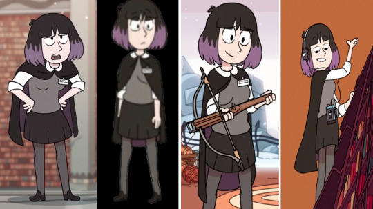
Four screenshots spliced together in order to show Kaisa's librarian outfit during the course of the first two seasons of the series
Her unique appearance fits within White beauty standards, even though she is casually gothic and witchy. In the series, she wears a gray sweater, grey leggings, black skirt, black cloak, and white blouse. She often wears black-grey headphones attached to a media player. Librarians are often shown wearing skirts, cardigans, while others have been more stylish with dresses, cardigans, sweaters, tights, and coats. [4] While Kaisa has her own unique style it fits within those standards. It fits with her calm personality, although she can be strict at enforcing rules, or even stern. At other times, she can be secretive and soft-spoken, but has an ability to know what people are looking for. Undoubtedly, this leads to certain insecurities, and feeling like an outcast, despite the fact she can be nice, supporting Hilda, Frida or David in their tasks throughout the series.
Although Kaisa is perhaps the prominent librarian character in an animated series in recent years, there are other librarians which fit the White standards of appearance. These same standards, of course, exclude and restrict librarians of color, as Macias pointed out. [5] Other fictional librarians dress even more conservatively, even if their style is not as distinctive as the one that Kaisa has in Hilda. This includes the curmudgeon librarian in the DC Super Hero Girls episode "#SoulSisters Part 2." She wears horn-rimmed glasses, a hair bun, a whitish high collar, cuffed sleeves, and a bluish dress of some kind, I believe. She fully fits the spinster librarian stereotype as outlined by Jennifer Snoek-Brown on her blog, Reel Librarians.
The same can be said for the Violet Stanhope, the librarian ghost in an episode of Archie’s Weird Mysteries ("The Haunting of Riverdale"), Francis Clara Censorsdoll in multiple episodes of the mature animated series Moral Orel, Mrs. Higgins in a Sofia the First episode ("The Princess Test"), and Rita Book in a Timon & Pumbaa episode ("Library Brouhaha"). All of these librarians are dressed in a "proper" way and well-groomed, even if not all of them conduct themselves professionally. What I mean is that Francis burns books she doesn't like and Rita demands total quiet, while Violet and Mr. Higgins are more helpful. The latter two characters fulfill what the UMW Libraries called "quality service, positive attitude, good patron relations, and pleasing personal appearance." The clothing of the characters, is in line with existing library dress codes that ban shorts, halter tops / tank tops, flip flops, backless shoes, ill-fitting clothing, or t-shirts with writing / slogans, no bare shoulders, no or few face piercings, no denim pants, and no torn jeans. It often goes beyond what could be called "business casual" ins some contexts. [6]
Continued in part 2
© 2022 Burkely Hermann. All rights reserved.
Notes
[1] Todd Honma, "Forward" in Topographies of Whiteness: Mapping Whiteness in Library and Information Science (ed. Gina Schlesselman-Tarango, Library Juice Press: Sacramento, CA: 2017), p. ix; Gina Schlesselman-Tarango, "Introduction" in Topographies of Whiteness: Mapping Whiteness in Library and Information Science (ed. Gina Schlesselman-Tarango, Library Juice Press: Sacramento, CA: 2017), p. 2; Ian Beilin,"The Academic Research Library's White Past and Present" in Topographies of Whiteness: Mapping Whiteness in Library and Information Science (ed. Gina Schlesselman-Tarango, Library Juice Press: Sacramento, CA: 2017), p. 83.
[2] I am putting aside the librarian in Futurama episode ("The Day the Earth Stood Stupid"), Librarian in Zevo-3 episode ("Zevo-3"), Librarian in Martin Mystery episode ("Return of the Dark Druid"), Librarian in Martin Mystery episode ("The Warlock Returns"), Librarian in Martin Mystery episode ("Return of the Dark Druid"), Librarian in Amphibia episode ("True Colors"), Librarian in Beavis and Butt-Head episode ("Cyber-Butt"), Librarian in Bob's Burgers episode ("Y Tu Ga-Ga Tina Tambien"), Arlene in Phineas & Ferb episode ("Phineas and Ferb's Quantum Boogaloo"), Librarian in Phineas & Ferb episode ("The Doonkelberry Imperative"), Librarian in The Flintstones episode ("The Hit Songwriter"), Librarian in The Owl House episode ("Lost in Language"), Unnamed librarian in Sofia the First episode ("Forever Royal"?), Librarian in Sarah and Duck episode ("Lost Librarian"), Librarian in Boyfriends, Lara in Action Comics, The Librarian in Detective Comics, Rupert Giles in Giles: Girl Blue, Skeezix in Guillotine Public Library, Barbara Gordon in Huntress: Year One, Ghost in Library Ghost, Crawley in Library of Ruins, Librarian in Meau!, Rabbi Rava in Monolith, Marten Reed in Questionable Content, Claire in Questionable Content, Rex Libris in Rex Libris, Suzie in Sex Criminals, Prysia in Smitty and Majesty, Lazurus Luca in Sword & Sphere, Daniel in The Library, Jane Case / Wonder Woman in Wonder Woman, as they either have minor roles or I haven't read the comics enough to cover them here.
[3] Jessica Macias, "Looking the Part" in Topographies of Whiteness: Mapping Whiteness in Library and Information Science (ed. Gina Schlesselman-Tarango, Library Juice Press: Sacramento, CA: 2017), p. 113-5; Gina Schlesselman-Tarango, "Introduction" in Topographies of Whiteness: Mapping Whiteness in Library and Information Science (ed. Gina Schlesselman-Tarango, Library Juice Press: Sacramento, CA: 2017), p. 5; April M. Hathcock and Stephanie Sendaula, "Mapping Whiteness at the Reference Desk" in Topographies of Whiteness: Mapping Whiteness in Library and Information Science (ed. Gina Schlesselman-Tarango, Library Juice Press: Sacramento, CA: 2017), p. 254-5.
[4] See Jennifer Snoek-Brown's "Librarian action figure," "Christmas with a reel librarian in ‘My Side of the Mountain’," and "Stylish female reel librarians" for instance.
[5] Macias, "Looking the Part," 118.
[6] "Dress Code," UMW Libraries Public Services, accessed Mar. 15 2022; "Dress Code Policy...," Adventures of a Misfit Librarian, Oct. 26, 2010; Comments on "Dress Codes" discussion on /r/librarians in May 2014; Comments on "Does your library have a dress code for librarians, aides, etc.?" discussion on /r/librarians in September 2014.
#fobazi ettarh#white privilege#whiteness#librarians#libraries#kaisa#kaisa hilda#hilda librarian#april hathcock#stephanie sendaula#professionalism#librarianship#beauty standards#fashion#librarian fashion#violet stanhope#archie's weird mysteries#timon & pumbaa#moral orel#sofia the first#reel librarians#jennifer snoek-brown#dc super hero girls
2 notes
·
View notes
Text
Module 9: The Ins and Outs of Latina/o Popular Culture
Coming out for an individual can be one of the most challenging things someone can do, especially for individuals of color and cultures that may not fully accept this due to tradition. Adding another minoritized identity can follow with many different struggles where one can feel isolated and not accepted by society or even their culture because they do not follow traditional norms. With this, the chapter is highlighting the fact that not all cultures have sexual identities that are accepted or have a way for an individual to open up about their sexuality, meaning in most cultures individuals have to hide their true identity from the world. Where a saying like, “coming out of the closet,” in a way sets the individual free from social restrictions, and since this phrase was constructed within the U.S. other cultures and countries may reject this concept.
The chapter then introduces the term joteria which connects to the perspective on intersectional issues and concerns of queer Chicana/o, Latina/o, and indigenous people experience. Joteria is used instead of the terms queer or LGBTQ within the Association of Joteria Arts and Activism Scholarship because it provides the politics of representation for queer Latinx in the arts, media and activism and also these terms centralize all individuals’ experiences when Joteria is a separate category. Continuing, the chapter focuses on the fact that there is an underrepresentation of Latinx joteria within the media, entertainment news, and in U.S. popular culture. With this, the author discusses important joteria figures that have come out, that are members within the joteria community or influences in music and films. For instance; Chavela Vargus whom was one of the earliest representations of lesbian desire in music breaking Mexicano traditon, Juan Gabriel believed it was not prevalent to come out but his queer representations encouraged Mexican popular culture, Ricky Martin wrote songs that had empowering messages towards queer life while being a symbol of Latinx gay masculinity, and then Adelina Anthony was a performance artist’s that identified as a two-spirited Xicana lesbian multi-genre artist, cultural activist, teaching artists, director and producer whom addressed many social issues within her work. Lastly, significant joteria influences in music included A Corrido by Los Tigres del Norte and songs by Girl in a Coma while influential films are Mosquita y Mari and La Mission.
After reading this chapter, I found it the most interesting how the need to come out is not as prevalent in Mexico as it is in the U.S. where sexuality is highly personal within Latinx cultures, to the point where individuals keep their identities hidden from society. Even when there are Latinx characters on television whom are openly gay their representation is either ignored or excluded while openly gay White characters are praised and all the focus is on them. This is where I knew that Ellen DeGeneres was the most significant gay character who came out on television in 1997, but I was unaware that there was another character, Ricky Vasquez, a gay Latino character that was on television in the 1990s before Ellen. This was interesting to me because of how unaware I was that Ricky Vasquez played by Wilson Cruz was actually the first example of an openly gay Latinx individual on American television that highlighted the struggles of being gay. Which barely received the credit it deserves, while Ellen DeGeneres receives excessive amounts of attention when in fact there were many people before her to come out and support the LGBTQ community. I believe it is because she is White and possibly the culture difference where the Latinx community did not believe it was acceptable to give attention to any Latinx gay characters, including Ricky Vasquez.
youtube
youtube
I have never personally experienced the struggles queer individuals face, but I have a friend whom identifies as Latinx that expresses the discrimination and stereotypes they still have to experience almost daily. Luckily, she has tons of pride towards how she identifies, but shared with me the difficult time she had expressing this to her parents due to her parents beliefs and values. This connects to the chapter where some individuals do not have the same opportunities within their culture to easily be able to express themselves the way they want to.
2 notes
·
View notes
Text
The Infinix Zero Flip Smartphones With AMOLED Technology

Smartphones are constantly changing as manufacturers push design and technology. The Infinix Zero Flip is one of the most intriguing entrants due to its unique design and promising performance and features. The reasons why the Infinix Zero Flip is a significant smartphone advancement are explored in this article.
Design and Construction Quality
The Infinix Zero Flip‘s unique design is among its most notable attributes. Reimagined for the present era, the flip mechanism is reminiscent of the vintage flip phones. When the phone is opened, its huge display remains visible to its compact design.
Compact Form Factor
The Infinix Zero Flip is incredibly portable since it can fit neatly into pockets and purses when closed. Opening up reveals a sizable display that’s ideal for multitasking, gaming, or video consumption this small design doesn’t sacrifice usefulness.
High-quality Construction
The Infinix Zero Flip also shines in terms of build quality. The phone feels solid and well-made in the hand because it is constructed of premium materials. Many different types of users will find the color and finish choices to be elegant and pleasing.
Display
Among its most remarkable characteristics is the Infinix Zero Flip‘s display.
Big AMOLED Screen
The phone has an AMOLED display with rich colors and sharp contrasts that is very vivid. By creating an immersive viewing experience, this improves everything from browsing photographs to watching movies.
Superior Refresh Rate
Navigating applications and webpages is exceptionally fluid, to a 120Hz refresh rate. Those who play video games and need smooth graphics will especially benefit from this.
Performance
The powerful chipset underpinning the Infinix Zero Flip guarantees that it can easily manage daily duties.
RAM and Processor
The device has a strong processor that provides good multitasking and gaming performance. It’s a fantastic option for productivity because it has plenty of RAM and allows users to navigate between apps quickly.
Storage Options
With the Zero Flip, users can select the configuration that best fits their needs from a range of storage options offered by Infinix. There is a choice for everyone, regardless of how much or little they utilize storage for games, pictures, and movies.
Camera Capabilities
The Infinix Zero Flip has excellent camera performance, which is crucial in the social media era.
High-Resolution Cameras
The gadget has a main camera with high resolution, which results in beautiful, detailed photos. Impressive outcomes are achieved whether photographing close-ups or landscapes.
Versatile Photography Modes
Users may capture imaginative images under a variety of lighting circumstances thanks to the camera’s numerous modes, which include night and portrait. In particular, the night mode offers excellent low-light performance, which facilitates the taking of pictures in dimly lit areas.
Selfie Camera
Beauty filters and other upgrades are available for the front-facing camera, which also produces excellent selfies. For individuals who love posting about their experiences on social media, this makes it a great option.
Battery Life
One important feature of every smartphone is its battery life, which is where the Infinix Zero Flip really shines.
Prolonged Battery Life
The Zero Flip boasts a large capacity battery that allows it to function well for an entire day of intensive use. No more concern about running out of battery when playing games, streaming, or surfing.
Software Experience
Android-based XOS is the operating system that the Infinix Zero Flip is using. It is currently at version 13.3.
Interface
XOS has a simple and easy-to-use interface that makes it simple for users to access and utilize the phone’s functions. There is no shortage of customization choices for users to personalize the UI.
Software updates on a regular basis
Infinix is dedicated to giving users access to the newest functionalities and security updates. Because of this, the item lasts longer and is therefore a wise purchase.
Connectivity and Additional Features
With the Infinix Zero Flip, Infinix has made sure customers can stay connected with a variety of connectivity options.
5G Capabilities
The smartphone is capable of 5G connectivity, which boosts surfing, gaming, and streaming experiences by giving consumers fast internet rates.
Multiple Sensors
Adding more sensors improves security and user comfort. Examples of these include a fingerprint sensor and facial recognition. Both speed and security of device unlocking are guaranteed by these features.
In summary
In terms of smartphone functionality and design, the Infinix Zero Flip is a revolutionary leap forward. A wide spectrum of customers find it to be an interesting option because of its novel flip mechanism, gorgeous display, strong performance, and flexible camera capabilities.
The Infinix Zero Flip is made to meet the needs of anybody, be it a professional seeking a dependable gadget or an enthusiast seeking a fashionable smartphone. Smartwatches like as the Infinix Zero Flip demonstrate how innovative and user-focused design can be while the market for smartphones keeps changing. The Zero Flip is a notable competitor in today’s competitive market thanks to its amazing features and fashionable appearance, which demonstrate Infinix’s commitment to producing goods that appeal to contemporary consumers.
Read more on Govindhtech.com
#smartphone#SmartphonePhotography#infinixzeroflip#amoled#mediatek#news#Technology#technews#technologytrends#govindhtech#technologynews
0 notes
Text
How to Make an Impactful Presence at Automechanika Frankfurt 2024 with Booth Constructor!
The auto world buzzes with excitement about Automechanika Frankfurt. As the trade fair is around the corner, companies beam with excitement to dazzle crowds with cutting-edge technology-enabled booths. Want your booth to stand out? Team up with a pro like Booth Constructor GmbH - we ace it with our eye-catching exhibition stands in Frankfurt. Here are some tips to help you prepare for an impactful presentation at Automechanika Show 2024.
1) Plan Ahead- Preparation is Key!
Know Your Goals & Do Your Homework
First things first: figure out why you're there. Chasing leads? Unveiling a game-changer? Boosting your brand? Nail down your aims - they'll steer your whole game plan. Scope out who you're trying to impress and what your rivals are up to. This intel helps you tailor a killer presentation.
Craft Your Presentation
Clear goals? Now shape your content. Aim for a message that hits home with your crowd. Grab their attention with cool visuals real-life stories, and snappy talk. Keep it punchy! Rehearse till you're smooth - you'll need that swagger to field questions like a pro.
Spread the Word
Get the hype train rolling for your Automechanika 2024 Frankfurt spot way ahead of time. Blast it on social media, fire off some emails, and cook up a juicy press release to get folks buzzing about your booth.
2) Booth Design and Construction
Partner with an Expert Booth Builder in Frankfurt
The design of your booth plays significant role in attracting visitors. Booth Constructor a leading Exhibition Stand Design Company in Frankfurt, can help you create a stunning. And functional booth. Here is how you can make the most of their expertise
Focus on Visual Appeal
Your booth should be visually appealing and reflective of your brand identity. Use bold colors. Incorporate attractive graphics and interactive elements to catch the eye of passersby. Ensure your brand logo is prominently displayed and key messages are easy to read.
Optimize Space and Layout
Work with Booth Constructor to optimize the space and layout of your booth. Ensure there is enough room for demonstrations. Have adequate space for product displays and visitor interaction. A well-organized booth not only looks professional but also makes it easier for visitors to navigate. Engage with your offerings.
Incorporate Technology
Incorporating technology can enhance the visitor experience. Consider using linear anamorphic displays or kinetic walls for better engagement. AR and virtual reality to showcase your products and services in a different light. Interactive technology can make presentation more engaging and memorable.
3) Practical Tips from Booth Constructor
- Optimal use of lighting: Use lighting to your benefit and draw focus to the key areas of your exhibition stand and highlight your products in the best way possible. This will help you to draw visitors attention towards your trade show booth.
- Choosing the most appropriate furniture: It is one of the most crucial part, you will have to choose furniture that goes well with the aesthetics of your exhibition stand. Also, happens to be functional and comfortable at the same time.
- Shine with your branding: Branding plays a key role to create brand recall, so that’s why it’s essential to ensure that your branding is consistent throughout your booth. It will help you in drawing clients towards your brand.
4) Post-Event Analysis
Measure Your Performance
It is of utmost importance to analyze your performance after the event. Pay due attention to it and take your time in evaluating the number of leads generated, visitor engagement and overall feedback. Analyze what worked well for you this time and what could have been better, identify those areas and work on it for your next trade show.
Implement it
The insights you must have gained from thoroughly evaluating everything. Put it in practice and see your brand shine. It will in return help you in maximizing your investment, create a captivating presence in the future and see which booth designs align perfectly with your brand’s vision.
Partnering with an established Exhibition Stand Design Company in Frankfurt like Booth Constructor GmbH can help you create an impactful presentation that attracts, engages and increases visitor impressions. By following these practical tips, you can maximize your presence at Automechanika Frankfurt 2024 and help you attain your exhibition goals!
0 notes
Text
High-Level Summarization Methodology

Overview– This report provides a very high-level overview of how Photon Insights generates unified summaries across many documents.
Core Summarization Capability:
Photon’s greatest strength is providing unified insights from a wide variety of sources (news journals, social media, SEC filings, earnings calls, etc.). Take a look at this sample, “Photon Insight” regarding Microsoft/ChatGPT – Photon produces an AI-generated summary (in a human-like tone) by taking certain elements of a set of articles. At a very high level, the proprietary Photon architecture leverages the power of large language models plus various classical supervised + unsupervised learning methods to generate the appropriate punchlines.
Performance Metrics (Warning, technical discussion to follow):
We are often asked, how much of the information do we capture from our summaries/how good are our summaries (both across many documents and on a per article basis)? We provide some rough metrics below, but want to note, evaluating summarization is extremely subjective (as evidenced by this paper: https://arxiv.org/pdf/2007.12626.pdf) – thus, even if our AI misses what you might deem as valuable information, we always link back to original sources/you can obtain more context if needed.
On a per document basis:
Based on ROUGE (Recall-Oriented Understudy for Gisting Evaluation) scores: Here are our ROUGE Scores relative to a few of the SOTA models (and higher is better).
Metric/Model Photon Proprietary Model Yale-LILY/brio-cnndm-uncased facebook/bart-large-cnn google/pegasus-cnn_dailymail
ROUGE-1 61.14 41.44 38.85 35.54
ROUGE-2 45.02 24.69 22.92 20.39
ROUGE-L 52.04 30.20 30.59 28.30,
On the one hand, this looks great for us, we seem to be blowing others out of the water – this is actually not as impressive as it seems, as our models were trained based on our datasets (which we feel will result in succinct human-like summarizations)/as a result, the ROGUE scores should be higher. Nonetheless, we included such numbers due to several inquiring scientists, but we feel a better method of evaluation is doing a qualitative comparison provided in the next section.
Qualitative comparison of models: Also, please see this post [INSERT LINK to CIR SUMMARIZATION POST] to see an application of our architectures to construct the CIR executive summary, and how it compares to other models. Most state-of-the-art language models, when given an article to summarize concisely, seem to be biased toward the information in the initial part of the text and perform poorly in extracting the information present in the lower parts of the inputted text – ideally, when we are reading a summary of any lengthy document/article, we need to grasp the whole picture, and we feel our proprietary models excel here.
Thanks to the tool presented in [SummVis: Interactive Visual Analysis of Models, Data, and Evaluation for Text Summarization (Vig et al., ACL-IJCNLP 2021)] we visualize how much of different summaries are captured for different models – we are happy to provide live visualizations, and it’s clear the Photon algorithm captures a large amount of context, take for instance the sample visualizations below corresponding to this document (ARUL, CAN WE LINK THE SOURCE DOCUMENT). In Layman’s terms, to explain these visuals, more different colors denote a more extensive capture of the document.
Photon Algorithm:
Of all the listed models, ours is the only one to show the information about DALL-E (Image generation service developed by OpenAI and which was released well before the days of ChatGPT), which we felt was highly relevant to the context of the article, and the reader will hopefully appreciate the inclusion!
Google Pegasus:
Facebook Larg Bart (CNN):
BRIO:
A Cool GIF showing several models:
Subjective assessment of our unified framework:
People often ask – what percentage of the important insights do you capture? Unfortunately this is tough to answer (as evidenced by the summeval paper, it is a highly subjective task) – here we provide three examples of “Photons” from approximately 4 PM ET on 1/26/2023, and information we might have missed (and the good news with our Photon Insights is even if we miss something, we still reference back to the original articles plus tell you where exactly the summaries were derived from, so if you need more context, we provide it).
Example 1, Tesla:
Photon Insights:
Human generated core points from all articles:
Tesla reported strong profits, with a 59 percent year-on-year gain in quarterly profit and rising demand.
Tesla reported 405,278 vehicle deliveries globally and production of 439,701 vehicles, but its automotive gross margin fell to 25.9%.
Tesla continues to lose money on Bitcoin, but Elon Musk is still holding on
Tesla recently dropped prices on its entire lineup, including the Model Y, which was eligible for a $7,500 US federal EV tax credit.
Tesla has been one of the most talked about stocks since 2020, but is currently down -64% since the start of 2022 due to Insider trading, demand and margin worries.
Analyst wrote that the report was “better than feared.”
Elon Musk is trying to convince Tesla investors that Twitter isn’t a problem, despite the fact that Tesla shareholders have seen their stock price plummet since he bought the blue bird app last year.
Tesla is investing $3.6 billion to expand its Nevada Semi truck factory, which will produce high volumes of semi-trucks and make enough cell batteries for 2 million light-duty vehicles annually.
Score: 7/8, everything except the point on Bitcoin was captured.
Example 2, Amazon:
Photon Insights:
Human generated core points from all articles:
Amazon recently laid off 18,000 employees, which was more than expected. A former employee was part of the company’s job cut, and the process felt “extremely robotic” to her.
Amazon is having difficulty in its battle against its UK employees, as it is finding it tougher to break UK unions than its usual union stomping ground, the US.
Workers at Amazon’s Coventry depot recently staged a historic strike to demand pay of 15 an hour and to be recognised by a union.
Amazon Prime Gaming is offering a variety of free games for February 2023
Amazon is expanding in Virginia, and a Hampton Roads agency is looking to land a data center. The company is investing $35 billion to build more data centers by 2040.
An Amazon Warehouse worker has made shocking claims about the unjust treatment of employees, claiming that the company treats its robots better than its human staff.
Amazon has announced the launch of the RxPass, a subscription-based benefit that allows Prime members to order eligible medications for a flat, low fee of $5 per month.
Score: 5/7, 1. Missed Amazon Prime Gaming (this is subjective as whether important), 2. Could have added the harsh conditions for employees (point 6).
Example 3, Google:
Photon Insights:
Human generated core points from all articles:
Google recently acquired Liist, an app that allowed users to save places they see in Instagram and TikTok.
The Justice Department has accused Google of an advertising monopoly, and the company has been sued by the Department of Justice and eight states.
Google was ordered to pay $161 million, but lost its appeal against the ruling. India’s Supreme Court found Google’s appeal against monopoly fines unappealing.
This week, Google announced plans to cut 12,000 employees due to a slowdown in its revenue growth.
AI is becoming increasingly popular, with Google may be only a year or two away from total disruption.
Score: 4/5, Got everything except the acquisition news but for a company of this scale it might be fine to ignore this and it was reported only in one of the news articles.
Hopefully these three examples help illustrate the difficulty of assessing the frameworks due to the subjectivity of tasks, but also provide confidence that Photon is seemingly obtaining the essence plus also links back to original sources in case we missed anything.
Thanks for reading, and please don’t hesitate to contact us if you have any questions!
0 notes
Text
Blog Entries
February 1, 2024: What emerging narratives are important in science and activism and how can the two complement each other?: Part 1
In narratives surrounding climate science, whiteness seems to prevail in the United States. During a class today, we had the opportunity to listen to a climate scientist and climate activist speak to their experiences, and their strengths, as well as touch lightly on how the two groups of science and activism can work together for change, and the power of communication.
Throughout the conversation, as activists such as Greta Thunberg were brought up, and as I looked at the white activist and white scientist in the center stage of the auditorium, I wondered what it would be like to hear more from activists and scientists who were Black, Indigenous, of people of color.
Growing up, I never thought of myself as someone who could become a scientist or a person who communicates science. Don’t get me wrong, I love science, I love the earth, and I love listening and communicating with people - I just didn’t grow up seeing people who look like me in mainstream media as scientists, or science communicators. Without representation, I was unable to dream of all of the opportunities that could be possible. Sometimes, seeing is believing.
In 2022 there were 11 Hispanic or Latino students, 3 Asian students, 4 Black students, 2 Native Hawaiian or Other Pacific Islander students, and 0 American Indian or Alaska Native students in the Columbia Climate School (OPIR, Columbia.edu). In a field that is dominated by whiteness, Black, Indigenous, and people of color hold voices that must be heard, especially as our populations are the ones that will be impacted statistically the most by the climate crisis due to systemic inequities, injustices, and inequalities that will be perpetuated through major weather events, increasing heat, floods, and sea rise.
I do not take it lightly that I am a Latinx student with access to this school and its resources - and that I have the opportunity to become the science communicator I wish I could’ve seen as a child. There is also the opportunity for the institutions that exist and hold power to bring in activists and scientists of color to ensure the academics, the business leaders, the communicators, and the activists of tomorrow see themselves represented today.
February 7, 2024: Reflect on how alumni from the program are applying their C&S degrees in different fields. Which of the alumni’s career path(s) did you find most interesting? How does this relate to your career ambitions?: Part 2
This was an incredibly interesting panel to hear about people’s journeys, from those from an older generation of alumni to a more recent generation of alumni. In the panel of recent alumni, a majority of whom were BIPOC, there was speak of balance, of emotions, of rest, of being unsure and still finding happiness and passion. As I listened, I began to recognize that I truly must take this one step at a time. It can feel overwhelming to work, school, and life, while also looking for new work and new opportunities in the world. The great thing about Columbia, and the privileges afforded by Columbia, is that there are many opportunities to take advantage of. For me, I didn’t know many of these options existed coming into the institution, and sometimes experienced analysis paralysis from fear of making the ‘wrong,’ choice. I have to remember that there is no wrong choice, there are just choices. One step, and one day at a time is what I keep telling myself, and a message I heard from the speakers.
Feb 14, 2024: What is one new thing about journalism that you learned from the speakers in class today? What kind of climate stories resonate with you the most and why?: Part 3
I connect strongly to climate stories that have a focus on constructive hope, as I believe
“Climate change is a crisis of heart.”
When I wrote about joining the climate school in my purpose statement, I wrote about how I wanted to look myself in the mirror, look my future children in the eyes, and say with full faith - “I tried. We tried.”
When I think about climate change, I think about how I have had nights frozen in bed, my breath halting, as I realized that the world that I know and love was already changing.
I think about the moments when I’m talking with friends and we say “We have to try to visit that place (the glaciers, coral reefs, the whales) before it’s too late!”
I think about the older woman in the homelessness encampment in the middle of winter as she lived with untreated cancer, and we ate a meal together in the snow. I think about how many more will be unhoused in the years to come, freezing or overheating because of the results of the rich’s impact on the world.
I think about how domestic violence rates rise when people are trapped inside, and how in the United States, it is becoming clear that our air is susceptible to becoming unbreathable - forest fire smoke knows no borders - and how many people will come outside after days of protecting their lungs with new bruises hidden under their longsleeved shirts.
I think about my old coach who drilled into me that “the game’s not over till it’s over,” and how often I apply that phrase to this climate fight.
I think about the people I met while volunteering in disaster relief from a flooded river, supporting one another as their homes disappeared under water, despite, or perhaps because of, the shared grief of lost lives.
I think about the time when my best friend slowly asked me if I thought this world was on its way out.
I think about the time when my mom asked me over the holidays why we should have hope, and admitted to me that it was hard for her to hope when there is so much greed.
I think about miners in Appalachia who went on strike because of the poor labor conditions and about the man connected to an oxygen tank because of the years he spent underground breathing in the coal that powered the country. I think about how he told me he would do it again to ensure financial security for his family.
I think about all that I take for granted; the air I breathe, the water I drink, the trees that provide shade, the cool winds that comfort me when I’m overwhelmed. And how quickly it can all disappear. And how the fight to ensure it all stays will be long and slow.
I’m not sure how to talk about this as a formal analysis, because I have yet been able to breach the gap between academics and heart. In my classes, I feel overwhelmed because we talk about island nations sinking, whole communities losing their homes, and needing to migrate. I look at graphs, modules, and numbers that tell me the world is heating, that it’s in crisis, that we are in crisis, and I look around and I don’t see anyone else with tears in their eyes or on their cheeks. And so I silently wipe them away and keep on working, telling myself I’m overreacting.
And yet, I’m not.
I understand that it is a strength to be able to feel both the pain of the loss of this world, and seeing the earth in pain, while also being able to hold and see the beauty within it. The only way forward is to try our best to see and feel all of it.
I feel as if sometimes scientists, academics, business people, and politicians, can focus so deeply on the trees in the forest, and I feel myself doing the same the longer I am at this school, as a coping mechanism to deal with all the new knowledge I’m gaining of how much pain this world is in. I don’t think their way of thinking is wrong. I don’t think mine is either. We need all different types of framing to meet people, to create a new future for ourselves.
It’s not all pain. It’s hope. It’s faith. I can see a world that does not look like the one we have today because we simply cannot continue to exist in this way. The goal is to not fight to continue the status quo, it is to create a different future. A future where kids think it’s silly that we ever drove cars with gasoline, and gasp when their parents talk about that summer in NYC when the sky went orange and people’s white masks were stained black from the smoke from a fire a country away. A future where whole nations' lives are not thrown away to the seas and the droughts so the wealthy can continue to overconsume. A future where we listen and return to the earth much more than we take. A future that holds more justice, equity, and equality.
I have received the feedback that having hope is childish. What is being an adult then? - Letting go of the need for something better? Hope creates space to imagine something new, and not everyone has the privilege of having enough stability and safety to be able to imagine; so many of us are preoccupied with just surviving within these oppressive systems. So for those of us who can dream, hope, and imagine, that is a privilege we cannot waste or throw away, as we must first imagine a different world to create it.
Feb 22, 2024: Part 4
Do you have any big ideas that you’d like to see translated into action? What are they and what tools might you use to put them into action?
A big idea that I’d like to see translated into action is being able to create a trauma informed news network for climate science. I used to work in sexual violence prevention, and I feel as if I have seen many people have similar freeze and dissociative responses to climate news and disaster, as they do to stories of sexual violence. This is not to say that climate stories should not be communicated, and that the race for clicks on stories can increase the output of stories that encourage a reader’s freeze response and feelings of hopelessness. By curating stories that have a basis of hope into action and tangible steps for readers, this may be supportive towards creating a climate shift. To create a news network, this would take a considerable amount of power, time, money, networking, and resources. If possible, mental health professionals could either be hired onto the network or act as highly paid consultants for both their time and efforts, as well as reporters. These stories could be created in a myriad of ways, from videos, to written word, to op-eds, and more.
Feb 22, 2024: Choose a / the moment that led you to pivot towards climate work. It can be big or small, sad or funny, uncanny, even a moment of levity: Part 5
A few years ago, I went through a hearing process, a process I had begun to seek justice for myself surrounding someone who had abused me. After the whole process, I lost. The verdict was that there was clear evidence of impact, and not enough evidence to prove that the abuse had happened. That day I watched the person who had abused me for years walk away without consequence. I had fought for myself for over a year, and in the end, it felt like it had amounted to nothing. I felt like I had been pushed down, and kicked while down, and I didn’t know when I would get back up.
During this time, I recognized the power of community through my experiences
of contact with sexual violence during the hearing process. I was not alone during this process. I had an entire community behind me and with me. Friends, family, professors, and an advocacy support group, all contributed to this community. I would not be where I am today without the community that so strongly supported me, even during times when it felt like I could not be there for myself.
Now, I am a sexual violence prevention educator. As a part of an amazing team of educators, I can plant new seeds to help prevent events like the ones that happened to me from happening to others. Together, we provide the opportunity for children and adults to learn that they are worthy and deserving, and that consent and love cannot be forced. As a queer, Latinx, non-binary, person of color, the likelihood of being impacted by sexual violence is higher than for folks who may not hold marginalized identities. I did not feel exceptionally brave during the hearing process. Yet, I know it takes courage to lose a fight and to get back up with an even deeper conviction that this world is worth fighting for and belief that I can be part of community-based action to create change.
This belief follows through to climate, the recognition that even if I lose a fight, I can get back up, and try again in a new way. Climate hope, climate resilience, is not about ignoring the realities of climate. It is about being able to see the reality, feel the fear, feel the doubt, and decide to create change in the face of all those aspects.
February 22, 2024: Part 6
What’s your pivot story?
A year and a half ago, one of my students looked up at me as we took a break from backpacking and asked me “Why aren’t the adults doing anything?”
A boy of 12 years old with big brown eyes, told me how he was confused about how he saw that adults were not doing anything to shift climate change. His dad had told him that the adults were not doing anything because they were ‘stupid.’ Elian declared that he didn’t think that people were stupid, but that they were filled with selfishness and greed. “What about us?” he asked me, “Don’t I deserve a world when I grow up?”
His words hit my heart. I took an inventory of myself. Whether I liked it or not, I was one of the adults Elian was speaking about. I want to be able to say to my kids and myself one day when they ask me what I did to support to shift of the tides of climate change and crisis, that I put my heart and mind into working with the community to make sure there is a world left for them to grow in, to play in, and to thrive in. I believe that learning in Columbia’s Climate and Society school will be one of the steps for me to continue on this lifelong journey.
March 21, 2024: Part 7
Climate change and social inequities loom large, demanding urgent action. While governments and communities work hard, the private sector, with its resources and innovation, holds a powerful position in addressing these challenges.
A position that resonates with me surrounding the financial and private sectors is the ability to mobilize so many people since at the end of the day we are all consumers. One aspect a classmate brought up is the extensive reach companies such as Coca-Cola have. If Coca-Cola provided funding for areas where large swaths of its products are provided, there could be communication methods put into place for possible climate action and adaptation. For instance, there could be small messages put onto Coca-Cola bottles and Coke products, surrounding what to do in case of climate-induced or enhanced natural disasters. Private companies for better or for worse have a large amount of power. What would happen if private sectors harnessed their power into climate messaging?
March 28, 2024: Part 8
What did I think about this class?
This class is actually one of my favorite classes, and this is not to be a suck up or to get extra credit. This class has been one of my favorites because of all of the different perspectives that are brought into this class. There are days where students may ask “Why are we doing this,” when a presenter speaks that doesn’t meet their interests. I used to be one of those students in essentially all of my classes the first semester at Columbia University, silently wondering to myself why I had asked for thousands of dollars in loans in order to receive an education about topics I did not care about, or see the importance in.
At that point in my graduate experience, I was resentful of the large focus on economics, finances, and mitigation measures such as carbon capture in the program. I would often wonder to myself how this was a climate and society program, it seemed more like a climate and finance program. I had come into the program to learn more about climate justice and climate equity, to learn how society thinks, communicates, and feels so I could learn how to better meet people so we could move forward together surrounding climate. I felt disenfranchised, burnt out, and so saddened to hear people’s lives and homes casually spoken about as “tradeoffs.”
This particular class supported in easing my burn out, because it had a focus on connection. Connecting to people who are experts in the field of climate - whether that’s a journalist, a scientist, finance worker, a government worker, an activist, a writer, an artist, a movie maker, or a teacher - was and is an invaluable experience. It’s all these people and all of the effort they pool that will create a difference. Connecting to our classmates through games and class discussions has proven to be important, to show that we are more than our productivity and our goals - in reality we’re all just people trying to make out way through a rigorous program, stand in our values, and hopefully find an opportunity for a steady income along the way. I am no longer as resentful of economics, finances, or mitigation measures. I understand it takes all of us to tip the needle in a positive direction, into a future where a liveable earth for all forms of life continues to be possible, and although I may not be the forefront of economics or mitigation I can now see the importance, the value, and the effort it takes to be a part of those movements. This class helps weave all the different aspects together, creating an opportunity to learn, connect, and sometimes offer a much needed break from the intensity of the overall climate program.
April 4, 2024: Part 9
Did simulating climate negotiations give you a new perspective on policy negotiations? What did you learn from the experience?
This did give me a new perspective on policy negotiations. For my past perspectives, I had a tendency to genuinely forget that policy makers are just people. I’ve had a habit of imagining that policy makers are bigger than life, and know more than the rest of us. In reality, they are just people making hard decisions, with the knowledge that they possess, with the biases based off of their own lives and community needs. To be able to genuinely advocate for the needs of one community, while trying to take into account the larger picture, is a difficult task for people to do. It does make me think and wonder about how in times of disaster, how policy makers may have trouble making decisions that are not out of fear, or trauma informed. For instance, if a local policy maker sees their hometown ravaged by flood, and is experiencing a human trauma response, they may not be able to make a purely rational decision, and rather make one that is based off protection, and even fear. This can impact a scientists work in communication, and the importance of people in communication, who are able to both speak to the science and to the people.
April 11, 2024: Part 10
What is your reaction to the speakers today? How can adaptation to climate change be done justly, how can it be organized, and who makes what decisions?
I genuinely enjoyed the variety of speakers today, and the emphasis the speakers had on community input, Indigenous tradition and knowledge, and how a just transition is when community voices are heard. It was especially interesting for me to learn more about how housing, as I used to work in the housing sector. The emphasis on creating safety as a major pillar was one that I really resonated with. It is incredibly difficult for people to function and think about the climate, if their basic needs are not met, and I greatly appreciated that the speakers put an emphasis on this. I also appreciated that there is acknowledgement that local community members, advocates, and organizations must be included in adaptation methods, and that top down approach alone is not enough and is not sustainable. To be able to create a long term plan surrounding adaptation the people most impacted, must be involved in decision making from the start, rather than an afterthought, or as tokenization.
April 18, 2024: Part 11
Reflect on what you’ve learned throughout the semester and what you are considering for the next step in your Climate Pathway after C&S.
Wow, an intense question. Throughout this semester, something that has come as a big message for me both in and outside of the classroom, is that without balance in life, I cannot tangibly hope to be much help and support to others, community, and the Earth. I have seen speaker after speaker come in, each putting effort in their own ways to shift the tides of climate change, and I have recognized that there is no one way to support the planet. Coming into the climate school, I had come from a grassroots activist background. In all honesty, I was burnt out. I was tired of fighting the way I had been, and knew I had to change.
Throughout the semester, I have begun to learn and navigate the importance of balance in my own life, and in this fight against rising temperatures and sea rise. The fight for a livable planet is one with a timeline on it, and there is also the recognition that there are many players. Burn out culture seems to be incredibly real in the climate space, which makes sense and is understandable. We only have so much time. And we will all last so much longer, if we allow ourselves balance, if we allow ourselves rest. If we allow others to take the weight for a bit, and then allow ourselves to come back later. We are of no use in this transition if we are all burnt out, and working in unsustainable levels, at least I am not of use.
As we listened to our speakers, I heard them all come from different perspectives. They came from perspectives of peace, science, policy, innovation, advocacy, communication, and so many more and what I took in was there is no one way to show up for the earth or community. Some of us are going to go fast and furious, some of us will go moderately, and some of us will go slowly and we are all needed.
My next steps in my climate pathway are to continue my research in climate equity, and returning to climate education in some capacity. I have realized throughout this year, that the moments in class I was most engaged was the times I was teaching, asking questions, and working together to find a common solution. I’m excited to return to teaching, with new skills, new hopes, and new resources.
0 notes
Text
(ARTS246) Ch. 5: Syntax + Communication & Project #1 Critique
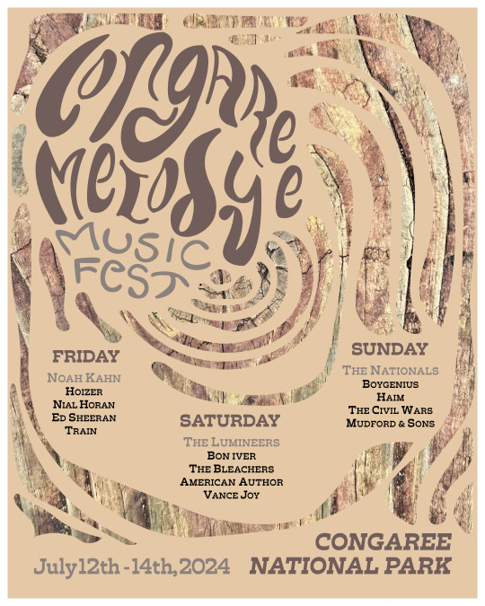
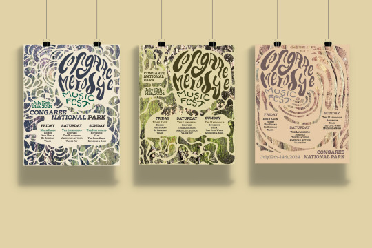
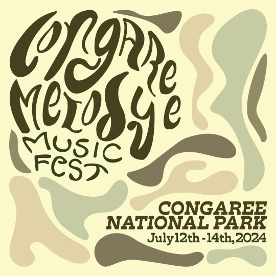
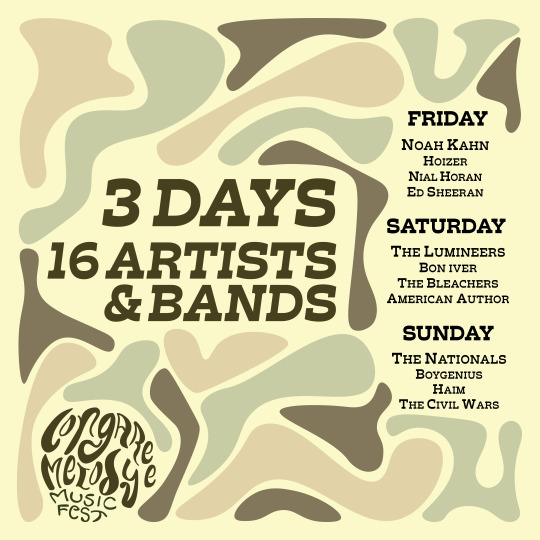

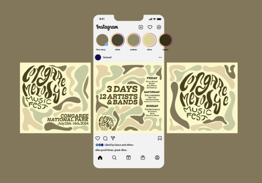
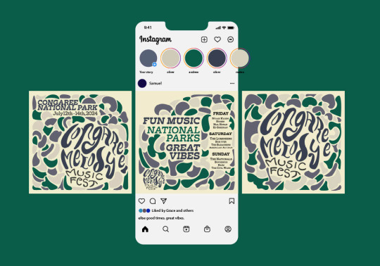
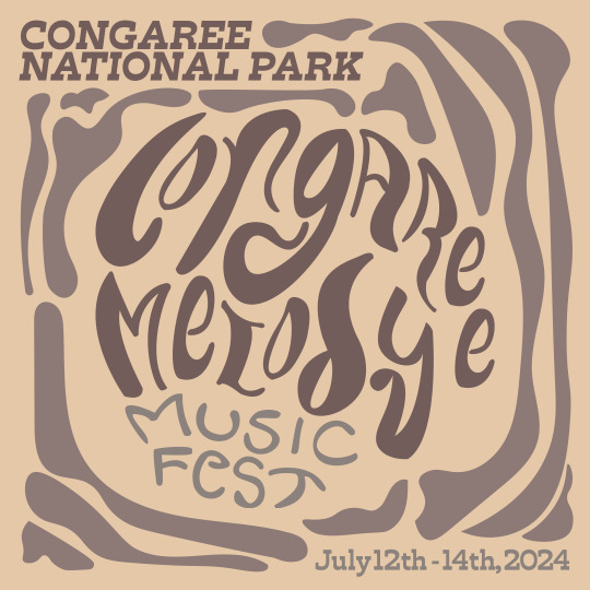
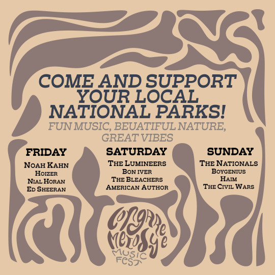

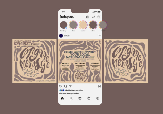
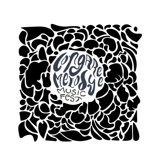

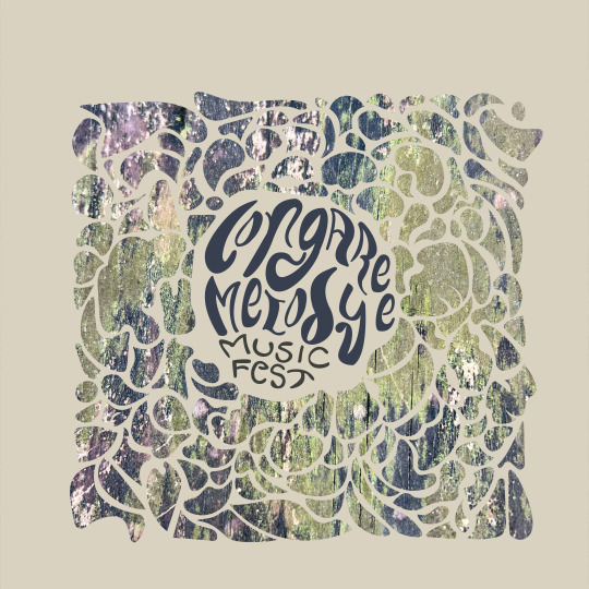
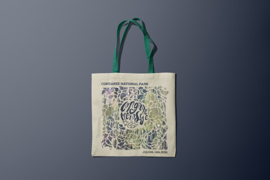
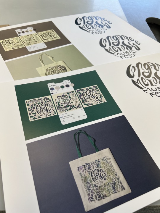


This week and the previous week were spent finalizing all the design components of Project #1. To review the assignment brief, this project's main goal is to create a music festival design system. This design system would consist of a hand-lettered logotype, poster designs that would highlight three main visual elements (the logo as the primary element, the date and location as the secondary element, and the headliners and four additional bands as the third element), a typeface to compliment the logotype, merchandise (such as a tote bag) that continues the theming of the poster, and a social media post in the square and 1080 pixels format (such as an Instagram post/carousel) to advertise the event.
The design of the logotype is inspired by my exploration of creating logos using found objects or imagery. Please refer to my third blog post for additional information on the process of creating my logo. My main objective for the logo was to create a design that embodied the look and feel of Congaree National Park while incorporating organic, handwritten type that gave the impression of a swamp, being fluid and loose. But I also aimed to create a fun logo that embodied the vibes of folk and indie music. After undergoing multiple revisions, edits, and experimentation, I feel like I have successfully achieved my goal.
The process of creating the poster design was enjoyable and allowed for constructive feedback from my peers. In referring to my previous two blog posts (specifically posts 4 and 5), the original design of my poster has come a long way, but the core idea has managed to stay consistent through the entirety of the design process. For example, in my original moodboard, I incorporated photographs of Congaree National Park, as well as fun, fluid, and organic typographic art and a jewel-tone color palette. I included all these elements in my final posters along with some abstract photos taken at Congaree National Park. Originally, I thought my photographs would be boring and dull, as I had visited the park during the middle of winter in January, in which the majority of the trees were bare, and the lush greenery was nowhere to be seen. Boy, was I wrong! I spent approximately three hours walking along the Boardwalk Trial, during which I became hyperfocused on my surroundings, specifically the texture of the trees and the boardwalk itself. I learned a valuable lesson about observing the world around me from an artist/graphic designer's perspective. During my observation, I took pictures of the wooden panels of the boardwalk, which were in different stages of weathering/decay. These photographs became the basis for the three design variations I created. For the poster component of the project, I was able to pull three different themes that all tied together to represent the natural beauty of Congaree National Park. These themes included the mossy green swampy wetlands, the hidden bioluminescent fungi and mushrooms, and the warm-toned hardwood forest that makes up the entirety of the park.
This component was also when I began to create my three variations of this project. In referring to a previous graphic design course, creating three variations of a design is always recommended. This creates a sense of diversity in my personal portfolio and is also great practice in creating multiple design options for a client while disciplining myself not to become too attached to a single design idea. Although this factor resulted in an additional workload for me each week, I aspire to include this project in my design portfolio. By doing so, I can showcase my diverse approaches to this project and demonstrate how I successfully created three distinct design systems that could function cohesively due to the unified inspiration drawn from organic and natural parks. I understand that some variations may be stronger than others, but this was a great way for me to improve my ability to execute multiple variations of a project and my time management skills.
I mostly used the "Trilby" font family in my advertising and merch designs. This font family worked well with my hand-lettered logo and its various weights and styles allowed me to create diverse designs that helped differentiate information and establish visual hierarchy. For example, I could feature the date and location in a black, italic font while using a bold, eye-catching style for headliners and band names. Using versatile typefaces is essential for creating a consistent look and feel across all design components.
The merch component proved to be the most challenging and difficult out of the required design components for this project, simply because I had no idea how to design merch! I have no prior experience in merch design, and I definitely encountered a learning curve in my search for realistic mockups. I spent more than four hours searching for free mockups that matched the look and feel I wanted to achieve for my music festival's advertising. However, this turned out to be quite difficult as most of the well-designed mockups required payment to create an account and access their content. I eventually stumbled upon multiple mockups that fit my advertising goals and downloaded the tote bag mockup from Creatsy. I chose to go with the tote bag as my main merch item, as the ideal audience for this music festival is individuals interested in indie and folk music and enjoying nature and national parks. I have conducted some research and, based on my understanding of this particular group of people (which I happen to belong to), I have found that tote bags are the most frequently purchased and commonly used item at any festival setting, be it music, craft, or local festival. Additionally, this group is generally regarded as artistic and creative, and individuals like myself who fall under this category tend to use tote bags as a fashion statement. Therefore, I believe that tote bags would be the most practical and popular merchandise item for this festival's primary audience and demographic. The designs themselves are also inspired by the original poster designs, incorporating similar imagery, illustrative elements, and the music festival's date, location, and logo. This was mainly chosen to help establish a sense of consistency within the elements of the design system.
In referring to the social media component of the project, I had such a fun time diving into the world of social media advertising! Prior to starting this component, I had no experience creating advertising for social media, but I have always wanted to! I found inspiration for my advertising from Instagram's music festival ads and searched for similar content. I drew direct inspiration from my three posters to create the three distinct variations. However, instead of incorporating the photographic element, I chose to include a more illustrative element by just incorporating my blobs meant to represent the swampy water of Congaree, as well as the mushrooms and the veins of the wood. I also chose to incorporate the three varying color palettes to connect them back to their original poster designs. Please refer to blog post 5 for additional info.
In reviewing the feedback I received from the critique, I would say most of the comments were positive. My first original design was inspired by the green moss and swamp wetlands, and out of all my poster variations, most people favored this one. Most of my peers favored my hand-lettered logotype and the illustrative blobs that complement the abstract photograph's texture. However, during critique, it was pointed out to me that I didn't follow the requirements for headliners and follow-up bands, as I had only listed one headliner and three additional bands/artists (12 artists/bands in total) when the assignment brief required one headliner and four additional artists/bands (16 artists/bands in total.) I am thankful a classmate brought this to my attention, as I was able to fix this mistake fairly quickly. I also made sure to refer back to the assignment brief before submitting my final project files. You can never look at an assignment brief too many times! There was also concern in regards to my logotype and location/date competing with each other. However, this design choice was intentional, as the goal is for the audience's eyes to be automatically drawn to the logotype, which then leads your eyes to the location and date next to it on the left-hand side of the poster, then the individual days, headliners, and bands/artists. The social media and merch also received positive feedback and followed the guidelines in the assignment brief.
To conclude, this project taught me a lot about myself as a designer and an artist. Prior to beginning this project, I had an entirely different vision for how I wanted each component to be completed. Originally, I had planned to have an illustrative, country-bears feel. For the branding design, I had planned to incorporate jewel-toned, rough illustrations into the poster, merch, and social media components, as when I automatically think of national parks and folk/indie music, those ideas automatically come to mind. This is also evident on the original mood board that I had started during the first week of class. However, despite those several ideas not being a reality, I cannot help but feel that I still followed the direction of my original mood board in various ways, such as the look and feel of my logotype, typeface, color scheme, and abstract photographs. The last lesson I learned: just start. In beginning design projects, I always tend to feel nervous and end up overthinking my design process. I find the best way to get out of your own way is just to do it! As cliche as it sounds, Nike was right, just do it! Sometimes, all you need to do is start something, even if it makes you scared or nervous. After initially beginning the process of creating each component, I found myself becoming more confident and comfortable with my designs. If I didn't know how to do something, I just googled it and watched TikTok/YouTube videos! I always tend to forget that even the most talented designers and artists in the industry watch tutorials from time to time! There is no shame in learning or relearning something, but getting over that initial overwhelming feeling is the key to creating great ideas. I'll need to remember to refer back to this blog post to remember this lesson!
While reading this week's material, I was reminded of a project I completed in my Introduction to Design Technology and Concepts course. This project required me to analyze the design components of a particular item category. I remember choosing backpacks as my focus for that assignment. I still recall the anxiety I experienced when I found out that the task that I completed in just one class period was actually supposed to be included in my portfolio for the GD+I Program. This made me very nervous as my professor hadn't emphasized the importance of spending a lot of time on it. I recall revisiting the assignment and making some revisions to it in order to improve my portfolio. Specifically, I adjusted the placement of the assignment in my portfolio and created an illustrative blueprint that highlighted what I had learned from dissecting the design of a backpack. I used a visual to communicate my understanding of the assignment. However, putting the memory aside, after reading the assigned material this week, I found the sections that discussed subtle uses of continuity in design, specifically logo design, quite interesting. On page 89, there was an example of the Olivetti logo that provided a great visual on how to keep a design consistent and clean. I sometimes struggle with this myself. However, the concept of the x-height establishing continuity within the design itself is really interesting to think about. I found that putting typographic design concepts into words helped me better understand them. Learning about the use of width, repetition, and rhythm in shaping text was particularly helpful, as I noticed that I already tend to use these techniques instinctively. Perhaps, highlighting these elements will not only help me reconsider my design intentions but also enable me to articulate my design choices more effectively instead of simply stating "because it looked good" or "because I liked it." Learning to better explain the reasoning behind my design choices will not only help me understand myself better as a designer but also help me better explain my designs and ideas to potential employers or clients in the future.
0 notes
Last Seen Blogs

lyricsloverfan
Lyrics Lover

shey-pancake
FREE PALESTINE

vanessatex
Lost Getaway

sattamatka2021
Matka 420

captain-nats-log
Captain Nat's Log