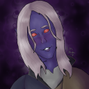
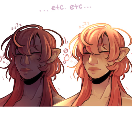
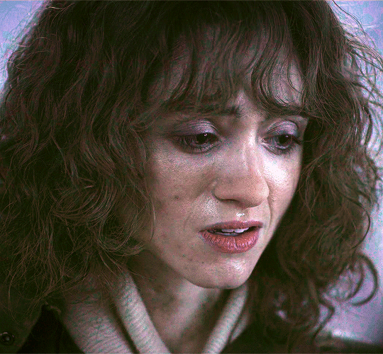
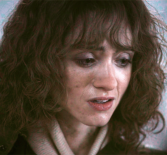
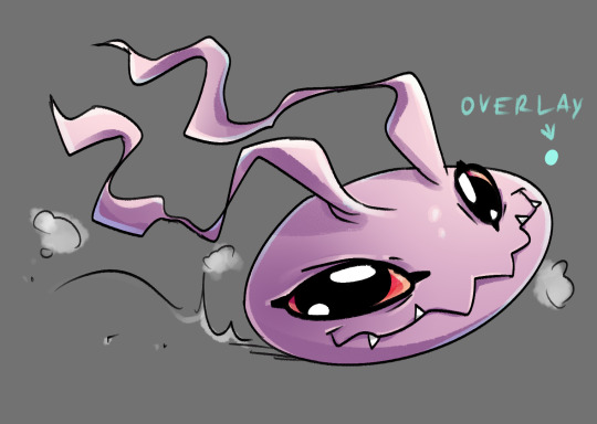
#edit: toned down the saturation a bit.
Text
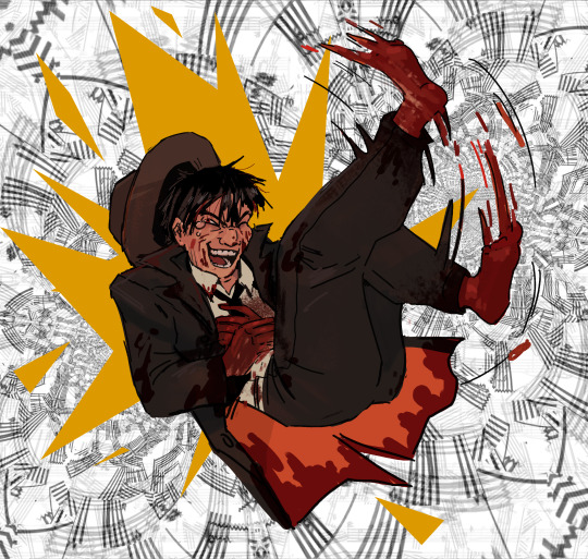
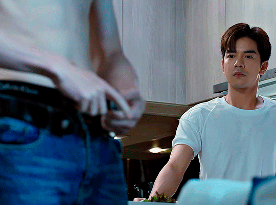
Best (?) quality: his giggles.
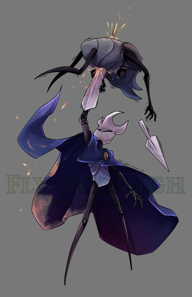
#ive caught up. i have very mixed feelings about this beautiful bastard#malevolent#kayne malevolent#artists on tumblr#digital#sfw#malevolent podcast#i refined his face a bit after the previous sketch#still based on Jim Carrey tho.#also fun fact that pattern in the background was originally sheet music of Faroe's Song!#edit: toned down the saturation a bit.#i have got a fancy monitor. Do i use it? NO i use the crappy laptop screen#that is a little liar about colors#EDIT 2 I FORGOT TO COLOR HIS TONGUE
714 notes
·
View notes
Text
My Favorite Cheap Art Trick: Gradient Maps and Blending Modes
i get questions on occasion regarding my coloring process, so i thought i would do a bit of a write up on my "secret technique." i don't think it really is that much of a secret, but i hope it can be helpful to someone. to that end:

this is one of my favorite tags ive ever gotten on my art. i think of it often. the pieces in question are all monochrome - sort of.

the left version is the final version, the right version is technically the original. in the final version, to me, the blues are pretty stark, while the greens and magentas are less so. there is some color theory thing going on here that i dont have a good cerebral understanding of and i wont pretend otherwise. i think i watched a youtube video on it once but it went in one ear and out the other. i just pick whatever colors look nicest based on whatever vibe im going for.

this one is more subtle, i think. can you tell the difference? there's nothing wrong with 100% greyscale art, but i like the depth that adding just a hint of color can bring.
i'll note that the examples i'll be using in this post all began as purely greyscale, but this is a process i use for just about every piece of art i make, including the full color ones. i'll use the recent mithrun art i made to demonstrate. additionally, i use clip studio paint, but the general concept should be transferable to other art programs.


for fun let's just start with Making The Picture. i've been thinking of making this writeup for a while and had it in mind while drawing this piece. beyond that, i didn't really have much of a plan for this outside of "mithrun looks down and hair goes woosh." i also really like all of the vertical lines in the canary uniform so i wanted to include those too but like. gone a little hog wild. that is the extent of my "concept." i do not remember why i had the thought of integrating a shattered mirror type of theme. i think i wanted to distract a bit from the awkward pose and cover it up some LOL but anyway. this lack of planning or thought will come into play later.
note 1: the textured marker brush i specifically use is the "bordered light marker" from daub. it is one of my favorite brushes in the history of forever and the daub mega brush pack is one of the best purchases ive ever made. highly recommend!!!
note 2: "what do you mean by exclusion and difference?" they are layer blending modes and not important to the overall lesson of this post but for transparency i wanted to say how i got these "effects." anyway!
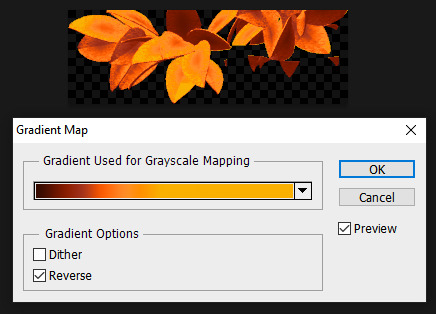
with the background figured out, this is the point at which i generally merge all of my layers, duplicate said merged layer, and Then i begin experimenting with gradient maps. what are gradient maps?
the basic gist is that gradient maps replace the colors of an image based on their value.

so, with this particular gradient map, black will be replaced with that orangey red tone, white will be replaced with the seafoamy green tone, etc. this particular gradient map i'm using as an example is very bright and saturated, but the colors can be literally anything.

these two sets are the ones i use most. they can be downloaded for free here and here if you have csp. there are many gradient map sets out there. and you can make your own!
you can apply a gradient map directly onto a specific layer in csp by going to edit>tonal correction>gradient map. to apply one indirectly, you can use a correction layer through layer>new correction layer>gradient map. honestly, correction layers are probably the better way to go, because you can adjust your gradient map whenever you want after creating the layer, whereas if you directly apply a gradient map to a layer thats like. it. it's done. if you want to make changes to the applied gradient map, you have to undo it and then reapply it. i don't use correction layers because i am old and stuck in my ways, but it's good to know what your options are.

this is what a correction layer looks like. it sits on top and applies the gradient map to the layers underneath it, so you can also change the layers beneath however and whenever you want. you can adjust the gradient map by double clicking the layer. there are also correction layers for tone curves, brightness/contrast, etc. many such useful things in this program.
let's see how mithrun looks when we apply that first gradient map we looked at.

gadzooks. apologies for eyestrain. we have turned mithrun into a neon hellscape, which might work for some pieces, but not this one. we can fix that by changing the layer blending mode, aka this laundry list of words:

some of them are self explanatory, like darken and lighten, while some of them i genuinely don't understand how they are meant to work and couldn't explain them to you, even if i do use them. i'm sure someone out there has written out an explanation for each and every one of them, but i've learned primarily by clicking on them to see what they do.
for the topic of this post, the blending mode of interest is soft light. so let's take hotline miamithrun and change the layer blending mode to soft light.

here it is at 100% opacity. this is the point at which i'd like to explain why i like using textured brushes so much - it makes it very easy to get subtle color variation when i use this Secret Technique. look at the striation in the upper right background! so tasty. however, to me, these colors are still a bit "much." so let's lower the opacity.

i think thats a lot nicer to look at, personally, but i dont really like these colors together. how about we try some other ones?

i like both of these a lot more. the palettes give the piece different vibes, at which point i have to ask myself: What Are The Vibes, Actually? well, to be honest i didn't really have a great answer because again, i didn't plan this out very much at all. however. i knew in my heart that there was too much color contrast going on and it was detracting from the two other contrasts in here: the light and dark values and the sharp and soft shapes. i wanted mithrun's head to be the main focal point. for a different illustration, colors like this might work great, but this is not that hypothetical illustration, so let's bring the opacity down again.

yippee!! that's getting closer to what my heart wants. for fun, let's see what this looks like if we change the blending mode to color.

i do like how these look but in the end they do not align with my heart. oh well. fun to experiment with though! good to keep in mind for a different piece, maybe! i often change blending modes just to see what happens, and sometimes it works, sometimes it doesn't. i very much cannot stress enough that much of my artistic process is clicking buttons i only sort of understand. for fun.
i ended up choosing the gradient map on the right because i liked that it was close to the actual canary uniform colors (sorta). it's at an even lower opacity though because there was Still too much color for my dear heart.

the actual process for this looks like me setting my merged layer to soft light at around 20% opacity and then clicking every single gradient map in my collection and seeing which one Works. sometimes i will do this multiple times and have multiple soft light and/or color layers combined.
typically at this point i merge everything again and do minor contrast adjustments using tone curves, which is another tool i find very fun to play around with. then for this piece in particular i did some finishing touches and decided that the white border was distracting so i cropped it. and then it's done!!! yay!!!!!
this process is a very simple and "fast" way to add more depth and visual interest to a piece without being overbearing. well, it's fast if you aren't indecisive like me, or if you are better at planning.

let's do another comparison. personally i feel that the hint of color on the left version makes mithrun look just a bit more unwell (this is a positive thing) and it makes the contrast on his arm a lot more pleasing to look at. someone who understands color theory better than i do might have more to say on the specifics, but that's honestly all i got.

just dont look at my layers too hard. ok?
2K notes
·
View notes
Note
Yo! Do you have any notes/tips for your coloring process? I've always had trouble with that part of drawings looking good lmao and I really like yours! If not for your specific style, do you have any tips with that in general?
Iv gotten a few asks about how I color but iv always avoided answering because
A) I am absolutely awful at explaining things, and
B) I am a very Very lazy artist you should probably Not do the things that I do
BUT i feel bad gatekeeping(?) my horrible technique if it helps anybody ig ill try and explain so
✨✨✨Welcome to Reegis’ Probably Not Reputable (But Very Long Winded) Art Advice✨✨✨✨


line art of a random character for the example, just pic whatever colors you have in mind for your base colors, you can try using palette generators or basing it off of existing palettes/characters/whatever I have absolutely no idea how color theory works (& this is why you shouldnt listen to me) so im solely going off of vibes. but it is Rough so onto step 2 & 3
(edit to add i usually start off with the skin hair & clothes on separate clipping layers and merge them together towards the end.. i think i forgot to say that at all here oops)
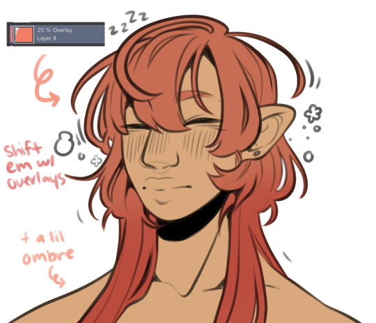

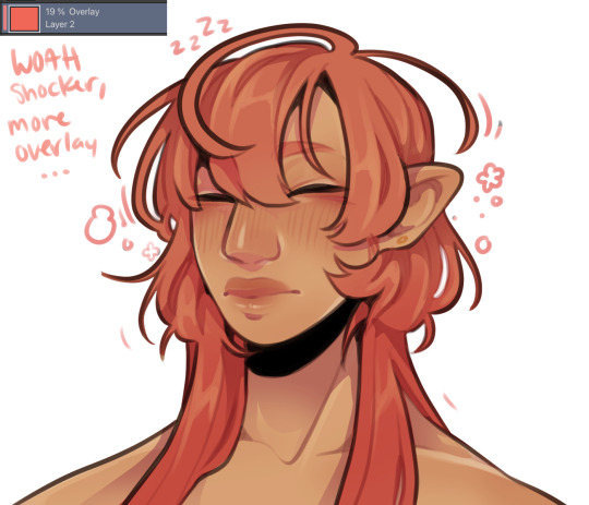
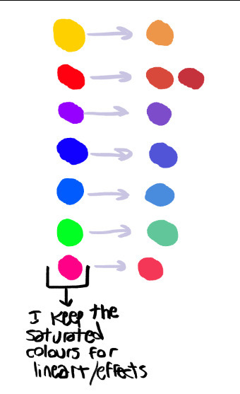
I abuse the hellll out of layer blending modes. overlay, saturation & multiply mainly, but also difference, brightness & screen. (just doodle something & try all of em out to get a feel for them honestly ik theres a Lot and they can be intimidating) for this i just wanted a more cohesive warmer tone to start with so i added a peachy overlay & a slight ombré to the hair to add a bit more interest to the character.
then just the most basic of rendering, some blush & highlights just wherever i think theyd go.


Another thing they tell you Not to do, my next step is to block out all my shading in a vaguely purpleish multiply layer!!! i cant be assed to do it any other way im sorry…. once i have the basic shading down, i lock the layer & go in with air brush eraser & also airbrush in other colors wherever I think the purple is maybe too harsh/clashing
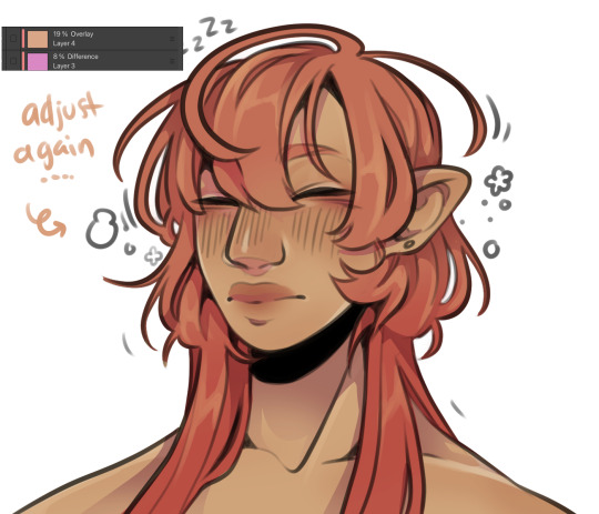
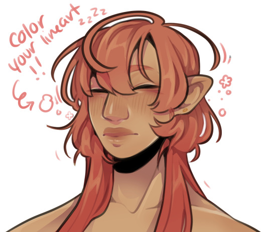
still wasnt 100% happy with the colors so messed around with some more layer filter/modes/whatever you call them then colored in my line art! i think this is honestly the saving grace for all of my art shshsdhhf color your lines people. doesnt have to be all (i dont, i like the contrast) but it usually helps to make some at least a little less harsh
then with a little more color tweaking im done! one random sleepy dude, fully colored (by my standards)
and then if a piece needs more dramatic lighting you justttt
im so serious play around with layer settings! these are just basic multiply & add(glow), there as so many others you can abuse the shit out of & nobody will know or care in your finished piece.
was this?? in any way helpful???? I hope so.
#THIS IS A BELATED ANSWER FOR ALL OF U MY B#scrolled back to find the earliest one i could bc i mean… you asked first#if this was in Any way helpful…. im glad#and also sorry. probably dont do these things#hmu if youd like me to clarify anything ill… do my best#asks#my art
99 notes
·
View notes
Text
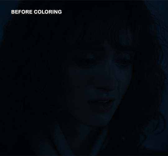
Coloring Tutorial
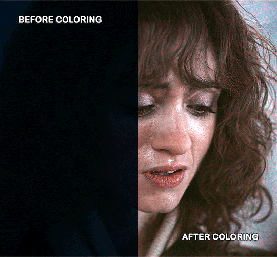
Hello, this tutorial is for the wonderful @djoharrington and those of you wondering how I colored this set. I’m going to be talking about how to color the first gif only to keep this tutorial from getting too long. The other two used the same coloring method with only minor adjustments made to keep them looking similar.
Yes, this scene really is that dark before coloring.
Quick notes on what I’m using:
mpv player for screencapping — not mentioned in tutorial
Photoshop 2021 for editing
I mention mpv player because I’m giffing 4k, and it’s one of the few players I’ve come across that take continuous caps that don’t end up looking washed out. It makes for easier coloring.
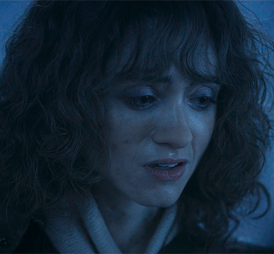
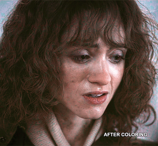
This is me coloring literally any Upside Down scene:

Step 1: brighten the hell out of this gif
You can use a throwaway layer to get you started. I used an exposure layer (which I eventually kept and adjusted during the original process of coloring this scene) with end settings of: exposure at +5.25, offset and gamma correction at default.


Now we can see all the beautiful details of Nancy’s face. Well, most of them.
Step 2: photo filter layer 1
The way I offset this horrid blue tint they use for Upside Down scenes is a photo filter layer (several for this particular scene). For now, just the one. Put this below the exposure layer!
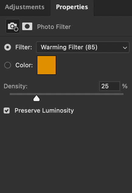
This brings a bit of color back to Nancy’s face and warms up the blue tones that are so prevalent in Upside Down scenes.
I don’t change the blending mode, opacity, or fill, just keep as is.
Step 3: curves layer 1
I clicked around a lot with this layer. Mostly in an attempt to get rid of the blue and adding more color to Nancy’s face. Didn’t get the result I was looking for with this layer until I added other layers. But I managed to brighten the gif a little more and add some contrast.

Step 4: hue/saturation layer
Put this layer below the photo filter layer! I used this layer to balance out the colors I pulled from the curves layer. Brought back some warmth/purples by adjusting cyans and blues.


Step 5: selective color layer 1
Ended up a little more purple than I wanted with the hue/sat layer, so I used a selective color layer (set between the hue/saturation layer and the photo filter layer) to get rid of the purple by, again, adjusting cyans and blues.
Make sure to have “Absolute” marked!

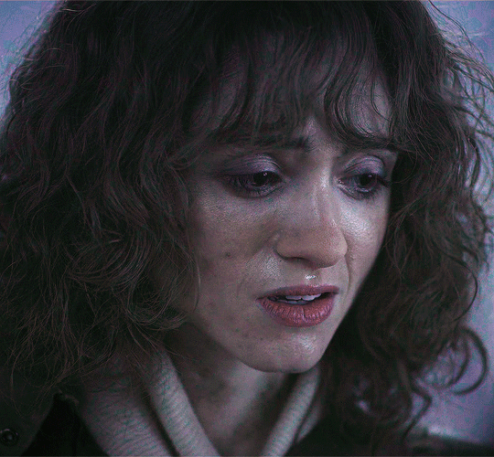
This is better! There’s a lot more color that isn’t blue in Nancy’s face now that I can work with and manipulate.
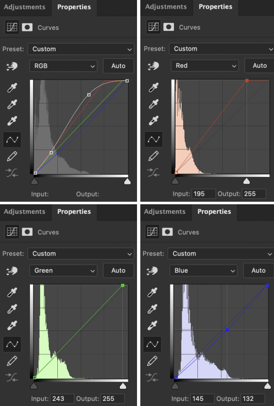
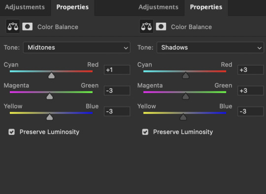
Step 6: color balance layer
This one goes on top of the curves layer (should be the topmost layer at this point). Only adjusted Midtones and Shadows, adding a little more red and yellow in her hair and face.

This looks a lot more natural. Now we just have to brighten it up again.
Step 7: exposure and curves layer 2
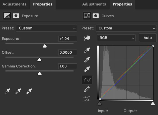
I don’t touch the RGB mode on this curves layer. I mostly adjust the Red, Green, and Blue modes by adding a little more red and green while sliding the bottom corner on Blue to add more yellow to the shadows.
Technically, I could stop here if I wanted, but the purple is still pretty prominent in the gif, especially in Nancy’s eyes, and it’s hard to adjust that without adjusting the color of the entire canvas since there’s movement in this gif. If Nancy were more of a still subject here, then layer masks are an option. Alas…

So I adjust the colors and try to get rid of the purple. The gif as a whole kind of looks washed out as well. I want more color here.
Step 8: photo filter layer 2
I set the opacity to 55%. I want warmth, but not too much.

Step 9: selective color layer 2
This is where I end up seeing the most change. Even small adjustments go a long way here.

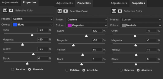
It’s mostly the cyans, blues, and magentas which makes sense given how overwhelmingly blue this scene was, then almost overwhelmingly purple as I started making adjustments. Red and yellows are important for anything to do with the face and hair. This is where I add a more “natural” shade to Nancy. Literally anything that isn’t fucking blue is an improvement to me at this point, given how it started out.
Blue is back in the background where it belongs and not in Nancy’s face.
I think this is where I originally stopped. Like this looks pretty good to me, but I also wanted to make sure the other two gifs could be colored similarly, and they were for the most part. But there was only so much adjusting I could do to Nancy’s face in the third gif without adjusting the entirety of the scene (and set), so I had to go back and adjust her here to get a similar coloring.
(A lot of this set was back and forth, adjusting the colorings until they matched. It took so long. Especially with the stupid Upside Down visual effects in the background. I’m a bit of a perfectionist, so there were a lot of minor adjustments and a lot of nitpicking until I ended up with a result I liked.)
So last and final step.
Step 10: selective color layer 3
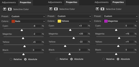
I ended up adding more red to the face, hair, and shadows to keep the first and third gif similar in coloring. And this is where we get our final product.
And the side-by-side comparison again.
Anyway, here you have it. This is the end of the tutorial. I can in no way guarantee that this method will work on other Upside Down scenes (trust me, I’ve tried), but hopefully you’ve learned something!
And hopefully I’ve explained myself well enough that you can apply this :)
#text#photoshop#tutorials#coloring tutorial#gif tutorial#photoshop tutorial#*tutorials#Stranger Things#djoharrington#requested
864 notes
·
View notes
Note
hello! I've played the fallout ttrpg (the one they had to pull the rights from when it was pretty much done so they called it Exodus instead), I wish it didn't suck so bad! Is there any system I could borrow that would fit with Fallout's setting? I love the world in itself, but Exodus was rushed and published half-baked
THEME: Fallout
Hello friend, I have quite a few games for you to check out today! Some of them are direct homages, while others simply just have elements that might remind you of the video game.
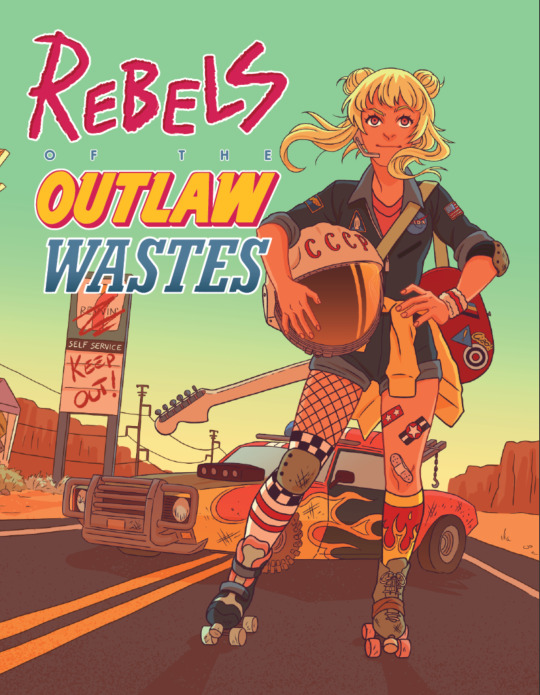

Rebels of the Outlaw Wastes, by Nerdy Pup Games.
Play misfit outlaws fighting against the authoritarian Powers That Be in a hyper-saturated, film-grained, retro dystopia. Save the future with the power of friendship, whoopass, and explosions! Features sticker-based character advancement, effortless cinematic vehicle action, and player-driven Ride-or-Die system usings d4s, d6s, d8s, d10s, and d12s.
This game is a bit more colourful and punk-rock, and a little less morally grey than some of the more popular Fallout games. The designer cites some pretty colourful inspirations, such as FLCL and Six-String Samurai, but also concedes that you can make the tone fit that of Borderlands, Fallout, and Mad Max. It depends on how you build your world - what tech was there before? What kinds of weirdness persists? What beliefs have survived?
You’ll make skill rolls that can be boosted by gear or your personal style, with anything above a 4 granting you a success, with bonuses for rolling even higher at an 8 or a 12. Badges are the representations of character growth, tied to the skills that you choose to improve, somewhat like how concentrating on certain skills in Fallout gives you access to perks. If you want a stripped-down basic idea of the rules for this game, the designer has a Pay-what-you-want playtest that you can download for free, just to dip your toes in the water.
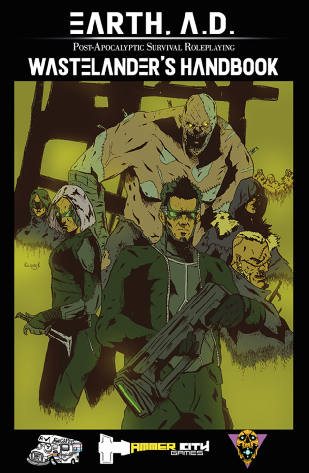
Earth: After Death, by Hammer City Games.
Boasting deep and crunchy mechanics reminiscent of the golden age of 90s TTRPGs, Earth, After Death focuses on OSR-style gaming, dungeon and hex crawling, fast-paced combat, high lethality, and a unique and fascinating setting to explore.
There’s plenty to do: kill mutants, explore ancient ruins, get lethal radiation poisoning, find a gun that has infinite ammunition, use psionic powers to blow up peoples heads, replace your legs with tank treads, and more!
This is a chunky, old-school style game that takes care to mention that your level-up system is just like the advancement system in Fallout games. You’ll be dealing with mutations, ghost machines, bartering for gear, and hex-crawling through dangerous wastelands. The character sheets point to a lot of moving pieces, so if you like wrangling together a character that does exactly what you want them to do, you’re going to have a lot to play with here. It looks like mutation is also a pretty big deal in this game, with over 100 different kinds advertised on the game’s store page.
Right now just the Wasteland’s Handbook is available to purchase, but the kickstarter for this game will be taking off later this year. If this sounds like your kind of game, then maybe hop over to the website to get in on the first full edition as it releases!
Fallout: The Roleplaying Game, by Modiphius.
In 2077, the storm of nuclear war reduced most of the planet to cinders. From the ashes of nuclear devastation, a new civilization will struggle to arise. A civilization you will shape.
How will you re-shape the world? Will you join with a plucky band of survivors to fight off all-comers and carve out your own settlement? Will you team up with pre-existing factions like the Brotherhood of Steel or Super Mutants to enforce your own ideals on the Wasteland? Ghoul or robot, paladin or raider, it’s your choice - and the consequences are yours. Welcome to the Wasteland. Welcome to the world of Fallout.
Utilizing Modiphius’ celebrated 2d20 cinematic role-playing system, the Fallout RPG will take players on an exciting journey into the post-apocalypse! Create your own survivors, super mutants, ghouls, and even Mister Handy robots. Immerse yourselves in the iconic post-nuclear apocalyptic world of Fallout, while gamemasters guide their group through unique stories and encounters. The 2d20 edition of Fallout is as close to the bottlecap bartering, wasteland wandering, Brotherhood battling excitement as you can get.
Modiphius gets the license to make a lot of games for different properties, so a Fallout game fits in alongside other big titles like Dune, John Carter of Mars, and Alien. This company uses their own 2d20 system, with a focus on inventory and Perks in an effort to make the game recognizable to any typical Fallout fan.
That being said, the game has come under fire for being poorly edited and inconsistent when it comes to finding the right rule. The company updated the game last year and released a Settler’s Guide book, so this might be something that’s a bit more read-able now. But if you want something set directly in the Fallout universe, this is your game.
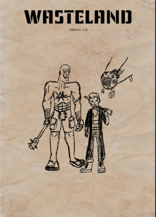
WASTELAND, by MaelikGames.
WASTELAND is a simple tabletop RPG about adventurers in the world that has only recently became hospitable after a War that might not end all wars, but almost ended the world. You and your friends decide whether this world is bleak and hopeless, like the one in Metro, or somewhat whimsical, as in Fallout.
Much of the inspiration from Fallout appears in the character options of this game. Arkanites are homages to Vault-Dwellers, Radkin are inspired by Ghouls, and robots are, well, robots. The talents also look like they are directly inspired by Fallout perks, such as Animal Friend, which allows you to turn hostile animals into allies. Gear and inventory are both very important in this game, which is something that I never find surprising in post-apocalyptic games, since having to track inventory feels like a pretty important thing in a game about scarcity. Your skills are also based on a percentage of success, because you’re rolling a d100, with the goal of rolling under your target number. If you’re looking for a game that can mechanically reflect much of what’s available in the Fallout video games, this might be for you!
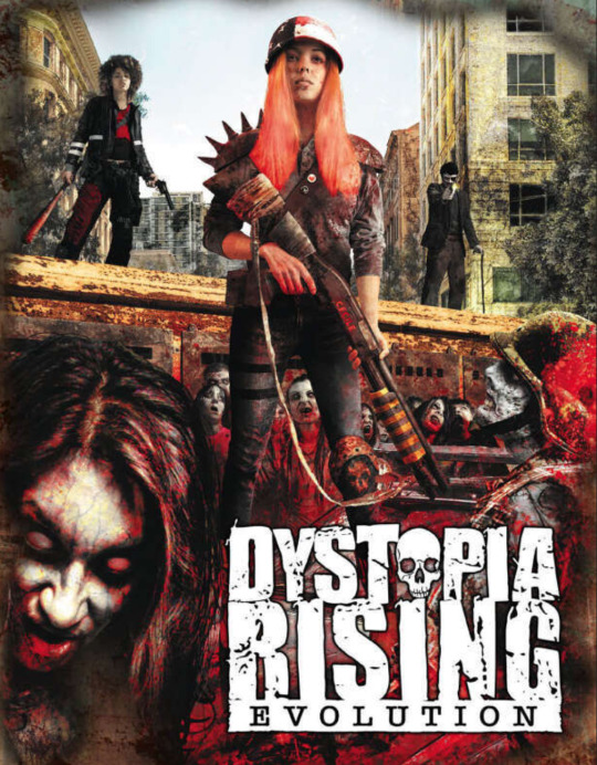
Dystopia Rising: Evolution, by Onyx Path.
No one knows how long it’s been since the world was blasted with nuclear radiation and became infested with the undead. The survivors of the Fall were the first strain of deviation of the human condition and were able to make it through the rapidly spreading epidemic. Finding a community of decent size in this world is rare; finding one that has any concept of equality or morality is rarer still.
Oh, and people have the unnerving ability to come back from the dead, regrown from the very virus that destroyed the world.
This is a completely different world from Fallout and yet I think it might still be worth talking about in this rec post. Dystopia Rising has a rich, detailed world, with various factions and faiths, and your characters are differentiated by the Strains that have helped them survive. There are plenty of conflicting beliefs that can be the seeds for unlimited conflict, including various faiths in things like evolution or the preservation of humanity, strains that give you psychic powers, and a universal ability to come back to the dead so many times before you’re turned into a mindless zombie.
There’s plenty of opportunity to fight things hand-to-hand, but there’s just as many possibilities to politic your way out of tough scenarios, which is a hallmark of Fallout New Vegas. Not only that, there's no clear "good guys": this is a complicated world with complicated people. If you want a game that carries a lot of similar themes of Fallout but puts you in a new setting, maybe check out this game.
Games I’ve Recommended in the Past
Extinction Punk, by Extinction Punk.
Wastoid, by Jason Tocci.
#tabletop games#indie ttrpgs#game recommendations#dnd#asks#fallout#post-apocalyptic#bittersweet futures
56 notes
·
View notes
Note
This is a very cool video, but I wanted to know if this is a real color that snakes can be or if this is edited. Also, if so, why? what causes them to be that color?
https://www.instagram.com/reel/CtRu7Zmg23A/?igshid=MWQ1ZGUxMzBkMA==
Link for everyone - it's a video of a bright blue green tree python.
Green tree pythons can be blue, but this video looks to have the saturation pumped up and is taking advantage of the lighting to make this snake look very blue.
A GTP this blue is extremely rare, and in imperfect lighting you can see they still have a green tinge, especially near the head.

Most blue GTPs look closer to this.
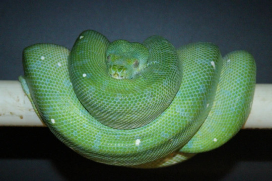
The blue is caused by structural coloration - that's when tiny structures on the snake's scales cause them to look like a certain color. Snakes don't really have a blue pigment, but most snakes who are green are actually mostly yellow pigment and blue structural coloration!
To get blue GTPs, breeders select for snakes with more of that structural coloration and tone down the yellow a bit. Because green snakes rely on blue structural coloration to look green, many green snakes will have blue color phases!
162 notes
·
View notes
Text
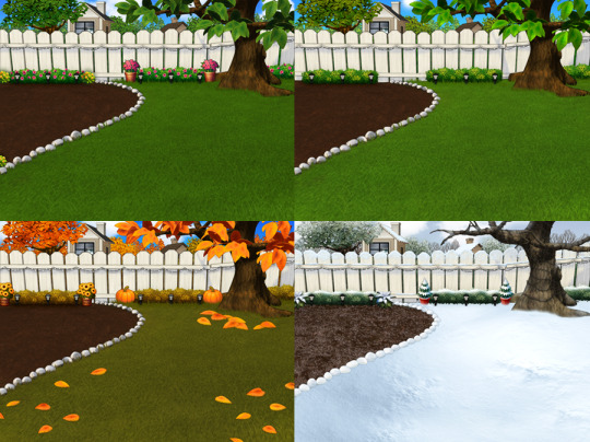
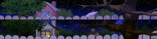
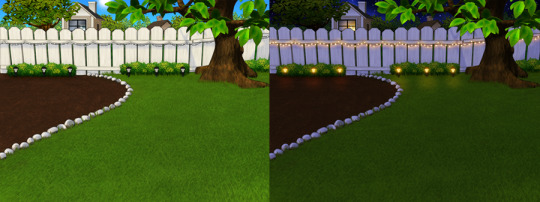
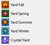
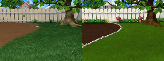
4 Seasons Back Yard Remodel + Crystal Yard
My 4 seasons remodels of the Petz 5 Back Yard are now available for download! And because I went on a bit of a side-quest, I’ve also made a bonus version, a fantasy, crystal back yard!
You can read my creator's notes below:
I somewhat wonder if it's fair to criticize the original Petz 5 playscenes too harshly. It's possible that the development team faced tight deadlines or budget constraints, factors that may not have been entirely within their control. However, regardless of the circumstances, the end result was a disappointingly sloppy product, and it's difficult to ignore some of the glaring flaws. While I can understand that the developers were working with dated software, there are certain flaws that can't be attributed to software limitations. Rather, they seem to reflect a clear lack of attention to detail. Here's what I mean.
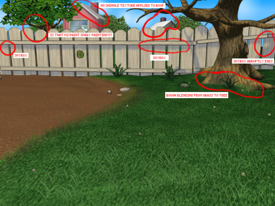
The more you look at it, the harder it is to decide which flaw is the worst. The blatant MS paint spray paint "touch-up" in the upper left, that there was no effort put into blending in the skybox, or that they neglected to add textures to the roof.
Alright, enough ranting there. None of this is to say my playscenes are perfect either, but they were a labor of love and I hope that this is evident in the final results.
SPRING
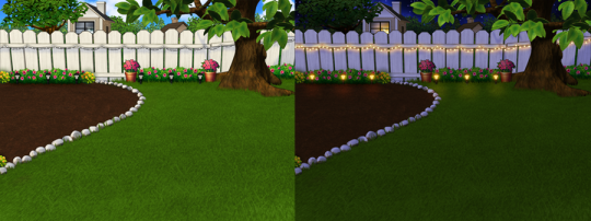
I smoothed out the grass texture to give it a more velvety, manicured lawn appearance. I brightened up the dingy looking fence to a more brighter white. The original playscene had a hole in the fence, and while it might add "character", I opted to cover over it for a more polished look. I added bushes behind the fence to cover up the skybox and to conceal the bottom of the houses.
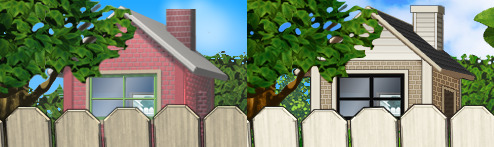
Speaking of houses. Wow these needed a big work-up. The texture work (or lack of) on these is just bad. I'm no expert in house construction, but even mostly-brick houses will have some accents like trims to break up the monotony of a fully-brick façade.
Because of how fuzzy the brick texture is in the original, I drew in the mortar lines of the bricks to enhance the texture. I added roof shingles, siding, and trim boards to the house to make it look more like a typical suburban house. Despite these edits, it's still not a "great" house - the way it looks through the windows, it looks like the house is one room lol. I wish I could put better houses in the backdrop but because Tinker doesn't allow me to edit the animated blinds, I'm constrained to keeping them the shape that they are. Oh well. We can use our imagination.
I added landscaping rocks to make the flower bed look nicer. I also added some landscaping details like bushes, garden lights, and string lights for ambiance.
[ Enlarged picture of the garden light I made ]
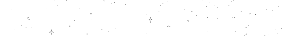
I also worked to improve the skyboxes in all 4 seasons of the of the Back Yard playscenes. It would be lengthy to get into the details of all that but here's a before and after of the night skybox. You got to love them high-quality MS paint stars in the original.
SUMMER
I had a hard time with the summer one because it was hard to come up with ways to make it look different from the spring version. I did make the grass, bushes, and tree leaves slightly more vibrant. Originally I had some flowers by the bushes but I just wasn't really happy with them. At the last minute, I made the decision to remove them entirely. This makes the playscene a little more "plain" but I think some people may want a more "plain", undecorated version so that they can dress it up how they want with toyz.
FALL
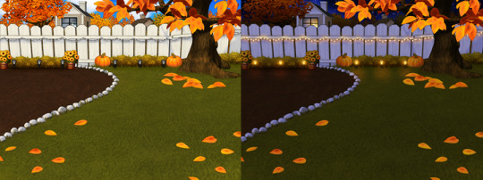
Fall is my favorite season, so this was a joy to make. I toned down the color of the grass and added fall landscaping motifs. Recoloring the tree's leaves was done by using Photoshop's gradient map feature. If time permits, I may do a tutorial on this in the future.
Gradient mapping is a powerful tool for recoloring almost anything. It can give way better results than methods such as hue/saturation, replace color, etc. And thanks to photoshop actions, applying this recolor to all the animation frames took just a couple of minutes.
Unfortunately, the fall leaves look "bright" in the nighttime version of the playscene. There does not seem to be a way to implement a darker version of these leaves for the nighttime playscene. If you look at the sprites in Tinker, you'll see that there are two sets of animations for Leaves A, B, and C and they're labeled "PropsAd" and "PropsAn", which would lead you to think that the developers originally intended for there to be a set of leaves for the day time, and a darker set for the night time. I guess the developers scrapped this idea because this does not work in the actual gameplay. When I experimented with this, the game appears to randomly display the nighttime sprite even during the day time, effectively ruining the intended affect. I'm not sure why the developers scrapped this. Either they had issues coding this properly or were just didn't want to put in the effort to make two sets of leaves.
WINTER
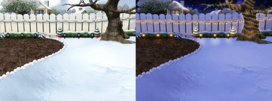
Instead of doing recolored leaves for this scene, I made all the leaves transparent and added holiday lighting to the tree. I know the lights aren't perfect - it was kind of hard to make out which direction a branch was going, so it has hard to maintain 'perfect' perspective.
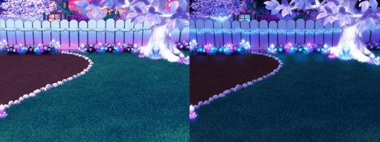
CRYSTAL YARD
This is a bonus playscene that I made because I got a little side-tracked as I was working on the 4 seasons back yards. This is inspired by the Suramar zone from World of Warcraft, so it has a bit of that fantasy, night-elf feel and color scheme. It's been years since I've played WoW but I still appreciate the enchanting aesthetic of the elven zones.
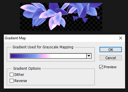
I used gradient mapping again to recolor the leaves to give it this lavender, shimmery, iridescent look. I did a little bit of gaussian blurring and layer effects to make them look a little more "glowy" than the originals.
As before, Tinker won't let me edit the blinds, so it limited what edits I could do to the houses. I would love it if I could have done curtains instead or something. I did my best to make these houses look a little less suburban and more elven. It's not perfect but it was rough working with what I had.
KNOWN ISSUES / THINGS I COULDN'T EDIT
As far as I'm aware, there is no way to turn off the snow effect for seasons like summer where it wouldn't make sense. This probably involves some code-editing that is beyond my technical skillset.
The winter playscene still has the green grass footprint when your petz walk. The sprites for these are not housed within the .env itself but in the Petz 5 Rez.dll file. It would probably involve a bit of tweaking in the code to switch the sprites to something else.
The fall leaves are "bright" in the night time version because there is no way to implement a second, darker set of leaves.
I cannot edit the blinds animation. Tinker gives you an error when you try to edit this sprite. This unfortunately limits what edits I can make to the house and the fence because of where the sprite is positioned.
If anyone does know of solutions to these, do let me know as I'd love to enhance these scenes further!
ICONS
Making the icons for these was also a fun little project. For some odd reason though, the game puts a stray pixel over them when I import them through LnzPro. I did my best to disguise them but there does not seem to be a way to fix that.
BEFORE / AFTER
With all that rambling out of the way, visit my main page over at Magnolia Road > Resources > Playscenes to download the goodies!
23 notes
·
View notes
Text
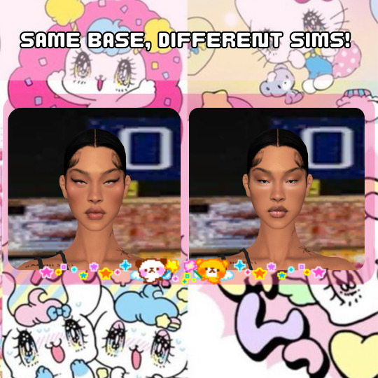
BUGGIN-0UT CAS CRASH COURSE!
I have zero video editing/ recording knowledge so i had to settle for this, hopefully its still helpful.
REFERENCES
@ iamkimey, blkkstar, dravenonline
When I use references, I rarely aim to make the Sim look exactly like the actual person. Instead I tend to select my favorite parts or features from each picture. Sometimes I don't use references at all, and people's features just pop into my head. Either way, my Sims are inspired by real people 95% of the time.

------------------------------------------------------------------------------
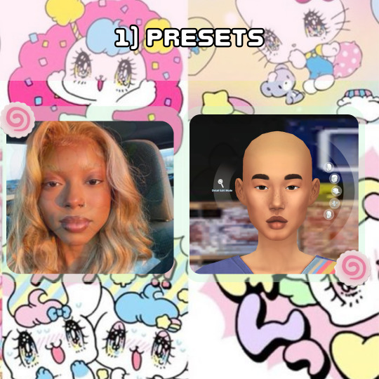
PRESETS
I loosely picked presets that were Similar to the reference I was using. I specifically liked the shape of her features and the fullness of her face, so that's what I focused on. Btw, I never aim to make it look exactly like the reference. I learned years ago that trying to make a perfect match is impossible unless you're using a face mask and As a perfectionist, it only sets you up for disappointment.
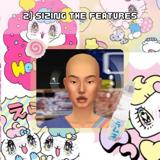
SIZING THE FEATURES
I think we all notice how cartoonish vanilla sims are so to make my sims look more "realistic" I do not make the features any bigger than the default size and I usually size the eyes down 1-3 bits, average being around 2. For the rest of the features I try to balance it out so that they're all cohesive.
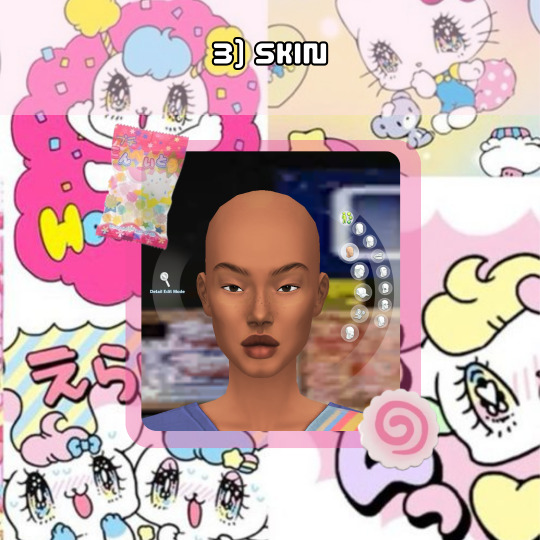
SKIN
When selecting a skin tone, I usually click around randomly or aim for something similar to the reference. In this case, I chose a tone randomly and adjusted it using the color slider.
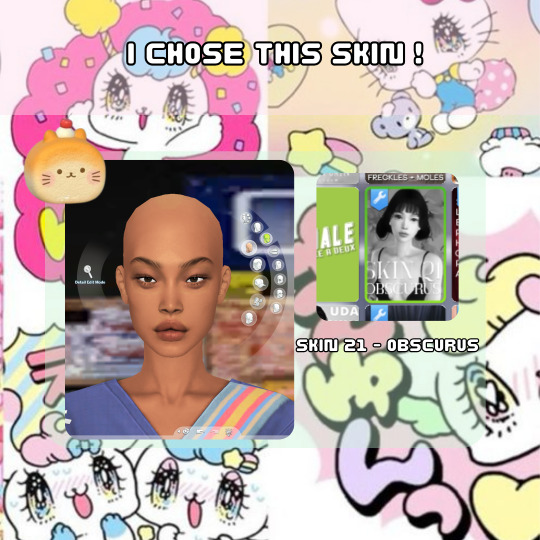
For this Sim, I desired a fuller, more plump face, so I searched for a skin that went with that look. Now, here are my most important tips! As you can see, this skin is an "Asian skin” but I'm not aiming to make this Sim Asian, I just chose it because it lacks cheek shadows. Skin details are important to my Sim making process and I cannot stress this enough! I plan to show the difference it makes by creating two different Sims using the same base at the end.
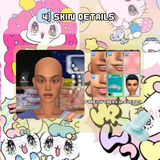
SKIN DETAILS
When it comes to skin details, I always use the Faaeish cheek and eye details. I've been using them for years and they significantly enhance my Sim creations. I use a variety of skin detail overlays, especially those that include skintones, because they offer more texture and definition. However, many overlays don't align well with the base game skin tones and I generally prefer non-overlay skins because overlay skins often have grey undertones for black skins. For this reason, I recommend using the color slider mod.

MINI COLOR SLIDER TUTORIAL
Here's an example of how I use color sliders to match my skin details. It helps if you're already familiar with color, hue, tone, etc., but it's not difficult if you're not. The swatch here is the closest match I could get in terms of color, so I'll use saturation, opacity, and brightness to achieve a closer match.
1) If it appears too orange, adjust the brightness and/or opacity.
2) Darkening the brightness helped, but it still looks too orange.
3 & 4) I reduced the opacity to slightly less than halfway, and it worked.
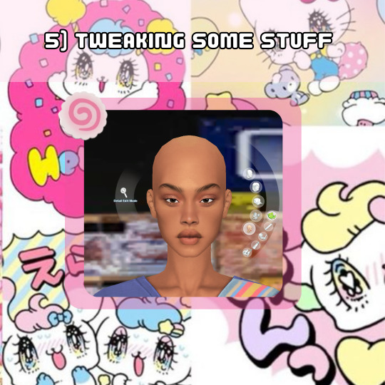
TWEAKING SOME STUFF
I adjusted the nose and lips to align with the fullness of the face. Remember when I mentioned cohesiveness earlier? Well, I'm going to dive into that a bit more right now. I chose a softer nose overlay to appear less defined and more rounded because a sharply defined nose on a full face wouldn't be as harmonious (although it can still work and look beautiful for sure). I added a lip overlay for fullness for the same reason. I then tweaked the face to ensure all features were facing neutrally (straight across, not up or down turned) to maintain consistency, because what???? cohesiveness blah blah blah!
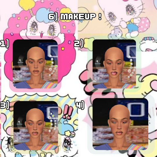
MAKEUP
Time for the fun part! I also use makeup skin details, which are superr helpful with giving my Sims distinct looks. This is how I can use the same base skin for almost all my Sims and still make them look unique. For eyeshadow, I use eyelid overlays and adjust the color using the color sliders, following the same method as before :). In the images, you can see the difference between using no makeup skin details and using them. You can also see the difference in lipstick before and after using the color slider. OH! I also included heterochromia, inspired by one of the references!

EYES
I always reduce the size of the eyes and go for ones with less shine to achieve a more "realistic" look. Since these were the only Heterochromia eyes I had, and they leaned towards the cartoonish side, I made them very small and raised them a little to appear less round and more oval-shaped. I also adjusted the brightness to darken the eyes, creating more shadow for the sclera, which I feel like enhances the realism…Then ofc I make them a lil cockeyed, cause whats a buggin-0ut sim if the eyes dont look like they tryna see each other.

SKIN BLENDING
This is a new method I've been using to add texture to my Sims. I utilize the color slider mod to blend skin overlays, non-overlays, and facemasks. For this Sim, I chose the Tems skin by ClaikSims, mainly because she fine BUT !, it was a good choice because the spacious eyelids matched up perfectly. When doing this step, I recommend not setting the opacity too low, it can make the skin see through, which makes double nipples, eyebrows, belly buttons, etc. If this does happen, I honestly just use the body and cleavage masks by Sims4Melancholic.
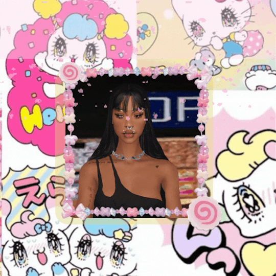
DO WHATEVER YOU WANT!
The final step! I revisit my references and see what else I can include, such as their hair, makeup style, aesthetic, and so on.
I didn't change anything except the makeup. I just wanted to show an example of how much it can change a Sim, regardless of the skin used.
….
And that's my CAS process! Nothing too crazy…i think???. I've been doing the same routine since 2018, minus the sliders ig.
If you have any more questions, feel free to ask. I dont say much, but I do not bite, またね!
#b0:tutorials#forgot to mention i also use HELLA sliders and use them at every angle#Didnt realize i did all this until i had to break it down step by step#AND DONT ASK ME FOR SHIT ELSE!#nah im jp#i am a proud gatekeeper tho so you probably wouldn’t want to frfr
21 notes
·
View notes
Note
hii sorry if you’ve already answered something like this in the past but how do you shade? ur art is always rendered so nicely and the colors are chosen so well!!
HELLOO THANK YOU! SO let’s start from the basics
when something is white or black you can change that to something else, here’s an example (for black you can just pick any colour and make it darker)

2. if you have space (in the background? idk how you call it) you can put a showy colour

3. colour picking - i tone it down / take the saturation
i dont add lighting unless there's something like glass
separation line cuz its gonna get a bit long
1.
you get your base colours ( i revived my oc for this ) (now after the basics u know where the white, black and [in this case] yellow came from)
2. i hope you know how to use layers
specific art style thing, i dont know what that is
3. if you arent the type of person to stick all the layers of your base colours then CHANGE IT!! for this tutorial
so what you are going to do is create a gray layer, all gray, fill it, the layer has to be on top of the base colour layer
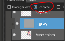
u click that button, it has to look like this
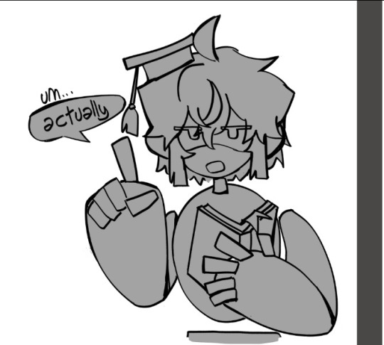
4. you create another layer (above the gray one) (it has to be on the same layer mode with the second button so what you do doesnt go out from the base colors)

then you put your shading, I use red
+ i like to remark around the lineart bc yes
5.
trust me
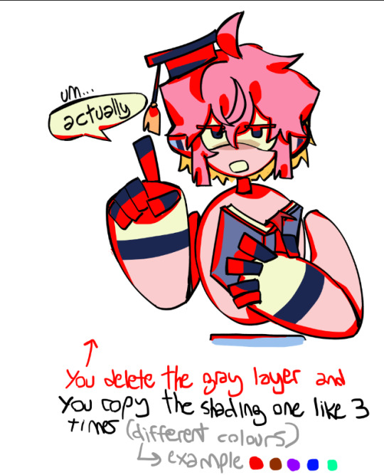
[extra unnecessary info = a good mix is red + blue, and purple or brown are good on their own (in multiply)]
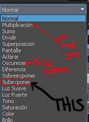
6.
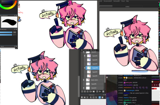
you experiment with the layers, adding or deleting until you like it (i usually dont like if the shading ends up too not-colourful or too heavy) (the modes for these layers are multiply and SUBEXPONER) (I DONT KNOW THE TRANSLATION BUT ITS THIS ONE)
7. once you get what you want you merge the shading layers one per one to the base colour layer, so its all gone, you have all in one layer

8. BORDERS
you make outlines around the shading, in a colour that is more ?saturated? / showy <- you can use these same lines you are doing to just remark what you want (like the speechbubble, bad example but u get it)
in the black color i used (here its darker blue) i didnt use a lighter saturated colour like everywhere else, i used a darker blue
9. SECOND ROUND OF BORDERS
whats the difference between these and the ones from before? in this step your starter color is the base color (in the other you picked from the shading) , you dont go too far to make it outstanding
all of this it makes it more solid
10. AND LAST you colour the lineart (in the same layer mode you used before where what u do doesnt go out of the layer)
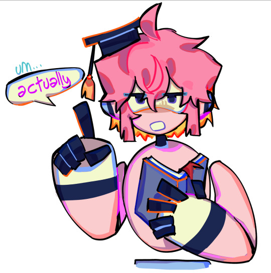
very saturated here and i randomly added orange bc reusing colors is cool (since the filling behind the hair was yellow it ended up like this)
edit: i dont like to change much from the outlines, more the inside because i like it when it looks like a sticker
thank u for reading
#art tag#adding in the tags that this is only a way of the many to colour#you can stop at any step#add more#modify anything#i guess what i keep the most is that in the shading there are outlines#also its better to have a grey-darker background colour while picking colours#bc if its white you will be like 'naah these colours are too strong' and you wont dare to try more#tutorial
76 notes
·
View notes
Text

a series of outfit concepts for Pax... I find clothing to be such an interesting part of character design and wanted to explore that more for her. especially since he's one of my more fashion-conscious characters. miscellaneous notes and extra doodles under the cut
the first four of these designs are worn in cyrodiil; the last two are from the shivering isles. I haven't done much brainstorming for cyrod fashion so that was something fun to explore - especially with the challenge of keeping to a similar-ish silhouette and with pax's tastes in mind. most inspiration was taken from byzantine fashion, with some influences from roman and celtic garb as well. there was also a fair bit of simply making shit up. (I also had quite a bit of fun fucking with the saturation and colour values a bit in editing: here's the initial image, minus the increased saturation and also with the finger tattoos on the wrong hand because I got left and right mixed up at first. oops.)
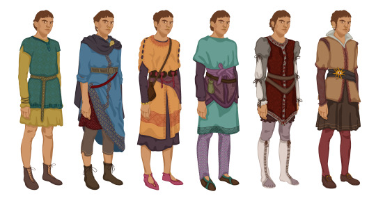
of all my characters, pax is one of the pickiest about how they dress; they don't like fashion at the expense of comfort but they don't like comfort at the expense of fashion, either. he likes bright colours and good quality fabric (ends up stealing and altering a lot of his clothes.) she tends not to wear things with very overt nibenese influences due to her own associations with that style of clothing + nibenese garb tends to have a lot of flowy extra fabric, which she doesn't like. I had a lot of fun trying to explore different ideas, colour palettes, and statement pieces while keeping to roughly similar-ish shapes; for each one I also included slightly different versions of Pax's endless repertoire of jewellery and ways to do their hair.
notes on specific designs: the third one incorporates more of how I picture nibenese fashion, the first one is a reimagining of an outfit i drew them in ages ago, and the second references a piece I wrote and haven't yet published, in which the blades get martin a lot of nice warm clothes, including a long blue tunic (seeing as cloud ruler temple is cold as shit and all he has is a ruined liturgical vestment and some cheap clothes pax stole him during their journey) and pax unceremoniously commandeers most of it. the last two outfits are mostly just self-indulgent - in the state he's in by the time they get to the shivering isles, pax isn't too fussed about appearances, but I wanted to explore what they would wear if they did give a shit. I tried to roughly keep similar elements to the rest of the outfits, with enough tweaks to make it clear that they are very much Of Another Place. I used red as a major tone and colour in both because pax fucking hates it :) (it's the colour of the deadlands, and the mythic dawn robes, and the amulet of kings.)
there were a few more specific things I would have liked to design - in particular a travelling outfit and some concepts for the really fancy garb they take on once they murder their way into a duchy - but those, as well as a breakdown of their armour, are things I would want to give more attention to detail to. so I will do all that separately sometime. however I did do an extra doodle, not included above, of their sleepwear; because it's extremely simple, and because I've never drawn her with her hair down and I really, really wanted to. (even if it's unrealistic; pax mostly sleeps with their hair still up in some finicky arrangement sewn tight enough in place to last for a week.)
#look at my images and rambles. boy#anyway I need to go to sleep!! big day tomorrow!! but all of this was very fun to draw and write out#my art#oc tag#pax#tesblr#the elder scrolls#tes#fay draws#oblivion#the shivering isles#shivering isles#fay talks fashion#cyrodiil
26 notes
·
View notes
Note
HII I’m not sure if this is the right blog but I’m so curious about how you color artwork, like what brushes you use, I really love your style and have thought about taking some inspiration from it
Hi! :D This is fine, I'll reblog it to my art blog so it can be easier to find, no worries.
I'm not the type that uses too many different brushes! I ended up comfortable with just a single brush for most of my work unless the style calls for something else (like soft look of Rain World, which I did a little step by step for here~)
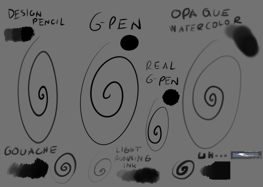
The main brush I use for just about everything is Design Brush. I use it for sketching, I use it for lineart and I use it to add shadows and highlights! I also like to mess with the backgrounds with it
I got hooked to Real G-pen recently for fun lines and texture! Opaque watercolor is what I use for soft rendering like slugcats~ Gouche is very fun to paint with also because of the texture! I haven't used in awhile tho. Light running ink is what I use for smokey effects, clouds, stuff like that! I love the brush! And uh... the last brush is called *checks the source* Nouchika Square Brush. It's free! It's square! It's new to me! very fun to use!
Details about the steps with Design pencil:
After sketching, I basically just lineart with the same brush in a different layer (or multiple of them, if needed!). Once done, I also duplicate the lineart layer to make the previous a little sharper, since depending on the pressure the brush can be faint or very strong, which will come in handy with colors later!
Single layer VS doubled:

Next, for easy color in, I select the areas outside of lineart, invert selection and even shrink it by 1 pixel. Then, I color the new layer bellow lineart flat with one base (in this case, Koromon's pinkish color)
Above it, I hand fill other colors and yes, there are probably easier ways to do that but I am way to used to the hard way XD Note that I rely on this: Hold CTRL and click on base color layer to select everything in that layer, then make a layer and color within that, so I don't cross the border/lines.

I usually lock layers for the next part but you can also just make a new layer above.
Use gradient tool (with which ever options) and select colors that are slightly shifted in hue and saturation from the base color picked one and toss in a bit of gradient shadow and highlight in each locked color!

Remember, color picker is your best friend ever to befriend in any art program! it will help you find hues in this gradient you can work with to add to the shape while doing the simple render!
Now, I use the same brush still but I change sizes depending on which area I'm going to go across. Nice part about it is the aforementioned pressure that can apply less or more color depending on how much you press down. I go with the light strokes over first and then stronger ones above! you can get softer shading this way! Same with highlight~ If something feels off somewhere, color pick the nearest hue and stroke the mistake away~ You can do the same if you want to use any present hue in another part of the figure

after that's done, I then tend to put another layer and select Overlay option on it to add at least a little bit more shadow or highlight (I chose highlight in this case). There is no background for this drawing so I figured it would be nice to add a little bit of cold colors to the warm ones Koromon is made of.
You can play with other layer options or even edit and color adjustments like tone curve, color balance and brightness/contrast, with any color layer! I do it a lot actually~
You add some extras if you want and you're done~
There is not much to it, so I use this for a simple style commission!
#ask#my art#sorry if something sounds odd it's a little later here as I toss this together dfgjgh#I dunno how good is to use the brush I use I'm just a bit too used to it with how I handle my pen pressure#I noticed it has a different(?) texture on my older tablet somehow?#might be the dps difference between tablets#but anyway#that's how I roll~
14 notes
·
View notes
Note
please could you do a tutorial on how you enhance the colouring of a gif to be really vibrant in one colour without it changing the coloring of the rest of the gif? you do it really well and it looks great!!
hii, thank you anon!! and yes, i will grab different psds i have around my laptop and explain how i achieved that coloring. very long tutorial under the cut!
it's a bit hard for me to explain how my brain works when it comes to selecting the type of coloring/scenes i want to gif so please bear with me lmao. okay so first things first, i always try to choose scenes that are in the same section of the color wheel, this makes things easier in photoshop.
i will use this gif as an example
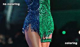
i chose this particular scene to turn it green because blues and cyans are close to the green tones in the color wheel, so that's gonna make things WAY easier in photoshop, especially if the subject is moving. another tip is to find scenes where there's a color that's really separated or isolated from the rest, that helps me so much in ps because then i can basically change its color without worrying about turning her legs the color i chose.
i don't apply all these tips at the same time because it truly depends on the case but i tried changing the color of the same gif to red with hue/saturation and it looks quite good as well since the blue is really separated from the rest:

now things get a bit more complicated, because now that taylor's bodysuit has the same tones as her skin tone editing everything gets a bit harder, bc let's say i want her legs to look a bit more purple-ish since they're a bit yellow and i want to tone that down (another tip: look at the color wheel to figure out which opposite color you need to cancel out a particular one you want to get rid of) i usually go liiiittle by little with selective color and i only work in the yellows and reds (sometimes magentas), this is trial and error, drag the tiny arrows in each color to see what looks best or what looks somewhat decent lol. this is how the finished psd would look like, i only had to tweak the yellow section in selective color, and that worked out well!

that's usually what i do 90% of the time. other times i try to edit the color just a bit, so i can further separate it more in case it still picks up similar tones that are around it.
_
other tip i have is that most of the times i choose scenes where the subject doesn't move that much, especially if i'm changing the color of something in particular.

like this lwymmd gif, it's a very radical change in color so i had to use a brush and stuff to make the red turn white, but see how there's barely any movement? that's the type of scenes you want to use when you want to change its color (especially if it's something as contrasting and different as white) this one had a combination of hue/saturation and using a brush with a green color for the most part and selective color to finish tweaking her skin tone.

for example since the red was super isolated i didn't have to tweak much, but for example when you want to include a bunch of colors you can play with the slides that are circled in teal to tell photoshop "i want you to include this specific tone in your color selection" so then you can desaturate it and increase the lightness (that's how you turn anything to white) or change it to another color, whatever you choose. that's what i did for the midnights bodysuit:

i dragged the shit out of those sliders lmfao, but it's how i got to change the color in a uniform and faster way.
-
hue/saturation is my favorite adjustment because i loooove turning things white/black bc of two reasons: makes the scene so unique, bc no one has seen the red dress from lwymmd white, so it automatically stands out AND if for example you're making an orange set and you have a random color that you don't need (like blue, or green, etc,. again, make sure they're a bit isolated at least and that they are not close in the color wheel) you can always turn them white or black to enhance even more the orange! it's what i did with this gif. my focus were pinks, yellows and oranges, so i got rid of the blues/purples/cyans by desaturating them and add lightness to them (like i did with the rep gif)

when it comes to enhancing a color that already exists in the scene i take some liberties, but it might not apply to every single scene. sometimes i do discard gifs bc it's not working how i want to. i just use selective color to adjust anything and again i go little by little.
-
another example of me changing the color and using a different technique: halsey isn't moving at all so that gives me the chance to change the background to anything i want, in this case i used hue/saturation but in a different way, i selected colorize and increased the saturation. that way you're turning your gif whatever color you choose. with a layer mask i then got rid of the parts i didn't want to be affected by this change.

-
and same with this one, got rid of the green because it's a very isolated color so that makes things easier when it comes to change its color or get rid of it. and for this set i went for an all pink color palette so see how me desaturating it and turn it into white makes the pink pop even more? it always depends on what your set is going to look like, i could've changed it to blue or purple depending on the color combo.
i think this is everything i can think of, since i color every gif from scratch one case might not apply to another one, so pls if you have any doubts about a particular gif i colored don't hesitate and ask! i'd be happy to help and explain!
16 notes
·
View notes
Text

Basic Adjustment Layers For Dummies <3
— as written by a dummy.
welcome to photopea for dummies, eos’ series on the website we all know and… “love”… photopea! if you don’t know what photopea is, it’s a free alternative to photoshop that can be used in your browser!
in any case, today we’re going to be discussing the average editor’s lifeblood: adjustment layers.
we’re not going to discuss all of the adjustment layers, as there’s about seventeen and some are much more complicated than others. for the sake of time, i’ll just be talking about some of the basic adjustment layers.
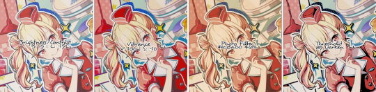
brightness/contrast
brightness/contrast is the first of the adjustment layers found in the drop-down menu (layers > new adjustment layer > brightness/contrast) and is fairly easy to use and understand.
as the name implies, brightness/contrast gives you two sliders—one that controls brightness, one for contrast. the contrast slider goes from -100 (low contrast) to 100 (high contrast.) the brightness slider goes from -150 (low brightness) to 150 (high brightness.)
this layer may seem fairly rudimentary, but makes a good foundation for all edits and can help set the tone of your entire psd.
— author’s note: if you need a quick way to make an image very bright, make a brightness/contrast layer and, without touching the sliders, set the blending mode to screen. then adjust the opacity as needed. it works well for a quick lighting fix, when you need one.
vibrance
vibrance is the fifth layer down in the drop-down menu, and marks the beginning of the category i like to call the color adjusters. i have no idea what the actual name is, so don’t ask.
similar to brightness/contrast, vibrance has two sliders: vibrance and saturation. vibrance is a lighter version of saturation—while saturation affects all the pixels of an image, vibrance tends to be much more targeted.
the vibrance and saturation sliders both range from -100 (least colorful) to 100 (most colorful.) it’s important to note that you should only knock saturation down to -100 if you want a grayscale image. i usually only push the saturation slider between the -30 to 30 range, but that’s just personal preference—mess around and see what works for you.
— author’s note: a fun trick to use is to mimic what i did in the image above: set the vibrance very high and the saturation in the negatives. it gives the image a nice pop.
photo filter
one of my personal favorites, photo filter is the eighth layer down in the drop-down menu. photo filter is a good way to collect your colors when they’ve splattered all over the place.
photo filter is a bit different than the layers we’ve looked at so far—it only has one slider, the intensity slider, which goes from 0 to 100, and has a small square above this slider. the square is where you select your color—click it and mess with the slider, or type in a memorized hex code if you’re some kind of color wizard.
most people have a general color palette in mind when making a psd, i’d like to think. photo filter helps to regulate these colors. if your psd is looking warmer than you’d like it to, a low level photo filter in #5b82a7 or #604db5 can help to cool it down. if your psd is looking too green, a low level photo filter in #af65c2 or #4a1a80 can do the trick. forgive me, but you’re going to want your color wheel for this layer. it’s easy to utilize, though!
— author’s note: a cool trick i like to use is to set photo filter’s density at 100 and get a pale grey like #eaeaea. it’s an easy way to desaturate your image without eating all of your colors. you can find this layer—or something very close to it—on virtually all of my psds.
threshold
ah, threshold. the best friend of every tumblr editor. threshold is fourteenth from the top in your drop-down menu, and is fairly simple to use. threshold has one slider, ranging from 1 to 255, and can be a little alarming if you don’t know what you’re looking at.
one of these days i’ll cover blending modes, but for now just know that when you’re trying to get a shadowy effect, it’s best to use darken, multiply, or darker color. threshold is an extreme contrast layer that breaks images into the whites and blacks. it’s commonly used to get a nice shadowy effect—you do this by setting it to multiply or darken.
the slider can be played with at your discretion; i typically have threshold as my first layer, and set it between 40-80, but it depends on the image.
— author’s note: i’ve also seen some people set threshold to soft light for real life images. i don’t typically work with these, and personally i don’t enjoy the look, but remember that nothing is set in stone—feel free to play with blending modes as much as you want!
and there you have it! some of the basic adjustment layers. i hope you have a greater understanding of photopea now, or at the very least a greater understand of my lack of ability to explain things. see you next time!
sincerely, eos
40 notes
·
View notes
Text

gifs from e6 set!! useless rambling + one (technically 2) more under here
that last gif -- yeowoon sleeping in the hospital -- total and complete pain OTL. the original is so dull & yellow that even after prodigious application of curves & channel mixer i couldn't get his shirt to be blue enough to edit it with selective color.
so i had to use a gradient layer, which was good except that it went over the red alert box. bc of the way my coloring action works you can't quite see it up there, but i actually did another very specific red gradient layer to recolor the alert box on the right side and then used keyframes to vanish it away, so it looks a Little Tiny Bit different from the rest. but i dont think its noticeable unless i point it out. see? lmao


here's a gif i worked really hard on but not enough to think it should go in the finished product, so like, imagine me shamefacedly dragging it to your dash like a cat with a not-quite-dead mouse. lmao. it wouldve worked if this color scheme was a little less... cartoonish, i guess
anyway this episode was really hard! because of the above but also mostly because i couldnt at all decide what scenes to use -- i have 21 screencap folders when i only need nine gifs OTL the red also was initially too saturated no matter what (and especially on my phone display, where magenta is really really saturated compared to my laptop) so i had to tone down the finished products to make it look more like the other ones
#ro's ps adventures#i talked a lot. forgive me#im in a fair amount of pain & this was what i occupied myself with today while i was languishing
7 notes
·
View notes
Text
continuation to this tutorial under the cut
we continue colouring. next, onto the Curves layer! just like with Levels, choose white dropper and pick a light spot. this will be mine:
again, that's far too white, i only want to brighten up the scene a bit, so i will be changing Curves layer's opacity to 15% and this is what i got:


the gif now has a bit of brightness and blueish tone from the Curves, but not too much!
use Selective Colour layer to correct any colours you would like in your gif! i usually use it to bring back the colour of the characters' skin by changing Reds: Black to a higher number. in this case i added +20. i will also move the Selective Colour layer down under the Levels layer because i'd like for it to be more intense.

next, please use the Gradient Map layer from my psd. i cannot remember where i learned it from, but i always use this one in my gifs, while only changing the opacity of it sometimes. it ranges from 20% to 60% on my edits. it adds contrast to the gif.

now, the last layer is Vibrance. as you pointed out, i really like to make gifs that are vibrant and colourful. my usual Vibrancy setting is +50 in Vibrance and +2 in Saturation, but you can play around to see what works best for you.
great, if you completed this step, you are done with colouring the way i do it! personally i will be erasing a bit of Levels layers on the left side of the gif cause the character's belly skin looks too light, but you don't need to worry about that for now.
Optional step: Captions
if you want to make a subtitle text layer, click the Type tool. then click on the picture and drag the tool on it.
type your text, choose a colour and a font. then change the font's setting to bold and italic

add a Layer Style by clicking on fx button > Stroke

enter these settings:
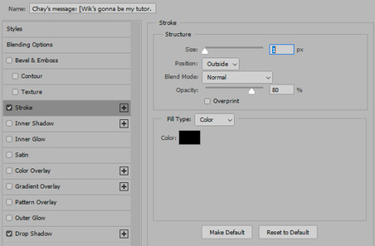
Click on Drop Shadow in this window and enter these settings > Click OK to save


here, we have a caption!
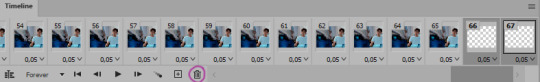
7. Saving the gif
click the Save action. check the end of the timeline to see if you have any blank layers, and delete them if you do.
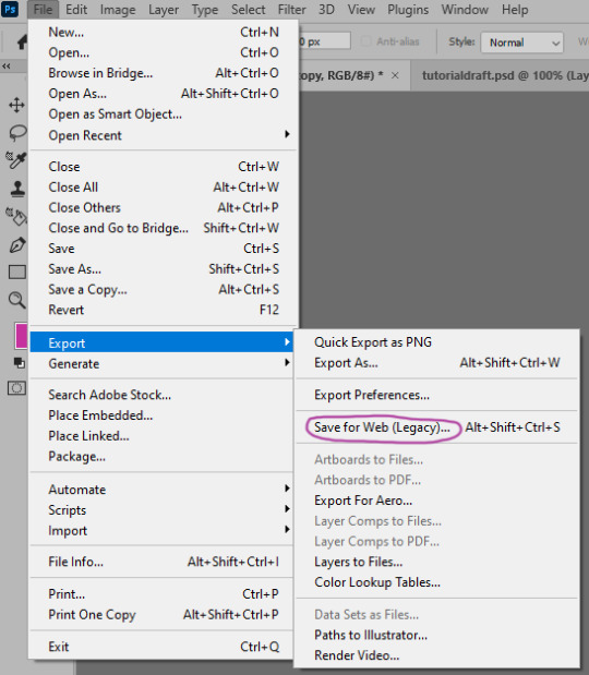
go to File > Export > Save for Web (Legacy)
these are my saving settings. most gifmakers use Diffusion, but i prefer Pattern cause i like the way it looks on the mobile better (especially in cases when my gifs are grainy).

click Save and name your gif. and you are done! hopefully i explained what you asked well, but english in not my first language and etc, i also am a whole damn idiot and not highly competent in the giffing field. sorry if anything in confusing! please send another ask or a message if you have questions darling <3 here is my result
also i collected many cool tumblr photoshop tutorials so i recommend going through my giffing tag too!
17 notes
·
View notes
Text


Ts2 classic pajamas default
I toned down the color saturation and also removed the satin shine so they look like cotton instead, the colors don't 100% match the original ones. Pretty sure these are just adult recolors, so elder and teen coming later
These kinda match uni young adult pajamas cuz they those look like cotton, unlike bg pajamas that are supposed to be satin. I also recommend installing this mesh default (I'm using it on the previews)
Download
EDIT: I changed the aqua/cyan recolor a bit so now it resembles the original color better. Please re-download!
74 notes
·
View notes
Last Seen Blogs