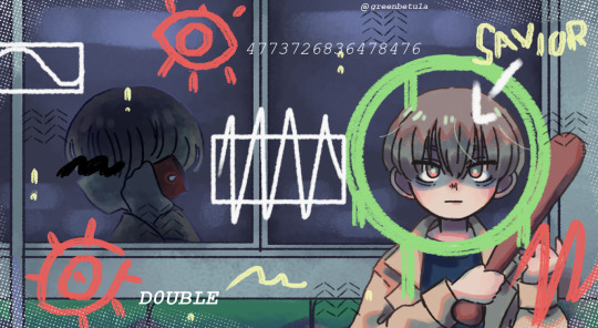
#even though the art for it is just like a more colorful saturated version of TMM I still wanna eat it
Text
Just gotta make it to one pm without listening to Inertia acoustic
I literally just woke up and my very first thought was “oh my god inertia acoustic inertia acoustic aaaughhhh I MEED to hear it right now or I’ll explode”
I’m trying so hard to not give in rn yall don’t even KNOW
I just gotta wait for my friend to get here
And then I can loose my fucking marbles over it
Bc oough I need that song like I need the bones in my body
#god gives his toughest battles to his weakest soldiers#idk how but I’ll MAKE IT#gotta survive for the pookie#even though the art for it is just like a more colorful saturated version of TMM I still wanna eat it#shit looks scrumdiddlyumptious fr#the colors look so YUMMY ok#I should probably go back to sleep to kill time#but I doubt my brain will turn off when I have the knowledge there’s an ajr song I HAVENT listened to#first time I haven’t woken up and IMMEDIATELY listened to AJR’s new single#ajr brothers#ajr
6 notes
·
View notes
Note
Sorry abt the big ask, but your colours are always really vibrant and interesting! They seem both saturated and subdued. What’s your general method for choosing them or are there any tricks/layer modes you use?
Thank you! This is gonna be a long one sorry😭
My favorite digital art trick for color is the curves tool! In procreate you press the wand tool in the top left corner (Adjustments) > Curves. I recommend just playing around with this until something you like happens.
Here’s a study I did with pretty standard colors.

Here are some versions of it after moving the curves around.

What I like about this is it’s a really quick way of changing the color scheme that’s more precise than applying a filter. It lets you see how far you can push things outside of what’s expected!
When I first started digital art I had so much trouble with color because unlike traditional, the colors have the ability to be fully opaque. With traditional if you’re doing a painting the paints/colored pencils/etc will naturally mix with one another creating a more cohesive overall image.

Here’s a drawing I did in 2020. As you can see it’s incredibly saturated. When I was picking colors I was working in the most saturated section for nearly every color.
These days even when I’m trying to make something super colorful I’ll force myself to desaturate it more than I think I need to. There are two ways to desaturate something. You can move it towards white or towards black.
Another thing I try to keep in mind is that colors look different based on what colors are around them. If you put gray next to a color it will look like that color’s complement. If you put a warm color next to a cool color they’ll amplify one another making both look more intense. In that same way if I put a super saturated color against a more neutral background the color will look even brighter.
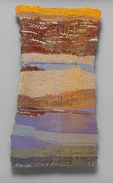
I like this tapestry by Sheila Hicks. See how the orange is glowing against the more muted purples and blues?
Another thing I try to keep in mind is value. Like color it’s influenced by its surroundings. If you place a lighter color over a dark background it will look brighter than over a light background.
So in a piece the eye will be drawn to the areas of highest contrast first. And area that’s similar in both value and hue will recede into the background.
I really am not an expert on color I have so much to learn. I recommend Marco Bucci’s videos as well as the book The Art of Color if you’d like more detailed+accurate info! Color theory is the most fascinating thing I’m obsessed with it.
You don’t really need to know theory to be good at color though! Just playing around and figuring out what you like (I LOVE PURPLE) will make you better!
The most satisfying thing is when you’re making a drawing and you decide to add a little gray or a little orange or whatever and suddenly your piece just starts to SING!!!! (That purple/blue/orange part of the Sheila Hicks tapestry is singing to me it will forever make me happy)
Anyways I hope this helps! 💜💜💜
322 notes
·
View notes
Text
i'll be disappearing for a while so have this drawing I submitted for art class back in november. we were just told to make a digital drawing so i took the chance to make more milgram fanart!
alt version under the cut (+ slight rant about our printer)
this was the first version I was supposed to submit. unfortunately we had to print it out and our printer hates me so it decided to completely go wild with the colors (even though I carefully chose the colors so that it's somewhat bearable for the printer, but sure yeah, make everything super saturated and dark since you want to suffer that much). so I had to go and adjust the colors and details, which is sad because I really like the original palette but we can't have nice things I guess.
#oh and while we were working on this our teacher didn't allow us to use any references at all#unfortunately for him I memorized the whole mv. haha checkmate sir#i've been making my school projects milgram-related in some way bc why not?#milgram#mikoto kayano#john milgram#john kayano#green's gallery#my stuff#digital art#fanart
78 notes
·
View notes
Text
Category is: The Art of GIF
Welcome to November’s Artist Picks series! This month, we’ve invited @catswilleatyou to share posts surrounding the theme, “The Art of GIF.”
Here is what they have to say about it below!
What does “The Art of GIF” mean to you?
The GIF is an art form that was born on the web. Videos existed in other places; paintings, photos existed in other places. GIFs just didn’t exist anywhere until the internet came along. Many artists were thrilled to be at the moment in art history when this medium was born. Even though the compression techniques are outdated and the functionality has been surpassed by other formats, the perfect infinite loop of the GIF has yet to be achieved by another file format. MP4s still have a hiccup when they start over. While GIFs are widely used for quick jokes and communication, many artists still believe there is more depth to this medium. I believe that as digital art continues to gain acceptance as a high art form, GIFs will eventually be realized as a cornerstone to it. To me, the art of GIF is about working within limitations and birthing something infinite.
Why did you pick these particular posts?
A few years ago I started creating GIFs that are Phenakistiscopes. I couldn’t find any resources on how to make Phenakistiscopes, but I found lots of tons of centuries old Phenakistiscopes that were making amazing GIFs. I sort of backwards engineered my own method of making them and I continue to explore this medium with GIFs. There’s a lot to be learned by limiting yourself to a small number of frames. I keep thinking I’m done making these but every time I work on one, I learn a new animation trick.
(Below are specific mentions of the artists @catswilleatyou chose posts from.)
@volvulent is a mysterious artist to me. I know nothing about their personal life. I’ve never been able to find them on other social media platforms. I feel so fortunate to have stumbled on their work many years ago. They are a complete master of organic form and hand drawn infinite loops. You can follow some of the shapes on these drawings for several seconds, and then when you go back and study the art closely, you discover that the whole looping sequence is only fraction of a second long.
@katecursed uses old and outdated technology in ways I’ll never understand. Tons of analog CRT TVs, oscilloscopes, old video games, and synths. I love it. She grew up around this stuff and is extremely knowledgeable. Her GIFs are timeless.
@alcrego is an absolute workhorse and in my opinion, a historically important GIF artist. He has an instantly recognizable voice using almost entirely black and white. I think he would even go so far as to say he only uses light. The minimalism is always deceptive—there is so much depth to his exploration of GIF as an artistic medium.
I’ve also chosen some very “classic” looking @kidmograph GIFs. I credit kidmograph with bringing the retro/video game style back into fashion about a decade ago. When he started posting this stuff, I hadn’t seen anything like it. Shortly after (and still to this day), there was a huge movement of artists that co-opted this approach. I wanted to include their work here because when you see this look, I want you to know where the echo started. I also want to say that this is just one of many tricks kidmograph has. They explore a wide range of styles and approaches, and they are continually evolving.
@mrdiv always had such a knack for color, compositing, and simplicity. When I was first learning 3D, they were a great artist for me to study because I saw how much emotion and reaction they can get with using very very little. I love the minimalism of their work.
I love how @maxcapacity incorporates vintage equipment in his process to create such wild psychedelic GIFs. They’re always pretty saturated with lovely colors. For me, there’s a heavy hitting moment with this work where I’m watching my childhood get spit back to me in perhaps a more truthful version than I even recall it. It’s hard to explain but the nostalgia lures me in, and then I’m cut with a darkness by them. There’s also some humor sprinkled in.
@zbags’s work is instantly recognizable with the way they use creepy lively eyeballs behind faces. Collin’s work is disturbing and fun. There’s always an added bonus in reading his wild descriptions and titles. When there was a file size limit to GIFs being posted on Tumblr, I was always impressed by their ability to get a very long and detailed animation into a small file. I think he’s doing lots of frame rate tricks I still don’t think I’ve ever figured it out.
Find out more about Artists Picks here!
400 notes
·
View notes
Note
How do you do your coloring? (Ex: ur clock drawing) I feel like mine ends up not blending into each other and looks off even when the colors are close. Im still kind of new to digital so i dont know the problem vs traditional. Love ur art!!
tysm!!! im not too sure how to explain it but. ok i really have no idea how to explain it. ill try.
i use a big version of the smooth watercolor tool to lay out flat colors & blend, then use the rough pencil to add that sorta chalky/unblended look i like. when using the rough pencil tool, it does NOT blend, so the colors just cover eachother which helps with adding texture instead of smoothing it all out... JUST REMEMBER NOT EVERYTHING NEEDS TO BLEND, its okay to have transition colors instead!!!!!!!!!!
i usually go for more saturation, reddish tones, and use analogous colors to shade! i rarely darken the color more than i saturate it, if that makes sense... I FOCUS ON COLOR-PICKING THE FIRST 5-7 COLORS/SHADES I CREATED, rather than creating more! occasionally i use the air brush tool to add a light blue hue into the shadow. idk why. i saw others do it and thought it looked good so i copied. occasionally, i'll do a brighter red on the outside of shadows like a transition color. . .
IM SORRY IM REALLY NOT GOOD AT EXPLAINING THIS i really recommend finding an artist you like on youtube!!! i dont think ginjaninjaowo does flatout tutorials, but I LIKE HER STUFF + she explains her process and you can watch her speedpaints to get an idea! the drawfee show also aren't tutorials but you can watch their speedpaints while they chat over art challenges, and its cool! but those are just some ppl i like. .
i really just recommend googling a youtube tutorial for coloring though!
22 notes
·
View notes
Text
Okay so I know I said I was going to draw it, but I'm in such a huge art block right now 😭. I hope this is okay in writing form and that I do Clora and your version of Sebastian Justice!
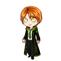
MC: Asher Bloomingdale
Year: 6th
Hair: Less saturated sky blue, side part, swooped over on the left. He's originally a brunette, but as his ancient magic developed, it changed his appearance.
Eyes: A teal-ish color as a result of his magic
House: Gryffindor
Scar: Right eye starting at his cheekbone, up his eye, and stopping right into his eyebrow.
The sound of quills scribbling and scratching against paper fileld the classroom as professor Hecat lectured the class the effects of a patronus spell on dementors. It was one of the more boring classes, but Asher found it more interesting than ever. Defense was practically his middle name, as he hated anything to do with attacking people. He didn't even like fighting ashwinders simply because they used dark spells (not to mention they were terrifying in large numbers). The boy continued to listen and write as quickly as he could, his handwriting on the parchment getting worse by the second. Of course, the bell just had to ring, loud and annoying in his ears. Asher stood up from his chair, adjusting his robes and stuffing his things back into his satchel. He was about to leave, when the glint of something in the corner of his eye caught his attention. Upon further inspection, he discovered that it was a bracelet, gold beading with little white daisies. It was quite pretty. The boy looked up, noticing a girl about his age not too far from the desk. He quickly caught up to her, though not without stumbling over his feet first.
"Ah- E-Excuse me, miss?" Asher sputtered, tapping the girl on the shoulder to get her attention. She had blonde hair swept behind her shoulders, just past her shoulder blades, blue eyes, a mole here and there, and a smile sweeter than sugar. Now, this may lead one to believe Asher had fallen in love, which he hadn't of course, Asher had no interest in girls, but this one struck him as someone who wouldn't belittle him.
"Was there something you needed?" The girl asked, tilting her head a bit in confusion. Asher then shook his head, realizing that he had been far too quiet. He held out the bracelet to her.
"S-sorry! Uhm- Did you happen to leave this at your desk? It's... awfully pretty and- it'd be a shame if you left it." Asher explained, feeling awkwardly close, but still too far away from the girl. He expected some type of strange reaction from her, but it seemed like she didn't much care about the scare thay dug through the right dlside of his face, or even the peculiar color of his hair. She just looked at him with a grateful smile.
"Oh! Thank you, I think that is mine- Oh, it must've slipped off my wrist again..." The girl took the bracelet from Asher and slipped it back onto her wrist, seeming to examine it to make sure none of the beads had fallen off. Just before Asher could respond, he heard a voice call from the doorway of the classroom. It was a voice he recognized... a voice he never thought he'd hear again.
"Clora?" Sebastian called out, looking around the classroom before spotting her with Asher. A strange look washed over his face at the sight if the two together. He stepped over quickly, his presence already imposing on the young Gryffindor. "There you are, darling, I've been waiting for you." Sebastian said, putting an emphasis on the pet name as he glanced over at Asher, who just looked bewildered.
Asher felt his heart stop as Sebastian came over, he stared in shock, standing so still one would think he was petrified. 'Why is he here?' 'How is he out?' were the only thoughts passing through Ashers mind. He could tell the girl, who he now recognized as Clora, was saying something to Sebastain, but the only thing he could focus on was Sebastian standing right there. The person who he clearly remembered turning into Azkaban.
"I'll be right out, I just need to say thank you to-" As Clora turned her head back to look at Asher, she stopped suddenly. Asher had... dissapeared? Where had he gone?
Meanwhile, Asher was running down the halls, his mind frantic. He stopped in the middle of the DADA tower, slumping against one of the staircase walls as he tried to catch his breath. He couldn't believe it. If Sebastian wasn't in prison, then how did he get out? Everything felt off from the moment Asher woke up in his dormitory that morning. The school felt different. That Sebastian wasn't his, so that meant none of the other classmates were his either. Was this some parallel universe? How did Asher get here? Was his ancient magic acting up again? Most importantly: how was he going to get home?
Clora belongs to: @choccy-milky
#harry potter#hogwarts legacy#character design#console#writing#AAAAA I LOVE YOUR STUFF#I hope this is okay 😭😭😭
6 notes
·
View notes
Text
how to scan lineart + sketches on iphone
hey you, traditional artist! you deserve to post eye-catching drawings! here are my tips for how to take + edit photos of your drawings!
note: these instructions only apply to lineart, but can be tinkered with for colored and/or shaded drawings.
step 1: photographing
- as everyone says, natural light is best, but don't fret if you don't have any!
- don't just put the paper on your lap; no matter how still you keep it's much more likely to have small blurs than if you used an unmoving surface
- if you only have one lamp and are struggling to find a place where the shadow from your phone isn't visible, try propping it up on something, as close to vertical as you can comfortably get
- if there's something on the page beneath, put a piece of scrap paper below your page, in between the two. if there's something on the other side of your paper, i recommend putting a dark surface behind the paper and shining a light directly on it
step 2: editing

here's the photo i'm going to be using as an example! as you can see, the two opposite corners are very different colors than each other due to shadows (i actually tried to take an even worse photo for this post, but the lighting was being regrettably cooperative hahahaha)
time to edit!


brilliance: this is a really easy cheat to even out the major shadows on your art; as you can see the big shadow i pointed out above is less dramatic. crank it straight to 100, and then if it looks weird, play with it until the lighting looks smooth and uniform.

contrast: time to make your lines pop!

saturation: stop being orange (or whatever color your iphone decided your totally-white canvas actually is). this will also give you a clearer view of your artwork; you'll be able to process what changes need to be made easier when the shadows are in black & white, so feel free to do this step first if you prefer

highlights: this just makes the white pop! you'll actually want a number closer to 70 here

black point: defines the lines some more! if your lineart is very precise/carefully drawn, you may want to skip this step, because it'll give the lines some weight you might not want. if so, the quick-and-dirty version of this guide stops at the step above.

shadows: lightens or deepens the shadows!
ta-da! doesn't this look much nicer?

other steps to consider:
definition: if your lines look blurry or too light. here's the same drawing with definition cranked up:

brightness: if you're confident your lines are dark enough, and you still want the canvas to look lighter. if your photo just looks super groty and you're okay with the result being a bit dark, you can crank the brightness all the way up, then play with inching the exposure down for a shadow smoothing effect. kind of a last resort.
warmth: a good "stop being orange" step for colored drawings! turning it down just a tiny bit is usually enough
sharpness: can help achieve the "pencil" look in small doses; i usually skip it though haha
4 notes
·
View notes
Text
Proof of drLvorobotnik Twitter reposting my stuff since they wanted to stir drama and make it public after I tried to DM privately.
Colors Japanese translation screenshots - exact amount, frames, sub text size, etc
Repost FEB 27 2023: https://twitter.com/DrlvoRobotnik/status/1630147943217889281


Og JAN 27 2023: https://www.tumblr.com/egg-emperor/707566272731316224/based-japanese-colors-eggman-hes-like-you-are?source=share

See any differences? Exactly. Was even scheduled to post exactly a month after mine in this case. It's not a coincidence.
Cute style art upscale in which I erased the bg, lined up the art, and upscaled myself
Repost JUN 15 2023: https://twitter.com/DrlvoRobotnik/status/1630680372932407296

Og JAN 5 2023: https://www.tumblr.com/egg-emperor/705652378852032512/i-finally-found-the-sheet-of-the-clean-art-of-the?source=share
I cropped and lined up the art myself too before upscaling it. Want to see the original it comes from?

Now try to tell me they coincidentally edited and lined them up exactly the same way
Archie cover EDIT and upscale:
Repost JUNE 20 2023: https://twitter.com/DrlvoRobotnik/status/1670954778547855366
Og JAN 27 2023: https://www.tumblr.com/egg-emperor/707561354007019520/i-absolutely-adore-this-cover-its-one-of-my?source=share

This includes my art edit. Let me show you how
The actual cover had a glasses lense coloring error on the left, where the blue goes too far and isn't circled off. And there's a white border around the bg https://www.deviantart.com/sdowner/art/Sonic-Universe-39-Cover-282494516

Notice how the repost has my cropped and fixed circled left lense edit version? I drew that black line on and colored it myself.
Actual cover:

My edit:

The repost:

My recording of the actual game I then screenshot that's overly saturated because of the recorder having issues, exact frame in my post too:
Repost JUNE 22 2023: https://twitter.com/DrlvoRobotnik/status/1671702742698541056

Og MAY 7 2023: https://www.tumblr.com/egg-emperor/716691124721500160/im-planning-on-making-a-much-more-in-depth-post?source=share
Eggman slapping belly gif
Repost JUNE 28 2023: https://twitter.com/DrlvoRobotnik/status/1674137071349317633?s=20
Og DECEMBER 5 2020: https://www.tumblr.com/egg-emperor/636629231814705152/i-realized-that-ive-only-ever-made-a-gif-of-my?source=share
Origins floatie gif
Repost MAY 16 2023: https://twitter.com/DrlvoRobotnik/status/1658329878146560001
Og JUNE 21 2022: https://www.tumblr.com/egg-emperor/687689067876548608/sonic-origins-eggman-gifs-55-look-at-him-on-his?source=share:
Origins fist pump gif saturated with added contrast by me
Repost JULY 3 2023: https://twitter.com/DrlvoRobotnik/status/1675933625362030602:
Og JUNE 21 2022: https://www.tumblr.com/egg-emperor/687689104200269824/sonic-origins-eggman-gifs-25-mischievous-egg?source=share
They're the exact same starting frame, length, and added saturation and contrast by me. I have way more of these too
They started trying to screenshot my gifs thinking I wouldn't notice, like this sandwich gif. I turned up the lightness in this gif so you can barely see Eggman's glove on the right side. You can see this is in their repost screenshot too, it also matches the very first frame of the paused gif. It's from me.
Repost JULY 24 2023: https://twitter.com/DrlvoRobotnik/status/1683292101990129665
Og JUNE 7 2020: https://www.tumblr.com/egg-emperor/620225073127768064/eggman-sandwich-appreciation?source=share
I'll be adding more to this as I gather the rest as there's many many more, too many to cover but I have at least 30+ of them saved that I could compare. But just getting these out before they private, block me, or delete the tweets. If they do it's further proof they're guilty and trying to cover their tracks. Though these images clearly prove enough
20 notes
·
View notes
Text
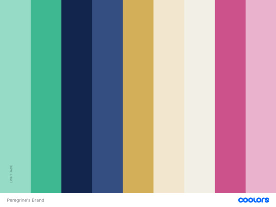
Brand Creation Process Notes: Peregrine
Part 1
So I felt for a long time like I was neglecting my main muse just because I didn't have the patterns I needed to meet my Very Specific Vision of a brand, and by the time I'm getting around to making this post I Have Found The Lolita Dresses And Can Die Happy but even so, the rest of her brand is still just. So satisfying to me.
I knew from the start that I wanted to do a something reminiscent of a luxury/girly kei brand, with a stronger, darker color palette. I knew for a while that I wanted navy to be my base color, with cream and maybe gold, but I wasn't sure what to do for an accent color. I eventually settled on two--a jade green and a mulberry color--and while they do look nice together, they're not meant to be used in the same outfit. It's more designed so that you can pick a dominant color--navy or cream or a balance of both--and an accent color--jade or mulberry--and mix and match any of the pieces until you have a cromulent outfit.
I'm describing it a little backwards, because I ended up waiting for patterns before I picked the colors. Even though the site I was using to compare color palettes has HSB, the colors display a little differently in game. The lighter navy is much brighter and feels more saturated in game, and the off-white feels much closer to white than to the cream. The only way to see those differences was to test them on actual patterns in-game, and it wasn't fun for me to test them on patterns I wouldn't be using and exit out.
So, I had to wait for patterns.
As I said above, i really wanted Peregrine's brand to be something between cute and elegant, and evocative of a luxury brand (I say, as someone who has never shopped at a luxury brand in my life). In terms of patterns, I knew I wanted a lot of fluffy knitwear, lace, cute dresses, suits and the depressingly few boy lolita patterns we have in game for the type Bs (mens fashion git gud challenge). But I really wanted the overall image to be fairly fancy and elegant. I wanted to make things that would work well with the lolita dresses when I finally was able to work them in, rather than make things that I was likely to stop using.
It was also really important to me to make a feminine brand that didn't have floral patterns. First of all, this brand is for me first. I hope the rest of you like it, but I came here to make art for me first. And I like floral patterns, but I get frustrated at not being able to find things in patterns that I do like. Thus, Peregrine's brand gets lace and bows patterns, subtle polka dots and pinstripes, plaids, and as many of the star patterns as I can make look classy instead of florals. I might make an exception for one or two of the lolita dresses I've seen around, but the bulk of the florals are going to Murasaki's brand.
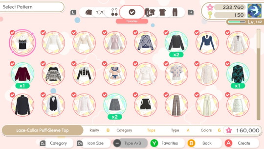
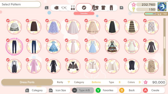
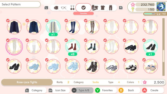
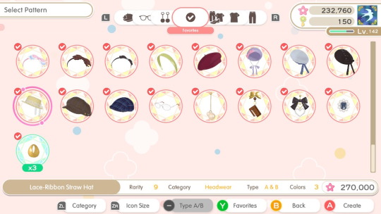
Above are almost all the patterns I've collected for use in Peregrine's brand so far. I haven't used all of them yet, and there are a few gacha patterns (the silk skirts, leather ballet flats) that I've used up already. Since Fashion dreamer mixes all your own brands together and i'm making a lot of duplicates for mix-and-matchability, I don't have a very efficient way to screenshot the finished products, but you can see the kind of image I'm going for! I also am trying to pay attention to finishes as well, for example I favor the leather ballet flats from the gacha over the just ballet flats that are in my pattern list, or I favor crew socks with emblem or wool crew socks over plain ones. When possible, I like to grab the versions of shirts or dresses that have necklaces over the ones that don't.
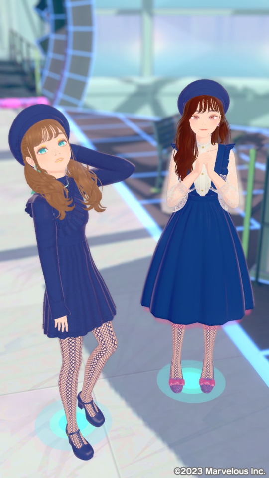
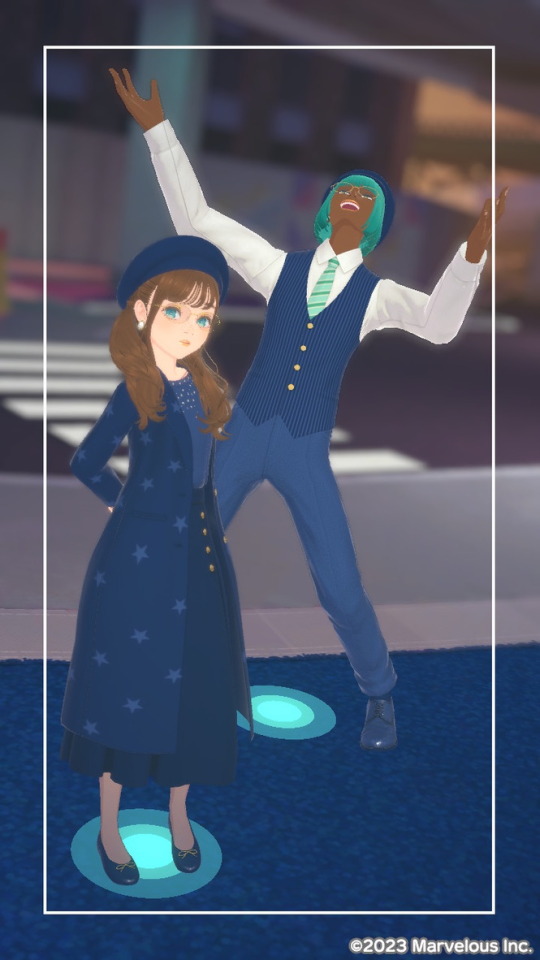
Once I got patterns, i finally got to start creating! I think the first thing I made for Peregrine's brand was the asymmetric knit dress she's wearing in the picture on the left, followed by the silk skirts and pearl-embroidered sweaters I got 50 million of from the gacha. Those items really solidified how I was going to use the colors I chose, interestingly enough. Outerwear has to be done in the darker navy or the cream to show up better over shirts or dresses made with the lighter navy/off-white. Non-lolita shirts are almost always off-white. Any metal on a pattern has to be changed to gold. The pale pink and greens are reserved for gems that look like they should have a high reflectivity. Cream tends to look better as lace than the off-white does.
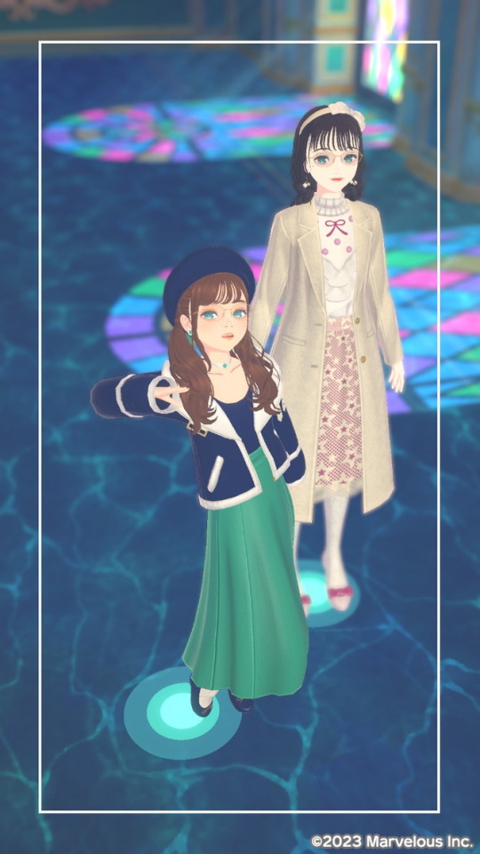
I know I absolutely favor the green when styling, but I love how the pink looks as well (even if I don't have nearly as many good pictures of it, augh). It's really satisfying to see all my pieces in my inventory, and mix and match them new and different ways.
If you've read this long, thank you! I put a lot of thought into my brand and I'm really proud of it. I'm going to try and take more photos, especially of the pieces that I don't tend to favor while styling.
If you enjoyed any of these looks please visit my showroom/request lookits! You can also DM me if you want something specific. I'm happy to accommodate!
ID: wEkrjAYrkL
In Part 2, I'll talk about vetting Lolita dresses for inclusion in my brand, and also hopefully name the damn thing.
6 notes
·
View notes
Note
hiii your art always make my day better, so hope u had a good day too. But can I ask what brushes you usually use in your arts? Like the way you use brushes and colors are so good TuT I can't fathom it sometimes. How do u make those kinds of textures. I'm new in this tumbler, so apologies if it's already been answered before. <33
Heyo anon, thanks for asking and no problem! I've answered this a couple of times before across all my platforms, but ig this is a good opportunity to answer and add to my carrd FAQ! <3 Let me break down what I use them for a bit too. (lots of blabbing below so I'll but a read-more tab)
Main:
(sketching) Design pencil (default in CSP, you can probably find it on the assets store because it was from the earlier version of CSP)
(sketching/coloring/general use) G-pen
(sketching/coloring/general use) Dense watercolor (same case as the design pencil)
As for brushes that I use for texturing and painting, I use the Daub brush pack for CSP. My favorites come from the aenigma, pigmento, and basiliscus sets. You can find them on gumroad, or just google! I believe they have brushes for procreate and photoshop too but I think the brush packs aren't the same across platforms.
For making the texture itself, it's kind of a random process that idk how to explain properly lmao. Let me link my Kokomi timelapse so you can see how much I jump around the canvas to carve out the textures:
I like to use different blending modes and layer tons of different colors. The color jitter function is super amazing too for that purpose, but probably shouldn't be overused for the sake of balance. (personally still trying to avoid over-saturating my works with textures tbh)
To be 100000% honest though, I tend to jump around a lot, and I certainly don't use all of those brushes in every piece.
I used to lurk around a lot myself and hoard tons of brushes other artists were using, until I saw a comment of an artist I admire: "sometimes the brush you use really isn't important. Without practice the painting will be ugly."(not the most accurate translation probably because it was written in another language)
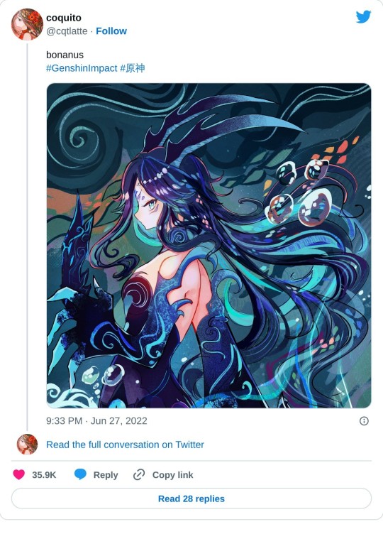
After that I had like… an epiphany moment where I really believed them, and drew a Bonanus fanart in June. I made the lineart with a g-pen (which I never used cuz I always thought I'd be somehow inhibiting my creative power using default brushes or something), and the piece ended up blowing up on twt much to my surprise.. LOL. After that, I started to care less about other's brushes and instead of looking for more, try to figure out how I could make cool textures and strokes with the ones I currently had at my disposal.
(said bonanus art)
This isn't a statement to say "stop looking for other artist's brushes, copying brushes bad, etc" because there is a LOT that you can learn from using other artist's brush inventory.
But you can also have a lot of fun drawing when you focus less about what other's use, and more about what brushes YOU are comfortable using + feels right to you. Sometimes you may even need to tweak them a bit in their brush settings instead of using their default form before they feel comfy for you! It's a matter of exploring and figuring out what works and what doesn't in your workflow, hehe.
Anyways I hope this answer helps as we all continue our art journey together. Sending positive vibes your way anon! <3
20 notes
·
View notes
Text
Tom and Jerry (Singapore) Series Review
So a few hours back, I watched all seven episodes (pilot included) of the Singapore-based Tom and Jerry cartoon released so far. I won't go into details for each episode, but I will voice out my general thoughts on the series overall.
STORY AND SETTING
As the title suggests, this take on the titular team of troublemakers is set in the state of Singapore. As a result, various references to Singapore's history, culture and national landmarks and locations are sprinkled throughout this mini-series. These settings serve as set pieces for with the cat and mouse carnage is carried out. While I am not Singaporean myself (far from it), I do know for sure that Singapore is represented quite well. However, while prevalent, the references are not overbearing and share centre stage with the stars of the show quite effectively, giving Tom and Jerry both fresh and familiar settings, situations and props to play with.
As for the stories, while not exactly far removed from the Tom and Jerry formula (some episodes even bringing to mind scenarios from the classic era), there's enough of a fresh spin on it to keep it from just being a retread of said classic scenarios. And while the 3 minute of runtime does mean that the pacing is a bit more frantic than in most other versions of the series, this also means that the episodes don't outstay their welcome. Think the earlier episodes of Paul Rudish's Mickey Mouse shorts.
ART AND ANIMATION
Okay, now for the aspect that will most likely draw the most ire of the fanbase, as well as perhaps slight confusion from the average casual viewer. Let's start with the Elephant in the Room: The character designs. They're fine. Sure, they are markedly different from what one normally associates with the franchise, but it's far from bad. The titular characters, as well as Spike who appears in about two episodes in minor roles, are rounder and cuter looking, but also highly expressive and with enough of a wacky edge that can play into the comedy aspect of the show; AND they're still recognizable as who they are supposed to be. As silhouettes together, you can tell the art-style is different, but it's still Tom and Jerry (less so with Spike, who is proportioned a bit more like an actual bulldog). Their colors are also brighter and more saturated; Tom has never looked bluer (and Jerry has never looked more orange. Spike is still gray though.) The characters are also (almost) consistently shaded, unless the situation or setting permits otherwise, which isn't often.
The backgrounds in this series are rich and vibrant, much like everything else in this series, but they somehow find a way not to overpower or compete with the characters that inhabit them. And now the animation: which is most likely the best thing about the show from a visual standpoint. It is definitely not cheap looking at all, and is consistently fluid and snappy when it needs to be. Clearly, a lot of love was poured into this aspect of the show. As for the actual slapstick being animated, it's serviceable. There are points where I actually found myself audibly giggling or laughing, or at least quietly acknowledging how well put together some of it is. Clearly, whoever choreographed the slapstick at least understood Tom and Jerry enough that this aspect was done so serviceably.
SOUND AND MUSIC
Ah, now for the more mixed aspect of the show: the audio.
I'm not sure if it's the print I watched that had a compromised mix, but well... that was just it. The audio mixing was 60% of the time good and 40% of the time kind of iffy. While previous versions of Tom and Jerry have grappled with this hurdle to some extent (what with combining archived audio from William Hanna and Mel Blanc with more modern sounds), this is probably the worst it's gotten. It's not unbearable, but it is distracting enough when certain sounds and vocals either don't fit, stand out too much, or are simply missing. And it's like that for almost all seven episodes. And as for the character's yelps, laughs, screams and gasps, mostly original, new clips are used. But as the episodes go on, more and more classic screams are heard in the episodes. Normally I don't mind this, especially if it's handled masterfully, but this is one of those instances where I wish they stuck to a lane, and I note that the lane more suited for this cartoon's presentation is the lane of new screams and yells. Though they can have one or two classic "̷̢̦̩̋̔̌Ạ̴̉̽Ă̸̧̜̬͑̏Ä̸̯̥́̅̓ͅÀ̶̪̺͝ͅĀ̴̝͌̂A̴͕̅A̴̝̺̒̈́Ȃ̸̼Ą̶̤̠̏͛A̸̢͓̿̃̅A̶̛̯͂̌Ă̵̰̥͠A̸̰̳͆̎Ạ̸̥͖̀A̶̞̦̩͌̾́H̴̛̻̬̿̏Ḥ̸̟̙̀H̵̛̛̠̙͌"̴̠̲̓̂'s. Just as a treat.
Now, the music on the other hand is pleasant to listen to. Some instances and phrases of it are even evocative, or even outright reference certain notable stings and melodies from the classic Tom and Jerry series; even down to the tempo becoming more frantic to match the actions of the characters. That aspect, I admired. Unfortunately, sometimes that too falls victim to some of the questionable mixing that runs through this series.
FINAL THOUGHTS
Nothing beats the classics, that much is true. In fact, this wouldn't be here if not for it. But you cannot go wrong with giving this mini-series a try. It is a well made, well put together (for the most part) labor of love, or at least respect, for both Tom and Jerry and the world they inhabit. So if you're a fan of Tom and Jerry, or at least just want something well made for the kids, or you always asked yourself "What if Tom and Jerry lived in Singapore?", then this series will do you no wrong.
FAVORITE EPISODES (SO FAR)
Sky's the Limit - A fun little romp with kites and drones.
Count on Merli - Features a cute iteration of Merli, Singapore's Mascot, who just wants Tom and Jerry to get along. But they don't seem to wanna listen. Poor Merli.
Colorful Chase - Simple for the plot point that they used, while they could have done more with the concept, it was only three minutes. And for three minutes, they did good.
LEAST FAVORITE EPISODE
What's that Smell? - The pilot. Passable on its own, but isn't as Tom and Jerry as the other episodes. Also it's the pilot. Things are bound to be weird.
5 notes
·
View notes
Text
Design Notes: The Original Ten Peggle Masters
If you follow my main, you might know that Peggle Dual Shot for the DS has a mechanic known as the Bonus Underground. Each playable Master that made it in (Marina got axed, presumably due to hardware limitations) has a unique background and layout, and most notably for this project, different colored Gems to collect.
Why is this notable? Because I made sure that all ten of them got that color somewhere on their design for OoD. If playing Magic Pengel has taught me anything, it's that colors bring meaning to life, and also that I'm drawn to bright things like a toddler.
And I figured that while I'm explaining that, I might as well explain the rest of the choices I made. Note that I'll be using avatars from Recolor as "concept art", so some details may be off.
This'll be a long post, so bear with me here.
Bjorn's Gems are Orange, as reflected in his hat, jacket, and shorts. His glasses being orange are a complete coincidence, though; that element was actually taken from his appearance in Blast!
(Funnily enough, earlier drafts from before Blast's release had Bjorn getting his eyesight damaged in a fight with Fnord; in the current lore, he's always had nearsightedness that he actively hid with his magic for...Fnord's-eyepatch-related reasons)
His outfit is a little out-there, but it's definitely grown on me. I wanted to go for more RPG Hero than Superhero, specifically an agile spear-wielder. Horses are pretty fragile animals, and a having a jabbing weapon rather than a traditional heroic sword serves as a nod to his horn.
The biggest change I made from the concept when drawing is probably his hat, which loses its brim and gets a horseshoe instead of a star. My goal with all the Institute Masters is to hide a horseshoe somewhere in their design to tie them all together; it's gonna be harder for some Masters than for others.
(The Academy has its own insignia: a flipped horseshoe resembling an omega, as seen on Fnord's eyepatch in canon.)
Jimmy's Gems are Blue, as seen on his jeans and elbow pads. Not many places I can hide a theme color on an already-clothed Master, but thankfully our favorite gopher (who I thought was a guinea pig for years cause science) is consistently pantsless.
While there was no getting rid of his iconic hat, I did give him some protection from impacts in his elbow pads. I gave him jeans to look more like a Rad Cool Kid(tm), but apparently it's recommended skaters wear them due to being wear-and-tear resistant.
While I'm pretty sure it's just weird artifacting from cranking up the saturation slider in Recolor, it kind of looks like he's got green patches or leggings, the latter of which I would definitely wear if I was forced to wear jeans for whatever reason.
If I had to add a horseshoe, it'd probably be some kind of charm on his hat.
Kat Tut's Gems are Cyan, which can be seen, uh...everywhere.
I'm not gonna lie I had ZERO ideas on what to do for KT. I knew Recolor had an "Egyptian Headdress" item (which I'm not sure were actually a thing in Ancient Egypt) and went from there. I do like the silhouette of the headpiece, though.
I wanted something light and show-offy, since Kat Tut is an acrobat and a performer, and well...something definitely happened.
This is probably the most likely to be subject to change, even if I do like the flowy shapes.
Splork's Gems are Yellow, as seen in his overshirt and shoes.
I originally wasn't the biggest fan of Splork, but I think designing this look made me warm up to him a little. It's fairly basic by gijinka standards, just with an added bowling shirt and shoes in his theme color.
Splork only has one eye, so I deliberately gave him the Other Eye Syndrome bangs as a nod. The particular hair part I use for said bangs have an annoying layering shortcut that puts a pile of disembodied hair at your avatars' feet, so I have to make a bald version of every Splork I make and photoshop the two together.
If I ever draw him, I very much intend to give this guy his bulk back. We have enough twinks in this project already.
Claude's Gems are Magenta, which I misremembered as a more coral-y shade of pink. At least it stands out more from Warren's purple?
My main inspiration for Claude was essentially just "guy who tries to pick up chicks at the beach". Unfortunately, in my folly it completely slipped my mind that the guy who gives you Flippers might have a reason to be wearing, well...flippers.
At least I gave him some Big Meaty Claws.
Renfield's Gems are an eerie Lime Green.
My idea for Renfield was to somehow combine a suit with a wizard's robe, and I think the execution went REALLY well.
The suit portion was actually lifted from Eyegor; while it hasn't been stated, Renfield is available as a hat/head item for Xbox Live Avatars if you own Peggle, heavily implying Eyegor is a headless body that Renfield normally perches upon.
Despite having left the Institute prior to the New Frontier's formation, Renfield is one of the few characters that actually DOES have a confirmed horseshoe placement: a subtle shape made with the detailing on the back of his jacket.
Tula's Gems are more of a minty Green, which I misremembered as being more vibrant like her stem.
Tula's design was...supposed to be derived from her Blast Design, but when I went back to look it turned out it was COMPLETELY different.
For starters, her hat. I initially gave her a sunhat, but I recently started wondering if it was actually meant to be a bucket hat. Looking at the art, I legitimately cannot tell what kind of hat that is supposed to be. And apparently it's supposed to have a gaudy fake flower charm on it??? Not only that, but it completely clashes with her color scheme??? That is NOT the same yellow as her petals, and that orange is nowhere else in her outfit!!!
Also, her raincoat??? Apparently it's not actually cerulean, but a bright aqua that makes the green of her stem look muddy and the rest of her design look plastic and fake, which is especially egregious since she's an environmentalist!!!
And good GOD, I think Blast!Tula's face is somehow giving me DOUBLE Uncanny Valley vibes. Like, Classic Tula and her flower friends are kinda disturbing since they have detailed human faces on flower bodies, but Blast Tula STILL looks disturbing because of how Not-Tula she looks.
...Anyways, this is "Design Notes", not "Getting Really Mad At Fashion". Let's move on.
Warren's Gems are Purple, which is convenient since his regular outfit is already almost completely purple.
In this concept, I made his suit fit better since he's larger than he is in-game as a humanoid, but I think I wanna walk that back. He's a gambling addict on a teacher's salary, this man CANNOT afford a tailored suit. If the art department had ever seen a rabbit before in their lives then he would've already been peak design.
Also, just for fun, Warren's form is short as hell. Possibly the shortest New Frontier member besides Gnorman and Luna. I'm thinking 5'1" (~155cm), possibly even shorter.
Cinderbottom's Gems are Red.
Not gonna lie, I think I might be less happy with Cindy's concept than Kat Tut's solely because of how I put in the red. I REALLY should've gone for something less bright. Probably need to do something about that hair, too; maybe some kind of gradient.
Among the Institute, Cinderbottom is the most at-odds with Bjorn, even (not-so) accidentally making him violently ill with his smoke in one of the old Blog posts -- now what was that about 'flames only serving the virtuous'?
Anyways, my point is that Cindy is also based on an RPG hero, this time an armor-clad knight with a sword, befitting his noble stature. (I also thought it'd be a neat reversal if The Hero had a lance while The Lancer had a sword.) His green mail is derived from his green scales.
Master Hu's Gems are White.
This one was pretty much as simple as just giving him a white robe. Recolor didn't have any good turbans, so I left it off.
#peggle#bjorn unicorn#jimmy lightning#kat tut#splork splorkan#claude lobster#renfield pumpkin#tula sunflower#warren rabbit#lord cinderbottom#master hu#design concept
3 notes
·
View notes
Text
Ice Guy and His Cool Female Colleague Episode 2: Okinawa Getaway
What can I say, it's cute. It's really cute. And the lighting work is definitely helping that. They're very liberal with highlights in this show, but it works out well with the art style and color palette. The art is very smooth and "simple", so to speak, and the art is very saturated. Lots of deep, vibrant colors everywhere, which helps a great deal. It means the highlights can brighten the colors and it won't look blown out or plain white, and that they won't end up covering up details. Also, they use depth of field quite a bit as well (like in the image above) and it helps sell the feel even more.

Regardless of art style though, Himuro is certainly the main attraction for the series. Fuyutsuki is of course as well, but Himuro's reaction and his Kansai accent are just too cute to not get wrapped up in. And I mean, he did a whole Rocky thing this episode training to make sure he wouldn't create a blizzard while in Onikawa which was a super fun extension of his cuteness when he gets worried and worked up over something.
Also, something I picked up on in the first episode but didn't get to chat about because I was late to watching it was the names of the characters, they're all references. Himuro and Komori share very similar naming sense with the first Kanji being in relation to their spirit ancestors, and the second kanji being a location ("room" for Himuro, "woods" for Komori). Of course, Fuyutsuki and Saejima are just regular humans so they don't have that first kanji, so Saejima's name is "skillful" and "island" put together, but Fuyutsuki's is the most interesting. Her name is comprised of "winter" and "moon", which are more nonsensical than the others, but also more interesting. The moon is featured quite heavily in these two episodes that we have, specifically in relation to Fuyutsuki and Himuro together. I'm very curious to find out if there's any reason for it, or if it's just a creative choice.
Anyways, the moment that caught my attention the most in today's episode was Himuro melting. I was really expecting him to just get younger, but after thinking on it a little bit what else would have happened? There's other ways to melt, but they wouldn't exactly be relaxing or anything to experience, so at the end of the day I'm fine with it. My only real concern was how they were going to approach a "younger"/smaller version of Himuro, but they did alright. Nothing out of pocket and nothing over the top, it's a normal interaction that ends with both Himuro and Fuyutsuki getting flustered about it but not completely overreacting, which was nice.

Overall, I wouldn't say this does anything extraordinary. It's not some incredibly special series, but it's cute, it's fresh, and it's fun. It's the trifecta for a well-received series, and doesn't try to force its way above and beyond. It seems to know what it's aiming for, and hits the mark really quite well. So, if you want a really relaxing and casual adult romance with a little bit of a twist, there's really nothing wrong with checking out The Ice Guy and His Cool Female Colleague.
#ice guy and the cool female colleague#koori zokusei danshi to cool na douryou joshi#anime recommendation#anime review#anime#anime and manga#氷属性男子とクールな同僚女子#ice guy and his cool female colleague
17 notes
·
View notes
Text
i tried to figure out exactly what was bothering me. my new phone stylus is very hard to hold so i had no good grip so the drawings look weird, but i think it conveys the idea for the most part. I PROMISE I DIDN'T TRY TO MISREPRESENT ONE OVER THE OTHER!!! the drawings just accidentally came out goofy 😭 its only to demonstrate the broad strokes anyway
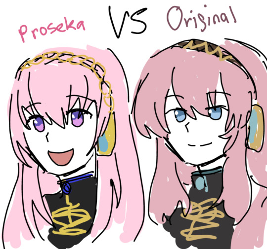
admittedly v4x luka sits in the middle of this scale but they specifically used a """revamped""" version of her v2 design so. v4x doesnt exist and tbh ixima has kept her personality mostly intact in most v4x promotional artwork WHY AM I TALKING ABOUT V4X THIS ISNT ABOUT HER but yes. i think the weirdly saturated color palette is kind of.. i dont wanna say poorly put together but i was surprised by them. theyre quite stark. i think the earthiness of luka's old v2 outfit in comparison contributes a sort of maturity and sophistication. the fluffy hair really helps too. the eye shape is a huge point as well... not to mention the personalities just seem so....different.
the saturation values are surprisingly similar between the two which is sound and correct, its easy to read regardless of which one it is, so i cant continue to nitpick from most technical aspects. itd just be pedantic (tho tbh proseka luka's hair could stand to have more contrast)
i will say proseka's luka's silhouette is way more ambigious compared to old luka even though its almost the same outfit— i already closed my phone's editing soft of choice and i didn't save the version with the key arts but try for yourself, clip layer and turn both solid, the proseka version of her hair is so shapeless it hurts the overall shape and dynamicism of the design (IMO). i think its closer to ixima's take on it, but i never liked how ixima draws hair, people started making bald miku jokes for a reason.
idk if i have it in me to go blow by blow about why i prefer what and why i dont but im starting to feel grief over how luka is misrepresented.
8 notes
·
View notes
Photo

And now for the piece of art I currently have done, as well as the piece I really wanted to show because of the recent announcements about the Mufasa movie and how my headcanons kinda connect to it. Here we have the beloved brightest star of the Pride Lands, King Mohatu, his adopted son and heir, the rogue-born orphan King Ahadi, and the daughter of an ousted Lord of a distant pride, Queen Masilahi, who renamed herself Uru to hide her identity in case her past came back to haunt her.
Background again belongs to Disney, and was edited for use by over here. You can see them without the background here.
Before getting into their stories, let's look first at the art. I had a lot of fun with Mohatu's design. Like Hifadhi, I used his colors from The Brightest Star and the same basic design, but exaggerated/played down several features so that he'd look a lot less like a Mufasa recolor (especially important given that he isn't even related to Mufasa in this version). He's got a similar sort of strong build as Mufasa, but he's smaller and has a longer, narrower face with different features.
Ahadi ended up changing quite a bit from the last time I drew him. I made his colors a bit darker and more saturated, gave him light eyerims instead of dark ones, and changed up his manestyle a bit (I'll have to draw him from the front sometime). He also now has his scars on his back rather than his neck/chest. I'm super happy with how he turned out, his face and build finally look how I always wanted them to look (he's skinny like Scar, but not unhealthy, he has that narrow face and long nose, but it's thinner than scars with the bend occuring further up, and he has broader, neater cheeks, and a square chin instead of Scar's scruff long one). I also love how his new colors look together, especially with the lighter eyerims and super-pale eyes, and the darker more saturated fur looks great. I think he looks fantastic overall. He's on the smaller side, shorter than Scar, but not tiny by any means.
Masilahi was super fun to draw in full-body view for the first time in a while. Her head-and-neck scruff has evolved into a sort of half-mane almost, though it's not quite enough to consider her a maned lioness, it's mostly just a trait common among her family and the prides that lived nearby. Her colors got tweaked a bit from the last time I drew her, but not nearly as much as Ahadi's. As always, she's a massive super-buff girl. ^^
And now, onto the story! Warning in advance - it's pretty long.
~-~-~
Mohatu was a wise and just king and much beloved in the Pride Lands. He was more open-minded than his traditionalist brother, and respected and listened to all of the creatures in his kingdom. He worked hard to tend to all of their needs and keep the circle of life in balance.
But the king had a secret that gnawed at his core. He had no desire for a mate -not a lioness, not a lion, not a creature of any species or gender, not anyone at all. He never had, and he knew in his heart that he never would. Taking a queen and fathering cubs to be his heirs was such an important duty of his, but the idea of it had only ever filled him with dread. He didn’t mind the idea of being a father, he’d always liked cubs and had gotten along with them well, but he shuddered to think of what he’d have to endure to have cubs of his own. He never told his parents, unable to bear the idea of disappointing them, or his brother, who would have scolded him for shrinking from his duty. The king was left to bury his fear in his heart and suffer his worries in silence.
But then, as though the great kings of the past themselves had intervened, the river glowing into his kingdom from the lands beyond delivered him a gift. A rogue cub, orphaned after a flood had claimed the lives of his parents, half-drowned and scrawny, barely able to draw breath. Mohatu hovered and fretted as the mjuzi tended to the cub, not relaxing until he was told that the boy would live. When the cub awoke, he was able to introduce himself as Ahadi and tell his rescuers of his parents’ fate. Mohatu immediately offered to let the cub live in his pride.
He had initially intended one of the pride to take in the boy, but as the weeks passed, he found himself growing closer to the cub. While the other cubs rough-housed, Ahadi was content to sit between the mighty paws of the king while Mohatu told him stories of the many creatures in his kingdom, of his own life, and of the great kings of the past. Love, a father’s love, had taken hold of his heart. He finally decided to do what he had always longed to, and what his heart now called him to do - announce his intention to never take a mate, and adopt Ahadi as his son and heir.
Ahadi was delighted at this turn of events. His parents had loved him, but life as rogues had been hard, and there had been much struggling and toil in the short years before they’d been taken from them. His hard life had left him quiet and introspective. He’d worried whether he’d ever be accepted by the louder, more boisterous cubs of the pride, or by the adults who seemed to find him odd for scarfing down his food quickly in case a predator came to take it, and for starting at any loud noise in case it heralded the approach of a dangerous animal. But Mohatu had never treated him like he was odd. He had always treated Ahadi with kindness, warmth, and respect. Ahadi had come to love the wise king as a father, and couldn’t be happier when Mohatu asked him to be his son. While he would never forget his parents and the love they had shown him, he was ready to move forward with his new life in the Pride Lands and with the father who loved him.
But even as Prince Ahadi grew surer and more confident, coming to befriend other cubs in the pride, one lion always watched him with an unfavorable eye. Prince Hifadhi, brother of the king, leader of the Lion Guard. At first. Ahadi was oblivious to the sour looks the older lion threw his way. But one traumatic day finally brought him face to face with Hifadhi’s disdain for him.
He and the other cubs were playing in a small gully when there were sudden snarls and the panicked shrieks and stomping hooves of a stampede. A group of hunting predators had ambushed a nearby antelope herd in a run-of-the mill hunt - but now the herd was coming straight at the cubs. Hifadhi and his guard were alerted by a young hornbill named Zuzu who had spotted the cubs in danger. The Guard came running to the rescue. The hunters too had heard the cubs and were frantically trying to chase the herd away from the young lions, but the antelopes were now mindless with panic and didn’t recognize the cries of frightened cubs among the growls of the hunters. While the rest of the guard pulled the other cubs away from danger, Hifadhi rushed in to grab the final cub. But when he saw that the cub was Ahadi, he hesitated. There was a moment where the terrified cub locked eyes with the older lion, and realized that Hifadhi did not want to help him.
Hifadhi’s hesitation lasted only a moment. Perhaps if he’d acted sooner, nothing would have changed, or perhaps it would have, but Ahadi would never know for sure. All he knew is that the panicked foreleg of an antelope knocked into him and shoved him roughly against a nearby rock. There was an explosion of pain in his back. Just before he blacked out from the pain, he heard Hifadhi’s roar scaring the antelope away from him, and he felt Hifadhi’s jaws close around him as he was carried away.
When he awoke, it was to Mohatu’s worried face hovering above his own. Hifadhi and the Guard had brought him back to Pride Rock, and the mjuzi had been called to tend to his wound. It seemed the rock had torn a great gash in his back. Nothing had been broken, thankfully, but Ahadi would be left with a permanent scar across his back, and would deal with pain and stiffness in his back for the rest of his life, limiting how long he could walk or stand. Over time, the mjuzi would figure out the right herb treatment to help lessen Ahadi’s pain, which Ahadi was immensely grateful for. But the scar and stiffness and limited mobility would remain. And perhaps what hurt more than any of that was the new knowledge that his adoptive uncle hated him and had let him be hurt.
Meanwhile, the lioness Masilahi had grown up in a part of Africa where smaller Pride units lived. There were no Kings or Queens ruling vast kingdoms with prey and predator alike as their subjects - instead, a Lord (or Lady) served as the protector of the pride’s territory, patrolling the borders, driving out other predators, and meeting any challengers in battle, in exchange for the pride hunting for them, giving them first dibs on food, and treating them with respect.
The rest of the pride were hunters, and the actual running of the pride was left up to the lead hunter or huntress, referred respectfully to as Mother or Father regardless of whether they’re actually someone’s parent or not. Often, the Lord/Lady and Mother/Father of the pride were the main breeding pair, with the rest of the hunters made up of their brothers and sisters, but it could vary. Cubs left their pride of birth at the start of adulthood to freshen up the gene pool - littermates often chose to join the same pride, but sometimes decided to go their separate ways. Young adults could join other prides as hunters, and were usually easily accepted that way, or could challenge the Lord of Lady of a pride in combat for the chance to take their place. Battles of this kind were fierce, but non-fatal unless an accident occurred, and followed strict rules of honor and tradition. Once either combatant yielded, the fight was over, and the loser was allowed to leave in peace, accompanied by any of the pride who chose to go with them.
Masilahi was the daughter of Lord Hodari and Mother Tamu, part of her family’s small pride. She lived a happy life with her little family. Her mother was a skilled huntress and stern but loving mother, who often called her Almasi, or her little gem. Her father always found time between patrols to goof around with his daughter and make her laugh. She knew she would have to leave one day, but she knew she would see her family at the borders sometimes, and she was determined to make them proud. She planned to become a huntress and study to one day become the lead huntress and Mother of her new pride - she was strong enough to become a Lady through combat, but preferred the close bonds between hunters to the more solitary life of a Lady.
But it was never to be. When Masilahi was a cub, a pair of rogue brothers came to challenge her father for his land and his pride. These males weren’t from any of the local prides - they came from a far-off land where kings ruled over vast kingdoms, and unknown to the pride, their ambition was to create such a kingdom in this land. One of the males met Hodari in combat, but the second male joined the fight partway through, which was against the rules, and sent Hodari fleeing for his life before the pride could even blink. Hodari left his home and family behind, wandering the vast lands of Africa over the years, until finally, as a very elderly lion with a chin fully white with age, he settled in a jungle oasis in the midst of a great jungle. There, he met a strange lone lion cub who called him Tanglemane and helped ease his loneliness in his final years. Unbeknownst to Hodari, the cub was his own great grandson, Simba, the grandson of his beloved Masilahi.
After Hodari’s unlawful defeat at the paws of the cheating males, Tamu gathered the pride’s cubs together. She told them that with such treacherous lions now in control of the pride, that their safety was no longer assured. She assigned a strong young hunter from the hunter as their protector, and ordered her to take the cubs far away, where they might find safety from the dangerous males. After a tearful goodbye, Masilahi departed with the hunter and the other cubs. But one of the males noticed the hunter trying to smuggle the cubs out of the territory and gave chase. During the confusion, Masilahi was separated from the others, and found herself all alone in a land she didn’t know.
Frightened and alone, Masilahi wandered for a time, surviving off of insects and scraps stolen from the kills of other predators. It was while she was scarfing down scraps from a kill behind the back of the hunters that she was finally caught by the original hunters of the carcass. But luckily for her the hunters, a wandering clan of hyenas, felt pity for the terrified little cub. They offered her shelter among their numbers. Masilahi gratefully accepted. In an effort to shield her identity, in case the male lions ever came looking for her, she told the hyenas her name was Uru - a gem, just as her mother had always called her.
Initially, the clan had only intended to let the cub stay with them long enough for them to find a rogue couple or a pride willing to take her in. But the longer she stayed with them, the more the clan came to care for her, and they soon considered her one of their own. Uru grew particularly close with a hyena with a daughter named Banagi who was close to her own age. The hyena took Uru under her wing, and she and Banagi soon considered each other sisters.
After some time of wandering and hunting where they could, Uru’s clan came across the Pride Lands. To their surprise, King Mohatu welcomed them into the kingdom with open arms. The hyena population in his kingdom had been dwindling in recent years due to some infertility issues, and he welcomed the chance to have more hyenas to balance out that section of the circle of life. The clan settled easily into life in a kingdom. They respected the laws of the king and of the circle of life, and only hunted as much as they needed.
Uru and Banagi were too young to hunt themselves, but an important part of learning to hunt was to watch how it was done, so they were brought along to hide from a safe distance and watch during a hunt one day. The clan ambushed a herd of antelope near a gully, only to realize too late that a group of lion cubs were playing in the gully. Uru and Banagi couldn’t help without getting trampled, but they were able to get the attention of a nearby hornbill who had already spotted the trouble, pointing her in the direction of where they’d last seen the Lion Guard passing by, in the hope that she’d be able to bring them in time to help. Uru was watching the rescue - she was the only one besides Ahadi to notice Hifadhi’s hesitation.
The clan apologized profusely to King Mohatu for the whole situation, as did the antelope once they’d calmed down, but the king could see that neither party was at fault, that it had all just been a terrible accident. What worried him more than any hyenas or antelopes was the cold manner of his brother when he’d brought the badly-injured cub home to Pride Rock, and Ahadi’s sudden change in attitude around Hifadhi, how he seemed almost scared of him now. While Ahadi didn’t tell him about Hifadhi’s hesitation, unsure if he was right about what he’d seen or whether he’d be believed, Mohatu could tell that something was very wrong. He resolved to keep a much closer eye on his brother going forward. But even with this extra effort, Hifadhi was able to keep training his son Jadi to be the next heir in secret, leading to the eventual coup later down the road.
The accident with the antelope did have one positive - it brought Uru, Ahadi, Banagi, and Zuzu into each others’ lives. Ahadi thanked the three girls for their parts in helping save him, and soon became very great friends with all three of them. A few years later, Nyonda joined their little group in secret, and the bonds of friendship between the five grew strong as a pride. But the strongest bond was between Uru and Ahadi. It was to her alone that Ahadi confided his fears of Hifadhi’s ill intentions towards him, as Uru had also witnessed his hesitation. It was to Ahadi alone that Uru shared the truth of her past. Even from the start, the two shared a trust and understanding that few could match.
Uru was bigger and stronger than any other cub in the pride, but she was also a thoughtful soul, even if she wasn’t as quiet and in her own head as Ahadi had been when he’d first arrived in the Pride Lands. She was perfectly happy sitting with Ahadi for hours, playing the games she and Ahadi came up with that could be done without moving too much and bothering Ahadi’s back - telling stories of make-believe to each other, counting all the stripes on a nearby grazing zebra, seeing who could build a higher stack of pebbles without it collapsing, and more. Sometimes, Mohatu would carry Ahadi out to a grassy field at night so he could gaze at the stars with his friends. Ahadi was quieter and more careful after the incident with Hifadhi, but with a loving and supportive father, and four wonderful close friends in his life, Ahadi was able to hold onto his happiness.
As the years passed, Ahadi grew into a quietly compassionate and thoughtful young lion, as wise and open-minded to nuance as his father before him, if a little less open to trusting those he didn’t know well. Uru grew into a powerful hunter and fighter, quick and clever with strategy in a way few could match, but also a deeply warm and caring presence, the eternal mom friend of their little group. The friendship between the two deepened over the years, growing into something more. After a lot of denial and flustered interactions and “gentle” encouragement from their friends, Ahadi and Uru began a relationship. Their love blossomed quickly after that, strengthened by the years of trust and close friendship that had preceded it. Shortly before Mohatu announced that he was going to step down and pass the throne onto Ahadi, the pair married.
At Ahadi and Uru’s coronation, Hifadhi’s son Jadi staged his coup, forcing Mohatu, Ahadi, and Uru out of Pride Rock and a good chunk of the kingdom. Mohatu crowned the pair properly not long after the coup, making Ahadi and Uru king and queen of a devastated and fractured kingdom. For the next several years, King Ahadi and Queen Uru were run ragged trying to hold their crumbling kingdom together, working out treaties with herds and hunters, figuring out how to space out the herds and hunters to keep everyone fed and watered, keeping hold of the borders as Jadi tried to chip away at them, etc.
They were overjoyed at the births of their sons, and did their best to be there for them, but their many duties to tend to their war-torn kingdom had them stretched so thin that they didn’t have as much time for their sons as they would wish. Mufasa was able to tag along for king lessons, but Taka was often left behind, and the boy’s bitterness over this unintentional neglect steadily grew.
During a particularly bad drought that dries up the few water sources Ahadi and Uru had in their part of the kingdom, Uru decided she must leave and try to find a source of water for the kingdom’s inhabitants to use. She first checked the lake Mohatu had once used in such a drought, but it was also dry. She remembered a particularly large lake closed in by the steep walls of a gorge she had come across during her travels with the hyenas as a cub - if she could find it again, it would more than suit the Pride Lands’ needs. She set off in search of the lake.
Uru soon found the lake she’d been seeking and resolved to negotiate with the local animals to sort out permission to use it. But the area seemed strangely bare of hunters, and the few herds fled at the sight of her. She finally managed to find a tough old tortoise willing to talk with her. The tortoise warned that the area had recently been taken over by a vicious pride of lions. They blocked predators from entering the narrow pass that led to the lake, and they ambushed prey animals when they came to drink. Everyone was terrified of them. Most of the herds had fled, as had all of the hunters.
With all of this in mind, Uru approached the narrow pass carefully. She was surprised to find herself greeted by a small delegation of lionesses, almost as though they had been waiting for her. They were all too eager to lead Uru to their kings. Uru could barely hide her astonishment as she was led to the same two lions who had taken over her father’s pride all those years ago. They, in turn, seemed to have no idea who she truly was. They greeted her with a sly appearance of friendliness, praising her to the skies as the widely-respected queen of the Pride Lands. They offered her a deal - she and King Ahadi must meet together with them and forge a formal alliance with their pride - in exchange, the kings would grant them access to the lake.
Uru knew better than to give away her identity now, or to show any distrust of the kings. The two lions were surrounded by their pride - Uru could see some of her old pridemates among their number, but there were far more than just her own Pride there. Some of the lions she recognized from prides that had neighbored her father’s; some she had never seen before. What she did know is that this pride greatly outnumbered her own since the civil war had divided them. They wouldn’t stand a chance if the kings attacked. She would have to be clever about this. Outwardly, she remained friendly and warm. She expressed her gratitude for the offer and gave her assent to the meeting. Under the kings' watchful eye, she sent a bird to the Pride Lands requesting Ahadi to come and meet with the kings. Under the kings' "friendly" insistence, she was to stay with their pride until Ahadi's arrival.
Once the kings had gone to sleep for the night, Uru made her way to some of her former pridemates in secret. They were stunned to realize that this mighty queen of the Pride Lands was the long-lost daughter of Lord Hodari and Mother Tamu. The young huntress Tamu had assigned to protect her and the cubs all those years ago stepped forward. She explained that she had managed to get the rest of the cubs to safety with a nearby pride, but the two kings had started taking over more and more territory, and had eventually taken over the pride she and the cubs were sheltering with. All cubs had been taken under the wings of the two kings and had been brainwashed into serving as their loyal guards. Some had resisted the kings' lies and still had their own minds, but there was a powerful circle of lions loyal to the kings who would protect them at all costs. The kings' cruelty and rash, foolish decisions had chased away the herds and bled the land dry, until they had been forced to move on in search of a new home. They had come here after hearing rumors of a civil war tearing the Pride Lands in half, leaving it vulnerable. They planned to ambush Ahadi and Uru at this meeting and kill them, then take over their half of the Pride Lands, use their superior numbers to conquer the other half, and claim the lands for their own. Many of the lions who had suffered under the kings' rule all these years now believed that all monarchs must be evil and cruel, so they didn't mind the idea of driving out more monarchs to claim a new home, but with Uru's assurance that this was not the case, they no longer wished to shed more blood on behalf of their cruel leaders.
Uru promised her old pridemates that if they helped her protect her home from this invasion, that she would help free them from the tyrannous kings. She and the huntress conferred for some time to form a plan, then sent a second bird in secret to warn Ahadi of the trap and inform him of the plan. Some hours before the meeting was to occur, some of Uru's allies among the pride had the king's strongest supporters lured away for a hunt. The meeting wasn't supposed to occur yet, so they thought they had time for a quick hunt. An injured wildebeest had been spotted drinking from the lake and would make an easy kill. As the hunters closed in, Uru's allies suddenly abandoned the hunt, and the supposedly-injured wildebeest turned on the hunters with a fierce strength. The rest of of the wildebeest's herd thundered into the lake's valley alongside Uru's allies, viciously attacking the hunters. This was one of the Pride Lands' herds, who had owed Uru a favor after she'd helped them sort out a diplomatic issue some time ago. With the combined strength of the wildebeests and Uru's allies, the kings' supporters turned tail and fled.
The kings had no idea that their strongest supporters had been chased away. They were irritated that their strongest guards were nowhere to be found, but simply assumed they'd gotten distracted on a hunt, and there were a few guards left anyway, so the meeting could go ahead as planned. But when they arrived to meet with the king, they found themselves confronted instead with the might of the Lion Guard. Uru's allies had also caught up at this point, so by the time the fight was over, the treacherous kings lay dead, and Uru's old pridemates, and all of the other lions held under the kings' thrall, were finally free. The huntress who had helped Uru come up with the plan thanked her profusely, and Uru thanked her in turn for helping her save the Pride Lands. Some of the lions returned to the lands that had been ravaged by the kings' rule, determined to restore the land and return to their old way of life. Some drifted away to join some of the nearby prides. Several of them, under the leadership of the huntress as their new Mother, chose to settle by the lake, this time keeping to their old laws and traditions so the land could flourish. The huntress would later have a daughter, and that daughter would have a son, who she would call Malka. As a nod of respect to the family that had raised her and the happy memories of her childhood, and to the family who had now helped save her home, Uru reclaimed her old name - she would now be Queen Masilahi of the Pride Lands.
By the time Masilahi and the Lion Guard returned to the Pride Lands, Jadi was dead, and the Pride Lands had been made whole once more. Masilahi was able to send some of the animals to the nearby lake to drink, while others used the watering holes that had been located in Jadi's part of the Pride Lands. King Ahadi and Queen Masilahi worked hard together in the years that followed to restore their fractured kingdom. By the time they handed the crown to their son Mufasa and retired together peacefully, the lands were flourishing once more. But little did they know of the bitterness that had been festering in the heart of their younger son, or of the darkness that awaited the land that they loved. Masilahi's old hyena clan had begun to change over the seasons. Many of the younger generation no longer looked at the lions with a friendly eye. They blamed Ahadi and Masilahi for the hardships brought on by the civil war. They blamed the older generation's unwillingness to break the rules to get them more food for their empty stomachs. Matriarch Banagi, once so revered and respected for her cunning and strength, was now mocked as nothing more than the royal family's lapdog, since she was the queen's sister and had taken a lioness for a mate. The winds in the clan were shifting, and it would only take a nudge from a manipulative young lion to send them spiraling down a dark path...
~-~-~
Soooo yeah, lots of changes from my old fanfic, and a looooooooot of rambling, sorry about that. But hopefully this is interesting to some of you. Yes, Masilahi's father is now Tanglemane. I dunno, I realized it would work well with the direction I wanted to take her story. I know he says he was defeated by the two challengers because he was too old, but shh, we'll just ignore that detail. Maybe he was embarrassed at having been defeated in his prime and fudged the truth a little to make himself look better to Simba. Malka is also no longer Masi's nephew, but he's still descended from her old pride.
And yes, I essentially gave Ahadi the backstory that Mufasa is apparently getting in the new movie. I mean, I've always written him as an orphan who was then adopted and made heir of the Pride Lands, it's been that way in my stories for a solid decade now, so when I heard that that was the direction the new movie is taking Mufasa's story, I honestly found it kinda hilarious that they incorporated a story for him so similar to the one I gave his dad. I just tweaked it a bit to a flood and being carried in by the river to better fit the details of the new movie. That's why the announcement about the new movie made me want to draw these guys so badly - it reminded me so much of the story I came up with for Ahadi. I also changed it so that Nyeusi isn't his brother and there's no adoptive mother - aroace Mohtu for the win. ^^ Mohatu is a much better father in this story as well, and a better king, truly deserving of the title of the Brightest Star.
I also had (perhaps a little too much) fun coming up with the concept for Masi's old pride, and her confrontation with them later in life. I had forgotten that she was MIA during the whole water buffalo incident, and realized that her being away from the Pride Lands for a while would be a great opportunity to confront her old pride again, just as she did in my old story, but this time helping to overthrow the two evil kings who'd driven out her father, rather than yelling at her abusive dad as she did in my old story. Ahadi and Masi are better parents in this version as well, with their neglect of Taka springing from being pulled in way too many directions by their duties because of the civil war, rather than intentionally ignoring/smothering him over grief due to the death of their first son. No Manufaa in this version either, he just didn't fit anywhere.
I think that's everything I wanted to cover! But feel free to ask if you have any questions.
9 notes
·
View notes
Photo

Build the Streets of Barcelona
by W. Eric Martin I primarily use Chrome as my browser, and I tend to have lots of tabs and windows open, thanks partly to having Google Earth integrated in the browser so that every time I open a new tab, an image pops up showing some part of Earth that I would otherwise have likely never seen, such as the Korgalzhyn District in Kazakhstan— —or Francois Peron National Park in Australia— —or Zug in the western Sahara— I'm unlikely to find myself in Zug or the Korgalzhyn District, so while I know they're places where humans can visit and might live, for the most part these images strike me as abstract works of art, the colors seemingly modified to intensify the saturation or contrast. The scale is often a mystery, leaving you to wonder what sort of vessel could fit between those islands in Kazakhstan, or the lighting creates an optical illusion, with Zug being a giant crevasse instead of a mountain. My thoughts are very different, though, with this image of Barcelona: The human impact visible in this image is striking, with each block containing dozens of homes, apartments, and businesses, each building holding generations of people, this frame containing ten thousand stories. I marvel at it for both what's visible and what's happening out of sight, and someday, yes, I might make it to Barcelona to walk these blocks myself. This image came to mind again when looking at the cover of Barcelona, a 1-4 player game from Dani Garcia for 1-4 players that Board&Dice will release before the end of 2023. Hey, now I can learn more about what this part of Barcelona actually is! It's the mid-19th century. The city of Barcelona is the most densely populated city in all of Europe. Shortly after the old city walls were finally destroyed, Ildefons Cerdà, who is now considered the inventor of urbanism, presented the plan for the creation of the "Eixample", the expansion that Barcelona so desperately needed. Its construction began in 1860. In Barcelona, you will take on the role of builders in 19th-century Barcelona who are working on the new expansion to the city. Your main goal is to construct buildings to accommodate the citizens who want to leave the old city, and in the process, you will also build streets, create tram lines, and build public services. You may even decide to explore "Modernisme", a new architectural and arts style that has been gaining popularity among the rich. Prototype Barcelona is played over a variable number of rounds interrupted by three scoring phases before a final scoring phase. Every round, each player takes a single turn consisting of two or more actions, a building phase, and then preparation for their next turn. At the end of the game, the player with the most points wins. • In other Board&Dice news, the company has launched a Kickstarter campaign for Teotihuacan: City of Gods – Deluxe Master Set, a giant box that collects everything for Daniele Tascini's Teotihuacan: City of Gods — all of the expansions and promos, along with alternate art versions of many game elements and hundreds of wooden components, not to mention separate playmats and a fifth player expansion and a "beauty pack" of just wooden bits for those who want to bling their current thing. The project has collected a quarter million US$ is less than a day, and all of the pledges deliver in October 2024, so you'll need something else to do in the meantime. Perhaps you could check out this image of Warsaw, Poland and ponder why we have so few games about trains in Poland...
https://boardgamegeek.com/blogpost/146691/build-streets-barcelona
0 notes
Last Seen Blogs

wanjie68
无标题

vasiouq
Lana's art blog
bratty-telepath
Something for your mind
beautiful-brides-weddings
Beautiful Brides

ginger-with-attitude
Ginger With Attitude