#everything is wrong with it
Text
Five being the founder of the commission makes no goddamn sense. It’s such bullshit
#I hate it so much#and it was such a big part of fives plot and eventually the season#he was literally having a whole existential crisis over it#and they made a point in saying that he didn’t remember so I thought they would explain it more#but they didn’t ??#everything is wrong with it#what we’re the writers thinking???#did they just forget everything about five and his past?? Jesus Christ#the umbrella academy#tua s3 spoilers#I might make a longer post about this later
347 notes
·
View notes
Text
learning that self deprecation isnt cool and just makes the people around you uncomfortable unironically improved my mental health a lot. like if you just stop saying negative shit about yourself you will genuinely like yourself more and other people wont be repulsed by your attitude and you will have more friends. it's true.
#people will fr go ''god im such an ugly loser LOL i suck at everything i do and i should just kms“#and then go “why does no one want to be around me”#maybe because your attitude sucks. maybe because i said 'those mean things you say about yourself arent true'#and you spent five minutes arguing with me about how im wrong.#00
85K notes
·
View notes
Text
Alastor being aroace makes his dynamic with Vox like 100% funnier. It's a villain rivalry, you immediately know people will look at these two and think "they crave each other carnally", except only one of them has the capacity for it. Which is the perfect set up for a ridiculous one-sided obsession, but then Alastor is shown to be acting way more unbothered by Vox than he actually is. Dude is walking the streets of Hell menacingly staring into cameras and doesn't even have the excuse of homosexuality. Both of these fuckers are goofy as hell.
#hazbin hotel#alastor#vox#they have everything wrong with them#tv or radio#original post#hazbin meta#aroace alastor
18K notes
·
View notes
Text
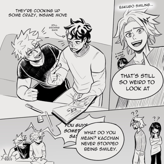

Post-war shenanigans. It's all the same to him
#dkbk#bkdk#midoriya izuku#bakugou katsuki#mha#bnha#i can and will write deku to be a little delusional#'I've literally done everything wrong in my life!!' 'I know this and I've always loved you'#or something
11K notes
·
View notes
Text
the glorification of your 20s and fear of anything else has got to stop. mainly bc your 20s is quite literally the worst decade of your life the idea that ppl think you peak at 25 has me so sad for them
#in your twenties everything starts to go wrong and you have no experience yet so it's just#ego death after ego death#no way ppl think it's all down hill from here like how BLEAK
46K notes
·
View notes
Text
ajshakjahaja why so cold?
#I'm the No.1 WINTER HATER#seriously hate this season#everything is wrong with it#only good thing is I get to wear everyone's sweaters and jackets#but nothing else#not one good thing
0 notes
Text
corrupted godhood. reluctant false messiah. prophecy as a creeping all consuming malady. does the oracle see the future or make the future? the horror of trapping yourself inescapably on purpose. the chains of destiny dragging you towards the path you are fighting tooth and nail to free yourself from. there never having been a chance to begin with. no other choice to make. but making that choice regardless.
#feel delirious with how well denis captured all of this. he made my blorbo of all time real 😭😭 timtom i owe u everything <3#way over half a decade waiting for this was more than worth it. im swooning#dune#dune part two#paul atreides#dunetwo#thats my sweet darling angel baby boy despotic genocidal religious figurehead who never did anything wrong ever 💖
8K notes
·
View notes
Text
Mlp infected aus that just erase Discord from existence is so funny, he would shut that shit down so fast. Not even all that for the sake of friendship or whatever he’d see it and be like erm… not really my cup of chaos, this is just gross (snap, fixed)
#my little pony#discord#mlp discord#discord mlp#he’d be like this bit is not funny#all zeros from the judges you’re out#it’s also inconveniencing/upsetting fluttershy#saw one version where discord had put fluttershy to sleep/in some fantasy land where everything was normal#the idea of him just skeddadling with fluttershy is equally funny what is wrong with you#skedadding* whatever#jabber
9K notes
·
View notes
Text
personally i think he should be given a really big hammer nothing wrong will happen i promise
(i very recently started commissions btw !! since this post has been so successful i thought i'd edit it and do a shameless plug dkjfghsdkfgh)
#(everything will go wrong)#also: this is not spoilers for the pilot at all /gen i just wanted to draw him with a huge hammer#the amazing digital circus#tadc#tadc jax#jax#lightly salted art#cw bright colors#bright colors cw#cw eyestrain#eyestrain cw
13K notes
·
View notes
Text
Everyone gets “The 90s” look wrong and I hate it
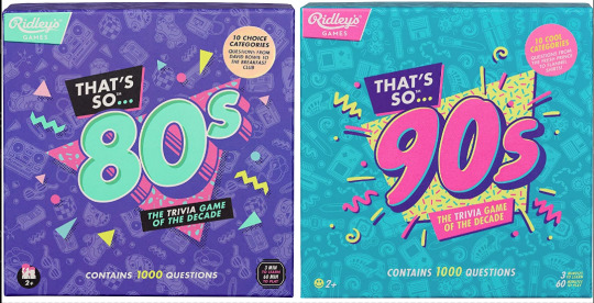
Couple years ago I saw these two board games at the store back to back. Well, not saw them per se, but ya know. Spied them out of the corner of my eye. And for a moment without reading the text, I couldn’t tell you which was which decade at first. Funny. Either they were in a rush to get these out the door or they wanted their throwback trivia game boxes to look uniform. I didn’t think too much of it.
Only, from then on I started seeing it MORE. Every time someone markets a 90s or 80s throwback...

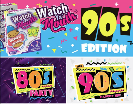
Goddammit they’re identical! What??! How did we let this happen? As a 90s survivor and a designer, this drives me up a wall.
Look, I know I’m late to the party to complain about “the 90s look” when we’re just starting to get sick of the Y2K nostalgia train. But c’mon, the 90s were not The 80s: Part Two™
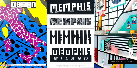
Trust me when I say that we weren’t all wearing neon trapezoids up until the year 2000. The 90s look being peddled is so specific to the tail end of the 80s and an early early part of the 90s - a part of the 90s when it wouldn’t stop being the 80s. This is Memphis design being conflated with the wrong decade.

Keep reading for a long ass graphic design history lesson and pictures of old soda and fast food.
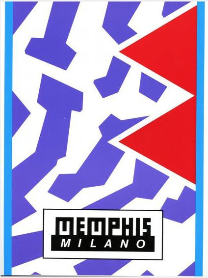
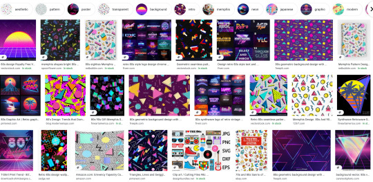
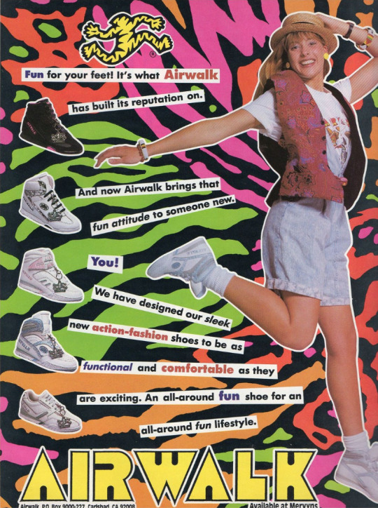
Specifically, the look is Memphis Milano, self-named by the Italian design house Memphis Group. Starting in the early to mid 80s, they made all sorts of furniture, fabrics and sculptures that were like a Piet Mondrian grid painting under heavy radiation. Their whole deal was defying the standards of existing industrial design up to that point on purpose. Chairs had weird arches, bookcases would be in strange alien colors, unusual materials like plastic or elastic were used in place of metal or wood, that sorta thing.
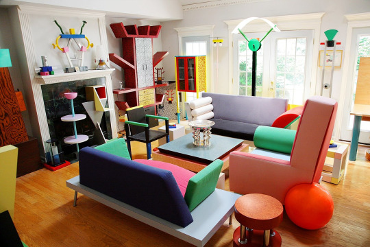
Memphis quickly became the signature look for the decade. You can tell something’s influenced by Memphis design from it’s telltale trademarks:
Clashing, neon colors.
Use of diametric shapes.
Contrasting patterns like zebra print stripes, confetti squiggles and checkerboards.
It wasn’t long before Memphis Milano-inspired design was everywhere in 80s pop culture:


It was a special time, yes.
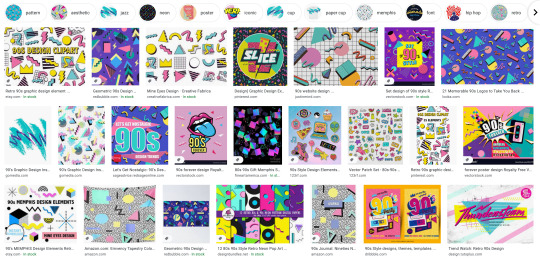
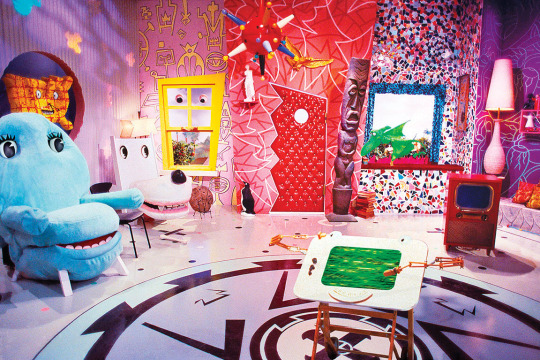
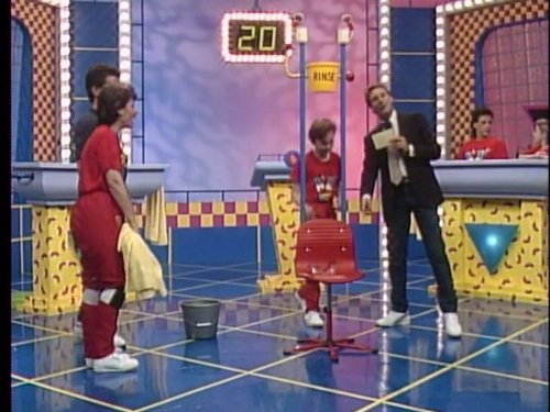
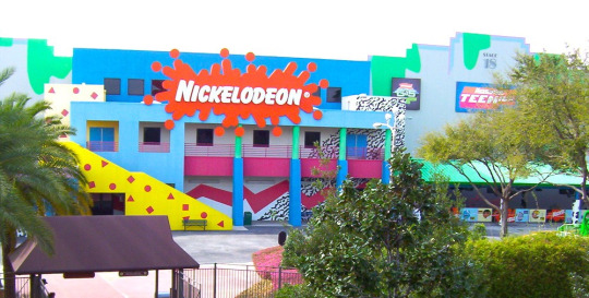
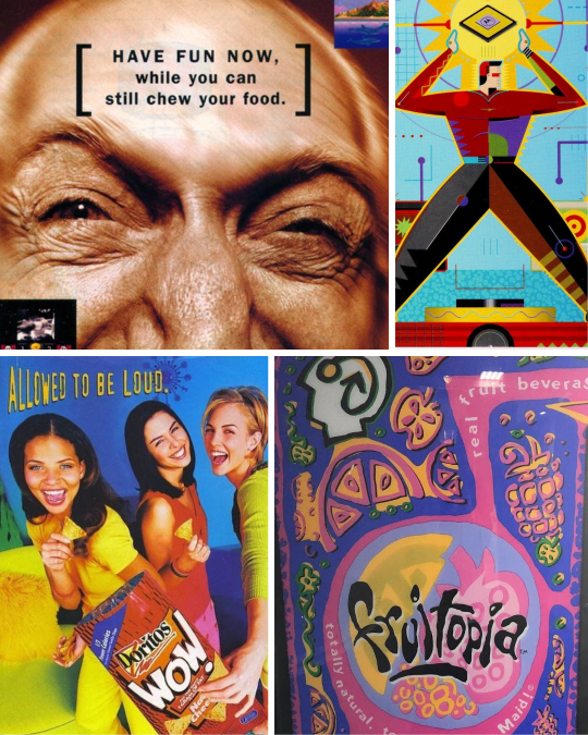
I was a kindergartener at the tail end of the 80s, so I knew Memphis mostly through the lens of kids media. Toys, clothes, games, tv shows used it like candy colored catnip. Cable channel Nickelodeon more or less adopted the Memphis aesthetic as their signature in-house style and practically built a monument to it at a Florida theme park:
I think this is why folks mistake what decade Memphis is representative of - 90s staples like Nick, Saved By The Bell, Fresh Prince - they all stayed around much longer than the design trend’s expiration date.


Couple that notion with the fact that companies are slow followers to design trends. Something gets popular and they want to get on the bandwagon? Gotta wait for the ink to dry, gotta wait for the production molds to be made. It would take a few years for them to completely work Memphis outta their system.
Now, this is not to say Memphis is bad! Personally I’m a fan of the aesthetic, if my neon-drenched artwork wasn’t a tip-off already. But it is a trend, and trends never last forever.
So what took the Memphis Milano look down for good? This part’s up for debate, but I personally think it had something to do with this dude:

It’s that grunge music from Seattle that’s so popular with the kids these days dontchaknow.
Once Smells Like Teen Spirit hit in 1991, the Nirvana tone drove the rest of the decade. Clean geometry became weathered, grainy and organic. Bright neon pastels became more bold. Bubblegum pop music sounded fake and manufactured. Attitude and apathy was authentic. Whatever.
Things got grungy. Things got grimy. Olestra was invented.
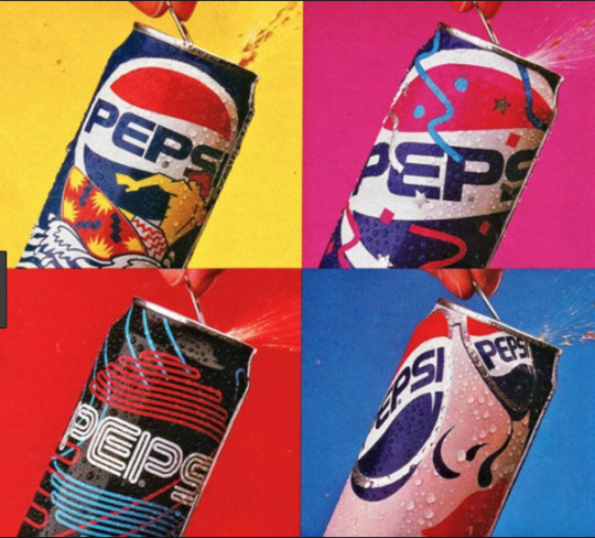
I think the best way to visualize this transition is how Cherry Coke entered the decade and how it left it:
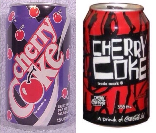
1992 Memphis on the left, 1998 grunge junkie on the right. Fitting that the 90s would end with a design that looked like Darth Maul’s lungs.
Okay, so what should 90s retro design look like?
Continue on to PART TWO! Spoilers: No VHS filters or vaporwave needed, but maybe bring an antacid.
16K notes
·
View notes
Text

Guess who caught up in the manga
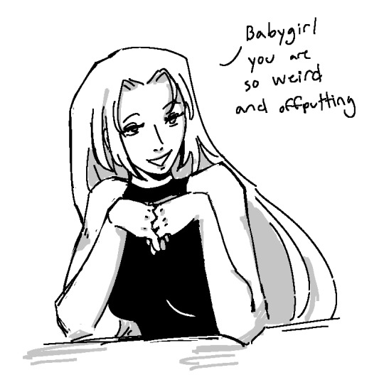
#everything went so wrong so fast in the manga. recommend reading if you like pain#fanart#myart#doodle time 😎#jjk#jujutusu kaisen#jjk manga spoilers#chosoyuki#yuki tsukumo#choso kamo#jjk choso#choso brain: weird ✅ offputting ✅ baby ❌ girl ❌. but who else could she possibly be referring to#yuki my beloved you were too good for gege he did you too dirty
3K notes
·
View notes
Text
One of the reasons why I love Steddie is how sweet Eddie was with Steve in the forest scene. That’s what got me into this ship. It was nice to see someone being patient and kind to Steve like that and it coming from someone like Eddie who viewed Steve so differently means a lot.
I loved how he told him how much Dustin looks up to him, making Steve smile and even after that wanting to joke around a little to make Steve laugh as well.
It was such a nice change, because all the other scenes we just see him bickering with someone or people making him seem stupid when he asks questions. Eddie didn’t make fun of him for not knowing Ozzy like he probably would have prior to things and instead let it be and called Steve cool. I love them.
#I know it shouldn’t be taken to heart how Dustin was like with him#But it just bothers me sometimes#Or even Nancy’s comment how it explains everything bc Steve hit his head#Implying there’s something wrong with him even as a joke#I just take things personally sometimes because I see myself in Steve and I’d love to be given that patience too#steve harrington#stranger things#eddie munson#steddie
1K notes
·
View notes
Text
anyone else have multiple traumatic memories associated specifically with holidays/family vacations? because that is a topic I never see discussed in all the So You Had A Shitty Childhood, Now What? self-help books i've been reading. but for me, it was a significant thing. and the more i think about it the more it seems like this would be an (unfortunately) common experience. would be grateful to hear if this matches other peoples' experiences...
#not a shitpost#serious post#ask to tag#tw trauma#cptsd#c-ptsd#and if so we should TALK about it#because it means there are a whole group of survivors out there whose mental health regularly worsens during holidays#like i know i am most certainly not the only person who feels an undefined Dread hanging over christmas/my birthday/july 4 etc#bc too many shitty things happened during those times and now my brain is hypervigilant bc traditionally these are the Danger Times#and this seems like it would be particularly common for survivors of abusive/dysfunctional households (aka most people with c-ptsd)#because holidays/vacations typically mean 1) the whole family is together/being forced to interact#2) and undergoing external stressors e.g. travel/relatives aka 'outsiders' visiting/routines & coping mechanisms being interrupted etc#3) there is social pressure for this to be a Fun Family Bonding Experience which only highlights the cracks in the foundation#and exposes the common Everything Is Fine/We Are A Happy Family lie#4) the cognitive dissonance of feeling tired/anxious/stressed/afraid during a time when you are 'supposed' to be Making Good Memories#and then everyone is angry/tired/anxious/triggered and things boil over and something or someone goes Very Wrong#weird that i'm posting this in october when halloween is...sort of the ONLY holiday i have only good and happy feelings towards#i got lucky there#also i have positive feelings towards Labor Day but that's for socialist reasons
4K notes
·
View notes
Text
i call this one "queer silence" or perhaps "slightly judgemental stare"
#trying out different shading stuff ON MY FAVORITE SQUEAKY TOY!!!!#SQUEAK SQUEAK I AM SQUEEZING THE STUFFING OUT OF HIM!!#lovingly. affectionately.#unless he isnt filled with stuffing. in which case. hm. concerning crunchies are occurring#BUT I KEEP SQUEEZING-#scribble garnish#welcome home#welcome home puppet show#welcome home fanart#welcome home wally#wally darling#i want him to be happy and kind but i also want him to be unhinged and violent but also-#basically whatever turns his character takes i am Here For It#no matter what. he could do anything im still on his side#im a supporter of wallys rights And wrongs and Everythings
8K notes
·
View notes
Text
Okay, one more doodle from session 2. In the words of bdubs, I too kinda love what this series is doing to etho LMAO
#secret life#slsmp#ethubs#ethoslab#bdoubleo100#bdubs#etho#art escapades#something is SO WRONG WITH THEM YOUR HONOR#secret life smp#slsmp session 2#trafficshipping#trafficblr#I forgot what to tag DFJBSFKHNCGN#I just. I just think#yknow?#yeah#THIS NEW BRUSH IVE BEEN USING IS KINDA EVERYTHING#idk I like her#she feels so loosey goosey and painterly#maybe more coming =w=#Dbhc#Dbhc etho#Dbhc bdubs#Hermitcraft dbh au
4K notes
·
View notes
Text
guys, i think the hermits are going to accidentally start a prank war again. because just like last time, a game of telephone has begun.
first, false made iskall's build into ''false beans,'' her shop from the previous season. however, to give herself plausible deniability, she signs it with "love, Joel. x" due to his username, smallishbeans.
next, iskall sees this, and completely believes it. he thinks it was joel who pranked him, and as he says to pearl while showing off the sign, which he kept even after tearing the prank down, "joel gave me a kiss." in his most recent video, he pranks joel by sending him loads of anonymous messages in order to completely spam and fill his inbox, preventing him from getting any more mail, with notes such as "thinking about you. x"
of course, joel is going to have absolutely no context for this, because he didn't make the initial prank. so who is joel going to assume sent him all those messages while he was away on holiday? well, i have a guess.
etho.
#hermitcraft#joel smallishbeans#iskall85#ethoslab#falsesymmetry#was gonna include in the post but it made it way too long that the other option is he misreads the ''x'' as xisuma signing his name#and thinks. well god now xisuma is obsessed with me too?#like wrong person buddy iskall is apparently the obsessed one now#genuinely the funniest thing is that joel is away on holiday so he will have no idea these messages all came at once.#he might think someone just like really missed him over the course of several days dskjhf#and also this is ignoring the fact that any REAL MAIL people send him will despawn and be lost forever which will possibly#result in more chaos like whyd you never reply to my mail joel :c#this is not even scratching the surface of the possible prank war also this is one tiny branch of everything. not even getting into#the hermit statues and who's been building them etc etc#sorry this situation is just so. it's sooo.
1K notes
·
View notes
Last Seen Blogs

auugustus
august

prayfork
Yes daddy?
prayfork
Yes daddy?

lokloft
Обо всём

circulusordinis-blog
Order