#gill sans medium
Text
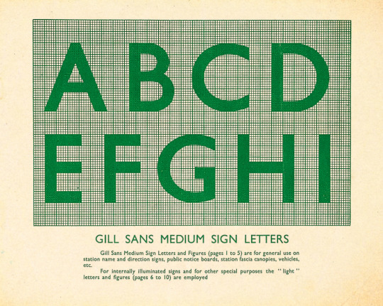
Gill Sans Medium.
#vintage illustration#vintage typography#typography#gill#gill sans#eric gill#type#type designer#type design#gill sans medium#signage#environmental graphics#graphics
8 notes
·
View notes
Photo
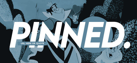


001. OFF WITH THEIR HEADS. pinned post & post banner customizable template. simple and easy to edit. compatible with gifs.
$4. available on payhip & deviantart !
( contact me to purchase file directly if need ! )
Fonts used —
• lemon milk medium italic.
• gill sans regular.
- coloring psd is not included.
- do not claim as your own or redistribute.
- personal use only. do not use in commissions.
- credit is mandatory and extremely appreciated!
- size is 540x250px
- please consider reblogging or liking to help support my work!
don't hesitate to reach out with any questions! thank you so much !
interested in custom work? I offer commissions !
91 notes
·
View notes
Text
Return to the Master Story Index
Return to CLASSICAL FANTASIES
THE FISHERMAN'S LEG (Part 18 of 20)
A sequel to Dee 1/2 Demon
by
De Writer (Glen Ten-Eyck)
21738 words (work in progress)
© 2023 by Glen Ten-Eyck
All rights reserved. This document may not be copied or distributed on or to any medium or placed in any mass storage system except by the express written consent of the author.
TUMBLR EXEMPTION
Blog holding members of Tumblr.com may freely reblog this story provided that the title, author and copyright information remain intact, unaltered, and are displayed at the head of the story.
Fan art, stories, music, cosplay and other fan activity is actively encouraged.
~~ ~~ ~~ ~~
New to the story? Read from the beginning HERE.
~~ ~~ ~~ ~~
“An amputation! I only had a small cut! As long as three fingers are wide!”
Magistrate Lim raised a finger and bowed, saying sharply, “Minami! What have your ears been doing while Doctor Siani and the others talked to you? Your use of bandages taken from a man dead of gangrene gave you gangrene too! If it had not gone inside the bone, they would have amputated your leg at mid thigh!”
It was an angry Dee who answered, “Not listening! That is what his ears were doing! This is a wasted time. Let us hear his fantasy of Sorcerous murder and be done with his slanders!”
Minami snapped back, “These things that you are claiming have to be false! What you have said was destroyed by gangrene could not be healed! Some things cannot be fixed!”
Nodding agreement emphatically, Dee snarled, “Correct! Your mind is proof of that! When a good fish like a sand shark is before your eyes for twenty years, you never looked to see that the mud and sand were blowing out the gill slits, leaving only the clean prey to be eaten. For twenty years, you looked with your eyes and could not see!
“Now, here in this Tribunal your ears hear but your mind is deaf! You know that you went to sleep on the plains in front of Port Nanchee, which was under seige. Waking up in a Hospice in a different province, over a moon later, you still cannot figure out that something went very wrong while you slept!”
Doctor Siani interposed calmly, “Minami san, you were partly correct. These feats of healing had never before been done. These young ladies managed a near miracle to save what they incorrectly believed to be a friend.
“The soreness of your throat was a consequence of the tubes that I put there so that you could breathe and be fed while being kept asleep. They removed them when the main things were healed and they expected to finish remainder of the work with you awake.”
The Doctor shook his head in sadness and wonder mixed, “None expected that you would be so unwilling to listen and allow the healing to go on. You were very angry and demanded that they not touch you further. They did not and THAT is why you have that scar-like cavity in your leg. YOU AND YOU ALONE would not allow them to finish their work.
“Why you became so afraid of people that you had known for some years is something that none of us know.”
Minami snarled, “I would not let them touch me after I saw them murder the man two pallets over from me! I watched them and the other three women there gather about his bed like vultures. That evil oni's brat summond her vile flame between her claws and pushed it into him and he died of it!
“I saw it happen! It was murder! I cannot be wrong because saw them do it!”
It was Miko who brightly pointed out, “Exactly like you saw sand sharks EATING MUD. You could not be wrong because you saw it with your own eyes! If you had only asked a simple question, you would have known what really happened.”
“You cannot tell me that I did not see it!” Minami made claws of his hands, face contorted with anger! “You murdered him like the hundreds of others! More than two hundred men were slaughtered at HER deadly claws and fire!”
Magistrate Lim nearly choked at the accusation! He raised his hands and demanded, “Stop! I keep the records of the Hospice for Mortal Wounds! They are here in my files. Two hundred and thirty four of those sent to the Hospice died . . .”
“MURDERED! You admit . . .” shouted Minami triumphantly! Constable Canra clubbed him down so that the Magistrate could continue.
The Magistrate made a deep sigh before continuing, “One hundred and sixty three of the first two hundred died before these girls even knew of the Hospice. It was for MORTAL WOUNDS, after all.
“After their arrival, another six hundred and fifty four were sent. Out of that eight hundred and fifty four, all expected to die, only two hundred and forty three did. Six hundred and eleven men, all of whom were dying when they arrived lived.”
Dee slowly shook her head trying not to cry at the memories engraved on her mind two years past. “We tried so hard and we did save most of them, but some wounds simply cannot be healed. I do remember the man that you spoke of just now. His liver was deeply pierced and all that we tried was to no avail. All that I could do was stop his pain for short periods.
“He asked for us and Lord Umayu's wives to be with him at the end. He wanted to see us, thank us, and pass without pain. When he knew that he was about to die, he asked for my fire sight to stop his pain. He laid his hands in Lady Donatse's and asked of the war. She told him that Corutsu was ours and he replied that his life was not wasted. She replied that any life lost was too many and his memory will be treasured. He said thank you and he was gone.”
Magistrate Lim waited for Dee to compose herself and replied, “I believe that this disposes of the accusation. Minami san saw a thing that he did not understand and his mind fastened on it without questioning to be sure of its truth. Most of those he accused you of killing died before you even knew of their existence. The balance have a simple explanation. Mortal Wounds. In a war, no matter what is done, some wounds cannot be healed.
“The accusation is dismissed. No unlawful magics or Sorcery were involved in any of these cases.
“We may now get to the remaining business of this Tribunal.”
To be Continued
<==PREVIOUS ~~ NEXT==>
Return to the Master Story Index
Return to CLASSICAL FANTASIES
#THE FISHERMAN'S LEG#Part 18 of ?#Classical Fantasy#sequel to DEE 1/2 DEMON#WORK IN PROGRESS#Written by De Writer
7 notes
·
View notes
Text
Headcanons Pt 1 - Nightmare's Gang
'Aight, I'm bored, haven't posted in ages, I need to do something. While I have been mostly inactive in the UTMV fandom, I thought it'd be fun to post some of my more uncommon headcanons! And some pretty common ones too, I guess. Here we go! This is all for sympathetic everyone btw. No heartless Sanses here!
Horror:
The shortest Sans in Nightmare's Gang. I will start fighting people over this. He was starved for years and people make him so much larger than the rest of the gang! He is tiny and spindly and it takes time for him to even begin to spar with the others
Best cook, 10/10, knows all the recipes. He had to spice up the lot of nothing he and Papy had, so he knows how to make a little go a long way and taste good
Really good at taking care of plants and animals. Always seems to be in tune with what others need.
Has sharper senses than most Sanses, minus his eyesight, but not by much
So nearsighted he needs glasses, but would break or loose them if he got any. His eye is too damaged to try contacts, physical or magical
Would be the best around children. Just, so caring and attentive. Panics a bit if they cry though
Isn't too science minded. I'd say since his AU deviated from canon Undertale, he'd focus less on science and more on food
Hates fish. Partially to do with Undyne, partially because their scales and gills freak him out. Hates cooking with them too
Very cuddly, loves being around as many people as possible
Killer:
Gonna say this once and only once: Human Killer would be ginger.
He cannot cook. Don't let this man into the kitchen. Not only is he a pyromaniac with poor self-control, he also swims in chaos and could not care less about the well-being of others
Has ADHD. Can't stand still for two seconds. Whenever Nightmare's lecturing or talking or something, he's always pacing around. Listening, but moving
Absolutely a cat person, but only has a single black cat and she's missing an eye
Is a flirt but terrified of romance. Hates it, can't stand it. Don't speak to my man about love. Personally, I think he's aroace, but flirts for fun
He can use knives as weapons but not for much else. Can't cut food, not very good at whittling, don't even get me started on peeling vegetables
Surprisingly, he is good at using knife-adjacent things, mostly tools that are basically just knives
I like people who headcanon him as a carver, because he totally would be. But I think his main medium for art would be clay. He has a potters wheel that he doesn't use too often as he likes sculpting without it
Dust:
Continuing on with the MTT, Dust can cook soup. He can make more, doesn't like to, don't ask him to
The most scientifically minded of Nightmare's Gang, he makes a lot of their chemical based weapons, smoke bombs, acids, and the like
His vision gets fuzzy during fights due to his magic, and nobody knows how to help. He's learned to fight with it, but it is a bit risky
Out of everyone in the gang, he gets overstimulated the easiest
He was the first of Nightmare's Gang. Then Killer, Horror, and lastly, Cross.
Chara had abandoned Dusttale for years before Nightmare found it, so Dust is used to absolute silence, he doesn't like it much
He doesn't like being around too many people at once, but it's better than being alone. He'll actively seek out company if it gets too quiet. Said company is often Horror, because H never really gets that loud
Nightmare's right-hand man and the braincell of the gang
Cross:
Has leukophobia and kenophobia
Great cook, rarely burns food, can make things taste good, and is probably the only one who is allowed to help Horror in the kitchen
Him and his Chara are actually pretty close. Not at first, obviously, but as time goes on, they both realize they are the only ones left of their AU. They hang on to each other when the memories don't shut up
Always finds a way to call Nightmare "my prince" or "your highness." Nightmare has asked him to stop, repeatedly
Likes climbing things. He'll go up into a tree and fall asleep there if someone lets him. Will also do this on rocks, walls, buildings, and people
Very quiet. His normal footsteps barely make any sound and he uses this to sneak up on people
Probably the most mischievous in the gang, second only to Killer. His best friend is Epic, this man is a complete and utter troll. Nightmare once woke up to his room flooded with rubber chickens. It wasn't Killer.
His voice is naturally so soft that you can barely hear him. His laugh sounds like a little imp though.
Well versed in sign language! His Frisk was mute and thus he had to learn it at a young age. He sometimes signs when he talks so the gang can understand him better. Granted, Nightmare is the only other person fluent in sign
Nightmare:
Freaking nerd.
Knows so many languages and three of them are dead. He had a lot of time on his hands after he left his AU
Had no idea he was farsighted until he found Dust, who could read things easily. He tried everything to make reading easier and just assumed that his goop had somehow ruined his vision
Can technically cook. There are no promises that it'll actually taste good though. It may also be burnt or expired.
He has to consume a mix of emotions and physical food to keep himself alive. He did not know he needed to eat until after he found Horror. The magical overload of the Apple Incident managed to sustain him. He passed out in front of Horror and was put on a "diet," if it can be called that
His corruption is semi-sentient. It's not malicious, but it's more selfish than Nightmare used to be. And I mean, Pass. Night was a doormat. He wouldn't fight back even if his life depended on it. The corruption keeps him from attempting to give everything he has to please others. It's still kind of an issue
He forgave Nim for everything she threw on him and Dream. Nobody in Nightmare's Gang thinks any of that was okay.
Really likes curling up with people. He'll drag some of the gang to a couch or bed and just curl his tentacles around them. Very cozy.
His magic is a bit of an "acquired taste." Without any prior exposure, it feels dangerous, threatening. But after time, one begins to realize it's like a blanket, covering and protective
Error:
Out off all the Sanses here who have eyesight issues, Error's are the worst. Not only does he naturally have poor vision, his glitching makes it way worse
Doesn't need or want food. He'll eat it to make others happy or less worried about him though
Knows a lot of string based arts, crochet is his favorite though
Has to sleep above the ground. No idea why, he just doesn't like sleeping on a bed, or chairs, or couches. He has to web himself a hammock and sleep ten feet above everyone else
Hates the sound of chewing. Annoys him to no end, will stab his own nonexistent ears if someone chews next to him
A bird person. He really likes parrots and cockatoos
Mildly leukophobic. He doesn't spend too much time in the anti-void because of that
Yes, he's brothers with Geno and Fresh. Yes, they both annoy him to no end. Yes, he would kill and die for them. No, they may not be in the same room as him. He's also the middle child
Was not born with dyslexia. Does not read or write enough to confirm or deny if he got it after he glitched. He does have it though
Likes gardening. Never forgets to tend to his plants
And there we go! I love all headcanons from anybody, it's so fun to see how other people see the same characters! I do love tiny Horror, though. I'll cover the Stars next. I'll keep them all sympathetic too, as much as I used to hate Dream as a person, he's a great character and I know how to write him with more emotions then just toxic positivity. As much as I love emotionless Ink, I never used to write him like that and it's still uncommon for me to do so today. Blue's just a bean, we've never had any issues anyway.
6 notes
·
View notes
Text
A Family Affair - The Penny Gill Story
Okay, so. I have this head canon that Penny is the love child of Grissom and Sara. I did the math, and it could very well be true.
I honestly love Penny and I DO see so much of Grissom and Sara in her. Whether it’s true or not, this is my head canon.
(Also hi I’m sort of back)
Enjoy!

She had an inkling when the Grissom’s first showed up that something was…familiar. But she couldn’t quite put her finger on it.
She knew that she was adopted. And don’t get her wrong, she loved her parents dearly and they gave her everything she ever needed.
…except that hole that just never filled her heart.
Penny Gill grew up just outside of San Francisco. She had a normal childhood, with her older brother and sister, the youngest of 3.
She was a straight A student and had a knack for taking things apart and putting them back together, much to the dismay of her fathers laptop computer. (It just never rebooted the same after that)
She liked bugs and science and was the President of the Physics Honor Society at her high school.
It wasn’t until she was 18 that her parents told her.
She walked in the door from her part-time grocery store job (college is expensive) when she saw her parents sitting next to each other on the sofa looking uneasy.
Her eyes moved back and forth between them. The silence was deafening.
“…what’s going on?” Her voice echoed through the house, breaking the awkward silence.
Her mom spoke then.
“Honey, we have something to tell you.”
Her mom, Sandra, put her hand on her husbands knee. He moved over to make room for Penny.
He patted the spot between them.
“Come, sit.”
Penny dropped her bag and sat slowly between her parents.
Her mom took a deep breath and steadied her gaze on her daughter.
“You guys aren’t getting a divorce are you?” Her breathing and heart rate began to quicken.
Her mom let out a small laugh, “Ha. No honey, no.”
Her dad, Geoffrey, cleared his throat.
“Sweetheart…” He looked over at his wife for permission. She nodded.
He searched his daughters face before he spoke. He knew this would crush her, but she needed to know.
“You’re adopted.”
It felt like the walls were shrinking.
“Wha-what?” Penny sputtered and her eyes widened.
Her mom answered.
“We wanted to wait to tell you until you were ready and we felt that, since you’re going to college in the fall, now was the time to do it.”
Then.
She stood up abruptly and felt her whole world came crashing down. Hot, wet tears of anger started to stream down her face.
“I can’t believe this! You’re just NOW tell me this?! I can’t be here right now!”
Her parents tried to stop her but she grabbed her bag and ran out the door. She jumped in her car and flew out of the driveway. Leaving her parents standing in the middle of the living room, heartbroken.
She remembers that day fondly. Looking back on it now, it all made sense that she was adopted.
Both her siblings were blonde, tall and athletic. She was medium height, brown hair and stocky. Not to mention smart and loved science.
It should have dawned on her sooner, but maybe she was just trying to not believe the obvious.
Since the day she found out she was adopted, she’s looked for her parents from time to time. It was a closed adoption and she knew very little about her birth parents, if anything at all. All she knew was that they couldn’t keep her for whatever reason.
She even tried a 23 and Me, but reached no results. They really didn’t want to be found.
Until.
When Gil and Sara joined the Las Vegas Crime Lab to help out Jim Brass, a nagging feeling engulfed Penny.
Something inside her buzzed.
The more she started to get to know them, the louder the nagging feeling got.
So. She decided to quiet that feeling.
She kept a careful eye on the two of them until finally Sara left behind her coffee cup to check on a lead from Max.
Penny took the opportunity and swiped Sara’s mug off the counter and headed to the DNA lab.
“Hey Parke.”
“Yo Penny. What’s up?”
“I need you to do me a favor…” Parke looked at the coffee cup in her hand.
“That from a case? I’m pretty backed up at the moment and I’m not sure-“
“-it’s a hunch.”
She set the cup on the counter and grabbed a buccal swab and swished it around her cheeks, closing the cap.
Parke stared at her.
“Normally this would break departmental policy, but I’m desperate.”
He nodded for her to continue.
“I need you to run the DNA on this cup against mine.”
His curiosity got the best of him.
“Whose cup is that?”
She hesitated at first.
“Sara Sidle.”
He gaped at her.
“Listen Penny I-“ Her hand covered his, her eyes pleading.
“Please. I need you to do this for me. Don’t tell anyone?”
He searched her face. She was serious and pleading. He nodded slowly.
“Okay. Off the books, but you owe me. Saturday night?” His voice sounded hopeful.
“Fine. Just dinner, but that’s it.” Penny gave him a sly smile and walked out of the DNA lab to keep busy on the case she was working on.
An hour later, she received a text from Parke.
“DNA. WTF.”
Her eyes widened and she bolted to DNA.
She flung the door open and found him in the middle of the room, shock clearly evident on his face.
“Well?!” She was impatient and snatched the paper out of his hands.
A small gasp escaped her as she looked up at him.
“I have 13 alleles in common with Sara Sidle. That means…” She trailed off.
“Uh huh.” Was all Parke could muster.
“…that means she’s my mom.” Her voice was barely above a whisper.
“I don’t-“
“How even is this possible? Like, what? Who-who’s your dad then?”
A pit suddenly dropped to her stomach when they both did the math in their head and realized.
“Gil Grissom.”
They both looked at each other, eyes wide with surprise.
Penny’s head started to spin (much like the day she found out she was adopted) and wondered how she was going to tell them, much less realized her news herself. So many questions started to accumulate in her head. It made her even more dizzy.
She leaned on the DNA lab counter to hold her balance.
She started to put all the pieces together in her head and work up her nerve.
During her break she found them in the lab kitchen making another cup of coffee (pulling a double) and decided that now was as good a time as any.
She just didn’t know what the hell she was going to say.
She approached them.
“Um, hi. Sara?”
“Hi Penny.” Sara took a sip of her coffee and smiled behind the rim. “What can I help you with?”
“Can I, um, talk to you and Mr. Grissom privately?” Penny wrung her hands together and looked between her and Grissom.
Sara furrowed her brow. “Sure. Is everything okay?”
“Well, yes and no.”
“Is it Hodges?” Sara’s voice rose to a panic.
“Oh no. Nothing like that, it’s just something…personal.”
Sara sighed relief. “Oh, whew. Sure…Gil?”
Grissom looked up from his case file.
“Penny needs to talk to us a minute.”
“Of course.”
Penny led them to a conference room and closed the door.
“So, um, I really don’t know how to say this.”
She rocked back and forth on her heels and didn’t meet their eyes.
“What is it Penny?” Sara’s voice was thick with concern.
“I, um, well…here goes.” She took a deep breath and steered her gaze at the both of them.
“I’m your daughter.”
Sara’s gasped filled the room and Grissom caught her as her legs gave out.
“Gil..”
Grissom’s face was blank. His mouth open and shut with nothing coming out.
“How did…?” He questioned.
Penny took another deep breath.
“My parents told me the year I was going off to college that I was adopted. I grew up just outside of San Francisco. And when you both showed up I just had this feeling. Sara had left her coffee cup behind and I had Parke compare the DNA to mine, and we have 13 alleles in common. Which also means that you have to be my father. We did the math.”
Sara brought her hand up to her mouth and stifled a sob.
“I-“
“Why did you give me up?” Penny’s voice was shaky and small.
Sara looked at her husband and he nodded.
“Come, sit.”
Suddenly, all those feelings those years ago came rushing back and Penny was weak in her legs.
Grissom helped her sit in front of them.
“Do you want to or should I?” Sara asked her husband.
“It’s all yours, dear.”
Sara was always better with words than he was.
Sara took a deep breath and began.
“Gil and I met at the Forensic Academy Conference in San Francisco in 1997 and we instantly fell in love with each other. Although, it wasn’t that simple.”
She stopped so she could collect herself.
“We had gone out one night. He had finally got the nerve to ask me out, and we slept together.”
Sara’s voice started to wobble. Grissom put his hand on her shoulder and she continued.
“I found out I was pregnant long after he had gone back to Vegas and I continued in San Francisco. I just, at the time, I was so young and into my career and I didn’t, couldn’t, be a mother. Especially with my family history.”
Tears were streaming down Sara and Penny’s faces by now. Sara composed herself and looked at Grissom for comfort to continue. He nodded.
“I called Gil and he and I both agreed to give you up for adoption. I knew that I didn’t want to get an abortion, so I had you and immediately gave you up.”
She took a deep breath.
“I had to. I was not cut out to be a mother and Gil wasn’t completely in my life then (he wouldn’t be for a long time after that) and I just couldn’t raise you by myself.”
Penny sniffed and looked up.
“Did you ever think about me? Do you regret what you did?”
Sara took her words in carefully before she responded.
“I have thought about you. A lot actually. I wondered what you’d look like and what you’d be. I also don’t regret what I did in the slightest.”
Penny really sobbed then.
“You didn’t love me…”
Then.
“But we did love you, sweetheart. That’s why we gave you up. We knew that we were in no position to take care of you and wanted to give you to someone who could.”
Grissom answered the question better than Sara ever could. Sara smiled at her husband and he returned it.
Sara took the first move and brought Penny in for a hug. Squeezing her tight against her and stroking her hair. Both with streaming tears down their cheeks.
Grissom took them in and wrapped them both in an embrace and then they all cried together for a good little while.
So many years of what ifs, of wondering, and acceptance.
Once they were brought back to reality, they broke away and wiped at their eyes.
“So…now what?” Penny broke the silence.
“Now-“
Grissom cut off his wife.
“-Now we get to know you and be a part of your life.”
He smiled at her. One she’d seen so many times smiling back at herself in the mirror.
That’s where her smile comes from.
“It all makes so much sense now. Both my siblings were the complete opposite of me and I always felt like ‘the weird kid’ or ‘the nerd’ because I liked bugs and science.”
They all laughed then.
Sara looked at Grissom, “her fathers’ daughter.”
Penny smiled a real smile then, much like her fathers.
“Is this the time to tell you that I get sea sick?”
They all erupted into laughter and headed out of the conference room.
One big happy family.
#sara sidle#gsr#gil grissom#csi#jorja fox#csi vegas#william petersen#csi crime scene investigation#penny gill#gsr geek!baby
15 notes
·
View notes
Text
Typeface notes
_
Futura
It looks simple
It could be used to clearly get across information
Used in body text
Modern typeface
Sans serif font
Gill sans
Bolder so it stands out more
More likely used for titles then futura
Is quite round
Still simple
Modern typeface
Sans serif font
High tower
Old
Classical
Titles and headings
Serif font
Short in height font
Medium contrast
Didot
Longer in height
Serif font
Old
High contrast
Long beaks and barbs
Big
Used for headings and titles
Has a character to it
Used in fashion ie vogue logo
Usually used in a feminine aspect
0 notes
Text
Penguin visual identity research


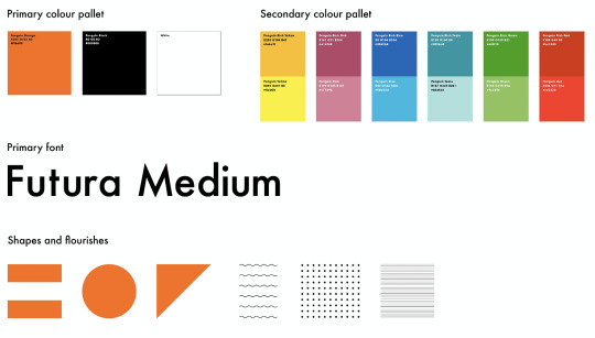
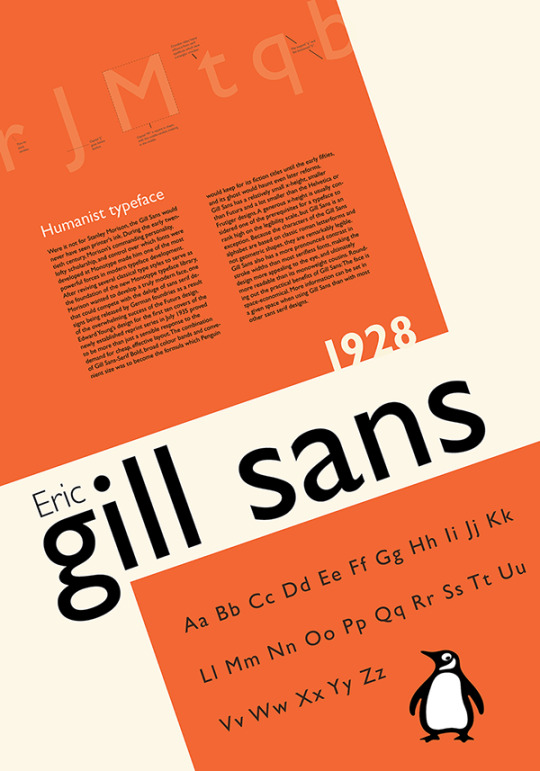
To get a better idea of Penguin as a brand, I had a look at the Penguin Random House brand identity, designed by Pentagarm. I found it interesting to see the shapes and flourishes they used - I think I could try and incorporate some of these into my design work as they have a modern, geometric feel to them as oppose to traditional looking. The colours used link back to the tri-band book covers, each linking to a genre. I think this could be an interesting concept to play with, if implemented with a contemporary twist.
The font for Penguin Random House is Future Medium, However Gills Sans is a more iconic Penguin font and therefore I think I might incorporate this to link it back to Penguin.
https://www.pentagram.com/work/penguin-random-house/story
0 notes
Photo
日之下あかめ『河畔の街のセリーヌ』:パリの街を歩き、人々の営みを見つめる少女の旅
Typeface: Shorai Sans, Gill Sans Nova
Text:
• note: https://note.com/iamfjk/n/nc92d5146aa27
• Medium: https://link.medium.com/c9fRQs0iHvb
0 notes
Text
Download caslon font

#Download caslon font pro
There’s a popular saying among type setters: ‘when in doubt, use Caslon’. The result is organic letters that bear close resemblance to the beloved serif of kings. Twombly designed them by studying specimen pages printed by William Caslon between 17. In 1990, type designer Carol Twombly created a Caslon revival called Adobe Caslon, which was more suited to digital needs. Soon, they also became famous outside of England, making their way to the New World, just in time for the signing of the Declaration of Independence. The Caslon fonts were used extensively by people from all ranks, particularly in political arenas. His works gained fame because of their attractiveness and functionality. A notable English punchcutter, he designed many typefaces during this time, until his death in 1766.
#Download caslon font pro
Sfns Display-Regular Helvetica Bold Font Download Swiss 721 Bt Bold Condensed Font freeload Clarendonbt Bold Helvetica World Font Free Laudatio Font Unisansheavycaps Font Nexarustsans-Black Font Helvetica Tt Sfns Display-Regular Ultrateens Adam Cg Pro Swiss Bold Condensed Helvetica World Bold Font Avenir Lt Medium Helvetica True Type Font Helvetica Regular Adam.Cg Pro Unisans Heavy Caps Helvetica Light Download Futura Lt Extra Bold California Sans freeload Helvetica World Regular Font freeload Font Helvetica World Download Helvetica.Ttf Helvetica Bold Oblique Font Helvetica Normal freeload Helvetica Font Family freeload Avenir Lt 65 Medium Bold Swis721 Cn Bt Font freeload Geometric Slabserif 703 Free Universltstd-Black Universltstd-Cn Font Free Futura Lt Bold Univers Lt Std Font Family freeload Nexarusthandmade Extended Futuralt Book Helvetica True Type Font Raleway Black Italic Font Download Helvetica Normal Font Indir Iowan Old Style Free Ck Journaling Font Univers Lt Std Bold Cn Avenir-Medium Font freeload Sfnstext Font Helvetica-Condensed-Light Download Minion Pro Helvetica Narrow Oblique Futura Lt Heavy Raleway-Black Nexa Rust Sans Black Font Corporate S Font freeload California Sans Font freeload Formata Regular Pablo Skinny Font Avenir 65 Medium Geometric Slabserif 703 Bold Helvetica Font Regular freeload Calvert Mt Copyright © 2022 download-fonts-free.Fonts 5,805 Fonts History of the Caslon FontĬaslon in essence refers to Old Style serifs originally created by William Caslon in 1722. Top Searches Helvetica-Normal Download Universltstd Lightcn Impact Font Download Helvetica-Oblique Font freeload Adam.Cg Pro Font Minion Pro Font Free Helvetica World Regular Swiss 721 Condensed Minion Pro Download Helvetica Truetype Download Adam.Cg Pro Font freeload Universltstd-Lightultracn Swiss 721 Bold Condensed Oswald-Demibold Helvetica World Bold freeload Univers Lt Std Font freeload Helvetica Ttf Font Download Helvetica Font freeload Helvetica Bold freeload Ttf Gill Sans Mt Bold Oswald Extra Light Helvetica Regular Font freeload Helvetica freeload Oswald Medium Font freeload Pokemon Font Helvetica Font Ttf File Download Oswald Demibold Font League Spartan Font freeload Amatic-Bold Nexa Rust Script L-0 Font Melmablack Font Helvetica Light Oblique freeload Helvetica Oblique freeload Futura Lt Condensed California Sans Font Free Univers Lt Std Cn Sfns Display Regular Fonte Helvetica Normal Download League Spartan Font Download Avenir Lt 65 Medium Helvetica Light Helvetica Light Oblique Font freeload.
0 notes
Text
9th-12th March
9th March: Part Five
For the reading area, I decided to go with the aurora borealis concept as before with the design murals. I wanted it to look pleasant and inviting, whilst adhering to Penguin's primary colour palettes. I realised relatively quickly that I didn't want to go with a plain mono theme, since vibrant rooms tend to provide a more ambient and relaxed experience. This was further reinforced when I read Eva Pavka’s piece on queer space, which discussed how there is a particularly strong relationship between the queer scene and moody, low-lighted spacial and interior design. For the process of this piece, I used a blur filter (the gradient blur specifically) on a canvas of various colours before using a noise filter. I wanted the walls to compliment the ambient theme, and I feel that I have achieved that. In comparison to my initial wall designs, the deisgn for this walls iis far greater. I used SketchClub, utilizing the gradient blur tool, the vector pen, and vector eraser.

Initial Wall Designs


12th March: Part Six
It eventually came to the stage where I wanted to broaden the concept of the digital archive. I knew from the get-go that presenting this with no context may cause confusion, and so I wanted to provide some detail on its functionality and appearance. Initial concepts were quite straightforward and minimal in terms of how I wanted it to appear, which helped with the general arrangement, but the final product turned out to be more balanced as an interactive medium. It was brought to my attention that I was utilising a disproportionately large amount of space for the Penguin logo and description alone; conflicted by this, I began a new experiment leveraging Penguin's colour scheme as a form of coding. However, this experiment was short-lived, as it came to me that I was still designing these far too big.
I was envisioning it on a smaller device, but in actuality, it would be on a screen that would be about the size of a flat-screen television. I made the decision to build a more appropriate showcase that would give the books more space to breathe. I used the Penguin logo and produced a brief description to establish the archive in Gill Sans, which is a traditional choice of typeface for the Penguin publishing house. I used light, semi-bold, and bold. A vivid backdrop is used in the finished piece, which incorporates the colour palette chosen for the wall designs (as seen preeviusly): I opted to do this as I wanted there to be greater harmony between my designs. I created this primarily in Indesign, with some assistance from Procreate and SketchClub. I utilised a variety of colours derived from Penguin's use of colour coding books in order to convey a sense of order, such as orange to represent general fiction, navy/dark blue to represent autobiographies, cerise to represent adventure and travel, and additionally, a rainbow of colours to represent the top picks of 2022.
To symbolise the transition from concealment to visibility after lockdown and as a representation of the queer experience in general, I decided that the titles of these books would only become visible to the viewer once they have interacted with them, otherwise, they will only see blocks of colour. This may seem radical for a showcase, but I knew I did not want this collection to be conventional; I wanted it to be reflective of the struggles queer have with identity and visibality. I implemented this idea after visiting a bookshop that had what they referred to as ‘mystery books,’ books wrapped delicately in newspaper with the sticker ‘unwrap me!’ plastered on each individual book. I watched as a couple or more so people looked over these books with intruige. I believe that the mystery showcase would result in a more engaging experience, the digital unwrapping of a book may pique the interest of viewers, just as I had witnessed, and it means the viewer can interact with the books in more way than one. I am satisfied with the direction this portion of the project has led me, being able to achieve balance for this specific design has motivated me to continue with additional design ideas and changes, for example, I aim to change the design of the panels for a more collective design appearance.
Initial Designs


I used Olivia (1946) by Dorothy Bussy as an example of how the book would appear under the archive’s colour scheme.

Final Design
I used Giovanni’s Room (1956) by James Baldwin as an example of how the book would look after being touched. After time it would fade back to being a block colour. The viewer can interact with as many books as they want in this way, but each will reset.
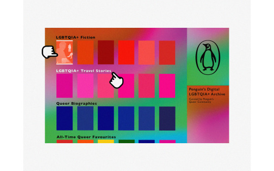
A similar interactive element would be included in the text. When you click on the text, you will be taken to a more extensive display of that genre. The page you are now seeing is the home page of the archive.
0 notes
Text

Saturday 30th April 2022 - Comparing Designs
Comparing both designs side by side there are distinguished similarities, such as a full bleed image and using lines to break up sections of information; whilst an obvious difference is using different typefaces to communicate a mood.
First things first lets talk about the grids used for each design. The design on the left follows an 8 column grid with 5 rows all aligned to the margins with a 4mm gutter. Having this many columns and rows evenly breaks up the page and is great for sectioning text over multiple columns, it's versatile and can be easily manipulated. The grid used for the design in the right follows the rule of 3, 3 columns, 3 rows, with a 3mm gutter. The rule of 3 is an easy conventional way of creating a layout - it's suppose to feel more comfortable to look at compared to a layout of 2 columns. Upon comparison I prefer the use of the grid in the design on the left. The layout feels more pulled together, allows for the image to be placed over the two pages as the structure of the grids allows for it. The 3x3 grid feels too blocked and that if there was more information the reader would loose interest because there's not much to break up the design; because there's minimal text it works okay for this design.
The type hierarchies follow a very similar pattern for both designs; Title above all other text followed by a stand first underneath, next you have any body copy text or side bars, and a full bleed image taking up a page. The reason both designs follow a similar type hierarchy is because of the rules that are in place when feeding information to a reader, it needs to be clear and follows an order that is known world-wide.
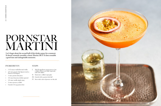
The choice of typefaces. On the left design I have chosen the font Big Caslon Medium at 59 & 72 pt for the title and Adobe Caslon Pro semibold at 12 pt. The subheadings for the ingredients and steps are in Big Caslon Medium at 12 pt whilst the body copy is in Adobe Caslon Pro Regular at 9 pt. I made the choice of pairing two serif typefaces because I wanted a design that communicated class and elegance and it was appropriate to use a serif font for the title because of the traditional background of these typefaces. The decision for using a serif font for my body copy is when printed a serif font is easier to read as it's softer on the eyes when scanning over a page of text. I believe the message communicated through the typeface choices alone shows a sophisticated style which is automatically picked up by the reader before reading any of the content. The right design was approached with a contemporary design in mind, the use of the san-serif Gill Sans Bold in 77 & 95 pt for the title gives a striking 'here I am, read me first' approach. Compared to the left design the title on the rights screams a more fun and playful approach, especially with the colour choices. Paired with the serif font Adobe Garamond Pro in Bold & Regular for the same reasoning as the left design, a serif font is easier to read when there's a chunk of text.
There were clear intentions on how I wanted to approach each design; one design was to be classy and sophisticated whilst the other was to be more fun, modern and vibrant, whilst hitting the target audience of 18-25 year olds. I believe both designs hit the target audience as the first one gives a responsible, mature feel almost like this book should be a prize possession. The second design hits the target audience for the fun, bold aspect, tailored more to students and young adults who have moved out for the first time and feeling like hosting a cocktail night/party.
Pleased with how both of these designs have turned out, if I was to favour one I believed the design on the left hits a sweet spot, but both have strengthen my knowledge of grids, guides, margins, layout, pairing type and constructing a well thought out design which I will carry over onto future projects.
0 notes
Text
“Dusty old death trap, this, any manner of nasty things down here,” Watch-Captain Parvette frowned, fixing his helmet in place with a slight snap-hiss. “Buckets on. Filters at medium. Could be all sorts of nasty things in the air.” He eyed Lir’s trundling form, “Venerable Brother, do us the honor, please…”
Lir, unused to such a comparatively small chassis, had the distinct impression that he was waddling as he approached. The kill team opened ranks and respectfully let him pass, a few clanking encouraging armored gauntlets on the ceramite plate of the Furibundus. Most of them had never seen a Furibundus. Some of them had never worked closely with any Dreadnought. It was awe inspiring, and a little surreal for the younger Astartes.
Lir raised his left power fist and slammed it into the rusting bulkhead door, loose from impact but otherwise near impossible to pass otherwise sans explosives. The grip secured, he tore away a section with his right. It was a little stiff, this old chassis, and he was slightly out of practice. The flexing artificial muscle sinews of the arm actuators were new, somewhat unsteady, but comforting. He fought the urge to crack non-existent knuckles. “This…” the vox decoder popped, “…should… be sufficient.”
Indeed it was. It was nothing artful, and his father the carpenter might have dismissed it as a poor excuse for a doorframe, but it served well enough. Parvette - a Mortificator by Chapter, so Lir understood - nodded his thanks, the scarred helmet showing the trademark evidence of battle his chapter rarely sought to hide. “The man knows his craft. Into the breach, gentlemen.” Parvette turned blazing orange optics toward Lir, “After you, Sir.”
Lir stepped through, ripping the entrance wider as he passed. Alastair Power would have made some comment about home redecorating during his lighter moments. Lir, however, had fewer such moments, though he conceded he was probably more personable than most of his kind.
The remaining Astartes followed, Parvette bringing up the rear. Lysimachus was with him, and the Blackshield passed an appraising glance over Lir. “Holding up?”
“…All parameters are… within acceptable range.”
Lysimachus turned to Parvette, “His generation of Legionaries were, on average, a hair taller. Required more adjustment. Alastor did a bang up job, however.”
“Good, I…”
Molloy, a young Ultramarine in MkVI, had taken the lead, and held up his hand, interrupting the Watch-Captain, “I think this is the right place, sir.”
Parvette looked in the direction of the Ultramarine, “What do you see?”
Molloy crouched slightly to read a dusty plate on the far wall. “Archaic AdMech insignia. Couldn’t tell you what it means, but it matches the images we saw.”
“I’ll have a look,” Lysimachus offered, “but I reckon Lir might have the superior knowledge here. Lir, would you mind?”
Lir strode toward Molloy, Lysimachus not far behind. It was difficult for Lir to slow himself to a gait approaching that of the other Astartes. It always was, starting out. He drew in a breath of purified oxygen, the fluid gurgling in the gills of his rebreather apparatus. This wasn’t the first time he had been assigned to a new chassis. Still, he walked on. A glance was all that was needed.
“No…. This is… post-war. The markings are… subtle enough. Note the… reversed sigma.”
“He’s right,” Lysimachus agreed, standing head high to the dreadnought’s shoulder. “That’s a Gethsemene inscription alright but the sigma reversal is a sort of post-war convention for… Eh, not important. Not the right one, though.”
“Damnit,” Molloy grunted.
“Happens to the best of us, Brother”, Parvette responded. “Alright, let’s move on. The damned thing has got to be in here somewhere.”
“And if it isn’t?” Glover, the Silver Skull, grunted.
“Then all of this has been a colossal waste of time,” Parvette acknowledged, “but it was worth pursuing. And if not, hell, any walk on land is a good excuse to get out of orbit. Some of you lazy fellows need it.”
Lir went on ahead, shining his spotlight along the walls of the old passageway. As he passed, Glover noted the insignia on the chassis' right arm. "Rainbow Warrior, huh? Don't meet a lot of them in this part of the galaxy."
"One of the first," Lysimachus said, his fascination with this palpable.
"No kidding," Glover said. "I bet you have some interesting stories, Venerable Brother."
Lir grunted, a barely audible sound, and continued to study the walls, reading panels, searching for new doors. Most were blocked, and would require far more heavy equipment than Lir could bring to bare just now. Others were open, and led into dark storage bays beyond. None of them were quite right. Not for what they were looking for, at any rate.
The others followed close behind, Molloy closest to Lir. "You were a tanker, I heard them say. I understand they haven't finished illuminating your chassis."
"I was." Lir responded.
"You might say, in a manner of speaking, that you were once a tanker, now a tank."
Lir smirked to himself, a human expression that had not left him in all this time. "I had not... thought of... that." He lied.
"I don't know if sarcasm carries well over your vocabulator, Venerable Brother Lir. But I'm honored you humor me in some way."
Lir grunted again. There was no need to be rude to any of them. He'd known Ancients, in his mortal days, who barely spoke a word. Dreadnoughts were not, by nature, particularly conversational. He'd heard stories of course. Bjorn. Older stories of an Ancient called Rylanor that most had now forgotten. Since his own interrment, he understood that this was often a matter of pain and discomfort. For his first few years, he was astounded that Pyrrhus, the first Ancient of the Rites for the young Chapter, spoke as much as he did. For Lir, these first few years were pain, discomfort. Speaking was not easy when interred. It was a chore, even when one had the use of one's own mouth and vocal chords to broadcast with the vocabulator. It didn't hurt so much anymore. But it was still exhausting.
"This... may be closer to what we are looking for." Lir pointed a ceramite finger at a smaller, human-sized door, just large enough for a Legionary in armor to squeeze through if he ducked his head. That struck Lir as a little unusual, given that the Mechanicum, the ones who built this ship, weren't always of precisely human proportions, anyway.
"This was an archive ship?" Gao, the Kill Team's Gunner and a White Scar, asked.
"In a manner of speaking," Lysimachus said. "Not an Ark Mechanicus. Far, far too small. Sort of a transport for important materials, though. Built to last, though. And armed to the teeth."
"Gods," Molloy grunted. "It smells in here. Smells like rotten... I don't know what."
"Any manner of nasty things down here," Pervette repeated, "just be thankful your filters work."
Lir inspected the door. The markings were correct. The mechanism was completely non-functional, of course. But perhaps a focused breaching charge would do it. How he wished for an assault drill.
"Your Mark VI..." Lir wheezed, "...odor reduction sensor. Nose cone."
"Sir?"
"Depress... tongue toggle... thirty seconds. Release."
"Sir?"
"Trust... me... Wore it... many years... myself."
"What have we got over there, Lir?" Parvette's transmission came over the command frequency, away from the ears of the others. "This... may be... our... quarry. The door... will not be... easy to open. I... advise caution."
"Thank you, Venerable Brother."
"Holy hell," Molloy said. "The smell is gone. Why didn't I know about this?"
"Not..." Lir said, "commonly... known. Developed... by..." he paused, "I'm not sure." He lied again. It would not do to mention that the innovation had actually been a development by a loyalist Iron Warrior turned Rainbow Warrior who complained of the odor on certain swamp worlds and found the Mark VI's enhanced sensors particularly sensitive to that sort of thing.
"Hmm. Whoever he or she was, Emperor bless that fine person."
"He was," Lir reflected to himself.
"I'm bringing up a breaching charge," Parvette announced. "Stand back."
The Mortifactor carried with him a large, circular disk, about the size of the opened palms of Lir's Furibundus chassis. "Stand clear, please. You too, Venerable Brother. Let's not get you damaged before they finish your paint job."
Molloy snorted. Lir would have rolled his eyes, if he still had use of them. He trundled back, motioning for the others to do the same.
"This should be relatively easy," Parvette announced, "just need to get this affixed, and... well, this is a problem."
"Sir?" Lysimachus called.
"Bit of interference with the magnetic field or, I don't know, something along those lines. Doesn't want to affix itself properly."
"I... advise... caution..." Lir repeated. "The Mechanicum of old had a tendency to..."
His words, transmitted though they were on open frequencies and with sound dampeners built into each transmitter and receptor, were drowned out by the explosion.
Watch-Captain Parvette's Mark VII armor was designed to defeat many things. To protect the wearer from a variety of threats. It was not capable, however, of preventing an Astartus from blowing himself to bits.
Dusty old death trap, this. Truer words had never been spoken.
9 notes
·
View notes
Text
Return to the Master Story Index
Return to CLASSICAL FANTASIES
THE FISHERMAN'S LEG (Part 13 of 20)
A sequel to Dee 1/2 Demon
by
De Writer (Glen Ten-Eyck)
16914 words (work in progress)
© 2023 by Glen Ten-Eyck
All rights reserved. This document may not be copied or distributed on or to any medium or placed in any mass storage system except by the express written consent of the author.
TUMBLR EXEMPTION
Blog holding members of Tumblr.com may freely reblog this story provided that the title, author and copyright information remain intact, unaltered, and are displayed at the head of the story.
Fan art, stories, music, cosplay and other fan activity is actively encouraged.
~~ ~~ ~~ ~~
New to the story? Read from the beginning HERE.
~~ ~~ ~~ ~~
Magistrate Lim was facing Minami yet again. The Fisherman was kneeling in front of him, Constable Canra standing just behind him with his ever present cudgel to quell any unruly behavior, of which Minami had been guilty several times.
He sighed and opened the thick file of Minami's many transgressions. “Minami san, why did you cause this violent fight in the village's Pauper's dining room? You know that good behavior is the only requirement to receive free food, yet you not only complained of the food, you threw good rice, fish, vegetables and bread about in anger! Why did you do so?”
“Magistrate san, They insulted us terribly! They tried to feed us that ghastly mucky tasting mud shark for a fish! It is nothing but foul bottom scavenger!”
“I see, Minami san. I have heard you call them that sort of thing for somewhat over twenty years. Tell me, have you ever tasted one?”
Minami bowed the light bob of conversation and replied, face contorted with disgust, “Never! Nor will I! I have seen them gobble up mud or sand and make great clouds of it with my own eyes! I could not be wrong because I have seen it many times!”
“Minami san, you have dug a yam from a garden, yes?”
“Of course! Who has not?”
“Is it ready to eat as it comes from the ground on your spade?”
“Certainly not! It must be washed free of dirt first.”
“Just so, Minami san. The sand shark finds its food lurking in the mud. Clams, shrimp, snails, blennys, small crabs, all sorts of animals. At the front of its gills are some stiff bristles that hold the prey. It blows the mud and sand out through its gill slits until the prey is clean to swallow.
“It eats no mud or sand, only creatures that are wholesome for it. The cloud of mud that you saw after it bit at the bottom was simply from washing its prey before eating.
“I have been taken out and caught such sharks myself and then cleaned them. Thus, I know from experience that the sand sharks are wholesome to eat.
“None will deny what you have seen for the last twenty years. The problem has arisen because you did not realize that what you saw was not the whole of what was happening.
“If you can understand that, dine with me and you may taste the truth of this. If not, I must fine you twenty five of copper cash.”
Minami looked up in total surprise! “Dinner and no fine? Or a fine and no dinner? Magistrate Lim san, I will dine with you and see if perhaps I have been in error about this.”
Later, waiting out the night in his cell, Fisherman Minami admitted to himself that he had been wrong about the sand sharks. They were in fact delicious.
Within two days other unruly behavior got him put onto the roads of Sabo province for a moon.
After about two weeks, living with his mother and “Big Sisters” Minara and Takahra, Ichuru was coming out of his shell, as some say. He even took delight in helping in the garden because, instead of seeing it as a chore, he was being included along with them!
He was spending half of each working day helping Patsu and her new girls to build the new boat for his mother. The other half was in the Fish Market! The customers would entrust him with their cash and take his carefully wrapped packages of fish in return!
With ten year old enthusiasm, he led the charge! “Everything's put away! Race you to the boat for crabbing!”
Takahara, who could easily outpace him, ALMOST beat him to the Chiasu dock to get a rental boat! Minara and his mother, Tanira followed more sedately.
They all bowed to him, sitting in the boat of his choice. “You have remembered your floats, Ichuru san. I see that you have got our crab trap rings and baits too. This is all excellently done.”
Only partly because it would make him feel more included, they all donned floats too. Rowing a ways out, they planted their crab ring traps under floats that would let them be found later and began trolling, pulling a baited hook on a longish line let out from the boat's small crane, mainly used to raise the crab traps.
The end of the crane yanked down! Something had taken the bait! Ichuru watched the crane tip. As it rose, he wound in line, making it bow down again. He kept that up, letting the crane do the work of pulling up the big reddish snapper!
Takahara got a big scooping net under it and the pulled it in! They put the fish in the catch box after they got the hook out of its mouth.
Minara and Tanira took the oars and rowed them back to their crab traps. With the line in the crane changed for the lifting of traps, they brought up one, until its upper ring was above water.
Here, it was Minara and Tanira's turn. Carefully reaching into the corralled crabs, they pulled out the first one. Minara laid the gage across its shell and grumped good naturedly, “Too small!” As she tossed it back to the sea with a splash, she told it, “There you go. Grow up some for us!”
The next three all went into the catch box. Minara took the fourth one with a grunt, “Oh, you are a big one, aren't you? Lucky day for you, dear, you are too big, back you go!” Ichuru watched the crab swim away.
“I didn't know that crabs can swim! Why did we put it back? Isn't a big one more valuable?”
Tanira gave him a bit of a hug and explained, “Yes, they can swim some. They don't like to, though. We put back big ones like that because they will make more than ten times as many baby crabs as the smaller ones will.”
Takahara picked up, “Besides just numbers, the big crabs won't let little crabs mate with them. That means that all their youngsters that don't get caught will grow into more big crabs. So, letting them go means that there will always be lots of good crabs for us to catch and eat.”
As he was winding in line for the next crab trap, Ichuru nodded, “That makes sense, Takahara san. Thank you.”
The next morning, they could not find Ichuru! As the girls and his mother searched frantically for him they found that his toy boat and floats were missing too!
Down at the docks there was even more consternation! The Sea Lion had been stolen sometime in the night or early morning!
To be Continued
<==PREVIOUS ~~ NEXT==>
Return to the Master Story Index
Return to CLASSICAL FANTASIES
#THE FISHERMAN'S LEG#Part 13 of ?#Classical Fantasy#sequel to DEE 1/2 DEMON#WORK IN PROGRESS#Written by De Writer
7 notes
·
View notes
Note
hello, i ADORE the way you use and pair fonts. i was just wondering if you had any tips for using more than one font in an edit? (Such as mixing cursive and non-cursive, etc.) if you've answered something like this before, my apologies!
nonnie!! literally never apologize for asking me to scream about fonts; they live in my mind rent free. 💜i’ve mentioned a vague collection of fonts i like here, but i’ve been meaning to do a post on how to combine them for awhile so thanks for giving me an opening to do so! so, without further ado, a few tips & tricks.
1. FIGURE OUT THE VIBES OF YOUR SET FIRST.
Like colours, fonts have a certain feeling/energy to them and should match the emotion you want your set to communicate. Cursive fonts tend to suggest a more gentle, relaxed, or fragile emotion; brush fonts convey a sense of movement, excitement, or freeness; heavy-weighted fonts have a sense of power, abruptness, or impact; and so on, and so on. For example:
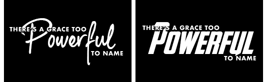
Although they’re both using the same kind of alignment, the combo on the left is far less in-your-face as the option on the right would’ve been. Using a handwritten font for the accent feels a bit more contemplative or personal, like an awed whisper; whereas the all-caps bold font is more like it’s coming to kick your door down in celebration. Either option works well enough as a font combo, but in terms of working together towards the theme, the left one matched what I wanted. So—always prioritize emotion in font choice, even if another option looks just as cool.
2. STYLE YOUR OTHER FONT(S) AROUND THE ACCENT FONT.
With “the accent font” being the “fancy” one, in this case. It’s going to be the centerpiece of your set, so you don’t want to have picked a supporting font first only to discover it doesn’t actually go with your main font. I usually type the text in a placeholder font (like Helvetica or let’s be real, my faves Gill Sans or Futura), then figure out my accent font for the Main words, then go back and find a supporting font & weight that I like.
You also, like me, might just stick to 3-4 “basic” fonts and never change them, because it’s much simpler that way and also Futura is such a pretty font y’know??
3. COMBINING FONTS IS ABOUT CONTRAST.
For fonts to work together, they have to contrast in (at least) two ways—in weight, in style, in size, or in colour. Similar to picking out an outfit, if a font is too similar to its neighbor it’ll clash, but they do still need to be living in roughly the same neighborhood or it won’t fly. For example:
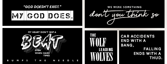
Only two fonts are used in each set (and only one in the last one—the contrast is made through negative space rather than font type), and contrast comes through 1) size (note how the accent font is always bigger—I usually aim for about double), 2) style (block, handwritten, brush, sans serif vs. serif), and in the case of the bottom left one, 3) tracking (“bumps the needle” is the same font [gill sans] as “my heart” is; the difference is the distance between letters is set at like 1500 vs about 75).
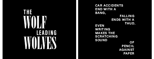
While there’s plenty of contrast in the examples above, there’s also harmony—in the top left example, the Accent font for “My God Does” is a thick, rounded font, so the supporting/plain font is also fairly rounded and a medium weight. Compare that to the middle bottom set, where since “Wolf” is in a tall, thin font, “Leading” is also in a tall and thin font.
Without harmony, the fonts start warring against each other. Taking that last set as an example:
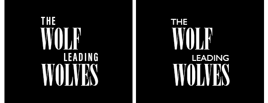
On the left, we have the original—“Wolf”/”Leading” pairs Onyx/Acumin Variable Concept (Extra Condensed)—and on the right, Gill Sans has replaced Acumin Variable as the secondary font. Because Gill Sans is so much rounder and bigger (this is despite my taking the pt size down by about 6), it reads as thicker. That added horizontal weight takes away from the very concentrated vertical weight of the Accent font, and therefore doesn’t work as smoothly.
You can get away with pairing rounded/thin letters or heavy/light letters, and in fact you should try it! Just make sure there’s a significant contrast between them, not just a minute one.
4. TYPOGRAPHY NEEDS AN ANCHOR.
Once you’ve picked your fonts, there’s another problem: placement. One of the difficulties of text in a gif is that it can go anywhere, and so sometimes we get carried away with the arrangement. That’s where anchoring the text—placing it in alignment with something else—comes in. Let’s zoom in on two of the examples above.
While the arrangement is playful in both, the text doesn’t feels lost because even when it’s unusual, it’s still directly aligned with some part of another word. In the left example, “The,” “Wolf,” and “Wolves” are all aligned with their first letter to the left, whereas the word “Leading” is aligned to the right with its last letter matching the “S” in wolves. Thus, while it breaks up the left-alignment of the rest of the set, it still feels like it belongs because it’s attached on the other side. It doesn’t “break the box,” so your brain doesn’t get confused.
With the set on the right, a similar thing is at play. First, the alternating pairs are aligned either to the left or the right so it still reads as a unified rectangle (don’t break the box!), and second, each time the text switches sides it’s placed directly on the line below the last word. So even though they’re not aligned on the left or right, they are aligned from top-to-bottom. The negative space is also key to breaking up the text in a pleasing manner, as seen in this comparison:
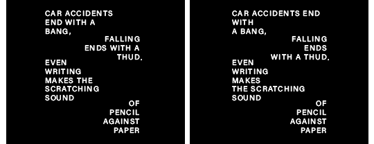
The original version on the left creates a smooth river or “S” shape, with each line break also making sense for the rhythm of the sentence. The one on the right, however, breaks the text up uncomfortably, the lines are jagged and bump up against each other unpleasantly, and “the scratching” stretches far out into the negative space, tripping up the flow. When and where you chop up a text matters not only for how you read it, but also how you feel about it.
5. A QUICK WORD OF WARNING.
Obviously no rule is a complete absolute, but I think this one holds up under most circumstances so here it goes: do not put two different fonts of the same genre in the same gif. If you have Cursive Font A already, you very likely won’t be able to successfully implement Cursive B right next to it without causing confusion (see rule 3 about contrast). You might be able to get away with two accent fonts (e.g., a nice cursive font + a thick impact font), but it’s a lot harder for the reasons mentioned above about clashing/warring for attention. Basically, make sure you’re adding, not subtracting, to the overall statement.
6. PRACTICE!!
The best way to figure out what style works best for you is to just go mad with it. I’ve been doing typography work of one kind or another for about a decade and yet even looking at some of my sets that are just a few months old I’m surprised by how much my style has grown & expanded! The more you use it, the more you’ll find certain fonts, styles, and tricks to your liking, and seeing what other people do with their sets is a great way to expand your repertoire, too.
Go forth and have fun. 💜
944 notes
·
View notes
Text
Early 20th Century Book Cover Design - The Rise Of The Paperback
The origins of the paperback can be traced back to Mid Victorian Britain; with the industrial revolution in full swing public access to education and rail travel was on the rise. A new readership, less wealthy than book owners of the past but keen for adventure, were met with low-cost, cheaply printed ‘yellowbacks’ or ‘penny dreadfuls’. Prevalent throughout train station concourses these were:
Printed entirely in paper, without a hard cover, and in a smaller format
(Graphéine - Agence de communication Paris Lyon, 2017)
The name ‘yellowback’ refers to the yellowy colour of the cover due to the use of low quality wood pulp in their manufacture. This incredible Flickr account has over 2000 examples, providing hours of browsing their weird, wonderful and at times bizarre titles.
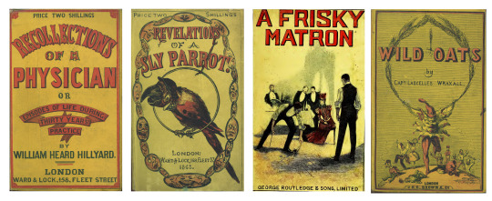
Hillyard, W. Heard (William Heard), Recollections of a Physician, or, Episodes of Life, Ward and Lock, 1861. Bennett, John, fl. 1858-1870., Revelations of a Sly Parrot, Ward & Lock, 1862. Lysle, Percy, A Frisky Matron, George Routledge and Sons, Limited, 1897. Wraxall, Lascelles, Wild Oats, J. & C. Brown, 18--
‘Penny Dreadfuls’ were cheap (one penny), serial literature published weekly
‘Penny bloods’ was the original name for the booklets that, in the 1860s, were renamed penny dreadfuls and told stories of adventure, initially of pirates and highwaymen, later concentrating on crime and detection. Issued weekly, each ‘number’, or episode, was eight (occasionally 16) pages, with a black-and-white illustration on the top half of the front page. Double columns of text filled the rest, breaking off at the bottom of the final page, even if it was the middle of a sentence.
Judith Flanders (May 2014)
By the 1920′s & 30′s, in the aftermath of the First World War, direct printing on to cloth became too expensive and so book cover illustrators moved their focus to the paper ‘dust covers’. Advancements in printing techniques allowed for four colour mechanical printing, where these paper dustjackets had previously been purely functional, they now became the star attraction.
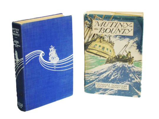
First Edition of Mutiny of the Bounty, Charles Nordhoff and James Norman Hall, Little, Brown and Company, 1932
By 1935 a more educated general public demanded a better quality of literature than seen in the Penny Dreadfuls (or their American cousin The Dime Novel) but still required access at low cost. This leaves publishers in a quandary, paperbacks are synonymous with low-level literature and; they don’t anticipate readers of this type of fiction to be interested in ‘real’ literature.
One man looked to change this preconception and with his two brothers established the publishing house ‘Penguin Books’. In 1935 Allen Lane Williams sought to
“Bring great literature to large numbers of people through cheap paperbacks”
AbeBooks 2018
What was really clever about his vision was the branding of their covers. Designed by Edward Young it is their apparent simplicity that has made them iconic. A series of three horizontal bands with type set in Bodoni Ultra Bold and Gill Sans; a system of colours is devised to represent the theme of the book, orange for fiction, dark blue for biographies, green for crime, purple for essays, pink for travel & adventure, red for theatre/drama and yellow for miscellaneous.
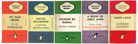
Penguin Book Covers
Costing just six pence each (about the same price as a packet of cigarettes) this low cost was crucial to their widespread appeal. Beyond train station kiosks, these books were stocked in department stores and high street favourite Woolworths. Within their first year, Penguin had published three million books.
In 1937 Lane went one step further and invented the ‘Penguincubator’ a penguin pocket book vending machine.
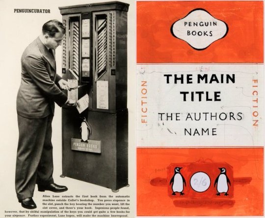
The Penguincubator
References
Graphéine - Agence de communication Paris Lyon. (2017). A short history of book covers - 2/4. [online] Available at: https://www.grapheine.com/en/history-of-graphic-design/history-of-book-covers-2 [Accessed 16 Feb. 2021].
Art, Y.C. (2020). uclalsc_sadleir3706bII2_001. [online] Flickr. Available at: https://www.flickr.com/photos/yellowbacks/page1 [Accessed 16 Feb. 2021].
The British Library. (n.d.). Penny dreadfuls. [online] Available at: https://www.bl.uk/romantics-and-victorians/articles/penny-dreadfuls.
AbeBooks (2018). How Penguin’s Paperbacks Changed the World of Books. [online] Medium. Available at: https://medium.com/@abebooks_writes/how-penguins-paperbacks-changed-the-world-of-books-880618282290 [Accessed 16 Feb. 2021].
Graphéine - Agence de communication Paris Lyon. (2017). A short history of book covers - 3/4 - Graphéine. [online] Available at: https://www.grapheine.com/en/history-of-graphic-design/history-of-book-covers-3 [Accessed 16 Feb. 2021].
2 notes
·
View notes
Photo

🦇Bat Fact! Do you know of the Pond Bat (Myotis dasycneme)? This medium-sized vesper bat can be found in a narrow zone from Belgium to Siberia, and scattered across Estonia islands and Talinn. This bat is 50-75mm in length and can weigh up to 28g! This bat roosts in lowland regions in the summer that have water, woods, and/or meadows. In the Winter this bat will stay in the foothills of mountains. It will hunt over lakes, canals, and rivers to prey upon gnats, midges and other smaller insects. The bat has no natural predators, but cats can pose a threat to some colonies. This bat is listed as “Near Threatened” by the IUCN due to loss of nursery sites and the overuse of pesticides🦇
📸Photo by Gilles San Martin (CC-BY-SA-3.0)📸
#batfacts #bats #bat #akhyls #education
⬇️Follow Bat Facts⬇️
https://akhylsthebat.tumblr.com/
https://www.minds.com/akhylsthebat/
https://twitter.com/AkhylsBatFacts
https://t.me/AkhylsBatFacts
https://www.facebook.com/groups/137858924078846/
❗️Disclaimer: All images used here are for educational purposes and are not used in any way for profit or to promote any products or services. Copyright Disclaimer under section 107 of the Copyright Act 1976, allowance is made for “fair use” for purposes such as criticism, comment, news reporting, teaching, scholarship, education and research. Fair use is a use permitted by copyright statute that might otherwise be infringing❗️
3 notes
·
View notes
Last Seen Blogs

totallyxtrapped
totally trapped

analogster
Analogster

lucifer-intheskywithdiamonds
The Four Horsemen

worm---wizard
Wizard Supreme