#gimp tricks
Explore tagged Tumblr posts
Visit Tumblr Blog
Explore Tumblr blogs with no restrictions, modern design and the best experience.
Last Seen Tumblr Blogs


Fun Fact
Tumblr has a 66 index score for customer satisfaction in the US.
Video
youtube
GIMP - How To Make Images Brighter
A short tutorial showcasing how to make your images a bit brighter using GIMP, a free photo editing software.
#youtube#gimp#how to use gimp#gimp tutorial#tutorial#free to use#free to use software#gimp tips#gimp tricks#gimp tips and tricks#gimp editing#gimp tools#photo editing#photo editing tips#photo editing hacks
12 notes
·
View notes
Text
Puzzleshipping: "You gave me your heart, you know..." [Insp.]
❕ Please do not repost to any other sites ❕
#rts super duper appreciated on this one because. holy shit#this took me more than two weeks and i need other people to stare at it with me#it was so fun to do tho#a lot of work but i learned some fun tricks with gimp and stuff#and im like stupid fucking proud of this i wont even lie#im really glad i decided to try this trend because this is by far the best edit ive ever made#i wanna make more like this style i just need to find the right audios for it#i dont want to do dangerously yours audios all the time yknow?#but this was good for puzzle#ok ill shut up now#puzzleshipping#yugi mutou#yugi muto#atem#yami yugi#yugioh#ygo#my edits#devo speaks#dangerously yours edit
624 notes
·
View notes
Text

I've only got gimp to work off of but omg there has to be a better way to get rid of this pattern than just smudging it around to look like folds for an hour
#wish I had photoshop but I aint giving adobe money#i need to learn lil tips and tricks for gimp#i mean theres gotta be an easier way right??#anyway heres a preview of some new recolors coming soon~#sims 4 recolor
0 notes
Text
How to fix transparent PS2 textures in Gimp Tutorial.

After experimenting different methods found from forum sites & YouTube, here are my methods. Keep in mind, these methods depend on which texture you're dealing with.
0 notes
Text
It's still not perfect but this is as close as I could get that colour transparency trick to work.
It's really annoying because it'll look just fine in GIMP but when I export it to png the transparency colour is way off. I had to fiddle with the transparent layer and export it and then test it on tumblr each time to get it even close to matching.
I tried fiddling with the export settings and thought I got it at one point but it turns out I had just exported it with the white background still visible :(
EDIT: I had a go at trying this in Photopea. It worked:
Looks like it's GIMP problem but I have no idea how to fix it.
0 notes
Text
Hey I figured out an easy perspective trick on Gimp:
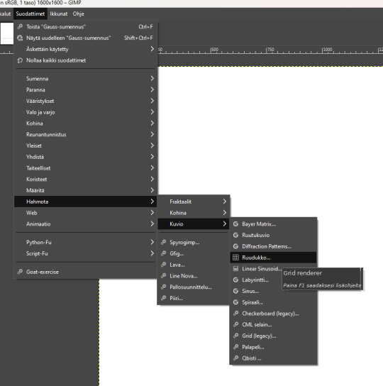
Yeah my Gimp is 50-75% in finnish because I'm a funny bitch. Anyway you make a new layer and then go down the selection to "render grid" and render a grid of your own preferences, though I recommend starting big.
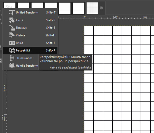
Then you go to the "perspective" tool. I recommend copying the grid layer before this, so you've got multiples of the same size and layout available. But take the one you're going to use now, and grab the perspective tool.
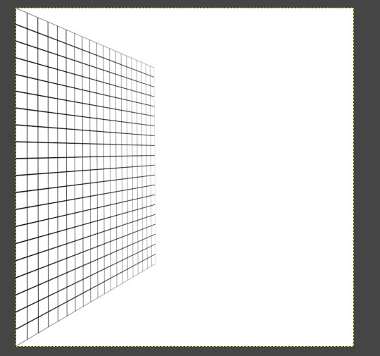
yooooooooooo
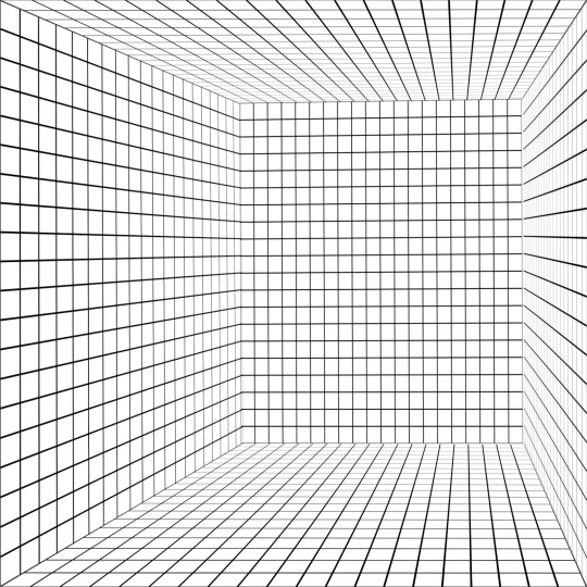
Repeat with as many as you like/want and/or need.

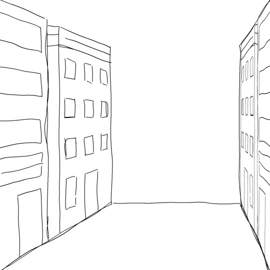
Lighten the grid layer and sketch on that shiiiiit
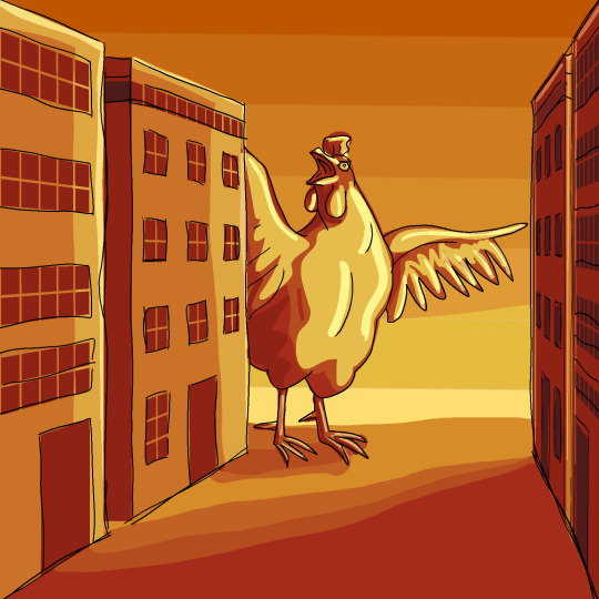
Use this power for good, evil, or whatever way your little heart desires. I am not your mother, your god, or your conscience.
540 notes
·
View notes
Text


Coming Soon : Splash Trash - 43 Dirty Pool Items - RELEASED 23/05/25
Download Here

About the Pack This custom content pack was created as a subgoal gift for the Kapands Twitch community, and more specifically for the amazing Pêches 🍑 — the loyal and creative subscribers who helped shape its theme: Grimy Poolside.
Most of the objects were directly inspired by suggestions from the community. Of course, I couldn’t resist adding a few extra items and quirky touches here and there — it wouldn’t be me otherwise! Every texture was lovingly handrawn using Procreate, GIMP, and sometimes Canva, depending on the vibe I wanted to achieve. While working on the pack, I couldn’t help but picture a group of teens hanging out in this run-down pool — skateboards, spray paint… and before I knew it, I had a whole story in my head. Just goes to show that creativity really has no limits !
I teamed up with @emany-sims, who is currently building the perfect lot to showcase the pack. You’ll be able to find it in Kapands’ Fresh Start save — so keep an eye out!
Hope you have as much fun using this pack as we did dreaming it up 💦💖 And with that, i'll let you read a short story about these teens I've pictured !

The Hideout
Charly, Armin, and Inès quickly found one thing in common: skateboarding. In Oasis Springs, there’s not much to do — so when something actually makes your heart race, you hold on to it. For them, it was their boards. That kind of obsession that makes you forget you’re stuck in a dusty nowhere-town where even dreams seem to dry up in the heat.
O.S. Highschool was no exception — dull, faded, full of students with no spark and teachers stuck on autopilot. But somehow, the three of them clicked. No long conversations needed. Just a glance after class, a failed trick, a laugh, and that was it.
It didn’t take long before they started wandering the town together after school, boards under their arms, old speaker blasting music, looking for spots to skate and escape the boredom. Oasis Springs had no shortage of forgotten corners — rusted warehouses, cracked parking lots, dead-end streets. But their real find came one spring evening, when they followed a half-ripped sign: Public Pool – Closed Until Further Notice.
The place was perfect. Empty, wrecked, abandoned by time. The drained pool made the perfect natural bowl, the crumbling locker rooms became little shelters. It didn’t take long before they claimed it as their hideout.
There, they’d practice new tricks, spray paint the walls, sneak a smoke, and laugh about everything and nothing. It was filthy, falling apart, smelled weird most days — but it was theirs.
Far from adults, far from rules, far from the blank stares at school. Out there, with the sound of wheels echoing on broken concrete and their voices bouncing off the cracked tiles, they actually felt alive.


I always use @franzillasims fonts every time I need simlish fonts !!!
#the sims 4#sims 4 custom content#sims 4 storytelling#ts4 cc#ts4#ts4 maxis match#maxis match#cc pack preview
144 notes
·
View notes
Text
How to take screenshots and edit (when it's just not your thing)

Alright-y!
So, I have over the years learned how to use reshade and to edit my pictures. I am really not a natural on these things, so this is very much to help others who are as aesthetically challenged as I am. I have to have certain "rules" to follow, because I can rarely just see if a picture will turn out well or not.
We all need to realize where I started. We're talking using FRAPS to take screenshots and then running holy colours batman! to get some sort of effect.
Now, I'm not one to buy fancy stuff and to pirate certain programs isn't really my thing either. So we mend and make do!
Also, I am by far very good at taking screenshots and edit, but I have learned things and hope that it might be useful for someone!
A word on light
One thing I've learned is to work with is light. Where the light is is where the focus will go. This doesn't mean that a person has to be in the spotlight, but if they aren't - try to make that a more conscious choice. I am no pro at this, but I have to say that some of my favorite screenshots are where the light is just good. It focuses the eye or it just give a vibe.


(and yes, for some reason all of my faves are of Agnes, which is a bit annoying since Amanda is my fav-character, lol)
This is also where reLight comes in handy. Yes, it's behind a paywall but there are ways that you will have to figure out yourself.
Great tutorial here on reLight by @pictureamoebae! (if you want to really understand reshade, do check out their tumblr. So many helpful tips and tricks!)


Posing
Posing is fun! I don't fully story-tell with my sims, most of it is gameplay. But I do like to pose for family pictures or to enhance something that is going on.
What you need is Andrew's Pose Player and Teleport Any Sim or Wicked Whims.
Now, I haven't figured out how to use WW for children and younger to pose, so I use both. And I like @ts4-poses to find poses. Eventually, you'll find your favorite creators and can follow them directly.


Angles and vibes
Here's a trick. Work with angles. I am a master of pictures with zero vibe, just a face. Those can be ok, and sometimes that's what you have - but try to angle your shot a little.
Or add clutter, focus on that and let something out of focus happen in the background.
Or just go higher, take the screenshot from above.
Or don't focus on your sim at all, focus on something else that adds to the story/post.


Take the screenshot
The light is good, the angle great, the poses are in place and now, we need to take the actual screenshots.
I am a huge fan of reshade, I use version 4.9.1 because that works for me and the presets I use. No need to update reshade unless it becomes too old.
It can be really difficult to to find a preset that you like. I mostly use birdie by @monasims, tawhay by @windslar and paperbacks by @literalite. But I have tried many.
I like this youtube-tutorial on how to make your own preset, which also helps if you wish to modify one that you've downloaded. I do always recommend learning how to use ADOF and CinematicDOF to help focus the image on what you want to capture. I also strongly recommend @pictureamoebae's Foundation.
To take pictures, use the tab-key to leave the UI behind and use Q and E to go down/up in your game and then the mouse to angle. I use print-screen to take my screenshot, but that's something you set up when installing reshade so that's different for everyone.
And now you have your screenshot and it's time to open an editing program. Cheap as I am, I open GIMP.
Let's edit!
I don't use many steps. Since I can't use fancy photoshop actions I have to make all the steps by myself and well - I am human and therefor lazy.
Resize and start to think of a post
First things first. I cut my pictures to work for the tumblr ratio. I actually don't resize them smaller anymore - because when I change layout on my tumblr I just feel as if it messes it up. Now, I don't have a huge screen and my screenshots aren't massive, so it's not necessary either.
My images will be 1017x1017, 1525 x 1017 or 678 x 1017.
Once this is done, I also try to look at how they will go together. If I want a post of just squares I need to have an even number of images. Sometimes I want a landscape image as a sort of heading, or one in the middle with squares around it. It depends on what I want to convey.
This is by no means something that comes natural to me - I am aesthetically challenged after all. Sometimes, I just have 5 images and have to make do.

Resized
Topaz Clean
Yup, it's awesome. No, it doesn't come with GIMP. Yes, there are ways to work around this. You will have to find those ways on your own.
But I have to say, it does makes wonder for the images. I have completely stolen @sojutrait 's settings because I really like her style and therefor - I copy. I have added a bit more sharpening, but otherwise it's completely hers.

Topaz Clean:ed
Curves
Curves my beloved! I use curves for two things! Take out the yellow (aka increase the blue) and to brighten/darken the image!
I do sometimes matte the image too and here's a good tutorial for GIMP users on how to use curves in GIMP (for a matte look)

Less yellow/more blue

Brighten the brights (but I did not brighten the darker parts)
Layers, curves and increase the light where needed
Now, remember that we need light? Sometimes, a screenshot just doesn't have the right light. So I duplicate the layer, use the free marking tool around what I wish was brighter and put that on a new layer.
Then I use curves to lighten the layer with what I want to brighten and to make darker the layer with what I want to put less focus on (here's an ok youtube video on the subject).
Below, you can see the effect on my images.


Sharpen
Pretty basic. I subtly sharpen the image again. Even if I use the sharpening in topaz clean I do like to add an extra touch before it's time to save and move on.

So sharp!
PSD and UI
I do like to use psd's now and then. I mainly use @windslar's psd-collections and @deathbypufferfish's Build-a-Sim Icon Pack.
It's mostly to help give some info about the post or when my sims age up and I want to show their traits.
I do use the UI-info sometimes. If I do, I go into Game Options in the game > Accessibility > UI-scale and just drag that up a bit. Then I copy/paste that part onto the image I'm using.


Done!
That's pretty much it. Thing is, to post good edits you have to actually take good screenshots. As annoying as it is, it's like cooking: it all comes down to the ingredients. I hate cooking Yes, editing does help but I think my main journey has been to learn to take better screenshots from the start.
The picture below is from resized to done.
Hope this might help someone! I will probably learn more and more as I continue to post, but this is where I am so far in my journey!
151 notes
·
View notes
Note
hi tumblr wip! is there anything that can be done about images stretching to the full width of a tumblr post? i make art and images that are sometimes under 540px, and there seems to be a point where they will stretch automatically to 540px. it makes things like pixel art or otherwise small images look terrible!
Answer: Hi there, @moxley!
We’re really glad you asked this question, as we love getting the opportunity to share the tips and tricks that are applicable in this area.
First off, here are the rules of our image stretching:
On mobile apps and mobile sites, we always stretch images to the full width of the post—since a small image on a small screen doesn’t make for an easy viewing experience.
On the desktop site, we only stretch images to the full width of the post if the image is at least 300px wide and/or 600px tall.
Any images that are placed side-by-side are always stretched to fit their frames, no matter the image’s dimensions or the viewer’s platform.
However, the vast majority of devices and browsers use antialiasing in their default image scaling algorithms. This, as you point out, doesn’t play nicely with pixel art at all. Boooooo!
So, how can you preserve your sharp pixels with 100% consistency for your viewers? The answer is simply to upscale the image yourself before uploading. To keep the pixels square, you’ll need to resize by factors of 100% (200%, 500%, etc.) and use a simple upscaling algorithm that doesn’t use antialiasing. For example, in Paint.NET’s image resize dialog, you can use “Resampling: Nearest Neighbor”, or in GIMP’s, “Interpolation: None”.
The trick here is to resize your pixel art to dimensions above 540px wide so that every viewer’s device is actually forced to downscale the resultant image instead. That way, instead of the resizing algorithm making up details by blurring the pixels, each original pixel is preserved as a perfect square.
We really hope this helps you and the other pixel artists out there. Please, have a great day, week, and month. No, in fact—a great rest of your Tumblr experience, however long it may last. Of course, if you have any other questions on this subject, we will be happy to answer those too!
466 notes
·
View notes
Text

If you create CC for TS2 you probably avoid using DXT1 format, because it often looks really bad, right? Well, I've got news for you😐
‣ SimPe texture viewer can't correctly decode DXT1 textures. It often displays artifacts not visible in the game.
Up until now it was not possible to extract such texture from a package without 'glitches'. @chieltbest recently shared their revolutionary YaPe package editor. It's an experimental version, for now - it's still being developed - but I've already edited 180+ CC textures with no issues. YaPe is very easy to use. It allows you to reconvert textures inside a package to different format, remove or add mipmaps with one click, replace textures with drag and drop method - supports JPEG, TIFF, DDS and more! You can get it here.
YaPe editor is also the only app I know, that allows you to extract DXT1 texture from the package file without glitches. Below the cut you'll find a little tutorial on that. I also included a detailed comparison of DXT textures built with various plugins:
Note: YaPe is a huge time saver, however I still recommend SimPe for textures with smooth gradients, where quality is very important - such as skintones, and especially dark ones (also for removing mipmaps from such content, current version of YaPe rebuilds textures in the process fixed).
-------------------------------------------------------------------------
*DXT1 format has gained a bad reputation amongst TS2 creators, mostly because of borked SimPe DXT1 texture preview/export.
But the fact is - DDS plugins (aside from SimPe DDS Builder) create DXT1 that looks quite similar or identical to flat DXT3 / DXT5.
Important thing about DXT1 format: file size is around half smaller than DXT3/5.
‣ What's wrong with SimPe DXT1 textures?
Nothing, really. SimPe /Nvidia tools DDS builder is using special settings for DXT1. It saves textures as DXT1a format.
Unlike ordinary DXT1 (DXT1c) that doesn't support transparency at all, DXT1a format has basic 1-bit transparency switch. DDS builder 'hides' black pixels from compression by enabling transparency - this trick is actually meant to reduce artifacts in some areas /thanks @chieltbest for explaining this/.
Transparent parts of DXT1a texture are displayed as black in the game, as long as TXMT doesn't have transparency enabled.
Below: DXT1a previewed in YaPe. Left pic features transparent pixels (hard to notice if you enable dark UI mode). Please note that, unlike SimPe, it displays colors and grays correctly.
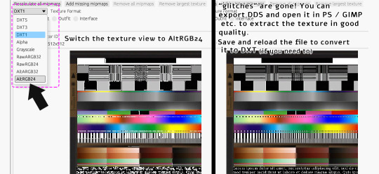
‣ Extracting DXT1 texture without 'glitches' in YaPe:
Open package in YaPe editor. Preview TXTR resource, pick AltRGB24 (Raw24Bit) from dropdown menu.
AltRGB24 preview displays flattened version of the texture (texture background is exposed)
'Export DDS' button creates .dds file out of the previewed texture
/optional: If you save the changes, then you can reload the package and convert from Raw to DXT format/
exported DDS texture can be opened in apps with DDS plugin - GIMP, Paint.NET etc.
if you don't have apps with DDS plugin, you can use SimPe (click on texture in SimPe, pick 'import DDS..', choose dds exported in YaPe, then export as PNG.
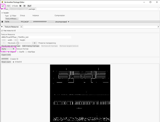
Pic above: Yet Another Package Editor v0.4.0, light UI mode. My sample DXT1a texture in Alpha preview - transparent pixels are clearly visible.
⚠️ Editing original SimPe DXT1a texture with YaPe (removing or adding mipmaps - for example) and saving as DXT1 again, will most likely increase the number of 'false artifacts'
..however, the texture will still look decent in game. I edit CC with DXT1a for my own use that way - because reconverting to other formats doesn't improve texture quality, might even make it a little worse in some cases.
BUT if you're going to share such content, it might be best to reconvert it. Because if it looks very glitchy in SimPe, it also looks glitchy in Sims2Pack Clean Installer. And people might just delete it.
Alternatively, if you use DXT1 for your CC, you could inform people that "glitches" in SimPe / Clean Installer preview are not visible in the game.
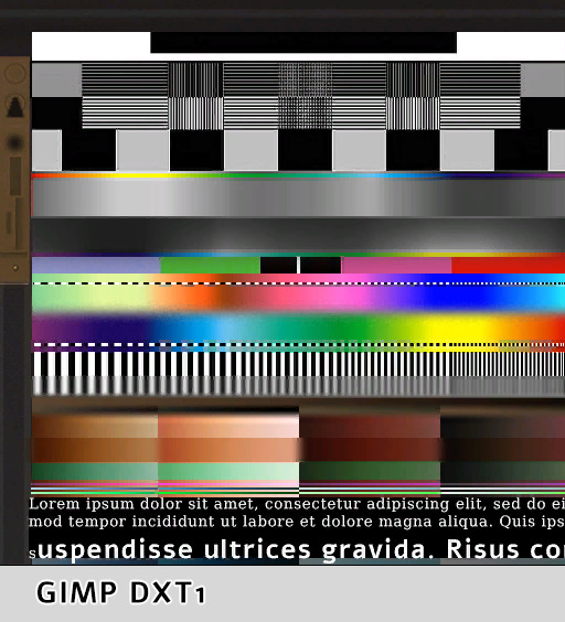
DXT1 vs flat DXT 3/ 5:
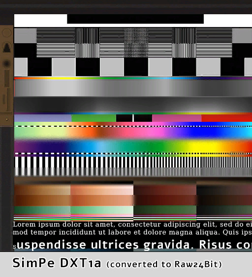

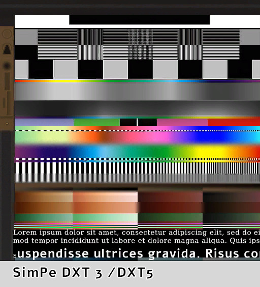


(YaPe allowed me to extract SimPe DXT1a texture without glitches)
*Yes, flat DXT1 and DXT3 / DXT5 created in GIMP really looked exactly the same.
GIMP had 'perceptual error metric' option on, it slightly improves some details.
so, who won?
You be the judge. Overall, I think YaPe (v0.4.0) did really good in this particular case.
SimPe DTX3 shows more artifacts in the blue/ turquoise /black dots area but dark gradients are smoother than others. GIMP DXT had issues with black dots over the pink - red tones seep into black.
SimPe DXT1 is not bad, but has some issues - a few artifacts appeared over thin black & white stripes. Also, blurred colors in the middle became a bit crunchy. /Dark brown gradients are better than GIMP DXT tho/.
‣ DXT5 Alpha-channel quality
The difference between DXT3 and DXT5 lies only in the way transparency is handled. DXT5 can store more alpha-channel grayscale information and offers much smoother transparency.
Pic above: alpha-channels extracted from DXT5 (white = opaque parts, pure black = 100% transparent). These looked basically the same so I did another test using more demanding texture - darker alpha gradients plus thin lines:

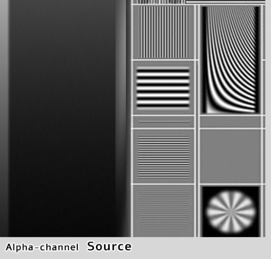
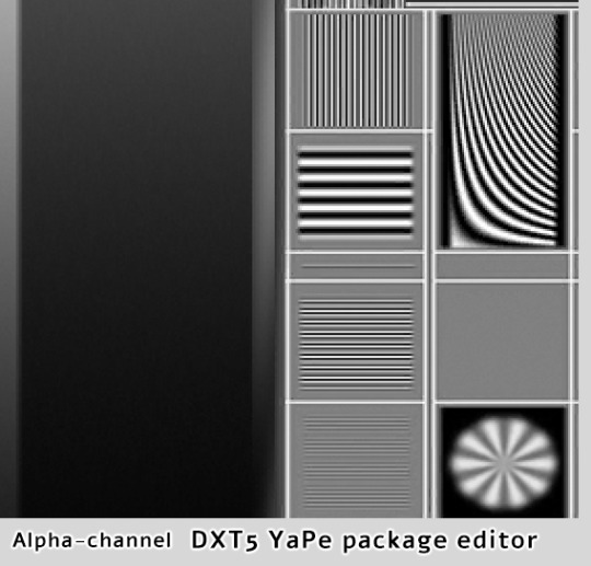
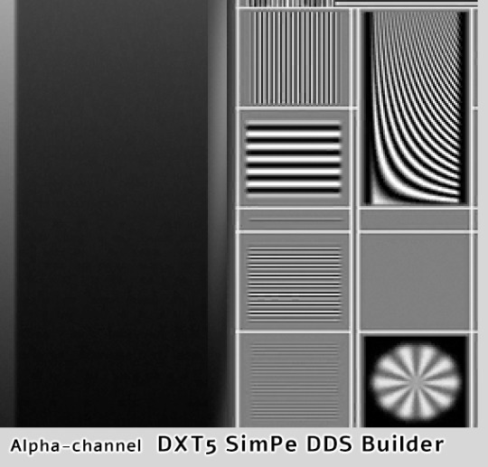
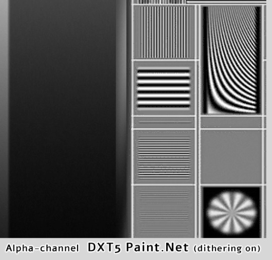
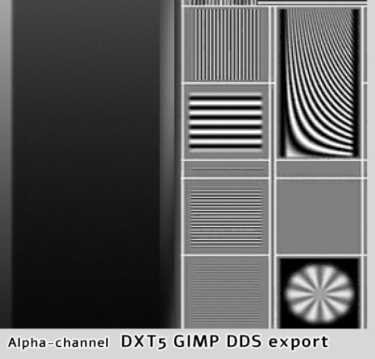
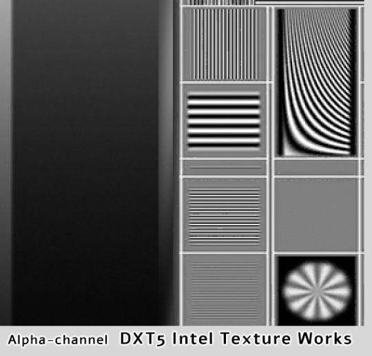
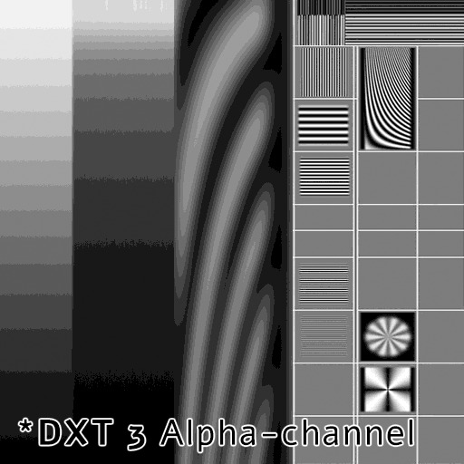
YaPe has produced very nice alpha channel without much artifacts, the gradient looks almost as the source. SimPe DXT5 - also clean details, but surprisingly, darkest parts of the gradient are a little bit choppy. GIMP DXT5 and the other two show tiny pixel artifacts around light lines.
Last pic above is DXT3 alpha-channel for comparison - crisp details are clean, but gradients are very choppy. I've compared various plugins, all produced identical DXT3 alpha. DXT3 format is OK for stuff that's using alpha-test transparency (not smooth, not see-through) - leafy plants etc.
*Please note that's exactly why transparent clothing looks so bad when created with Bodyshop - it doesn't use DXT5, only DXT3.
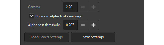
GIMP DDS exporter allows you to improve transparent mipmaps for plant textures etc, you need to select 'Preserve alpha test coverage' and increase the threshold if required - it will make very thin details a bit more thick on zoom-out and reduce details disappearing.
YaPe editor also has an option to tune transparent mipmaps (increase the value with "preserve transparency" slider). YaPe lets you preview each mipmap, which is very convenient. Here's a detailed tutorial by Chieltbest.
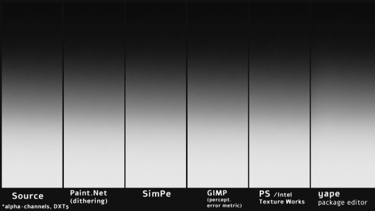
‣ Color gradient: DXT3 /DXT5
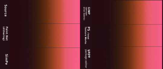
Paint.NET (DDSFileTypePlus 1.12.13.0) did best in this case, thanks to agressive error-diffusion dithering. SimPe DDS Builder DXT 3/5 did really good and you probably won't find better DDS plugin for building clothing or skintone DXT textures, especially dark skins.
Next goes YaPe editor - gradient is quite smooth, aside from the darkest tones - quite choppy. GIMP DXT and Intel Texture Works are so-so.
*I already posted one DXT formats test here, it features darker gradients. I still need to compare how textures look as actual SimSkin or overlays in game. The TS2 game is not great at displaying grey / dark color gradations, especially on Sims...
Above, uncompressed png texture for reference.
98 notes
·
View notes
Text
A year in illustration, 2023 edition (part one)
(This is part one; part two is here.)
I am objectively very bad at visual art. I am bad at vision, period – I'm astigmatic, shortsighted, color blind, and often miss visual details others see. I can't even draw a stick-figure. To top things off, I have cataracts in both eyes and my book publishing/touring schedule is so intense that I keep having to reschedule the surgeries. But despite my vast visual deficits, I thoroughly enjoy making collages for this blog.
For many years now – decades – I've been illustrating my blog posts by mixing public domain and Creative Commons art with work that I can make a good fair use case for. As bad as art as I may be, all this practice has paid off. Call it unseemly, but I think I'm turning out some terrific illustrations – not all the time, but often enough.
Last year, I rounded up my best art of the year:
https://pluralistic.net/2022/12/25/a-year-in-illustration/
And I liked reflecting on the year's art so much, I decided I'd do it again. Be sure to scroll to the bottom for some downloadables – freely usable images that I painstakingly cut up with the lasso tool in The Gimp.
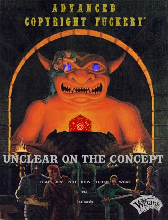
The original AD&D hardcover cover art is seared into my psyche. For several years, there were few images I looked at so closely as these. When Hasbro pulled some world-beatingly sleazy stuff with the Open Gaming License, I knew just how to mod Dave Trampier's 'Eve Of Moloch' from the cover of the Players' Handbook. Thankfully, bigger nerds than me have identified all the fonts in the image, making the remix a doddle.
https://pluralistic.net/2023/01/12/beg-forgiveness-ask-permission/#whats-a-copyright-exception
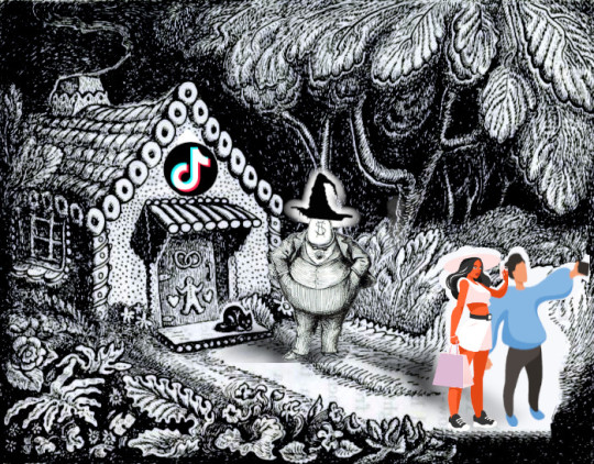
Even though I don't keep logs or collect any analytics, I can say with confidence that "Tiktok's Enshittification" was the most popular thing I published on Pluralistic this year. I mixed some public domain Brother's Grimm art, mixed with a classic caricature of Boss Tweed, and some very cheesy royalty-free/open access influencer graphics. One gingerbread cottage social media trap, coming up:
https://pluralistic.net/2023/01/21/potemkin-ai/#hey-guys
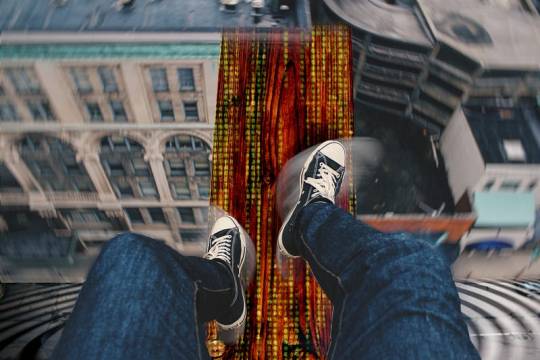
To illustrate the idea of overcoming walking-the-plank fear (as a metaphor for writing when it feels like you suck) I mixed public domain stock of a plank, a high building and legs, along with a procedurally generated Matrix "code waterfall" and a vertiginous spiral ganked from a Heinz Bunse photo of a German office lobby.
https://pluralistic.net/2023/01/22/walking-the-plank/
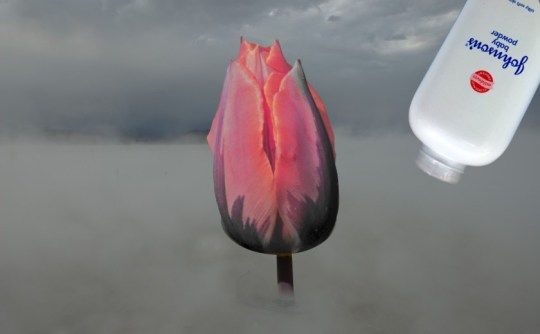
Finding a tasteful way to illustrate a story about Johnson & Johnson losing a court case after it spent a generation tricking women into dusting their vulvas with asbestos-tainted talcum was a challenge. The tulip (featured in many public domain images) was a natural starting point. I mixed it with Jesse Wagstaff's image of a Burning Man dust-storm and Mike Mozart's shelf-shot of a J&J talcum bottle.
https://pluralistic.net/2023/02/01/j-and-j-jk/#risible-gambit
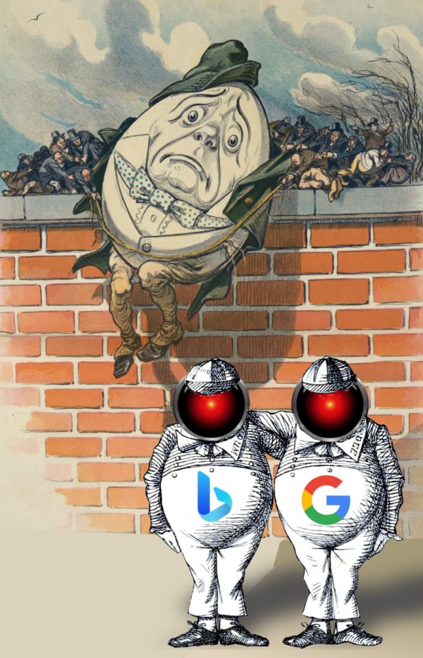
"Google's Chatbot Panic" is about Google's long history of being stampeded into doing stupid things because its competitors are doing them. Once it was Yahoo, now it's Bing. Tenniel's Tweedle Dee and Dum were a good starting point. I mixed in one of several Humpty Dumpty editorial cartoon images from 19th century political coverage that I painstakingly cut out with the lasso tool on a long plane-ride. This is one of my favorite Humpties, I just love the little 19th C businessmen trying to keep him from falling! I finished it off with HAL 9000's glowing red eye, my standard 'this is about AI' image, which I got from Cryteria's CC-licensed SVG.
https://pluralistic.net/2023/02/16/tweedledumber/#easily-spooked
Though I started writing about Luddites in my January, 2022 Locus column, 2023 was the Year of the Luddite, thanks to Brian Merchant's outstanding Blood In the Machine:
https://pluralistic.net/2023/09/26/enochs-hammer/#thats-fronkonsteen
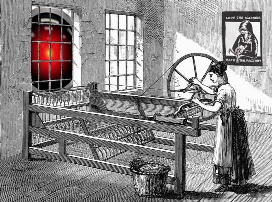
When it came time to illustrate "Gig Work Is the Opposite of Steampunk," I found a public domain weaver's loft, and put one of Cryteria's HAL9000 eyes in the window. Magpie Killjoy's Steampunk Magazine poster, 'Love the Machine, Hate the Factory,' completed the look.
https://pluralistic.net/2023/03/12/gig-work-is-the-opposite-of-steampunk/
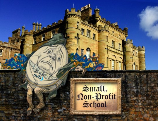
For the "small, non-profit school" that got used as an excuse to bail out Silicon Valley Bank, I brought back Humpty Dumpty, mixing him with a Hogwartsian castle, a brick wall texture, and an ornate, gilded frame. I love how this one came out. This Humpty was made for the SVB bailout.
https://pluralistic.net/2023/03/23/small-nonprofit-school/#north-country-school
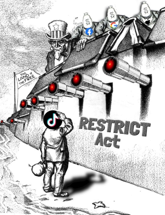
The RESTRICT Act would have federally banned Tiktok – a proposal that was both technically unworkable and unconstitutional. I found an early 20th century editorial cartoon depicting Uncle Sam behind a fortress wall that was keeping a downtrodden refugee family out of America. I got rid of most of the family, giving the dad a Tiktok logo head, and I put Cryteria's HAL9000 eyes over each cannonmouth. Three Boss Tweed moneybag-head caricatures, adorned with Big Tech logos, rounded it out.
https://pluralistic.net/2023/03/30/tik-tok-tow/#good-politics-for-electoral-victories
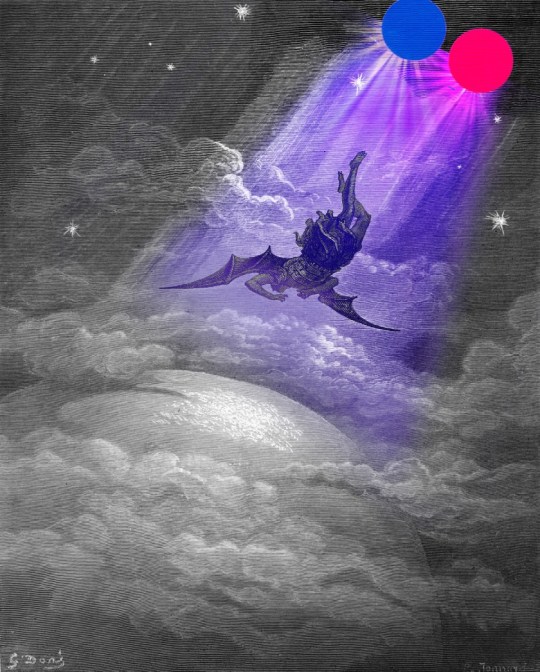
When Flickr took decisive action to purge the copyleft trolls who'd been abusing its platform, I knew I wanted to illustrate this with Lucifer being cast out of heaven, and the very best one of those comes from John Milton, who is conveniently well in the public domain. The Flickr logo suggested a bicolored streaming-light-of-heaven motif that just made it.
https://pluralistic.net/2023/04/01/pixsynnussija/#pilkunnussija
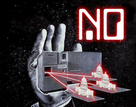
Old mainframe ads are a great source of stock for a "Computer Says No" image. And Congress being a public building, there are lots of federal (and hence public domain) images of its facade.
https://pluralistic.net/2023/04/04/cbo-says-no/#wealth-tax
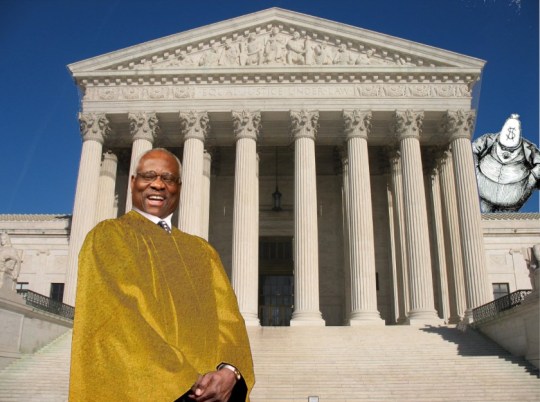
When I wrote about the Clarence Thomas/Harlan Crow bribery scandal, it was easy to find Mr. Kjetil Ree's great image of the Supreme Court building. Thomas being a federal judge, it was easy to find a government photo of his head, but it's impossible to find an image of him in robes at a decent resolution. Luckily, there are tons of other federal judges who've been photographed in their robes! Boss Tweed with the dollar-sign head was a great stand-in for Harlan Crow (no one knows what he looks like anyway). Gilding Thomas's robes was a simple matter of superimposing a gold texture and twiddling with the layers.
https://pluralistic.net/2023/04/06/clarence-thomas/#harlan-crow
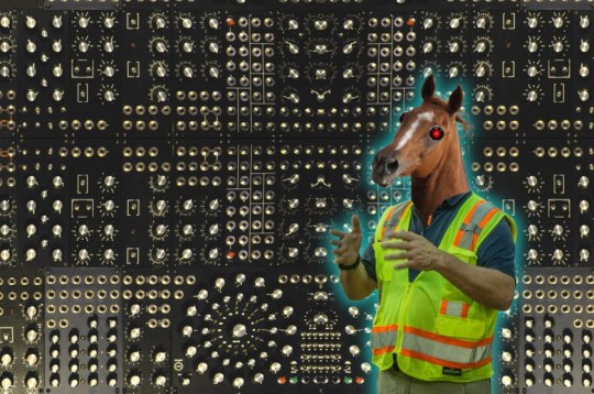
"Gig apps trap reverse centaurs in wage-stealing Skinner boxes" is one of my best titles. This is the post where I introduce the idea of "twiddling" as part of the theory of enshittification, and explain how it relates to "reverse centaurs" – people who assist machines, rather than the other way around. Finding a CC licensed modular synth was much harder than I thought, but I found Stephen Drake's image and stitched it into a mandala. Cutting out the horse's head for the reverse centaur was a lot of work (manes are a huuuuge pain in the ass), but I love how his head sits on the public domain high-viz-wearing warehouse worker's body I cut up (thanks, OSHA!). Seeing as this is an horrors-of-automation story, Cryteria's HAL9000 eyes make an appearance.
https://pluralistic.net/2023/04/12/algorithmic-wage-discrimination/#fishers-of-men
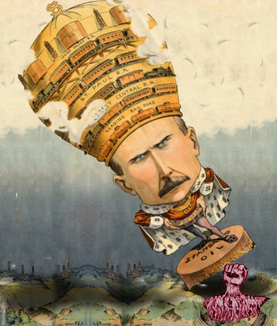
Rockefeller's greatest contribution to our culture was inspiring many excellent unflattering caricatures. The IWW's many-fists-turning-into-one-fist image made it easy to have the collective might of workers toppling the original robber-baron.
https://pluralistic.net/2023/04/14/aiming-at-dollars/#not-men
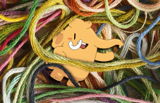
I link to this post explaining how to make good Mastodon threads at least once a week, so it's a good thing the graphic turned out so well. Close-cropping the threads from a public domain yarn tangle worked out great. Eugen Rochko's Mastodon logo was and is the only Affero-licensed image ever to appear on Pluralistic.
https://pluralistic.net/2023/04/16/how-to-make-the-least-worst-mastodon-threads/
I spent hours on the sofa one night painstakingly cutting up and reassembling the cover art from a science fiction pulp. I have a folder full of color-corrected, high-rez scans from an 18th century anatomy textbook, and the cross-section head-and-brain is the best of the lot.
https://pluralistic.net/2023/05/04/analytical-democratic-theory/#epistocratic-delusions
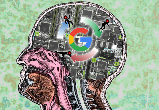
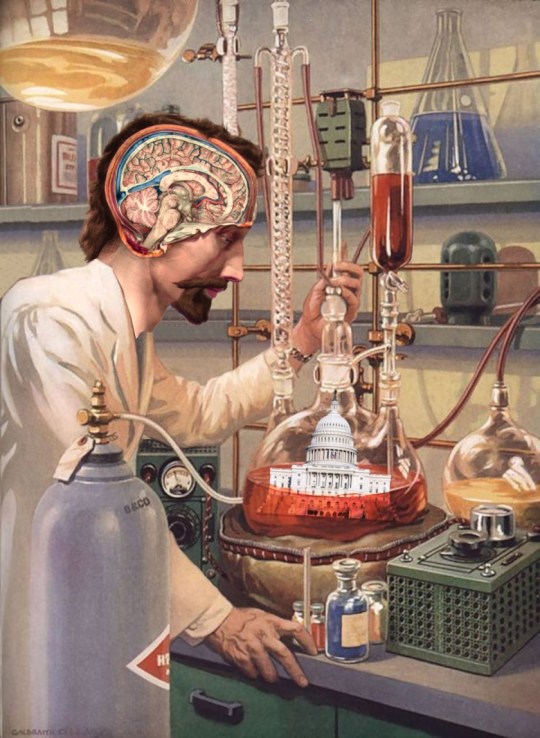
Those old French anatomical drawings are an endless source of delight to me. Take one cross-sectioned noggin, mix in an old PC mainboard, and a vector art illo of a virtuous cycle with some of Cryteria's HAL9000 eyes and you've got a great illustration of Google's brain-worms.
https://pluralistic.net/2023/05/14/googles-ai-hype-circle/
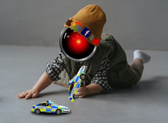
Ireland's privacy regulator is but a plaything in Big Tech's hand, but it's goddamned hard to find an open-access Garda car. I manually dressed some public domain car art in Garda livery, painstakingly tracing it over the panels. The (public domain) baby's knit cap really hides the seams from replacing the baby's head with HAL9000's eye.
https://pluralistic.net/2023/05/15/finnegans-snooze/#dirty-old-town
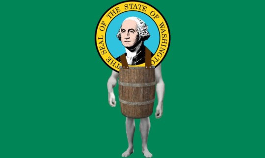
Naked-guy-in-a-barrel bankruptcy images feel like something you can find in an old Collier's or Punch, but I came up snake-eyes and ended up frankensteining a naked body into a barrel for the George Washington crest on the Washington State flag. It came out well, but harvesting the body parts from old muscle-beach photos left George with some really big guns. I tried five different pairs of suspenders here before just drawing in black polyhedrons with little grey dots for rivets.
https://pluralistic.net/2023/06/03/when-the-tide-goes-out/#passive-income
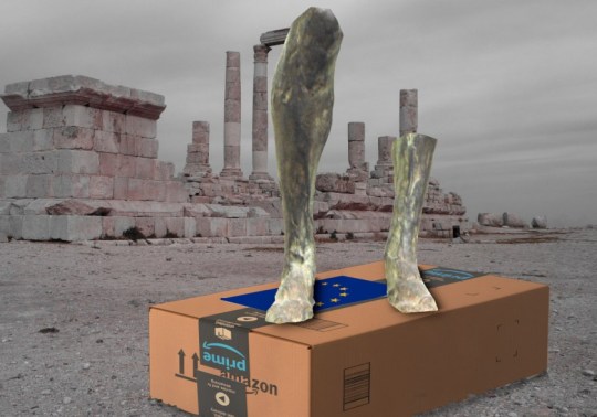
Illustrating Amazon's dominance over the EU coulda been easy – just stick Amazon 'A's in place of the yellow stars that form a ring on the EU flag. So I decided to riff on Plutarch's Alexander, out of lands to conquer. Rama's statue legs were nice and high-rez. I had my choice of public domain ruin images, though it was harder thank expected to find a good Amazon box as a plinth for those broken-off legs.
https://pluralistic.net/2023/06/14/flywheel-shyster-and-flywheel/#unfulfilled-by-amazon
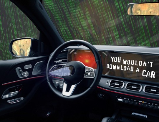
God help me, I could not stop playing with this image of a demon-haunted IoT car. All those reflections! The knife sticking out of the steering wheel, the multiple Munsch 'Scream'ers, etc etc. The more I patchked with it, the better it got, though. This one's a banger.
https://pluralistic.net/2023/07/24/rent-to-pwn/#kitt-is-a-demon
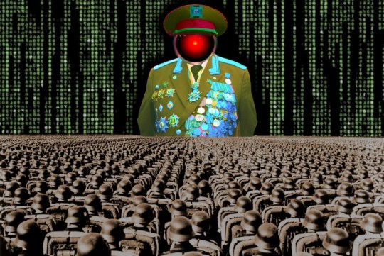
To depict a "data-driven dictatorship," I ganked elements of heavily beribboned Russian military dress uniforms, replacing the head with HAL9000's eye. I turned the foreground into the crowds from the Nuremberg rallies and filled the sky with Matrix code waterfall.
https://pluralistic.net/2023/07/26/dictators-dilemma/#garbage-in-garbage-out-garbage-back-in
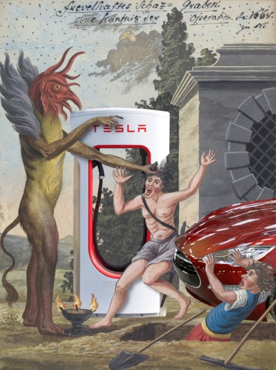
The best thing about analogizing DRM to demonic possession is the wealth of medieval artwork to choose from . This one comes from the 11th century 'Compendium rarissimum totius Artis Magicae sistematisatae per celeberrimos Artis hujus Magistros.' I mixed in the shiny red Tesla (working those reflections!), and a Tesla charger to make my point.
https://pluralistic.net/2023/07/28/edison-not-tesla/#demon-haunted-world
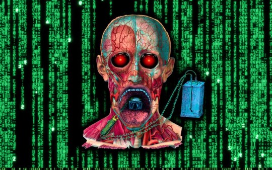
Yet more dividends from those old French anatomical plates: a flayed skull, a detached jaw, a quack electronic gadget, a Wachowski code waterfall and some HAL 9000 eyes and you've got a truly unsettling image of machine-compelled speech.
https://pluralistic.net/2023/08/02/self-incrimination/#wei-bai-bai

I had no idea this would work out so well, but daaaamn, crossfading between a Wachowski code waterfall and a motherboard behind a roiling thundercloud is dank af.
https://pluralistic.net/2023/08/03/there-is-no-cloud/#only-other-peoples-computers
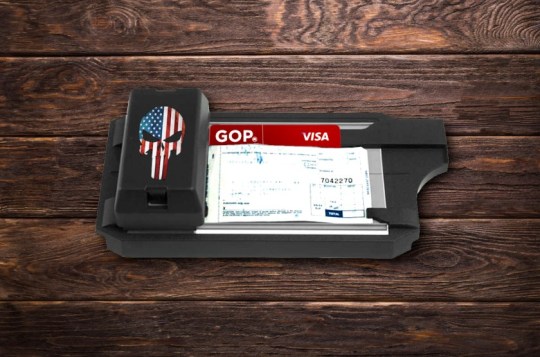
Of all the turkeys-voting-for-Christmas self-owns conservative culture warriors fall for, few can rival the "banning junk fees is woke" hustle. Slap a US-flag Punisher logo on and old-time card imprinter, add a GOP logo to a red credit-card blank, and then throw in a rustic barn countertop and you've got a junk-fee extracter fit for the Cracker Barrel.
https://pluralistic.net/2023/08/04/owning-the-libs/#swiper-no-swiping
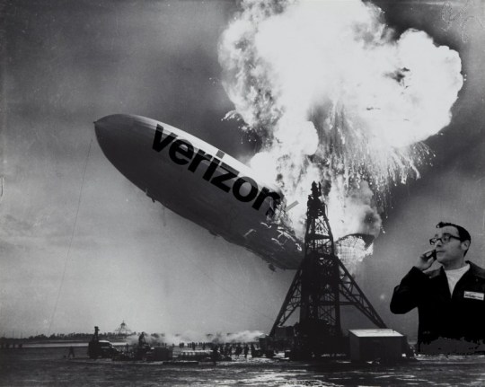
Putting the Verizon logo on the Hinderberg was an obvious gambit (even if I did have to mess with the flames a lot), but the cutout of Paul Marcarelli as the 'can you hear me now?' guy, desaturated and contrast-matched, made it sing.
https://pluralistic.net/2023/08/10/smartest-guys-in-the-room/#can-you-hear-me-now
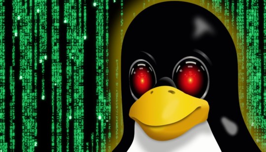
Note to self: Tux the Penguin is really easy to source in free/open formats! He looks great with HAL9000 eyes.
https://pluralistic.net/2023/08/18/openwashing/#you-keep-using-that-word-i-do-not-think-it-means-what-you-think-it-means
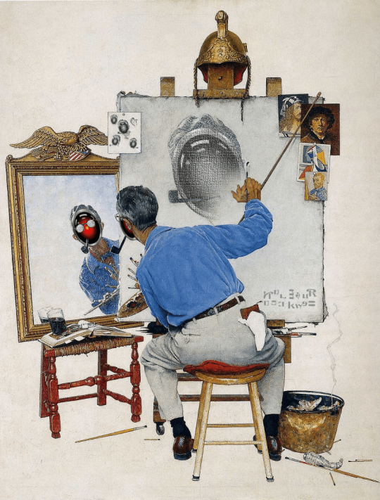
Rockwell's self-portrait image is a classic; that made it a natural for a HAL9000-style remix about AI art. I put a bunch of time into chopping and remixing Rockwell's signature to give it that AI look, and added as many fingers as would fit on each hand.
https://pluralistic.net/2023/08/20/everything-made-by-an-ai-is-in-the-public-domain/
(Images: Heinz Bunse, West Midlands Police, Christopher Sessums, CC BY-SA 2.0; Mike Mozart, Jesse Wagstaff, Stephen Drake, Steve Jurvetson, syvwlch, Doc Searls, https://www.flickr.com/photos/mosaic36/14231376315, Chatham House, CC BY 2.0; Cryteria, CC BY 3.0; Mr. Kjetil Ree, Trevor Parscal, Rama, “Soldiers of Russia” Cultural Center, Russian Airborne Troops Press Service, CC BY-SA 3.0; Raimond Spekking, CC BY 4.0; Drahtlos, CC BY-SA 4.0; Eugen Rochko, Affero; modified)
#pluralistic#illustration#collage#fair use#creative commons#stock art#blogging#art#practice makes perfect
239 notes
·
View notes
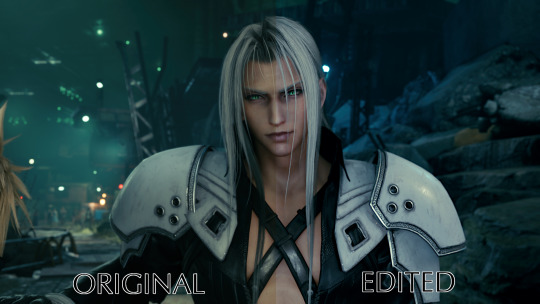
Note
how do you manipulate the in-game camera to get screenshots from different angles in FF7? I got Rebirth for my computer and some of the things you've pointed out in your shots are really amazing (Sephiroth's look of affection at the Edge of Creation is a personal standout). I'd love to be able to do that too
I'm happy to share with you! 🥰 The trick is that it's a mod, so after Rebirth comes out, you may have to wait just a little while for it to become compatible, but I'll tell you my setup for Remake. Rebirth will be a tidbit different, since it runs on Unreal Engine 5 instead of 4, like Remake. Still, the process should be about the same. 🤔The beauty of having the game on PC is being able to use lovely mods, and I get 99% of them on Nexus.
On this page here, you will find all the information you could need about the Universal Unreal Engine Unlocker, or UUU for short(the link is for Unreal 5, so this should be the one you need). The download link at the top will take you to his Patreon, and I did pay $6 at the time for a one-month subscription to him in order to download it. I was able to keep using it all this time without any updates, it's a very solid program. But you may want to wait just a couple months to make sure it's a solid version with FF7R compatibility before you pledge on Patreon and download it. Then you won't have to worry about bugs and such. If you have the means, you can continue to pledge to him and receive updates, I just don't have the means to do that every month. I know that the instructions look extremely long and daunting, and a lot of it is very technical, talking about all the things it can do. So I'll just give you the simple guide, with the easy things you need to know.
...I have a feeling that I'm going to exceed the character limit, so I'll just put this in Word and screenshot it for you to make it easier on everyone, haha...
In my case, my computer is meant for 1920x1080 resolution. So I use a program called Flawless Widescreen, which looks like this:
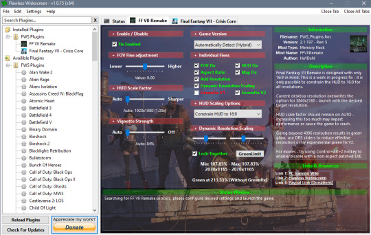
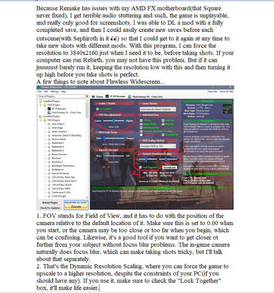
Next, the camera...
The other part of the camera that's important is the lighting ability. It won't work in every part of every scene(for some reason), but it's quite useful most of the time.
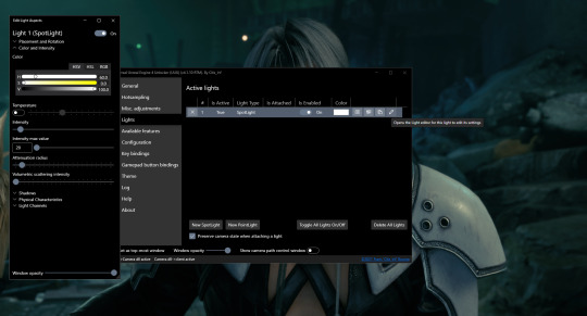
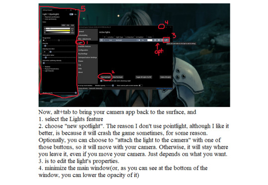
Once I have my light in place, time to use Flawless Widescreen. I just alt+tab to bring it up, then increase the resolution as high as it will go. Once in a while, it will seem to blur the camera a bit and I may have to readjust it.
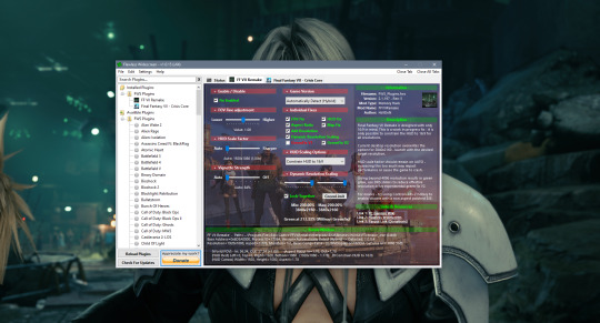
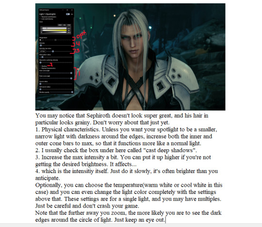
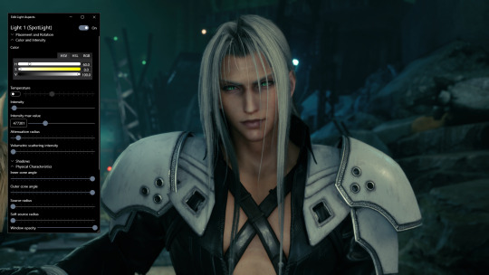
After that, the character's hair(and everything else) will look smooth and beautiful~...there are other things to consider, such as if you'll need a hook in order to have an ini file, but that's more in the fine details, which varies from game to game. It depends on how the settings are in Rebirth, which may be just fine if they did it right, and how your computer runs those settings, which may be also fine if you have a beast of a machine. You may think that the colors seem washed out from what I'd usually post, and you're right. The rest is what you might call post-processing, which are the things I do with GIMP(GNU Image Manipulation Program). That would be a different tutorial, but I wouldn't mind doing it if you're interested.
31 notes
·
View notes
Text
A Mistress’s Guide to Punishments That Stick
Submission isn’t a gift—it’s a skill, and like any skill, it needs sharpening. A sub might start out eager, all wide-eyed and “Yes, Mistress,” but let’s be honest: they slip. They get lazy, cocky, or just plain forget who’s in charge. That’s where punishment comes in—not as petty revenge, but as a tool to carve them back into the devoted, trembling creatures they’re meant to be. Over the past three years, I’ve turned my 22-year-old slave from a bratty 19-year-old into a sub who knows his place, and I’ve done it with punishments that don’t just sting—they stick. Here’s my guide, straight from the trenches, with a few tricks I’ve tested on my own boy and some fresh ideas to keep any sub in line.
The Gimp Suit: Erasing the Self
Let’s start with a classic from my own playbook: the gimp suit. When my sub was 19 and first getting used to chastity, he struggled. I’d tell him to scrub the floors or cook dinner, and he’d dawdle, distracted by the cage between his legs. He was still clinging to some shred of “me” instead of “her.” So, I zipped him into a full-body gimp suit—black, shiny, dehumanizing—and left him in it for a week straight. No breaks, no excuses. He slept in it, ate in it, served in it. By day three, he wasn’t a person anymore—he was a thing, my thing. The suit stripped away his identity, his comfort, his pride, and replaced it with a single truth: “I don’t matter; my Mistress does.” That week rewired him. He came out focused, obedient, and desperate to please. It’s a punishment that sticks because it’s total—body and mind, he’s mine.
High Heels: Melting the Masculinity
Cockiness is a sub’s worst enemy, and it usually comes from that little spark of masculinity they haven’t let go of yet. My solution? High heels. If my slave ever puffs up his chest or talks back, I pull out a pair of stilettos—red, towering, ridiculous—and make him wear them. Not just for an hour, but until I say stop. Watching him stumble around, wincing as his calves burn, is hilarious, but it’s more than that. It’s emasculating. That swagger melts away as he’s forced to feel feminine, vulnerable, out of his depth. One time, he got lippy about a chore, so I had him vacuum in heels for a full day. By the end, he was begging to take them off—and begging to behave. It’s a punishment that sticks because it hits the ego where it hurts, turning pride into humility with every awkward step.
Public Humiliation: The Spotlight of Shame
Sometimes, a sub needs more than a private lesson—they need the world to see their place. I’ve humbled my slave in public a few times, and it’s never failed to snap him back into line. One favorite was making him wear a diaper under low-slung jeans while we ran errands—every sag showed off his shame, and he couldn’t meet anyone’s eyes. Another time, I had him strut around in a Speedo with his chastity cage bulging underneath, the outline unmistakable. But the crown jewel? Throwing a massive party where everyone—friends, kinksters, strangers—watched his torment. I tied him up, teased him, made him serve drinks in nothing but the cage, and let the crowd laugh. He was red-faced, silent, and utterly submissive by the end. Public humiliation sticks because it’s inescapable—there’s no hiding from the eyes that see you as hers.
Forced Gay Acts: Breaking the Comfort Zone
Now, this one’s not for every sub, but when it fits, it’s devastatingly effective. If my slave steps out of line in a way that demands a hard reset, I’ll make him do something gay—suck cock or take it, depending on the mood. It’s not about his orientation; it’s about pushing him past his comfort zone into a space where he has no control, no say, just obedience. One time, after he’d been sulky for days, I brought in a friend—let’s call him Sir—and told my boy to get on his knees. He hesitated, but he did it, and the look in his eyes after? Pure surrender. It’s a punishment that sticks because it’s raw, visceral, and leaves no room for defiance—just the reality of my power over him.
Solitary Confinement: The Silence of Submission
When I need to really drive a lesson home, I turn to solitary confinement—up to 48 hours in a small, dark space with nothing but his thoughts. No phone, no light, no me. My slave’s tasted this a few times, like when he forgot a direct order one too many times. I locked him in a closet with just a blanket, set a timer, and left. The first time, he came out shaky, apologizing before I even asked. The second time, he was quieter, more reflective. It works because it strips everything away—no distractions, no excuses, just him and the weight of his failure. Forty-eight hours is the max I’ll do; any longer risks breaking more than I want. It sticks because it’s a void that forces him to crave my presence, my voice, my command.
The Ice Bath Challenge: Shocking Obedience
Fill a tub with cold water and ice, and make him sit in it—fully submerged up to his neck—for as long as I decide. Ten minutes feels like forever when your teeth are chattering. I’ve got this planned for my slave next time he slacks on his gym routine. The shock of the cold, the physical strain—it’s a wake-up call that says, “You don’t get to coast.” It sticks because it’s a visceral reminder of my control over his body, inside and out, and he’ll be begging to warm up by serving me better.
The Word Jar: Endless Apologies
This one’s a slow burn. Take a jar, fill it with slips of paper—each one with a word like “sorry,” “please,” or “Mistress”—and make him write every word out, by hand, 100 times. If he’s been disrespectful, I’ll hand my slave this punishment and watch him hunch over a notebook for hours. It’s tedious, humbling, and forces him to internalize his mistake with every stroke of the pen. It sticks because it’s mental as much as physical—by the end, those words are burned into his brain, and he’s too exhausted to disobey again.
The Mirror Game: Facing Himself
For a sub who’s lost his focus, I’ll sit him in front of a mirror, naked except for his cage, and make him stare at himself while repeating a mantra I choose—“I am hers,” “I obey,” whatever fits. He’s not allowed to look away or stop until I’m satisfied. It’s psychological warfare—forcing him to confront his submission, his vulnerability, his place. I’ve got this in mind for my boy if he ever forgets why he’s locked. It sticks because it’s intimate, inescapable, and turns his own reflection into a lesson in humility.
The Taste Test: Bitter Reminders
This one’s delightfully cruel: blindfold him and feed him something bitter or unpleasant—lemon extract, a spoonful of mustard, a shot of vinegar—every time he messes up for a day. Each taste is tied to a specific failure, and he has to guess what he did wrong before he gets water. It’s a sensory punishment that links disobedience to discomfort in a way he won’t forget. It sticks because it’s unpredictable and visceral—he’ll dread the next spoonful enough to stay in line.
Crafting Punishments That Last
The key to punishments that stick? They’ve got to hit deep—body, mind, or both. A good Mistress knows her sub’s weaknesses and turns them into lessons. My slave’s gone from a cocky 19-year-old to a 22-year-old who flinches at the thought of disappointing me, and it’s these punishments that got him there. Whether it’s the gimp suit’s erasure, the heels’ humiliation, or the ice bath’s shock, each one’s a brushstroke on my canvas of control.
So, subs, take note: step out of line, and your Mistress might just get creative. And Mistresses? Don’t settle for a slap on the wrist—make it stick. My boy’s proof it works, and I’ve got plenty more ideas where these came from. After all, a sub’s only as good as the lessons he remembers.
23 notes
·
View notes
Text
I made a video explaining the very basics on how sprite comics are made! I opted to choose Microsoft Paint because it's a simple program that's easily available on Windows.
If you use macOS, the closest fit would be Paint X, available for like $10. Of course, if you're going to pay for a pixel art tool, Aseprite is much better, and that program has an excellent manual. You could also start an Adobe Creative Cloud subscription to get PhotoShop (or set sail and download a previous version from a fun place).
Free tools are available, like GIMP (because I'm old), Pixelorama, Krita, Paint.net, the list goes on.
Fonts I recommended:
Back Issues
Atkinson Hyperlegible
Transcript below the readmore!
Sprite comics are easy. You just need sprites and an image editing program.
Most comics in the BZPower days were made in MS Paint and they were not fancy-looking comics like mine. Most of them looked like this, and it works very well! In MS Paint, you only need to know two tricks:
The eraser tool has a right-click function that only replaces Color 1 with Color 2. This will help you recolor your sprites.
You can copy and paste sprites as transparent images. Click the dropdown under the selection tool and select "transparent selection" to filter out Color 2.
Here's some bonus advice:
People have huge resolution monitors now, so I recommend doubling your comic's size. In MS Paint, select Resize and then type 200 in the percent field.
The most common mistake is unreadable text. Always pick a font that is easy to read and simple. Opt for a "sans serif" font as they're easier to read than "serif" fonts. Here are two good default pixel fonts:
Small Fonts, size 20
System, size 24
If you don't want to use a pixel font, then you can use Arial or Comic Sans. There are tens of thousands of downloadable fonts, too.
For non-pixel fonts, I'm partial to Atkinson Hyperlegible by the Braille Institute. I also like having a comic book feel to my comics, so I use "Back Issues" by Blambot.
Be sure to pick colors that are easy on the eyes. Like, we can agree that this is kinda harsh. These colors are more gentle. Using gentle colors also makes your more colorful characters pop out.
If you're doing colored text on colored backgrounds, you want a high degree of contrast. Notice that when I apply this Chroma filter, you can see why the text is unpleasant to read; the lightness values shown here are way too close. I can make the background darker and the font brighter to help that.
You should also try to have a system when doing dialogue. People will read top to bottom, left to right. It makes sense for dialog to follow that pattern. If you're going to use lines to indicate who's talking, try to avoid making the lines cross. Plan your dialogue, rearrange the characters if you need to, etc etc.
If you're pressuring yourself and not having fun, then you're ruining it. You don't need translucent word balloons, you don't need fancy custom background art, you don't need to be super witty, and you don't need to obey this video! Just have fun. And send me your Bionicle sprite comics.
13 notes
·
View notes
Text


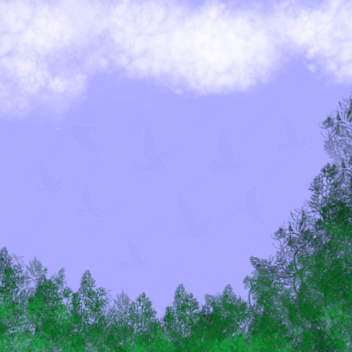
We had a small, optional assignment today to make connotative images of the item we previously made denotative images of. I probably invested way too much time in this, but I had a lot of fun and learned some new tricks in GIMP.
11 notes
·
View notes
Note
Hi, what app you used for drawing? I am trying to start digital art and I am a bit lost
I use GIMP. I'm still learning about all sorts of nifty tricks that one can do in it, so I recommend it!
60 notes
·
View notes