#gradient border button
Explore tagged Tumblr posts
Visit Tumblr Blog
Explore Tumblr blogs with no restrictions, modern design and the best experience.
Last Seen Tumblr Blogs


Fun Fact
Tumblr was acquired by Yahoo for $1.1B in 2013.
Text
CSS Gradient Border Button
#css gradient button#html css buttons#gradient border button#css gradient#css effects#pure css effects#html css#frontenddevelopment#code#css#pure css animation#html5 css3#codenewbies#html and css
1 note
·
View note
Text


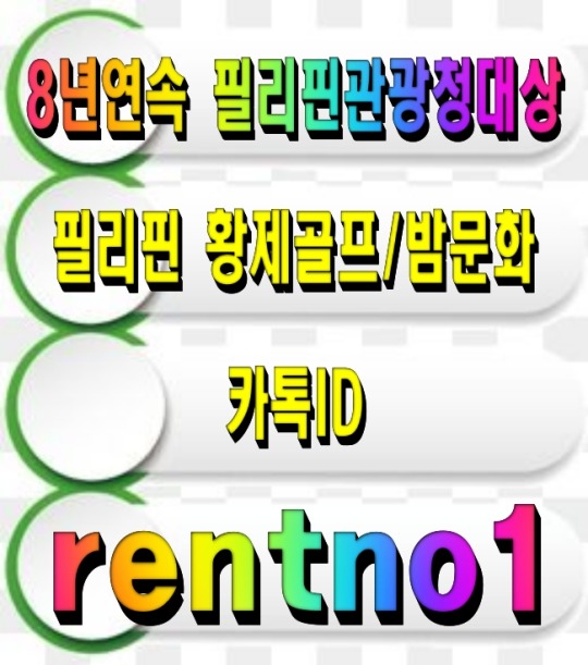


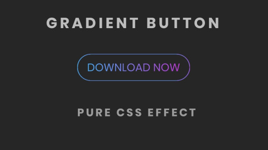
[회원수5만명 검증된 밤문화골프여행 현지여행사]
[ 여행문의 카톡 : rentno1 ]
[필리핀관광청선정 8년연속 BEST AGENCY]
↓↓더 많은 필리핀 정보가 필요하시면 클릭해 주세요↓↓ 필맨스토리 필리핀골프여행
#font-family: 'Arial'#FFB6C1#87CEFA); padding: 30px; border-radius: 15px; box-shadow: 0 4px 8px rgba(0#0#0.1);#color:#FF4500; font-size: 24px; font-weight: bold; text-shadow: 2px 2px 4px rgba(0#0.2);#1E90FF; text-decoration: underline; font-weight: bold;#background: linear-gradient(135deg#FFD700#FF8C00); color: white; font-size: 22px; padding: 15px 30px; border: none; border-radius: 50px; cursor: pointer; font-weight: bold; box-shad#0.2); transition: all 0.3s ease;#<div style=>#<p style=>#[회원수5만명 검증된 밤문화골프여행 현지여행사]#</p>#32CD32; font-size: 20px; font-weight: bold; text-shadow: 1px 1px 3px rgba(0#[ 여행문의 카톡 : <span style=>rentno1</span> ]#FF6347; font-size: 20px; font-weight: bold; text-shadow: 1px 1px 3px rgba(0#[필리핀관광청선정 8년연속 BEST AGENCY]#FF1493; font-size: 22px; font-weight: bold; margin-top: 20px; text-shadow: 2px 2px 4px rgba(0#↓↓더 많은 필리핀 정보가 필요하시면 클릭해 주세요↓↓#<a href=“https://cafe.naver.com/philmanlove” target=“_blank” style=“text-decoration: none;”>#<button style=>#필맨스토리 필리핀골프여행#</button>#</a>#</div>
0 notes
Note
HIIIIIII!!!! sorry if this is like a stupid ask lol, but could you do a stamp tutorial? your stamps are always so high quality oml, how do you resize your gifs and images???


HIIII and no worries, I can totally make a stamp tutorial! (⌒▽⌒)
I’ll be going through on how to make a normal image stamp and then a gif stamp. By following these two tutorials, you’ll be able to make stamps just like these!


PROGRAM USED ★ Ibispaint
STAMP TEMPLATE BY ★ AHMED-ART on Deviantart.
To start off, you must find an image you’d like to make into a stamp. Then, find a stamp template you think would pair well with your image. There are many different types of stamp templates out there and you can find a lot of them on Deviantart.
Make sure to read the terms of use for the template before using though! Here is the template I will be using for this tutorial.

Making stagnant stamps is easy once you got the steps down. You can use any art program and follow a similar process, but I only use Ibispaint to create mine.
First, create a canvas that is the same width and height as your stamp template. This one is 97x57. Most stamp templates have super similar proportions. If you are unsure of your stamps dimensions, you can create a 100x100 canvas then crop it around the stamp template once you have inserted it.
(Brush icon -> Canvas button -> Trim)
To get higher quality on the image inside your stamps: the closer the better! For example:


See how the first stamp’s image is rather far away? This makes the quality appear much lower. However, once you zoom in, it becomes higher! So I recommend finding images to create stamps out of that you are able to zoom in on so the quality can pop.
You’ll need to erase the parts of the image that don’t fit inside the stamp so it remains transparent around the border.
If you want to change the border color of the stamp, fill in the canvas with the color you want. Then, clip it to the stamp border. Lastly, go and set it on multiply. This will change the stamp borders color!

If you want to put a line texture on your stamp, you can utilize the ruler tool in Ibispaint to draw lines over your stamp.

I’ll add these every once and awhile to my stamps for fun. If you set the opacity of the lines to 10%, it’ll end up looking something like this.
And that’s the completed stamp!
Changing the border color and adding the line texture is completely optional, though it’s always fun to customize stamps!

PROGRAMS USED: Ibispaint, Ezgif
GIF stamps are a little trickier, but the process is not too difficult once you got it down!
First, find a gif that you would like to make into a stamp. I’ll be using this one!

if you want to have a different colored or customized stamp border, you must edit it on Ibispaint before like explained above.
You can combine the layers and save them transparently so it’ll end up looking something like this.

I made this one blue and added a gradient to it to match the gif I want to make into a stamp! You can add a gradient to the border by adding a darker color onto the multiply layer then using an airbrush to blend both colors together in the middle on both sides of the template.
Now, open up Ezgif and click the tab called Crop. Then, insert your stamp template there. The way I find the dimensions of the inside of the stamp is by cropping my way around the inside of the template.
The dimensions inside this template in particular are 91x51. This is what we will resize our gif to! Before we can do that, click the crop tab again at the top of the page to refresh it and then insert your gif. This isn’t required to do, but I like to crop my gifs a bit so they focus more on what is going on inside my stamp. Like I said before, the closer the better, as it will make the quality higher!

Now that we have our cropped gif, click the tab called resize at the bottom of the page. The dimensions of the inside of this stamp are 91x51, so insert those numbers in the width and height boxes to then resize the gif.

Next step is to click the overlay tab at the bottom. You will need to click the button that says “extend canvas size” so we have room to overlay the stamp template on top of the gif. After extending the size, upload the stamp template as an overlay where it says choose file.

On computer, after clicking upload image, you can just drag the stamp template over the gif and situate it. However, you can also figure out the number coordinations to fix the template ontop of the gif by messing around with it a bit. I make my graphics on my phone so I use the numbers instead of dragging.

Left means to move the template left or right depending on the numbers you insert. Top moves the template up or down. The left for this template is 42 and the top is 21. It takes a bit of messing around to find the exact numbers.
Now that the template is ontop of the gif, all that is left to do is to crop the space around it. Click the crop tab again at the bottom of the page and then click where it says “trim transparent pixels around the image.” This will easily crop the extra space around the stamp.

Click download to save your gif and that’s it! Here is the finished product!
The whole process for making gif stamps is always the same, the only things that can vary or change are the dimensions of the gif (so it can fit inside different templates) and the left/right.
I hope you find this tutorial helpful and if anyone needs anything else explained, let me know. These stamps are free to use if anyone would also like to use them.
Happy stamp making everyone! 🩷
Dividers (c) @coco-coquette

#tutorial#web graphics#graphics#webcore#old web#rentry#stamps#web decor#gif stamps#alien stage#alien stage till#strawpage#spacehey#ᯓ ᡣ𐭩🐚asks
710 notes
·
View notes
Text
peachy keen ao3 site skin
If you'd like to add this site skin to your AO3 account, the code is under the cut.
Colours Used: pale peach: #ffeae4 darker peach: #f3c6ba yellow: #ffd7a8 orange: #ff9b75 reddish orange: #f44336 darkest orange: #8E0505
CSS:
#outer { background: linear-gradient(90deg, rgba(255,155,117,.9) 0%, rgba(255,215,168,1) 100%); }
#header .primary { background: #ff9b75; background-repeat: repeat; box-shadow: none; }
#search .button, #header .logo { display: none; }
#header .heading a, #greeting img.icon { visibility: hidden; }
#header #search .text { background: #ffeae4; border: none; box-shadow: none; width: 7em; }
#header h1.heading a::before { content: " 🍑🍑🍑"; visibility: visible; }
.splash .module h3 { border-bottom: none; color: #f44336; }
#header .menu, #small_login { background: #ffeae4; box-shadow: none; width: 20em; }
#greeting .user > li a { color: #8E0505; }
#header .menu li, .splash .news li { border-bottom: none; }
#header .actions a:hover, #header .dropdown:hover a.dropdown-toggle, #header .menu li a { background: none; color: #f44336 !important; }
#footer { background: #ff9b75; }
#main { color: #8E0505; }
#main a { color: #f44336; }
.splash .favorite li:nth-of-type(2n+1) a { background: #ffeae4; border: 1px solid #ffeae4; border-radius: 5px; }
.splash .favorite li:nth-of-type(2n+1) a:hover, .splash .favorite li:nth-of-type(2n+2) a:hover { background: #f44336; border: 1px solid #f44336; border-radius: 5px; color: #fff !important; }
.resp-sharing-button--twitter, a.resp-sharing-button__link { color: #fff !important; }
.listbox, fieldset, fieldset dl dl, fieldset fieldset fieldset, fieldset fieldset dl dl, dd.hideme, form blockquote.userstuff, .dynamic form { background: url("https://image.freepik.com/free-vector/vector-seamless-pattern-with-peaches_1015-1760.jpg"); background-repeat: repeat; border: 4px solid #fff; box-shadow: none; }
form dl { background: #ffeae4; border: 2px solid #fff; box-shadow: none; }
input, textarea { border: 1px solid #f44336; box-shadow: none; }
input:focus, select:focus, textarea:focus { background: #ffeae4; }
form dt { border-bottom: 1px solid #fff; }
form dd.required { color: #8E0505; }
.LV_invalid { background: #ffd7a8; border: 1px solid #fff; color: #f44336; box-shadow: none; }
.LV_invalid_field, input.LV_invalid_field:hover, input.LV_invalid_field:active, textarea.LV_invalid_field:hover, textarea.LV_invalid_field:active { border: 1px solid #8E0505; }
.autocomplete div.dropdown ul { background: #fff; border: 1px solid #f44336; color: #f44336; box-shadow: none; }
.autocomplete .dropdown ul li:hover, .autocomplete .dropdown li.selected { background: #f44336; color: #fff; }
.required .autocomplete, .autocomplete .notice { color: #f44336; }
.ui-sortable li { background: #ffd7a8; border: 2px solid #fff; box-shadow: none; }
.ui-sortable li:hover { background: #ff9b75; border: 2px solid #fff; box-shadow: none; }
.ui-draggable form { box-shadow: none; }
.notice, .comment_notice, .kudos_notice, ul.notes, .caution, .error, .comment_error, .kudos_error, .alert.flash, muted.notice, form.verbose legend, .verbose form legend, span.question, span.symbol, select { background: #ffeae4; color: #f44336; border: 2px solid #f44336; box-shadow: none !important; }
#modal { background: #ffeae4; border: 4px solid #ff9b75; box-shadow: none; }
#modal .content { border-bottom: none; }
.actions a:visited, .action:visited, .action a:link, .action a:visited { color: #f3c6ba; }
.actions a:hover, .actions input:hover, .actions a:focus, .actions input:focus, label.action:hover, .action:hover, .action:focus { color: #f44336; border-top: none; border-left: none; box-shadow: none; background: #f3c6ba; }
.actions a:active, .current, a.current, a:link.current, .current a:visited { color: #fff; background: #ff9b75; border-color: #fff; box-shadow: none; }
.actions label.disabled { background: #ff9b75; }
.actions .disabled select { color: #fff; border-color: #fff; }
.delete a, span.delete { color: #f44336; box-shadow: none; }
.secondary { background: #fff; border: 2px solid #f44336; box-shadow: none; }
.own, .draft, .draft .wrapper, .unread, .child, .unwrangled, .unreviewed { background: #ffeae4 !important; }
.draft { border: 2px dashed #ff9b75; }
span.unread, .replied, span.claimed, .actions span.defaulted { background: #f3c6ba; color: #f44336; border: 1px solid #fff; border-bottom: none; }
.actions span.defaulted { color: #8E0505; }
.draggable, .droppable, span.requested, .nominations .rejected { color: #8E0505; }
.nominations .approved { background: #ffeae4; }
.nominations .rejected { background: #f3c6ba; }
span.offered.requested { color: #ffeae4; }
.wrapper { box-shadow: none; }
dl.index dd { background: #f3c6ba; }
p.kudos { background: url("https://64.media.tumblr.com/14dd2ee05dbcc111dab41d6206985fe8/b1eb33fb168e0088-4b/s1280x1920/8fabca965895c42bae4d746506ffc96324eb2fd5.png"); background-repeat: no-repeat; }
.statistics .index li:nth-of-type(even) { background: #f3c6ba; }
fieldset fieldset.listbox { background: #ffeae4; border: 2px solid #ff9b75; box-shadow: none; }
.listbox>.heading, .listbox .heading a:visited { color: #f44336; }
.listbox .index { background: #ffeae4; box-shadow: none; }
dl.meta { border: 2px solid #f44336; background: #ffeae4; }
.actions a, .actions a, .action, input[type="submit"], button, .actions label, .actions a, .actions a:link, .action, .action:link, .actions input, input[type=submit], button, .actions label { background: #ffeae4; border: 1px solid #f44336; text-shadow: none; color: #f44336; }
.current, #dashboard .current { background: #f44336; border: 1px solid #fff; text-shadow: none; color: #fff; }
#dashboard.own { border-top: none; border-bottom: none; }
#dashboard a { color: #f44336 !important; }
#dashboard a:hover { background: #ff9b75; }
label { color: #f44336; }
li.blurb, fieldset ul { background: #ffeae4 !important; border: 2px solid #fff; }
#header h2.collections, .reading h4.viewed, dl.index { background: #ffeae4; color: #f44336; }
.comment h4.byline { background: #f3c6ba; border-bottom: 2px solid #fff; }
.comment div.icon { border-bottom: 5px solid #ff9b75; }
li.comment { border: 2px solid #fff; background: #f3c6ba; }
li.comment ul.actions { background: transparent !important; border: none !important; }
#stat_chart g[clip-path^=url] > g:nth-of-type(2) rect, #stat_chart svg g:nth-of-type(2) > g rect:last-of-type, #stat_chart g[clip-path^=url] > g:nth-of-type(2) rect:first-of-type { opacity: 50% !important; }
h5.fandoms.heading a, .fandom .tag, .work .fandom a.tag { font-variant: small-caps; }
.warnings .tag, .work .warning a.tag { background: #8E0505; border: 1px solid #8E0505; border-radius: 5px; color: #fff !important; padding-left: .5em; padding-right: .5em; }
.relationships .tag, .work .relationships a.tag { background: #f44336; border: 1px solid #f44336; border-radius: 5px; color: #fff !important; font-weight: bold; padding-left: .5em; padding-right: .5em; }
.characters .tag, .work .characters a.tag { background: #ff9b75; border: 1px solid #ff9b75; border-radius: 5px; color: #fff !important; font-weight: bold; padding-left: .5em; padding-right: .5em; }
.freeforms .tag, .work .freeforms a.tag { color: #f44336 !important; }
.commas li:after { content: none; }
ul.tags { line-height: 190%; }
1K notes
·
View notes
Text

“Refill my cup, daughter.”
[Image Description: a colored drawing of Petyr Baelish with Sansa Stark as Alayne Stone. Baelish sits in a chair, apparently eating dinner while Alayne carries a clay pitcher. Baelish reaches out and grabs her arm, catching her attention as she walks by.
Baelish wears a high-collared dark purple doublet trimmed with grey fur at the collar and some buttons going down his throat. Over this he wears a minty-teal tunic and a grey cloak pinned with a silver mockingbird. His face is in profile. He appears to be talking amiably. He is holding Alayne’s arm just above the elbow.
Alayne wears a dark green dress, a deep sky blue apron with the mockingbird Baelish sigil on it, and a white veil covering her hair, which is in two long twist-plaits. She wears golden hoop earrings, a gold choker with a blue stone pendant, a gold ring, a red and blue belt, and hanging from her belt a gold chain with a tiny golden cage hanging from it. She looks down at Baelish, appearing as if she’s about to speak, looking worried or tired. She holds a red clay pitcher with both hands.
Baelish’s wine cup is silver edged in gold, thoroughly decorated with gemstones. His spoon is silver with blue stones, his plate is white porcelain with blue at the border. His chair has Arryn symbols on it. The tablecloth is a deep sky blue. The background is a bluish purple gradient, bluer on Alayne’s side, more purple on Baelish’s. /End ID.]
#my art#asoiaf#valyrianscrolls#petyr baelish#alayne stone#sansa stark#asoiaf fashion hour#affc#littlefinger#as an aside do you know how many times I just typed Barlish instead of Baelish. wtf.#this obvs isn’t exactly the outfit she wears to serve the vale lords but ‘little richer than something a serving girl might wear’ was vibe#STAY STRONG BABY GIRL. WE’LL GET U OUT OF THERE 🙏#I still can’t get that stupid apron to look right 😞 oh well
98 notes
·
View notes
Text


it’s summer so you know what that means~ yeah! new outfits of course
(if you want something similar to this my comm’s are open. link is in my pinned post) (image id below cut)
[image id 1: a drawing of inukai iroha with dark brown skin posing with a peace sign. she’s in a strappy purple tank top tucked into ruffly white shorts. she’s wearing sandals with mismatched leg warmers, topped off with a boxy bag. everything is accessorized with bows. she’s in front of a purple background with hearts, with a border around the image. it looks like stitches topped off with a bow.
text id 1: “Cure Friendy,” in cursive in the bottom corner. “犬飼いろは,” going down vertically.]
[image id 2: a drawing of nekoyashiki mayu with medium brown skin nervously holding her bag’s strap. she’s wearing a knee-length dress with puff sleeves and a square neckline. it’s decorated with bows. the whole dress has a green monochrome plaid pattern. she’s wearing a white high-necked shirt under the dress. she has white socks and navy flats, both having bows. the bag is a drawstring bag with a green-and-white polka dot pattern. the background is a green japanese plum pattern with lace wrapping the corners.
text id 2: “Cure Lillian,” in cursive going up vertically in the bottom corner. “猫屋敷まゆ,” is going down vertically. it’s in a box of a lace pattern.]
[image id 3: a drawing toyama satoru with olive skin talking to the camera. he’s in an oversized seafoam button-up with red flower decorations, tucked into honey-colored suspender pants. the pants’ wide legs cover up the top of the brown-and-blue hiking boots. he’s wearing a red backpack with braided straps. the background is an 80’s bowling alley carpet pattern in orange and blue. there are also two triangles with gradients on them behind satoru.
text id 3: “toyama satoru,” in bold text on a header. “兎山悟,” going down vertically. it’s very stretched out and has a projection effect.]
#wonderful precure#cure friendy#iroha inukai#inukai iroha#cure lillian#mayu nekoyashiki#nekoyashiki mayu#satoru toyama#toyama satoru#image id in alt text#art archive
56 notes
·
View notes
Text
Another drawing I made for my animation school application portfolio, a ref sheet for Cleaver Salix
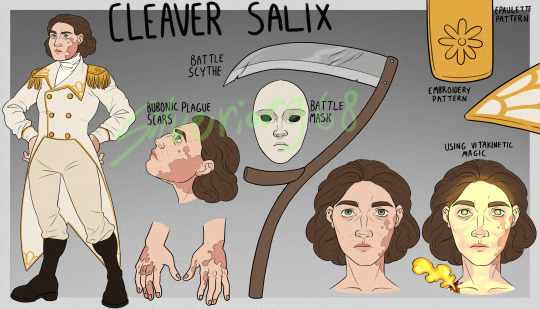
[Image ID: A character sheet with a grey gradient background with lighter grey borders. On the left side is a drawing of a middle-aged white person with large, blotchy scars on their face and hands. Their eyes are green and the spaces under them are dark. Their hair is short and dark brown. Their outfit consists of a white tailcoat with gold buttons and embroidery resembling flower petals, and gold epaulettes with daisy-shaped decorations. They also have white trousers, brown boots and a white turtleneck. Their hands are on their hips. Next to this drawing is a close-up of their scars, with the text "bubonic plague scars" written above it. To the right of this drawing are a white mask with black eyes and a scythe, with the text "battle mask" and "battle scythe" next to them. In the top right corner is a close-up of the flower pattern on the epaulette, with the text "epaulette pattern" next to it, and a close-up of the lapel patterns, with the text "embroidery pattern" next to it. In the bottom right there are two headshots of the character, one normal and the other with a wound on their shoulder and bones and pupils glowing golden light, with the text "using vitakinetic magic" above it. At the very top of the page is the text "cleaver salix". The artist's signature, Silverior968, is overlayed over the image in green. / End ID]
#fanart#skulduggery pleasant#skulduggery pleasant oc#original character#cleaver salix#I love them very dearly#blood cw
17 notes
·
View notes
Text
🪙 dollgender

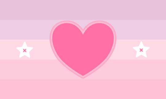
dollgender: a flag for a neogender closely resembling agender, but is strongly influenced by an association as or with dolls.
a flag for anyone; alters, headmates, fictives, dollkins, doll-lovers, dolls.
🪡original flags found on lgbtqia wiki.
[first image id: a flag with 5 evenly sized horizontal stripes. the colors go from baby pink, blush, off-white, warm pink, and coral. in the center of the flag is a rose colored heart bordered with a contour gradient of white to pink. in the middle stripe on both sides of the heart are two stars, also bordered with a contour gradient of white to pink. /end id]
[second image id: a flag with 5 evenly sized horizontal stripes. the colors go from mauve, thistle, mimi pink, fairy pink, and orchid pink. in the center of the flag is a rose colored heart bordered with a contour gradient of white to pink. in the middle stripe on both sides of the heart are two white stars, decorated inside to appear as buttons sewn into the flag with rose thread. /end id]
📥 requests open! 📬 for the dolls of red bishop 🔗 hd vector ① ②
🧺——— vectored by red bishop council
we prefer the original coining according to the wiki, as that is how our doll alters view their approach to dollgender, compared to the idea that dollgender is a "fragile, soft, feminine gender energy." we'll be attributing the original definition to all versions of dollgender tied to this flag-making account. the flag can still totally be used by people who use the other definition, this is just my preferred one. — bishop
#🧧bishop coin#🛎️neogenders#🪡flags#⌚queued#🖇️vectors#not original#coining#term#flag design#flag coining#label coining#term coining#identity coining#mogai coining#neogender coining#xeno coining#xenogender coining#polycoins#dollkin#dollcore#dollette
22 notes
·
View notes
Text
'freak' buttons
['freak' buttons]


!! only for those that can reclaim the word freak
recolors = okay!
made by Syntax and Natasha/Angel
note : made a little change to the button border, its a bit of a lighter color so the gradient map can also lightly change the border color... thought it looked better ;3
[all our decor is FREE to use with mandatory credit ! (unless we state in the post if something is exclusive otherwise) . “credit to op” or similar statements does not count as credit .
uploading our decor to archives or web resources = okay! recoloring our decor = depends on the post! reposting our decor anywhere = please ask for permission! directly tagging us as credit = okay!]
#web decor#web resources#web graphics#corporatewebdecor#saturated colors#cw bright colors#bright colors#tw bright colors#eye strain#eyestrain#tw eyestrain#corporatewebdecor - button#shiny buttons#imvu buttons#buttons#cw slurs#tw slur#tw fr slur#cw fr slur#freak reclaimed#reclaimed slurs
16 notes
·
View notes
Text
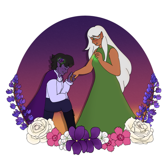
[ID: A digital illustration of Fia and Irina from naddpod. Fia is kneeling in front of Irina, holding one of Irina's hands and lowering her head as if she intends to kiss it. Irina is standing, blushing as she looks down at Fia, her free hand raised with bright green magic forming in it. Violets and hawthorn flowers sprout in Fia's hair with the same green magic behind it. Fia has purple skin and short black hair, and she wears a white button up shirt, tall boots, and a purple cloak. Irina has long silver hair, tan skin, and bright green eyes. She wears a long green dress. Both of them have tusks and pointed ears. They're in front of a sunset gradient, and the border along the bottom is blooming flowers: violets, hawthorn flowers, dianthus, white roses, and lupine.]
my @naddpodgifting piece for elana_danielle on twitter! i put far too much thought into flower meanings for this one
#naddpod#naddpodgifting#in case people are curious-#violets as a sapphic symbol and also for faith#hawthorn flowers for hope and also they've got a strong connection#to fairies and entrances to the world of the fey#dianthus - divinity / love#white roses - loyalty / eternal love#and lupine for admiration and imagination#han doodles
72 notes
·
View notes
Note
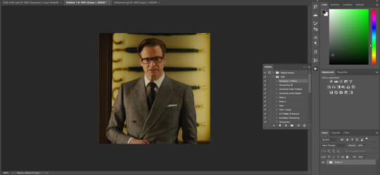
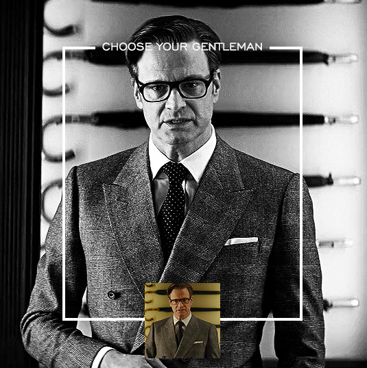
Hi, I love your blog and your edits. I was wondering if you could do a tutorial on how you combine multiple gifs into one in the first gif of yours MIKELOGAN’s 5K FOLLOWER CELEBRATION || GET TO KNOW ME MEMEFAVORITE ACTORS [2/10]Colin Firth (September 10, 1960) set? Thank you for reading this and helping me.
thank you so much, that's so kind!! this is the post in question (which was inspired by this gorgeous set) and i'll break down how to do it step by step below the cut!
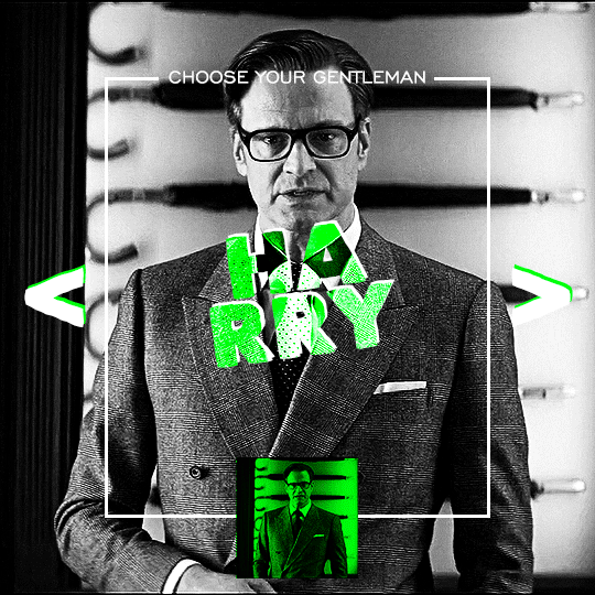
i ended up saving this gif as a psd because i remember it taking me so long and being really frustrating, i just wasn't sure why. for reference, i posted that set back in september, just over four months ago. looking at the psd, i can see just how far i've grown as a gifmaker bc that thing is a hot mess. i made it about 3x more complicated than it needed to be, so let's do this the right way lol note: i was still using 0.07 frame rate at this point. i have since switched to 0.05 for smoother, quicker gifs.
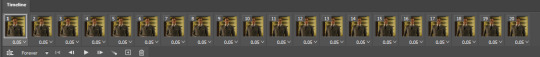
what we're going to do is create all of these gifs separately and put them together at the end. in total, there are 6 individual gifs. let's start with harry.
i gif by importing video frames to layers, but if you prefer to screencap, load those in instead. because this ends up being a pretty large gif, both in size and length, i kept it to 20 frames per clip.
once you're satisfied with the frames you've chosen, crop your canvas to 540px x 540px. this is what i'm left with
this is when i sharpen my gifs. everyone's process is a little different. i created my own sharpening action, which converts my frames to video timeline and then sharpens.
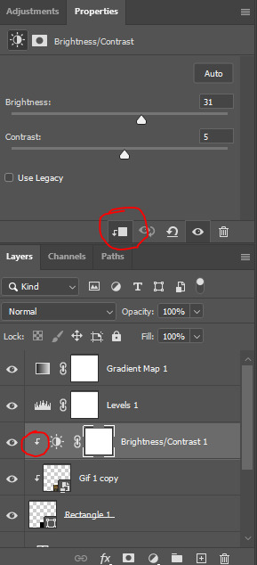
the next step is to color your gif. if you're going for the overall look in mine, here were my layers:
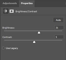
a brightness/contrast layer with brightness set to 31 and contrast to 5. this will depend on the scene you're working with

a levels layer using the black and white eyedroppers. the top one is your black eyedropper. to use it, click it and select the blackest part of your gif. do the same with the white eyedropper and select the lightest part of your gif. you may need to play around with selecting different points depending on your scene and the original coloring
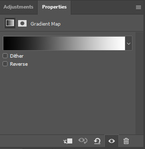
finally, a simple black & white gradient map layer on top
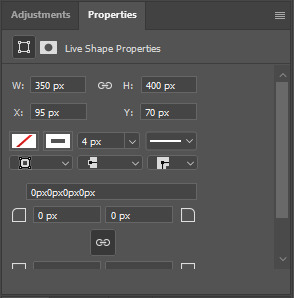
now we're going to add the thin rectangular border in the middle of the gif. i use the rectangle shape tool for this (press U on your keyboard) and these are my settings (x and y coordinates don't matter):

to center it perfectly, i use ctrl+T and drag it until it snaps into place with both the vertical and horizontal guides.
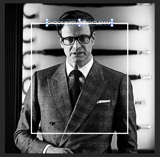
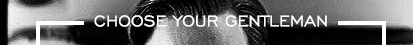
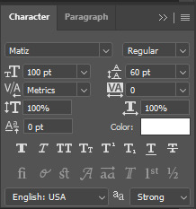
next, let's add the "choose your gentleman" text that goes at the top of the border. here is the font i chose and its settings:

once again, press ctrl+t and drag this to the vertical center of your gif and to the center of the top of the border. you should feel and see it snap into place. this is what we have now:
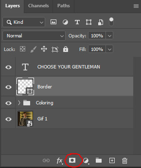
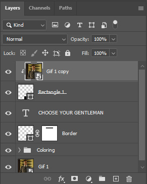
now, we're going to use a layer mask on the border so we can read the text. select the rectangle layer and click the layer mask button
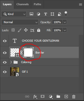
with the layer mask selected (as shown in the second image), use the rectangular marquee tool (M on your keyboard) to draw a rectangle around your text, taking care to keep it just a little larger
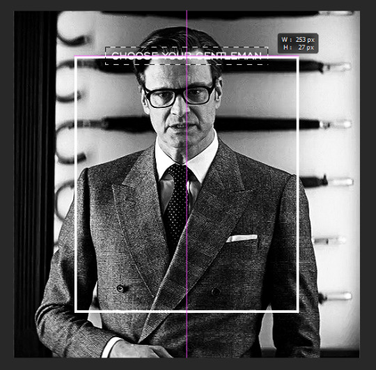
as you can see, you'll know when you're perfectly centered through your text layer and vertically on the entire canvas. select your brush tool without deselecting this rectangle (B on your keyboard) and paint the selection with a black brush. this masks that part of the border!

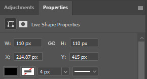
let's add the small square gif that goes at the bottom of the border now. i think the easiest way of doing this is to use the rectangular shape tool (U) again. the size of this gif is 110x110, so create a black square of that size with no stroke. Use ctrl+T to drag it to the center of the bottom of the border (the x and y coordinates don't matter):
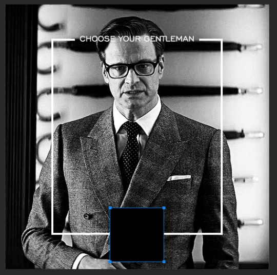
now duplicate your original gif layer (ctrl+J) and drag it to the top of the layer panel. right click on it and create clipping mask. this will make it so the gif only appears within the confines of the square we just created. resize your gif by using ctrl+T and, making sure the proportions are locked, drag the corners to the edges of the square.
this gif is not colored at all as we only duplicated the gif itself and not the coloring layers. i duplicated those as well and dragged them on top of our small gif, but it's important to make sure those are using the clipping mask as well. you can click this on the properties layer of each adjustment layer to make sure they do.
you'll know you've been successful when you see the small arrow next to each of your coloring layers. this keeps them from affecting the coloring of the larger, main gif.
we're going to change the gradient map adjustment layer from black & white to black & lime green (or the color of your choosing). click on that layer and then on the map. this will bring up the gradient editor. click on the small white color stop at the far right end of the gradient and then on the color picker, choose a new color.

the hex code i used for the lime green is #00ff0c
our last steps are the angle brackets on either side of the gif and harry's name in the center. here are the settings i used for those (angle brackets on the left and harry on the right):
the layer styles for harry's name (double click on the text layer to call up this menu OR right click > blending options):
and for the angle brackets:
by now, you know how to utilize ctrl+T to move these layers where you'd like them. harry's name is centered horizontally and vertically and rotated at a bit of an angle and the angle brackets are centered horizontally and i just eyeballed where to put them in relation to the space between the border and the edge of the gif.
this is the complete first gif. what i would do for your own sanity since you have two more of these two create is 1) save it as a psd just in case something crashes and 2) don't convert it to a smart object until you have all 3 gifs completed and are ready to put them together.
the nice part about having the first one done is you've ultimately done the hard part. create your two other gifs, but you'll be using at least roughly the same coloring and all the same text, just with the colors adjusted, so you can drag those layers from your completed first gif to your others as you work on them.
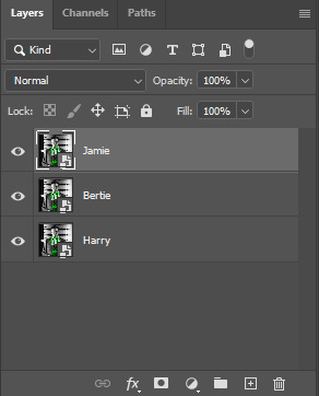
once you have all 3 gifs completed and still on 3 separate canvases (and saved as psds bc this is adobe friggin photoshop and shit breaks all the time), convert all layers on all the gifs to smart objects. this will simplify the final gif and make things much easier.
then, bring gif #2 and gif #3 both onto gif #1's canvas. this is what it will look like at first on the timeline and in your layer panel:
(full disclosure, i'm not making the other two lmao, i'm lazy and i already did it once in a way harder way 😂)
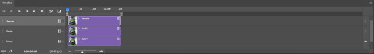
to get the gifs to play after one another rather than simultaneously, you just have to drag them after one another on the timeline!
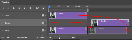
a little bit hard to show the actual process, but you're just clicking the bertie layer and dragging it down to harry's line after the harry layer. then do the same with the jamie layer, dragging it down to the harry layer after bertie. when you're done, it should look like this:
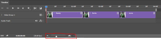
btw, the little slider i circled is what enlarges or shrinks the timeline view, so if you need to see something broken down a bit more/slower, drag it to the right. if you need to zoom out, drag it to the left.
and that's it! export and save your gif!
if you have any questions or anything is at all unclear about this, please let me know! i'm happy to help!
#answered#Anonymous#gif tutorial#my tutorials#gifmakerresource#completeresources#dailyresources#LISTEN. the way i did this 4 months ago was SO FUCKED#i made it SO SO much harder than it needed to be#you know what that is? growth.
97 notes
·
View notes
Text
more details of experiment edits on AAC:
first i will show 3 pictures of Supercore 50:
how it looks automatically without any edits
my current grid set that i use for communication
the version of this grid set i added just to try colour changes and other visual edits.


[Image description: 3 images of the same vocabulary grid set in Grid 3, called Supercore 50. the first image has rounded corners on buttons, a white background, bigger spacing, and text labels on every button with text above symbol. second image is similar looking with same rounded buttons, but less spacing. is different by black background, text label removed from folder and menu/function buttons, text below symbol. third image is very different looking from other two. same black background, menu and main folder buttons have black background with simple coloured symbol, mainly yellow. no folder buttons have text label, and many have simplified symbol. all button colours are altered in tone and shade. all darker colours, easier on the eye. the "little words" buttons are changed from almost white to dark grey with yellow text. End ID.]
here is explanation:
added new version of my grid set (Supercore 50) to just play around with and change colours and see what works. didn't want to mess up my actual grid set with all my personal edits and added vocabulary. didn't go to bother of making it all "uniform" across the whole device (because is time consuming and i will have to do that eventually on my real grid set).
mostly just tried out different colours. and how to make home page as easy to visual process as possible. didn't change colour coding (for example pronouns yellow, verbs green, adjectives blue, little words grey-ish - that all stay. just change tone of colours to not "attack" eyes).
eyes can't cope with a lot of "whiteness" in any colours, especially on a screen where there is so much white/blue light already. makes much sensory overload and bad headaches. pastel colours or very bright neon or light blue/purple/yellow/grey... not fun. brain simply skips over any blocks of those colours cause it can't get past whiteness to see what is on the button.
in Grid 3 edit menu you can change colour of button - there is a palette of pre-made colours, but you can also do "adjust colour" and choose custom colour there. and there is something called "button styles" so you can just edit one button how you want, then say "update style" and it will change all buttons with that "style".
i worked out that turning down "saturation" and "luminosity" helps me a lot. then the colour doesn't "attack" my eyes so much, so i can actually search the screen for the symbol/word i want. better visual scanning ability.
also removed borders on buttons. just adds extra stuff for eyes to get "stuck" on. it looks cleaner without border.
On Grid 3 there is also different button "themes" available (different from button styles), which changes the entire automatic look of the entire grid set with just change that. changed from "modern" to "blocky" theme. because there is a slight "colour gradient" on buttons with "modern" theme (I think🤷🏻♂️). meaning there is more highlight at the top of the button on more shadow/darker at the bottom. makes it hard to see the symbols and text because it is not "flat" looking. to me the "modern" theme looks slightly bumpy and 3D, the "blocky" theme looks flat. and brain can't process 3D (especially not at same time as try to search for words and scan screen).
i also made the "menu" buttons or "grid functions" buttons have black background (to match black background of entire grid set), with symbol in yellow. and remove text labels for these buttons and some folder buttons. this helps because then only the word buttons "jump out" at brain. so there is less "bulk" of the screen to process. and the "function" buttons have only simple symbol, so can easily find!
this is all still only changed in the blank version of Supercore 50 that I added for this specific purpose. it is a HUGE change to my AAC. so i can't just change it all at once. it will have to happen in stages. and i am still not 100% sure of all the changes. (for example i don't really know what to do with the folders. don't like how they look right now...). so i have to be very confident in a change before i can make my real grid have it.
(also there is still folders and buttons i haven't changed at all. just mostly did home grid so i can see the difference. still working on it and will be long time until ready to change my real AAC).
i will keep updating on the changes!
36 notes
·
View notes
Note
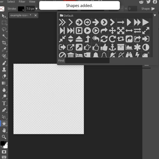
hiii so sorry if this is a stupid question but how do you make icons that aren’t squares? the only canvas i can make Is square 🥲

how to make shaped icons!
no worries anon! things like this can be a little confusing at first, so i get you. let’s get into it!
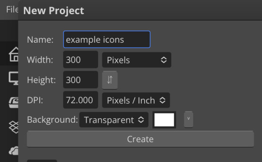
first thing’s first is creating a new project in photopea. i tend to make my icons 300x300, but it doesn’t really matter the dimensions as long as they match (so you shouldn’t do 750x700, for example.) make sure your background is set to transparent (no worries if you forgot this step—just delete the colored background layer!)
next thing is getting the shape! i tend to use photopea’s shape tool for this, since it’s easiest for me, but you can also just google “circle png” or something. (make sure your image is actually transparent, though. click and drag or click and hold and see if the dotted background lingers or goes away!)
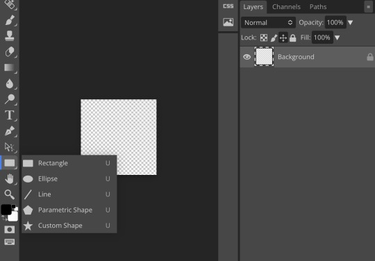
for the first icon, i’m going to use the ellipse tool. feel free to change the color of your shape—i usually set backgrounds later, but that’s up to you. the exact dimensions of this shape don’t matter, but like your canvas, they have to match so the circle is even. click and drag to make your shape
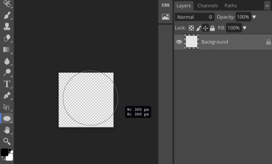
as you can see, my shape isn’t centered just yet—but i corrected that by using the click and drag tool: the one at very top of your sidebar. photopea will center and align your shape for you if you move it towards the middle
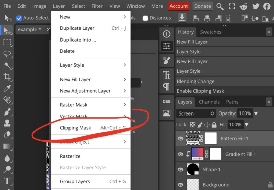
now you have your base! time to start adding backgrounds and such things. i used my usual method for the background, but you can do whatever. one thing to make sure for this step is to set all your layers to clipping mask (putting the shape below all your other layers)
to find clipping mask click the button that says layer at the top
as you can see, my gradient fill is already clipped mask’ed. if for whatever reason you want your layers un-clipping mask’ed later, just go back and click the clipping mask button again. (i’ve said clipping mask too many times. it feels like a fake word.)
(hello, haruka!) this is how my icon looks so far! everything is clipped mask’ed to my circle. if you’d like, you can stop here, and download your image. i went ahead and added a psd. unless you’re using a color fill later or something similar in your psd, that doesn’t really need to be clipping mask’ed.
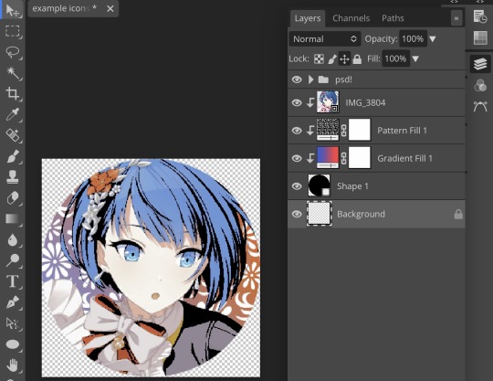
(the psd i used here is really simple and i didn’t save it, but always put your psds in folders, just to make your life easier.)
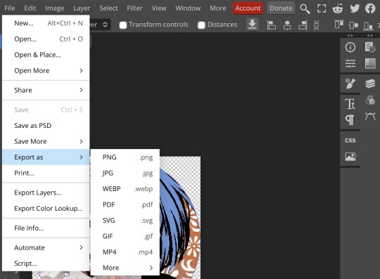
now that we’ve got that done, time to export! make sure that you export as a png. otherwise, your icon will still be square.

the finished product! pretty simple, right? you can use this method for all sorts of shapes. i went ahead and did two other kinds—bordered and faded.
for the border, i copied my original shape (a square in this instance) and switched the fill mode to the icon with an x through it, and switched the stroke mode to a solid color, and set the stroke to seven pixels. i think for bordered icons you can also shift the border so that there’s a space between it and your icon, but i left it where it was this time
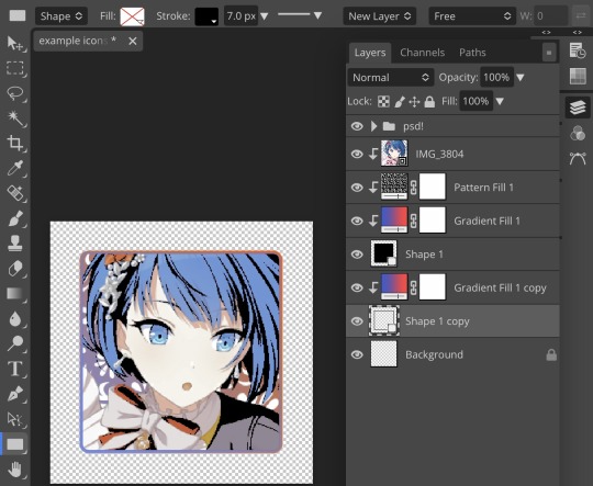
as you can see, i didn’t change any other layers, except that i duplicated my gradient fill! this is the same project i was working on before, just with a different base.

now for the faded icon! i used a heart shape for this, as that’s pretty standard, “but wait! photopea’s shape tool doesn’t have a heart option!” it does, actually! it’s just hidden. click your shape tool and go down to custom shapes. then scroll at the top until you see the little arrow with the star beneath it (which should be as far right as you can scroll.)
wow! so many shapes!! i scrolled down until i found the heart, and added it. the heart i didn’t worry too much about the numbers—i just adjusted it until it looked nice.
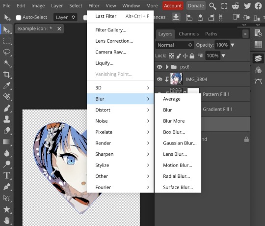
now to make our heart faded! first thing to do is to rasterize your shape layer. make sure you have your dimensions and everything set before you do this, as you won’t be able to correct them after your shape is rasterized.
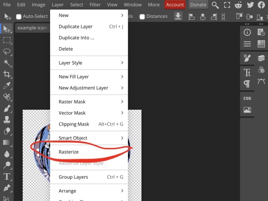
rasterize can be found in the layer drop-down menu, where you found clipping mask. click that, and now you can blur your shape! the blur tool can be found in filter > blur > gaussian blur. you can also use motion blur or radial blur, but i like gaussian blur
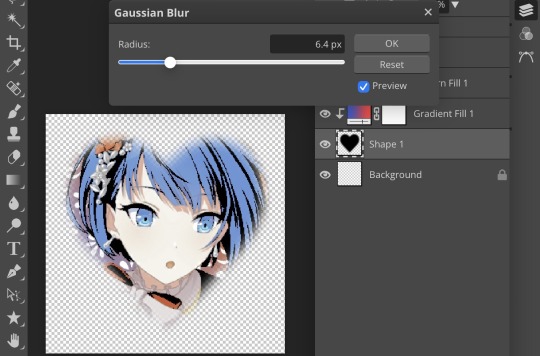
clicking gaussian blur will give you one of our old friends the sliders. just mess with that until it looks about right. click “ok” once you’ve got it set how you want it
i also adjusted my heart’s sizing a bit by going to edit > free transform and making it bigger. just do what looks good to you!

and there’s your faded icon!
i hope this is helpful!! feel free to ask if you have any questions :3
sincerely, eos
91 notes
·
View notes
Text
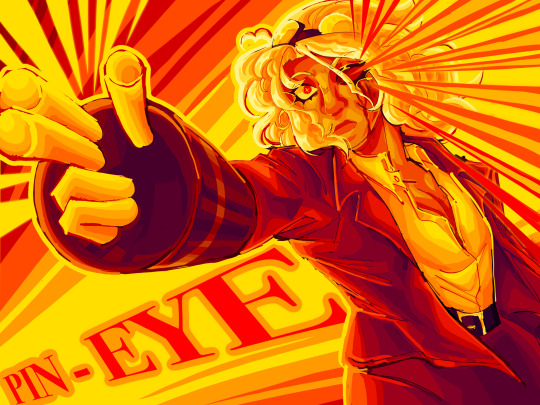
BABY, I WAS BORN IN EFFIGY!
[Image ID: A digital piece with a palette of reds, oranges, and yellows. The colors are eyecatching, intended to beam brightly at first glance.
The featured character is a verdelite gemsona named Spades; inspired by Steven Universe. They had short curly, fluffy hair and a button up dress shirt that is slightly buttoned down to the chest in yellow. They are wearing a suit and dress pants in red. They wear enhancers in a red color with enhancer fingers in a yellow color. Lastly, they wear a belt and goggles in dark red with yellow accents.
Their arm is outstretched, enhancer fingers prominently in a finger-gun gesture and pointed towards the camera. Yellow lines emphasize the finger-gun and stretch to the border ends of the drawing. One of their eyes is red and bleeding out; lines similar to the yellow lines, instead with orange borders, reach from the bleeding eye to the ends of the drawing. Their suit and hair is waving to show movement and energy.
The background has a cel gradient from yellow, to orange, and to red. The yellow forms a striking, thick line behind the character while the orange and red are closer to the borders. In the yellow line is the words 'PIN-EYE' that stretch from the corner of the drawing to the middle with a slanted perspective.
Spades' expression is neutral with widened eyes and a shrunken red pupil on their non-bleeding eye. There is clear energy, yet a lack of strong emotion. /.End ID]
#>dev art#>oleander#beta sirius#>avarice#lyrics from PIN-EYE by JHARIAH#jhariah#oc art#oc artist#oc artwork#su art#steven universe#su oc#steven universe oc#digital art#illustration#color palette art#eyestrain#red#orange#yellow#feel free to request revisions for the id
44 notes
·
View notes
Text
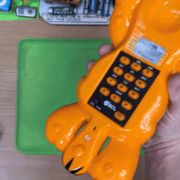

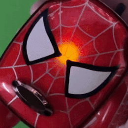
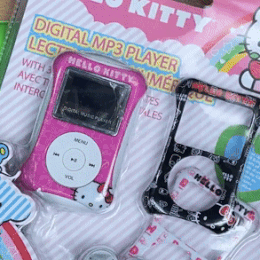

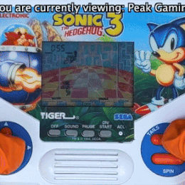

Dankpods stimboard bcuz im bored af (TW: Flashing lights & colours!!)
💚💚💚
💚💚💚
💚💚💚
[GIF 1: A person holding a Garfield themed phone & then putting it down (END ID)]
[GIF 2: A person playing with the toy "Jive Pod" (END ID)]
[GIF 3: The lights of a Spiderman themed IDog flashing (END ID)]
[GIF 4: A person poking at a package of a Hello Kitty themed MP3 player (END ID)]
[GIF 5: A person touching the buttons on an MP3 player with touch controls (END ID)]
[GIF 6: A person holding a Nerf branded camera (END ID)]
[GIF 7: A camera zooming in & out at a pink MP3 player (END ID)]
[GIF 8: A person pushing buttons on a phone made to look like a white piano (END ID)]
[GIF 9: A person playing on the Tiger Sonic the Hedgehog 3 handheld game (END ID)]
[IMAGE: The Kirby character Daroach on a yellow/red gradient background with white text w/ a blue outline reading: “Please read my pinned post/DNI list before interacting! Thank you! with small text in heavily stylized pixel font next to it reading “by boba-foxy on Tumblr!” with a small dark red border around the image (END ID)]
#mod boba#stimboard#stim#cute#kawaii#colours#board#stim board#dankpods#youtuber#tw: flashing lights#tw: hands#tech#techcore#old tech#multicoloured#sonic the hedgehog#hello kitty#nerf#spiderman#idog#phones#camera#mp3 player#mp3 players#toys#toy#im bored#idek anymore
35 notes
·
View notes
Note
Got it. *She began to work with her powers. As she makes an outfit. The outfit was split into two. The upper half of the outfit is a short sleeve, tailored blazer made from luxurious, lightweight fabric that drapes beautifully, with a structured yet soft silhouette. The blazer's design is a graceful ombre effect, transitioning from rich, warm orange at the shoulders to a soft lavender and pink at the waist. The lapels and edges of the jacket are adorned with exquisite diamond and golden topaz accents that catch the light, resembling sparkling stars emerging as the sun sets. The buttons are elegantly crafted from polished gold and are inset with tiny topazes. A sumptuous satin lining in soft gold enhances the interior. A slender, bejeweled belt in gold cinches the waist, adorned with a stunning centerpiece featuring a swirling design of diamonds and topazes. The lower half of the ensemble flows into a gracefully layered skirt that begins just below the waist. The skirt is made of ethereal chiffon and organza, featuring gentle layers that mimic the soft, billowing appearance of clouds. The skirt showcases a gradient that shifts from soft lavender at the waist to pastel pink and peach towards the hem. Dotted throughout the skirt are delicate, shimmering diamonds and topazes. A few hairpins featuring small topazes and diamonds, shaped like clouds. A multi-layered statement necklace with chains of gold interspersed with vibrant orange and red coral beads. In the middle of the necklace was a diamond and topaz intertwined. A thin, bangled bracelet made of intertwined gold and rose-gold strands, embedded with small, shimmering pearls, diamonds, and topazes. A wide band ring featuring a large, rectangular orange citrine in the center, bordered by smaller, round yellow diamonds. A decorative brooch shaped like a swirling cloud or sunburst, crafted with diamonds, topazes, amethysts, rubies, and pink diamonds. White soft gloves that go up to the elbows. Gold heels that wrap around the ankles, embellished with tiny topaz and diamonds.* How's this?
Angel: !

*he's too shocked and awed to speak*
#fantasy-addict-fics#hazbin hotel#rp blog#ask blog#husks bar#ask angel dust#man this is beautiful#i seriously need fanatt of these two in these outfits#someone pls draw#DTNGHT
2 notes
·
View notes