#css gradient
Explore tagged Tumblr posts
Visit Tumblr Blog
Explore Tumblr blogs with no restrictions, modern design and the best experience.
Last Seen Tumblr Blogs


Fun Fact
When “GIF” was named word of the year in 2012, Oxford Dictionaries U.S.A. credited Tumblr for pushing the word.
Text
Gradient Background Animation
#css gradient#gradient animation css#html css animation#css animation examples#html css#divinectorweb#css#frontenddevelopment#webdesign#html#css3#animation in css#gradient background animation#gradient background
3 notes
·
View notes
Text

CSS Gradient Text Stroke
#html css#css text stroke#css text effects#css#html#frontend#css3#neduzone#css tutorial#frontenddevelopment#css tricks#html5#css effects#css gradient#css gradients#gradient text stroke
4 notes
·
View notes
Text

Image Effect using CSS
#image effects css#css tricks#css effects#html css#codenewbies#frontenddevelopment#html5 css3#css#css gradient
1 note
·
View note
Text
#colorschroma#color palette#color scheme#gradient color generator#gradient color palette#gradient palette#design#random color generator#contrast checker#css gradient#colorpicker#2color gradient#3color gradient#brand color palette#palette#color swatches
1 note
·
View note
Text
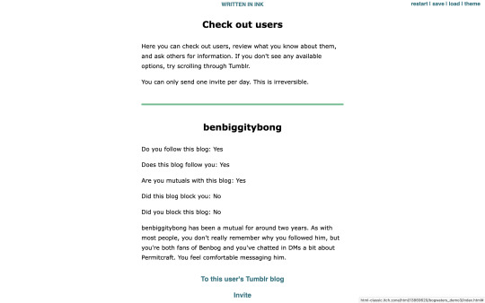
🎈 Bogwaters Demo update!! :D
Formatting update, 2 new NPCs, randomisation feature, and quality of life changes
(Previous post)
Bogwaters is a free, text-based, interactive fiction browser game about running an underground shipping Discord server in the 2021 MCYT fandom, hosted on itch.io.

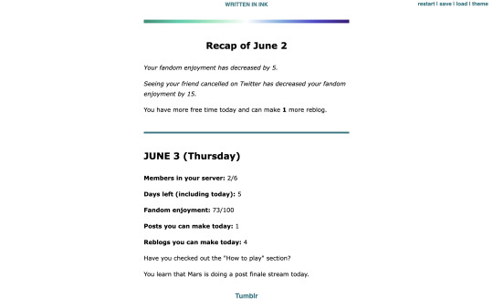
Formatting update:
Added more headers. Also added coloured dividers to section off text:
Home: teal
Tumblr: light blue
Discord: light purplish blue (Discord colour)
Ao3: dark red (Ao3 colour)
Messages: yellow
Check out users/invite: light green
Sleep/new day: gay man flag gradient
Trivia: colours for Tumblr, Messages, and Check out users are eyedropped from the old Tumblr UI
Feedback for these colours are welcome!
2 new NPCs:
Now you won't be locked out of winning the game if someone blocks you! The new NPCs are carbonara-art and hippie-benbog with their own storylines and unlock conditions.
New features:
Randomised mandatory daily fandom enjoyment decrease ranging from 3 to 7
Chances: -3 (10%), -4 (10%), -5 (60%), -6 (10%), -7 (10%)
When you sleep, there is a randomised potential +1 increase in reblog (20% chance) and post (10%) quota for the following day. Does not carry past that day.
In addition to blogs of the 2 new NPCs, blogs for doehills, ofthebigwaters, and riversymphony are added. These three are not interactable.
Quality of life changes:
Skippable prologue
Some scenes that don't have bearing on the gameplay are skippable (for this version, it's the conversation with kindredwaves on June 2)
An individual "check out a user" section now has a link to their respective Tumblr blog and vice versa
Misc:
Minor changes to dash content
Minor changes to text formatting
"Days played" shows up as a stat when you get an ending
"Days left (including today)" shows up in the home menu
Reduced animation
Reblogs and feedback are appreciated! Thanks for playing! <3
#interactive fiction#ink#inkle#bogwaters#trafficblr#treebark#life series#mcyt#mcytblr#hi yes. i added gacha#the gradient was gonna be rainbow but it looked soo goofy#this is like middle grade student's first html project#the thing is. ink itself is not very good with css since you can only put a class in one line. can't span multiple lines#so i haven't figured out how to make borders for sections but the dividers should help hopefully#my less ugly css baby...
67 notes
·
View notes
Text

CSS Gradient Text Generator is a CSS code generation tool that helps developers and designers create visually appealing colorful gradient text effects. It allows you to apply gradient colors to text elements effortlessly.
#CSS Gradient Text Generator#CSS Code Generator#Gradient Text Generator#free online tools#online tools#web tools#online web tools#free web tools#online tool#a.tools
2 notes
·
View notes
Text
#workskin .rainbowStroke { -webkit-text-fill-color: black; background-image: -webkit-linear-gradient(-45deg,blue,magenta,red,orange,yellow,green,cyan); -webkit-background-clip: text; -webkit-text-stroke: 2px transparent; padding-left: 5px; margin-left: -5px; padding-right: 5px; margin-right: -5px;
}
edit: added four new lines to prevent bg clipping
spokeishere text (black text with rainbow stroke) if anyone wants it
idk if theres already a workskin that works just like/similar to this but i havent checked lol
breakdown of code for anyone too intimidated to play around with it (not an expert tho this is mainly just me listing down my conclusions after playing around with it, also written in a way thats assuming the reader knows fuckall about coding):
#workskin .rainbowStroke { -webkit-text-fill-color: black; background-image: -webkit-linear-gradient(-45deg,blue,magenta,red,orange,yellow,green,cyan); -webkit-background-clip: text; -webkit-text-stroke: 2px transparent; padding-left: 5px; margin-left: -5px; padding-right: 5px; margin-right: -5px;}
code name
> can be changed
> is what you use to define the code aka attach the properties to the actual text using text
text color
> webkit is what supports the existence of stroke hence why it's there and why you cant just use {color: black;}
> fill is what thickens the text, you can delete it but it makes the text harder to read
stroke colors aka the text outline
> deg is the way the colors are rotated, feel free to change the number and to make it positive or negative
what makes the stroke not just a square
> clipping for those of you unfamiliar with it just means it follows the shape of whats underneath it
stroke properties
> the px means pixels and indicates the size of the stroke
> transparent means it'll actually show whats underneath, it can be deleted but doing so will make the text moremuddy/desaturated
background overflow
> there to prevent the colors from being cut too short since nackground normally is almost the exact size of the text
> can be changed but will affect the colors, also having it too small will cause clipping
anything in black/white is code language properties, you cannot make anything without them
#writing#spokeishere#did this cause i wanted to try colorcoding in my fics but realized that spoke has a rainbow gradient thing going on#took me like 2 hours to get through all the technobabble and irrelevant info to find what i was actually looking for#https://stackoverflow.com/questions/61825324/css-gradient-text-with-opacity-and-gradient-text-stroke-outline#<---- shoutout to the guy from this question btw couldnt have done it without ya#https://stackoverflow.com/a/17756378#<------- also shout out this guy
6 notes
·
View notes
Text
2 notes
·
View notes
Text
Modern Scroll Shadows Using Scroll-Driven Animations
New Post has been published on https://thedigitalinsider.com/modern-scroll-shadows-using-scroll-driven-animations/
Modern Scroll Shadows Using Scroll-Driven Animations

Using scroll shadows, especially for mobile devices, is a subtle bit of UX that Chris has covered before (indeed, it’s one of his all-time favorite CSS tricks), by layering background gradients with different attachments, we can get shadows that are covered up when you’ve scrolled to the limits of the element.
Geoff covered a newer approach that uses the animation-timeline property. Using animation-timeline, we can tie CSS animation to the scroll position. His example uses pseudo-elements to render the scroll shadows, and animation-range to animate the opacity of the pseudo-elements based on scroll.
Here’s yet another way. Instead of using shadows, let’s use a CSS mask to fade out the edges of the scrollable element. This is a slightly different visual metaphor that works great for horizontally scrollable elements — places where your scrollable element doesn’t have a distinct border of its own. This approach still uses animation-timeline, but we’ll use custom properties instead of pseudo-elements. Since we’re fading, the effect also works regardless of whether we’re on a dark or light background.
First, we’ll define our scrollable element with a mask that fades out the start and end of the container. For this example, let’s consider the infamous table that can’t be responsive and has to be horizontally scrollable on mobile.
Let’s add the mask. We can use the shorthand and find the mask as a linear gradient that fades out on either end. A mask lets the table fade into the background instead of overlaying a shadow, but you could use the same technique for shadows.
.scrollable mask: linear-gradient(to right, #0000, #ffff 3rem calc(100% - 3rem), #0000);
Defining the custom properties and animation
Next, we need to define our custom properties and the animation. We’ll define two separate properties, --left-fade and --right-fade, using @property. Using @property is necessary here to specify the syntax of the properties so that browsers can animate the property’s values.
@property --left-fade syntax: "<length>"; inherits: false; initial-value: 0; @property --right-fade syntax: "<length>"; inherits: false; initial-value: 0; @keyframes scrollfade 0% --left-fade: 0; 10%, 100% --left-fade: 3rem; 0%, 90% --right-fade: 3rem; 100% --right-fade: 0;
Instead of using multiple animations or animation-range, we can define a single animation where --left-fade animates from 0 to 3rem between 0-10%, and --right-fade animates from 3rem to 0 between 90-100%. Now we update our mask to use our custom properties and tie the scroll-timeline of our element to its own animation-timeline.
Putting it all together
Putting it all together, we have the effect we’re after:
We’re still waiting for some browsers (Safari) to support animation-timeline, but this gracefully degrades to simply not fading the element at all.
Wrapping up
I like this implementation because it combines two newer bits of CSS — animating custom properties and animation-timeline — to achieve a practical effect that’s more than just decoration. The technique can even be used with scroll-snap-based carousels or cards:
It works regardless of content or background and doesn’t require JavaScript. It exemplifies just how far CSS has come lately.
#ADD#animation#animations#approach#Articles#background#border#container#content#CSS#CSS Animation#css-tricks#custom properties#Dark#devices#digitalocean#gradients#how#indeed#it#JavaScript#Light#linear-gradient#mask#Mobile#mobile devices#One#responsive#safari#scroll
0 notes
Text

How to add Gradient Background Overlay
#gradient background overlay#css gradient#html css#divinector#css#html#css3#code#webdesign#frontenddevelopment#css gradient effect#css tricks#css effects#learn to code
1 note
·
View note
Text
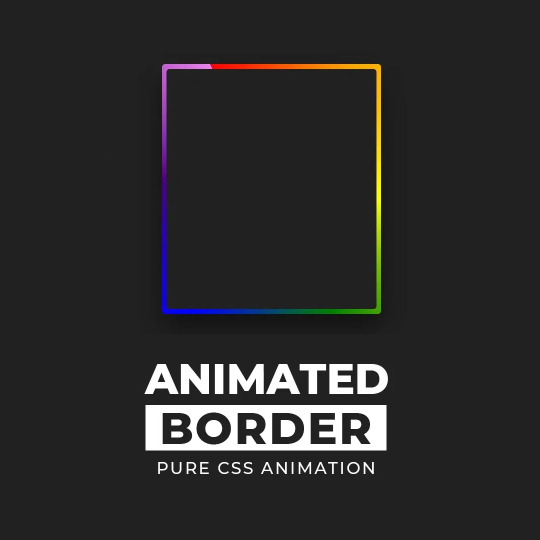
CSS Gradient Border Animation
#gradient border animation#css border animation#css animation examples#css animation tutorial#css animation#cool css animation#css gradient animation#css gradient#learn to code#code#html css#css#html#css3#frontenddevelopment#webdesign#frontend#gradient
7 notes
·
View notes
Text
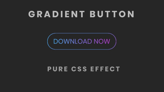
CSS Gradient Border Button
#css gradient button#html css buttons#gradient border button#css gradient#css effects#pure css effects#html css#frontenddevelopment#code#css#pure css animation#html5 css3#codenewbies#html and css
1 note
·
View note
Text
Gradient is type of image Shading between two or multi color which is developed by computer programming.Gradient is implemented Background color. Gradient can be Implemented Background for Html control like div,button,range input etc.Gradient works faster than image with minimum code.Gradient impress user experience.Gradient development is easy and quick.Works almost all device , almost all browser.
1 note
·
View note
Text
CSS Gradient Color generator , gradient generator , background gradient generator
Link: CSS Gradient Color Generator Now!
In the realm of web design, gradients add depth, dimension, and visual interest to websites, creating captivating visual effects and enhancing user experience. EditBoxPro’s CSS Gradient Color Generator offers a user-friendly solution for creating custom CSS gradients that elevate the aesthetics of your web projects. Let’s explore how EditBoxPro’s CSS Gradient Color Generator can empower web designers to unleash their creativity and bring their design visions to life.
Harnessing the Power of CSS Gradients
CSS gradients allow web designers to create smooth transitions between two or more colors, resulting in visually appealing backgrounds, buttons, overlays, and other design elements. Gradients add depth and texture to web interfaces, making them more engaging and immersive for users. With EditBoxPro’s CSS Gradient Color Generator, designers can easily experiment with different gradient styles, angles, and color combinations to achieve the desired visual effect for their websites.
Key Features of EditBoxPro’s CSS Gradient Color Generator
Intuitive Gradient Editor: EditBoxPro’s CSS Gradient Color Generator features an intuitive gradient editor that allows designers to create custom gradients with ease. Whether you prefer linear gradients, radial gradients, or conic gradients, our tool offers a range of options to suit your design needs.
Color Picker and Gradient Stops: Customize your gradients by selecting colors from a comprehensive color picker or entering hex codes manually. EditBoxPro’s Gradient Color Generator also allows you to add multiple gradient stops and adjust their positions and opacity levels for precise control over your gradient design.
Gradient Angle and Direction: Experiment with different gradient angles and directions to achieve the desired visual effect for your web design projects. EditBoxPro’s CSS Gradient Color Generator allows you to specify linear gradient angles, radial gradient shapes, and conic gradient starting points for endless design possibilities.
Preview and Code Export: Visualize your gradient designs in real time with EditBoxPro’s live preview feature. As you make changes to your gradient settings, our tool provides instant feedback, allowing you to see how your gradients will appear on the web. Once you’re satisfied with your design, you can easily export the CSS code and integrate it into your web projects.
Cross-Browser Compatibility: EditBoxPro’s CSS Gradient Color Generator ensures cross-browser compatibility by generating CSS code that works seamlessly across modern web browsers. Whether you’re targeting desktop or mobile users, our tool helps you create gradients that render consistently across different devices and platforms.
Advantages of Using EditBoxPro’s CSS Gradient Color Generator
Enhanced Visual Appeal: Elevate the visual appeal of your websites with stunning CSS gradients created using EditBoxPro’s Gradient Color Generator. Whether you’re designing headers, buttons, backgrounds, or overlays, gradients add depth, dimension, and sophistication to your web interfaces, making them more visually appealing and memorable for users.
Time-Saving Design Solution: Streamline your design process and save time with EditBoxPro’s CSS Gradient Color Generator, which offers a user-friendly interface and intuitive controls for creating custom gradients in minutes. Instead of manually coding gradients from scratch, designers can use our tool to experiment with different gradient styles and color combinations effortlessly.
Versatile Design Applications: Whether you’re designing personal websites, portfolio sites, e-commerce platforms, or corporate landing pages, EditBoxPro’s CSS Gradient Color Generator offers a versatile solution for integrating gradients into your web projects. From subtle color transitions to bold gradient effects, our tool empowers designers to create custom gradients that reflect their brand identity and design aesthetic.
Accessible Design Tool: EditBoxPro’s CSS Gradient Color Generator is accessible to designers of all skill levels, from beginners to experienced professionals. With its user-friendly interface and visual editor, our tool makes it easy for designers to experiment with gradients and create visually stunning web designs without the need for advanced coding knowledge.
Conclusion
Transform your web design projects with EditBoxPro’s CSS Gradient Color Generator. Whether you’re a seasoned web designer or just starting out, our tool provides the functionality, flexibility, and convenience you need to create custom gradients that enhance the visual appeal of your websites. Experience the power of CSS gradients, unleash your creativity, and elevate your web design game with EditBoxPro today!
Create Custom CSS Gradients with EditBoxPro’s CSS Gradient Color Generator Now!
gradient generator, gradient generator javascript, css gradient generator, background gradient generator, javascript gradient background generator, multiple color gradient generator, linear gradient generator, gradient color generator, gradient image generator, ultimate css gradient generator, background color generator, random color gradient generator, gradient, gradient color generator javascript, css gradient tutorial, linear gradient
1 note
·
View note
Text
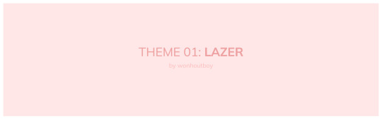
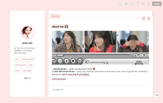
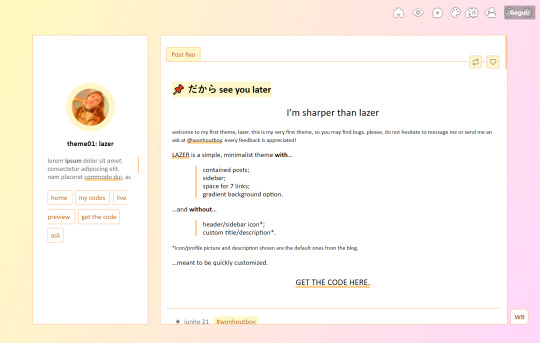
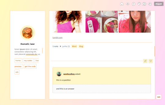
theme_01: lazer by wonhoutboy
static preview / [temporary] live preview / code
• simple, minimalist & responsive theme for easy customization; • sidebar and contained posts; • 7 links; • no extra icon/header or description (uses the blog's originals); • credits here; • please consider buying me a coffee <3.
!! this is my very first theme, so if you find any bugs/if anything doesn’t go well or if you just struggle with customizing it, please reach out to me via private message or ask and i’ll gladly help!
#code#theme#html#contained#container#sidebar#left sidebar#themes#tumblr themes#css#theme-hunter#themehunter#pink#gradient#customization
130 notes
·
View notes