#gradient design
Explore tagged Tumblr posts
Visit Tumblr Blog
Explore Tumblr blogs with no restrictions, modern design and the best experience.
Last Seen Tumblr Blogs


Fun Fact
25% of US internet users with an annual income of $80-100K use Tumblr.
Text
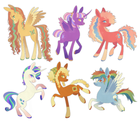
friendship is magic if I was in charge of art style and character design
#yes they're all based off G3#I didn't want to make rarity pink so I just gave her cute pink gradient socks and shadows [:#pinkie is based off my favourite version of G3 pinkie pie (the super dark coloured one with super pale hair!!!)#twilight is based off twilight twinkle#ALSO. DO YOU GUYS SEE HOW I GAVE AJ AND PINKIE SIMILAR MARKINGS AND HAIR TYPES#they can be WHATEVER you want them to be but I thought it'd be cute to lean into the distant cousins narrative for once#mlp#my little pony#mlpfim#twilight sparkle#rarity#fluttershy#pinkie pie#applejack#rainbow dash#mane 6#mlp redesign#my little pony fanart#mlp fanart#character design
5K notes
·
View notes
Text
was bored at work so i made a collage
#is it fair to call this a collage? not sure but i saw a cool artist i follow do something similar and i was like yeah why not#I guess i can just paint over it to define some details too#also the gradient map was necesary imo it looked weird without it#not sure how to tag this lol#my art#?#collage#??#character design#monster#creature#wgd
4K notes
·
View notes
Photo

#rainbow#gif#art#digital art#color#colors#colorful#artists on tumblr#aesthetic#arte#stimmy#aes#design#stim#cool#gradient#gifs#calm#peaceful#visual stim#YIQ#*d14#*h0#*pfn e0 sp1 r134#*c46.180.89.235.48.168#*mp4776.1264.0401#*tp2423.0022.0100
1K notes
·
View notes
Text

don't give me that shit boneless 🖕🖕🖕
#rambling on what i dont like i hate the red and pink they picked bc they dont look nice together at all#the pink is very cool toned and the red is orangey-warm toned so it clashes like a mf#the headband is like.. too tall and they use the xoxo candy hearts a little too much as a motif#no gradient on the arms same issue i have with lagoona and twyla#the silhouette is so same-y with the puffy tutu dress i wish it was like poofy from the top like the neckline not from the hips#that being said: i adore the hair and the bone wings and leg tattoos and bloomers shape under the skirt and sleeves#to even out the colors i made the bone skin more warm yellow/orange to match with the gold#and i made the pinks more warm and reddish and the reds more cool and pinkish#i wish the bone elemental thing was more of a feature bc the wings are so fucking cool thats why i gave her black sclera on the eyes#i dont know why i made her ears like feathery i just thought it looked cool#whatever i need her irl to customize but i have no money and mattels been even shitter than usual last few months so 💔#im stealing her design she's mine now 👍#my art 🎨#cupid asteria#ca cupid#c.a. cupid#monster high#mh#monster high redesign#ibispaint x
593 notes
·
View notes
Text
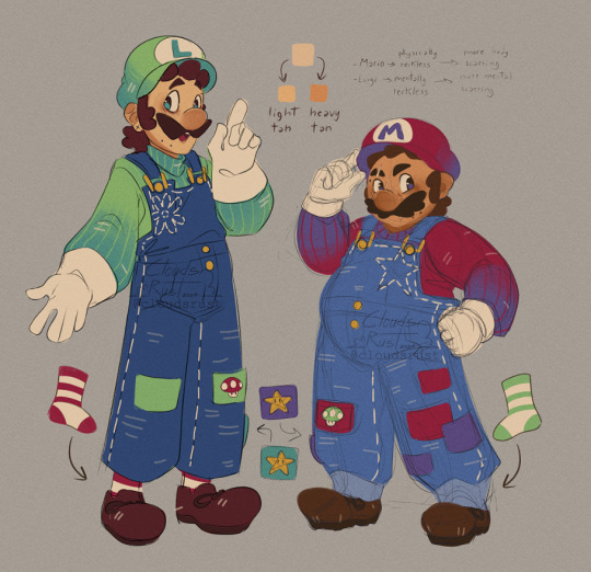
Got so many tags saying how much they liked Luigi's overalls (which makes me so happy because it's the part I kept personalizing the most during the years I've drawn him! :,>)- I wanted to show how my take on the bros mirror each others.
I like to think Luigi is the one who sews and patches up both of their clothes/overalls when they inevitably get roughed up during adventuring- mostly Mario's ones though.
#mario and luigi#super mario bros#doodle#myart#the Brothership gradients really came in clutch because oughh they just complete the design so well- especially in Mario's case
944 notes
·
View notes
Note
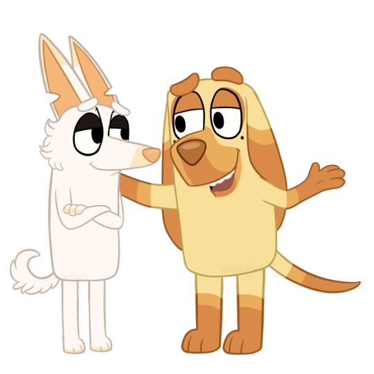
Real fan art is coming one day, but for now I really wanted to see if it was feasible to simplify their gradients into something that would fit a simple style like Bluey’s 😅
.
#aaaaaaaaaAAA#they're so precious I can't ;m;#I still haven't watched Bluey so I can't really comment on show accuracy but to me these look spot on#if you ask me the gradients work really well#if you look at them and unfocus your eyes they look like their normal markings#Vasco might benefit from having one more band between the base yellow and the lighter brown but that's totally optional and might take away#from the simplicity of his design#their colors are so true to the way I color them which is both cool and kind of uncanny#like Machete's pink details which in reality are very peachy almost closer to light orange than true pink#and their colored linearts which use the same colors I use for my colored linearts#I don't know I thought that was really cool attention to detail#they're adorable#thank you!#gift art#apupcalyptic#own characters#Machete#Vasco#their lives would be a lot less stressful in bluey universe I reckon
1K notes
·
View notes
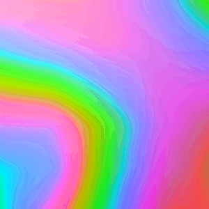
Photo


"Concentric Expansion" by Hagihara Takuya ⊙ The eye sinks inward while colors push outward
#hagihara takuya#green#gradient#abstract art#contemporary#pink#digital art#abstract#concentric design
239 notes
·
View notes
Text
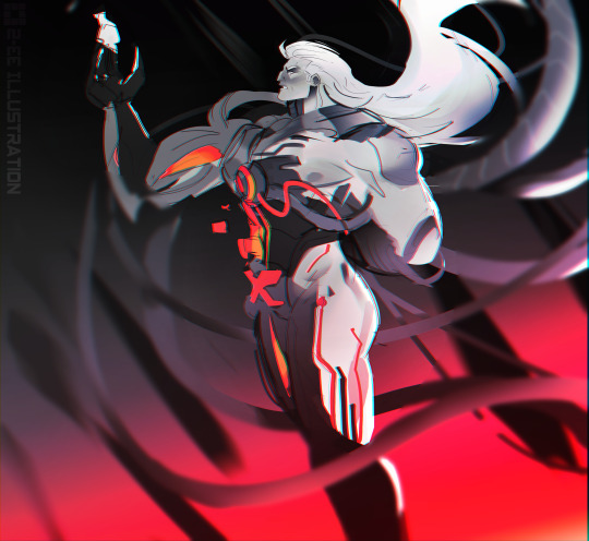

Binary Sword Magneto doodle for my soul b/c I needed to get his absolute territory out of my system b4 I crash out this week from dayjob stress
#magento#binary sword#fanart#marvel rivals#tooie don't overuse gradient maps impossible challenge#i need more practice with this design this sketch is all over the place lmao#timelapse#speedpaint#digital sketch
221 notes
·
View notes
Text
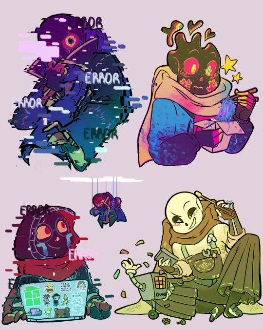
Hee hoo more of the fam! ( ≧ᗜ≦)
Ft ideas:
-Error having Geno's glitches when hes unstable (and maybe even his eye melting,,, tho you rarely get to see it)
- PJ's comfort food is just some weird concoction Ink and Error made thats just error's strings and purple paint and called it "homemade ramen"
It sounds so dumb but its probably a really good healing item for him if he lost his strings=structure somehow.
-Gradient and Error communicate through puppets. Both of them are too socially awkward when face to face so this is for the best lmfao
-Ink building lil mini metatton robots!! Did you know his dad taught him how to build machines and studying astrophysics? Its so he learns to be less dependent on his paints and powers. I wish ppl draw him doing stuff like this more ; w ;
Error by @/loverofpiggies
PJ is by @/7goodangel
Gradient is by @/askcomboclub
Ink by @/comyet
#i love em all so much#dysfunctional af family#ive also... been thinking about making my own lil errorink kid....#hee hee. i just need to finish up her design#junie art post#ScumAnomalyverse#SAverse#utmv#errorink#error sans x ink sans#error x ink#ink x error#inkerror#errink#paperjam sans#gradient sans#paperjam#gradient
2K notes
·
View notes
Text
I think 90% of my gripes with how modern anime looks comes down to flat color design/palettes.
Non-cohesive, washed-out color palettes can destroy lineart quality. I see this all the time when comparing an anime's lineart/layout to its colored/post-processed final product and it's heartbreaking. Compare this pre-color vs. final frame from Dungeon Meshi's OP.


So much sharpness and detail and weight gets washed out and flattened by 'meh' color design. I LOVE the flow and thickness and shadows in the fabrics on the left. The white against pastel really brings it out. Check out all the detail in their hair, the highlights in Rin's, the different hues to denote hair color, the blue tint in the clothes' shadows, and how all of that just gets... lost. It works, but it's not particularly good and does a disservice to the line-artist.
I'm using Dungeon Meshi as an example not because it's bad, I'm just especially disappointed because this is Studio Trigger we're talking about. The character animation is fantastic, but the color design is usually much more exciting. We're not seeing Trigger at their full potential, so I'm focusing on them.
Here's a very quick and messy color correct. Not meant to be taken seriously, just to provide comparison to see why colors can feel "washed out." Top is edit, bottom is original.
You can really see how desaturated and "white fluorescent lighting" the original color palettes are.
[Remember: the easiest way to make your colors more lively is to choose a warm or cool tint. From there, you can play around with bringing out complementary colors for a cohesive palette (I warmed Marcille's skintone and hair but made sure to bring out her deep blue clothes). Avoid using too many blend mode layers; hand-picking colors will really help you build your innate color sense and find a color style. Try using saturated colors in unexpected places! If you're coloring a night scene, try using deep blues or greens or magentas. You see these deep colors used all the time in older anime because they couldn't rely on a lightness scale to make colors darker, they had to use darker paints with specific hues. Don't overthink it, simpler is better!]
#not art#dungeon meshi#rant#i'm someone who can get obsessive over colors in my own art#will stare at the screen adjusting hues/saturation for hours#luckily i've gotten faster at color picking#but yeah modern anime's color design is saddening to me. the general trend leans towards white/grey desaturated palettes#simply because they're easier to pick digitally#this is not the colorists fault mind you. the anime industry's problems are also labor problems. artists are severely underpaid#and overworked. colorists literally aren't paid enough to do their best#there isn't a “creative drought” in the anime industry. this trend is widespread across studios purely BECAUSE it's not up to individuals#until work conditions improve anime will unfortunately continue to miss its fullest potential visually#don't even GET ME STARTED ON THE USE OF POST-PROCESSING FILTERS AND LIGHTING IN ANIME THOUGH#SOMEONE HOLD ME BACK. I HATE LENS FLARES I HATE GRADIENT SHADING I HATE CHROMATIC ABBERATION AND BLUR
2K notes
·
View notes
Photo
#rainbow#pink#background#art#colorful#gradient#artists on tumblr#sensory#colors#calm#color#aesthetic#gifs#digital art#gif#design#pretty#stimmy#colours#pride#YIQ#*d45#*h 32#*ky1#*m pfn 1290 e-e12 sp1 r152#*mp3348.5679.0209#*tp0226.3436.0005
204 notes
·
View notes
Text

I don't tend to use a lot of orange or yellow unless they're part of a colour wheel, but wanted something fire-inspired for this. It's another big one, about 43cm (17") across. Blackwork embroidery on 14-count Aida cloth.
Pattern here (my site) or here (Etsy).
#blackwork#blackwork embroidery#embroidery#cross stitch#fiber art#fibre art#textiles#pattern#gradient#fire#flame#orange#sampler#my designs
1K notes
·
View notes
Text

tankfamily yaaaay
#fnf#pico's school#tankmen#tankdad#fnf fanart#newgrounds#moon art#pico newgrounds#sergeant john captain#tankmen steve#tankmen captain#tankman#fnf pico#pico fnf#all the colour gradients n editing n shit RUINED picos pants colour btw theyre meant to be brownish. oh well#is a couple months after i finally drew and posted all my fnf designs a bad time to say#“hey do we fw this new pico outfit” bc i got sick of drawing the old one LMAO#ur gettin it anyway. new fit#puttin shit in the fnf tags just for more visibility (im VERY mad abt captain being flanderized in fnf but. *sniffles* dont worry about it)
227 notes
·
View notes
Text
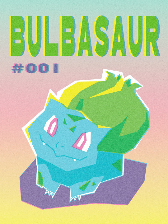
bulbasaur risograph style poster <3 currently still experimenting with this art style
#graphic design#poster design#illustration#digital art#print design#risograph#retro aesthetic#gradient art#pop art style#colorful art#pokemon#bulbasaur#gen 1 pokemon#pokemon fanart#pokemon art#pokemon illustration#starter pokemon#kanto starter#bulbasaur fanart#aesthetic#cute art#bold colors#nostalgia#art print#fanart#artist on tumblr#artists on tumblr#typography#poster art#design inspiration
215 notes
·
View notes
Text

who up here regretting they evator
#my art#art#digital art#regretevator#regretevator fanart#regretevator pest#regretevator bive#unpleasant gradient#regretevator unpleasant gradient#i was bored and drew pest but i was like wow thids is good enough 2 post but it's just a doodle might as well drsw more#and then it took like over 2 hours huhhh#anyways there is my designs 4 them
1K notes
·
View notes
