#gradient text border animation
Explore tagged Tumblr posts
Visit Tumblr Blog
Explore Tumblr blogs with no restrictions, modern design and the best experience.
Last Seen Tumblr Blogs


Fun Fact
Tumblr has a 66 index score for customer satisfaction in the US.
Text

Gradient Text Border Animation
#gradient text border animation#neon border animation#html css#codenewbies#frontenddevelopment#html5 css3#css animation examples#pure css animation#css animation tutorial#css#html css animation#pure css effects
5 notes
·
View notes
Text
0 notes
Text
𐔌 ‧₊ᢉ𐭩˚ mango swirl 𐦯
it's been a minute , friends ! i hope everyone is doing fantastic and thriving ! i'm pleased to release my newest theme , mango swirl . she's cute , she's versatile , and she's the perfect theme for the summer ! complete with animations , a mock twitter bio , and all the bells and whistles ! as always , please don't hesitate to message me on patreon or here on tumblr if u encounter any issues and we can troubleshoot it together !
pretty please give this post a like or reblog if u intend on using this code or if u just want to be a supportive hottie ! love u all bigly ; be sure to pet a cute animal today ! mwuah !

𐔌 ᢉ𐭩 theme features 𐦯
optional grayscale img toggle
accessible font sizing toggle
beautiful animated gradient star border
aesthetically pleasing micro text accents
1 free link to use however u please
mock twitter bio complete w/ icon and header
navigation tab with 6 free links
subtle animations use throughout
full list of credits , inspo , image sizes , and fonts are listed within the google doc containing the code

this theme is a patreon exclusive . interested ? click here or the attached source link to consider becoming a part of the hottie crew ! we'd love to have u !
⟡⋆。⊹₊˚ notice : there is no live preview of this theme , hence the video preview ... apologies if this inconveniences anyone !

#rph#indie rp theme#rp theme#rpt#premium theme#paid theme#theme#rec#mine#supportcontentcreators#for patrons
35 notes
·
View notes
Note
What is your creation process? :3c
hey, thanks for the inquiry! i've been meaning to make a post like this for some time now. NOTE: this will only cover how i make my blinkies. if you want me to go in depth about how i make stamps, please send another ask! i just think they're kind of self explanatory in comparison >_>
MY BLINKIE MAKING PROCESS
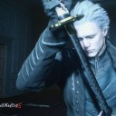
for this demonstration, i will make this graphic of Acht Mizuta from Splatoon 3. it's free to use btw:
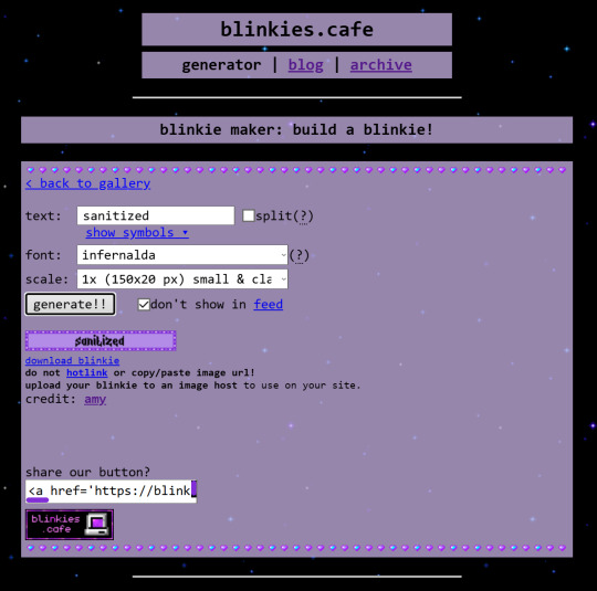
i make my graphics in Krita, which is great for editing pixel art, but does not have an option to disable font antialiasing. this leads me to generate my pixel text through external online services, but i usually generate it on blinkies.cafe and get an editable template to go along with it. my go-to is the simple purple template, since it has a simple palette and the text has its own color so i can put it in a separate layer easier.
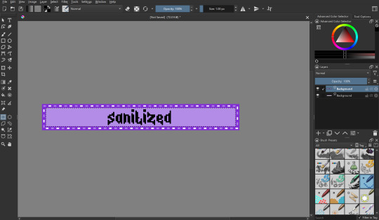
i import it as a single frame that i will animate later. usually what i do first is cut+paste the inner content of the blinkie into a separate layer:
then i remove the background with a fill erase on the third mode, and move it around as i see fit. i put it in a separate layer before this so it's easier to color and add things like outlines.

let's import graphics! usually i find a transparent png and overlay it onto the background, but in this case i'm using a full background, so it needs to be prepared:

(source: splatoon 3 side order locker reward banner)
i import the image into a new file with the same resolution as the blinkie. i edit it to have a wider resolution so it fits better:
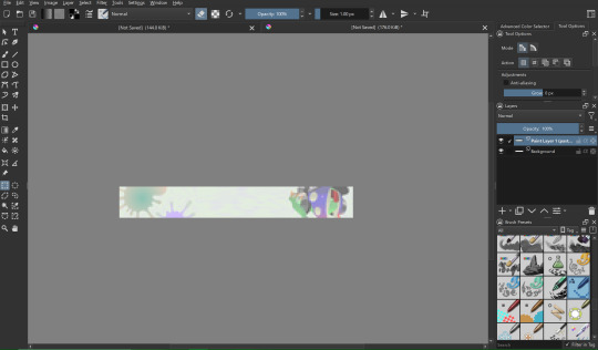
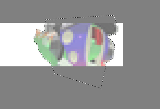
i use a lasso tool to put acht in a separate layer (so they stick out of the frame)
i import the two layers into the original file with the text. though i feel the images could use a little color grading...
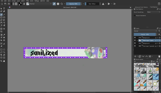
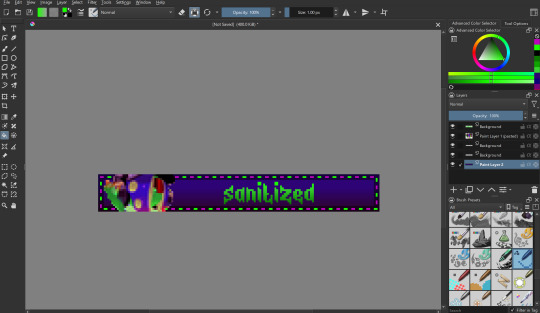
at this point i begin to mess around with the layout a little, trying to match the original "sanitized" theme i had in mind. i also do color grading on the render of acht and change out the background. now we're getting somewhere! i also color the text at this point to be a nice gradient green.
let's color the outer part of the blinkie! i thought i would make the border a transparent black, with the lights being neon green and a dark magenta respectively.
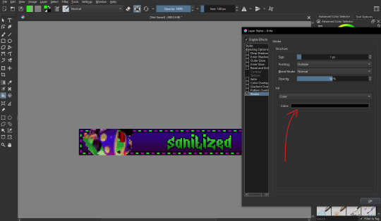
i also want to make the text have a nice little border around it, so i put a stroke filter on the text layer with the following settings. these usually change depending on graphic but the thickness is always 1px (any more and it gets antialiasing)
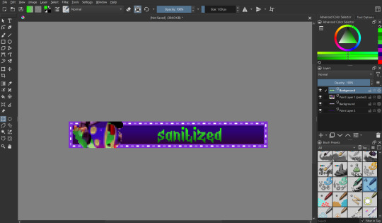
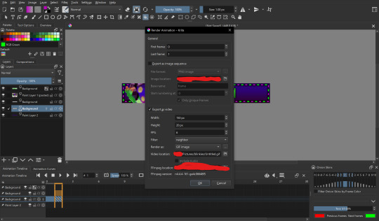
that's it for designing the blinkie, now it's time to animate it! i do this internally in krita, since it has an animation feature:

i make a new frame for the animation and change the colors and positions around. i also set up my clip settings - ending at frame 1 (2 frames - frame 0 and frame 1) at 6fps.

that's pretty much it! the gif is ready to export, just make sure you export it in the right format and don't accidentally compress it or make it too big.
the gif is ready!! wahoo!! i hope this was somewhat enlightening, i'm not the best at explaining stuff but i tried to go in depth as much as i could
#dj's commentary#pixels garage#web graphics#blinkies#dedf1sh#acht mizuta#acht splatoon#blinkies.cafe#tutorial
42 notes
·
View notes
Text
Another drawing I made for my animation school application portfolio, a ref sheet for Cleaver Salix
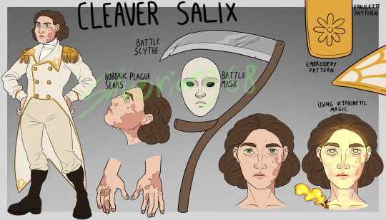
[Image ID: A character sheet with a grey gradient background with lighter grey borders. On the left side is a drawing of a middle-aged white person with large, blotchy scars on their face and hands. Their eyes are green and the spaces under them are dark. Their hair is short and dark brown. Their outfit consists of a white tailcoat with gold buttons and embroidery resembling flower petals, and gold epaulettes with daisy-shaped decorations. They also have white trousers, brown boots and a white turtleneck. Their hands are on their hips. Next to this drawing is a close-up of their scars, with the text "bubonic plague scars" written above it. To the right of this drawing are a white mask with black eyes and a scythe, with the text "battle mask" and "battle scythe" next to them. In the top right corner is a close-up of the flower pattern on the epaulette, with the text "epaulette pattern" next to it, and a close-up of the lapel patterns, with the text "embroidery pattern" next to it. In the bottom right there are two headshots of the character, one normal and the other with a wound on their shoulder and bones and pupils glowing golden light, with the text "using vitakinetic magic" above it. At the very top of the page is the text "cleaver salix". The artist's signature, Silverior968, is overlayed over the image in green. / End ID]
#fanart#skulduggery pleasant#skulduggery pleasant oc#original character#cleaver salix#I love them very dearly#blood cw
17 notes
·
View notes
Text
SETACIN COMMS OPEN NOW!
Have YOU ever gone "Hey I wish there was more art of this character" or "Man I really wish I had more art of my oc" WELL NOW'S YOUR CHANCE! :D


If you have any questions, let me know! (text transcription below)
SETACIN COMMISSIONS 2024
Method of contact - Discord, Twitter, Tumblr DMs Method of payment - Paypal invoice, 50% upfront, prices in USD
CHARACTER ILLUSTRATIONS: character illustrations will have a single color or gradient background with small decorations like stars or hearts available upon request :)
FLAT COLOR: head/shoulders - $30 waist-up - $40 thighs-up - $45 full-body - $50
COLOR + SHADING: head/shoulders - $50 waist-up - $60 thighs-up - $65 full-body - $70
RENDERED: head/shoulders - $60 waist-up - $70 thighs-up - $75 full-body - $80 ADD-ONS: Animals ~$25+ Weapons ~$10+ Additional characters +75% normal character price
FULL ILLUSTRATIONS (rendered only)
SIMPLE BACKGROUND/HARSH LIGHTING +$30 - 1-3 simple items in background - particle/magic effects - dramatic lighting w/ dark background COMPLEX BACKGROUND +$50 - scenery/full environments - complex items - borders/edge detailing STAINED GLASS - full window $250+ - full body $200+ - waist-up $150+ *prices highly variable based on complexity
I am open to other formats such as character sheets, youtube thumbnails, profile pictures, banners, etc. upon request! :)
I WILL DRAW: - OCs/Sonas - Fan art - complex armor/weapons - Mild gore (blood/injury_ - Ship art I WILL NOT DRAW: - NSFW/Fetish - IRL people - Complex mech - Hate Symbols - Extreme gore - Children (<15 yrs)
ADDITIONAL INFO - Character references must be provided. I CAN design a character, but price will need to be negotiated - Depending on complexity, prices may increase - Revisions are free up until I start line art, after which major changes may increase price - Email must be provided for Paypal invoice, Final piece will be sent via dms and/or email - Commission will take up to a month max - If you would like to use my art as branding, please let me know! :) TERMS OF SERVICE: - I reserve the right to refuse any request - Commission is for personal use only unless otherwise discussed - You may not re-sell my art or turn it into NFTs - You may not share WIPs shown during commissioning process - Work on piece will not start until 50% upfront payment has been made - No refunds, no physical product provided (this is digital art) CONTACT ME: Tumblr - setacin Twitter - setacinn
#this goes out to anyone who has sat there refreshing a character tag and seeing no new art now YOU can change that#im so excited to be able to draw everyones blorbos ive been working on these sheets for like a week now LMAO#drawing commisions#art commissions#art commission prices#commissions open#comms open
65 notes
·
View notes
Text
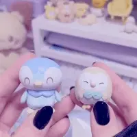
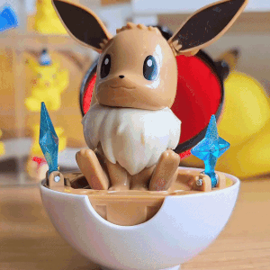
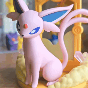
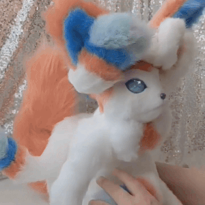

A Pokémon related stimboard with my stim gifs! (I made all of the gifs myself lol)
x/x/x/x/o/x/x/x/x
[GIF 1: Light skinned hands showing off figures of the avian Pokémon Piplup & Rowlet (END ID)]
[GIF 2: A person playing with the ears of a figure of the Pokémon Eevee (END ID)]
[GIF 3: A camera panning to a figure of the Pokémon Espeon (END ID)]
[GIF 4: A person showing off the details of a poseable art doll of the Pokémon Sylveon (END ID)]
[GIF 5: A camera panning to a person's arm to show a tattoo of the Pokémon Eevee & the original 3 Kanto region Eeveelutions (Jolteon (Yellow), Flareon (Red) & Vaporeon (Blue)) (END ID)]
[GIF 6: A person holding a clothing hanger shaped like the Pokémon Leafeon (END ID)]
[GIF 7: A person holding a statue/figure of the Pokémon Sprigatito (END ID)]
[GIF 8: A person holding a decoden phonecase themed to the Pokémon Sylveon (END ID)]
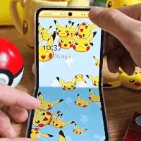
[GIF 9: A camera panning to a Samsung Galaxy flip phone with an animated wallpaper of the Pokémon Pikachu on it (END ID)]
[IMAGE: The Kirby character Daroach on a yellow/red gradient background with white text w/ a blue outline reading: “Please read my pinned post/DNI list before interacting! Thank you! with small text in heavily stylized pixel font next to it reading “by boba-foxy on Tumblr!” with a small dark red border around the image (END ID)]
#mod boba#pokemon#stimboard#figures#poseable doll#decoden phonecase#phone#visual stim#multicoloured#stim#colours#board#stim board#eevee#sylveon#leafeon#vaporeon#jolteon#flareon#espeon#rowlet#piplup#sprigatito#pikachu
92 notes
·
View notes
Text

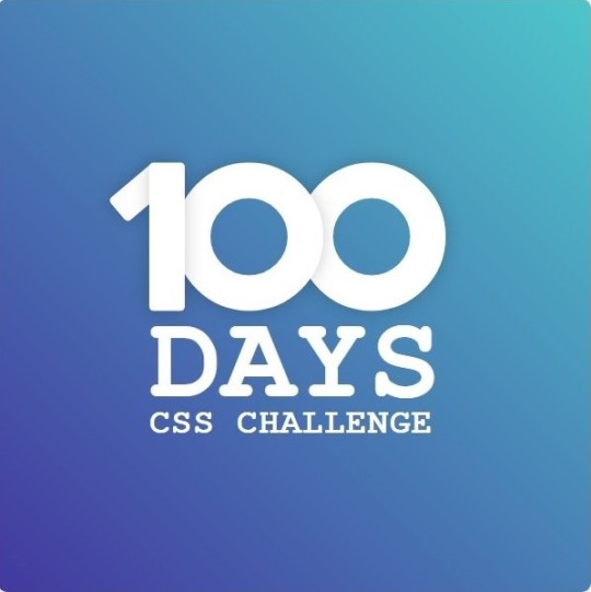
Day 1 - 100 Days CSS Challenge
Welcome to day 1 of the 100 Days CSS Challenge! In this challenge, we'll bring a design to life using only CSS. Our goal is to recreate the image we're provided with on the challenge page using HTML and CSS.
On the challenge page, we see:

A small preview of the design we need to replicate.
A starter HTML template.
A submission form to showcase our work alongside others who have taken on the same challenge.
Let's dive into the process step by step.
Step 1: Screenshot the Image
The first thing I always do is take a screenshot of the target design. Even if the design includes animation, having a static reference helps me focus on the basic structure and colors. Here’s the screenshot of the design we’re aiming for:
Step 2: Extract the Color Palette
Next, I identify the color palette that we'll need. This helps ensure that we maintain consistency with the original design. Here’s the color palette I’ve created:

Step 3: Identify and Create the Image Elements in HTML
Now that we know the colors, I break down the elements in the image:
Background: This is a linear gradient.
The 100 number: This is the main challenge, and it will require some work.
Text: “days css challenge,” which we’ll place to the left of the number.
Here’s the HTML structure for these elements:
<div class="frame"> <div class="center"> <div class="number"> <div class="one-one"></div> <div class="one-two"></div> <div class="zero-one"></div> <div class="zero-two"></div> </div> <p class="sentence1">days</p> <p class="sentence2">css challenge</p> </div> </div>
Now that the elements are in place, CSS will bring them to life.
Step 4: Bringing the Elements to Life with CSS
Linear Gradient
To create the background, we’ll use a linear gradient. Here’s a basic syntax:
background: linear-gradient(to <direction>, <color-stop1>, <color-stop2>, ...);
Parameter 1: Direction/Angle
This defines the starting point of the gradient. You can either specify a direction (e.g., to top, to bottom) or an angle (e.g., 90deg, 180deg).
Direction options:
to top
to bottom
to left
to right
If you want more precision, you can specify angles:
0deg: Gradient starts from the top.
90deg: From the right.
180deg: From the bottom.
270deg: From the left.
You can also combine two directions, specifying both horizontal and vertical movements, like to left top or to right bottom. This means:
The first keyword (left or right) controls the horizontal movement.
The second keyword (top or bottom) controls the vertical movement.
For example:
background: linear-gradient(to left top, red, blue);
This gradient starts at the bottom-right corner and transitions toward the top-left.
Parameter 2: Color Stops
Color stops define how the gradient transitions between colors. Each color stop specifies a point where a color starts or ends. Here's an example:
background: linear-gradient(to right, red 10%, blue 90%);
This means:
The element starts at 0% fully red.
By 10%, the transition from red begins.
Between 10% and 90%, there is a smooth blend from red to blue.
At 90%, the transition to blue is complete, and the remaining part is fully blue.

Once we understand the concept, we can apply the background we need. In our case, the gradient flows from the bottom left to the top right, so the code will look like this:
background: linear-gradient(to right top, #443DA1, #4EC3C9);
Bonus: Stacking Multiple Linear Gradients
You can also apply multiple gradients on top of each other:
background: linear-gradient(180deg, #f00, #0f0), linear-gradient(90deg, #ff0, #f0f);
Step 5: Making the "100" Number
Creating the Zeros
We start with the zeros. These are simply circles created using CSS. To make a full circle, we use border-radius set to 50%.
The white border gives it the appearance of the number zero.
.zero-one, .zero-two { position: absolute; height: 100px; width: 100px; border-radius: 50%; border: 24px solid #fff; box-shadow: 0 0 13px 0 rgba(0,0,0,0.2); }
This gives us a nice circular zero. We adjust their positions using properties like left and top, and manage the z-index to make sure the zeros stack correctly.
.zero-one { z-index: 8; left: 17px; } .zero-two { z-index: 6; left: 100px; }

Now both zeros are positioned, and they overlap in the way we want.
Creating the "1" Number
The number "1" is made of two div elements:
One-One: This part represents the slanted part of the "1".
One-Two: This is the straight vertical part of the "1".
What make the one-one element slightly slanted is
transform: rotate(50deg);)
the one-two is created simply with a little height and width nothing too particular then it is placed directly on top of the slanted part, giving us the full "1". Its z-index tho has to have a higher value than the slanted part of our 1 to ensure it stays above the slanted one.
Step 6: Adding the Text
For the two sentences “days” and “css challenge,” the styling is basic CSS. You can achieve the look with just a few font changes, some padding, and adjustments to font size. It’s as simple as:
.sentence1,.sentence2{ text-transform: uppercase; margin:0; padding:0; } .sentence1{ font-size:82px; font-weight:700; } .sentence2{ font-size:25px; font-weight:700; margin-top:-20px; }
And just like that, we’ve completed day 1 of the 100 Days CSS Challenge! Each part of the design is carefully crafted using CSS, giving us the final result.
Happy coding, and see you tomorrow for Day 2!
#100dayscssChallenge#codeblr#code#css#html#javascript#java development company#python#studyblr#progblr#programming#comp sci#web design#web developers#web development#website design#webdev#website#tech#html css#learn to code
16 notes
·
View notes
Text
imo deltarune chapter 3 is very messy visually and the eclectic style collage feels lazy sometimes, bordering on a shitpost. for some reason the use of compressed real life photos isnt the greatest offender, its actually reasonable within the context, but i hate the combination of brown, grey and neon colours, its not thought through and desperately needs some colour grading. the idea of a lightsource seems to be an afterthought in this room as well as every other, but this normally isnt a problem when we dont see the physical lamp. the cooky star gradient backgrounds feel like a sims wallpaper that needs to rape your eyes with cheap effects so people notice it in the store and buy it with real money, only for it to look dogshit in the context of an actual room

i also think the ammount of funny text and 3d graphics sort of retroactively ruins spamton, his impact came partially from pushing the format of deltarune, but now it has been pushed much further without the element of surprise, putting out tenna and undercutting spamton in one shot. but it wasssss kinda fun and i suppose in the end thats all that matters..

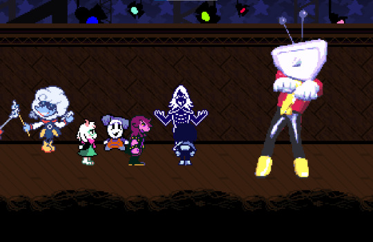
i do have to say the weather reporters look amazing and its not surprising theres so much fanart of them, its kind of odd that they're the only visual aspect in the chapter that someone worked hard on (in the design phase, not the animation phase) but i still appreciate it.

i also like the silhouette darkners for their dynamic poses and expressions, and the zelda style minigames for having actually decent colour palettes. they could be improved upon but they still carry artistic value

in many fandoms fake leaks can be distinguished by just being worse quality than the actual product, but in this case, quite a few fake "chapter 3" fangames were alot more refined.
6 notes
·
View notes
Text
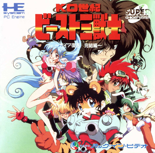
PC Engine - K.O. Century Beast Warriors
Title: K.O. Century Beast Warriors / KO世紀ビースト三獣士 ガイア復活 完結編
Developer: Matrix / Radical Plan Corp.
Publisher: Pack-in-Video (Victor Company of Japan)
Release date: 17 June 1994
Catalogue No.: PVCD4011
Genre: RPG
Format: Super CD-ROM2
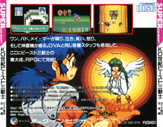
Based on the 1992 anime, KO Seiki BEAST: Sanjuushi is set in a future where two supercomputers, Gaia and Uranus, have split the Earth in two at the equator. The Gaia-controlled Northern half stayed in regular orbit, and the people evolved into shapeshifting Beasts. The Southern half, controlled by the Uranus computer, was banished to a parallel dimension. These people remained human but are ruled by the power-hungry Czar Master. The humans seek the power of the North’s “Gaia Network” to unify the planet and cleanse it of the freakish Beasts. Tiger Beast Wan Dabadabadatta, Mermaid Mei Mah, and Bado Mint of the Bird clan make up the Three Beast Warriors. With the power of their stone totems called “Jinn”, these three can call upon mechanized Beast Lords: Chirei-Oh, the panther; Kairei-Oh, a colossus; and Kurei-Oh, the phoenix. These three form the gestalt of Jinrei-Oh, the Master Lord. Wan, Mei, and Bado are the only masters, but they have a fourth friend named Mekken Mannen, a chubby Turtle Beast.
The story begins with the imprisonment of all four beasts and their subsequent release by Dr. Password and his granddaughter, Yuuni Charm Password. Though humans and once in the service of the Czar, they are sympathetic to the beasts’ plight and seek to aid them in unlocking the power of Gaia for the good of all. Yuuni even has a mysterious psychic link to the sentient Gaia computer. Hounded by the Czar’s henchmen V-Darn, his female counterpart V-Sion, and their lackey demon Akumako, the good guys set out to learn the power of their Jinns, reboot Gaia, and stop the evil Czar.
One can tell this game was made for fans of the series. I knew nothing of the show before I played this and when I got to searching for the background story in English, I could pick out every story point in the game. The game characters talk in text A LOT! I can read Katakana and some Hiragana, but it got to the point where I would cringe to talk to someone because of the constant yacking. If you are a fan and can read Japanese, you’d love it.
Graphics get the job done, but even for a game made in 1994 they are a bit bland, not bad, but nothing astounding like Magicoal, Ys IV or Legend of Xanadu II – maybe on par with Xanadu I. Music is that fun ol’ PC Engine synth with lots of slap bass and catchy repetitive tunes. Cut scenes are colorful and well animated but average for CD games of that day. The character screens just have words for the different items, weapons, or selections (in Japanese, of course), and I would have liked icons or images.
Fighting is your basic walk on the overhead map, and you go to a fight screen every six or seven steps. Fights consist of a sparse screen bordered by 5 gradients of a color (I’ve seen this in other Pack-In-Video RPGs), monsters in the background, the current active character in the foreground and the usual fight, magic (beast attack), item, and run away. Absolutely nothing to write home about here, and the fact that you fight every couple of seconds when walking around, you’ll find yourself just mashing buttons to get through it. All in all, it is a great novelty and worth a play if you have nothing else to do or, of course, if you are a fan. I personally am not going to rush out and find the OVA’s based on my experience with this, but you might.


youtube
2 notes
·
View notes
Text
Progress list!
- Decided on a site name <- This one took ages
- Created and used a Favicon <- Also happened to take forever
- Figured out what a site title was (mildly embarrassing, I know)
- Made our marquee text bounce
- Mastered borders
- Vaguely understood how to use “div” tag but not much
Next we’re attempting animated images, a custom cursor and gradient text/links :)
2 notes
·
View notes
Text
Some general information
Hi! You can call me Dex!
I like to draw
some basic information:
-I go by all pronouns (when in doubt use he/they)
-i like making art and I'm trying to learn animation (if you wanna see it i post it under the #my art tag!)
-I'm autistic
-I'm a MINOR
-non art posts are under #tiny rat talks (previously tiny rat posts)
-I'm fine with being called things like "girlie", "man", "guy", etc. whatever as long as it's funny
-things i like include:
-dhmis
batman (very invested in atm)
-deltarune/undertale
-invader zim
johnny the homicidal maniac
-fnaf
-rats
-lemon demon
-will wood and the tapeworms
-mcr
-bigtop burger
my ocs ^^ (under #oc
nine inch nails
-ena
-bugbo
Yo-kai watch
-a lot of other things
-If you wanna use my art in anything, its cool! All you have to do is give credit
-sometimes i reblog ship art of things i dont ship. One general way to tell if i dont actually ship it is if i tag the characters but not the ship
-its perfectly fine if you wanna send asks/request ^^ (just dont send any nsfw asks or ask me to draw nsfw stuff)
-I don't like discourse, please don't mention it if you can
DNI: TERFS/transphobes, homophobes, racists, NSFW accounts, proshippers/anti antis, if you've ever sent DEATH THREATS to proshippers (or really anyone), ableists, ai "artists",nft bros, anything of the like

(ID: a blinkie rectangle with balloons outside of it and a dashed white border. The inside has a rainbow gradient with red text with a white border saying, "i'm just a goofy lil guy with three y's/end ID)
Also please remember to do your daily clicks for Palestine!
6 notes
·
View notes
Text
flag list 4
[pt: flag list 4]
emotional support animal, guide animal and therapy animal haver flags (animal aid flags/flags for people with animal aids)
flags under cut
in order: esa user, esa cat, esa dog, by us on @/fantasy-store


image one: [id: a flag with a grey border around 7 vertical stripes ranging from left to right as hot pink, pink, light pink, pale pink, peach, orange peach and pink-orange. :end id]
image two: [id: a flag with a grey border around 7 vertical stripes ranging from left to right as bright purple, purple-pink, fuschia, peach, orange peach and pink-orange. :end id]
image three: [id: a flag with a grey border around 7 vertical stripes ranging from left to right as bright purple, purple-pink, fuschia, pink, light pink, pale pink and light pink. :end id]
esa rabbit, by us on @/fantasy-store

image four: [id: a flag with a grey border around 7 vertical stripes ranging from left to right as medium pink, pink, light pink, pale pink, pastel pink, pink pearl and light pearl. :end id]
guide dog user, by us on @/fantasy-store

image five: [id: a flag with a grey border around 7 vertical stripes ranging from left to right as teal, light green, light olive, muted yellow, light orange, muted orange and muted red-orange. :end id]
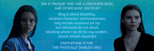
image six: [id: a banner with a blue to green gradient and water-filtering-light texture under a faintly transparent blue rectangular box. in the box is light blue text that reads "Blog is about disability, disabled characters and headcanons. may include occasional pd rep but otherwise do not derail. blocking where i see fir for my comfort, please remain respectful." on the top of the banner outside the blue box is more light blue text that reads "DNI if proship, terf, are a discourse blog and other basic dni stuff" in all caps. under the blue box at the bottom of the banner is more light blue text that reads "cripplepunk is for the physically disabled only" in all caps. on either side of the banner is an image of ryn from the show siren staring off to the side. :end id]
2 notes
·
View notes
Text
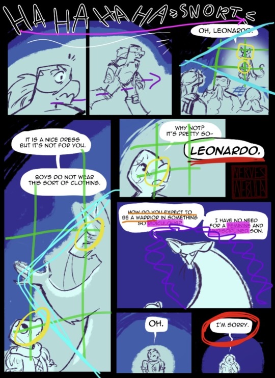
Leo memory comic analysis I might add to eventually who know
Disclaimer: I’m not smart.
Disclaimerer: Not my art (@nerves-nebula)

Page 1
From the get go, we start with a clear image illustrating the situation, and a quick, concise summary of what led to the comic’s starting point; this informs the readers of the brothers’ motivation and goal in this story.
Then, despite the simple, exaggerated style of next panel, carrying a clearly rushed and comedic energy, the formatting is still well done, using the rule of thirds to draw the readers’ eyes to Draxum and Raph, respectively.
The next text box, draws a comparison to a Rise episode that utilizes this same trope using the same narrative device (a spell) as in said episode. This further helps the reader understand what is happening in the story, implying and stating that the brothers are going to travel through Leo’s mind and witness her memories.
The final image is centered, placing an emphasis on it. This part is important, because it marks the start of the brothers’ journey, clearly showing them casting the spell. Here, the background fades to white, creating an effect of a magical glow, while also transitioning into the gradient on next page’s background.

Page 2
The background starts white at the top, strokes turning darker as they travel down, until they reach black. It creates the impression of sinking, of falling into the mindscape. This also establishes the comic’s black borders, something indicative of the turtles being in the mindscape.
Accompanying this are three panels overtop, of Raph’s face as the spell activates. The soft white within these panels indicates this is him in the real world. He looks disgruntled and disoriented, and effect added to by the way the panels zoom in on him—his tensing jaw, his bracing squint—and the placement of those panels; they are disconnected, crooked, broken up in places.
This leads to a shot of the brothers standing together in the bottom center of the page, packed together. The border around their heads separates them from the background, while also filling up the space they’re in. Raph appears driven, if hesitant, and his wide open eye partnered with the previous images of him carry an animated feel which makes the components of the page be less disjointed when put together.
Mikey’s expression appears bored, he’s being flippant and casual about the mission. In contrast, Donnie seems anxious, but focused, worry/stress evident in how he holds himself. Behind them, there are waters and stone pavement; Donnie notes that the setting of most of Leo’s memories should be the sewers, establishing what the environment the entire rest of the comic will take place in.
Finally, large (loud) laughter leads of the bottom right of the page, leading the reader to the next page.
Page 3
The laughter is large and loud, taking up a lot of space as it stretches across the page, right above the beginnings of Splinter’s chiding. The size of the laughter could be alluding to how formative this event was to Leo, Splinter’s mocking laughter ringing loudly through the memory. The way the sound stretches along is also very cohesive with Raph in the panel below; it looks like he’s walking along with it, following the sound to its source.
The first two panels show a fluid sequence as Raph moves smoothly between actions. He hears the sound, then he follows it. His fast action and awareness—him being the only one shown to be doing this despite his brothers following—shows that he is the one taking their mission the most seriously.
In the third panel, all three brothers are somewhat acting as a frame, looking on at a distance. This separation allows the comic to veer away from them for a moment, as it focuses on the memory. Leo and Splinter are at focal points in the panel as they are the new subject of the comic.
In the next panel, Splinters’s expression is light, in similarity to the bright background. He seems unbothered, as he gives Leo his advice. Leo however, looks deeply confused, clearly bothered by Splinter’s flippancy and not at all comprehending the problem.
Taking focus, Leo argues that the dress he found is pretty. Her current mindset innocent and simple. There is an honest distress to his lack of understanding. His question is cut off, Splinter’s tone change made evident as he says Leonardo’s name in bold, his speech bubble outlined as no others have been thus far.
Leo is tiny and cropped, barely in the panel, as Splinter looms over her, appearance suddenly massive and menacing, the background dim. This is probably how Leo saw Splinter as his question was answered, how big of an impact those words made. He asks how Leo plans to be a warrior in something so ridiculous. He holds up Leo’s current life goal, her most guaranteed expectation, and tells her this behavior will get in the way. He calls the dress ridiculous, which would of course make Leo feel like he wouldn’t be taken seriously in it, like he’s inviting derision and mockery just by wearing it. In Leo’s mind, the dress now undermines her.
I have no need, Splinter says, giving Leo the idea that he might do something that would make him hold less worth. This would have made him feel like he could be discarded. And the use of the words feminine and undisciplined together no doubt form that association in Leo’s head, plants the idea that to partake in anything feminine is to be undisciplined, and to undisciplined is to be unworthy of Splinter’s affection.
In the next panel, she’s still looking up at Splinter. She is listening. And it only takes a moment for every word Splinter said to sink in.
This is the only point in the page where Leo stops looking up; he looks up to Splinter as a source of wisdom and authority, and so looks down on himself upon being “corrected”—the beginnings of self loathing. He’s also likely embarrassed at having done something so supposedly shameful without even realizing. The background surrounds him in black, as he takes these ideas to heart. He’s ashamed. Subdued. Leo apologizes for it all.

Page 4
A wide panel at the top of the next page, reintegrates Raph, Mikey, and Donnie into the scene, still watching the memory from a distance with some discomfort. The background shifts into Leo’s emotional state, the background taking on darker tones in messier strokes, the border becoming significantly less rigid, highlighting Leo as she becomes shrouded in that darkness.
The next panel shows him facing away, still seemingly part of a memory. Dark drips into the background around him. Mirroring this, it’s as if the border itself drips down, framing Leo, indicating her connection to this world. He turns, clearly addressing the turtles. His new eye stands out, glowing against the shadows of his new form.
As Leo explains that she needs help fighting the worm, Raph seems taken aback at being addressed by this child version of Leo, an open surprise on his face.
Raph pushes past the oddness of the situation as he agrees, but his averted eyes display that he finds this turn in their mission unsettling. Leo appears entirely stoic, in contrast to the real Leo seen into the memory, which drives the reader to separate the two to a degree.
Leo establishes that she’ll be the one taking them from memory to memory, in their search for the worm, driving the story along. This control he has over the story is emphasized by him tearing into the background, wherein three colours can be seen: Black only found in the comic borders and backgrounds; Purple and orange are similarly unique, seen only (in excess) on Leo himself. She swings her claws in an arc, ripping open a portal of sorts. And she stands next to it, entirely in black space, undeniably a part of the world around them.
oOo
Comic Links:
https://www.tumblr.com/nerves-nebula/713460172208635904/ayooooo-leo-memory-stuff-partttt-1
#sorry if there are like words just missing I did not proof read this#had fun with it really#just for the record this is how I interpreted these details specifically#and I am not knowledgeable on anything ever so-#but still#fun#analysis#comic analysis#Leo memory comic analysis#breakdown#tmnt#teenage mutant ninja turtles#tm(n)t#teenage mutant neglected turtles
1 note
·
View note
Text
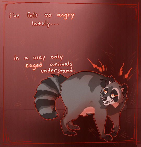
[Image description: Digital drawing of a raccoon backed into a corner snarling over his shoulder. His fur is bushed up, back arched and eyes red. The background is a light to dark red gradient with a bright red border and light scratch marks covering the whole piece. Text reads: I've felt so angry lately...in a way only caged animals understand.
but my claws are tired and my teeth wont bite
304 notes
·
View notes
Text
ToolsToEdit.in – Your Ultimate Free Toolkit for Everyday Digital Tasks
In today’s fast-moving digital world, being productive means using the right tools at the right time. But what if you could access over 30+ essential online tools in one place—without paying a cent? That’s exactly what ToolsToEdit.in offers: a centralized, no-cost platform built for students, teachers, professionals, content creators, and anyone who wants to get things done—fast and efficiently.
🌐 What Is ToolsToEdit.in?
ToolsToEdit.in is a multi-purpose online toolkit that combines the functionality of dozens of individual tools into one convenient, browser-based hub. From quick calculations to SEO audits, PDF conversions to text clean-up—this platform is designed to simplify your work, save you time, and help you perform complex tasks with just a few clicks.
👥 Who Is It For?
This site isn’t just for techies or web developers. ToolsToEdit.in is built for everyday users:
🎓 Students can calculate percentages, solve EMI questions, or convert between binary and text.
👨🏫 Teachers can create resources, check text readability, or compress files.
🧑💻 Content Creators & Bloggers can analyze SEO, clean content, and manage PDFs.
👥 General Users can generate strong passwords, spot phishing links, and much more.
🔧 Key Tool Categories and Features
Here’s a breakdown of what ToolsToEdit.in offers:
🧮 Calculator Tools
No need for separate apps—just launch and use:
BMI Calculator – Check body mass index.
Discount Calculator – Know how much you’re saving.
EMI Calculator – Plan your finances smartly.
Age Calculator – Get accurate age from date of birth.
Percentage Calculator – Solve quick percentage problems.
✍️ Text Utilities
Content handling made easy:
Word Counter – Know your length before publishing.
Case Converter – Switch between uppercase, lowercase, and more.
Remove Duplicate Lines – Clean up large text files.
Find & Replace – Mass replace words or phrases.
Binary ⇄ Decimal/Text Converters – Useful for coding and education.
Text Encoder/Decoder – Encrypt and decode web-safe content.
🔐 Security Tools
Keep your data secure:
Password Generator – Create complex passwords.
Password Strength Checker – Test how secure your password is.
Phishing URL Detector – Protect yourself from scams.
🔍 SEO Optimization Tools
Get your website found:
Meta Tag Analyzer – Improve search engine visibility.
Mobile-Friendly Test – Make sure your site works on smartphones.
Page Speed Analyzer – Identify and fix performance issues.
Sitemap Generator – Generate XML sitemaps for indexing.
Keyword Density Checker – Analyze your content for keyword balance.
Robots.txt Generator – Guide search engine bots effectively.
🎨 Design & Image Tools
Handy for bloggers, designers, and developers:
Color Picker Tool – Find and copy hex codes easily.
CSS Gradient & Animation Previews – Visualize effects before using them.
Box Shadow & Border Radius Preview – Quick CSS styling helpers.
Image Compressor – Reduce image file sizes without losing quality.
Image to Base64 Converter – Embed images in web code.
Image Color Picker – Get exact color details from any picture.
📄 PDF Tools
Manage documents like a pro:
Merge PDF Files – Combine multiple documents into one.
PDF to Image/Text/Word – Convert PDFs into different formats.
Image to PDF Converter – Make professional documents from images.
💡 Why ToolsToEdit.in Stands Out
✅ No Installations: Everything runs right in your browser.
✅ Free Forever: No subscriptions, no sign-ups, no hidden fees.
✅ Mobile-Friendly: Use it seamlessly across devices.
✅ Time-Saving: Get tasks done in seconds.
✅ Clean UI: Easy to use even for beginners.
📢 Final Thoughts
In a world of scattered tools, ToolsToEdit.in brings clarity and convenience. Whether you're a digital marketer doing an SEO audit, a student calculating your GPA, or a teacher preparing resources—this site empowers you to work smarter, not harder.
Visit www.toolstoedit.in and explore the full suite of tools today. It’s time to edit, create, calculate, optimize, and convert—all in one place.
1 note
·
View note