#graphing inequality
Explore tagged Tumblr posts
Visit Tumblr Blog
Explore Tumblr blogs with no restrictions, modern design and the best experience.
Last Seen Tumblr Blogs


Fun Fact
130K people were victims of a chain letter scam that affected Tumblr in May 2011.
Text
<— Unit 4: Part 2 — Unit 5 —>
Inequality Graphing Steps

Graphing Inequality

Page 11 —>
#aapc1u4#inequality#inequalities#graphing inequalities#graphing inequality#linear equation#point-slope form
0 notes
Text
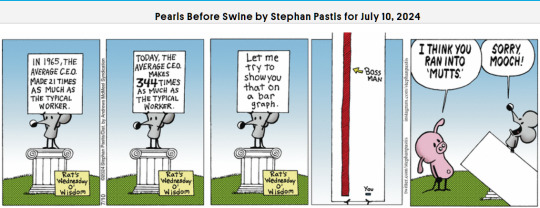
#comic strips#pearls before swine#stephan pastis#income inequality#ceos#workers#bar graph#4th wall#cartoon
5 notes
·
View notes
Text


3 notes
·
View notes
Text
DO YOU HEAR THE PEOPLE SING-
#anti capitalist#income inequality#french revolution#look at this graph#le miserables#guillotines are actually pretty easy to build#it only takes one trip to the hardware store#jk jk unless
139K notes
·
View notes
Text
🧠 Master Graphical Applications of Quadratic Equations – Part 2 | JEE Series Part-15 | By 9nid
🎯 Introduction Quadratic Equations are one of the most tested and important topics in JEE Mathematics, and understanding their graphical behavior can make even the toughest questions feel easy! In Part-15 of the JEE Series by @9nid, we dive deeper into the Graphical Application of Quadratic Equations (Part-2) — focused on visualizing inequalities and interpreting expressions using…
#graph-based JEE questions#graphical application of quadratic equations#JEE Advanced quadratic graphs#JEE algebra in Hinglish#JEE Main 2025 maths#JEE maths graph method#JEE with 9nid#parabola graph JEE#quadratic equations visual method#quadratic expressions JEE#quadratic graph JEE#quadratic MCQs JEE#sign of quadratic expression#solve quadratic inequalities using graph
0 notes
Text
#Pi Day#Pi Skyline#Desmos project#graphing project#math project#inequalities#trigonometry#Desmos tutorial#Pi Day activity#math celebration#hands-on learning#math technology#graphing activities#math education#math visualizations#Desmos graphing#math for high school#Pi Day fun#geometry activities
0 notes
Text
lol I hate algebra :)
#I’m gonna cry#why is it so hard?#why are there so many properties?#why must I know more about inequalities that I already knew?#why are we using graphing calculators?#HOW TF DOES THE GRAPHING CALCULATOR KNOW?!
1 note
·
View note
Text
Great job putting all this together, OP! Reblogging this to help it get the recognition it deserves

For the past six years or so, this graph has been making its rounds on social media, always reappearing at conveniently timed moments…
The insinuation is loud and clear: parallels abound between 18th-century France and 21st-century USA. Cue the alarm bells—revolution is imminent! The 10% should panic, and ordinary folk should stock up on non-perishables and, of course, toilet paper, because it wouldn’t be a proper crisis without that particular frenzy. You know the drill.

Well, unfortunately, I have zero interest in commenting on the political implications or the parallels this graph is trying to make with today’s world. I have precisely zero interest in discussing modern-day politics here. And I also have zero interest in addressing the bottom graph.
This is not going to be one of those "the [insert random group of people] à la lanterne” (1) kind of posts. If you’re here for that, I’m afraid you’ll be disappointed.
What I am interested in is something much less click-worthy but far more useful: how historical data gets used and abused and why the illusion of historical parallels can be so seductive—and so misleading. It’s not glamorous, I’ll admit, but digging into this stuff teaches us a lot more than mindless rage.
So, let’s get into it. Step by step, we’ll examine the top graph, unpick its assumptions, and see whether its alarmist undertones hold any historical weight.
Step 1: Actually Look at the Picture and Use Your Brain
When I saw this graph, my first thought was, “That’s odd.” Not because it’s hard to believe the top 10% in 18th-century France controlled 60% of the wealth—that could very well be true. But because, in 15 years of studying the French Revolution, I’ve never encountered reliable data on wealth distribution from that period.
Why? Because to the best of my knowledge, no one was systematically tracking income or wealth across the population in the 18th century. There were no comprehensive records, no centralised statistics, and certainly no detailed breakdowns of who owned what across different classes. Graphs like this imply data, and data means either someone tracked it or someone made assumptions to reconstruct it. That’s not inherently bad, but it did get my spider senses tingling.
Then there’s the timeframe: 1760–1790. Thirty years is a long time— especially when discussing a period that included wars, failed financial policies, growing debt, and shifting social dynamics. Wealth distribution wouldn’t have stayed static during that time. Nobles who were at the top in 1760 could be destitute by 1790, while merchants starting out in 1760 could be climbing into the upper tiers by the end of the period. Economic mobility wasn’t common, but over three decades, it wasn’t unheard of either.
All of this raises questions about how this graph was created. Where’s the data coming from? How was it measured? And can we really trust it to represent such a complex period?
Step 2: Check the Fine Print
Since the graph seemed questionable, the obvious next step was to ask: Where does this thing come from? Luckily, the source is clearly cited at the bottom: “The Income Inequality of France in Historical Perspective” by Christian Morrisson and Wayne Snyder, published in the European Review of Economic History, Vol. 4, No. 1 (2000).

Great! A proper academic source. But, before diving into the article, there’s a crucial detail tucked into the fine print:
“Data for the bottom 40% in France is extrapolated given a single data point.”
What does that mean?
Extrapolation is a statistical method used to estimate unknown values by extending patterns or trends from a small sample of data. In this case, the graph’s creator used one single piece of data—one solitary data point—about the wealth of the bottom 40% of the French population. They then scaled or applied that one value to represent the entire group across the 30-year period (1760–1790).
Put simply, this means someone found one record—maybe a tax ledger, an income statement, or some financial data—pertaining to one specific year, region, or subset of the bottom 40%, and decided it was representative of the entire demographic for three decades.
Let’s be honest: you don’t need a degree in statistics to know that’s problematic. Using a single data point to make sweeping generalisations about a large, diverse population (let alone across an era of wars, famines, and economic shifts) is a massive leap. In fact, it’s about as reliable as guessing how the internet feels about a topic from a single tweet.
This immediately tells me that whatever numbers they claim for the bottom 40% of the population are, at best, speculative. At worst? Utterly meaningless.

It also raises another question: What kind of serious journal would let something like this slide? So, time to pull up the actual article and see what’s going on.
Step 3: Check the Sources
As I mentioned earlier, the source for this graph is conveniently listed at the bottom of the image. Three clicks later, I had downloaded the actual article: “The Income Inequality of France in Historical Perspective” by Morrisson and Snyder.
The first thing I noticed while skimming through the article? The graph itself is nowhere to be found in the publication.
This is important. It means the person who created the graph didn’t just lift it straight from the article—they derived it from the data in the publication. Now, that’s not necessarily a problem; secondary analysis of published data is common. But here’s the kicker: there’s no explanation in the screenshot of the graph about which dataset or calculations were used to make it. We’re left to guess.
So, to figure this out, I guess I’ll have to dive into the article itself, trying to identify where they might have pulled the numbers from. Translation: I signed myself up to read 20+ pages of economic history. Thrilling stuff.
But hey, someone has to do it. The things I endure to fight disinformation...
Step 4: Actually Assess the Sources Critically
It doesn’t take long, once you start reading the article, to realise that regardless of what the graph is based on, it’s bound to be somewhat unreliable. Right from the first paragraph, the authors of the paper point out the core issue with calculating income for 18th-century French households: THERE IS NO DATA.
The article is refreshingly honest about this. It states multiple times that there were no reliable income distribution estimates in France before World War II. To fill this gap, Morrisson and Snyder used a variety of proxy sources like the Capitation Tax Records (2), historical socio-professional tables, and Isnard’s income distribution estimates (3).
After reading the whole paper, I can say their methodology is intriguing and very reasonable. They’ve pieced together what they could by using available evidence, and their process is quite well thought-out. I won’t rehash their entire argument here, but if you’re curious, I’d genuinely recommend giving it a read.
Most importantly, the authors are painfully aware of the limitations of their approach. They make it very clear that their estimates are a form of educated guesswork—evidence-based, yes, but still guesswork. At no point do they overstate their findings or present their conclusions as definitive
As such, instead of concluding with a single, definitive version of the income distribution, they offer multiple possible scenarios.
It’s not as flashy as a bold, tidy graph, is it? But it’s far more honest—and far more reflective of the complexities involved in reconstructing historical economic data.
Step 5: Run the numbers
Now that we’ve established the authors of the paper don’t actually propose a definitive income distribution, the question remains: where did the creators of the graph get their data? More specifically, which of the proposed distributions did they use?
Unfortunately, I haven’t been able to locate the original article or post containing the graph. Admittedly, I haven’t tried very hard, but the first few pages of Google results just link back to Twitter, Reddit, Facebook, and Tumblr posts. In short, all I have to go on is this screenshot.
I’ll give the graph creators the benefit of the doubt and assume that, in the full article, they explain where they sourced their data. I really hope they do—because they absolutely should.
That being said, based on the information in Morrisson and Snyder’s paper, I’d make an educated guess that the data came from Table 6 or Table 10, as these are the sections where the authors attempt to provide income distribution estimates.

Now, which dataset does the graph use? Spoiler: None of them.
How can we tell? Since I don’t have access to the raw data or the article where this graph might have been originally posted, I resorted to a rather unscientific method: I used a graphical design program to divide each bar of the chart into 2.5% increments and measure the approximate percentage for each income group.
Here’s what I found:

Now, take a moment to spot the issue. Do you see it?
The problem is glaring: NONE of the datasets from the paper fit the graph. Granted, my measurements are just estimates, so there might be some rounding errors. But the discrepancies are impossible to ignore, particularly for the bottom 40% and the top 10%.
In Morrisson and Snyder’s paper, the lowest estimate for the bottom 40% (1st and 2nd quintiles) is 10%. Even if we use the most conservative proxy, the Capitation Tax estimate, it’s 9%. But the graph claims the bottom 40% held only 6%.
For the top 10% (10th decile), the highest estimate in the paper is 53%. Yet the graph inflates this to 60%.
Step 6: For fun, I made my own bar charts
Because I enjoy this sort of thing (yes, this is what I consider fun—I’m a very fun person), I decided to use the data from the paper to create my own bar charts. Here’s what came out:

What do you notice?
While the results don’t exactly scream “healthy economy,” they look much less dramatic than the graph we started with. The creators of the graph have clearly exaggerated the disparities, making inequality seem worse.
Step 7: Understand the context before drawing conclusions
Numbers, by themselves, mean nothing. Absolutely nothing.
I could tell you right now that 47% of people admit to arguing with inanimate objects when they don’t work, with printers being the most common offender, and you’d probably believe it. Why? Because it sounds plausible—printers are frustrating, I’ve used a percentage, and I’ve phrased it in a way that sounds “academic.”
You likely wouldn’t even pause to consider that I’m claiming 3.8 billion people argue with inanimate objects. And let’s be real: 3.8 billion is such an incomprehensibly large number that our brains tend to gloss over it.
If, instead, I said, “Half of your friends probably argue with their printers,” you might stop and think, “Wait, that seems a bit unlikely.” (For the record, I completely made that up—I have no clue how many people yell at their stoves or complain to their toasters.)
The point? Numbers mean nothing unless we put them into context.
The original paper does this well by contextualising its estimates, primarily through the calculation of the Gini coefficient (4).
The authors estimate France’s Gini coefficient in the late 18th century to be 0.59, indicating significant income inequality. However, they compare this figure to other regions and periods to provide a clearer picture:
Amsterdam (1742): Much higher inequality, with a Gini of 0.69.
Britain (1759): Lower inequality, with a Gini of 0.52, which rose to 0.59 by 1801.
Prussia (mid-19th century): Far less inequality, with a Gini of 0.34–0.36.
This comparison shows that income inequality wasn’t unique to France. Other regions experienced similar or even higher levels of inequality without spontaneously erupting into revolution.
Accounting for Variations
The authors also recalculated the Gini coefficient to account for potential variations. They assumed that the income of the top quintile (the wealthiest 20%) could vary by ±10%. Here’s what they found:
If the top quintile earned 10% more, the Gini coefficient rose to 0.66, placing France significantly above other European countries of the time.
If the top quintile earned 10% less, the Gini dropped to 0.55, bringing France closer to Britain’s level.
Ultimately, the authors admit there’s uncertainty about the exact level of inequality in France. Their best guess is that it was comparable to other countries or somewhat worse.
Step 8: Drawing Some Conclusions
Saying that most people in the 18th century were poor and miserable—perhaps the French more so than others—isn’t exactly a compelling statement if your goal is to gather clicks or make a dramatic political point.
It’s incredibly tempting to look at the past and find exactly what we want to see in it. History often acts as a mirror, reflecting our own expectations unless we challenge ourselves to think critically. Whether you call it wishful thinking or confirmation bias, it’s easy to project the future onto the past.
Looking at the initial graph, I understand why someone might fall into this trap. Simple, tidy narratives are appealing to everyone. But if you’ve studied history, you’ll know that such narratives are a myth. Human nature may not have changed in thousands of years, but the contexts we inhabit are so vastly different that direct parallels are meaningless.
So, is revolution imminent? Well, that’s up to you—not some random graph on the internet.
Notes
(1) A la lanterne was a revolutionary cry during the French Revolution, symbolising mob justice where individuals were sometimes hanged from lampposts as a form of public execution
(2) The capitation tax was a fixed head tax implemented in France during the Ancien Régime. It was levied on individuals, with the amount owed determined by their social and professional status. Unlike a proportional income tax, it was based on pre-assigned categories rather than actual earnings, meaning nobles, clergy, and commoners paid different rates regardless of their actual wealth or income.
(3) Jean-Baptiste Isnard was an 18th-century economist. These estimates attempted to describe the theoretical distribution of income among different social classes in pre-revolutionary France. Isnard’s work aimed to categorise income across groups like nobles, clergy, and commoners, providing a broad picture of economic disparity during the period.
(4) The Gini coefficient (or Gini index) is a widely used statistical measure of inequality within a population, specifically in terms of income or wealth distribution. It ranges from 0 to 1, where 0 indicates perfect equality (everyone has the same income or wealth), and 1 represents maximum inequality (one person or household holds all the wealth).
249 notes
·
View notes
Text
★ in his arms, the world fades // clark kent.


synopsis. feeling unwell and overwhelmed, you seek comfort in clark's arms. his warmth, soothing touch, and sweet words make the ache in your stomach—and your heart—feel bearable.
warning(s). fluff | comfort | f!reader | s1!clark | reader feels unwell stomach aches | nausea | difficulty eating | mild angst | distressing moments | academic stress | brief mentions of exams | studying | cuddling | kisses | superman references.
kari yaps. last night, i had horrible stomach pains and wrote this <333 + a lil disclaimer! i'm on ep 5 of smallville (the ads on hulu r mad annoying) so i only know a little about clark. but don't worry i will get to know all ab pookie soon !!! trust <33

it starts with the ache. sharp and twisting, like someone's wringing your stomach out like a wet rag. it's been days now—days of barely keeping food down, of your appetite wavering between nothing and everything, only for nausea to win every time. eating has become a battle, and losing feels inevitable. but you haven't told anyone, not really. maybe it's pride. maybe it's not wanting to worry anyone. maybe you're just hoping it'll go away on its own.
still, it lingers, and today's no different. you pull up to the kent farm, the gravel crunching under your tires, the sight of the red barn and yellow farmhouse somehow grounding you. you're supposed to be here to study. algebra—not exactly something you're excited about, but clark's always been good at making the hard stuff easier. it's one of the many things you love about him: his patience, his steadiness, the way he seems to know when you need a little extra reassurance. and maybe you need that today more than ever.
"hey, pretty girl," clark greets you at the door, his smile soft and familiar, like it's meant just for you. "you okay? you look…" he trails off, squinting at you in that way he does when he's trying to figure you out. "…tired."
you force a smile, shrugging it off. "just didn't sleep much last night."
it's not a lie, exactly. the ache had kept you up most of the night, twisting and turning beneath the covers, unable to find a position that didn't make it worse. but clark doesn't need to know that. not right now.
he nods, stepping aside to let you in. "i made us some lemonade," he says as you follow him up the stairs to his room. "my mom said it's good for focus or something. i don't know, but it tastes good."
you hum in response, though the thought of drinking anything right now makes your stomach churn. you'll figure out a way to avoid it later.
when you get to his room, it's the same as always—neat but lived-in, the bed made but the desk cluttered with papers and books, a small stack of cds next to his stereo. it smells faintly of pine and something distinctly clark, like sun-warmed hay and fresh laundry. it's comforting in a way you didn't realize you needed.
you settle on the floor with him, textbooks and notebooks spread out between you. he's already flipping through his algebra book, pen tapping idly against his knee as he scans the pages.
"okay," he says, glancing at you with a smile. "where should we start? graphing inequalities or quadratic equations?"
you groan, letting your head fall back against the bed. "do we have to start?"
he chuckles. "the exam's next week. i don't think mr. phillips is gonna let us wing it."
"worth a shot," you mutter, but you sit up anyway, flipping open your notebook to a blank page. you try to focus, really, but the ache is still there, dull and persistent, and it's hard to think about numbers and graphs when all you want to do is curl up in a ball and sleep.
half an hour in, you're staring at your notebook, pen tapping against the paper. clark's voice is distant as he explains something about parabolas, the words blurring together in your head. you're not even sure when you stopped listening. all you know is that your chest feels tight, your stomach twists again, and suddenly, you just can't anymore.
"hey," clark says, his voice soft with concern. "what's wrong?"
you don't answer, don't even look at him. instead, you set your notebook aside, shifting closer to him until you're wrapping your arms around his neck and burying your face in the crook of it. his skin is warm against your cheek, the faint scent of his cologne lingering there. you don't say anything, and neither does he, not at first. he just sits there, still and quiet, letting you hold on like he's been expecting this all along.
then, slowly, he moves. his arms come around you, strong and steady, and he shifts your things aside before effortlessly pulling you up with him onto the bed. his back hits the mattress, and you're lying on top of him, your head resting against his chest. his hands find your back, warm and soothing as they rub up and down in slow, gentle strokes.
you close your eyes, letting out a shaky breath. his touch is enough to warm you, enough to quiet the ache in your stomach, at least for now. you don't know how he does it—how he makes everything feel a little less heavy just by being there.
your hands move to rest on his collarbone, fingers brushing against the fabric of his t-shirt. the side of your head presses against his chest, and you can feel the steady rhythm of his heartbeat beneath your ear. it's grounding in a way you didn't know you needed.
he doesn't say anything at first, just keeps rubbing your back, his touch slow and deliberate, like he knows exactly how to calm you down. but then he starts murmuring soft, sweet things in your ear, his voice low and soothing.
"you're okay," he says, his lips brushing against the top of your head. "whatever it is, you're okay. i've got you."
his hand moves to rest on the side of your head, his thumb tracing gentle circles against your hair. he presses another kiss to your temple, then another, each one softer than the last.
"you don't have to say anything," he whispers. "just let me hold you."
and you do. you let yourself relax against him, let yourself melt into his warmth. his chest rises and falls beneath you, steady and strong, and you match your breathing to his without even realizing it. the ache in your stomach is still there, but it feels distant now, muted by the way his hands move against your back, by the way his voice wraps around you like a blanket.
"you know," he starts after a while, his voice still soft, "i'm not great at algebra either. but i'm pretty sure lying here with you is a way better use of my time."
you let out a quiet laugh, your breath fanning against his chest. "you're supposed to be the responsible one."
"yeah, well," he murmurs, his fingers threading through your hair, "even superheroes need a break sometimes."
you tilt your head to look up at him, catching the small smile playing on his lips. "superhero, huh?"
"what? you didn't know?" his grin widens, teasing. "i'm kind of a big deal."
you roll your eyes, but there's no real bite to it. "you're ridiculous."
"maybe," he says, pressing another kiss to your forehead. "but i made you laugh, didn't i?"
you hum in response, letting your head fall back against his chest. the silence that follows is comfortable, the kind that wraps around you like a warm blanket. his hand moves back to your back, tracing slow, lazy patterns against your spine.
"i mean it, though," he says after a while, his voice quieter now. "whatever's going on, you don't have to go through it alone. you can tell me."
"i know," you whisper, your fingers curling into the fabric of his shirt. "i just… i don't know. i've been feeling off lately. stomach stuff. it's probably nothing."
he frowns, his hand pausing mid-stroke. "how long?"
"a few days," you admit. "it's not a big deal. it'll pass."
"you don't know that," he says gently. "have you eaten today?"
you hesitate, and that's enough of an answer for him. he sighs, his hand resuming its slow movements against your back.
"you're stubborn, you know that?" he murmurs, but there's no heat behind it. just concern, soft and steady, like everything else about him.
"takes one to know one," you shoot back, your voice muffled against his chest.
he chuckles, the sound rumbling beneath you. "fair enough. but promise me you'll let me know if it gets worse, okay?"
"okay," you say, and you mean it. because if anyone can make you feel like everything's going to be okay, it's clark.
you stay like that for a while longer, wrapped up in each other, the rest of the world fading away. the algebra books are forgotten, but neither of you seems to care. right now, this is enough. he's enough.
and for the first time in days, the ache in your stomach feels bearable.
⎯⎯ SPECIAL TAGS. @titsout4jackles @aileenunfiltered @st4rfckerz @jasvtsc . . . ୨୧
#kari ♡ writes.#clark kent#clark kent smallville#clark kent fluff#clark kent angst#clark kent fanfiction#clark kent fic#smallville#clark kent x reader#clark kent x you#clark kent x y/n#clark kent x female reader#clark kent x fem reader#clark x reader#clark x female reader#clark x you#clark x y/n#tom welling#tom welling x reader#tom welling x female reader#tom welling x fem reader#tom welling fluff#tom welling angst#tom welling smut#clark kent smut#tom welling x you#tom welling x y/n#smallville fluff#smallville smut#smallville x reader
970 notes
·
View notes
Text
Also preserved in our archive

By Sarah Schwartz
Test after test of U.S. students’ reading and math abilities have shown scores declining since the pandemic.
Now, new results show that it’s not just children whose skills have fallen over the past few years—American adults are getting worse at reading and math, too.
The connection, if any, between the two patterns isn’t clear—the tests aren’t set up to provide that kind of information. But it does point to a populace that is becoming more stratified by ability at a time when economic inequality continues to widen and debates over opportunity for social mobility are on the rise.
The findings from the 2023 administration of the Program for the International Assessment of Adult Competencies, or PIAAC, show that 16- to 65-year-olds’ literacy scores declined by 12 points from 2017 to 2023, while their numeracy scores fell by 7 points during the same period.
These trends aren’t unique in the global context: Of the 31 countries and economies in the Organization for Economic Cooperation and Development that participated in PIAAC, some saw scores drop over the past six years, while others improved or held constant.
Still, as in previous years, the United States doesn’t compare favorably to other countries: The country ranks in the middle of the pack in literacy and below the international average in math. (Literacy and numeracy on the test are scored on a 500-point scale.)
But Americans do stand out in one way: The gap between the highest- and lowest-performing adults is growing wider, as the top scorers hold steady and other test takers see their scores fall.
“There’s a dwindling middle in the United States in terms of skills,” said Peggy Carr, the commissioner of the National Center for Education Statistics, which oversees PIAAC in the country. (The test was developed by the OECD and is administered every three years.)
It’s a phenomenon that distinguishes the United States, she said.
“Some of that is because we’re very diverse and it’s large, in comparison to some of the OECD countries,” Carr said in a call with reporters on Monday. “But that clearly is not the only reason.”
American children, too, are experiencing this widening chasm between high and low performers. National and international tests show the country’s top students holding steady, while students at the bottom of the distribution are falling further behind.
It’s hard to know why U.S. adults’ scores have taken this precipitous dive, Carr said.
About a third of Americans score at lowest levels PIAAC is different from large-scale assessments for students, which measure kids’ academic abilities.
Instead, this test for adults evaluates their abilities to use math and reading in real-world contexts���to navigate public services in their neighborhood, for example, or complete a task at work. The United States sample is nationally representative random sample, drawn from census data.
American respondents averaged a level 2 of 5 in both subjects.
In practice, that means that they can, for example, use a website to find information about how to order a recycling cart, or read and understand a list of rules for sending their child to preschool. But they would have trouble using a library search engine to find the author of a book.
In math, they could compare a table and a graph of the same information to check for errors. But they wouldn’t be able to calculate average monthly expenses with several months of data.
While the U.S. average is a level 2, more adults now fall at a level 1 or below—28 percent scored at that level in literacy, up from 19 percent in 2017, and 34 percent in numeracy, up from 29 percent in 2017.
Respondents scoring below level 1 couldn’t compare calendar dates printed on grocery tags to determine which food item was packed first. They would also struggle to read several job descriptions and identify which company was looking to hire a night-shift worker.
The findings also show sharp divides by race and national origin, with respondents born in the United States outscoring those born outside of the country, and white respondents outscoring Black and Hispanic test takers. Those trends have persisted over the past decade.
#mask up#public health#wear a mask#pandemic#wear a respirator#covid#still coviding#covid 19#coronavirus#sars cov 2
396 notes
·
View notes
Note
I saw how you said that describing the PRC as capitalist betrays a lack of understanding of capitalism and I actually really liked how well you explained that being against capitalism isn't proper Marxism/communism so I was wondering if you could open that post on understanding capitalism a bit more! Only if you're okay with it, of course!
Eventually I should do a real proper Effortpost on this with all the graphs and figures to really drive home the point that I'm making, but very briefly since it's getting late here:
In Marx's time, capitalism was an emergent societal mode of production that was closely entertwined with the enclosure movement and the industrial revolution. On the level of labor, it saw the decline of peasant and artisan labor and the rise of proletarianization, and with it the tendencies of mechanization and rationalization of production (e.g. de-skilling of manufacturing and measurement of efficiency by the labor-hour)
On a consistent historical level, from Marx's time to ours, capitalism has been characterized by the role of liquidity holders (e.g. banks, joint stock companies, investment funds &c) in investigating growth industries and investing in them for the purpose of greater profit. Notably: the demand from financial actors for returns on their balance-sheets is constant, regardless of the state of the development in any given productive market. Meanwhile the nature of industrial development is that it happens in fits and starts, in great surging advances followed by relatively stagnant plateaus. The results of this mismatch are twofold:
First, as Lenin chronicled, it leads for a demand to engage in imperialist expansion to open new markets and seek new profits that way. The other, arguably larger and more important frontier however is that of speculation. Because the inflation of the value of an asset creates purchasing power in and of itself in the short term, which is maintained on balance sheets so long as the arrears on credit derived on it keeps getting paid on a notional path to amortizaiton.
The tendency in capitalism since Marx's time has been the ever-growing importance of these two dynamics and the gradual receding of the importance of low-elasticity economic activity like manufacturing goods.
The tendency of imperialist expansion within capitalism has created a networked global bourgeoisie throughout the financial capitals of the world who extract rentier profits from the various rural peripheries of the global south, and the speculative nature of investment capital in the late 20th and early 21st century defines the quality of the "capitalist develpment" we see in bourgeois states in the contemporary global south: namely, extremely uneven development between rural and urban, trapping of the labor force in a holding-pattern of low-pay low-skill work such as textile production or low-end manufacturing (e.g. Bangladesh and Malaysia) while their capitals enjoy wealth near that of the imperial core, with relatively very high-paying jobs in the knowledge industries (this should ring a bell with India lol). Any country that is actually ruled by its bourgeoisie will follow this pattern, because financialized paper profits are larger (in nominal terms) than the highly investment-intensive industrial development that has gone on in the PRC under the stewardship of the Party. However the result is that the PRC has relatively low inequality among middle-income countries and the technological benefits of the industrialization led by cities is beginning to flow to rural China, which is what allowed them to lift 800 million people out of extreme poverty, something that has yet to happen in actually capitalist bourgeis states like India.
280 notes
·
View notes
Text
math study techniques
i’m going to break down some of the most effective ways to study math. this subject definitely can feel overwhelming, but with the right strategies, you can build confidence and success.
this is how i got consistent As on my tests!

mistakes are valuable
go over your mistakes and learn from them – don't move on without fully understanding why something went wrong.
keep an error log – reviewing common errors helps you avoid them in the future.
ngl, sometimes i get disappointed when i don't make mistakes cuz then i don't have a reference point for studying 😭
˚ ͙۪۪̥◌ ✧˚ · . ˚ · . ༉‧₊˚. ‘˚ ͙۪۪̥◌ ✧˚ · . ˚ · . ༉‧₊˚. ‘˚ ͙۪۪̥◌ ✧˚ · . ˚ · . ༉‧₊˚. ‘˚ ͙۪۪̥◌ ✧˚ · . ˚ · .༉‧₊˚. ‘˚ ͙۪۪̥◌
use visual aids
in geometry or algebra, draw diagrams to visualize the problems.
i am a heavy visual learner so if I can, I will draw out every graph and shape.
here is a simple example of visual notes in math that i took a while ago
use graphing tools to understand functions or inequalities in a tangible way.
˚ ͙۪۪̥◌ ✧˚ · . ˚ · . ༉‧₊˚. ‘˚ ͙۪۪̥◌ ✧˚ · . ˚ · . ༉‧₊˚. ‘˚ ͙۪۪̥◌ ✧˚ · . ˚ · . ༉‧₊˚. ‘˚ ͙۪۪̥◌ ✧˚ · . ˚ · .༉‧₊˚. ‘˚ ͙۪۪̥◌
practice is key
math requires consistent practice – work through as many problems as you can, varying difficulty levels as you go.
don't rush – make sure you truly understand each problem before moving on.
time yourself during practice to build speed and accuracy for exams.
so important for testing! the tests i do best on i spend around 1-2 minutes per question, leaving me with almost an hour usually to review my work.
˚ ͙۪۪̥◌ ✧˚ · . ˚ · . ༉‧₊˚. ‘˚ ͙۪۪̥◌ ✧˚ · . ˚ · . ༉‧₊˚. ‘˚ ͙۪۪̥◌ ✧˚ · . ˚ · . ༉‧₊˚. ‘˚ ͙۪۪̥◌ ✧˚ · . ˚ · .༉‧₊˚. ‘˚ ͙۪۪̥◌
use online resources
platforms like Khan Academy or other math-focused sites can be super helpful for understanding difficult concepts.
personally i use resources like ChatGPT to give me extra problems that i can do before an exam
˚ ͙۪۪̥◌ ✧˚ · . ˚ · . ༉‧₊˚. ‘˚ ͙۪۪̥◌ ✧˚ · . ˚ · . ༉‧₊˚. ‘˚ ͙۪۪̥◌ ✧˚ · . ˚ · . ༉‧₊˚. ‘˚ ͙۪۪̥◌ ✧˚ · . ˚ · .༉‧₊˚. ‘˚ ͙۪۪̥◌
understand, don't memorize
break down formulas – know why and how formulas work to better apply them in different contexts.
if you're in more advanced math, try 'rediscovering' the formula
concepts over shortcuts – shortcuts can help, but deeper understanding will ensure long-term success.
˚ ͙۪۪̥◌ ✧˚ · . ˚ · . ༉‧₊˚. ‘˚ ͙۪۪̥◌ ✧˚ · . ˚ · . ༉‧₊˚. ‘˚ ͙۪۪̥◌ ✧˚ · . ˚ · . ༉‧₊˚. ‘˚ ͙۪۪̥◌ ✧˚ · . ˚ · .༉‧₊˚. ‘˚ ͙۪۪̥◌
ask for help when needed
study groups or tutors can provide new perspectives on tough problems.
don’t hesitate to ask your teacher for help if you’re stuck
trust me, teachers love questions. my teacher practically begs for them so don't be too afraid. spam office hours if you need to.
˚ ͙۪۪̥◌ ✧˚ · . ˚ · . ༉‧₊˚. ‘˚ ͙۪۪̥◌ ✧˚ · . ˚ · . ༉‧₊˚. ‘˚ ͙۪۪̥◌ ✧˚ · . ˚ · . ༉‧₊˚. ‘˚ ͙۪۪̥◌ ✧˚ · . ˚ · .༉‧₊˚. ‘˚ ͙۪۪̥◌
thank you for taking the time to read this. if you have any topics that you want me to cover, let me know!!
#studybrl#aesthetic#study motivation#it girl#studyspo#student life#study blog#studyblr#studying#academia#mathematics#study notes#study tips#study aesthetic#grrloriginal
276 notes
·
View notes
Text
🎯 Master the Graphical Method to Solve Inequalities for JEE | JEE Series Part-10 | 9nid
📖 Introduction: Solving inequalities is one of the most important concepts in JEE Mathematics, and if you’re preparing seriously, then the Graphical Method is a tool you must master. In Part-10 of the JEE Series by 9nid, we dive deep into the Graphical Approach to Inequalities, explaining how to visualize and solve even the trickiest algebraic inequalities with confidence. This session is…
#9nid maths JEE series#Algebra for JEE#graphical method for inequalities#graphical solution quadratic inequalities#how to solve inequalities JEE#inequality solving for IIT JEE#JEE Advanced maths tricks#JEE inequalities tricks#JEE inequality questions#JEE Main 2025 maths#JEE Main algebra questions#JEE maths shortcuts#JEE Preparation Hinglish#Learn Inequalities JEE#quadratic graph analysis JEE#quadratic inequality graph JEE#sign chart method JEE#solve inequalities using graphs#visual method for algebra
0 notes
Text
the classes | mandatory
------------------------------------------------------------------------------
date: march 23, 2025. 3:01 am. (starting). i fell asleep. lmao. 10:30
------------------------------------------------------------------------------


✧˖*°࿐ The Mandatory Classes
𓂃༊veltrius Lumos Academy's mandatory curriculum blends rigorous academics with cultural and artistic exploration. these courses ensure students develop critical thinking, research skills, creativity, and problem-solving abilities, preparing them for higher education and global careers.


✧˖*°࿐ Language Studies
𓂃༊students are required to take Haiqinian, Greek, and English throughout their academic journey.
*ೃ༄Haiqinian Language and Composition (3 years, Pre-AP & AP Available)
𓂃༊ Year 1 (Pre-AP or Regular Haiqinian Language & Composition I):
✧ 𓂃 › grammar & sentence structure: verb conjugations, syntax, and advanced sentence formation.
✧ 𓂃 › composition: essay writing, formal letters, and literary analysis.
✧ 𓂃 › literary study: introduction to Haiqinian classical and modern literature.
𓂃༊ Year 2 (AP or Regular Haiqinian Language & Composition II):
✧ 𓂃 › advanced grammar & writing: rhetorical devices, argumentation, and structured compositions.
✧ 𓂃 › comparative literature: study of Haiqinian texts alongside global literature.
✧ 𓂃 › research & analysis: writing research papers and learning source evaluation.
𓂃༊ Year 3 (AP or Regular Haiqinian Literature & Composition III):
✧ 𓂃 › critical literary analysis: deep dive into Haiqinian poetry, novels, and plays.
✧ 𓂃 › creative writing & public speaking: writing short stories, poetry, and persuasive speeches.
✧ 𓂃 › capstone research paper: a long-form thesis-style paper analyzing a Haiqinian literary work.
*ೃ༄Greek Language & Literature (3 years, required for all students)
𓂃༊ Year 1 (Greek I – Basic Grammar & Conversation):
✧ 𓂃 › introduction to the greek alphabet & pronunciation.
✧ 𓂃 › basic sentence structure: verb forms, nouns, and adjectives.
✧ 𓂃 › conversational skills: daily interactions, greetings, and essential expressions.
𓂃༊ Year 2 (Greek II – Intermediate Grammar, Translation & History):
✧ 𓂃 › complex sentence structures: subjunctive, conditional, and imperative verb forms.
✧ 𓂃 › translation practice: excerpts from Homer, Aesop, and historical texts.
✧ 𓂃 › greek culture & history: myths, political systems, and philosophy.
𓂃༊ Year 3 (Greek III – Advanced Reading, Writing & Translation):
✧ 𓂃 › advanced text analysis: works of Plato, Sophocles, and Aristophanes.
✧ 𓂃 › academic writing & discussion: essays on Greek mythology, ethics, and politics.
✧ 𓂃 › capstone project: a final presentation translating and analyzing a classical Greek work.
*ೃ༄English Language & Composition (2 years, English III is an elective)
𓂃༊ Year 1 (English I – General English Skills, Literature & Creative Writing):
✧ 𓂃 › grammar & vocabulary: structure, syntax, and advanced composition skills.
✧ 𓂃 › literature study: analysis of classic and modern English literature.
✧ 𓂃 › creative writing: poetry, short stories, and personal narratives.
𓂃༊ Year 2 (English II – Critical Thinking & Analytical Writing):
✧ 𓂃 › advanced literature study: British and American literature from different eras.
✧ 𓂃 › essay writing & rhetoric: persuasive essays, literary analysis, and argument development.
✧ 𓂃 › public speaking: presentations, debates, and discussions on literary themes.
𓂃༊ Year 3 (English III – Elective, Optional for Advanced Study):
✧ 𓂃 › world literature focus: exploring literature from South America, Asia, and Europe.
✧ 𓂃 › research & thesis writing: students write and defend a long-form literary thesis.
✧ 𓂃 › experimental writing styles: creative non-fiction, stream-of-consciousness, and hybrid prose.

✧˖*°࿐ Mathematics (3 years, AP Available)
*ೃ༄Core Math Progression:
𓂃༊ Year 1 (Algebra I w/ Probability – Pre-AP or Regular):
✧ 𓂃 › linear & quadratic equations: graphing, inequalities, and polynomials.
✧ 𓂃 › probability & statistics: basic probability theory, combinatorics, and statistics.
✧ 𓂃 › real-world applications: business forecasting, data analysis, and logical reasoning.
𓂃༊ Year 2 (Algebra II w/ Statistics + Precalculus – AP or Regular):
✧ 𓂃 › advanced algebra concepts: exponential/logarithmic functions, matrices, and conic sections.
✧ 𓂃 › statistics & data science: regression analysis, probability distributions, and data visualization.
✧ 𓂃 › pre-calculus introduction: trigonometric functions, sequences, and limits.
𓂃༊ Year 3 (AP Calculus + Finance or Regular Finance):
✧ 𓂃 › differential & integral calculus: derivatives, integrals, and applications in physics/economics.
✧ 𓂃 › financial mathematics: investments, banking, risk analysis, and economic modeling.
✧ 𓂃 › capstone project: using calculus and finance principles to analyze a real-world financial trend.


✧˖*°࿐ History & Social Sciences (3 years, AP Available)
*ೃ༄Year 1 (AP or Regular Haiqin History):
𓂃༊ linear & quadratic equations: graphing, inequalities, and polynomials.
𓂃༊ probability & statistics: basic probability theory, combinatorics, and statistics.
𓂃༊ real-world applications: business forecasting, data analysis, and logical reasoning.
*ೃ༄Year 2 (AP or Regular World History):
𓂃༊ advanced algebra concepts: exponential/logarithmic functions, matrices, and conic sections.
𓂃༊ statistics & data science: regression analysis, probability distributions, and data visualization.
𓂃༊ pre-calculus introduction: trigonometric functions, sequences, and limits.
*ೃ༄Year 3 (AP or Regular Government & Economics):
𓂃༊ differential & integral calculus: derivatives, integrals, and applications in physics/economics.
𓂃༊ financial mathematics: investments, banking, risk analysis, and economic modeling.
𓂃༊ capstone project: using calculus and finance principles to analyze a real-world financial trend.


✧˖*°࿐ Science Studies (3 years, AP Available for Some Courses)
*ೃ༄Year 1 (AP or Regular Chemistry):
𓂃༊ atomic theory & molecular structure: periodic trends and chemical bonding.
𓂃༊ thermodynamics & reaction kinetics: understanding physical and chemical reactions.
𓂃༊ lab work: hands-on chemical experiments, titration, and organic synthesis.
*ೃ༄Year 2 & 3 (Choice of Science, Must Take at Least One More):
𓂃༊ environmental science: climate change, ecosystems, and sustainable development.
𓂃༊ forensics: DNA analysis, fingerprinting, toxicology, and forensic anthropology.
𓂃༊ anatomy & physiology: human body systems, genetics, and medical applications.
𓂃༊ physics: classical mechanics, electromagnetism, and astrophysics.
𓂃༊ marine biology: ocean ecosystems, marine conservation, and field research.


✧˖*°࿐ Specialized & Cultural Studies
*ೃ༄AP or Regular Myths & Legends:
𓂃༊ greek & roman mythology: The Iliad, The Odyssey, Aeneid.
𓂃༊ comparative mythology: Norse, Celtic, Japanese, and Mesopotamian myths.
𓂃༊ symbolism & influence: how mythology influences modern media and storytelling.
*ೃ༄Astrology I (AP or Regular):
𓂃༊ foundations of astrology: birth charts, planetary movements, zodiac signs.
𓂃༊ cultural perspectives: astrology in Greek, Chinese, and Vedic traditions.
𓂃༊ scientific & spiritual debate: skepticism vs. belief, practical applications.
#reyaint#reality shifting#shiftblr#reality shifter#shifting#shifting community#shifting motivation#anti shifters dni#dr scrapbook#boarding school dr
56 notes
·
View notes