#he seems awesome
Text
never change, man !
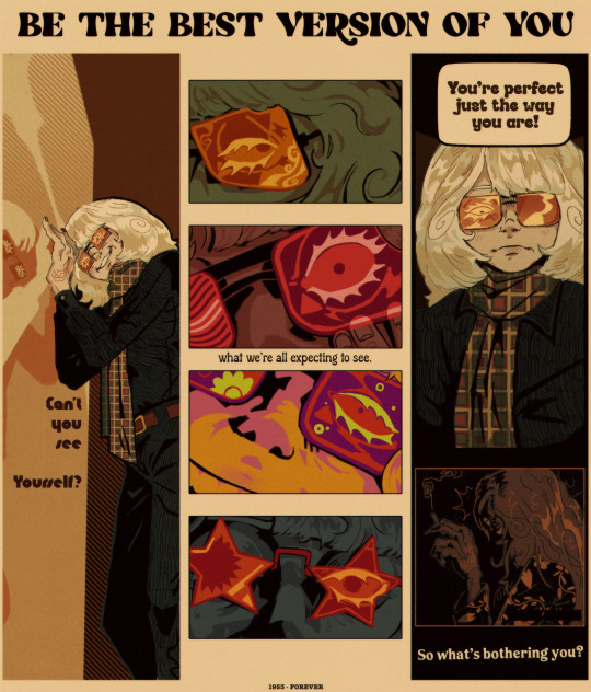
#phantom of the paradise#potp#swan potp#nightmaretheater#65 layers and about 24 hours . Eeeyyuppp#Look into my beautiful mind boy#Its a bit unusual to what i usually draw#but i had to push a specific look for this piece#hopefully you all are picking up on the corperate look . the advertisment look#Sneeze. Anyways my point is industry destroys creative people. This includes swan#I feel like phrases like these ; how he was put on a pedistal…. it lead him to be Like That#as awful as he is he desperately needed help#it might seem like vanity on the surface#but i think its… more than that#long story short: we need to destroy the beauty industry. the skincare industry. the anti-aging industry#It ruined his psyche forever and he cant let go of the ideal version of himself he will never truly be again#i dont think he can at this point. hes in too deep and hes suffering for it no matter how much he feels hes fixed his problems#he cant accept a version of himself that isnt that perfect young man. because he never confronted his problems. he just ran away#anyways . Hi swath *punches him**kicks him*#i dont care if nobody gets me lalalalla my truths and headcanons are awesome forever and i live in my own reality lallaallal#sorry i think im gonna be posting about swan alot for a few months hes making me sick#i wass gonna post this earlier but my internet was real bad#*lays down in my pile of pillows* eat up boys. haha#sidenote: drawing white blond people is horrifiying. Boy your skin and hair are the same color. Introduce some contrast to yourself. Please#adding on: its inportant to note this focuses on him looking st himself in the mirror alot on purpouse#to remind himself what he ‘’’’really’’’’ looks like#the 4 middle pannels all represent that too . u have to be in my brain ri get this#sorry for unleashijg another swan essay in my tags. will happen again lol
508 notes
·
View notes
Text
The fact that The S.I.N.N.E.D. System is not only the reverse of The D.E.N.N.I.S. System by name, but in its actual goal:
The D.E.N.N.I.S. System ends with Separate Entirely and begins with the avoidance of going on a date. It’s purely about sex.
The S.I.N.N.E.D. System ends with Do You Want a Tissue? Dennis’ tried and true method to secure a second date, and:
it works for Dee but she sabotages herself—because she has no interest in pursuing a man romantically;
it works for Mac but he bows out—because he already has a man he’s pursuing romantically;
The S.I.N.N.E.D. System is about romance. Dating, consistently, something Dennis makes very clear he doesn't do...
Except:

"This is a man we're talking about,


it's always about him."
#never forget the gang dines out was originally called date night#iasip#macdennis#the sinned system#fvr#dines out#rip dennis babe you tried.#macs too stupid to understand LMAOOO#tho rob's face in “make him seem like he's awesome” macdee reaction shot is.. interesting#and yeah dee may have sex with men but#shes literally never been romantically attracted to a man in her life#oh dee gives birth... ty
496 notes
·
View notes
Text
why Aurora's art is genius
It's break for me, and I've been meaning to sit down and read the Aurora webcomic (https://comicaurora.com/, @comicaurora on Tumblr) for quite a bit. So I did that over the last few days.
And… y'know. I can't actually say "I should've read this earlier," because otherwise I would've been up at 2:30-3am when I had responsibilities in the morning and I couldn't have properly enjoyed it, but. Holy shit guys THIS COMIC.
I intended to just do a generalized "hello this is all the things I love about this story," and I wrote a paragraph or two about art style. …and then another. And another. And I realized I needed to actually reference things so I would stop being too vague. I was reading the comic on my tablet or phone, because I wanted to stay curled up in my chair, but I type at a big monitor and so I saw more details… aaaaaand it turned into its own giant-ass post.
SO. Enjoy a few thousand words of me nerding out about this insanely cool art style and how fucking gorgeous this comic is? (There are screenshots, I promise it isn't just a wall of text.) In my defense, I just spent two semesters in graphic design classes focusing on the Adobe Suite, so… I get to be a nerd about pretty things…???
All positive feedback btw! No downers here. <3
---
I cannot emphasize enough how much I love the beautiful, simple stylistic method of drawing characters and figures. It is absolutely stunning and effortless and utterly graceful—it is so hard to capture the sheer beauty and fluidity of the human form in such a fashion. Even a simple outline of a character feels dynamic! It's gorgeous!
Though I do have a love-hate relationship with this, because my artistic side looks at that lovely simplicity, goes "I CAN DO THAT!" and then I sit down and go to the paper and realize that no, in fact, I cannot do that yet, because that simplicity is born of a hell of a lot of practice and understanding of bodies and actually is really hard to do. It's a very developed style that only looks simple because the artist knows what they're doing. The human body is hard to pull off, and this comic does so beautifully and makes it look effortless.
Also: line weight line weight line weight. It's especially important in simplified shapes and figures like this, and hoo boy is it used excellently. It's especially apparent the newer the pages get—I love watching that improvement over time—but with simpler figures and lines, you get nice light lines to emphasize both smaller details, like in the draping of clothing and the curls of hair—which, hello, yes—and thicker lines to emphasize bigger and more important details and silhouettes. It's the sort of thing that's essential to most illustrations, but I wanted to make a note of it because it's so vital to this art style.
THE USE OF LAYER BLENDING MODES OH MY GODS. (...uhhh, apologies to the people who don't know what that means, it's a digital art program thing? This article explains it for beginners.)
Bear with me, I just finished my second Photoshop course, I spent months and months working on projects with this shit so I see the genius use of Screen and/or its siblings (of which there are many—if I say "Screen" here, assume I mean the entire umbrella of Screen blending modes and possibly Overlay) and go nuts, but seriously it's so clever and also fucking gorgeous:
Firstly: the use of screened-on sound effect words over an action? A "CRACK" written over a branch and then put on Screen in glowy green so that it's subtle enough that it doesn't disrupt the visual flow, but still sticks out enough to make itself heard? Little "scritches" that are transparent where they're laid on without outlines to emphasize the sound without disrupting the underlying image? FUCK YES. I haven't seen this done literally anywhere else—granted, I haven't read a massive amount of comics, but I've read enough—and it is so clever and I adore it. Examples:


Secondly: The beautiful lighting effects. The curling leaves, all the magic, the various glowing eyes, the fog, the way it's all so vividly colored but doesn't burn your eyeballs out—a balance that's way harder to achieve than you'd think—and the soft glows around them, eeeee it's so pretty so pretty SO PRETTY. Not sure if some of these are Outer/Inner Glow/Shadow layer effects or if it's entirely hand-drawn, but major kudos either way; I can see the beautiful use of blending modes and I SALUTE YOUR GENIUS.
I keep looking at some of this stuff and go "is that a layer effect or is it done by hand?" Because you can make some similar things with the Satin layer effect in Photoshop (I don't know if other programs have this? I'm gonna have to find out since I won't have access to PS for much longer ;-;) that resembles some of the swirly inner bits on some of the lit effects, but I'm not sure if it is that or not. Or you could mask over textures? There's... many ways to do it.
If done by hand: oh my gods the patience, how. If done with layer effects: really clever work that knows how to stop said effects from looking wonky, because ugh those things get temperamental. If done with a layer of texture that's been masked over: very, very good masking work. No matter the method, pretty shimmers and swirly bits inside the bigger pretty swirls!
Next: The way color contrast is used! I will never be over the glowy green-on-black Primordial Life vibes when Alinua gets dropped into that… unconscious space?? with Life, for example, and the sharp contrast of vines and crack and branches and leaves against pitch black is just visually stunning. The way the roots sink into the ground and the three-dimensional sensation of it is particularly badass here:

Friggin. How does this imply depth like that. HOW. IT'S SO FREAKING COOL.
A huge point here is also color language and use! Everybody has their own particular shade, generally matching their eyes, magic, and personality, and I adore how this is used to make it clear who's talking or who's doing an action. That was especially apparent to me with Dainix and Falst in the caves—their colors are both fairly warm, but quite distinct, and I love how this clarifies who's doing what in panels with a lot of action from both of them. There is a particular bit that stuck out to me, so I dug up the panels (see this page and the following one https://comicaurora.com/aurora/1-20-30/):

(Gods it looks even prettier now that I put it against a plain background. Also, appreciation to Falst for managing a bridal-carry midair, damn.)
The way that their colors MERGE here! And the immense attention to detail in doing so—Dainix is higher up than Falst is in the first panel, so Dainix's orange fades into Falst's orange at the base. The next panel has gold up top and orange on bottom; we can't really tell in that panel where each of them are, but that's carried over to the next panel—

—where we now see that Falst's position is raised above Dainix's due to the way he's carrying him. (Points for continuity!) And, of course, we see the little "huffs" flowing from orange to yellow over their heads (where Dainix's head is higher than Falst's) to merge the sound of their breathing, which is absurdly clever because it emphasizes to the viewer how we hear two sets of huffing overlaying each other, not one. Absolutely brilliant.
(A few other notes of appreciation to that panel: beautiful glows around them, the sparks, the jagged silhouette of the spider legs, the lovely colors that have no right to make the area around a spider corpse that pretty, the excellent texturing on the cave walls plus perspective, the way Falst's movements imply Dainix's hefty weight, the natural posing of the characters, their on-point expressions that convey exactly how fuckin terrifying everything is right now, the slight glows to their eyes, and also they're just handsome boys <3)
Next up: Rain!!!! So well done! It's subtle enough that it never ever disrupts the impact of the focal point, but evident enough you can tell! And more importantly: THE MIST OFF THE CHARACTERS. Rain does this irl, it has that little vapor that comes off you and makes that little misty effect that plays with lighting, it's so cool-looking and here it's used to such pretty effect!
One of the panel captions says something about it blurring out all the injuries on the characters but like THAT AIN'T TOO BIG OF A PROBLEM when it gets across the environmental vibes, and also that'd be how it would look in real life too so like… outside viewer's angle is the same as the characters', mostly? my point is: that's the environment!!! that's the vibes, that's the feel! It gets it across and it does so in the most pretty way possible!
And another thing re: rain, the use of it to establish perspective, particularly in panels like this—

—where we can tell we're looking down at Tynan due to the perspective on the rain and where it's pointing. Excellent. (Also, kudos for looking down and emphasizing how Tynan's losing his advantage—lovely use of visual storytelling.)
Additionally, the misting here:

We see it most heavily in the leftmost panel, where it's quite foggy as you would expect in a rainstorm, especially in an environment with a lot of heat, but it's also lightly powdered on in the following two panels and tends to follow light sources, which makes complete sense given how light bounces off particles in the air.
A major point of strength in these too is a thorough understanding of lighting, like rim lighting, the various hues and shades, and an intricate understanding of how light bounces off surfaces even when they're in shadow (we'll see a faint glow in spots where characters are half in shadow, but that's how it would work in real life, because of how light bounces around).
Bringing some of these points together: the fluidity of the lines in magic, and the way simple glowing lines are used to emphasize motion and the magic itself, is deeply clever. I'm basically pulling at random from panels and there's definitely even better examples, but here's one (see this page https://comicaurora.com/aurora/1-16-33/):

First panel, listed in numbers because these build on each other:
The tension of the lines in Tess's magic here. This works on a couple levels: first, the way she's holding her fists, as if she's pulling a rope taut.
The way there's one primary line, emphasizing the rope feeling, accompanied by smaller ones.
The additional lines starbursting around her hands, to indicate the energy crackling in her hands and how she's doing a good bit more than just holding it. (That combined with the fists suggests some tension to the magic, too.) Also the variations in brightness, a feature you'll find in actual lightning. :D Additional kudos for how the lightning sparks and breaks off the metal of the sword.
A handful of miscellaneous notes on the second panel:
The reflection of the flames in Erin's typically dark blue eyes (which bears a remarkable resemblance to Dainix, incidentally—almost a thematic sort of parallel given Erin's using the same magic Dainix specializes in?)
The flowing of fabric in the wind and associated variation in the lineart
The way Erin's tattoos interact with the fire he's pulling to his hand
The way the rain overlays some of the fainter areas of fire (attention! to! detail! hell yeah!)
I could go on. I won't because this is a lot of writing already.
Third panel gets paragraphs, not bullets:
Erin's giant-ass "FWOOM" of fire there, and the way the outline of the word is puffy-edged and gradated to feel almost three-dimensional, plus once again using Screen or a variation on it so that the stars show up in the background. All this against that stunning plume of fire, which ripples and sparks so gorgeously, and the ending "om" of the onomatopoeia is emphasized incredibly brightly against that, adding to the punch of it and making the plume feel even brighter.
Also, once again, rain helping establish perspective, especially in how it's very angular in the left side of the panel and then slowly becomes more like a point to the right to indicate it's falling directly down on the viewer. Add in the bright, beautiful glow effects, fainter but no less important black lines beneath them to emphasize the sky and smoke and the like, and the stunningly beautiful lighting and gradated glows surrounding Erin plus the lightning jagging up at him from below, and you get one hell of an impactful panel right there. (And there is definitely more in there I could break down, this is just a lot already.)
And in general: The colors in this? Incredible. The blues and purples and oranges and golds compliment so well, and it's all so rich.
Like, seriously, just throughout the whole comic, the use of gradients, blending modes, color balance and hues, all the things, all the things, it makes for the most beautiful effects and glows and such a rich environment. There's a very distinct style to this comic in its simplified backgrounds (which I recognize are done partly because it's way easier and also backgrounds are so time-consuming dear gods but lemme say this) and vivid, smoothly drawn characters; the simplicity lets them come to the front and gives room for those beautiful, richly saturated focal points, letting the stylized designs of the magic and characters shine. The use of distinct silhouettes is insanely good. Honestly, complex backgrounds might run the risk of making everything too visually busy in this case. It's just, augh, so GORGEOUS.
Another bit, take a look at this page (https://comicaurora.com/aurora/1-15-28/):

It's not quite as evident here as it is in the next page, but this one does some other fun things so I'm grabbing it. Points:
Once again, using different colors to represent different character actions. The "WHAM" of Kendal hitting the ground is caused by Dainix's force, so it's orange (and kudos for doubling the word over to add a shake effect). But we see blue layered underneath, which could be an environmental choice, but might also be because it's Kendal, whose color is blue.
And speaking off, take a look at the right-most panel on top, where Kendal grabs the spear: his motion is, again, illustrated in bright blue, versus the atmospheric screened-on orange lines that point toward him around the whole panel (I'm sure these have a name, I think they might be more of a manga thing though and the only experience I have in manga is reading a bit of Fullmetal Alchemist). Those lines emphasize the weight of the spear being shoved at him, and their color tells us Dainix is responsible for it.
One of my all-time favorite effects in this comic is the way cracks manifest across Dainix's body to represent when he starts to lose control; it is utterly gorgeous and wonderfully thematic. These are more evident in the page before and after this one, but you get a decent idea here. I love the way they glow softly, the way the fire juuuust flickers through at the start and then becomes more evident over time, and the cracks feel so realistic, like his skin is made of pottery. Additional points for how fire begins to creep into his hair.
A small detail that's generally consistent across the comic, but which I want to make note of here because you can see it pretty well: Kendal's eyes glow about the same as the jewel in his sword, mirroring his connection to said sword and calling back to how the jewel became Vash's eye temporarily and thus was once Kendal's eye. You can always see this connection (though there might be some spots where this also changes in a symbolic manner; I went through it quickly on the first time around, so I'll pay more attention when I inevitably reread this), where Kendal's always got that little shine of blue in his eyes the same as the jewel. It's a beautiful visual parallel that encourages the reader to subconsciously link them together, especially since the lines used to illustrate character movements typically mirror their eye color. It's an extension of Kendal.
Did I mention how ABSOLUTELY BEAUTIFUL the colors in this are?
Also, the mythological/legend-type scenes are illustrated in familiar style often used for that type of story, a simple and heavily symbolic two-dimensional cave-painting-like look. They are absolutely beautiful on many levels, employing simple, lovely gradients, slightly rougher and thicker lineart that is nonetheless smoothly beautiful, and working with clear silhouettes (a major strength of this art style, but also a strength in the comic overall). But in particular, I wanted to call attention to a particular thing (see this page https://comicaurora.com/aurora/1-12-4/):

The flowing symbolic lineart surrounding each character. This is actually quite consistent across characters—see also Life's typical lines and how they curl:

What's particularly interesting here is how these symbols are often similar, but not the same. Vash's lines are always smooth, clean curls, often playing off each other and echoing one another like ripples in a pond. You'd think they'd look too similar to Life's—but they don't. Life's curl like vines, and they remain connected; where one curve might echo another but exist entirely detached from each other in Vash's, Life's lines still remain wound together, because vines are continuous and don't float around. :P
Tahraim's are less continuous, often breaking up with significantly smaller bits and pieces floating around like—of course—sparks, and come to sharper points. These are also constants: we see the vines repeated over and over in Alinua's dreams of Life, and the echoing ripples of Vash are consistent wherever we encounter him. Kendal's dream of the ghost citizens of the city of Vash in the last few chapters is filled with these rippling, echoing patterns, to beautiful effect (https://comicaurora.com/aurora/1-20-14/):

They ripple and spiral, often in long, sinuous curves, with smooth elegance. It reminds me a great deal of images of space and sine waves and the like. This establishes a definite feel to these different characters and their magic. And the thing is, that's not something that had to be done—the colors are good at emphasizing who's who. But it was done, and it adds a whole other dimension to the story. Whenever you're in a deity's domain, you know whose it is no matter the color.
Regarding that shape language, I wanted to make another note, too—Vash is sometimes described as chaotic and doing what he likes, which is interesting to me, because smooth, elegant curves and the color blue aren't generally associated with chaos. So while Vash might behave like that on the surface, I'm guessing he's got a lot more going on underneath; he's probably much more intentional in his actions than you'd think at a glance, and he is certainly quite caring with his city. The other thing is that this suits Kendal perfectly. He's a paragon character; he is kind, virtuous, and self-sacrificing, and often we see him aiming to calm others and keep them safe. Blue is such a good color for him. There is… probably more to this, but I'm not deep enough in yet to say.
And here's the thing: I'm only scratching the surface. There is so much more here I'm not covering (color palettes! outfits! character design! environment! the deities! so much more!) and a lot more I can't cover, because I don't have the experience; this is me as a hobbyist artist who happened to take a couple design classes because I wanted to. The art style to this comic is so clever and creative and beautiful, though, I just had to go off about it. <3
...brownie points for getting all the way down here? Have a cookie.
#aurora comic#aurora webcomic#comicaurora#art analysis#...I hope those are the right tags???#new fandom new tagging practices to learn ig#much thanks for something to read while I try to rest my wrists. carpal tunnel BAD. (ignore that I wrote this I've got braces ok it's fine)#anyway! I HAVE. MANY MORE THOUGHTS. ON THE STORY ITSELF. THIS LOVELY STORY#also a collection of reactions to a chunk of the comic before I hit the point where I was too busy reading to write anything down#idk how to format those tho#...yeet them into one post...???#eh I usually don't go off this much these days but this seems like a smaller tight-knit fandom so... might as well help build it?#and I have a little more time thanks to break so#oh yes also shoutout to my insanely awesome professor for teaching me all the technical stuff from this he is LOVELY#made an incredibly complex program into something comprehensible <3#synapse talks
761 notes
·
View notes
Text
Hot take: Don is low-key a romantic whereas Leo has zero interest in it.
(Not shown bc screenshot: Donnie nodding approvingly)
#This scene says it all. Plus Donnie has the most canonical crushes out of any of the turtles.#Leo just seems like he wants nuthin to do with all that mushy stuff lol. He's here to look awesome and have fun not make kissy-face.#Further proving that Donnie is the more mature twin despite being the younger twin.#disaster twins#rottmnt#leonardo hamato#donatello hamato#rottmnt leo#rottmnt donnie#rise leo#rise donnie#character analysis#screenshot#rise of the tmnt#rise of the teenage mutant ninja turtles
1K notes
·
View notes
Text
as an american, sam reid’s total inability to hide his contempt for overly fake-chipper american journalists, especially ones who Have Not Done The Assigned Reading know and care about the show, will never not be hilarious and iconic to me
#sometimes he can dial it back to civil blank apathy#but i have never laughed and cringed like that at the same time#sorry we’re so fake bro we’re just Like That#his frank tiredness with unoriginal or dumb questions is kinda refreshing#i think we first got it full-blast with It’s What’s Written In The Books last season#after 5K ‘why is it gay’ questions#but that latest Dish tv interview where the journo joked they thought he was dead holy fuck#defcon 1 levels of Done#it’s sort of fascinating since generally all celebrities play along with any interviewing atrocities they suffer though#american fakeism is the lowest bar to endure but the man is just a wall#lol don’t lose that sir#iwtv#interview with the vampire#okay no sorry this is my ted talk—#i mean he’s not alone frex some european actors in particular seem to pull out their best acting chops when#faced with shrilly chipper american interviewers#though sometimes you can catch the horror in their eyes#and hugh grant epically blanked that one effusive interviewer on the red carpet at the oscars the yr before last#and was almost assigned 40 lashes in the court of public opinion#(until will smith sucked all the oxygen out of the room)#but sam reid is just full stop not going to reflect back. it’s…kind of awesome and not a little brave in this biz#anyway this has been my ted talk#saluting an icon 🫡
379 notes
·
View notes
Text


THE GRAND TOUR | JAMES MAY
#did you see that dude with the gray streaks?#this guy totally caught my eye#he’s got this awesome vibe#while I eagerly anticipate the new season of the devil’s hour I find myself drawn back to the familiar charm of the grand tour#it’s impossible not to be captivated by james whose allure seems to deepen with time like a fine wine mellowing in the cellar#the silver streaks in his hair and the distinguished salt-and-pepper beard only amplify his handsomeness#lending him an air of gravitas that is undeniably magnetic#there’s something undeniably alluring about a man with a touch of gray#a hint of wisdom in his eyes and the strength etched into his features#james may#richard hammond#jeremy clarkson#top gear#the grand tour#sand job
132 notes
·
View notes
Text


Previous // Next
Robin: Dad?
Oscar: Me.
Robin: Are you busy?
Oscar: Not too busy to talk about getting a call from school earlier-.. three hours into the first day of term, no less.
[Robin huffed, his shoulders slumping; that wasn’t what he wanted to talk about]
Oscar: Two-way street, pal.. you talk, I talk.
Robin: Fine-.. what does it mean when someone who’s usually an asshole suddenly starts being nice?
Oscar: I guess it depends on the asshole, do they want something?
Robin: I don’t know, it’s hard to tell via messenger-.. or any other time.
Oscar: [hums] I dunno, I wouldn’t dismiss it straight away but I wouldn’t let my guard down either-.. play it by ear y’know? Your mom’s always saying life’s too short for grudges, but she can be too nice sometimes.
Robin: So, somewhere in the middle is good?
Oscar: Maybe? Life’s messy, bud.. I don’t think I can give you any definitive answers on this kinda shit.
[Robin heaved a weary sigh, wishing he’d just gone to bed]
Oscar: Are you gonna tell me what happened today?
Robin: I don’t wanna talk about it.
Oscar: You can’t just up n’ leave at lunch, what’re you playing at?
Robin: Sorry.
Oscar: Sorry ain’t gonna cut it every time, Robin. I don’t wanna have to start getting on your case about school, but if you don’t sort your shit out, we’re gonna have to-.. and let’s be honest, no one can be arsed with that.
[Oscar jostled Robin’s knee affectionately, he wasn’t really mad, but he wasn’t messing around either]
Robin: I’ll try harder.
Oscar: No one’s asking you for straight A’s but you’re taking the piss now. Apply yourself or whatever the teachers say-.. and keep your ass inside the gates ‘til three as well, okay?
Robin: Okay, okay!
Oscar: You better! I’ll pick up a military school pamphlet if you don’t.
Robin: [snorts] Yeah, right.
#ts4#sims 4#simblr#ts4 story#sims story#forever in between#fib#oscar finch#robin finch#i can imagine oscar just giving robin the side eye when he came home from school early#like >.>#and u know he's gonna say smth but when? who knows.. it's a surprise#when u want smth it seems#skdjk#🙈#they're so soft#but we'll allow it cos they're awesome parents#poor robin just wants to go to bed and not be hurt and confused anymore PLZ#my guy's had a DAY#😭
132 notes
·
View notes
Text
just something i thought i’d mention because in spite of last night i apparently still haven’t recovered from the hallelujah -> 27 combo: pete’s kids were there that night. meagan and pete’s youngest two kids were in the soundbooth and he smiled and winked and waved at them when he went back there during dance dance. they performed THOSE songs in THAT combination and pete’s family was there when they did.
#LITERALLY THE THERE WILL ALWAYS BE SOMEONE WHO WANTS YOU WHOLE#everyone seems to have been super respectful of them too!#someone in the stardust project server was right there and chatted with meagan a bit and gave the kids bracelets and shells#and it was all very nice and chill#they were also there last night! pete and marvel were spotted watching carr’s performance from side stage <3#again everyone has been super respectful about the kids privacy which is awesome#it is just. so awesome to see how loved and supported he is on all sides
697 notes
·
View notes
Text

whats ur fucking deal
#GGGRRRRRRGRRRR GGRGAGGHHH#despicable me#maxime le mal#felonious gru#gruxime#spread the word.#pre transition maxime if anyone gaffffffff#realising i can just draw shit and not have to explain myself or provide full context. awesome (provides anyway)#non descript minion. i like the idea that they go to school w gru in like shifts each week#maxime has a cokcroach ☝️ on his shoulder#they look so fucking stupid next to each other i cant get them to look normal. sorry gru ur built so weird#i need to do more kinda doodly stuff and not alwayssss full pieces#this uniform is pretty cute btw but strange that the trousers and skirt colours r different?#i mean actually. my school did that at one point but its still odd to me#btwwwwww design notes.#was torn abt giving gru his scarf but i thought it wld clash too much. for me i feel the tie serves the same purpose#looking at the One scene we see the uniform it seems the dress code is… not soooo tight? but this is also 30/40 yrs prior soooo idk#(also yeah debatably the uniform wld have been different. but fuckkkk that shit)#forrrrr maxime i like to think his glasses r like actually prescription but he uses tinted ones bc 1. he saw nefario once and was like#‘FUCKKK THATS KINDA CRAZY COOL’ and stole the idea#and also 2. he is light sensitiveeeeeee. :3#gloves r again mostly cus of sensory issues but also this kinda body dysmorphia thing he has going on#samew the socks.#was considering tights buttttt i didnt see any of the students wearing them and also booooo tights suck. so just knee length socks#so he can get around dress code andddd still cover up more#plusssss it lets him not have to shave his legs :T#shoes i didnt see any pattern i assume u can just wear whatever lollll#i give him a hairclip toooooo just cus theyre cute. and put some greeeeen in itttt#btw drew the minion w the gay flag then realised it wldnt make sense w maxime being pre transition but#i think its funnier to imply the minion just sees right thru him immediately
72 notes
·
View notes
Text
I think I like this character from (tadc sibling au)
he’s kinda cool not gonna lie heh
@sm-baby

#tadc#the amazing digital circus#the amazing digital circus fanart#Randy Tadc#he seem like a cool guy and he’s awesome hehe#tadc siblings au#sketch of Randy#quick sketch#fypツ
54 notes
·
View notes
Text

#sonicmovie3hype#sonicmovie3#stobotnik#agent stone#movie robotnik#dr robotnik#Im insane abt them#Just give me an Agent Stone and Robotnik Valentines special.#EGGSTONEEEEEEEE 🥚🪨☕️♥️#I like how everyone in the Sonic fandom has simultaneously agreed that Agent Stone should just be apart of the main cast#Sage would appreciate having two dads after all#are they finally gonna have a daughter in the third movie? 👀#“Life you're making me think Eggman is pregnant and not in fact fat- 💀😭#don’t worry#She’s an ai daughter lol#even sonic himself pointed this out in the Sonic Twitter & TikTok Takeover LMFAOOO#Awesome Titanic reference lol#what was it like shaving his head?#And Robotnik will never let go of Stone#Agent Stone is never gonna give you up.#Never gonna let you down.#Never gonna run around and hurt you.#Never gonna make you cry.#Never gonna say goodbye.#Never gonna tell a lie and hurt you.#🏳️🌈❓#Agent Stone can do it all!#he’s a man of many talents 🙌#Heard someone say Agent Stone is like the Harley Quinn of the Sonic Franchise#and yeah that seems accurate 🤣
41 notes
·
View notes
Note
*hug Kinito*
YOU SOOOOO CUTE!!!
Thanks, seems like he needed that (:
#this took surprisingly long#seems like my artblock is not over entierly...#tho his design now is awesome for animating!!! no calculating angles and geometry homework masquerading as a character! yuppie!!!#anyways... sorry it took so long lol.... hope you did not forget about this ask already hahsdhfh (:#ahem. onto normal tags now#kinitopet#kinito the axolotl#kinitopet fanart#kinito fanart#prosto cup of art#kinito pet#kinito my beloved#p s there is also a secret horror version that i might or might not finish#yk... cause he's evil and stuff... i cant make fluff without angst and cant make angst without fluff#it is like ying yang of this angly bastard
35 notes
·
View notes
Text
Come back home when you have some sense
You can throw your life away just not at my expense
You’re not the son I raised
#jhariah#this one just rawrrfrrr#and then uh another line thats like ‘tell me did you raise a man?’#nice#im just listening to the new album to cope with nasty sickness and feeling out of it#god this album is really good it has every emotion in there like this song for example just the part where they scream the chorus its like#hnnnghhh#hm some other moments from the album im liking a lot uhhh i love re: concerns a lot#the part where hes like reading off the complaints and then the part where hes just screaming and its like BAM BAM BAM BAAAM#sasuke is so good and the bit at the end where its like ‘i just want you to know im so so...’#like hes gonna say sorry but cant seem to say the word for whatever reason and i know nothing about sasuke#but i has to imagine the fan girlies are eating gravel over that one lol it gets me#and theres just that like spooky echoing afterwards#the intro to fire4fun goes SOOOOOOOO hard i was losing my shit its awesome#the entirety of trust ceremony is giving me big feelings but specifically that part towards the end where its all quiet and you hear#its like whistling i think? like a marching band is coming in maybe#but it also kinda sounds like nature too and idk i like got a little bit um magical at that part cuz i was driving down a big hill#and it had been raining but there was a clearing in the clouds and the sun was bright and like at this particular hill#you can just see everything like the land stretches for miles theres trees hills the river farms all that shit#and idk with the extreme stress and depression ive been feeling its hard to have these moments where life seems worth it#and its hard to really feel anything anymore or to feel in the moment but idk i was just going down that hill seeing everything and it was#very majestic so yeah that song is definitely gonna have the same effect as pin eye for me#which i must mention pin eye again its still OOOOGHH very good it came at a pretty good time for me#yeah basically this album is uhhhh whats keeping me somewhat grounded rn i recommend 👍
76 notes
·
View notes
Text
everytime i read heartstopper i think to myself
'omg i really would love a little brother like oliver'
and then everytime i interact with a child i remember why i hate them.
#like oliver seems awesome#oliver spring#hes such a vibe#but#i hate kids#children#theyre not my thing#heartstopper#charlie spring#tori spring#osemanverse#alice oseman#springs#heartstopper springs#solitaire#nick and charlie#nick nelson#solitaire alice oseman#reading#sprolden#charles spring#victoria spring#victoria solitaire#secretly victoria spring#i am tori spring#tori solitaire#tori and michael#its just tori and michael#micheal holden#michael holden
103 notes
·
View notes
Note
Was anything mentioned about Dee at all? I’ve been hoping she’d get more screen time next season
Ah, yes! Honestly I’m hesitant to share specifics cos Charlie was drunk and I was drinking but he did mention a Dee storyline for S17 :)
#iasip#charlie day#sunny 17#idk if it’ll happen#it was an interesting idea#it seems like he and glenn were talking a lot for s17!?#like it seemed very on their minds which is awesome
55 notes
·
View notes
Text
midst podcast really called moc weepe a "diabolical bastard" in the literal trailer description and is still leaving me with my jaw on the fucking FLOOR about him being a diabolical bastard. "oh haha cool glass man with the funny voice who runs a shady cabaret and commits petty theft in his first scene i BET he's diabolical :) wow he's killing the guy trying to blackmail him in a totally horrible way but the guy WAS trying to blackmail him so go king! :) hey what do you MEAN he's selling out dozens of his own friends and employees to the church corporation in exchange for a bunch of beads that mean basically nothing to him what do you MEAN--"
#it's a critical role property so i've decided it can go on this blog.#midst podcast#midst spoilers#midst#this is HIGH praise btw i'm having the time of my LIFE#the only moment i was more delighted was when phineas rejected the rich guy's offer to even his balance bc his pride couldn't handle it#i was CHEERING in my car for that one.#clapping and cheering and yelling 'YEAHHHH PRIDE!!!! YEAHHHHH BETRAYAL!!!!!!!!'#it does seem possible moc weepe has some sort of double cross scheme going on. i really hope he doesn't but even if he DOES that's SO many#people's lives to gamble without their knowledge......#everyone listen to this podcast i think it might be awesome for real.
247 notes
·
View notes
Last Seen Blogs

werewolf-things-blog
WereWolf.

fieldsautogroup
FIELDS AUTO GROUP

futuristicdonutreview
Tin Tức Tài Chính - Xã Hội - Giải Trí

claudrew12
I'm a Titanium
