#how to enable javascript in mobile
Explore tagged Tumblr posts
Visit Tumblr Blog
Explore Tumblr blogs with no restrictions, modern design and the best experience.
Last Seen Tumblr Blogs


Fun Fact
Tumblr’s website traffic is steadily declining.
Text
How to Enable JavaScript on Your iPhone
How to Enable JavaScript on Your iPhone? JavaScript is an essential feature for browsing modern websites. If you find that certain sites are not working correctly on your iPhone, it might be because JavaScript is disabled. Follow this quick guide to enable it in Safari. Step-by-Step Guide to Enabling JavaScript Step 1: Open Settings Unlock your iPhone and go to the Settings app. Step 2:…
#enable javascript on iphone#how to enable javascript in chrome iphone#how to enable javascript in mobile#How to enable JavaScript on iPhone?#how to enable or disable javascript on iphone#how to turn off javascript on iphone#how to turn on javascript in safari#how to turn on javascript on ipad
0 notes
Text
Complete-ish Guide To Settings You Might Want to Change
These instructions will be for desktop, because the settings are easier to find there. You can do the same on mobile, but it might be in different places.
Dash settings

Your dashboard is broken down into several feeds, including "Following" and "For You".
"Following" is primarily the posts of people you follow, "For You" is algorithmic.
If you just joined, "For You" is default, if you're a longtime user it's "Following". You can change this in the settings on the right
A lot of longtime users will tell you that the Following feed is where we spend most of our time. But try out all the feeds, and see what you like most.
The settings that are settings:
To start, click the settings gear under the account icon (the abstract person head).

This should take you to the General tab. Key settings:
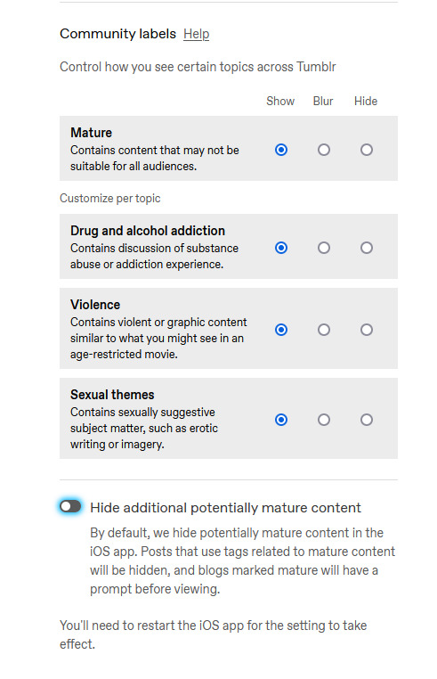
Community Labels: By default anything NSFW is silently hidden. You can change how each subtype is handled.
Hide Additional Mature Content: If you have an iPhone disable this or it'll hide every post from you on the off-chance it contains porn.
If you're under 18 as determined by the birthdate you entered on signup, you can't change these. (If you want them on, you'll have to make a new account and lie)
Under the "Dashboard" tab, you can enable timestamps, which is mostly just nice information to have. sometimes a post is from 2010 and you can be like wow.

The next four probably have the biggest impact on your tumblr experience, so I'm gonna do a breakdown.
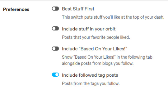
Best Stuff First reorders your "Following" to have popular posts at the top. Disabling it makes your feed chronological. I like it off, but up to you.
Include Stuff In Your Orbit and Based On Your Likes put various content from "For You" into "Following". Personally, I disable them to keep "Following" purely posts by people I follow, and then switch between feeds to get what I want.
Followed Tag Posts will put content from the "Your Tags" feed into your "Following" feed. Since you can go to the separate tags feed, I usually turn this off (it tends to show me a lot of duplicate posts), but up to you.
Under the "Notifications" tab you can tell Tumblr to stop sending you emails.

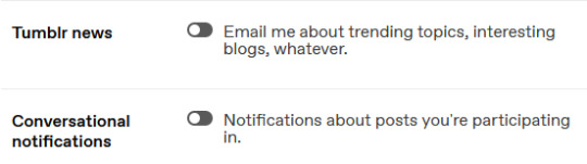
I'd recommend disabling all the emails--if you get a bunch of replies, Tumblr will happily send you dozens of emails, and you don't need that.
Notifications is the push-notifications in-app/in-website. The mobile app, for some reason, has a much better interface for controlling these, including the option to only get activity-notifications for mutuals. You can leave these on, or turn them off if you find the flood of notifications is distracting.
Tumblr News is a newsletter, it usually just has content from @fandom and the other staff-run recap blogs.
Conversational notifications sends you more emails.
Under the "Tumblr Labs" tab you can enable a bunch of cool beta tests.

I particularly suggest Reblog Graphs, What you Missed tab, & Popular Reblogs tab, but they're all fun to try out. A lot of these are honestly better than the For You dashboard.
For each blog you have, you can customize it's Blog Settings. Beyond things like setting an avatar or description, there's a few settings that are fun.
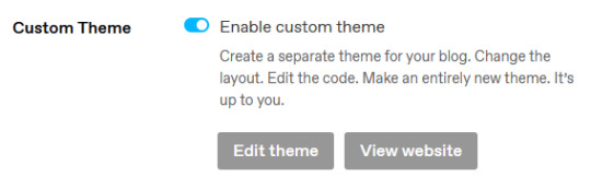
Custom Theme gives you your own subdomain at [blogurl].tumblr.com.
This makes your blog easier to search, and a lot of 3rd party tools depend on you enabling it. It also makes it easier to link your posts to people who don't have tumblr accounts.
You can completely customize the CSS/HTML/Javascript. you can go legitimately crazy. It's not a requirement, but if you want unlimited flexibility, go wild.
On the contrary, if you wanna run a more private blog, you can disable this and then hide your blog from search results/non-registered users.

Likes and Following are public by default. I like to turn these off so I don't have to worry about like, "what will people think if they see i'm following [...] or liking [...]". But it's also fair to keep them public if you'd like.
The other Blog Settings are important but pretty self-explanatory I think.
Finally, there's some useful tools I like:
XKit Rewritten - A bunch of scripts (like RES for Reddit). The one I really like is "mutual checker", which shows at a glance which blogs you are in mutuals with. Which is such a good feature it's included in the mobile apps by default i think.
siikr.tumblr.com - Tumblr search is bad, and google's indexing of tumblr blogs is worse. Siikr will find any post you've made on your blog. Because disk space is limited, only use it to search your blog, and if you're tech savvy consider running a local copy from source.
988 notes
·
View notes
Text

A.K.A. "I wrote this instead of sleeping..."
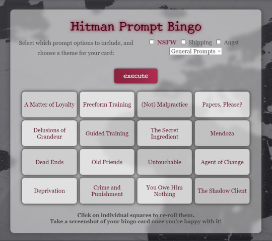
You can find the prompt bingo right here.
It's still a work in progress, and there's so much more I want to add eventually, but everything that's already there is working.
And what's there is a lot. Like, a metric shit ton.

I've added all
Cinematic Titles
Mission Names
Mission Stories
Challenges
Destinations
of all Hitman World of Assassination Game Modes.
Some challenge prompts might look like typos to you. While I always appreciate when you point those out to me so I can fix them (seriously, please do let me know if I missed something!), please check first if there isn't an in-game challenge with that exact name, because so many of them look like I forgot how to spell. :D
Fun fact, did you know that there are roughly 1,200 challenges in the game? I wasn't joking about the "instead of sleeping" part of the title.
Additionally, there are long lists with smutty, kinky, romantic, angsty and whumpy prompts.
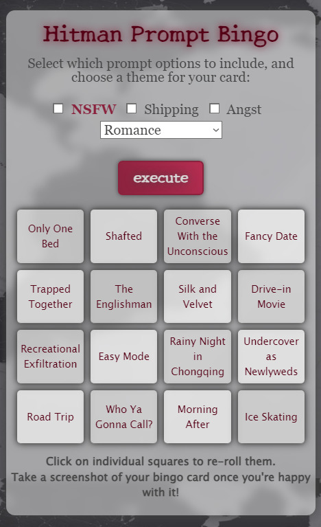
You can opt-out of NSFW, Shipping and Angst by not opting in (I swear this makes sense in my head right now), but if you select the theme "Romance" from the dropdown menu, you will get shippy prompts even if you don't tick the Shipping checkbox, and if you select Hurt/Comfort from the dropdown menu you will get angsty prompts even if you don't tick the Angst checkbox. I recommend ticking the Shipping or Angst checkbox if you select Romance or Hurt/Comfort for a larger pool of prompts.
You will not get NSFW prompts unless you tick the NSFW checkbox.
However, some mission stories and challenges have names that could be mistaken for NSFW prompts. I haven't put them behind the filter, and I don't know if I will do that in the future.
If you don't like a prompt, you can just re-roll that one specific prompt by clicking/tapping the field it's in.
The Themes
The bingo generator has four themed lists so far: General Prompts, Mission Fic, Romance, and Hurt/Comfort.
I will be adding more at appropriate times, such as a summer list for summer (Northern Hemisphere) or a Halloween list for Halloween. Those will be permanent additions. It's just a lot of work, and I have so many more plot bunnies and code bunnies and art bunnies, so I really have to space these updates out. xD
If you'd like to suggest a theme or donate a list of prompts, please feel free to do so!
How to Play
Create the card you want, do with it whatever you want.
You can take the prompts literally or interpret them any way you like. If it's the name of a mission story or challenge, you can use the mission story or challenge itself as a prompt, or come up with something just based on the name. If it's a pun, you can use the prompt as-is or remove the pun element from it.
Use as many or as few prompts as you want in a fic, or in a drawing, or in a daydream. You make the rules!
If you think a bingo should require a line of prompts used in one single work, cool. If you think four single works should count, that's cool too. And again, if you don't like a prompt, just re-roll it until you get one you like more.
Just have fun with it! :)
Mobile Version
The mobile version is working, but word breaks for longer words won't be pretty. I still need to add word break opportunities, but that's a lot of work, and I will probably do this in small batches over the next month or so.
If you want a prettier card, you can re-roll prompts with unpretty word breaks by tapping on the prompt you want to change.
Keyboard-Only Users
For accessibility, all prompt fields have added button functionality, which means you can use tab to select them and enter to interact with them. Your browser needs to have JavaScript enabled for that to work, though.
Now go play with it!
Or don't, I'm not your mum, I can't tell you what to do.
Final disclaimer: The platform I'm using to host my generators, Perchance, recently added AI options. My generators were not built using AI, and none of the prompts you'll get are AI generated.
My generators are all 100% handcrafted chaos. :D
If bingos are not to your liking and you'd like more detailed prompts, try my Hitman Prompt Generator!
36 notes
·
View notes
Text

🌸 Sakura Page Theme 🌸
re-coded an unreleased page theme an anon asked me to release like 5 years ago (example of the original). realized i actually hated a lot of how it was originally handled and changed it up. now it is ready to be unfurled!
features:
mobile responsive (built with flexbox)
header designed for 4:3 ratio gifs/images
up to 2 side pixels (left & right) with optional captions
two javascript-powered pop-up modals
title font supports english & japanese
customizable fonts, images, and colors
CSS variable settings
tumblr controls removed (like the follow button)
...and more! just play around with it!
notes:
you must have javascript enabled for this page theme to work! see this post for instructions.
this theme is meant to be used with custom tumblr pages (select custom layout rather than standard layout and then copy + paste)
this can also be used on neocities or any other host that supports html/css/js.
🍃 code + live preview + more 🍃
98 notes
·
View notes
Text
Silm fandom! Have a PSA. Hate the piped tags on AO3? Would much rather read a fic tagged Fingon/Maedhros than one tagged Fingon | Findekáno/Maedhros | Maitimo? Have I got the userscript for you! Look how neat and readable my AO3 silm character tags look now:
What is a userscript?
Good question! The small sibling, who is a computer geek, did not know about these when I mentioned them, so I have to conclude I have stumbled upon some secret hidden wisdom here. In short, a userscript is a (free) program written in JavaScript that modifies the web pages you visit. They're very safe, and imo an essential part of customising your web browsing experience to your liking!
How do I install userscripts?
I might make a separate post about mobile browsers because I'm tired. But on desktop, you first want to get a browser extension that allows you to manage your userscripts. I like Tampermonkey, which works with most major browsers.
Okay, how do I get rid of the piped tags?
Once you've installed the userscript manager of your choice, you want to go to the userscript Ao3 De-Piped Tags on Greasy Fork and click the big green "install" button. For most userscripts, that's it! For this one, we need to take a couple of tiny extra steps:
Go to your Tampermonkey dashboard (you can find this by clicking on "browser extensions" and then "Tampermonkey". Unfortunately I don't know how other userscript managers work, so if you didn't choose Tampermonkey you'll have to play around a little.)
Click the "Ao3 De-Piped Tags" script on your Tampermonkey dashboard.
This should bring you to the "Editor" page, and a bunch of scary-looking code in JavaScript. Don't panic, I have no idea what any of this does and I still managed to do the necessary fiddling! The block you want looks like this:
//SCRIPT SETTINGS// const sideToDisplay = 'right'; //left OR right, for character tags with one pipe (two names) const partToDisplay = 'right'; // left OR right OR central, for character tags with two pipes (three names) const tagsOnFicPage = 0; //0 to disable, 1 to enable
4. All you want to do now is change the first line so that it reads
const sideToDisplay = 'left'; //left OR right, for character tags with one pipe (two names)
so that the tag "Maedhros | Maitimo" displays as "Maedhros" instead. If you're a Quenya freak (affectionate) who would prefer all the tags display characters' Quenya names instead of Sindarin ones, skip this step.
5. If you'd also like this change to show on the fic page itself, not just the AO3 search results page, change the third line of the code block to read
const tagsOnFicPage = 1; //0 to disable, 1 to enable
6. Save your changes to the file, refresh your AO3 page, and marvel!
I hate this and want to get rid of it.
No problem, you can turn off the userscipt or completely uninstall it from the Tampermonkey dashboard!
I want to display some names with the left part of the piped tag and others with the right part, is that possible?
Unfortunately not :( This also applies if you're in other fandoms (I hear The Witcher fandom is one such?) which uses piped tags where you want to use the right side of the tag.
Can anyone else see the changes I've made?
No! The userscript applies to your own browsing experience only, so you aren't messing with how anyone else's fics display when you use it.
This is magic, got any other cool userscripts for AO3?
Loads, most of them much easier to use than this one! Here are some links:
Put your "marked for later" button on the AO3 homepage
Add HTML formatting options to the AO3 comment box
Set your default posting language to English
Fix the bug where copy-pasting from Google Docs to AO3 puts spaces around all your italics
And here's a list of many more to peruse!
Cool, how do I get this to work on a mobile browser?
Yeah my laundry's finished now so I'm not typing all that out. Maybe tomorrow.
20 notes
·
View notes
Text
Accelerate LWC Development With Salesforce’s Local Development Server

Tired of constantly deploying and refreshing your UI every time you update your Lightning web components (LWCs)?
With Local Dev (beta), you can streamline your workflow by developing your LWCs while previewing them in real-time directly within your Lightning app or Experience Cloud site.
Note: Before you begin make sure that you have the latest version of the CLI command, run “sf update”.
Step 1: Install the Local Dev Plugin To begin, install the Local Dev Plugin using one of the following commands based on your environment:
For Production or Scratch orgs:
sf plugins install @salesforce/plugin-lightning-dev
OR
sf plugins install @salesforce/plugin-lightning-dev@latest
For Sandbox environments:
sf plugins install @salesforce/plugin-lightning-dev@prerelease
Step 2: Enable Local Dev
Navigate to Setup in Salesforce.
In the Quick Find box, type Local Dev.
Select Local Dev and enable the feature.

Step 3: Enable Local Dev for Your Scratch Org
To configure Local Dev for a scratch org:
Open your SFDX project.
Locate the config/project-scratch-def.json file.
In the settings section of the file, add the following key “enableLightningPreviewPref”: true

Step 4: Preview
Use Local Dev to run a preview of the following types of Salesforce projects.
Lightning Experience apps (desktop and Salesforce mobile app)
LWR Sites for Experience Cloud
To preview your application, use the following steps:
Run the command below in the CLI to start the guided setup: sf lightning dev app
Alternatively, if you want to bypass the guided steps, you can directly use the following command in the VS Code terminal: sf lightning dev app — target-org — name — device-type — device-id — flags-dir
Replace the placeholders with the appropriate values for your project. This will launch the application preview.
Guided Steps When Running the Command sf lightning dev app:


Step 4: Build an LWC Component and Experience the Real-Time Magic of Local Dev (Beta).
Start by creating a Lightning Web Component (LWC).
Embed the LWC into any Lightning app. For now, you can add it to any page in the Sales App.
Make changes to your LWC, such as modifying the HTML, CSS, or JavaScript. As soon as you save your code, you’ll experience the power of Local Dev (Beta), with changes reflected in real-time on the UI.
Notice how quickly the LWC updates, without needing to deploy your code or refresh the page. The changes are applied instantly!
Considerations and Limitations:
LWCs automatically update for the following changes only.
1. Basic HTML revisions: Changing component attributes, like in our case
lighting-button variant=”neutral” to variant=”brand”
Get More info: https://www.kandisatech.com/blog-details/accelerate-lwc-development-with-salesforces-local-development-server
#Salesforce#salesforcepartner#Lightning#LWC#SalesforceDevelopment#salesforcelightning#SalesforceLWC#LWCDevelopment#usa#uk#salesforceconsultant
2 notes
·
View notes
Text
"Passionate graphic designer from New York, delivering creative solutions and technical support to help clients thrive!"
Hi, I’m Evans Dezven, a skilled UI/UX designer based in New York, USA, dedicated to creating intuitive and visually compelling digital experiences. As a freelancer, I’m available to collaborate on design projects that demand a perfect blend of creativity, technical expertise, and user-centered design.
I hold a degree from Chicago University with a background in computer science and design, enabling me to craft innovative solutions like the acclaimed “Genius In You” portfolio website. My expertise lies in delivering modern, functional, and aesthetically pleasing designs tailored to meet client needs while enhancing user engagement.
With a strong grasp of design trends, user behavior, and cutting-edge tools, I aim to help clients stand out in today’s competitive digital landscape. Whether you need a sleek portfolio, a polished mobile app design, or a revamped digital platform, I’m here to deliver exceptional results.
Explore my portfolio and services at https://iakash.digital/ or visit my personal site,https://iakash.digital. You can reach me via email at [email protected] or call (+91) 987-011-3409. Let’s collaborate to turn your vision into reality and create outstanding digital experiences that captivate and inspire!
#UIUXDesigner#FreelanceDesigner#DigitalDesign#CreativeSolutions#UserExperience#UserInterface#WebDesign#AppDesign#PortfolioWebsite#ModernDesign#InnovativeDesign#GraphicDesign#NewYorkDesigner#DesignTrends#DigitalExperience#ClientEngagement#CuttingEdgeDesign#DesignExpert#AvailableForProjects#DesignInspiration
2 notes
·
View notes
Text
Page Optimization Best Practices: A Blueprint for Online Growth
Page optimization is an essential system in virtual advertising and net development that ensures websites are person-friendly, functional, and aligned with seek engine tips. It encompasses quite a few techniques and practices aimed at improving a website's performance, visibility, and general user revel in (UX). By optimizing a page, companies and content creators can achieve better search engine ratings, force organic visitors, and ultimately enhance conversion costs. This complete manual explores the facets of page optimization, from its technical factors to consumer-centered techniques.

On-Page Optimization
The Importance of Page Optimization
In the state-of-the-art competitive digital landscape, merely having an internet site is inadequate. Users anticipate rapid-loading, cellular-friendly, and easily navigable pages. Moreover, serps like Google prioritize web sites that supply value through optimized overall performance. Here’s why page optimization is essential:
Enhanced User Experience: Optimized pages load quickly, are visually appealing and provide intuitive navigation. This maintains users engaged and decreases bounce costs.
Higher Search Engine Rankings: Search engines reward optimized pages with better ratings, growing visibility, and natural reach.
Increased Conversions: A properly optimized web page encourages customers to take desired movements, including creating a purchase, signing up for a publication, or downloading content.
Better Accessibility: Optimization guarantees your content is on the market to all customers, such as people with disabilities, through features like alt textual content and proper structure.
Cost Efficiency: Pages optimized for speed and overall performance lessen server load and bandwidth utilization, reducing hosting expenses.
Key Elements of Page Optimization
Page optimization is multi-faceted, involving each technical and content-associated components. Below, we delve into its middle elements:
Page Speed Optimization
Page speed refers to how quickly a webpage masses its content. It's a crucial rating issue for search engines like Google and Yahoo and significantly affects consumer retention. A postponement of even a 2nd can bring about massive drops in personal engagement and conversions.
Minimize HTTP Requests: Reduce the number of factors like photographs, scripts, and CSS documents.
Compress Images: Use equipment like TinyPNG or ImageOptim to lessen image sizes without compromising quality.
Enable Browser Caching: Cache static files so returning site visitors don’t need to reload all factors.
Use a Content Delivery Network (CDN): Distribute content across more than one server to reduce latency.
Optimize Code: Minify CSS, JavaScript, and HTML to put off unnecessary characters.
Mobile-Friendliness
With over half of internet traffic coming from cellular gadgets, ensuring a web page is cell-pleasant is non-negotiable.
Responsive Design: Use CSS frameworks like Bootstrap to ensure the page adapts to specific screen sizes.
Viewport Settings: Define the viewport for your HTML to govern how your website is displayed on cell devices.
Clickable Elements: Ensure buttons and hyperlinks are properly sized and spaced for touchscreens.
Content Optimization
Content is at the heart of any website. Optimizing content for relevance, readability, and engagement is crucial.
Keyword Research: Identify and use goal key phrases naturally in your content.
Structured Data: Use schema markup to help serps recognize your content material.
Readability: Use brief paragraphs, subheadings, and bullet points to make content material scannable.
Engaging Visuals: Incorporate great images, movies, and infographics to complement textual content.
On-page search engine marketing
On-page search engine marketing entails optimizing character internet pages to rank better in seek engine results.
Title Tags: Create compelling and keyword-rich titles within 50-60 characters.
Meta Descriptions: Write concise descriptions that summarize the page content material and consist of target keywords.
Header Tags (H1, H2, and so forth.): Use headers to shape content material logically and improve readability.
Internal Linking: Link to different applicable pages in your website to enhance navigation and search engine optimization.
Technical Optimization
Technical optimization makes a specialty of backend upgrades to beautify overall performance and seek engine crawlability.
Robots.Txt File: Guide engines like Google on which pages to crawl or ignore.
Canonical Tags: Avoid duplicate content material problems by specifying the favored version of a website.
SSL Certificate: Secure your website online with HTTPS to reinforce consideration and ratings.
404 Error Pages: Create consumer-friendly error pages to guide users to lower back to practical parts of your website online.
Tools for Page Optimization
Several tools can simplify and streamline the optimization manner:
Google PageSpeed Insights: Analyzes web page speed and affords actionable guidelines.
GTmetrix: Offers insights into website performance and areas for development.
Ahrefs/Semrush: Helps with keyword studies, content optimization, and search engine marketing monitoring.
Hotjar: Tracks user behavior via heatmaps and session recordings.
Strategies for Effective Page Optimization
To reap meaningful effects, you want a well-rounded strategy. Here’s a step-by-step approach:
Conduct an Audit
Before enforcing modifications, conduct a comprehensive audit to identify existing troubles. Tools like Screaming Frog or Google Analytics can reveal overall performance bottlenecks, broken hyperlinks, and content gaps.
Prioritize User Intent
Understand your target market's wishes and design pages that cope with them. Whether users are seeking data, products, or services, make certain your content aligns with their intent.
Focus on Core Web Vitals
Google’s Core Web Vitals — Largest Contentful Paint (LCP), First Input Delay (FID), and Cumulative Layout Shift (CLS) — are crucial for web page optimization. Aim to meet their benchmarks for stepped forward user revel in and scores.
Test and Iterate
Optimization is an ongoing system. Use A/B checking out to experiment with web page layouts, calls-to-movement (CTAs), and different elements. Monitor overall performance and refine based on results.
Keep Up with Trends
The digital landscape evolves swiftly. Stay knowledgeable about updates to look engine algorithms, layout developments, and emerging technologies.
Common Challenges and Solutions
While web page optimization gives huge advantages, it also affords challenges:
Balancing Speed and Functionality: Advanced capabilities like animations can sluggish down your website online. Use light-weight libraries and green coding to strike stability.
Content Overload: Too a whole lot of content material can crush users. Focus on turning in concise, cost-driven information.
Managing Multiple Platforms: Ensuring steady overall performance across desktop, cell, and drugs requires thorough testing and responsive design.
The Future of Page Optimization
As technology advances, web page optimization will keep evolving. Emerging tendencies like voice seek, AI-pushed personalization, and augmented truth (AR) integration will redefine consumer expectations. Websites will want to leverage these improvements at the same time as adhering to foundational optimization ideas.
Additionally, the rise of privacy policies emphasizes the want for transparent facts practices. Optimized pages will not only perform nicely but additionally build acceptance as true through secure and ethical dealing with of personal records.
2 notes
·
View notes
Text
What is Headless WordPress and When Should You Use It? | Island Wizards

As businesses evolve and digital experiences become more sophisticated, traditional website setups are often not enough to meet modern demands. Enter headless WordPress—a flexible, high-performance solution that offers better control over both the front-end and back-end. If you're wondering when and why you should consider this approach, we’ve got you covered.
What is Headless WordPress?
In a traditional WordPress setup, the content management system (CMS) is tightly coupled with the front-end display, meaning the website's content and its design are intertwined. However, in a headless WordPress setup, the CMS is decoupled from the front-end. The “head” (front-end) is removed, allowing developers to use APIs to push content to various platforms like websites, mobile apps, or any digital interface.
In simpler terms, with headless WordPress, WordPress manages the back-end content, while the front-end is managed separately, usually using technologies like React, Vue.js, or Angular.
Benefits of Headless WordPress
Flexibility Across PlatformsHeadless WordPress allows you to push content to multiple platforms. Whether you're delivering content to a mobile app, a website, or even a wearable device, this system enables you to maintain a single content repository.
Faster PerformanceBy decoupling the front-end from the back-end, your site can load faster and more efficiently. Headless WordPress websites can often use faster, modern JavaScript frameworks for front-end rendering, improving user experience and speed.
ScalabilityFor businesses that plan to scale their online presence, headless architecture offers a future-proof solution. Content can be reused and distributed across different channels without major changes to the back-end.
Enhanced SecuritySince the front-end and back-end are decoupled, potential vulnerabilities in the front-end won’t necessarily compromise your back-end. This makes headless WordPress websites inherently more secure.
Customization FreedomUnlike traditional WordPress, where your design choices may be limited to available themes, headless WordPress allows complete freedom to design a custom front-end using the latest technologies.
When Should You Use Headless WordPress?
At Island Wizards, we recommend using headless WordPress in the following situations:
Multiple Channels: If your business requires content distribution across websites, mobile apps, and other platforms, headless WordPress is the way to go.
High-Traffic Websites: If you expect high levels of traffic and need your site to load lightning-fast, headless architecture can deliver optimized performance and better user experiences.
Complex, Custom Front-End: If you have specific front-end design requirements that can’t be easily handled by traditional WordPress themes, headless WordPress offers unmatched flexibility and customization.
Security Concerns: Businesses that are security-conscious may benefit from the enhanced protection offered by a decoupled system.
Headless WordPress at Island Wizards
At Island Wizards, we specialize in building headless WordPress websites that combine the power of a flexible back-end with modern front-end technologies. Our experts can help you create a lightning-fast, secure, and scalable website that meets the unique demands of your business.
If you're looking for a powerful, future-proof solution, headless WordPress is the way forward. Reach out to Island Wizards today to explore how we can tailor a headless WordPress solution to your needs.
Explore more about our service…https://islandwizards.com/blogs/tag/shopify-theme/
#headless wordpress development services#seo#island wizards#wordpress#shopify#shopify partner program#island wizards uk'#wizards island
2 notes
·
View notes
Note
yo dunno if you've been asked this question before or not (sorry if you have) but where'd you get your tumblr theme? and are the colors customizable or at least have theme variants (like royale or maybe royale noir, but i honestly have never been able to find anything for the latter)??
Hey, I'm always open for questions like that! So, when you say theme, there are a couple different possibilities you might be referring to: either the colors of a basic tumblr blog (the small popup window you see via Tumblr directly) or the desktop site you receive automatically upon acquiring a URL. You should get everything you need for the in-site customization when you first make a tumblr blog--and I'm most familiar with this on desktop, so forgive me for not providing details on mobile--but anyway, it would be discoverable through your blog editor in the same place you go to edit your description, title, pfp, etc. As for my desktop blog, this was made using customizable HTML (hypertext markup language), or a basic programming language for websites used in tandem with CSS (cascading style sheets). There is also a section of JavaScript on my blog which is for the sparkles that follow the cursor on my page. All three of these languages can be used to make your blog virtually whatever you want, but considering the question, I'll operate on the basis that you don't know how to code. How can you get a customizable theme?
Follow these simple directions:
go to settings
select your blog on the right sidebar (should look like this but with your blogs instead of mine)

scroll until you see this setting

if not enabled, enable custom theme
click edit theme
At this point, you should see an editor much like this, but with your desktop site, which is likely going to be a generic model.

I will be proceeding in this guide assuming that you don't know HTML. To get a custom theme, select the icon on the left sidebar that says browse themes.
You will then see the sidebar change to feature Tumblr's generic theme and probably one or two paid ones. Look to the bottom of the sidebar to find this fun lil guy:

Then do me a favor and select it.
On the new page that pops up, you should be able to find hundreds and hundreds of themes made both by professionals and amateur programmers, some of them with price tags, but plenty of others totally free! To install a theme onto your blog, first find one that fits your tastes about right. Don't fret too much about colors and images, because the vast majority of themes will allow you to customize that--you just need the computer to know where to put things. Let's take a look at some of the featured selections here.
Let's say you want to try the first theme! Select it so this window pops up on your computer.

Preview and install do exactly what it says on the tin. For now, let's scroll down a little bit to check this theme's stats...

Take a look at all of this stuff to make sure that it does what you like, and make sure that you understand what you're signing up for. It's totally reversible in the sense that you can install the generic theme again at any time, but remember that whatever theme you already have WILL change when you install this. Always check for accessibility features as well! Depending on your needs, you might need to know if the programmer whose code you're borrowing has put any flashing lights or gifs in the layout before you download. Better safe than sorry.
Once you've decided on a theme, go ahead and click install.
It shouldn't take long afterwards for your blog to finish rearranging itself. Once it's finished, mosey over to your desktop site to check out how it's changed!
Most themes that you can download will include their own customization options that you can find using the same method we used earlier to open up this part of the blog editor:
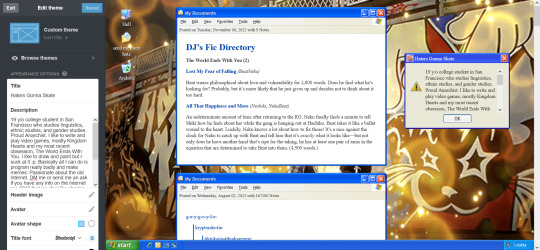
Just use the left sidebar to make any changes you might want to make to your theme in there. The theme description should've listed everything you can customize before downloading, and it'll all be right there in that menu! Most themes will let you change the color, images, backgrounds, links, music, or any other custom features to your heart's content through those controls. And if you're still unsatisfied, you can open up your blog's HTML file by clicking the edit HTML tab at the top of the left sidebar. Make sure you read some basic guides on code insertion if you do, though. It can be a little tricky to reverse garbage code if you put it in the wrong place.
Let me know if I can do anything else, anon! Good luck and happy customizing!

13 notes
·
View notes
Text
App Development frameworks
How do the most popular app development frameworks contribute to mobile app development?
In today’s digital landscape, mobile applications (app development frameworks) have become a necessity for businesses to reach their target audience effectively. With the ever-growing demand for innovative and user-friendly mobile applications, developers are constantly seeking efficient ways to build high-quality applications in very little time. This is where mobile app development frameworks come into play. The frameworks provide a foundation for developers to create cross-platform mobile applications that work seamlessly across various devices and OSes.
Development Frameworks Used for Developing Mobile Applications
Most popular app development frameworks
React Native (developed by Facebook) — This framework has gained immense popularity among developers due to its ability to build native-like mobile apps using JavaScript. It allows them to write the codes once and deploy them on both Android and iOS platforms. Hire React Native developers to obtain cross-platform mobile app solutions for iOS, Android, and the web and enjoy benefits like reduced costs and time and enhanced productivity and profitability. app development frameworks
Flutter (backed by Google) — Flutter uses the Dart programming language and provides a rich set of customizable widgets, enabling developers to create visually appealing and responsive applications. Its hot reload feature helps the developers change the codes in real time and obtain immediate visual updates. If you opt to hire Flutter developers, your cross-platform applications will have a quicker time-to-market with a single codebase for all the platforms. app development frameworks
Ionic (open-source framework) — It uses technologies like HTML, CSS, and JavaScript in the development of cross-platform mobile applications. It enables developers to provide end users with a consistent user experience across multiple platforms. It will be a smart choice to hire Ionic developers when it comes to obtaining a feature-rich cross-platform mobile application. app development frameworks
Kotlin (open source, originated at JetBrains) — This is another app development framework that allows developers to share codes between Android and iOS platforms. It seamlessly works with Android Jetpacks (a tool provided by Google). Hire Kotlin developers to enjoy improved app performance and a better user experience with access to modern technologies. app development frameworks
Hire Experts
In today’s mobile-driven world, mobile app development has become a crucial aspect of achieving business success. Hiring the right mobile app developer is essential to obtaining a high-quality application. With various frameworks available, such as React Native, Flutter, Ionic, and Kotlin, selecting the ideal developer can be challenging. A skilled developer can help you cut down on the cost of application development. Correspondingly, it will lead to an increase in the ROI value. Hire the best developers from WEBSTEP Technologies. Visit https://www.webstep.in to obtain more information and connect with them to acquire a cutting-edge mobile solution for your business. app development frameworks
2 notes
·
View notes
Text
Candy Hearts Bingo 2024
The Candy Hearts 2024 collection is finally revealed, and many of us love to read more than just our own gifts and treats. If gamification is your thing, why not enhance your Candy Hearts reading experience with a fun challenge?
Candy Hearts Bingo
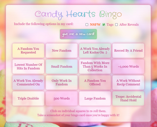
With this bingo card generator, you can generate your own Candy Hearts Reading Bingo Card and try to finish it over a timespan of your choice. If you like, you can challenge yourself to not only reading the fics, but also commenting on them.
There are no fanfic/fandom/exchange-negative or bashing items in the lists. This bingo card is meant to be a positive experience and celebrate fanfiction and fanworks in general, and Valentine's Day and Candy Hearts in specific.
Screenshot of the mobile version and instructions and such under the cut! :D
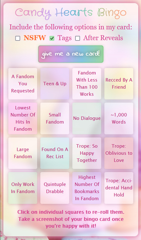
How to Play
Generate a new bingo card until you're (mostly) happy with the results. If some fields are duplicates or contain items you don't want to have in your card, you can then re-roll every single bingo field separately by clicking/tapping on it. If you have JavaScript enabled, you can also switch between the bingo fields with [Tab] and re-roll them with [Enter]. Once you have a card that fits your reading habits (or that takes you out of your comfort zone, if you want to challenge yourself), take a screenshot of the card to keep it.
Closing the page and reloading it will reset the card.
Cross off the bingo fields on your screenshot as you read (or read and comment on) fics that you think count for a field.
Items like "Fandom with over 500 works" mean works in the fandom tag, not in the collection. There are specific versions for the number of works in the collection. Items like "Fandom with over 1,000 works" doesn't mean qualifying works. There are specific versions for the number of qualifying works. Items like "Highest number of hits in fandom" or similar however mean in this collection, not in the fandom tag.
If a work you read has a tag that's similar but not identical to a tag on your card, let it count. There were some almost-duplicates that I trimmed.
The Lists
Canon (options like canon released this year, book fandom, etc)
Category (the AO3 categories and their platonic versions: F/F, F & F, Gen, etc)
Creator (only if you checked the "After Reveals" box; options like favourite author, mutuals, etc)
Discovery (various ways you could've found a fic)
Fandom (options like tiny fandom, uncategorised fandom)
Length (wordcounts from drabble to 30k)
Meta (a fic's front-end and stats, also "citrus scale for rating" xD)
Reader (your relationship with the fic; is it your comfort fic, or your first fic in a fandom?)
Style (chatfic, iambic pentameter, custom workskin, stuff like that)
Tag Roughly 1,500 tags from the 2024 main collection)
Trope (roughly 100 tropes)
What do the Checkboxes Mean?
NSFW is basically what it says on the tin. If you tick this box, the NSFW tropes will be added to the mix. If you also ticked the Tags box, NSFW tags will be added.
Tags is also what it says on the tin. It's a list with currently roughly 1,500 tags from the Candy Hearts 2024 main collection. Around 200 of them are currently marked NSFW and can only be generated if you ticked both the NSFW box and the Tags box.
After Reveals includes items that only make sense after creator reveals, such as "work by last year's recipient" or "creator is your Tumblr mutual".
Leaving the NSFW checkbox unchecked should remove all NSFW tags and tropes, but you could still come across content you find objectionable. Leaving the Tags checkbox unchecked removes all tags, but you could still come across tropes you find objectionable.
This bingo generator can be used to generate totally safe-for-work or family-friendly bingo cards, but it was created by an adult with an adult audience in mind.
If you run into any issues or come across any bugs, please let me know. If you find something that should be in the NSFW category, but isn't, please also let me know. It's possible that I missed a few tags when I worked through the list of over 1,600 tags in the collection. Please don't ask me to remove content you find objectionable. If there's anything unclear, feel free to ask! I'll try to get back to you as soon as possible, but please understand if it takes a while; it's a busy time for all of us. :D
Just FYI, the platform I'm using, Perchance, recently added AI options for their generators. This is a regrettable decision that I don't condone, and I'd like to emphasise that this generator is 100% handcrafted chaos. It's possible that the site asks you to disable your adblocker to be able to load properly. There are exactly zero ads on any of my generators and it's safe for you to allowlist Perchance.org for using this bingo generator.
This generator is based on my Fanfiction Reading Bingo and my Yuletide Bingo; which I made as little practice pieces for funsies. It's responsive, which means it should work on desktop and mobile. The mobile layout isn't ideal yet; I'm trying my best to make it better (but I'd also still consider myself a newbie and I'm learning by doing).
The background image is an edited version of this photo by Laura Ockel on Unsplash.
I hope you'll find as much fun in using this generator as I found in making it! <3
5 notes
·
View notes
Text
Importance of MERN Stack
What is MERN Stack?
Four essential technologies make up the full-stack JavaScript framework MERN Stack:
MongoDB: A NoSQL database system known for its flexibility and scalability, MongoDB stores data in a JSON-like format, making it ideal for handling large volumes of data.
Express.js: A minimalist web application framework for Node.js, Express.js simplifies the process of building robust and scalable web applications by providing a set of features for web and mobile applications.
React.js: Developed by Facebook, React.js is a powerful JavaScript library for building interactive user interfaces. Its component-based architecture allows developers to create reusable UI components, resulting in a more modular and maintainable codebase.
Node.js: A server-side JavaScript runtime environment, Node.js enables developers to build fast and scalable network applications. With its event-driven, non-blocking I/O model, Node.js is well-suited for building real-time web applications.
Why Choose MERN Stack?
Streamlined Development: With MERN Stack, developers can leverage the power of JavaScript across the entire development stack, from frontend to backend. This unified approach reduces development time and eliminates the need to switch between different programming languages and frameworks.
SEO-Friendly Architecture: MERN Stack's server-side rendering capabilities, coupled with its support for modern JavaScript frameworks like React.js, make it highly SEO-friendly. This ensures that web applications built with MERN Stack are easily discoverable by search engines, leading to improved search engine rankings and increased organic traffic.
Optimized Performance: MERN Stack's asynchronous, non-blocking architecture allows for seamless communication between frontend, backend, and database components, resulting in faster response times and improved performance. This translates to a smoother user experience and higher customer satisfaction.
Improved Security: In today's digital environment, security is of the highest priority. MERN Stack provides built-in security features, such as authentication and authorization mechanisms, as well as support for encryption and data validation, to ensure that web applications are protected against common security threats.
Scalability and Flexibility: Whether you're building a small-scale application or a large-scale enterprise solution, MERN Stack offers the scalability and flexibility you need to grow and adapt to changing business requirements. With its modular architecture and support for microservices, MERN Stack allows for easy scaling and maintenance of complex applications.
Getting Started with MERN Stack
Are you prepared to explore the MERN Stack world? Here is a detailed how-to for getting started:
Install Node.js: Begin by installing Node.js, which includes npm (Node Package Manager), on your local machine. Node.js will serve as the runtime environment for your server-side code.
Set Up MongoDB: Install MongoDB, a NoSQL database system, and set up a local or remote MongoDB instance to store your application data.
Create an Express.js Server: Use Express.js to create a server-side application that will handle HTTP requests and serve as the backend for your web application.
Build Your React.js Frontend: Use React.js to create a client-side application that will handle user interface interactions and communicate with the backend server.
Integrate MongoDB with Express.js: Connect your Express.js server to your MongoDB database using Mongoose, a MongoDB object modeling tool for Node.js.
Deploy Your Application: Once your application is complete, deploy it to a hosting provider of your choice to make it accessible to users worldwide.
Conclusion
MERN Stack offers a powerful and versatile framework for building modern web applications that are fast, scalable, and secure. Whether you're a seasoned developer or just getting started, MERN Stack provides the tools and resources you need to bring your ideas to life. So why wait? Start exploring the endless possibilities of MERN Stack today and unlock the potential of your web development projects with Meander Training, Meander training is a platform where you can start your web development journey, it provides industrial training with certification.
1 note
·
View note
Text
How to design Interactive Web Design in best price?
Designing an interactive web design on a budget requires careful planning, creativity, and efficient use of resources. In this guide, I'll provide you with a step-by-step approach to creating an engaging and interactive web design within the best price constraints.
Interactive web design is a powerful tool for creating memorable and effective online experiences that benefit both users and businesses alike. As technology continues to evolve, web designers must keep innovating and adapting interactive elements to cater to the ever-changing expectations of users.
Set Clear Goals and Scope
Before starting any project, define your goals and project scope. Understand the purpose of the Interactive Websites, its target audience, and the specific Interactive Websites elements you want to include. Having a clear vision will help you stay focused and avoid unnecessary expenses.
Choose the Right Platform and Tools
Select a web development platform that aligns with your budget and requirements. Popular cost-effective options include WordPress, Joomla, or using a website builder like Wix or Squarespace. These platforms often come with built-in interactive features and templates that can save you time and money. Utilize free or affordable design tools like Canva or GIMP for graphics and image editing.
Responsive Design
Ensure your web design is responsive, meaning it adapts to different screen sizes and devices. Responsive Interactive Websites design eliminates the need for separate mobile versions, reducing development costs.
Minimalistic Design Approach
Embrace a minimalistic design approach that focuses on simplicity and clean aesthetics. Fewer design elements mean less time spent on development and lower costs. Use negative space effectively and choose a cohesive color palette to create an elegant yet cost-efficient design.
Open-Source Templates and Themes
Explore free and open-source website templates and themes available online. Platforms like WordPress offer a wide range of themes with Interactive Websites elements that can be customized to suit your needs, saving you both time and money.
DIY vs. Hiring Professionals
Assess your skills and expertise in Interactive Websites and development. If you have the required knowledge, consider doing some parts of the design yourself. For complex interactive features, like animations or custom coding, it may be worth hiring freelancers or a web development agency. Compare prices and portfolios to find the best fit for your budget.
Optimize for Performance
Performance optimization is crucial for user experience and search engine rankings. Compress images, minify CSS and JavaScript, and enable caching to reduce loading times. Faster-loading pages often lead to higher engagement and conversion rates with your Interactive Websites.
User-First Approach
Place user experience at the forefront of your design. Ensure that Interactive Websites elements enhance usability and engagement, rather than complicating the navigation. Conduct user testing and gather feedback to refine your design iteratively.
Integrate Social Media
Use social media integrations to increase user engagement and expand your online presence. Social media plugins and sharing buttons can be easily added to your Interactive Websites for little to no cost.
Educational Content and Tutorials
Create educational content and Interactive Websites tutorials that provide value to your audience. Informative videos, infographics, and interactive guides can be cost-effective ways to engage users and establish your expertise.
Continuous Maintenance and Updates
Regularly update and maintain your website to ensure it stays relevant and functional. Promptly fix any bugs or issues that arise to avoid costly repairs in the future.
Therefore creating an interactive web design on a budget requires smart decision-making and resourceful use of available tools and platforms. By following these guidelines and maintaining a user-centric approach, you can design an engaging website without breaking the bank. Remember to regularly evaluate the performance and user feedback to make improvements over time.
Interactive Web Design
Interactive web design refers to the process of creating web pages or applications that engage users and allow them to interact with the content and functionality. The primary goal of interactive web design is to enhance user experience, encourage user participation, and make the website or web application more enjoyable and effective.
Key Elements of Interactive Web Design:
User Interface (UI): The UI is the visual and Interactive Websites elements of the website that users interact with, such as buttons, menus, forms, and navigation. A well-designed UI makes it easy for users to understand and use the website's features.
User Experience (UX): UX focuses on creating a positive and seamless experience for users while they interact with the website. This involves considering user needs, preferences, and behaviors to design intuitive and efficient interactions.
Animation and Transitions: Adding subtle animations and transitions to elements can make the website feel more dynamic and responsive. However, it's essential not to overdo it, as excessive animation can lead to a cluttered and distracting experience.
Responsiveness: Interactive web design should adapt to different devices and screen sizes. This means the website should be mobile-friendly and work well on various devices, including smartphones, tablets, and desktop computers.
Feedback and Validation: Providing real-time feedback to users when they interact with elements like forms or buttons helps them understand their actions and prevents errors. Validation messages for form inputs are crucial to guide users and reduce frustration.
Microinteractions: These are small, subtle interactions that serve a specific purpose, such as liking a post, clicking a button, or expanding a menu. Microinteractions add a sense of delight and engagement to the user experience.
Scroll and Parallax Effects: Scrolling can be used creatively to enhance storytelling or to trigger animations and effects as users move down the page. Parallax effects, where background elements move at a different speed than foreground elements, can create a sense of depth and immersion.
Gamification: Incorporating game-like elements, such as points, badges, or progress bars, can make the website more fun and encourage users to explore and engage with the content.
Multimedia Elements: Using images, videos, audio, and interactive elements like sliders and carousels can make the website more engaging and visually appealing.
Personalization: Tailoring the user experience based on individual preferences and behavior can make the website feel more relevant and user-centric.
Remember that interactive web design should not sacrifice usability and accessibility for the sake of novelty. The goal is to strike a balance between creativity and user-friendliness, ensuring that all visitors can easily interact with and enjoy the website.
Interactive web design is a powerful and essential approach to creating engaging and user-friendly websites. By incorporating interactive elements, such as animations, hover effects, interactive forms, and dynamic content, web designers can enhance the user experience and encourage visitors to stay longer on the site.
One of the key benefits of interactive web design is its ability to create a more memorable and enjoyable browsing experience. Users are more likely to connect with a website that responds to their actions and provides instant feedback. This increased engagement can lead to higher user retention, increased conversions, and improved brand perception.
Furthermore, interactive web design plays a crucial role in keeping up with the ever-evolving digital landscape. As technology advances and user expectations grow, static and traditional web designs may fall short in delivering the desired user experience. By embracing interactive design principles, websites can adapt to various devices and cater to different user preferences, ensuring they remain relevant and competitive in the online space.
Additionally, interactive web design fosters better communication and interaction between businesses and their customers. Through interactive elements like chatbots, feedback forms, and interactive product showcases, companies can gather valuable insights, understand their audience better, and provide personalized solutions to their users' needs.
However, while interactive web design can be highly beneficial, it should be approached with care. Overloading a website with unnecessary animations or complex interactions can lead to slow loading times and a cluttered user interface, which can be counterproductive and frustrating for users. Thus, striking the right balance between functionality, aesthetics, and user-friendliness is crucial.
Interactive web design is a vital component of modern web development that can significantly impact user engagement, brand perception, and business success. By creating dynamic, user-centric, and visually appealing experiences, web designers can elevate their websites and ensure they stay ahead in an increasingly competitive digital world.
2 notes
·
View notes
Text
Several people asked how to use this userscript on mobile, and also how to modify it for darkmode, so I will do my best to explain!
Installing Userscripts on Mobile
FIRST: Make sure you are using a mobile web browser which supports installing extensions or supports userscripts. I use Firefox for Android, so that's what these directions will be for, but there are a few other options that might work if you are on iOS or elsewhere.
In Firefox for Android, open the options menu > Add-ons, and select the Add-ons Manager. In the list of recommended Add-ons, find Tampermonkey and install/enable it.
Go back to the Add-ons menu and tap Tampermonkey. You can use Tampermonkey's search function to find the userscript, or simply go to the userscript's GreasyFork link and install it from there.
Repeat with any other userscripts you'd like to install! Searching "AO3" on GreasyFork can turn up some fun options, and AO3 themselves link to a few in this guide.
✅ The userscript is now installed! You can go on and use the script on AO3 now as OP described. Everything after this is just optional tweaks, mostly cosmetic.
Further tweaks...
Note: All of the tweaks below also work for desktop.
Optional: Modify AO3 Floating Comment Box for Darkmode
By default, the background of the input text box is white and doesn't change with your browser/phone settings. Fortunately, a quick edit fixes this. (Note: you can also do this same kind of edit if you use this userscript in a computer browser. The code change is the same.)
Open the Tampermonkey add-on and navigate to settings.
Select the Installed Userscripts tag, then tap the "Edit" button on AO3 Floating Comment Box (the little pencil and paper)
This will open the code editor. It might look like a bunch of nonsense unless you're already familiar with JavaScript/userscripts, but don't be intimidated: we're just finding one word and changing it!
At the top of the editor, click Find. Search for white
You will see the following chunk of code:
".float-box": { "min-height": "70%", "max-width": "98%", "background-color": "white" },
replace white with 333 (i.e., changing the color of the background of the text box from white to a dark grey). Make sure you don't accidentally alter any of the punctuation!
-> if you want it to be a different color than the one I picked, you can use an HTML Color Picker or names list to get the hexadecimal code or official name for the color you want. (Don't include the #)
Close the Find dialogue, then at the top, select File > Save. All done!
In your browser, open a works page on AO3 and open the floating comment box to check that the result was what you wanted.
Other Optional Tweaks
---- FOR AUTHORS: Ensure that the script doesn't try to modify the New Works page:
Toward the top of the script, in the header/settings section, immediately below the //include line, add:
// @exclude *://archiveofourown.org/works/new
----- Add the AO3 logo as an icon for the script:
Toward the top of the script, in the header/settings section, immediately above the // @namespace line, add:
// @icon https://archiveofourown.org/favicon.ico
---- Make the text box take up less vertical room on your screen:
under const allStyles, in the float-div section, change "height = 30%" to "height = 20%"
(you can also play around with these numbers to tweak it to your preferences)
Mentions for the folks who @-ed me: @inahc3 @harleyqueerner @sunset-diamond @fuctacles
Hope this helps!
(edited for clarity 2023-11-03)
In the spirit of encouraging people to comment on fanfics while also making it easier to do so, I feel obliged to share a browser extension for ao3 that has quite literally revolutionized the comment game for me.
I present to you: the floating ao3 comment box!
From what I've seen, a big problem for many people is that once you reach the comments at the bottom of a fic, your memory of it miraculously disappears. Anything you wanted to say is stuck ten paragraphs ago, and you barely remember what you thought while reading. This fixes that!
I'll give a little explanation on the features and how it works, but if you want to skip all that, here's the link.
The extension is visible as a small blue box in the upper left corner.
(Side note: The green colouring is not from the extension, that's me.)

If you click on it, you open a comment box window at the bottom of your screen but not at the bottom of the fic. I opened my own fic for demonstrative purposes.

The website also gives explanations on how exactly it functions, but I'll summarize regardless.
insert selection -> if you highlight a sentence in the fic it will be added in italics to the comment box
add to comment box -> once you're done writing your comment, you click this button and the entire thing will automatically copied to the ao3 comment box
delete -> self explanatory
on mulitchapter fics, you will be given the option to either add the comment to just the current chapter or the entire fic
The best part? You can simply close the window the same way you opened it and your progress will automatically be saved. So you can open it, comment on a paragraph, and then close it and keep reading without having the box in your face.
Comments are what keep writers going, and as both a writer and a reader, I think it's such an easy way of showing support and enthusiasm.
#ao3#ao3 userscripts#how to#ren gets technical#or something#AO3 Floating Comment Box#edited for clarity
78K notes
·
View notes
Text
Top Programming Languages for Web App Development in 2025

In 2025, Web App Development continues to evolve rapidly, with businesses seeking high-performing, scalable, and secure digital solutions. Whether you're a startup looking for MVP development or an enterprise modernizing legacy systems, choosing the right programming language can significantly affect your application's success. As a Web App Development Company in the UK, we understand that the tech stack determines not just performance but also the Web App Development Cost, team scalability, and future maintenance.
1. JavaScript and TypeScript: Still Reigning Supreme
JavaScript remains the backbone of modern web apps. Combined with powerful frameworks like React, Angular, or Vue.js, it ensures rich UI/UX experiences. TypeScript, a superset of JavaScript, has gained huge traction in 2025 due to its static typing and better scalability for larger projects. If you're planning to hire Web App Development developers, a JavaScript- or TypeScript-based stack is a safe, future-proof choice.
2. Python: Great for Rapid Development
Python continues to be a go-to choice for startups and SMEs due to its simplicity and wide community support. Frameworks like Django and Flask enable fast development with clean, maintainable code. Python is particularly useful for integrating AI and ML capabilities into web apps—an area many Web App Development companies are focusing on this year.
3. Ruby: Ideal for MVPs and Agile Web Development
Ruby, particularly Ruby on Rails, is still favored for rapid MVP development and agile web projects. It’s perfect for businesses that want to launch quickly and iterate based on user feedback. As a Web App Development Service, we often recommend Ruby to clients with evolving product visions and short go-to-market timelines.
Book an Appointment with Our Experts
Let’s discuss your project requirements, budget, and timeline to help you choose the best language and tech stack.
4. Go (Golang): The Performance-Oriented Choice
Go is gaining popularity for backend development where performance and concurrency are critical. Companies that need scalable microservices and high-performing APIs are increasingly turning to Go. If you're aiming to optimize backend speed without sacrificing developer productivity, Go is worth considering.
5. PHP (with Laravel): Still Relevant in 2025
While PHP may seem outdated to some, frameworks like Laravel have kept it modern and efficient. It's a solid option for content-driven websites, CRMs, and small to medium-sized web applications. Many Web App Development Companies still rely on PHP for specific types of projects due to its stability and large pool of available developers.
6. Kotlin and Swift (for Cross-Platform Web & Mobile)
Though traditionally mobile languages, Kotlin (with Kotlin Multiplatform) and Swift are now seeing some traction in full-stack and cross-platform environments. They are emerging in hybrid Web App Development Services where seamless interaction between mobile and web platforms is critical.
How to Choose the Right Language?
Choosing the right programming language depends on:
The type of application (MVP, enterprise-grade, eCommerce, etc.)
Your budget and timeline
Availability of developers
Long-term maintenance
That’s why working with an experienced Web App Development Company can make all the difference. A reliable partner will help balance tech choices with business goals and offer transparent Web App Development Cost estimates.
Whether you're looking to hire Web App Development developers for a custom solution or want a complete product built from scratch, it's crucial to align your language and framework choice with your growth strategy. Our Web App Development Company in the UK offers tailored Web App Development Services that fit your needs, budget, and long-term vision.
0 notes