#html how to put image. html how to change image size. html how to put images in a row. html how to center a row of images. html how to
Explore tagged Tumblr posts
Visit Tumblr Blog
Explore Tumblr blogs with no restrictions, modern design and the best experience.
Last Seen Tumblr Blogs


Fun Fact
US Tumblr user growth rate is estimated to slow down to 4.1%.
Text
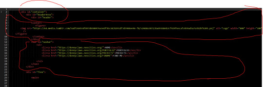
she's live

now you can see what everyones height is in my head because i refuse to download height sliders. look at ass <3
#also works on mobile btw ☝️ !!#me successfully making this is proof you can achieve anything with 500 google searches#you should see my search history#html how to put image. html how to change image size. html how to put images in a row. html how to center a row of images. html how to#their pinterest boards are disabled at the moment because i need to make them look good before i share them#and most tags don't work yet because i'm too lazy to go back through my whole blog and tag almost 2 years worth of posts 😭#going to christen it by reblogging one of those dress up your sim prompt ask games#if i can find it#and then i'm going to get completely stuck into rufus and sawyers gameplay yessss i can't wait#leaving virgils gameplay forever i think because when rufus and sawyer have a kid i'm moving him in as the babysitter#would you believe me if i told you there is 0 cc clothes in this#i've fallen in love with maxis clothing recently idk what happened to me#besides roxys boots and virgils bag its a vanilla lookbook#thank you to everyone who voted on the poll yesterday btw#even though it was 50/50 the majority of the time it was up#it ended up 60/40 after an hour tho so i went with my fav macmahon lifestages instead of young adult stages!#goodnight <3
247 notes
·
View notes
Note
your oc website is SO SO SO SO INCREDIBLY COOL how the hell do you even start learning how to do this ?? if you learned how to do this by yourself online, are there any tutorials or resources you can share with us? was making this website free??
omg THANK YOU SO SOOOOOO MUCH!!! It makes me so happy to hear that folks like my little site. I code my site with Phoenix Code (for the live viewer and number dials) and I host my site on Neocities - it is all free. Phoenix can be used in browser or on desktop, but I like having it on desktop more for big projects in case my files get deleted. I use the browser version when I just want to test something quickly.
The 2 videos I use and can not recommend enough to anyone who asks me are this HTML tutorial and this CSS tutorial. They are simple and easy to understand, but I recommend watching it the first go, and then following along the next few watches until you get the flow of basic parts to a website, how they're organized, and what order they go in. At this point, I've memorized exactly where everything goes, and it is all thanks to these 2 videos.
If I am being honest, I learned how to code by myself, not quite even with online tutorials but just from being stupid and messing around myself (1, because I was a kid, and 2, because I didn't understand English very well to know what tutorials are saying.) I used to do html coding for Neopet pages when I was a kid with too much online time, first by just editing the default petpages and adding info and images, and then just doing trial and error with the html. I'll just try something and then if it doesn't turn out the way I want it, I try to find out why it didn't work and also get inspiration from other similar sites to figure out where things go or how they coded (with this nifty thing called right click > inspect page or right click > view page source). And BOOM, working webpage.
It was rudimentary, white blank background without any boxes or anything, you just scrolled down the page and sections were separated by a horizontal bar. OH and every text was centered! I had no idea how to make scrolling boxes or fancy assets, but damn I still had so much fun working on it every weekend. When you find authentic selfmade sites from the 90s and 2000s, most of them aren't super fancy either unlike what modern nostalgia makes you think. So I hope you don't feel discouraged if you begin making a website and feel it isn't "fancy", you're already doing a first big step which is making a webpage and learned your first set of html code!
It was over a decade later before I coded webpages with html again. I've gotten lazy and started relying on site builders, but nothing was quite as versatile as html. I wanted to try coding my own OC site again, so that was when I started working on OutKrop (the site I posted). Until I started coding again, I had literally no idea what CSS even is (and let me tell you, it's a game changer!)
Personally, I work best when I can do things hands on. I don't read through tutorials, I code first then go back and read through coding help sites like w3schools when I find myself stuck and unable to figure something out. Sometimes I grab existing codes and play around with them to see what changes and what I can do with it, cuz having visual context is what helps me a lot.
I can also share my process:
Once I gather up some ideas, I make a sketch, including what boxes (divs in css) should approximately go. It is very rough, but shows me exactly what I need to know.
Next I load up my coding app (Phoenix Code in my case) and "sketch" the layout. Nothing fancy going on here, just putting things where they need to be, and fixing size of boxes and margins if needed. I give my boxes all a background color so I can easily see how big they are and where they are located.

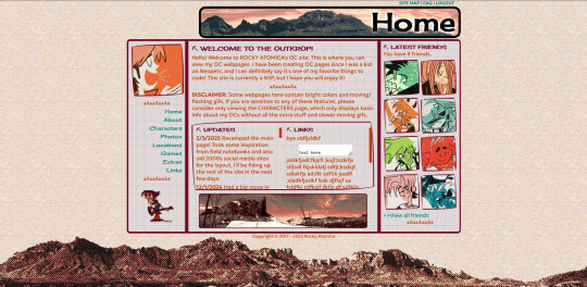
After some adjustments like moving stuff around and adding assets like backgrounds and images, and changing colors of the boxes, rounding off corners, etc., we get this!
so recap + additional useful sites I use:
Coding app: Phoenix Code
Site hosted on: Neocities
Video tutorials: HTML and CSS
Sites for learning code: w3schools, also lissa explains is a great site that is written for kids to learn html so it's easy to understand. Finally, sadgrl has a lot of great resources for coding as well!
I recommend looking through these sites AFTER you tried taking a spin at coding - it doesn't have to be anything fancy just follow the HTML video tutorial I linked!
Thanks for the ask, and I hope this helps you and many others out there who are interested in building a site with html/css! Don't be afraid to get things "wrong" or have an "un-fancy" site. This is how you learn to code, and it'll become so easy once you get the hang of it.
Anyone is always more than welcome to reach out for coding help and advice :-]
58 notes
·
View notes
Text
embedding images on ao3 (or at least how i do it)
step one - create a work skin
this is step is optional, technically, but it'll make for better viewing across different devices. go to your ao3 dash, and on the left menu (or the top menu if you're on mobile) you're going to click on 'skins'. click on 'my work skins', and then click on 'create work skin'. make sure that the type says work skin, and then put in a title. this is just for you, so it doesn't really matter what it is. then in the css box, you're going to copy and paste this exactly:
#workskin img {
max-width: 100%;
height: auto;
}
save it.
step two: host your image
you can't actually host images on ao3, and i don't recommend hosting them on tumblr either. you need a static link for the image and tumblr's are always subject to change. ive never been able to get drive to work for this either but that might just be user error, idk. when i need something hosted for ao3, i use dropbox personally. from here, the instructions are going to be with that in mind, other image hosters might be different.
upload your image and copy the permanent link.
step three: put your image in your wip
in your ao3 wip, scroll down to 'select work skin' and click on the skin that you made earlier
in the text editor itself, make sure that you have it set to rich text rather than html. place your cursor within the editor where you want the image to go and then click on insert/edit image. in the menu that comes up, you're going to paste your image link. if you're using dropbox to host, you have to change the dl=0 at the end of the link to raw=1. i'm not sure if this applies with other image hosters.
if you want to adjust the size of your image in this menu, make sure that the proportions are locked. there will be a little lock icon next to the width and height boxes. i usually size mine at around 750 to 800 on the longest/widest side but this piece is totally up to you. you can also click and drag the image size within the text editor itself, but if the image is very big this may be more difficult.
step four: profit
(for legal reasons this is a joke. thou shalt not profit from fanworks lest ip holders decide to get litigious)
#i was asked for some guidance on how to do this and this seemed like the easiest way to do it#i hope this is helpful#tutorial#how to
50 notes
·
View notes
Note
hi girl!! i was wondering how you do gradient text on your posts! i keep looking for tuts but all of them are using features that tumblr removed…. anyways, whenever you’re free, i’d love a tutorial! thank you!🩷🩷
OFC!! i got you bby!!
Go to image color picker (this is for the color of your words) and scroll down a little until you see ‘use your image’ and upload the photo to your choice for color theme! Once you’re done with picking your photo, you can choose a color out of the palette and copy it! (Pick two colors for the start and end color for your text!!)
After you copy it, you wanna head over to another website: stuffbydavid (this is where you’re gonna get the gradient style for your text!!) You’re gonna enter your text in the first box, then choose the way you want your gradient like (I usually use horizontal gradient!!)
After that, you’re gonna paste the hex code of your color you picked from the image color picker website and paste your end and start color in the slots. When you’re done with that and feel like it, you can choose your font, size and either have your text bold or italic. Your choice! (I usually just let it be)
After you got your text all ready, you want to scroll down and get the HTML code, NOT THE BBcode cause it will not work. You’re gonna copy the HTML code and there you have your gradient text ready to be pasted!
For this part, i’m gonna put a video for this one, but i’ll still explain it anyway :) So with this part, after you copied your HTML code, you’re gonna open your tumblr account on the website on a browser and go to create or if you have any asks, you can click ‘answer’ and begin the steps. Once you open a inbox or create a new one, you’re gonna click the setting icon (⚙️) on the top right corner and click it! After you do that, you scroll down to text editor and see that it’s set on ‘RICH TEXT’, you’re gonna change it to ‘HTML’ for your code. After you do that, you’re gonna paste your code in the blank spot and then click ‘preview’ and now you have your gradient text!!
6. Next you’re gonna change to ‘post now’ to ‘save as draft’ and exit out of the website to open the app back up and there, you should see the saved draft with your gradient text!!
Hope this helped bby🫶🏾
22 notes
·
View notes
Note
hey ! may i ask , how do u make ur text colours like fading ? ty
hello ! i'll try my best to explain how to do it.
first, i go to this website ! (click on this to open the website)
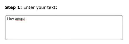
second, i input the text i want to be coloured with a gradient.
next, i change the colour effect from horizontal gradient to three-coloured gradient. this gives you room to select three colour hex codes you want your text to be coloured with.
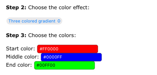
this step is completely optional ! you can make your text bold or italic and you can change the font and the size of the text. i personally do not change anything for my text.

you're almost done ! you will get to see the preview of your text show up on the screen so you can see how it looks after getting the gradient. make sure to copy the entire html code. for reference, it is the second code type on the website. i have provided the screenshot below.

next, open tumblr and select the post you would like to edit. click on the 'gear' option and change the the text editor from rich text to html. this step is very crucial or else your post won't have the coloured text! i have provided screenshots below for where these options are located on the website. i am not aware on how to do it on the app so i use the website instead.
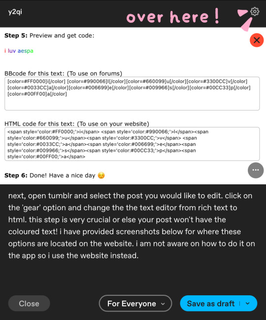

last step ! you paste the html code from your clipboard onto the html code you see on the screen. to make it easier to distinguish where to put it, i usually put a full stop so i know where i'm putting the text so that it does not appear between images. after clicking 'done', you may see the post has the images being stacked one on top another instead of next to each other. it is easy to fix this problem by rearranging the pictures to how it was before.

and voila ! now you have a post with the faded text. i hope this helped !
64 notes
·
View notes
Note
Hi!! I just reed the last chapter of EMC and by the gods!!! I LOVE IT!! The newspaper format?!? FUCKING AMAZING!!! I do want to ask how you did it? I knew you could do many things in ao3, but that?! You're so creative!!!
🥰🥰🥰
Thank-you so much!! As the texts in ECM would probably suggest, I really love mixing up the narrative with these kinds of things (I did something similar in my other fic, A Permanent Fixture).
I used Work skins and CSS for the formatting - nothing ground-breaking! Just fonts. That and using the H1, H2 and H3 headings in AO3's html. I will not claim anything more than slightly above average skills at this stuff!!
This is the CSS I used for the fonts with the work skin:
#workskin .News-name { font-size: 200%; font-family: Old English Text MT, Copper Plate Gothic Bold, Rockwell Extra Bold, serif; }
#workskin .font-serif { font-family: Georgia, Cambria, Constantia, Palatino, serif; }
Here's AO3s guidance on work skins
Here's a bunch of tutorials on the amazing things you can do with skins!
Honestly it took me ages! Mostly because there was a lot of hit 'preview', check, hit 'edit', change CSS/HTML, rinse and repeat while growing increasingly more irate.
I tried a billion times to do something with the images: I wanted them aligned with the text, but also needed the caption to float with it. However my abilities are relatively limited and AO3's HTML coding is equally limited so in the end I gave up and just added the captions onto the image in paint lmao. Paint these days lets you save with transparencies, which is a nice thing to know! But that's why the font in the captions is big and looks a little funny.
If you want to know how to get text to wrap around an image, then you do this:
<img src="IMAGE URL" alt="TITLE OF YOUR IMAGE" width="x" height="Y" align="right/left" />
(the underlined bit is what you add to put in the alignment)
It's not perfect: the text sticks tightly to the image when it wraps, which is why they're both aligned to the right so it was harder to notice, but it works well enough. I know you can use CSS and work skins to give the image a bit of a border, but by that point I was getting the shits and figured it was good enough lol.
I would note that skins sometimes don't work on things like phones (for instance, on my phone the Old English font doesn't appear for the name of the newspaper)!
Hope this is helpful!
#existential crisis mode#work skins ao3#they're cool#but also very conducive to me tearing out my hair
21 notes
·
View notes
Note
sorry if you’ve answered something similar before but how do you format things for your website? in the collections you have for poems
i love how it looks. the book kind of format it has
and i want to do similar/the same formatting for my own works but im really struggling…
i've been asked stuff like this a lot and i don't mind explaining it often because i want people to make websites more. i made a tutorial video at some point but it's kind of hard to make a curriculum or tutorial or whatever around this kind of thing because it's really just a self expression thing. i'll try to break down as much of my thought process as makes sense.
i design my pages in photoshop with either double/single page display in mind and then i use html to set them next to each other. most of the choice here comes down to how overwhelming i want my designs to feel. in the case of the lonely leaver page, the entire book was designed to be something that could be a physical book, and so from the getgo i made the pages in that kind of format. i previewed things in acrobat which has a booklet view mode (which singles out the front and back cover around the contents of the file) & allows you to process double page view as well. as for the actual process in photoshop before that point, i typically will open a canvas that is the size of the full 2 page spread (i.e. 8 inches wide for 2 pages which are both 4 inches wide) and i set grid lines for bleed margins and to mark the center of the page so that i can make the composition something that im comfortable with having a gap in the middle from the book folding. with lonely leaver i had to reformat about half the book at some point because i wanted to make it a larger resolution which was annoying but i just keep my guidelines for a print size in mind while im working. often if im a certain amount of time into a project that i feel like i will be spending a lot more time with i'll create a dummy psd file at this point which is devoid of content but which has all of the margins/resolution stuff set up already so i can just open that up and save a different version of it when i'm done.
my actual writing process and my design process is generally extremely intertwined, that's why things tend to be varying degrees stream of conscious in my work i think. i'll for instance, have a thought im stuck on for several days, and then open photoshop without having a poem or comic in mind, but i'll fill the canvas with some kind of color like red or yellow or a photo or whatever, and then open a text box or start drawing. telling a story through composition (i.e. page layout itself) is generally my favorite aspect of art and design because i enjoy how violent and dramatic framing angles can make the content of a piece feel so i'll try to move stuff around as much as possible in order to get my desired effect, often times using place holder shapes in lieu of finished design elements in order to get a rough blocking. as i do this i tend to react to what i'm writing/making as i'm doing it, and i do a lot of selective self editing during this part. for instance, i'll start manipulating rasterized text or cutting around images or whatever. i'll reread and look at whatever im doing for a couple of hours and then when i'm done with a spread or whatever i will save the document as a psd with a combined full spread and then each page separately as pngs or whatever (split at the middle grid line, back to the example, i'll save 2 different 4 inch wide images by changing the canvas size).
when it's time for me to put stuff on my website i then batch convert whatever pngs i exported into webp's because they load faster and take up less space on the server/my computer. you can look at my direct html/css files in your internet browser's explorer mode to see exactly what i do but essentially i just have either 1 or 2 images in a block and then a series of repeating vertical blocks containing images. i don't have an extremely efficient way of uploading pages and i'll typically just copy the same
"<p><img src="01.png"> <p><img src="02.png">"
like, 30 or 40 times or whatever into a html document. i use visual studio code for this stuff because it lets me do a bunch of stuff like having several files open at once & the navigation pane is nice & there's a live server extension that automatically refereshes the html file in my web browser on file save which is really awesome. i have a css page that i made like, 5 years ago, and i usually just link new projects to that because it has a bunch of different settings in it which i'll toggle on or off depending on the needs of whatever page or i'll add new div id's to it. it's kind of messy at this point, but it gets the job done. i use filezilla and something like bluehost or something for webhosting/file management.
i arrange and organize all of my art extremely methodically so usually in my like "<root catch all poetry folder>" inside of my "<root catch all art folder>" there will be a "<name of specific poem book>" folder which just contains the poems named by their actual name e.g. "dedication to saint eulalia 4.png" and then another folder inside of that is called "paginated" where i, using the acrobat document i arrange stuff in as reference, rename copies of my pages which i have placed in that folder to be named things like "01.png" so that i can then manually flip through it sequentially in the windows photo viewer and also just so that i don't have to go through the arduous process of renaming and tracking stuff inside of the root folder i'm containing that project's files in.
i'm 26 now and i made my first website when i was like 18, and my first zine project and i'm tired of feeling feeling around that same time, so i've got like, coming up on a decade of trial and error behind this and this is generally what has worked for me. my website isn't super complicated and mostly just gets the job done but because i try to think about style and presentation up front with whatever projects i'm doing i tend to just make plans based around that as early as it makes sense. to me having a website for art presentation has always been the Primary Method and intended landing zone for my art so it's genuinely always been a consideration in my process to try to plan around how i will put it on my website. i do this because i believe having my own curated space for containing my art allows it to exist in a context which best heightens whatever message i'm trying to convey. if there's an issues with my website right now they are that i'm very bad at mobile browser formatting & i havent updated the main look of the website in something like 4 years barely at all.
anyway, at the end of the day i think really as long as you can identify whatever your intentions are and do some planning/problem solving around that you should probably be able to find your own method which works for you better than mine might but if you do just want to copy my website the tools to do so are within your brain and internet searches and i believe in you. i think the biggest strength of my website is that it shows how easy it is to just put art big as fuck on a webpage and how effective that kind of minimalism can be. i just want my website to be like a museum's walls. and it's not super complicated to get to that level of html knowledge.
11 notes
·
View notes
Note
Previous anon here! I would love to read how you did it. Im suprised you managed to did it in Google Docs. I thought you used a program similar to InDesign or programs that are more suitable for graphic design ANYWAY i am also curious how many chapters you used. Was it seven? Did you stop there because the length was convinient or because a story arc ended there? I am not really good at identifying where an arc begins and stops. okay bcgjkkcj THANK YOU FOR YOUR TIME
YAYYY I LOVE TALKING ABOUT ARTS AND CRAFTS!!
gonna put this in main tags as well this time so:
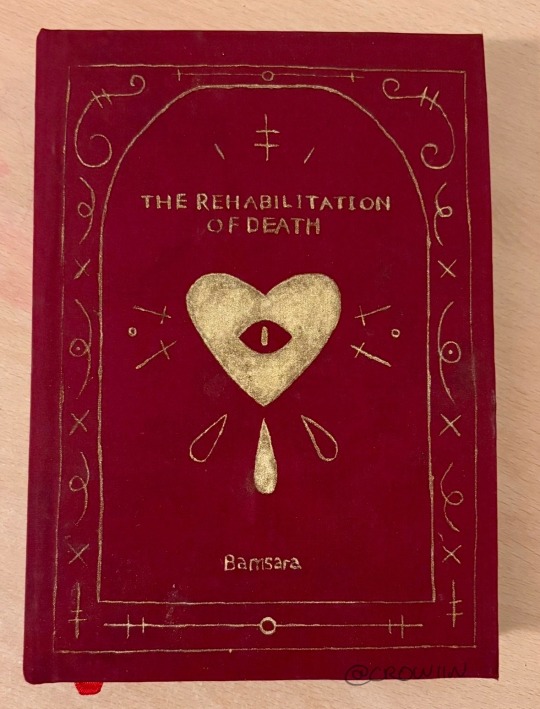
this is my bookbind of trod pt 1 :] by @bamsara which u can and SHOULD read here
ok so this first bit is how I made the pdf and then the next bit is how I turned it into signatures for binding. Then the last bit is splitting up chapters and stuff. If anyone has any advice or tips on what I could do differently (for free or v cheap haha) please let me know!! This is so fun I love learning and discussing and making things
first thing I did was grab a real book so I could take a look at where they put the title page, where they left the pages blank, etc
I then formatted the title and contents and stuff in docs by messing with font and position on the page (etc) until it was to my liking! THEN I realised I wanted an image on the very first page so I went back and put that in. I got to design it it was sooo fun
OH. I ALSO STUCK A SHAMURA QUOTE WHERE THE DEDICATION WOULD BE. HEHE
thennn I went and changed all the heading, title and normal text options for the doc so that they looked nice! I used times new roman size 16 :) but that might be a bit big for most people. I like bigger text
^^ that step was important so that when I started copy-pasting in the text it would all come out the right size automatically. also so that my chapter titles and notes pages looked consistent
next I downloaded trod from ao3 as a html file! I found it works better than pdf bc there aren’t any page breaks
I just copied and pasted trod in one chapter at a time and added in the notes and summary for every chapter where I wanted it and that worked pretty well for me
THEN SPELLCHECK. I didn’t want to do it automatically (docs had some horrible opinions sometimes. Also kept trying to erase bits of the writing style that made perfect sense and sound beautiful???) so I had to confirm every change which took a while but I think was worth it
lastly I added page numbers. They did not want to cooperate with me and I still do not understand the tiny fuckers, but I managed to get them in the middle of the page for book 2 so it looks less weird (hurrah). There’s a button for it
then I saved it as a pdf!
OK NEXT THING : SIGNATURES
this post is my bestest friend (link is to a tumblr post that was really helpful)
and this webpage is how I got a pdf of the signatures (it’s the same one linked in the post)
CHAPTERS:
yeah I split it into chunks of 7 chapters! Book 1 ends on the argument in the field bc a) it was getting wayyy too long and b) I want to lend it to my friends and that’s a delightful emotional cliffhanger. Book 2 (which is actually finished. I’ll try and post photos later today or something) ends after hekets release from purgatory which is I thiiiink another 7 chapters? Book 3 is gonna be a bit longer bc I want to do it up to the most recent chapter, which I was gonna leave out bc of length but then it came out and I went insane haha
OH in book 2 I did drop caps and title decoration which I designed in procreate and then imported into docs and moved around as imported photos. I’ll put a bunch of pictures at the end too
THANK U FOR ASKING!!! If there’s anything else u want to know then let me know!! :]


15 notes
·
View notes
Note
Have you got any good resources for men’s clothing in Ireland (or even Scotland) during about the 1400’s-1600’s?
I have been trying to find anything that can give me better insight so I can recreate the clothing but so far I’m mostly seeing cheap rubbish costumes that are very clearly the generic “medieval” style that everyone goes to when they want to convey a vibe but don’t feel like doing historic accuracy.
Not to say there’s anything wrong with that but I’d like to really impress people in future gatherings that pertain to this time period
This is a tough one, unfortunately. The 2 best books for this have been out of print for decades and now sell second hand for $100+ USD. Your best bet for getting a hold of them is interlibrary loan. Neither of these books contains sewing patterns or construction information. They are:
Old Irish and Highland Dress by H. F. McClintock, 1st ed. 1943, 2nd ed 1950
Dress in Ireland by Mairead Dunlevy, 1st ed 1989, 2nd ed. 1999
The one book I know of that's still in print is Before the Kilt: How the Irish and Scots Dressed in the 16th Century by Gerald A. John Kelly. I haven't actually read it. I've heard it has some issues with the images being low resolution (probably because it was printed by a small press), but it does contain good primary source research. The only place I know of that sells legitimate sewing patterns is Reconstructing History. I haven't actually bought any, but I have heard that their sewing directions are not the easiest to follow, and some people have issues with the size grading. Their patterns for the wool garments are all based off of extant period garments. Based on more recent research, I don't their léine patterns are completely correct, but they are at least better than some of the léine patterns out there. (Avoid anyone who tells you to put drawstrings in the tops of the sleeves or that a man's léine should be hip-length.)
Websites of reenactors and historical costumers who have put serious research into their outfits:
https://saffroncloth.wordpress.com/
https://www.wildeirishe.com/
http://matsukazesewing.blogspot.com/2014/06/16th-century-irish-dress_19.html
https://www.thelastprince.ie/
http://www.claiomh.ie/
A couple of decent videos on 16th-early 17th c Irish dress:
Traditional Irish Clothing in the Gaelic Period
Depicting and Describing Dress in Early Modern Ireland by Dr. Katherine Bond
If you're planning on doing the 16th c, definitely check out Susan Flavin's research. It has great information on what types of textiles, dyes, and trims that were available in 16th c. Ireland. You can download a pdf of her dissertation here.
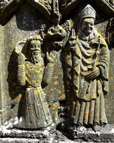
I'm sure you already know that 1400s-1600s is a long time period for dress history. Irish dress changed a lot during that period. If your goal is to make a single, well-researched outfit, I would recommend picking a period that's somewhere 1500s-1600. There are a lot fewer primary sources (extant garments, art, documents, etc) for 1400s Ireland. On the other hand if you enjoy making educated guesses, 1400s might be more fun. Just check out this neat 15th c. outfit from Strade Abbey, County Mayo:
If you have any more specific questions, feel free to ask. I can't guarantee I have answers, but I do have a bunch of random Irish-dress-history related articles for this period on my computer.
55 notes
·
View notes
Note
Ur website so cool!! ❤️❤️ Do you have by any chances coding tips? Been trying to make my own website for a while but adhd won't let me concentrate a second when it comes to learning coding
Thank you! And 100% It is deceptively approachable but also time consuming, I'm familiar enough with html from a highschool class where we did need to write code out by hand, and then soft practice with coding toyhou.se profiles and futzing around with free code snippets. Largely though I don't think you need to know everything or to write everything by hand, you just need to frankenstein code pieces together (As long as they're free ofc).
I used this first, it's fucking insanely handy and lets you make a simple layout with sidebars, navigation, header, footer and a body base ect, and then just generate and copy the code. The html itself also has greyed out little notes about what parts do what!
I'll be real the rest of it after that is just me googling what I want to do or googling html snippets bc I forgot them. So like html image link with size attributes ect ect, how to make a html image gallery. I don't use one site exclusively but w3schools.com has a bunch of common ones and also has a little live code editor in its tutorials.
Like I still get greatly stumped for hours bc code's kinda sensitive and one or two characters out of place will break sections of it especially when ur just frankensteining. Trying out little segments in live code editors is really helpful because you can kinda break it apart and diagnose the issue before putting it into your site html.
Also if it helps this is kind of how I break it down in my brain as another ADHD-er. so fuckign sorry for how this looks im doing it in snipping tool. But code bits love to live in cages even if it all looks the same, iit would also help if you clean your code up mine is pretty horrid but you just want to familiarize yourself with the little "Sections" ig that's where doing things by hand would help because you would 100% know what each chunk is for but yk yk.
CSS is a different beast I barely understand. The parts of code where it starts stacking on top instead of being horizontal is css and it's basically how you do fancier things to your code, it's linked to stuff you already have down. So like changing the background in the body text box or something, you can only do so much in there. Css targetting the body text box is where you can level it up. Again the sadgrl layout builder has notes so you're not completely blind in there. There's also 100% so many resources to explain what all these words mean, my mmethod is incredibly avoidant I don't know what flex is I haven't needed to fight her yet ect ect.

Sorry if this is confusing this is just my hack and slash understanding atm. Be humbled by code I've spent too long trying to fix up hysterical margin issues just because I had a random apostrophe somewhere or because I tried to spell it colour and not color ect.
33 notes
·
View notes
Note
Hi! Gonna start off and say that I love the work you're doing with the Welcome Home neocities website! It's perfectly stylized for the project/puppet show and I can see the work you're putting into it.
I'd love to learn how to make my own neocities website (for fun? For a personal project??), so I was wondering if you could provide some tips and/or pointers for a first-timer.
Thank you!
HAHA well first of all i'm flattered that someone would think i'm skilled enough to be giving pointers in the first place. i still consider myself a novice when it comes to web design (for example, if you're wondering why every page on welcome to welcome home has its own CSS, it's because CSS is Way harder for me to wrap my head around than HTML) so i can't give any Super advanced tips, but i can at least write about what's helped me so far:
GUIDES. neocities has its own tutorial and list of HTML/CSS resources, but user-made guides are your best friend when it comes to figuring out where to go from there. a.n. lucas and pauli kohberger both have really good guides for beginners, but for the more advanced stuff, i found myself referencing the resources on solaria's webspace and sadgrl.online the most. w3schools is also very helpful when it comes to answering more specific questions like "how do i use two different fonts on the same page?" (and probably more.) if all else fails, then usually just googling "how to (x) in HTML" or "how to (x) in CSS" will yield at least one useful result. for making your website more accessible, there's the accessible net directory and this masterpost by foxpunk on tumblr.
it sounds obvious, but it helps to have a solid idea of what kind of site you want to build before you actually dive in, and then snoop around on neocities to get an idea of how other users approach the same topic. for example, i got the idea to start a welcome home wiki on neocities after being reminded of the 8:11 wiki on the same site, and then i spent a couple days just looking up stuff like "wiki" or "fansite" on neocities and then clicking on any page that caught my attention to study it.
layouts! there's no shame in using a premade one, and you can even learn more about HTML/CSS in real time just by messing around with the base code before implementing any intentional changes. sadgrl.online's layout builder is a VERY popular choice, since you can already do a lot with the basic options it offers and it's easy to further customize once you have it set up on your page; it's what i used to make welcome to welcome home. sadgrl.online's webmaster links also feature a bunch of other options under the "layouts" tag, and if none of those work for you, then you can even find something just by looking up template/templates/layout/layouts/HTML/CSS on neocities itself.
side note: if you're reading this and you want to make a wiki then you can also use this wikitable code. it came out after i had already established the Look of welcome to welcome home, so i probably won't implement it any time soon, but i TOTALLY WOULD HAVE if it was around when i first set the site up.
you can scale images up or down using percentage, with 100% being the image's default size. i don't know how helpful or acceptable that is, but i use it a lot.
don't feel pressured to get everything done at once, even if you expect people to be visiting your site frequently. usually if you just slap on an "under construction" gif or even just write "hey this site is still under construction" then people will understand. i don't think i've ever seen anyone get super huffy about slow updates on neocities, anyway.
EDIT: OH. GRAPHICS. i mention all of these on welcome to welcome home's front page but i Also wanted to note them here: betty's graphics and websets by lynn both have HUGE collections of background tiles and other graphics that work especially well if you're going for that old web charm. i also like to use this mirror of patterncooler for backgrounds bc of the customization options. you can also make your own background tile and then use a seamless tile maker like this if all else fails.
EDIT 2: ALSO. obviously. do not be like me and use discord or any other chat client as a filehost, no matter how promising it looks, because one day you WILL get a very nasty surprise when the request signature on those urls expire and the images are no longer accessible on other sites. there are a myriad of other filehosts out there, but personally i recommend file garden (and also donating to file garden if you can, even if only for a couple months. i know i said that just yesterday, but if it gets more folks to subscribe then i'm gonna keep saying it.)
#imaginatorofthings#ask#welcome to welcome home#web design#? yeah i'll slap that tag on there why not#neocities
20 notes
·
View notes
Text
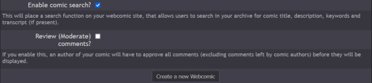
How do you publish a comic on ComicFury? A beginner's overview
So, you're on ComicFury, see all these cool comics and think you want to make one of your own? Worry not, it's actually pretty easy :D When you have signed up, got accostumed, even subscribed to a few comics, you can go to the "new webcomic site" page to get started
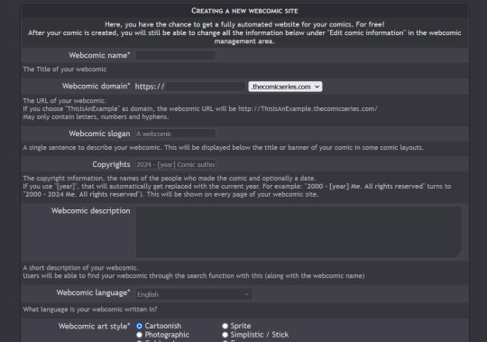
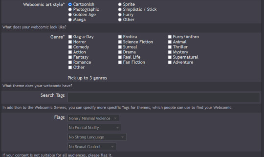
The screenshots cover the whole page, but I will summarize for you: you can chose title, description, slogan, language, style & genre, tags, content warnings and moderation settings (such as allowing comments and ratings)
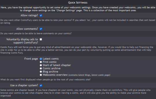
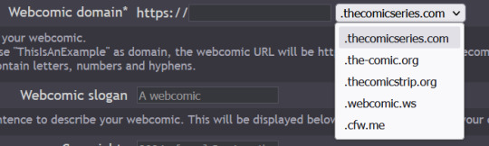
Additionally, you have five different domain options to pick from: .thecomicseries.com, .the-comic.org, .thecomicstrip.org, .webcomic.ws, and .cfw.me
Akin to tumblr's range of default themes to pick from, here you have to pick one default layout you will be able to customize later on (you can also work on the html if you're crafty enough)
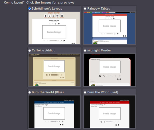
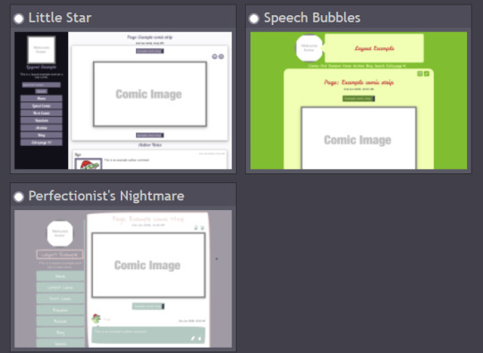
I personally picked "Rainbow Tables" because it already fits well enough the vibes of Wacky Races XD

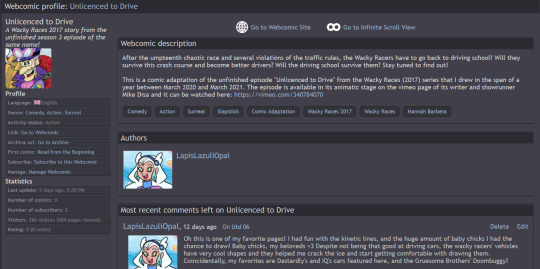
Once you're done, you will find your webcomic or webcomics (there's no limit on how many webcomic sites you can open as far as I know) in the "My Webcomics" page. Your webcomic will have, in addition, a profile page which will be the first thing people will see when they browse on comicfury
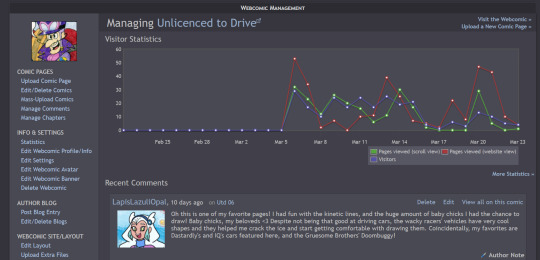
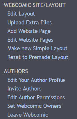
By clicking on "manage webcomic", you can do many things ranging from uploading/editing/scheduling pages to changing the website's layout
So now you want to upload some pages, right? Here we goooo
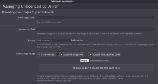
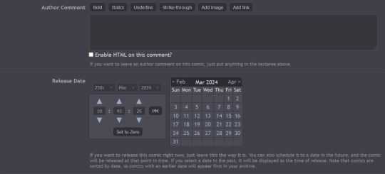
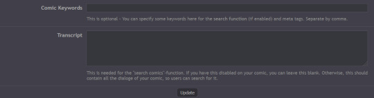
You have to pick a title for the page (could even be just Utd 01, 02 and so on), you can chose a chapter it will belong to (if you want to create chapters) then you can upload up to 12 images in the same page! But remember there's size limits: for multiple images it's maximum 2MB each, for a single image it's maxmimum 5MB. It supports png, gif, jpg and jpeg formats. After putting it some keywords that will make your comic easier to find and adding a transcript of the page if you want, you can upload your page!
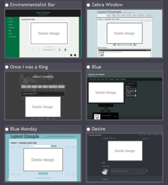
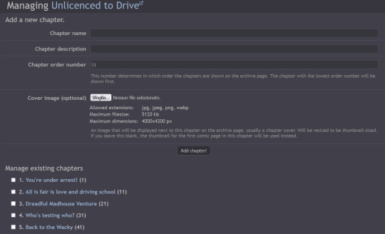
Here's how you can create chapters by clicking on "manage chapters", you pick a name and you can add a description and a cover (that's optional though) As you can see, I have five chapters on my comic for example
Now that you know the basis you can try it out yourself!! Mind you, it doesn't even have to be a comic, I've seen people create websites to host illustrations made for monthly challenges as well, or other webcomics can be made by photographing action figures, it can really be whatever you want! Have fun out there :D

#ComicFury#webcomics#how to use comicfury#I hope this can help anyone who wants to try out making a webcomic!#comic#webcomic#artists on tumblr#indie comics
6 notes
·
View notes
Note
Hnnnghh I was informed by tatp that u know about about coding wdgvbb any tips or whatever I’m trying to make a neocitys website or smthg
Since it's neocities website all you need is: HTML, CSS and maybe some graphics. As I said before I'm shit at explaining stuff but I will try my best. So here's "I want to make my own website" the basics!
HTML - markup language, the base of your websiteCSS - style of your website, can change color of html elements, size, font etc. I linked w3schools website since it's pretty easy to understand.Do you need to learn all of this before coding? No. I think it's the best to just check things that you need for your website. If you need to change background color of your website just find a w3schools tutorial on it or simply search for "how to change background color in css". You just should know html tags and basic attributes: id and class and how to link your css in html file so your style actually works! Neocities has it's own tutorials on html and css so you could check them out too! Neocities also has it's own code editor. You can edit everything in browser. I personally like to code in Visual Studio Code then just paste the code into Neocities editor. VS Code has a lot of addons (some of them are there by default) that make coding way easier for example: autocorrection of syntax errors and giving you suggestions!
Example: If you type html in vs code html file you will get 3 suggestions:
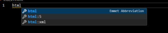
choose the html:5 one:
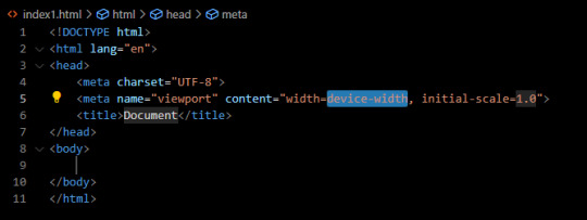
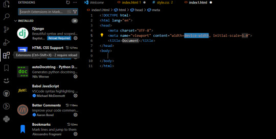
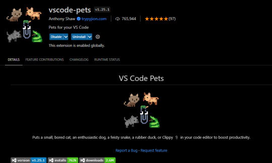
TAADAAAM!! VS Code just wrote the whole website structure for you! You can install more extensions here under extension section! There is this extension called vscode-pets it won't help you with coding but its really cute:
some yt tutorials: CINNIMANI (specifically for neocities), web coding playlist (this one is good for all websites in general); https://sadgrl.online if you were on neocities you probably saw her website. She has a lot of useful resources including image resources and also she made her own WEBSITE BUILDER or acutally layout builder! It's pretty simple website builder but still. If you are looking for premade layouts you can just search them on google or get sum from the website I linked ^__^ Uploading your website to neocities is really easy since all you need to do is to put all the files on there! I guess that's all for now. If you have any problems or questions just ask. I'm here to help ^^ websites with free to edit code: https://codepen.io, https://github.com
10 notes
·
View notes
Text
[post text: YOUR WEBSITE'S TITLE HERE
Going to put all this in its own post too by popular request: here's how you make your own website with no understanding of HTML code at all, no software, no backend, absolutely nothing but a text file and image files!
First get website server space of your own, like at NEOCITIES. The free version has enough room to host a whole fan page, your art, a simple comic series, whatever!
The link I've provided goes to a silly comic that will tell you how to save the page as an html file and make it into a page for your own site. The bare minimum of all you need to do with it is JUST THIS: /end ID]
[image ID: a creature explaining what to change after you save the html to make it your own website: “Guess what? The circled bits are all you ever need to change to make it your OWN PAGE” The sections circled in red are:
the text of the page's tab, between "head" and "title" tags. it says “YOUR WEBSITE'S TITLE HERE”; the full line is: <head><title>YOUR WEBSITE'S TITLE HERE</title><head>
a header for the page, between "h1" and "p" tags. it says “BIG, CENTERED TEXT”; the full line is: <h1><p style="font-size:40px">BIG, CENTERED TEXT</p><h1>
a link to the image files of the comic, between an "h1" tag and inside an "img." tag. it says “thisisntyourcomic.png”; the full line is: <h1><img src="thisisntyourcomic.png"></h1>
the three navigation links, each inside an "a" tag. the first link applies to the word “Previous”, the second applies to the word “Home”, and the third to the word “Next”; the first line is: <a href="001.html"><b>Previous</b></a> . the second line is: <a href="YOURWEBSITE.WHATEVER"><b>Home</b></a>&nps;&nps; . the third line is: <a href="001.html"><b>Next</b></a>
/end ID]
[post text: Change the titles, text, and image url's to whatever you want them to be, upload your image files and the html file together to your free website (or the same subfolder in that website), and now you have a webpage with those pictures on it. That's it!!!!!
.....But if you want to change some more super basic things about it, here's additional tips from the same terrible little guy: /end PT]
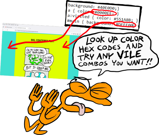
[image ID: the creature from before, explaining how to change the background colors: “AAH! It's extra stuff! Here's where you can change colors!” a few spots for hexcodes and code segments are circled and labelled. The lines of code are:
color: "#000000;" labelled “Font”
background: "#FFFFFF;" labelled “Background 1”
a { color: "#0000EE;" } labelled “Links”
a:visited { "color: #551A8B;" } labelled “Visited Links”
#main { "background: #FFFFFF;" width: 900…} labelled “Background 2”
The creature continues: “There's two different ones for "background" because the sample file has this nice middle column for your content!”
/end ID]
[image ID: a demonstration of the different background colors. Background 1 applies to the background of the webpage, and Background 2 applies to the background of the content column. The creature instructs: “Look up color hex codes and try any vile combos you want!” /end ID]
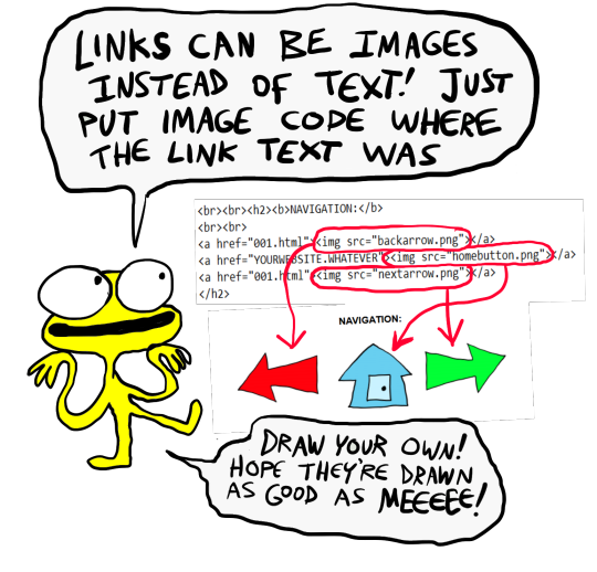
[image ID: the creature explaining how to change the navigation at the bottom: “Links can be images instead of text! Just put an image code where the link text was.” The code segment from the first image for navigation links except with the "Previous", "Home", and "Next" texts replaced with <img src="backbutton.png">, <img src="homebutton.png"> and <img src="nextbutton.png"> /end ID]
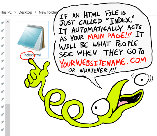
[image ID: a screenshot of the html code inside the computer's files, with the creature explaining: “If an html file is just called "Index," it automatically acts as your main page! It will be what people see when they go to yourwebsitename.com or whatever!” /end ID]
[image ID: a singular line of code: <meta HTTP-EQUIV="REFRESH" content="0; url=yourwebsite.com"> The creature says: “If you make a page with only this one line of code, anyone who goes to the page will be taken to whatever URL you put there!” /end ID]
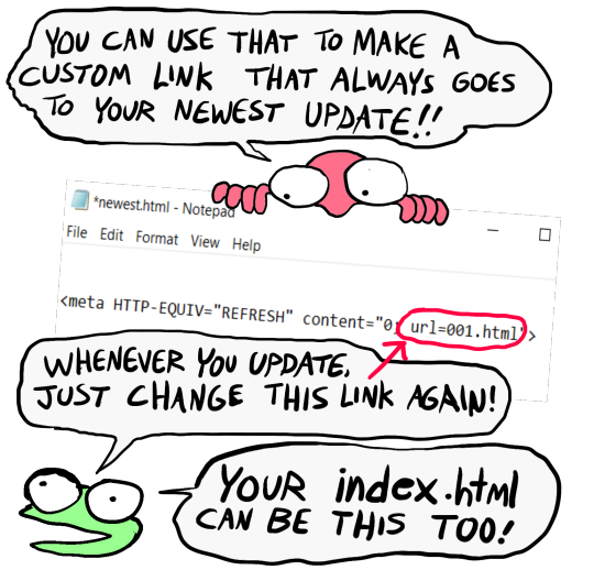
[image ID: the creature further explains: "You can use that to make a custom link that always goes to your newest update! Whenever you update, just change this link again! Your index.html can be this, too!" There's an arrow pointing towards the "url=yourwebsite.com" in the code segment from the previous image. /end ID]
[post text: That last code by itself is:
<meta HTTP-EQUIV="REFRESH" content="0; url=001.html">
Change "001.html" to wherever you want that link to take people. THIS IS THE REASON WHY when you go to bogleech.com/pokemon/ you are taken instantly to the newest Pokemon review, because the /pokemon/ directory of my website has an "index.html" page with this single line of code. Every pokemon review has its own permanent link, but I change that single line in the index file so it points to the newest page whenever I need it to!
While I catered these instructions to updating a webcomic, you can use the same template to make blog type posts, articles or just image galleries. Anything you want! You can delete the navigational links entirely, you can make your site's index.html into a simple list of text links OR fun little image links to your different content, whatever! Your website can be nothing but a big ugly deep fried JPEG of goku with a recipe for potato salad on it, no other content ever, who cares! We did that kind of nonsense all the time in the 1990's and thought it was the pinnacle of comedy!! Maybe it still can be?!?! Or maybe you just want a place to put some artwork and thoughts of yours that doesn't come with the same baggage as big social media?
Make a webpage this way and it will look the same in any browser, any operating system for years and years to come, because it's the same kind of basic raw code most of the internet depends upon!
/end PT]
小い.> very useful guide~ thank you for making it!♡
게터.> neocities time〜 have fun everyone :]
ゆの.> web liberation W
additional useful things people added in the notes:
alternatives for making a link to the newest update, because the method privided by the guide above will break the back button
website for learning more html and css
how to make the text properly formatted and visible on mobile
Going to put all this in its own post too by popular request: here's how you make your own website with no understanding of HTML code at all, no software, no backend, absolutely nothing but a text file and image files! First get website server space of your own, like at NEOCITIES. The free version has enough room to host a whole fan page, your art, a simple comic series, whatever! The link I've provided goes to a silly comic that will tell you how to save the page as an html file and make it into a page for your own site. The bare minimum of all you need to do with it is JUST THIS:

Change the titles, text, and image url's to whatever you want them to be, upload your image files and the html file together to your free website (or the same subfolder in that website), and now you have a webpage with those pictures on it. That's it!!!!! .....But if you want to change some more super basic things about it, here's additional tips from the same terrible little guy:


That last code by itself is: <meta HTTP-EQUIV="REFRESH" content="0; url=001.html"> Change "001.html" to wherever you want that link to take people. THIS IS THE REASON WHY when you go to bogleech.com/pokemon/ you are taken instantly to the newest Pokemon review, because the /pokemon/ directory of my website has an "index.html" page with this single line of code. Every pokemon review has its own permanent link, but I change that single line in the index file so it points to the newest page whenever I need it to! While I catered these instructions to updating a webcomic, you can use the same template to make blog type posts, articles or just image galleries. Anything you want! You can delete the navigational links entirely, you can make your site's index.html into a simple list of text links OR fun little image links to your different content, whatever! Your website can be nothing but a big ugly deep fried JPEG of goku with a recipe for potato salad on it, no other content ever, who cares! We did that kind of nonsense all the time in the 1990's and thought it was the pinnacle of comedy!! Maybe it still can be?!?! Or maybe you just want a place to put some artwork and thoughts of yours that doesn't come with the same baggage as big social media? Make a webpage this way and it will look the same in any browser, any operating system for years and years to come, because it's the same kind of basic raw code most of the internet depends upon!
#chroma…#〖게타⎯⎯⎯ ʳᵉᵈᵃᶜᵗᵉᵈ : ⿻␘␇ ױ⸋⸋⸋𓐄𓐄𓐄⸋⸋⸋〗#id added#described#neocities#website#htmlcoding#html css#learn to code#indie comics#comics#website development#coding guide#website guide
12K notes
·
View notes
Text
HTML and CSS Made Simple: Know the Difference and Why It Matters

If you're beginning your journey in web development, you've likely encountered the two most fundamental technologies: HTML and CSS. They are the building blocks of nearly every website you’ve ever visited. While these two tools work side by side, they each play distinct roles in how websites look and function. Understanding the HTML and CSS differences is crucial for anyone wanting to build a clean, functional, and visually appealing website.
In this blog, we’ll explain what HTML and CSS are, how they differ, and why knowing both is essential in 2025 and beyond.
What Is HTML?
HTML stands for HyperText Markup Language. It's the standard language used to create the structure and content of a webpage. Think of HTML as the skeleton of a website. It organizes everything — from text, headings, and images to links and videos — into a readable format for web browsers.
Here’s a simple HTML example:
<h1>Welcome to My Website</h1> <p>This is a paragraph about me.</p> <img src="profile.jpg" alt="My Profile Picture">
With just a few lines of HTML, you can add essential elements to a page. But while HTML is powerful for content structure, it doesn’t handle design.
What Is CSS?
CSS, or Cascading Style Sheets, is the language used to style and design the elements you create with HTML. CSS controls how your web page looks — colors, fonts, spacing, layout, and more. If HTML is the skeleton, CSS is the skin, clothing, and personality that make your website visually appealing.
Here’s how CSS can change the look of the HTML example above:
h1 { color: blue; font-size: 36px; } p { font-family: Arial, sans-serif; color: #444; }
By linking this CSS code to your HTML file, you can completely transform how your page appears, all without altering the content.
Why Does the Difference Matter?
Understanding the difference between HTML and CSS helps you:
Design better websites – You can separate structure and style, making your site easier to build and maintain.
Write clean code – You’ll avoid clutter by keeping your content (HTML) and design (CSS) in separate files.
Make your site responsive – CSS allows for flexible design that works on all screen sizes.
Collaborate efficiently – Designers and developers often work together. Knowing both HTML and CSS makes communication smoother.
Level up your career – Most front-end development jobs require a solid grasp of both technologies.
How Do HTML and CSS Work Together?
To build a modern website, you need both HTML and CSS. Here’s how you connect them:
Write your HTML content
Create a CSS file with all your styles
Link the CSS file to your HTML file using a simple line of code in the <head> section:
<link rel="stylesheet" href="styles.css">
Now, every element in your HTML file can be styled using your CSS rules. This separation makes updating your site fast and efficient.
Real-World Analogy
Still confused? Think of building a house.
HTML is like laying the bricks, putting up the walls, and installing the windows.
CSS is choosing the paint colors, installing curtains, and decorating the interior.
One provides the structure, and the other provides the look and feel.
Why Learn HTML and CSS in 2025?
In 2025, the demand for front-end developers continues to grow. As more businesses go digital, the need for well-designed, functional websites is increasing. Learning HTML and CSS opens doors to roles such as:
Web Developer
UI/UX Designer
Front-End Engineer
WordPress Developer
Freelance Web Designer
Even if you don’t plan to code professionally, knowing the basics helps you better manage websites, communicate with developers, or even build your personal portfolio.
Where to Start Learning
The best way to learn HTML and CSS is by doing. Here are a few steps to get you started:
Use free platforms like W3Schools, free Code Camp, or MDN Web Docs
Watch YouTube tutorials for beginners
Practice by building small web pages (a resume, a portfolio, or a personal blog)
Join online communities and forums for support and feedback
Consistency is key. Start small and gradually build more complex layouts and styles.
Final Thoughts
HTML and CSS are the foundation of web development. While they serve different functions, they are designed to work together seamlessly. Understanding the difference between HTML and CSS not only helps you become a better coder but also makes your web projects more efficient, attractive, and professional.
So whether you're a student, a business owner, or an aspiring developer, start learning HTML and CSS today. You’ll be amazed at how quickly you can bring your ideas to life on the web.
#HTML#CSS#HTMLvsCSS#WebDevelopment#FrontEndDevelopment#LearnToCode#CodingForBeginners#WebDesign#ProgrammingBasics#WebDevelopmentTips#WebsiteDesign#HTMLandCSS#TechEducation#CodeNewbie#DigitalSkills
0 notes
Text
Beginner's Guide to Responsive Web Design
Websites are the storefronts of the digital world. Everyone wants a sleek, stylish, and easy-to-use web design in Sydney. However, not everyone knows how to make one that works on all devices. That is where responsive web design comes in. It is not just a trend—it is the new normal. If your web design in Sydney is not responsive, you are already behind. But don’t worry, this guide will help you catch up.
What is Responsive Web Design?
Responsive web design means a website adjusts to any screen size. You don’t need to zoom in. You don’t need to scroll side to side. Everything lines up. Everything flows. It feels natural.
So, the goal is simple: Make your web design in Sydney readable and usable, no matter the device. No matter the screen resolution.
Why Should You Care?
People use all kinds of gadgets today. Laptops, tablets, smartphones, smart TVs, and so on. Some websites look perfect on a laptop, but try the same site on your phone. It’s a mess. The text is tiny. Buttons are hard to click. Images get cut off. All this chaos makes your visitors leave in frustration.
Google loves responsive websites and gives them better rankings. This leads to more visitors and better visibility. Thus, a responsive site is not a luxury but a necessity.
The Key Ingredients of Responsive Design
1. Fluid Grids
A fluid grid uses percentages instead of fixed pixels. That way, elements grow or shrink depending on the screen size. For example, imagine a picture might be 50% wide. It stretches on a big screen, while on a small screen, it shrinks. The layout stays balanced. The structure remains intact.
2. Flexible Images
Images are tricky. If not sized properly, they break layouts. So, responsive design always uses flexible images that are easy to scale and adjust. No overflow. No broken sections. Just smooth visuals. You can use CSS to control this. A common trick is to set the image width to 100%. That way, it always fills the space.
3. Media Queries
This is the secret sauce. Media queries are CSS rules. They tell the browser how to style the page based on screen size.
When the screen is 600 pixels wide or smaller, the background turns light blue. You can:
Change fonts
Rearrange sections
Hide or show content
In short, media queries give you control and make your design smart.
Mobile-First Design: Start Small
Design for the smallest screen first. That is mobile-first design. It makes you focus. It helps you prioritise. You start with what really matters. To put it in order:
Build a layout for phones.
Then scale it up for tablets.
Then expand it for desktops.
This approach saves time while reducing clutter. It also ensures a clean and clear user experience.
Tools to Help You Get Started
Bootstrap
This is a popular framework with pre-made grid systems. It includes responsive components, from buttons to forms to navigation bars. You can build fast. You can customise easily.
CSS Flexbox
Flexbox helps you align items in rows or columns. It adapts quickly and is ideal for one-dimensional layouts. Want a row of cards that wraps on small screens? Flexbox does that.
CSS Grid
Grid is perfect for complex layouts. You can place items wherever you want—rows, columns, or overlapping elements. It gives you full control.
Chrome DevTools
Test your design right in your browser.
Open Chrome.
Press F12.
You’ll see the Developer Tools.
Switch to mobile view.
Resize the window.
See how your site responds.
Adjust and fix issues on the spot.
Tips for Better Responsive Web Design in Sydney
Keep Navigation Simple
Big menus do not work well on phones. Use icons or collapsible menus, and keep it clean. More importantly, keep it user-friendly.
Avoid Fixed Widths
Fixed widths can break your layout. Stick to percentages. Embrace fluidity.
Use Viewport Meta Tag
Add this to your HTML:
```html
<meta name="viewport" content="width=device-width, initial-scale=1.0">
```
This tells the browser how to scale the page. Without it, your design might look weird on mobile.
Test on Real Devices
Simulators help, but nothing beats the real thing. Open your site on different phones. Try it on tablets. Check how it looks. Check how it feels.
Optimise Loading Time
Mobile users want speed. Compress your images. Minify your CSS and JavaScript. Use lazy loading. Keep things light.
Real World Example
Let’s take a basic layout. A homepage with a header, a main section, a sidebar, and a footer.
On desktop:
– The header stretches across the top.
– The main section sits on the left.
– The sidebar is on the right.
– The footer is at the bottom.
On mobile:
– The header still sits on top.
– The sidebar moves below the main section.
– Everything stacks vertically.
Same content. Different layout. That’s the beauty of responsive design.
Common Mistakes to Avoid
Even the best designers mess up. Let’s make sure you don’t.
– Don’t forget the viewport meta tag.
– Don’t use large fixed images.
– Don’t hide important content on mobile.
– Don’t ignore load speed.
– Don’t test only on one screen size.
Each screen is a new experience. Each visitor deserves a smooth journey.
Final Thoughts: The Future is Flexible
The internet will keep changing. New devices will appear and new screen sizes will emerge. So, your fully responsive website must be ready. It keeps your site future-proof. To get started with your responsive web design in Sydney - https://www.makemywebsite.com.au/web-design/sydney/ , connect with Make My Website.
Web design is not just about looking pretty. It’s about function. It’s about flow. It’s about flexibility. Responsive design gives your website a fighting chance.
0 notes