#i actually use the same color palette for everything
Text
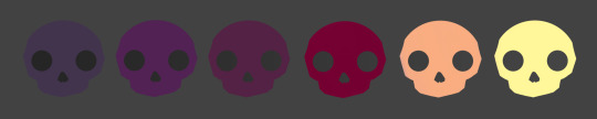
skullour palette: feathers
#skullour palette#happy halloween#skulls#cute#color palette#i actually use the same color palette for everything#any belief otherwise is simply an illusion#mort's unique art tag#phoenix porsche#colors!
6 notes
·
View notes
Text
Just a bunch of Useful websites - Updated for 2023
Removed/checked all links to make sure everything is working (03/03/23). Hope they help!
Sejda - Free online PDF editor.
Supercook - Have ingredients but no idea what to make? Put them in here and it'll give you recipe ideas.
Still Tasty - Trying the above but unsure about whether that sauce in the fridge is still edible? Check here first.
Archive.ph - Paywall bypass. Like 12ft below but appears to work far better and across more sites in my testing. I'd recommend trying this one first as I had more success with it.
12ft – Hate paywalls? Try this site out.
Where Is This - Want to know where a picture was taken, this site can help.
TOS/DR - Terms of service, didn't read. Gives you a summary of terms of service plus gives each site a privacy rating.
OneLook - Reverse dictionary for when you know the description of the word but can't for the life of you remember the actual word.
My Abandonware - Brilliant site for free, legal games. Has games from 1978 up to present day across pc and console. You'll be surprised by some of the games on there, some absolute gems.
Project Gutenberg – Always ends up on these type of lists and for very good reason. All works that are copyright free in one place.
Ninite – New PC? Install all of your programs in one go with no bloat or unnecessary crap.
PatchMyPC - Alternative to ninite with over 300 app options to keep upto date. Free for home users.
Unchecky – Tired of software trying to install additional unwanted programs? This will stop it completely by unchecking the necessary boxes when you install.
Sci-Hub – Research papers galore! Check here before shelling out money. And if it’s not here, try the next link in our list.
LibGen – Lots of free PDFs relate primarily to the sciences.
Zotero – A free and easy to use program to collect, organize, cite and share research.
Car Complaints – Buying a used car? Check out what other owners of the same model have to say about it first.
CamelCamelCamel – Check the historical prices of items on Amazon and set alerts for when prices drop.
Have I Been Pawned – Still the king when it comes to checking if your online accounts have been released in a data breach. Also able to sign up for email alerts if you’ve ever a victim of a breach.
I Have No TV - A collection of documentaries for you to while away the time. Completely free.
Radio Garden – Think Google Earth but wherever you zoom, you get the radio station of that place.
Just The Recipe – Paste in the url and get just the recipe as a result. No life story or adverts.
Tineye – An Amazing reverse image search tool.
My 90s TV – Simulates 90’s TV using YouTube videos. Also has My80sTV, My70sTV, My60sTV and for the younger ones out there, My00sTV. Lose yourself in nostalgia.
Foto Forensics – Free image analysis tools.
Old Games Download – A repository of games from the 90’s and early 2000’s. Get your fix of nostalgia here.
Online OCR – Convert pictures of text into actual text and output it in the format you need.
Remove Background – An amazingly quick and accurate way to remove backgrounds from your pictures.
Twoseven – Allows you to sync videos from providers such as Netflix, Youtube, Disney+ etc and watch them with your friends. Ad free and also has the ability to do real time video and text chat.
Terms of Service, Didn’t Read – Get a quick summary of Terms of service plus a privacy rating.
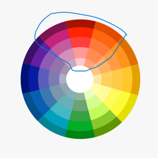
Coolors – Struggling to get a good combination of colors? This site will generate color palettes for you.
This To That – Need to glue two things together? This’ll help.
Photopea – A free online alternative to Adobe Photoshop. Does everything in your browser.
BitWarden – Free open source password manager.
Just Beam It - Peer to peer file transfer. Drop the file in on one end, click create link and send to whoever. Leave your pc on that page while they download. Because of how it works there are no file limits. It's genuinely amazing. Best file transfer system I have ever used.
Atlas Obscura – Travelling to a new place? Find out the hidden treasures you should go to with Atlas Obscura.
ID Ransomware – Ever get ransomware on your computer? Use this to see if the virus infecting your pc has been cracked yet or not. Potentially saving you money. You can also sign up for email notifications if your particular problem hasn’t been cracked yet.
Way Back Machine – The Internet Archive is a non-profit library of millions of free books, movies, software, music, websites and loads more.
Rome2Rio – Directions from anywhere to anywhere by bus, train, plane, car and ferry.
Splitter – Seperate different audio tracks audio. Allowing you to split out music from the words for example.
myNoise – Gives you beautiful noises to match your mood. Increase your productivity, calm down and need help sleeping? All here for you.
DeepL – Best language translation tool on the web.
Forvo – Alternatively, if you need to hear a local speaking a word, this is the site for you.
For even more useful sites, there is an expanded list that can be found here.
76K notes
·
View notes
Text
The Magnus Archives (Season One) Production Design Project
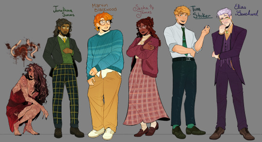

Hello everyone! Let me introduce myself- I'm Tilda (or Tilde), and I'm want to be a production designer.
Production designers create the overall look of a piece of media. From costumes, lighting, environments, props, etc., these designers make sure that everything looks cohesive and sets the mood.
So, I thought it would be fun to put my skills to the test by designing season one of The Magnus Archives. My winter break started as soon as I became interested in the show. Needless to say, a new obsession and an abundance of free time go well together.
You may have seen these illustrations posted separately, this is a master post of the whole project. My thoughts, processes, and critiques are all included under the cut. If you read them, I hope you enjoy! If, not, thank you for supporting my work regardless.
The Characters
When designing these characters, I tried to avoid being influenced by fan interpretations. Though, that was a challenge (especially with Jon and Sasha). I found that I looked to my friends for inspiration. Certain elements (Jon's glasses) were based off of what they wore.
Pinterest was also useful for finding clothing and pose references. Some looks were based off of different actors- in particular, Tim was inspired by Nicholas Galitzine and Elias inspired by Matthew Lillard.
Jane was the most fun to design! I believe in making terrifying characters actually terrifying.
Elias's design needs the most work. Having now finished the show, I see that it doesn't fit him. The purple is overly saturated, especially compared to the set. He looks out of place! I'd reverse the color palette to mostly green/yellow with purple accents instead. Although, I will forever defend the purple tint in his gray hair.
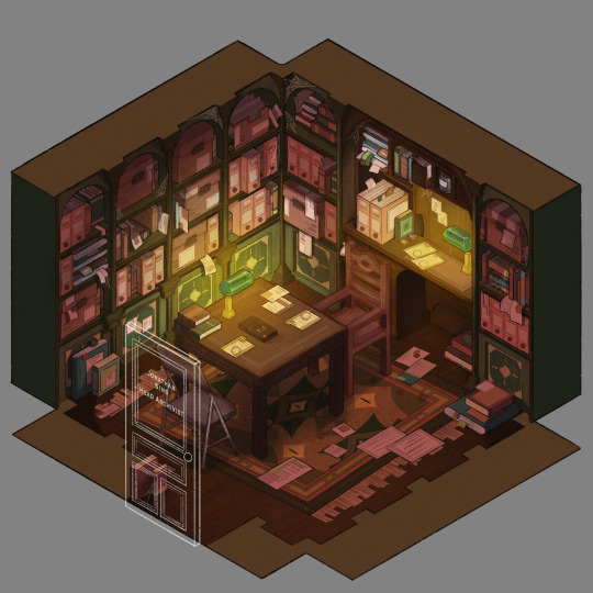
The Set
Jonathan's office was a treat to design! Balancing the color and clutter was especially important. This room is meant to be claustrophobic and uncomfortable, but not overbearingly so.
The wood looks to be full of splinters, but not so worn that it can be thrown out. The chairs offer no back support, and the shelves make the room smaller. The goal was to represented Jon's mind. Intricate, messy, and suffocating (Note: that is more of a season two description).
One goal was to capture the look of an actual archive. Valuable times was spent researching the different kinds of storage, files, paper, etc. The texture and color had to be accurate.
A split-complementary color palette of blue-green, yellow-green, and red was used. Of course, I had to get green in there, and the varying hues and desaturated reds worked well for the wood and filing supplies.
Jane's ashes and the Web lighter on the desk place this set at the end of season one. I find details like this to be important, it's one of my favorite parts of design. There is much needed abundance of eye imagery as well. Most obviously in the carpet, but eyes are carved into the table and watch from the shelves.
My main critique is the lighting- the filters used could be adjusted as to not distort the colors of the boxes. They look inconsistent. The Web lighter could also be more obvious, yet it is small and pixelated.
The Props
I designed these as I re-listened to season one, and it is the most recent piece I finished. Combining the details described in the show with what the objects would have realistically looked like was interesting. That was most useful for the clown, the Ming vase, and Ex Altiora.
Each of these objects came from a specific time with a specific look. Ex Altiora was bound in calf leather from the 1800s, so those books were referenced. Same with the frills on the clown's outfit.
The Ming vase was especially interesting, as it is from the Jiajing period. When looking at photographs of Jiajing vases, I found that many of them lacked handles and had an hourglass shape. That was fascinating to me, as many artists depict a standard oval-shaped vase. Also, the vase's design is described as straight lines that create distorted patterns when looking at it. That effect was achieved using chromatic aberration and the liquify tool (chromatic aberration was used to create a vertigo effect on Ex Altiora).
My critiques are... nitpicky. minimal. The shading on top of the garbage bag is unnatural. The thickness of the gold engraving on Ex Altiora is uneven. The "I" in "Immediate Consideration" is not capitalized. Other than that, I'm happy with how the props look.
Conclusion
First off, if you read everything, thank you!! It is a lot, I know.
My greatest takeaways are that 1) ask for critique, always 2) research skills are necessary for design 3) references are your friend! Seriously guys, use your references.
I hope you enjoyed this project and I'm excited to share more of my work in the future!
#and before anyone asks#i am not doing this for any other season#feel free to ask any questions about this project!#tma#the magnus archives#tma season one#production design#tildexart#tilda rambles
3K notes
·
View notes
Photo
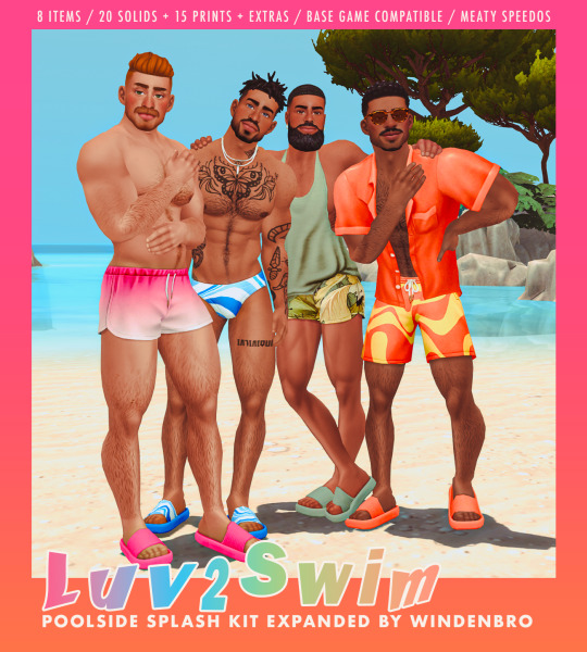
🌊 LUV2SWIM ☀️
I could not have expected to enjoy the Poolside Splash kit as much as I did. As soon as I got my hands on it I knew I wanted to take it even further. Of course the speedos needed a bulge on them, but I actually loved the whole vibe and theme and decided I wanted to do my own spin on the whole thing. I had originally planned to put this off for a week since I’m going on vacation next week and didn’t think I’d have time, but inspiration hit like a truck and I just couldn’t sleep until I finished this.
Luv2Swim is 9 items from the kit all edited & recolored in a new palette I created just for this very creatively called…SPLASH. I’ve got to have my neutrals so you’ll see some of that as well as a selection of brighter shades and pastels. Something for everybody I hope! Also made a selection of 15 prints I really loved to use here. Some of them you will have seen on some previous items and some are brand new finds.
If you’re curious about what you’ll get, here’s a breakdown.
4 speedos: Personally I was really only a fan of the one speedo shape, however I’m so glad we got as many as we did. If course 2 of them are flagged feminine but I swapped that over for these items. Added a bulge to all of them of course. Also one of them seemed to be completely missing a specular map so I learned how to make one and added that too. You’ll get all the original EA swatches as well as a second package in SPLASH + prints.
2 trunks: I’ll be honest I didn’t do much with these. The shorter trunks got a very minor mesh edit to make em a lil fuller in the front but the longer ones got nothing really lol. That said they both come in the same solids/prints swatches as mentioned before, as well as 14 “extras”, that is a few cute gradients and color blocked styles as well. Also added a specular to the shorter trunks because…trunks should be shiny!! I didn’t add specular to the longer trunks as..frankly the kinda read more as sweatpants to me and sweat pants should absolutely NOT be shiny. (Also the longer shorts are literally just me taking the exact item from EA and making it BGC..that was an accident but..oh well you’re welcome!)
2 tops: Thank tank top is absolutely my favorite in the game now by far! I loved that open shirt too we always need more of those! Just recolored these in 20 solids each and added a bit of shiny to the open shirt cause I feel like it should be kinda silky looking no?
1 sandal: The shoes EA have been making lately have been so good, but these are absolutely my new faves!! That chunky ass sole is just…chefs kiss! This was recolored in SPLASH colors as well as 15 prints across the strap and a handful of color blocked swatches (the same ones the trunks came in)
Again everything is BGC and has all maps but LODs are…well..nothing is particularly high poly so it’ll be fine I promise (I mean it’s mostly speedos so that’s like... no poly lol)
Anyway I hope you guys enjoy!
📂 SFS
#ts4cc#the sims 4#poolside splash#ts4 male cc#windenbro#bro#dropping cc at like 4:30 am so i can finally go the fuck to SLEEP
1K notes
·
View notes
Text
“are you done yet?”
it was quiet and free from disturbance, drawers open and close while you got ready for dinner with your boyfriend. you smooth and fix the strap of your dress, flinching when it nips your skin. “yes, actually.”
he stands at the doorway, half hidden, but he stood tall and you could feel the strong aura that overwhelmed every room katsuki bakugo walked into.
“you are so handsome, katsuki.” and all for you. he hummed at the praise, still trying to wrap his mind around it.
you compliment the color of his tie and there was that petty pout as you start to fix his collar. katsuki scratches the palm of his right hand, nose crinkled like a child.
he eyes the jacket slung over the chair across the room. you smile and let out a sigh, feeling good next to the man so many girls fawned over; but he came home to you.
“i hate jackets, i can barely move my arms.”
“because your arms are too big, maybe stop going to the gym so often?” he laughed, despite his annoyance. you give him a kiss.
the nice breeze from the open windows felt nice, maybe you could hear the ticking of the clock from the room next door. you could already taste dinner, it had been a long day.
the chained necklace shines around your neck, no doubt it was pure silver or gold— only the best for his woman— he knew you were the most amazing, beautiful person in the world.
katsuki clicks his tongue and reaches inside the bag full of your makeup, lipsticks, glosses, the new eyeshadow palette you had yet to use. you watched him twist the tube and pull you closer by the hip.
“it smudged,” he said, reapplying the color that matched your cheeks perfectly. maybe it was the shade he picked when you dragged him shopping last week.
you could feel your nails ache and dig into the fabric of his tie, still so neat with no wrinkles.
katsuki’s heart skipped a beat and he felt his cheeks flush with warmth. the hand on your skin turned hesitant, strange for a man who was always sure. “hm, there. let’s go already, or we’ll be late.”
you nodded with a smile, grateful. “okay, let’s go.”
we’ll be late— but he still takes a moment to kiss you again, all the same. kisses your cheek just this once, light and full of air. gentle with you not because he thinks you would break, but because he’s soft with everything, when he gets the chance.
“happy birthday.. you look beautiful.” you held a love that could withstand any storm.

dedicated to the most beautiful amazing talented @call-me-ko’s happy date of birth !!! ah i hope u have a great one
#mha x reader#bakugou x reader#bnha x reader#bakugou x you#mha x you#bakugo x reader#bakugou katsuki x reader#mha fluff#my writing
2K notes
·
View notes
Text
Let's talk about this and patterns in the show, shaw we?
Okay, so Buck wearing green here is stressing me out now. I have a really long meta in Buck and green and red clothing (you can read it here), but I'll explain the green side of the point here if you don't want to read that. Basically, Buck wears a lot of red, enough for it to be a stable color for him, and red's complementary color is green. He's usually on the reds, pinks, and oranges.
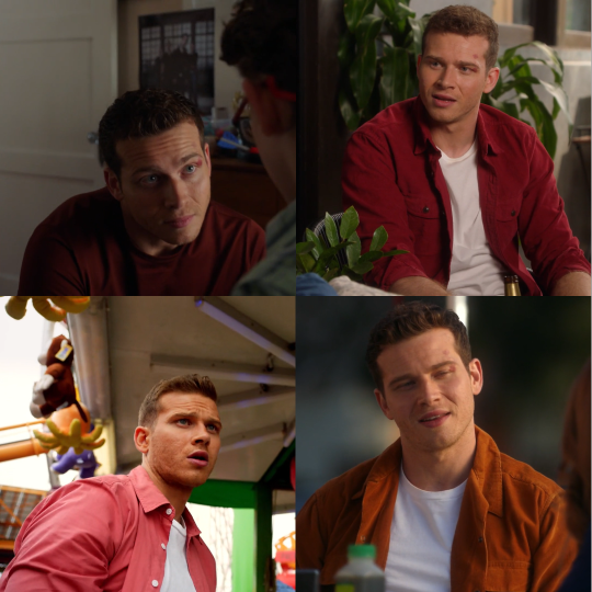
The point of a complementary color, is to create contrast, and they used green on Buck in the coma world, so we would feel like something is wrong even if we can't quite figure out why.
They made a lot of choices about his wardrobe in the coma dream that just looked weird, up to getting him black vans instead of the usual white hightops, and that creates a contrast with the usual Buck that's unsettling.
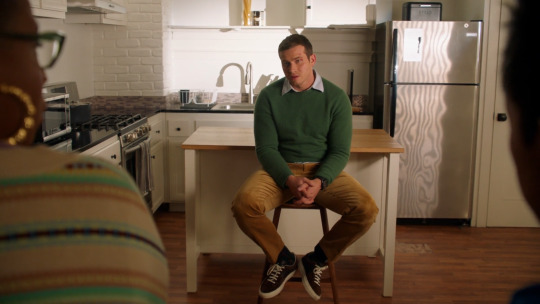
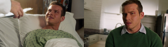
Why is that relevant? Well, green is his something is wrong color. The coma world being the most blatant example because that sweater is green, BUT he wears green during breakups and when he's doing misguided stupid shit in the name of love. The breakup with Ali, the breakup with Taylor, and I will throw in the graveyard as a breakup with Eddie, because that's the feel of the scene and he's wearing green, but technically he's just being an idiot about love.
He's also wearing green when he takes Red to see Cindy, subsequently when he talks to Maddie about how it feels to always be left, when he's hiding at Eddie's place because he doesn't want to confront Taylor because that would lead to them breaking up and he's not there yet, and when he is trying to convince himself Abby is coming back (this last one really confused me but I did color picked a palette out of that shirt and that's green).

But if we established enough of a pattern to say he does misguided shit when it comes to love, like inserting himself in Red's love life, saying this random woman he met 5 minutes ago really sees him, trying to convince himself the women who fled the country is coming back to him, then Buck wearing green with Eddie is worrying.
Because if you look at the conversations they have in the firehouse, they are usually close to the point but still need something else to truly fix the situation, they hiding something or holding on to something they shouldn't, and it goes from the first fight at the gym with the way Buck is making his insecurities about Eddie and not really working through what's really bothering him, after the lawsuit, they do clear the air but Eddie is still hiding the whole fighting thing and the fighting thing actually makes Eddie flinch away from Buck, when they are talking after the dinner with Buck's parents, Eddie is trying to have a conversation but Buck wants to hold on to anger, when they are talking about the panic attacks, Eddie shuts Buck out because he doesn't want to admit Buck is right yet, and when they are talking about Chris having nightmares, Eddie is fully taking the blame for Chris missing Shannon, even if that's something completely out of his control and that eventually even leads to Eddie quitting and the thought process starts there.
So they always involve one of them wanting to have a conversation but the other not being fully ready to be honest about everything so they are talking but they are not on the same wavelength. They also always end with one of them walking out.

I have a really long meta about the framing in a lot of their big conversations (you can read it here if you want all the thoughts), but basically if they are on the same level, as they are both sitting down they are usually talking about Eddie.

Because when they are talking about Buck, Eddie is usually standing up and Buck is looking up at him. (I have a meta on the looking-up thing if you feel like reading more thoughts on that)
And if they are discussing their relationship, they are face to face.

Random add on, if they are talking about Chris, they are usually sitting side by side on the same surface in a sense, yes I'm counting the counter as one surface lol

So signs point to the new stills being Buck forcing Eddie to talk about something he's not ready to talk about. But when you add the green while Eddie is not wearing blue, so the green is not about the blue and green thing, (I have a meta on the blue and green thing in general and it applied to buddie too that one is truly unhinged tho), and the way talks at the station mean holding on to something they shouldn't and the still of Eddie talking to Bobby, this conversation can very easily be a moment of tension.
AND, I know I'm not the only one who saw those stills and immediately thought about the panic attacks conversation, BUT, stay with me because now I'm reaching, the graveyard conversation tries to call back to the dumb luck conversation (I also have a meta on the graveyard that touches on that if you want thoughts)
But basically, similar outfits and angles, locations we never saw before and probably will never see again. But, while the equine therapy talk works to give Eddie hope and bring them closer together, the cemetery has the exact opposite effect. It creates space between them.
If we consider this and the way it seems to be calling back to a conversation that led Eddie to do the right thing about Ana, they could very much be calling back to that just to do the opposite and having Eddie refuse to listen to Buck for whatever reason.
Because one thing about the dumb luck conversation is also the movement, they are walking, the camera is moving, the conversation is moving and they are making progress, something we don't feel in the cemetery because they are in the same place, the conversation is not leading them anywhere besides away from each other.
And the conversation about the panic attacks that happen while Buck corners Eddie while Eddie is trying to sleep, so Eddie will be in a more relaxed state than when Buck is walking in wearing civilian clothes and Eddie is so deep in his workout he's glistening with sweat, so Buck is walking in on Eddie with a completely different energy. And assuming conflict to the point Buck feels the need to corner him in the gym? That means fight.
This is a very long way to say divorced era 2.0 is upon us lol basically they are arguing and it's about Eddie refusing to listen to Buck about something. Maybe even love related.
If you reached this I love you 🫶
If you liked my brand of crazy, you can find all my metas here.
#911#buddie#otp: you don't need to pretend with me#911 meta#buddie thoughts#buddie meta#911 spoilers#911 speculation#this is very chaotic#this is very unhinged#but not the craziest thing ive ever typed laoskaoskaoksaoksas#if im right im gonna scream soakoskaoksaoks#911 abc
296 notes
·
View notes
Text
you left me at the train station. — simon riley, crush series.

crushing on younger! simon would include :
୨୧ ... your bedroom was his safe haven. sometimes, it was messy with pleated skirts, spilled nail polish, and empty soda cans covering the floor and sure, he hated it, but he felt guilty when it was clean - everything had its designated spot and simon felt like he didn't belong yet his own things found their way on your desk, in your closet, his sneakers even found home on the shoe rack by your bedroom door.
୨୧ ... new tights and a bare face when you didn't want to go home right after your part-time job, working at some shitty gas station ten minutes away from your brick townhouse. so, you would go and knock on the door and pray his dad wasn't home or that someone else would at least open the door. sat on the swings of your local park. when you feel confident enough, you told him things you had never told anyone. "even if you decide that you hate me one day in the future, never tell anyone this." you pleaded with him the first time. "why would i ever hate you?"
୨୧ ... staring at the ceilings when you held him in bed with his head on your chest, an act that left you with a quickened heart rate and colored face. if you were at his house, the ceiling would be stippled and cracked. his room wasn't unloved - far from it, actually. his family didn't have much and you quickly understood his room was loved and looked after, unlike the rest of his house.
୨୧ ... piggyback rides whenever you asked him to walk you home from parties you'd been out to. you were always tipsy and complaining, asking him to carry you. sliver eyeshadow and ripped fishnets under frayed black shorts, your cheek against his shoulder. you always asked him to run away with you, leave manchester - maybe even england - behind. "we could get an apartment, it'd be ours and we could decorate it however we wanted." he never paid much attention to your ramblings but the thought of spending the rest of your life with him was something you could only hope for, so why not ask when all your confidence was based on liquor?
୨୧ ... if he went to bed early or his father got to the phone before him and hung it up, you had to walk on your own, black jeans and beaded bracelets while trying to remember his address with your arms crossed. "twenty-five, twenty-six..." squinting at the house numbers while mumbling. when you found your way, you stood on the outdoor ac unit, knocking on his window. "can i come in?" it was asked before he could even open the window halfway, staring at him with a sluggish grin.
୨୧ ... bruises you run your fingers over and bloodied bandages you'd change for him. "your dad?" he never responded so you stopped asking. early mornings of sitting on the porch and helping him after getting the med kit from the family bathroom, the silence only being broken by your occasional sniffling from the cold. lilac and baby pink was your style and you treated him with the same softness as your color palette.
୨୧ ... using him as your human notepad whenever you were out with him. "palm." turned into a heads up, your glitter pen already piercing against his hand before he could even blink as wrote down numbers, addresses, even tab amounts you owed. "i'm preparing you for tattoos so you won't be a baby in the chair." you always joked.
୨୧ ... all it took was one bad day for an impulse to guide you to the train station. it was two a.m. and the last train to london left in five minutes. it all happened so fast and he barely processed any of it until you were buying the tickets, your left hand holding his right. the ceiling lights flickered and there was a blue hue coming from the train windows and open doors, purple graphic liner and lip gloss. "we shouldn't." you squeezed his hand. "of course we should." you scoffed, smiling. he let you drag him all the way to the train doors before he finally stopped. who would protect his mom? he was afraid of what his dad would do if he saw he was gone. you had gone back and forth, the overhead announcer telling the few remaining bystanders the train would leave in one minute. your throat tight, you set down your bag and let go of his hand. "i love you, okay? i love you a lot and i hate everyone but you, so just please come with me." but simon shook his head. you weren't gonna get off and he wasn't gonna get on, so you left him. standing on his sneakers, you went to kiss him, lips just barely touching and simon wished you did but neither of you closed the space. rather, you hugged him with a kiss on his cheek, lip tint and glossy material lingering. you grabbed your bag and without looking back, without a goodbye, you got on the train. you left him there in the cold, humid train station at two in the morning.
#modern warfare 2#modern warfare 2 x reader#modern warfare ii#modern warfare ii x reader#simon ghost riley#simon riley#simon riley x reader#ghost x reader#divider credit to hyelita!
160 notes
·
View notes
Note
I love your art so much!!! I've also been starting to paint with gouache, and I'd love to know a little more about your process! What kind of paints do you use, do you sketch first or start with paint, do you paint in layers over several day or all at once?
Hi and thank you! I hope you don't mind me answering this publicly and apologies for length, but:
MY ART PROCESS!
Supplies: I use winsor and newton gouache and arches cold press paper blocks, usually 140 lbs (the lime green ones) and sometimes 300 lbs (the teal green ones). Even though this paper comes pre-stretched in blocks, I actually take the sheets off and stretch them myself because I've found arches' glue isn't as strong as it used to be. This is how you get watercolor paper to lay flat! I recommend youtubing some videos on how to do it -- there's a lot of great tutorials out there. Also, I use princeton brushes, and kraft paper tape and these boards to stretch my paper. (these aren't affiliate links, I just shop at blick)
A word about art supplies: these are the exact tools I use but everyone uses supplies differently and two people with the exact same supplies might get different results! A lot of it is about what works for you and what you like, so I always suggest that gouache/watercolor beginners just buy a few tubes from a couple of different paint companies and some small pieces of paper from different manufacturers to see what you like. Just changing one ingredient in the above has created massively different results for me, but maybe that'll end up being something you'd like! The first step in learning a new medium imo is to play. Just have fun!
ALSO: gouache isn't super light permanent, check your tubes for which ones hold up to sunlight. Here is winsor and newton's color chart explaining which ones will fade when exposed to sunlight -- all manufacturers will give you this. I only use the colors rated A and AA, and I still frame my pieces with UV glass just to be safe. Not all gouache is re-wettable, but winsor and newton is. I just put it in my palettes and refill my palettes if it runs low. AND SOME PAINT IS TOXIC. A lot of paints have cadmium and cobalt in them. I don't use any of the toxic colors, but if you do, make sure you don't eat while working and wash your hands thoroughly afterwards. This information is also usually available on manufacturer's websites. As more people are rejecting cadmium paint, you'll see more tubes labeled things like cadmium-free yellow. This is why. More artists should be aware that their tools can be dangerous. You don't need that many tubes of paint to begin, just a warm and cool red, warm and cool yellow, warm and cool blue, white and black. I have around 50 colors and use 20 regularly. I always mix all my colors myself, and never use straight tube paint. Most of my colors have about 5-6 different tube colors mixed together. If you use re-wettable paint a tube of paint will last you years; even as a professional I only buy new paints every 5 years or so.
Process: I ALWAYS start with a sketch first. Not everyone has to, but because I do illustration work -- where sometimes a client gets input on a drawing -- I always do a lot of preliminary work before I even begin to paint. At this point, even my personal work usually involves the exact same process:
I start with a 3" or so thumbnail that I scan (left; I traced it quickly digtally for clarity to myself here) and then either clean up digitally or print out and clean up traditionally with tracing paper (right):

Then I scan the cleaned sketch in and color rough it digitally (left, this was for a gallery show, so no one had to approve my color roughs, so it's messy!) then I transfer my sketch to my paper (with either carbon transfer paper or a light table), stretch my paper, and paint (right):
I obviously changed my mind about the color of the ribbon in the trees, ha, and made everything a lot more vibrant. The benefit again of gallery work is no pre-approval!
You are correct, I paint in a series of washes, going from lightest to darkest, where I apply the same color beneath all shapes that are the same warmth (cools under all upcoming cools, warms under all upcoming warms). I paint a piece usually in one or two days, depending on complexity. I didn't take pictures of the above painting, but here's a different painting to show you a little bit what I mean:
I painted the peach color under everything (and twice for skin tones), and the gray color of the sky under everything that would be grayish (the rocks, trees, her pants, her skirt, and coat). I do this to stop me from getting darker lines where two different colors butt up against each other, and also for color harmony. I have step by step photos of this in my process stories highlight on my instagram; also check my FAQ and tip highlights for more info on all this stuff. Most pieces take around 25-30 washes before I start adding in the details (sometimes I add in face details early though because if I mess those up it's not worth finishing the rest of the painting! 😅)
All this might seem like a lot of work (...it is) but I do it so that I can show clients previews of the final piece and so I don't have to repaint the finals. I also used to pre-test all of my washes on scrap paper like this:
I still recommend doing this if you're just beginning! But at this point I only do it when testing techniques because I know my paints really well. (the above was my test for the pine boughs in this piece)
Painting by far is the longest part of the process, so I do more work up front to not have to do it twice. Every piece takes about 6-24 hrs of actual work time to produce. Stretching watercolor paper takes about 24 hrs to dry, and because I sell most of my originals in galleries, they need to be flawless, so planning ahead is useful and in the end saves me time.
And to conclude this novel of an explanation, don't be overwhelmed by all the information I've given you! I put it here so that people at various stages of their artistic journey can maybe find something useful in it. But seriously, the first step to learning how to paint whether it's traditionally or digitally is just to have fun. Try it out, see what's working and what isn't, and then try to solve specific issues that you're struggling with. I've been doing this for a loooooong time at this point, but here's my first watercolor piece from when I was re-teaching myself how to paint traditionally nine years ago:
Obviously, I was destined for greatness. Ha, yeah, no. If you scroll back through my tumblr archive, you can see me learning how to use these paints in real time. And keep in mind that I'd been working digitally for years before then, and years before that where I didn't post my work online at all.
So for anyone who needs to hear it: there's no such thing as talent, just hard work, patience, and trying again and again and again...and sometimes again. What I do is a skill and anyone can learn it. Sometimes, progress is slow. I'm 38. I only really feel like my art was half-way decent starting a few years ago, but I've been making art my entire life, and I went to art school at 18. 20 years later I'm kind of figuring it out.
The best advice I can give, whether it's about art or not, is find the thing you love so much that you'll keep at it even when you suck at it, because most skills you'll suck at to begin with -- and perhaps for a long time. I sucked at art for yeeeaaaaarrrrs. On top of the usual learning curve, I struggled with fine motor control and dexterity. But I loved it so much I kept trying every time I failed. If I can do it, so can all of you, no matter what stage of art you're at now, and no matter how old you are.
Anyway, thank you to those still reading this deep in. I wish you all the best on your artistic journey. Art can kick your butt sometimes, but it's also pretty dang rewarding 💛
529 notes
·
View notes
Note
Sorry if you’ve answered this before, but I really love how your illustrations have such a cohesive color palette, how do you pick your colors to have a certain theme without looking monochromatic?
(In your breakdown on the saloon/western BP illustration, you mentioned that the overall color was reddish brown so you added blue to the main group to set them apart. But like how did you decide on which reddish brown colors to use for the flats?)
Thank you!! Your art is really expressive and the colors always work so well in the illustration. I’m always in awe of your pics
That’s an excellent question! My drawings actually start out pretty monochromatic because I tend to put most of my effort into the lighting and shading part to help differentiate where I want people to look.
For all of my pieces, I want my characters to be in focus. So no matter what, I always have to keep their main colors in mind and make sure their outfits and the background don’t clash with them (Kain’s red hair tends to be a problem, pft).
For my flats, I generally work with two main colors that tend to contrast each other and then I mix a lot of neutrals around them. (Sometimes the main colors are in the light and shading itself, but I’ll just focus on the flats!).
Sometimes, I will change the hue of their colors. So while Kain has bright orange hair, I will dull it down if it overwhelms the piece or doesn’t fit with the tone - like I did for the cowboy drawing - but never so much that it no longer looks like him.
With the cowboy drawing as an example, if I strip it down to my flats, it instantly becomes very dull and monochromatic. I really enjoy working with these colors because they’re easy on the eyes (or my eyes specifically) and I can see the difference in subtle hues a lot better than if they were very high in contrast. I like working with subtleties when I want background characters to become a single unit but still be separated as individual people.
When I picked the colors for the background, I wanted to separate the characters from the walls. Therefore, I kept the walls red and gold, and the characters brown - they’re still within the same warm-colored family, but they’re far enough away from each other that they don’t become one with each other. I also like to not have clothes from different characters blend together, so overlapping colours can't be the same. I made one coat lighter than the other, the glove warmer than the dark jacket, and so on.
(their coats are also in the same realm as the green/gold colour of the details for the curtains and the frames on the walls)
For the paintings I actually chose to put a bit of blue and green in to help create some interest for the main characters and keep your eyes around that area, as it matches the blue they’re wearing, just a whole lot darker. It also makes them pop just enough so they look interesting against the wall, but not enough to overshadow the main characters
I know, because of the way I work with layers, that when I add my overlays, I automatically brighten and saturate the colors a lot. It’s a lot easier for me to saturate something “dull” and move it into all kinds of hues than saturating something already high in contrast and then trying to force it into a new color theme.
But because of this, I usually have to go back and change the colors I work with constantly while the overlays are on. Since the overlays don’t know what sort of materials they’re laying on top of, everything gets lighter and washed out, so dark skin tones, hair, and clothes have to be corrected one by one afterward. If I were to remove the overlays after I corrected it to make it feel like a dark blue outfit on Raki, it’s basically just a black void now; but with the overlay, it’s a dark blue outfit. Before that, he simple blended in with the background too much and he didn’t feel like he was a part of the group either.
I always try to put down colors how I imagine they’re going to look like, unaffected by light, but I’m also naturally drawn toward more earthy and warm tones, so all of my color choices will tend to lean that way.
Here’s another example of main colours vs. neutrals; the main colours are red and green/turquoise, with dark browns and greys to encapsulate them, and gold for accents or to make certain things pop (the chair, Dakon’s dark coat, etc.).
I never want them all to wear the exact same color, but I want them to feel connected and be in the same 'colour family,' so Dakon and Kain have nearly the same dark red/brown, and Christie and Raki have nearly the same 'bright'/red.
The blacks and browns, I’ve kept warm as well, so they stay within that realm of red. I also make sure that none of them are too close to Kain’s hair since he’s in the middle of the piece, and I want your eyes to be drawn toward the middle, and his orange hair helps with that.
The paintings I basically do not care too much about, as long as each individual painting has a single dominating colour. I mute them down with a darker overlay and ensure they don’t have strong shadows and light, so they get pushed to the background, so despite being a bunch of different colours, each painting feels like a solid color and they’re still cast in the same light as the rest of the piece, so they feel like they belong in the same room.
I try to help move the eye around the piece as well, so I keep the big painting sort of in the same realm of red and brown as the main characters, because it’s so big it shouldn’t dominate with a new color and force interest toward it. The blue/purple ones melt in with the background as they’re close to the turquoise background, but without disappearing, the yellow ones work sort of like the gold accents and blend in with the frames, and the green paintings at the top give the illusion of a monochrome fade, so everything gets more eerie and green as the image goes up - there’s also a subtle green fade that affects the gold accents from the top down, to enhance that effect.
This is just a few examples, if there are any pieces in particular you were thinking of, and it’s neither of these, just let me know, and I can break those down as well!
Thank you for the question; I hope I answered it somewhat, and thank you for the kind words! <3
319 notes
·
View notes
Text
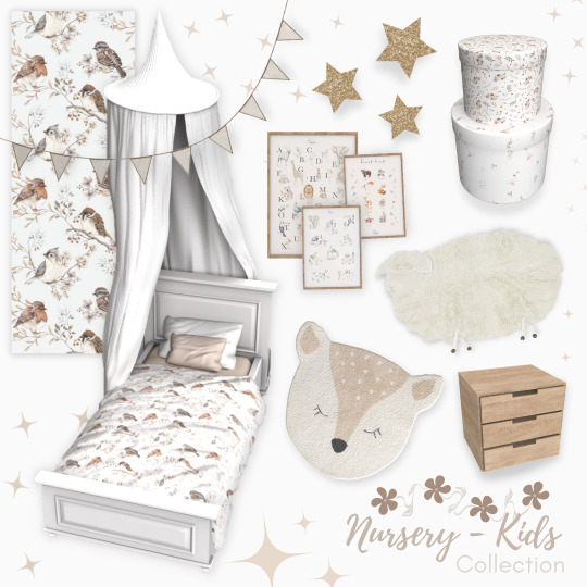
The Nursery/Kid Collection

Hello everyone 🤗
I'm wishing you all a Happy New Year 😍🥳🥳 I hope you're all doing great at the beginning of 2023!
I'm so, so happy today to share with you the biggest collection I ever made and to show you my progress in Blender 😱
About my progress this month:
One of the biggest new skills I have now is that the bed blanket is animated!!!!
I learned how to make a cloth simulation on a mesh, which means I created from scratch for the first time in my life the pillow, the blanket (bed cover?), and the bed canopy
As I already said, I learn how to animate the blanket, which means the bed is fully functional exactly as it should be. No more strange animation when a toddler will going to sleep in it 👌
I also learned how to create a curve, which was needed for the garland
Most of the rugs in this collection has now a thickness even if the shape is not a basic shape such as a square, rectangle, or round. I learned how to add texture details to them which gives a realistic and mellow appearance which can be great if you have a Simstagram and share cute toddler poses for example
I started learning several new other skills but the end result is too bad to be shared right now 😂
Thank you all so so much for all your support without which I simply wouldn't be able to spend as much time learning new 3d skills 🙏❤
About the collection:
The collection is composed of 25 new CC with a total of ... 291 swatches! 😱
I wanted to cover as many styles as possible with plain colors and matching patterns for you to be sure to be able to create a lot of different toddler bedrooms even if you're using the same mesh. I'm personally always frustrated when the CC is exactly the one I want to use but can't find the swatch that is matching with the other items made by another CC creator.
Of course, I couldn't create all the textures ever possible, but for sure when an item has 38 different swatches, you'll find at least 1 of them matching your interior 😍
The color palettes I used to create this collection are mostly white, pink, orange, green, and blue with matching patterns and for some items, I created different kinds and tones of wood from light to dark.
Everything is base game and HQ compatible
Everything is functional and playtested
All items have from 1 swatch up to 38
When possible, all items have all their LODs
Except for the bed canopy (sorry), everything is low poly
They all have their custom thumbnails and are correctly tagged
Most of them can be found under "kid's furniture" or "kid's decoration"
All of them can also be found with those keywords: sims4luxury; nursery; toddler; kid
Here are all the thumbnails of the collection:


How to make the bed functional:
The bed is coming in 3 separated pieces:
Bed frame
mattress
blanket
and ONLY THE BLANKET is actually functional. Bed frames and mattresses are only decor items with 0 interactions or animations linking to them. So you'll need to place the blanket if you want your toddler sim to be able to sleep in the bed from this collection.
You can use the blanket with any other bed frame you have, it will work the same.
I separated the bed into 3 pieces for you to choose between all the swatches and mix and match all of them the way you prefer.
About the bed canopy:
The bed canopy is a high poly mesh. I did my best and created several versions of it but the only one which didn't look too weird to be shared is the version that has 25k poly. So please be cautious!
I created the mesh to be placed as close as possible to the walls in a corner so that the bed frame can be placed below it, not next to or in front of it and it does not create a collision with any sim.
Tips:
Because of the number of swatches a lot of the CC in this collection has, the files are large.
If you need to save space on your computer but still want to keep this collection installed, I suggest you delete the swatches you like the least with Sims4Studio.
---------------------
Et voilà 🤗
I wish you all to enjoy this new CC collection and all the best for 2023 😍🥳
Full love to everyone of you and thank you from the bottom of my heart for all your support 🙏
Mélissa
* FREE DOWNLOAD *
#thesims4#the sims interior#the sims cc#the sims 4#the sims#ts4 cc#ts4 house#ts4 custom content#ts4 download#ts4cc#sims 4#sims 4 download#sims4 cc#my cc#cc finds#cc creator#sims cc#the sims 4 toddler custom content#ts4 toddlers#the sims 4 toddlers#ts4 furniture#sims 4 furniture#the sims 4 furniture#sims 4 buy mode#build mode#ts4 rugs#sims 4 rugs#sims 4 walls#ts4 wallpaper#sims 4 wallpaper
1K notes
·
View notes
Text
so 96% of you wanted to see me do a redesign of mermista. and while i can draw, i've been stuck in an art block so i opted to just draw over her current design. i don't hate all of it so i'm not changing everything.
let me go through the complaints i do have about her design.
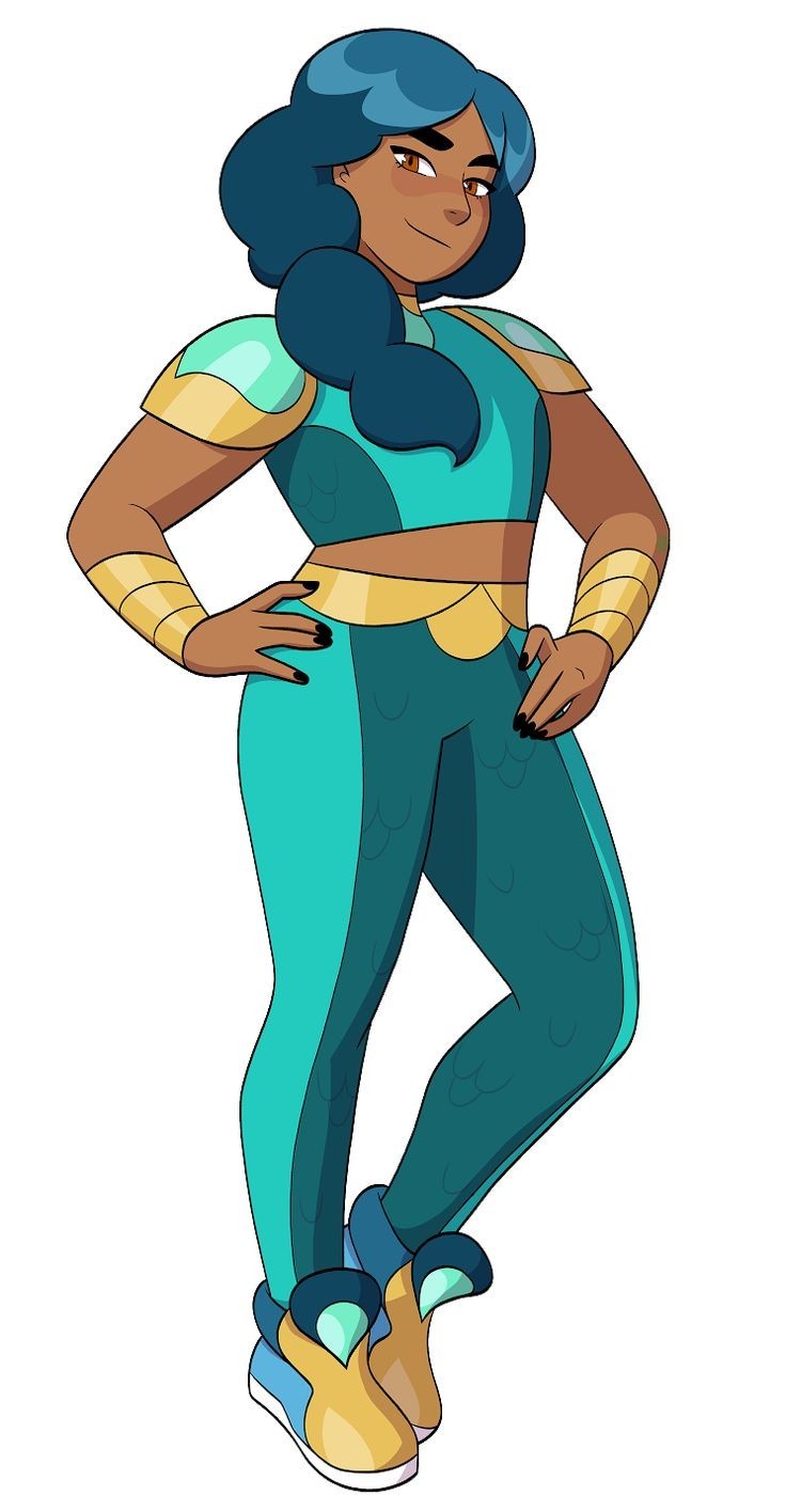
first off, she does not look like royalty in the slightest. she just looks like some girl who likes the color blue. even the gold accents don't really help. i'm not saying she has to walk around in a gown and tiara but at least add something to her design to indicate that she's a princess?
secondly, those clown shoes are NOT IT. who even thought of that? they look uncomfortable and ridiculous, and doesn't make sense for her character design.
those sleeves/armor (??? i honestly don't know what those are) and gold gauntlets also do not look practical in the slightest. they look like they'd be a hindrance for a swimmer. and guess what, she still has them in her mermaid form.
the OG mermista design wasn't the greatest but at least it looked like she could swim comfortably.
so my objectives were:
give her outfit a more streamlined look so it would make sense for her powers
make her look like actual royalty and not some girl with a cool color palette
expand more on the indian-inspired design and reflect that in her usual outfit, instead of putting her in a saree-inspired dress for one episode and calling it a day (i say saree-inspired because it's not really a traditional saree, but more like a modern and slightly western rendition)
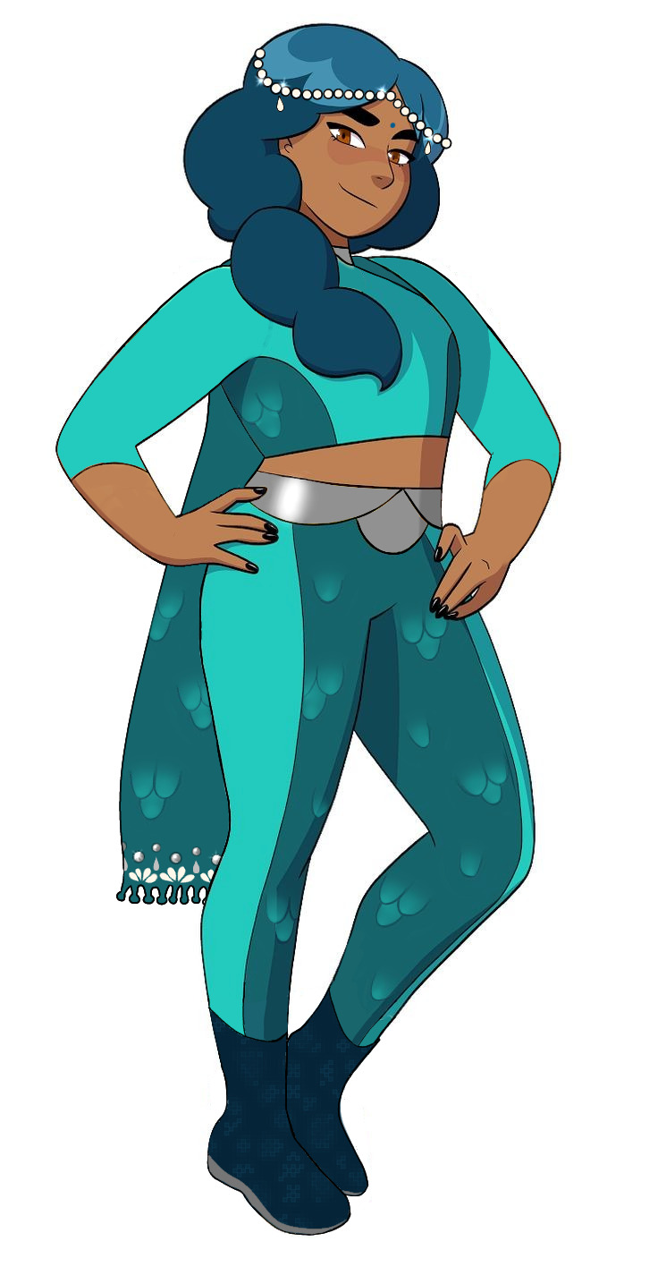
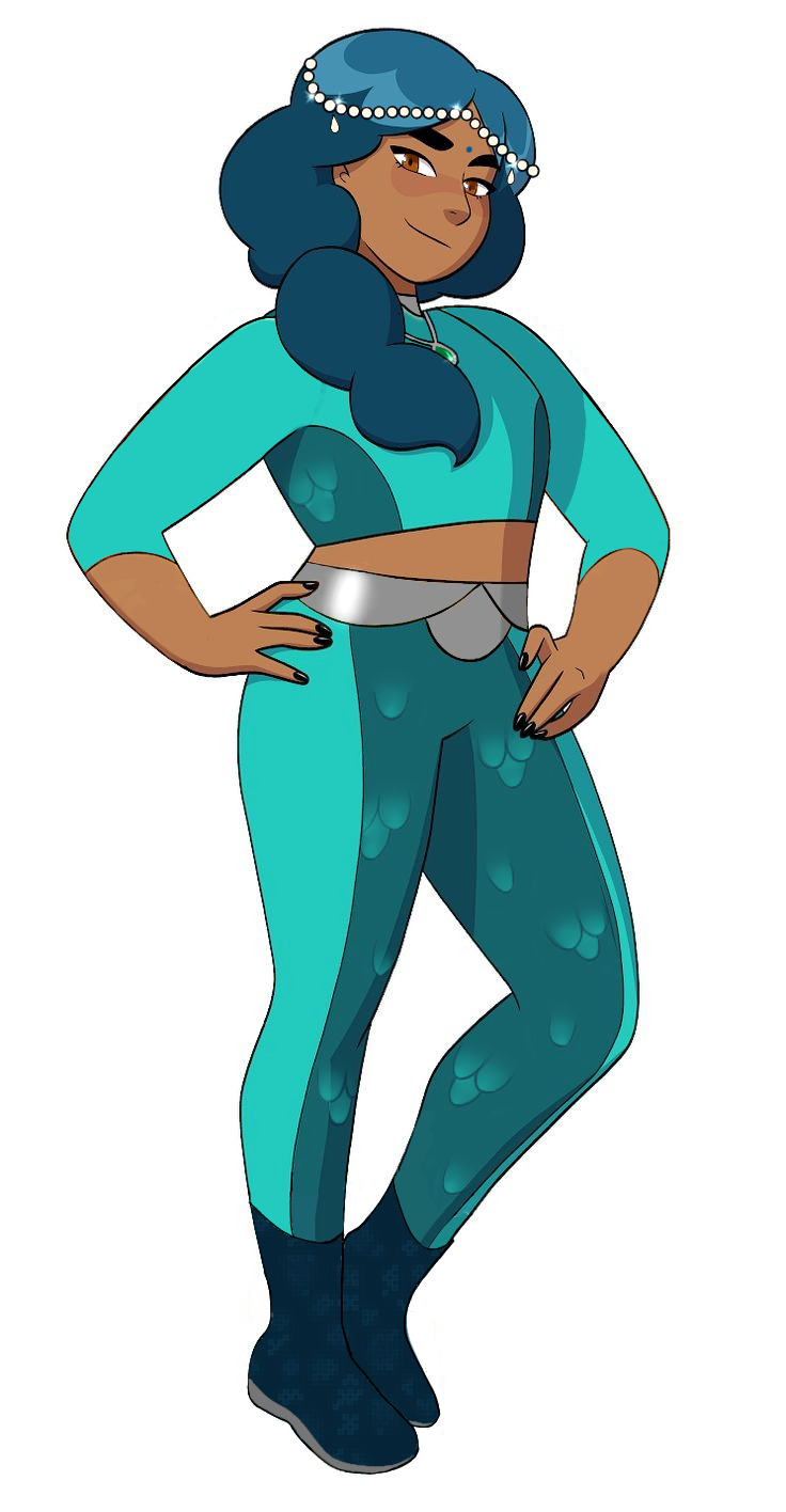
i made two versions of her redesign - one with a dupatta and one without. the dupatta, i understand, could be a hindrance in certain situations but i just wanted to give an example of how to take inspiration from a culture instead of just using it for brownie points. a dupatta is something indians would wear with their casual attire, mostly with salwars, unlike sarees which are generally reserved for special occasions (there are sarees that are casual wear, but they're still not the most convenient).
secondly, i gave her a headwear inspired from desi wedding attire and older indian tiaras. mind you, indian tiaras themselves are a lot more complex and beautifully crafted, but 1. it would take me ages to draw all the details and 2. i figured mermista would go for a simpler look, especially when she's not at her palace. also, while indian headwears are usually made with gold and jewels, i gave mermista's headwear pearls because.. pearls, oysters, ocean. mermaid vibes.
i changed the shoes and gave her a pair that are inspired by water shoes. i know that she would transform into a mermaid while swimming anyway, but these still look more comfortable without serving clowncore.
i replaced her gold accents with silver because the gold doesn't really mesh well with the teal, in my opinion. while indians are known for their love of gold, a lot of people nowadays opt for silver, because it is less expensive and more compatible with casual wear.
i highlighted the fishscale pattern in her outfit since you could barely see them in the original.
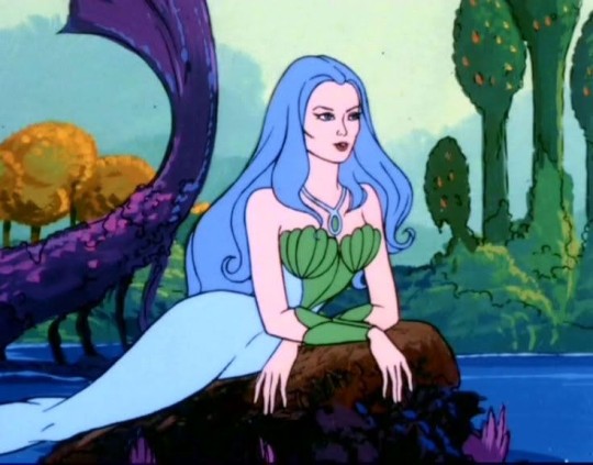
i gave her a bindi and the necklace that 80s mermista wore, as a tribute to the OG show, and the design is complete. i know that some of these may not be the easiest to animate but if they could animate perfuma's cape thing, entrapta's hair and a hundred different outfits for catra; this design is just child's play.
let me know what you think of the redesign and if you want me to do the same for the other characters!
#spop critical#spop#spop criticism#spop discourse#she ra#spop redesign#character redesign#character design#mermista#mermista redesign
184 notes
·
View notes
Note
im assuming this is the case but were jesse / lukas / petra’s admin designs having similar palettes / overall color schemes to the original three on purpose ??? i remember you doing admin jesse art before so im not 100% sure but i think its a really cool detail unintentional or not :)
actually no not at all. i didn’t even realize that until now 👀
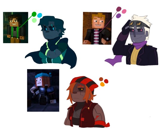
i kinda wanted their color pallets to all stay similar to the colors that really make each character stand out like jesse’s green suspenders, lukas’ magenta shirt, and petra’s red hair.
jesse’s design is based off your classic hero look with the onesie and the cape. the straps around his suit are supposed to represent the suspenders, and they, along with his eyes, are the only parts of him that glow. his colors are supposed to be calm and comfortable, yet dark and intimidating to look at because his admin self is honestly pretty sad. he’s eternally grumpy and wearing a smile is rare for him, so the colors also represent his gloomy mood. (he’s absolutely in no way evil though he’s still the same happy little jesse we know and love, it’s just very hard for him to take on positive feelings while in this form)
lukas’ design is supposed to look like someone of high authority. he’s a leader after all, and i wanted his design to be so anyone who takes a look at him knows he must be a person of high caliber. kind of imagine a pokemon antagonist and how they’re always decked out in attire that kinda makes you think like oh yeah that must be the boss, meanwhile look at all the grunts and they wear something similar, just not as ✨extra✨. yeah like that’s kind of what i had in mind for lukas, but instead of his magenta, i gave him purple because i personally really feel like purple is a powerful color. he’s the most like his original self compared to petra and jesse and he’s far more capable of staying calm and collected. also a good boy. looks intimidating but has the sweetest smile and the softest distorted laugh.
petra is… far more unhinged. her design is not entirely based off of her original appearance, but more around the energy and emotion she gives off. i kinda had a volcano in mind for her because it’s easy to spark a fuse in her and she can erupt and explode at any time really. she’s the most chaotic of the three, and if you read the details of jesse and lukas’ admin experience, petra’s is far less happy. she absolutely had to deal with becoming an admin all alone, and while that does sound sad for her, it’s honestly for the better. she would have been too worried about her appearance being so similar to romeo’s if she were around anyone else, and she gets to cope with that realization by herself and in a way that is honestly much better for her. like she goes down into a massive cave and destroys everything lol. uses her powers to destroy so much and take out all of her anger and aggression on mobs and her surroundings. she’s actively exploding, and once she gets it all out, she feels much better and theeen gets to really sit down and think it all over and cope with this newfound identity crisis
but yeah no the similar themes/pallets to the original admins was a complete accident 💀
154 notes
·
View notes
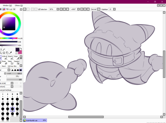
Note
Sorry to come out of nowhere but I just wanted to say that your art is so warm and so colorful and so ROUND in all the best ways and your style really captures my favorite things about Kirby! I've always found it really inspirational!
Also, I love the way your line art looks?! I have to ask (you don't have to answer though) is there a specific brush or technique you use to get that soft, multi-layered effect?
Either way, wishing you a wonderful day!
Thank you so much for your nice message, it means a lot!!
I've been wanting to make a small tutorial about how I make my Kirby art, so I guess your question came right on time hehe ^^
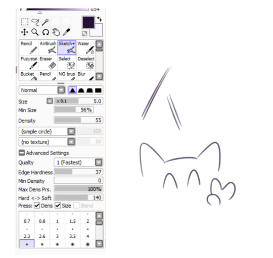
As I'll be explaining all of my process, I'll also answer your question about my line art! Btw my art program is Paint Tool SAI and I'll also be showing the brushes I use as well as their settings (i made up most of them a long time tho).
So first here's the brush that I use for basically anything, whether sketch or lineart!
It took me a while to understand what you meant by multi-layered effect, but no the brush doesn't do that, that's actually my way of doing "lineart" (ig it's not really lineart cus I just do sketches that I clean later on).
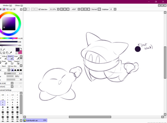
I then clean up everything, add the details and block by using a grey color.
Afterwards I add the flat colors! I already have my own made up color palette, but otherwise I always use a purple color as overlay.
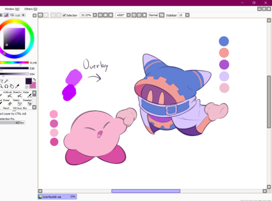
And I also use that same shade to color the lineart!

Next comes the fun part, shading! Here's THE brush that gives that soft effect to all of my drawings ^^ It's the same setting as my eraser too!
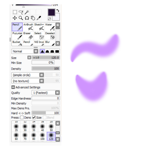
And yeah I also shade with light purple lol
There's also some other brushes that I use for more effects, like the airbrush! (I don't think I've touched the settings that much) I mostly use this one for lighting effects.
And finally the water brush! I sometimes use it for blending or for quick backgrounds,
but you can also see that when put it to "Spread" it also becomes the one that I use for my blushes hehe
Aaand I believe that's all of the brushes I use for my art! I do have more, but I only use those for other specific stuff like animation or pixel art.
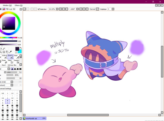
Adding some details AND VOILÀ!!

Now you know how I make my Kirby art! (but this also applies for all of my art) I sometimes redraw on the contours to give that "pop up effect" a bit like what they did in rtdldx lol ^^
I really hope it was easy for everyone to understand cus this is my first time making a tutorial! And to Desultory Novice, I hope I managed to answer your question too!!
Thanks again and have a great day :D
241 notes
·
View notes
Photo
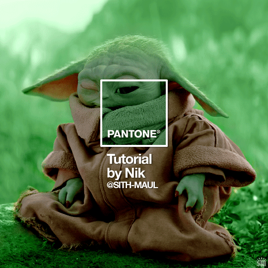
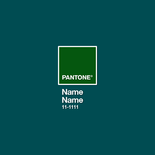
HOW TO: Make a Pantone “Color of the Year” Gif
A few people have asked about my Pantone sets which use the “Color of the Year” swatch design. So, here’s a full tutorial with a downloadable template of my exact overlay! Disclaimer: This tutorial assumes you have a basic understanding of gif-making in Photoshop.
PHASE 1: PICKING A SCENE + PANTONE COLOR(S)
I’m starting with this because it’s crucial for planning your gifset as well as making sure the execution is smooth sailing. The steps in this phase won’t necessarily be literal steps but some tips for how I usually go about making a Pantone set:
1.1 – Picking a scene.
Scene selection is everything. To make things easy on yourself, I suggest choosing scenes where the background is mainly ONE color — for example, a scene where the subject has a clear blue sky behind them. To make things even easier, choose a color that isn’t the same color as the subject of your gif. Like, if your subject is a human, I’d avoid using a gif with a red or yellow background unless you want to do a lot more work to mask their skin.
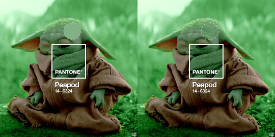
Rip me using a scene of green lil Grogu in green grass lmao. But I guess that goes to show you could really do this with any scene (I just did lots of masking and keyframe animations to perfect this green shade). BUT selecting your scenes wisely = a lot less work.
1.2 – Picking Pantone colors.
People often ask me how I choose my colors and there are a few methods which I’ll go over below.
But note that not all Pantone colors have a cute name, or any name (fun fact: only Pantone textiles have official names and they end with TCX, TPX, or TPG).
METHOD A: Google Search “Pantone [Color]”
Source: Google
Easy but not always fruitful, all you do for this method is open Google and type “Pantone [insert color here].” For example, when searching for teal colors, I searched several things including: Pantone Teal, Pantone Turquoise, Pantone Blue, Pantone Green, Pantone Blue Green, etc. Then, just sift through the Google results and click on whatever comes up from the official Pantone website! Since Pantone’s site blocks some info behind a paywall, you won’t be able to get a hex code from them. But you can just screenshot the swatch from their site, put it in Photoshop, and use the eyedropper tool to figure out the color.
METHOD B: Color-Name Site
Source: https://www.color-name.com/
This handy website lets you search by colors using the upper navigation bar. Or you can just type something like "magenta" or "blue pantone" or even “frog” and see what comes up lol. Color-name can put together palettes too! I like that this site also tells you the hex code of a color, which is really helpful for getting the right code to put in my overlay. Note: Not every color on this site is a Pantone textile, so not all of these names are Pantone-official names. You can tell it’s official if, in the Pantone row of the Color Codes table on the middle of the page, it has a code that’s 2 numbers, a dash, 4 numbers, and either TCX, TPX, or TPG.
METHOD C: User-Made Pantone Colors Archive
Source: https://margaret2.github.io/pantone-colors/
For my Wednesday characters as Pantone colors set, it was all about matching the color name to the character’s vibe. So, before looking at the actual colors themselves, I wanted to find the perfect color names. I stumbled upon this page. The pros = it lists pretty much all of the current official Pantone names. The cons = it’s not convenient since there’s no filtering tool. You can do Command+F and search for keywords, but that’s it. I literally scrolled through this whole page for my Wednesday set and read every single name, which... I think means... something’s wrong with me /lh /hj
METHOD D: Official Pantone Color Finder
Source: https://www.pantone.com/pantone-connect
This is last on my list because I don’t actually recommend it. Unless you already have access to this resource from your school or work or something, I would never pay for it and it is a paid feature only. Boooo 👎 But there is a free trial (which I’ve never used), so if you want to see what it’s about, you can definitely go for it.
PHASE 2: MAKING THE BASE GIF
Again, just some super quick tips for making a gif that, I think, looks best with this kind of set — but if you’re still learning how to gif, I do have a basic gif-making tutorial here for extra guidance!
2.1 – Uncheck “Delete Cropped Pixels” before cropping your gif. When you use the crop tool, this checkbox appears in the top toolbar. Unchecking it allows you to move the positioning of your gif later on, which is handy in this case when you want to choose which part of your gif will be underneath the Pantone swatch. You can read more about this tip in my basic gif-making tutorial (linked above; Step 1.5 – Tip B).

2.2 – Make your gif 540px width. My gifs for these sets are usually 540x540px but I think 540x500px will also look good. I think it’s more impactful though to make a big gif to show off your coloring.
PHASE 3: ADDING THE PANTONE OVERLAY
3.1 – Download my template
I made this template myself, so all I ask is that you don’t claim it as your own and that you give me proper insp or template credit in your caption if you decide to use it! Get the PSD with the transparent background here!
3.2 – Download the font Helvetica Neue Bold
The font I use (and I’m pretty sure it’s the same font Pantone uses) is Helvetica Neue Bold, with some very specific letter spacing (which I determined by studying Pantone’s official Color of the Year Very Peri design). It’s already set in my .psd but here are specs in case: color name spacing = -40, color code spacing = -75 (sometimes I’ll do -25 for the numbers after the dash if I don’t like how tightly they’re packed together).
I uploaded Helvetica Neue Bold to my dropbox here!
3.3 – Import my overlay
You can either drag the whole folder onto your gif from tab to tab or right-click the folder, select Duplicate Group, and select your gif as the destination document. Just make sure this overlay group is above your base gif!
3.4 – Fill the color swatch
In my .psd, on the layer labeled “Pantone Swatch,” just grab the hex code of your chosen Pantone color and fill that layer using the Paint Bucket tool! I’ve already put a layer mask on the layer for you so it fits perfectly inside the square outline.
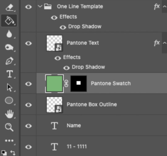
If you’re using my .psd, all the blend mode settings are already in place! I usually set the colored square behind the Pantone logo to the Color blend mode, but sometimes, I prefer the way Hue looks. It’s up to you!
You can also adjust the drop shadow settings to make your text more visible as needed. The layers are arranged in this order so the drop shadows don’t interfere with the semi-transparent part of the colored swatch.
3.5 – Insert the color name and code
My .psd has two versions to choose from: (1) a color name that fits on one line and (2) a color name that requires two lines. Use the one that applies to your color name and simply type that and color code into the corresponding text layers!
Note 1: Pantone doesn’t keep their font size uniform for every color of the year. They’ll sometimes shrink the text to fit longer names, but I like being consistent. So, I use this one font size for all my colors.
Note 2: My template has all the text left-justified and matching the starting point of the P in Pantone. BUT, sometimes the gif looks better if you nudge the text a bit so it looks more centered. Use your discretion when aligning the text!
Note 3: Btw, you definitely don’t have to use the TCX/TPG codes like me. (I’m a nut and there’s no way I’ll ever do a Pantone set and not use those types of codes to maintain uniformity across this series lol.) I’ve seen others do sets inspired by mine using different color codes or even just the hex code itself!
PHASE 4: COLORING THE BASE GIF
The key here is to make a majority of your gif feature your chosen Pantone swatch. If you’re really smart with your scene selections, this should be a breeze! If you’re stubborn like me and want to use specific scenes with the opposite color of your chosen Pantone swatch, there will be a bit more color manipulation involved... However, this isn’t a coloring tutorial, so again, I’m going to give some tips and resources that will hopefully help you out!
4.1 – Color matching.
Now that you have the Pantone swatch on your gif, you should be able to reference that center square set to Color/Hue to match the rest of your gif to that color. Feel free to paint a little blob of your color onto another layer anywhere on your gif so you can refer to it closer over a specific part of your gif. For example, I put a little circle over Grogu’s head to see how closely I matched Pantone’s Peapod color, then I tweaked my adjustment layers a bit more until the colors matched near perfectly and I couldn’t tell where that blob begins or ends. The left is the solid color and the right is set to the blending mode Color (like the square):
4.2 – Moving the base gif.
This isn’t really about coloring... but remember when I said to uncheck “Delete Cropped Pixels” in Step 2.1? Well, here’s your chance to adjust your canvas and move the gif around so the exact part you want under the color swatch is in the right position. I personally think these kinds of sets are more impactful when you put a differently colored part of your gif under the swatch so you can see through it and the difference is clearer. In my example, I put Grogu in the center so the green box would cover some of his brown potato sack robe.
4.3 – Color manipulation.
Color manipulation is when you transform your media’s original color grading into a completely different color. The Grogu gif isn’t a great example because the original scene was already a green-yellow color:
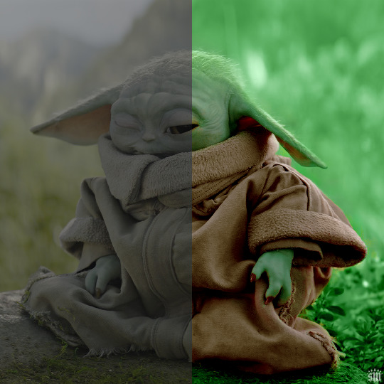
I mean, the difference is still pretty drastic but that’s mostly because my file was HDR and washed out as a result.
So, here’s an example I made using a gif from my first Pantone set for ITSV (I’m not doing this demo to the Grogu gif because it’d be too much work to manipulate a green background with a green subject. This ITSV scene is perfect bc the majority of it is blue while the subjects are mostly red.)
For the “basic coloring,” I did everything as I normally would: mostly levels and selective color layers.
For color manipulation, my fav adjustment layer is Hue/Saturation (those are the screenshots that are on the gif above). When you’re smart with your scene selection, it’s pretty easy to manipulate colors with one Hue/Sat layer because you usually only need to tamper with 1-2 colors and, hopefully, they shouldn’t interfere with skin tones (obviously you’ll do other layers to further enhance your gif’s brightness, contrast, etc. — but I just mean the heavy lifting usually only takes me one layer with a good scene choice).
All you have to do is figure out what color the majority of your gif is, toggle to that color’s channel, and fiddle with the hue slider. In the gif above, you can see that I played with both the Blue and Cyan channels. Here’s why:
If I only adjust the Blue hue slider, I get those speckles of cyan peaking through in the gif above. Unless you’re working with completely flat colors — like 2D animation with zero shading/highlights — a color is never just one, solid color. Blue isn’t just blue, it may have some cyan. Purple isn’t just purple, I often have to toggle the Blue channel too. So, yeah, be mindful of that!
I’ll sometimes go in with the brush tool and paint over some areas of my gif to really smooth out the color and make it uniform. When I do that, I just set that painted layer to the Color blend mode. Some of the resources below go into that technique a bit more!
4.4 – Coloring resources.
While not all of these tutorials cover the same type of color manipulation I did in my gifs, I think the principles are similar and would be helpful to anyone who’s a beginner:
– color manipulation tutorial by usergif/me: I go a bit more in depth here (I think lol)
– how to change the background of any gif by usergif/fionagallaqher: a great tutorial for using keyframes so you can manipulate the background of a gif with lots of motion
– bea’s color isolation gif tutorial by nina-zcnik: this tutorial has more tips about hue/saturation layers as well as masking your subject
– elio’s colouring tutorial by djarin: this tutorial shows a lot of examples of first manipulating the colors then brushing over the gif with a matching color for extra coverage
And just one last note on coloring, I always try to appreciate gifs with the mentality that “good” coloring is 100% subjective. One of the only things I would classify as “bad” coloring is when you whitewash or [color]wash someone’s skin tone. So, as long as you keep the integrity of your subjects’ natural skin — especially if they’re a POC — you should feel good about your coloring, because it’s yours and you worked hard! <3
PHASE 4: EXPORT
That’s it!! If you work in Video Timeline like me, just convert from Timeline back to Frames, export your gif, and voila!
Easy PEAsy. 🥁
If you have specific questions about this tutorial, my ask box is open <3
Also, check out these other Pantone-inspired sets by my friends @nobodynocrime (Mulan set) and @wakandasforever (Ponyo set)! There are so many ways to use Pantone colors in your set, so I hope this inspires you to create something beautifully colorful <3
#gif tutorial#completeresources#usershreyu#useryoshi#userelio#userannalise#userzaynab#userives#usermarsy#usertreena#usercim#userrobin#userkosmos#usersalty#usermills#userhella#alielook#resource*#gfx*#pantone*
960 notes
·
View notes
Text
If there's one thing I'm proud of as an artist, it's the fact I'm a style chameleon. I decided to sit down and recreate 4 artists I really love, and who better to do it with than with the most varied character in the entire franchise: King Dedede! This isn't just for appreciation though, but a study on how other people translate DDD's design, since character design is a passion of mine!
Let's start with @miniiieevee!
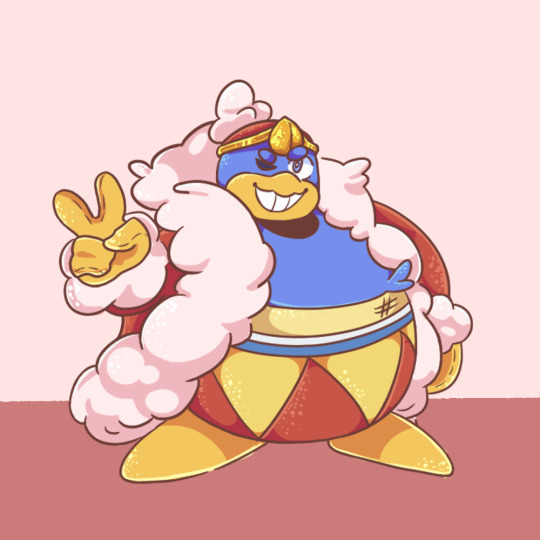
Oh my gosh their art is super great, and I think the most important part of getting the style right was the sparkles. I have never seen someone do highlights this way, and it's both super recognizable and super cute! For the King himself, we have a nice round beak, visibly blue eyes, a distinct head, pointed crown jewel, an undershirt, and stripes along the top of the belt. Like most of us, they use the (owo) kind of mouth and really fluff up the coat. Separate fingers can also show up for posing, following Spongebob physics. The stitching on the gloves and the little round eyebrows are another really cool touch! Out of all of the styles I looked at, this one has the most pastel colors.
-
Next is @das-a-kirby-blog!
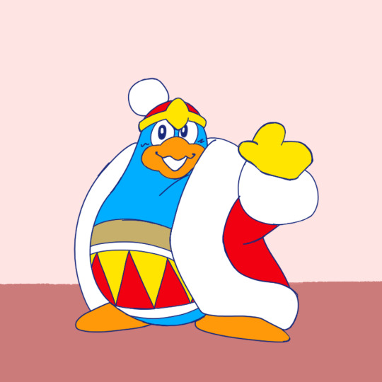
Das-a-kirby-blog has such a cool variety in their work, from really shapey sketches to super abstracted color schemes, which while super amazing, didn't provide me the best ref material. The colors here are frankensteined from a few sources, so I hope they capture their actual base color palette. They go for the pin-shaped route for body shape, with the undershirt (though sometimes there's no under layer), typically black eyes, extra belt stripes, and a chunky diamond shaped crown jewel. My favorite touch is the cottonball on the crown. Like I said at the top, they excel at shapes in their art!
-
Third is @jojo-schmo!
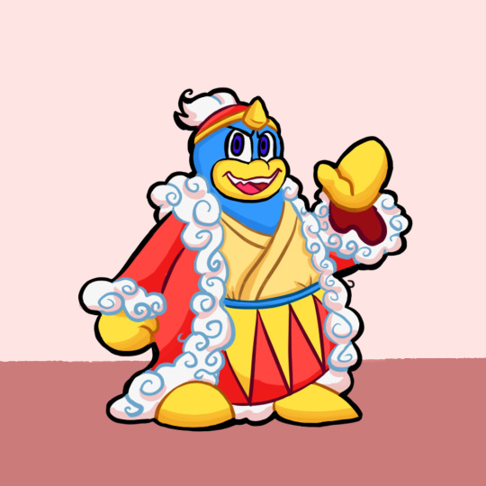
I've been silently reading their roleswap comic, but I should've been loudly reading it because I super recommend it! I'd also say design wise their Dedede is the most unique! Besides myself they're the only one here to pick the kimono, they have a single blue stripe at the top of the belt, a triangular jewel, and the coolest element of the style, spirals! I've not seen anyone stylize the trim this way, and it's so cool in execution. Another unique element that really adds to certain expressions is the spiky teeth (which matches real life penguins! ...Don't look it up).
-
Last but not least, @cosmicwhoreo!
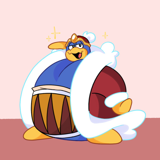
God, their art is everything. The flow of the lines is so clean and smooth and everything they draw is super expressive. Their Dedede is by far the hugest, and also marks the 4/5 DDDs with a separate head, and 3/5 with black eyes. We have the belt stripes, occasionally a shirt, and a smooth tear drop jewel, but a uniquely shaped crown band. This design sees a lot of influence from the anime unlike the others here, so the color scheme is the most unique.
-
As a conclusion, it's really cool to see all the different design elements that we pick and choose for DDD. Some give him his smash outfit. Some people give him a body type closer to K64 or KATFL. Some people draw his eye color, or separate eyebrows, and others don't. There's no detail that's the same across every version, but they're all our lovable king. If you don't recognize one of these artists, check them out! I can only do a fraction of the incredible work they do, and let me know if there's any other characters or artists you'd like to see this exercise with!
#my kirby art#kirby#king dedede#art style study#I actually have no idea if @s notify the person or not#Probably?#I hope I did you guys justice
446 notes
·
View notes
Text
So I’ve finally got some of my thoughts on the new season in order and letting my self sit on it for a while
Dragons rising season 2 spoilers!!!!!
So first off holy shit this season has managed to completely wipe out any fears I had for season two. I’m a generally anxious person and am pretty naturally pessimistic about most things and was pretty anxious about season 2 because from the stuff shown in trailers and promotional vids it looked like a “Lloyd chosen one” plot line and I have a history of hating that kinda thing because it’s been beaten to death in ninjago at this point. While a bit of that was there I found it was done quite tastefully and didn’t overwhelm everything else story wise.
I felt that the pacing of the first 6-7ish episodes was a bit all over the place. Having the training arc and the Cole-Zane plot lines happen in the same episode with the pov switching back in forth felt a little bit off to me.
Sora and arins character arcs are shaping up to be pretty good. Soras more confident in her self than season one and she’s trying to help Arin but I feel like the whole using her elemental power to help Arin will backfire into her face. Arin’s insecurity and the whole how can I be useful if I don’t have an element I fell is being handled way better than the dumb kai arc in season 11(dw I will get to that when I get to kai) and it’s about on par with the Lloyd powerless plot from hunted. I am really excited to see what they do next and if Arin will be really mad at sora or not cuz like he’s super nice and stuff and I fell like he would be sad instead of mad.
Nya didn’t really have a lot going on personally except the stuff with Jay which I’m iffy on because so much of Nyas character in older seasons revolved around Jay and I just hope they don’t go back to that and let her character breath a bit.
In the topic of Jay I really really REALLY hope he isn’t evil. That the idea because it’s really out of character and they are already pushing my buttons with the lost memory crap because that’s something that I’ve rarely seen done well at all and it makes me very nervous and I just don’t like it. I do like that Jay just seems to be a guy who hates his job tho that’s fun.
I think the writers are just having fun with Zane and I think that’s cool. I do wanna punch the administration guy who said Zane isn’t a person because he is and he’s a bean and I will not allow this nobody to slander him.
It was nice to see more of Cole this season. I swear him and geo are so cute. The hand holding and the fact that they basically adopted two kids together is amazing and I am fully on board for this ship.
The villans were really interesting. I hope they keep up the quality with them because the mystery of ras’ master and wtf happened with jordana is really exciting. Cinder was intresting and as someone who has no interest in men what so ever I am kinda baffled at why so many people want this man but hey you do you. I do wonder what happened to ash tho. The member of the forbidden five looks interesting too and part of me is hoping that the leaked “evil jay” minifig is actually this guy just powered up cuz the color palette is similar enough and I just don’t want an evil jay.
Wyldfyre is amazing her whole leg being broken then sneaking on the ship to the exasperation of kai (like he would totally have pulled something like this a few seasons ago the hypocrite <3) and the others was so good. I am curious about her talk with egalt she mentioned one of her family members getting the wasting sickness but it can’t be heat wave cuz he seems fine so maybe she had more than one dragon guardian??? I do hope that Kai’s portal abduction does affected going into part 2 and that she bonds with nya and the others over it.
Egalt and rontu were very interesting to me and I’m glad they didn’t go the route of them being the actual creators of spinjitzu and kept the lore consistent I was slightly worried about that. Hope they come back in part 2 too.
Bonzle was a big surprise for me. I likes her personality in season 1 but I didn’t expect her to be so important. She’s really sweet and the scene with wu was great too.
And finally last but definitely not least, the best character in this entire show and my favorite comfort character to beat the shit out of
KAI
IT WAS SO FREAKING GOOD. I LITERALLY HAVE NOT BEEN THIS HAPPY WITH AN EPISODE SINCE SEASON 4 EPISODE 7 THE FORGOTTEN ELEMENT (iykyk) I was literately kicking my feet like a little girl and crying and screaming my head off to the point I woke up other family members. Him unlocking the rising dragon technique by having his sister help and being in harmony with his family is so fucking sweet and I cried like a little bitch it was so good. I am also so happy that they used his old hair and didn’t just slap a smaller version of his current hair onto him (tho I kinda wish they had used the fucked up custom hair that was in the older episodes but I doubt that model is even in their hands so whatever(side side note I love the fucked up hair so much it’s so stupid I love it and will forever miss it)) him being such a dad to wyld fire was so sweet and then using the rising dragon technique after he saw his family in danger was just perfect. I do kinda wish there was more of a dramatic reaction to him getting yeeted by ras into the portal (kinda like any of the other ninja “deaths/major injuries”) but im fine with what we got. Except I kinda hate that only nya has an outward reaction in the aftermath. No lloyd reaction no Cole reaction and nothing from Zane and it makes me mad because every other time a ninja had their moment there was a whole team reaction. But I’m feeling like that’s to nitpicky and there’s still ten more episodes to fix that so fingers crossed. But kai also encouraging bonzle to close the portal even if he’s trapped inside is such a kai thing and hit me like a truck. Also him calling bonzle kid dispite her being much much older than him is funny and sweet cuz Kai’s big brother/father figure side is coming through and it’s so sweet. And the ninja never quit line is so great I was sobbing even more after that. (Tho I don’t know why he said he got it from Lloyd when it would have made more sense to have it be from master wu cuz that’s where he learned it but eh whatever).
While im really happy about kai finally getting some well deserved angst im also very anxious about it too. This could be the perfect opportunity for the writers to just conveniently forget about him for a while and idk if i could sit through that. Kai is a huge part of why I watch ninjago and he’s always been handed the shortest stick character development wise and technically he never got his own focus season either (and no i dont count the pilots because that focused mainly on all the ninja and was only two episodes, i also don’t count season four because it was more a group season, and season 11 doesn’t count because he got a half baked b plot that sucked) I’m very worried that I will loose enjoyment in the show because I dropped the show out of disappointment after season 11 because A LOT of premonitional material made it seem like a kai season and I got my hopes up and was let down so much. I’m very cautious when getting excited about things involving kai in particular because of that and I’m just hoping the writers don’t fuck it up.
Ok that’s enough negativity for once. I’m so excited for more and am foaming at the mouth for more!
#ninjago#lego ninjago#kai jiang#kai smith#kai <3#ninjago dragons rising#kai ninjago#ninjago cole#ninjago nya#ninjago zane#ninjago jay#ninjago sora#ninjago arin#nya smith#nya jiang#zane julien#cole brookstone#lloyd garmadon#lloyd montgomery garmadon#ninjago lloyd#ninjago dr spoilers#ninjago spoilers#ninjago dragons rising spoilers#ninjago dragons rising season 2#sorry for any spelling mistakes I just wrote this a quickly as possible#I’m excited but also cautious per usual#us kai fans are eating good tho
58 notes
·
View notes
Last Seen Blogs
kellynickelsgf
kelly nickels' gf (real)

papershreddersindia-blog
Paper Shredders India
sl-vega
𝓯𝓪𝓲𝓻 𝓭𝓻𝓮𝓪𝓶𝓮𝓻
mientus-com
mientus.com