#i can’t. perceive. the world. in any way *but* how the visual media portrayed it
Text
hey gang! just learned it’s not normal to be scared all the time :/ sounds fake imo…
#vent post#vent tw#uh. mmm. how to explain this one.#I got um.#anxiety#paranoia#the works#but rn I’m ✨shaking✨ bc i feel like something is watching me and is going to attack me 🥰✨#(those 🥰✨😍🤭s are all sarcasm btw i hate this)#I’m chilling working on dnd stuff and voila!! I’m shivering in fear!! 😍#my heartbeat is so high for no reason WHY AM I LIKE THIS. NOTHING HAPPENED.#i need ✨therapy✨#my brain is mentally ill in some very specific fucked up ways where if I interact w/ or consume visual media of any type#i can’t. perceive. the world. in any way *but* how the visual media portrayed it#like— after watching spy movies my anxiety will skyrocket and I feel like I’m being watched/attacked for example#or!!!! HORROR GAMES :))))))))) in this specific example :))))))#for context i watched part of a horror game playthough YESTERDAY. IT'S BEEN A WHOLE ASS DAY. I STILL CAN'T FUCKING SEE SHIT NORMALLY#mmmmmm intense derealization 🤝 no sense of self 🤝 mirrors everything around me 🤝 no one i can talk to/relate to#im having a time#complete isolation save for those u hate :))))#wahoo!
0 notes
Note
Anonymous because.. not yet.
How do you, or do you have any tips on having and writing a storyline?
I’m an animator (tween w AM) who’s learning renpy and soon making a visual novel. I was wondering if you just have writing tips. Thanmnsk
Hi :D (sorry for taking so long to answer)
Considering that my only posted work is the AU, I’ll tell you a bit about my process while writing it, so hopefully you’ll find it useful for your future projects owo
1. The What-If Question: I find that with all or most of my written works, I end up asking myself “what if _____ happened?” For example:
What if Pastor Craig summoned an imp?
However, asking this question once won’t suffice to create a whole plot. So I asked myself more follow-up questions after that:
Why would Pastor Craig summon an imp? What would his motivation be?
What kind of information would Tweek hold? What types of stories would he tell?
Why are we taking the time to hear such stories?
With that, you start to build the scenario in which your story will stem from.
2. Plot First, Characters Last: Though it’s really fun to think about the characters (whether original or predetermined), I find that sometimes it’s easier to craft the plot first, then create/assign characters later. Yes, the characters are important, but the plot is what keeps the characters vivid, so I would suggest working on the plot first.
3. Dynamics: The way in which characters interact with each other is vital to how they are perceived by the audience. This can apply to original or predetermined characters. Some characters will act a certain way around some people and another way with others. Dynamics also extend past singular characters, but also things that are bigger, like power. How do these characters interact with certain aspects of their world? Do they care?
4. Motion: When writing, and also drawing, you have to remember to keep the environment moving based on the scenario. A lot of times, some casual scenes might seem stiff, but this can easily be fixed by observing the way in which you yourself find yourself going about your day. Yes, there are some times in which you are standing face-to-face with someone while having a casual conversation, but that isn’t always going to be the case. A lot of times, people are multitasking, moving around, or sometimes don’t speak as clearly. Consider these little things when observing the situation that you are trying to convey.
5. Get in their shoes: I would say this is more of when you’re writing more emotional scenes, but this can apply anywhere. As a writer, you have to get yourself in whatever headspace you are trying to write. If you feel like you can’t get it right, watching TV or films can help you visualize the type of emotion that you are trying to portray. Aside from how people feel inside, they tend to also have visual reactions, so I would suggest paying attention to those.
6. Where are you going with this?: A lot of times, people get lost on what they’re writing about because they don’t know where the story is going or how it will end. Now, you don’t have to necessarily know how the story will end from the beginning, but it can help to know what the first conflict will be for your characters to overcome. It’s okay if you don’t know how your story will go from the beginning to the conflict, but that’s okay. This space in between is used to get you there. On a similar note, it’s okay to just visualize plot points without knowing how to get there. There’s a reason why filler episodes exist.
7. Think of your favs: I’m sure that there’s a show or movie out there that you might feel inspired by to make your own story, so use it as motivation to write! Now, I’m obviously not telling you to copy the characters or story, but it’s also common for people to take what they observe in other pieces of media and take inspiration from it. Create a little collection of cool things you see from media you like that you’d like to apply to your own story.
Anyway, that’s just my thoughts. Hope you find this helpful and good luck with your work :)
6 notes
·
View notes
Text
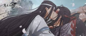
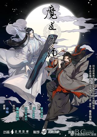
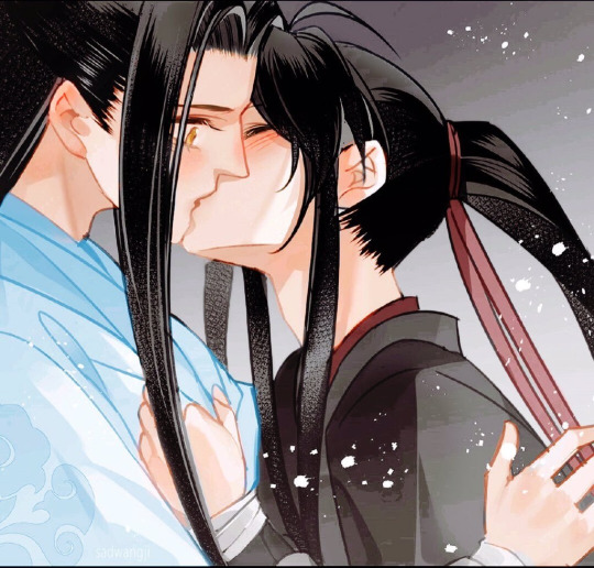
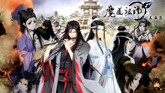
SPOOKY SEASON! An ode to Mo Dao Zu Shi: one of the best BL story created!
HAPPY HALLOWEEN!!!!!
One last Halloween post and it's about one of my favourite pieces of media in the world of BL, romance, and supernatural stories. Roll your eyes because once again I'm talking about Mo Dao Zu Shi (The grandmaster of demonic cultivation) I mean already with the demons, and cultivation is already hinting why this is Halloween themed, and trust me MDZ has much more than that: from zombies to ghosts, to magical instruments and weapons, and we love our fantasy cultivation sects and clans. Anyhoo, I am here to write a fun post another verdict/review on each of the adaptations available so far for MDZ, yeh you heard me I've listened, read and watched all versions of this masterpiece, and I'm here to tell you to go and do the same for Halloween. Also in case, you haven't heard MTX (the author of MDZ) has another show on its way TODAY! And that's the magnificent, the excellent and incredible Heaven's Official Blessing after marathoning MDZ do that too.
As always with my verdicts: we have ratings: From 1 to 5 (1 being least excited to watch, 5 being most,) how excited am I to delve into these again?
Country: China
Genre: Danmei, Supernatural, Action, Fantasy, Romance, Comedy, BL, Horror,
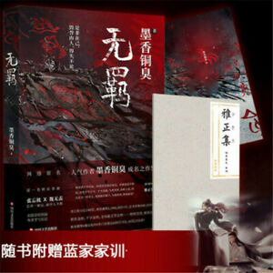
1.The Book
We begin with the one that started it all. The reason for my devotion and love for this world, for Wei Wuxian and Lan Wang Ji. My heart hasn't stopped loving this book experience. And at first, it wasn't easy to understand all the logic and terms needed to know for this world of cultivation and sects and clans, and magical skills. But once I got the hang of it (maybe after reading it three times I wonder how I had time to do this by the way), this is a book that I keep on returning to, crying to, and just breaking down into a mess too. This book is the most original source for the love story of Wangxian and to be honest its a masterpiece. Now onto the pros and cons, I guess about this adaptation.
Pro:
First, I would say that this is the most non censored version of MDZ, meaning China couldn't mute the romance or delete scenes because it's the original written story. The romance between Wangxian stands out and makes your heart go through a lot of emotions, from frustration at Wei Wuxian not realising how he feels for Wang Ji, to pain because of Wang Ji's perceived unrequited feelings for so long, to happiness when they're just together, to confusion at some drunk scenes and then to all-out shock as the story reveals its self to the villains, the background of Weiying's death and more.
The introduction to all these characters, all of them have a role in the story, all of them are important to keep an eye on, and they all grow and develop throughout the story as we find out more about their circumstances and their own perspective on Wei Wuxian.
Cons but not actual cons
The book is longggggg. The first time I read it I wondered when we would finally get a resolution or hint that Wei Wuxian finally understands what he's been feeling for sooo long, but it took forever and to be honest even though this is a con to me, it also is a positive for those who love slowwwww burns, and slow reveal to the background and development of Wangxians feelings for each other. There are many missions although essential to the world-building and the actual plot/mystery that at first seem so useless and not needed, but they are there for a purpose, and they do help us find out more clues about what's been going on and why Wei Wuxian was brought back from the dead.
The book is the most non censored version of MDZ, and so there are many questionable moments/questions about Non-consent that occur during moments when Wangxian are drunk. Honestly, these scenes are so weird to me, because they hold so much truth and revelations to Wangji's feelings for Weiying. After all, he's drunk and the most authentic version of himself. There are so many moments (like stealing chickens or showing him the bunnies) that make you just want to cry at his love Weiying and the pain he had to endure when he thought he was never coming back. Still, at the same time, there are many moments where you're like oh wow that escalated, and you feel just a tad discomfort at the idea of the non-con. But like I said these scenes are required for these two to really like give into what they've both been trying to push away or ignore, and it's nice to see how Weiying reacts to his feelings becoming uncontrollable and more prominent.
There are some moments in the book where things seem vague or unexplained (which the other sources did their own thing with), some characters who are mentioned but not really given enough detail, some plot details where it's not fully understood. However, I do think that because the book is already so long, the most critical information needed was there and the reveal of the mysteries were all done well. I think though that it's better to see how it materialises visually hence the other media adaptations.
Ratings: 4/5 -It's not easy to pick up the book and read, but I have so much fun returning to it and laughing along with Wei Wuxian's thoughts and ideas about Wang Ji.
2.The Manhua
I was so shook when I found out MDZ has a manhua. Mostly because China wouldn't really make it easy for the book adaptation to be honestly portrayed visually. But the manga shocked me, it is censored, but the writers and the artists are all so obsessed with this book and this couple that despite having to remove or edit some scenes, they draw some additional scenes and post it online so that international fans can still get to see these moments visually. That is incredible, and I'm so grateful that we have a team of people who respect and love the piece as much as the fans do.
Pros:
With any graphic novel/manga the art of MDZ is fantastic to see, the characters are brought to life with colour and also the inclusion of chibi drawings to make a moment incredibly cute or funny. Weiying is very naughty, so a chibi drawing of him makes us see him like how he's acting a child. I enjoy the manhua of MDZ so much, and I love how they drew each of the characters and the world.
Cons but not really cons:
I think, however, there are better visual sources for MDZ available that is more detailed in terms of characters and includes more information about the world-building. The plot also has to be condensed as well because you can't draw everything from the book. The manhua is also still in the works so, its a very slow upload and it will take years for it to be completed. But this is understandable, and I can't wait to read the full completed copy. If you hate reading and can't stand words, I think the manhua version is for you!
Ratings: 3.5/5 -It’s the waiting that lowered the ratings for me and the fact that I prefer other sources but I’m so grateful for the manhua.
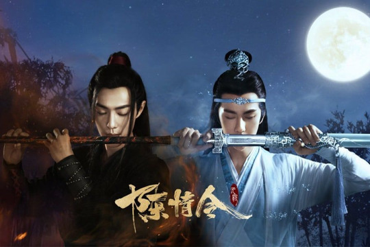
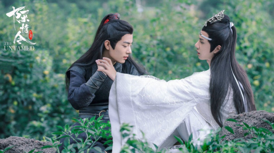
3.The Show
The one that brought international fans like swarms to this story. Untamed shocked all of us in the BL community as the first time we heard about it, sure it was nice to see that Yibo was cast as Wang Ji, but even then his acting wasn't that profound or praised so we didn't care, and Zhan also seemed like an interesting choice for out Weiying. I think there were an outrage and confusion when we heard this was going to be censored and a bromance. It felt like it made no sense because there's no way really to edit the relationship and love of Wangxian, so people went into the show resentful and worried. But after 20 episodes, the anger, worry and upset were erased. Untamed is a masterpiece, and it blows my mind how censored it is but still not really censored? It deletes the questionable moments in the book but adds the essential parts even where we get to see Wang Ji's feelings (Though obviously not mentioned as feelings but respect). We get to watch Weiying realise how much he cherishes whatever he has with Wang Ji and how much he misunderstood the latter, and how much Wang Ji cared for him. The show as Netflix says is not about just friends. Still, it emphasises the connection between these two using subtext clues and symbolisms, and visual metaphors to make sure the audience knows that these two are soulmates and are meant for each other. Here are the other pros and cons of the show:
Pros:
The acting is incredible, like so good and I can't think of two people who were more suited for Wangxian, Yibo shocked me as Wang Ji because although I knew him (because of Kpop), I didn't really think he would pull of stoic but still vulnerable Wang Ji. He was good at showing the emotions of love and longing that has been connected with Wang Ji. Zhan was an excellent Wuxian, he made me smile, he made laugh, he made me so happy because of his mischievous aura, but he also played serious and emotional and resentful Wuxian well as well. I keep crying every time I see the death scene in the show because it's just so done well.The directors and producers who didn't care about hiding the relationship between these two, they still wanted to be respectful to the writer and the source, and they still wanted to show as much as possible that these two loved each other. For that, I'm so grateful and they did a brilliant job with what they could. The character arcs and development and depth; Its the way they took the other characters from the book and fleshed them out giving each of them more depth, more understanding, more dimensionality and more story connecting to our plot, and it broke my heart how much I loved everyone in this show. The actors all performed so well, and some gave me goosebumps at how well they portrayed their characters (Xue Yang!!) like stunning and just a great cast.The storyline was also written in an innovative way, the flashbacks were first shown to the audience, how Wangxian became Wangxian and so the audience felt every single hurt and pain that Wang Ji was feeling. We understood why he acted the way he did. The flashbacks also provided plot structure to the mystery and the actual plot of the show, it left clues, and we watched the villains become villains (secretly), we saw how some characters grew. Each of the arcs in the book was told in a way that it flowed together and made sense. Due to this way of structuring the plot the show became so much more profound in the way it messed with our emotions, every death mattered, and every character had their own story and importance to the audience.
Cons:
The censorship. I've praised how they overcame it, but it's still there, the ending of the show was done this way because of censorship and to be honest I still think everyone should read the book because there are moments where the romance of Wangxian is fun and memorable to see (the confession scene whilst it was done okay in the show because of censorship it doesn't hold as much oomph as it did in the book. Mainly because the events that happened before it was already so filled with angst and drama and the results of the confession Wangxian clinging onto each other despite being in danger is a must-see, the censorship is annoying because it shouldn't be there, it's something that whilst it did help with some stuff, it still feels like an insult to the piece, and it still doesn't sit well with me that China censors their BL. So its a con.
Ratings 5/5 I think I could spend so much time breaking down why Untamed is a masterpiece BL show, but all I can say is despite 50 episodes (longgg) it is worth the time and effort and if you watch BL, go see it.
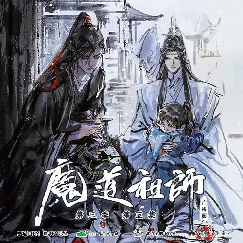
4.The Audio
The audio for the MDZ is like my favourite thing in the world. I love Chinese audiobook dramas; it's an incredible experience to listen to. With MDZ, this is what the show would be if it wasn't censored. The actors for the audio drama are amazing, and I love them so much. The audio drama is three seasons with some extra scenes and it's incredible if you don't want to read the book, then just watch and listen to the audio drama because its the same story but its brought to life by the acting and storytelling. Also though there are some scenes removed, I think the audio drama is the next uncensored gem of MDZ that shows Wangxian's romance the best way possible. I squeal, and I laugh, and again I cry at every single moment; their first kiss, the inn scene, the confession (i spend time pausing it just to cry at how good it is) and more. I just love it, and I prefer it to reading the book. Other pros and cons:
Pros:
The story is structured and told properly, follows all the arcs and events in the book and brings them life by voice acting, and the music is incredible. It's nice to listen to and hear Weiying's thoughts and to also listen to an audible version of the book. The audio drama has all the pros from the book as well.
Cons:
Nothing much to say about the cons. It is not easy to attain the audio drama in English subs, its hard to download and store it, but once you overcome that it's great. I think the audio drama is the most difficult to obtain.
Ratings: My favourite adaptation 5/5
5.The Donghua
Lastly, we have the Donghua or the anime version of MDZ. What can I say about this, its brilliant, masterpiece, it's gorgeous. If you think the art for the manhua is good, the donghua takes it to a different level. The visuals are stunning, the animation is breath-taking, and the story is again following Untamed ways of censoring the story but making sure it doesn't remove the romantic connotations and symbolism to Wangxian. The donghua also follows Untameds way of starting with flashbacks to explain what happened to Weiying before it started. I have nothing else to say about how great this is. It's the same thing I've been saying about all these adaptations. The donghua though is the best visual masterpiece for MDZ, in my opinion.
Pros;
Packed full with symbolism and clues to the plot, it's detailed so well for the storyline and its an excellent way to tell this story. The music and ost for the donghua are also beautiful and gets me emotional each time I hear it.
Cons:
Censorship. That's it, that's what it always is. For me, I think the donghua is the most censored version of MDZ? Or maybe I just feel that way despite the subtext clues; I do feel irritated at the censorship in the donghua. Let's pray Heaven's official blessing overcomes that.
Ratings: 3.8/5 - I love it so much because of the visuals but apart from that I prefer other sources for MDZ. Still the best donghua that exists.
So here you have in an in-depth and messy conversation about one of my favourite media pieces to existing right now in BL. I think I will never stop singing praises at MXT for creating this story and I think there's nothing else I rather do than just spend times when I need a distraction watching, listening or reading this story again and again. What about you all. What do you feel about MDZ? What pros and cons do you have for each adaptation? Which is your favourite. And have you been able to get any rest when we know that Heaven's official blessing is out TODAY!! Let me know your thoughts. Happy Halloween, Enjoy it.
#mo dao zu shi#the untamed#mdzs#wrpup#FVete#october#halloween#wei ying#wei wuxain#lan wangji#mdzs donghua#wwx#lwj#chen qing ling#cql#bl series#danmei
56 notes
·
View notes
Text
An Essay on POC and Fics
[ORIGINALLY A WRITER ASK GAME]: Ramble about any fic-related thing you want!
(AKA me explaining in long-form why June is white, complete with some drama and a lot of rambling. Do not feel obligated to read).
.
I’ve never talked about this extensively, but I want to discuss ethnic minority OFCs in fics. Specifically, SiA. I originally was going to make June partially nonwhite. And I ran into problems.
I really found myself worrying about relatability. If a character is POC, I thought it would ruin immersion for people who are looking for an OFC fic to lose themselves in. It’s no secret that I’m Asian-American, and I was originally all for making the character part Asian. It’s ironic that I was worried about immersion when outside of fic spaces, I argue unendingly for Asians to be cast as leads and stereotype-defying roles. Because any POC is also just a person who can be as “relatable” as any white character, theoretically. I feel a little hypocritical, but at the same time it’s true.
When I watched The Walking Dead, Glenn was my absolute favorite. Because he was Korean-American. And for the first time, I watched a major (Asian!) character in a show become hailed as a man defined not by his race, but for his achievements and his personality. If Glenn was white, he still would’ve been one of my favorites. But seeing Asians portrayed as... normal people shouldn’t be this rare. However, it is, at least in mainstream America.
The issue with creating POC characters is racism. That’s always the issue, isn’t it? Racism has been ingrained into every system and cultural dynamic, globally. The remnants of colonialism are alive and well, and the treatment of POC people, generally, is far from sterling.
Thus it became almost impossible for me to justify creating an Asian-American (or, for that matter, any other POC) OFC. They would be defined by race, because back in the 40s, any American ethnic minority had no choice but to be characterized by their appearance. It still happens today. And I wanted the focus to be on humanity, war, bonds, and gender. Not race, because race is unpleasant to talk about. It wouldn’t be fun for me to be researching 1940s race discrimination to create a character who must overcome that too. I’m not looking to undergo an identity crisis in the pursuit of a fic aimed at social justice. I just want to write something fun.
Fic is created, many times, by minority groups, including POC. However, like any institution, it’s white-centric. And I don’t fault it for that. Most media in the mainstream is white-centric and thus it makes perfect sense for the works created based on the material to be also that way. But I felt like I was betraying myself by writing fic and not taking a chance to diversify the narrative.
Because if a significant part of my irl advocacy is attempting to champion race diversity, and I don’t take that chance in the fandom space, am I a hypocrite?
The fault of this culture, and this struggle, is not with me. It’s with the centuries and ages of oppression and typecasting and discrimination in the pages of world history. It’s unavoidable.
However, to be kind of frank, it sucks to have to consider these things when all I wanna do is write a self-indulgent narrative about WWII boyfriends. I want to just be myself and imagine a fun time with my favorite characters. But I know, deep down, that anyone who is not white would not have been accepted into the group. I decided to just circumvent all these problems by writing a white character.
And it’s not true to the narrative if I wrote a POC OFC and then bent all the other characters OOC and forced them to be non-problematic. Because I know, regrettably, that the norm back then (and still in some areas) is casual racism. It was only 1948 when the American Army officially desegregated. You can watch The Pacific for yourself and find out what the Americans called Japanese people. The racial slurs, I’ll admit, made me uncomfortable despite how much I love the series. Army culture in the 40s towards a woman who is also a racial minority would have been egregious. And that’s not fun to write about in a fic.
I can’t not think about race -- not forever, at least. I don’t have that luxury. I do acknowledge that I, as an Asian-Amerian, benefit from a white-centric culture that has designated us (condescendingly) as a “model minority” and as an exception race. Systemic racism is less impactful towards Asians. This is, however, not to discount the terrible history of Asian-American discrimination that is not immediately apparent (I have been told that not everyone is educated of the existence of the Japanese-American internment or other examples of irrefutable discrimination). There is history in my family of experiencing both ends of the Asian-American experience: as a “model” and also discriminated against as a perceived threat (or a scapegoat, if you will, for the Vietnam war and other matters).
I went through a phase (as many American POC do) of wanting to be white when I was very young. I don’t know exactly why. Is it because the American identity is so deeply rooted in the striking visual of the white settler, despite the deep history of the continent in indigenous people? Is it because diversity is (or was) not common in the mainstream -- when we didn’t have people like Glenn at the forefront of media representation but instead had stereotyped caricatures like Mr. Yunioshi? I didn’t know what it meant to be beautiful back then unless the portrait was of caucasian features. I have a distinct memory of complaining to my mother when I was about five or six years old that I didn’t like my black hair, and I think my way of thinking unconsciously had to do more with my Asian heritage than the actual color. I cannot tell you honestly what specifically caused this type of thinking, but it’s more widespread than you’d think among POC children.
So this is why I am a POC and yet I choose to write a white protagonist. Historical fiction always contains complexities: decisions that must be made with the wisest discernment that I don’t feel like I can always make. History is a burden upon us all. The present will never be free of the past, and it’s our job as writers to navigate the gray patches between interpretation and accurate portrayal. Sometimes it seems like an insurmountable task, and sometimes it’s as if I can forget about my POC-ness altogether and lose myself in my OFC without thinking about heritage or discrimination.
But here we are, writing fanfiction of WWII heroes who come from a different time and a different era.
It had to have felt different back then, don’t you think? When I think of the forties, I think of patriotism and B-24s and victory; I think of a feeling of hope tinged with despair. I think of radios and dance halls and tragic heroes and the glory of soldiers dropping from the sky, backlit like angels and tasked with democracy and hope and things that are right and true. I think of a time where Americans united for good.
But this is a glamorized version of history. It’s the enjoyable version, we all know. And it genuinely consisted partially of these snippets of greatness, but there was a larger part that lay, vast, underneath the golden panorama that sometimes we forget about. And I think the WWII fic-writing community is keenly conscious of this aspect. I see it in the writing that we all so lovingly produce: a lot of us understand, at least on a surface level, that war is not glamorous and that the times were still as turbulent as they are today.
It’s something we all must grapple with.
And this, in a slightly dramatic fashion, is my personal conflict of being a person of color, and choosing to write a white character for the sake of joy and fun.
.
Thank you for reading if you got to the end! I love you all :)
.
(Partially inspired by this post by @rhovanian, but mostly my own ruminations based on the brief time I have existed on this earth).
.
10 notes
·
View notes
Text
What are the inattentive symptoms of ADHD?
Before I answer, it’s important to acknowledge that not everyone experiences ADHD the same way. I came up with this list through hours of extensive research, but I still explained each one based on how I experience them personally, because I wanted it to be an honest and accurate resource.
Now, I experience every inattentive symptom of ADHD severely. As well as most hyperactive type symptoms, but not nearly as severely. Hence why my explanations are on the severe side. So if you don’t experience every one of these, or you don’t experience them exactly like this, that doesn’t mean you don’t have ADHD.
Most Commonly Known Symptoms:
Inattentive ADHD is pretty much the same thing as hyperactive ADHD but with less hyperactive tendencies. So technically these symptoms apply to both, but ADHD has a few more that won’t be listed here.
• Inability to focus on disinteresting or unengaging tasks even if you need or even want to – As if your brain physically won’t let you. Because that’s exactly what’s happening. There is no, “Just do it because you have to.”
For real. Imagine a video came where you’ve reached the end of the map and there’s that invisible barrier to keep you from going any farther. But all the other players are passing it just fine. They look at you like you’re crazy and can’t believe that you can’t get through. But it’s literally IMPOSSIBLE.
Now apply that to easy individual movements or tasks like plugging in your charger right next to you or washing a few bowls.
• Focusing WAY too much on this single thing whether you like it or not. It’s called “hyperfixating” and it’s both the most exhilarating experience in the world and the most soul crushing. You can watch/do nothing else, consume nothing else, think of nothing else. It’s exciting and invigorating. But as soon as there is no more material/info about it to devour, existence is gray and meaningless. The adrenaline rush and laser focus are like nothing else, but the crash is just as intense.
• Inability to divert attention to something different when you're already focused on something else. (More of a product of the two above, really)
• Inability to organize or maintain a neat system. It’s not that we don’t have a system (because we do, and if it’s altered in the most miniscule way we will know and we will be furious) but that our systems tend to be more about ease of access. It looks messy, but everything is just easily reachable instead of tucked away in drawers or hidden in organizer bins.
“Out of sight, out of mind.” As soon as we can’t see it, or we get used to it and it becomes a background visual (like background noise but for your eyes), it no longer exists. Until we see it again we have never seen it before either.
• Emotions are forceful and kinda scary. Lacking the ability to regulate emotions means violently strong feelings. They can sweep you away and leave you stranded in an uncomfortable predicament. Major highs and lows as well as strong grudges and emotionally based actions.
• Distractability: There’s this stereotype that all people with ADHD are hyper airheads who cut off mid sentence to shout random shit like “SQUIRREL!” whenever they see something remotely interesting. They’re super excited about it and HAVE to let everyone know, no matter what they were doing before. It’s kind of the “cutesie” version that the media portrays a lot. Most ADHDers don’t actually fit this stereotype.
However, stereotypes are often based on true characteristics, even if they have been twisted into a sick joke or a cruel portrayal.
NOTE: There is nothing wrong with this form of ADHD. It just sucks that if you don’t match this stereotype, no one really believes you have ADHD. Also that so many people use it to insult and bully people with ADHD, even if that isn’t how they display their symptoms.
Lesser Known Symptoms:
Basically if these are #relateable, you probably have ADHD.
• Unable to conceptualize time in any way. Will this take two minutes? Three hours? No one knows! You thought this would take a half hour at most and it’s taken three! How?? This was a five-minute task and you’ve just realized you zoned out. It felt like two seconds but it was two hours!
• There is only Now and Not Now. Again, it’s a time thing. The future always seems so far away that it's almost like it doesn't exist. "Time is a construct" is something I often say because I have no sense of time passing, having past, or will pass. People describe me as "living in the present.” But that’s only because I forget that there is a future or that time is moving. I just don't think about it at all and when I try to it's impossible to understand and it feels made up.
• Sensitive to any form of rejection, actual or perceived. A friend texts you back, but they don’t sound nearly as enthusiastic as usual. You immediately tear your message apart to try to find what upset them and how you can make it up to them. Because surely that’s what that nontypical period means? You want to curl up in a hole and never come out, never face the horrible thing you’ve done to a treasured friend. Intense fear and sorrow mingle into all consuming guilt. The kind that makes you wish you’d never met them, just so they wouldn’t have to be hurt by you now. All because they added a period.
Everyone with some form of an anxiety disorder will recognize this. But it’s also a very common ADHD experience. This is in part because anxiety is SUPER likely to be comorbid with ADHD. But we also have Rejection Sensative Dysphoria. Which basically means we’re ridiculously sensitive to the slightest possibility of the barest chance that we maybe might receive a sliver of perceived ambiguous rejection. To the point where we cut off good relationships for seemingly no reason because we’re too afraid to even speak to them again, much less explain our emotions that we know are irrational but can’t help. The guilt and regret are too agonizing, the fear to face them too much.
• Reading is AWFUL. We’ve already established that attention is not your friend. Unfortunately, that makes it difficult to read blocks of boring text. The information could be good, it could be fun even. But if the format is too uniform and plain, it’s impossible to get past the first few sentences. You just keep rereading the same line over and over, realizing every time that you zoned out halfway across. It’s infuriating and very sad. It also makes studying an absolute nightmare.
Many people actually don’t have this experience. They hyperfocus on their reading or their schoolwork so it isn’t a problem. I was the same way until college and now I can’t even read a little recipe card without zoning out. But it’s a very common experience nevertheless so I listed it anyway.
• Ringing ears, hearing electricity. This is one I just heard about. I haven’t been able to actually research this one, but it’s interesting and every ADHDer I know has confirmed it so I’m adding it. ‘Cause I’ve had constant ringing since I was old enough to talk. And I’ve always been able to hear power lines, household appliances, wires inside the walls, all those varying vibrating hums and crackling pops. It’s one of the weird quirks that “run in the family.” Just like Tinnitus and all ADHD symptoms. Apparently, MANY people with ADHD have similar experiences.
• Negative stimming. Things that negatively stimulate your senses. After encountering a certain stim, you feel it physically. It causes a sensation that hurts, in a way. It shouldn’t, logically. But your body’s reaction is to pain. This includes foods you can’t eat because the texture is wrong. Clothing you can’t wear because you can easily breath but no you really can’t because the collar sits wrong against your throat. Sounds that make your spine stiffen or skin crawl. Bright lights or colors that don’t affect anyone else but make your head ache.
Stims and sensitivity can affect any and all senses. A certain smell, agitating fabrics, an unbelievably smooth stone, specific tastes and food textures, certain color combinations, particular sounds/pitches/volumes, et cetera.
• Positive stimming. The other side of the sensory coin. Things that are exceptionally pleasant to your senses/stimulate you positively. For example, the way light shines through a transparent bright blue gem. Watching the light catch and twist so fluidly when you move it takes your breath away. There’s a euphoric feeling to it, and you can’t look away. It’s too pleasing. It’s like a deep satisfaction you can physically feel throughout your whole body, emanating from deep within your chest. You never want to stop that feeling.
Personally, it feels like my chest is somehow much deeper than it actually is. And at the farthest, deepest part is where that satisfaction settles. Nothing else can ever reach that hidden, impossibly deep cavity. It’s so amazing, I never want it to stop. It can feel like that endless pit is starved, and the stim is the first sustenance it’s ever had so it never what’s to let it go.
• Forgetting supposedly unforgettable things. Like where the fuck I parked my car. Also what my car looks like. It’s blue right? It has a hatch. I accidently memorized the license plate (complicated story) but I can’t tell you what model it is?? Is it even in this parking lot? I’ve never parked anywhere else but my memory is obviously garbage so now I need to check every parking lot just in case.
End Note:
It’s important to know that ADHD has many symptoms that overlap with other nuerodivergencies such as autism or ASD. Executive dysfunction can be caused by a number of mental illnesses such as depression and anxiety. Emotional regulation problems can look just like Bipolar disorder and vice versus.
My point is, every symptom could actually be something else. It’s really easy to be misdiagnosed because they all have such similar symptoms. I know someone who thought they had ADHD for years, but it was actually a mix of severe depression and anxiety that fucked with their working memory (as both depression and anxiety do). Someone else I know was diagnosed with manic depression and thought they might be bipolar, but it was undiagnosed ADD the whole time.
#cassidy talks once in a while#info about everything adhd#add#add symptoms#adhd symptoms#add info#adhd info#add information#adhd information
188 notes
·
View notes
Text
Ransom note style collaging
Today I created some compositions in a ransom note style by cutting up articles and writing, changing the order of the words and what they mean, before developing onto these with different medias for a mixed media outcome. The inspirations for this task are “Tomato” (a design collective including John Warwicker and Karl Hyde), Linda Zacks, Meg Hitchcock and Steve Mccaffery. Another source of inspiration for how to start these compositions was David Bowie’s “cut up technique” which he used to write songs.
By using words in this way within our art the messages we are trying to communicate can be in plain sight without people realising.
“Tomato” John Warwicker and Karl Hyde
Tomato is a design collective made to “support individuals on their exploratory journey”. The particular pieces I am focusing on today are from John Warwicker’s collaboration with Underworld, where he visually responded to the content of the music to produce album covers and artwork which portrays the themes and sounds of the music in a visual format.
To achieve this he replicated some of the techniques used in the music into his art, such as layering many elements, which can also be heard in the album. Another important part of the music to tie into the art was to make the art almost indecipherable, as Karl Hyde’s music is also indecipherable in ways from the sounds used being enigmatic to his “stream of consciousness vocal poetry” which he pairs with it.

The art is all monochrome and typographic. This works really well when paired with Underworld’s music as they have a very electronic industrial sound which has so many elements but overall a cohesive sound, so by using black and white throughout but then having many elements within, it visually shares the messages of the album.
The black shapes on the front cover of the album remind me of the “threshold” technique I have used previously in photoshop and therefore it is something I could possibly implement in my photoshop lessons. I really like how distorted and mysterious most of the imagery is in this and how you can’t really tell what they are of and they appear more as misshapen objects. I could use this in the future in my own work to display glitches and hacking.

I also really like the way all of the type is duplicated and overlapped in this part of the cover and I was heavily influenced by this in one of the pieces I created. My favourite element of this is where the text “30 feet above” gets cut up and squashed with lines as it reminds me almost of an elevator as you see yourself go past all the lines which are different levels. The use of different fonts is also something I am heavily inspired by as it adds lots of intrigue and could represent all the different sounds and stories that Karl Hyde is trying to communicate in this album.
Linda Zacks
Linda Zacks is a contemporary artist who’s visual storytelling uses many different mediums to create compelling, vibrant mixed media outcomes. She describes her work as “part paint, part poetry” and sends her messages on a usually large scale, making installations in cities or working on very large canvases to maximise the mediums and details she can add.
I really like the use of colour within her work especially where she sticks to one colour and uses many different tones of it to create her composition, and I used this in my own work in areas to try and replicate some of the use of colours I saw here.

Zacks’ work contains many layers and textures which I really enjoy as there is always more to notice in her work. It appears that she starts with a base layer of colour before adding type and illustration on top of it which is something I tried to do in my work. Her work makes me wish I had stencils as her use of them works in a way I really enjoy as it contrasts something uniform against the scratchy hand written words in what is presumably oil pastel.
I also like how the words in this piece are all black and white on their colourful backdrop, as that could be to emphasise the message of the piece. The piece to me seems as though it is highlighting the control that places and the government have on how we live our lives, telling us “no” we can’t do things. The colourful background is counteracting the serious words and voices we have to put up with on a daily basis.

As said previously, I really like how this piece only contains one many colour and uses many tones of it. I really like how colourful the silhouette is and how the type within it can share the message of the piece. The bright red which is paired with the pink could be to share the violence in the city and how living in a city can aggressively affect your life and perception of the world. The text “boxed in” can be seen which could be Zacks’ way of communicating her feeling towards cities to her audience.
In my own work I tried to create some mixed media outcomes similar to Zacks and I tried to make my words appear as different textures to communicate something within my message.
Meg Hitchcock
Meg Hitchcock is a text based artist who works with sacred texts as part of her lifelong interest in religion, literature and psychology. In her work she takes texts and cuts them up letter by letter to rearrange them into a pattern and abstract shape. She mainly uses curved, flowing lines and creates her work in such a way that the trail of letters is one continuous line. The messages in her work could be perceived as religious due to the words being that of actual religious passages, but could also be perceived as very anti religion, as you aren’t typically meant to “destroy” religious passages like this. She spends hours cutting and sticking to produce “visual matras of devotion”.
Personally, I see her art as a respectful visual presentation of these passage which still tells the audience the original message, just in a different form.

I really like the way she cuts up the letters to create new compositions with them, and I attempted to use this in my own work but it didn’t work very well or as I intended. The scale in which she works sometimes is extremely large and the intricacy that she achieves is phenomenal. I think the way she makes these letters swirl and curve is extremely captivating to look at and follow. I also like how she manages to create smooth curves with small rectangles and straight lines.
The way her shapes chosen are influenced by the passages she uses are very interesting to me, as the piece above contains many words about direction and guidance, so her choice to make them centre of the composition a spiral may be so that the piece has a direction.

The piece above is a small extract from a composition which contains so many curves and is very large. By the way that the words are arranged it looks as though the words are almost crushing eachother, like the words on top are weighing down on the words below. this could be Hitchcock’s way of send the message that the passage chosen for this piece is very heavy and not a joyous read.
Steve McCaffery
Steve McCaffery is a poet who uses typography to create abstract typewriter art that captures the concept of the poem in an abstract way. He sticks to a black and red colour scheme with a white background throughout all his pieces, and he uses many different scales of type and repeating letters. A common occurrence in his pieces are circles or semi circles of type of a single word, highlighting the importance of this word in the overall message of the typographic compositions.

The pieces contain the poem along with additional letters overlapping and producing new shapes and additional elements to the page which help to push forward the message McCaffery is communicating. I like how he uses this artistic format to emphasise and display pats of the poem in a way which isn’t just reading it from left to right. An example of what i mean is above where text says “coral reefs and later a land bridge” it is in a wave shape, not a straight line, to visually represent the coral reefs and bridges mentioned.
I was very inspired by the repetitive use of “O” within this piece and it reminded me of binary code so I used that within one of my compositions about robots to send the message of technology and robotics.

I really like how he repeated words and shows them facing directions which aren’t the way words typically face. I also like how he joins the verses of his poetry together by overlapping them, as that way they keep their original message without being cut up but still create a new appearance and this creates some darker areas within the composition. Another thing I took inspiration from in this piece is how there is one area where all the ink and type is concentrated, and everything builds off of that until the edge of the page where there is little to no type. In my own work I tried to have areas where there was more type that then gradually built out to nothing, but it was not as effective.
David Bowie’s “cut up technique”
David Bowie utilised a technique when writing songs which is similar to this art as he would cut up words and phrases and put them back together to make some abstract lyrics unlike any others at the time. It was this technique which would bring him some of his most famous songs and deem him unforgettable in the future. He would take is weird and wonderful thoughts, write them down and put them back together like a puzzle to see what fits and sounds good and what doesn’t. The more bizarre the better, at times.
https://www.youtube.com/watch?v=m1InCrzGIPU
The technique was originally made popular by William S Burroughs, a French poet who would cut up and rearrange his text to create a new one. In my own work I cut up text in a similar way to this to create out of context pieces of text that I could then put into context with the art I chose to apply on top of it.
My ransom note collages
In my own ransom note style pieces I took inspiration from all areas of these 5 artist’s ways of working to create my own pieces relevant to my news articles.
To start with on this piece I decided I was going to use one colour along with black and white in a similar way to McCaffery, however I put the the black and green in the background and made the white the foreground. I really like the texture I created by using a dry brush to spread the ink as it is similar to some of the textures seen in Zacks’ work. I didn’t want the background to be entirely black and green so I left some of the white of the paper, but in hindsight that wasn’t the best idea as you cant see some of the type I added as it is white on white. I chose the colour green as green and black is a colour scheme commonly associated with spies in the media (for example, it is used heavily throughout “The Matrix”), and therefore the message of spies is instantly recognisable as I chose to focus this first piece around my article about the CIA creating robot fly spies.
Before I added type I added some cut up extracts of the article I was representing to add to the image, in a similar way to Meg Hitchcock. I created the shape of eyes with these people so that they would stand out and send the message that the fly is watching you. I don’t particularly like how this turned out as I don’t think the representation of eyes is very understandable, I wish it were more obvious what it is.

I also don’t like the elements I added after this. I tried to make the fly out of binary but it isn’t very obvious what it is due to the lack of detail added. I also added some type in a binary font but the white in the background makes it unreadable.
If I was to do this again I would make sure that the background was slightly more saturated with colour and I would make the fly the only focus so I could add more detail to it. I would also make this on a larger scale for the same reason.
For this piece I was heavily influenced by John Warwicker’s work on the album cover for Underworld and the way David Bowie would use the cut up technique. I cut up my article into fragments which made little sense without context and arranged them in a way which I thought would represent a corrupt file, as the article I worked with for this piece was also a technology based one, this time themed around robots displaying human emotions. To create the look of corruption I staggered the lines of writing and also left extremely large gaps between parts of it to make it look out of the ordinary.

When adding the type on top of my article cut outs, I decided to pick out words and phrases from the composition that were already there and enlarge them and duplicate them. I also added some black areas on the page and wrote on them with a white pen. which I think worked really well to add some deepness to areas of the composition which I felt were unbalanced. I also really like the area where I created a mirror image of the type of “artificial faces” as I feel it could send the message of how these robots are mirroring our facial expressions but are not real, just a reflection of how they have been produced.
I am much more happy with this piece than I was the previous one as I think it works well as a representation for the article and it highlights the important phases to communicate the message. I also am really glad I chose to leave white space and I didn’t add any colour as the lack of colour and harsh contrast between black and white acts as a communication of the difference between human-like robots and real humans.

For my 3rd piece I made the subject of my composition the article about mammoths being resurrected by scientists. I started by applying colour to the background and brown in the rough shape of a mammoth. I tried to keep my brush dry so that some of the texture could be seen, in a similar way to Linda Zacks’ work. I chose the blue as the background as mammoths were alive in a cold climate and blue is usually associated with freezing temperature.
To represent the scientific element of this story and also to show that the mammoth could be living, I collaged a simplified anatomical heart and I used the news article to create a skeleton for the mammoth. The idea to use the words for the ribs was inspired by how Meg Hitchcock and Steve McCaffery create shapes with their words to illustrate the meaning behind them.
I was inspired by Zacks’ style again when adding words as I tried to use different medias to create words in different textures. The dark blue words have a more calm feel to them since they are written in ink and therefore aren’t scratchy, whereas the words in blue and white are scratchy due to them being done in acrylic paint very quickly. I wanted to have this effect to communicate the time period that mammoths are from as they could represent cavemen’s inscriptions onto walls and other writing forms from a long time ago.
Overall I am extremely happy with how this piece turned out and I think the mixed media approach I took to it worked very successfully to emphasise all the elements I wanted and included many textures within.
2 notes
·
View notes
Text
TMFU, Gaby’s fashion, and some feminist film analysis
Back when I slapped together a reblog post about the men’s fashion in The Man From UNCLE in between physio appointments, which somehow got like way more notes than I ever really expected or even wanted, I didn’t address the fashion of the lead female character, Gaby. It was outside the scope of the OP, and I didn’t feel like I had anything new or interesting to say about Gaby’s fashion, or lack thereof.

(My beta says those earrings are the ugliest thing ever. I disagree. It’s a wonder we’re still friends)
Anyways, we see only one brief scene of Gaby in her own street clothes, and a slightly longer sequence of her in her work clothes. The rest of the film, she is wearing clothes chosen for her by Illya. Saying “we just don’t have enough info” is a perfectly reasonable approach to this. So this was the other reason I had no intention of making this post.
But then people started getting interested. Someone reblogged commenting about Gaby’s fashion, and I discovered that I have very strong opinions about something I’d previously claimed was unknowable, and it made me wonder what was going on in my brain.
Then I talked to some other TMFU friends who all seemed interested in what I assumed was common knowledge/nothing unique. So, they may have been feigning interest out of politeness, but it activated the art history side of my brain, and here we are now!
The boring stuff but please read this
I am not attempting to tell anyone how to interpret this film. I am not even trying to change people’s minds or persuade them to my thinking. All I am doing is sharing my thought process. I wasn’t even going to do this for Gaby until people asked. To this end, please don’t attempt to argue with me about this. I don’t want to argue. I won’t respond to it. If you disagree, then please, just move along.
And I’m going to remind people that I love TMFU. I love this movie so much it hurts. Why am I putting this reminder here? Because I am about to apply some critical analysis to it, and in places this will be cynical, and it will not always look kindly on the film. If you just want to exist in a happy “I love TMFU!” bubble and not hear anything less than 100% positive about the film (which is a totally valid choice, I don’t fault anyone for that), then don’t read. But don’t yell at me for being mean or criticizing the film, because I warned you.
Tldr; or, if I were still being graded for this stuff here’s my thesis statement
When analysing Gaby’s fashion, there exist considerations which don’t apply to the male characters. Namely, she is a woman and the male gaze is a thing. So I am very, very wary about taking at face value any expressions of traditional femininity in the choices made for her outfits, hair, makeup, etc. Therefore, when considering her character, I find it much more useful and informative to give more weight to the aspects of her appearance which do not connote traditional femininity, rather than those that do.
For readers who have studied enough media analysis to follow my thought based on that alone, there’s the thesis statement, y’all can go home (or at least skip to the end where I come to a conclusion). If you’re lost, then read on.
(mobile readers, the cut here might not work, and if so I apologize for what is going to be a very long post. Tumblr’s “keep reading” functionality is inconsistent at best, but I tried)
Context is for kings essential for analysing media in a meaningful way
(Or, some brief background. Stick with me here, we’ll get to the good stuff soon)
So, art doesn’t exist in a vacuum. Attempting to analyze any artwork (in this case a film) while disregarding the culture it was created in and the intentions of the creator is...not going to get you very far. Asking “what is art” is a question that quite frankly exhausts me at this point (looking at you, Duchamp) but the closest I’ve ever come to an answer is that the only thing that separates art from everything else is intent. And intention only exists within cultural context. So yes, intent and context don’t just matter peripherally, they are one of the biggest considerations one needs to make when analyzing works of art. The creator in this case being Guy Ritchie et al, the culture being British/American Popular Cinema in The Year of Somebody’s Lord Two-Thousand-And-Fifteen.
Everyone views and creates (if applicable) art through their own distorted, murky, imperfect lens of personal experience. And one of the most persistent Things in western art is that cishet men create art based on their experience of Being A Dude. This is crucial, because this lens of cishet male perspective literally underpins almost all of western culture including popular culture. And thanks to feminist film theorist Laura Mulvey, we have a name for this.
The male gaze and you
I’m going to quote Wikipedia here, because honestly this intro sentence sums things up rather neatly (with one exception which I will address momentarily).
In feminist theory, the male gaze is the act of depicting women and the world, in the visual arts and literature, from a masculine, heterosexual perspective that presents and represents women as sexual objects for the pleasure of the male viewer.
What does that all mean? That the Viewer and the Artist are both cishet men by default, and any women are Subjects of art. Women are viewed, never viewers. Men take action, women are subjected to actions. Furthermore, women are supposed to be pleasurable to view. By men. Since the Viewer is male by default.
But I would disagree that the pleasure is inherently based on women being sexual objects. That’s honestly a really damn limited read on the whole theory, and it’s one that Wikipedia itself contradicts later in the article. More broadly, cis men also derive other forms of pleasure from the presentation and viewing of female bodies, including aesthetic pleasure (the enjoyment of looking at beautiful things).
The theory of the male gaze is not without limits. As originally theorized, afaik it’s not particularly intersectional. It doesn’t really address queer perspectives or perspectives of POC. However, these issues are something I just can’t address here, unfortunately. And when looking at popular media, I still find the concept of the male gaze, imperfect as it may be, is a helpful means of analysis, so it’s worth having in your toolbox.
Circling back, the easiest way to sum up the male gaze, if you’re still not super clear on what it is, is with a demonstration.
Ever seen a shot like this in a movie?

And did you immediately roll your eyes? Feel gross? Congrats, you have just perceived and reacted to the male gaze.
Now we actually get back to TMFU
But the male gaze also shows up in many more subtle, insidious ways than fanservice-y boob shots. For this post, let’s focus on the following considerations, which might help everyone follow my thought process more clearly.
Gaby is a woman
She functions as the love interest of Illya in the script (I am not talking from a shipping perspective. What you ship does not matter for this discussion. I am talking about the narrative function of Gaby in the script as written. Put on your “cishet man” goggles for a moment)
Illya is a man who is attracted to women, specifically Gaby (again, I don’t care if your shipping conflicts with this. I am analyzing the film based on a literal reading of it as if I were a cishet man. Why? Because that’s who made the film. That’s who it’s “for”. I am all for queer readings of film--hell, I ship OT3, I myself have chosen a queer reading for how I interact with it, but I’m not critiquing people’s readings, I’m critiquing the film itself and to do that I have to critique its intentions and cultural context.)
Cishet men are traditionally only allowed to be attracted to women who are conventionally attractive. If they were to be attracted to anyone else it would destroy their fragile senses of self and their heads would explode or something. At least I assume that’s what must happen, based on how terrified they are of it.
Therefore, Gaby must be conventionally attractive, because it is literally required of her or otherwise the whole underpinning of western straight malehood crumbles and then where would we get such a pure, vast source of unadulterated toxic masculinity?
(Yes, this is a very cynical read on things. I’ve studied, like, three centuries worth of this bullshit. I’m tired. Let me be cynical.)
Or, to force myself to be less cynical, Gaby has to be pretty because...nope, this is still going to turn out just as cynical.
But what I will say in favour of this movie is that it gives Gaby and Victoria both a lot of agency and general awesomeness, which is quite unusual in this sort of big-budget action film, and it’s one of the big reasons I love it. I’m not saying that the entire film is sexist. On the contrary, there’s a ton of stuff to celebrate about how it portrays its female characters. But these aspects don’t change the cultural context, and we still have to consider the impacts of the male gaze.
Anyways, point being is that as filtered through the male gaze, Gaby is never given the option to, say, wear no makeup (or the appearance of such, as the guys are afforded, this being cinema where “no makeup” still means makeup) because that would look “ugly”. Instead she needs to have a “baseline of pretty” which is way higher than reality because she is not a real human being with her own agency, she is a character created by a cis male writer/director team in a film directed by a cis man in a genre that caters to cishet men.
Gaby doesn’t exist in a vacuum. She exists battling centuries and centuries worth of sexist convention.
Now then, remembering all of that, let’s actually look at her. There are woefully few good pictures so I’m going to have to piece things together a little. Starting with the coveralls.
This is a great look, I love it. And I’m going to give Ritchie a lot of credit here because it would’ve been easy to go for a “Michelle Rodriguez in F&F sexy mechanic lady” look. In case I need to provide a visual:
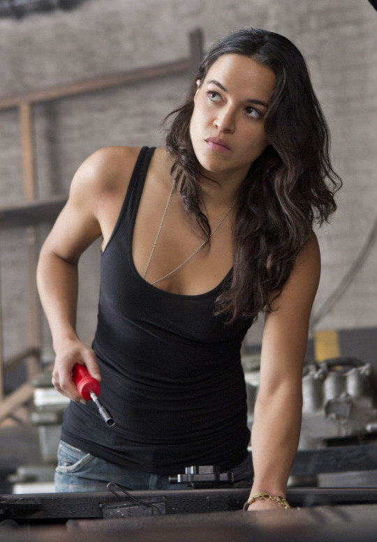
(Repeat above gif about rolling my eyes)
Now, to be clear, I am not making any judgement about the way any real-life women dress. I’m sure there’s plenty of female mechanics who have their hair down and wear tank tops while working. That doesn’t bother me. I don’t care if real life mechanics choose to do their jobs in a string bikini. Or in cosplay of the bee from Bee Movie. I don’t care (and quite frankly it’s none of my business) because they are real people who can make their own decisions. But what I am talking about here is a fictional character who does not have her own agency. I am critiquing how male creators choose to dress their female characters.
So I personally choose to read much more into the unpretty aspects of Gaby’s outfit, because these are not the “obvious” or “easy” things. Obvious and easy are “of course she wears makeup” and “of course her hair looks good” and “of course she doesn’t look like a swamp witch who bathes in mud and spends her days cursing passing men”. Those things don’t challenge or disrupt the assumption that women must look attractive for male consumption.
Gaby’s introduction to us is with her in a pair of grease-stained, baggy coveralls, not wearing any obvious makeup (again, this is cinema, so she is wearing makeup. For cinema the goal posts around “wearing makeup” always need to be moved from where they’d be irl). There’s very little here that screams ‘pretty’. And that is fascinating to me.
I don’t know how deeply Ritchie thought this through when giving final approval to the costume, hair and makeup. But unpretty is not the default here. It’s a choice
And look at this. This is the stance and dress sense (and socks!) of a woman who does not give a damn about looking good for the male gaze, whether the in-movie gaze of Napoleon, or the implied gaze of the viewer and creator. It’s not ‘pretty’. And this is the only time in the film we see Gaby in her own everyday clothes, as she only escapes East Berlin with the literal clothes on her back.
So how do I think Gaby dresses? I think that for the most part she dresses....like this. Practical. Comfortable. With a few simple touches of things she likes/finds pretty, perhaps, but not with a specific interest in being pretty. She dresses for herself, not for others. And if that isn’t something to aspire to, I don’t know what is.
#gaby teller#tmfu#the man from uncle#meta#costume design#male gaze#fashion#thank you to michael bay for providing me with such a good example of the male gaze
75 notes
·
View notes
Text
FLCL Progressive Ep. 1 “RE: Start” Review

Guess I’m returning to doing TV show recaps for a bit, as well as my first coverage of anime I’ve ever done for this blog. May as well be for a follow up to an old favorite.
The original six episodes of FLCL from Gainax are such a specific thing. Blending animation styles, the humor, music by The Pillows and the intentionally vague overarching plot were all used to convey themes about adolescence and maturity. How all of that blended together feels so lightning-in-a-bottle that when the idea of following it up was first announced as a co-production between Adult Swim and Production IG, skepticism felt like the natural reaction. FLCL’s quality comes more down to a specific feeling of what it is on its own than whatever a follow-up (or two) could bring to the table.
For all the intentional echoes of the original the first episode of FLCL Progressive brings into play, the potential for how it could be different this time is what’s already grabbing me.
[Full Review Under the Cut]
Hidomi (voiced by Xanthe Huynh) has surroundings and a disposition that, while not in opposition to how Naoto was in the original, are the product of a different sort of context. Opening the episode on a dream (or possible flashforward) of her in a ruined version of her hometown as Medical Mechanica plants iron away at the world around her as her body rots before transforming into a robot similar to Canti, immediately connects her to what’s carrying over from the original into Progressive. That opening, accompanied by the music of The Pillows, feels like a definitive statement of this story to carry on the spirit of FLCL. It’s immediately followed by a series of scenes that establish Hidomi as a character, but it can’t be as simply summed up in her mother’s reductively calling her a “tsundere.” She’s introverted in a very believable way, which gets demonstrated visually when she gets solely represented by a purple blob with cat ears as she disengages from the people talking to her. She’s also disengaged while her classes at junior high are going on as she scrolls through social media on her phone.
Where Naoto was defined by the absence of the older brother he was using as his role model, Hidomi lacks any sort of model for who she wants to be. A fact she states outright at one point. She’s not sure who she is now or what she wants to be like in the future in even a vague sense. It’s briefly hinted that this may be due to her father’s absence, but we’ll have to see how that gets expanded on. Her cat-ear headphones are the symbol of her disconnecting from the rest of the world. This adolescent angst is remarked upon by both the mysterious Jinyu (voiced by Allegra Clark) and her homeroom teacher, revealed at the end of the episode to be the returning Haruko (voiced once more by Kari Wahlgren).
Jinyu and Haruko clearly have some sort of pre-existing conflict and connection, further hinted at by the ED sequence. We first see Haruko in disguise as the homeroom teacher for Hidomi’s class, though her iconic vespa makes her presence clear from the start. She seems to be up to her old tricks, having already manipulated Hidomi’s classmate Ide (voiced by Robbie Daymond), made clear by the familiar bandage on his forehead. Her end goal isn’t explained yet but seeing her act in how she perceives authority as a teacher before the reveal is funny in how she droningly talks down her students. Particularly when she remarks that Hidomi doesn’t want to “be over the hill before she reaches adolescence” while making her watch internet porn in class. Hidomi’s social media feed descending into a repeated endless stream of “Fooly Cooly” as Haruko makes her presence known to the class made a great gag to end the episode on. It’s clear Wahlgren hasn’t lost a step with portraying the character’s mannerisms.
In contrast, Jinyu has a manic mellowness to how she acts. If Haruko is more “Fooly”, then Jinyu is definitely more “Cooly.” The way she acts in the aftermath of crashing into Hidomi, another deliberate echo of the original series, calmly saying to the girl’s mother “I’m sorry but your daughter is going to be fine.” Her washing plates at the Hidomi’s mother’s café in a maid outfit with a stoic expressing on her face before splitting the plates in half creates a comedic juxtaposition of attitude and action. She’s also the one to cut right through Hidomi’s demeanor of “pretending she can’t hear” by wearing her headphones everywhere without anything playing. She’s also desperate for any information about Haruko’s whereabouts, apparent in how she briefly tries to interrogate a dazed Ide after realizing the Medical Mechanica robot she stops must have come from his head.
Production IG clearly put a lot of effort into making Progressive look stellar, with the opening dream and the robot attack at the end the standout sequences in this first episode. There aren’t any complete stylistic breaks from the norm so far in the way the original did them, but not doing them for the moment may be the right way to distinguish Progressive as it begins. The English voice cast are all doing an admirable job of carrying the mannerisms of the fast paced, off-beat exchanges that carried through the original. There were plenty of touches in this episode I haven’t even mentioned, like the interactions between Ide and his two friends in class or consistently excellent music, that added flavor to this revival. However, some things can’t be done justice in a text recap. I was entertained by the first episode and ready to see how it moves forward from here.
9 notes
·
View notes
Text
Ada’s Top 20 Films of the 2010′s

2010 seems long ago. It was the year when Netflix, previously a mail order DVD rental operation, launched its streaming service and changed our TV/movie consumption forever. Originally known for old favourites and terrible in-house productions, Netflix and its competitors such as Amazon Studios have gone on to become award season contenders in just a few short years. The functions of film festivals and movie theatres have shifted due to streaming services’ enormous effects.
This decade also saw the warp up of some beloved sagas and series on the big screen - from Christopher Nolan’s Batman Trilogy to Harry Potter (more on those later!) Then there was an entire Star Wars Trilogy and end to a saga, which, love or hate it, was something many of us have been literally waiting our whole lives for. Throw in some Marvel at every turn, and an assuring expanse into the exploration of LGBTQ+ subjects, toss out Harvey Weinstein, and I think you have a reasonably accurate summation of film in the 2010′s.
Something else close to my heart that unfortunately also fell to the wayside this past decade is Hong Kong cinema. Once famed for slick neo noir style action with an eye-popping blend of gun play and kung fu, the genre has died to a trickle as the Chinese film industry evolves.
Without (much) further pre-amble, here is a list of my top 20 films of the 2010′s, chosen based on personal preference, and what I perceive to be cultural/technological/cinematic significance, presented in no definitive order...
The Social Network (2010)
I talk about the things that were different at the start of the decade, and Facebook was certainly one of them. Although still a top contender in the social media minefield, at the beginning of the decade Facebook was king. From the cinema perspective, this was also a David Fincher directed, and Aaron Sorkin written film. These credentials aside, the film was additionally recognized for its editing, soundtrack, and transforming Jesse Eisenberg from the “poor man’s Michael Cera” (and what is Michael Cera doing these days again??) to a formidable dramatic talent. Altogether was a way to immortalize Mark Zuckerberg on screen eh?
Inception (2010)
Brace yourselves, I will tell you now that the 2010′s was the decade of Christopher Nolan for me. I didn’t realize until I compiled this list, that starting with this mind-bending thriller, every film he made this decade is right up there for me. Aside from its story, the stunning visuals, and pacing, Inception was cleverly tied together to give me one of the most unforgettable movie going experiences this decade.
The Artist (2011)
The best kind of homage here, and reminder that story and performance are what make up a good film. Is this an Art House film? Sure, but the story transcends even words, it’s a celebration, and a love story not just between two characters but to cinema itself.
Hugo (2011)
And speaking of celebration of cinema, does anyone really do it better than Martin Scorsese? In this case, an homage to a forefather of motion picture wrapped in the ultimate feel good family film. Seeing Melies’ films within a film, the automatons, and the blend of history and fantasy, make you believe. When asked to name a good family film, I often name this one.
Harry Potter and The Deathly Hallows Part 2 (2011)
The final film of the series and also my favourite chapter. Deathly Hallows is a good example where the 2-parter turns out to be a good idea rather than a mere cash grab (as in the case Twilight). It set a precedent showcasing the benefits of a longer story format that is enhancing for the story. Also, the Battle of Hogwarts, how do you get enough? Amiright?
Super 8 (2011)
2011 was really the year of terrific family films. J.J. Abram’s Super 8 was no exception. It was through Super 8 that I was introduced to Abram’s sense of adventure and wonder through his characters. This was also Steven Spielberg produced adding to its positive attributes. When Abrams made Star Wars: The Force Awakens later in the decade, I was thrilled he was at the helm based on my love for Super 8.
Moonrise Kingdom (2012)
A different family film by Wes Anderson, and also one of the most endearing love stories told on the big screen this year. His follow up The Grand Budapest Hotel was also a contender for my best of the decade list but ultimately the unconventional young couple in Moonrise Kingdom versus the flagrantly over the top romantic gestures in Grand Budapest helped me make my choice. Still, both are visually spectacular.
The Dark Knight Rises (2012)
Christopher Nolan film #2 and the close out to the best Batman trilogy. While a certain level of campiness has come to be associated with preceding Batman offerings, Nolan and Christian Bale did something different and in turn won over a lot of new audiences for the superhero genre. While you can’t turn these days without bumping into a Marvel, etc. production, I think the quality of superhero films was raised leaps and bounds this decade and much of it in thanks to Nolan’s Dark Knight trilogy which began in the decade before.
Dallas Buyers Club (2013)
Oscar accolades (and Jennifer Garner) aside, Dallas Buyers Club by Canadian filmmaker Jean-Marc Vallee told a important story and told it well. It also brought Vallee’s work to a larger scale audience than any of his previous projects, giving him the attention he so very much deserves. From set design to story to acting, I truly believe this was one of the best films of the decade.
The Theory of Everything (2014)
I may be partial to biopics but there’s no denying the venerability of Stephen Hawking, and Stephen Hawking as portrayed by Eddie Redmayne... well, there are no words!
Boyhood (2014)
When I first began compiling this list, Boyhood was one of the first few films to come to mind. Aside from being directed by one of my favourite filmmakers Richard Linklater (who was also featured in my 2000′s list with Before Sunset - which I argue is still the best of the trilogy) it was also a very ambitious undertaking as a filmmaker. It’s my hope that the significance of Boyhood isn’t diminished in the age of digital aging/de-aging technologies, to do something like this organically is a labour of love. To commit to a project that spends 12 years in production is firstly insanity, but then to have a finished product that ties so seamlessly together in a tale of family, life, and love. Who knows if this will ever be done again?
Interstellar (2014)
Christopher Nolan film #3. I’m not as into movies about space and time travel as I was as a teenager/young adult, so I’m of the belief that while I still watch a fair amount of them, fewer and fewer truly stand out. When it came to explore this decade’s offerings, Interstellar and First Man were the only two even worth mentioning to me. The latter was more traditionally biopic-ish, though well told, and I maintain has the best soundtrack of 2018. Interstellar on the other hand had other thought-provoking layers (as I have come to expect from Nolan).
What We Do in the Shadows (2014)
And now for something completely different! What would life be like if Taika Waititi didn't make films? Mankind has been telling stories since the beginning of time so it’s understandingly hard to come up with truly original stories after thousands of years, and yet... Taika Waititi does it! Seriously though , What We Do In the Shadows was the single funniest film I’ve watched this decade.
Mad Max: Fury Road (2015)
If What We Do in the Shadows was the funniest movie of the decade, then Mad Max: Fury Road had to be hands down the most intense, non-stop, adrenaline rush thriller. Again, I watch a lot of this stuff and find myself largely disillusioned or unimpressed with most of what’s out there. Sure, I love the Avengers movies, and I’m always up for gratuitous violence but so few of these films will make me stop everything that I’m doing and stay rooted on the spot for the entire film - which I can recall distinctly is what happened when I put on this film on in early 2016.
The Hateful Eight (2015)
Westerns aren’t my cup of tea, but it’s common knowledge that Quentin Tarantino certainly is. When it came time to choose a QT film for my list, and we all know that’s exactly how I went about it. Once Upon A Time... In Hollywood was never even a contender, it was between Django Unchained and The Hateful Eight, overall I appreciated the simple (but elaborate!) set up of a cast of questionable characters in a cabin that kept me entranced for near 3 hours just listening to them talk.
Straight Outta Compton (2015)
Ok, there’s a clear nostalgia factor in play here, but Straight Outta Compton was also straight up good storytelling, coupled with a badass soundtrack. I didn’t give it much thought until later, but there’s also a certain level of accessibility in the storytelling, it was a film that was made for a wide audience without sparking disdain from dedicated members of the rap/hip hop community (not much significant backlash that I'm aware anyway... As someone who’s been devoted to certain subcultures, I can vouch this is entirely a possibility.)
Blue Jay (2016)
Who has no idea what film this is? Hint: go watch it on Netflix. In the 2000′s I included Conversations with Other Women in my top 20 list, I feel like Blue Jay is my 2010′s equivalent. Not that I was looking for an equivalent but I have an appreciation for unforgettable stories about the undeniable attraction between two people who have previously had a failed relationship with each other. It's Sarah Paulson and Mark Duplass on screen the entire time, and it's completely engrossing. Not an easy feat, not appreciated by many, but glorious to me.
Call Me By Your Name (2017)
This is my Ghost World of the 2010′s, not because the content is at all alike, but because it’s the only movie I watched repeatedly, and the only book in history that I’ve read twice in a single month. Some stories just touch you, this one did. Factor in the brilliant performances, the exquisite writing, beautiful settings, music, and every intricacy that together made up the whole film. I only wish I had more pretty words to give it a proper description but I will never come close to what Andre Aciman and James Ivory and Luca Guadagnino put on screen.
Dunkirk (2017)
Christopher Nolan film #4. Dunkirk was the first film I thought of when I started to make this list. It seemed so obvious. While I said I wasn’t ranking these Top 20 films of the decade, if hard pressed, I would put Dunkirk at the top. Not merely a good historical drama, this was a technical achievement. There’s a lot of articles out there about how a special plane was refitted to house the camera, you can read those online. What I think needs to be mentioned more often is astounding sound mixing and design in Dunkirk. It’s so good, and I’ve been privileged to see it in 70MM and in Imax that I’m hesitant to watch it in my home with my dinky home theatre now. When they update the history of film textbooks, they’d better be adding Dunkirk.
The Irishman (2019)
Ok, so maybe this isn’t Marty’s best. Maybe it’s a slight rehashing of his best work. (But his best is so good, the rehashing is still miles beyond the rest!) But to me, it’s Martin Scorsese embracing the evolution of storytelling in film, the formats in which it's presented, and how he’s going to adapt it in his favour. What you have here is an excessive piece of work that would likely not ever have been made in the last 50 years due to cost, impracticality, audience appreciation, what have you. However, in an unexpected turn, longer formats have come back into favour, and found a new platform in which to present themselves (ie. streaming servies like Netflix) So here he is, and here is The Irishman.
There you have it movie lovers, more or less my top 20 films for the 2010's. Here is an abbreviated recap:
The Social Network - dir. David Fincher (2010)
Inception - dir. Christopher Nolan (2010)
The Artist - dir. Michel Hazanavicius (2011)
Hugo - dir. Martin Scorsese (2011)
Harry Potter and the Deathly Hallows Part 2 - dir. David Yates (2011)
Super 8 - dir. J.J. Abrams (2011)
Moonrise Kingdom - dir. Wes Anderson (2012)
The Dark Knight Rises - dir. Christopher Nolan (2012)
Dallas Buyers Club - dir. Jean-Marc Vallee (2013)
The Theory of Everything - dir. James Marsh (2014)
Boyhood - dir. Richard Linklater (2014)
Interstellar - dir. Christopher Nolan (2014)
What We Do in the Shadows - dir. Taika Waititi (2014)
Mad Max: Fury Road - dir. George Miller (2015)
The Hateful Eight - dir. Quentin Tarantino (2015)
Straight Outta Compton - dir. F. Gary Gray (2015)
Blue Jay - dir. Alex Lehmann (2016)
Call Me By Your Name - dir. Luca Guadagnino (2017)
Dunkirk - dir. Christopher Nolan (2017)
The Irishman - dir. Martin Scorsese (2019)
Just missing the list was The Favourite - dir. Yorgos Lanthimos (2018). I actually miscounted my movies during the first draft of this list and originally had this to say about The Favourite when I'd mistakenly thought it'd made the list:
The Favourite (2018)
This is the only film on the list that's not here because of its story. It’s not a bad story, but plot alone wouldn’t put The Favourite amongst my favourites. (Also a part of me has yet to forgive Yorgos Lanthimos for making me endure Dogtooth) What makes The Favourite stand out is that it’s genre-bending, it’s like an absurd period piece for lack of a better description, and it’s awesome. Also the camera work including those panning shots with an extreme wide angle lens combined with the elaborate costume design really makes the film pop visually in a most wonderfully unconventional way.
Other films that didn't wind up making the cut:
The Town (2010)
Last Night (2010)
Rare Exports (Finland 2010)
Django Unchained (2012)
Cloud Atlas (2012)
Inside Llewyn Davis (2013)
Captain Phillips (2013)
Star Wars Episode VII: The Force Awakens (2015)
The Danish Girl (2015)
Get Out (2017)
The Shape of Water (2017)
The Hate U Give (2018)
And two others I'd like to mention are:
1. Beasts of the Southern Wild (2012), which is an affecting film but admittedly will never be my cup of tea. Doesn't mean it's not great. And,
2. Eden (France 2014) a personal favourite that I had not even considered for one of the 20 best films of the decade, but delightfully it showed up on a Vulture article about the best films of the decade in 47th place (coincidentally the writer's initials are also A.W. and this is what they had to say...)

There you have it, my decade in film summed up. I look forward to sharing many more film experiences and thoughts with you in the years to come. Our annual January challenge "30 Films in 31 Days" commences for another year starting tomorrow, and I hope to be able to follow shortly after with my top films of 2019.
Happy movie-going and happy new year!
0 notes
Text
50 Fun Contest Ideas You Can Use Today

Social media contests are one of the best ways to build your brand, while simultaneously helping to boost social media engagement and build a targeted list of customers.
They're quick to set up, easy to manage, and can provide an astronomical return on investment if done properly.
Wondering how you can get started with a contest today?
This article will give you 50 fun contest ideas for 10 major industries - 5 specific ideas for each. I'll also include a few real-world contest examples for each, so you can see these ideas in action.
Simply select your industry below (or scroll down to see them all!).
Enjoy!

Social Media Contest Idea by Industry:
Women's Ecommerce
General Ecommerce
Men's Ecommerce
Hospitality/Spa
Fitness
B2B
Photography
Restaurant
Dental/Cosmetic Medical
Auto
DON'T SEE YOUR INDUSTRY?
We'd love to brainstorm fun social media contest ideas with you one-on-one! We've worked with hundreds of businesses from every sphere, and run successful competitions in all of them. Book a time to chat with a contest expert today.
1. Women's Ecommerce
When it comes to social media, women are the biggest sharers - responsible for 62% of total shares on Facebook.
Women are also more talkative with their friends (rather than men, who tend to just put things on social media and leave them there, expecting acknowledgement).
How is this relevant to your business and contests, though?
It means that you should be running referral and bonus entry contests - a competition idea which rewards your entrants with more chances to win whenever they share your contest with their friends.
Women are more likely to share than men, and their friends are more likely to get involved in your contest (enter themselves, support their friends, vote, etc). In the process, your social media contest will increase in visibility and you'll get the contact information for more new prospective customers.
Women's Fashion Contest Ideas & Examples:
×


These women's ecommerce contest examples were built with Wishpond.
Our ready-made contest templates make building your next contest a matter of minutes. Click here to create an account and try out the builder today (no credit card required).
Ideas for the Women's Ecommerce:
Shopping Spree: Offer a gift card for your eCommerce site, but pitch it as a "Shopping spree." On your contest page, be sure to show exactly what people can buy with the gift card (rather than the gift card itself).
Holiday/Seasonal sweepstakes: Give away a gift card or product based around the primary "buying" holidays and seasons (Black Friday, Cyber Monday, Christmas, Pre-Summer, Pre-Fall, etc). For an example of marketing on a holiday, check out some St. Patrick's Day Contest Ideas.
Partner up: Partner with a yoga studio or gym around New Year's and give away a complete workout outfit and 6-month membership. Alternatively, partner with another brand and give away a workout outfit alongside a mat, ball, etc. Promote to both brand's customer lists (yours and theirs) and you'll get their contacts as well.
"Night-on-the-town" contest: Give away a complete "going out" outfit/gift card alongside two tickets to a show in your area.
"Summer Swing" contest: Run a summer-themed contest which gives away a summer dress and accessories (or a gift card which can buy those things).
Back to Top
2. General Ecommerce
Ecommerce is the #1 business for running contests, hands down.
Your products make excellent prizes and your target market is tech-savvv and active on social media. Better yet, if someone makes one purchase from you, you're the business most likely to make two.
The mass majority of the contests we run are for eCommerce brands. And I highly encourage you to give them a shot. There's no better way to generate buzz about a new product, boost sales in the slow season, or get the details of new prospective customers (and all their friends).
General Ecommerce Contest Ideas & Examples:
×


These ecommerce contest examples were built with Wishpond.
Our ready-made contest templates make building your next contest a matter of minutes. Click here to create an account and try out the builder today (no credit card required).
Ideas for General Ecommerce:
Run a pre-winter contest giving away a gift card. Pitch your products as a "winter necessity." It doesn't matter what your products actually are, but how you portray them as relevant to what your entrants are already thinking about.
Run a Valentine's Day contest giving away a "his and hers" package for Valentine's Day. Alternatively, offer a "Just for Her" prize on Mother's Day (or a "Just for Him" prize on Father's Day). Remember, with these contests, that your market is your usual target market's partner, family, or friends (so target accordingly).
Run a contest that gives away a prize pack of your products. This improves the chance of someone being interested in at least one of the things you're giving away.
Offer free shipping for a year. This is a great contest to give to 10 winners with the message "Get a chance to win every day for 10 days!" And it's particularly valuable because all you're doing is cutting into your profit margins, rather than giving away something completely free.
Reach out to another brand with a similar target market as your own. Create a co-contest Send this campaign to your existing list so they'll send it to theirs. This enables you to trade contacts. See the example below:

Back to Top
3. Men's Ecommerce
Despite the fact that women control around 80% of household spending, it's men who are more enthusiastic about buying from their couch
40% of men ages 18-to-34 "would ideally buy everything online" while only 33% of women say the same.
It's even more prominent among teens. 86% of male teens say they shop online whereas only 76% of teen girls say they do.
What does this mean for your next competition?
It means that, when it comes to driving online sales, men are upsetting the stereotype.
Men's Ecommerce Contest Ideas & Examples:
×


These men's ecommerce contest examples were built with Wishpond.
Our ready-made contest templates make building your next contest a matter of minutes. Click here to create an account and try out the builder today (no credit card required).
Ideas for the Men's Fashion:
Run a Father's Day competition to your normal target market's partners. Consider giving away one of your more expensive products, particularly if you're not going to offer a gift card.
Partner with a barbershop in your area. Give a "manly makeover" with product prize package.
Run a summer BBQ-themed contest, where you offer a (humorous or not) BBQ/summer party outfit. Also consider teaming up with another brand to offer a BBQ, fireworks, meat, etc.
Offer a Groomsman gift package. Offer three or four product prize packages - items could include a watch, a tie, a flask, a satchel/messenger bag, a smoking jacket, etc.
Run a themed competition. This could be anything from the Super Bowl to Christmas to National Hotdog Day. Get creative with your contest theme to drive sales in your slow season.
Back to Top
4. Hospitality/Spa
The hospitality and spa business has a strength that none of the other industries have: a super valuable product.
A two-night stay or spa day is a contest prize that results in huge numbers of competition entrants.
They're also a really exciting thing to win because they're such luxuries. Sure, it's great to win a new vacuum or outfit, but a romantic getaway for two - away from the kids and in a location they wouldn't normally see? That's a prize you really want to win.
Top Tip: Whenever you run a social media contest, you need to be considering how you're going to convert those entrants who didn't win. We recently had a client who gave all their entrants a secondary offer via email - 30% off their first booking - which resulted in a huge return on their competition investment.
Hospitality/Spa Contest Ideas & Examples:
×


These hospitality/spa contest examples were built with Wishpond.
Our ready-made contest templates make building your next contest a matter of minutes. Click here to create an account and try out the builder today (no credit card required).
Ideas for the Hospitality/Spa:
A two-night stay. Be sure to give a reason: Valentine's Day, Father's/Mother's Day, etc.
A free upgrade to your President's Suite (or equivalent). Pair with "You deserve it!" messaging.
Partner with a restaurant, spa or theater in your area. Give a romantic weekend getaway for two.
Give away a "Girls Weekend" spa day. When you're creating Facebook Ads for this competition, try creating an ad set targeting the boyfriends/husbands of your target market.
Offer 7 deep tissue/Swedish massages. To increase the perceived possibility of any given entrant winning, offer a massage every day for a week.
Back to Top
5. Fitness
There's no beating around the bush here: we run more fitness contests than any other activity except eCommerce. Your business is absolutely perfect for contests (which I, unfortunately, can't say for B2B).
You have clearly valuable prizes: 6-month membership, free personal training, whatever. You have the benefit of a lot of great visuals, and price is one of the main pain points in your trade. When you tell someone they can get fit and healthy for free? The perceived value is priceless.
Any competition you run needs to have what we call a value proposition - the reason that people see you as valuable. But it can't just be "get 50% off" or "get your first month free".
Instead, you should consider the emotional value of your offer. For instance, "Get ready for summer," "Burn those Christmas calories," "We'll help you stick to your resolution" etc.
Fitness Contest Contest Ideas & Examples:
×


These fitness contest examples were built with Wishpond.
Our ready-made contest templates make building your next contest a matter of minutes. Click here to create an account and try out the builder today (no credit card required).
Fitness Competition Ideas:
Free membership for brides. Facebook advertising will enable you to only show your contest to women who are engaged. You can also target female friends of engaged people.
Free workout and healthy eating plan. This is also a great option to add to our website as a "lead magnet" - a free giveaway that you deliver to people when they submit their contact information. Create a series of emails (also called an email drip campaign) that are designed to turn your new contacts into paying customers.
Free personal training. Personal training, unlike a general gym membership, feels like a luxury (with higher perceived value). Be sure to add the dollar value of personal training into your value proposition/contest headline.
"Spin with the girls!" Consider giving away a pack of spin class passes (10), enabling girls to bring their friends to multiple sessions. This is an especially valuable contest for you as, when your winner's friends enjoy spin class, they're likely to pay full price down the line.
Free 12-month membership. Only consider a full free membership if you're running a bonus entry contest as you'll need to generate a lot of prospective customers to make the giveaway worth it. The last thing you want is to offer a $1,200 prize and only have two entrants.
Top Tip: Want to target friends of engaged people on Facebook? Simply type "Friends of" into the Detailed Targeting box within the Facebook Ad manager to see all your options:
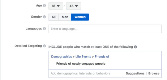
Back to Top
6. B2B
The honest answer here is that we don't run that many B2B contests. And that's because, in general, there's usually a better way for your business to find the results you want.
However, there is a single type of social media contest that I can confidently recommend, and it's one we've used to great success many times over the years.
Here's an example:

This is a partnered contest. And (again, to be totally honest) it's a super valuable campaign not because you're going to go viral on social media, but because when you notify your existing lists about the contest, you'll be legitimately trading contacts with a business similar to your own.
To learn more about partnered campaigns (and how we've used them), check out "A Behind-the-Scenes Look at How We Generated 1,263 New Leads (With a Little Help from Our Friends)."
This B2B contest example was built with Wishpond.
Our ready-made contest templates make building your next contest a matter of minutes. Click here to create an account and try out the builder today (no credit card required).
B2B Competition Ideas:
Partner with another business. Give a year's subscription to both your service/platform and theirs. Be sure to find a business which not only has the same target market as you, but also compatible products.
Run an internal contest (within your office/branches) giving away a gift basket or swag. Internal contests can be a great way to boost company morale.
Black Friday/Cyber Monday discount plan. If you're going to run a discount plan promotion, consider giving it to "10 lucky winners" - because you're going to be competing with other SaaS/B2B companies who simply run sales. Honestly my recommendation would be to just run a sale, rather than a contest, here.
If you're an office supplier, offer free shipping for a year. Consider running this as a month-long promotion and it's exclusively available to first-time buyers.
Sports team sponsorship. A contest where you offer sponsorship of a local youth team gets your name out there. Just don't expect it to drive final sales.
Back to Top
7. Photography
If you're like most photography businesses, you get most of your clients through word of mouth. They ask a friend if they know any good photographers, you're mentioned, and the rest is history.
Contests, however, are like word-of-mouth marketing on speed.
Online contests are, by definition, online. And that means that information, recommendations and references can be shared and disseminated at lightning speed and shared with huge numbers of people.
Your target customer has 100 friends who are also your target customer. Contests, especially bonus entry and referral contests, are a fantastic way to reach all of them.
Photography Contest Examples from Wishpond:
×


These photography contest examples were built with Wishpond.
Our ready-made contest templates make building your next contest a matter of minutes. Click here to create an account and try out the builder today (no credit card required).
Photography Competition Ideas:
Offer a wedding package in the Fall. Be sure to time your contests correctly to engage with the maximum number of people who might be interested in your prize. Most people who are having late Spring/Summer weddings are planning their photographer in late Fall.
Offer a new baby photoshoot. Similarly to the above, you should know that most babies (in North America) are born around September.
Offer free photo framing. Do this for the first 10 booked photoshoots, then offer 50% off to everyone who books after the first ten.
Offer a "Friend's Day" photoshoot with costumes. Run a photo contest where one entrant can submit a photo and get their friends and family to vote on it (they'll need to submit their contact information to vote).
Partner with a hairdresser or makeup artist. Offer a photoshoot with makeover package. If you photograph weddings, it should be easy to connect with makeup/hairdressers before the wedding.
Back to Top
8. Restaurant
Most restaurants don't think about online marketing too much. Much of your business comes from word of mouth and (if anything) review sites and Google search.
Nonetheless, a good social media contest is one of the best ways for a new restaurant (or one looking to increase declining patronage) to get people in the door.
Note: A contest is also a powerful way to get people to review your restaurant online. With a bit of help from our fully-managed team, you can use Wishpond's bonus entry contest builder to give extra chances to win to those contest entrants who review your restaurant on the platform of your choice.
Just be sure you only target people within your area. Online marketing is powerful in its ability to give businesses huge reach, but it can also be dangerous. Be sure you're not spending money or resources to reach people who are nowhere near your restaurant.
Restaurant Contest Examples from Wishpond:
×
These restaurant contest examples were built with Wishpond.
Our ready-made contest templates make building your next contest a matter of minutes. Click here to create an account and try out the builder today (no credit card required).
Restaurant Competition Ideas:
Reach out to a hotel in your area. Offer a romantic weekend away with your restaurant giving a three-course dinner and bottle of wine.
Is there a popular movie coming out? Buy tickets and offer a date night.
"Get Away from the Kids." While this is, ostensibly, just free dinner, the most successful contests are always those which tie into a well-recognized idea or theme. Consider running this contest in the middle of the summer, targeting parents with children who are on Summer break.
Offer a Thanksgiving dinner. Cater a family's Thanksgiving dinner with all the fixings. A cool idea for this (if you want to take it a step beyond, would be to offer a free dinner for the contest winner as well as a needy family in your area.
Create and offer a Superbowl party pack. My recommendation for this would be to make a big deal out of the winner. Have your chef, restaurant owner and waiters/waitresses pull up in a van and deliver the Superbowl food in person. Take some photos with the winners (and their friends) and post them on social media.
Back to Top
9. Dental/Cosmetic Medical
Contests can actually be a very valuable marketing strategy for dental/cosmetic medical enterprises.
And there are three reasons for that:
1. Your services are expensive, so a prize has a high dollar value. This increases the number of entrants you'll likely get.
2. People who enter your contest will think of your business the next time they need your services (even if they don't win).
3. The people who do win will return to your business (if their experience is good) for any follow-up care or with a family member. It's far easier to keep going to a dentist or cosmetic surgeon you like than find a new one you don't know anything about.
Top Tip: My recommendation is to have multiple winners for your dental/cosmetic medical contest. It increases your entrant's belief that they'll win (which increases entry rates) and you'll get more people through the door who will become loyal clients.
Dental/Cosmetic Medical Contest Examples from Wishpond:
×


These dental/cosmetic medical contest examples were built with Wishpond.
Our ready-made contest templates make building your next contest a matter of minutes. Click here to create an account and try out the builder today (no credit card required).
Cosmetic & Dental Competition ideas:
Offer dental care or cosmetic medical treatment before Valentine's Day. My recommendation would be to create two contest pages - one which targets men ("Surprise her on Valentine's Day!)" and one which targets her ("Give him a surprise on Valentine's Day!").
Target engaged women on Facebook. Give a pre-wedding treatment (teeth whitening, wrinkle removal, etc) up to your selected dollar value.
Run a "back-to-school" or "before University" contest giving free dental treatment. Target parents of 8-18 year olds around August. Consider two different contest pages: one with a young child smiling and one with an older teenager.
Offer a "Golden Years" cosmetic treatment. Target men and women on Facebook who are 55+ to be sure you don't waste your money.
Offer a teeth whitening treatment. Consider running a standard contest like this a few times a year. Just be sure to exclude your previous contest entrants from your target audience on Facebook.
Want to learn more about Facebook Ads?
We wrote a complete guide to Facebook Ads last year with everything you need to know. Check it out!
Back to Top
10. Auto
The auto industry is one of those industries which hasn't fully embraced online marketing as a viable way for them to succeed.
For you, then (someone within that business who recognizes how powerful online marketing can be) the opportunities are massive.
Did you know that Facebook enables you to target, specifically, people who own a certain type of vehicle in your area? Can you imagine how powerful that would be if you owned a Subaru, Mitsubishi or Volkswagen auto shop?
But let's not get ahead of ourselves. We're talking online contests here.
Before the winter comes around, many of us consider winterizing our vehicles. We're perusing Facebook as we normally do and "Bam!" an auto shop near me is giving away free vehicle winterizing.
Or I'm looking to go on a family road trip for an upcoming long weekend. "Bam!" my friend shares with me an auto shop giving away a complete vehicle checkup for free.
Auto Contest Examples from Wishpond:
×


These auto industry contest examples were built with Wishpond.
Our ready-made contest templates make building your next contest a matter of minutes. Click here to create an account and try out the builder today (no credit card required).
Auto Competition Ideas:
Offer a free tire rotation or a new set of tires. This is the standard "product prize" for the auto business (rather than some of the more complicated campaigns or prizes). This kind of giveaway/sweepstakes can be run as many times per year as you like. Just remember to exclude your previous campaign's entrants from your targeting and email mailout.
Offer a vehicle checkup before road trip season. My recommendation would be to run a summer-oriented online contest around May to tap into what people are already thinking about.
Offer a free vehicle rental. Again, run this campaign before a major long weekend to increase the chance of your prospective customers needing your prize.
At the end of the road trip/travel season, offer windshield repair. My recommendation would be to give this to 10 lucky winners over the course of 10 days. This increases the perceived chance to win and gets more people to enter.
Offer free vehicle winterizing. Run this contest in early-mid Fall (and of course you should only run it in places where snow and ice is a thing...)
Back to Top
Conclusion
There you have it, 50 social media contest & competition ideas to try out for your business.
See anything that intrigues you? Or do you have some that you've already put to use?
Let me know in the comment section!
Related Reading:
30 Amazing Examples of Branded Facebook Contests Done Right
How to Run a Facebook Contest or Facebook Sweepstakes
24 Amazing Facebook Giveaway Examples
Social Media Marketing Plan: An 11-Step Template
25 Awesome Ideas for Giveaways on Facebook
Did you know?
All of the examples in this article were created using Wishpond's easy-to-use contest builder. Get started building your own campaign with our 14-day free trial.
.h2 { font-size: 18px; letter-spacing: 1px; line-height: 26px; text-transform: uppercase; margin: 0 0 8px; } .h3 { margin-top: 4px; font-weight: 700; } a[name] { display: block; height: 60px; margin-top: -60px; visibility: hidden; } .content-article .row .col-sm-6 img, .content-article .row .col-sm-4 img { width: 100%; } li { font-weight: bold !important; } li span { font-weight: normal !important; } .modal-content { background-color: transparent; box-shadow: none; border: none; } .modal-header { border: none; /* background-color: #333; */ padding: 15px 5px 20px; } .modal-body { padding: 0; border: none; } .modal-dialog { width: auto; max-width: 70%; } .modal-body img { border: none !important; border-radius: 0 !important; } .close { color: #FFF; opacity: 1; transition: 0.2s ease-in-out all; font-size: 30px; } var popupTimeout = function () { setTimeout(function() { Wishpond.perform('showPopup', 2304919); }, 25000); }; var popupRequest = function() { if (!popupHasBeenTriggered) { popupHasBeenTriggered = true; popupTimeout(); } }; window.mobilecheck = function() { var check = false; (function(a){if(/(android|bb\d+|meego).+mobile|avantgo|bada\/|blackberry|blazer|compal|elaine|fennec|hiptop|iemobile|ip(hone|od)|iris|kindle|lge |maemo|midp|mmp|mobile.+firefox|netfront|opera m(ob|in)i|palm( os)?|phone|p(ixi|re)\/|plucker|pocket|psp|series(4|6)0|symbian|treo|up\.(browser|link)|vodafone|wap|windows ce|xda|xiino/i.test(a)||/1207|6310|6590|3gso|4thp|50[1-6]i|770s|802s|a wa|abac|ac(er|oo|s\-)|ai(ko|rn)|al(av|ca|co)|amoi|an(ex|ny|yw)|aptu|ar(ch|go)|as(te|us)|attw|au(di|\-m|r |s )|avan|be(ck|ll|nq)|bi(lb|rd)|bl(ac|az)|br(e|v)w|bumb|bw\-(n|u)|c55\/|capi|ccwa|cdm\-|cell|chtm|cldc|cmd\-|co(mp|nd)|craw|da(it|ll|ng)|dbte|dc\-s|devi|dica|dmob|do(c|p)o|ds(12|\-d)|el(49|ai)|em(l2|ul)|er(ic|k0)|esl8|ez([4-7]0|os|wa|ze)|fetc|fly(\-|_)|g1 u|g560|gene|gf\-5|g\-mo|go(\.w|od)|gr(ad|un)|haie|hcit|hd\-(m|p|t)|hei\-|hi(pt|ta)|hp( i|ip)|hs\-c|ht(c(\-| |_|a|g|p|s|t)|tp)|hu(aw|tc)|i\-(20|go|ma)|i230|iac( |\-|\/)|ibro|idea|ig01|ikom|im1k|inno|ipaq|iris|ja(t|v)a|jbro|jemu|jigs|kddi|keji|kgt( |\/)|klon|kpt |kwc\-|kyo(c|k)|le(no|xi)|lg( g|\/(k|l|u)|50|54|\-[a-w])|libw|lynx|m1\-w|m3ga|m50\/|ma(te|ui|xo)|mc(01|21|ca)|m\-cr|me(rc|ri)|mi(o8|oa|ts)|mmef|mo(01|02|bi|de|do|t(\-| |o|v)|zz)|mt(50|p1|v )|mwbp|mywa|n10[0-2]|n20[2-3]|n30(0|2)|n50(0|2|5)|n7(0(0|1)|10)|ne((c|m)\-|on|tf|wf|wg|wt)|nok(6|i)|nzph|o2im|op(ti|wv)|oran|owg1|p800|pan(a|d|t)|pdxg|pg(13|\-([1-8]|c))|phil|pire|pl(ay|uc)|pn\-2|po(ck|rt|se)|prox|psio|pt\-g|qa\-a|qc(07|12|21|32|60|\-[2-7]|i\-)|qtek|r380|r600|raks|rim9|ro(ve|zo)|s55\/|sa(ge|ma|mm|ms|ny|va)|sc(01|h\-|oo|p\-)|sdk\/|se(c(\-|0|1)|47|mc|nd|ri)|sgh\-|shar|sie(\-|m)|sk\-0|sl(45|id)|sm(al|ar|b3|it|t5)|so(ft|ny)|sp(01|h\-|v\-|v )|sy(01|mb)|t2(18|50)|t6(00|10|18)|ta(gt|lk)|tcl\-|tdg\-|tel(i|m)|tim\-|t\-mo|to(pl|sh)|ts(70|m\-|m3|m5)|tx\-9|up(\.b|g1|si)|utst|v400|v750|veri|vi(rg|te)|vk(40|5[0-3]|\-v)|vm40|voda|vulc|vx(52|53|60|61|70|80|81|83|85|98)|w3c(\-| )|webc|whit|wi(g |nc|nw)|wmlb|wonu|x700|yas\-|your|zeto|zte\-/i.test(a.substr(0,4))) check = true;})(navigator.userAgent||navigator.vendor||window.opera); return check; }; if (mobilecheck()) { var popupHasBeenTriggered = true; var ifJQueryExists = setInterval(function () { if (typeof jQuery == "function") { clearInterval(ifJQueryExists); var popupHasBeenTriggered = true; $(".toc a").click(function(e) { e.preventDefault(); var scrollToThisEl = this.href.split('#')[1]; $('html,body').animate({ scrollTop: $('[name="' + scrollToThisEl + '"]').offset().top }, 'slow'); analytics.track('Selected TOC Industry', { industry: $(this).text() }); }); $('#lightboxModal').on('show.bs.modal', function (event) { var thumbnail = $(event.relatedTarget); // Button that triggered the modal var img = thumbnail.data('src'); // Extract info from data-* attributes var modal = $(this); modal.find('img').attr('src', img); }); } }); } else { document.domain = 'wishpond.com'; var popupHasBeenTriggered = false; var pageHeight = document.body.scrollHeight; var halfAPage = pageHeight/2; window.addEventListener("scroll",function() { if(window.scrollY > halfAPage && !popupHasBeenTriggered) { popupHasBeenTriggered = true; Wishpond.perform('showPopup', 2304919); } },false); }
from RSSMix.com Mix ID 8230801 https://ift.tt/3xhkPv4
via IFTTT
0 notes
Text
‘Mutations workshop’
Aims and Objectives:
To contrast and juxtapose source imagery to create mutated bio-mechanical drawings.
To explore the evolving relationship between human beings and cybernetic enhancements (man & machines)
To blend analogue and digital skills to create illustrations of our own cybernetic mutations
To begin to think about styles and aesthetics within science fiction concepts.
To develop visual ideas & experiments based on these concepts & principles
What is a cybernetic organism?
Cybernetic organisms can be any living tissue that integrates artificial technologies within it, but it is most often associated with humans. This is because cybernetic organisms are already in the mainstream in the form of pacemakers, implanted defibrillators, and even cochlear implants. The relationship between humans and technology continues to grow, with medicine and science giving humans the ability to restore lost hearing or sight, gain control over their cardiovascular system, sleep through the night without the risks of apnea, and more. Cybernetic organisms continue to be the focus for medical research that directly impacts humans and healthcare.


The relationship between man and machine has been ever growing throughout history. Machines used to just be there to help us with simple things such as making clothes or food. But as time went on machines started to be used for things that weren't just purely function and became used for entertainment. Machines began to cross the boundaries into things that we were emotionally invested in. Nowadays machines are so deeply embedded in everyday life that it would be extremely hard to imagine life without them. We have become emotionally attached to things such as our phone due to the invention of the internet and social media. But is this relationship between man and machine really healthy?
Are we too obsessed with what these machines can give us? Our online persona is so important to us and effects relationships, jobs and mental health. We find it difficult to engage in human interaction without using dating apps to find our perfect match, and Facebook to see what their interest are and who our mutual friends may be. Have machines become too linked to human emotion?
Machines have advanced so much over such a short period of time. They are being used to complete more and more tasks and becoming used in more and more aspects of everyday life. How long will it be until there is nothing left for humans to do? If machines can be used for all jobs such as mass production, driving buses, teaching classes, what will there be left for humans to do? Will we have to become part machine in order to keep up?
This overwhelming idea that machines are somewhat consuming our lives is an interesting emotion that I would like to explore in my work. The idea that we may have to enhance ourselves mechanically and make that relationship between man and machine even closer is expressed through this workshop.

In this workshop, we began to look at other artists who also portray the themes on man and machine.
Guiseppe Arcimboldo’s work was the oldest out of the three artists. This is evident in the work; there isn't any colour, only tonal value, and the ‘robot’ seems to be made up of household objects. This makes it recognizable for its time. Guiseppe couldn't make the robot extremely streamline or modernistic as his audience would understand it. Not only this but his outlook on what the future may look like would be very different to ours as their machinery wasn't very advanced at the time. This links to the fundamental idea that was discussed in the brief as well as the first workshop, that you need a thread of reality in your work. Guiseppe’s work was relevant to his time and based off of human form so that his audience could understand the message his was trying to portray in his work.
Masumune Shirow’s work is much more modernistic then Guiseppe’s. The head of the robot is broken into parts and reminds me of a car bonnet. Unlike Guiseppe ‘s work, there are cables liking the robot to an unknown object. This is relevant to the time was they had computer and TVs that need wires to work. The wires are also interesting as you can't see where they lead too, it could be to a system that is controlling the robot.
Josan Gonzalez’s work is the most realistic in my opinion. The characters are all set in a realistic setting which makes the sci-fi element to the work more believable. There are also wires connecting the robot to something much like in Shirow’s work. The cigaret in the second piece of work also helps to give the work that thread of reality and makes that character more human-like. Even though it is a robot potentially with no human emotion, it still has an addiction to cigarettes, making it more human-like and also making it seem more rebellious. The use of colour is also interesting as they are all unnatural colours that strengthen that otherworldly effect.
Overall the main theme that links all the artists work together is that thread of reality. All the characters and based off of human form and a made of objects that can be recognisable for the time. I would like to incorporate the colour scheme of Gonzalez’s work into my own, as I think that it works very effectively to give the work a futuristic look.
‘Ghost in the shell’ clip

‘But no one really understands the risk to individuality, to identity, messing with the human soul’
This quote from this clip shows a very clear insight as to how the people that created this film perceive the future. The emotion of uncertainty is provoked within this quote and the theme of disorientation and uncertainty is apparent through all the workshop that I have looked at so far. Even in this futuristic worlds with all these technological developments, there is still an uncertainty of what the future will look like and how technology may be affecting us. Throughout history people have always been wary of new development as its human nature to be scared of the unknown, no matter how technologically advanced a society is, there is always going to be a fear of the future.
This idea of individuality and identity is something that I discussed the ‘Identity’ workshop and in this workshop. With advancements in robotic technology, there is always the worry that our identity may and individuality may be lost. In the first workshop, I look t the idea of whether we will all look the same in the future and how will this affect us? Is individuality and personal identity an important part of what makes us human? In this workshop, we discuss the theme of mutation and man and machine through our collaging. Adding robotic parts to humans is altering the natural human form, what happens if we take robotic enhancements too far and begin to interfere with the brain, soul and our conscience. These are one of the only factors that differentiate and better humans from robots. If we could give robots a conscience would there be a need for humans anymore?
This clip discusses what could go wrong with messing with man and machine. The second frame shows the expression on the mans face when the robot acts against its program. That betrayal and surprise is evident in his face. Has the robot made its own decision and doesn't want to be told what to do anymore, so instead attacks the man? The robot had been hacked to retrieve information from the man and kill him, but for a split second, it seems as though the robot has a mind of its own. And this draws attention to how horrific it could be if robots could suddenly make there own decisions as they are much more powerful and advanced then humans, and if used for evil, could use a lot of harm.
Overall this clip provides a lot of context to my own work and really defines the possible negative octopus of merging man with machine. Is man controlling the machine or is the machine controlling man?
‘Akira’ clip

In this clip, we see how machine and scientific experiments could alter humans. We see the character struggling to control the expanding ‘machine’ aspect of his body. He isn't in control of this thing that is taking over his body and harming his friends.
At the end of the clip, there is a giant explosion as the characters had to sacrifice themselves to stop this machine. This shows how drastic it may become, to stop it you have to drastically destroy everything in order to save it.
Could this happen in the future? The merging of man and machine could become so out of control that we would have to destroy it all to return to normal. I think that this clip shows quite a dramatised vision of this idea, but I think that this theme of machines becoming out of our control and causing destruction and a very likely reality for our future.
These two clips link together as they both discuss the theme of machines becoming out of control. They provide context for this workshop as they show the potential negative effects of combining man and machine may have.
This workshop could be seen in a positive way too. Machines help humans on a daily basis and mechanical enhancement already has a big presence in today's society. We are enchanted by machine through prosthetics, hearing aids, pace-makers ect. So not all combinations of man and machines have a negative effect. But in the future will this begin to spiral out of control? For example, we have started to use prosthetics to enhance man by designing them to be more ergonomic to help people run and compete in other sports. Whereas in the past prosthetics use to just be for a cosmetic reason. They needed to be as realistic as possible so they looked more ‘normal’, but we are looking past that now and considering how they can be used to enchase us not just make us fit in. However, these designs still keep that thread of reality.
Overall this workshop was useful when considering how machines can control and enhance us and what they may be used for in the future. I find the idea of machines being used to control us the most interesting, and it think its very relevant in the sense that even now machines do heavily affect our lives. Especially phones and social media, which have a huge effect on today's generation. Could machines be used to control society into making important commitments such as political decisions; will this affect our individuality and ability to make out own decisions?

Eduardo Paolozzi’s work is very relevant to this project, not only our his processes very similar but his work is also futuristic. He includes pop culture references, making his work relevant to the time as well as keeping that thread of reality. I think that the line work use in the example images above is very effective. The tonal value created quite a grim dystopian effect, and the piles of objects also adds to the chaos.
In order to develop the college work further, I re-drew the college using a fine liner. I tried to replicate Paolozzi’s techniques of using lines to create tonal value. This helped to make the blend between man and machine more seamless as I could draw in parts to make it more realistic. Whilst still keeping that stark juxtaposition between the robotic machine and the biological man.

gif of process

original collage

line drawings

Digital development
I decided next to adapt this work digitally so that I could add colour and textures. This process helped me to develop my digital swing skills as well as develop these outcomes further so they were more effective.
I first created a line drawing on a separate layer copying the original scan of the collage. To make the blend of man and mechanic more seamless I added more tonal value as well as more wires around the face.
I then created a texture for the background using a brush tool on pro-create. I think that this replicated a galaxy therefore, it was fitting to the futuristic theme as space travel was one idea which I thought linked to the brief in the initial discussion of the brief.
I think that the women the picture was very ‘perfect’ and therefore, almost looked robotic or alien and there wasn't any flaw; the original photo was from a magazine cover and so had most likely been photoshopped. So this was one of the reasons for choosing this background as I think the drawing and the themes of the brief both link to a space travel theme.

I wanted to keep the image mostly black and white but the line work didn't stand out as much with the dark background behind it. So I made an alternative with blue line work, I think that this was effective as the blue give a cold and gloomy feel to the illustration; as the illustration is part machine this is fitting as machines don't portray emotion, so in the future AI robots may come across as cold an emotionless.

Development
To develop this workshop I applied this technique but using other images. I decided to use a picture of Donald Trump as I wanted my project to include political figures as they play a big role in the control of the world.
To further develop this I could animate my work and colour it as animation is one of the specialist areas that I want to explore.

Links
This workshop links to the artist Raoul Hausmann and the other workshops through the methods and themes that the work explores.
The method of collage is very similar to that of Raoul Hausmann, who also combined images of people and combined them with machines. Another similarity is that he uses images of pop culture, often cut from magazines. Therefore both my work and his keeps a thread of reality through the use of realistic photography. Our work depicts relevant subjects, in mine, I have used Donald Trump as he is a widely discussed and controversial figure. By using the fun, a simple and playful method of collaging, the work manages to discuss important subjects but in a more easy and universal way, which an audience will respond better too.
The theme of juxtaposition and the use of hand rendered collaging techniques links this workshop to the ‘glitches’ workshop. The physical process of collaging by taking one part of something and attaching it to another reminds me of the surgical process that we would have to go through to become robotically enhanced.
Conclusion
To conclude I think that combining man and machine together so that they look as though they belong together was very difficult. However, when I developed this digitally I could edit it so that it looked more seamless. So there were some limitations to hand-rendered processes, however having to develop them digitally has helped to improve my digital skills and keep a thread of reality in my work.
0 notes
Text
Windows, rethought: An audit of Windows 8 Windows 8 is a review in bargains. Do its two parts frame a reasonable whole?.
After months of suspicion, Windows 8 is here. It dispatches today and goes at a bargain internationally tomorrow. For the most recent eighteen months, we've kept tabs on its development crosswise over three betas and the last discharge, investigating the intricate details of Microsoft's most goal-oriented item dispatch in two decades.
Throughout the following couple of days we'll be distributing a blast of Windows 8 scope. Today we'll have the primary survey, which focuses on Windows 8's radical new UI and inquires as to whether Microsoft has finally figured out how to understand its fantasy of a genuine tablet PC. We're covering the establishment and overhaul involvement in a different element. On tap is a screenshot visit that shows off Redmond's sparkly new look and feel, and we'll likewise take a gander at benchmarks to ensure the OS still keeps running and also it ought to.
In the coming days, we'll be looking in the engine in an examination concerning the work Microsoft has done to make Windows 8 more secure, more proficient, and more adaptable. We'll couple that with an expanded take a gander at Storage Spaces, the product goliath's answer for dealing with all your circle space needs. We'll additionally be taking a gander at the all-new Xbox-marked interactive media encounter.
Beginning this end of the week, we'll have audits of the packaged Bing applications and Microsoft's scope of new amusements, alongside a gander at Windows 8's new undertaking focused elements. We'll complete up with an examination of the stage's center correspondence and informing applications right on time one week from now.
It has been right around 17 months since we got our first take a gander at Windows 8. Steven Sinofsky, leader of Windows and the Windows Live Division, and Julie Larson-Green, VP of program administration for the Windows Experience, exhibited the new Windows 8 Start screen, codenamed Modern Shell, the principal significant change to the Windows UI since Windows 95... 17 years prior.
The change was encouraged by the acknowledgment that touch figuring could be a standard wonder—would be a standard marvel—the length of it had a UI that was agreeable and helpful when controlled by fingertips alone. In the mid year of 2009, after Windows 7's improvement was finished and before Apple's iPad was declared or discharged, Microsoft started making the UI that would make Windows a really touchable working framework that would be at home on tablets.This was not the organization's initially attack into the universe of tablet figuring. Redmond's initial speculative strides into the tablet space were made back in the 1990s, with the unsuccessful "Windows for Pen Computing." In the 2000s, the organization attempted once more, with Windows XP Tablet PC Edition. Advertise achievement again demonstrated evasive.The crucial blemish with both of these frameworks was that Microsoft left the Windows UI, planned as it is for mouse and console, basically unaltered, depending on styli to duplicate the sort of exact controls that mice empowered. The outcome was unbalanced and awkward.
The iPhone's prosperity shown to the world that touchscreens were in truth reasonable info gadgets, additionally that immediate control with fingers, combined with bigger, upgraded UIs, were instrumental in accomplishing far reaching acknowledgment. Touch interfaces could be characteristic, natural, and prominent, the length of they were thoughtful to the constraints of finger info.
The UI, reconsidered
For Windows 8's UI, fingers would start things out. Yet, Microsoft has never viewed tablets as a classification in their own right; they have dependably been tablet PCs, with "PC" conveying essential ramifications of its own. PCs are adaptable, they're accessible in all shapes and sizes, from the slimmest ultraportables to full tower, multiprocessor, multimonitor behemoths. Windows 8 couldn't relinquish this assortment, so in spite of the fact that fingers would start things out, they could never be the elite info technique. Windows 8 needed to cross over any barrier: it needed to don a finger-first UI that would likewise work with mice and consoles.
After that initially look at the Start screen, our first genuine involvement with Windows 8's Modern Shell came in September 2011 at an engineer gathering called BUILD. In sunny Anaheim, California, we got the opportunity to utilize the principal open beta of Windows 8, the Developer Preview.
By then, the center ideas of the interface were at that point an unavoidable reality. Windows 8 would have two identities. One identity would be the conventional desktop and taskbar for customary mouse-and-console applications. The other would be another interface composed with fingers as top notch residents, additionally supporting mice and consoles. The tasteful of the new interface was depicted as Metro, as it was motivated by the signage utilized on mass travel frameworks around the globe: intense utilization of shading, a reliance on typography, and clear, adapted iconography.
Applications themselves would likewise be part between the customary desktop programming and the new Metro style applications: touch-to start with, yet mouse and console open.
(Microsoft has since moved in an opposite direction from the Metro name, yet the organization has not offered any predominant substitution wording, so Metro is what I'm staying with.)
Sinofsky has depicted this double interface as a "no bargain" approach, giving clients the best of both universes, "consistent" exchanging amongst Metro and the desktop, an "astonishing" touch involvement, additionally an ordeal that works with mouse and keyboard.Calling at all stations
Windows 8 isn't Microsoft's first item to wear a Metro plan. The Zune arrangement of convenient media players and their sidekick application on the PC laid the Metro foundation: the reliance on typography and the evasion of artificial 3D ingenuity, and applications that utilized the full screen (or full window) rather than committing space to fringes, title bars, menus, and other visual mess.
It was with Windows Phone 7 that Metro initially turned into a universally useful UI vocabulary. Windows Phone 7 based on the before ideas of typography and full-screen applications, including systems, for example, "live tiles," the squares and rectangles that populate the Start screen and fill double need as application launchers and status markers, alongside the "application bar," a little toolbar docked to the base of the screen.
In the Developer Preview we found out about the following cycle of Metro. Live tiles, full-screen applications, and typography were all center, however to this Microsoft included the Edge UI.
Understanding the Edge UI is instrumental to understanding Windows 8. As intense and vivid and essential as the Start screen with its Live Tiles is, it is Edge UI that drives Windows 8. It is additionally Edge UI that is Windows 8's greatest hindrance.
Edge UI is conjured in a couple of various ways. Mouse clients have two primary motions: the first is putting the cursor into any edge of the screen and either clicking or moving the mouse up or down vertically (contingent upon which work they wish to utilize); the second is correct clicking. Touch clients swipe from any edge of the screen. Portable workstation clients with reasonable touchpads (most aren't, however they ought to wind up noticeably more typical in the coming months) can likewise swipe from any edge of their touchpads. There are likewise console alternate ways.
The nuts and bolts of Edge UI haven't changed altogether since I portrayed how it functioned in the Developer Preview, however to recap the nuts and bolts:
The left-hand edge controls errand exchanging. You can swipe in from the left to burn through open applications, or swipe and hold to see a rundown of all open applications to permit coordinate exchanging.
The right-hand edge controls the charms, an arrangement of five center components: look, share, begin, gadgets, and settings. Aside from the begin enchant, which dependably flips the perceivability of the Start screen, the charms are relevant, so the Settings appeal is utilized to get to the settings of the application as of now being used.
The top and base edges control the application bar. Not at all like Windows Phone, which made the application bar a close lasting on-screen installation, in Windows 8 the application bar is covered up until uncovered with a swipe.The charms are second in significance to the Edge UI. They give reliable top-level access to five expansive practical territories. At the point when summoned with the Start screen noticeable, they act all around; for instance, Search defaults to looking all your applications, settings, or documents. Their concentration is limited when conjured with an application noticeable—the pursuit enchant changes to an application's particular hunt highlight, for instance.
While inquiry and settings are plain as day, offer and gadgets require somewhat more clarification. Dissimilar to desktop programming, Metro applications can't specifically speak with each other. Web Explorer, for instance, can't specifically speak with the email application. This implies Internet Explorer can't tell the email application "make another email with this URL in it."
Rather, Metro applications need to play out this sort of correspondence by means of the Share fascinate. Applications that have information to share simply need to bolster it into the sharing framework, which happens at whatever point you open the Share enchant. Applications that can do helpful things with shared information—sending it to somebody by email, transferring it to a cloud benefit, tweeting it—enlist with the framework, and are recorded in the Share beguile. You then pick the application you need to use to share from the rundown the appeal provides.To email a URL, for instance, you peruse to the URL in Internet Explorer, then open the Share enchant. The Mail application will be recorded; tap it and another mail with the URL will be made. All the correspondence is intervened by the working framework.
0 notes
Text
Notes on American Gods S1E2 The Secret of Spoons
(Notes on other episodes here)
Second episode and I love this show even more. This week I really couldn’t decide what was my favorite bit in the episode, because everything (and everyone!) was excellent.
The first episode was, in a way, fairly straightforward translation from book to screen in that it followed the early parts of the book fairly faithfully. It’s not a word for word adaptation, scenes are fiddled with and changed, some characterizations are enhanced and expanded, but it still sticks pretty close. And it did it all extremely well.
This second episode is a whole another matter. It still follows the plot of the book, there are the familiar characters and scenes, but it also pushes and transforms it, molds the story to better fit the time we’re living in as well as the format of TV. It is still the same story, but reborn. And it’s the way one should go about adaptations in my opinion, to find the soul of the story, keep it, and then push and take risks with the rest of it.
(Same as before, there are no major plot spoilers, but there is an emphasis on the book comparisons, and for example the characters’ identities are discussed.)
The first scene, the Coming to America section of this episode, is new, and not from the book. It is also excellent and timely, not pulling punches at all, going meta in a way it can when the character is a god, and managing to not become silly or make us step out of the scene. No small amount of credit for this goes to Orlando Jones, who is great in the role of Anansi. The character is one of the principal gods in the story, and I’m excited to see more of him.
The next scene is with Shadow and Wednesday, and coming back to the slight misgivings I had about the ending of the first episode, here they put it plainly and have Shadow say he was lynched. I’m still iffy about the scene though, to have it so deliberately depicted. I think they wanted it to be more violent than it is in the book, but I think the same would have been achieved by having Shadow get beaten, without the uncomfortable connotations. The reason for the escalated violence is probably to pave way to Media, and to have the tone of her first appearance (more about that later) be the same as it is in the book. In the text she appears to Shadow for the first time after he’s been held captive and beaten, but it is much later in the story.
I really like seeing more of the dynamic between Shadow and Wednesday, there’s more tension in it than there is in the book. As I discussed last time, Shadow’s characterization has been shifted for the screen, he’s more open, less passive, showing more emotions, and that calls for different kind of Mr Wednesday too. I like to see these two grating their edges together, the push and pull of the two of them, Shadow a lot angrier, Wednesday even more of an obvious asshole than he is in the book.
The scene in the hotel room again differs from the book, in a pretty major way, and the scene at Shadow’s house is completely new. What we get with the change is really seeing Shadow’s grief, how it mixes with confusion and anger about what went on between Laura and Robbie. It’s obvious Shadow is hurt but it’s mixed up because he misses her and also feels betrayed by her, and there isn’t even an outlet for it, because both of them are gone and he can’t get any more clarity.
The next paragraph has a plot spoiler, albeit very minor (because frankly, the promotion has given it away), about how this scene is different from the book, so if you’re avoiding spoilers skip over it.
In the book the motel scene is where we first find out Laura is walking about, as she appears in the room with Shadow. She’s still dead, just animated somehow, and she asks Shadow to find a way to make her live again. It makes a different sort of narrative, in that Shadow doesn’t have much time to grieve before he’s thrown into this new confusion. It’ll be interesting to see how Laura’s story shapes up here, where we get to see her again. We do know that the fourth episode is entirely her story, and I’m very much anticipating it.
Best part of the car scene: Wednesday saying Shadow has no personality and Shadow going wow. Their exchanges are terribly entertaining.
Wednesday says he’s going to get his hammer, referring of course to Chernobog. It’s mostly a visual metaphor, Chernobog in this story has a hammer, but in the Slavic mythology there is no such thing. However, if we think of Norse mythology and hammers one of course thinks of Thor, Odin’s son. Chernbog is nothing like Thor, who is associated with protection, creation, and fertility, while Chernobog is associated with all evil. Of course, considering Wednesday’s ultimate purpose, Chernobog serves it rather better.
Also notable, as the creators extend their wings with what they can do with the story adaptation out of the confines of the book, the CGI skies are getting more prominent. It is one of the more clever uses of enhanced imagery, because when we think of gods we also often think of skies, and the slight unreality of them brings us into the world, makes us feel just a bit unsettled with it all, keeps us on our toes without having to be overt about it.
The unreal skies lead us to the odd reality of a supermarket, which are really their own little worlds. The scene of Shadow shopping is shot from unusual angles, enhancing the feeling of unease he’s feeling, making us also take note of it. And as I mentioned earlier, we meet Media earlier than in the book, which is super okay with me, since it means we are going to get more of Gillian Anderson, who is unsurprisingly excellent. The scene itself is fairly similar to the book, albeit updated to the current day.
No wonder Shadow is rather wondering if he’s going crazy.
The scene with Bilquis is expanding on her character. She only has two scenes in the book, but here we get something that’s not in the text. We see how she survives these days; by consuming mortals during sex, and as we can tell from her lying alone in her bed, it’s not satisfying. She goes to the museum, to remember the past when she was decked in gold and properly worshiped, and while the memories are good, they’re also painful, since she knows there’s no going back to it. Yetide Badaki does wonderful job conveying meaning with just her expression, there’s no need for words at all.
Very important note; I want the coat Zorya Vechernyaya is wearing when we first meet her.
In this episode we meet two of the three Zoryas, portrayed as the Slavic version of the Triple Goddess. Although in the original myth there are only two sister, the morning and evening star, the Zoryas wee meet in this episode. The third sister is Gaiman’s addition.
In a way that is already consistent in the show (and as we’ve been told in promotion that they very consciously have chosen to do) the female characters get more screen time, and they are more defined here than they are in the book. In the text, Zorya Vechernyaya and Zorya Utrennyaya are not given too much personality, but in the show they are very distinct from each other. Curiously, a lot of the lines are transferred from Zorya Utrennyaya to Zorya Vechernyaya, making the former more quiet and reserved. Also, there are lines that in the book are something Chernobog says about them, that they now say about themselves, so there is a sort of self actualization going on here here that I like. We get to see how they define themselves, not how someone else defines them.
The fortune telling scene is especially hilarious here.
I like how Chernobog is portrayed here; he isn’t likable at all, which suits the character very well. And the family of him and the Zoryas is dysfunctional, but as Zorya Vechernyaya says, one survives with the family even if they don’t get along.
In the checkers scene it’s obvious that Shadow kind of metaphorically throws his hands up; whatever, lets see what happens. For the whole episode he’s been slowly moving toward the edge of his perceived sanity, and he probably decides here that it all is crazy, so might as well go for it. Also it’s not like he has too much to lose anymore, and in a way he is still in the bottom, with loss and sorrow and confusion, and hasn’t yet been too interested in dragging himself out of it.
Also the episode ends at the least surprising cliffhanger of them all, I knew that was going to be episode break, and it’ll be fun to see how it all plays out in third.
(And phew, got this done before the third episode is out, just barely. Writing time is pretty limited for me these days...)
(S1E3 here)
0 notes
Text
Post D. Textual Analysis Final Draft
Explain how the theme of coming of age is portrayed in The Fault in Our Stars (Boone, 2014) and The Spectacular Now (Ponsoldt, 2013) as unconventional teen films.
These two American teen films, The Fault in Our Stars and The Spectacular Now, one thing that you might notice after watching them is that they’re simultaneously very conventional and unconventional as teen films at once, based on Driscoll’s teen film conventions. Both of them present what it’s like to be an adolescent very well using typical coming of age conventions such as romantic and sexual relationships with heterosexuality, peer groups, parents and alcohol. Meanwhile, although they contain lots of those conventional factors, they’re still distinguishable from other typical teen films because what they focus on throughout the whole movie is how characters address their perceived imperfection and instability in order to mature, rather than normal rites of passage. According to representation theory, in general sense, media representations are the ways in which films portray particular objects from a particular dominant perspective. In these movies, the narratives get developed based on the ideological perspective concentrated on highlighting negative space, and the way they portray those alternative representations of teens for coming of age theme would be the point which will be covered in this essay.
The First film to discuss is The Fault in Our Stars (Boone, 2014). The movie is classified as romance and drama genre. The key themes are coming of age, loss of innocence and virginity, love, family, death, grief, and loss. The film is about a girl named Hazel who’s got cancer, meeting a boy named Augustus, who’s also a cancer patient, and building a relationship with him. A protagonist is technically Hazel, but Augustus is also a very large part of the movie since he’s the one who encourages Hazel to lead her life and gives her meaning of life that she was losing. I can’t really find any antagonist among the characters, which presents how grounded and realistic this film is, because in our normal life, it’s hard to find merely bad people around us. In the real world, everyone is a protagonist in their own lives. However, if an antagonist is not only limited to humans, cancer can be an antagonist in the film, which is an another unconventional feature.
The next film is The Spectacular Now (Ponsoldt, 2013). The movie is classified as comedy, drama, and romance genre. The key themes are coming of age, loss of innocence and virginity, love, family, hedonism and man vs himself. The film is about a high school boy named Sutter who only lives in the present. However, through meeting a girl named Aimee and finding his long lost father, he started to change. The protagonist would probably be Sutter, but simultaneously he’s also shown as an antagonist. Throughout the whole movie, the story is entirely built around Sutter, which tells that he’s obviously a protagonist, but all the hardships he needs to go through have been caused by him, and that setting reinforces the theme of man vs himself.
In this chosen scene in The Fault in Our Stars, there are some points that we can find some important relevance to the chosen macro concept from.
The first crucial aspect of cinematography in the scene is the use of ELS. Hazel and Augustus visually take very small part in this shot, which makes them seem to be quite powerless and even unimportant. It’s significant in relation to the theme because it connotes that although they feel extraordinary about themselves, still they’re just tiny parts of this enormous world.
The second aspect of cinematography is the use of off centre frame. They put Hazel and Augustus on the left quite small to show the contrast between them and the kids playing in the playground. It means more than it seems like because during the first half of the movie, there was a scene that Hazel and Augustus went to picnic together to the same place, and at that point, they were part of those kids because both of them were much more stable physically and emotionally. It fragmentarily shows how vulnerable their mental and physical status has become compared to their past. However, in a positive way, it also can be interpreted as being more mature than before.
The last aspect is the use of MCU. Instead of using LS to show their entire look, the director chose to focus on Hazel’s hand helping Augustus getting up and his facial expression. It emphasizes Augustus’s feeling about his own health condition which is very precarious and facilitates comparison with how he normally acted like before his cancer got worse. It also portrays how different he is from other teenagers because normally teenagers don’t need help when they get up. This relates to my focal macro concept because it shows how much people can change due to circumstances and how hard it is to overcome when you face adversity which can never be overcome.
Meanwhile, in The Spectacular Now, cinematography is used in quite different way from the previous one.
The first aspect to focus on is the use of low key tone. While Sutter is driving his car on his way back home, light only comes from the outside of the car so that we only can see Sutter’s vague silhouette in the dark. It represents pessimistic attitude of life that he has at that moment and that he’s being emotionally closed due to fear and despair. It’s strongly connected to the theme because it portrays adolescents’ insecurity appearing when they’re having a hard time to control their feelings.
Next significant aspect is the use of Dutch tilt. When Sutter is parking his car, it seems to be slanted which gives us some vital clues to, psychologically, the angst of his mind, and physically, his drunkenness, which both are related to stereotypes of teenagers. Therefore we can get the idea that he’s quite out of his mind because of the trouble he’s got with Aimee and his dad.
The third aspect is the use of a face in half shadow. It’s one of the cinematographic aspects in the movie that clearly represent Sutter’s characteristic as both hero and villain. It also shows the inner conflict that he’s having and confusion of his identity formed after he met his dad and found himself from his dad’s careless behaviour.
Firstly, in the chosen scene of The Fault in Our Stars, one of the significant factors of mise en scene is those two characters’ costumes.
While Hazel is wearing jeans and jacket like a normal teenage girl, Augustus is wearing a sweatshirt and sweatpants with a woolly hat in order to keep himself warm and we immediately can notice that he’s a patient from his outfit. It directly represents their health status, especially how sick and depressed Augustus is compared to Hazel.
The second factor to focus on is a champagne bottle. In this scene, the champagne complements what Augustus talks about his anxiety about getting forgotten after death, since alcohol in movies generally has an image of distress and instability, both mentally and socially. It also means that as opposed to his obsession of being remembered, he wants to look away from his own life through drinking because it’s not what he wanted to get.
The last key prop is Hazel’s oxygen tank and Augustus’s wheelchair. While they’re talking to each other, the tank and the wheelchair keep being shown in the frame and they remind us that those two kids are sick and different from other ‘normal’ teenagers. It’s important in relation to the theme because they’re medical assist devices that directly show us incompleteness of the characters.
In The Spectacular Now, the first mise en scene that catches our eyes is the colour.
Since the frame is quite dark overall, the yellow colour of the traffic light, traffic sign, the car’s headlight and rear light seems to be very conspicuous. In this case, the colour yellow represents negative images such as cowardice, egoism, and madness. It implies what kind of emotions that Sutter will express in the following shot, which also can be interpreted as ‘warning’.
The second factor is Sutter’s costume. He’s wearing a t-shirt that is very crumpled, greyish, and obviously not quite clean. It tells us that what we expected about Sutter’s emotional status from the previous shot was exactly right and gives more plausibility to his words and actions.
The last mise en scene to analyse is the location of the scene when Sutter’s mom soothes him crying. The kitchen represents Sutter’s mom since she’s the only person who generally uses it and the fact that he’s crying in her area symbolizes that he’s wanted to rely on her, express his feeling and show his weak inside to her. It also means that he finally got to merged into the family since a kitchen is occasionally called the ‘heart’ of the home.
The chosen sequence from The Fault in Our Stars is a plain scene that mainly shows a relaxed conversation between characters. Only non-diegetic sounds in this sequence are two pieces of score, one that comes out at the beginning and the other one at the end. The first one named ‘Funky Bones 2 Part 1’ gives the whole scene sad and gloomy atmosphere and implies the idea of how their conversation would go. The music stops right before the dialogue starts. The following dialogue, especially when Hazel says “You think that the only way to lead a meaningful life is for everyone to remember you. For everyone to love you. Guess what, Gus. This is your life. This is all you get.”, emphasises the theme through showing that teenagers commonly think themselves as a protagonist of the whole world and expect something greater than others in the future, but inevitably they only get their small world just like others. At the end of the dialogue, Hazel says “But it’s not nothing, because I love you, and I’m gonna remember you.” and it tells you that although that tiny world it all you get, it’s eternally meaningful to you because the world will always be there for you till the end. Then the second background music named ‘Funky Bones 2 Part 2’ comes out and changes the atmosphere of the scene more delightful and hopeful.
We can find almost exactly same composition of sound in the chosen scene of The Spectacular Now as well. There are two pieces of background music at the beginning and at the end, which are only non-diegetic sounds in the scene, and in the middle, there’s a long dialogue between the two characters. The first piece of music functions as a factor that gives the scene tension and anxiety. It reaches its peak when Sutter runs into the mailbox and makes huge banging sound. After that, they start their conversation and it lets us know what kind of kid Sutter was, for example when Sutter’s mom says “You love everybody. You have the biggest heart of anyone I know”. He seems to be quite defiant and indulging at the moment but he’s actually very caring person, except that it’s not being shown well because of his identity crisis. His mom reminds him how special he is to her and a song named ‘Song for Zula’ that suggests feeling of hope and delight comes out at the end of the scene and gives us hint at the way the rest of the film would go.
Since neither of the chosen scenes used dramatic and various editing techniques, there’s not much to analyse about what kind of editing technique has been used. One noticeable editing skill that I found from both of them is that they followed 180 degree rule very well, which relates to the theme because it helps showing argument between the characters with more tension and intensity. It cements the realism of the films and therefore immerses the audience in narrative as well. Also they both use shot reverse shot during conversation, and it helps us to see the characters’ reactions to each other, especially Augustus’s and Sutter’s, since they keep venting their stress and negative emotions through their verbal and facial responses.
As I mentioned above, The Fault in Our Stars and The Spectacular Now are very similar films in many ways. They have similar narrative structure, characters, and themes. However, through this essay, we found out that although they have a lot of things in common, still the way they’re being presented can be quite different. I think the difference might be mostly caused by the fact that The Fault in Our Stars was produced by 20th Century Fox, one of the biggest movie production companies, with 12 million dollars of budget, and The Spectacular Now was produced by an independent film production called Andrew Lauren Productions, with 2.5 million dollars. In relation to my focal macro concept, the most effective micro feature was mise en scene for both films in my opinion. Sometimes things placed in the frame tell us more than actual words do because they can be interpreted in so many different perspectives. Since everything in the frame is placed for the right reason, they all got messages to tell us and we can derive one big theme from those messages.
0 notes
Last Seen Blogs

i-married-taylor-swift-blog
I Like Celebratory Handshakes
vintage-advertisement
Vintage Advertisement

from-the-datastorm-server
Call me Ryōken.

notoriusraider
Untitled

jackd-sg
BEST OF JACK'D SINGAPORE