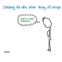
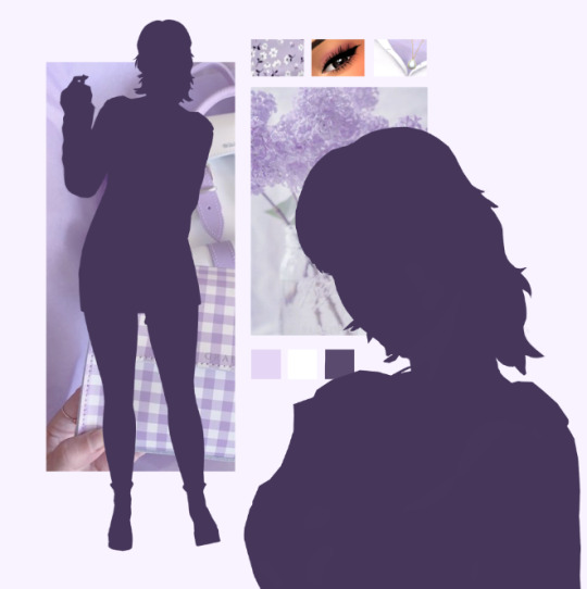
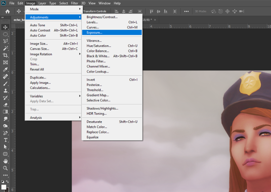
#i edited it out with photoshop generative fill....... IS THAT NOT COOL??????
Text
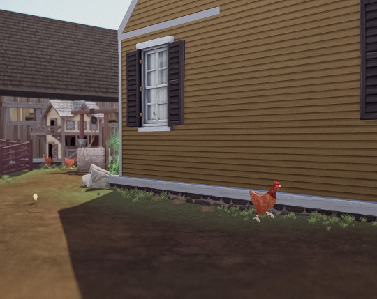
Life on the farm had been quiet since Lucy's birth.
Nellie was enjoying her role as a mother very much. The two had bonded quickly, since spending all their time together. Nellie thought she was quite an easy baby.
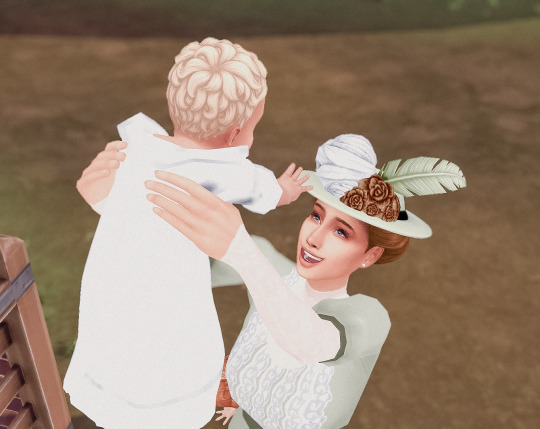
Though Abraham was not as involved with Lucy, being busy with his work and the farm, he still found himself spending time with her whenever possible.

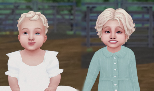
Eventually, enough time had passed for Lucy to become a toddler. Both Abraham and Nellie are excited to see their little girl grow. Nellie can't wait for her to become old enough, to assist her around the house. Likewise Abraham is wishing for their next child to be a boy. Someone who can help out around the farm, so he can focus on his writing.
For her birthday, Abraham gifted her quite an expensive dollhouse. He was able to afford it, with funds from the farm.


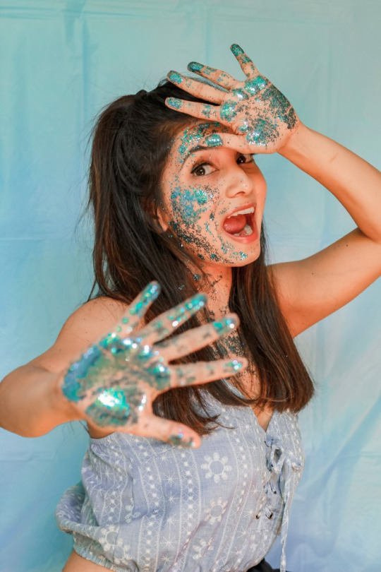
#so you know how there's a hot tub on the og dollhouse at the end right????#i edited it out with photoshop generative fill....... IS THAT NOT COOL??????#ts4 decades challenge#ts4 historical#1890#ts4 legacy#the landgraab legacy#abraham landgraab#nellie landgraab#lucy landgraab#simblr#ts4 gameplay#ts4 community
29 notes
·
View notes
Text
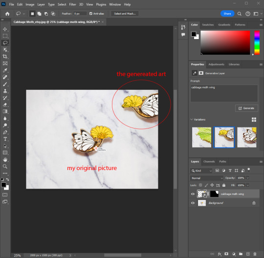
Where is Photoshop getting its AI training from?
Well, probably from scraping. And your stuff might be already in their database without your permission. Above is a screenshot of my Photoshop app with my original picture of my butterfly/moth pin with my watermark already baked in. I was trying out their generative AI tool that is integrated with their new version to see what kind of potential problems could arise and I found one immediately.
As you can see in the image, when I clicked generative fill and typed in "cabbage moth wing" it generated a slightly garbled flipped image of my pin. Where did it get this? Adobe states it's not using your images to train their AI. So let's believe that's true and that when I edited the original photo in Photoshop, it didn't use it from there. I also don't think used the pre-existing pixels to generate it. The generative AI is using a different source than the Content-Aware tool they have.
So it must be from where I've posted it online. After all those are keywords I use for my project. That would be Etsy, my Shopify, and my Instagram page. While nothing in their terms explicitly calls out selling your imagery to AI companies (as far as I've found in their legal pages) they could be. Or, my theory is, Adobe purchased data from people who were scraping the internet.
Currently Adobe prohibits you from using anything created fro their generative AI for commercial purposes (personal use only). It will take your AI text prompts. My worry is that they don't say they won't use it in the future and their already using a database that more than likely has illegally scraped data.
I have no advice except perhaps don't use their tool. It's pretty cool honestly, but we must simply make a moral choice here.
#AI discourse#generative art#somehow Instagram had the best terms where if you delete your content#they forfeit right to using it for any purpose#I am not a lawyer#I am simply an artist trying to understand terms of service#you know the thing most people don't scroll through and just accept
10 notes
·
View notes
Text
General post to say how much i loved this week of the f1mblrcreators fest, seeing people putting out so much incredible stuff is so amazing and inspiring, i think now I have a lot of rejects for after this month is over to fill a lot of dead moments
But now, some special mentions
@mickbetsch riel your piece was just so perfect and complex and insanely detailed and really made me stop and read every single word on it, and it fitted Charles pefectly
@argentinagp lourdes i loved so much your figurine edit, it was so fun picking through every single one amd took me back when I was a child filling my little album with stickers, also the Alex glitch one was super cool, the lid flip on the helmet was a genius move!
@husbono i'm just gonna bown to your Seb edit Natasha, i have actually no words for how perfect i found it, how it captured so many moments and how seb's smile never changed through the years
Honorable mentions: @leqclerc & @leclerqued because while both said you haven't giffed in a while i thought the results were absolutely stunning and worth the little pain of photoshop <3
10 notes
·
View notes
Text
Heads up that I won't have much to post for a while. I'm moving! Back home for a bit while I'm figuring stuff out (like not being broke). Before, when I mentioned my slow activity I left for a few years. Don't worry, I'm not planning on doing that. I have a backlog of... shitpost ideas, which I will post when I have time. If I have the sudden urge and energy to get some of my longer text posts done then I'll try to do them. Any edits and gifs though will be on the back burner for a while.
(That's the gist of it. If you want a mental health discussion and my general thought process on tumblr, read more if curious. It's more of the vein of "tumblr is an addictive website for me" than "this site is destructive and damning." jsyk)
I know I have it in my blog description that the blog is semi-archived. I have been doing my best though to at least post somewhat regularly. The rate for posting may not be fast per number of posts but for me working on them it is very time and energy consuming (yay executive dysfunction and undiagnosed ADHD woo). It doesn't help either not using Photoshop anymore making gifs is lot less streamlined (get all my necessary screenshots frame by frame and organize them -> edit each individually -> put them together with final edits to make a gif. All in 3 separate programs). My wallet appreciates the decision at least.
The thing is I put that in the description not for the lack of time I have to do stuff but the opposite. I have a lot of empty time to fill. Tumblr is one of the few social media sites I actually use and even with the ability to curate your dash (maybe in part because of it), it is easy for tumblr to be addictive without noticing it. That's with me not bothering with the app. I do check a lot with the mobile browser though. I knew with my attention span and how I tend to do or not get things done that being consistently active would not be the best for me personally. Not bad, per say, but not great.
I love you all. It's been great to see a few of my older followers still interact with my posts from time to time. It's nice to see new ones and the Magi fandom in general getting new people coming in, maybe just for the tumblr side or maybe new altogether, when the series has been complete for years. When I say tumblr is not good for me, I don't mean you. Lots of love for everyone /platonically, my aroace ass wants to clarify and add on a giant thank you for no aphobic hate by anyone here either. I would not have trusted to come out on tumblr even if I had my identity figured out when I was active before.
I do want to keep people satisfied. Analytics shouldn't matter on this hellsite, and they don't, not really. I don't care about what the number is but seeing any notes on my posts is a quick dopamine rush. "Yay, I made someone smile." If I have a free moment, I'm like "I should check tumblr," or "I should work on post for blog." I enjoy what I make and enjoy doing it. However, it's become more attempting to be active and getting something out there despite saying I will manage juggling all sorts of different stuff better. I'm not doing other recreational stuff I want to do. I'm behind on games, movies, books, creative shit outside of tumblr, watching Magi for at least the fifth time... If I have a free moment I'm "work on tumblr post."
It's dumb. I should be able to manage shit better. Again, ADHD. Or maybe it's something else. IDFK.
All this to say that I'm taking the excuse of moving to force myself out of the tumblr sphere. I won't have the time or energy to get larger time-consuming posts done. I might as well focus on something else when I have the opportunity.
I am not planning on disappearing. I do like it here. Stayed too long at the spa though and need to get out and get cool, fresh air. I have short, borderline/actual shitposts I want to get done, as mentioned up top. One may be up in the next week. Who knows though? I don't. What I do know is that if I post something over the summer it will be because it is something I want to get done, when I want it to get done. No rushing myself pointlessly. It will be little things though. Bigger edits and gifs aren't hard yet tedious and draining when I'll be buried in boxes and working on home repairs for the immediate future.
Everyone take care of yourselves out there. If you read all this, thanks! Now, I've spent over an hour working on this when it was supposed to take me 15-20 minutes, and I need to sleep lol.
#update post#long post#idk if i will wake up in several hours and be like ahh i shared too much#and edit and delay it for another day or so#it's happened more times than i can count honestly#most of my posts go on queue for the day after i finish them#to stop any last minute regrets and second guessing to get out there haha#update: yup lmao but only sleep-deprived mistakes#have enough time to still post today too
4 notes
·
View notes
Note
hi! i was wondering how do you make your lookbooks? im horrible at photoshop/gimp so if you could, could you describe it in detail of what to do?
hi there! i'm so sorry for the late reply! i made a mini tutorial here going into detail on how i take pictures of my sims in cas and how i edit them! i use paint tool sai for the majority of my edits and add filters in photoshop. here’s a more detailed process on how i edit my lookbooks after this step (under the cut)
this part of my editing process mostly uses clipping layers and selection tool, so it’s a good idea to get familiar with those. i’ve never used gimp before, but i know that photoshop has both of these tools and i know there are other art/photo editing programs that do too (procreate, clip studio paint, sai, etc).
once i’m finished cutting out the background from cas and editing my sims, i arrange them on my canvas in a way i like:
the checkered background shows that it is transparent, so i am able to add a background underneath the sim
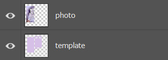
i add a layer below my sim to act as my “photo template”. i use a template so i know where to put my images below my sim. i included the png below so you can feel free to use it for your own lookbooks. you can also make your own if you’d like and mess around with the layout for your background.

once i have my template ready, i gather some photos from pinterest that i feel match my lookbook. i usually try to go by the colour scheme or general aesthetic of the look. i then loosely arrange the photos over the template. they don’t have to perfectly overlap since we’ll be clipping them in the next part
this next part can be a bit tricky to describe so just bear with me haha,, basically, i use clipping layers to add my photos and cut them to the template without having to erase any of the excess. when you “clip” a layer to another layer in photoshop, it will essentially take the shape of that layer?? i’m not the best at explaining it but its a really easy way to add my photos without having to specifically crop them to perfectly fit the template.
to clip layers in photoshop, first put your photo layer above your template layer
then go up to your “layer” option in the menu bar and select “create clipping mask”.
you can also hold the alt key and position your mouse so it’s between the two layers, then click, as a shortcut. i prefer doing this since it’s faster and especially more helpful when i have to clip multiple layers
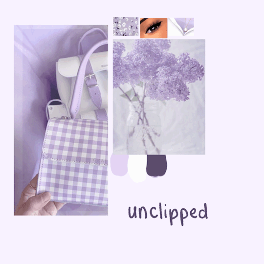
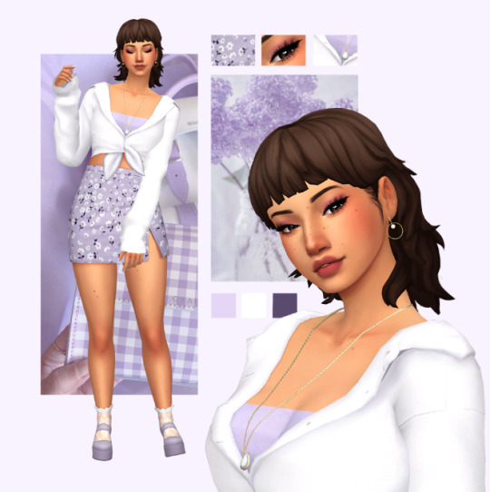
here’s a look at what the photos look like clipped vs unclipped:
if you’re still confused on clipping layers, you can find a more in depth explanation here :)
once i have my background ready, i’ll add my sim and make adjustments if necessary
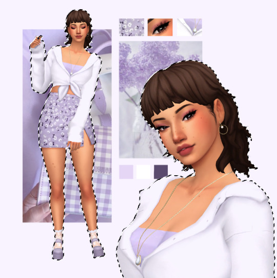
you can leave it here if you’d like, but i like to take it one step further by adding a subtle shadow underneath to add some dimension and separate the background from the sim! i start by making a selection of my sim. this can be done easily by holding + clicking the ctrl key over the thumbnail of your sim layer. its important to make sure that your sim is on a transparent layer so you get a clean selection of the sims silhouette

your selection should look something like this
with the selection made, make a new layer below your sim layer for your shadow. then, select a dark colour and use the paint bucket tool to fill in your selection. i try to avoid using a pure black for the shadow since it tends to look pretty harsh, and try and pick something similar to the colours of the layout. for this one, i went with a dark purple.
your layer should look something like this
i then add a blur by going into filter > blur > gaussian blur, then adjust according to preference. you should have something like this
i then add my sim back and adjust the opacity of my shadow layer if needed
and here’s what the finished lookbook looks like! i hope this made sense and was helpful in some sort of way,, feel free to experiment with this method and create some cool stuff :)
31 notes
·
View notes
Note
Was it just me or is corran’s dragon for rathian looking?? Also how did you design Avengret in game?? Cause I see a bunch of people make screenshots for their stuff and I’m here going ‘???? How???’
Short answer: Patience and a little Crime.
Longer Answer: Go under the cut for explanations, like Avengret's body double, Corran's transformed model, and How Lyn (subjects you all to her) Screenshots.
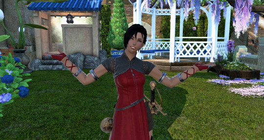
The model I used for Avengret is simply a red dragon at Anyx Trine named Nehsk Fan, using careful Gpose angles, camera zoom, filters, lighting, time of day, and the same Gshade filter I've been using for these headers for consistency (Teddy Gpose for the curious). So actually fairly simple in the manner of "anyone can actually do this and get similar results" (aside from the Gshade).
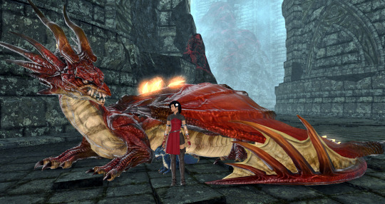
Image is Aeryn at Anyx Trine with Nehsk Fan, using my simple default gameplay filter in Gshade.
For Corran's look in "Scale" I used CMTools, which takes in game assets and allows one to manipulate them, as well as time and weather. It's how one can use carbuncles, chocobos, and/or most housing retainers to take the form of NPCs, and create custom poses while dressing up in whatever existing clothing items one wants.
Which is how I got this shot with all 4 of my OCs in one room; one I am actually playing, another is a carbuncle, and 2 others are Dark's housing servants, after saving each of my ladies' appearances in the tool. This is also how I get so many shippy shots of Aeryn with Thancred; she's just hanging out somewhere with a carbuncle (while I curse how various joints work as I mess with sliders).
For "Scale" I actually went with the monster menu and stood Dark Autumn somewhere while overwriting her appearance with Rathalos. Anyone else wandering by just saw my femroe idling on a hill, as the change is only visible on my own screen. Then back to the game's Gpose, using zoom, angles, drop lighting, filters, to take multiple shots until I found one I was happy with; I have 7 others in this case that I took and edited but didn't use.
For post-work, I mostly use Picasa 3, a simple photo editor discontinued about 10 years ago but still can be found in places online. I don't do Photoshop, so a simple tool that lets me one click color corrections, lighting balance, and various filters and minor adjustments, as well as cropping, lettering, angling/straightening the pic, works for me.
Image below are just the examples of options I can play with in Picasa 3, many of them adjustable in various ways:
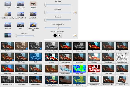
I mostly use Crop, Straighten, I'm Feeling Lucky, Auto Contrast, Auto Color, the Fill Lights/Highlights/Shadows/Color Temp menu, and play around with what filters seem to work for the shot I want. I use "Tint" with the default light blue to "cool down" many of Aeryn's screenshots so she's not super red, depending on what other lighting and colors are happening in the picture. Saturation is good for upping or lowering saturation, especially when using the Bright 4 filter in Gpose.
Knowing how to compose a picture using camera angles, lighting, color, etc, with the in game tools is the most important part; all the extra tools won't do a darn thing to make a good screenshot if you don't learn the basics. Basic photography/art rules apply! The extra tools just make some things easier. I don't think I'm that good at it (I have little sense of composition, lighting, or color; all my best stuff is happy accident!) and I still have a lot to learn, and it does take time and practice. As well as lots of patience and taking dozens of shots to only then end up posting 1 or 2.
My dear friend @healerstail is fantastic at taking screenshots (and photography in general) and has mostly only used basic Gpose and Gshade, only the occasional mod and just recently picked up CMTools. Mostly it's just knowing how to set up the default emotes, timing, and good angles. His composition is amazing. Likewise, @gunbun is very good at lighting and composition, and has been using the new posing tool, Anamnesis (CMT's successor) to excellent affect. She'll tell you to mind your drop lights and camera angles, too
Extra tools only work on PC, so console users have to use only Gpose and defaults, though some do post-work in Photoshop. An excellent example of detailed post-work is @kukurubean's edits.
NOTE: Remember that while Gshade is fine as it's just a filter overlay (and one can get the same results from most graphic card interfaces these days), mods are against the SquareEnix TOS so use your extra tools responsibly; remove the default watermark from screenshots, do not tag official accounts, do not talk about mods in game, put any lewds on locked/private/behind cuts. Do not tease or harass other players with either cosmetic or combat mods.
The FFXIV devs are willing to turn a blind eye and allow player creativity so long as extra tools are used responsibly, not to affect gameplay or bother other players. Yoshida flat out hates DPS meters as people don't tend to use them for personal growth; we have Sky Sea Stone and the metric is "did the boss die and everyone have fun?" Also he has gone on a PLL before and told people to stop lewding younger characters using game assets for legal reasons--right after talking about changing code to break a combat mod used during the TEA world first race (as well as changing how combat markers work in general), making the implications clear.
20 notes
·
View notes
Note
1, 14, 32 for the gifmaker asks? :)
Ahhh thank you so much for the ask!!
1. What are your top 3 favorite sets you’ve made?
This is a difficult question, there are definitely certain gifsets I like more or less than others but to pick a top three is hard. So, I reserve the right to change this list at any time, but at this moment I think my top 3 would have to be:
This Sebastian gifset. I think the typography is cool, the colouring is bright and fun, and I'm really happy with the scenes and quotes I chose. I think it's one of my most polished looking sets.
This gifset of Kurt with Bo Burnham lyrics. I'm a slut for lyric gifsets, I love making them and taking inspiration from music. The lyrics to this song just seemed so good for Kurt, I love his whole Inside special and I love angst so I had to do it. Then of course I loved getting to do the typography, I think the cursive mixed with the non-cursive looks really pretty and I tried out some softer colouring that I think goes really well with the overall vibe of the gifset.
This Kurt + his soulmates gifset. I actually think it's kind of funny how much I like this set, because I don't like the soulmate concept in general, and even if I did I'm not a huge fan of Finn and Hummelberry and Klaine wouldn't be my top friend and relationship picks for Kurt either, but it just felt right for this gifset and I think it turned out really well. I think the colours all go really well together, and I like what I did with the typography. It's an older set at this point, but I think it holds up really well!
14. How long does it usually take you to make a set?
Quite often I'll make a gifset in a single evening, but those are usually shorter and less detailed. For something more complicated, or that I'm less certain exactly what I want to do going into it, it could take longer. It also depends on what it's for, because if I'm participating in an event or need to post it on a certain day I usually spend more time going back and editing, otherwise I'm very impatient and just post it immediately. Longer or more detailed sets might take me a week, but that's just working on them in the evenings and probably not every day.
32. What is your favorite tool/adjustment layer in Photoshop?
I used to use curves a lot, and I still use it often but I don't rely on it as much as I once did. Lately I've been really appreciating levels and hue/saturation layers! And then this might be a bit niche, but I am obsessed with layer styles. Give me a drop shadow, give me a stroke, give me a gradient fill yes please. Obsessed. I'm sure it's because my gifsets tend to be typography-heavy because they're often lyric gifsets, but I kinda just feel like I owe layer styles my life.
2 notes
·
View notes
Text
To anyone who reads this, IM SO FUCKING SORRY YOU HAD TO READ MY CRACKPOT THOUGHTS.
I’ve wanted to say this for a few days now. When thinking back to the times I was a part of the Creepypasta fanon fandom I always headcanon Slenderman as a parental figure. When I had an original character related to him because well everyone usually does with pastas, Slenderman was not considered the best parental figure. Literally in all edits of my original character, Slenderman was never seen as a good parental figure.
And I mean someone could point it out by saying stuff like , well duh that’s obvious, doesn’t the dude abduct kids and forces people to become proxies? Normally I would say yeah but like I gotta blame the parents on this because who doesn’t watch their young kids when going outside? The fuck is wrong with you? When looking into Slender’s origins that crowd of people image with the photoshopped Slender comes up. A bunch of those people are young adults or adults in general. The implication is that Slender has manipulated their minds to murder them, but who is them? Well based on general knowledge of Slenderman presumably children. I honestly feel as though Slender did this as a lesson. Because if Slender has retractable tendrils, able to teleport, possible telepathy, and causes static to occur near technology what is to say that Slender can’t be able to manipulate people’s memories or brainwash people? Hell Slender is probably “abducting kids” because letting a kid wander on their own without supervision is neglectful. Hell the people in that first image could’ve been neglecting their kids and Slender brain washed them to make it seem like they did a terrible deed because they neglected their fucking kids. Is that terrible? Yes. Could some of these parents been able to change themselves? Probably. Honestly I wouldn’t be surprised if Slender basically cared for these kids and then when they grew up let them go off to better families. Honestly I feel like that would be a cool narrative.
So I made a Slenderman based idea where they in my headcanon is a German man who had turned into an eldritch horror. The man likely had lost a child and made multiple attempts to find the child and thus resulting in attempting to fill the void by taking in abandoned children and abducting them to likely replace Slender’s original kid. Why is Slender German? In a roleplay I was in Slenderman was implied to be German which I just thought as interesting and kind of neat. I also had an weird idea that the kid could’ve had like an octopus like white plushy it just some sort of white plush that ended up fusing with him when he turned into the horror. They likely has had some partners prior in attempts to have kids. Slenderman definitely knows something about carpentry because how the fuck would this fanon mansion of theirs exist and Slender definitely doesn’t have a job unless they robs their victims.
My overall thoughts are that unless you’re a minor Slenderman gives off the illusion of a good caregiver, while with much older children such a teenagers or anyone in the proxy range Slender is fucking manipulative. Slender’s like one of the most manipulative parents. Slender would keep you sheltered and provide for you but you gotta do shit in return. Like oh, you thought you were living here for free? As long as you live under my roof you do what I fucking say. Though Slender is most definitely toxic I don’t think Slender is bigoted considering a majority of the pastas in fanon are queer especially Slender themselves.
Despite the ridiculous nature of this talk, I do believe there is a reason for Slender to be presumably toxic. The reason being that although we wish for a perfect parental figure what we consider as perfect is usually flawed and seen through rose-colored glasses. Also, the fact that if Slender has had a child with a lover the child would usually resent him. Though I did this for my canon where my original character has resentment towards Slender. Slender is easy to resent as Slender is simply an archetype of an overprotective strict father in fanon. Not only that but does make teenagers work for him which he wouldn’t need as he could simply do work himself. I dunno how to end this off properly so… Stan splendor man.
#creepypasta#slenderman#creepypasta fandom#tldr: slender would be a fucking toxic parent and you know it. Stan splendorman.#this headcanon took a bit of research and thought process#I honestly enjoy toxic slender because I feel that it implies that in the future he could probably get better#then again that could be the sleepiness kicking in.#also I don’t condone any actions Slender man makes. obviously#these are just sudden ideas I had
9 notes
·
View notes
Note
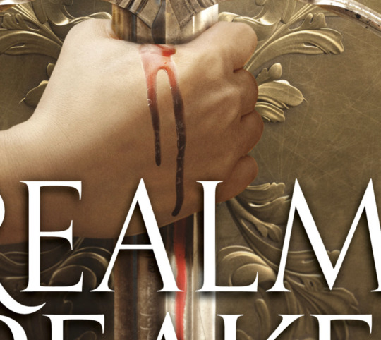
Just saw Aveyard's cover for Realm Breaker was released. It's reading Adult to me instead of YA (title font + drop shadows, Aveyard's name is Big and Bolded) thought that was interesting. Thoughts?

Oh, yeah, this is directly aping not just adult fantasy but Game of Thrones specifically. Down to the multiple lines in that A crossbar.


Which..... Okay! I guess!
Important context here is that we’re working with the most generic capital-F-Fantasy synopsis/ pitch (read: list of jobs) possible:
A strange darkness grows in Allward.
Even Corayne an-Amarat can feel it, tucked away in her small town at the edge of the sea.
She soon discovers the truth: She is the last of an ancient lineage — and the last hope to save the world from destruction. But she won’t be alone. Even as darkness falls, she is joined by a band of unlikely companions:
A squire, forced to choose between home and honor.
An immortal, avenging a broken promise.
An assassin, exiled and bloodthirsty.
An ancient sorceress, whose riddles hide an eerie foresight.
A forger with a secret past.
A bounty hunter with a score to settle.
Together they stand against a vicious opponent, invincible and determined to burn all kingdoms to ash, and an army unlike anything the realm has ever witnessed.
“Teenager has big magical destiny + large group of edgy outcasts with very specific and fun fantasy professions unite to stop the big evil what threatens the kingdom” is the most quintessential fantasy plot out there, and for that reason it is very hard to sell without a more specific hook. But here we are trying to do it...... again. Macmillan YA inexplicably bet big on this formula last year with debut series THERE WILL COME A DARKNESS and bombed hard: after spending a fairly insane million dollars on the advance (for three books, so ~$333,333 per book), more than a year after its release, the first book has less than 5k ratings on goodreads. (Compare to “successful” ‘19 debuts SERPENT & DOVE with 67k or WICKED SAINTS with 18k)
Worth noting that the DARKNESS covers went distinctly Schwabian:

When I complained at one point about the emphasis on the five protagonists in that synopsis and their little portraits on the covers, someone said to me, ‘but they have these nuanced little details that are so cool if you’ve read the book!’ And y’all, that’s lovely, but we are talking marketing, and “having five+ protagonists who are very cool, we swear” is not a selling point. It’s closer to the opposite of a selling point. Even as someone who likes epic fantasy, getting Into It with five whole characters is potentially a lot of effort, and I want to know what my reward for that will be, not just how much work I’m going to have to do. ANYWAY.
While I don’t think it’s necessarily a bad move for REALM BREAKER to hit that big red “IT’S LIKE GAME OF THRONES, GUYS!!” button I do think it’s, um, kind of silly. On the one hand, sure, you’re limited in immediately identifiable epic fantasy points of comparison, and, uh, go hard or go home? On the other hand... adult crossover exists, but are these books going to successfully pull any honest to goodness George RR Martin fans looking to fill a Winds of Winter shaped hole in their heart? I mean...... I guess it’s possible, but they are in for a YA culture shock that I can’t wait to read about in goodreads reviews.
At the end of the day, I presume that Aveyard has the clout and established readership to avoid the fate of THERE WILL COME A DARKNESS and generally sell lots of books regardless of the marketing angle or cover comps, but the GOT-ness of it all strikes me as somehow both indulgent and disappointingly generic. That said, the cover itself is fine (hard to fuck up SWORD IN MIDDLE with some plain ass fonts). The flourish textures are elegant unto themselves, and the lighting end editing is classy enough that nothing looks disastrously cheap or fake.
Except for this hilarious, budget TV show, watery ass “blood”, lmaooooooooooooo. Come on, guys, we could have photoshopped that.
76 notes
·
View notes
Photo

Hey guys! 😊 I’ve written this tutorial on how I edit my screenshots! It’s maybe a bit (a lot) more detailed than I originally intended, but I hope it gives you some new ideas/tips/tricks! 💗 (included below: how i fake reshade xD)

So I’m gonna start with this unedited screenshot of Felicia. 😁 I don’t use Reshade in my game, too much hassle. :P Instead, I use overlay textures and Photoshop actions to make my shots look pretty~ 😁
Here’s what that shot looks like after I’ve dragged it onto my echo_base.psd (the file I use for all my Winter Echo posts). I resize the shot only after bringing it onto the psd (but for this one, I’m leaving it at the original size). For Winter Echo panels, I use dimensions of 1011x608px at 72dpi.

Here’s what the shot looks like after I’ve turned on my four overlay texture layers above it. I have a large collection of these because I use them in my illustration work. Most of my textures I get from Adobe Stock (or make myself) but you can find a lot of great free ones on google images by using search terms like “gradient texture” or “overlay texture” (to get the best ones, change your image search settings: Tools > Size > Large). Here are the four I’m using for Winter Echo without their overlay effects applied:


And here are the specific overlay settings I’ve applied to each one:

This requires a bit of trial and error! If you use this method you’ll probably end up mucking around with the overlay effects and opacity a lot because the results will vary according to the textures you’re using and the lighting in the shot underneath. These specific textures and their settings took me a while to settle on and I’ve used a variety of others in the past. 😊

This brings me to the Actions Panel! xD If you use a lot of lighting and colour adjustments on your shots, actions are a really good way to record them so you can apply identical effects to each shot. The shot above has had my “WE Indoor New” and “WE Colour Adjust” actions applied. But that doesn’t help you much, so here’s what I’ve actually recorded for those actions:
Photo Filter

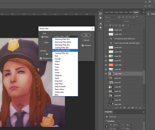
First step is always Photo Filter. Sims shots tend to come out a bit too warm imo, so I usually apply a Cooling filter (LBB is slightly purple).
Exposure
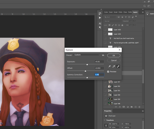
Exposure is a bitch to adjust because it will often have wildly different effects in different lighting. So I usually only adjust this a little, and let my textures do most of the lightening/brightening. You can get some very interesting effects with this though (e.g. I used to increase the offset a fair amount to make my shots look more dusty/soft).
Colour Balance

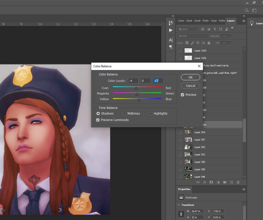
Again, my textures and photo filter are doing most of the work here, but I always add a bit more blue to shadows, and sometimes a bit of yellow to highlights just to take some redness out of skintones.
Levels

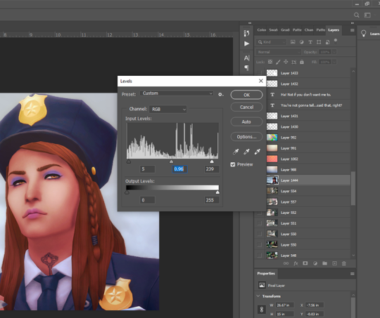
I use this instead of brightness/contrast. Just to make whites a little more white, and blacks a little more black, because sometimes my textures can make them a bit dull. Adjust as you like!
Noise

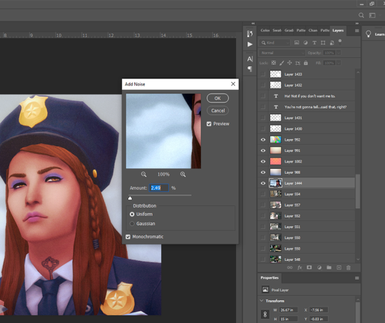
I used to use an overlay texture for this, but I like the consistency of Photoshop’s Noise effect. 😊 Don’t go nuts with this! A tiny bit of noise goes a long way. xD (and also, a higher noise level that looks good on a close up will make your wide angle shots look like a blurry mess, trust me 😅)
That’s all the effects I use in my recorded actions! Next step is...
Dodge & Burn
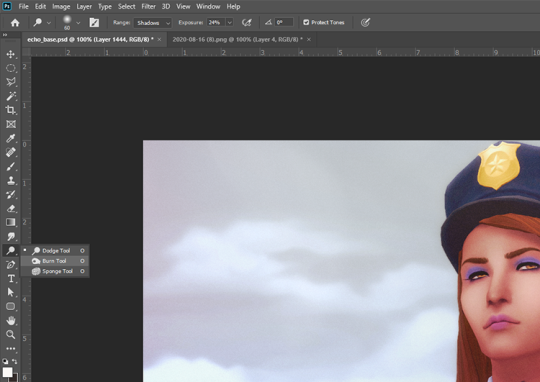
I only use this on shots that need a little extra depth, and only on faces/hair/clothing. Mostly I use the dodge tool on the T-zone of faces and the burn tool (with a large, soft brush) around the sides of faces. Keep the exposure very low to control how much shadow/highlight you’re adding. (You might also want to work on a duplicate layer for this step, in case you end up hating the result and wanna go back to the original xD)
That’s pretty much it for how I edit my shots! Obviously I haven’t gone into the tiny editing things like smoothing really angular edges, fixing clipping, etc or we’d be here all day. 😅 But here’s a little bit extra about how I make my speech bubbles:

I use Photoshop’s Rounded Rectangle tool on a new layer...


The corner radius can be adjusted in this panel. If you can’t see this panel, you can find it under Window > Properties.

Then I use the Polygonal Lasso tool (right-click on the Lasso tool to find the Polygonal Lasso) to draw a triangle on a new layer, and fill it with white.

I merge the two layers (the rounded rectangle layer & the triangle layer) and bring the opacity down to around 75-80% (depending on the shot in the background - if there’s a lot of detail behind the bubble, it needs to be more solid so the text stays readable). I’ve added text afterwards in this example but I always put the text in first, so I know how big the bubble needs to be and where to place it. I keep all these bubble and text layers in the psd until after they’re posted, so I can easily make edits as needed. 😊 (but I don’t keep them forever, because I’d have thousands of layers by now and the psd would take 10min to open 😅)
I hope that was all easy enough to follow!! If you have any questions at all about any of this stuff, or need help with Photoshop in general, please feel free to leave me a comment or shoot me a message! I’m always happy to help 😁💗
83 notes
·
View notes
Text
Make love, not war: The anti- OBX drama edition
Okay kids, listen up.
I’m too old for all of this drama and I’ve been on this hellsite for way too long to just keep watching it in silence so this is gonna be my only, long ass post about this mess that has occured/is occuring. I’m trying to get my thoughts out and and maybe talk some sense into the last three braincells some people have left.
These are my thoughts. My opinion. It’s totally fine if you disagree but if you feel strongly offended or called out by this, you might be part of the problem.
I’ve been watching the drama for a while now and normally I’m just someone who’s on the quiet side, grabbing a box of popcorn and watching how y’all tear each other to pieces but seriously?
Some of you really need to get a life.
Fandom life isn’t always easy, fandom life can be messy, some people are not what they seem, yadda yadda.
But seriously, did you lose all the respect you had when you’ve signed up on this website or social media in general?
First: The Rudy “drama”
Someone, a really sweet and nice to everyone person, stated a theory based on an anon ask who based their ask on a social media website. A theory. A worst case scenario of what might have happened. They wanted to be nice and answer to every anon they’re getting but guys.
Guys.
It was a theory. A mere idea of what might have happened because someone asked, nothing else. It was not facts, there was no evidence and the ask that caused all of this was not based on facts either. It can totally be fun to speculate about things. You’re allowed to believe what you want. Rudy’s a dick, Rudy’s a sweet angel, Rudy is a blue alien in disguise, everyone is allowed to have an opinion on something but oh my god.
Don’t make facts out of theories.
Don’t look at three emotes and be like “oh my god they have to be dating!”
Don’t make a drama out of two actors not liking each other’s posts on Instagram like what the heck.
When did Social Media take over your life so much that you interpret everything in those little things? There’s a real life out there, ya know?
We don’t know anything for a fact so let it go. Wait until someone says something official which probably won’t happen.
More importantly, stay out of actors' private lives as much as you can. Seriously. You’re welcome to state your opinion about them, make theories, stuff like that but tbh, it’s better to stay out of it because at the end of your day, it’s none of our business. Celebrity stalking is not and never will be cool. Don’t waste your time and energy of trying to figure something out they clearly don’t want you to see. Best example for this are like, baby news.
I know it can be exciting to figure stuff out. I know you can be totally curious because you like that person and want to find things about their life but don’t blow it out of proportion.
Actors are humans. Actors are not their characters. They have their own private life and if they want to share, that’s cool. If not, then that’s also cool. And tbh, the OBX cast is feeding us a lot more way more than other actors from other shows/movies, god bless them.
But who the fuck do you think you are that you’re sending them, the actors or the people talking about it, hate based on a simple theory on a website that has a life on it’s own and things that happen on here should stay on here? That’s not cool, it’s a shame for other people in the fandom. Why would you want to make a person feel bad because I’m pretty sure you wouldn’t like to feel this way either.
They’re grown ups, they can do what they want. You don’t have to like it but for the love of god:
Have some respect for a human being.

Second: The Chase Thing aka #chasestokespartyisover
That last sentence totally applies here too.
Have respect for a human being.
Boy made a tweet over ten years ago where he said something that was problematic. Was that cool? No. Did he apologize? Yes. Is it time to let it go? Totally. Was his hacking excuse true or not? WE DON’T KNOW.
You know what’s not cool tho? Some people taking their time to scroll down TEN YEARS AND MORE on a timeline to get some tea on them that you can use and complain about.
I know quarantine can get boring but jfc guys. There are more things to life than obsessing over an actor, ya know.
We all said shit in our youth, that’s a fact but people change. They grow. Don’t compare a teenage boy with a grown ass man.
You know what’s also totally 100% not acceptable? People photoshopping fake screenshots to show what a big mean white boi Chase is, trying to fuel the fire of hate. What the fuck is wrong in those minds?
Cancel Culture is a toxic phenomenon that should be the only thing getting canceled. You can’t cancel people, ya know. It’s fucking toxic to say something like that and just...don’t, man. I barely have any words left to describe this stupid thing.
Make love, not war. Spread love, not hate.
Fandom is not a place to rip each other to pieces. Not everything in this world is about race, sex/gender or problematic things. Just because someone doesn’t reblog a lot about Madison it’s mostly not because of racism or because she’s queer. Sure, that’s probably the case for some people but you know, those people aren’t worth it then.
Fandom is not a place that should spread hate around, especially not on anon, sending people asks filled with hate. There’s a bunch of younger kids on here, especially in the OBX fandom from what I’ve seen so far and it’s not okay to tell a 15 year old girl to tell her to go kill herself because she likes Rudy more than JD or shit like that. It’s never okay to something like that but it hits the younger ones even harder. Maybe it’s their first fandom and people ruin that experience on the spot, feeling powerful while on anon.
Fandom should be a place where we come together and have fun. Make friends and share things. Gifset, fanfics, theories about the new season, things like that. It should be a place to freak out over new teasers, new pictures from the set, the cast sharing stuff on their platform of choice and just things we enjoy.
There are different ways to block and blacklist on Tumblr, especially if you’re using it in a browser on your laptop/pc. Use that to block toxic people, tags you don’t wanna see and create your own little bubble where you’re happy in. Do this in case you feel uncomfortable with some people around here, so you only see what makes you happy.
Please remind yourself about the fact that behind all those blogs, there are real people. People who all have their own lives, own opinions, own ideas. Same goes for actors. They’re not there for your personal entertainment, they don’t have to share their complete private life with you.
They’re human, just like you and me and it’s unacceptable to send them hate, no matter what they’ve done. You don’t have to like them but keep it to yourself or talk about it with friends, I don’t give a shit but leave it out of their sight.
Please remind yourself that we want to have a good time here and especially during times like these where we spend more time on here than we probably should *laughs*
If you made it to the end, thank you for your attention and taking your time and remember:
Be nice to each other, the world is cruel enough.
-Captain out.

#outer banks#obx#obx netflix#rudy pankow#chase stokes#madison bailey#jonathan daviss#madelyn cline#drew starkey#obx cast#this is just a massive brain dumb with lots of swearing lmao
142 notes
·
View notes
Text
Home photography ideas
If you believe that pictures shot at home are boring, a simple object may make all the difference. Accessories may not only make your photographs more interesting, but they can also provide context to your photos and help you tell a narrative. There are several props that are inexpensive, simple to obtain, and may be extremely beneficial for home photoshoots. Here are some ideas for home photoshoots using props.
1. ADD SOME FLOWERS
When shooting photographs at home, flowers are one of the greatest accessories to utilise (and pretty much in every other situation). Adding flowers as a prop to a lifeless shot or a plain background is a fantastic way to add a splash of colour. Flowers look beautiful in photographs, whether you're holding a bouquet, filling a bathtub with them, scattering flowers about you, or taping them together to make a flower wall.
2. USE A MIRROR TO BE CREATIVE
Using a mirror as a prop, you may create some interesting photographs at home. To get an intriguing angle, simply play about with a mirror. It may also be used to make some interesting reflections. Even the most basic mirror may help you elevate your house photography to new heights.
It serves more than just checking cosmetics, at least for photographers. A pocket-sized mirror gives a snapshot a different viewpoint, making the arrangement appear conflicted but still fascinating. It's a unique method to include oneself in the photo alongside your chosen backdrop.
3. EXPERIMENT WITH LIGHTS
When filming indoors, Xmas lights are a great accessory to employ.
To create a contrast between the natural chilly light of the space and the warm artificial lighting behind your model, hang some lights behind her. Take a few of the light bulbs and place them near the camera.
Fairy lights, especially battery-powered portable ones, are excellent photography props! When working with a wide aperture (small F/number, i.e. F/2.8), use them as a fast addition to the back or foreground of a photo to produce some gorgeous spheres of bokeh surrounding your subject.
Request that your model hold some of the lights near to her face to produce a lovely warm glow.
4. USE GLITTER OR PAINT
Using glitter or paint as another method to get creative when shooting at home is another option (for the sake of your skin I suggest using face pain). It's a simple and enjoyable method to transform a plain portrait into a work of art. You may blow glitter in the direction of the camera or cover your face and body with it when shooting with it. Although, once you've finished, this house photography concept may require some tidying up.
5. LOOK FOR SHADOWS
Look around your home for lovely shadows cast by commonplace items. Examine the light that enters your home at various times of the day for this. You may picture the item as well as its shadow, or you can only shoot the shadow on its own.
6....OR Create YOUR OWN SHADOWS
Another home photography idea: if you can't locate any shadows, make your own. Simply cut different shapes out of paper and shine a phone flashlight or natural light through them. You may also utilise other household items to cast fascinating shadows on your face.
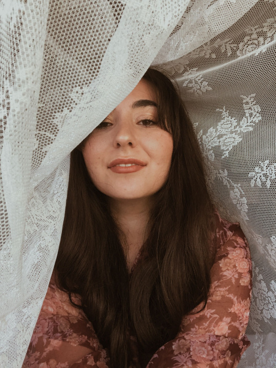
7. TAKE A PHOTO THROUGH LACE
Lace may also be used to produce lovely and distinctive shadows on your skin. Find a location with natural warm light and allow the lace shine through; it will make lovely patterns on your skin. Check out this lovely and reasonably priced lace tablecloth, which is ideal for this photograph.
8. BUILD A RAINBOW
Use a disc or a glass prism to produce stunning rainbow-like shadows. To generate multicolored flare and reflections, catch some light and reflect it towards your figure. You'll almost certainly have a spare CD lying around the home; just make sure it's not your favorite. The iridescent characteristics of the disc's underside make it an ideal photography prop for reflecting or distorting light as foreground bokeh.
If you add a little water, it may even be used as a stand-alone subject. The iridescent characteristics of the disc's underside make it an ideal photography prop for reflecting or distorting light as foreground bokeh.
If you add a little water, it may even be used as a stand-alone subject.
9. CREATE A NEW BACKGROUND
You don't have any Instagrammable walls in your house? Don't worry, you can always make some unique backdrops out of everyday items. For an interior photography, use white bedsheets, newspapers, or colourful posters as a backdrop.
To make an intriguing backdrop, you may utilise Photoshop or several phone editing applications. Simply snap a picture in front of a simple wall and then alter the colour afterwards. Here's a brief tutorial on how to alter the backdrop of a photo in Photoshop.
10. TAKE A PHOTO THROUGH A WINDOW
Shoot through a glass window or door to add depth to your interior photographs. It's yet another method to get the dreamy romantic appearance. Focus manually while shooting through glass, and try to adjust your angle to eliminate reflections. When shooting through glass, employing a polarizing filter is the best approach to reduce reflections.
11. SPRAY BOTTLE
We discussed it previously in conjunction with the CD, but this isn't a one-trick pony! A spray bottle packed with 90% water and 10% baby oil can give any topic a natural moist appearance that won't evaporate right away.
It's cool to use to make water drops on flowers, metals, glass, and mirrors. For varying consistency levels, adjust the water-to-oil ratio.
12. CHOOSE YOUR FAVORITE BOOK
This one is more customizable depending on your hobbies, but the goal is the same - choose something that reflects you. Most of us have a prized object, and if it isn't too large, why not use it as inspiration for your photography?
It might be a hidden detail that your viewers must discover, or a sequence of photos showing the object in various settings. In any case, it's all about injecting your individuality into your picture and making it truly one-of-a-kind. A favorite book, hat, jacket, badge, drink, or scarf may be the item. Find out how intelligent and cunning you are.
#hpmephotographyideas#photography#art#photoshoot#photoart#edit#ideas#pic#creative#photooftheday#picoftheweek#pictures#happy#travel#bueaty#portrait#nature#bueatiful
2 notes
·
View notes
Text
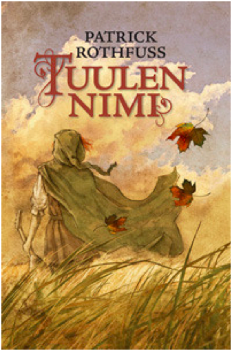
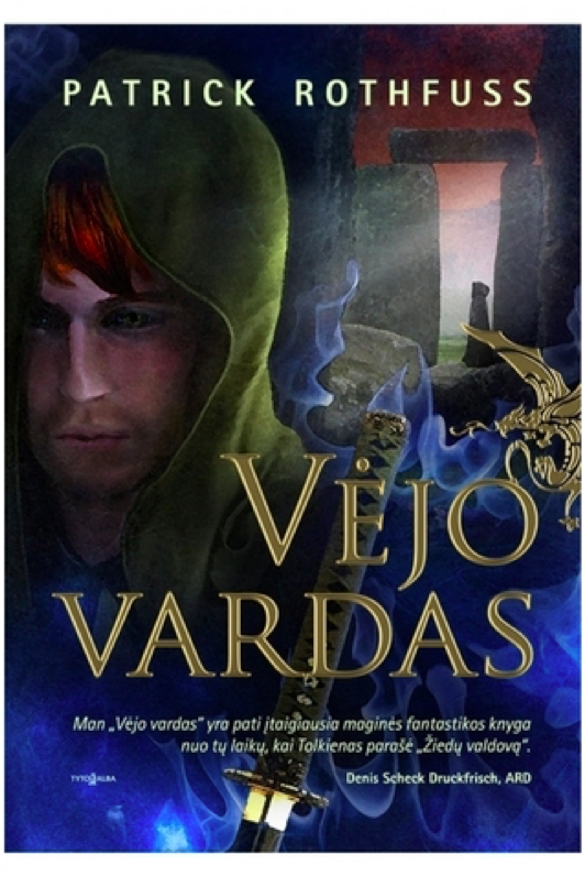
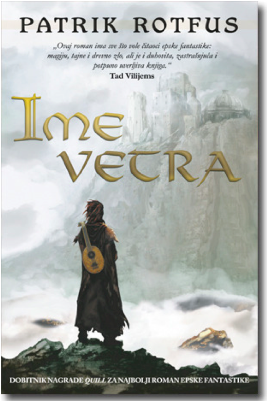
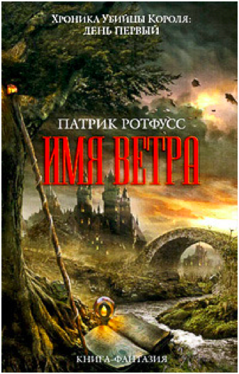
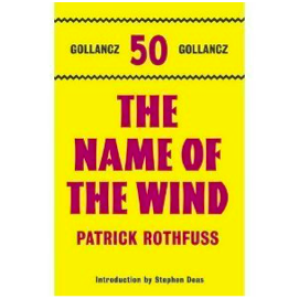
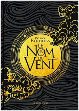
Rating Every Single Name of the Wind Cover
Why? Because I can. I am not a graphic designer, just a person with opinions.
Criteria for consideration: Must be a cover in a published edition of The Name of the Wind by Patrick Rothfuss. Hardcover, paperback, and ebook are all fair game, as are foreign language editions. Some editions reuse the same cover art, in which case I only rate one cover. Some editions modify cover art from another edition. If the differences are substantial, I’ll rate both.

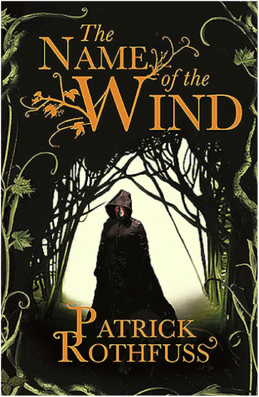
Kindle March 2007 Edition
Ah, the famous shirtless redhead cover. This cover is a bit infamous in the fandom for being both bad and cringey. This is not good art. It’s cheesy. The shirtless aspect is silly, and the windswept hair is so windswept, you’d think Kvothe was in a tornado. Nice balance with the title and author text, although it looks like the title and author text are slightly off center.
3/10

Hardcover April 2007 Edition
This is just a zoomed in crop of the above cover, which is a little lazy. It does make for a better cover image, except the creepy goat man bust has nothing to do with the plot of Name of the Wind. So I suppose they cancel out.
3/10

Mass Market Paperback April 2009 Edition
I despise this cover. It’s a lazy design, and the photo manipulation is terrible. Points I guess for good title text placement. But the photo manipulation is so! So! Bad! This is also the start of the trend of a hooded, cloaked figure with his back to the viewer staring out into the void. It is a bad trend.
2/10
Paperback UK June 2008 Edition
We’re still with the hooded, cloaked figure, but at least he’s facing front this time. I like the embellishment on the ‘W’ in the title text, although it gets a little pumpkin viney. Overall, it’s an ok cover. It doesn’t make me cringe, but it doesn’t grab the viewer’s interest, either.
4/10
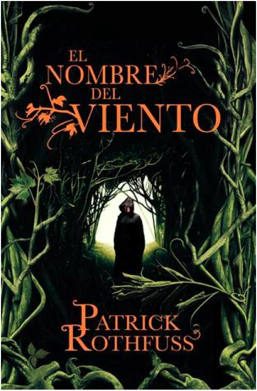
Paperback Spanish May 2009 Edition
Same image as the previous cover, but this one is uncropped and has a different plant border. I’m not sure how successful the changes are. On the one hand, shrinking the image of the figure makes the figure look more mysterious, which is good. But on the other hand, this is a bad plant border. I thought there was some corn on the right side for a minute.
4/10

Hardcover 10th Anniversary October 2017 Edition
10th Anniversary edition got fancy, and it shows. I love the ruin influence in the title text, which is a great callback to the use of ruins in the novel and also a more creative and unexpected choice than making the title text leafy. That being said, the “of the” in the title text is very oddly formatted and doesn’t fit the style. The cover illustration is pretty great, with lots of symbolism for old fans while still maintaining visual interest for new readers who are browsing and happen to pick the book up. The Cinder statue is delightfully creepy and much more relevant to the novel than the dumb pan statue from the earlier cover.
9/10

Paperback Turkish March 2007 Edition
Another trend starting here: Cloaked figure staring out at a city in the distance. I like the painting, at least what I can see of it. I find the choice to crop out most of the painting really bizarre. Is this supposed to be a telescope we’re looking through? And the leaves look like lily pads. The title and author text leaf embellishments are quite nice here, but I don’t know why there’s a metallic color shift. Overall, a poor use of space.
4/10
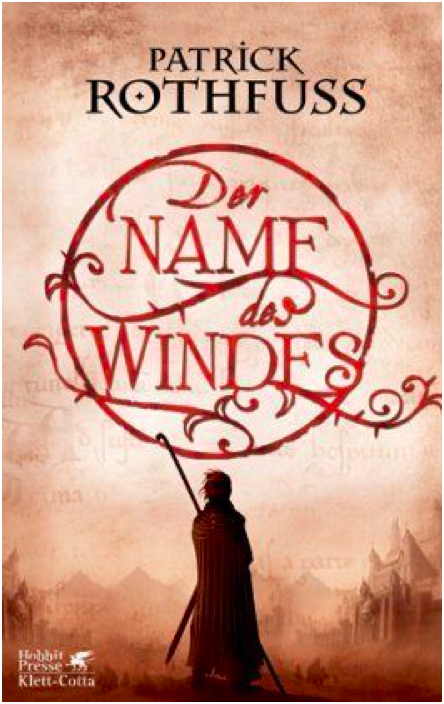
Hardcover German March 2007 Edition
Oh look! A cloaked figure staring at a city. What a surprise. I rather like the title text design, which is pretty creative and a good way to make the title visually appealing. I wish the city in the painting weren’t so damn faded and distant – I think it’s a mistake to keep the visual focus on the figure exclusively and only hint at the city beyond.
6/10
Paperback Portuguese September 2009 Edition
This cover is terrible. I would say the worst, but there’s more still to come. Anyways, this is incredibly bad. We’re once again with the hooded, cloaked figure with his back to the viewer, which is a lazy and uninteresting pose. The image is badly photoshopped and looks like an alternate movie poster for The Blair Witch Project. There’s nothing interesting about the image, nothing that interests the viewer. The title font isn’t boring, I guess. That’s the only good thing I have to say about this.
1/10

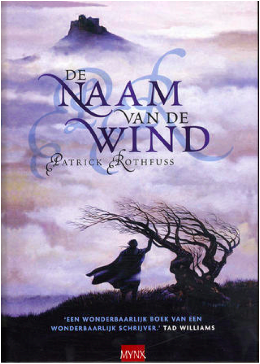
Paperback Portuguese July 2009 Edition
Still another cloaked figure staring off at a distant city, but this is one my favorite versions of this trope. The city is far enough in the middle distance that the figure is the main focus, but we can still see enough of the city to see that it’s cool looking. I’m glad to see the bridge from the books, which is a nice detail. The title text does a good job of filling in the empty space of the painting without crowding the other elements.
9/10

Paperback French November 2009 Edition
This is the same cover image as before, but it’s been cropped so that the figure is centered. I don’t like the change – the balance is better when the figure is off center. Also, the title text is way too big and dominates, which is unfortunate because the Spanish cover had such a lovely balance throughout.
7/10
Hardcover Dutch July 2007 Edition
Yet. Another. Hooded figure. Staring. At a city. Wow. This one has a tree, at least. The image is… fine? I might be kinder to it if I hadn’t seen several better iterations of this right before. Because so much of the image is shrouded in fog, there’s very little to go on in terms of visual interest. And while I don’t mind the shadowed, muted color scheme, it also means that there’s very little to distinguish the cloaked figure and make him intriguing. The shadow initials behind the title text is horrific and obscures the title somewhat, so docking a couple of points for that.
5/10

Hardcover UK January 2017 Edition
Ahahahaha. This looks like the My Neighbor Totoro edition of Name of the Wind. It’s very silly and lighthearted, but wholly inappropriate for a book whose reading level is above first grade. If this was a kid’s book, I’d give it full marks. But Name of the Wind is very much for adults, and this cover is way too young and childish.
1/10
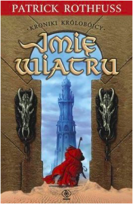
Paperback Polish August 2008
YIKES. I cannot figure out which scene or location from the book this image is trying to evoke, which makes me think the cover artist did not have the book or a text excerpt to work from. What the hell are those weird horse skulls? Why is this taking place in a desert? Why is the texture so bad? So many questions. And the effect on the title text is bad.
0/10 YES WE CAN GO LOWER THAN 1
Hardcover Russian 2010 Edition
This looks like the cover to a Dungeons and Dragons manual. I suppose that’s supposed to be from the Dracchus scene with Denna, but the image doesn’t look quite right for Name of the Wind. It’s just so generic fantasy. I also don’t like how the image is cropped top and bottom to make way for a very generic marble background. Still, the image is colorful and exciting, even if it could be the cover for any fantasy novel ever.
5/10

Paperback UK 2011 Edition
What the FUCK happened here? Who let this shit happen?
-10/10
Hardcover Finnish August 2010 Edition
Ooooh, more Miyazaki fanart! This is actually quite lovely, and it fits the tone of the books much better than the kids book cover from before. I love how soft and gentle the painting is. Notice the color balance. I don’t know if this cover really ‘grabs’ you or draws interest, but it’s one of my favorites of the bunch.
10/10

Paperback Bulgarian October 2010 Edition
I reserve the right to change my opinion later, but this may be the worst contender in the cloaked and hooded figure from behind category. I actually had to double check that this wasn’t a reused image from the mass market paperback edition, but nope! This is a brand new cover image, and it’s absolute shit. The lighting is so dark it’s impossible to make out details, the balance is way off, and the cover and title text are placed over the figure (aka the only object of interest) instead of the boring, generic storm clouds.
0/10
Hardcover Lithuanian 2011 Edition
YIKES times two. This cover art is truly awful in ways I didn’t know could still happen. Kvothe’s face looks ‘off’ because the facial proportions are all wrong. The blue mystical katana is bizarre because there’s no magical sword, much less a katana, in the story. And is that a photo of Stonehenge in the background? With yet another hooded figure?! I do like the gold foil of the title and the golden dragon embellishment, but the rest of this is such shit.
0/10
Paperback Serbian February 2011
And we’re back in the safe territory of a cloaked figure staring off at a distant city! All these covers are starting to run together, but this is a new cover art. It just looks like all the others. Once again, it’s fine. The city is a little too distant and greyed out to hold interest, and the figure is kind of generic.
5/10
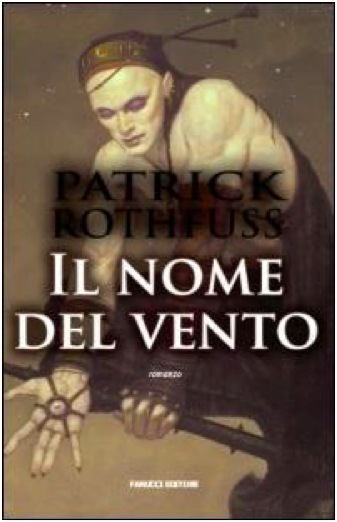
Paperback Italian 2008 Edition
I do not know what happened here. Who is this figure supposed to be? I cannot for the life of me figure out which character this is. It’s a shame, because it’s well-done art with a cool character and costume design. The title and author text obscure the image, though, and the shadow on the text is so extreme it’s hilarious.
0/10
Hardcover Hungarian 2009 Edition
This is just boring. There’s no information conveyed here, nothing interesting or arresting to attract the viewer’s attention. The translucent overlay on the title is an odd choice.
2/10
Paperback Persian 2016 Edition
I believe this was originally a fanart of Kvothe (correct me if I’m wrong please), but it’s a good one. The tree shadow in the back is distracting and obscures the handle of the lute on his back, though. I wish there was more here – it feels very spare in an unintentional way.
6/10

Hardcover Georgian 2016 Edition
Cloaked and hooded figure staring off into the distance, check. I’m not crazy about this one – the art is very soft in a blurred kind of way, and it reads as a little humdrum. The tower in the distance is quite dull – it looks like a modern office building.
4/10

Hardcover Italian October 2016 Edition
The title text is a little too high – I don’t like how it covers the figure’s chin. It’s not a bad idea to make Kvothe’s green eyes a focal point, and it’s certainly more of an original idea than most of these covers have shown. But the muted color pallete drags the whole mood down. It’s not evocative, just kind of damp.
5/10

Hardcover 10th Anniversary French November 2019
I LOVE this cover. It’s gorgeous. I love the gold foil, love the text, love the clouds. It’s stunning and timeless. Amazing.
10/10
Hardcover Latvian October 2013 Edition
It’s a cloaked figure with a city in the distance, but he’s NOT looking at the city! What!! I’m rather surprised at how few covers feature Kvothe actually playing the lute – this may be the only one, actually. I don’t like the bottom fade, and I think the design is a little generic fantasy. But it’s a nice balance, and the title text is fancy and eye-catching.
7/10

Paperback Polish 2017 Edition
This cover artist also clearly wasn’t working off an excerpt from the book. The character design is so off and unlike Kvothe, except for the cloak. Wall texture looks like a photo manipulation, which is cheap. This whole thing is bad.
0/10

Hardcover Russian 2015 Edition
What is with the Stonehenge imagery? And why is that guy floating off of Stonehenge in a modern hoodie? Why is that one leaf in the top right so huge? Why is the title text red and difficult to read? At least there’s a broken lute, I guess.
1/10
Paperback Chinese May 2012 Edition
This is incredibly lazy and the photoshop job is terrible and generic. Zero effort was put into this cover.
0/10
Hardcover Russian 2011 Edition
I’ve been pretty harsh on Russia, mostly because the Russian covers have been terrible. This is ok-ish. It’s very generic fantasy, and the castle looks like Hogwarts. But it has visual interest, even if the title text color is garish.
2/10

Japanese 2017 Edition
I quite love that they turned Kvothe into an anime character. And he’s doing stuff, too, and not just staring out into the middle distance. There’s so much imagery of the broken lute in these covers, so it’s refreshing to see the other part of this scene – when Kvothe loses his shit and finally calls the name of the wind. Fun cover, good artwork. The red title text works here because it matches Kvothe’s hair.
9/10
WORST:
BEST:
#The name of the wind#kingkiller chronicle#patrick rothfuss#book cover art#books#apologies for poor image quality i was working with what god and goodreads gave me#which was variable image quality i guess#I've been told I'm very judgemental so I decided to put those judgey skills to good use
49 notes
·
View notes
Text
Seeds
Before I read it, I had this idea I could write a review of Ann Nocenti and David Aja’s The Seeds for the Comics Journal, but the book just sucked too much. It had basically nothing going for it, or even decipherable as an advancing plot. One thing wrong with it is there’s this sort of conspiracy element, or this “no one believes the news” anymore element of it, but Nocenti didn’t want it to be about “fake news.” Donald Trump has rewired the narrative, so now entire types of subject matter feed into this propaganda machine simply by being addressed. Nocenti’s best work does not shy from topicality, addressing the currents in the cultural air, but this time the modern world feels too hot to handle.
I ordered the Daredevil: Typhoid’s Kiss trade paperback, reprinting a bunch of Nocenti’s work with the Typhoid Mary character from the nineties. The longest story in there is a miniseries with art by John Van Fleet. It’s partly about post-Tarantino video-store employees turned filmmakers kidnapping Typhoid Mary to use her as the subject of a documentary about serial killers and violent media. It’s also about Typhoid Mary working as a private detective trying to track down a killer of prostitutes, who the police don’t care about, and are maybe the actual killers of themselves. Storywise, it’s a pretty cool attempt to address real-world issues of the day within a pulp context.
Van Fleet’s art is pretty boring and bad in a way that’s distinctly ahead of its time. While the miniseries itself probably wouldn’t exist without the precedent of Elektra: Assassin a decade before, (a spinoff about a female Daredevil villain created by the writer during their run on Daredevil where that character defined their run) all the photoreference that’s probably actually just photo backgrounds run through filters sets a precedent for the Alex Maleev/Matt Hollingsworth Daredevil stuff to come a decade later. And it’s frequently annoying on a page design/panel background level. Like in terms of how the panel borders sort of default to grid shapes so there ends up being things that “read” as panels but that don’t actually do anything for pacing. It’s just fitting the narrative into regimented design choices.
This maybe only happens the once. But the art is also just super-stiff throughout, with a very chunky line that eliminates any real nuance. There’s a bunch of characters, but a lot of them are indistinguishable from one another, and that’s because the linework is about as muddy as the color palette — It kinda seems like he’s working with models and photo reference but also doesn’t have that many models to work with so he’s having them play multiple roles, but also his work basically seems more like photoshop filters than actual drawing? There’s a bunch of stuff that I think sucks, basically. But you can also draw a direct line from what Van Fleet is doing in Typhoid to what Aja does in The Seeds. All these choices that are meant to be classy and dignifed, a move away from the excess of superhero comics. The covers of Typhoid are just portraits of the main character, interchangeable from one issue to the next, which was a move that again, was ahead of its time: This is what so many Marvel covers in the 2000s looked like, the Tim Bradstreet Punisher covers probably being the go-to example. It’s pretty dull but it’s nice they’re not super-sexualized.
While the choices arguably suit the subject matter in Typhoid, which is at least partly about movies, in The Seeds, the story doesn’t really make any sense because the visuals seem so steeped in unreality. The premise is that a tabloid has photographed an alien, proving aliens are real. There is really nothing within the context of the story that explains why the news outlet would have enough gravitas to be convincing and have this be an actual news story. And the book is drawn in Photoshop, which is itself a photo-editing software, so the “reality” of the book is defined by the very medium that people recognize as why images can’t be trusted. This contributes a level of irony that could maybe be worked with if the book itself wasn’t so ugly and dull. The whole thing looks like some Banksy bullshit. Outside of word balloons, text appears in the large all-caps typeface of image macros. I don’t have scans of The Seeds because I gave my copy away on account of there not being any reason to keep it around.
The book is beyond dated at the time of its release. Partly this is due to the speed the cultural conversation has been moving for the past five years. It’s been a difficult time period to work on a work of fiction about the news, certainly, and not only has the comic been a long time in the making, the writer has also been away from making comics for decades now. If the authors had been able to make this as a serialized monthly comic, it might’ve stumbled into timeliness, or the predictive, but as it is, the reading experience feels like a bunch of different, disparate ideas that do not really cohere into a narrative. Leaving aside how the book seems to emerge from a general cultural gestalt of the the 1990s, when The X-Files and Weekly World News were objects of discussion, every major plot point or news story chosen for thematic resonance is approximately fifteen years old. I believe 2005 was when I started to hear about colony collapse disorder. This bee metaphor has been lapped by a Honey Nut Cheerios campaign at this point. (A few years back, boxes of cereal came with seeds of wildflowers you/children could plant.)
Darin Morgan’s episode of The X-Files revival “The Mengele Effect” ably addresses all the issues with how cynicism and conspiracy theories feel different now, all the issues that Nocenti seems terrified of and hopes the audience doesn’t think of when reading her humorless X-Files throwback comic. That episode’s great. Much of The Seeds seems like it was better done in the decidedly not-great Transmetropolitian. There’s something so dated and sad about this comic’s idea of a cool journalist protagonist: People barely smoke cigarettes anymore! I know no one wants to draw people vaping, but the imagery this book wishes meant “cool, urban, woman” reads as nostalgic affectation in 2021. That so much of the commercial landscapes of our cities has been replaced by vape shops was one of the biggest clues we were already living in a dystopia three years ago.
Nocenti, when she was working regularly, got to be a pretty effective writer for having a monthly deadline wherein she could speak on the issues of the day as they were happening. In the absence of a regular gig, this rare chance to speak her mind gets hampered by how much there is to talk about, and how complicated it all is. If it’s too complicated to address in an ongoing superhero comic, a one-off graphic novel with vaguely commercial ambitions turns out to be a worse space for it. It’s so much sadder than anything in this dream-of-the-nineties comic that the authors were given the grace to make something only under the conditions that doom it to failure. Real people made this work of fiction, and I don’t know what the fuck they’re even talking about, and that’s a more complicated narrative than the journalists in this comic who… stumble upon a story and then need to take to back because it’s too important or something? I don’t understand what this comic is about. It’s clearly gesturing at being about a bunch of different things, but what they get from being in juxtaposition with one another, I don’t know.
In interviews in advance of the release of The Seeds, Nocenti talked about how this was the first time she got to make a comic that didn’t have to have fight scenes or conflict in it. But reading Typhoid it’s clear how conflict ties the story’s disparate threads together. But also while reading Typhoid I kept on thinking about how visually, the Steve Lightle shit that preceded it is so much cooler! Here he is, bifurcating a page so two narrative threads can be told with different approaches to stoytelling:

People sometimes talk about how crazy it is that Nocenti started her Daredevil run immediately following up the Miller/Mazzucchelli Born Again run with a fill-in drawn by Barry Windsor-Smith. But I don’t think anyone has pointed out that, since these Typhoid Mary team-up comics appeared in Marvel Comics Presents, she’s basically following up Barry Windsor-Smith’s Weapon X, and Steve Lightle is totally capable of doing that! Even if these comics are kinda whatever narratively, Nocenti comes up with dense enough narratives to give him shit to do. She’s a good writer within the context of the harsh strictures of early nineties mainstream comics. Which I know seems like a harsh diss! But being a writer that makes work that consistently gives a comics artist something interesting to do is a difficult job that many people are just not interested in doing for various reasons, so it should be recognized when it’s attempted and accomplished.
It’s also interesting that the whole visual approach where both Steve Lightle and Barry Windsor-Smith shine is dependent on flat color. The changes in storytelling made to accommodate the shifts in visual language in full-color mainstream comics didn’t really benefit anyone, and now needs to be outsmarted. In The Seeds, we’ve got this pretty dull reading experience that superficially in its two-color print job and nine-panel grid, looks like it might be influenced by Mazzucchelli’s work in Rubber Blanket and City Of Glass. And we’ve got a black and white Barry Windsor-Smith comic coming out from Fantagraphics in a few weeks that I really hope blows it out of the water.
5 notes
·
View notes
Text
Upload New Fanfic for Emi's fans in AO3!!

as what I have been promise for, I will make a new fanfic which take the event after vol 21 ended! But like i said, this fanfic wasn't for maouemi fans cuz even though there will be maouemi scene at it, the story really not made for someone who want see Emi ended with Maou (because this fic was taken after vol 21, and you know how I hate Maou vol 21 version, even Alas=ramus dislike him in that vol, so...yeah). Thus fanfic just dedicated for Emi's fans who didn't like with the ending where Emi and Alas-ramus doesn't get their happiness in the real series, or if you want to see Chiho suffer and Maou jealous. And, this fanfic will also bring a problem between Shepira Earth and Shepira Ente Isla as the plot.
If you guys still interested with this fanfic, you guys could read about the characters and the summary for this fic below of ‘keep reading’ first! Or you can just click the link here if you want to read this fanfic immediately! Enjoy!
https://www.archiveofourown.org/works/26650105/chapters/64991062
Summary
Coinciding when vol 21 ended, Emi's daily life with her daughter, Alas=ramus, become a little different after Alas=ramus entered her first class as Kindergarten Student! The Yesod, who saw a loneliness in her Mama's eyes tried to fill the emptiness in her mother's heart.
However, the presence of a stranger who turns out to be related to their real identity appears! Is it their enemy? Or is it their friend?
At the same time, the problems between Shepira from Earth and Shepira from Ente Isla start to collide, making the Hero have to face various dangers and problems that suddenly arise! Will the child succeed in completing her mission to make her Mama happy? When the person who Alas=ramus thought would never interfere, instead become a great opponent she had to deal with!
This is the story about how The Hero and her daughter could find their own happiness and justice!!
Characters Introduction
(please not, I wasn’t the original illustration for this fanart, so if you find the face is similar with a certain character that because I took it from pinterest then I photoshop, edited, colored, and remake it so it looks like character which I want.)
Main Female Character:
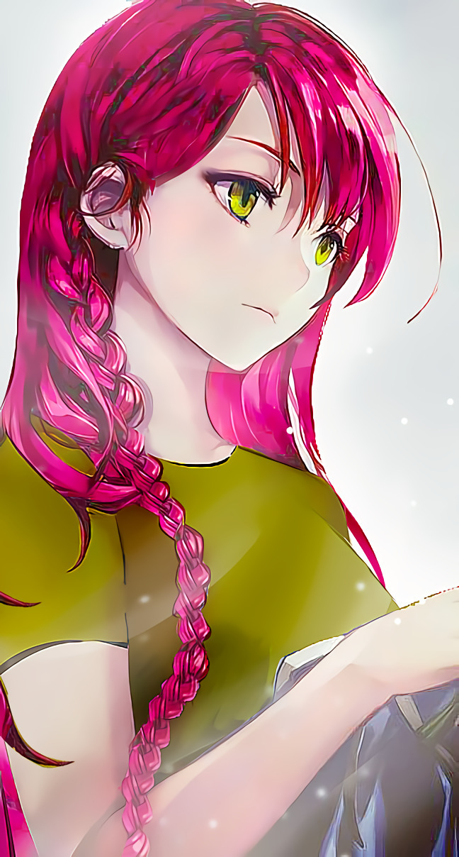
Emi Yusa: 23 years old in Japan (21 years old in real)
Gender: Female
Race: Half Angel Half human
Power: Having Daath, and Yesod within her power and become the strongest human in universe (according to Daath)
Job: Currently a share holder of Café with Sadao Maou
Living: In Apartment Villa Sasazuka with her children
Personality: always on guard with people she hasn't known for too long yet. Warm and caring to those she cared about, but sometimes strict if that comes for her children benefits. Always thinking about other people rather than herself (I honestly confused if I should put this in weakness or not). Have a strong responsibility to protect and consider everyone feelings or safety. It's hard to showing her real feelings to someone, because of that she often referred to as a tsundere type. Due to the strict and tough past, combined with all the responsibilities she now bears, it made Emi look more a lady and more mature compared to other normal girls of the same age as her. Have a high sense of justice and are always wise in certain circumstances.
Weaknesses: have emotions that sometimes change and are weak. Even though Emi herself often hides it. Because she has been a Hero since she was a child, Emi can't act selfish at all (one of her personality which I honestly dislike from her) Very weak to romantic things because of that, she often blushes easily
Like: Rillakkuma and Alas=ramus
Dislike: illogical things, and when people do something injustice
Main Male Character

Timmy Goldman (in Japanese, can be written as Timi and I will use this version in the story as well): 26 Years old (*I put a wrong number in his picture tho lol
Gender: Male
Race: Second Generation Shepira Earth of Kether
Power: Have a similar ability with Kether (his father) but weaker compared with him. His eyes will glow if he activates his power, and sometimes he will also emit a mist around him like Amane, but the difference is that Amane has a black mist, Timi has a golden mist. (I will leave his power just like this, until we reach a certain chapter)
Job: running a marine ship family business in Hawaii and America (description from vol 12)
Living: even though he comes from a rich family, he does not have a permanent home because he is always busy with work (and since he found it was unnecessary to have home) But he has apartments in various cities and countries, and will occasionally visit his father's villa on holidays in Hawaii or if it was an orders.
Personality: never shows his original expression. He only often uses his smile on his face. Manipulative and good at negotiating. Even though he is always smiling, but he has a cold aura and is difficult to approach. he always easy to approaching women, because of his sweet and calm demeanor, but until now he have never considered in any relationship. Although he often hides it, Timmy often misses his mother who died. Very protective when it concerns the feelings of any children. He got the nickname Manipulative Prince in his company and between Shepira Earth Family because of his calm and cool characteristic like a prince, but still expertly able to tease the other or play with people's feelings without destroying his cool image.
Weaknesses: Dislikes mistakes. and is sometimes too serious in the job or task given. Just treating emotions or feelings as one of the tools that can be used or manipulated, that's why never considering other feelings if that will lead into some mistake or if that unnecessary. (I already write his dark past as well regarding this, but we will get it on certain chapter in the future)
Like: Coffe, and following the schedule.
Dislike: Mistakes. But he hates people who selfish the most.
Mentioned in Vol 12
Second Main Male Character
Sadao Maou: 24 years old in Japan (Um, since he became a human, does anyone know whether he should be branded as a newborn or what?)
Gender: Male
Race: Human
Power:…Uh, let's call he have a strength and spirit compared with the other guy.
Job: CEO at his Café with Emi
Personality: when it comes to his own feelings he always quiet. Always try his best to fulfill his obligations in matters of his child. Hard worker. Does not like something that is not logical, still does not really understand things about romantic affair.
Weaknesses: Cannot act decisively. Sometimes hesitant to make decisions. If something is useless or of no urgency, he will delay the job. Bad at managing money.
Like: Movie, and All food which tasty
Dislike: Illogical things and debt
Main Support Character
Alas=Ramus: 4 years old
Gender: Female
Race: Shepira Yesod from Ente Isla
Power: Having an ability and strength as a Yesod
Study: Currently at Yochien (Kindergarten) first year
Personality: Always smiling and cheerful. Very fond to her family especially her mother. She can be very protective when it comes to her mother and sometimes understands adult feelings better and is always honest with everyone. Enjoy discovering and doing new things. Want to be a hero like Emi.
Weakness: when it comes to her mother, she can be very protective and even attack anyone who hurts her mother's feelings. Sometimes it's still too innocent and speak out frankly. Still unable to manage the malfunction she has because she lives outside Ente Isla
Like: Rillakkuma, courn soup, and her Mama
Dislike: Everything or everyone who hurt her family.
Other Support Character
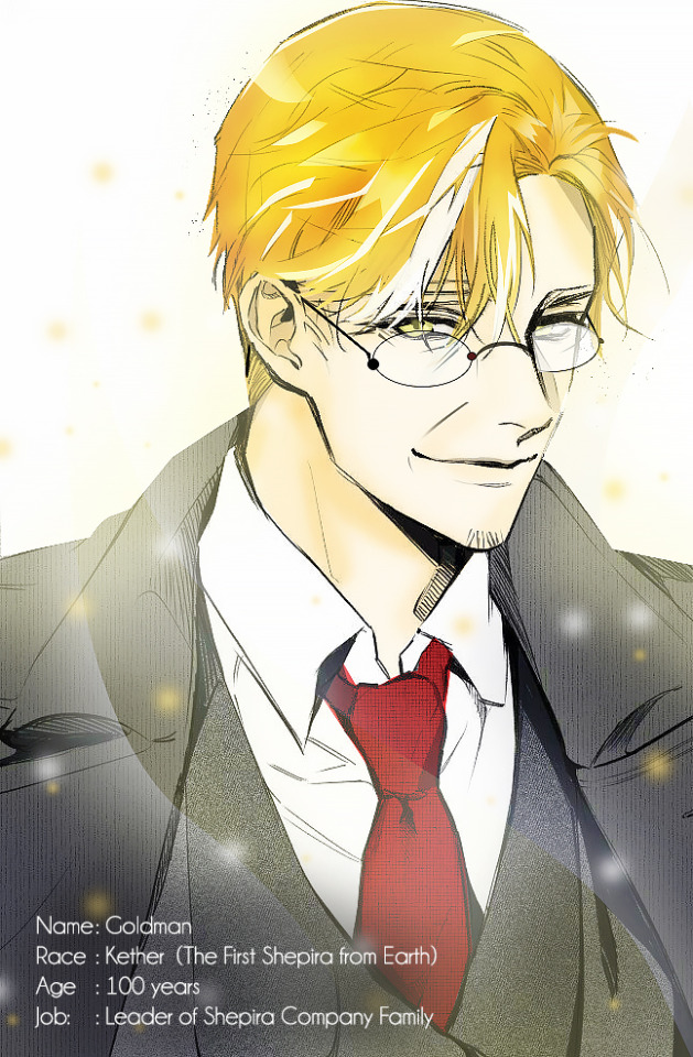
Goldman: 48/50 years (100 years in fact)
Gender: Male
Race: Kether from earth (Timi's father)
Power: as the first shepira who is nicknamed by The Crown; which therefore refers to things that are above the mind's abilities of comprehension, Kether is able to read, control and manipulate thoughts, even the minds of other shepiras. as the highest Sefirah, is situated about the intellectual triad and is designated as “superconscious.” Keter is infinite source, a state of being, the field of possibility. It is the ultimate unseen reality, that's why can created any type of barrier (like Sariel, Geburah, or even Angel). Color gold represents purification, conductivity and malleability. Can easily moving around the world or to make a gate. also have an ability to change his appearance.
Job: Running and leader of the Shepira Company family on Earth
Personality:He can be really quiet or can be so expressive. He is never serious in responding to a problem, unless he really need to do so. Can easily read other people's attitudes. Rarely uses his strength for a battle. Can be very affectionate if he see cute animals or baby. Very fond and protective to his shepira family
Weaknesses: will not hesitate to kill if it is needed without feeling guilty if there are enemies who harm the family or especially his son. Never differentiate between good or evil plans. For him all ways to accomplish the goals are the same.
Mentioned in vol 12
Other Support Character

Yamanaka Kozo = 55 years
Gender: Male
Race: Human
Power: Martial arts, swordsmen, and very strong.
Personality: flat and smart in making decisions. He rarely speaks but is very wise and good at reading the situation. Knowing the existence of shepira on earth. One of the confidants and even the entire Shepira family
Job: Timi's right hand man. Has been a butler to his young master when Timi was just born
He was the only OC which I made lol
Other Support Character
Harianak: 28 Years (appeared in vol 12, I will make his illustration next time lol)
Gender: Male
Race: Second Generation of Shepira Chochmah from earth
Job: Running a famous Family food company around the world
Power: Dark blue Mist can created anything.
Living: Often moves because of work, but has a place to live in Indonesia ( description from vol 12). His place of birth
Personality: always joking around and loves to tease Timi. Amane and Tim's childhood friends. Good strategy. Never serious.
Weaknesses: Always playing with women.
Mentioned in vol 12
Other Support Character
Amane: 32 years old
Gender: Female
Race: Second Generation of Shepira Binah from earth
Job: Running a beach family business
Power: Strong, can be compared with the other second generation of shepira. Dark Mist governs the energy of the underworld like a spirit (I'm not really sure about this tbh, I will check it later on vol 4)
Living: Now live and take control of Shepira from Ente Isla at Mikitti's aunt's house
Personality: always ignorant and likes to tease Timi. Childhood friend of Harianak and Tim. Easygoing. Very affectionate and protective of Shepira's family and friends
Weaknesses: If lazy or find it unnecessary, then Amane won't do anything.
The other character from this series will appear as well, such like Suzuno, Urushihara, Gabriel, Chiho, Ignora, and as well as other shepira from earth and Ente Isla. I will update it if i find how their illustration would be. But because this is important for the stories, I will also put the explanation regarding Shepira (Which I got it from internet of course)
Shepira from The Tree of Life
1 Keter (Earth=Goldman, Ente Isla= Not Born yet) is Crown, as the highest Sefirah, is situated about the intellectual triad and is designated as “superconscious.” Keter is infinite source, a state of being, the field of possibility. It is the ultimate unseen reality. Color gold represents purification, conductivity and malleability.
2 Chochmah (Earth= Harianak's father, Ente Isla= Not born yet) is Wisdom: the seed of an idea, insight, inspiration, intuition, inchoate awareness. Color blue-black represents emergence of something from no-thing.
3 Binah (Amane's father, Ente Isla= Not born yet) is Understanding: fleshing out an idea, formulating the story, fashioning the structure. Color dark red represents the “something” congealing.
4 Chesed (Earth = Uncle George, Ente Isla = Just born) is Unbounded Love: expanding ideas, enlarging the circle, empathic concern. Color blue for flow (water).
5 Gevurah (Earth = already born, Ente Isla = Iron) is Strength of Boundaries: setting limits, saying no, seeking focus. Color red for definition (stop).
6 Tiferet (Earth = already born, Ente Isla = Not born yet?) is Beauty: harmonizing and holding opposing energies, having compassion. Color yellow radiates light.
7 Netzach (Earth = already born, Ente Isla = Not born yet?) is Victory: overcoming obstacles, orchestrating intention. Color green for power.
8 Hod is (Earth = already born, Ente Isla = Not born yet?) Surrender: acknowledging what is, accepting and giving way. Color orange for restoration and hope.
9 Yesod (Earth = already born, Ente Isla = Alas Ramus and Acies) is Foundation: telling or twisting your truth, testing authenticity. Color purple for growth and renewal.
10 Malchut (Earth = already born, Ente Isla = Nuxe, and...I forgot) is Sovereignty the final, lowest Sefirah of the culmination of the flow from Keter through the Sefirot, from possible to actual. Malchut is what manifests or is expressed. Color brown for source-ground.
11 Da’at (Earth= Mikitti , Ente Isla = Utsushihara) is Knowing: integrating the idea, identifying with it, an intimate connection. Color gray for integration.
Okay, the reason why I put my fanfic on AO3, was because i want to add another illustration and picture within the story as to for reader can imagined the story better!
#hataraku maou sama!#Yusa Emi#alas=ramus#Justice for Emi and Alas#new fanfic#update#AO3#vol 21#hataraku#Emilia Justina#fanart#illustration
18 notes
·
View notes
Photo


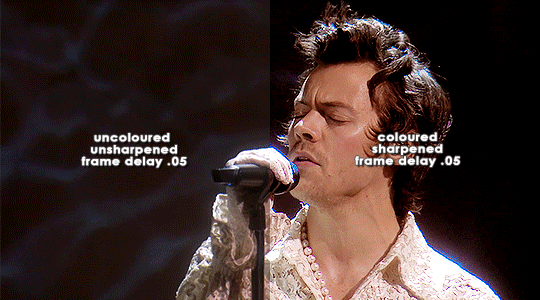
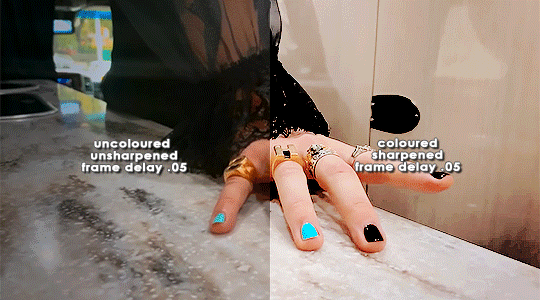
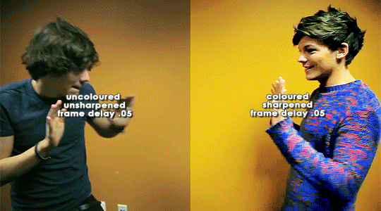
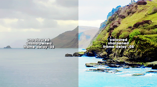
ORIGINAL → EDITED
gif making process
thank you so so much to the lovely and talented @pridesobright and @supportivehusbands for tagging me :’) reading about your processes was so interesting!!
LEFT: cropped, resized (height 300px; width 540px), unedited, unsharpened, frame delay set to 0.05
RIGHT: cropped, resized (height 300px; width 540px), edited, sharpened, frame delay set to 0.05
ideally, 1080p is what i’d use for everything, but sometimes you just have to settle for what you can get (and if you’re cursed…………. you have to battle with less than 480p……….. im looking at you, miss ‘now kiss me you fool’ footage). for this post, i made gifs from ten separate videos to illustrate how even though your source materials are wildly different from each other, the resulting gifs can still be stylistically similar. this is why it’s so upsetting to see people steal gifs like it’s nothing. we put so much thought and care and time into our posts and i can’t even put into words how discouraging it is to see people act like crediting gif makers is a hardship.
i have a note filled with ideas for lyric sets, parallels, etc etc that i work from, but sometimes i’ll just sit down and pick a random video and play around with whatever idea i have in the moment. (that’s how this set came to be!)
after i’ve imported the footage to photoshop (i use cc 2019, although i first started out using cs5 and it’ll always have a soft spot in my heart), removed any redundant frames, and cropped it, i’ll resize it (to 540px more often than not), and set the frame delay to 0.05. when all that’s done, i can colour.
i colour every gifset from scratch — i’ve never had much success with using the same psd on other gifs. it totally works for gifs from the same source, but when you’re using like six different videos for the one gifset, you have to take much more care in making them all correspond to the aesthetic you’re planning for the post. i tend to choose a dominant theme or colour to work from, like blue, green, magenta, pastels, rainbow, etc.
i usually begin with curves and levels until im happy with the brightness. then i’ll move on to either selective colour or colour balance or vibrance, depending on the original colours of the footage. i almost always skew my gifs towards blues and cyans and magentas rather than yellows and greens (i lean more towards coolness or neutrals rather than warmth). and im just really fond of blue, which is apparent if you’ve ever seen anything i’ve made lmao especially if louis’ eyes are involved. this is definitely where i spend the most time messing around with different settings (like increasing cyans and blues and blacks in general / increasing cyans in whites if i want the sky to look more blue / decreasing the blacks in whites for contrast / decreasing the cyans in reds to make them really red / decreasing the yellows across the board, but most definitely in blues and cyans / decreasing magentas in greens if i want Very Bright greens). sometimes i lose my mind a little and i end up with like twelve selective colour layers and im like This Is Fine . skdjfskjf anyways, when everything looks as vibrant and colourful as i want it, i’ll go back to curves or levels or add a contrast layer to make everything look stronger. i also might go back to selective colour or vibrance with incremental changes at the end, just as a final touch. [tl;dr: curves > levels > colour balance > vibrance > selective colour > contrast > go back for any little amendments] for black and white gifs, i’ll start with a gradient map and then continue with curves, levels, etc. after all that’s done, i’ll convert to video timeline > select all layers > filter for smart objects > either sharpen with this action or use these smart sharpen settings > add text if the post calls for it (if it’s a concept/lyric gifset, i like to play around with the settings — although century gothic is my favourite font for this — and if it’s a captioned gifset my standard is arial bold italic / drop shadow to 140 degrees / grey stroke / adjust font pt according to the size of the gif) > export > save for web. et voilà!! one gif down, probably nine to go sdkfksjdfhsjdf
the double edged sword of making gifs for one direction fandom is the sheer volume of footage available to you: on the one hand, you have a whole decade’s worth of moments to gif (and that’s incredible!!!), and on the other, it’s so difficult and time consuming to colour all of these separate moments in a cohesive way that hopefully expresses your own unique creative style. so sometimes it’s frankly impossible to make certain things look the way you want them to. maybe you can’t find high quality footage (the absolute BANES of my existence are the rtl footage where they reacted to themselves playing football at boston common and the louis is loud……loud……….and……..loud footage where you can see harry’s face close up. it’s a TRAVESTY that they don’t exist in 1080p and i WILL scream it from the rooftops), or the moments you want to gif simply refuse to look good next to each other because they’re so wildly dissimilar in hue that no matter what you do, they look strange and disjointed when juxtaposed (in those moments i do tend to either give up or choose to make them black and white). but honestly? the obstacles i’ve come across while making gifs for this fandom have been amazing learning opportunities for me. i’ve grown into and experimented with my style way more than i ever did anywhere else, and i continue to feel inspired by this fandom every day, so thank you to every single creator for your ingenuity and hard work!! 💖💖💖💖
i think y’all have been tagged or done this already, so im just going to tag everyone i admire to say you’re legends and i love your content very much a lot!! @caparius @sunflowrsix @jimmytfallon @stylex @tmlnsn @cuddlerlouis @2tiedships2 @moonshinelouis @ltpolari @itsastorm @finelinee @ltwalls2020 @half-lightl @fallenwalls @tomlinsun @louisbravado @tattooedlovers@lordtomlinson @livehabit @halosboat @thepeacering @alinok
#photoshop#gif tutorial#kinda idk ?? sfkjhskdfjdfg#gif making process tag#the first gif is almost jarring to look at . like sometimes i forget how aggressively i remove warmth from the wmyb video dskfjhdkfjhdjgf#one direction: yellow/warmth. me: NOT IN MY HOUSE#anyways sorry this was so long i just got so excited kskdjfhskhdf#i love making gifs!!! even when i fucking despise it!!!#**#*#creations
93 notes
·
View notes
Last Seen Blogs