#i got a codepen with examples
Explore tagged Tumblr posts
Visit Tumblr Blog
Explore Tumblr blogs with no restrictions, modern design and the best experience.
Last Seen Tumblr Blogs


Fun Fact
Tumblr was named as a finalist in Lead411’s New York City Hot 125 in Aug 2010.
Note
how did you learn coding?
I am pretty much entirely self taught as far as front end goes!
I started messing around with HTML and CSS with tumblr themes back in 2016-ish.
For javascript I looked at https://developer.mozilla.org/en-US/ for a lot of documentation + examples. And also used codepen a lot to kinda reverse engineer existing snippets of code.
I also read a lot of https://css-tricks.com/
And for flexbox + css grid there's these:
After I got a good foundation of vanilla JS, I learned Vue for a little while and then moved on to React. The new react documentation is really good in my opinion so I definitely recommend reading that if you're interested in learning.
Most of my learning came from trial and error and working on projects that I was really excited about. I used to be so proud of findtags (the original version) which was in jquery...
The react version is miles ahead of it. And even then, the theme builder is also way ahead of findtags. I learned way more between those two projects than reading documentation alone!
191 notes
·
View notes
Note
not sure if this is helpful but re: your headmates webpage, i did something similar on my site by making each about page a separate html file and using an <iframe> with the chosen page. there's a little bit of javascript to load a page in the iframe when a link or the next/previous arrows are clicked and that's it
we are actually using the isotope javascript library, which is theoretically capable of everything we want it to do and has a lot of nice out-of-box options, but unfortunately all the examples of "everything we want it to do" (filter by dropdown select, because we have way too many potential categories for buttons to look dignified (see below), combine this filter with quicksearch, sort functionality) are distinctly not combined in the various example codepens we have been shamelessly ransacking code from. so far we have successfully gotten the sort buttons and quicksearch to work at the same time but OH BOY does it not like when we try to add the filter select into the mix. this is probably not very hard to solve overall but considering we dont know how to do javascript basically at all it kind of has made us insane
this is completely dogshit on mobile, like don't-even-bother dogshit we havent made it responsive yet, but here is the headmates page as it currently exists-- it's got some neat functionality even though none of the links actually work lol. every time we try to add the <select> code it busts the entire thing so bad that it makes us, well, give up to go play sims
1 note
·
View note
Text
Scroll Driven Animations Notebook
New Post has been published on https://thedigitalinsider.com/scroll-driven-animations-notebook/
Scroll Driven Animations Notebook
Adam’s such a mad scientist with CSS. He’s been putting together a series of “notebooks” that make it easy for him to demo code. He’s got one for gradient text, one for a comparison slider, another for accordions, and the list goes on.
One of his latest is a notebook of scroll-driven animations. They’re all impressive as heck, as you’d expect from Adam. But it’s the simplicity of the first few examples that I love most. Here I am recreating two of the effects in a CodePen, which you’ll want to view in the latest version of Chrome for support.
This is a perfect example of how a scroll-driven animation is simply a normal CSS animation, just tied to scrolling instead of the document’s default timeline, which starts on render. We’re talking about the same set of keyframes:
@keyframes slide-in-from-left from transform: translateX(-100%);
All we have to do to trigger scrolling is call the animation and assign it to the timeline:
li animation: var(--animation) linear both; animation-timeline: view();
Notice how there’s no duration set on the animation. There’s no need to since we’re dealing with a scroll-based timeline instead of the document’s timeline. We’re using the view() function instead of the scroll() function, which acts sort of like JavsScript’s Intersection Observer where scrolling is based on where the element comes into view and intersects the scrollable area.
It’s easy to drop your jaw and ooo and ahh all over Adam’s demos, especially as they get more advanced. But just remember that we’re still working with plain ol’ CSS animations. The difference is the timeline they’re on.
Direct Link →
#animation#animations#chrome#code#comparison#CSS#CSS Animation#css animations#css-tricks#easy#effects#how#it#Link#links#list#One#scientist#scroll#Scroll Driven Animation#simplicity#slider#text#timeline#transform#Version#view
0 notes
Text
I looked through the accessibility tag today and found a few posts telling people to stop using gradient text, weird unicode symbols instead of letters, zalgo, spaces between letters for emphasis etc, because screen readers can’t read that correctly.
And I felt a lot of mixed emotions, because:
people shouldn’t have to stop using language in a natural and playful way just because the developers of screen readers haven’t accounted for that behaviour yet
these problems sound possible to fix both on the website end and on the screen reader end
So, since I’m more familiar with HTML than Python (read: not familiar with it at all, unfortunately) I tried to figure out how the social media websites could let the users write their own alt text for text.
So I tried experimenting with different ARIA attributes, trying to see if this could even work...
...and then scrolled down one of the pages on MDN and guess what I found? This exact use case! Not just possible, but documented in one of the web’s biggest manuals already!!!
In certain cases, assistive technology users won't be able to get the meaning of content expressed in certain ways, through certain media, or implied in certain ways. This is obvious to fix in the case of images (you can use the alt attribute), but in the case of mixed or other certain types of content it is not so obvious, and role="img" can come into play. [...] Another example where this might be suitable is when using ASCII emoji combinations, like the legendary "Table flip":
<div role="img" aria-label="Table flip"> <p> (╯°□°)╯︵ ┻━┻ </p> </div>
That’s it. One HTML tag, two attributes. Should be as easy to implement in a post editor as inserting a link.
I tested it already. It works, even if not perfectly.
And you know what? If I, not a professional web designer, not an accessibility expert, could find all of this in one day – what excuse do the social media owners have?
#blah blah blah#lava klanka is watching you#i got a codepen with examples#i'll make a proper post without personal rants
6 notes
·
View notes
Photo

During my time learning how to code I have learned the fundamentals I experimented how to code using CodePen and Free Code Camp which was a great resource, when I started out.
I learned the basics of HTML and CSS so far I have learned fun stuff like SASS, Bootstrap, flexbox and one thing I enjoy doing is ‘Grids’ in CSS but I need to work on my HTML more especially my tags I notice I forget my closing tags sometimes. Moving forward putting more attention into my HTML will improve my CSS and overall code.
The one thing I disliked the most in this month was using Khan Academy. My experience with this website was up and down - there were days I got angry and couldn’t pass a project and I didn’t understand how it works then I realised it is about the way one should think for example imagine its a puzzle that I need to solve. So with this new concept in mind I manage to pass the Khan academy projects faster and I understood the work.
The feeling I get when I solve or debug my code and its runs smoothly without any glitches is indescribable. If you know, you know.

As well as learning how to code, I have also listened to podcasts & youtube videos on Computer Programming on my spare time to get in the mindset of developer along the way.
I recommend listening to:
- Lex Fridmen
- Stack overflow Podcast
- Idea to Value Podcast
- Travery Media Youtube
1 note
·
View note
Text
How to put Roleplaying on your resume
And other skills you’ve picked up along the way.
I’ve gotten so many discord messages since my last post, both from other rpers who include roleplaying on their resume and others who are hesitant to. So, for those of you who want to be able to use this as a marketable skill, or want to know how you can improve your current resume roleplay listing, I’m here to help.
Please note - I am not a professional resume writer, just a broke ass twenty-something who was written too many resumes. The examples used below are generalizations taken from my personal resumes that have resulted in me getting the job. Use your best judgement, but, if in doubt, feel free to shoot me a message!
Also, I am primarily a forum roleplayer. While this can be used for other forms of roleplaying, you may have to change more of these examples to better fit your experiences.
Tips for your basic roleplay writer
As your basic roleplay writer, you excel at mostly one thing - writing. Perhaps you’ve picked up other skills along the way, like graphics or coding, or you’ve become familiar with software like Google Docs. These are all important skills you use professionally, so be sure to include them in the Skills section of your resume. Employers often refer to these as “soft skills” and it’s extremely difficult to find employees that have those skills and actually demonstrate them, so these can really help you stand out.
But the most important thing is to be able to include some examples. Find your favorite roleplay post and include it in your portfolio. Gather together your best moodboards, signature graphics, or avatars. Link to your resource site galleries or your rp tumblr tag. Demonstrate that you actually have these skills and that they’re more than just words on paper.
Here’s an example of some of the things I list in the skills section of my resume.
Skills
Writing: website content, blog articles, social media, coding markup, collaborative articles,
Software & Languages: Google Drive, Microsoft Office, WordPress, Invision Power Board, Tumblr, Photoshop, Gimp, Pinterest. CSS, Javascript, HTML, JQuery
I also include three of my favorite roleplay posts I’ve written, and I’m building up a coding tumblr to showcase the things I’ve coded for rp, which I will include on future resumes. While hobbies sections of a resume are very outdated, this is a subtle way you can include this particular hobby. And employers generally like you more for it!
Tips for your roleplay staffer
Staffing a roleplay is, or rather should be, a whole different ballgame from being just a roleplay writer. Because, if you’ve staffed your roleplay the right way, it has now become a well of marketable content you can actually show to your potential employer. You have actual proof of your management skills and abilities you can link a live version to, even if the site has since closed. Don’t take that for granted! That kind of content is very valuable to a potential employer.
And now, aside from listing your abilities in the skills section of your resume, you have the opportunity to list your staffing experience in the list of jobs you’ve had experience with. Because your web forum is, essentially, a brand, and staffing is your job.
Aside from listing basic rp duties, if you do social media for your rp, or even advertise for it, those are marketable skills. If you use particular software to make things for your rp, like maps or timelines, ads or trailers, include that. Each rp is different, and there are many different forms of roleplaying. So tailor the below example to your experiences and include achievements that are relevant to you.
Web Community Administrator - Site Name and link, 2017-Present
Wrote, edited, and maintained all web manuals across web pages
Moderated community engagement & content across platforms to enforce community rules and regulations
Consistently maintained brand voice across publications by creating style guidelines and consistent posting rules
Collaborated with community members on site content to create engaging SEO statistics
Built a successful user and readership base by building advertising strategies across multiple web platforms.
Tips for your roleplay coder
I am partial to the rp coder, specifically of forums, because I am one! Being able to code anything is such a skill these days, and employers like it a lot more if you tell them you do it for fun. Even if you’re not applying for a coding job, it’s another fun fact about you that makes you stand out.
If you’re a coder, I would suggest having a portfolio of your work somewhere. Either on a resource site they can access as a guest (codepen is great for this) or a blog, forum, or website they can see your work on.
Here are some generic examples of things you can put on your resume, but tailor them to your specialties!
Web Forum Designer - Site or Portfolio name/link, Date-Present
Designed interactive web templates and mobile-first layouts to increase web accessibility
Maintained multiple web forums via back end control panel of Invision Power Board
Increased user engagement by ##% by designing intuitive interfaces
Built brand style guidelines to improve brand recognition, increasing website hits by ##%
Tips - and disclaimers - for everyone
The best tip I can give to anyone about writing a resume is to tailor each resume to the job you are applying for. Use keywords used in the job listing. Use terms like KPI or ROI where necessary. Use specific examples of the things you’ve done in concise sentences. Where you can, avoid being vague. Show your worth. Link examples!
The examples I used above are very generic and are meant to be used as a place to start from for everybody. I cannot stress it enough that you still need to tailor these examples to your experience and skills. For example, if you designed interactive web templates, link to your coding tumblr tag or resource gallery. If you wrote and maintained web manuals (see site rules, plot, member groups, etc.), link to that forum or those pages or put a (see below) and include them in the examples you send along with your resume. Use percentages where appropriate and include trackable data where you can to help illustrate your positive impact on that site.
However, when putting your resume into website instead of uploading it as a .pdf or .doc, this can be difficult. So use your best judgement.
How to tell a potential employer you roleplay while in an interview
So now that you’ve gotten through writing your resume, let’s assume you got the interview! Congratulations! You used your skills to stand out a little bit from the 800 other applicants that put in for the job. But you still have to make an impression out of the 20 other suits coming in for the interview. *Gulp*
I’ve found that the easiest way is to mention it when they ask you the infamous “Tell me about yourself” question. This question is your elevator pitch, so work it in in a way that’s quick and will make them want to ask you more about it later. Don’t make it the focus, just drop in a line and move on. For example:
“I’ve been working in media for the last five years, but I would like to focus on web media in particular. I’ve been writing for websites in my free time for the last decade, and found this is the area I’m most passionate about...” I’ll let you imagine how the rest of that elevator pitch goes.
Now my interviewer will probably ask me about all this experience I have writing for web that’s not exactly spelled out on my resume. But I’ll have those experiences, either listed in my skills section or as a job listing, to refer them back to.
So now you’re probably wondering, when they do ask you about it, how to not be weird about it. Because rp is...actually really weird I mean the amount of sex I write about is unreal, yo. But you really only need get into the basics. Tell them you enjoy writing, and that you enjoy writing collaboratively. And through that passion, you’ve learned how to effectively manage web communities or taught yourself CSS. When you talk about your passions in an interview and how they’ve lead you to pursue professional advancement, you really stand out. You become “that girl who loved writing so much she became this dope ass graphic designer” or “that guy who loved writing so much he became this insane web developer.” It shows not just passion, but a breadth of skills and curiosities and gives you much more potential to grow within a position than other candidates.
While talking about your roleplay experience, offer to send them examples of your work when you get home. The amount of times I’ve mentioned my creative passions in an interview and had the non-creative interviewer want to know more is too damn high. But not only does that give you the opportunity to send a thank you email, but gives them something to click on and remember you by. Which is a make it or break it part of most interviews.
Thanks for coming to my TED Talk
That’s all the advice I’ve got for you, kids. I apologize for it being so vague, but I wanted this to be usable by the largest amount of roleplayers it could be. If you have questions, or want to know how it could be used to highlight your own skills more, feel free to drop me an ask or friend me on discord and shoot me a message! I’m always happy to offer some suggestions to you.
And if you’re already doing all of this, why don’t you share your own experiences? How has using rp on a resume helped you? What other tips do you have? And how can others make the most of their experiences to help them?
60 notes
·
View notes
Text
Something Awesome: Data Thief or Gift Recipient
Okay, we’ve seen more than a few attacks that can be performed when someone clicks a link or navigates to a website.
Cryptojacking
Cross Site Request Forgery
Drive-By Attacks
Zoom 0day
But it’s time to pay homage to the attack that’s hidden in plain site.
tldr; head over to https://fingerprintme.herokuapp.com/ for some fun.
Passive Data Theft
I hesitate to call it theft when in fact we are giving all of this data to every website we visit like a little gift.
Please, accept this bundle of quasi-identifiers as a token of my appreciation.
Many internet users have no idea just how much data is available to websites they are visiting, so it’s worth exploring just what is in our present.

IP Address and Geolocation API
Like any good gift giver, we better write on the tag.
To: <website server> From: <your IP address>
Your IP (Internet Protocol) address is a little 32-bit (now possibly 128-bit) number that uniquely identifies your device on the Internet. This is by design; people need to be able to address you to be able to send you any packets. A static 1:1 mapping of devices to IPs is definitely a massive exaggeration today as as we use technologies to let multiple devices share one IP, dynamically acquire an IP for each session, and our ISPs (Internet Service Providers) may also dynamically assign our IP address.
Nonetheless, IP addresses have (again by design) another function; location addressing. This is because when you’re internet traffic is propagating through the Internet (a global network of routers) it needs to know where it physically needs to go, and fast. Owing to this, the internet has taken on a hierarchical structure, with different ISPs servicing different geographical regions. These ISPs are tiered such that lower tier ISPs service specific subsets of the upper level tier’s region, providing more geographical specificity. It is this property of IP addresses that allows anyone with your IP address to get a rough idea where you are in the world. Moreover, IP addresses from specific subnets like AARNet (for Australian Universities) can be a giveaway for your location.
Try Googling “my ip” or “where am i”. There are many IP to Geolocation API services available. I have made use of https://ipgeolocation.io/, which has a generous free tier 🙏.

User Agent
Every request your browser makes to a server is wrapped up with a nice little UserAgent String bow, that looks a little like this,
User-Agent: Mozilla/<version> (<system-information>) <platform> (<platform-details>) <extensions>
Oh how sweet 😊 it’s our Operating System, our browser and what versions we of each we are running, and if the server is lucky, perhaps a few extra details.
Here are a few examples from MDN:
Mozilla/5.0 (Windows NT 6.1; Win64; x64; rv:47.0) Gecko/20100101 Firefox/47.0
Mozilla/5.0 (Macintosh; Intel Mac OS X x.y; rv:42.0) Gecko/20100101 Firefox/42.0
Mozilla/5.0 (X11; Linux x86_64) AppleWebKit/537.36 (KHTML, like Gecko) Chrome/51.0.2704.103 Safari/537.36
Why might this be a problem? Allow me to direct you towards my earlier post on Drive-By Attacks. Vulnerabilities are often present in specific versions of specific platforms. If an exploit server detects that your particular version of Chrome for Windows (for example) has a known vulnerability, well then prepare to be infected.
Navigator
Okay, I think we’ve been polite enough, it’s time to rip this packaging open! Ooh what is this inside? It’s an invitation to our browser of course!
When we send off a request to a web server complete with our IP and User Agent string, the web server will typically respond by sending us a web page to render. These days a web page can be anything from a single HTML file with a few verses from a dead poet, to a fully fledged JavaScript application. To support this development, browsers are exposing more and more functionality/system information through a special JavaScript interface called Navigator.
From MDN,
The Navigator interface represents the state and the identity of the user agent. It allows scripts to query it and to register themselves to carry on some activities.
...to carry on some activities... I wonder. The list of available properties and methods is pretty comprehensive so I’ll just point out a few interesting ones.
getBattery() (have only seen this on chrome)
connection (some details about your network connection)
hardwareConcurrency (for multithreading)
plugins (another important vector for Drive-Bys)
storage (persisted storage available to websites)
clipboard (requires permissions, goodness plz be careful)
doNotTrack (i wonder who checks this...)
vibrate() (because haptic is the only real feedback)
While I’ve got it in mind, here’s a wonderful browser localStorage vulnerability I stumbled across https://github.com/feross/filldisk.com. There’s a 10MB per site limit, but no browser is enforcing this quota across both a.something.com and b.something.com...
I have no idea why Chrome thinks it’s useful to expose your battery status to every website you visit... Personally, the clipboard API feels the most violating. It requires permissions, but once given you’re never asked again. Control/Command + V right now and see what’s on your clipboard. I doubt there’s many web pages that you’d actually want to be able to read your clipboard every time you visit.

Social Media Side Channel / CSRF
Okay, now we’re getting a little cheeky. It’s actually possible to determine if a browser has an authenticated session with a bunch of social media platforms and services.
It’s a well known vulnerability (have a laughcry at some of the socials responses), which abuses the redirect on login functionality we see on many of these platforms, as well as the Same-Origin Policy SOP being relaxed around HTML tags, as we saw was sometimes exploited by Cross Site Request Forgery attacks.
Consider this lovely image tag.
<img src="https://www.facebook.com/login.php?next=https%3A%2F%2Fwww.facebook.com%2Ffavicon.ico%3F_rdr%3Dp">
As you can see, the image source (at least originally) doesn’t point to an image at all, but rather the Facebook login page. Thanks to SOP, we wouldn’t and shouldn’t be able to send an AJAX request to this website and see the response. But this HTML image tag is going to fire off a GET request for it’s source no problem.
Thanks to redirect on login, if a user rocks up to the login page with the correct session cookies then we won’t have them login again, but rather we redirect them to their newsfeed; or, as it turns out, whatever the URL parameter next points to. What if we point it to an actual image, say the website icon, such that the HTML image tag loads if we are redirected, and fails if not.
Simple but effective. You can try it for yourself here, by opening my codepen in your browser when you’re signed in to Facebook, and when you’re signed out (or just use Incognito).

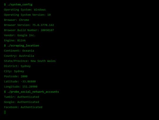
Fingerprint Me v1.0
Okay, time for a demonstration. I took the liberty of writing my own web page that pulls all this data together, and rather than store it for a rainy day (like every other page on the web), I present it to the user on a little web dashboard. It’s like a mirror for your browser. And who doesn’t like to check themselves out in the mirror from time to time 🙃
Random technical content: I had to fetch the geolocation data server-side to protect my API key from the client, then I sneak it back into the static HTML web page I’m serving to the user by setting it on the window variable in some inline script tags.
I bust out some React experience, and have something looking pretty (pretty scary I hope) in some nondescript amount of time (time knows no sink like frontend webdev). I rub my hands together grinning to myself, and send it off to some friends.
“Very scary”. I can see straight through the thin veil of their encouragement and instead read “Yeaaaah okay”. One of them admits that they actually missed the point when they first looked at it. But.. but... nevermind. It’s clearly not having the intended effect. These guys are pretty Internet savvy, but I feel like this should be disconcerting for even the most well seasoned web user...
Like that moment you lock eyes with yourself in the mirror after forgetting to shave a few days in a row.

Fingerprint Me v2.0
An inspired moment follows. I trace it back to the week ?7 activity class on privacy:
It is very hard to make a case for privacy. What is the inherent value of privacy? Why shouldn’t the government have our data, we give it to a million services everyday anyway, and receive a wealth of benefits for it. Go on, have it. I wasn’t using it for anything anyway.
It is very easy to make a case for privacy, if there is any sense that someone malicious is involved. As soon as there is someone who would wish us ill it becomes obvious that there are things that the less they know the better.
<Enter great The Art of War quote here.>
~ Sun Tzu
Therein lies the solution. I need to make the user feel victimised. And what better to do it than a green on black terminal with someone that calls themselves a hacker rooting your machine.
DO CLICK THIS LINK (it’s very safe, I promise) https://fingerprintme.herokuapp.com
Some more random technical content: Programming this quite synchronous behaviour in the very async-centric JavaScript was quite a pain. It was particularly tricky to get around the fact that React renders it’s component hierarchy top down, so I needed the parent components to mount empty in order for them to be correctly populated with child components later. It was also a pain to access and render child components conditionally, especially if you want to have sets of child components in different files, as though they aren’t ultimately nested in the DOM, React will treat them as if they are.
Some User Reviews:
“It feels like I should shut the window”
“This is SO RUDE”
“Battery level. I mean. Literally. How.”
Excellent.
Recommendations
Know what’s in your present, and who you’re gifting it to 🎁
To protect your IP address/location consider using a VPN or ToR
Check out NoScript, a browser plugin that will block JavaScript by default, but allow you to enable it for trusted sites.
Check out and share https://fingerprintme.herokuapp.com 😉
3 notes
·
View notes
Note
hey! i just found your blog and your work is just incredible!!!! as someone who is trying to teach themselves how to code, i was hoping to get some advice from you. how did you learn to code so well? i'm sorry if you answered this question somewhere but i couldn't find anything. do you have any resources you would recommend? (also you said somewhere that you did math to move your tumblr controls. would you mind explaining that?) i'm sorry if this is too much of a bother, have a great day! :))
hello! thank you!!!
here’s a lil “anna’s coding journey” timeline:
2012: learned html/css from codecademy2013: learned jquery from codecademy2015: completed the general assembly tumblr theme tutorial2018: completed codecademy’s javascript course; took a c++ class at the local college — i will admit, taking that c++ class probably helped me improve the most, especially with javascript, but i know that such classes are not accessible to everyone.
but here’s the most important part that you can’t find on any timeline: practice. play around with code. see something you like? try it out yourself. find something interesting? see if you can recreate it! i made like 10 different themes and pages between 2015 and 2017 (that i’ve never published anywhere).
additionally, don’t be afraid to ask for help! i think one of my biggeset regrets regarding my learning-to-code is not asking questions, either when i got stuck or when i saw something cool and was curious. while figuring out everything myself definitely helped me learn code, it also slowed my improvement in ways. as a learner, i was afraid of being bothersome; as a theme maker, it brings me great delight helping someone figure something out. heck, i still ask questions.
the last piece of advice i can give is to reach out and talk to other coders and tag them in things! most theme makers i’ve encountered are open to messages and discussion, and tagging them in your codes helps them gain exposure. if you’d like, you can message or tag me, i track #annasthms.
here’s a non-exhaustive list of resources that i use:
official tumblr docs – while not the easiest to comprehend, it lists out and explains all most of tumblr’s variables
bychloethemes’s tumblr undocs – lists out the tumblr variables for unnested captions, and other goodies that the official docs don’t cover
w3schools/mozilla docs – gives explanations and examples about pretty much everything you would ever need to know about html/css/javascript etc.
stackoverflow – a coding forum where you can get your coding-related questions answered; make sure you’re not asking an already-asked question though, as people are taking time out of their day to answer questions and don’t appreciate repeated questions.
codrops/codepen – tutorials and coding playgrounds where people share their ideas; very useful to discover cool stuff to incorporate into your codes
caniuse – a website that tells you what browsers support [insert html/css element]
google fonts – a large collection of web fonts hosted by google
atom/brackets – free coding environments that you can download if you disagree with the tumblr editor
google – ask and you shall receive (an answer); a coder’s best friend
(x) (x) (x) – i’ve also got these three answers to similar questions bookmarked
oh! for that math, i simply calculated how far down the bottom of the sidebar was (sidebar offset + height) and moved the tumblr controls down that far. nothing complicated.
best of luck on your coding journey!
#this got really long oops#i love giving out advice and talking a lot can u tell#i hope this helps!#and is what you were looking for#if not ask again#coding help#ask#anna.txt#walldust
207 notes
·
View notes
Text
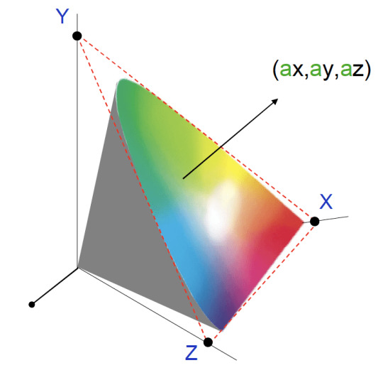
X Y Z Space

Space is vast. Space is awesome. Space is difficult to understand — or so people tend to think. But in this tutorial I am going to show you that this is not the case. Quite the contrary; the laws that govern the motion of the stars, planets, asteroids and even entire galaxies are incredibly simple. You could argue that if our Universe was created by a developer, she sure was concerned about writing clean code that would be easy to maintain and scale.
Solution for Let x, y, and z be vectors in a vector space V. Prove that if x + y = x + z then y = z. It has four dimensions: three dimensions of space (x, y, z) and one dimension of time. Minkowski spacetime has a metric signature of (-), and describes a flat surface when no mass is present. The convention in this article is to call Minkowski spacetime simply spacetime. However, Minkowski spacetime only applies in special relativity. METRIC SPACES 1.1 Definitions and examples As already mentioned, a metric space is just a set X equipped with a function d: X×X → R which measures the distance d(x,y) beween points x,y ∈ X.
What we are going to do is create a simulation of the inner region of our solar system using nothing but plain old JavaScript. It will be a gravitational n-body simulation where every mass feels the gravity of all the other masses being simulated. To spice things up, I will also show how you can enable users of your simulator to add planets of their own to the simulation with nothing but a little bit of mouse drag action, and in doing so, cause all sorts of cosmic mayhem. A gravity or space simulator would not be worthy of its name without motion trails, so I will show you how to create some fancy looking trails, too, in addition to some other shenanigans that will make the simulator a little bit more fun for the average user.
See the Pen Gravity Simulator Tutorial by Darrell Huffman (@thehappykoala) on CodePen.
You will find the complete source code for this project in the Pen above. There is nothing fancy going on there. No bundling of modules, or transpilation of TypeScript or JSX into JavaScript; just HTML markup, CSS, and a healthy dose of JavaScript.

I came up with the idea for this while working on a project that is close to my heart, namely Harmony of the Spheres. Harmony of the Spheres is open source and very much a work in progress, so if you enjoy this tutorial and got your appetite for all things space and physics related going, check out the repository and fire away a pull request if you find a bug or have a cool new feature that you would like to see implemented.
For this tutorial, it is assumed that you have a basic grasp of JavaScript and the syntax and features that were introduced with ES6. Also, if you are able to draw a rectangle onto a canvas element, that would help, too. If you are not yet in possession of this knowledge, I suggest you head over to MDN and start reading up on ES6 classes, arrow functions, shorthand notation for defining key-value pairs for object literals and const and let. If you are not quite sure how to set up a canvas animation, go check out the documentation on the Canvas API on MDN.
Part 1: Writing a Gravitational N-Body Algorithm
To achieve the goal outlined above, we are going to draw on numerical integration, which is an approach to solving gravitational n-body problems where you take the positions and velocities of all objects at a given time (T), calculate the gravitational force they exert on each other and update their velocities and positions at time (T + dt, dt being shorthand for delta time), or in other words, the change in time between iterations. Repeating this process, we can trace the trajectories of a set of masses through space and time.
We will use a Cartesian coordinate system for our simulation. The Cartesian coordinate system is based on three mutually perpendicular coordinate axes: the x-axis, the y-axis, and the z-axis. The three axes intersect at the point called the origin, where x, y and z are equal to 0. An object in a Cartesian space has a unique position that is defined by its x, y and z values. The benefit of using the Cartesian coordinate system for our simulation is that the Canvas API, with which we will visualize our simulation, uses it, too.

For the purpose of writing an algorithm for solving the gravitational n-body problem, it is necessary to have an understanding of what is meant by velocity and acceleration. Velocity is the change in position of an object with time, while acceleration is the change in an object’s velocity with time. Newton’s first law of motion stipulates that every object will remain at rest or in uniform motion in a straight line unless compelled to change its state by the action of an external force. The Earth does not move in a straight line, but orbits the Sun, so clearly it is accelerating, but what is causing this acceleration? As you have probably guessed, given the subject matter of this tutorial, the answer is the gravitational forces exerted on Earth by the Sun, the other planets in our solar system and every other celestial object in the Universe.
Before we discuss gravity, let us write some pseudo code for updating the positions and velocities of a set of masses in Cartesian space. We store our masses as objects in an array where each object represents a mass with x, y and z position and velocity vectors. Velocity vectors are prefixed with a v — v for velocity!
Looking at the code above, we can see that — as outlined in our discussion on numerical integration — every time we advance the simulation by a given time step, dt, we update the velocities of the masses being simulated and, with those velocities, we update the positions of the masses. The relationship between position and velocity is also made clear in the code above, as we can see that in one step of our simulation, the change in, for example, the x position vector of our mass is equal to the product of the mass’s x velocity vector and dt. Similarly, we can make out the relationship between velocity and acceleration.
How, then, do we get the x, y and z acceleration vectors for a mass so that we can calculate the change in its velocity vectors? To get the contribution of massJ to the x acceleration vector of massI, we need to calculate the gravitational force exerted by massJ on massI, and then, to obtain the x acceleration vector, we simply calculate the product of this force and the distance between the two masses on the x axis. To get the y and z acceleration vectors, we follow the same procedure. Now we just have to figure out how to calculate the gravitational force exerted by massJ on massI to be able to write some more pseudo code. The formula we are interested in looks like this:
X Y Z Space
The formula above tells us that the gravitational force exerted by massJ on massI is equal to the product of the gravitational constant (g) and the mass of massJ (massJ.m) divided by the product of the sum of the squares of the distance between massI and massJ on the x, y and z axises (dSq) and the square root of dSq + s, where s is what is referred to as a softening constant (softeningConstant). Including a softening constant in our gravity calculations prevents a situation where the gravitational force exerted by massJ becomes infinite because it is too close to massI. This “bug,” if you will, in the Newtonian theory of gravity arises for the reason that Newtonian gravity treats masses as point objects, which they are not in reality. Moving on, to get the net acceleration of massI along, for example, the x axis, we simply sum the acceleration induced on it by every other mass in the simulation.
Let us transform the above into code for updating the acceleration vectors of all the masses in the simulation.
We iterate over all the masses in the simulation, and for every mass we calculate the contribution to its acceleration by the other masses in a nested loop and increment the acceleration vectors accordingly. Once we are out of the nested loop, we update the acceleration vectors of massI, which we can then use to calculate its new velocity vectors! Whowie. That was a lot. We now know how to update the position, velocity and acceleration vectors of n bodies in a gravity simulation using numerical integration.
But wait; there is something missing. That is right, we have talked about distance, mass and time, but we have never specified what units we ought to use for these quantities. As long as we are consistent, the choice is arbitrary, but generally speaking, it is a good idea to go for units that are suitable for the scales under consideration, so as to avoid awkwardly long numbers. In the context of our solar system, scientists tend to use astronomical units for distance, solar masses for mass and years for time. Adopting this set of units, the value of the gravitational constant (g in the formula for calculating the gravitational force exerted by massJ on massI) is 39.5. For the position and velocity vectors of the Sun and planets of the inner solar system — Mercury, Venus, Earth and Mars — we turn to NASA JPL’s HORIZONS Web-Interface where we change the output setting to vector tables and the units to astronomical units and days. For whatever reason, Horizons does not serve vectors with years as the unit of time, so we have to multiply the velocity vectors by 365.25, the number of days in a year, to obtain velocity vectors that are consistent with our choice of years as the unit of time.
A JavaScript class seems like an excellent way of encapsulating the methods we wrote above together with the data on the masses and the constants we need for our simulation, so let us do some refactoring:
That looks much nicer! Let us create an instance of this class. To do so, we need to specify three constants, namely the gravitational constant (g), the time step of the simulation (dt) and the softening constant (softeningConstant). We also need to populate an array with mass objects. Once we have all of those, we can create an instance of the nBodyProblem class, which we will call the innerSolarSystem, since, well, our simulation is going to be of the inner solar system!
At this moment, you are probably looking at how I instantiated the nBodyProblem class and asking yourself what is up with the JSON parsing and string-ifying nonsense. The reason for why I went about passing the data contained in the masses array to the nBodyProblem constructor in this way is that we want our users to be able to reset the simulation. However, if we pass the masses array itself to the constructor of the nBodyProblem class when we create an instance of it, and then set the value of the masses property of this instance to be equal to the masses array when the user clicks the reset button, the simulation would not have been reset; the state of the masses from the end of the previous simulation run would still be there, and so would any masses the user had added. To solve this problem, we need to pass a clone of the masses array when we instantiate the nBodyProblem class or reset the simulation, so as to avoid modifying the masses array, which we need to keep pristine and untouched, and the easiest way of cloning it is to simply parse a string-ified version of it.
Okay, moving on: to advance the simulation by one step, we simply call:
Congratulations. You are now one step closer to collecting a Nobel prize in physics!
Part 2: Creating a Visual Manifestation for our Masses
X Y Z Access
We could represent our masses with cute little circles created with the Canvas API’s arc method, but that would look kind of dull, and we would not get a sense of the trajectories of our masses through space and time, so let us write a JavaScript class that will be our template for how our masses manifest themselves visually. It will create a circle that leaves a predetermined number of smaller and faded circles where it has been before, which conveys a sense of motion and direction to the user. The farther you get from the current position of the mass, the smaller and more faded out the circles will become. In this way, we will have created a pretty looking motion trail for our masses.
The constructor accepts three arguments, namely the drawing context for our canvas element (ctx), the length of the motion trail (trailLength) that represents the number of previous positions of our mass that the trail will visualize and finally the radius (radius) of the circle that represents the current position of our mass. In the constructor we will also initialize an empty array that we will call positions, which will — quell surprise — store the current and previous positions of the mass that are included in the motion trail.
At this point, our manifestation class looks like this:
How do we go about populating the positions array with positions and making sure that we do not store more positions than the number specified by the trailLength property? The answer is that we add a method to our class that accepts the x and y coordinates of the mass’s position as arguments and stores them in an object in the array using the array push method, which appends an element to an array. This means that the current position of the mass will be the last element in the positions array. To make sure we do not store more positions than specified when we instantiated the class, we check if the length of the positions array is greater than the trailLength property. If it is, we use the array shift method to remove the first element, which represents the oldest stored position of the positions array.
Okay, let us write a method that draws our motion trail. As you have probably guessed, it will accept two arguments, namely the x and y positions of the mass we are drawing the trail for. The first thing we need to do is to store the new position in the positions array and discard any superfluous positions stored in it. Then we iterate over the positions array and draw a circle for every position and voilà, we have ourselves a motion trail! But it does not look very nice, and I promised you that our trail would be pretty with circles that would become increasingly smaller and faded out according to how close they were to the current position of our mass in time.
What we need is, clearly, a scale factor whose size depends on how far away the position we are drawing is from the current position of our mass in time! An excellent way of obtaining an appropriate scale factor, for our intents and purposes, is to simply divide the index (i) of the circle being drawn by the length of the positions array. For example, if the number of elements allowed in the positions array is 25, element number 23 in that array will get a scale factor of 23 / 25, which gives us 0.92. Element number 5, on the other hand, will get a scale factor of 5 / 25, which gives us 0.2; the scale factor decreases the further we get from the current position of our mass, which is the relationship we want! Do note that we need a condition that makes sure that if the circle being drawn represents the current position, the scale factor is set to 1, as we do not want that circle to be either faded or smaller, for that matter. With all this in mind, let us write the code for the draw method of our Manifestation class.
Part 3: Visualizing Our Simulation
Let us write some canvas boilerplate and bind it together with the gravitational n-body algorithm and the motion trails, so that we can get an animation of our inner solar system simulation up and running. As mentioned in the introduction to this tutorial, I do not discuss the Canvas API in any great depth, as this is not an introductory tutorial on the Canvas API, so if you find yourself looking rather bemused and or perplexed, make haste and change this state of affairs by heading over to MDN’s documentation on the subject.
Before we continue, though, here is the HTML markup for our simulator:
Now, we turn to the interesting part: the JavaScript. We start by getting a reference to the canvas element and then we proceed by getting its drawing context. Next, we set the dimensions of our canvas element. When it comes to canvas animations on the web, I do not spare any expenses in terms of screen real estate, so let us set the width and height properties of the canvas element to the width and height of the browser window, respectively. You will notice that I have drawn on a peculiar syntax for setting the width and height of the canvas element in that I have declared, in one statement, that the width variable is equal to the width property of the canvas element which, in turn, is equal to the width of the window. Some developers frown upon the use of this syntax, but I find it to be semantically beautiful. If you do not feel the same way, you can deconstruct that statement into two statements. Generally speaking, do whatever you feel most comfortable with, or if you find yourself collaborating with others, what the team has agreed on.
At this point, we are going to declare some constants for our animation. More specifically, there are three of them. The first is the radius (radius) of the circle, which represents the current position of a mass, in pixels. The second is the length of our motion trail (trailLength), which is the number of previous positions that it includes. Last, but not least, we have the scale (scale) constant, which represents the number of pixels per astronomical unit; Earth is one astronomical unit from the Sun, so if we did not introduce this scale factor, our inner solar system would look very claustrophobic, to say the least.
Let us now turn to the visual manifestations of the masses we are simulating. We have written a class that encapsulates their behavior, but how do we instantiate and work with these manifestations in our code? The most convenient and elegant way would be to populate every element of the masses array we are simulating with an instance of the Manifestation class, so let us write a simple method that iterates over these masses and does just that, which we then invoke.
Our simulator is meant to be a playful affair, so it is only to be expected that users will spawn masses left and right and that after a minute, or so, the inner solar system will look like an unrecognizable cosmic mess, which is why I think it would be decent of us to provide them with the ability to reset the simulation. To achieve this goal, we start by attaching an event listener to the reset button, and then we write a callback for this event listener that sets the value of the masses property of the innerSolarSystem object to a clone of the masses array. As we cloned the masses array, we no longer have the manifestations of our masses in it, so we call the populateManifestations method to make sure that our users have something to look at after having reset the simulation.
Okay, enough setting things up. Let us breathe some life into the inner solar system by writing a method that, with the help of the requestAnimationFrame API, will run 60 steps of our simulation a second and animate the results with motion trails and labels for the planets of the inner solar system and the Sun.
The first thing this method does is advance the inner solar system by one step and it does so by updating the position, acceleration and velocity vectors of its masses. Then we prepare the canvas element for the next animation cycle by clearing it of what was drawn in the preceding animation cycle using the Canvas API’s clearRect method.
Next, we iterate over the masses array and invoke the draw method of each mass manifestation. Moreover, if the mass being drawn has a name, we draw it onto the canvas, so that the user can see where the original planets are after things have gone haywire. Looking at the code in the loop, you will probably notice that we are not setting, for example, the value of the mass’s x coordinate on the canvas to massI times scale, and that we are in fact setting it to the width of the viewport divided by two plus massI times scale. Why is this? The answer is that the origin (x = 0, y = 0) of the canvas coordinate system is set to the top left corner of the canvas element, so to center our simulation on the canvas where it is clearly visible to the user, we must include this offset.

After the loop, at the end of the animate method, we call requestAnimationFrame with the animate method as the callback, and then the whole process discussed above is repeated again, creating yet another frame — and run in quick succession, these frames have brought the inner solar system to life. But wait, we have missed something! If you were to run the code I have walked you through thus far, you would not see anything at all. Fortunately, all we have to do to change this sad state of affairs is to proverbially give the inner solar system a kick in its rear end (no, I am not going to fall for the temptation of inserting a Uranus joke here; grow up!) by invoking the animate method!
Woah! We have now gotten to the point where our simulation is animated, with the masses represented by dainty little blue circles stalked by marvelous looking motion trails. That is pretty cool in itself, if you were to ask me; but I did promise to also show how you can enable the user to add masses of their own to the simulation with a little bit of mouse drag action, so we are not done quite yet!
Part 4: Adding Masses with the Mouse

The idea here is that the user should be able to press down on the mouse button and draw a line by dragging it; the line will start where the user pressed down and end at the current position of the mouse cursor. When the user releases the mouse button, a new mass is spawned at the position of the screen where the user pressed down the mouse button, and the direction the mass will move is determined by the direction of the line; the length of the line determines the velocity vectors of the mass. So, how do we go about implementing this? Let us run through what we need to do, step by step. The code for steps one through six go above the animate method, while the code for step seven is a small addition to the animate method.
1. We need two variables that will store the x and y coordinates where the user pressed down the mouse button on the screen.
2. We need two variables that store the current x and y coordinates of the mouse cursor on the screen.
3. We need one variable that keeps track of whether the mouse is being dragged or not. The mouse is being dragged in the time that passes from when the user has pressed down the mouse button to the point where he releases it.
4. We need to attach a mousedown listener to the canvas element that logs the x and y coordinates of where the mouse was pressed down and sets the dragging variable to true.
5. We need to attach a mousemove listener to the canvas element that logs the current x and y coordinates of the mouse cursor.
6. We need to attach a mouseup listener to the canvas element that sets the drag variable to false, and pushes a new object representing a mass into the innerSolarSystem.masses array where the x and y position vectors are the point where the user pressed down the mouse button divided by value of the scale variable.
X Y Z 10
If we did not divide these vectors by the scale variable, the added masses would end up way out in the solar system, which is not what we want. The z position vector is set to zero and so is the z velocity vector. The x velocity vector is set to the x coordinate where the mouse was released subtracted by the x coordinate where the mouse was pressed down, and then you divide this number by 35. I will be honest and admit that 35 is a magical number that just happens to give you reasonable velocities when you add masses with the mouse to the inner solar system. Same procedure for the y velocity vector. The mass (m) of the mass we are adding is set by the user with a select element that we have populated with the masses of some famous celestial objects in the HTML markup. Last, but not least, we populate the object representing our mass with an instance of the Manifestation class so that the user can see it on the screen!
7. In the animate function, after the loop where we draw our manifestations and, before we call requestAnimationFrame, check if the mouse is being dragged. If that is the case, we’ll draw a line between the position where the mouse was pressed down and the mouse cursors current position.
Adding masses to our simulation with your mouse is not more difficult than that! Now, grab your mouse and unleash some mayhem on the inner solar system.
X Y Z Color Space
Part 5: Fencing off the Inner Solar System
As you will probably have noticed after adding some masses to the simulation, celestial objects are very shenanigan-prone in that they have a tendency to dance their way out of the viewport, especially if the added masses are very massive or they have too high of a velocity, which is kind of annoying. The natural solution to this problem is, of course, to fence off the inner solar system so that if a mass reaches the edge of the viewport, it will bounce back in! Sounds like quite a project, implementing this functionality, but fortunately doing so is a rather simple affair. At the end of the loop where we iterate over the masses and draw them in the animate method, we have insert two conditions: one that checks if our mass is outside the bounds of the viewport on the x-axis, and another that does the same check for the y axis. If the position of our mass is outside of the viewport on the x axis we reverse its x velocity vector so that it bounces back into the viewport, and the same logic applies if our mass is outside of the viewport on the y axis. With these two conditions, the animate method will look like so:
Ping, pong! It is almost as though we are playing a game of cosmic billiards with all those masses bouncing off the fence that we have built for the inner solar system!
Xyz Space Frame Bikes
Concluding Remarks
People have a tendency to think of orbital mechanics — which is what we have played around with in this tutorial — as something that is beyond the understanding of mere mortals such as yours truly. Truth, though, is that orbital mechanics follows a very simple and elegant set of rules, as this tutorial is a testament to. With a little bit of JavaScript and high-school mathematics and physics, we have reconstructed the inner solar system to a reasonable degree of accuracy, and gone beyond that to make things a little bit more spicy and, therefore, more interesting. With this simulator, you can answer silly what-if questions along the lines of, “What would happen if I flung a star with the mass of the Sun into our inner solar system?” or develop a feeling for Kepler’s laws of planetary motion by, for example, observing the relationship between the distance of a mass from the Sun and its velocity.
I sure had fun writing this tutorial, and it is my sincere hope that you had as much fun reading it!
1 note
·
View note
Photo

Higher-order Components: A React Application Design Pattern
In this article, we’ll discuss how to use higher-order components to keep your React applications tidy, well-structured and easy to maintain. We’ll discuss how pure functions keep code clean and how these same principles can be applied to React components.
Pure Functions
A function is considered pure if it adheres to the following properties:
all the data it deals with is declared as arguments
it doesn’t mutate data it was given or any other data (these are often referred to as side effects)
given the same input, it will always return the same output.
For example, the add function below is pure:
function add(x, y) { return x + y; }
However, the function badAdd below is impure:
let y = 2; function badAdd(x) { return x + y; }
This function is not pure because it references data that it hasn’t directly been given. As a result, it’s possible to call this function with the same input and get different output:
let y = 2; badAdd(3) // 5 y = 3; badAdd(3) // 6
To read more about pure functions you can read “An introduction to reasonably pure programming” by Mark Brown.
Whilst pure functions are very useful, and make debugging and testing an application much easier, occasionally you’ll need to create impure functions that have side effects, or modify the behavior of an existing function that you’re unable to access directly (a function from a library, for example). To enable this, we need to look at higher-order functions.
Higher-order Functions
A higher-order function is a function that returns another function when it’s called. Often they also take a function as an argument, but this isn’t required for a function to be considered higher-order.
Let’s say we have our add function from above, and we want to write some code so that when we call it, we log the result to the console before returning the result. We’re unable to edit the add function, so instead we can create a new function:
function addAndLog(x, y) { const result = add(x, y); console.log(`Result: ${result}`); return result; }
We decide that logging results of functions is useful, and now we want to do the same with a subtract function. Rather than duplicate the above, we could write a higher-order function that can take a function and return a new function that calls the given function and logs the result before then returning it:
function logAndReturn(func) { return function(...args) { const result = func(...args) console.log('Result', result); return result; } }
Now we can take this function and use it to add logging to add and subtract:
const addAndLog = logAndReturn(add); addAndLog(4, 4) // 8 is returned, ‘Result 8’ is logged const subtractAndLog = logAndReturn(subtract); subtractAndLog(4, 3) // 1 is returned, ‘Result 1’ is logged;
logAndReturn is a higher-order function because it takes a function as its argument and returns a new function that we can call. These are really useful for wrapping existing functions that you can’t change in behavior. For more information on this, check M. David Green’s article “Higher-Order Functions in JavaScript”, which goes into much more detail on the subject.
See the Pen Higher Order Functions by SitePoint (@SitePoint) on CodePen.
Higher-order Components
Moving into React land, we can use the same logic as above to take existing React components and give them some extra behaviors.
Note: with the introduction of React Hooks, released in React 16.8, higher-order functions became slightly less useful because hooks enabled behavior sharing without the need for extra components. That said, they are still a useful tool to have in your belt.
In this section, we’re going to use React Router, the de facto routing solution for React. If you’d like to get started with the library, I highly recommend the React Router documentation as the best place to get started.
React Router’s Link component
React Router provides a <NavLink> component that’s used to link between pages in a React application. One of the properties that this <NavLink> component takes is activeClassName. When a <NavLink> has this property and it’s currently active (the user is on a URL that the link points to), the component will be given this class, enabling the developer to style it.
This is a really useful feature, and in our hypothetical application we decide that we always want to use this property. However, after doing so we quickly discover that this is making all our <NavLink> components very verbose:
<NavLink to="/" activeClassName="active-link">Home</NavLink> <NavLink to="/about" activeClassName="active-link">About</NavLink> <NavLink to="/contact" activeClassName="active-link">Contact</NavLink>
Notice that we’re having to repeat the class name property every time. Not only does this make our components verbose, it also means that if we decide to change the class name we’ve got to do it in a lot of places.
Instead, we can write a component that wraps the <NavLink> component:
const AppLink = (props) => { return ( <NavLink to={props.to} activeClassName="active-link"> {props.children} </NavLink> ); };
And now we can use this component, which tidies up our links:
<AppLink to="/home" exact>Home</AppLink> <AppLink to="/about">About</AppLink> <AppLink to="/contact">Contact</AppLink>
In the React ecosystem, these components are known as higher-order components, because they take an existing component and manipulate it slightly without changing the existing component. You can also think of these as wrapper components, but you’ll find them commonly referred to as higher-order components in React-based content.
Continue reading Higher-order Components: A React Application Design Pattern on SitePoint.
by Jack Franklin via SitePoint https://ift.tt/3kEY8L9
0 notes
Text
Cool Little CSS Grid Tricks for Your Blog
I discovered CSS about a decade ago while trying to modify the look of a blog I had created. Pretty soon, I was able to code cool things with more mathematical and, therefore, easier-to-understand features like transforms. However, other areas of CSS, such as layout, have remained a constant source of pain.
This post is about a problem I encountered about a decade ago and, until recently, did not know how to solve in a smart way. Specifically, it’s about how I found a solution to a long-running problem using a modern CSS grid technique that, in the process, gave me even cooler results than I originally imagined.
That this is not a tutorial on how to best use CSS grid, but more of a walk through my own learning process.
The problem
One of the first things I used to dump on that blog were random photos from the city, so I had this idea about having a grid of thumbnails with a fixed size. For a nicer look, I wanted this grid to be middle-aligned with respect to the paragraphs above and below it, but, at the same time, I wanted the thumbnails on the last row to be left-aligned with respect to the grid. Meanwhile, the width of the post (and the width of the grid within it) would depend on the viewport.
The HTML looks something like this:
<section class='post__content'> <p><!-- some text --></p> <div class='grid--thumbs'> <a href='full-size-image.jpg'> <img src='thumb-image.jpg' alt='image description'/> </a> <!-- more such thumbnails --> </div> <p><!-- some more text --></p> </section>
It may seem simple, but it turned out to be one of the most difficult CSS problems I’ve ever encountered.
Less than ideal solutions
These are things I have tried or seen suggested over the years, but that never really got me anywhere.
Floating impossibility
Floats turned out to be a dead end because I couldn’t figure out how to make the grid be middle aligned this way.
.grid--thumbs { overflow: hidden; } .grid--thumbs a { float: left; }
The demo below shows the float attempt. Resize the embed to see how they behave at different viewport widths.
CodePen Embed Fallback
inline-block madness
At first, this seemed like a better idea:
.grid--thumbs { text-align: center } .grid--thumbs a { display: inline-block }
Except it turned out it wasn’t:
CodePen Embed Fallback
The last row isn’t left aligned in this case.
At a certain point, thanks to an accidental CSS auto-complete on CodePen, I found out about a property called text-align-last, which determines how the last line of a block is aligned.
Unfortunately, setting text-align-last: left on the grid wasn’t the solution I was looking for either:
CodePen Embed Fallback
At this point, I actually considered dropping the idea of a middle aligned grid. Could a combo of text-align: justified and text-align-last: left on the grid produce a better result?
Well, turns out it doesn’t. That is, unless there’s only a thumbnail on the last row and the gaps between the columns aren’t too big. Resize the embed below to see what I mean.
CodePen Embed Fallback
This is pretty where I was at two years ago, after nine years of trying and failing to come up with a solution to this problem.
Messy flexbox hacks
A flexbox solution that seemed like it would work at first was to add an ::after pseudo-element on the grid and set flex: 1 on both the thumbnails and this pseudo-element:
.grid--thumbs { display: flex; flex-wrap: wrap; a, &::after { flex: 1; } img { margin: auto; } &:after { content: 'AFTER'; } }
The demo below shows how this method works. I’ve given the thumbnails and the ::after pseudo-element purple outlines to make it easier to see what is going on.
CodePen Embed Fallback
This is not quite what I wanted because the grid of thumbnails is not middle-aligned. Thats said, it doesn’t look too bad… as long as the last row has exactly one item less image than the others. As soon as that changes, however, the layout breaks if it’s missing more items or none.

Why the ::after hack is not reliable.
That was one hacky idea. Another is to use a pseudo-element again, but add as many empty divs after the thumbnails as there are columns that we’re expecting to have. That number is something we should be able to approximate since the size of the thumbnails is fixed. We probably want to set a maximum width for the post since text that stretches across the width of a full screen can visually exhausting for eyes to read.
The first empty elements will take up the full width of the row that’s not completely filled with thumbnails, while the rest will spill into other rows. But since their height is zero, it won’t matter visually.
CodePen Embed Fallback
This kind of does the trick but, again, it’s hacky and still doesn’t produce the exact result I want since it sometimes ends up with big and kind of ugly-looking gaps between the columns.
A grid solution?
The grid layout has always sounded like the answer, given its name. The problem was that all examples I had seen by then were using a predefined number of columns and that doesn’t work for this particular pattern where the number of columns is determined by the viewport width.
Last year, while coding a collection of one element, pure CSS background patterns, I had the idea of generating a bunch of media queries that would modify a CSS variable, --n, corresponding to the number of columns used to set grid-template-columns.
$w: 13em; $h: 19em; $f: $h/$w; $n: 7; $g: 1em; --h: #{$f*$w}; display: grid; grid-template-columns: repeat(var(--n, #{$n}), var(--w, #{$w})); grid-gap: $g; place-content: center; @for $i from 1 to $n { @media (max-width: ($n - $i + 1)*$w + ($n - $i + 2)*$g) { --n: #{$n - $i} } }
CodePen Embed Fallback
I was actually super proud of this idea at the time, even though I cringe looking back on it now. One media query for every number of columns possible is not exactly ideal, not to mention it doesn’t work so well when the grid width doesn’t equal the viewport width, but is still somewhat flexible and also depends on the width of its siblings.
A magic solution
I finally came across a better solution while working with CSS grid and failing to understand why the repeat() function wasn’t working in a particular situation. It was so frustrating and prompted me to go to MDN, where I happened to notice the auto-fit keyword and, while I didn’t understand the explanation, I had a hunch that it could help with this other problem, so I dropped everything else I was doing and gave it a try.
Here’s what I got:
.grid--thumbs { display: grid; justify-content: center; grid-gap: .25em; grid-template-columns: repeat(auto-fit, 8em); }
CodePen Embed Fallback
I also discovered the minmax() function, which can be used in place of fixed sizes on grid items. I still haven’t been able to understand exactly how minmax() works — and the more I play with it, the less I understand it — but what it looks like it does in this situation is create the grid then stretch its columns equally until they fill all of the available space:
grid-template-columns: repeat(auto-fit, minmax(8em, 1fr));
CodePen Embed Fallback
Another cool thing we can do here is prevent the image from overflowing when it’s wider than the grid element. We can do this by replacing the minimum 8em with min(8em, 100%) That essentially ensures that images will never exceed 100%, but never below 8em. Thanks to Chris for this suggestion!
Note that the min() function doesn’t work in pre-Chromium Edge!
CodePen Embed Fallback
Keep in mind that this only produces a nice result if all of the images have the same aspect ratio — like the square images I’ve used here. For my blog, this was not an issue since all photos were taken with my Sony Ericsson W800i phone, and they all had the same aspect ratio. But if we were to drop images with different aspect ratios, the grid wouldn’t look as good anymore:
CodePen Embed Fallback
We can, of course, set the image height to a fixed value, but that distorts the images… unless we set object-fit to cover, which solves our problem!
CodePen Embed Fallback
Another idea would be to turn the first thumbnail into a sort of banner that spans all grid columns. The one problem is that we don’t know the number of columns because that depends on the viewport. But, there is a solution — we can set grid-column-end to -1!
.grid--thumbs { /* same styles as before */ a:first-child { grid-column: 1/ -1; img { height: 13em } } }
The first image gets a bigger height than all the others.
CodePen Embed Fallback
Of course, if we wanted the image to span all columns except the last, one we’d set it to -2 and so on… negative column indices are a thing!
auto-fill is another grid property keyword I noticed on MDN. The explanations for both are long walls of text without visuals, so I didn’t find them particularly useful. Even worse, replacing auto-fit with auto-fill in any of the grid demos above produces absolutely no difference. How they really work and how they differ still remains a mystery, even after checking out articles or toying with examples.
However, trying out different things and seeing what happens in various scenarios at one point led me to the conclusion that, if we’re using a minmax() column width and not a fixed one (like 8em), then it’s probably better to use auto-fill instead of auto-fit because, the result looks better if we happen to only have a few images, as illustrated by the interactive demo below:
CodePen Embed Fallback
I think what I personally like best is the initial idea of a thumbnail grid that’s middle-aligned and has a mostly fixed column width (but still uses min(100%, 15em) instead of just 15em though). At the end of the day, it’s a matter of personal preference and what can be seen in the demo below just happens to look better to me:
CodePen Embed Fallback
I’m using auto-fit in this demo because it produces the same result as auto-fill and is one character shorter. However, what I didn’t understand when making this is that both keywords produce the same result because there are more items in the gallery than we need to fill a row.
But once that changes, auto-fit and auto-fill produce different results, as illustrated below. You can change the justify-content value and the number of items placed on the grid:
CodePen Embed Fallback
I’m not really sure which is the better choice. I guess this also depends on personal preference. Coupled with justify-content: center, auto-fill seems to be the more logical option, but, at the same time, auto-fit produces a better-looking result.
The post Cool Little CSS Grid Tricks for Your Blog appeared first on CSS-Tricks.
source https://css-tricks.com/cool-little-css-grid-tricks-for-your-blog/
from WordPress https://ift.tt/3cNgDZf via IFTTT
0 notes
Text
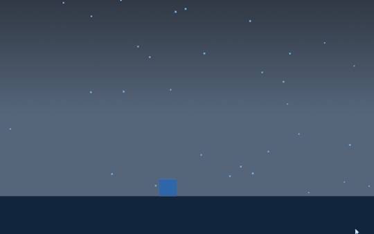
28/2 Entry #11
API-lab coming to a close. This project is coming to an end and we’re working on gettign the readme files in order before the hand in. THe group has worked really well, and we’ve been able to both work on what has been fun, and communicate and help each other during the project. For my part in the project I transformed a codepen project into a rainy background for a small game that I programmed into the example. I added a little cube that I’ve called Blob that you can move around and jump. I thought I would add some sort of an objective, and have Blob interacting with the environment but I did run out of time for that. I have an idea of how I would go about doing it though, so I do not think that it would be impossible. I kind of got into a rabbit hole with Blob however. While I know that it was perhaps not the best way to spend my time working on that project to keep developing and polishing the way everything looked and how he moved I couldn’t help myself from doing it, even if it doesn’t have the most obvious connection to interaction design. It’s something I do when I get into something that I find both challenging and fun.
0 notes
Text
CSS Masonry & CSS Grid
New Post has been published on https://thedigitalinsider.com/css-masonry-css-grid/
CSS Masonry & CSS Grid
An approach for creating masonry layouts in vanilla CSS is one of those “holy grail” aspirations. I actually tend to plop masonry and the classic “Holy Grail” layout in the same general era of web design. They’re different types of layouts, of course, but the Holy Grail was a done deal when we got CSS Grid.
That leaves masonry as perhaps the last standing layout from the CSS 3 era that is left without a baked-in solution. I might argue that masonry is no longer en vogue so to speak, but there clearly are use cases for packing items with varying sizes into columns based on available space. And masonry is still very much in the wild.
Steam is picking up on a formal solution. We even have a CSSWG draft specification for it. But notice how the draft breaks things out.
Grid-integrated syntax? Grid-independent syntax? We’ve done gone and multiplied CSS!
That’s the context for this batch of notes. There are two competing proposals for CSS masonry at the time of writing and many opinions are flying around advocating one or the other. I have personal thoughts on it, but that’s not important. I’ll be happy with whatever the consensus happens to be. Both proposals have merits and come with potential challenges — it’s a matter of what you prioritize which, in this case, I believe is a choice between leveraging existing CSS layout features and the ergonomics of a fresh new approach.
But let’s get to some notes from discussions that are already happening to help get a clearer picture of things!
What is masonry layout?
Think of it like erecting a wall of stones or bricks.
The sizes of the bricks and stones don’t matter — the column (or less commonly a row) is the boss of sizing things. Pack as many stones or bricks in the nearest column and then those adapt to the column’s width. Or more concisely, we’re laying out unevenly sized items in a column such that there aren’t uneven gaps between them.
Examples, please?
Here’s perhaps the most widely seen example in a CodePen, courtesy of Dave DeSandro, using his Masonry.js tool:
I use this example because, if I remember correctly, Masonry.js was what stoked the masonry trend in, like 2010 or something. Dave implemented it on Beyoncé’s website which certainly gave masonry a highly visible profile. Sometimes you might hear masonry called a “Pinterest-style” layout because, well, that’s been the site’s signature design — perhaps even its brand — since day one.
Here’s a faux example Jhey put together using flexbox:
Chris also rounded up a bunch of other workarounds in 2019 that get us somewhat there, under ideal conditions. But none of these are based on standardized approaches or features. I mean, columns and flexbox are specced but weren’t designed with masonry in mind. But with masonry having a long track record of being used, it most certainly deserves a place in the CSS specs.
There are two competing proposals
This isn’t exactly news. In fact, we can get earlier whiffs of this looking back to 2020. Rachel Andrew introduced the concept of making masonry a sub-feature of grid in a Smashing Magazine article.
Let’s fast-forward to 2022. We had an editor’s draft for CSS Masonry baked into the CSS Grid Layout Module 3 specification. Jenn Simmons motioned for the CSSWG to move it forward to be a first public working draft. Five days later, Chromium engineer Ian Kilpatrick raised two concerns about moving things forward as part of the CSS Grid Layout module, the first being related to sizing column tracks and grid’s layout algorithm:
Grid works by placing everything in the grid ahead of time, then sizing the rows/columns to fit the items. Masonry fundamentally doesn’t work this way as you need to size the rows/columns ahead of time – then place items within those rows/columns.
As a result the way the current specification re-uses the grid sizing logic leads to poor results when intrinsically sizing tracks, and if the grid is intrinsically-sized itself (e.g. if its within a grid/flex/table, etc).
Good point! Grid places grid items in advance ahead of sizing them to fit into the available space. Again, it’s the column’s size that bosses things around in masonry. It logically follows that we would need to declare masonry and configure the column track sizes in advance to place things according to space. The other concern concerns accessibility as far as visual and reading order.
That stopped Jenn’s motion for first public working draft status dead in its tracks in early 2023. If we fast-forward to July of this year, we get Ian’s points for an alternative path forward for masonry. That garnered support from all sorts of CSS heavyweights, including Rachel Andrew who authored the CSS Grid specification.
And, just a mere three weeks ago from today, fantasai shared a draft for an alternate proposal put together with Tab Atkins. This proposal, you’ll see, is specific to masonry as its own module.
And thus we have two competing proposals to solve masonry in CSS.
The case for merging masonry and grid
Rounding up comments from GitHub tickets and blog posts…
Flexbox is really designed for putting things into a line and distributing spare space. So that initial behaviour of putting all your things in a row is a great starting point for whatever you might want to do. It may be all you need to do. It’s not difficult as a teacher to then unpack how to add space inside or outside items, align them, or make it a column rather than a row. Step by step, from the defaults.
I want to be able to take the same approach with display: masonry.
[…]
We can’t do that as easily with grid, because of the pre-existing initial values. The good defaults for grid don’t work as well for masonry. Currently you’d need to:
Add display: grid, to get a single column grid layout.
Add grid-template-columns: <track-listing>, and at the moment there’s no way to auto-fill auto sized tracks so you’ll need to decide on how many. Using grid-template-columns: repeat(3, auto), for example.
Add grid-template-rows: masonry.
Want to define rows instead? Switch the masonry value to apply to grid-template-columns and now define your rows. Once again, you have to explicitly define rows.
Rachel Andrew, “Masonry and good defaults”
For what it’s worth, Rachel has been waving this flag since at least 2020. The ergonomics of display: masonry with default configurations that solve baseline functionality are clear and compelling. The default behavior oughta match the feature’s purpose and grid just ain’t a great set of default configurations to jump into a masonry layout. Rachel’s point is that teaching and learning grid to get to understand masonry behavior unnecessarily lumps two different formatting contexts into one, which is a certain path to confusion. I find it tough to refute this, as I also come at this from a teaching perspective. Seen this way, we might say that merging features is another lost entry point into front-end development.
In recent years, the two primary methods we’ve used to pull off masonry layouts are:
Flexbox for consistent row sizes. We adjust the flex-basis based on the item’s expected percentage of the total row width.
Grid for consistent column sizes. We set the row span based on the expected aspect ratio of the content, either server-side for imagery or client-side for dynamic content.
What I’ve personally observed is:
Neither feels more intuitive than the other as a starting point for masonry. So it feels a little itchy to single out Grid as a foundation.
While there is friction when teaching folks when to use a Flexbox versus a Grid, it’s a much bigger leap for contributors to wrap their heads around properties that significantly change behavior (such as flex-wrap or grid-auto-flow: dense).
Tyler Sticka, commenting on GitHub Issue #9041
It’s true! If I had to single out either flexbox or grid as the starting poit for masonry (and I doubt I would either way), I might lean flexbox purely for the default behavior of aligning flexible items in a column.
The syntax and semantics of the CSS that will drive masonry layout is a concern that is separate from the actual layout mechanics itself, which internally in implementation by user agents can still re-use parts of the existing mechanics for grids, including subgrids. For cases where masonry is nested inside grid, or grid inside masonry, the relationship between the two can be made explicit.
@jgotten, commenting on GitHub Issue #9041
Rachel again, this time speaking on behalf of the Chrome team:
There are two related reasons why we feel that masonry is better defined outside of grid layout—the potential of layout performance issues, and the fact that both masonry and grid have features that make sense in one layout method but not the other.
The case for keeping masonry separate from grid
One of the key benefits of integrating masonry into the grid layout (as in CASE 2) is the ability to leverage existing grid features, such as subgrids. Subgrids allow for cohesive designs among child elements within a grid, something highly desirable in many masonry layouts as well. Additionally, I believe that future enhancements to the grid layout will also be beneficial for masonry, making their integration even more valuable. By treating masonry as an extension of the grid layout, developers would be able to start using it immediately, without needing to learn a completely new system.
Kokomi, commenting on GitHub Issue #9041
It really would be a shame if keeping masonry separate from grid prevents masonry from being as powerful as it could be with access to grid’s feature set:
I think the arguments for a separate display: masonry focus too much on the potential simplicity at the expense of functionality. Excluding Grid’s powerful features would hinder developers who want or need more than basic layouts. Plus, introducing another display type could lead to confusion and fragmentation in the layout ecosystem.
Angel Ponce, commenting on GitHub Issue #9041
Rachel counters that, though.
I want express my strong support for adding masonry to display:grid. The fact that it gracefully degrades to a traditional grid is a huge benefit IMO. But also, masonry layout is already possible (with some constraints) in Grid layout today!
Naman Goel, Angel Ponce, commenting on GitHub Issue #9041
Chris mildly voiced interest in merging the two in 2020 before the debate got larger and more heated. Not exactly a ringing endorsement, but rather an acknowledgment that it could make sense:
I like the grid-template-rows: masonry; syntax because I think it clearly communicates: “You aren’t setting these rows. In fact, there aren’t even really rows at all anymore, we’ll take care of that.” Which I guess means there are no rows to inherit in subgrid, which also makes sense.
Where we at?
Collecting feedback. Rachel, Ian, and Tab published a joint call for folks like you and me to add our thoughts to the bag. That was eight days ago as of this writing. Not only is it a call to action, but it’s also an excellent overview of the two competing ideas and considerations for each one. You’ll want to add your feedback to GitHub Issue #9041.
#2022#2023#Accessibility#ADD#agents#algorithm#amp#approach#Article#Behavior#Blog#change#chrome#chromium#columns#content#course#CSS#CSS Grid#csswg#deal#Design#developers#development#display#Engineer#express#extension#Features#focus
0 notes
Text
Editorial Design Patterns With CSS Grid And Named Columns
Editorial Design Patterns With CSS Grid And Named Columns
Rachel Andrew
2019-10-04T12:30:00+02:002019-10-04T10:46:20+00:00
Many websites, in particular those which display long-form content, have a fairly straightforward repeating pattern of components: a full-width area for images, a central content area, and perhaps a split view of two half-width blocks. These components repeat to display an article, images and other related content — with content editors selecting the right component as they create articles for publication.
In this article, I’m going to demonstrate an approach to this kind of editorial design, which builds on a few techniques some of which are discussed in the following articles:
“Breaking Out With CSS Grid Layout”
“Breaking Out With CSS Grid Explained”
“Naming Things In CSS Grid Layout”
In addition to this being a nice way to name sections of your layout, this technique exposes a whole bunch of interesting things about Grid Layout which you may find useful in creating your own layout patterns. It also demonstrates more of the promise of subgrid (a part of the upcoming Level 2 of the grid specification and being implemented in Firefox).
Naming Things In CSS Grid Layout
When using CSS Grid Layout, you can name lines and areas. Both of these things can make working with Grid — especially complex grids — more straightforward. Defining naming conventions for things in your layout can be useful when working with your team; it is much easier to understand where anything placed with grid-area: content will end up than having something placed from column-line: 3 / 9.
When using the grid-template-areas approach, you give the items that you want to place on the grid a name by using the grid-area property and then placing them around the grid. In the following example, the item with grid-area: content goes into the grid area defined by the grid-template-areas property:
See the Pen [Layout With Named Area](https://codepen.io/rachelandrew/pen/zYOQBba) by Rachel Andrew.
See the Pen Layout With Named Area by Rachel Andrew.
This works well for components where you have one item to go into one area; however, if you want to place multiple things into the content area (one below the other), using grid-area is the wrong approach. Instead, you might define names for the column lines and place the item from the start to end line.
See the Pen [Layout With Named Columns](https://codepen.io/rachelandrew/pen/xxKNONQ) by Rachel Andrew.
See the Pen Layout With Named Columns by Rachel Andrew.
This isn’t as neat, however, when using the grid-area approach we have to know both the start and end line when placing an item using grid-column or grid-row — or do we?
Take a look at this next CodePen example. My items are placed using a single name or ident by using the grid-column property, even though some of the grid areas being targeted cross a number of columns:
See the Pen [Layout with Named Columns](https://codepen.io/rachelandrew/pen/mdbYEod) by Rachel Andrew.
See the Pen Layout with Named Columns by Rachel Andrew.
My aim here is to abstract away the complexity of the grid setup when actually using the grid. I can put a lot of work into creating the initial grid, but then place things without thinking too much about it as I populate my pages. I also want to make sure that we can repeat the components as often as we need to as we build up the article. What I have in mind is a content creator using a CMS, and creating blocks of content using the different patterns whilst knowing that they will be placed correctly one below the other on the overall grid.
In order to understand how I got to this point requires an understanding of a few things about CSS Grid Layout as well as named lines and areas.
We Can Name Lines
As you’ve already seen in my second example above, we can name lines on the grid that can be pretty much anything we like — other than the word span. The name is an ident rather than a string which is why it is not quoted.
However, you will see many examples where the naming conventions name-start and name-end are used that append -start onto the name of the start line and -end on the name of the end line. This is not purely convention and for the technique I am going to show you why we need to name our lines this way. So you should pick a name for the area you are describing, and then add the -start and -end suffixes — which need to match, of course!
We name our lines inside square brackets. Lines can (and often need to) have multiple names. In this case, space separates the names. When placing the items using line-based positioning, you can pick any name for the line to do the placement.
With our named lines in place, we could place our items using grid-column by specifying the start and end line name. This pattern is just the same as using line numbers, so the name before the slash is the start line and the name after is the end line.
See the Pen [Example using start and end lines](https://codepen.io/rachelandrew/pen/VwZOPgO) by Rachel Andrew.
See the Pen Example using start and end lines by Rachel Andrew.
This places the items but isn’t the neat single name per item that I used in the example. However, we now have everything in place due to the special way that Grid handles named areas and lines.
Line Names Give Us A Named Area
Assuming you have named your lines with -start and -end as I have, Grid will give you a named area of the main name you used. Therefore, in my case, I have areas named content, start-half, end-half, full and center. Each of these areas is a single row (as I don’t have named rows), however, it will span the column tracks from the -start to the -end line.
Named Areas Give Us A Named Line Of The Main Name Used
If we want to be able to place our items as if we have a column name, we also need to make use of the fact that when we create a grid area, we get a line name of the main name used; that is, the main name being the name with -start and -end removed. This line name resolves to the start or end of the area depending on whether we are targeting grid-column-start or grid-column-end.
So, we have an area named content, because we have column lines named content-start and content-end. The area named content also gives us the ability to use grid-column-start: content which will resolve to the start line of that content area, while grid-column-end: content will resolve to the end line of the content area.
This, therefore, means that we can place an item into the content area by using the following:
.content { grid-column: content / content; }
Next, we can now tidy up this technique further due to the fact that if you use a named line for grid-column-start and omit the end line (rather than spanning one track as would be the case if you used line numbers), grid copies the name over to the end line. Therefore, grid-column: content is exactly the same as grid-column: content / content;
This is then all we need to be able to place items using grid-column with a simple, single name. This behavior is all exactly as specified and not some kind of “hack”. It demonstrates the depth of thinking that went into the creation of the Grid Layout specification, and the amount of careful work that has gone into making it so straightforward to lay items out in our designs.
Giving This Technique Superpowers With Subgrid
I think this technique is a nice one that enables a very straightforward way of declaring where elements should be placed on the grid. However, if we add subgrid support to the mix, it becomes very powerful indeed.
Currently, subgrid is being implemented in Firefox, and so these next examples require Firefox Nightly to run. You can download Nightly here.
The subgrid value of grid-template-columns and grid-template-rows means that sizing created on a parent grid can be opted into by an item which is a child of the grid (assuming it is also using grid layout) by having display: grid applied.
Note: You can read more about the features of subgrid in my articles here on Smashing Magazine “CSS Grid Level 2: Here Comes Subgrid” and “Digging Into The Display Property: Grids All The Way Down”.
Line Names From The Parent Are Passed Into Subgrids
In addition to the track sizing information being passed into the child grid, any line names set on the parent will be passed in. This means that we can use our “column names” within subgridded components, making this solution very useful in a world where subgrid exists. An item placed in content — even if nested down inside subgrids — will line up with one placed as a direct child of the main grid.
In this next example, I have nested two elements directly inside the div with a class of full-2. I have also placed a ul inside .content. If we look at the items inside full-2, in order to place these on the parent grid, we need to make the selector full-2 a grid with display: grid then use the grid-template-columns property with a value of subgrid.
This causes the grid on .full-2 to use the tracks defined on the parent grid, and have access to the named lines defined there. As this is a full-width item, this really will behave just like the parent grid in terms of placing our items. We can then use any of the names we defined for the different columns to place the items. In this case, I have set both child elements to grid-column: center and they display one after the other in that center area.
.full-2 { grid-row: 4; grid-column: full; display: grid; row-gap: 10px; grid-template-columns: subgrid; } .full-2 > div { background-color: rgb(124,222,220); grid-column: center; }

The nested elements line up with the grid on the parent (Large preview)
If we take a look at our nested ul inside .content, we will need to create a subgrid on the selector .content just as with the last example; when we do this, the ul falls into the first track of the subgrid. If we want to lay out the listen items on the subgrid, we need to do two things: cause the ul to take up the same area as its parent by placing it with grid-column: content, and then making it a grid which is a subgrid.
Having done this the list items will lay out using auto-placement into the column tracks of the subgrid:
.content { grid-row: 1; grid-column: content; display: grid; grid-template-columns: subgrid; } .content ul { grid-column: content; display: grid; row-gap: 10px; grid-template-columns: subgrid; }

With auto-placement the items fall into the tracks of the parent (Large preview)
Once you have your grid, you can use the names from the parent in exactly the same way as before.
.content li:nth-child(1) { grid-column: center; } .content li:nth-child(2) { grid-column: start-half; } .content li:nth-child(3) { grid-column: end-half; } .content li:nth-child(4) { grid-column: content; }

The completed subgrid layout (Large preview)
If you have Firefox Nightly, you can see the full demo in this CodePen example:
See the Pen [Naming Column and Subgrid](https://codepen.io/rachelandrew/pen/OJLYRRb) by Rachel Andrew.
See the Pen Naming Column and Subgrid by Rachel Andrew.
You can keep “nesting’ subgrids into your markup structure like this, and each time the line names will be passed through. This is a feature that I think will be particularly useful.
When you create a subgrid, the line numbers correspond to the lines of the subgrid and not the parent grid. Therefore, if you do want to ensure that elements in the subgrid line up with the parent grid, then using line names or named areas (as shown in this example) will make that straightforward and logical.
Wrapping Up
You now know how to use this technique for your main grid, and hopefully, it won’t take too long before we start seeing support for subgrid in all browsers. It’ll enable techniques such as this one and make it incredibly powerful for us to use.

(il)
0 notes
Text
Target Size and 2.5.5 | Adrian Roselli
June eight, 2019; 5 Comments

TL;DR: No matter what accessibility conformance degree you target, attempt to make sure that interactive controls are at the least 44 by 44 pixels in measurement. Hyperlinks in blocks of textual content are exempt.
Overview
In real life there’s sometimes both a visual and tactile element to an interface. You’ve got to be able to feel the button splits or ridges of your automotive’s local weather management should you don’t need to take your eyes off the street. Contact typing depends on sensing the F and J nubs (for U.S. English keyboards, at the very least) and the gaps between keys. Fumbling with a light-weight change at the hours of darkness is about sliding your hand across the wall.
With computer systems operating a graphical consumer interface (GUI), clicking a button or link is a matter of getting both a proxy on your finger or your finger itself into the fitting spot and not lacking. You’ll be able to swing a mouse pointer round a display with out clicking and nothing dangerous happens, but you can’t drag your finger across your telephone to really feel the quantity pad. A stylus might do both, depending on the developer’s intent.
Actual life elements reminiscent of bumpy roads (as a passenger in a automotive, not a driver), palms sticky with ice cream, single-handed use of big shows, previous ball mice filled with desktop lint, or mobility impairments can make a graphical interface confounding to use. Luckily some individuals have been considering these challenges for quite a while.
Fitts’ Regulation
The GUIs we use immediately are informed each by expertise going back millennia and research that is a little more current. For example, in 1954 Fitts’ Regulation put to phrases one thing we might have have innately understood — the time to get to a goal is said to its distance from our start line and its measurement. The result of testing this with customers is that small targets end in larger error charges.
I am oversimplifying a bit, but the gist is that the world of interplay design has recognized concerning the need for bigger targets for longer than there has been a subject of interplay design, not to mention GUIs. Nevertheless, there’s loads of proof that individual interplay designers perhaps do not know this.
That’s part of how we received to a state where we have to mandate bigger goal areas inside WCAG.
WCAG
WCAG 2.1 brought with it a couple of new success standards. 2.5.5 Target Size requires a goal space for a pointer interplay (touch or mouse, for example) to be 44 × 44 CSS pixels. This equates to a visual angle of about 0.9372 degrees, or no matter you get if you make a 44 pixel block and view it in your browser with default zoom.
There are exceptions:
If there is a duplicate or equal version of the control at the minimum measurement, then an occasion could be smaller;
If the control lives inside the move of a piece of textual content;
If it’s a default control from the browser with no types applied;
If its smaller measurement is important to accurately conveying info.
2.5.5 is a degree AAA success criterion, which suggests organizations concentrating on AA compliance (primarily all of them) are more likely to ignore it. Which is unlucky, given the potential benefit. Causes for why this was categorized at AAA are past the scope of this publish. Fortunately, there are platform tips and interface design names that advocate for a bigger goal measurement, unbiased of WCAG.
Apple
Apple offers design ideas for contact goal sizes throughout its units. For iOS, it recommends 44 points × 44 points (not pixels) at least.
For buttons on watchOS, Apple recommends totally different minimums based mostly on the form of the button using the next (complicated to me) desk.
Dimensions as pulled from the Apple website Button sort 38mm (minimal) 42mm (minimum) Round 75 pixels 80 pixels Spherical rectangular 50 pixels high 52 pixels high
There look like no minimal management sizes for macOS, nor for its Contact Bar, although the Touch Bar most peak is 60 pixels, with 44 pixels advisable as the utmost peak for icons.

Pulled from the Hit Targets part of the UI Design Do’s and Don’ts web page.
Microsoft
Microsoft offers tips for touch targets in Fluent, its design system, as 7.5mm sq., or 40 × 40 effective pixels (epx) on a 135 PPI display, at default zoom. This was a lower from 44 pixels (epx), which was the Common Home windows Platform commonplace prior to the Windows 10 October 2018 Update (version 1809).
The web page additionally outlines what to think about as you measurement touch controls:
Frequency of Touches — think about making targets which are repeatedly or often pressed larger than the minimum measurement.
Error Consequence — targets that have severe penalties if touched in error should have larger padding and be placed further from the edge of the content space. That is especially true for targets which are touched incessantly.
Position within the content area.
Type factor and display measurement.
Finger posture.
Contact visualizations.
These sizing standards will not be brand new in Fluent. When you return to 2017, you’ll be able to see Microsoft advisable a minimum goal measurement of 60 pixels, or 11mm square, which included 2mm of padding to the subsequent target. Observe that right here it referred to targets, not touch targets.

Microsoft’s no-longer-current recommendation on the right track sizes, circa 2017..
Android
The Android Developer Guide recommends a minimum touch target of 48 × 48 system pixels. Unfortunately, this info is buried in the Accessibility section of the Greatest Practices portion of the guide as an alternative of alongside or embedded inside the documentation for constructing contact controls.
Google reinforces this sizing in the Net Fundamentals course in the part for accessible types. Along with noting that 48 gadget pixels is 9mm (which it asserts is the dimensions of an individual’s finger pad area), it also suggests an eight pixel hole between controls to attenuate mis-taps.

This image is from the Net Fundamentals course, not the Android Developer Information.
BBC
BBC’s Cellular Accessibility Tips are a set of standards for BBC staff and its suppliers when creating net or native content or apps. They defer to the Android and iOS platform tips for native apps and advocate a minimum 7mm touch target.
International Expertise Language (GEL) is BBC’s design system for all of its on-line presence. GEL recommends a minimum contact measurement of 7mm, with 5mm in special instances. For instances the place either dimension can’t be 7mm, then it mandates a 5mm exclusion zone. It also supplies these dimensions in pixels — advisable 44 pixels with a 32 pixel minimum, and for particular instances a 24 pixel minimum.

One of the examples out there on the GEL website.
Nielsen Norman Group
Nielsen Norman Group recommends a touch goal measurement of 1cm (0.four inches). NNGs touch goal article cites research of finger sizes, references Fitts’ Regulation, and shares a number of examples. It’s a good resource if it’s worthwhile to persuade others on your workforce of the significance of affordable sizes but who will not be interested within the platform tips nor the WCAG SC.
The article declines to offer pixel sizes. This is recognition of the variation of displayed physical pixel dimensions throughout units. That brings us again to the impracticality of holding a ruler to a display, not to mention holding a rule to each of a sampling of screens that correspond to your viewers.
Testing Reference
44 pixels may have totally different bodily sizes across units, even with no zooming applied. For example, 44 pixels on an iPad might be physically larger than 44 pixels on an iPad Mini, owing to them having the same pixel rely but in hardware with totally different display sizes.
You cannot be anticipated to seize a ruler and measure every system. You’ll be able to, nevertheless, create a reference field at that measurement and view it across units, evaluating it to the controls you’ve in your design and making certain they are at the least that enormous. I made a 44px reference sq. and embedded it under.
See the Pen 44px Square for testing 2.5.5 Target Size by Adrian Roselli (@aardrian) on CodePen.
Wrapping it Up
For controls that may be activated by touch, with a pointer a stylus, or another physical gadget, ensure they are giant enough to hit simply and have enough lifeless area between them to assist avoid mis-clicks or mis-taps.
Even if WCAG AAA compliance isn’t your objective, lean on the guidelines from locations who have been doing this some time and affirm those sizes work in your users of their contexts (akin to a pitching fishing trawler versus a front room Davenport).
44 pixels might be an excellent minimum, provided that it or a worth close to it’s persistently beneficial throughout specialists, requirements, and platforms.
The opening picture is from I Contact Myself by Divinyls, fronted by Chrissy Amphlett. In 2013 she died of breast most cancers and problems from a number of sclerosis and this track soon turned the anthem for the Australian breast cancer awareness challenge “I Touch Myself.” The U.S. Facilities for Disease Control has info on breast most cancers awareness.
Update: 10 June 2019
Shortly after posting, I used to be asked concerning the problem making footer links conform to WCAG 2.5.5. Patrick Lauke walks via a bit of the history of the SC and his final suggestion.
The overall argument I’m making is much less about WCAG conformance and extra about making a usable interface whereas leaning on the teachings of past analysis and tips. However principally, in instances like this, ensure a consumer can’t easily mis-tap the flawed thing however can still get to the factor you want.
Tags
accessibility, standards, usability, UX, W3C, WAI, WCAG
Other Posts
Earlier submit: A Model for WordPress Accessibility
Newer submit: Scraping Burned Toast
The post Target Size and 2.5.5
0 notes
Text
Target Size and 2.5.5 | Adrian Roselli
June eight, 2019; 5 Comments

TL;DR: No matter what accessibility conformance degree you target, attempt to make sure that interactive controls are at the least 44 by 44 pixels in measurement. Hyperlinks in blocks of textual content are exempt.
Overview
In real life there’s sometimes both a visual and tactile element to an interface. You’ve got to be able to feel the button splits or ridges of your automotive’s local weather management should you don’t need to take your eyes off the street. Contact typing depends on sensing the F and J nubs (for U.S. English keyboards, at the very least) and the gaps between keys. Fumbling with a light-weight change at the hours of darkness is about sliding your hand across the wall.
With computer systems operating a graphical consumer interface (GUI), clicking a button or link is a matter of getting both a proxy on your finger or your finger itself into the fitting spot and not lacking. You’ll be able to swing a mouse pointer round a display with out clicking and nothing dangerous happens, but you can’t drag your finger across your telephone to really feel the quantity pad. A stylus might do both, depending on the developer’s intent.
Actual life elements reminiscent of bumpy roads (as a passenger in a automotive, not a driver), palms sticky with ice cream, single-handed use of big shows, previous ball mice filled with desktop lint, or mobility impairments can make a graphical interface confounding to use. Luckily some individuals have been considering these challenges for quite a while.
Fitts’ Regulation
The GUIs we use immediately are informed each by expertise going back millennia and research that is a little more current. For example, in 1954 Fitts’ Regulation put to phrases one thing we might have have innately understood — the time to get to a goal is said to its distance from our start line and its measurement. The result of testing this with customers is that small targets end in larger error charges.
I am oversimplifying a bit, but the gist is that the world of interplay design has recognized concerning the need for bigger targets for longer than there has been a subject of interplay design, not to mention GUIs. Nevertheless, there’s loads of proof that individual interplay designers perhaps do not know this.
That’s part of how we received to a state where we have to mandate bigger goal areas inside WCAG.
WCAG
WCAG 2.1 brought with it a couple of new success standards. 2.5.5 Target Size requires a goal space for a pointer interplay (touch or mouse, for example) to be 44 × 44 CSS pixels. This equates to a visual angle of about 0.9372 degrees, or no matter you get if you make a 44 pixel block and view it in your browser with default zoom.
There are exceptions:
If there is a duplicate or equal version of the control at the minimum measurement, then an occasion could be smaller;
If the control lives inside the move of a piece of textual content;
If it’s a default control from the browser with no types applied;
If its smaller measurement is important to accurately conveying info.
2.5.5 is a degree AAA success criterion, which suggests organizations concentrating on AA compliance (primarily all of them) are more likely to ignore it. Which is unlucky, given the potential benefit. Causes for why this was categorized at AAA are past the scope of this publish. Fortunately, there are platform tips and interface design names that advocate for a bigger goal measurement, unbiased of WCAG.
Apple
Apple offers design ideas for contact goal sizes throughout its units. For iOS, it recommends 44 points × 44 points (not pixels) at least.
For buttons on watchOS, Apple recommends totally different minimums based mostly on the form of the button using the next (complicated to me) desk.
Dimensions as pulled from the Apple website Button sort 38mm (minimal) 42mm (minimum) Round 75 pixels 80 pixels Spherical rectangular 50 pixels high 52 pixels high
There look like no minimal management sizes for macOS, nor for its Contact Bar, although the Touch Bar most peak is 60 pixels, with 44 pixels advisable as the utmost peak for icons.
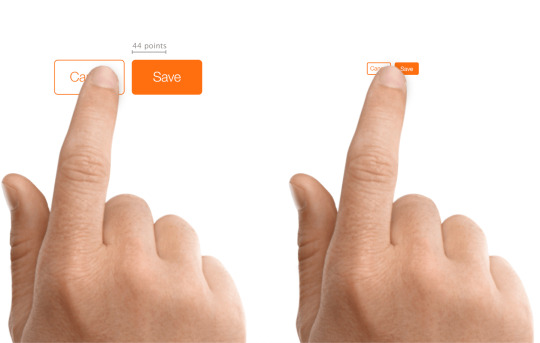
Pulled from the Hit Targets part of the UI Design Do’s and Don’ts web page.
Microsoft
Microsoft offers tips for touch targets in Fluent, its design system, as 7.5mm sq., or 40 × 40 effective pixels (epx) on a 135 PPI display, at default zoom. This was a lower from 44 pixels (epx), which was the Common Home windows Platform commonplace prior to the Windows 10 October 2018 Update (version 1809).
The web page additionally outlines what to think about as you measurement touch controls:
Frequency of Touches — think about making targets which are repeatedly or often pressed larger than the minimum measurement.
Error Consequence — targets that have severe penalties if touched in error should have larger padding and be placed further from the edge of the content space. That is especially true for targets which are touched incessantly.
Position within the content area.
Type factor and display measurement.
Finger posture.
Contact visualizations.
These sizing standards will not be brand new in Fluent. When you return to 2017, you’ll be able to see Microsoft advisable a minimum goal measurement of 60 pixels, or 11mm square, which included 2mm of padding to the subsequent target. Observe that right here it referred to targets, not touch targets.

Microsoft’s no-longer-current recommendation on the right track sizes, circa 2017..
Android
The Android Developer Guide recommends a minimum touch target of 48 × 48 system pixels. Unfortunately, this info is buried in the Accessibility section of the Greatest Practices portion of the guide as an alternative of alongside or embedded inside the documentation for constructing contact controls.
Google reinforces this sizing in the Net Fundamentals course in the part for accessible types. Along with noting that 48 gadget pixels is 9mm (which it asserts is the dimensions of an individual’s finger pad area), it also suggests an eight pixel hole between controls to attenuate mis-taps.

This image is from the Net Fundamentals course, not the Android Developer Information.
BBC
BBC’s Cellular Accessibility Tips are a set of standards for BBC staff and its suppliers when creating net or native content or apps. They defer to the Android and iOS platform tips for native apps and advocate a minimum 7mm touch target.
International Expertise Language (GEL) is BBC’s design system for all of its on-line presence. GEL recommends a minimum contact measurement of 7mm, with 5mm in special instances. For instances the place either dimension can’t be 7mm, then it mandates a 5mm exclusion zone. It also supplies these dimensions in pixels — advisable 44 pixels with a 32 pixel minimum, and for particular instances a 24 pixel minimum.

One of the examples out there on the GEL website.
Nielsen Norman Group
Nielsen Norman Group recommends a touch goal measurement of 1cm (0.four inches). NNGs touch goal article cites research of finger sizes, references Fitts’ Regulation, and shares a number of examples. It’s a good resource if it’s worthwhile to persuade others on your workforce of the significance of affordable sizes but who will not be interested within the platform tips nor the WCAG SC.
The article declines to offer pixel sizes. This is recognition of the variation of displayed physical pixel dimensions throughout units. That brings us again to the impracticality of holding a ruler to a display, not to mention holding a rule to each of a sampling of screens that correspond to your viewers.
Testing Reference
44 pixels may have totally different bodily sizes across units, even with no zooming applied. For example, 44 pixels on an iPad might be physically larger than 44 pixels on an iPad Mini, owing to them having the same pixel rely but in hardware with totally different display sizes.
You cannot be anticipated to seize a ruler and measure every system. You’ll be able to, nevertheless, create a reference field at that measurement and view it across units, evaluating it to the controls you’ve in your design and making certain they are at the least that enormous. I made a 44px reference sq. and embedded it under.
See the Pen 44px Square for testing 2.5.5 Target Size by Adrian Roselli (@aardrian) on CodePen.
Wrapping it Up
For controls that may be activated by touch, with a pointer a stylus, or another physical gadget, ensure they are giant enough to hit simply and have enough lifeless area between them to assist avoid mis-clicks or mis-taps.
Even if WCAG AAA compliance isn’t your objective, lean on the guidelines from locations who have been doing this some time and affirm those sizes work in your users of their contexts (akin to a pitching fishing trawler versus a front room Davenport).
44 pixels might be an excellent minimum, provided that it or a worth close to it’s persistently beneficial throughout specialists, requirements, and platforms.
The opening picture is from I Contact Myself by Divinyls, fronted by Chrissy Amphlett. In 2013 she died of breast most cancers and problems from a number of sclerosis and this track soon turned the anthem for the Australian breast cancer awareness challenge “I Touch Myself.” The U.S. Facilities for Disease Control has info on breast most cancers awareness.
Update: 10 June 2019
Shortly after posting, I used to be asked concerning the problem making footer links conform to WCAG 2.5.5. Patrick Lauke walks via a bit of the history of the SC and his final suggestion.
The overall argument I’m making is much less about WCAG conformance and extra about making a usable interface whereas leaning on the teachings of past analysis and tips. However principally, in instances like this, ensure a consumer can’t easily mis-tap the flawed thing however can still get to the factor you want.
Tags
accessibility, standards, usability, UX, W3C, WAI, WCAG
Other Posts
Earlier submit: A Model for WordPress Accessibility
Newer submit: Scraping Burned Toast
The post Target Size and 2.5.5
0 notes