#i have an order i want to post them in which is this: 1. slider 2. 1812 au 3. a third secret more boring thing
Text
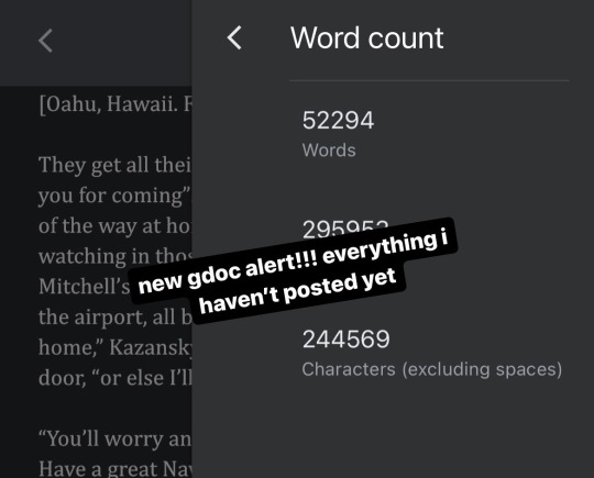

wip wednesday: the going is slow but the going is going
#i want to apologize that these are taking so long#i have an order i want to post them in which is this: 1. slider 2. 1812 au 3. a third secret more boring thing#4. drabbles pre-TGM mission (1989-2016) 5. drabbles post TGM mission (2016-2022)#which is a problem when im most motivated to work on everything that isn’t no. 1&2#1. stuuuuuupid shit. in case you were wondering what the ‘sprained wrist’ i alluded to in debriefing was#2. excerpt from the third secret more boring thing#3. your friends are by definition not your enemies so stop treating us as adversaries#pete maverick mitchell#tom iceman kazansky#icemav#top gun maverick#top gun#top gun fanfiction#also a problem is that the slider one shot could either be 10k mediocre words or 40k excellent words#i am aiming for 15k but i am truly sorry that i am incapable of writing concisely#and truly sorry these are taking so long
85 notes
·
View notes
Note
hii, megan! I hope everything is going well for you. I was wondering if you'd be willing to share how you created the gifs and images overlay effect in this /post/727210103698259968/scott-pilgrim-2010-lgbtqcreators-bingo pretty set? Have a nice day.
I will do my best!
First and foremost shout out to @nelsonnicks Norah whose beautiful gif set here inspired me!
In order to make this as succinct but also thorough as possible, there are some assumptions this tutorial makes:
We are working in photoshop
You know how to make a gif using photoshop
You know how to use the timeline feature to make/edit gifs
Okay let's learn how to make this gif:

(Due to Tumblr's image number limitations, there is a PART TWO linked where I add that "item" and gif, which you can find by clicking this entire sentence.)
STEP ONE: The Image Overlay
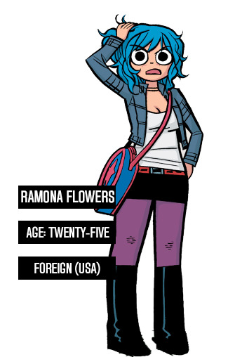
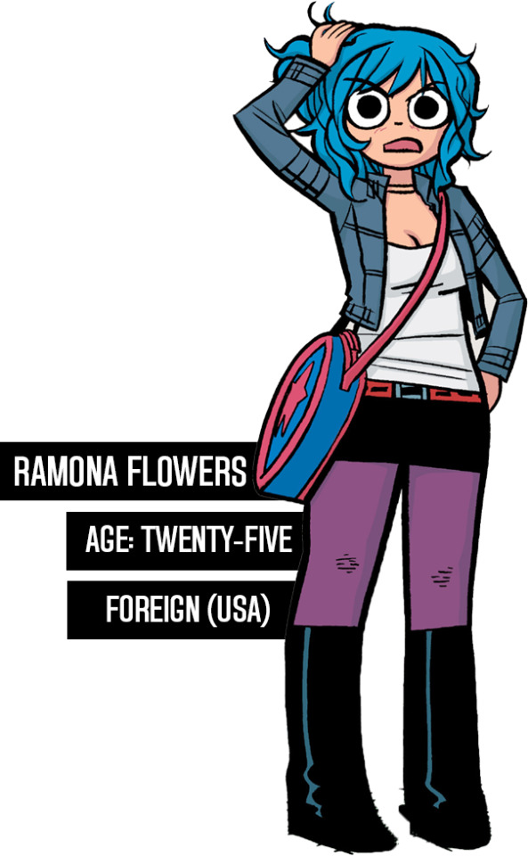
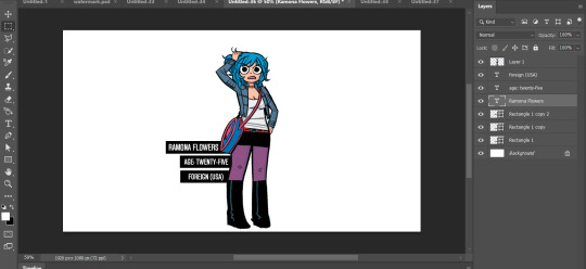
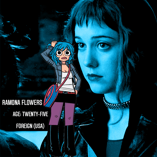
Pick your image! Here's the one I've picked, I cropped a page of the graphic novel:

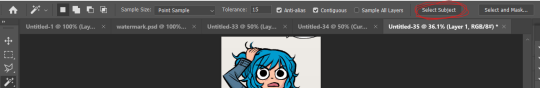
From there, I'm going to click on that magic wand tool:

And select subject (crudely circled for emphasis)
If it's not perfect, you can either use the quick selection tool to refine the selection before or continue on with these steps and use the eraser later. I do both, but it's up to you.
Now I have a lasso around the subject, and I'll click that "Select and Mask" button next to "Select Subject"
Now I can see what my lasso'd image looks like against a white background, and I see that it's pretty good, nothing I can't fix with an eraser if I really want to later.
If the image looks rougher than you were expecting, use the SMOOTH option and play around with that slider.
If it looks a bit more smooth than you wanted (not clear defined lines where you were aiming for clear defined lines) use the CONTRAST option and play with that.
And if you wanted a little more or less around the edges, you can use the SHIFT EDGE tool to grab like 1px-ish of additional space.
Anyway, I like what I've got, so I am gonna CLICK OK
And I'll either cut or copy it onto a new file, and throw away my scraps.
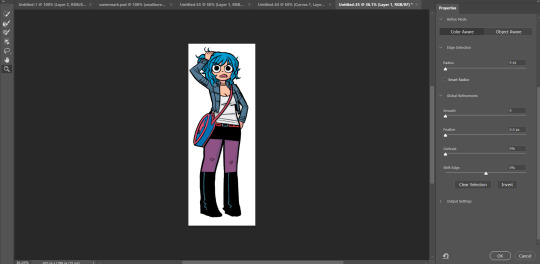
Now it's time to add my character details! I'll use the same format I did for the original set here, and create 3 equal-sized rectangles using this lovely shape tool tool:

So my working file now looks like this:

I move the rectangles closer, I'll want them behind the image of Ramona after but here's just what it looks like while I'm adjusting them.

Then I add the text:
Now, it looks like when I put the bars behind her it'll cut off her name! I don't want that, so I'll adjust the side of the bar for her name and scoot it over....

Nice!
Now I'll adjust those layers to be closer together and behind Ramona...
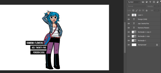
And this is what my screen looks like now!
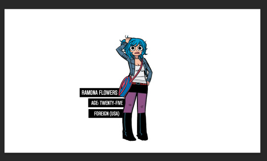
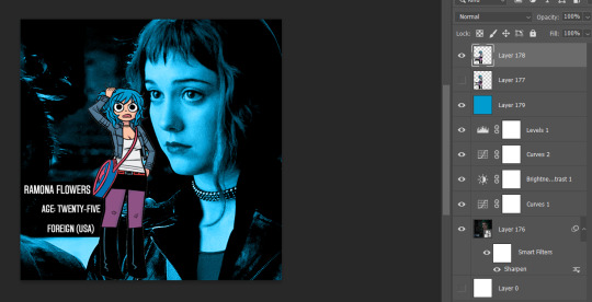
It looks how I want it, so now I'm gonna merge all of the layers EXCEPT the background layer. This makes it so the part that's merged has a transparent background.
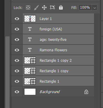
Highlight the layers, right click, and find the "Merge Layers" option
And now it looks like this:
Step one COMPLETE. Great job. Have you been drinking water? It helps you think clearer. Or something.
STEP TWO: Make the gif you want. Sorry I'm not doing this step-by-step it would be so long I'm sorry!!!
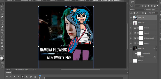
STEP THREE: Put Ramona on the gif!
So I just use the selection tool and make a square around my bestie Ramona here to create this:
And then paste her right on top of my gif here:
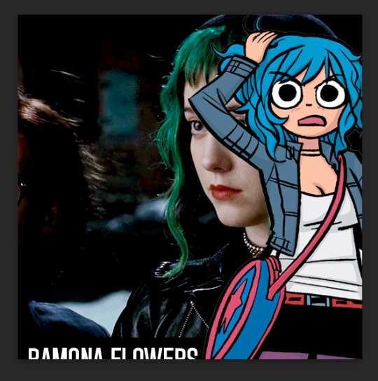
Woah! She's ginormous!
Let's resize her by hitting CTRL+T....
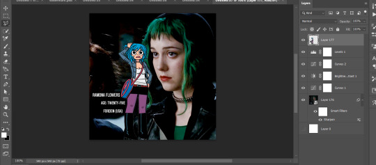
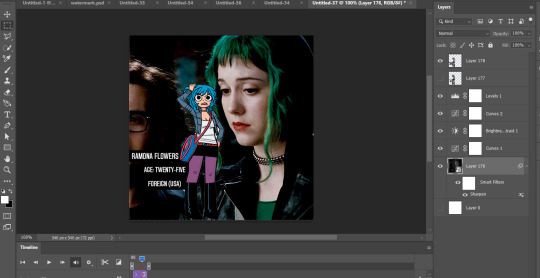
This is where we get a little creative. Personally? I think the font is legible, but doesn't look nice now that I've resized it. So I'm going to back to the original file and UNDO my last action (merging the files):
And hit CTRL + T on the Ramona layer (Layer 1 pictured) and adjust her size:
Time to merge these layers again, and redo the process:
MEGAN SHE'S LARGE AGAIN! I know, I'd rather work with big files I have to make smaller than small files I have to make bigger. Sue me.
Resize the layer, make any adjustments to the gif you have under it in terms of placement/size:
And WHEW we got this part done.
STEP FOUR: Add color overlay
I'm gonna make her color overlay blue like her cartoon hair, so I'll eyedrop tool her hair:
Go to Layer:

Add new, and then using a regular brush at like 5000px just click onto that new layer, and...
Bump that layer under your Ramona cut-out,

Go back to the layer drop-down menu, and select Blending options...
And this little menu will pop up:
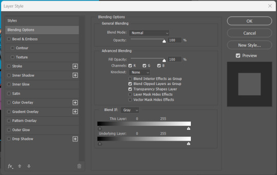
MAKE SURE YOU HAVE THE PROPER LAYER SELECTED FOR THIS. Otherwise you're going to be very confused.
See where it says "Blend Mode" and it has a drop down under normal? For these purposes, I'm gonna use the drop down and select COLOR:
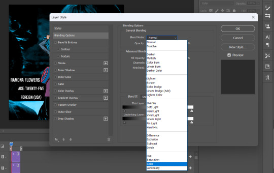
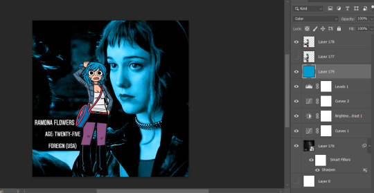
Now you can see that all-blue layer in the background now is showing the original gif behind it, but you know your original gif? "I know of it." It's all blueee. /ref
This is what it should look like:
Before I go any further, I'm going to check my timeline to make sure this is covering the WHOLE duration of the gif:
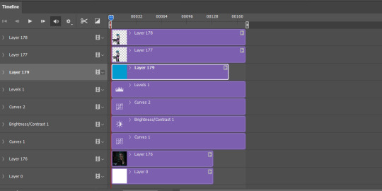
It does, so let's drag that bar on the right to line up with the end of the gif:
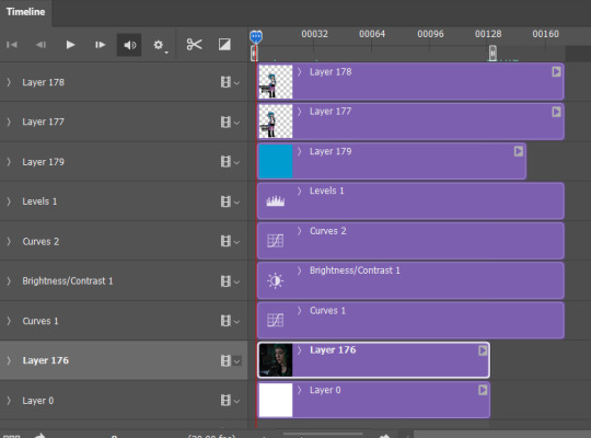
All fixed!
So now we've got this:
Oh man! See those white spaces between her arms? I'm gonna go back and fix those now, fortunately I can edit it directly on the full file itself, by just editing that layer.
Using my magic wand tool, I'm selecting those white spaces between her arms and her jacket and deleting them-
She's not perfect but you can always be nit-picky and zoom in really close and refine with the eraser.
PART TWO
#answered#Anonymous#usergif#userairi#usernorah#userbarrow#userhallie#usercats#tuserheidi#tutorial#gresource#gif tutorial#pscentral
45 notes
·
View notes
Note
I gotta know, what is your writing process? Is there a specific mindset you get into or can you just write anywhere? take me through the process please:)
Hey there! Okay, wow, so. I'm going to attempt to answer this without sounding like a lunatic. It's going to be long so I'll put it under the cut for those of you who want to move on.
First, my actual writing process, which is mostly planning.
The first thing I do is decide how I'm ending. I'm a work backwards kind of writer, probably because I'm a teacher and that's how we plan, the first thing we decide is what we want them to know. So in writing, I always decide, "How is this going to end?" and write that first. I've had the final scene of I'll Ride in my google docs since about 3 hours after I saw TG:M for the fourth time (I saw it 12 times in theaters, hence the lunatic comment above, but I digress).
Once I know how it's going to end, I decide, who are the characters? Where is the setting? What is the conflict going to be? Once I have a vague idea of that, I start my google doc for my outline. Since I write both POVs, I do three columns:
chapter number
POV
main scenes / summary
I'm not someone who writes out every little thing in an outline. Just to give you an idea, here's the summary for chapter 8
title: that fear that’s inside you will lift, give it time
-Ice & his fam vs. The Colonel Who Is An Ass
-Sarah is a gem and already knows he’s gay and loves him anyways because, she’s A Gem™
-ice talks to Pete on the phone after dinner, listens as Mav and Bradley read the dinosaur book to him
-ice goes to the o club to see the boys and is all ‘yo maverick is fucking struggling also we’re all adopting bradley’ and the boys go ‘aiight cool bro’
-slider pins him against a building and is like “so how long have you been fucking mitchell” and ice is like ‘fuck off ronnie’ and ronnie is all ‘ice for fucks sake how stupid do you think i am i don’t give a fuck if you like dick i know you’re in love with him i’m not an idiot’ etc
-He checks out books after Mav’s panic attack on how to help with trauma
So as you can see what I had in my outline isn't exactly what happened, it's basically just "which scenes do I want in this part". I don't write them in order I just kind of write the main things I want to happen, the scaffold if you will, and then I build the house. I usually go through 2-3 drafts which is why it sometimes takes me a long time to post. It's a 4 step process.
+ decide the scenes I want to see
+ write the main scenes
+ put them in chronological order in a new doc
+ go back and fill in details to connect the scenes together
I'm a very visual person and I have a gift of being able to read something and play it like a movie in my head while I'm reading. It's actually called "visualization" and lots of people can't do it which is my theory why they hate reading but that's whole other conversation. The point is I make the movie in my head, but I pay attention to - where are they? What are they doing? How are they moving? Where are their hands? Ice picked something up, now he has to put it down, where is he going to put it down, how, when, etc. I call it setting the scene but I don't know what it's actually called. As a reader it annoys me when I have no guide on what they're doing in a scene so I try to include those details just because it's easier for me to picture it and I hope it's the same for my readers.
Sometimes my brain decides to do other scenes and I'll add those in as I go. Sometimes my chapters get too long and I have to shove scenes down into the next chapter. It all lives in my google doc so I can keep track. When I'm working on a chapter I will just highlight what I've written so I can see what I still need to write.
Once it's written, and I think this is the most important part, I go back and reread. The whole thing. Start to the end of my new chapter. I check for:
1. am I following my own canon
2. do I have a plot hole on accident, and if I do, I have to fill it
3. do details match (like descriptions)
4. does it flow
Sometimes I don't like the flow and that's why I will scrap sections and rewrite them to get more in the headspace of whoever the POV character is. This is extremely difficult for me to do with Ice, he's the harder of the two to write and his chapters take me a life age. I've straight up had Mav's chapters done for over a year. It's the Ice ones I'm working on now. Some of the later chapters will have both POVs just because Ice is so hard for me right now.
Once I have it done I send the link over to my beta. She's great and gives feedback on scenes etc. (Love you mtnofgrace!) and helps me to check that it makes sense / is in character / etc.
Then, I post! I can write pretty much anywhere, and I get into the writing mood by listening to the Top Gun soundtrack mostly. Or just rewatching one of the movies if it's been a while since I've written. Some days I write nothing and others I crank out thousands of words, it just kind of depends on if my muse is flowing. Listening to asmr Top Gun youtube videos with the music and jet noises helps me focus that's what I usually listen to while writing.
Hope that answered your question!
12 notes
·
View notes
Photo
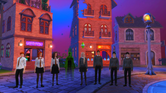


Golden Trio + Silver Trio (+Myrtle)
I downloaded Harry Potter sims! I’ve given them makeovers with CC I’ve been collecting, but I did not make these sims myself! Sim credits under the cut:
Ron is from “Weasley family” by Mikka3 on the gallery!
Ginny is also on the gallery, her household name is “Ginny weasley” by Lasanie4
For Ron and Ginny I looked for Gallery versions that I think look more like how I envision these characters based on the book descriptions. I was never a fan of the casting choice for them. They need to be 10% cooler.
All the other characters I found are based on the actors, though! I was happy with the rest of the movie casting~♡
Hermoine is by SirSIM on the gallery, her household name is “Hermione Granger Wizard”
i changed her hair to be one of the super curly ones from island living
“Moaning Myrtle” is from the gallery as well, she’s made by TheSimEmporium
And she’s my favorite minor character! When I was a kid I dressed up as her to go to the Midnight Book Release Party at Borders for Order of the Phoenix! 🤓
i had recently gotten glasses that year... 😅
Luna Lovegood is by @kamiiri (and IMO this is the BEST Luna EVER, she looks so good!~♡)
https://kamiiri.tumblr.com/post/640343196544679936/ginny-neville-luna-download-i-love-these
You should also check out Kamiiri’s Sim Collection, she has a lot of pop culture & celebrity sims and they look so realistic while still being Maxis Match! Her sims are just the best! The only reason I didn’t download more of hers instead of gallery finds is just ‘cuz I don’t like stuffing my game with tons of sliders. But it was def. worth the CC explosion for Luna! She’s my #1 favorite character! 💖
https://kamiiri.tumblr.com/my-sims
“Neville Longbottom” is by NetsFantastico82 on the gallery!
And then I have both a Book Harry (Maxis Match) and a Movie Harry (Alpha). He was my first ever childhood crush so yes this was necessary to have both. 🤣
Alpha Harry is by BAkalia on The Sims Resource!
https://www.thesimsresource.com/downloads/details/category/sims4-sims-male-teen/title/sim-harry-potter-arcaneillusions-tsr-only-cc/id/1562006/
Make sure to tab over to the “Required” section to see all of the CC used on the sim! You have to download all of them separately unless you pay a subscription for TSR. (which i don’t so i just dust off my Sims Mobile while i wait...)
BAkalia also made Alpha versions of Ron and Hermoine too! And the Required CC in Hermoine’s section will get you her Yule Ball dress! (which I def. downloaded!)
Alpha Ron:
https://www.thesimsresource.com/members/BAkalia/downloads/details/category/sims4-sims-male-teen/title/sim-ron-weasley-inspiration-arcaneillusions/id/1561880/
Alpha Hermoine:
https://www.thesimsresource.com/members/BAkalia/downloads/details/category/sims4-sims-female-teen/title/sim-hermione-granger-inspiration-arcaneillusions/id/1561886/
(oh they have Alpha Voldy too)
https://www.thesimsresource.com/members/BAkalia/downloads/details/category/sims4-makeup-male-costumemakeup/title/lord-voldemort-head-and-skin/id/1622383/
https://www.thesimsresource.com/members/BAkalia/downloads/details/category/sims4-clothing-male-teenadultelder-everyday/title/you-know-who-s-robe/id/1622382/
For Maxis Match Harry, I actually took Alpha Harry, used it as a base and edited the sim myself. So I actually made this one! 😊
And then last, but not least, is my favorite Hogwarts CC Uniform that I found!
Kiro_Hogwarts uniform set (remaster) +Kids version by @thisiskiro
https://thisiskiro.tumblr.com/post/637610382697037824/kirohogwarts-uniform-set-remaster-kids
I can make a more detailed CC post later if y’all want one from me, but all the Harry Potter CC I’ve been finding & loving have been reblogged on my CC blog @sheepyshenanigans with the tag #hogwarts
https://sheepyshenanigans.tumblr.com/tagged/hogwarts
#sims 4#ts4#sims 4 cas#ts4 cas#create a sim#simblr#fantasy save#hogwarts#wizarding world#wcif#harry potter#hermoine granger#ron weasley#ginny weasley#luna lovegood#neville longbottom#moaning myrtle#golden trio#silver trio
32 notes
·
View notes
Text
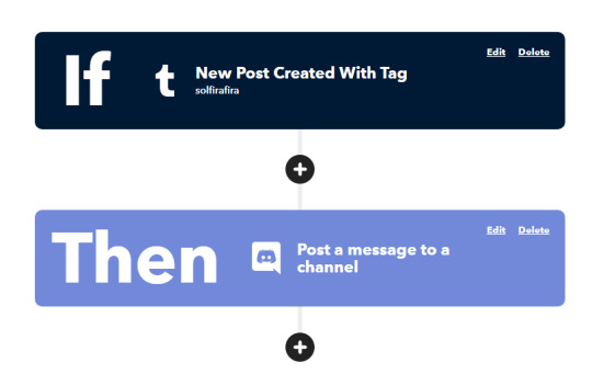
Make Your Life Easier
and take some time this weekend and follow these steps to make sure you don’t need to do more work than needed with the IFTTT tool :>
Summary: Post teaches you
1. How to automatically make a video embed post on tumblr everytime you go live on twitch, and
2. How to keep your discord community updated on your tumblr activities so that they’re not missing out!
FIRST
if you’ve never used IFTTT before, here’s a quick refresher!
IFTTT stands for If This, Then That. Basically, it’s a no-code way of telling platforms what to do and how to do it so that tasks are accomplished without you ever having to think about it.
There are two sections to this:

Naturally, If This runs first.
Then That runs next.
Both of these sections can be any platform action that IFTTT supports. In our case, we want Twitch, Tumblr, and Discord to be supported. Thankfully, it does!
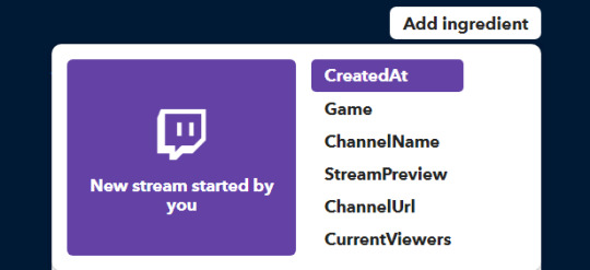
Ingredients are a core aspect of IFTTT and they represent the various elements of the specified platform. If you click “Add Ingredient” you can see the range of options to choose from and customize. In regards to Twitch, this would be things like when the stream started, what game’s being played, the channel name, etc. All these things are considered Ingredients which are used in your “recipe” to create the final result.
Let’s put this into practice and start with our first example:
Twitch to Tumblr
Here’s the command I’ve created:
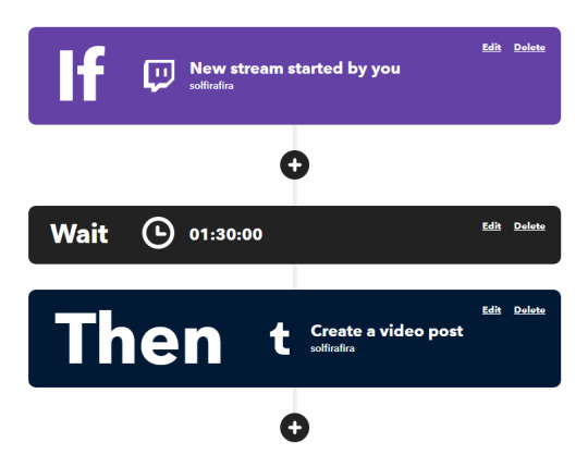
I’ve set this up so that everytime I go live on twitch, I want it to make a Go Live post on tumblr without me ever having to log into tumblr and make a post mid-stream.
I’ve also set mine to wait 1hr30 before posting because I like to chat with my viewers for a bit, y’know catch up with them etc. before jumping straight into the game but that’s just me.
The twitch section is self-explanatory. You just connect your twitch account if you haven’t already. There are other scenarios here so feel free to experiment!
.
As for the tumblr section..
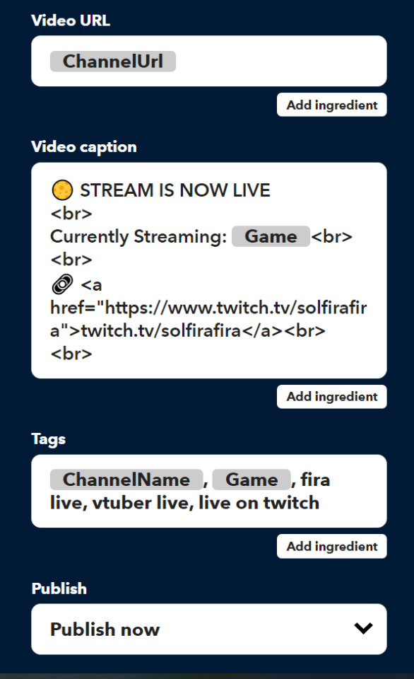
As you can see, HTML is accepted in the caption section so if you wanna jazz it up even more, feel free! For me, I didn’t like that ChannelUrl would post an ifttt link so I forced it to include a direct link to my twitch channel instead.
That’s about it for that applet. Just make sure the little slider shows as Connected and you’re good to go!

NEXT..
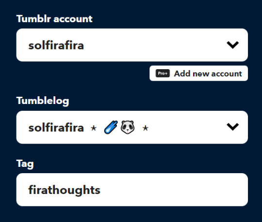
Tumblr to Discord
Method 1

The link: https://help.tumblr.com/hc/en-us/articles/4421081082775-Discord-Webhooks
Method 2
So what I’ve done here is a basic command where I’ve specified it to only post in a specific discord channel when I textpost on tumblr with a specific tag in order to avoid spamming it with countless reblogs. Basically have it act as a second twitter so my community can keep up with the essentials!
This is how I’ve set up the tumblr section, note the specific tag included:
And then here’s how I set up the discord section. I will say it was tempting to include other things like PostTitle and PostTags so do note those options and more are available to you (by clicking Add Ingredient), but for my purposes I felt less was more in this circumstance:
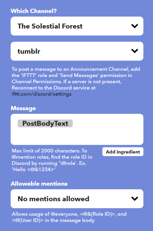
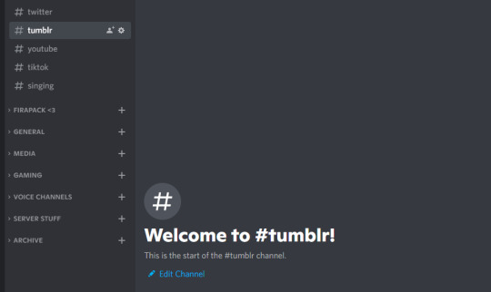
This is what my #tumblr discord channel looks like:
And you’re done! Just like the previous applet, make sure the little slider shows as Connected and you’re good to go!

#ifttt#vtuber tips#vtuber resources#vtuber uprising#envtuber#fira tips#twitch to tumblr#tumblr to discord
111 notes
·
View notes
Text
Sounding performant
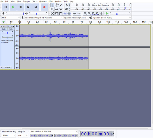
I had a late night last night tweaking things and getting a bit carried away with all-things audio.
There's quite a lot to cover from those developments, and there's some nerdy performance-related discussion later further down - so skip past all that if it's of no interest!
For now, here's a quick look at some of the work done on the audio system:
Now with sounds and music!
I spent a while working on the audio system for the game. This included setting up a bunch of initial sound effects for various things. Chief amongst these are the UI sounds - something I'm always really keen on getting right (I haven't yet added any audio to main menu screen yet though).
I've always been a fan of more understated audio feedback. Whilst it's nice to have solid, heavy-sounding call-to-action feedback in certain games, for games like this where you're continually interacting with the UI, I prefer to aim for very short clicks and pops.
I also wanted to get two other main things sorted out - the ambient background loop and some sort of music jukebox of sorts (nothing the player can see, this is an internal thing). The ambience is a kind of airy, factory-esque soundscape I discovered whilst hunting for loops, and I trimmed out a nice portion for a continual ambient loop.
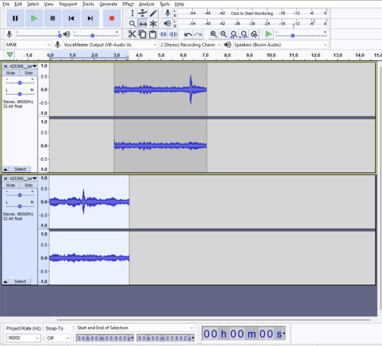
How did I make a non-looping sample loop?
I discovered a neat trick some years back to loop any audio sample seamlessly. It's a similar trick to how you create seamless repeatable textures (in a weird kind of way).
Open up the sample in your program of choice. In this example I'm using Audacity.
2. Cut the sample in half from somewhere near the middle, and paste it onto a new track. Move the first half you just cut to begin almost as the second part ends (below they're arranged so that the first part begins about 1 second before the last part ends).
3. Fade-in the first part, and fade-out the last part by as much as the overlapped section (in my example they overlap by about 1 second, which is what I set both their fade in/out durations to):
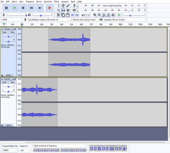
And that's it! A perfectly looping sample! You can move the first track to start a bit earlier if you want to make the blend between them a little more balanced. For me, this strategy has worked countless times.
Music management
I discovered some nice royalty free, CC BY-SA licensed audio and music which I can attribute in the game's credits screen. I set up a background music randomiser so that it'll shuffle all the audio tracks and play them in order at a fairly low-key background volume.
The game has four primary audio mixers - effects, ambience, music, and master. The latter controls all the others, but having separate channels for each audio lane will let me add sliders that the players can control the levels of each. Something I'm sure players appreciate for their specific tastes.
Beyond this I had to spend some time setting up a global audio singleton (for easy reusability elsewhere in the game), and a lot of time in Audactity trimming and normalising a bunch of sound effects. The net result of all of this is in the video I linked earlier.
The big performance discussion
A few posts ago, I talked about the importance I attached to making sure the game was performant. In games where you allow the player to effectively build whatever they want in moreorless unlimited numbers, performance becomes a tabled issue before too long. It's also something worth considering as a matter of principle when developing a game, because not everybody will share the same specifications of your development machine.
I'm developing this game on a PC with an AMD Ryzen 5 3600 and an nVidia 2070 Super. Not exactly 'prime gamer' specs, but maybe a bit higher than some folks who might want to play the game. Therefore, shooting for a decent level of optimisation is an important element for me.
I'm not trying to run the game on a potato or anything, but I'd like to ensure I'm making some basic optimisations if nothing else.
Stress testing
One of the best ways I've found of testing the game under load is to simply scale everything up. More objects, more running logic, more rendering. The works.
To this end, I created a stress testing class which I can just switch on in the project.
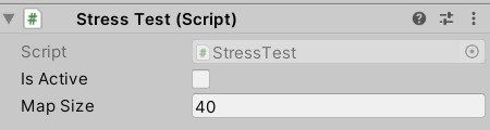
I've found that my current default map size of 40 allows for a pretty big factory, though the player may have to work up to that size initially. 40 feels like a good maximum, but why stop there? I want the ability to test the game at an arbitrary size - even far exceeding what I ever envisage it to be used for.
I find that the more you scale up, the easier it is to spot glaring problems in either the code or the rendering. To this end, I decided that the main likely culprit of code slowdowns would either be my belt logic, or my machine loop code.
To get started, I first needed a benchmark to test against.
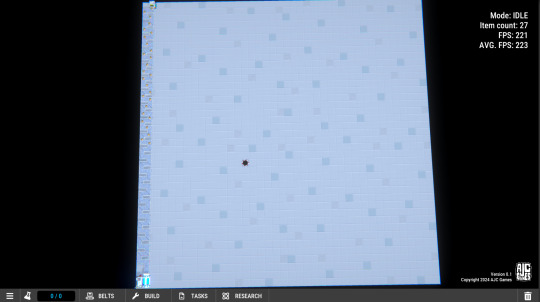
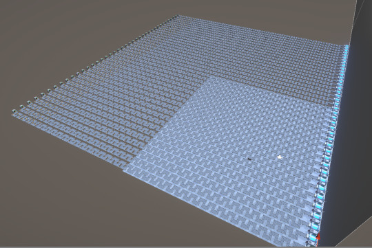
Here is what the game runs like with absolutely nothing loaded into the level. Predictably, with no loaded machines or belts, and no logic being processed, it runs pretty fast as an empty level:

The test structure
When you enable the stress test, the game doesn't load a previous level, but instead lays out a level structure in an algorithmic format, following some layout rules and placement logic.
I first create a routine that adds an extractor against the edge of the level, then places down the maximum density of belts to reach the other size of the map - which is a zig-zag pattern. In order to get a couple of machine's worth of processing out of this layout (and to make sure it actually functions as a factory line), I drop an Analyzer on the end of it.
It looks something like this:

Then, I simply repeat this for every odd-numbered column in the level, and you then end up with this monster:

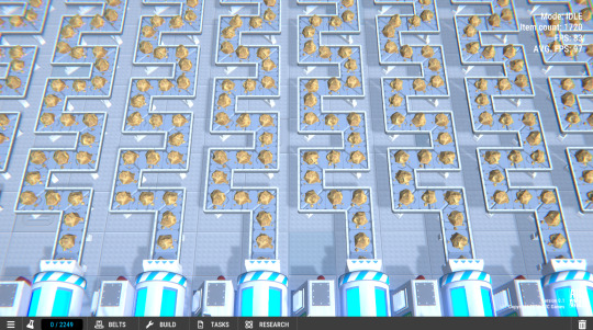
That is moreorless the maximum number of things you can put in a 40x40 level. Rather a lot.
Crucially though, this is where I can start looking at the raw numbers and see where my performance bottlenecks are.
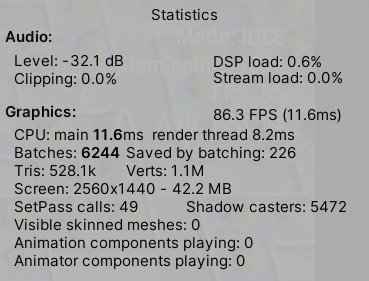
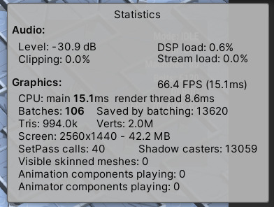
Immediately I can see several problems.
There are way too many Batches being handled, along with a ludicrous number of Shadow casters. The render time of 11.6ms is both unsurprising and a little disappointing.
But this is without any optimisations having been made. So I can move straight on to the obvious things: static meshes.
There's thousands of items in this stress test, all being updated. But lots of things (machines & belts) never move and never rotate during the game once they're placed. You can combine these into static meshes to improve draw performance, along with allowing their materials to be GPU instanced to combine them together into single draw calls for each shared material object.
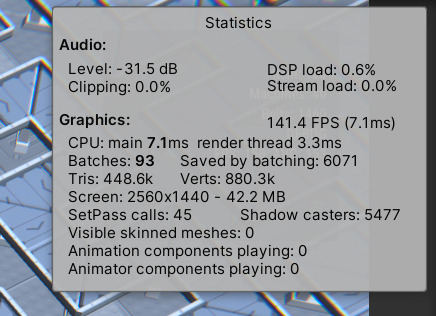
The effect is immediate, and almost doubled the average FPS available in this stress test.
I continued on, tweaking things like shadow complexity and removing them completely from some objects that didn't need to cast shadows at all. After a bunch of optimisations I had managed to get a stabilized average frame rate of around 180 fps.
There are definitely logic improvements I could make, but after running a lot of profiling on the game I was starting to make only tiny sub-millisecond improvements to the frame time.
After all my tweaks, I decided to go all-out and double the stress test map size.
I was plesantly surprised at how well it ran. If nothing else, it showed how well the belt code was working under such immense load.
Again, I should stress that there is no way there will be a need for 80x80 factory sizes, at least not in my current plan for the game. But it's nice to know that I'm still getting over 60 fps even at that extreme level.
Going above and beyond 80x80 footprints for a level would likely require some re-thinks about how I collate and render the level entirely. I'm convinced I can still do a lot of work about these shadow casters, but I'll need to do some research there. Shadows are notoriously expensive in graphics processing, so I'd like to fully understand what's going on there and mitigate it as much as possible. I expect I can make some additional gains to the FPS when I do so.
Anyway, that's about all I have for this one. I hope you enjoyed if you made it this far, and sorry it was such a long one. Hopefully you have a great day, wherever you are!
2 notes
·
View notes
Note
Hi, I really love your andor gifset from September 28 2022 (idk if I can post a link so... but it's from the first episode) and I was wondering if you could maybe give me some tips on how to make it so clear and vibrant even when the picture is big? I have just started gif-making a few days ago and I definitely want to aspire to make such great gifs.
Hi there!!!! Firstly tysmmm 🥺 i really had a fun time making those big gif andor episode sets i think they all turned out great!
I did make a tutorial a while back mostly focusing on how I sharpen my gifs. My steps mostly the same as they were here except I now export gifs using "adaptive & diffusion"
The Andor gifsets you called out I did use 4K SDR videos. But I don't always think 4K is necessary (especially where r we gunna get them now rip rarbg), 1080p is always preferred and if you're d*wnl*ding / t*rr*nting i would recommend trying to pick the larger file size, for example choosing a movie thats 5GB over 1.5GB.
In my last tutorial I didn't really go into how I colour my gifs but that's where the biggest changes come into place. I don't use a set preset/psd, I colour each gifset uniquely but I do have the same order of steps generally. My order of adjustment layers tends to be: Levels, Curves, Selective Colour, Vibrancy. I also frequently use Channel Mixer and Hue/Saturation when needed. Below the cut I'll share my "starting" settings for some of the adjustments layers but these often change as the gif needs.
I hope this is somewhat helpful!! I think with practice and more gifing you'll find your own style and process. I look back at gifs I made a year ago and think oooof haha what was I doing back then. constant improvements & always finding new tricks♥️ I would also recommend following some gif resources blogs like @usergif or @pscentral they often post really helpful tutorials & tricks to help make your gifmaking the best it can be!
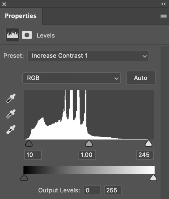
Levels - I tend to start with the default "Increase Contrast 1" or "Increase Contrast 2" depending on how dark the intial scene is. When making aditional adjustments I focus on the end sliders - the dark & light, and barely ever touch the midtones adjustment, if i do use it I go very subtly so 1.05 or 0.95. Our goal in the end is to make the darkest parts of the gif black & the lightest parts almost white.
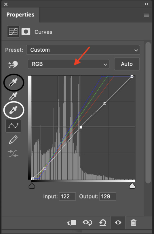
Curves - imo curves makes the biggest adjustment for the gif colouring. shes my best friend! So again I focus on the dark/light eye droppers. I start with the white eyedropper and select something white or the lightest part of the gif, then go to the black eye dropper selecting a very dark portion of the gif. Then in the middle section I adjust the curves line (white line) to meet the needs of the gif for proper contrast / brightness. If needed Ill open the RGB drop down (red arrow) and adjust specific colours. I use the Blue the most as i often see alot of yellow tint in movies (which i hate lol) so ill bring the top end of the blue line closer to the centre of the grid to reduce the yellowness. Sometimes ill make a second curves layer, set the preset to "linear contrast" then adjust the sliders as needed, this often gives additional contrast & brightness.
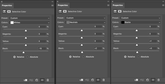
Selective Colour - my second best friend! this is where you can make little adjustments to the hues of the gif, then fine tweak the darkness/brightness in the gif. So below i have my "starting points" in the white, natural & black colours. Often the white ends up being a much lower number (-40 or less) and in the neutrals area i can fine tune the overall hue of the gif - reduce the yellows or increase the reds etc. This tool is alot of playing around with and just seeing what looks good!
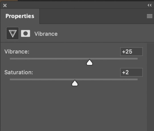
Vibrance - this is normally the last layer ill add. I barely change the settings I tend to go with 20-30 Vibrance and then 2-5 on Saturation. Just gives add extra vibrancy and colour pop. Saturation stays a bit on the lower side as often bringing it makes peoples skin tone too orange/red/yellow etc. But if I want over saturation increase on particular colours I'll make those adjustments with a Hue/Saturation layer.
10 notes
·
View notes
Text
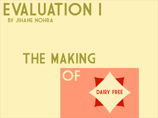
Evaluation 1
Conventions and Narrative
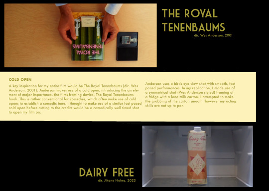
My narrative follows a vengeful girlfriend exploiting her boyfriends allergies after he has wronged her. In my study of the black comedy, a convention I identified would be a misleadingly light opening in order to juxtapose the darker themes present later on. My film adheres to convention as it follows the same format, however the dark humour becomes present within the intro, specifically halfway, whereas others wait till either the end or the next scene. This will likely come as a surprise to the audience as it is not conventional to appear so early on.
Camerawork and editing
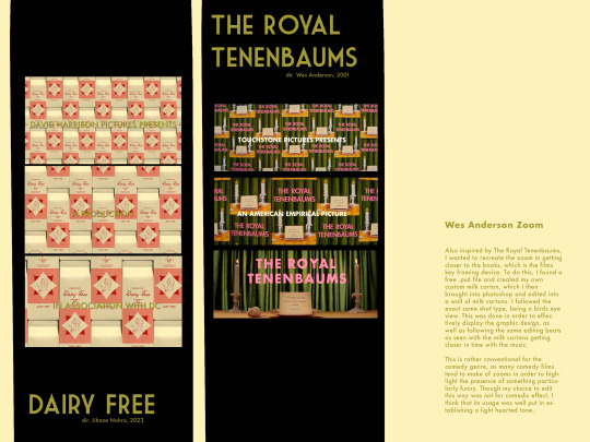
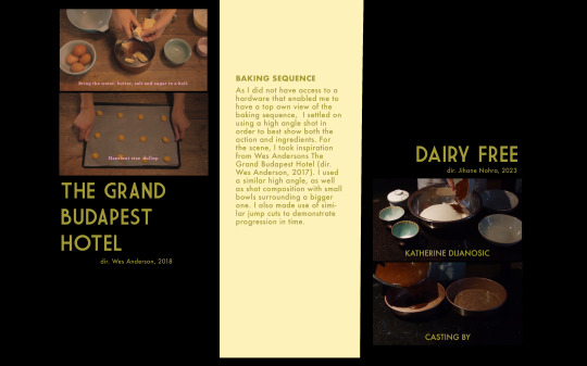
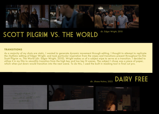
The use of camera is relatively simple with minimal movement throughout my film, as I only made use of a tripod and slider. This relatively fixed setup is rather unconventional for comedies, which are typically high energy and demand a lot of camera movement, especially with the recent trend of handheld in comedy with shows such as modern family and the office. To add dynamics to my film, I used masking to make text appear and disappear as well as transition from one scene to another. I also used fast paced editing as seen in the baking sequence.
Lighting
The lighting in my film changes drastically throughout each sequence. It opens with high key lighting, and goes into low key, chiaroscuro during the baking segment. It was a stylistic choice to keep the kitchen the darkest as it is where the protagonist makes her death cake. My sequence ends by going back to high key lighting, ironically, when the boyfriend is killed. Most black comedies adhere to the cinematography of standard comedies, as dark humour is often shown through character and dialogue rather than cinematically through film language.
MES
MES was an important element of my film. I wanted the colours to be bright and warm to contrast the dark tone. This was accomplished largely in pre and post production by making custom graphics, as well as by turning up the saturation in final cuts built in colour grading program. I wanted my fonts and titles to be complimentary, and thus decided on a warm green. This is typical of black comedies in recent years, with black comedies almost becoming synonymous with satire, and thus have exaggerated set pieces and dressing. The order of credits follows an almost identical trajectory to that of "Panic Room" (dir. David Fincher, 2002)
Representation
My Film only contains two characters, that being a girl and boy. Based on the homely location, and clothing choices such as watches and jewellery, it could be determined that they are both relatively well off people with enough spare time to share a meal together. The representation of the female character, Faye, is one of having feminine rage. Characters that harbour said quality are female and enact revenge on those who have wronged them, often by violent means. However, this previously unconventional representation of women has become. Niche trend, specifically in the indie sphere of filmmaking. Her choice to murder explores the theme of immorality, and how audiences engage with it. Especially with how now more than ever, media can create sympathetic villains, such as the likes of Walter White
1 note
·
View note
Text
Reduce picture file size lightroom 6

#Reduce picture file size lightroom 6 how to#
#Reduce picture file size lightroom 6 pro#
#Reduce picture file size lightroom 6 software#
To import them to another catalog you need to use the option File -> Import From Another Catalog. Make sure you are using the best quality possible for your photos without constantly worrying about file size or.
#Reduce picture file size lightroom 6 pro#
JPEGmini Pro Reduce file size, not quality. It prints the same, looks the same and the client gets the same image.' Ning Wong. I can get a great image in a smaller file size. Thus, you export photos you have chosen as a catalog. It just plugs into Lightroom and it does all for me.'. If you want to upload photos to a different Lightroom catalog preserving all labels, processing, keywords, location information - you need to use the option File -> Export as Catalog. Color Space - if you have not calibrated the monitor, select the sRGB profile, if calibrated, I think, I don't need to explain this to you. To make your colors on the photos look the same in Lightroom and the Internet, you need to work in one color profile. Make a Photoshop file smaller by optimizing the. Flatten layers in Photoshop to reduce the file size. Decrease the file size by making layers invisible. Add a white layer in Photoshop to shrink large files. On the other hand, JPEG is a compressed file format which slightly reduces image quality in order to provide a significantly smaller file size. If you want to learn more, scroll down and well get more into it. The quick and dirty way - Select the shots you want to crop in Grid, and then in the Quick Develop panel on the right, pull down the Crop Ratio.12 posts In lightroom, I want to make sure that when I am cropping pictures I dont overcrop them.
#Reduce picture file size lightroom 6 how to#
Reduce one side of your photo up to 1024 pixels and put the slider Quality on 80%. Here are 14 tips and tricks on how to reduce your file size in Photoshop. However, here’s a tip that not many Lightroom users know about.
#Reduce picture file size lightroom 6 software#
Since I came across the fantastic image compression software JPEGMini, I thought my JPEG sizes couldn’t get any smaller. You should use a panel Image Sizing for that. 2) Reduce the Size of your JPEGs (for free) This tip can be used on its own, or in conjunction with tip 1 for further file size savings. If you want to post a picture on social networks or other services, I recommend you to change the size of the photo. If you want to reduce the size of the photos slightly, you can set the "Quality" on 80%, it's undesirable to reduce below 70%. To maximize the quality use "Quality" with a value of 100%, the Sizing while panel remains inactive, the output sharpening is turned off. Here are a few more of the commonly used cases: Hope, you have understood how to save in Lightroom :) Small automation of actions can be also applied after export:
0 notes
Text
How to remove virus from iPhone
Hello guys, welcome to my publication. If you haven't subscribe, like or join this publication, please do that now before you continue reading. In this post, I will reviewing to you simple step by step methods you can use to get rid of viruses on your iPhone.
But before that, what are the signs that identifies iPhone has a virus? The first sign you will noticed is sluggishness. Your iPhone will begin to work slowly which is very annoying. Secondly, you will notice some apps are malfunctioning on the device. There are lots of signs iPhone gives when it's affecting by viruses.
I know it's very annoying when your iPhone work slowly, as every iPhone users loves their iPhone working very fast, so when your iPhone start to act sluggish or weird, you should assume something is definitely wrong.
However, it's rare an iPhone get virus. Numerous things can be considered when iPhone act sluggish or weird apart from viuses, some of them are browser and app cache and cookies.
These two memories can cause your iPhone to work slowly when they are full, so it's very advisable to clear your cache and cookies before jumping into conclusion of virus.
Like I said earlier that this post contains how to remove viruses on iPhone, there are some sub-topics I should explain but because of time and some people might have know more about it, so I decided to omit that here. However, you can go-to this page to know more about it.
Here are what you're going to know in the page:
How virus gets to your iPhone
How to check for virus on iPhone
How to get rid of viruses and malwares from iPhones
How to avoid getting virus on iPhone
How to delete suspicious app
Antivirus App suitable for Mac Computer and lots more...
Without much Ado, let's get in the primary reason of this article.
How to remove virus and malwares from iPhones
Follow the below step by step guides to remove viruses and malwares from your iPhone.
First thing first, you've suspected that your iPhone has viruses, try those below methods to get rid of virus.
Restart your iPhone
Like I said earlier that iPhones rarely get virus. So restarting your iPhone will helps to remove unused and malicious files downloaded with your app from the app store. Meanwhile, these files are temporary files.
However, if you've never restored or restarted your iPhone before, here is how to restart your iPhone;
Restarting iPhone depends on which model you use, however two methods are explained below.
Step 1. Press and hold the sleep/wake button ontop of your iPhone, slide the power button to shutdown the device, repeat the process to restart your iPhone.
Step 2. Press and hold the sleep/wake and volume-down button, slide the power slider to shutdown your device, then press and hold sleep/wake button to restart your iPhone.
Delete Suspicious App
If you have restarted your iPhone and the problem still persist, I will recommend you to delete the suspected application on your device.
Here is how to delete app on iPhone
On the home screen of your iPhone, tap and hold particular app Icon you want to delete, then tap remove, then tap delete app to confirm order.
Other ways to remove virus from iPhone
Restore apps from backup or another device
Factory reset your iPhone
For more explanation on these two methods, go-to that link provided above in this post for full tutorial. Thanks for reading, and don't hesitate to join this publication.
1 note
·
View note
Text
Basics of Blender building
I have received a lot of messages about how I build scenes in Blender, so this post will be a quick rundown of my building process. There are quite a few steps, so I apologize if I miss anything. Feel free to message if you have more questions!
1. Import a .dae
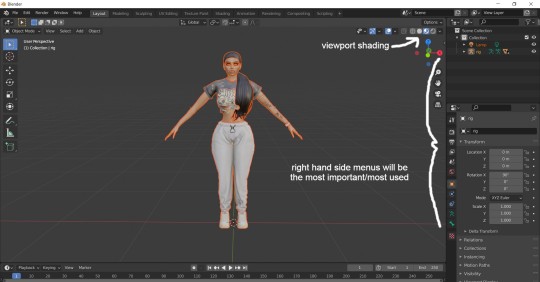
I always like to start by importing a random .dae of your sim for reference, just to make sure everything will be built to the correct size and height. If things appear a solid grey or not the proper texture, make sure you have the viewport shading in the top right set to the second to last setting(material preview). Click, hold and drag the scroll button on your mouse to rotate the viewing angle, and hold with shift to move up and down.
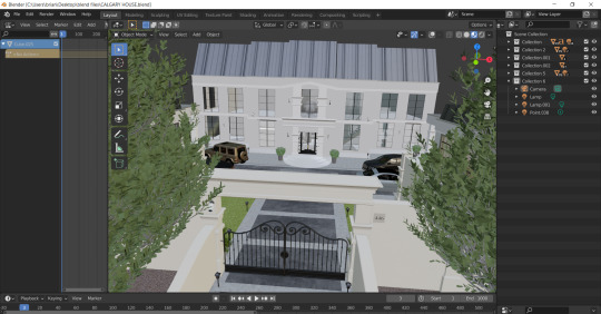
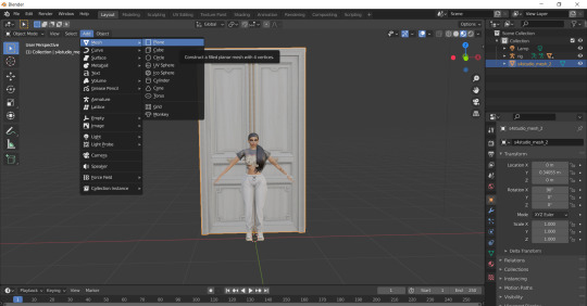
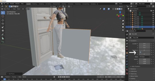
2. Start with the front door/entrance.
I most always place the front door first and build off it or position the camera where I want & build within the camera view. Press S to resize, clicking the scroll button to resize along the axis. Press G to move, and R to rotate.
In order to add furniture/decor items, you will need to export the mesh of that object from Sims4Studio. It will export from there as a new Blender file, which you can then open in Blender, and then simply export it as an .obj file. The .obj can then be imported to the scene your building. Remember where you got it from so you can give credit for these meshes!
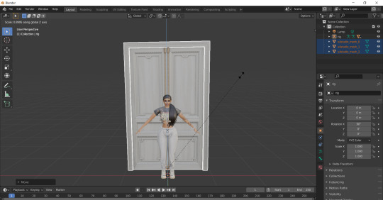
3. Join separated meshes.
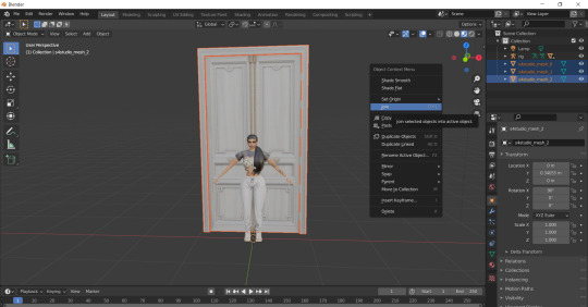
Sometimes objects will be made up a multiple meshes, which can make it harder to move the object as a whole, so joining meshes will come in handy. Just select everything you want to join, and either right click and choose join, or press Ctrl+J.
4. Add plane mesh for walls.
The easiest thing to use to construct the floors and walls of your scene is the plane mesh. Cubes can also work for walls, but are hard to add windows to.
5. Add textures.
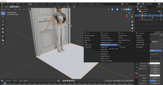
To add the texture of your floor/walls, we go to the right side menu and select the material prosperities tab second from the bottom. Next click the yellow dot beside ‘Base color’ and select ‘Image texture’ from the pop-up menu. Now you’ll be able to open the image of the texture you want(I almost always just use Google to find textures).
6. Creating shine/reflections.
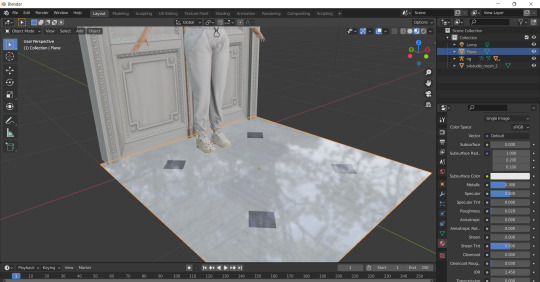
In that same Material properties tab, you can also create a shine on your floors if you want some nice smooth marble or something. Just adjust both the metallic and roughness sliders to get the level of reflectiveness you want. Lowering them both to zero will create a perfect mirror.
7. Copy & paste multiple planes to expand floor.
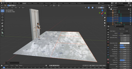
Once you’re happy with the texture, use Ctrl+C to copy that plane mesh, and then Ctrl+V to paste. Copying more than one at a time makes the process of placing the floor much faster. You can also join all these meshes too to make one large mesh for the floor.
8. Use the object properties for a perfect 90 degree angle.
Add a new plane mesh to start building the walls. Select the object properties tab(the orange square icon) and change the Y and Z to 90 degrees which will rotate the plane perfectly upright.
9. Position the walls.
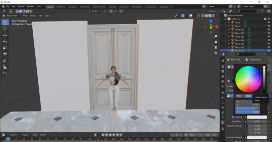
Resize your wall planes and place them as you want next to the door. You can add a texture to the wall the same way you did for the floor, or you can click the white box by the ‘Base color’ which will bring up the color wheel for you to customize a paint color.
10. Creating transparent windows in shading.
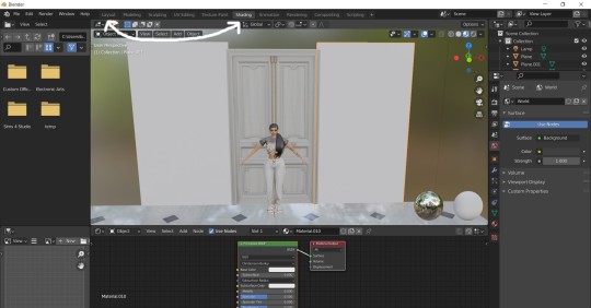
Now in addition to walls and floors, you probably want some windows too. For this we switch to the Shading page at the very top. Select the plane mesh you want for your window(if no nodes first appear, just click NEW to make a new material).
11. Add appropriate nodes.
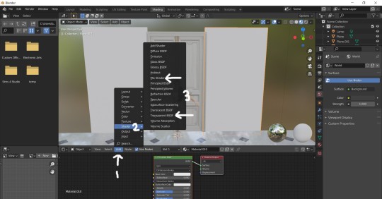
Next we need to add in 2 nodes; a mix shader and a transparent BSDF. The order you add them doesn’t matter, only where you place them.
12. Connect the nodes.
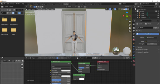
The mix shader should be dropped in right between the principled BSDF and the material output nodes, and the transparent BSDF can go just below it. Then you’ll need to connect the dots as show in the photo above; principled BSDF to the lowest ‘shader’ on mixed shader, then the middle ‘shader’ to the transparent BSDF.
13. Switch the blend mode.
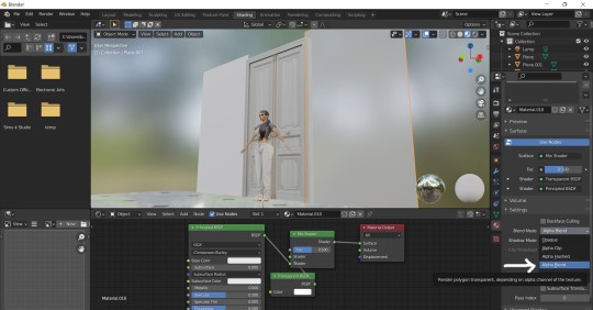
Lastly, go back to the material properties tab on the right, and find the blend mode drop-down menu. If you don’t see it under the settings section, check the viewport display section. Switch from opaque to alpha blend. You should see the plane become some-what clear. Adjust the metallic and the roughness sliders to create the level of translucence you wish.
I hope this tutorial will help! Blender skills, like any other new skill, will take a lot of practice & patience, so just keep experimenting and tinkering. In addition, keep in mind the larger of a scene you build, the bigger the Blend file which can become very laggy & requires a lot of processing power. Happy building! :)
564 notes
·
View notes
Photo
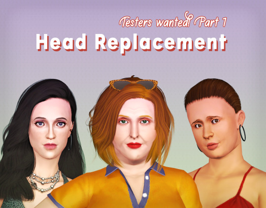
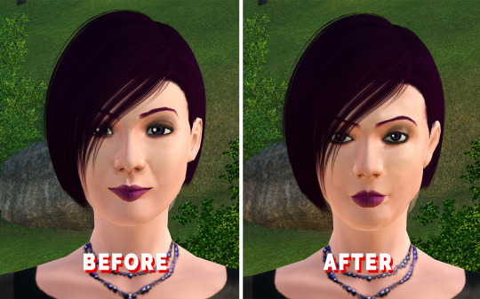
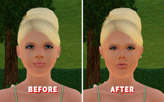
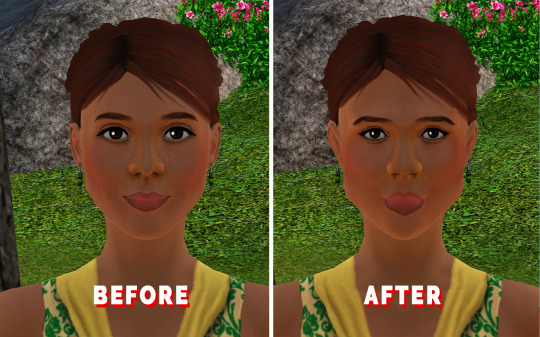
[Beta Testing] Head Replacement - Part 1
Our first BETA of the Medieval heads > TS3 conversion! :) The last couple of months (I started this back in April, so a long time! :p) I've been converting all the sliders to work with the face :)
This has probably been the hardest replacement project I've ever done and it still needs tweaking here and there, but I figured I should have some of you help me out as well!
Why Part 1?
I've converted all the mesh sliders. The sims actually come with normal sliders (they create shadows on the face where necessary) and actually mesh sliders (so the vertices are manipulated by the game to be shaped a certain way).
And because I've only done the mesh sliders, you are going to have sims in CAS, that have these odd spots on them. You may also notice that as well when you use certain sliders they get worse/better. I'm working on fixing this! But that will be in Part 2 of the Beta testing :)
NOTE: IF YOU USE EA'S EYELASHES, PLEASE DON'T USE THEM WITH THE FACE REPLACEMENT!
S-CLUB Eyelashes are okay though, as they come with their own sliders to move them up/down/adapt to eye shapes.
(if you do have EA's eyelashes, and you want to test this properly, make sure to install: https://www.modthesims.info/d/654691/eyelash-mesh-terminator.html
Or any other "eyelash terminator" mods ;))
This will of course be fixed in either part 2 or the released version :)
Some things I'm aware of and am trying to fix:
There seems to be a seam across the neck, as well as between the neck seam and the ear
Some sims happen to have really thick lips all of the sudden! (Molly French is an example) I'm still trying to trace down which slider is doing that (because I think I screwed up the min/max order :p)
I'm still tweaking the eyebrows a bit. Sometimes they get a bit awkward and look like a half empty balloon :p
Sometimes the eyeballs are poking out of the eyelids? Really odd! But also looking into that :p
Some super "Mouth open wide" like animations show the mouth somewhat spiky, still tweaking the vertex paint for that :)
As mentioned, the weird glitchy spots you see with some sliders in CAS. In the world, it's barely noticeable though! Again, will be fixed in part 2! ;)
Custom sliders that alter the mesh won’t work with this. So if you have a heavily edited sim, the chances are that they might look a little, or entirely off (quite a few custom sims I have heavily edited with custom sliders, actually haven’t suffered from this too badly! so this can work two ways.) I’ll make a compatible custom sliders list soon!
Some sliders seem to stretch some makeups to the max. (especially eyeliners!) If they look oddly shaped, first check this with the basic first preset eyes and see if it’s the complicated shape of the mesh rather than a UV map issue. (Still have to find a workaround for this)
Otherwise! Feel free to point them out in the comments! :) Or message me, that's fine too! (or, even make a test post on whatever social media you got, perfectly fine with me too! As long as I know what bugs you found :))
-----------
Technical details:
Ages available: currently Young adult female & Adult female
Polys: 2565 (Reference: EA’s default female head is: 2058)
Compatible with: Custom makeup, custom eyes, custom skins, can be funky with some hairs with scalp hair but overall works well.
Type: Default replacement
DOWNLOAD: [PATREON (free as ever)] | SIMFILESHARE
283 notes
·
View notes
Text
gif coloring tutorial
for @sappho-mia
a photoshop tutorial on how to make gifs that look like the ones in this gifset. I will only explain how to do the coloring, so if there’s any other part of gifmaking that you’d like for me to explain, let me know and I’ll make another tutorial or send you some tips!
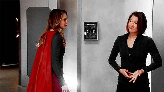
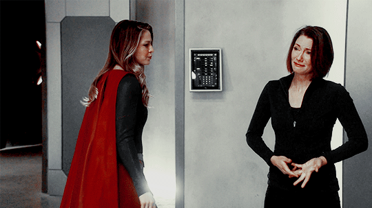
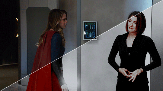
I’ll show you how to go from this:
to this:
1. exposure
shows have the lovely habit of underexposing every scene, but you don’t want people looking at your gifs like this
so: time to brighten that shit up!
I have a psd (an edited version of the one in this tutorial by @redkrypto) that I use and adjust for basically all my gifs, but for the sake of this tutorial I’ll do this step by step.
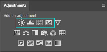
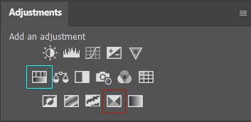
photoshop has a few good options for changing the exposure. first, go to window > adjustments to get this:

which is your biggest friend. the ones on exposure are these 4:
I’ll be honest, I have no idea what the difference between levels (the second one) and curves (the third one) is. they both adjust the tone of your gif - with the option to make the dark tones, the light tones and the midtones either brighter or less bright, separately. this’ll make your gif look less flat!
let’s take a look at levels:
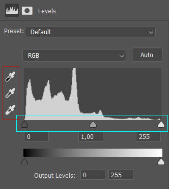
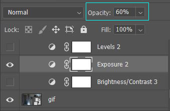
this might look daunting but I promise I don’t really know how to read the histogram either, I just use the little sliders (cyan) and see how it looks. you can also use one of the eyedroppers (red) and click on a part of your gif that you want to be black, white or grey, and the rest of the image will adjust to this. it might be a little too intense - in that case you can lower the opacity of the layer (see image below).
then there’s brightness/contrast and exposure. the difference between these two is that brightness will mostly affect the parts of your image that are already bright, while exposure will affect the whole image. the exposure window has another option I use often too, gamma correction. with gamma correction you can change the gamma levels of your gif, and I have no idea what that means but it sure does look good lmao
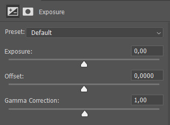
there not one ‘right’ way to do this, so just play around a little and see which ways you like the most :)
after brightening, our gif looks like this. yay!

for comparison:

2. coloring
I remember feeling very overwhelmed with all of photoshop’s options at first. I will discuss all of the ones I used to create this gif, but you definitely don’t have to use or understand all of them in order to make beautiful gifs!
two adjustments I use in pretty much every gif are hue/saturation (cyan) and selective color (red).
first, selective color. selective color basically gives you the option to single out a color in your gif and change it. the most important thing to understand here is which colors are opposites: red and cyan, green and magenta, blue and yellow. so if you’d want your yellows to be green, you use the magenta slider.
for the gif we’re making, we want kara’s cape to stand out, because red is going to be the only color left. these are the settings I used:

now it’s gonna look a little oversaturated, but we’ll fix that later on. I also made the yellows more red and less yellow and increased the blackness a little.
another way to make a color stand out is by removing the other colors -- the background is mostly yellow, green, cyan and blue. so we’re gonna go to hue/saturation and completely remove their saturation, which will make the wall behind them look gray.
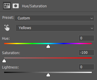
in the saturation window, you also get the option to reduce the lightness (and the hue, but we’ll get to that later). reducing the lightness does not do the same thing as increasing the blackness in selective color: reducing the lightness will give it more shadow, while increasing the blackness in selective color will make for example a lilac go to a purple, or a red to a deep red.
for our gif, I reduced the lightness (-13) and the saturation (-3) of the reds. now it looks like this:
the next step will make the gif look weird at first but after we add the other layers, it’ll look better. go to adjustments > photo filter and select ‘sepia’ (it’ll be a warming filter first - click on that and you’ll see all the other options). then increase the density:

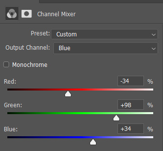
next, we’ll move to channel mixer. channel mixer is one of my favorite adjustment layers because it’s the easiest way to make your colors look really different. there are three channels (red, green and blue) and the best way to use it is to just try things out and see how it looks. my settings for this gif were:

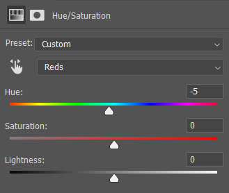
then I added another saturation layer and reduced the saturation for the yellows, greens, cyans and blues, and removed the saturation completely for the magentas. for the blues, I also decreased the lightness, and for the reds, I changed the hue a bit so it looks less yellow:
another selective color layer (with opacity and fill both at 65%):

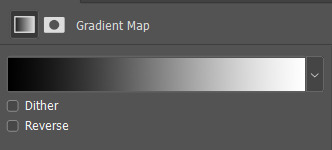
then add a gradient map (bottom right in the adjustments window). make sure it goes from black to white, and isn’t reversed. this will make the gif look a little softer! opacity: 20% fill: 50% (or your whole gif will be black and white)
increase the red saturation a bit and increase the blackness with selective color, so it’ll look like this:
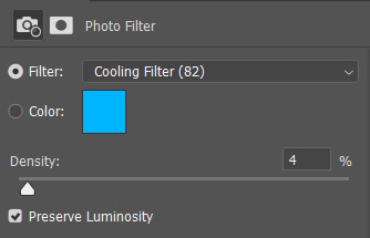
see if your exposure needs some tweaking, remove all the colors you don’t want (the background is mostly yellow now) and add another photo filter, a cooling filter this time, and set it at 4%.
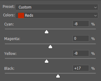
finally, one last selective color layer:
and that’s it, we’re done!!

3. some final tips
it matters which layer is on top. if you use selective color to turn all the green into cyan and put a saturation layer on top of that, not a lot will happen if you increase or decrease the green saturation. but if you increase the cyan saturation, every part that photoshop recognizes as cyan now will become more saturated.
some scenes are a lot harder to color than others, and you’re allowed to just ignore the existence of those scenes. :-)
use folders or “groups” to put layers together. my psds are very chaotic but this helps me find things!
when making a set, your gifs should look good together, not just on their own - sometimes seeing my gifs together makes me realize I need to change the coloring / brightness in some of them. to make sure this realization doesn’t happen when I’ve finished all of them already, I always put them in a tumblr post in my drafts while I’m still working on them.
use creator tags when posting your gifs. so don’t just tag it as “supergirl” but also “supergirledit” and not just “kara danvers” but also “karadanversedit” - this is the easiest way for other people and other creators in your fandom to find you! if your set doesn’t show up in the tags (when you search supergirledit and click on “recent”), send me a message and I’ll help you figure out what went wrong.
try to make your coloring match the ‘mood’ of your gifset - is it dramatic? soft? angsty? romantic? should there be intense contrasts? lots of reds, or calmer blues? same goes for the font you choose, but that’s a whole other tutorial (that I am probably not qualified to give haha, but I can point you in the direction of some people that are really good at it!).
you’re going to make a lot of gifs you don’t like, and that’s okay. it doesn’t mean you’re not good at it, it means you’re learning and improving! and it can also mean that you forgot to turn off the night shift on your laptop and your ‘red’ gif turns out to be... definitely not red. lol

if you have any questions, don’t hesitate to ask!! good luck & have fun :)
#completeresources#allresources#gif tutorial#coloring tutorial#photoshop#photoshop tutorial#ps tutorial#dailyresources#mytutorials#I didn't use color balance for this one but that's a very useful one too!#and vibrance too#though that one makes ALL of your colors more vibrant and that's not always ideal
147 notes
·
View notes
Note
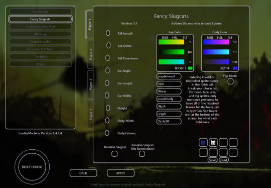
Hi ! Just wanted to ask , how do you put your own slugcat skin in game? I know it's works with fancy slugcat mod,,, but i don't know how to use it ;-; , can you teach me
i can try! although i only learned most of this very recently, so i’m not the most knowledgeable. i also use BepInEx as the modloader.
im going to start with the assumption that you already have fancy slugcats installed and working, after this you’re going to need the custom assets and custom tails mod. both can be found on RainDB.
keep in mind, each of these mods contains a read me with more information, so reference those if you don’t understand something in my explanation. everything is under a read more as this post is very long.
ive also attempted to be as detailed with this tutorial as possible.
and lastly, please read through the entire tutorial before starting work as it’s very likely you’ll end up having to redo things otherwise, mostly because of the way custom tails functions.
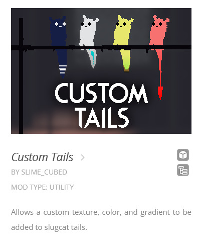
part 1: custom tails
we’ll start with adding a custom tail, the custom tails mod requires ConfigMachine, fancy Slugcats and Custom Assets. (publicity stunt is only required if you still use Partiality, not if you use BepInEx) download and apply these mods first. (the .dll files)
once you’ve downloaded custom tails you’ll find an “examples” folder in the .zip file, this contains the files you’ll edit to make your own custom tail.
each of the example tails is shown on the thumbnail for the custom tails mod, so you can get an idea of how they look in action.
sidenote: the devil tail png is completely white, and thus it can be hard or impossible to see on a default photo viewer, open it on something like paint tool sai and add a colored background.
once you’ve selected which base you want to use, extract (or just copy and paste) that tail png along with its txt file somewhere you can work on it, desktop works just fine. now you can make whatever modifications you want to the tail, i’ll use my firecracker tail as an example.
note: if you leave parts of the sprite purely white, it will get colored in with whatever color you choose in the fancy slugcats menu, its essentially transparency.
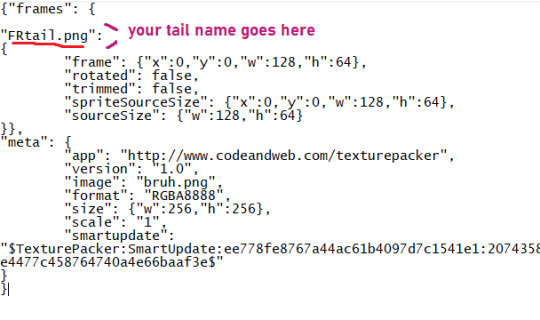
once you’re happy with how it looks, it’s time to apply it. firstly, change the tails name into something recognizable, like FRtail.png
now take your txt file and name it the same thing you named your tail, and make sure to be exact or things might break.
then open said txt file and change the default tail name into your tails name.
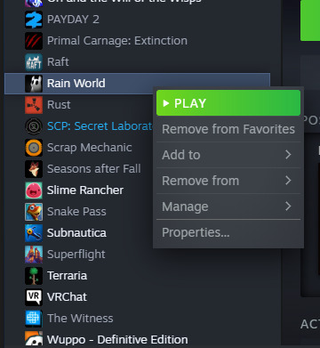
once all that is done, you have to navigate into the atlases folder in your rain world install. to get there open up steam, find RW and right click it in the menu to bring up this text box
choose “properties” at the very bottom to open up this menu
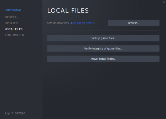
select “local files” on the side, and when you see this screen press “browse” and it will open up the root folder of RW.
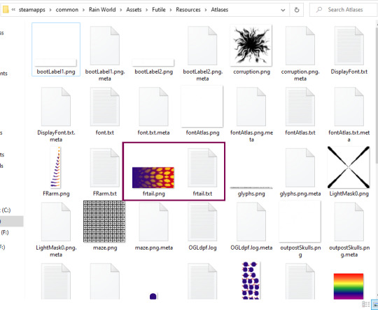
(i have quite a bit more stuff in my install folder due to mods, so don’t worry about not having all of it) from here you want to open the “Assets” folder near the top, from there you open Futile > Resources > Atlases.
now all you need to do is put both your tail png and txt files into Atlases like so:
note: capital letters matter, if you used capital letters in your name you have to use those same capital letters in every name, for example if you use frtail.txt and FRtail.png it wont work. it all has to be the same in every case.
once that’s done, go back to your RW root folder (the one where RainWorld.exe is located) and open the “ModConfigs” folder, from there go to Fancy slugcats > custom heads. it will be empty if you haven’t made any modifications yet.
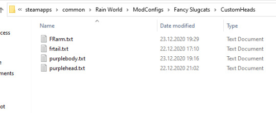
once youre here, make a new txt file and name it the same name you’ve used for your tail.png and txt files. then open it and type the same name inside it, don’t forget to save.
now you should be ready to open up RW, remember to enable the required mods: fancy slugcats, custom assets, custom tails, config machine and publicity stunt (partiality only)
note: if your game opens up to a black screen and wont start, it usually means something is wrong with the txt files, either you forgot to add a name inside one of them, you forgot to save when you added the name, or you’ve misspelled the name. double check all the names for your png and txt files.
now then, let’s get to adding your tail to your slugcat
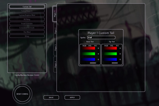
once the game is open, navigate to settings and open mod config, from there you should see custom tails in the menu. once here type your custom tails name into the “sprite” box, remember to be exact with the name.
if the name shows up red, you’ve made a mistake somewhere in the process, if it shows up as white, its been successfully added!
if you touch the sliders it will add a gradient to your tail and undo/cover up any sprite changes, so keep them as black. you can also change your tails size in the fancy slugcats menu as usual.
now you have a snazzy tail to show off to the world!
“.......but wait” i might hear you say “my tail isn’t the same color as the image i made!”
that’s because whatever color you apply to your slugcat in the fancy slugcats menu gets applied on top of the image you made. meaning if your slugcat is a rather more dark color, it will make your tail darker as well. meaning not only will bright aspects of it not be bright anymore, the base of your tail will be darker than your base slugcat color, thus it wont match. this is a problem i ran into as my slugcat is purple with bright accents.
the transparency i mentioned earlier helps with this “if you leave parts of the sprite purely white, it will get colored in with whatever color you choose in the fancy slugcats menu, its essentially transparency.“
you can use this transparency to make the base of your tail match the rest of your slugcats body, now all the white will be filled in with whatever color you’ve chosen in the menu, however it still wont fix all other parts of it having the base color applied to them.
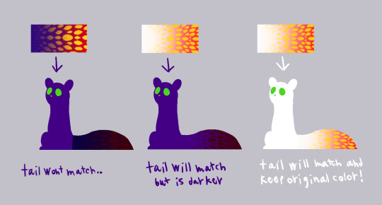
now if your base slugcat color is white, you don’t have to worry about any of this at all! the tail will stay how you made it!
if your slugcat will be lightly colored but not completely white, or your dark slugcat will have dark markings, this is all stuff you can reasonably account for while making the markings themselves (once you’ve made the txt and png files and put them in the right places, you can edit the png in the atlases folder directly) but if you want to do something more close to my slugcat, we’re going to have to do it by changing the color of slugcat using sprites.
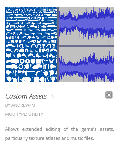
part 2: sprite edits
so, to get around this problem and to get the freedom to edit the sprites however we like we’re going to be editing each sprite separately. this way you can virtually add anything you like to your slugcat, antlers, spikes, fur. although this might require you to change the position of the sprites to get them to line up properly in-game.
i’ll only touch on recoloring sprites as i haven’t edited the shape of any of them yet, i’ll update this tutorial with extra info once i’ve tried it out myself.
some of slugcats sprites have multiple versions that will get bundled in order to make the animations you see in game (head, arms, legs)
others are static sprites and only have one version (tail, body, hips)
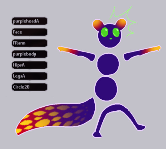
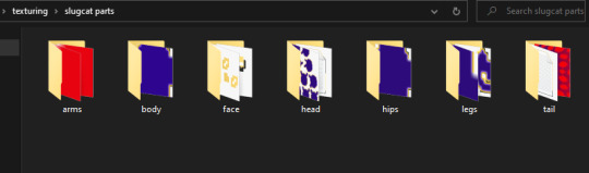
firstly, you’ll need to find the sprites you’re going to edit, all of these sprites are included in the custom assets zip file you downloaded from RainDB.
you’ll find slugcats sprites in Unpacked Atlases > RainWorld, extract this folder to make looking for the correct sprites easier.
note: all of the sprites are white by default, this makes them incredibly difficult to see in a folder without opening them in some external program, thus i’ve changed my windows settings to make the folder background dark (this can be found in Personalization)
this folder includes the sprites of most of the creatures in RW, so picking out slugcats sprites can be a tad... difficult. thus i'll name every single sprite you’ll need to hopefully make it easier.
BodyA, HipsA, PlayerArm0 to 12, FaceA0 to 8, FaceB0 to 8, FaceDead, FaceStunned, HeadA0 to 17
aaand all the leg sprites are in a png because they have so many names
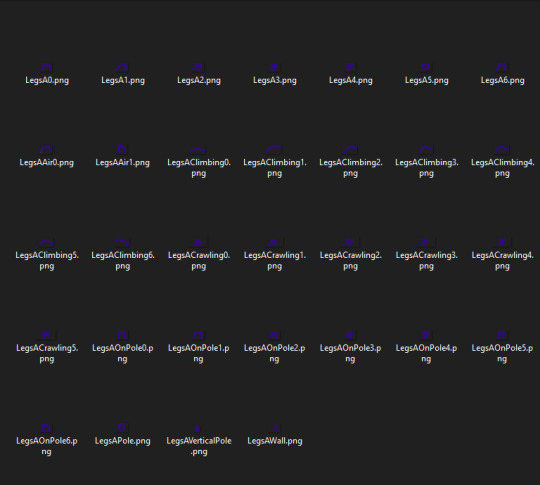
most of them can be found bunched up together in the RW folder, a tail texture isn’t included as that will still be handled through custom tails as detailed above.
now i suggest you make some way to store all of slugcats sprites neatly, as it will save you a lot of hassle in the long run. i separated all body part sprites into folders.
now you’re free to make any edits you like to the sprites. however, i’ll go about this tutorial with the expectation the only edits are color edits, not shape edits, as again i don’t have experience with those.
once your sprites are all colored and neatly organized its time to compile them, each body part gets compiled into their own bunch (arms in one, legs in another) for this you’ll need a program called texture packer, i can’t provide a direct link because my post might get thrown into the void by tumblr, there is however a direct link in the custom assets read me.
once you’ve downloaded texture packer, heres an easy to follow short video tutorial made by AndrewFM on how to use it.
once your sprites are bundled you’ll go through the same process as with adding your custom tail. i’ll use arm sprites as an example.
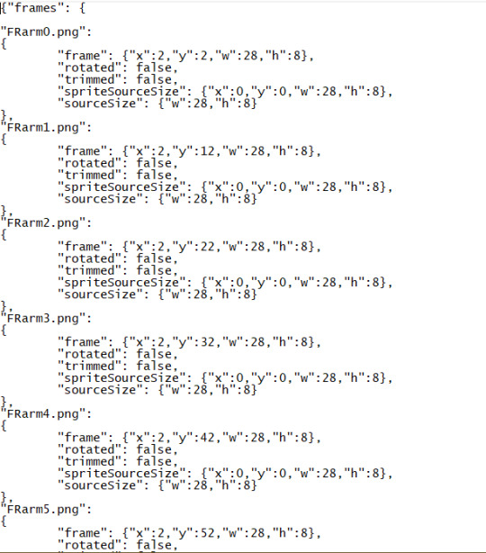
you’ll get a png file with all of your edited sprites in them, as well as a .json file that contains placement information, turn that json file into a txt by renaming it (yourarmname).txt
now open the txt file and rename every single part to whatever name you decided to give your arm sprites, but keep the numbers at the end of the sprite names, they are important.
note: do not rename the individual sprite png’s before they are packed
now that your txt and png files are ready, drop them into the same Atlases folder in your RW install as you did with your custom tail, and similarly add another new txt file into ModConfig > FancySlugcats > CustomHeads and rename it to the same name you named your sprite, and add that exact same name inside the txt file itself.
if the game yet again refuses to start, remember to double check the names in the txt files.
now we’re ready to apply the sprites in-game, open up RW and head to setting > mod config,
depending on which sprites you’ve edited, you’ll need to enter the sprite name into the specific field it belongs to, for me i’ll add the name to the arms section. you’ll get more details about what goes where when you hover over the text field.
for some of them, you’ll need to include A at the end of your sprite name, but only in the mod config menu
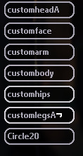
this shows where they are needed.
now you need to repeat this process for each bundle of slugcats body parts and apply them. note: body and hips despite both being part of slugcats main body gets applied separately, and even though they only have one sprite each you still need to pack them with texture packer and go through the same process as for the others.
this all might seem tiresome, and in certain ways it definitely is, but once you’ve gotten the hang of the packing, adding to folders and applying the process gets a lot faster.
once all of your sprites are applied, legs, hips, body, head, arms, tail. you want to make sure in fancy slugcats settings to make your slugcats color pure white so it wont affect your custom sprite coloration in any way. however you can apply color to slugcats face through the menu as usual.
there is a known issue where slugcats fists when climbing poles don’t get colored, this issue currently can’t be fixed easily.
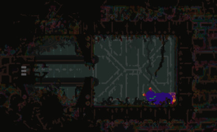
the end result? quite a fancy slugcat indeed!
if i made any mistakes, or there’s extra info i should add, then message me and i’ll edit the post accordingly!
if there’s anything you can’t figure out no matter what you try, join the RW discord and ask people in the modding support channel, thats where i got most of my information from!
hopefully this is helpful to some of you! i spent quite a while making this tutorial so reblogs would be very much appreciated!
77 notes
·
View notes
Text
gif tutorial ✨🎥
I got a few requests to make a gif tutorial so here it is. hope it helps :) It’s quite long so I’ll put it all under a read more. If you have any questions, feel free to ask or PM me directly for help!
Alright....sooo, I don’t remember the last time I made a gif tutorial on this site, but I figured I would even though I use the same method a lot of gif makers have been using for years. I have never strayed from this process and I’ve been making gifs on this site for a decade.
There are a couple methods to making gifs. You can import your video directly into photoshop and cut your gif there. OR you can use a separate video player that has a screencapping tool, then import all your frames into photoshop; this is the method I use and it’s how I’ve adapted and perfected my giffing skills over time.
This post will be long, but I want to be as detailed as I can and explain it step by step. It’s really NOT difficult once you get the hang of it, which is probably why I’ve always done it this way.
Disclaimer: There are three programs I use and I highly suggest you look for reliable links yourself if I’m not able to provide one. I use pretty old versions of KMPlayer and Photoshop (I’ll explain why later), so be careful where you go looking for downloads. There are some photoshop downloads here, but I can’t vouch for them.
Let’s start :)
DOWNLOADING VIDEOS
I use a program called 4k Video Downloader to rip HD videos from Youtube. 1080p is the way to go, but obviously that’s not always possible. It’s ridiculously easy, all you do is click the “Paste Link” button and it’ll download your video. Clicking the “Smart Mode” button will let you set the default quality and the folder you want all your videos to be saved to.
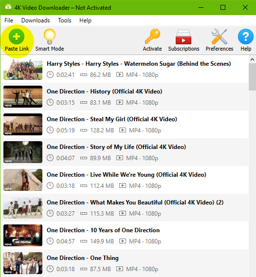
As you can see, here are all the videos I’ve downloaded recently for my gif posts. You can clear this download history list at any time.
SCREENCAPPING
After your video is done downloading, I open the video in KMPlayer. Now, I use an OLD version of this program because this was exactly how I learned to do this back in the day. You can find old versions online, I don’t really know exactly which version mine is because I’ve had it forever, but it’s the old school one that looks like this.
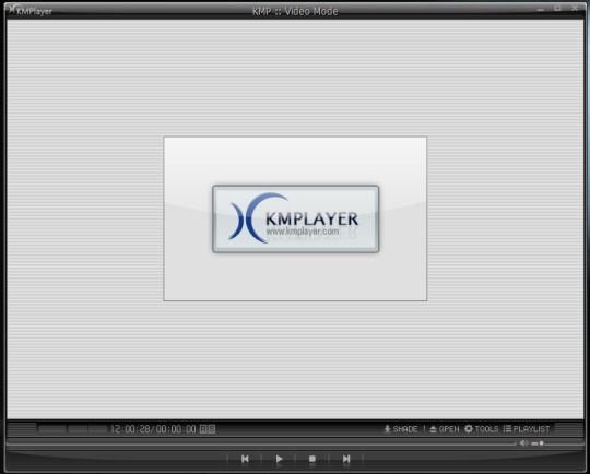
When you open the video, it might stretch the player to full screen so I always adjust it by dragging the corner of the player inward so it shrinks to a more medium size. This will also make your screencaps not so GIANT, which will take longer to load into photoshop.
Anyways, you’re gonna open your video and right click anywhere on the video to select Capture > Frame Extract... (or Ctrl+G on Windows). This window will come up. Make sure all your settings look like this to ensure a really smooth gif.
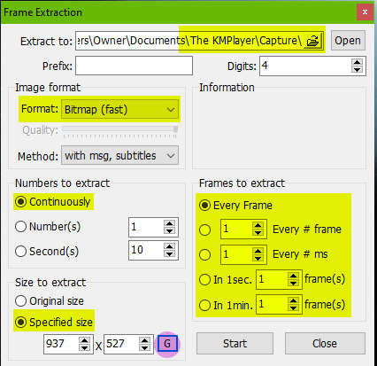
The first thing you should do is click that little “G” button next to the window size at the bottom. That’ll lock in the dimensions of however big you’ve made your video window, and if you stretch it you’ll see these numbers change. If you start capping without remembering to push that and you make your window smaller/bigger, your caps might be a wacky size or look stretched and you’ll have to go back and do it again. Also note the extracting location at the top. All your caps will go directly to a default folder titled “Capture”.
Once all the settings are ready, go to your desired section of the video, pause it, and hit “Start”. Play the video, pause the video when you’ve got all your caps, then hit “Stop”.
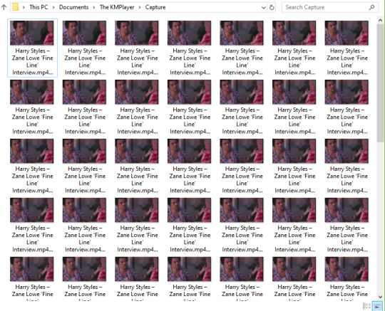
Locate your “Capture” folder and doublecheck you got all the caps you want. This is where I take a moment to delete any caps I don’t want in my gif, that way you don’t bother loading them into photoshop and making it take longer than it needs to.
MAKING THE GIF
You’re gonna open whatever version of Photoshop you’re using. I hilariously still use CS3 to make gifs because the next script I’m gonna run doesn’t work in the free download that I have of CS5, but that’s what you get sometimes when you don’t pay for stuff. Hopefully whatever more recent version of PS you use, you have no problems.
Go to File > Scripts > Load Files Into Stack...
This window will come up.
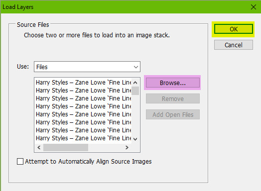
Hit “Browse” and locate your capture folder. Highlight all your caps and press OK. You’ll see them all come up in a list as shown above. Press OK again. Your caps will start to load into one big stack of layers. This will take a minute or so.
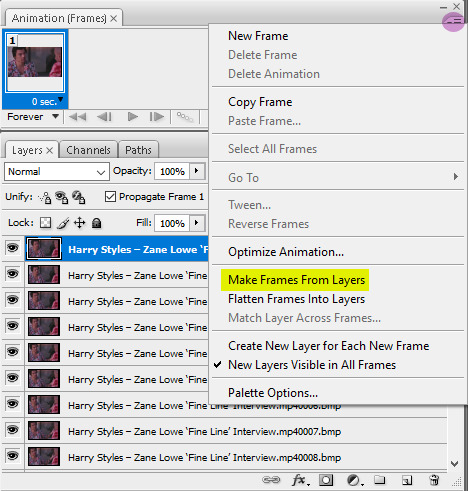
When it’s all loaded in, you’ll see them all stacked in your Layers window (Windows > Layers). You’re gonna open your animations timeline (Windows > Animation) and click the little drop down button in the top right corner of the window and select “Make Frames From Layers”.
Click that drop down menu again and hit “Reverse Frames”. Click that drop down menu again and hit “Flatten Frames Into Layers” (this is so our sharpening action will work later). Click the drop down menu again and select “Select All Frames”. All your frames will be highlighted. This is where you’ll set your animation speed. Under each frame you’ll see “0 sec.” Click on that and select “Other”. Type in your desired speed. I usually go for 0.04 if it has a lot of frames. For less frames, 0.05 or 0.06. This is honestly entirely up to your preference. I actually made myself a photoshop action doing all these repetitive steps so it saves me a few precious long seconds of clicking around over and over. I just run the action after my caps are loaded. If you make gifs a lot, I recommend it.
Next it cropping. The reason I don’t crop right away after the files are loaded into a stack is because I like to see where the subject in the gif moves before I decide where I need to crop. I don’t want to accidentally cut anything off. The subject might sway in and out of frame or be off center if I crop it blindly before seeing exactly where the object moves around. So I’ll play the gif first to see exactly where to crop.
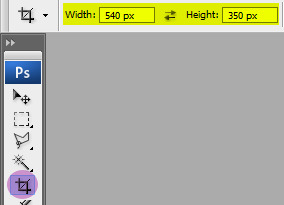
Anyways, you’re gonna set your desired width x height of your gif. I’m making this a big gif so you can see the details better. 540 px is Tumblr’s width for big horizontal gifs. If you’re making a photoset with two gifs side by side the width for Tumblr is 268 px.
Go ahead and crop your gif. It’ll resize itself as well. Play the gif back so you can see if anything gets cut off or it’s not where you want it. You can undo the crop and do it again until you’re satisfied.
Here is what my gif looks like animated and cropped.

As you can see, it plays nice and smoothly due to our screencap settings from before in KMPlayer and with our set gif speed (I used 0.05 here).
Next is sharpening the gif. I use a sharpening action that can quickly sharpen up to 120 frames. You can download it here. Open the action by going to File > Open and locating the file. It’ll be added to your Actions window. (Window > Actions if you can’t see it.) In order for it to run correctly, you have to have the first frame selected on your animation window, as well as “Frame 1″ in the layers window. Just like this:
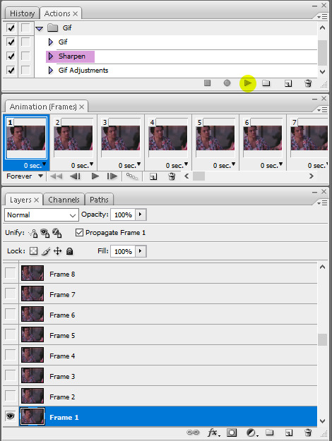
Click the play button on the action and wait a few seconds for all the gifs to finish being sharpened. For any gif with less than 120 frames (which I hope is always, good God) a pop-up will come up when it reaches the end of the frames asking you if you want to stop. Click “Stop”.
Tip: If you think you want to delete more frames, run the sharpening action before you do it. Otherwise you’ll have to flatten your frames into layers again. The first frame and the “Frame 1″ layer should always be the same (the little eye will appear to the left of the layer to let you know it’s visible when you have that specific frame selected) otherwise the action won’t work.
Here is what my gif looks like now that it’s sharpened.
COLORING THE GIF
This is where all the fun (or pain) comes in. All your coloring will be done by using Adjustment Layers (Layers > New Adjustment Layer). I usually go in the same order of adjustments, but this is where personal style comes in and you do no have to do it in the same order I do. You can practice with this part all you want and see how you like to do it.
I start with brightening the gif first and fixing the white balance if a scene needs it. I chose this video specifically so you could see this next handy trick that a lot of people don’t even know about. It’s a dark scene and the white balance makes the subject look quite blue.
I can fix this by starting with a Curves layer. By clicking the third eyedropper tool, you can go and click on a white point in your gif (in this case, I clicked on a white square on his shirt) and bumped up the input number a bit for a little contrast (optional). My curves look like this. Click OK.
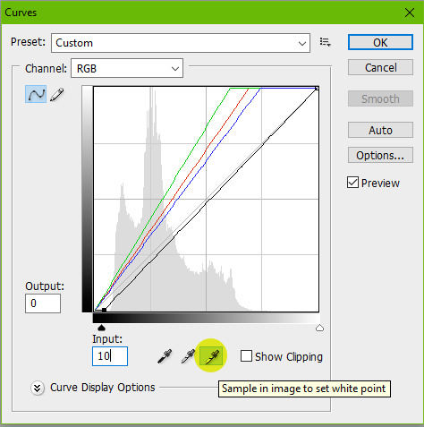
My gif now looks like this.

It’s much better, right? The white eyedropper tool will become a lifesaver sometimes, but it’s not always needed.
Next, I go in with a Levels adjustment to do some more brightening. This is all up to preference, but you can play around with this. I typically like to add more contrast with this layer. I just adjust the sliders until I’m satisfied.
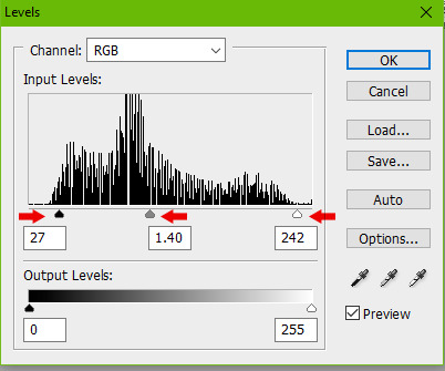
Here is my gif now.
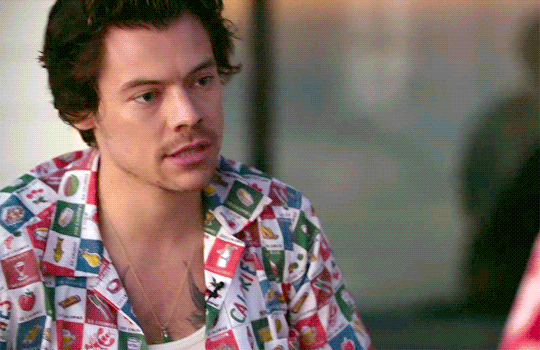
Onto yet another brightening layer. Brightness/Contrast. A couple teeny tiny more positive numbers and I now have this.
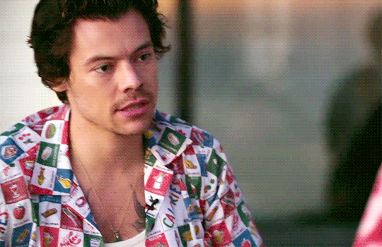
Next is Selective Color. I wish I could explain this in a way that makes sense, but this is the layer that takes a bit of practice getting down and boils down to how you like the colors in your gif to look. I personally don’t like a lot of yellow in mine, so I focus a lot on the Yellow and Black sliders in each specific tab. I start in the Reds, then Yellows, Whites, Neutrals, then bump up the Blacks a tiny bit.
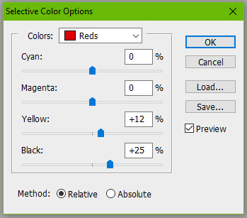
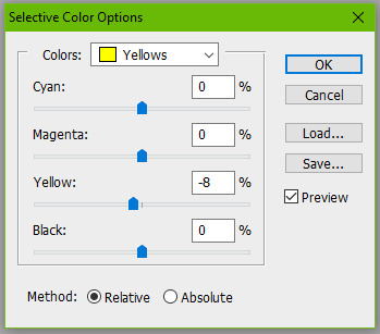
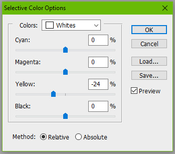
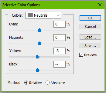
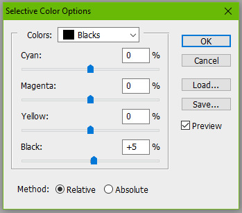
Here is my gif now. It’s a bit more cool toned, which is what I like.
Next I’ll go in with a Color Balance layer and play with the Midtones and Shadows.
Here it is now.
This is usually my last step unless I want to adjust the brightness again (which I do), so I might go back into my Curves and Levels layers to bump it up.

And you can totally stop there, but I would like to mention a few more optional layers to add depending on your gif. If I wanted more saturation, I would add a Hue/Saturation layer at this point, but I think it’s colorful enough so I’m not going to.
Another layer you can use is Gradient Maps.
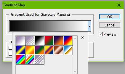
Setting a black and white gradient map overtop your gif and setting the layer to Soft Light and lowering the opacity to your heart’s desire (you might need to go to the little drop down menu in your animation timeline and hit “Match Layers Across Frames”) can give your gif a very contrast-y look like this.
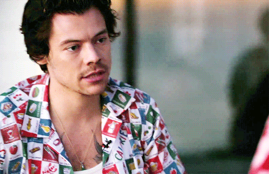
Or you can change the black color to something else for a different tone, like a dark blue.
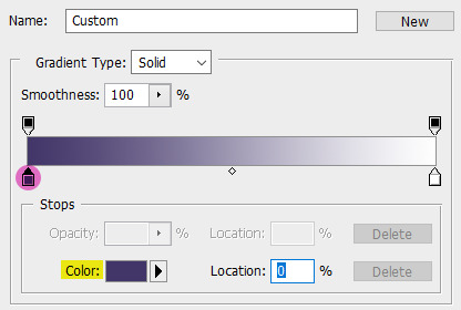
Here is my final gif.
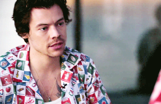
If you want to add a caption to your gif, you can do so with your font of choice (Arial and Calibri are good) and add Stroke or a Drop Shadow to it by going to Layer > Layer Style. You can make sure the text is perfectly centered by clicking on your top frame layer under all your coloring adjustments, hitting Select > All, then clicking your text layer again and going to Layer > Align Layers To Selection > Horizontal Centers. Then hit Select > Deselect and go to your little drop down menu in your animation timeline and click “Match Layers Across Frames”.
Here is what it looks like with a caption.
SAVING YOUR GIF
Go to File > Save for Web & Devices...
A big window will come up where you can preview your finished gif by pressing the play button on the right hand side. In the bottom left corner will tell you what size your gif is. Tumblr’s gif limit is a whopping 10 MB, so we’re good.
Your gif settings should look something like this.
We always want to keep all colors at 256 (the highest). Lowering this number will make our gif file size smaller, but also decrease the quality of the gif itself. If your file size is more than 10 MB, I recommend going back and deleting some frames or making some more curve adjustments. Some users also like to set their gif to “Adaptive” instead of “Selective”. This is up to you.
Click Save and you’re done!
#this took me all day and half the gifs dont even move when you view this post on my desktop theme#LOVE THAT#please view this on the mobile view
220 notes
·
View notes
Text
How to Update TS4 Custom Skin Colors for Patch 1.69 with Sims4Studio
EDIT 12/22/2020: S4S has updated with a batchfix and several other related improvements; so I’ll be updating this post soon to focus more on editing already-fixed files (and to update the names of the fields).
You can use this method to update any non-default custom skin COLORS, as well as defaults that are not texture-only (but not any other type of skin-related custom content, and not texture-only defaults which already needed updating after the October patch), that do not work after the December 2020 skintone patch. (This is particularly relevant to Macintosh users who can’t use CmarNYC’s automated tools, or to people who just want to do it themselves at least once so they have a better idea what’s under the hood.)
You can also use this method to change whether custom skin colors that already work in the game show up as Warm, Neutral, Cool, or Miscellaneous, or to change the values of the light-dark sliders on custom skin colors. (This is particularly relevant to people who have downloaded a creator’s own updated version of their custom skin colors, but have totally different ideas about where they should appear in CAS.)
It’s possible S4S may later add prettier GUI tools for at least some of this process. If so, I’ll update to mention it.
I am going to assume that you have some basic familiarity with Sims4Studio and not tell you how to open a package file in it. Skintone packages don’t have the Studio tab, only the Warehouse. You’ll see something like this (which is the upper left part of the S4S window):

(You might also see other resource types, but in this tutorial I’m only working with the things that say SKINTONE. This tutorial also doesn’t cover updating RLE2 image resources to LRLE, which may be necessary in some cases, as there are already multuple good tutorials on how to do that.)
There will be one Skintone resource for each skin color in your package. (That could be quite a few.) You’ll need to follow these steps for each one, or any that you skip won’t show up in game. (If you click on the Type header, it will sort the contents of the package file by type so that all the Skintone resources are together in the list.)
The fields inside the Skintone resources (and resources in general) are listed in alphabetical order in S4S, so we’ll update them in alphabetical order. Click on the first Skintone resource you want to edit, and here’s what you’ll look for next:
The F1-F3 fields are the slider values. (EA hasn’t shared the technical specs for the new version of the CASPart resource yet, so we don’t know what their proper names are.) You don’t have to change them to make the skin color work, but you do have to change them to make the slider work; sliders with no values are not disabled, but work poorly. If you’re fixing the skin color for the first time, all the numbers I highlighted in yellow will be zeroes before you change them. Unless you specifically want to fool around with these values, you should set them exactly as shown, which is the same way that EA skin colors are set.
If you do want to fool around with them, F1 is the minimum value, F2 is the maximum value, and F3 is the increment the slider moves by. If you want a larger or smaller range, you can try things like setting F1 to -0.07 and F2 to 0.07 (bigger) or setting F1 to -0.03 and F2 to 0.03 (smaller). Beyond that, you can experiment as much as you want; you can’t break anything in a way that can’t be fixed by changing them back to the EA values.
Next you’ll want to scroll down near the bottom of the Skintone resource, where you’ll see a section like this:
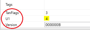
We need to make sure all three of these fields are updated. Unlike the sliders, these are needed for the skin color to show up at all.
TanFlags might already be set to 3, since it was introduced in Island Living and your skin colors may have already been updated for that. If it is not, change it.
U1 is the field that determines whether each skin color shows up as Warm (U1 = 1), Neutral (2), Cool (3), or Miscellaneous (4). THIS AFFECTS GENETICS. If both parents have Warm, Neutral, or Cool skin colors, then their kids will have skin colors based on, but not necessarily identical to, their skin colors. (More on that in a bit.) If at least one parent has a Miscellaneous skin color, then their kids will get the same skin color as one parent or the other.
Version tells the game which version of the Skintone resource the skin color is using, and must be set to 0000000B.
Once you’ve changed everything, save your package file for safety, then start over with the next Skintone resource and continue until done.
Re: genetics, my info is based on my own testing in CAS. Also, which skin color kids whose parents all have Warm/Neutral/Cool skin colors get is based on both those values and how light or dark the game thinks each color is is.
If Sim A has the lightest warm skin color and Sim B has the darkest warm skin color, then their kids could have any warm skin color, but not a neutral or cool one. If Sim A has the darkest warm skin color and Sim B has the lightest neutral skin color, their kids could have any warm or neutral skin color. If Sim A has a fairly light cool skin color and Sim B has a very light neutral skin color, their kids could have any cool or neutral skin color that is fairly to very light. You can probably extrapolate from there, or do some of your own testing. A warm/cool pair does not appear produce any kids with neutral skin colors, so neutral doesn’t seem to be considered a middle point between warm and cool.
Miscellaneous skin colors don’t participate in this system because the EA Misc colors for humans alone include green, blue, red, blue-white, and a small range of greys. It’s just straight up one parent’s skin color or the other.
Telling the game to put a skin color in the Warm/Neutral/Cool bins does not necessarily mean that the game will correctly understand how light or dark the skin color is. I have not played with this in the game yet (and EA’s own ordering of swatches doesn’t seem perfectly based on light/dark value either, though it’s clearly at least approximately based on it), but I have some ideas about it. If I learn anything useful later, I might add it, or make and link a separate tutorial.
That’s all I’ve got! At least 95% of the important information in this post came from conversations with CmarNYC, who I’m pretty sure knows at least as much about CAS content in TS4 as anybody else who doesn’t work for EA. I just wrote it up and added screenshots to it.
Let me know if there’s anything in here that is unclear, or if you run into something that doesn’t match with the info here, and I’ll try to clarify/investigate. I’m also often hanging around on the Creator Musings Discord (as are many other people who may be able to help, that’s what it’s for!) since Tumblr is (still) a terrible way to have a conversation.
26 notes
·
View notes
Last Seen Blogs

daviddrakehot2-blog
Untitled

youplusjapan
YOUPLUS
jaopebar
Sem título
tdfswarriors
Fox's Warrior Cat Designs