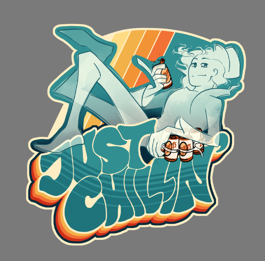
#i just want some merch
Text
Being a splatoon fan in Europe is dreadful
#i just want some merch#without having to pay 30 euros for shipping#I've seen like 1 (one) commercial about splatoon 3 when it was coming out#never heard anyone talk about it#like i know it's more popular in japan but#please#but also the official stuff don't come to us#the zelda×splatoon stuff didn't cone until june and they sold out immediatly#splatoon 3#splat3#splatoon#sploon#splatoon game#splatoon merch#merchandising#game merch#i just want some silly squid game stuff#pleasepleasepleaseplesseplsapls#europe man#nintendo of europe what the fuck
12 notes
·
View notes
Text


smallidarity to me. thumbs up emoji
#smallidarity#tubby art#gay panic joel is really real to me sorry thumbs up emoji#the first one is inspired by an animatic that Liauditore is making. Its so close to completion. You guys will eat SO well#2nd image based on that clip of Lizzie saying smth along the lines of “Joel won't want to play some game with me but will with Jimmy”#finished my merch art and drew as much smallidarity as I wanted as a treat#I really do just flip flop between smallidarity and gemprl these days#trafficshipping
711 notes
·
View notes
Text

Quick hug greetings in the Lighthouse.
#dragon age#dragon age the veilguard#DAtV#emmrich volkarin#da manfred#da rook#my art#scribbly tonight again cos I was working on some merch stuff#and I just wanted to draw more shippy art#rook is still masked cos I haven’t decided on what I want them to be ahah#Manfred is always around watching hehe#cuties I’m so excited pls#can I play with the CC early Ahahaa
248 notes
·
View notes
Text


hi all!
my sun and moon peeker stickers are now live on my kofi! they're $6 apiece, or both for $10 :D
everything is now back in stock on my shop, though some items have very limited availability. additionally, i learned a LOT from my first round of sales and made some adjustments! i've dropped prices on all my prints, and untracked shipping is now $1 flat for small prints and stickers in the US and $3 international! sadly large prints will still be $7 tracked and US only since they have to be shipped as a package
if you have any questions, feel free to message me <3
#fnaf daycare attendant#fnaf sb#fnaf sun#fnaf moon#thank you to everyone who bought something from me during my first round <3#shipping will now be done with stamps bc to be blunt i felt bad that some people had to pay as much for their tracked shipping as yknow#the actual stickers#i'm open to having an option to purchase tracked shipping if enough people want it though! it's just so pricey now#my merch#my art#i can't remember the merch tag i used last time oof
375 notes
·
View notes
Text

moon n ballora
#my art#daycare attendant#dca fandom#moondrop#ballora#sorry to all the sl fans who r sick of hearing about the daycare attendant HFJSJGKDJG#anyway its real funny how i can draw the dca at a side view fairly well but ballora? fucking impossible#i wanted to keep it more in line w/ her canon design bc then otherwise moon would look weird but UGHHH i did NOT draw her well#this drawing is like. roughly a month old by now? but i wanted to post something#i havent been drawing as much bc of art block hell!!!!!! so if posts r slower thats why#i did go through my hundreds of drafts to put some posts in the queue though so those will be going for roughly 2 months at the current rat#theres still... a lot of posts in my drafts though... oops#also. did you guys hear that theyre making a whole ass dca pin set#the dca is like the perfect cash cow of merch now. pisses me off a little ngl HFJZJFKSJG#gonna be fun to see them release product after product as the masses go crazy over it again and again#im being kind of negative i know but. god#im honestly just posting this as an excuse to rant about it without making a whole post for it HFKZJFKD#i fucking knew this was gonna happen but man! it still sucks#anyway uhh if youre gonna buy merch buy fanmade stuff and bootlegs instead!#be aware of where your money is going!#... that's all i'll say about it
120 notes
·
View notes
Text
i had a dream where something was off with riku’s shadow…

(this art is so sucks i made this when i was tired and less experienced which ended up making riku look so much skinnier than how i normally draw him post-kh2 can you stop engaging it with pretty pweeease)
#beep boop you want fries with that#kingdom hearts#riku#(and ansem. in shadow form)#IGNORE THE MISTAKE OF RIKUS HAND AUUGHH I HATE DRAWING HANDS#riku wasnt wearing his dream drop distance outfit but i drew him with it because. well. dream LOL#its so weird like it wasnt even clear what world he was in#he was in some sort of tavern?? so maybe you’d think it was the kingdom of corona#liek the snuggly duckling but it definitely wasnt#i couldnt tell you why but trust me#it was kinda surreal that i actually had a dream about kingdom hearts. go figure#its like the hardest thing in the world to have a dream about a fixation im having#usually my dreams are trauma. and me dying. sometimes both.#and if it is about my fixation it’s usually me getting a bunch of merch of it and then i wake up and whoops i dont have it#or i just forget all of my dreams and wake up with nothing to think about.#so i like it when i have some cool bizarre shit related to my fixation happen#its funny because this sounds like something that would happen in either kh itself or someones fanfiction#i wouldnt be surprised if someone has already drawn or written about this#anyway gn i hope i have another weird dream about kh
166 notes
·
View notes
Text

#im lazy as hell#4 boxes in i lost my mind hahaha#megastar#im rewatching g1#ill draw better latee trust me#i just need to learn how to draw#hes supposed to be kissing the gun i uhhhh couldnt portray that so take my word for it#maccadam#transformers#anyways how yall nerds doing? i found my megatron figurine that survived getting ran over by a car. hes on my desk now.#anyways on the topic of g1 WTF IS WRONG WITH THESE TWO????#you ever see some shit like damn i hope you two die together#they give me secondhand cringe. head in hands i cant be near these deranged mfs#5 years ago ppl tried to pressure me away from this ship lmao#megatron#starscream#dawg im being ran through by my workload.#wanna hear another very real problem i have? so im a starscream fan since i was like 7. always a ss fan#and one time when i was a teen my mom accidentally ran over my megatron toy with her car so i begged my parents for a model kit#ss was out of stock for years so i got tc. i bought that for $24 and it was all chill#recently i was thinking i want the entire dumbass squad. all 3. i checked the price#$58??? MINIMUM???? AVG PRICE IS 70???? for HIM???#so what i need yall to do is i need a recs so i can infiltrate hasbro and character assassinate ss so bad the merch price drops back to $30#for the small cost of 20 rec letters i promise to destroy the franchise. how about it? then we can all get merch for better prices. cool!#or we can start a gofund me and raise millions so i can become an investor and tell them to lower prices from outside the club#maybe i should email the board. some shit like hey i was planning on having kids but i cant if the toys cost as much as the hospital bill#can you lower the prices so i can buy my future kids toys so i can indoctrinate them like my dad indoctrinated me to become a lifelong fan#sincerely. two generations of TF fans (your franchise isnt that old yet and i hope my kids can afford to be the third gen)
79 notes
·
View notes
Text
I am so so so happy with my patreon merch designs for August...
I seriously love getting to design things every month and send them out...
You can get these stickers if you sign up for one of my merch tiers before the month is over!
#sorry I have to self promo sometimes#I promised my friends I would#but also. I legitimately just extremely like these stickers so much#I might make these designs available for sale eventually (normal style)#and I also want to do more designs in this kind of general aesthetic...#its. I really like it hahahahhahaha#and I like how these came out a ton#so I think I wanna do some more like this! at least for a bit#anyways yeah if you like these then you can get them as a patron#but also just my merch tier is my favorite patreion thing and I love getting to design and ship stuff out every month. its so wonderful..#MY FAVORITE THING.... DESIGNING MERCH...#great way to support me while getting something out of it lmao#I mean you can also just look at my patreon in general#I wish sooo fucking bad I could post updates early there but it's against my contract#so. just previews for now...#next comic for sure though.#stickers#patreon#self promo#ugh I am just so happy with these....
64 notes
·
View notes
Text

Beloved little gremlin boy Taylor!!!!! I care him
#I gotta embrace my cringe and admit that we would have been the best of friends during highschool#he's just like the combination of me and one of my best friends.. he would've fit right in'#anyway! token eva shirt... naruto and one piece pins... totoro socks and miku plush...#all the merch I wanted and felt to embarrassed to wear in public <3#also! I gave him some nice little glenn parallels hehe#taylor swift dndads#taylor swift dungeons and daddies#dndads#dungeons and daddies#dndads s2#my art
359 notes
·
View notes
Text

wakey wakey, asshole
#this piece has been sitting in my WIP folder for a few days#i just couldnt get his face right#headcanon: johnny is an early riser#and while he waits for V to wake up he lights a smoke and watches the sun rise#today he's got some coffee in his hand#i just wanted to draw soft happy johnny :)#ok and he DEFINITELY wears his own merch like 24/7#cyberpunk 2077#cyberpunk 2077 fanart#cp2077#cp77#my art#johnny silverhand#digital art#johnny in a bun makes a reappearance mwahah#matapang coffee#silverv#bishiart
488 notes
·
View notes
Text
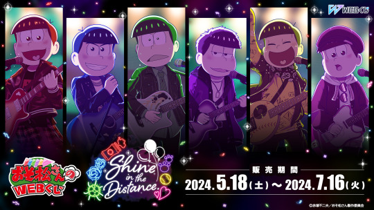
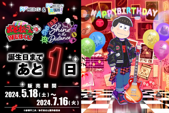
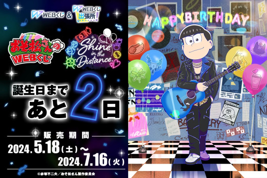
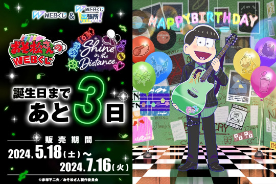
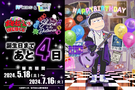
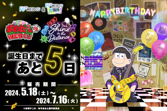
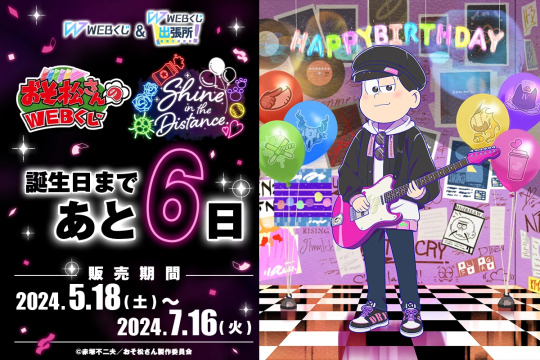
Osomatsu-San Web Kuji — Shine in the Distance Web Kuji ( 2024 )
#hi have you guys seen this year's birthday kuji? bc i'm still not over it#the art in this is so good i really love their outfits.........#ngl i'm usually only really interested in kara's merch but i actually wouldn't mind having all of the brothers' postcards#ALSO THOSE PICK SHAPED BADGES??? killer i want them so badly#the acrylic panels that look like displayed cds too.......#now if only i knew how to enter a kuji from the us......#i know there's ways to do it i just need to look into it ig#i wonder if the proxy service i started using lets you enter web ones through them...#i've already seen listings for some of the items on mercari jp tho so i'll probably just try to keep an eye out for anything i want#osomatsu-san#osmt#web kuji#merch#osomatsu#osomatsu matsuno#karamatsu#karamatsu matsuno#choromatsu#choromatsu matsu#ichimatsu#ichimatsu matsuno#jyushimatsu#jyushimatsu matsuno#todomatsu#todomatsu matsuno#official art#queuesomatsu
77 notes
·
View notes
Text
Catching up on the whole watcher situation because I ironically stopped watching their channel regularly because I didn’t like how expensively produced their shows were compared to Buzzfeed Unsolved’s simplicity
#i didn’t have a problem with them changing the way they did things or anything#like it made sense that they would want to have a significant departure from their Buzzfeed style after leaving Buzzfeed#i just didn’t like it as much#so i would only watch occasionally if i needed something to listen to in the background#the fact that they are now trying to put their content behind a paywall#because production is so expensive#is wild to me#like imo the production actively made the show less enjoyable#why are you spending money you don’t have on it???#idk it just makes me sad#like i know the YouTube documentarians i watch are probably going to end up doing videos on this#usually with those videos i’m the one from the outside looking in on some drama around a person i’ve never heard about before#but i was a fan of ryan and shane since high school#I have some of their Buzzfeed unsolved merch#it’s sad that people i looked up to turned out to be so out of touch on so many levels#watcher
110 notes
·
View notes
Text

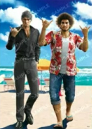
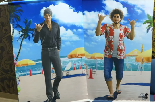
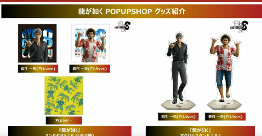
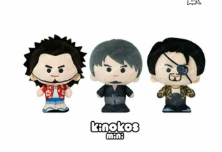
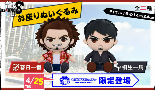
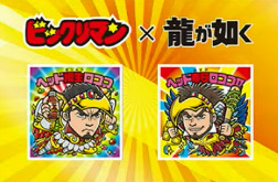
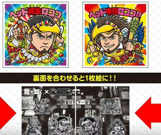
#i would kill for the kiryu wall scroll but im mad as hell they aren't selling one with both him and ichi#yakuza#infinite wealth#like a dragon infinite wealth#rgg8#ichiban kasuga#kazuma kiryu#ada speaks#horrid creatures#im not gonna bother captioning this but. it's from today's livestream#kinda surprised kinda not surprised at all nobody's posting about it but w/e#there was a shitload of other merch too but i just want the 🤙 renders#was very very funny watching people screaming in chat bc yokoyama said the words Kiwami Three#(saying it's not coming next but maybe at some point)
91 notes
·
View notes
Text
We have run like 30 railjack missions and Sevagoth's fat heaving chassis won't drop. I have like 5 Sevagoth systems. Maybe if I hammer them onto one of my 9,000,000,000 Harrow chassis I can transmute it into the part I need to make this man
#textpost#I've been haunted by visions since that dream yesterday#NO ONE DRAWS SEVAGOTH. I've found like maybe 10 drawings of him#And the subreddit/tierlists always have him in 'who's that again?' tier argh!!!#solradguy get into a character that's not some weird side freak challenge 2024#(sol badguy doesn't count.... but HOS does..... no fucker draws HOS. he's got like 3 official pieces of merch)#Sux I've pigeonholed myself so firmly into Guilty Gear#I could make merch for the little guys that don't get anything otherwise but it'd just confuse my followers if I like#Randomly dropped Sevagoth or Vincent Valentine merch rofl#I don't want to invest in something I'm not confident I'll break even on...
71 notes
·
View notes
Text
can dnp please do archival merch soon. im talking like og amazingphil and danisnotonfire merch. im talking the 'im a danosaur rawr' shirt.
#i really want that shirt#i also want to just get my hands on some old school merch aaaaaa#dnp#phan#diary
47 notes
·
View notes
Text
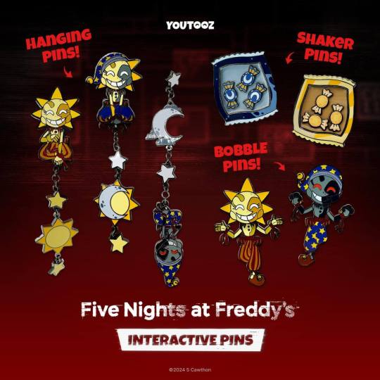
overanalyzing (nitpicking) these pins (under the cut)
sun's hanging pin: printing error on the ribbon on sun's right hand (yellow instead of red)
this has since been fixed but it's really funny LMAOOOO how did that happen
moon's hanging pin: the ribbons and the hat are going different directions in the artwork (moon's hat falls down but the ribbons don't, most likely because this is essentially just an edited version of sun's artwork)
this one's a little hard to explain. the colors for The Sun and the stars on sun's hanging pin share the same color palette as sun, but the colors of The Moon and stars on moon's pin don't relate to moon's color palette as easily. the star's are the same color as their teeth, but The Moon itself has it's own unique color. it's actually the clouds surrounding The Moon that share a color with moon (same color as their face)
this makes me think that the clouds were added for the sake of sharing colors from moon's face so it's like sun's? but idk that's just a theory lol. imo it's an odd choice to add clouds to it but it's honestly the prettiest part of the pin so i shouldn't complain too much i guess..
"sun and moon" hanging pin: this is obviously based off of eclipse so why are they calling it "sun and moon"? is it because it's not technically ruin eclipse and therefore they can't call it that? that's odd to me. maybe it's for a legal reason. who knows? i certainly don't
the pants don't have any stars even though the hat has them. and this was a purposeful choice. is it because it'd overcomplicate the design? is it a restriction required to make the pin? it's just an odd choice considering it's such a noticeably empty space now
all the dark parts that are meant to represent moon are a weird grey color now and it looks really odd to me. i'm guessing this is just to differentiate them but it's kind of ugly HFJSJGJD
their button's are blue? even though moon's aren't? why
the crators on The Moon on this pin are positioned slightly differently than the ones on moon's. i thought the design was just copy pasted onto this pin but i guess i was wrong? i'm not sure if this even means anything JDJSJFKDG
the bobble head pins: i think their poses are the same as the other's but they've been flipped and edited to differentiate them. this is probably a really obvious observation. regardless i do think it's fun when they parallel each other so i guess i can't complain about how cheap it feels HFJZJGK
there's a weird space between their arm and their ruffles? for sun it's on the left and for moon it's on the right but i can't really figure out why it's there... my guess is that it might've too hard to cut out since it's enclosed in the design, but it's too large of a space to hide it by coloring it in so they had to leave it like that. there's a space like that on the ribbons too so that's probably it. oh well, nothing's perfect
speaking of the ribbons: they're drawn differently between sun and moon! i thought it was just the hands that were changed but i guess the ribbons were too
moon's bobble pin: according to the art for the pin moon's secondary body color is supposed to be a dark blue, however it's so dark that it just looks black on the pin... it's probably more of an oversight than anything but i honestly think it looks kind of cool. i wanna draw it
i think moon's primary body color on the pin is honestly kind of ugly. the color on the art is ok even if it's a little dark but the cyan tint on the pin combined with how dark it is makes it look ugly to me
sun's bobble pin: sun's colors are... a little too yellow for my tastes but are otherwise fine. the colors on the art itself look nicer but i'm aware that the physical coloring doesn't always line up with digital color codes so you can't be too picky about it i guess
sun's secondary body color is technically incorrect (it should be the same secondary color as the face) but it does look nicer like this so just consider this as an observation rather than a complaint lol
the candy shaker pins: i dont have much to say about these (i think theyre nice but a little boring) but i do like how the designs for the bags match the time of day for each of them. the moondrops have a moon with stars and the sunnydrops have a sun with rays of light. it's charming
overall: they're cute i guess... but the fact that there's an entire collection of dca pins makes it so obvious who they're marketing to lmaooooo
#my post#this is just a bunch of nothing HFJZKFKF#i just. im obsessed with that printing error. how did that happen. isn't there some sort of quality assurance for these things#anyway despite how long this post is no im not buying them#i don't like the youtooz designs for anything. i know it's their entire marketing schtick but the eyes bother meeee#and also there's simply too much merch for the dca. it's so obvious that everyone's just using their popularity to sell more stuff to peopl#btw i turned rbs off because i dont want this to spread to the people who r gonna complain about me being overly mean DhJzjKdjLKdj
59 notes
·
View notes
Last Seen Blogs
etoile-harmonia
Noa

fadidoo205-blog
Untitled

eagleroof
Eagle Roofing

superhijaaabi
SUPERHIJAABI

thesimpsonswayoflife
The Simpsons Way of Life