#i kinda..really like the third palette
Explore tagged Tumblr posts
Visit Tumblr Blog
Explore Tumblr blogs with no restrictions, modern design and the best experience.
Last Seen Tumblr Blogs


Fun Fact
When “GIF” was named word of the year in 2012, Oxford Dictionaries U.S.A. credited Tumblr for pushing the word.
Text


I’m playing dress up
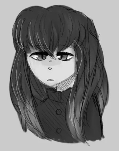
#maccadam#transformers#senator shockwave#shockwave#I can’t believe I’m only now doing this lmao#the guy changes his paint every week and yet I keep repainting everyone except him#stupid idea for Senator Shockwave merchandise#a toy that has removable plates that you can color yourself#literally who except for me would do that but anyway#i kinda..really like the third palette
1K notes
·
View notes
Text
its been forever since i first redesigned poppy but im still so proud cuz her old design(s) sucked soo bad and now shes so so cute
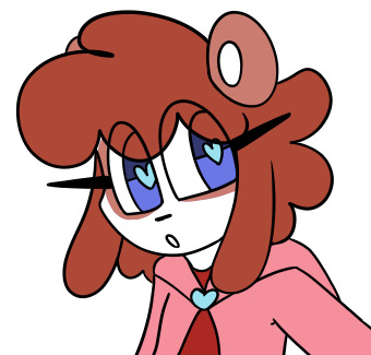
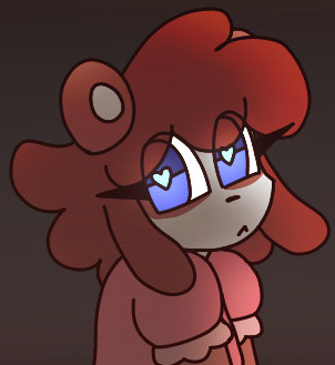
(old art but its still relevant loooooooook)
#im drawing her again n e ways teehee#i am soooort of redesigning her kiiiinda mostly just so she fits my current style mostly just her clothing#its more poofy cuz i like drawing hoodie sleeves n stuff alot#also was thinking about her old design(s) again.#idk if she counts as a redesign actually or moreso. repurposed?#her name comes from an unrelated character whereas the character i redesigned was completely overhauled here#old design that wasnt called poppy was kinda ugly. she was like purpleish i think but a really sucky palette#old poppy where i got the name from was green... and ig both old ocs had similar premises so they could just count as one idk#i dont know if i was thinking that when i made old design not-called-poppy#WAIT I JUST REMEMBERED I HAD A THIRD WHOLE OC TOO SHE HAD LIKE ZERO CONSIDERATION IN POPPY except maybe that she was pink.#i couldve looked at third girl and been like hmmm pinks cuter.#old poppy and third girl actually co-existed but w/e#i have to go out tomorrow idk why im rambling in the tags at like almost 2am jesusss
0 notes
Note
hi I really love your art I just wanna eat it and consume its knowledge but that’s kinda impossible so I wanted to ask a bit about your process? How do you pick your colors? I really like your color palettes :))
Aw heck thank you!
Here are my color swatches since you asked:

I can go over what I remember of my thought process when picking these colors.
Lets start with Starscream since I really wasnt drawing anyone else back then. I know some of the toys has him as more of a grey mech but I always saw his body as white, but even then I didnt want it to be a pure white. I decided silver would be a good compromise, and to me silver is a light grey with more of a cool tone to it, which meant the grey of his helm and faceplate had to also be more cool toned to match. I also didnt want his helm to be too dark even tho I think it’s supposed to be black? It’s just better for readability, I use that helm color for anything that should be dark grey to black, like car tires. I gave his face a darker grey than the body since Starscream has a darker face than Thundercracker and Skywarp in the cartoon.
From there I think I just tried out different reds until I found one I liked, a bit of trial and error. I might have made it slightly muted cuz it felt less heroic? I don’t really know haha. I just know when I picked a red for the Autobots I made it more saturated. I also don’t know why I chose that particular shade of blue, since I think Starscream’s arms are usually a lighter blue? Must have just decided it worked best with the red, or maybe the reference I was using just happened to be darker.
His eyes (and the eyes of pretty much all cold constructed bots) are pure saturated red.
And then I decided all cybertronians would have blue tongues since their blood is blue.
When I started drawing other seekers I decided they should all have the same faceplate and helm color. The only exception is sunstorm, who I decided to give a warmer toned grey for his helm and faceplate. I think it makes him look out of place among the seekers, which is the point
Thundercracker just straight up shares his color pallet with Starscream, but Skywarp needed his own swatch since neither of them had purple in their designs besides the decepticon logo, and I wanted skywarp’s purple to be different from the purple used in the decepticon logo.
For the longest time my color swatches were just Starscream’s colors plus a purple for Skywarp. Ive been slowly adding colors as the need arises. I prefer reusing swatches over color picking new colors every time, like how Sunstorm and Bumblebee share the same color Yellow. That said, I’m also stingy about adding swatches too XD usually I wont add a color to the pallet until the third or fourth time I have to pull up an old comic to eyedropper from. not sure why I havent added swatches for rumble yet tbh
idk if any of that was interesting or made sense, but thanks for asking XD
276 notes
·
View notes
Text

LET'S GO OUT WITH A BANG 🚦
taglist:
@ashiyn @single-malt-scotch @goodtimeswithetho @pebbltree @crabbunch @catmaidetho @amethyst-allium @stitchthesewords
sooooo ermm i guess i get to talk about this piece now YIPPEE
i am one of those people who's constantly trying to figure out what their own art style looks like LMFAO. i take frequent breaks from art due to mental health shit so it feels like every time i come back i'm trying to find my footing again.
that being said, i had a lot of caffeine yesterday and started this on a whim and it ended up being something i'm incredibly proud of. i think it helps that i've been redrawing old emotes for a friend's twitch channel, so figuring out which brushes i like right now was really helpful, and i ended up using my personal emote palette like...a lot. that pink in Etho's eye, the purple used for shading, most of the browns are all used in my own emotes. it's wild how much having colours already picked out streamlines things!
Etho is the one i started with, of course, and ended up being one that i went back to re-draw after i'd done...three? or four? more, because the sizing wasn't right and i wasn't happy with the posing. i still wish i could have conveyed him dipping his chin into his coat fluff a little better, but oh well. i thought of the little detail of him looking at Martyn's drawing at the last second (#ethtyn4life) and it made me laugh so i did it. points to you if you caught that!
Joel was the second - life!Joel has always been fey in my head, especially after that season when he just went batshit insane the second he turned red. can't explain it, that's just how it be. i tried to give him an air of subtle menace about him but i think he just looks sleepy 💀 i'd like to do these as individual, larger pieces at some point, so maybe i can work on that more then.
Grian was the third - he reminds me of a Lost Boy here and that wasn't intentional but the Lost Boys always kind of freaked me out and life!Grian's kinda freaky so i think it fits. his little smirk is so creepy and i love him.
i don't remember who i did next after this so we'll just go in order pfft
Bdubs is SO CUTE look at him. one of the few where i couldn't make a menacing expression work, and honestly with how good his profile turned out i barely mind. i did that side profile with no reference, y'all, idk what kind of crack i was on last night. what the hell. this was about the point where i started wanting to do little lore doodles for everybody so i added the clock face - i think it clashes with the red background but what can you do.
CLEOOOOOO CLEO CLEO. i LOVED drawing them, i think their design is one of my favourites of the bunch. her hair has always been snakes in my head and AGAIN i drew those with no reference, can you fucking believe that. i loved the little detail of some of the snakes poking at the people next to her, they're so cute hehe. also Cleo has freckles now, i'm so sorry but i don't make the rules. someone complimented the teeth in the reblogs and THANK YOU!! they're not quite anatomically correct but fuck it we ball and they look cool as hell anyway.
Martyn is so smug, i love him. points if you caught that he's looking at Cleo bc Double Life, i wanted to do something a lil different with him than just another straight up symmetry tool drawing and i think it fits. he is so eye-searing tho sir please tone it down.
Lizzie is fey just like her husband, and also she is smol. i don't think it's conveyed as well as i'd like here but i also didn't want her to look like a straight-up child so i did what i could. she is So Scary with those vacant blue eyes oh my god. and drawing her hair was sooooo fun i love long hair ahh
with Gem i basically smoothed out a rough design sketch i posted awhile back and i'm so proud of the little head cock she's got going on, she looks so cool. also her hair?? idk how i did that. i love her swoopy bangs so much.
Pearl is moth. Pearl will always be Moth. so she got lil antennae and big buggy eyes. drawing that hood was so satisfying, i used to try and draw Raven Teen Titans in high school and could never get the hood to look right so seeing this one come out perfectly was sooooo good. and of course had to include a teensy moon.
that's all i've got, i think - i feel myself crashing LMFAO. maybe at some point i'll come back and say more but here's this for now!
#smallishbeans#ethoslab#bdoubleo100#grian#zombiecleo#inthelittlewood#itlw#ldshadowlady#geminitay#pearlescentmoon#trafficblr#life smp#🚦smp#vse.art#*#image description in alt#y'all doing the alt text for this was an ADVENTURE lmfao#popular? i know about popular.
235 notes
·
View notes
Note
Do you have some REALLY old sketches or drawings of kny characters you could show us, like maybe before your artstyle developed? 😋 (Idk I'm just so curious how you ended up with this fluffy adorable style bc I LOVE IT T-T)
oh my god i absolutely do--
lets use muichiro as an example
the first drawing was from 2019, to give you an idea of what my art looked like at the time
i had no idea how i wanted to go about drawing humans. at the time it was drilled to me i should draw more realistically, so my work suffered greatly. this is why the hair is so messy and the face just looks so... walten-filesy, i guess
the second drawing was from early 2023, when i tried drawing muichiro again as a result of catching up on demon slayer!
i was still not drawing humans, so you can tell i was kinda experimenting a bit with the brushes. i color picked from his official design
i stopped drawing him for a few months, as i really hated how it turned out. i ultimately gave up on my art for a bit
then, at the end of the swordsmith village arc, i tried again. i ended up getting really attached to all of the hashira, so i drew them little profiles-- as shown in the third image
this is where you can see im staring to develop my style properly. i came to terms with the fact that i wanted a more cartoony style, and i started to embrace it. i also made my own color palette to better fit my art style
from then on, i was fixated on demon slayer, and with muichiro being my favorite, i drew him constantly. the fourth image was drawn a couple months later, after the baby hashira craze

you can see how much it was changing. the detail in the eyes, the way i drew the hair, his palette, etc. through constantly practicing and drawing him, i developed my style more and more
the fifth image comes from the "hugging muichiro" series, in which i had to draw muichiro nine different times
i began studying art styles i really liked, and particularly analyzed the way muichiro was drawn in the manga. i loved his hair, and tried to replicate it in my style. you can also see i revised the palette a bit more to better compliment my work!
finally, the sixth image-- my more recent style!
his current rendition really just comes from me having drawn him so many times. my style just grew and grew and grew! i modified his color palette even more, making his hair more blue tinted and giving him a cool color palette
that saying "practice makes perfect" really does reign true tbh. the reason my style is the way it is was because i kept practicing and revising my work, and i would adopt things i like from other people, such as gotouge themself
i hope this helps!!!
my art literally started off looking like That. trust . everyone has potential!
#askbites#art help#digital art#artwork#art#artists on tumblr#my art#art study#art process#demon slayer#kny#artbites#illustration#muichiro tokito
185 notes
·
View notes
Text
the doctors and companions as animals that fit their vibe
nine: dolphin. i had a friend who used to say "nine scares me, he looks like a shark" and everytime it would make me grouchy. she was kinda right, though. but i think dolphin is closer. i know dolphins aren't actually that nice, but today we're mostly judging based on looks and nine most definitely has the vibe of a dolphin: gentle eyes, a huge smile, a very loud, fantastic voice, fast, cheeky and excited. oh, and a big nose as well
rose: seahorse. idk, it just fits. it's the fact that they're colourful creatures maybe, and the shape of the jaw, or also how magic they are... can't really explain it! rose just reminds me of a seahorse
mickey: tiger. it's in the face shape and those facial expressions he gets when he stands up to the doctor or anyone who goes against his beliefs, i think
jack: american black bear. not grizzly bear, not polar bear (although i did hesitate with polar bear), american black bear all the way. first, cause he's american so it's funny. second, cause bears are massive creatures and jack is tall and muscular. third, again, the head shape (which is why grizzly bear was out of the way). fourth, both are hug shaped, wild and actually dangerous
ten: fennec. do i really need to explain that one? big brown eyes, cute af, high-pitched voice and funny jaw... yeah, ten is a fennec
martha: zebra. this one i really can't explain! but i'll still try: i'm not really familiar with zebras, so idk how they behave, but they look gentle, and i've heard they're intelligent, sensitive creatures as well. which is what martha is. i think it's also in the pretty brown eyes with long lashes hihi
donna: doe. maybe some of you will be mad i didn't just say fox, or disagree cause the doe is known to be a fearful, quiet creature, and donna is absolutely none of this. but hear me out: she is gentle and when she's not screaming at the top of her lungs, there's something so soothing and ethereal about her. they are both very maternal, and red hair holds -to me- a connection to nature that no other colour does. the doe has huge brown eyes, and donna's eyes, although huge, are blue. but when you look into them, you can see a gentleness that knows no bounds and that is why i chose it as donna's animal. also the little spots on baby deer remind me of her freckles (yes i am in love with her shut up)
eleven: racoon. well... yall got stuck on the giraffe but eleven is a little shit and so is the racoon. i absolutely do not have anything deep or smart to add to this, i just feel it in my gut
river: leopard. fast, dangerous, elegant, and also the colour palette kinda fits. and! the female feline usually does all the work so that's the tea for today
amy: red panda. red hair, round face, big eyes, cute... yup, amy's a red panda for sure
rory: koala bear. they both look like they get screwed over on a daily poor little guys. gentle and slow, the koala bear is rory's perfect fit. also, they have a similar nose shape
clara: elf owl. just like that bird, clara is small, has enormous brown eyes, a cute little mouth and a sorta heart-shaped face. i think it's one of my best choices
twelve: crow. crows are smart, edgy, actually very sensitive and like to hang out with living creatures even though you often see them alone, and they're also annoying af, can't stfu, hold grudges and take their revenge. twelve is mostly all that. also if i remember correctly he seemed to relate to and like crows
missy: peregrine falcon. idk, missy does have a bird face with her long sharp nose and big blue eyes. i even think michelle gomez mentioned it in an interview (like, she compared herself to a bird. maybe i'm delirious). falcons like to prey on small defenseless animals. missy does too
bill: horse. she kinda looks like a horse i think (it sounds mean but in my head it really isn't i promise). at first i said pony but then i remembered my mum saying ponies are dumb, petty creatures. bill on the other hand is smart, sensitive and gentle. she does still have a sharp edge to her, won't hesitate to kick your arse if so deserved, even if you're a 40000000 or whatever y/o time lord who looks like your local knowledgeable cool grandpa. which is why horse is a very nice fit for bill
nardole: penguin. the choice was so easy to make cause the man is bald, bitchy, weird and kinda walks like a penguin. we love you nardole, never change
thirteen: kangaroo. i don't have a clue as to why tbf. it's the sheer adhd, also the colour for some reason fits her, and the fact that they look nice and peaceful but are actually very dangerous, destructive creatures lol
yaz: hare. another one i can't explain. just fits. yaz, to me, didn't reach her full potential as a character, but what i did notice in her was her intuitiveness and how she usually kept her guard up. reminds me of hares. not just that but also the general vibe as well
graham: beaver. graham had this cute quirky little obsession with building a home and with his "fam" and that's what beavers are known for. apart from his blue eyes that differ from the beaver's own brown ones, he also physically reminds me of a beaver. and if beavers could talk i'm certain they would sound like graham o'brien
ryan: labrador retriever. i had a labrador once, they're goofy, awkward, impulsive, friendly creatures. and just as cats show severe signs of autism and adhd, labradors absolutely display symptoms of dyspraxia, which is what ryan has. both are disoriented and clumsy. they also will do anything to protect people they love, and then be like "oh shit" cause they actually can't really fight and keep putting themselves in situations
dan: wolf. idk he just really looks like a wolf
fourteen: coyote. we're staying in the canine family for david tennant. i did want to choose something other than ten's for fourteen cause they have such a different vibe. there's something really pitiful about coyotes that fits this man perfectly. again with the high-pitched voice as well. anyway. fourteen is a coyote
fifteen: panther. fifteen is seductive, pretty, slim and smoothe af. he's also dangerous and yet you still wanna hug him don't you? yeah that's how panthers make me feel
ruby: dormouse. ruby is cute as hell, i think we can all agree on this. i chose this rodent specifically because of its slightly rounder face shape (hamster might have been more accurate but i hate hamsters so much man, ruby deserves better). she's always so stressed and jumpy as well, which is why to me a small rodent was an appropriate choice
belinda: european robin. she has the elegance of a robin, she's adorable, she's fierce and quick and physically reminds me of a little bird for some reason and that is all honestly
#doctor who#dw#ninth doctor#rose tyler#mickey smith#captain jack harkness#tenth doctor#martha jones#donna noble#eleventh doctor#river song#amy pond#rory williams#clara oswald#twelfth doctor#missy doctor who#bill potts#nardole#thirteenth doctor#yazmin khan#graham o'brien#ryan sinclair#dan lewis#fourteenth doctor#fifteenth doctor#ruby sunday#belinda chandra#feel free to bring your opinion to this#i've spent half the night doing this cause i couldn't sleep lol
52 notes
·
View notes
Text
Finally Ironed out some ninja designs! I Usually don’t share references but with the behind the scenes stuff I’m doing on my Skybound project I don’t have much else I can share yet.


There is a few headcanon/ Fic stuff in references and powers and the all ninja shot is for first part of Skybound project.
I can share Skybound project Updates! I’m making lots of progress! Trying to focus on p1 stuff so I can put full force into the p2 stuff!
|
V
P1 may be ready Summer? 2025
My Skybound talk Video:
* God I have so much to ramble about just when I think I covered something a new angle gets me
* How TF am I supposed to sanely transition from the wholesome reasons I love this season into the horribly problem stuff. Sigh*
* Actually studying videos covering serious topics to navigate how to word things.
* I have to stop drawing so much art for everything or no one will ever see this video.
* The desire to animate my character lipsinking to me is an evolutionary disadvantage I will resist.
Cannon compliant Animatic:
* Song is Ironed out fought a while adding voice lines and I’m way more excited than I thought I’d be for this animatic because I thought it would be overshadowed by how strongly I feel about the other 2. But damn.
* I’m storyboarding after like my life depends on it rn
* Really trying to capture Nya’s character Ark which sent me right back to the video script because I remembered that one reddit post calling her a bitch and rage wrote for 2 hours.
* I am determined to make people see how good her character arc actually is.
* Throwing Jay shade in this one lol he was kinda awful even with being manipulated.
* Trying to convey clear Ideas and story through art is pain but also addicting.
* This is meant as a leading to both part two animatics, but bbnb Kai is shorter than wytyaa Kai. The difference is significant everything else pre dinner with Nadakhan is the same. The other head cannons are almost aligned as far as I know. It’s JUST Kai. What do I do with him?!? Lmao Might just distance him from the other ninja so you can’t tell how tall he is. Thank goodness he is the most gullible and first to wish it all away
P2 out like December if I’M lucky TT
Even though I should focus on first things first, I can’t help myself. these fics have lived rent free in my brain for like 2 years and despite plans shifting the excitement of drawing the story I read and put to music in my head is a force of nature. Thanks Adhd
Wytyaa:
* I storyboarded about half the scenes I want to. Songs are decided but a few parts I’m waiting for the rest of the story for.
* I think I’m going to mess with color palette. I really want to capture the emotion and intensity. I’m learning the full potential of my art and
* I need Final ch released for maping out the second half.
* BUT I AM NOT READY TO READ IT @mondothebombo And from what you told me I don’t think I’ll be able to finish P1 by then. cries*
* I wanna capture the feeling reading wytyaa.
* May make my wytyaa specific refs so I can make animatic art I can post early.
Bbnb
* It’s all storyboarded and half animated
* Thinking about redoing most the earlier stuff, consistency has been a problem
* Also was to mess with colors, dark backgrounds and intense colors.
* I fought with my ref forever to find good enough lightning scar colors cause figuring out the right amount of contrast is pain.
* So now I want to redraw my bbnb scar references a third time.
* May draw other bbnb specific refs so I can make some art for the animatic I can post here early or on on my old A03 book
If you have Any questions feel free to leave an ask! I answer all eventually sometimes I do save em up though so if I didn’t answer something yet, Sorry I will get to you.
#ninjago#ninjago art#ninjago skybound#ninjago jay#lego ninjago#ninjago angst#ninjago nadakhan#Oli Art#my skybound project#jay ninjago#ninjago kai#nya ninjago#ninjago cole#ninjago zane#cole ninjago#ninjago lloyd#ninjago nya#ninjago skybound art#ninjago season 6#wytyaa#bbnb#<- my friends fics are incredible but very dark head the warnings#especially bending but never breaking adults only
81 notes
·
View notes
Text
lolol finally finished the “something” i mentioned in my first post.
initially this was gonna be my first post.
would you believe me if i said that i’ve been on a binge of undertale multiverse brainrot, yet missed the sans 2024 au sexyman poll?
or whatever its called lol.
i don’t have a twitter anyways.
as much as i’m tempted to go quietly stalk the artists over there…
i’ve already bit the bullet and finally made an account after being a long time lurker of this hellsite. you win tumblr. fu¢k you and your stupid login wall.
anyways hi.
take a guess who’s been living rent free in my head the past month lol.
Sans is actually my second favorite character after Papyrus, if we’re talking canon story ahaha…
i used to post so much of my art when i was younger. it was fun. i miss that.
the engagement and feedback, interacting with fandom…
self-imposed pressure to consistently post art that i wasn’t very proud of may have killed my motivation. among other things. like being too "busy".
the only way i’ve really been able to get back into drawing is sketching. full color drawings is still too overwhelming.
but i find this character design particularly fun to draw AND color. i guess it’s the simple palette. usually i stress unnecessarily over colors not looking right.
but here i think chaotic elements like sketched and messy coloring help work FOR the character to represent the glitching. like if you look at the sleeves i normally don't like when the pencil texture looks like that. it's still kinda messy. but i like how it turned out overall.
drawing characters i like helps get me out of my comfort zone. and enjoy drawing again.
and Error's such a fun character.
he's definitely one of my favorites.
how happy i was to see he actually won this year. enough so i drew up these sketches as soon as i found out. a month late.
lowkey tho it would have been very funny if he got 2nd place third year in a row lolol.
maybe next yeeeaaarrrrrr.
#errorsweep#undertale#error sans#geno sans#utmv#utau#sketch#sketch dump#2024#tumblr sexyman#sans polls#momomomochi#how many tags is too many tags
70 notes
·
View notes
Text
Constantine XI Alter (Saber)
>Spoilers for Constantine’s Interlude<


Foreword: This was supposed to be a sketch, I swear. But on another note, I am alive! Just slowly working up to writing after a few hectic weeks. But the train is moving, just very slowly which I imagine is nothing new. One thing I HAVE been getting up to is my painting of portraits of my blorbos for their birthdays. I suck at drawing anything festive, so I hope the quality of the piece makes up for it, hehe… I have Constantine’s done and I am extremely proud of it.
Buuut that’s in February, so let’s get into my explanation and thoughts on this hypothetical of my boi! Starting off with…why he looks like this.
(I would also like to note that I haven’t ran this through TTS yet so there probably is some grammatical errors and for that I will apologize in advance, I will iron them out soon.)
Fixed it! And I added a few more lines just to explain things further.

On the Subject of Appearance:
Alright, obvious and iconic Alter color palette aside, what’s up with the vast amounts of white? That’s because… Our guy wears black mostly in his first ascension and then dies it down in his second by adding a LOT of red, so it’d make sense that his alternative would be set apart by having him wear and have the color white. Plus it illustrates just how DIFFERENT he is compared to Micheal, how opposite or perhaps opposing he is. But more on that later.
I also tried making his hair look significantly messier than Constantine’s to set him apart and make him look more scary with his wild hair, especially in his third ascension. I looked at a panel of Yhwach from Bleach to see how I could do that since his hair looks so COOL but I couldn’t quite get it to how I wanted it thanks to the pencil I was using admittedly not being the best for that sort of thing. Now if I had used monoline instead then maybe it could’ve came out better…
(Also I was planning on this being just a sketch so I wasn’t really thinking of coloring anything until his second ascension when I realized I would have to in order to communicate how different he is from Constantine and it kinda snowballed from there. Oops… You might be able to tell, but I was looking at Saber Alter’s sprite from Stay Night for ideas on how to color him. Now. I just noticed that I forgot his crown for 3rd ascension and I did try adding one recently but it looked kinda bad… So we’ll just leave him without it for now. I could justify its absence by saying that it broke when he was altered and it basically signals his now ironically unholy nature, but I had to speak truthfully first.)
Now, about the cracks on his skin. THAT is marble. Sections of Alter’s body are petrified marble with a few dry cracks in the skin. Why? Because of the legend circulating after his death of him being a marble statue. It’s like how Hans has mermaid scales and how Okita will forever have tuberculosis, Alter’s body along with several other things were affected by how people saw him. I’ll get into it more later.
But! There are some cool things, or not cool rather, to note about the marble patches on his body. Like how a lot of pain he’d feel is nullified by it thanks to lack of, y’know, nerves. This also goes for sensations in general as he wouldn’t know if you were tapping him on the shoulder or were pouring boiling water on that spot. Sections of his body cannot feel but can still move just fine. It doesn’t impede his movement at all. It just…cracks a lot.
If you ever see him stretch and pop his spine, you will not only hear the snapping of bones but also stone splitting. Don’t worry, it’ll fix itself so you don’t have to worry about him sustaining major damage from just moving around. It’ll just take some getting used to on your end.
Now. You may have noticed that the marble patches grow more the further into his ascensions he is, to the point where his armor receives patches of marble on it too. Now this wouldn’t even be something to mention if not for the fact that I’d like to think that anything new he wears in his 2nd and 3rd ascension starts petrifying slowly over time. Not all the way but enough to the point where it gets to be a chore doing laundry. Just a neat addition to what is already there.
But yeah, that’s all I got for his design so far. On to the next!
On The Subject of Class and Gameplay:
If you play JP or have Clairvoyance then you already know why its not the obvious choice. Because his legend mentions specifically that the angel who wakes him up will give him the sword he used on his final day. So it’d make sense that his class would change to Saber.
Now. In this hypothetical where I’m the one designing him as a unit. I’d imagine his gameplay to be like so:
2 Buster Cards with 5 hits, 2 Arts Cards with 4 hits, and 1 Quick card with 3 hits. Five hit Extra Attack because he’s cool like that. Same card numbers but different hits on most.
His NP would be an Offensive Buster NP whose description looks something like this:
Legend of The Marble Emperor (EX):
Increase Buster Card Effectiveness for 3 Turns, Increase ATK for 1 Turn, Inflict Curse, Deal Major defense ignoring damage to one/all enemies, Restore HP by 2,000 (effect increases with Overcharge), Apply Resistance to Death by 5000% for 1 time (non-stackable) and Apply a stackable Guts for 5 turns that restores half of Constantine XI Alter (Saber)’s HP upon Death.
That is one hell of an NP that not only hits hard but also provides major survivability which is what Constantine is all about. Now, I could quite decide if he should be a Single Target or an AOE but I do imagine his gameplay to be your awesome clutch soloist unit for CQ’s, Advanced Quests or boss fights. Is this really cool hypothetical NP a showing of my massive bias? …Maybe. But that’s not important, onto the skills!
Skill 1: The Ends Justify The Means (A) [Cooldown at LV.10 is 6 Turns]
Increase Buster Card Effectiveness for 3 Turns, Increase ATK for 3 turns for All Party Members and Apply Target Focus to All Party Members Excluding Constantine XI Alter (Saber) for 3 Turns.
Skill 2: Demise Privilege (Alternative) (C) [Cooldown at LV.10 is 7 Turns]
Increase NP Gauge for Self by 50%, Gain crit.stars per turn for 3 turns, Remove 2,000 HP from all Non-Roman Party Members and Restore HP by 3,000 to self, Apply Guts to self for 3 Turns.
Skill 3: The People’s Wish (Alternative) (EX) [Cooldown at LV.10 is 6 Turns]
Apply a State Where Upon Hitting an Enemy, Inflict Curse (1,000 DMG) and Disastrous Curse for 3 Turns, Apply Special ATK to enemies with Curse.
As you can see, Alter is a very selfish DPS that drains HP from his non-Roman allies to keep himself alive along with inflicting curse stacks for damage over time. He’s be a nice pair up with Van Gogh for that last thing. And much like his NP, he really wants to live and it’s going to be difficult to kill him. So yes! Soloist in the form of a Saber.
Is his kit too cracked? …Maybe. Maybe not. I’ll let you all tell me what’s what.
On the Subject of Composition:
Constantine XI Alter is a Saber class servant comprised of three parts.
The first and the largest portion—the base, if you will—is Constantine’s ideal self, dreamed up during his final years of life in the late 1400s. As we are aware, Constantine utterly despises how weak he thinks he is. He hates the fact that he feels like he wants to breakdown and cry so much, he hates the fact that he’s terrified of dying, and most of all he hates that he isn’t strong enough to take the current crisis in stride like he believed his idols would have. Thus, Constantine saw his ideal self as a man who would not feel fear in times of crisis, would not cry when he was losing, and would not break under pressure. A truly stoic and strong leader that can handle any sort of disaster, that is to say: an emperor who wins for his people and survives.
The second part that makes up this servant are the wishes of the people of Constantinople. After Constantine’s death, a rumor floated around that the emperor had not died. He was rescued by an angel at the brink of death and turned into a statue. He would then sleep in a hidden cave underneath the Golden Gate of Constantinople awaiting the call of an angel who would restore his form and give him the sword he used in the final battle. It was a lovely thing to hope for and believe in, thus that rumor turned into a legend backed by the hopes and dreams of the people. It is this that would have completed this variation of Constantine had it not been for…
The third and final part is less of a ‘part’ per se and more of a distortion of what already existed. A wild, vengeful anger and grief corrupted what would have been the lovely culmination of the ideal self of Constantine plus the people’s hopes and dreams and twisted it into a cold automaton hellbent on continuing the existence of Rome as he knew it no matter the cost. These intense negative emotions came from the one and only Constantinople herself. When our favorite emperor perished and the Ottomans took over, there was no one as thoroughly stricken by grief—if we ignore George and Constantine’s remaining family—as Constantinople. It was pure agony to watch her people be murdered, enslaved and violated for days with the subsequent rebuild and installation of new buildings hurting too. But the most painful thing of all was watching her subjects slowly disappear one by one: people she watched grow up and live life for centuries on end vanishing never to return until all that was left was a large group of strangers who now occupied that space. It was maddening to say the least. The result was a lot of time passing and the events of Constantine’s interlude (yes, I read a summary of it and it could not come sooner for me.) While Constantinople WAS forced into slumber through the battle, much like the emperor she is so deeply connected with, Constantinople made a final last ditch effort to have her and Constantine’s wish come true. Thus the creation of an Alter of Constantine XI as well as a new singularity set shortly after the death of the real Constantine came to be.
On The Subject of Personality:
Alter is barely like the man we are familiar with, he would be practically unrecognizable if his face and voice were different. The most glaring difference is the lack of any expression on this man’s face. The muscles on his face only move for three reasons: he’s speaking, blinking, or the boiling rage underneath his skin has erupted upon the mention or appearance of the Ottomans. He just carries that same deadpan expression no matter what happens, good or bad. This is due to Constantine’s wishes to be a truly stoic man down to his core. Though, thanks to the distortion caused by Constantinople, most of his other emotions have been muted to make room for the, and I quote: “Boiling Rage™ that is 100% necessary and important to the restoration and maintenance of the Byzantine Empire. Yup, totally required. Why? Because screw you that’s why!”— Constantinople, circa Right Now. I kid, I kid. But really. Alter is either having tiny tinges of emotion flittering around in his skull sometimes—you know like the alleged to exist fruity taste of La Croix—or pure and absolute anger, no in between. Thankfully, for masters, the percentages of the anger are incredibly low unless for some odd reason you have Ottoman Turks appearing left and right in your area.
Unlike our friend Micheal, or any sapient being really, Alter doesn’t really…have opinions. He’s just neutral about most things in the world and mostly shrugs at whatever he’s interacting with. Good weather? Okay. Great food? Okay. Amazing friends? Okay. The milk went bad and the store’s closed right now? Okay. You stepped on the corner of five different Lego blocks on your way to the bathroom? Okay. Your pillow is scorching hot and you can’t sleep? Okay. Several hundred people just died in utter agony? O—you get the point. I’m sure you know one exception that Alter has, but allow me to provide you with one more and we’ll get into another in the next section.
The red earrings on his ears, cracked beyond belief yet still hanging just fine… Yes, Alter likes those. That’s why he hasn’t taken them off or let them shatter. Why? Well… He vaguely recalls someone important to him gifting him these. That man, after helping Constantine put his on, took out another similar pair and placed them on his own ears. He then said: “Now we match! Plus, I’ll be able to pick you out in even the most dense of crowds, my lord, as these earrings are one of a kind.”
(Yes, I headcanon that George gifted Constantine his iconic red earrings and has a matching blue pair for himself so that they both kinda match but hold their individuality all the same. A nice little thought that warms my heart.)
On The Subject of Speech:
The way this man talks is so dry and bland that one would think that Alter is bored out of his skull by simply existing. His voice is so flat and borderline monotone, no effort to emphasize anything or even to make digesting the info any easier. And to make matters perhaps worse he doesn’t talk much and tends to make what little he does say compact. It’s a flavorless way of communication that only changes when, you know, the Boiling Rage™ surfaces.
You know how in Constantine’s Bond Profile #1 it states that he “sometimes speaks more roughly in times of duress?” (Or “a more crude tone” if we’re reading the fan translation.) Yeah, well that’s no longer a sometimes. He still doesn’t talk much but man is he swearing and being rude as hell when he is pissed. The imperial decorum that our Micheal lives by has gone out of the window and will not be seen again until Alter calms down. No, he won’t apologize to anyone. Don’t bother, it’s a fruitless endeavor.
On the Subject of His Knowledge:
Alright, what does Alter know about himself? He knows that he was crafted by Constantine to be the ideal version of him. He knows about the legend surrounding his death and that being the reason for the petrification on his body. And he knows about Constantinople messing with his Spirit Origin and his current reason for existing and the objective that comes with it. …That’s it. That is all he knows.
Nothing about his personal life or his family or his best friend who had his back throughout it all, nothing. In its place are vague and fuzzy vignettes of familiar people he can’t put a name or face to that appear in his mind’s eye from time to time.
Now, as for his opinions on what he knows… Uh, I’ll just get the one with the least words on it out of the way first. The petrification thing? Yeah, he could not care less. The patches of marble on his body don’t limit his mobility any and yeah, the petrifying of his clothes is kind of annoying but it’s slow enough to where it’s not that big of a deal. It’s whatever for him.
Now. As for his creation—that being Constantinople messing with him and him being Constantine’s ideal self—he has a…not very good opinion on the two. And by that I mean he absolutely hates them both.
He hates Constantinople for twisting his already good spirit origin into what it is now and placing within him an undying anger. He also hates her for basically using him as a tool to get what she wants all because the ‘real’ Constantine rejected her wishes, essentially using him as a replacement. A simple means to an end… Yeah, even someone as dry as Alter isn’t happy with her one bit and immediately rebelled against her the moment she turned her back on him.
He hates Constantine for cursing him with the ridiculous traits of being stoic down to his core as well being the ‘perfect’ emperor for his people, the one who wins and survives. Because of that, not only does he not FEEL anything at all but he also has this immense pressure in his very soul that he MUST have Rome survive at all costs and that he must solely devote himself to that cause with every fiber of his being. Yes, the severity of those traits were caused by Constantinople’s anger and grief distorting him but the base traits were all on Constantine.
Now, in Constantine’s defense (because I am a Constantine defender), he had no idea that this would happen let alone that an Alter of himself based on what he saw as his ideal self, the emperor his people deserved and would suit them best, even existed in the first place. It was a dream to him. A dream of a man who was much better than he was, doing way better than he is and winning all at once. That is all that Alter was to him then and what he was to Constantine before the singularity. And upon seeing the cursed man before him, he could not feel worse about himself if he tried.
Endnote: Whew… That was a lot! But I think that was I’ve got on Alter. As you can see, I’d been doin’ a big think on him and he was a very fun character to design both artistically and in writing.
Whew… That was a lot! But I think that was I’ve got on Alter. As you can see, I’d been doin’ a big think on him and he was a very fun character to design both artistically and in writing. I hope you don’t mind the crumminess in the piece, if you can even call it that. I wasn’t joking when I said it was supposed to be a sketch hence the noticeable climb in effort across the ascensions.
In other more exciting news… I have 10 followers! Ten whole people! That’s enough to get one of those long tables at the fancy restaurants with!
It’s quite the milestone, one I was not expecting. So, to celebrate, I’m going to bypass the order of things I WANTED to get through with before I did this sort of thing—since I didn’t think I’d get 10 followers, honestly. But, I will be dropping a poll sometime soon—before the day’s end Nope, way too sleepy right now.—of a few headcanons you guys can choose from for me to do next! And not JUST for Constantine, Mehmed, or Sannan—no, no. I will also be tacking on my two other blorbos that I have neglected to mention, them being Hajime-chan (my strongest Saber) and Izou (my strongest Assassin.) So it’ll be Multi-Core Headcanons (haha), five people in one list. And don’t you worry, it won’t be like, one paragraph long or anything half-assed. That shit will be long, like 4k minimum per person which would—if I strictly hang around that number—would be a 20k long HC list.
So case in point! It’ll be a celebration and I implore you to vote.
But yeah. That’s all for this post. I’ll also be posting something else shortly after that is NOT the poll but a nice occurrence for lil’ ol’ me. If you have questions, comments, a desire for elaboration or a keyboard smash of your thoughts, let me know! And I’d like to thank you all for indulging my delusions today and before today and I hope you all have a great day.
—Redline, over and out!
#constantine xi#kōnstantînos xi#constantine xi fgo#kōnstantînos xi fgo#fgo headcanons#fgo headcanon#fate series#fate grand order#fgo#fate go#fate/go#Constantine XI Alter#Kōnstantînos XI Alter#Redline CAN draw?!#I also recently learned how to use pencil for lineart so that’s neat#I do kinda still prefer monoline due to its crisp#I also suck at giving names to things#So his skill names might be cringe#And I have no clue what his NP name could be#Also System 0 and Melting Away from Umineko were my jams for this#That soundtrack is excellent and I will never get enough of Harpsichord and Violin Rave Music#edit: shoot shoot I forgot the spoiler tag SHOOT
34 notes
·
View notes
Text

◟⸝⸝₊ Inkcomposer 500 Followers Event ᐟᐟ◞
I never thought I come this far this soon, I'm so happy and glad I get to this point, there's not enough words for me to thank y'all for this support I've got this four months
I know the previous event was kinda... A failure, but this is different and have 3 categories, so I hope this makes up to have more participation than the last event!

⟡ ݁₊ Event Rules + Info ⸝⸝⸝𓃦
This event is divided in 3 categories, drawing, writing and editing, so you can choose whatever category you feel like, or even try and participate in more than one, the choice is yours!
The theme of the event is Space Foxes and the blog's mascot Zresp, so all entries have to be related to the mascot or the space foxes theme to count
To enter you just have to have one entry in any of the categories, you can participate in multiple categories and that will give you an entry in each one of them, you can also submit multiple entries in one category and will count each of them when the price is given, so feel free to make as many entries as you want!
Make sure to use the tag #3StarsToFoxes and tag me in the post with your entry, if you don't do it like that there's a high chance I won't be able to see your participation
The event starts on April 20th and ends on April 30th, you have 10 days to submit your entry!!
⟡ ݁₊ Categories Info ⸝⸝⸝𓃦
Each category has its own rules and things to have in mind, so let's see each one so you can choose the one that fits you better!
Edit Category
You can edit either something with the theme of space foxes, or Zresp himself!
There's a drawing of Zresp here on the blog that you can use to edit if you're going to edit him, or you can ask for a pic in the inbox, I don't mind!
Regarding the theme, you can make any kind of edit (graphic, stamps, dividers, buttons, moodboards, stimboards, etc.) of any character or aesthetic, just make sure there's a glimpse of foxes and space, the edit has to have at least one element of both foxes and space to count
Drawing Category
This category is self explanatory, it's just make a drawing of Zresp or any kind of space fox you'd like
If you need the color palette of Zresp you can ask me on inbox or dm and I'll provide it to you
Writing Category
There are two modalities you can work in this category, either story or headcanons
Story, it's just write whatever you want (no nsfw) using Zresp or space foxes as a theme, just let your creativity flow, you don't have to write a super long story, it can be short if you want to, but make sure the theme is there!
Headcanons, because hc tend to be short one entry will be 10 headcanons, every 10 headcanons counts as an entry, but if one of your hc is really long can count as more, it will depend on how long or detailed the hc is for me to count it as more than one hc for the entry. And ofc, the hc will be regarding Zresp
⟡ ݁₊ Prizes ⸝⸝⸝𓃦
It's important to note, if you won in one category your entries for the other categories will not count, this is to ensure everyone has an equal opportunity of winning one prize
Each category will have their 3 winners, so in total, there can be 9 winners of this event!
First place: Tumblr blog pack + Theme pack or Rentry decor 1 + Theme pack
Second place: Theme pack or a Rentry decor 2 + 3 blinkies
Third place: Decor set or Page decor + 2 userbars
Important to note, because these are prizes they're not attached to the "only whitelist" rule I have in my normal requests info, but I won't be taking anything from my blacklist
Any question that you have, or something that I didn't specify that you want me to clear up, my inbox is open!
Thank you if you read all this shit, and I hope someone participates and enjoys this!
No tags because I'm to shy, boots if you want

15 notes
·
View notes
Text
On Acht and Romance
going into side order, from the september direct trailer where Acht was first revealed i remember the joke at the time clearly being "and now Marina's ex is here".
the way this line [image description in alt] was written was basically the only evidence for this kind of idea, when the theories were kind of "Marina's order tantrum is sucking people in from her past and the DLC will be about going through her memories", so ellipses in a line like this is basically all theory crafters on no info need to go for shipping.
i'm not one who's super into plot theory crafting, i know full well the tendency to theorize something that's cooler than what you actually get and being disappointed that the story didn't live up to your imagination. the things i was obsessed with in side order promotional material was the obvious bleached coral theme, the symbolism of coral ejecting it that which keeps it safe out of stress being mapped onto Marina, the idea of her pushing those she loves (and those that keep her colorful) away out of a spiral (and it does turn out that was basically exactly what the prologue was going for)
so the whole "Acht and Marina exes" thing was kinda just a joke to me, wasn't even on my radar as something they were actually going to lean into, frankly i was still scared nintendo was going to make them kill pearlina by sending Marina to superhell or smth and we'd end up with a splatoonified destiel meme
so when the DLC comes out and it is legitimately a "they knew each other since childhood" thing, and the running bit is Acht feeling awkward third-wheeling pearlina, and it's explicit in text that one of the reasons they're coming back after the DLC is over is to scope out Pearl as the girl who took down the NILS statue who is now dating Marina... it struck me as really interesting.
at first it was me keeping up the "Marina and Acht are exes" as a joke, but as i kept reading dialogue lines, it slowly became less of a joke, they were to some degree dating because opposite but complimentary autisms, and then drifting apart as Marina got pulled away on the big girl assignment with DJ Octavio, and then the despair of knowing Marina left without even saying goodbye to Acht... it fits well into that reading, it slowly became less of a joke to believe that
but the thing that really makes me think this is intentional subtext is the final Acht diary entry you get from clearing Eight's palette. through the rest of side order talking about Acht's backstory, it seemed like they were retconning the OE lore that Acht had gotten themself sanitized intentionally, losing themself so they could explore their music deeper. but in the final diary, where Acht directly says they drifted into the deepsea metro to fall into their music, because, and i quote
"Hey, Marina. You can guess the chaos your desertion caused. I ended up without much to do except make music. "
they fell into a depression spiral when their girlfriend deserted their society without so much as saying goodbye, falling into their music deep away from interacting with everyone else, to the point that, as the old lore implies, they chose to give up their identity to escape the depression, but sanitization so thoroughly did it that they forget even making the choice.
so when they get brought out of that haze back into being themself again, with the only the barest strung-together horrified memories of what happened in the half a decade interim gap in their life, only to find themself replaced by some inkling they don't know at all, of course they're gonna be awkward seeing the two flirting.
they put on a stoic face because that's clearly their coping mechanism within this damaged body they barely recognize, hiding their eyes behind their tinted glasses so they can't be seen beneath. but the only time they let themself be vulnerable, the only time their eyes can be seen, is when they charge out in the climax when the world is at stake, diving in to try to save Marina, leaving the elevator and its protection behind to help the only person they remember ever caring about.
it's why i don't really like the aroace reading that much, because i think this reading is even more tragic and fits into the themes. the world has changed, it can't go back to how it once was, you can't put the octolings back in the canyon bottle. Marina abandoned Acht to the point they got their identity destroyed willingly to escape the pain, and when Acht came back they were replaced by the inkling whose voice they remember even through the haze of sanitized memories.
the lingering effects of sanitization have changed how they relate to everything (i think there's a fair argument to be made for the idea that sanitization took their gender can't have shit in the deepsea metro), but Acht clearly still cares for Marina and still, the slightest bit, resents having to be reminded repeatedly every time pearlina flirts in front of them how they were replaced.
#acht splatoon#side order spoilers#dedf1sh#side order#splatoon 3 side order#seriously i'm so normal about this you have no idea#splatoon#splatoon 3
92 notes
·
View notes
Note
Hi hello, I love your art so much LIKE MY BROTHER. IT'S SO YUMMY, THE SHADOWS THE EXPRESSIONS, I love how you draw Timur , Felwinter and Osiris together 🙏 little bird with his two funky adoptive parents. I stare at your art like , I'm always ready and hyped to give traditional art another try ✨
If I was to go back, any tips for which watercolours to pick? I so far got only aniline colours.
Aah, thank you so much!! 😳💙
Hmmm, the thing is, I use fountain pen inks almost always for painting. I don't use watercolour much, so I can't really suggest anything in particular… I have a selection of colours from different brands, of course, I know quite a lot about pigments, and I like using watercolour from time to time to add some special effects to my works. For sketching outdoors it's also the easiest to use among all other paints, probably. But painting a whole artwork with it……… I try doing it sometimes, but every single time I end up thinking "God, I wish I used inks instead, I hate this so much, why is it so BLEURGH". I guess watercolour just isn't my medium 😂
I can share my thinking process when building up a palette though, I use it with all mixable mediums I use, be it inks, watercolour, gouache, etc. I found it to be the most effective (and money-saving, lol) approach for me.
So what I want for my main mixing palette is to have 3 sets of primary trios. All colours also must be as smooth as possible, with no surprises or unwanted colour separation. For watercolour - not granulating ones.
(my camera tends to make all colours brighter and also fails to see the subtle difference between some shades, but you can still get the idea)
The first trio is extremely vivid, consisting of bright cool colours - lemon yellow, cyan, magenta-leaning pink. It gives you access to all the bright, open colours.

Second is the classic they teach in all art schools (probably, from what I've heard, I never went into one alkjdshfk) - sunshine yellow, bright warm red and ultramarine blue. This gives you a huge selection of warmer, natural colours, like all shades of golds, eggplant purples, olive greens, etc. It also allows some nice selection of wood browns.
Third is my personal favorite, the muted trio. You kinda can get similar colours from the previous trio, but I prefer having these separately, because of how often I use them all. It consists of golden ochre-leaning yellow, dark bloody red and dark indanthrone blue. It gives you the most beautiful browns, beiges, blacks and other rich, deep colours.

On top of that I also like to have at least one decent black (in my case it's Quink Black ink, I cannot live without it). And these 10 would be my essentials. Other colours I add to my mixing palette are basically shortcuts to the shades I find myself mixing the most - like a few browns and violets. There are also a few inks that I need for some very specific purposes - like, I have a very vivid cold magenta ink to mix a certain bright cold shade of the Void, and also a fluorescent orange for adding shiny Exo LED lights. And etc.
(Actually I'm currently in the process of re-organizing my main palette and also considering making a few small sets for painting some characters specifically)
I also have a separate selection of chromatographic inks, which can probably be compared to granulating watercolours… But not quite. A few examples:
Here I don't have any special notes or advices, just get the ink you like and enjoy it. Some of these I use so often that I always keep them in my main palette, and others I only get out for some special occasion. These are also mixable btw - I constantly add other ink in Quink Black to get different shades of it.
However, I must say that not all of the ~special effects~ inks are polite and well-behaved, some will agree to work only on some specific paper after a significant amount of coaxing, and others will straight out say "fuck you" at the most crucial moment, even if they worked perfectly just a moment ago.
Btw, when working with inks, I really recommend to put it into smaller bottles with a dropper, so you don't have to open the big bottle each time. It's both easier to use for you and much safer for inks!
ANYWAY, I hope this post was of some use for you 🌈
57 notes
·
View notes
Note
STOP I CANT WITH THIS MOCHI PLEASE 😭😭😭😭😭 pls more secret husbands 🥺 /nf
more secret husbands for you!! :D <3
season 9. ohhhh season 9.
grian loves scar’s elven tree. he also really loves his long hair <333 sometimes when he’s bored and they’re relaxing, grian will start braiding scar’s hair just because. scar always really enjoys it, he gets really relaxed and becomes jello against grian
god the looty and booty conversations… scar calls grian’s booty “adequate” one time as a joke and this man Never lets scar live it down. “gonna say it adequate again, dearest?” “griaaaan, it was one time! you know I love your beautiful booty! it’s amayzin’!”
I. Cannot believe I just wrote those words. ANYWAYS
they do the villager stuff with tango, and poor tango is third wheeling the Whole time. by now they know their friends are trying to set them up together, so their goal to mess with them is in effect. rip tango
the diamond pillar war… the fact that it started between scar and grian is so ???? look, they’re grossly in love and are absolute sweethearts. but they’re also the most competitive bastards with each other. it’s a part of their love language
scar has accompanied grian on many diamond hunting trips so he can make his tower bigger, and vice versa
when the hotguy thing starts… everyone is incredibly surprised by how accurate of a shot scar is — with the exception of grian, who knows how scar even got those accurate shooting skills. I think there’s a moment where he checks in with scar, just to make sure he’s okay and it feels alright. which has scar melting, pulling grian in by his waist and kissing his forehead, “I’m feeling a-okay, sweetheart. thank you for checking”
grian is very quickly exasperated by hotguy
when they go to the end together and scar kills him, he feels horrible. he didn’t mean for grian to lose all his stuff! he immediately heads home to meet grian in the overworld and help him with whatever he needs. he kinda follows grian around like a kicked puppy — except he’s the one who kicked himself. grian, while annoyed and a bit frustrated, takes scar’s face in his hands and promises that it’s alright, give him a few minutes to cool off
after their end busting trip there is a very long cuddle session
when grian starts having issues making progress on his mega base, he hides out in scarland a lot more. in fact, they’re in scarland for most of the season. the main reason is because grian wants to experience as much of scar’s dream with him as he can, and scarland is more polished and complete than grian’s rocks are
when building the scarland castle, scar consults grian a lot for block palettes, gradients, general building ideas. grian is his personal cheerleader through the whole thing
grian is also really clingy with scar while mumbo is off world. outside of scar, mumbo is very close with grian. after he crashed into mumbo’s redstone world, the two of them bonded a lot. they almost instantly became best buds. mumbo is grian’s second emotional support guy. he’s also been a constant in grian’s life since he joined hermitcraft (something he’s not used to having outside of scar) so grian misses him a lot, and with a member of his flock gone, he gets clingier with the others
scar doesn’t mind all that much, he loves a clingy grian — he’s always told grian not to be afraid to ask for things with him, and grian being clingy is a result of that. it makes scar happy to see (and maybe after losing him for two years or so, scar is a little clingy too)
grian bounces building ideas around with scar whenever he gets stuck on his base. sometimes the two of them will go there together and see what they can throw around
THE FUED WITH DOC…. it’s really funny because these two really are each other’s worst enablers. scar hasn’t been sleeping because he’s been stressing with building and hiding it so grian doesn’t worry about him. but that’s thrown out the window during grian’s intervention with his base. and then they’re flying to doc’s tunnel bore and oh god they’re in so much trouble. they hide together in scarland and start making evacuation plans to hide in their apartment in hypixel
and I’ll end this with: in between every season, with the exception of the jump between season 8 and 9, the two of them go back to their hypixel apartment with jellie and spend their breaks there <3
95 notes
·
View notes
Text


After finally introducing Ni'onthe's crew one by one, let me finally formally introduce you to Blauauge (=“blue eye”) who's giving me brainrot for over a year now💙⚓
Blauauge is a tiefling barbarian and the third mate of the Soft Seaside, the ship that Ni'onthe sailed with for two years prior to the main campaign. I created him and the whole crew way back in 2021 when I wrote Ni’onthe’s backstory (more about Ni'onthe's crew here).
I’ve always planned for him to be my back-up character, should she ever die (that hopefully never happens lol). For now, he is a NPC in my mini-campaign called "Stille und Sturm" (which is just my modified self-indulgent version of "Dragons of Stormwreck Isle"). There, the party travels with the Ni'onthe's crew to solve problems on her home island
He seems like an angry, tough guy on the outside who gets irritated very quickly and often fights in taverns, but on the inside, he is a really insecure and overcompensates a lot. He's just a good and soft boy who genuinely cares about his loved ones but has problems showing and receiving affection 👀 (A lot of my fave characters are angry tsundere b*tch boys who are actually super soft and insecure and he is no exception, he is a big tsundere 💙) He is extremely loyal towards his captain and crew and takes his duties very seriously. He and Ni’onthe were really good friends.

(old art from 2021)
Blauauge likes drinking and fishing, he swears a lot and is liked by animals. He hates nobility and rich people. He believes that a good brawl is the best way to get to know a new city and become closer with someone. His choice of weapons are his fists and an anchor.
His name “Blauauge” which translates to “blue eye” is a german pun because he often has a black eye because of all the tavern brawls (black eye also translates into “blue eye” in german). But it's also a reference to his very bright blue eyes.
Sailor tattoos with actual meaning:
dagger with a rose (loyality and willing to fight everything, even something as sweet as a rose
“HOLD FAST” (for a good grip for rigging)
compass rose (always finding your way home)
Other tattoos:
waves
his crew’s slogan and flag
anchor (his character themes are anchors and storms)
I...eeeeeeeeh...like him a total normal amount so stay tuned for LOOOTS of art of him 💙
Old designs, some backstory lore drop and context for his role as NPC under the cut
(I changed his design quite a lot so please keep in mind when I post some of my older art! Also, I still have a lot to learn about drawing trans anatomy so if you see anything depicted wrong in my newer art, please dm me so I can learn!)
Old Design and Concept
As a big ass Fire Emblem Fan, I really liked the idea of a duo of two color-coded ship officers who are the complete opposite of each other, just like the iconic red-green knight-duos in FE.
Since sailors in media often have unique nicknames that are related to them, I also wanted to give them funny names that are very similar to each other to to immediately tell that they belong together. And that's how Blauauge (german for "blue eye") and Rotauge (german for "red eye") came to be!

Rotauge and Blauauge are complete opposites but get along very well…veeeeeery well 👀 Rotauge is a safe space for Blauauge where he can calm down and Rotauge likes Blauauge's company a lot.
Blauauge's design changed quite a bit since 2024 (2021, 2023, early 2024)

I still like the old design a lot, especially I already received so much art for it already and the yellow top scars were kinda iconic LMAO But I always felt like his old design didn’t show off his sailor background enough.
FUN FACT: “Blauauge” is the german term for blue-eyes, a specific kind of fishes with very bright blue eyes! I didn’t know about them when I created him, so after finishing his design, I was REALLY surprised to learn about them and coincidentally used a similar color palette sdlfkjsdlfkj
Backstory
Blauauge was born and raised on the streets of Neverwinter until Captain Sheryl took him to SoftSeaside at the age of 10. Sheryl noticed him because of his striking blue eyes and his defiant nature. When they met, he had a black eye (in german = blue eye) and gave him the nickname "Blauauge" ("blue eye" in german), which he eventually chose as his own when he transitioned. On the ship he learned to read, write and live the life of the sea. Before she took him in, he barely spoke and tried to survive by making a living by participating in underground fights. As a tiefling, he experienced a lot of racism (especially by nobility and rich people) when he was younger and even though, society changed a lot since the scars still remain. He's also feeling very disconnected to his heritage since he didn't have any contact with other tieflings. (because in this household we project our trauma on our OCs ✨)
Blauauge has been sailing on the ship for 16 years since he was 10 years old and with passing years, more people joined the crew permanently. He will never admit it but he loves them all very dearly and would do anything to protect them. Blauauge became the third mate of the ship, a role he holds with a lot of pride and he takes his duties very seriously. (While he was trying to survive on the streets, he really didn't have the headspace to think about gender (lmao) but after being adopted, he finally had a safe space to figure stuff out and his crew was really supportive during his transition for which he is extremely thankful for.)
And then, one day, a optimistic fish-looking goofball called Ni'onthe joined the crew, hehe ✨ In the beginning, he found her pretty annoying but her positive personality was really refreshing and he saw a lot of similarities (blue and yellow, trans, athelete, soft and caring) Since he is four years older than her, Ni'onthe kinda became a little sister for them. He and Ni’onthe were really good friends and was protective other her, taking her out for meals, showing her how to sail and checking on her (she really missed her parents in the beginning).
And even though, they had a lot of fun and a great time, Ni'onthe decided to leave to gain more experience and awaken her Ki. Blauauge was ✨ distraught ✨ by that and he really misses her a lot. This really got him thinking and since then, even though he loves his crew, he craves for adventures and wonders if he isn't missing something if he stays on the ship…But he is also scared to leave his loved ones behind, scared that he will not return or worse…to return and realize that he doesn't belong anymore.
Right now, he is an NPC in the mini-campaign that I'm dming right now (It's a modified self-indulgent OC version of StormWreck Isle, lol).
Quick campaign summary
As for now, during my campaign, while the party is solving the problems on the island, Blauauge does through his own fucking character arc while helping out in the village. Loyalty towards his crew and fear of leaving his home vs. the call for adventures and being very jealous that the party is fighting some monsters LMAO
However, Blauauge is currently being falsely accused of theft and banned from the temple because the party's rogue Nería (played by @/allbutnotthis) broke into the room of the grand master of the Order of Eldath to find a item. However, she got caught by Blauauge before she was able to lock the door. She gatekept, gaslighted, girlbossed her way out of this situation by using his weaknesses (aka his loyalty and softness towards his crew) against him. Blauauge believed her and promised to not snitch on her because she helped to save the ship from sinking earlier in the campaign. However, because Nería is such a good liar and Blauauge is a really bad liar, the grand master believes that Blauauge attempted to steal something and banned him from the temple temporarely until he is proven innocent or proves that he is trustworthy after all.
Let's see how this turns out LMAO
#blauauge#stille und sturm campaign#dnd#dungeons and dragons#dnd 5e#dnd art#dungeons and dragons art#dnd character#dnd character art#dnd artist#tabletop rpg#ttrpg#my art#softseaside art#own art#digital art#dnd storm herald#storm herald#dnd barbarian#barbarian#dnd sailor#tiefling#dnd tiefling#dnd npc#my dnd character#my dnd campaign#my ocs#dnd character design#character design#character art
20 notes
·
View notes
Text
Helmet Watch 2025
It's me, hi! I'm back to yell about the driver's helmets for another season, it's me.
If you're new here, Helmet Watch is the sister to Livery Watch where I give my opinions and rate each driver's core helmet design for the upcoming season. And thanks to the powers that be (aka the F1 instagram account) I have HQ shots of all the helmets before the start of pre-season testing! As ever all the drivers will be listed in alphabetical order by surname and hopefully I don't have to update this due to any mid-season driver swaps.
Everything's under the cut, let's go!
Alexander Albon (Williams)

Starting off strong for the third year running with Alex! This is a great evolution of his core design from last year only with the very welcome addition of more baby pink.
I just love how Alex has embraced the blue and pink colour scheme for his core helmet, it feels really unique and identifiable to him but still compliments the Williams blues livery very nicely.
I really enjoy the zig zag lines - they both stand out and are in the same bubble style as Alex's double A logo, and the bright blue visor is just *chef's kiss*. It's bright enough that it adds a lot of dimension to the helmet, but it's not so bright that it overshadows the helmet as a whole. Alas, I have to deduct a point for it being matte.
9/10
Fernando Alonso (Aston Martin)

Nobody should put baby (the Aston Martin wings) in a corner. And yet...
I do think it takes the overall look of the helmet down as with the wings now being in a small corner as opposed to coming off the end of the visor (which, was such a great design choice) makes it look like a rushed after thought. And despite how the rest of Fernando's helmet is virtually unchanged from last season, I have to deduct points as a matter of Team Green pride.
5.5/10
Andrea Kimi Antonelli (Mercedes)

Just in case we'd all forgotten that Kimi's Italian we have the red, white and green of the tricolore and the Azzuri blue of the Italian football and rugby union strips making up the colour scheme of his 2025 helmet.
As a colour palette, it definitely works, and I do once again enjoy the blue visor. I just can't help but feel that the colour blocking pattern and line work is a bit too busy. The stars on top are definitely fun, they just feel like a bit of a last minute add on. But, I have to give kudos to the blue having a soft semi-metallic shimmer to it - it adds a much needed bit of dimension to the helmet.
6/10
Oliver Bearman (Haas)

Gonna be real, I had hoped Ollie would be using the second of his reserve duty helmets from last year that had the medium blue section swapped out for a bright white - but I do think it looks a lot better alongside the Haas logo as opposed to the Ferrari branding he ran in Saudi Arabia last year.
I think the neon yellow is so fun (more neon helmets in 2025 please!) and the bear logo on top is such a great design choice. I think the polygons (I have no idea what to call them) flow really well around the helmet. Overall the helmet is gonna look really good with the 2025 Haas livery, and it's even glossy!!!
7.5/10
Gabriel Bortoleto (Sauber)

I can't say that I'm surprised to see a Brazilian driver (and notably the first full-time Brazilian driver on the grid since 2016) running a very heavily Senna inspired design. I do enjoy the kinda-blocky kinda-geometric pattern that does a lot to make Bortoleto's helmet look really modern, and I like the choice to use a navy blue as opposed to the brighter blue used on the Brazilian flag just for something different.
Overall I think it's just fine, I'm not overly wowed but it's far from being the worst helmet on the grid. (And kudos for it being glossy, of course).
6.5/10
Jack Doohan (Alpine - R1-6)

This helmet feels like a mid-00s throwback in a way, both with the saturated colours and really bold shapes with the white bordering. I am however glad for the soft metallic sheen in the blue sections and the swirl-esque patten in the black section and it makes the helmet much more interesting to look at.
I'm very glad to see that it's glossy, but sadly apart from that this helmet doesn't do much for me. But I have to give points for it looking so unique design wise compared to the rest of the grid.
6/10
Pierre Gasly (Alpine)
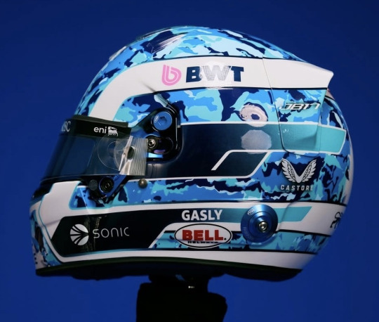
*insert joke about how I can't see the helmet because of the camouflage pattern here*
Pierre's helmet was one of my favourites from last season, and I'm really glad to see that he's kept the overall colour scheme despite the camo makeover. I have to say I really like the sections that have the navy blue to sky blue gradient, it adds just the right amount of dimension without taking away from the main camo print or making the helmet look too busy.
The splashes of white and matching blue visor really are the perfect finishing touches.
10/10
Isack Hadjar (Racing Bulls)
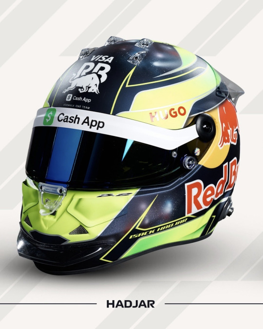
This is just so fun. I love the neon yellow first of all, it's going to add some much needed colour to the Racing Bulls garage and I just love neon helmets in general (see: Bearman and Lawson). But my favourite part of this helmet is the STUNNING nebula pattern that's in the dark sections of the design. I'm a massive space enthusiast so I of course absolutely love it.
If I could change one thing, I would make the neon parts of the helmet glossy just for extra contrast. But apart from that I have zero notes.
9/10
Lewis Hamilton (Ferrari)

Not gonna lie, I did have some pretty high expectations about what Lewis' first Ferrari helmet was going to look like. And as much as I want to like this... I just doesn't quite hit for me as much as I want it to.
The crème finish sunflower yellow base is perfectly in keeping with Lewis' original helmet design he started with in 2007, and the angled half-stripes with stars design still makes it look like a Lewis Hamilton helmet. I just miss the additional blue and green that was also a part of Lewis' core helmet design, as well as the 'Still I Rise' typography on the back. I'm so used to Lewis running bright and bold helmet designs that this just feels a bit too simplified to me.
HOWEVER, as we know, I do enjoy a matching/co-ordinating helmet visor, so I will add on half a point for the red-to-orange duo-chrome visor used here.
7.5/10
Nico Hulkenberg (Sauber)

Not quite a copy and paste from last year's design and more a copy, paste and let's delete a bunch of stuff. I am very glad and relieved to see that the paint splatter effect is still on the front part of the helmet, and I think the Stake/Kick acid green and splashes of white gives some much needed colour to the design.
For once I don't mind the exposed carbon base because it's glossy, and the gloss finish brings out the dimension that carbon fibre has so much better. Overall I just think it's a bit too dark, and looks too plain from the side.
5/10
Liam Lawson (Red Bull R1-2, Racing Bulls R3-)
First off, I got so caught up in all the mid-season driver swaps we had last year that I completely forgot to add Lawson to my Livery Watch 2024 post, so sorry about that. Secondly: NEON PINK!!!
I really like it, I think the colour scheme as a whole just works. It does make me wish that the Red Bull logo could be a different colour because it and the helmet colours don't really go together. In terms of the design layout, I wish the pink and white sections could be swapped round so we could get even more colour (because the RBR livery badly needs it). But apart from that this is a solid helmet design.
7/10
Charles Leclerc (Ferrari)

This feels like a hybrid of his Monaco helmet from last year and Ferrari's Las Vegas livery from 2023, and I like it!
To quote Lewis' instagram comment, it's a really clean design. I like the inverted red and white lines when they cross over into the different half of the helmet - and the design overall feels somewhat retro inspired which I really enjoy. I do take issue with the number 16 though, I'm not sure if the right font was used here as it stands out a bit too much for me.
7.5/10
Lando Norris (McLaren)

Pretty much an exact copy and paste from his 2024 helmet, but with more ✨blobbyness✨
Honestly, if it ain't broke - don't fix it. My thoughts from last year about this being a great design definitely still stand. It's very bright and very fun and I don't have anything to complain about.
10/10
Esteban Ocon (Haas)
Estie Bestie has once again delivered. While his 2023 red and black helmet will forever be my favourite, this is a very respectable second place. I quite like having the 31 be so prominent because the way it's been drawn makes it flow into the rest of the design well, you almost don't immediately notice that it's his driver number which I kind of like. While you can't see it in this picture I love the return of the Eiffel Tower motif on the top of his helmet, and I love that it's glossy too. This is a great helmet to kick start his time at Haas.
9/10
Oscar Piastri (McLaren)

Can we please have a brief moment of commotion for the orange-to-pink duo-chrome visor? Excellent, thank you.
So, like a lot of other drivers this is an evolution from his helmet from last year, only with some of the blue patterned sections swapped out for black. I'm not 100% sure how I feel about it, but it does contrast well with the neon red and bright yellow colour blocks.
I do wish that the thin blue outlines were holographic silver like what Oscar had on his 2023 helmet though, I think that would really elevate the design as a whole and look much more fun.
8/10
George Russell (Mercedes)

Also another copy and paste from last year's helmet, though the Mercedes star is more sparkly this year which is love! As ever I love the matching tinted blue visor and the shade of blue on the base is stunning, but I miss the thin lines of darker blue shading - this version of the design looks a lot more plain without them.
And it's also matte. George WHY?!
7/10
Carlos Sainz Jr. (Williams)

Gonna be very brutally honest and say that the Spanish flag colours just does not work with the medium blue used here. If it had been a lighter sky blue or even baby blue I think it would look so much nicer but... I just don't think this looks good.
The geometric elements of this design are fun but as a whole, it's not for me.
4.5/10
Lance Stroll (Aston Martin)
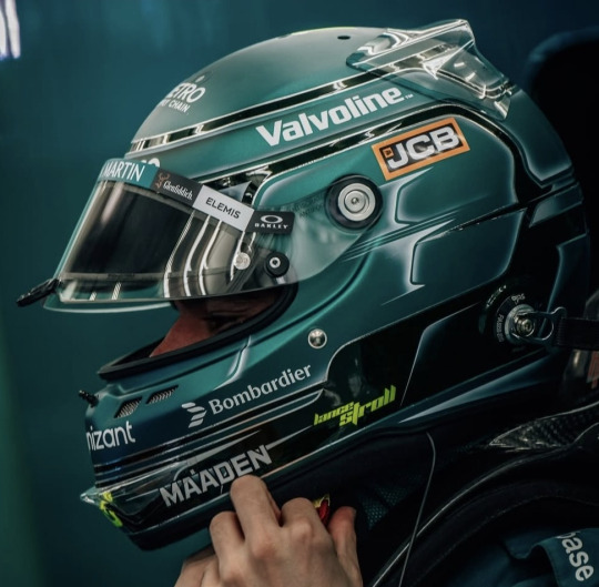
Watching an old Aston Martin Insider video from 2021 made me realise just how much I miss Lance having the Aston Martin wings on his helmet. If you're new here, this is a copy and paste from his 2024 helmet, which in itself is a repeat of the helmet design Lance used in European F3, just in Aston Martin colours.
Don't get me wrong, I think the design is good. There's been some changes from last year's helmet in that all the lime green bits of shading are now white and the helmet is now a matte finish instead of gloss which I had to deduct half a point by default. As a whole the helmet is fun and distinctive, I just prefer so many of Lance's previous helmets compared to this.
6.5/10
Yuki Tsunoda (Racing Bulls R1-2, Red Bull R3-)

By far without a shadow of a doubt hands down my favourite iteration of the Japanese Maple Leaf design that Yuki has ran since 2023. I love the switched up colour scheme with orange leaves on the plain white base - I also think that having some leaves be full colour and some just outlines is a perfect design choice.
The way the Red Bull logo has been placed feels really intentional and as such the placement of it blends in really well with the rest of the design. Also the gold visor is quite literally perfect.
10/10
Max Verstappen (Red Bull)

it honestly really bothers me that the apex of where the blue, white and red meet isn't centred. The chrome silver accents are nice and the colour clocking is very fun but every time I look at this I am just filled with the urge to physically move things around.
5.5/10
Honourable Mention: Valtteri Bottas (Mercedes 3rd Driver)

Oh you know I had to talk about this. If I had the means to give out a trophy for the Helmet Watch Award for Helmet Design Excellence, the 2025 edition would be going to Valtteri without hesitation.
The swirly water marble design is just so eye catching, especially with the use of two different shades of black/grey, and Petronas teal with white as an accent colour. And the lines of sparkly silver that outline the angular black sections are just sooooo pretty. *chef's kiss*
I think this should be the textbook example of a team colours driver helmet, it's on brand for Mercedes but still has it's own unique identity. Huge props to Valtteri's partner Tiffany for once again knocking it out of the park
10/10
EDIT - May 2025

So that aged well :)
With the Doohan-Colapinto swap I'll be adding any new drivers we get mid-season below.
Franco Colapinto (Alpine - R6-)
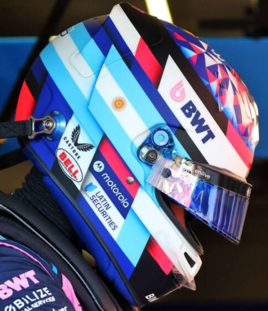
I actually think I prefer the 2025 Alpine version of his helmet to the 2024 Williams one. The Argentine flag banner has been refined slightly and is a tad smaller and also more angular, I'm assuming to co-ordinate with the geometric pattern on the top of his helmet (which I LOVE).
I really like the colour scheme, I don't think you can really go wrong with baby blue, hot pink and cobalt blue to be fair - and as ever I do enjoy the matching blue visor.
Alas, I have to deduct point for it being matte so - 8.5/10
#happy testing eve and happy helmet watch to all who celebrate!!!#Formula 1#Helmet#Helmet Watch#2025#Helmet Watch 2025
13 notes
·
View notes
Text
Sandwing Headcanons
(Info below the cut)
I had fun drawing this one! I nearly forgot one of the back legs, so that was interesting. I kinda based this one on red sand and the mesa/badlands. This one is a bit more simplified than the others, but honestly it was a nice break from doing more detailed designs.
Tribe Headcanons
The black sclera and cheetah-like marking helps them see through the blazing haze the sun creates on the sand. Especially sand that is nearly white.
The tufts of fur on their ears helps keep flies and other insects away from their ears.
Sometimes a Sandwing will grow a beard and resemble a Bearded Vulture, though this is extremely rare in the tribe. Maybe 1 in every 10,000 of them get the genes to be able to grow one.
Some Sandwings are also born with retractable fangs like a venomous snake's.
The bearded plates on their necks can puff out as an intimidation tactic.
They also can cry blood as a way to scare off oncoming dragons that might try to kill them if nothing else works.
Their scales match the palette of the sands that they hatched in. This means different natural sand colors can influence the color of a Sandwing's scales. It is near impossible to have them hatch the color of dyed sand. When it does happen, they are considered defective.
Sandwings are the third largest tribe in general, beaten by a a few hairs by the Nightwings.
Their wings are made for long distance travel, making staying in the air for long periods like a walk in the park. They are only beat by Skywings when it comes to flight time between landings.
The top of their wings are colored the same as the sand they hatched in. The bottom coloration of their wings matches their lighter colored underbellies.
Sandwings have the easiest time getting freckled scales due to their length of time in the sun.
Sandwings tend to show emotion though music, dance, and their festivals. Most dragonets are even pushed to learn something to help with one of those three things instead of actually feeling out their emotions.
Sandwings are considered the best ambush predators out of all of the tribes due to their tails and lack of outward showing emotions. A lot of assassin groups either are lead of Sandwings, made up of mostly sandwings, or are purely made of sandwings.
Most tribes mistake them for being an angry tribe. They're not. They're a vengeful and ambitious tribe. If a perfectionist could be put into a single tribe, it would be the Sandwings. They hold their pride high, but not on a faulty pedestal.
Their patience is unmatched, even by a Nightwing's standards. Having them angry at another dragon is silent, but it oozes into the atmosphere is a scarily silent way.
On a lighter note, Sandwing scales are warm to the touch, like a heated rock on a mid-summer's day. They're unfazed by the chill of an icewing's scales.
On that note, fire scales were once such a common ability in Sandwings that Sandwings used to be their nickname. They used to be called Sunwings.
Their spine sail is to help them regulate their internal body heat.
Lore Headcanons
One of their greatest exports in the past was their assassination services. The Scorpions Den used to be this mystical den of assassins before it became a place for what most of the tribe would consider "Undesirables".
Festivals dedicated to the longest day of the year are full of joy and laughter. Their hard, almost completely unreadable, outward expressions melt into this calm and most of the time happy celebration.
It took several centuries for Sandwings to show the array of emotions they do now. Some say that it was because a cowardly queen had used her subjects in a manipulative way that broke the tribe of feeling anything. Others say it was almost like an animus curse. No one really knows.
Survival is their main priority due to them having this sixth sense of having a strong gut instinct about what another dragon will do. Though they are getting better with trusting other dragons under the current queen's guidance.
Current exports include tanned hides and poisons. With their aloof nature, business is done upfront. They take trades and deals seriously, so backing out with enough time or a good excuse means you aren't cut off. They tend to talk to other Sandwing traders, meaning a dragon will not be able to scam others, or waste their time. Scammers are killed on sight. There are no questions asked.
Betrayal upon one is betrayal of all. Sandwings, no matter their position in life, will back one another unless they have done something egregious. Family units are commonly not broken, but in recent years it's not unknown of.
Keeping a singular bone of one family member, be it blood or not, is considered a sacred thing to the individual Sandwing. It means that dragon was extremely important to them. It is sacrilege to take or destroy it. This is the highest form of disrespect and other Sandwings will plot the dragon's death if that Sandwing doesn't kill the dragon.
Sandwings take marriage seriously before the ceremony, but all marriages are considered another festival that has been known to last weeks. A honeymoon isn't necessary due to the weeks long festivities. This is the longest another dragon will see a Sandwing be open about their emotions.
Drawing Inspirations
Their bodies resemble an American Short Hair. These cats give the best build that would be similar to a Sandwing.
Sandwings having primarily desert reptile patterns would be the best, but other desert/savanna/badlands animals would work as well.
The behaviors resemble a more strict regimen household where showing emotions would cause the inhabitants to be severely reprimanded.
Bearded dragons/toads are great for references for the expansion of the neck plates expanding.
Wings of Fire Headcanon List
Skywings
Icewings
Mudwings
Leafwings
Hivewings
Silkwings
#wings of fire#wof#wings of fire art#wings of fire design#wings of fire headcanons#wof art#wof design#wof headcanon#wof sandwing#sandwing#wings of fire dragon#wings of fire headcanon#wings of fire sandwing#wings of fire artist#wof artist
35 notes
·
View notes