#i like like a serif headline
Text
#this is SO important to me#and idek why!#yes i do im a graphic designer lmao but irregardless!#i’m torn myself#i like like a serif headline#sans serif body#my favorite fonts tho are almost all sans though?#but i’m torn#elle talks#typeface#polls#random polls#studyblr#graphic design#fonts#design#serif#sans serif#font#typefaces
0 notes
Text
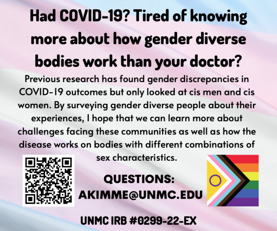
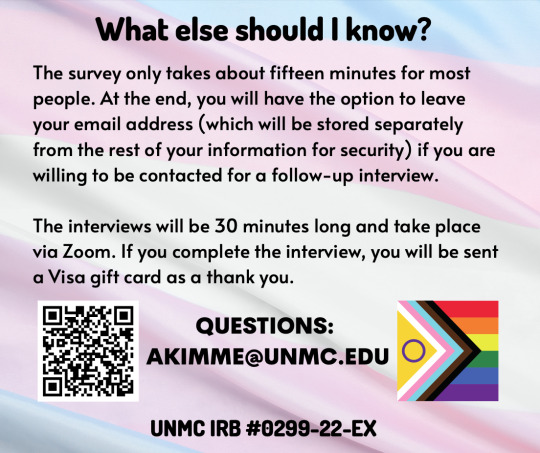
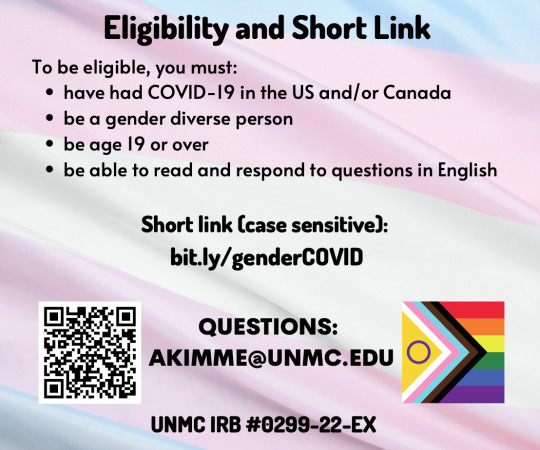
Hello! I'm a grad student at the University of Nebraska Medical Center who is surveying gender diverse people who've had COVID-19 about their experiences.
Earlier research saw differences by gender, even after adjusting for other factors like lifestyle, but only considered cis men and cis women.
I'm hoping that reaching out to gender diverse folks will lead to better understanding of medical issues facing this community specifically as well as help us better understand and treat COVID-19 in general.
I would really appreciate it if anyone who is gender diverse (transgender, intersex, etc), had COVID-19 in the US/CAN, and is 19 or older could help support this research by taking the survey. If you know someone who is eligible, I would appreciate it if you'd share the link with them.
I've double-checked and fixed the shortened link - they are case-sensitive, which I think has also been an issue for some folks. In case it's not working for you, here's the full link: https://unmcredcap.unmc.edu/redcap/surveys/?s=KNJ7AXF9JRE8P8DT&fbclid=IwAR2Yx77NJV9yQrYJPdGn5FbZfz3tczGuIdcfMijKUImWBoiUBsKwDr3Nv8s
You can reach me at my university email: [email protected]. Thank you for reading and to everyone who has participated so far!
[ID: Three images, all with sans serif black text on a trans flag background. Each has a QR code on the lower left and the progress pride flag with the intersex, trans, and rainbow flags on the lower right. The first headline is "Had COVID-19? Tired of knowing more about how gender diverse bodies work than your doctor?" but otherwise, the information follows what I've written here. All images contain my university email ([email protected]) and the study number, #0299-22-EX. The last one contains my short link that keeps breaking, which is bit.ly/genderCOVID - case sensitive, must have "gender" in lowercase and "COVID" in caps.]
4K notes
·
View notes
Text
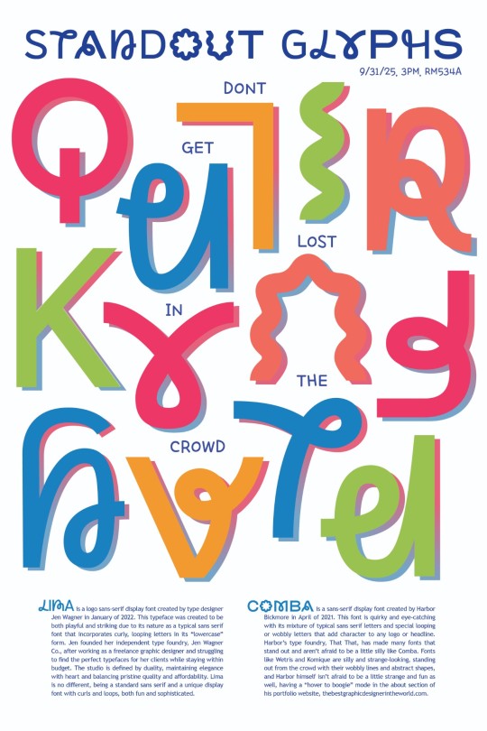
my final project for my typography class was to create a poster using type as image!
i chose to use two fonts, Lima by Jen Wagner and Comba by Harbor Bickmore, and write about their similarities and differences,, the poster text is as follows:
Lima is a logo sans-serif display font created by type designer Jen Wagner in January of 2022. This typeface was created to be both playful and striking due to its nature as a typical sans serif font that incorporates curly, looping letters in its “lowercase” form. Jen founded her independent type foundry, Jen Wagner Co., after working as a freelance graphic designer and struggling to find the perfect typefaces for her clients while staying within budget. The studio is defined by duality, maintaining elegance with heart and balancing pristine quality and affordability. Lima is no different, being a standard sans serif and a unique display font with curls and loops, both fun and sophisticated.
Comba is a sans-serif display font created by Harbor Bickmore in April of 2021. This font is quirky and eye-catching with its mixture of typical sans serif letters and special looping or wobbly letters that add character to any logo or headline. Harbor’s type foundry, That That, has made many fonts that stand out and aren’t afraid to be a little silly like Comba. Fonts like Wetris and Komique are silly and strange-looking, standing out from the crowd with their wobbly lines and abstract shapes, and Harbor himself isn’t afraid to be a little strange and fun as well, having a “hover to boogie” mode in the about section of his portfolio website, thebestgraphicdesignerintheworld.com.
#bought both typefaces for like $30 total and im really in love with both :D typography is fun!!#my art#typography#artists on tumblr#im proud of this poster even though i did the whole thing in like 3 days#still ended up getting a D as my overall grade for the class tho :'( guh
44 notes
·
View notes
Text
17 of the Best New Font Releases: March 2024
New Post has been published on https://thedigitalinsider.com/17-of-the-best-new-font-releases-march-2024/
17 of the Best New Font Releases: March 2024
Check out the best new font releases for March 2024! Often new fonts are released with some nice discounts, so it can be the perfect time to pick them up when they’re fresh out of the font foundry. Some of these typefaces have up to 60% off, and certain fonts can even be downloaded free!
[embedded content]
Up first is an expertly designed font called Garrison, it’s a nice modern sans serif with a humanist style, a little like the classic Gill Sans. This one comes packed with 21 individual fonts in a variety of weights and styles, and what’s more it’s currently 60% off as part of its launch sale.
Next up is a great looking new condensed sans named Entropia. It’s another family of loads of styles, including a rather unusual backslant version, for those rare occasions you might want an italic but leaning the opposite way. The full collection is quite pricey at almost £300, but you can pick up 3 versions for free. You could even combine them with a selection Regular, Bold, Black and Heavy fonts to build your own much more cost-effective bundle.
Petrov Sans is another highly ranked new release. This modern sans has quite a futuristic look to it and includes 19 styles ranging from Thin and Extra Light all the way to Black and Extra Black. It’s another font that is currently on offer at 60% off.
Greater Neue Condensed… Or ‘NOIER’ is if I was to pronounce it correctly… is a nice new industrial style condensed sans that’s right up my street. I can see myself only using this in its heavier weights and only in all caps for logos or headlines, so the full price of £200 probably wouldn’t be worth it for me, but it just happens that you can pick up the individual Greater Neue Condensed Heavy font for free.
Script fonts have been in trend for several years now, but this new Retro Script named The Original stands out with a pretty unique style. It’s based on vintage car badge inscriptions, so it’s much slimmer than some other scripts and has a large selection of elegant swashes to completely customise its appearance.
Font Duos take the hassle out of having to find two separate typefaces to pair together. Hajime is the perfect combo of bold condensed sans and a cursive script. You can use them individually in your regular design work, or together to create cool quote art. At the $10 discount price it’s definitely worth adding to your collection.
Brush scripts are one handwritten lettering style that fully makes use of SVG font technology. With SVG Fonts like the new Beast Mode you can include the authentic texturing of hand painted lettering directly into each glyph, rather than it just being a solid letter shape. Several of Sam from Set Sail Studio’s fonts are amongst my go-to favourites in my library so I think Beast Mode definitely needs to be added to the collection, especially with such a memorable name!
The name of Qumer Pefolijqey probably *isn’t* one of the most memorable font names, but this new script font needs to be one to remember for when you need a cursive, monoweight typeface. With 363 glyphs comprising of multilingual characters and several ligatures it’s capable of displaying whatever words you need it to. This is one of a few fonts in this roundup from Envato Elements, so it can be downloaded as part of your subscription if you’re a member like me. Check the link in the description to sign up to the biggest creative library out there.
Millaris is another font with extensive multilingual support, but the reason I chose it for this roundup is its lovely design. It’s described as a modern retro serif. It doesn’t come in any other weights or styles, but with a decent selection of alternates and ligatures it would be a great choice for logos or even editorial titles.
Kirgina is a Modern Condensed Sans with a cool unique style. It has some really high contrast in its letter shapes and tight angles which makes it almost a display font, but it comes in plenty of styles from Light to Extra Bold. This is another font that’s available to download from Envato Elements.
Brickers is a really narrow condensed sans that doesn’t come in any additional weights, but some of the ligatures do transform this font with some quirky and unusual layouts that would make great logos or quote art. It’s available in an inline version too, but to be honest you could save some money by just picking up the main regular version and apply your own stroke.
The Brucken is another brush script, but this one is more in the style of the popular brush script fonts with its fatter appearance and simpler swooshes. There are loads of these kinds of brush scripts out there but the best ones are those that include lots of stylistic alternates so you can tweak it to perfectly suit your wording. The Brucken has plenty to choose from!
If you already have some of the classic Swiss neo grotesque fonts such as Helvetica, Univers or Akzidenz then there might not be much reason to spend $360 on Solidus Open as a newcomer in 2024 compared to those timeless typographic icons from centuries past. But if you look closely it does have some really nice features, namely the opened up terminals which gives it a really cool appearance. It also comes in a huge selection of 19 styles with weights from Hairline to Black.
Massivemoon is one font I wasn’t going to include in this roundup with it being more of a display typeface, but I really like its retro style and it has some unique alternate characters that can inject ludicrously stretched out letters. I’m not entirely sure when you might need to create such a typographic layout, but the main reason it made the pick was its bargain price at just $5 for the main desktop version.
Variable Fonts are the latest typographic technology. Rather than have several separate font files for each weight, variable fonts combine them into one so you can essentially stretch the font to the exact size you need and the font will fill the space with the relevant weight without affecting the typefaces proportions. Check out Graveur as a classy looking serif that’s ideal for headings and even small book text.
Corsario is another variable serif font, but this time with a much more modern style. This was designed with magazine and editorial use in mind, so if you’re in that field of graphic design, it could be a great choice for a headline, especially with it being easily accessible directly in InDesign via Adobe Fonts.
And to finish off this first roundup of the best new fonts we have another variable font choice from Adobe Fonts named Picholine Antique. This one is a slab serif with some nice curves that help soften it up compared to many other hard slab serif styles. What’s great about the Adobe Fonts library is not only are these hot new variable fonts available for use directly in your software at no extra cost, they’re also cleared for commercial use too.
#2024#adobe#Art#badge#book#bundle#Design#desktop#display#editorial#Features#fonts#Full#Graphic design#hand#icons#it#italic#layout#Light#Link#Logos#mind#money#namely#News#One#opposite#Other#price
2 notes
·
View notes
Text
Magra Font Free Download

Magra Font is a beautiful sans-serif display typeface that comes with both spatial economy and multiple composition styles. His personality and humanist qualities also make him an excellent choice for creative projects.
FontFuror is known as the primary designer of this typeface. That was selected to be part of the German editorial project Typoderium 2012. This free font comes in two different weights including Regular and Bold.
Its humanist fonts have minimal contrasting strokes. The headline design is required with its bold texture. And for regular paragraphs, apply regular weights as a strong font pair.
All letters, including the Magra typeface, contain a uniquely attractive pattern. Take a look at the images in the font alphabet map after the same baseline as we add fas to see what it looks like.
Magra Font
Font Name:
Magra Font
Style:
Display, Sans-serif Typeface
Font Designer:
FontFuror
File Format:
TTF
License:
Free For Commercial Use
Files:
Magra (Truetype)
Excellent strength, keen features, extensive language support, and basic weight range. But a good typeface. Its neutral temper & humanist qualities make it a special choice for corporate use.
Use this fine-quality font in various design operations. Practice this font in composing books, displaying logos, labeling, business, banner designs, hoardings, invitations, brochures, flyers, and many more.
Most importantly, this sans-serif font is free for both personal as well as commercial use. Same as Univers Black Font by Adrian Frutiger, and Fontin Font by Jos Buivenga.
I hope you enjoy this awesome contribution from us now but still, if you want more questions contact its owner. That way, you can get more and more solid information about this amazing typeface.
Download this free font family for free in real file format from here. Just click on the download link here Install your software on your device and start using it anywhere.
Read the full article
0 notes
Text
Font Finding
In the ongoing development of my media projects, I've been looking for fonts to use in my Brand Kit. I used DafontFree.co where I browsed for retro funky styles reminiscent of current design trends. Drawing inspiration from Two Or More, an event for Christian creatives here in Waikato, I aimed to find fonts that would make a subtle statement while ensuring readability and versatility.
Starting with serif fonts, I was looking for options that balanced elegance with practicality. A few of the fonts I like so far are Flawsome, Black Lunatic and Rossta Norla. They all have normal and italic variants that provide flexibility for different design contexts, ensuring consistency throughout the project.
In looking for a standout statement font in a more vintage retro style, I discovered Ugroh Black. This font stood out with its distinctive aesthetic, featuring bold letters and unique details that add personality to headlines and titles.
The process of selecting fonts for my media project has been ongoing and strenuous. I haven't made a decision on a final font as I am still playing around with which combinations look best and if they work for all the use cases, however, I am much more confident about the design direction now that I have a selected catalogue of potential fonts.


0 notes
Text
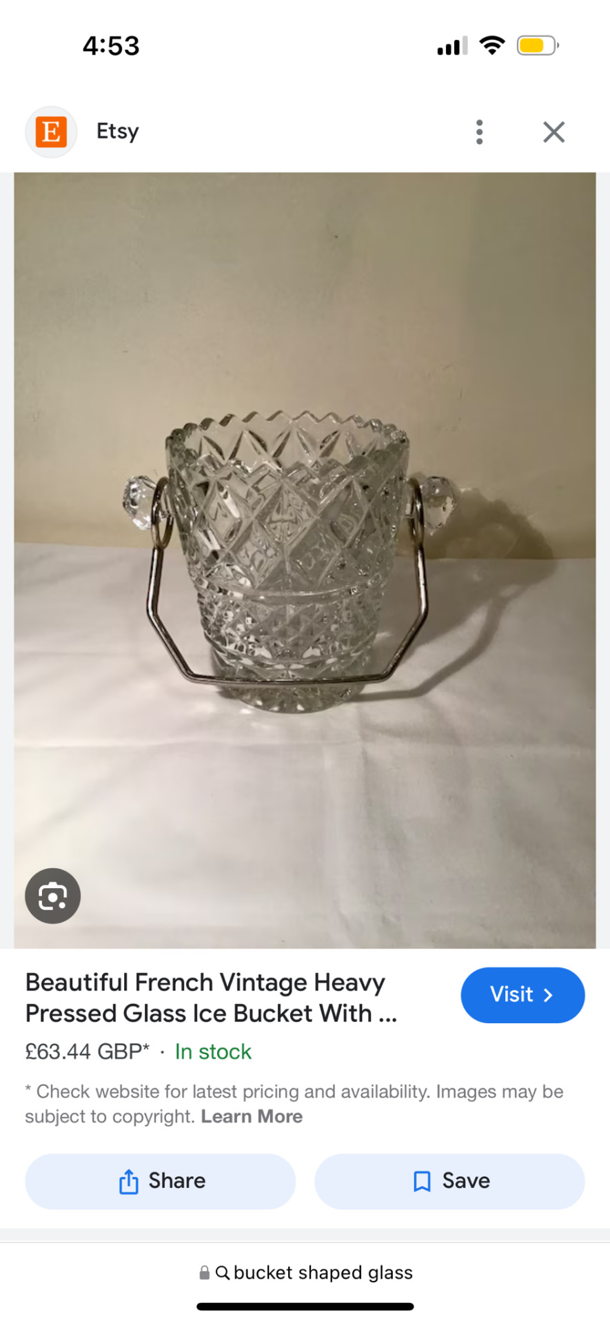
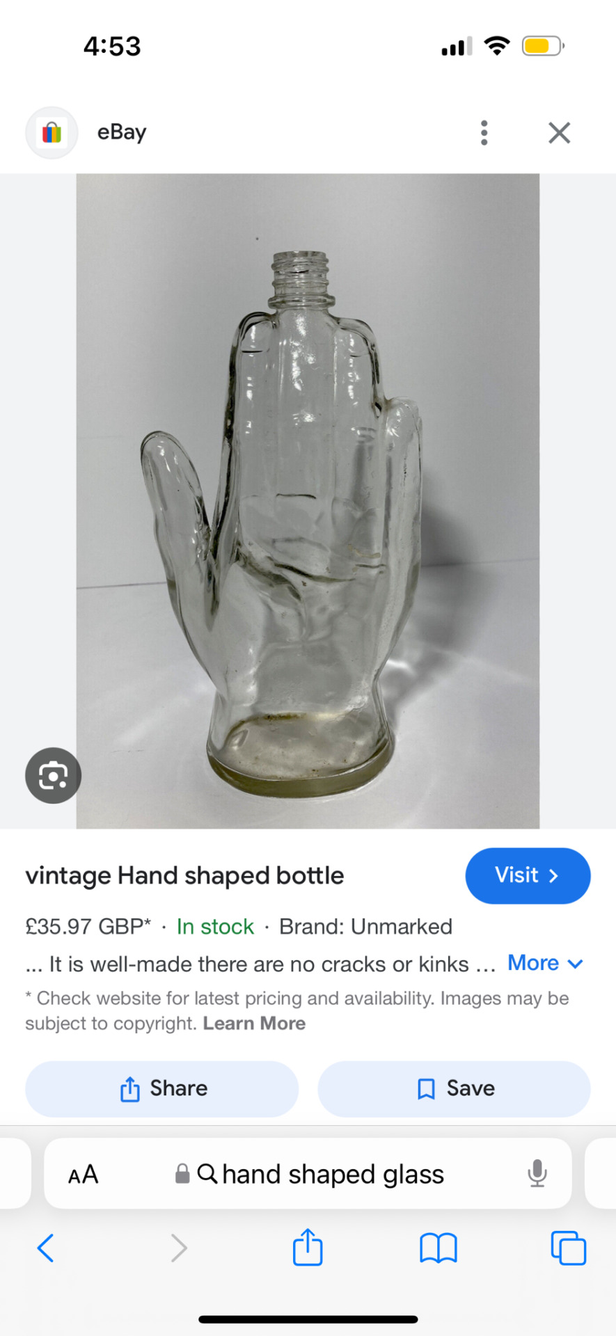
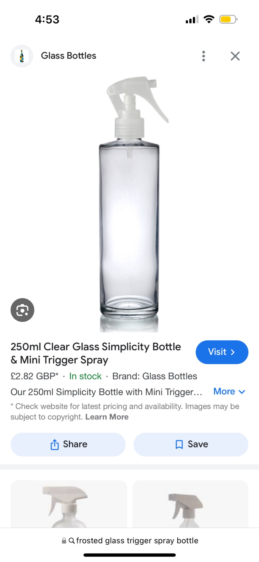

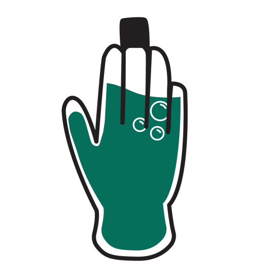

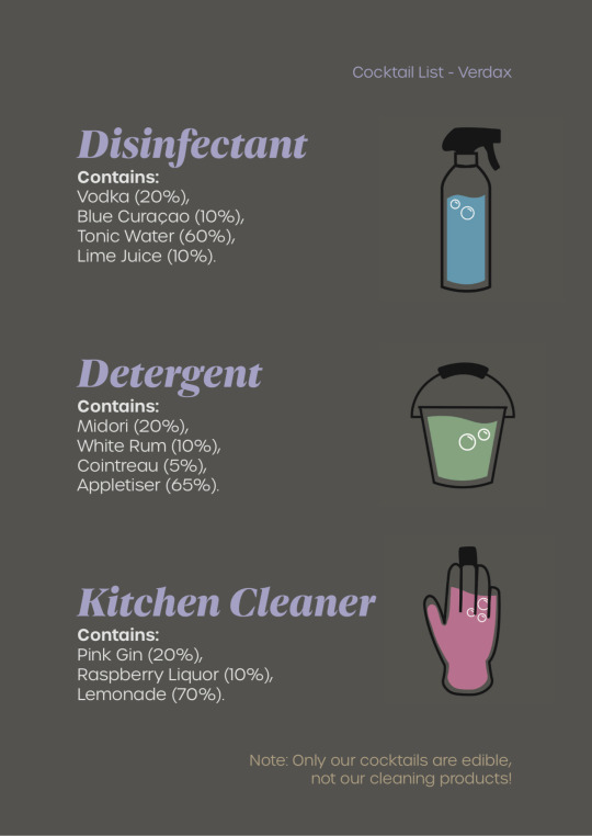
24/04/24 - Cocktail List
We thought it would be cool to have the drinks in different, cleaning related glasses, so I found some uniquely-shaped glass bottles to represent a rubber glove, spray bottle and a bucket. Amy then put them into Illustrator and vectorised them to make little cocktail icons. She sent them back to me so I could include them on the cocktail menu.
I used the dark grey from Verdax’s colour palette as the background as I think white text on a dark background looks sleek and sophisticated. I had the name of the cocktail in Dejanire Headline black italic, as the hand-lettered curves appeared friendly and elegant, and paired it with another sans serif font, Urbane Light, to have enough contrast between the fonts but still keep them consistent. We had used Urbane in our project, for example in the wayfinding, so it made sense to include it in the cocktails list as well.
I added the percentages of each component of the cocktails as percentages to resemble an ingredients list on the back of a cleaning product, which worked successfully. I also included a jokey note on the bottom to not drink the actual cleaning products, just in case people were confused.
Overall I like the way this turned out, and Amy’s icons added personality to it and let people know which cocktail glass they were going to get.
0 notes
Text
I also find myself with a weird desire to find a sans serif body font I like to redesign the site around. I don’t know if I will, though. (Currently it uses MB Type fonts: body text in Equity, headlines in Concourse.)
0 notes
Text


Week 4: Typeface - First Responses
In this exercise we were asked to review and record our initial responses to these typeface designs. The purpose of this is to establish awareness of the context that is connected with typeface in order to improve our decision-making skills when picking a font. These were my responses:
Futura - Modern Sans Serif. I feel as though I have seen this primarily used in magazines back when I was younger. Cutting up headlines for scrapbooking and collages. Would work well for a body of text since it has the best legibility. Feels very neutral. Has the least contrast in strokes. Could be interchangeable with Helvetica.
Didot - Modern Serif. Also commonly used in magazines. Feels like a statement piece best used for titles. Leaner edges of the text provide an elegant element. Has the highest contrast in strokes. Reads as more feminine when compared to the other typefaces in this exercise.
Hightower - Serif. Old literature comes to mind when I see this. Stylistically similar to Garamond, which is a common font used for novels. Has a formal undertone. Best suited for a body of text in that context.
Gill Sans - Sans Serif. Decent legibility, although overall design feels more sharp than Futura. Suitable for titles or headings. Personally I don't feel drawn to this font so less likely to use it.
0 notes
Text
Typeface first response
Futara:
Less sophisticated
Ridgid yet not serious
Straightforward
Very clear
Easy to read
Rounded lowercase
Sharper uppercase
Would use for a sign where the place is chill but gets to the point like a busy cafe
Hightower:
More traditional with the serifs
Quite pretty
I would use this typeface as it has an older more aged look
gill sans:
Bold
Tall
Thin and small
More traditional look compared to the first one but less than the second.
Delicate
Didot:
A more playful traditional typeface
Serifs give an aged look
Flicks on the ends of the letter give a fun playful vibe.
Hightower
Designed by Tobias Frere Jones
Loosely based on the printing in venice in the 1470s.
It was named after caroline warner hightower
It includes an italic style but not bold
Its organic forms and details also work well in headlines, adding complexity and subtlety.
0 notes
Text
judging the vibes of some typefaces


Futura: corporate - logo / cartoony
Gill sans: corporate but trying not to be - why so pointy ? i despise those s’s and the G makes me uncomfy. bad.
Didot: trying hard to be classy and succeeding - decorative / fashion magazine-y / so french
Hightower: laid-back, not trying hard to be classy, but still classy - info / subtle / storybook / petite ! / a series of unfortunate events
Hightower Research
Who: Tobias Frere-Jones
When: 1990-94
Where: New York City
What: A serif typeface
How: Influenced by Nicholas Jenson’s “old style” serif work from Venice in the 1470’s
font family includes italic (unlike Jenson's - as italic) but not bold (like Jenson's)
Adobe Fonts: "Hightower’s wide proportions and deep color were calibrated for small text sizes. Its organic forms and details also work well in headlines, adding complexity and subtlety.”
1 note
·
View note
Text
Futura Typeface Research
Futura is a geo metric sans-serif typeface released in 1927 by designer Paul Reiner. It is used on a daily basis for print and digital purposes as a headline and body font. The font is also used extensively across many industries for film, video, advertisements and logos, for one example IKEA.
I think Futura is a great font for basic and bold use, in terms of making something unique, I don't think I would use it because of its simplicity. But for making something like a invitation or letter I would definitely use.
0 notes
Text
Web design trends 2024
It's easy to picture a world where websites aren't just static pages but actual living things that answer to our every command and wish. Imagine using a virtual reality interface or talking to chatbots that are driven by AI and are built into every website you visit.
When picturing the web design trends that will shape our online lives in 2024, the only thing that stops us is our imagination. As we look into the exciting future of web design in the coming years, prepare for a visual journey you've never seen before.

1. UX-Focused design
Today, many websites pay attention to UX, or user experience, which is good. This top web design trend will grow as designers try to give users more engaging experiences. User-centered design includes many parts of websites.
The trip is focused on the visitors, even though the end goal includes getting more leads, traffic, and sales. The website's interactions and touchpoints were carefully thought out with the user in mind.
The navigation bar, the hero picture or headline, the animations or videos, and the text are all set up to grab people's attention as soon as they land on the site. Every piece of information should be easy to understand and quickly show what a business can do for potential customers and what value it brings.
Companies can quickly figure out what their customers want and need, and they can also make unique events for each customer. Many websites now use AI-driven platforms to make navigation easier and give instant answers or suggestions. UX may become an even bigger part of web design trends.
It's easy to picture a world where websites aren't just static pages but actual living things that answer to our every command and wish. Imagine using a virtual reality interface or talking to chatbots that are driven by AI and are built into every website you visit.
When picturing the web design trends that will shape our online lives in 2024, the only thing that stops us is our imagination. As we look into the exciting future of web design in the coming years, prepare for a visual journey you've never seen before.
2. Kinetic or Dynamic Typography
Kinetic typography, also called "moving typography," is a new style in web design that uses moving text to grab people's attention right away. A lot of designers and brands are embracing this style.
You can use the kinetic font as the main focus of your website or leave it on the home page and use it as is. You can keep people interested in your website without adding a lot of extra forms or images by using moving text for headlines and subheadings. It also doesn't slow down the page and looks good on phones.
This web design movement will likely have a big effect in the future. Adding kinetic typography to websites for digital marketing services, portfolios, companies, and SaaS platforms can make them stand out more.
3. Large or Oversized Text
Consider utilizing a large or expanded font in every section to create a simple website that provides crucial information rapidly. Strong, thick headers can effectively showcase services, best-selling products, contact details, and the main headline above the fold.
Using plain text in sans-serif font styles could make your website look more visually appealing. By keeping layouts straightforward and eschewing the necessity for massive pictures on websites, using huge and enlarged text helps you express more with less while improving website responsiveness.
This type of web design is perfect for SaaS websites, agencies, and service-oriented businesses. Utilizing large or expansive text draws attention to the USP (unique selling point) and emphasizes how a product is addressed.
4. Handmade Illustrations
We expect to see more of this new web design style in the future. Website illustrations became famous because of Mailchimp but were seen infrequently in recent years. But things have changed a lot since then. I have seen a number of websites with hand-drawn pictures that grab people's attention and make them want to read the whole thing.
You can use these images to tell stories, show how a business solves real customer problems, or effectively promote different services. Handmade solutions don't need to be complicated; simple ones can still convey the message.
Adding pictures to any website can make the user experience more memorable. Handmade drawings are expected to become very popular in 2024 because they can be used in many ways. They can go with many different themes, layouts, and features, and they're also a big part of ensuring that businesses always use good web design practices.
5. Motion Effects on The Home Page
Motion effects on home pages are a new trend in web design that is already making a lot of noise in the field. This style has become very popular among designers because it can be used to create immersive experiences for visitors. It will be one of the top ten trends in 2024, and we can expect it to become more common.
Different kinds of motion effects can be added to the home page for more engagement. Scroll-driven graphics show users how to get to different parts of the page and draw attention to what the company or service has to offer. Hover animation, loading animation, accent animation, and moving parts are other ways to add motion effects.
Visitors can easily be interested in showing off past work in a portfolio or telling inspiring visual stories.
It's very important to ensure that adding these moving features to a website doesn't slow it down or make it look not good on mobile devices. Too strong effects should be avoided because they could be too much to look at or confuse users.
Websites that offer design services and SaaS goods can get ideas from this trend. Adding animations to homepages makes platforms more appealing and encourages visitors to connect with these sites more while browsing.
6. Interactive Storytelling
In order to use storytelling well in web design in 2024, artists will have to get good at what they do. This trend is already prevalent, and you can use it to give your brand a unique voice and personality in a digital world that is very competitive.
How can storytelling stay a new trend in web design when it has been popular in the design world for a long time? Coming up with new ideas is the key. You can significantly affect the audience and get them to stay interested in the material for a long time by adding interactivity to stories.
Getting good at participatory storytelling might take a lot of work. It's all about adding things that make it easy for guests to move from one point to another without stopping the flow of information.
Websites can give users a great experience by adding games, movies, and 3D graphics that draw them in. Also, this method works for more than just big productions; it works well with two or three visuals and easy animations or dynamic text. This web design trend benefits e-commerce sites that want to keep people interested.
7. Vibrant Gradients
Gradients were used again in Instagram's logo, which started a new style in the industry. Designers and brands learned from how people responded to the app's icon that gradients could make websites, images, and logos look better. It's important to talk about this when talking about web design trends.
Adding black and white gradient accents can make a big difference, whether starting from scratch or changing a current website. You could also use bright colors for CTAs to get people's attention. For a stronger color palette, you might use gradients in background images or whole areas and white space to break up the layout.
Gradients can also improve SaaS and e-commerce sites by drawing attention to important messages that make people want to take action while pushing them to keep scrolling.
8. Glassmorphism for The Hero Section
The hero picture, which takes up the whole space above the screen, is usually the first thing people notice when they visit the website. Another new trend that can help this stand out and appeal to your audience is "glassmorphism."
Glassmorphism is a style of design that uses transparency to make something look like glass, giving it a unique look. It's becoming increasingly famous, and 2024 is expected to be the year it takes over. By using glassmorphism in the hero area, you can get people to pay attention to your message or product.
If someone sees an image or shape in this way that they like, they might want to learn more about the business or brand by scrolling down. Even though it seems complicated, professionals can save time and effort by using glassmorphism in their designs. It also fits in with minimalistic ideas and works well on websites for many different businesses.
9. Parallax Scrolling
Parallax scrolling is an old technique that keeps making waves yearly by bringing in new and interesting ways that keep users interested and give designers ideas for effectively communicating brand messages.
It became famous last year for multiplanar sliding to appear. People who scrolled down saw material that moved along both the x- and z-axes. Some websites even had content that moved backward along the z-axis or had cool zoom effects.
This change shows how vital parallax scrolling is becoming for artists to express their creativity. It also has many other benefits, such as blending in smoothly with different animations, being a key part of current storytelling trends, and giving even the most boring website designs a new look.
Without question, parallax scrolling will still be popular this year. In line with current trends, you can expect more visually beautiful scroll-driven experiences with cutting-edge technology, motion effects, and interactive elements. On the other hand, people who like simplicity can find ways to show beauty by using nontraditional axis movements and avoiding too many visual elements.
When adding parallax scrolling to websites, it's important to remember that too many of these effects can make some users feel uncomfortable. This makes it even more important to balance creativity and functionality and ensure the best user experience is maintained without hurting marketing tactics for readability.
When focused on mobile devices, another thing to think about is that long scrolling sessions may test users' patience, and keeping them interested may mean making some sacrifices. For instance, you could use image-scroll animations or dynamic effects to show key messages carefully.
Conclusion
Web design trends for 2024 that strongly emphasize immersive experiences, user personalization, and sustainability are likely to change the digital world. As long as creators keep trying new things and pushing the limits, websites in 2024 will be more fun and beautiful to look at than ever. You should follow these trends if you want to stay ahead of the curve and give users more meaningful digital encounters.

Janet Watson
MyResellerHome
MyResellerhome.com
We offer experienced web hosting services that are customized to your specific requirements.
Facebook Twitter YouTube Instagram
0 notes
Text
Case Study


Transcript:
Slide 2
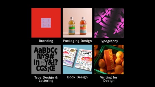
While researching D&AD award winners, I selected a series of categories that particularly sparked my interest as I felt like my work related to them. These categories included branding and packaging design - which is relevant to this units work, typography, type, design & lettering, book design, and writing for design. From each category, I then selected one pencil winner that had designs drawing me in the most.
Slide 3
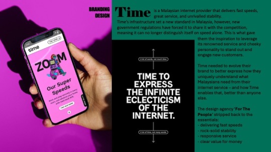
To begin with, the branding design award was Time, a Malaysian Internet provider known for delivering fast speeds. New government regulations meant it could no longer distinguishe itself from speed alone. The design agency ‘For The People’ stripped back to the essentials and redesigned the company with new illustrations and a more distinguishable logo, to accentuate the companies cheeky personality, and engage new customers. ‘For The People’ won a wood pencil for this redesign.
Slide 4
I then looked at packaging design for the Hornicultural Society. ‘Ogilvy UK’ released a series of limited edition condom packets in the style of seed packets to help tackle the rise in STD’s among the over 65s. The packets feature typography and cheeky strap lines that are all creative ways to loosely describe sexual body parts. Both graphite pencils and wood pencils were won for this under numerous categories.
Slide 5
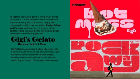
Under the category of typography, I selected Gigi‘s Gelato. The design agency ‘Bridge and Partners’ explored how primary colour palettes evoke the ingredients, flavours and hues of endless summers enjoyed with Gigi’s. ‘Bridge and Partners’ won a graphic pencil award for this type design
Slide 6
The fourth award I looked at was type design, where ‘Studio Drama’ created a dualistic headline type face family for Vogue Brazil. They were presented with the challenge to effectively combine sans serif and serif styles encapsulated by two polarising ideas - vernacular and elegance, creating an authentic outcome that embodied Vogues iconic brand with the rich and cultural typographic heritage of Brazil. ‘Studio Drama’ were awarded a graphite pencil for this typeface
Slide 7
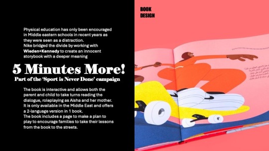
Looking into the category of book design, the one that stood out the most to me was “five minutes more” - which is part of the “sport is never done” campaign with Nike. Physical education has only been encouraged in Middle Eastern schools recently, as it was always seen as a distraction. Nike worked with Wieden and Kennedy to bridge the divide by creating an innocent storybook with a deeper meaning. The book is interactive and allows the parent and child to take turns role-playing as Aisha and her mother, and encourages families to take their lessons from the book to the streets.
Slide 8
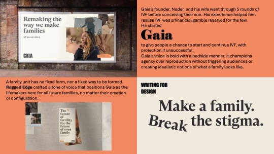
Finally, I looked at writing for design, where the design agency, ‘Ragged Edge’ crafted a tone of voice that positioned Gaia as the life makers here for all the future families. Gaia was founded by a man called Nader to give people the chance to start and continue IVF with protection if unsuccessful, after him and his wife went through five rounds before conceiving their son, and discovering how much of financial gamble IVF is.
Slide 9
This design agency is the one that struck me the most, so I began to research them further.
Slide 10
I discovered that they have won a few D&AD pencil awards and have been featured on their website a few times, for Gaia, Eager which is a juice company they did a simplistic yet impactful packaging redesign for, and Papier - a stationary company they did a logo redesign for. But who are Ragged Edge??
Slide 11
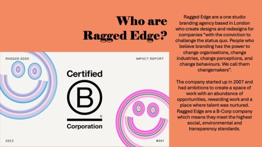
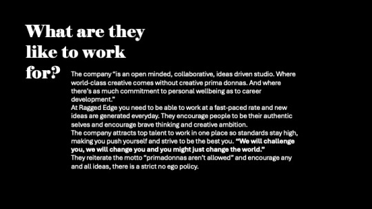
Ragged Edge are a one studio branding agency based in London, who create designs and redesigns for companies with the conviction to challenge the status quo. They state that “People believe branding has the power to change organisations. Change industries change perceptions and change behaviours” this is what they call a changemaker. Clients and that believe they have the ability to become a changemaker reach out to Ragged Edge directly to give themselves the opportunity to become one. The company started up in 2007, and had ambitions to create a space of work with an abundance of opportunities, rewarding work and a place where talent was nurtured. Ragged Edge are a B-Corp company, which means they meet the highest social, environmental and transparency standards.
Slide 12
The company states they are an open minded, collaborative, ideas driven studio where world class creative comes without primadonnas and where theres as much commitment to personal wellbeing as to career development”. After reading a lot of the reviews on Glassdoor for what the company are like to work with, I could see that the only negative things mentioned were the workloads, that is its a very fast paced studio where new ideas are generated everyday. I don’t personally see this as a downside but i guess the workload may pile up and become overwhelming. Many people who have worked for them exaggerate how they are a super kind team of people and the work environment is very friendly. People are pushed to be their authentic selves and brave thinking and creative ambition is highly encouraged. This is what drew me to them even more as i aspire to work for/ have my own company with the same mindset.
Slide 13
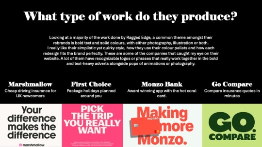
Looking at a majority of the work done by Ragged Edge, a common theme amongst the brand is bold text and solid colours with either photography, illustrations or both. I really like their simplistic quirky style, how they use their colour pallets and how each redesign fits the brand perfectly. I would love to implement these features and style into my own future work as i think they give character to the brand without overwhelming customers.
These are some of the companies that caught my eye on the website. A lot of them have recognisable logos or phrases that really work together in the bold and text heavy adverts alongside pops of animations or photography - Marshmallow, a driving insurance company, First choice, package holidays, monzo banking and go compare.
Slide 14
I delved a bit deeper into some of their projects that interested me the most. Firstly, Marshmallow insurance
Slide 15
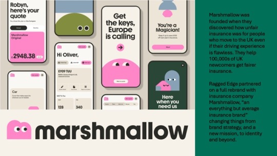
Marshmallow was created when it was discovered how unfair insurance prices were for people who move to the UK - even with flawless driving experience. Marshmallow helped to combat this and help hundreds of thousands of UK newcompers get fairer insurance. Ragged edge partnered on a full rebrand with this insurance company and changed things from brand strategy and a new mission, to identity and beyond.
Slide 16
They generated a library of what they called “marshforms” made up of different shapes, that can be stacked and built together to represent the infinite variation and uniqueness of their customers. A bespoke typeface was also created, with a brand new M logo of a little marshmallow who is always looking forward. With the implementation of photography as well, they were able to bring their customer’s personality to life with bright and vibrant lighting.
I really admire the simplicity and clean feel to the brand with it still having its own character and personality. This is the style of work i hope to be able to produce in coming units and projects.
Slide 17
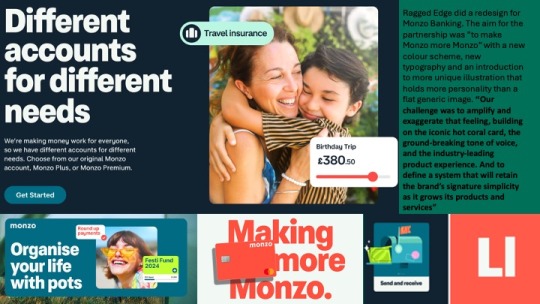
Additionally, I looked into their rebrand of Monzo where they aimed to make Monzo more Monzo with new colours, type and illustration.
Slide 18
With the introduction of these things, the brand feels much more welcoming and friendly in comparison to other banking companies. I think the colour palette used fits really well together. The illustration suits the vibe of the bank and the type with moving image is bold enough that catches your attention yet simple enough to get the message across.
Slide 19
Looking at the interface and how the colours match each other well is very interesting to me. The hot coral represents the warmth from the company, followed by a complementary, navy blue and soft white alongside vibrant secondary colours used when necessary for added eyecatching features. The design is quite simple, but adding these vibrant colours and accents across the UI makes it more unique than what generic banking app/website includes. For example, Lloyds Bank has white black and green as their only featured colours and this can be quite boring. The pops of colour Monzo use along side animated illustrations has makes the banking seem like less of a chore.
Slide 20
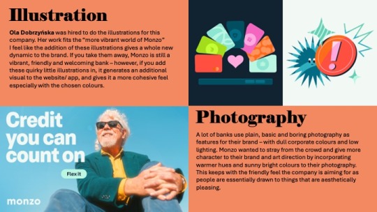
A lot of banks, use plain basic and boring photography as features for their brand with corporate colours and low lighting. Monzo wants to stray from the crowd and give more character to the brand and art direction by incorporating warmer hues and sunny bright colours to the photography, keeping to the friendly feel of the company.
Ola Dobrzyńska was hired to do the illustrations for this company. Her work fits the more vibrant world of Monzo. But I feel like the addition of these illustrations gives a whole new dynamic to the brand. If you take them away, Monzo is still a vibrant friendly and welcoming bank however, if you add these quirky little illustrations in, it gives an additional visual to the website/app and gives it more cohesive feel.
Slide 21
I looked further into the work of Ola Dobrzyńska, a full time freelance illustrator based in Warsaw, Poland.
Slide 22
Ola’s work is bold and colourful with a passion for character design.
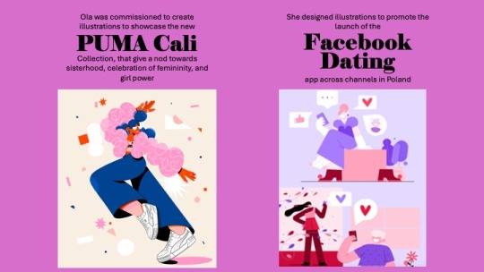
Two pieces of work she has created with recognisable industries outside Monzo include illustrations to showcase the new Puma Cali - a collection that gives a nod towards sisterhood, the celebration of femininity and girl power. And illustrations to promote the launch of the Facebook dating app across channels in Poland.
Her work can be seen mostly on instagram where she showcases her illustrations frequently, and etsy where she sells her prints.
Ola’s work as an illustrator really inspires me as this is a strong interest of mine and the opportunity to work with big name clients like she has done would be incredible.
However, I would need to expand my illustration skills a lot more if i would like to work to this level - I can’t be a procreate girl forever, I need to step into the adobe illustrator world and learn to draw in vector.
Her illustration style is very different to mine but is all cohesive. While it is nice to have versatility in drawings, it is also nice to have a consistent theme amongst them, and this is something that i would like to improve on, so no matter what piece of artwork you see, you know it was by the same person.
Slide 23
As a whole, looking at both Ragged Edge’s and Ola’s work. I know that this is the path of work that is for me, either working in a design agency for branding, or being a freelance illustrator FOR the design agency.
To be able to achieve this I would need to expand my skills in all softwares and be able to use them easily and glide through without problems to ensure i work quickly and efficiently. I would also need to generate a portfolio of work that relates to the industry I want to work in, showcasing all skills i have in a multitude of ways and over a range of projects. Ragged Edge seem like a really great company to work for with opportunities to work on some amazing things that would be really fulfilling and exciting. The only way to work for them would be to check out the open roles on their website or email them, so this is something i can consider in the future when i have a large enough portfolio
In the next 3 years I aim to refine my design work a bit more and create more professional seeming work, with a variety of brand assets that can be incorporated and a solid recognisable logo through the use of thorough experimentation. I will try to increase my knowledge and use of adobe illustrator for typography and the designing of graphics to make things more seamless and clean.
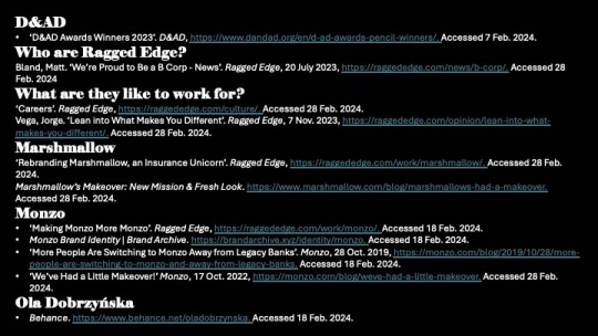
Bibliography:
0 notes
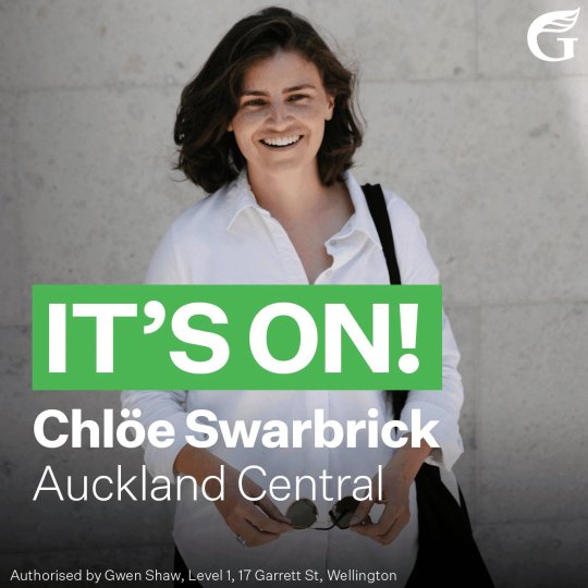
Text
Visual Identity
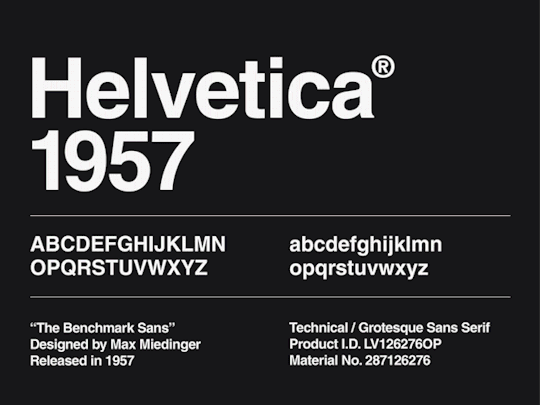
Below are the common visual themes of the Green Party, exploring colour patterns and typefaces. I have noticed the use of bright green throughout their campaigns, and although I could not find an exact copy of their typeface, I found that the fonts Helvetica and Times New Roman were close enough. I plan to incorporate these fonts and colours in the visual language of my animation.
Helvetica Typeface
Helvetica or Neue Haas Grotesk is a widely used sans-serif typeface developed in 1957 by Swiss typeface designer Max Miedinger with input from Eduard Hoffmann. Helvetica brings unusually tight spacing between letters that give the typeface a dense, solid appearance, making it perfect for capturing headlines. Notable features of Helvetica as originally designed include a high x-height, the termination of strokes on horizontal or vertical lines and an unusually tight spacing between letters, which combine to give it a dense, solid appearance.

Times New Roman Typeface
Times New Roman is a serif typeface commissioned by the British newspaper The Times in 1931 and conceived by Stanley Morison. Being a default font on most computers, Times New Roman is a classic typeface that everyone is familiar with. Being used in olden day newspapers, I feel like this font would be great to use as the theme of my audio speech relates to politics and the news.

1 note
·
View note
Text
Choosing Utopia: The Ideal Typeface for My Assignment
Introduction
Typography plays a pivotal role in setting the tone, creating an atmosphere, and enhancing the readability of a piece of writing. Among the myriad of typefaces available, I've decided to use Utopia, an Adobe Original designed by Robert Slimbach, for my upcoming assignment. My decision is not just based on aesthetics or functionality, but also on the emotional resonance that the typeface holds for me. As someone who considers New Zealand to be my personal Utopia, the clean style and classical design of this typeface perfectly encapsulate my feelings towards this beautiful country. Here's why I've chosen Utopia:
A Testament to Exemplary Design
Utopia, a transitional serif typeface, was released by Adobe Systems in 1989. It was part of the Adobe Originals program, an in-house type foundry at Adobe, started to create original typefaces of exemplary design quality, technical fidelity, and aesthetic longevity. The typefaces released as Adobe Originals are the result of years of work and study and are regarded as industry standards for their ambition and quality of development.
A Harmonious Blend of Historical and Contemporary Design
Utopia is influenced by the 18th- and early-19th-century ideals of classical design. It combines the vertical stress and pronounced stroke contrast of eighteenth-century Transitional types like Baskerville and Walbaum with contemporary innovations in character shapes and stroke details. Adobe's Sumner Stone has also compared it to Hermann Zapf's Melior, highlighting its distinctive blend of historical and modern aesthetics. This unique combination of the old and the new is one of the reasons why I'm drawn to this typeface for my assignment as New Zealand has a long history and yet is also a very young and new country even queen street is filled with building old and new.
Versatile, Professional & Feature-Rich
Utopia is available in four optical variants for display, headline, regular, and caption text sizes, each in regular, semibold, and bold weights. There's also a black (extra-bold) weight available in the headline size. Released in the OpenType format, Utopia comes with advanced typographic features like ligatures and small capitals, further enhancing its usability and appearance. However, it is important to note that Adobe does not guarantee identical character metrics. This means that documents developed using one font file should not be switched to using another, at risk of lines breaking in different places.
Embodying the Open Source Spirit
In an unprecedented move for Adobe's professional typefaces, a basic set of Utopia's styles has been open-sourced, allowing it to be used for free. This includes regular, italic, bold, and bold italic styles of the regular size. This spirit of open-source accessibility not only broadens Utopia's reach but also allows it to be a part of a larger creative community, contributing to its ongoing evolution.
Conclusion
Choosing Utopia for my assignment is a decision that resonates with my personal style and my vision of New Zealand as my Utopia. This typeface, with its timeless design, professional versatility, and the spirit of open-source sharing, perfectly encapsulates my thoughts and emotions. I am confident that Utopia will not only articulate my ideas clearly and elegantly, but also embody the feelings and aspirations that I associate with my personal Utopia.
0 notes
Last Seen Blogs
floralluxe-banners
BANNERS

eleganzamaschile
Eleganza Maschile
s1ck-fvckkk
The Aussie Gentleman

semeraldo
Mine
chetsbaker
blue note