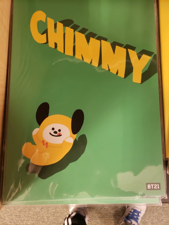
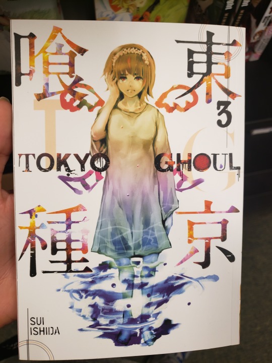
#i love super super saturated colors this was v fun to make
Text
“You see something change in his eyes—
You see realization dawn on him—
You see him figure something out.”
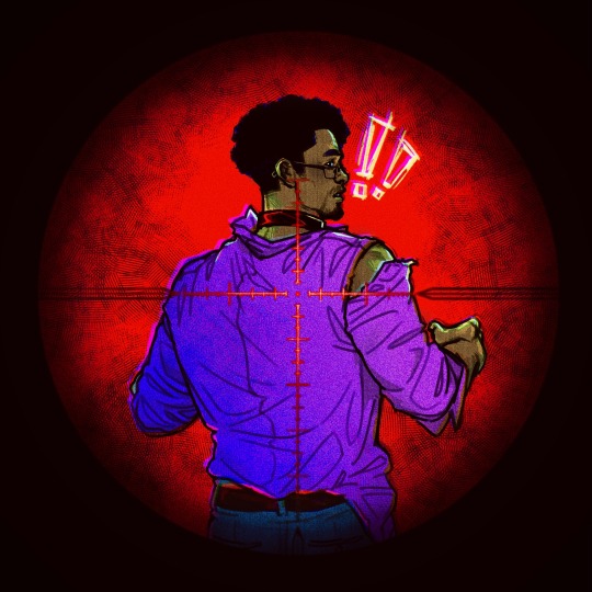
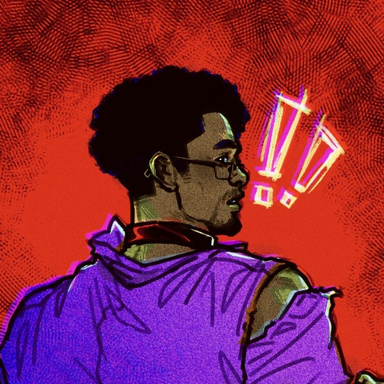
Clean headshot (heh) version
#dungeons and daddies#dndaddies#dndads#dndads s2#dndaddies s2#terry jr#terry jr stampler#dndads spoilers#dungeons and daddies spoilers#dndaddies spoilers#my art#eyestrain#chromatic aberration my beloved#i love super super saturated colors this was v fun to make#also rip tj u ate this episode but I hate u had to die bbg :-[[[#also the choker is a lewk ngl#Willy did one thing right and that is give me an excuse to draw the kid dads in chokers WHICH I WILL DO NOW every time they get mentioned in#the pod#grant u r next babeyyy [probably]
768 notes
·
View notes
Note
if you don't mind me asking, which is better, tripping on acid or tripping on shrooms. also is it possible to get cross faded or do they cancel each other out?
not at all I love giving drug advice :3c
It’s hard to say what’s better bc I love both but I believe they serve different purposes and thus, different experiences.
Acid trips are like, a fun loud party you have to commit to. Their trips last about 12-14 hours, and tend to make one pretty active. You wanna do like Everything, like watch movies/shows, listen to music, walk around outside, etc. Drawing is also incredibly fun on acid, and I can safely say they helped me understand color theory better than any class. Colors are incredible and everything has a rainbow veneer, one time it made Metalocalypse looks SUPER HD and I was convinced that it was a part that didnt exist outside the trip ghrheh. The one downside I can say is that having a bad/weird trips is fairly easy, since they last so long. I took acid quite a few times and my last two trips ended up being weirdly scary even though I knew how to handle my acid. It’s a fickle mistress, but I have tons of fun on it and if you take your normal pre-trip prep it should be gravy.
Shrooms (the ones I took were psilocybe mexicana) on the other hand are like, it’s chiller less neurotic sibling. Shroom trips only last about 6-8 hours, and they don’t wanna make you do shit lol. The kinds of stimulus I want on shrooms is v different than acid, p much strictly natural stimulus; sunlight, trees, wind and water noises…also dancing lol. Colors are still vibrant but theres more patterns floating around (funnily enough they look like the patterns found in pre-columbian mexican codices; mexican flavored visuals lol) They also make you Super social, like when I took some w two other friends all we did that whole trip was talk about awful work stories. When I try to watch something w a friend we just end up talking about what we’re watching instead of actually paying attention. It’s like a homey lil trip that makes you feel good in a soft and comfortable way. In fact, I took shrooms the days after I felt I emerged from an acid trip wrong. tho I can’t say I took a HUGE dose of shrooms yet, only 2g doses, so I don’t think I had a chance to completely lose my gourd on them yet unlike acid ghggh
I think the difference between them lies in their purpose, acid is made to be a party drug, a good time to have in concerts. It comes from ergot, a fungus that grows on rye wheat, concentrated into liquid and saturated in paper. and is theorized to be why the mass hysteria in Salem broke out into the witch trials. (baking the fungus into their rye bread left trace amounts of LSD that may have drove them apeshit) while Shrooms we’re used as medicine, for rituals of internal healing, and they definitely act as such. You also consume them the way they are grown in nature, save for some processes.
As far as getting crossfaded w them I have no idea I haven’t actually done that yet🤔maybe one day
13 notes
·
View notes
Text
IU - Palette
Like Perfect Velvet, this was an album of two halves for me. The first half was a bit faster, the second half was a bit slower. And as you can guess, my ratings more or less track.
I do think it’s an incredibly cohesive album though. The song Palette is a minimalist song, and the entire album follows that cue. The only song which feels completely saturated sonically is Jam Jam - everything else has quite some empty space. That’s not a bad thing inherently; it’s just a thing. And it really helps the theme of the album, I think. A “palette” is something you use to make art; it is not, traditionally speaking, the art itself. Thus the palette is kind of a pre-art; it’s more simple, in a way, than the artwork.
IU’s voice continues to be gorgeous; half of these songs would have dropped a point or two if any other vocalist had done them. This is clearly an album that was created for IU to sing; the songs showcase her voice, and her voice specifically. That said, the features also fit pretty well. G-Dragon does feel a tad out of place on Palette, but the lyrical content of his verse makes up for it. The duet lines with Oh Hyuk were super pretty, fantastic addition to the album.
Average rating of 7.8 which might be a tad too low, but it’s about right. Some really good songs, but ultimately I’m just not a huge fan of the quiet ballads that the second half of the album became.
I know Palette and Jam Jam, and I love them both. Also, full disclosure, I’m not using my usual headphones for this one, I’m using my earbuds. They’re reasonably good quality earbuds, but they’re no headphones. If the quality is too much of an issue then I’ll figure something out.
dlwlrma
Oh, I definitely recognize this though
Haha, “wow, wow, wow”, cute
I really enjoy the instrumentation of this
Also structurally, how it alternates between soft and loud
Really cute, fun, classic IU
8/10
Palette
I found this song recently enough that it wasn’t on my Favorites list last time I updated it
I suspect it would end up somewhere in the top 20
I always loved this music video. It’s so simple that it really lets IU’s beauty shine. In the same way that the song is simple enough that it lets her voice shine.
I also love the minimalist style in general. Like, all of these shots could be wallpapers
(In fact I currently have a couple of shots from this video as my phone wallpapers)
The g-dragon part of the MV (and song tbh) does feel a bit off
Maybe it’s smoother if you can read the korean
But otherwise it’s kind of just glamor shots of IU while someone else sings to her
10/10
Ending Scene
Well this sure is romantic
Just piano and vocals so far
The MV shares a similar color palette with Palette
Oh no, what’s wrong
Why is it all grey now
Why is she all sad oh no this is so sad what
And now they’re happy?
Okay wait I don’t get at all what’s going on here
I bet the lyrics would sure help here
Bro the symbolism here is going way over my head but it certainly seems deep
The scissors - she cut him down and now she’s cutting herself down
And now what, she died?
Okay that won’t do, let me go look the plot of that MV up before I judge it
I see. Hmmm… I dunno. It definitely follows nicely from Palette
8/10
Can’t Love You Anymore (With OHHYUK)
Oh okay, this guy has a pretty voice
Instrumentation is incredibly simple. Probably a theme for this album then?
This duet section is gorgeous
Have I ever mentioned how much I love IU’s voice?
8/10
Jam Jam
The fact that they teased us with a clip for this song and never produced a whole MV is literally criminal
Actually, since I’m familiar with the song, let’s pull up a lyric video this time around
Woah okay, I knew this song was sultry, I didn’t realize it was Bad lol
I really, really love the sound of this song. From a purely sonic perspective, this might be my favorite IU song
Mkay, so it’s kind of “bad romance” vibes
9/10, love this song
Black Out
This is rather synthy for IU
I’m not sure I like it either, we’ll see
Otherwise, still very minimal, still prominent voice
Hmm… That guitar there is also a bit odd
Where’s the chorus at
This reminds me of an f(x) song, I can’t remember which one
Yeah I dunno tbh. It’s trying to do a lot and yet also be minimal and idk about that
Oh okay, we get a guitar solo
Hmm… I really don’t know about that one
6/10 to be honest, it was alright, but I am not convinced by it
Full Stop
Piano now
Violins
Oh, some flute, nice
Maybe it’s a clarinet actually? This lower register sounds more clarinet-y
7/10
Through The Night
Water
Is that a book in her hand?
Button
Woah that was loud
What a tiny microphone haha
She’s knitting!! Sakura knits too
Guitar and vocals
That shot of the pond was gorgeous
A little flower hair clip
These harmonies are exactly what this song needed
Ball of yarn!
Broken mirror
This is minimalist too, but in a different way than Palette
8/10 for the MV
Love Alone
Now we’re even quieter
Talk about intimate, I can hardly hear her
Alright guitar, pop off
Yeah, songs like this are kind of annoying, because they’re probably great if you know what she’s saying, but I don’t
I can appreciate just how Quiet she is though. Kpop tends to be obsessed with loudness
7/10
Dear Name
More quiet, more piano
Kind of hoping for a crazy high note, not much of that in this album yet
Oh no, it’s a Proper slow jam, oh god
At least it’s an IU slow jam, so her voice is enough to carry it well
7/10
0 notes
Photo
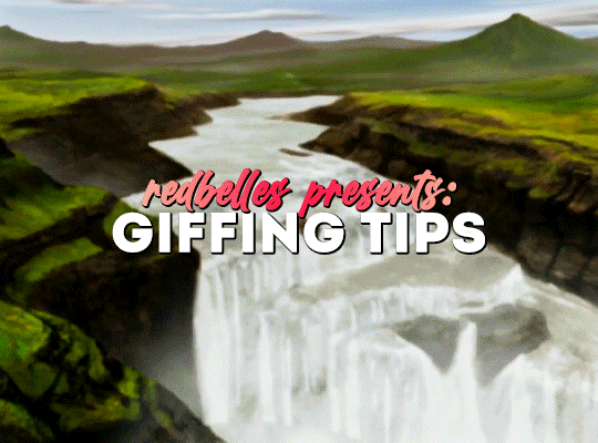
hello! i’ve been asked by a genuinely surprising number of people to walk through how i gif, so here i am with something that’s less a tutorial and more a collection of tips, tricks, and useful links. i hope it helps! ✨
08/23 UPDATE:
i see this post is making the rounds again, but i’ve actually got something better these days: here is the super in-depth gifmaking 101: a comprehensive guide tutorial i put together earlier this year! the new one is way more helpful ✨
GIFMAKING: BASIC TUTORIALS
i’ve been doing this for just over a year two years, guys! i know nothing some things, jon snow!
i learned to gif by following tay’s (@kylos) tutorials, so rather than look to me, go ahead and check out her incredibly thorough master list of tutorials for all your giffing needs
another great resource is rina’s (@hayaosmiyazaki) extremely detailed gifmaking for beginners guide, which is current as of july 2020
V. BASIC TIPS
always, always, always gif from 1080p or up. seriously.
sharpen your gifs! tay and rina both cover sharpening, and here’s another great tutorial by @justin-ripley
always make sure you brighten + color your gifs
@anyataylorjoy has a phenomenal action pack to help you streamline your giffing process
don’t be afraid to experiment! just, idk, fuck around and play with things and see what happens
BRIGHTENING & COLORING & PSDS (OH MY)
experiment. play with levels, selective color, curves, hue and saturation, etc. until you know how they work; that’s the easiest way to figure out what your own personal style + preferences are
or, if you’re looking for something to help you along as you color, go nuts with psds
@dailypsd is an awesome resource for psds
@chaoticresources, which also has tutorials, template, fonts, etc.
@itsphotoshop also has tutorials, templates, etc.
tutorials: tay and rina both cover brightening and coloring!
@bbbbbbbbbbbbbbb-8 also has an amazing guide on how to color correct the murderously blue exegol scenes from sw: tros that is super helpful if you’re struggling with an overabundance of a particular color
i can’t for the life of me remember where i first saw this, but a great trick for Instant Brightening™ is to create a brightness/contrast layer just above your video layer, do exactly nothing to the settings themselves, and just set the blending mode to screen. it preserves most of the colors while dramatically brightening the gif and giving you a great starting point for the rest of your coloring
and holy shit, here is a truly life-changing tutorial on channel mixer which can be super intimidating if you don’t know quite how to work it
practice really is your best friend here! just fiddle around with stuff and you’ll eventually get the hang of it, i promise
FONTS
fonts are the goddamn bane of my existence, but here are some resources to help you conquer them
@yourfonts is the holy grail of font blogs! go give them some love!
@ihaveresources also has one of my favorite font tags
you can always message a content creator to ask what font(s) they’ve used in a particular edit, but if you’re not comfortable doing that, both WhatFontIs and WhatTheFont are super helpful for tracking down fonts
pick a simple, legible font (arial, alte haas grotesk, myriad pro, calibri, etc. are all good options) for subtitles
speaking of subtitles: tay and rina talk about them!
drop shadow is your friend
gradient text can be super fun! if you’re working in photoshop just go to layer > layer style > gradient overlay, and go wild
gradient text in captions is a bit of a pain but also very cool
TAGGING & POSTING
rina has a very comprehensive guide to tagging!
general rules of thumb: tag what you’re editing, who you’re editing, source blogs, and then any user tracked tags
for example: i track #userbells
be mindful of content warnings: for example, i always try to tag anything that flashes as #flashing tw
post on an east coast-ish schedule if you can! 7-10 pm est seems to be the optimal time to post if you want to maximize engagement. here’s a whole union metrics thing about it
boost your own stuff by doing a timezone reblog or two to make sure people have a chance to see it. it’s damn impossible to get a reblog in this economy, so do what you gotta do!
FINALLY! MY PERSONAL NONSENSE: STEP BY STEP
✨ updated 12/2021 ✨
for files i can successfully acquire
acquire file(s)
open file(s) in mpv player + take screencaps
load files into stack in photoshop
crop + resize canvas
covert files into layers on video timeline
sharpen
color
add text and/or effects
convert back to frames + adjust timing
export
post to tumblr
for files i cannot acquire
screen record file(s) player using mac screen capture/quicktime player
import video frames to layers in photoshop
import every frame
crop + resize canvas
manually remove duplicate frames
convert to video timeline
select all layers + convert for smart filters
sharpen
color
add any text and/or effects
convert back to frames + adjust timing
export
post to tumblr
voilà! there you have it!
i’m working on a more comprehensive guide to how i do things, but in the meantime, please feel free to send an ask/shoot me a message if you have questions about something i didn’t address here!
306 notes
·
View notes
Text
CW: Discussion of sizes, clothing fit, and patterns v ready to wear (other than the 1st item not really in any order)
1. first of all, if you are new to sewing you need to memorize this *Your pattern size has nothing to do with the size you wear 'off the peg' or 'ready-to-wear.*
0nothing
not at all
no, i don't care if they say something that "sounds like" ready to wear sizing.
2. you need to take your measurements.you do not have any idea HOW to take your measurements if you are not used to buying patterns, because everyone has taught you incorrectly.
2a. UNLESS patterns say otherwise they are fitted for a 5'6 woman with a 'B' cup size. You want to buy the pattern based on your "high bust" (above your girls) if you are larger than a B cup, and then make adjustments. if you do not do that you will buy for the "bust measurement" and it wont fit your shoulders. many patterns have pre-done adjustments for C and D cups, but THEIR idea of a C and D cup may not be yours- check the fit.
2b. for the love of Gd do all your fittings and measurements in the same bra- or same type of bra- that you will actually be wearing the pattern with. a strapless bra v a regular bra will change your fit.
3. worth its own bullet point: all patterns are designed with ease (extra space for it so you can move) and/or 'design ease (how it fits, like a 'loosely fitted' top is not as tight as a 'slim fit')
3a. If you are sewing a skirt with a snug waist, but full swishy gathers... it will fit over a wider range of hip sizes than the pattern says.
3b. you buy your pattern based on the part of the body that is a critical fit. if it drapes off my bust and then is "A" line (flares out) it doesnt matter much if my waist is a bit larger than the pattern.
NOTE: if you have an *extreme* difference of size between your waist bust and hips, you may need to worry about this, but if its just a little off the measure in a loose fitting place? dont worry about it.
4. did i mention your pattern sizes are not your RTW sizes? i did? cool... have i mentioned that your RTW sizing is an arbitrary number that varies widely between brands anyway?you knew that? good.
4a. fit of a pattern can also vary between vastly different brands.CHECK THE PATTERN AGAINST YOUR MEASUREMENTS because while the 'big three' you see in the fabric stores may all be similar, EVEN those have specialty lines that use different sizing... and if you get into ANY of the other designers? Totally different sizes.
5. you need to make a 'muslin' or test fit (pin fit) the pattern at the very least.
5a. no, seriously you do... at least until you have made enough similar patterns that you can check the fit against your existing work.
5b. if you cannot bring yourself to "waste" the sewing on a muslin? at least either buy a 'fun fabric' to make a trial run in, or buy double of your fashion fabric.
5c. ok, but don't swear at me when you find out you need to replace that 'perfect' fabric because the pattern doesnt fit, and now you cant find anymore.
6. If you expect to launder the clothes? you need to wash the fabric before you cut and sew it.
6a. this is also where you keep a close eye on red, purple, blue and other super saturated colors for any sign that they are 'bleeding' and likely to end up making all your white blouses a weird pinkish color in the next wash.
6b. some fabrics (cough linen and linen blends) fray and can generate a lot of lint- especially on the first wash. this is why many people serge or zig zag stitch the cut ends of the fabric before washing.
7. look at the pattern and choose fabrics wisely. That pleated swishy skirt may look really cool in a crisp stiff fabric, but it wont be a SWISHY skirt... it will stand out away from your body... this may be what you want, but it may not.Likewise that crisp jacket detail will look sad and wilted in a soft drape fabric.
8. pattern photos (the models) often show the patterns in fabrics that do not help you understand the pattern at all- look at the black and white line drawing that shows you the seam lines.
8a. also, yes, they choose really weird fabrics for some of the photo shoots- no we don't know why.
9. seriously please get any shame or obsession with "sizes" out of your mind (in general but in sewing especially).
9a. no one will see your size number: it doesn't appear on the back of your dress, but if it makes you feel better put a label in everything you sew with whatever size you like.
9b seriously? sizes are not even consistent in RTW, and they are not the same across different pattern lines. the whole point of sewing is to make the clothes fit you.
9c. honestly you can get professionally made clothes labels and put whatever size you want on them. a friend who made clothing actually named her sizes after the fit models she used, so Roseamund and other names were *sizes*... its cool. your clothes should be YOU sized.
10. pattern making and alteration sounds scary, but even if you dont want to do it at all? some things are really easy.
10a. some patterns come with interchangeable parts, so once you make one outfit that fits, you can wip up a dozen with different necklines, sleeves, amounts of swish in the skirts, length in the pants, pockets...
10b. certain changed are easy- peasy. change the fabric (remember the crisp versus draped fabrics?), make it dressy or casual, changing pleats into gathers (or vice versa) add trim, pockets, embroidery, lengthen or shorten it.
10c. some changes are a bit more skilled, BUT STILL WITHIN BEGINNER capabilities, just take your time!add an over-layer of lace (in whole or in part), add width to a sleeve and make it a dolman or a flutter sleeve, add width to the skirt, changing it from a straight skirt to a full skirt, add a colored insert, or 'slot seams' (not as hard as it sounds, trust me)
you can LITERALLY make hundreds of outfits out of a good basic pattern set by making minor adjustments!
46 notes
·
View notes
Note
You are seriously one of my favorite artists of all time and holy shit that frame looks so amazing! How do you pick your colors? Like you always have such fun pallets that I would never have thought of but it always works so well
o thank u ! I actually feel like im p bad with colours with things being too faded or weird combinations usually and it takes a lot of fiddling sdfjkh
Specifically with the thrushpelt amv i was inspired by the orange bg colour thats in the official music video of the song She Wants Me (To Be Loved), so i also worked with a orange bg
i try to be aware of how warm/cold main colours will affect how warm/cold other colours will look in comparison? For example grey-green can look like a warm blue when you put it on a v warm orange background cause a normal blue looks super cold/clashing in comparison to the warm bg!
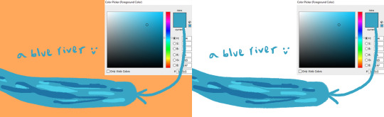
Also when choosing darker/lighter colours, i’ll usually also make it a darker/lighter hue too cause it looks more interestin/vibrant?
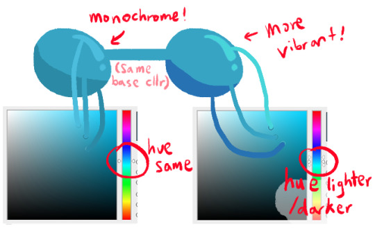
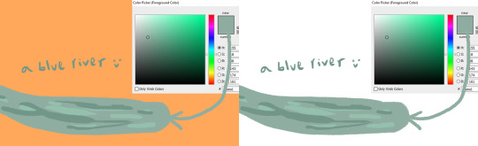
but maybe sometimes you want a monochromatic look! or you want a particular element to stand out like maybe a river, so you let the river be a v visible cold blue against an orange bg etc etc. its all loosey goosey
(and uhh the colour balance tool in photoshop is v useful and i sometimes fiddle with those colour sliders to make things more pink or blue or whatever, but sometimes i overdo it anyways and things look weirdly saturated or too monochromatic and i back out fsjdklh)(wait almost forgot abt overlays; i’ll try slapping an overlay on smth and if it looks good, nice! and if it doesnt uhh scrap it)
#tutorial#??i guess??#color tutorial#colour tutorial#ask#anon#colours are hard i hope this helps someone fsdjklh i feel like im not v good with colours#lot of trial and error of just hoping some colours look good together and if they dont then. try smth else lmao#just sharin wht little i know whehe
29 notes
·
View notes
Text
Name: Neon Terranova
Age: 13
Gender: Non-binary (ze/zem/zeir)
Occupation: Vigilante, usually stopping petty crimes and muggings, but willing to help out with larger scale crime if necessary
Lives in: Classic futuristic world, flying cars and all
Personality: Rarely serious, confident, (some may even call zem cocky) a bit of a goofball, always has a huge grin, tries to go with the flow, but doesn’t put up with anyone’s crap
Appearance: Wouldn’t be caught dead wearing anything but the brightest possible neon colors powerful enough to make you go blind, 5’4, eye and hair color unknown, ze uses different contacts and hair wax to change them, sometimes multiple times a day
Abilities: Can turn colors into different kinds of attacks, reds in to fire or lava, orange into energy that can be used to boost zeir own attacks or to overstimulate an enemy, yellow to blind someone, green to heal wounds and rebuild things, like cracked glass, blue can be turned into water, purple to calm someone down, light grey can be turned into ice, not to be confused with silver, which can turn into metal, dark, grey to make someone lose all emotion, black to show someone their greatest fears, white to reach out into a person’s thoughts, brown is turned into rocks or dirt, pink to charm someone and make them trust or even fall in love with Neon. These can vary in strength and effect depending on the shade of the color, and how much of it, brighter or more saturated shades are usually more powerful. All effects are temporary, but when Neon is done with the attack the color usually ends up in a different place than it used to be, or disappears completely depending on how long Neon used it.
Sorry I’m late! I had a lot of fun coming up with with Neon (:
vvvHost's Commentaryvvv
It's okay! What matters is that you made zem, and besides, your lateness helped me decide to tweak the initial time frame for making OCs :v Also, call me whatever you want, but as soon as I saw those neopronouns I just bloody lit up- Like-- oh peck I'm actually able to say those pronouns! I'm gonna be able to see them more! And also, ze seems super cool! And like-- zeir abilities are really creative too; I can't wait to see how they get used in the writing portion!
6 notes
·
View notes
Text
things a new rp partner should know about me !
fun new meme here ! write 3-5 things a new rp partner ( or those who want to be ) should know about you and tag 3-5 people ! it should be related to rp and not to other interests.
I. hi i’m lucifer and i’ve been writing for over twenty years. it shows. a lot. please don’t ever feel afraid of me or intimidated by me. i promise that i am nothing more than a tired old enby potato who just wants to yell a lot about his muses and have fun and make new friends.
II. i am probably always going to be canon divergent. i’ve been writing sephiroth for probably 12 years now so i’ve had a LOT of time to take what square’s given me in terms of food and i make my own damn meals out of it. i always delight in seeing what similarities my sephiroth has with others, though! seriously, i’m quite duplicate friendly and we should all give this man some hugs.
III. there’s only one major rule in writing with me and that is very simple. please please please do not use sub small text with me. it’s very hard for me to read it without zooming in or leaning in real close to my screen and squinting. colored text is kind of okay but i’m a little ‘eh’ about it. other than that, go wild. though i may ask what your icon is if you’re one of those people who likes super small icons and super saturates them.
IV. i am a master of slow burns. while i’m usually down for shipping and will probably be right on board immediately if you’re into shipping, the actual relationship with sephiroth will take time to build given his internal traumas and whatnot. he is a very affectionate and loving partner if you get there, but it will take time. some people will have far better luck than others and he is, ultimately, preferential towards men. but i like to keep my options open! seriously, if you’re interested, let me know. i’m sure we can definitely work something out together. it doesn’t have to be romantic either. i’m down for hateships and platonic bliss and frenemies and more!
V. i’m a friendly person and i love to make friends with new people but, sometimes, my energy levels are not where i want them to be. the spirit is willing but the flesh is weak and all of that. if i ever have periods of time where i’m just very quiet, i promise it’s very much me working through my energy for the day how i can. it’s very hard to offend or bother me and so long as you can be patient with me when i’m having a slow day, we’ll get along great.
tagged by: i’m a thief.
tagging: did you read it? have you done it? go do it.
5 notes
·
View notes
Note
i guess its compliment hour over here, so i gotta say i've always loved your colors?? its something i struggle with myself and while reading your comic it's all just SO vibrant and inspiring i can feel it even while i'm not looking at it here... do you happen to have any advice for picking colors? can't wait for the next comic update btw!
yall are SO nice to me and I am insufficient in expressing it beyond HEART EMOJIS— ❤❤❤ thank you so much!! ;u;
my artsy talk is under a cut cuz i am again not well acquainted with brevity ghjsghs—
theres a lot I’m still working on learning in art+coloring but coloring is my favorite part!! I honestly just futz around with layers until I feel like it looks Right l ol, I like pink and purple so I use those a lot! and I like limited color schemes so I use repeating colors among groups of characters rather than giving each one a fully unique palette. ik that cause them to stand out a little less but personally I like using shared colors to give a look of unity among characters who have close ties and using more unique/different colors for characters who don’t fit in with that group :V
for picking base color schemes for characters i just use the colors i like and use ones that are just,, magic girl color psychology basically ppfh—like using my ps1983 characters as an example! pastel pink feels soft and comfy with a vibe of healing, and Healing is gonna be a big thing in my comic. blue is elegant and dark blue can feel cold and distant and mysterious, especially when kinda at lower saturation. Bev has got a much more uniform color scheme than the other mcs with it being mostly blue, for that reason :^0 bon wears some muted colors but her shirts tend to be yellow/orange or otherwise bright to help establish her on sight as warm and friendly and bright—all basic color stuff that everyone knows of and uses, whether intentionally or not, but it is effective so i deliberate over em!
and with backgrounds, for my comic I usually do one nicely colored one per page (roughly) and then in the rest of the panels I do it in either monochrome or very limited color just to make the characters stand out more against it. i like how some older cartoons do it, where you might have just blocks of super limited color or monochrome with different saturation as the background and lineart overtop without actually coloring in anything! i think it looks cool lol
and picking color based on mood of the drawing is the obvious one but i have fun with that too! and will just shift the whole palette to one color. ex., I might just color everything using only blue from the start rather than use an overlay or shading of blue and leaving everything else fairly intact. or a more subtle one ive used is, for panels or draws i want to look richer and warmer, I’ll paint a rainbow on top and blur it to heck and lower the opacity a lot ¯\_(ツ)_/¯ most of my techniques dont have a solid basis other than “i think it looks nice!” haha but! for me thats what counts!
thank u again so much for your kind words and support!! and for giving me a chance to talk about art stuff!! 💖💖💖 :,3 I hope you have a wonderful day!
4 notes
·
View notes
Text
FAQ
Can I use your art as an icon?
yes, but please give me credit in the description :0
Do u have any comic advice for ppl who have trouble visualizing/mapping out panels? Layout is always the hardest part of making them for me :')
I’m still pretty new to making comics, so I’m not really sure I’m qualified to give super good advice or anything- but I struggle with this too. You really have to think about what purpose you want each scene to serve/show. If you can cut out a shot that you feel is unnecessary, it gives you more time to add detail to the important shots. You also have to think about what mood or atmosphere you want each panel to show. Honestly though, don’t worry too much about having a super fancy layout- usually, I draw first and then put the box around it later- because sometimes you can push yourself into a corner by drawing the panel first and it becomes restricting.
Tips on making a visual novel?
Just have fun with it, really. Don’t be afraid to look up youtube tutorials. Don't be afraid to make shitty-sounding music, don’t be afraid to make your own backgrounds and sprites, even if you think they’ll look bad. Making a visual novel was super fun and gratifying to me- even if just a few of your friends end up playing it. I’ve only made (1) visual novel as of now, but I definitely want to continue making them in the future. I don’t really have any other tips besides that, sorry if it wasn’t very helpful ;v;
how long did it take to make your visual novel?
about one week.
whats your inspiration (artists, shows, etc)
I recently realized my art is inspired a lot by the original fruits basket anime. I love the art style of the old show and I used to watch it nonstop when I was 8, 9, 10 years old. It had a huge impact on me and my art I think. Other shows that inspire me are sangatsu no lion, sailor moon, cardcaptor sakura, & kodocha. I’m also inspired HUGELY by @insertdisc5 , Heinz Edelmann, @mmcoconut , @kallenart , the kagepro music vids for imagination forest, otsukimi recital, and kisaragi attention, and @kaijugunk + @lasanha-do-lidl ( pls check them out!!)
How do you choose your colors because I am literally shook, your art looks amazing. (first of all aaa tysm ;;)
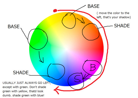
My basic rule of thumb when using a color wheel is when you want to shade something, don’t be scared to SATURATE the FUCK out of it, and always (with some exceptions) choose your shade color by going left on the color wheel.
69 notes
·
View notes
Text
dESIGN sPELUNKING
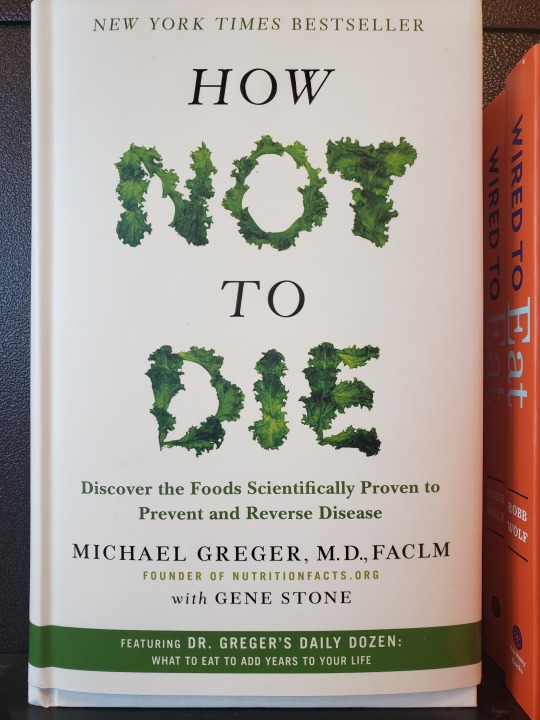
I like the way the lettuce is used within the title to give texture to the type. It also alludes to the topic of food within the book. (Great foreshadowing)
I like how the type is interacting with itself. The letters and numbers are working really well together to make the cover page very attractive and eye catching!
I’ve always had a liking for Chinese/Japanese calligraphy. It’s such a beautiful way to communicate, the lines seem so personified with each stroke!
I like the type having 2 colors. Also the way that the type interacts with the illustration is a great way to tie the title of the book into the cover. These elements don’t feel separated, but infused.
Again I just really like the way that the type and the imagery are working together!
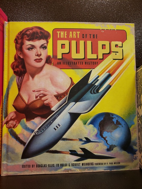
Since the beginning of comics was pulp (smut/inappropriate depictions of humans). I couldn’t help but take note of this particular book. I like the vintage aesthetic depicted on the cover page (I appreciate the lack of saturation, gives off a cartoon realism vibe.
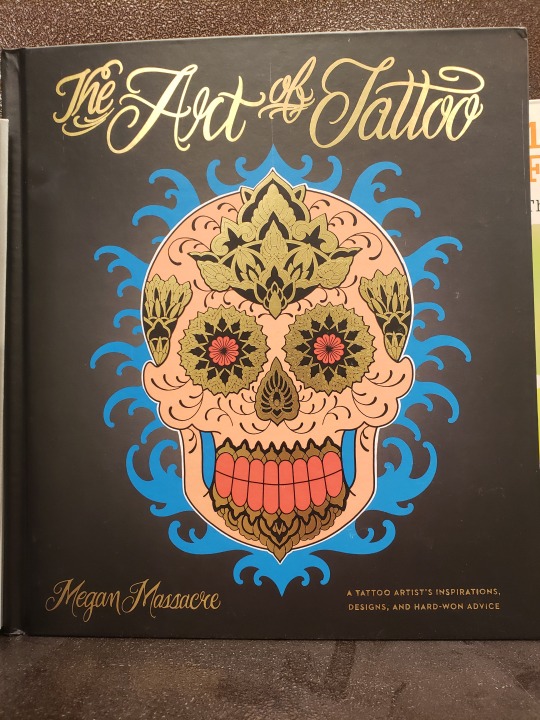
The skull illustration with the vibrant colors and the type that introduces the readers to the book are very stylized. The handwritten cursive font really creates an interesting look. I like the organic shapes and the saturated colors as well.
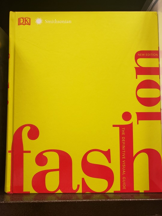
I enjoy the way the type is interacting with the concept of the rectangular form of the book itself. Instead of fitting all the type onto one line, the type runs along the side, almost like water filling into the cup instead of maintaining a specified shape.
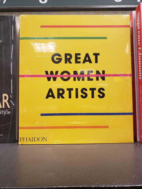
The lines on the cover are interesting, however, I was mostly intrigued by the line running through the word “Women.” I wonder why the designer chose this.
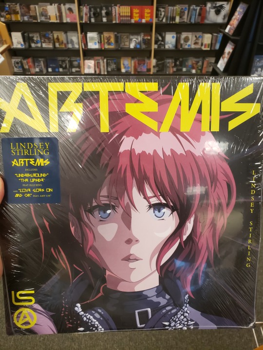
Vinyl covers are always awesome. I love the illustration!
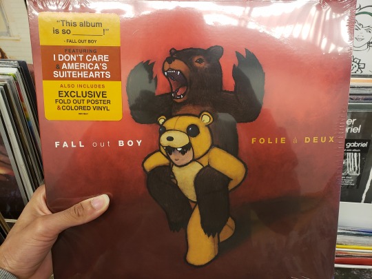
This cover was really interesting because of the way the type seems to float between the two bears. Also the illustration is super adorable.
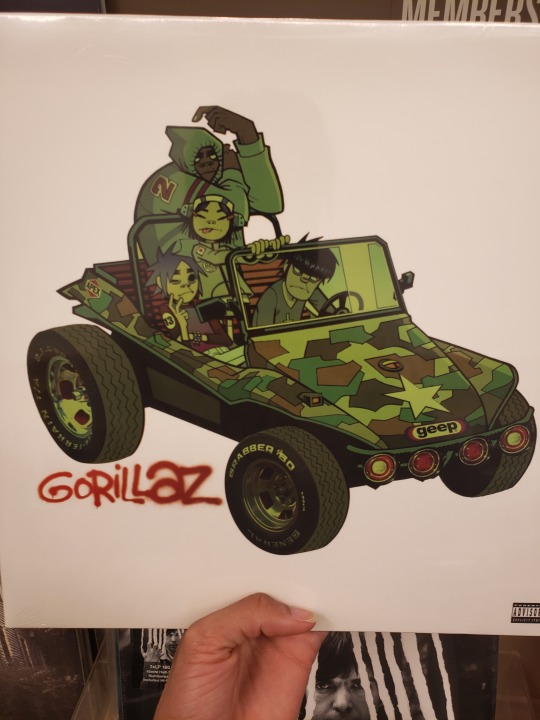
One of my design role models Jamie Hewlett makes the cover art for the group Gorillaz. I find all of his compositions very inspiring and amazing. The monotone use of the dark, nasty green is working well with the illustration of the band members.
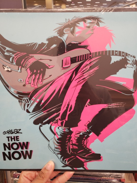
I like the way the colors aren’t completely aligned with the character on the cover. It creates a neon glow that sort of acts as a shadow for the figure and it works well against the light blue background.
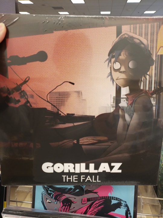
I like the dark theme. A lot of the Gorillaz cover art is more vibrant, but this piece seems more tragic.
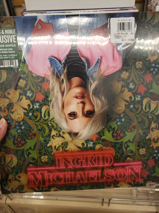
I like that I picked this vinyl up and wondered whether it was upside down or not. The contrast between the artist and the text were interesting and the Stranger Things type/font alongside the pattern design in the background was very interesting. The color choices prohibit any of the elements from being too forward or distracting from the main idea.
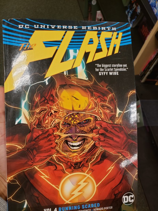
I love comic book covers, ESPECIALLY the Flash comics. The lightning bolts that are all over the composition is very pleasing to look at as it spans all over the place. Also the type is very interesting!
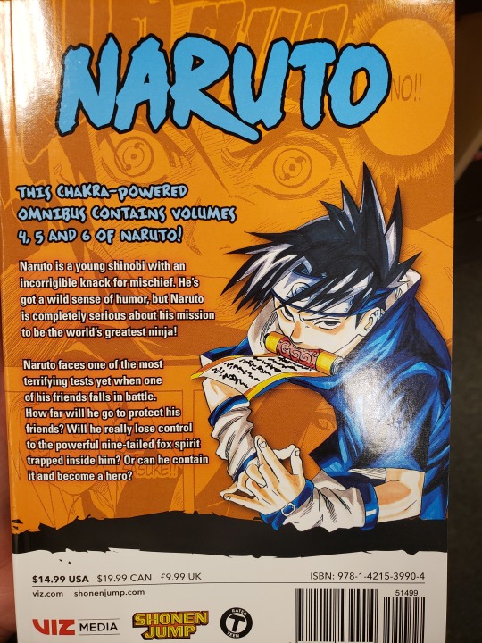
I appreciate the combination of illustration and text! They are related to each other with the amount of space they take up on the cover. Also the font for the word NARUTO is interesting. I like the edges being more jagged. That isn’t explored in a lot of titles of shows or movies.
I love the illustration here. I’ve always been a fan of compositions that take up an entire page. The different characters and their relation to the story of this particular issue are emphasized with their size differences and how they appear. This is a very dynamic illustration.
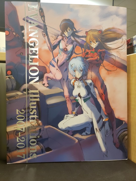
I like the character illustration and the way they’re placed in a scene that adds dimension to the composition. Also I like how the type interacts with the book cover. At one part the V in ‘Evangelion’ is almost perfectly aligned with an illustrated pole that causes movement from the text to the imagery.
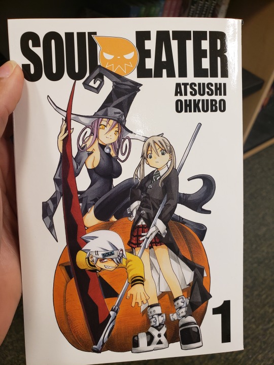
I enjoy the illustration. The character coming out of a scythe is interesting and fun to look at. Also I like the way that the elements point to the type. The tip of the witch hat interacts with the title of the book and so does the edge of the scythe. Also the pole connected to the scythe points at the books’ author.
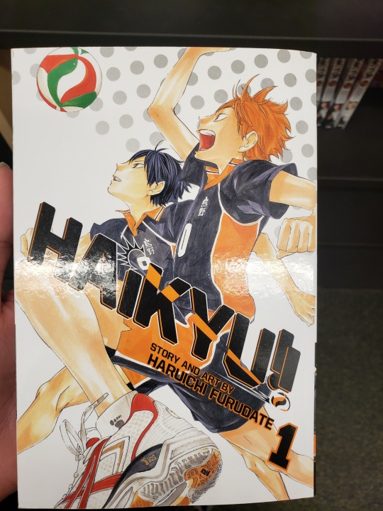
(I like anime and manga) This manga cover uses the illustration to interact with the type in a dynamic fashion. The art and design work together and makes the composition pop!
The type is very adorable (matching the character on the cover. Also from an illustrative standpoint. The shadow adds dimension and makes the brighter elements on the page stand out!
Same as the one before. This one is just really cute and the “blankness” of the cover creates an interesting emphasis on the character and the character’s name.
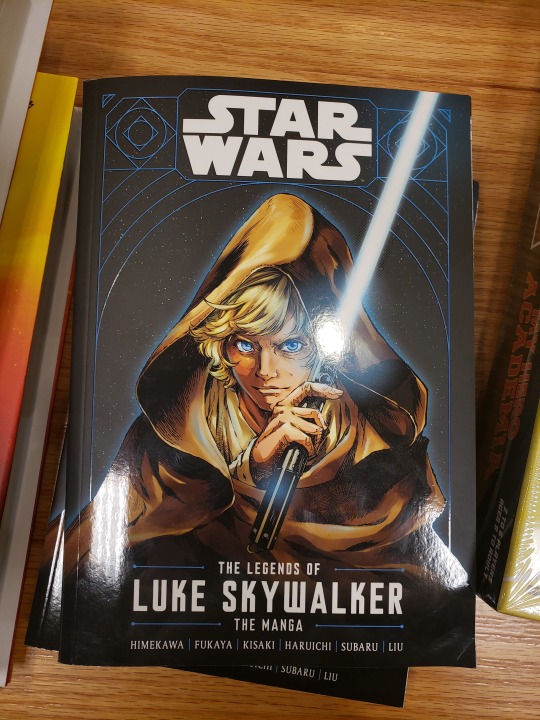
This detailed illustration of Luke Skywalker is very pleasing to look at. The colors associated with the character stand out very strongly against the stark, dark space background. From the cloak to the light saber and his bright hair and eyes, this illustration is eye candy.
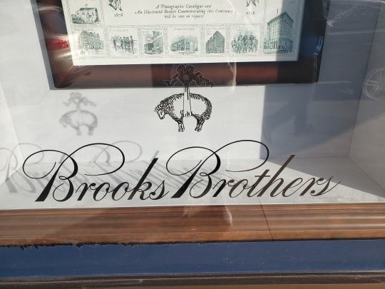
The cursive type with the curvy lines that connect each letter form together and unifies the sense of sophistication for this particular brand is wonderful to look at. I like the lines that branch off of the uppercase ‘b’ and the lowercase ‘s’ at the end of the brand/company name.
I appreciate compositions that utilize type vertically, this is one example. Also, the use of the period after presenting the name of the mall makes it seem more like an announcement. The mall itself introducing itself to the viewer.
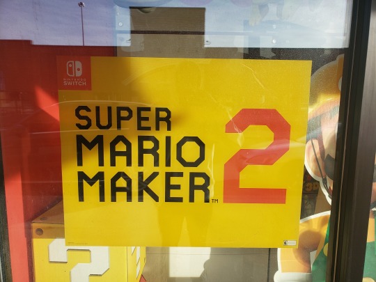
The main reason I chose this poster for Super Mario Maker 2, was the fact that the words are presented in this hamburger fashion, while the number 2 is gigantic next to it. I like the alignment of the number 2 and the title of the game.
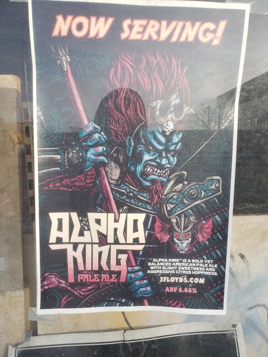
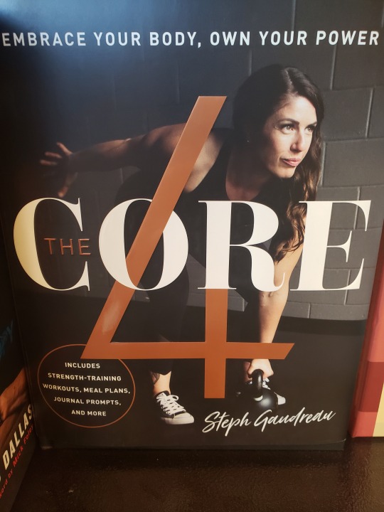
This alcohol poster about “Alpha King Pale Ale” is accompanied by a very rich illustration of a samurai and a unique typeface used to present the name of the beverage in a fashion similar to a comic book or manga cover page! The poster uses the entire page covering it in wonderful illustration and a nice sized title to reel in the viewer.
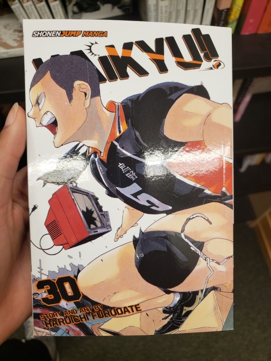
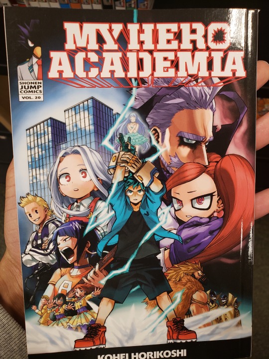
Here’s another manga cover with wonderful illustration. A big dream of mine is to be able to consistently draw very dynamic character figures/poses very similar to this one that covers an entire page and has type working around the illustration instead of the other way around.
Very similar to the flash comic cover presented earlier, I just love the dynamic presentation of the character. The illustration of this man running so fast that lightning is emulating from his body is very chaotic and a creative way to guide the viewers’ eyes around the composition. Also the type seems to move in a place of its own. Not sitting directly on a horizontal line, but flowing on a slant which unifies the sense of movement in the cover.
1 note
·
View note
Text
Hey I know that you all see me as the Grand Authority on Movie Opinions in that I am correct and can never be wrong and also my opinion on things is NEVER unsolicited because I’m literally the most important person on the internet and you CRAVE my opinions.
So I saw Shazam last night and I’m gonna talk about it under this readmore because I dunno how long it’s gonna be and I respect y’all’s dashes like that (plus if y’all don’t care abt what I thought then you can keep scrolling). There will be spoilers but I will clearly mark them.
So I’ve been thinking to myself on whether or not Shazam was the best DCEU movie. All things considered, it didn’t have too high of a bar to leap over, seeing how Wonder Woman, which was originally my favorite, had a lot of incredible moments, but was bogged down by a few of the scenes around those moments and a frankly terrible final act. And if I were to put it into numbers, (which people seem to love) I’d put Wonder Woman at about 50% INCREDIBLE 20% ehhhh and 30% GOD WHY, plus add a few bonus points for being so inspiring within its social context as a female-led superhero movie that isn’t terrible, sexualized or both. Shazam, on the other hand, doesn’t get those bonus points of social context, but has about a 60% Pretty Good and 40% ehhhh with one small bonus point for having one scene that personally hit me pretty hard that I’ll talk about later. It doesn’t reach any of the LOWS that any other film in the DCEU had, but at the same time, it didn’t really hit any of the highs either.
Something that’s worth addressing is that as someone who likes to partake in any and all drama because I’m a gremlin who loves seeing complaining, I saw plenty of DC fans complain that this movie was falling into a sort of trap set up saying “ITS ONLY BEING LIGHTHEARTED BECAUSE IT THINKS THAT IT HAS TO BE MORE LIKE MARVEL AND THATS WHY MORE PEOPLE LIKE IT” and I do want to address that because it’s a stupid argument. While Shazam is a departure from the DCEU’s more serious tone thus far, it’s not a black and white deal. DC isn’t strictly defined by being “the more serious Marvel” or vice versa. Being lighthearted did help Shazam out, not BECAUSE it was more like a Marvel movie, but because unlike movies like Batman v Superman, it didn’t try (and fail) to tackle more complex themes and down to earth schemes that made it lose focus and become an enormous mess. That being said, Shazam’s schemes and themes were much simpler, and it made for a much SMALLER mess if/when it did lose focus.
Before I dive into the spoilers, I’ll give my two cents on the film as a whole. Like I mentioned, the light-hearted tone did help out the movie, and it took itself a little less seriously with things while still balancing out some emotion in the story, and the whole theme behind it, while not PERFECTLY drawn out, still had a coherent message behind it. Visually, the movie was definitely trying to break out of the Zack Snyder mold that had been set up back with Man Of Steel, and while it still chills out in Low Saturation City a lot of the time, it IS doing a better job. Zachary Levi definitely deserves a shoutout in this movie for probably being the second best actor in the DCEU closely behind Gal Gadot in terms of casting choices, perfectly encapsulating the idea of Shazam, and pulling off the role of a Big Billy Batson, however he seems to have taken away the acting talent from half of the rest of the cast, because some of the acting in this movie is.....not great. And that’s not counting the child actors who did alright considering they’re child actors (Freddy in particular was fantastic).
The dialogue in this is pretty solid and indicative of the situation, and they really tried to lean into the idea that it’s some middle school (or early high I cant really remember) kid who just got these powers, and they do a pretty good job of that in both the dialogue and in the first half of the movie. And like I mentioned, there is a bit of Emotion in this movie that they really tried to deliver and they did a pretty good job delivering it. That being said, it’s very clear that they’re going for a kinda cheesy sort of vibe. Which makes sense, since the concept is Kid Becomes Superhero, which is ripe for picking like some kind of Cheese Tree....orchard.....thing.....and it leads to just a fun experience. It’s something that knows it shouldn’t be taken too seriously, which is why I’m writing an incredibly long analytical review of it, because I’m a curmudgeon like that.
ALRIGHT SPOILER TIME SCROLL DOWN TO THE VERY BOTTOM IF YOU DONT WANNA GET SPOILED
Lol alright so this spoiler section is gonna have a lot of negative points, so let me start with some positives.
The overall theme of this movie is sort of an idea of Found Family (which I’m an absolute sucker for), and there’s a subplot that follows this idea where Billy is looking for his mom. The movie starts showing a flashback where Billy’s mom gives him a compass saying “it’ll always help you find your way home” and then very shortly afterward, Billy gets himself seperated from his mother and had to be put into foster care and is now searching for his mother by looking everywhere he can to the point it causes him to run away multiple times. It’s not too surprising how this ends, with him finding his mother, only to find out that she just didn’t pick him up because she was 17 at the time and felt she COULDN’T take care of him. And that’s the point when he realizes “maybe my REAL family were the kids in the foster home all along”. Billy Batson sees that his birth mother’s life is tumultuous, taking on new lovers, working part time jobs, and not having time to even consider caring for Billy, moreso just hoping he turned out alright. Billy, as a sort of symbolic gesture, hands his mother the compass saying “you’ll need this more than me”. And then she replies with two words that just killed me for some reason.
“What’s this?”
I don’t know. It was a line that hit me. Kinda reflecting that sort of disconnect. Alright enough being nice, let’s talk things that are Alright but could be better.
The villain was alright. His character was pretty fun at the beginning, but after he got revenge on his father for Toxic Masculinity™ he became pretty boring, acting more like a CGI Monster Vending Machine. Of course it kinda leads into the whole Cheesy vibe they were going for, but it’s hard to make your movie seem like it’s gonna be campy and cheesy when your villain doesn’t really fall into the role once he actually fights the hero (also with the color palette). Just wish they would’ve sorta gone full Sam Raimi and just leaned into the campiness, with this movie kinda afraid to jump into the pool past its bathing suit.
And then there was the climax of the movie in the carnival, where I felt like it went a little bit downhill, not really being the best that it could be, but still pretty serviceable. The director seemed to be REALLY into using slo-mo, using it a little more than necessary to the point of being distracting, and while the Shazam concept was used in a few fun creative ways, there were some moments where it could have had more utility, or one moment in particular when he absolutely needed to change back and probably had time to say “Shazam” like twenty times over, but he didn’t, which was a LITTLE frustrating, but that’s way more nitpicky. Speaking of nitpicks, there were a few shots that were.....questionable (most notably the Santa.....moment? It seemed to be a clear funny moment, but it didn’t really land and didn’t flow either)
And also the climax has a bit of a fun twist moment that helps round out the Found Family moment where all of Billy’s adopted family also become superheroes, which is pretty sweet, but there was one SMALL nitpick that doesn’t overwhelmingly detract from anything but I found strange. Every character had a power, with one person showing the super strength, another showing super speed, another with lightning, another with flying, which were Shazam’s powers. And then Mary was there....and we don’t really get to see her powers? I did research and apparently she’s a character in the comics with all the powers of Shazam, but Mary was one of the only other characters with an arc and we don’t get to see her with any powers, which is a bit weird (we also don’t get to see her arc formally conclude. We can draw conclusions but still). So in the end it looks like Mary essentially kinda got Kairi’d. Oof.
But that’s really it for spoilers, in terms of the “bad” it’s really just that it didn’t really give it enough of an impact and while it knew what it wanted to be and isn’t disingenuous about it, it also doesn’t really commit to BEING what it wants to be.
ALRIGHT SPOILERS ARE ALL DONE YOU CAN LOOK NOW HERES MY BOTTOM LINE
Bottom line is that this movie is definitely flawed, and after consideration I don’t think I’d put it at the top of the DCEU, if only because Wonder Woman reached higher points than this one did, but that shouldn’t be a slight against Shazam at all. Heck, I would consider putting it a little bit above Captain Marvel if we’re inevitably comparing rivals.
So all in all I give it a Shazam/10. A good fun time. Not the BEST movie you’ll see this year, but you’re there to have a good time and you’ll have it.
37 notes
·
View notes
Note
Can I ask a about your tattoo getting experience? I have some paper airplanes on my forearm (my first and only tattoo) and I really want to get something done to them (like add color or something). But I am really intimidated by tattoo artists. I'm sure they're not judging me like I think they are, but still. How was your experience getting yours? I'm trying to build up the nerve to just do it. (Also, I love your daily positives! Keep it up!)
hiya :) omg i’m sorry i took so long to reply to this, tonight has been A Lot but i’ve been thinking about you and this ask so much. i always question if i am E V E R the best person to give A N Y advice or encouragement to anyone ever, so if anyone else has anything to add, please feel free to share your stories :)
(i will say that i am definitely someone who can be easily intimidated both in new locations and also in spaces that are traditionally male-dominated. like, going inside a guitar shop? so stressful, convinced that i’m being judged every single second that i’m there, no one will ever help me or even make eye contact with me, 0/10 do not recommend.)
but! i had a positive experience getting my tattoo, but i kind of…curated that experience to be the most positive one for me? first, i went with a friend, someone who i really love and trust, so it was a fun outing that was really meaningful for both of us, and it felt super empowering and enjoyable. plus, we got enchiladas afterwards :) if you have someone you can go with, that might be a way to help you feel less nervous. if you don’t have anyone to go with, you will still be okay, because you’re going to do this badass thing for yourself because you deserve to have nice things that you want!!!
the next thing is that i chose a female artist. for me, personally, that’s just what made me most comfortable, and it was the same for my friend. if that’s something that would make you comfortable, it might be worth checking around to see if that’s an option for you. if you don’t care, then don’t worry about it! there was a male artist in the shop while we were there, and he was also super friendly and nice and cool, and i’m sure i would have had a fine experience with him, too!��
the last part of it is that i made sure i knew exactly what i wanted, and i tried to have some knowledge to back up my decision. like, some people probably choose an artist based on how cool the images are, but i tried to really focus on things like, does the outline look perfectly even everywhere, how good are they at drawing a perfect circle and straight lines, does the color look nice and evenly saturated. mine’s really small and not very involved, but i knew what i wanted it to look like and where i wanted it to be, and i listened to her input, but ultimately, i’m the one who’s gonna be wearing it forever. if you’re not sure what you want, then it’s definitely cool to have an actual artist who can offer you some ideas and draw some different things for you! but you also have to be willing to assert yourself and be your own advocate and be like, that’s too big, i don’t want it there, can you do this a little different, in a way that’s respectful. that’s another reason that it might be nice to have someone else there, because if you find yourself having trouble saying no, maybe you could give your friend some kind of signal and they could intervene for you.
i think one important thing to remember is that, at the heart of it, tattoo artists are artists, and all artists are basically huge geeks on some level. like, this girl draws lizards and rabbit skulls for fun in her free time, she’s not cool, she’s a nerd like me 🤓 and most artists take a lot of pride in their work, and they want to do something really cool that you’re going to be happy with. also, they can be sitting down with people for like five hours or longer at a time, so they’re used to dealing with people, they’re used to being chatty if you’re into it or quiet if you’re not into it. and ULTIMATELY, you are the boss! you are the one making a decision to give them money or not, and their shops would not be able to stay in business if they just went around being judgmental assholes to people all the time, because no one would get tattoos from them!
in general, i think most people are not judging us as much as we assume they are. i’ve worked plenty of customer service jobs and not judged people unless they were absolute fucking assholes. just be your normal nice self, and you should be fine :) this is a gift for yourself, and you deserve it!!!! if you lived near me, i’d go with you, but i know you are strong enough to do this, and i’m already so proud of you, and i want to hear all about it when you get it done :) :)
11 notes
·
View notes
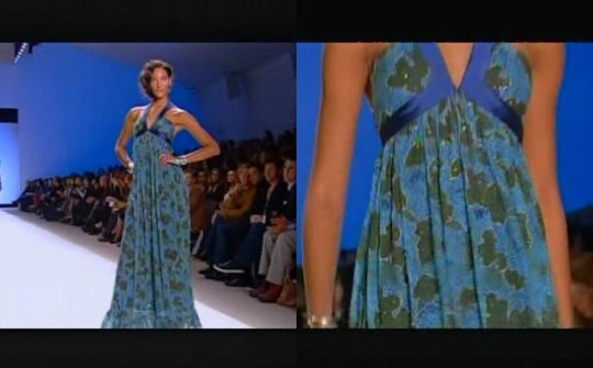
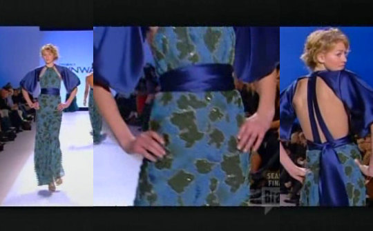
Text
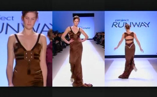
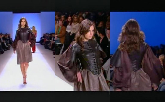
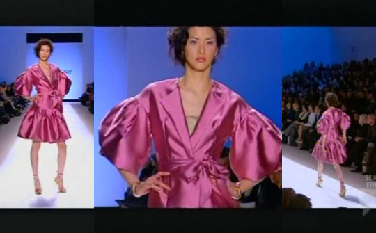
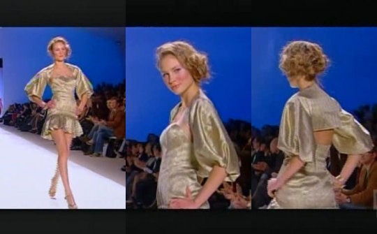
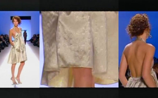
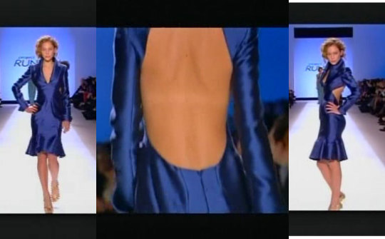
Season 2 Episode 14- Floundering Finale
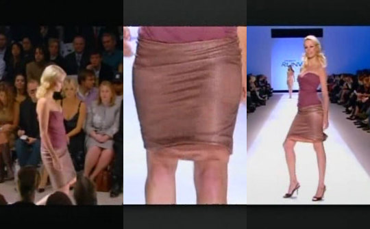
It’s no secret that I think these designers stumbled to the finish line this season. Unfortunately, Daniel, Chloe, and Santino really didn’t step it up going into the finale and we got three fairly underwhelming collections. None of the collections A) felt like full collections or B) had any surprising wow pieces. This made it feel like I could take any look from one collection and throw it into the other and it would fit in. Everything was just “fine”.
3. Daniel V.
Oof what a disappointment this was. Daniel seemed to be the preordained winner of the season, but this collection was just a conglomerate of mall wear with a few “fancy dresses” with ugly appliques. There were certain flashes of brilliance, but he had too many starting points and never really went anywhere with any of them. It was such a shame to see Daniel fall so hard, but guess what? We all done known this!!! He wasn’t that great on the season and this collection showed that.
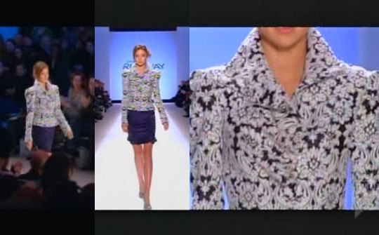
Serving you Blanche Deveroux realness. Tacky floral? Check. Shoulder pads? Check. Fit and flair? Check. Congratulations you’ve made your first grandma jacket!
The skirt is nothing.
The boring daughter of the woman in the first look. I can get that top at J.Crew, Gap, Macy’s, literally any department store. There is no design here.

This is a cute coat, and had he run in this direction I think he could have eeked out the win because the judges really loved him. The collar is wonderful and it is impeccably made. the silhouette is gorgeous, too.
And we’re back to mall wear. The only part that is remotely designed are the shoulder straps. Yawn.

I agree with Michael Kors, I want to rip that thing off of her chest. The pleating on the bottom is cute but still boring.
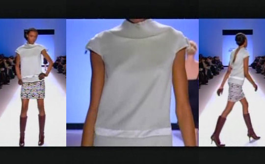
Had this shirt been a mini dress I would have loved it, but it isnt. The top is cute, but once again the skirt is nothing. I also hate the two together, especially with the boots.
Where did this come from? It has absolutely nothing to do with the rest of his collection. Had this been in the same cool tones I would have given it a pass, but changing the pallet and design details is too much. I actually really like the pants but, as we know, I hate the under boob scoop.

Oh look! He took my advice and made his shirt and skirt a mini dress for his thirteenth look. This is cute and totally in line with the best pieces in his collection. It isn’t shown here but I love the cowl neck back to these pieces. I would have switched this piece and the previous piece in his lineup for a smoother transition.
I want to like this but I just can’t. Each piece individually is cute but all together it gets a bit costume, like someone on a Disney show. Had he gotten rid of the purple sweater, which is a nothing piece already, it would have been much more successful. But again with the damn chest patch.

There were strokes of greatness in this collection. I absolutely love this top, it is so soft and delicate, the best parts of Daniel’s designs. The pants are wonky but at least there is design there.
J. Crew Outlet

I like it but once again it does not fit with his collection. No where else has he played with transparent volume or monotone multi-piece looks. I like that he played with volume and top and on bottom, but was able to balance it out by keeping it body con in the middle.
This dress is horrendous from beginning to end and not what I would want to leave in the mind of the public and the judges. The patch needs to go, but past that there are many more issues. The color is so blah and the two browns do not mesh well. All of the detail in the back looks very western, like cowboy boot or saloon door details. Mess all around.
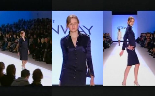
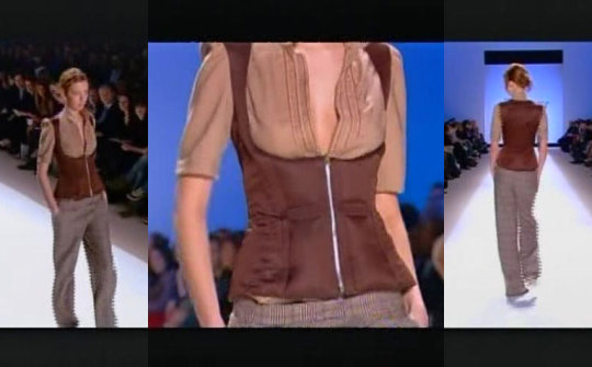
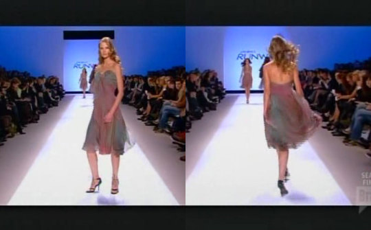
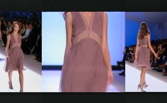
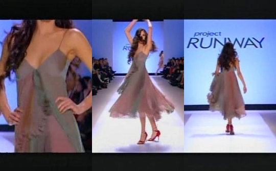
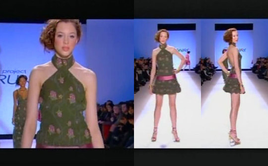
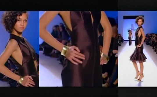
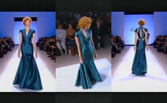
2. Santino
Santino created a lot of beautiful dresses for his finale collection, but he showed very little range. It was quite boring and after a while and a lot of the pieces began to blend together. That being said, there were no truly bad pieces in his collection but it didn’t feel like a full runway show to me.
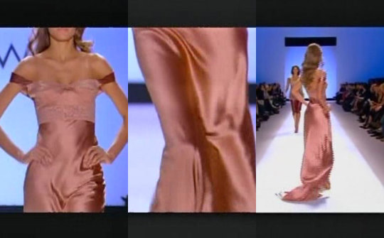
This is a gorgeous gown but it doesn’t give me the oomph I need from an opener. The proportions are great and make the model look super tall and I love the fabrics he chose. It’s just a bit safe.
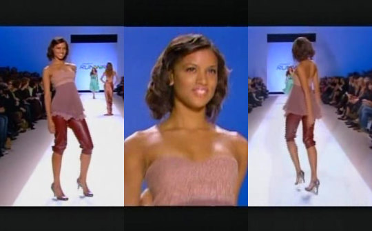
This is cute and fun. I love the leather pants, they add an edge to an extremely saccharine look. The top is cute as well, I just wanted some more oomph again.
Everyone on Project Runway has created this dress, and it’s normally in a quick or unconventional challenge. I don’t need this in a 13 piece collection. Love the color though. Why this was in the middle of his maroon and pink looks I will never know.
Yawn. At least the blue dress was made well. What is up with the hem.

It’s a beautiful slip dress with a wonky back.

For the 13th look it was more designed than any of the previous 3 looks. Still, it needs even more. Maybe if the lace was in a different tone than the dress?
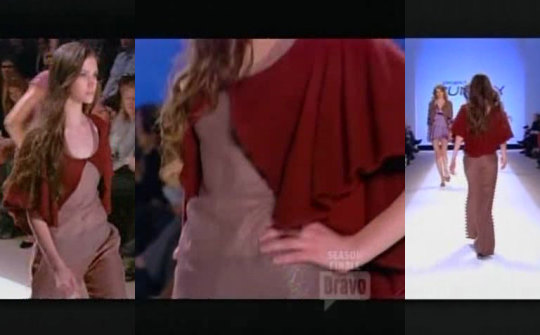
This one I love. The jumpsuit is nice but the star here is the cape. It falls beautifully around her shoulders and arms and scoops around her neck wonderfully. The only problem is that this should be a low point in a collection in terms of amount of design, not a high.
She’s a majorette. The dress is ok but that jacket is hideous. The horizontal lines are cutting her off at too many places.I
I love the sudden pop of super saturation. It’s the same cut on top as many of his other dresses but I enjoy the mix of fabrics. I wish he had continued that into the skirt.
And then this comes out of nowhere in the collection. I kind of enjoy it just because I was so bored by everything else. I don’t think he used the right fabric for the skirt or sleeves, it has too much structure for what he wanted. I would have loved to see more of this leather work in his collection, but overall it’s a bit too Ren Fair.
I. Love. This. Fabric. He only used it in 2 pieces but I would have loved it in about 5 or 6. And he knows how to work with it. The way it flows around her body and drapes down is amazing. The pleating is amazing. I need Santino to stay in this lane because this is where his strength lies.
His blue dress but in puce. I like the lines of the trim though and it seems much better executed.
Yes yes yes yes yes yes. He should have opened with this look and gone from there because this is by far the best look in the collection. The extra drape in the front is such a beautiful and understated edition. I just love it, possibly the best look of all 3 collections.
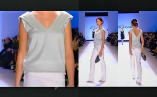
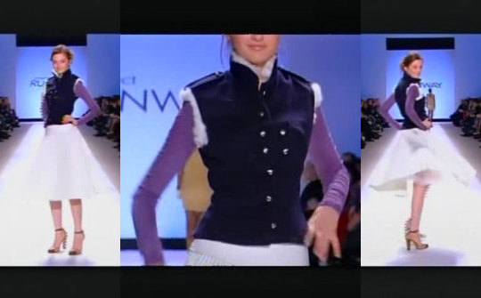
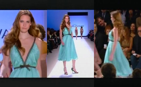
1. Chloe
Chloe deserved to win just because of the lack of imagination of Daniel and Santino. Still, it isn’t the best collection in the history of the show.
She had the best opener of any of the finalists. It is fun, cool, and most importantly, interesting. It’s a new take on a classic coat dress.
I haaaaate this print. I have never been a fan of dark green and pink and the floral looks dated, even for 2005. The actual dress is cute and a lot of girls would rock that silhouette.

The same ugly fabric but in a much more boring silhouette.
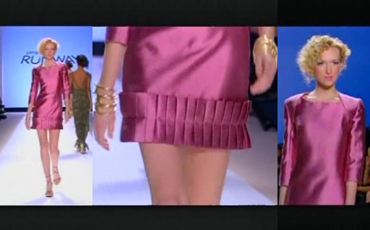
I’ve been on the fence about this dress, but I’m coming down on the side of quite liking it. The pleating on the bottom are something I’ve never seen before and I like the folding detailing of the shoulder. The fabric and sleeve length make it a bit grandma but overall its a success.
This is cute. The fabric could have easily gone grandam but the cuts make it young and fresh. The dress is cute but the shrug is amazing. The way the two pieces make a cutout in the back is sublime. She did a great job with volume in this collection.

This look I don’t like as much. It’s a little too stiff and stuffy and doesn’t match the easier fun attitude of the previous looks. The tuxedo stripe is problematic, she tried to be different by angling it to the pockets but it doesn’t work.
The same boring dress Santino made twice. The fabric is way too thick and stiff, it looks like maternity wear. You can tell this was her 13th look.
From the waist up I like it, a chic little cocktail dress. The color is also extremely rich. The fit and flair leaves a bit to be desired just because I’ve seen it so much. I wish should have taken the pleating from her 4th look and added it to more pieces, maybe this one.
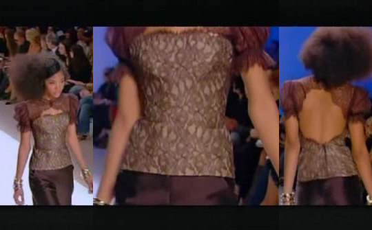
In my opinion, the printed pieces in her collection were the least successful. The lace up top looks costumey and the shirt hits the model and an odd length, accentuating her hips.
Upon closer inspection it may not be a print but a lace overlay an odd choice considering the abundance of solids and lack of lace in the rest of her collection.
I have no clue where anyone would wear this dress. The front is too stuffy for a cocktail party but the back is completely inappropriate for the workplace. I love the power of the cobalt blue though, she looks powerful. The seams on the front make her look extremely tall and lean.
I am really not responding well to the print’s that she chose. This looks like random islands or a deconstructed globe. Aside from that it is the same basic empire waist dress I’ve been harping on, but this time in a maxi.
I don’t mind the print as much here because a lot of the focus is on the gorgeous cobalt blue. The sleeves and back make this dress. The rest is a bit underwhelming.
This is a strong second to last dress, but I would never use it as a closer. This shows a restrained and edited design eye but doesn’t scream “this is who I am as a designer”. I really have no issues with the actual dress, and the back is fantastic.
A well deserved win for Chloe, even if it was by default.
10 notes
·
View notes
Note
Hello! Your art is absolutely gorgeous; I've been following your work for a few years now and originally found you through Invader Zim fanart. I had a few questions for you, if you don't mind. ^^ Do you do your work in black and white first, or paint in colour immediately? I've been finding overlaying colour is convenient for markings but it can be kind of... Clumsy. Maybe that's me, lol. Also, do you have any tips for environmental painting? I want to practice but I'm not good at it. x.x
Hi there, and thanks for taking the time to write me. I’m so happy to hear you enjoy my work, and have been following me for so long. ;u; It is an honor!
You have some great questions, and I’d be more than happy to answer (while hopefully not making this reply too long). I do not start my paintings in black and white, unless I have to make a lot of small thumbnails for a client (with private commissions, this is almost never the case). Grayscale is a fantastic way of painting when starting out and trying to understand the values of specific colors and the role saturation plays when deciding which colors to choose for your painting. However, the very best thing for me was when I allowed myself to make mistakes, then correct them in real-time. Meaning I would start out painting in color, add a few basic elements (never too much at a time), then switch my canvas to grayscale to see where I went wrong. This may sound tedious (and at times it is super frustrating), but it’s what really made things stick. Now I paint in full color and my understanding of value keeps me from having to go back and color everything once it’s all done (which, most of the time if not handled in just the right way, results in muddy-looking images). I get a lot of questions asking about how I paint characters with complex markings, and for this, I utilize the “Aaron Blaise” technique. This involves the use of a few layers; one for your flat colors (or midtones), one for your shadows (where light does not hit), and one for your main light source (where light is striking your subject directly). Rather than getting too in-depth here, I’ll simply link you to Aaron’s channel to see a hands-on approach to what I’m talking about exactly: https://www.youtube.com/watch?v=vZ5ulFxA-eA
The only significant difference between the technique I use and the one Aaron uses is that I use a “subtractive” method of shading, meaning I paint from dark to light. In this case, I literally erase where I don’t want my shadows (using a layer mask so I have greater flexibility).
For environments, I’d recommend a couple of things… First, study from life directly and your surroundings. *Reference, reference, reference!* This part is so important. Do not be afraid to use references when studying. Nobody else has to see it, but you will learn so much from it. Second, study from the masters.I specifically love the early-to-mid 1800′s romanticism movement era of paintings, more specifically those produced from the Hudson River School painters. One of my favorite masters to study from is Albert Bierstadt. I highly recommend everyone to check out his work; it is beyond gorgeous and inspirational doesn’t even begin to describe it.
But most importantly (and this is very general advice), have fun with it! Art is hard, art can be super frustrating, and we all feel like giving up sometimes. *Don’t* give in. You will get there, trust me. It may take you a year to see improvement, it may take you ten (or more!), but you will get there. We all learn at our own pace. Don’t rush it, take your time with it. We are constantly changing and improving, and our art changes with us.
Thanks again for your question, and I hoped my rambling helped at least a little. ;u; Happy art’ing!
#artists on tumblr#ask#art help#art advice#janeiye#speak your mind#aaron blaise#text post#long post#mylafox
28 notes
·
View notes
Text
Chickpea Salad - Spend With Pennies
New Post has been published on https://cookingawe.com/chickpea-salad-spend-with-pennies/
Chickpea Salad - Spend With Pennies
amzn_assoc_placement = "adunit0"; amzn_assoc_tracking_id = "workathome089-20"; amzn_assoc_ad_mode = "search"; amzn_assoc_ad_type = "smart"; amzn_assoc_marketplace = "amazon"; amzn_assoc_region = "US"; amzn_assoc_title = "Shop Related Products"; amzn_assoc_default_search_phrase = "cooking"; amzn_assoc_default_category = "Kitchen"; amzn_assoc_linkid = "51fe4d035c7af8dc5928e6f5e5b79c4e"; amzn_assoc_default_browse_node = "284507"; amzn_assoc_rows = "4"; amzn_assoc_design = "text_links";
Chickpea Salad combines all of my favorite fresh vegetables in one delicious bite. Chickpeas are combined with juicy tomatoes, refreshing cucumbers and creamy avocados all tossed in an easy homemade lemon kissed dressing.
This easy salad recipe makes a perfect side dish for burgers or steaks or turn it into a complete meal by adding in grilled chicken breasts!
A Protein Packed Salad
How can you create a salad that packs a protein punch without adding meat? One of the best ways is to include chickpeas! Chickpea Salad is such a delicious and nutritious way to enjoy fresh summer veggies and is perfect to make ahead and enjoy for lunch!
I love fresh summery salads filled with a huge variety of produce and this recipe contains so many wonderful, fresh ingredients! Refreshing cucumbers, juicy diced tomatoes, crisp bell peppers and smooth creamy avocados are the perfect complement to chickpeas! Not only is the combination of colors and textures beautiful, it is loaded with flavor for a totally irresistible meal ready in just minutes.
How to Make a Chickpea Salad
Chickpeas are the same as garbanzo beans and can be used interchangeably in this recipe.
Avocado: Choose an avocado that is ripe (a little bit soft but not too soft). Once the seed is removed, cut the flesh into squares right in the skin and then use a spoon to easily scoop them out into a bowl. Squeeze fresh lemon juice over it, this not only adds flavor to the salad, it keeps avocado from turning brown.
Fresh Herbs: In this chickpea salad you’ll really want to use fresh parsley (dry parsley doesn’t have the same flavor for this salad). You can substitute cilantro or dill if you’d prefer.
Veggies: Chop your veggies into bite sized pieces and toss with the dressing. This will last days in the fridge making for a great lunch dish! If you’re making this ahead of time, you might list to leave the avocado out and add it just before serving!
Chickpea Salad Dressing
For the dressing in this recipe, I combine all of the liquid ingredients in a mason jar and give it a shake. You can use as much or as little as you’d like and the leftovers will keep at least 1 week to drizzle over tossed salad or even grilled veggies!
Olive Oil: There are many options for olive oil; extra virgin, virgin, pure/light, extra light. Extra virgin is considered the least processed and most flavorful, while extra light is the most processed and has a much lighter flavor (and isn’t lighter in fat). So your personal taste and nutritional desires will dictate which one you choose. Vegetable oil or avocado oil will also work in this recipe!
Swap Out the Veggies
This recipe is so versatile, you can substitute your favorite vegetables; red pepper for green pepper, white or green onion for red onion. Adding feta cheese makes a nice variation, but since feta is quite salty itself start with less salt when you add the seasonings.
Chickpea Salad is a complete meal that is low in fat, high in protein and incredibly delicious! A super power salad that is so satisfying, and …fun!
More Easy Salads
Chickpea Salad
This beautiful Chickpea Salad combines all of my favorite fresh vegetables in one delicious bite. Chickpeas are combined with juicy tomatoes, refreshing cucumbers and creamy avocados all tossed in an easy homemade lemon kissed dressing.
1 avocado
1/2 fresh lemon
1 can chickpeas drained (19 oz)
1/4 cup sliced red onion
2 cups grape tomatoes sliced
2 cups diced cucumber
1/2 cup fresh parsley
3/4 cup diced green bell pepper
Dressing
1/4 cup olive oil
2 tablespoons red wine vinegar
1/2 teaspoon cumin
salt & pepper
Follow Spend with Pennies on Pinterest
Cut avocado into cubes and place in bowl. Squeeze the juice from 1/2 lemon over the avocado and gently stir to combine.
Add remaining salad ingredients and gently toss to combine.
Refrigerate at least one hour before serving.
Nutrition Information
Calories: 238, Fat: 15g, Saturated Fat: 2g, Sodium: 259mg, Potassium: 552mg, Carbohydrates: 20g, Fiber: 7g, Sugar: 3g, Protein: 6g, Vitamin A: 20%, Vitamin C: 46.6%, Calcium: 5.8%, Iron: 11.7%
(Nutrition information provided is an estimate and will vary based on cooking methods and brands of ingredients used.)
© SpendWithPennies.com. Content and photographs are copyright protected. Sharing of this recipe is both encouraged and appreciated. Copying and/or pasting full recipes to any social media is strictly prohibited. Please view my photo use policy here.
REPIN this Delicious Recipe
More Recipes You’ll Love
!function(f,b,e,v,n,t,s) if(f.fbq)return;n=f.fbq=function()n.callMethod? n.callMethod.apply(n,arguments):n.queue.push(arguments); if(!f._fbq)f._fbq=n;n.push=n;n.loaded=!0;n.version='2.0'; n.queue=[];t=b.createElement(e);t.async=!0; t.src=v;s=b.getElementsByTagName(e)[0]; s.parentNode.insertBefore(t,s)(window,document,'script', 'https://connect.facebook.net/en_US/fbevents.js'); fbq('init', '1997436690581127'); fbq('track', 'PageView');
amzn_assoc_placement = "adunit0"; amzn_assoc_search_bar = "true"; amzn_assoc_search_bar_position = "bottom"; amzn_assoc_tracking_id = "workathome089-20"; amzn_assoc_ad_mode = "search"; amzn_assoc_ad_type = "smart"; amzn_assoc_marketplace = "amazon"; amzn_assoc_region = "US"; amzn_assoc_title = "Shop Related Products"; amzn_assoc_default_search_phrase = "cookware"; amzn_assoc_default_category = "All"; amzn_assoc_linkid = "b45319dac495d29e17b5eff312392025";
Source link
0 notes
Last Seen Blogs
my-name-is-lumien
Tyril Starfury's Exquisite Arms

soft-hao
Xu Minghao

giancarlozema
Giancarlo Zema

nigromanceshadows
Nigromante.
nagisavie
nagisakura