#i really always default to purple tones
Text

head empty just noe
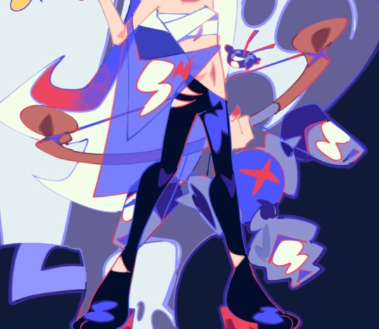
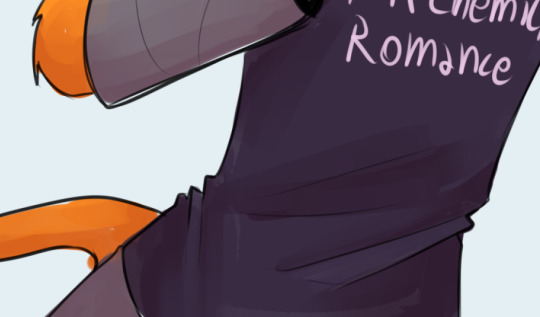
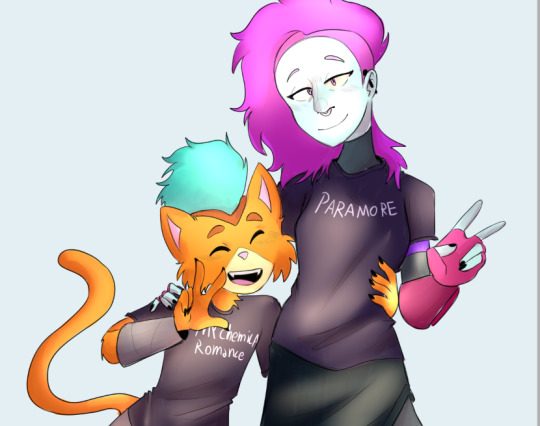
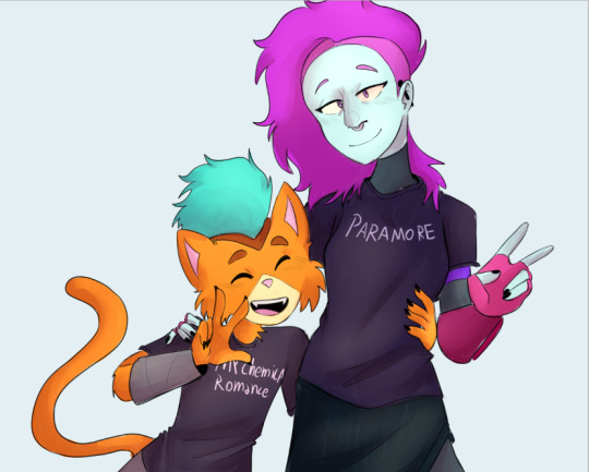
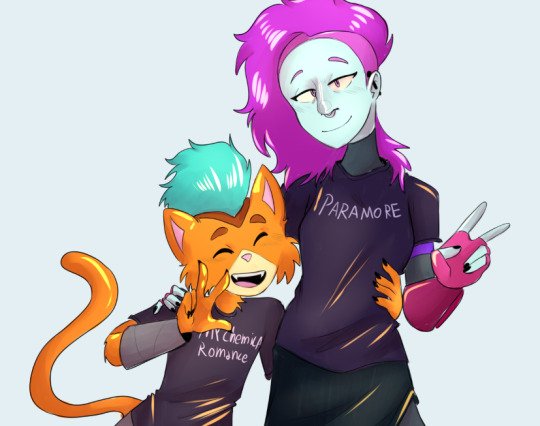
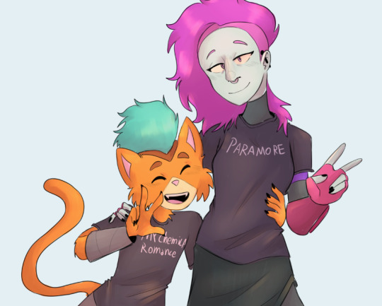
#vanitas no carte#the case study of vanitas#vnc#vnc fanart#noe archiviste#noé archiviste#description in alt text#my art#from the depths of art block i offer this#honestly idk if i'd call it art block or just. I've been hella busy and i've had no head space for creativity#anyway i just realized this is purple AGAIN#i really always default to purple tones#but how could i resist honestly purple is great
269 notes
·
View notes
Text
OK heres zeno coloring tutorial 2.0 !!!! i'm gonna do it kind of in chapters i guess?
chapter 1: choosing base colors
when i'm choosing base colors i always pick everything based on a specific off-white! my 'default' off-white is this kind of very light cyan color but i change it regularly based on character designs/environment/lighting whatever,, examples here!
for callie in this piece, i based everything off of this pinkish color! her skin tone, tentacles, outfit etc are all chosen to harmonise/contrast with the pink color

and with this piece, i used a slightly darker blueish color as they're in space but there's still a lot of light... and the lighter colors in the background (the explosion) make a sense of depth i guess? i used that blue color and chose similar cool colors to harmonise with it!
so i more or less base the tone of the colors in the piece off the off-white! warm off-white = warmer colors (like the nova valentine's day art) and cold off white = cooler colors (like the explosion nova and paro art). but i switch up this formula often !!
chapter 2: coloring specific things
here i'll go over some specific textures and stuff like skin and hair ... skin first !!
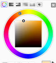
for skin, i like to use a variety of tones! there are different ways to draw cooler and warmer skintones that other people have gone over way better than i have but basically for skin i use this part of the color wheel and pick the darker tones of oranges/reds/pinks etc. (for darker skintones, i go to the middle of the color square thingy, and for lighter tones, i usually slide down the upper-right side)

when it comes to shading skintones, it's pretty straightforward, just a darkish-purple and a pinkish color on 100% multiply, and i always add a little shadow on the nose and blush becuz i think it's cute
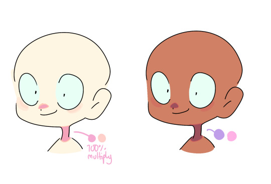
(also i like to add reflective spots on darker skin tones sometimes because 1. darker skin tones reflect in real life and 2. it's fun)

next up is hair... this is very specific to my artstyle but i like to add 3-6 long oval line thingies to the hair to mimic reflection ! it looks cool, it's a good way to show off different colors in the design and i like to switch it up sometimes based on a character's personality!! (like how the frye pic above has a lighting bolt shaped hair thing, or how my teto design has a wing shaped hair thing to mimic her wings in her chimera form!) (note: it doesn't always need to be lighter than the actually hair color and it usually isn't)

for other materials like metal, screens, etc etc... i just add random X marks lol... and reflections!!!

(also, just a general thing, but adding little saturated lines to shading really adds depth and color imo!!)
i would put more tips with refs but tumbles only allows 10 images per post ;w; so i will simply close off by saying don't be afraid to add overlays and filters to your art!! overlays can really help harmonise colors and filters like brightness and contrast can help colors pop... try not to completely rely on them for color choice tho!!
and that's basically it !!! this is not a definitive 'how to draw/color' post... i am not a color theorist... i just wanted to show people how i choose colors cuz a lot of people say they like my color choices! honestly i don't know much myself but i hope that this and the philosophy of 'do what looks good' will help you all o_ob thank you and goodbye
#long post#ah its so freeing to have zero character limit on this site#i did want to add more pics tho 😭#i would make a part two but i dont have much else to say#hope this helps people maybe#also idk how to add a cut/'continue reading' thingy on mobile so if someone could tell me how id appreciate it 😭😭😭
936 notes
·
View notes
Note
hihi! :) (let’s hope the tumblr gods don’t eat this)
do you have any thoughts about modern sevika tastes? i.e how she dresses, the scents she likes to wear, the music she might like, what her phone case might be like. things like that! :)
- topdrop anon
i have a few, but i would LOVE to hear your guys thoughts in the comments too!!
men and minors dni
she dresses practically: pants with lots of pockets, shoes with steel toes, breathable and easy to wash fabrics. but i think she's got a little fashion sense in her, and she knows how good she looks, so she's always buying her clothes just one size too small so all her muscles are on full display, pulling and tugging at the tight fabric of her clothes.
lots of shades of gray and black. some earthy tones-- olive greens and tans and browns. a few pops of color here and there: her favorite red jacket, the purple beanie she wears in winter.
all her socks are black. but her boxers are the cutsy-est things you've ever seen. prints of little hearts, dogs, kitties, ducks, lolipops; writing over the ass like 'eat me' or 'kiss me'; she keeps most of her attire serious, but her undies are always goofy.
i think her left arm would either be a prosthetic or covered in tattoos. shoulder to fingertips.
she's totally the type of person to drive in silence. or listen to the news. she doesn't really listen to music, but she's got a few jazz vinyls she's always cycling through at home. i think it's mostly instrumental, but she does have a soft spot for some soulful singing (which means she cries when nina simone comes on every. single. time. and can you blame her?)
as much as i want to make her a punk-rocker, i just think she'd find it noisy and annoying hahaha.
her phone case is either clear, or it's super bulky and has a little latch on it so she can latch it to her belt lmaoooo.
she keeps the background photo as the default picture it comes with, until she meets you. (she changes it to a pic of the two of you kissing the SECOND you agree to be her girlfriend. she grins after you say yes, pulls her phone out, and quickly changes her background, whispering, "fuck yes, i've been waiting to get rid of this boring ass wallpaper.")
i don't know how to describe scents, but i picture her smelling fresh, like kinda minty, but in a irish spring way. sandalwood too. but on top of all her soaps and lotions, she wears a really warm scented cologne, like tobacco and brown sugar and whiskey and coconut. like amber-y smelling?
she tries to deny the fact that she's got a sweet tooth. she's always munching on chips or nuts or other salty snacks. but that's just because if she starts on a sugary treat, she won't be able to stop herself until it's all gone.
you find this out after you gift her a pan of brownies for her birthday in the morning, and find that they're gone by lunchtime.
now, you always keep little chocolates and hard candies on you to pass to her when she looks stressed. she always gives you the biggest, happiest eyes you've ever seen, like you've just handed her a check for a million dollars instead of a peanutbutter cup.
taglist!
@fyeahnix @sapphicsgirl @half-of-a-gay @ellabslut @thesevi0lentdelights @sexysapphicshopowner @shimtarofstupidity @love-sugarr @chuucanchuucan @222danielaa @badbye666 @femme-historian @lia-winther @gr0ssz0mbi3 @ellsss @sevikaspillowprincess @leomatsuzaki @emiliabby @sevikasbeloved @hellorai
87 notes
·
View notes
Text
ROTI phone hcs, go!!!
Anne Maria:
The phone case is pink.
VERY PINK.
Pink & purple leopard print. I am right. You can’t fricking deny it
She has a phone string with purple and golden charms on it
It’s a pretty new model.
There’s a crack on the upper right corner.
She has trouble typing up the code with her nails, so she has Touch ID.
Her lockscreen is probably some bad pic of her and her gal pals or a great one of her and Vito
Her home screen is some dreamy purple background. Probably some clouds with tiny sparkles all around
Her ringtone… this one was hard. I don’t know any techno! I decided to go with like the one song I know, Evacuate The Dancefloor by Cascada.
She has a special ring tone for Vito, Everytime We Touch (also by Cascada)
She talks about the most unhinged gossip on the phone in public
Every contact is saved with a pretty emoji next to them (Jo insisted that if she HAD to have her name saved with a heart, it had to be the black one)
B:
…
…
Nah, kidding.
He has a clear phone case. Simple, but efficient.
His phone is pretty old, and he knows it inside out.
His phone has been through some shit, but the screen is somehow intact.
His Lock Screen is probably some pretty science-ish thing, like a butterfly nebula.
His Home Screen is just one of the default ones.
His ringtone (I don’t know why anyone would call him, but anyway) is some instrumental… I can’t come up with what he’d listen to tbh.
Absolute meme lord. Has a meme or a GIF for every occasion.
He has one alarm at 6:30 every day and never misses it (TEACH ME YOUR WAYS B)
Brick:
Black leather phone case. Dare to tell me I’m wrong. I am not.
His phone is absolute blasted. You cannot tell me there aren’t at least ten cracks. That man is a KLUTZ
These bullet points really show you who my favourite character is up until now
His lock screen and home screen are the same green army pattern background.
He changes the Home Screen to a picture he stealthily took of Jo
Old model.
iPhone? What is that???
His ringtone is absolutely awful. No song in mind, but Brick just sounds like someone with absolutely no taste in music.
Reveille is his alarm sound which goes off at 0600 hours every day. He’s also an adept at waking up with one alarm. Bro is always ready to seize the day
Talks ridiculously loud over the phone
Has absolutely no social media. He is nowhere
Cameron:
Bought a phone with the prize money
It’s one of his most prized possessions
His mom bought him one of those mom phone cases with the wrap in front (I don’t know how to word that correctly)
It’s black
His lock screen is a picture of a butterfly. Not just any butterfly! A Danaus plexippus (AKA a monarch butterfly - the orange and black ones with those little white dots)
His home screen is a picture of him with Mike and Zoey
His phone is a pretty new model. His mom was afraid it would overheat too much if he had an older one
His ringtone is You’ve Got A Friend In Me
He doesn’t need an alarm because his mom wakes him up every day
Dakota:
Pink,pink,pink!
Bubblegum pink!
She has a personalised pop socket! It has D written in gold and the rest is - you guessed it - pink
Her lock screen is a picture of her and Sam (cutie piessss)
Home Screen is her favourite picture of her
It’s the newest model (obvi)
Touch ID & Facial recognition for easy use
Has paparazzis on speed dial
Her ringtone is Call Me Maybe by Carly Rae Jepsen
If you have some time, check out the music video. The last few seconds are PRICELESS
She has every social media app you can think of
She’s verified too!!
Uses emojis religiously. Always uses !! or ?? instead of a single sign
Dawn:
Got a phone solely to be able to give tarot readings over call
She gives the money she makes from it to associations
She has a clear phone case, but she put an upright Fool card in it
It symbolises innocence and free spiritedness
I looked it up on Wikipedia. Thanks Wikipedia (Henry Cahill would be disappointed)
It’s a decently old model, but she doesn’t plan on changing it anytime soon
Somehow always charged
Her homescreen and lockscreen are different pictures of her friends (both human and animal)
Has a ringtone, but she can somehow always sense when someone will be calling a few seconds before it starts ringing
It’s probably some New Age music (Gwen: 😖)
Always answers 3 to 5 business days after you send a message. It’s better to call her directly
Jo:
A simple black phone case
Her Lock Screen is just a black background with white text that says: “Why are you even touching my phone?”
Her home screen is literally the worst picture of Brick ever.
She always manages to catch him at the worst moments
He used to hate it, but he finds it endearing now
Again, you can really see who are my favourites rn
Her workout playlist goes hard!
Her ringtone is It’s My Life by Bon Jovi
She doesn’t have an alarm
Alarms are for chumps
You’ll die before you ever see her use an emoji.
There’s a few cracks around the lower corners
It’s a miracle there aren’t more considering how much it falls while she runs
Her voice mail says: “It’s Jo. Just don’t call me.”
Lightning:
Newest model. There is no way he isn’t one of those people who change phones every time a newer one comes out
Has a personalised phone case.
It’s a blue one, with yellow lines, his jersey number and his name
Both the Home Screen and Lock Screen are pictures of him
As it should, king!!
His workout playlist is also great
He listens to Brick’s music recs too much though, so it’s not as good as Jo’s
Only sends voice messages
Sends every sports video he ever sees to Jo and Brick
Jo nearly blocked him because of it
Has an awesome group chat with the rest of his football team
Again, my favourites really show
His ringtone is Moves Like Jagger by Maroon 5
Thought Jagger was a football player for the longest time
Mike & Co.
Mi: Black phone case so the system won’t go crazy
Mi: His Lock Screen & Home Screen is a picture of him and Zoey
The System: Writes out entire convos in the notes app
V: Everytime he’s in control, he changes the Home Screen to a picture of him and Anne Maria
V: He also calls her every single time
Cutie pie
V: voice messages are his thing
V: definitely dropped it a dozen times. It’s cracked all over.
S: Follows every gymnast you can think of on social media
S: She’s the reason Mike has a Russian keyboard too
S: Her and Simone Biles are literally besties
S: Forced him to install Duolingo to learn Russian
Mi: He makes her learn Italian
MS: Tries to install dating apps every time he’s on the phone
MS: Searches for “Single Women In The Area” way too many times for it not to be concerning
Reminder: He’s married.
MS: Mike changed the password and no one can tell him what the new one is
C: “Alarms? Back in my day, we woke up with the sun!” *disables it*
C: Also doesn’t know the new password
Ma: Are you kidding? Obviously doesn’t know the password.
Ma: Guessed it once, and changed Mike’s ringtone to fart sounds
Mi: The original ringtone was Under Pressure by David Bowie & Queen
V: Likes to change it to Ice Ice Baby because Mike won’t notice it instantly
Ice Ice Baby <3 Thank you Laurie Elliott
Sam:
A Mario phone case. No other option.
His Lock Screen is the same as Dakota’s
CUTIE PIESSSSS OMG I LOVE THEM SO SO MUCH ASIDHDHS
*cough*
Anyways, his Home Screen is probably some game related Easter Egg.
Not an actual easter egg jic someone gets the wrong idea
His ringtone is Jump Up Superstar by The Living Tombstone
My personal fav version is the one by VGR
It’s a pretty new model
Dakota offered to buy him a newer one but he said it wasn’t necessary
It always has a low battery percentage so he carries a charger everywhere
Definitely a moderator on a few gaming rated subreddits or Discord servers
A lot more low-key than his gf on social media
They have matching profile pictures
Scott:
His phone is a hand me down
It’s so old it’s nearly a family heirloom
Dude doesn’t have a phone case
It SHOWS. His phone is beat up.
His lockscreen is a photoshopped pic of his sister’s head on the body of a donkey.
They’re each others biggest hater
His homescreen is just a big pile of dirt.
It always reminds him of home.
I’m having so much fun with this one you have no idea
Scott and Jo have the most insane Twitter beef I swear
There’s a Tumblr account dedicated to it.
Scott also has several fan accounts (all ran by me lmao)
His playlist is absolutely insane.
The only Kanye songs I listened to are Monster & American Boy - because he’s awful - and they’re both 10/10 songs I fear
Scott actually has an amazing taste in music
Dude probably loves Whistle
I hate to admit it but it’s a good song
His ringtone is Right Round by Flo Rida & Ke$ha
Staci:
Phone case is light blue.
Both backgrounds are family photos
The family group chat is crazy
She makes it her job to alter Wikipedia articles every weekend
Her calendar is full of family functions
Her ringtone is Beautiful atiful Liar by Beyoncé and Shakira
Unfortunately her music taste is great too
Her voice messages are infinitely long. So are her voice mails
Multiple people from Total Drama (Jo and Scott) have her blocked
Zoey:
Her phone case is clear. She slipped a Polaroid photo of the Revenge cast inside
She made her phone string herself. It’s full of cute charms like little mushrooms, flowers, ladybugs, leaves…
Her Lock Screen is a cute (and slightly goofy ) picture of her, Cam and Mike
Her Home Screen was a group selfie taken on a girl’s night she had with the Revenge girls. Jo has her middle finger out - it was painted black at Dakota’s insistence-, Dakota and Anne Maria are posing while Dawn and Staci have each other in a half-hug and Zoey is taking the picture and doing a peace sign
I should draw that sometimes…
Anyway, Zoey is definitely an avail emoji user too. Also kaomojis (/*•*)/
Her ring tone is Take Me Away by Christina Vidal
Freaky Friday anyone??
She posts the cutest pics on social media
Tries to defuse the Jo/Scott beef
Fails, miserably
#total drama#tdroti#total drama revenge of the island#tdas#total drama all stars#td anne maria#td b#td brick#td cameron#td dakota#td dawn#td jo#td lightning#td mike#td scott#td sam#td staci#td zoey#zoke#td zoke#samkota#jockjockjock#i love them so so so much#headcanon#td headcanons#Spotify
119 notes
·
View notes
Text
A Change
Marc Spector X GN!Reader

Masterlist
Summary: Marc always takes care of you, and always takes the lead in bed. Today, you think it's time for a change of pace when he looks like he needs to be taken care of in return.
Warnings: smut, reach around hand-job, subby?Marc? lots of praise, moon titties, Marc's lil tum tum I love soooooo much, lil bit sad Marc but we make it better.... uh I think thats it. enjoy
A/N i tried to make this gender neutral but I am a cis woman so sometimes this is my default, but I'm actively trying to change my one shots to make them more accessible. if i missed anything that got in the way of imersability, please let me know
**********
Marc Spector looked like hell. Well, that wasn’t entirely true, he looked beautiful, as always.
But he looked like he had been through hell, dragged through kicking and screaming. Again.
“Baby?” You ask, getting up from the couch. “What’s wrong, Marc?”
He shook his head, leaning into your touch as he closed his eyes. “Don’t really wanna talk about it, I left it at the door. Don’t wanna bring it into our home”
“Okay” You whisper, holding his stubbled face. “I want you to be open with me, I love you, this is a partnership” You spoke softly, never wanting to pressure him.
“I know,” He nodded. “Can we talk tomorrow? Maybe go on a walk? I don’t want to associate that with our house, I’m serious about that.”
“Of course, my love. Have you ate today baby?”
He nods, rolling his shoulders. “Yeah, I grabbed a burger, you?”
“Yeah, I ate” You guide him towards the bathroom “Why don’t you shower, okay?”
“Yeah” Marc managed to breath out, exhausted.
You hear him start the shower and scramble to get everything ready. You toss the flannel pj’s he swore he’d never wear but ended up being his favorites (with matching fuzzy socks), a throw blanket and a fluffy towel in the drawer. You start the tea in the kettle and get yourself into pajamas as well. When the shower stops, you call into the shower “Don’t dry off yet baby!” And you bring him the warm towel, keeping everything else drying.
When you brought him the warm towel to where he stood naked in the rub, Marc looked at you like no one had ever shown him an ounce of kindness in his life. “Dry yourself off and come to the living room”
He toweled off, trailing after you into the ‘living room’ of the studio apartment. He marveled at the sight of you bent over to the dryer. You take out the pjs and socks to hand to him, and he smiles softly at you, eyes full of love and adoration as he dresses, your big, tough, fist of vengeance wearing fuzzy purple socks.
Marc wraps his arms around you, his cheeky little hands settling at your ass. “What did I ever do to deserve you?” His words were rhetorical, but his tone was so soft, you knew there was some real question there.
“You exist” You kiss his lips, taking his hand and pulling him to the bed.
He hesitates “Babe…”
You turn to him, concerned. “We don’t have to do anything, baby.”
Marc ran the show in bed. He always listened to you, of course, but in general he set the pace, and you did as you were told, but right now he seemed like he needed to be taken care of.
He shook his head, smiling but tired. “No, I do, but… I’m just tired, is it okay if we take it easy tonight?” He kissed you deeply. “I really, really want you, but… slower?” Sex with Marc was usually a work out. A marathon sometimes, sweaty and wet and heated. He was asking for slow, calm, loving.
The roles felt so… reversed, but you were happy to take care of him, happy to protect and reassure him. “I had another idea, actually…” You sit at the bed, back up against the bedpost, patting between your spread legs. Marc smiles, starting to crawl between you, looking like he’s going to eat you out, and you close up, giving him a tsk tsk tsk. “Not like that, sit up against me, pretty boy”
Marc looked confused, but did as he was told, sitting with his back against your chest. You began slowly, wrapping your arms around his board waist, nestling your face into his neck and hair. “I love you so much, Marc, you know that, right?”
“Y-yes” He was melting to your touch.
You begin to explore his body over the warm flannel pajamas, feeling his strong arms and dipping your hands under the top of his clothes to feel his tummy. “Love you so fucking much, Marc”
“MMmmmm” was all he replied, his tense body relaxing.
You reach down over his pants, and feel his semi-hard cock, palming the outline with the soft material. “So fucking big, love feeling you in my hand.” Once he was fully hardened, you grab the lubricant on the nightstand, rubbing it on your hand before taking his dick out, feeling his chest at the same time.
The sound that escaped Marc as you coordinated the first stroke with your other hand groping at his tit, it was loud and fucking feral.
When you looked at his face, smiling, he looked embarrassed, but you took his mouth in your, practically inhaling him. “Fuck baby, keep making those sounds” You keep stroking him, feeling his body writh in your grasp.
“God, baby, you, you are, f-fuck” He threw his head back onto your shoulder and you sucked possessive hickies into his neck.
As you began playing with the tip and balls, his chest rose and his legs started shaking, and you wrap your legs around his, pinning them to the bed as you lessen the stimulation. “Not yet, baby” you scolded, catching a peak of his strained face as he came down from the edging.
“You’re so meeeeaann” He whined, but chuckled.
You kiss him on the cheek, running your fingers through his thick hair as you continue pumping him painfully slow. “I know baby” You unbutton his flannel, leaving his chest open bare to you and admiring the way his stomach folded just a bit at his bent angle.
“You’re just getting revenge” He joked, breath hitching as you swipe your thumb over the sensitive tip. Marc loved to edge you.
“I would never” You were, a little bit. You took out your vibrator from the drawer. “Can I try this?” You squeeze his thick thighs, appreciating every inch of him. “Wanna make you feel good”
“Baby” He said, exasperated, “You can do anything if you let me come”
You chuckle, turning it on “Not yet, Marc” You run the vibrating toy over his cock, finding that he really really, really, liked when you swiped it along the large vein on the underside.
“God! God, f-FUCK! Jesus christ, I love you, I love you, I love you, fuck b-baby, love you s’much” Marc began babbling, thoroughly unraveling for you.
He started bucking again, testing the strength of your legs hold on him. You turn off the vibrator to the loud groan out of his mouth. “I’m sorry, I’m sorry, I know, last time, I promise” You kiss him, taking a moment to let go of his dick to allow yourself to just feel him, breathe him in, exist with him. "You're doing so good, baby, so fucking good pretty boy"
Marc had other plans. He went to go grab his own cock, but you grab his arms, pulling them back. “Aht, aht, aht” You kiss him. “Let me take my time with you”
“O-okay” He relaxes.
You begin working him again, slow and strong, whispering praises in his ear. “My strong man, always protecting me, protecting our city, taking care of me” You kiss under his ear, and kissed all around his face that he turned to you, desperate for affection as you played with his balls. “Always making me feel so good, fucking me so good with your fat cock”
“Baby…” He began bucking his hips up again. “Baby please, please” He begged for you to let him cum this time, a refreshing change from your whimpers as he edged you for hours.
“You like that, baby? You like when I touch you?”
“Y-yes, love you” He began fucking your hand, and this time you let him, let him chase his high.
“Pretty boy, my pretty boy, so fucking handsome, so fucking perfect” You play with his chest, feeling his hard nipples and the flesh that surrounds them, marveling at his soft and strong body that you were so blessed with. You watched as his chest heaved and his back arched, and you whispered “come for me baby.”
legs shaking, the moans that left his mouth were sinful and loud, ending in a practical whine as he came onto your hand, his warm hot semen coating your hand and spurting over his stomach and you whispered good boy, stroking him through his orgasm. Marc’s body writhed in your grasp as you continued praising him, the orgasm hard and heavy after being edged twice, and he melted into your arms loving grasp like slipping into a bubble bath; content.
You let him lay there for a moment, Marc occasionally twitching as you continued to feel his body, and cradle his head as it rested on your lap until the kettle blew. You began to stand up with a kiss to his head, but he grabbed your arm. “Baby, stay, please?” His large eyes begging you, his fucked out and desperate expression looking more like Steven after you were finished with him.
“I’ll be right back, mi tesoro” You made him tea, sweet and sugary just like he pretended he didn’t want, and took the blanket out of the dryer where it had been warming all this time. You hand the tea to Marc, clean him up with a wipe, and snuggle up next to him under the warmth of the blanket. “You feel better?”
Marc pulled you into him, and you see he rebuttoned his shirt, looking utterly domestic. He wrapped his arm around you, coaxing you to nestle your head on the flannel. Even after that, he was still your big, strong man, and you were his to love and protect. “I feel much better.”
“And you liked that? It wasn’t too much or anything?” You ask him, like he always asks you.
“It was perfect, you were perfect” He finished his tea, setting the mug down and relaxing down to lay on the bed you shared. You held you close onto him. “I love, you know that right?”
You kiss his chest. “I could never doubt it, Marc.”
***************
I would like to apologize to my friend @my-secret-shame who i promised after I finished Seattle, I'd write part 2 to Fuck you Like an Animal.... and i did... Well i started... but I got this idea and I really just wanted to treat my comfort character right <3
anyway I hope you all liked this! If you did, be sure to check out my masterlist full of other Marc Spector content. Gonna plug a fic that FLOPPED so maybe you'd like to check it out, Marc Spector: Angel, Knight, Protector: just be sure to read the warnings
Love you all
tagging the usual whores, if anyone wants to be added or removed from the usual taglist, let me know! It will be for all oscar content, not just moon knight specific
@my-secret-shame-but-fanfiction @welcometostayingawake
@in-between-the-cafes @lucianadraven32 @howaboutcastiel
@ahookedheroespureheart @jake-g-lockley
#marc spector#marc spector smut#marc spector fanfic#marc spector moon knight#marc spector fluff#soft!marc spector#soft marc spector#moon knight smut#marc spector needs a hug
271 notes
·
View notes
Text
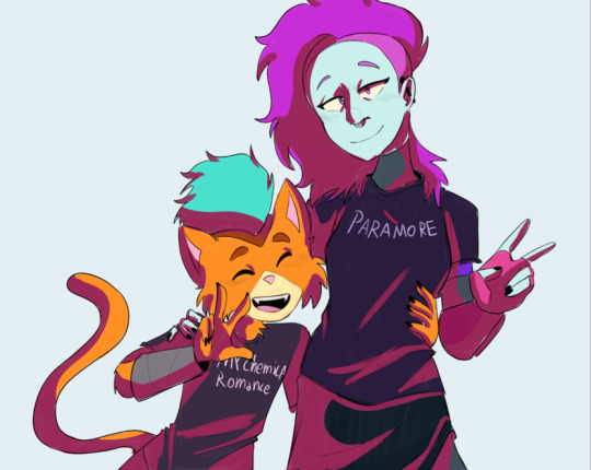
Sunny's unnofficial rendering tutorial because idk why but people say they like how I color
Hey kid. So you got your drawing, right? And you have your flat colors, now you gotta render 'em, right? Then you find that BAM, you have no idea how to make it look cool? Neither do I! But here's what I do (I've been told that my coloring is cool)
1. Place your flat colors
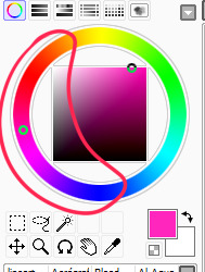
Imagine these are your flats. A few things: you want your base colors to be all around the same hue, that way they look better together. See how all the blacks, greys and whites are purple/blue-ish? That's on purpose babey! But how do you acheive this? idfk. jk, you have to stay on one (or two) areas of a hue wheel.
This way, all the colors look like, nicer around each other. You're not FORBIDDEN from going outside an area you picked, but you should still try to make sure everything is in the same hue so you have to do less overlay layers later.
(FYI: I do this because it saves me time on rendering. I don't think it's mandatory, there's no rules to art. Go crazy!)
2. Shading
I think shading makes or breaks a drawing. Personally I don't have a lot of rules about it, but there are still tips I can give.
So here's what you gonna do. You're gonna pick a color that's somewhere on the opposite of your main hue, alright? Here, my hue is mostly cold colors, so I'm going to pick a warm tone. You're gonna make sure it's dark enough so it's like, a shade, but not enough so it becomes black when you set the shading layer to multiply.
(Note: I never get this right on the first try)
(Another note: as you can see, I have the entire drawing, including the lines, inside a group. Don't worry! I'll explain this later)
Personally I like to use a paintbrush-esque brush because I like the look of it being hand-painted that it gives my art. Mine is the default paint tool sai brush, but I'll leave the settings down here just in case.
I don't. Really know how to explain the way I shade, I mostly follow the lines I already placed in the lineart phase, and give them depth. I guess my biggest tip would be to FOLLOW THE CLOTHING FOLDS!!!

Idk how to explain this. But people always tell me that they like how I shade the clothes, it's because I follow the fold lines I place on the lineart phase! Not only does this give the clothes depth, it also makes shading a lot easier. Follow your lineart, idk what else to tell ya.
Now you're gonna set the layer to multiply...
And lower the opacity as much as you want until it looks good. No real rules to this, it's kind of depending on the vibe you want your piece to have.

Now, and stay with me here, grab a blending tool, okay? This is the one I use, I have a textured version for when I'm feeling brave, and a regular, flat version (the one I use the most) Here I'll use the flat version.
And. Stay with me here. I want you to blend the FUCK out of this. Just absolutely destroy those borders. Okay? Trust me. If it looks messy you're doing it right. You're gonna want to follow the shape of the shadows tho, this way you don't lose the shape of the objects you're shading.
Woah! Suddenly everything has depth! Let me go back to the clothing folds, because holy shit, the clothing folds.
See how I'm adding depth to the shadows I placed by kinda. Following the line I drew and blending the outside? Idk how to explain this. You blend whatever isn't touching the line, okay? Trust me.
3. Lighting
Ok. I'm holding your hand gently. You have to do lighting on your art, okay? You have to. It adds depth to the shapes and also is sososoososo easy. Here's how. It's so easy.
Grab your airbrush tool. Yes, that one. Hear me out okay?
Pick a light, warm color between yellow and orange.
Stay with me. Make a new layer, set it to whatever lighting mode you prefer. I use luminosity because I live dangerously.
Now.
Airbrush everything that the shadows aren't touching. Yes. I'm serious.
It's gonna look ugly as shit. DON'T BE ALARMED. This is part of the process. I want you to take the blur tool. And blur the ever loving fuck out of this. Just go fucking ham.
Good. You're doing so well. You're being so brave. Now lower the opacity as much as you want, until you like the way it looks.
Like so. I also like to add a few brush strokes and blend them on an up-and-down motion for the hair and certain details, but this is optional. Same as before, you're gonna take a (slightly warmer, but still bright color) and make a new layer on luminosity mode.
Take the blending tool and make it small, only slightly bigger than the brush strokes, and blend these lines until they look nice. Adjust the opacity, and voila!

Now, I could stop here. But I'm extra so I keep going.
4. The pizzazz
AKA, "Ah fuck the colors don't look the way I wanted them to!"
Do not worry! I have a solution that's almost never failed me.
Overlays. Just a whole fuckton of them. I don't really have a method to this, I just kinda try colors and layer modes until something looks good.
For this one, I felt like I wanted the colors to be warmer, so I picked a warm color and overlayed it on multiply. Then, I noticed that the darker colors came out darker than planned, and you couldn't really tell them apart, so I picked a light warm color and overlayed it on screen.
Voila! We're not done! There's one more thing I like to do, and here's where the layer folder comes in!
Remember how I said I keep everything, including the lines in a folder? This is why!
Make a layer that's on top of everything, like this. Pick whatever color you want, make sure it's bright. (Personally I like using pink). Take the airbrush tool again and airbrush whatever edges you want to give a little more pizzazz to.
Blur it as much as you'd like...
And adjust the opacity and layer mode however you like!
5. And done!
Sometimes I add white highlights. Sometimes I add more shading, or more lighting. It depends! But this is the method I use in a nutshell.
Hope you enjoyed it, or at the very least realized idk what the fuck I'm doing!
21 notes
·
View notes
Note
Hello again!
Sorry, I forgot that you wouldn't know what I meant by 'text'. I, and at least a few other voices here can see you like text on a screen. When you started being able to talk to us without Owen, it appeared like another screen option to click on. The text appears different for each person talking too. On your screen, you talking appears as plain black text, as does Owen on his. When we see you through the other's screen though, your text is red and his is orange. Rasbi appears purple on both screens. The text can be different sizes, bolded, or italicized depending on the tone of what you say.
The glitched text, however, is covered in strange symbols and glitches that trail off to the top and bottom, often obscuring other text. It is visibly very different from any other text.
Also, since it seems different for every voice, I thought I'd share? I do have a lot of other screens I can interact with. Hundreds of thousands, actually, and most of them I have never clicked. Some are text, like yours, and others are like videos. Some allow me to interact, and others I am merely a spectator. A lot of them are from entirely different worlds, or maybe universes, as well. Where the rules are different for life and sometimes even death is considered a temporary minor annoyance. On many occasions I have encountered multiple of the same person, too! In different worlds, and leading different lives, but unmistakably the same person with same name and face. Usually, they aren't aware of any other versions of themselves, but there are exceptions.
There are many voices out there like me too, I have encountered tens of thousands, even in just the 15-20 worlds I've seen.
Wow, this got a lot longer than I originally intended. Sorry about any potential information overload. -Purple Voice
Hey, Purple Voice! This looks like a lot, so I'm just gonna respond to it as best I can, yeah?
...Okay, first off: you see how we talk through text on a screen. That's... interesting. I guess I always assumed you could hear us? The colored text thing- that's really interesting. So I showed up as a separate application of sorts? Another page from Owen's? I guess that makes sense, as does the colored text thing. If I'm on Owen's screen, you guys would need a way to differentiate, as well as him on mine. So it sounds like the black text is kind of the default for whoever's talking, whoever's in charge? And Rasbi is purple. Interesting.
Woah, so if I STARTED YELLING REALLY LOUD, it would look different than if I were to whisper? Interesting. Really really interesting.
Oh, I remember the glitched text- that's what it looks like to you when Owen gets all static-y. Yeah. "Strange symbols"... huh. Is it anything like Vex Voice? Because I've noticed that Vex Voice sounds different from all the others too. Not static-y like the apparent "glitched text", but more... warbly, kind of. Like you're hearing them from underwater.
Oh! What it's like for you as a Voice! Yeah, I was always a little bit confused by that. You all seem the same to us, how can you all be so different? Some of you are ghosts, some of you are real people with real lives- it's a little bit crazy, the diversity among you. It sets my head reeling a little bit, I'll be honest.
"Other screens"... and you described talking to Owen and talking to me as "screens". Gotcha.
That's... that's a little bit crazy, actually. I'm guessing our screens are the text variety, from what you've said? That's actually insane. I can't imagine... hundreds of thousands? I have never... that's a little bit concerning, actually. That makes my head hurt, thinking about that.
Death as a minor annoyance? What?! That's... holy shit, man, that's certainly something else. Multiple of the same person? Are there... are there more than one of me? More than one Owen?
Wait. Holy shit.
Pastry Voice- I overheard them talking to Owen the other day, mentioning how one of his "brothers" had just gotten a "happy ending." Is that... is this what they meant by that? That's... this is a lot, but in a good way, a really good way! This is ridiculously helpful, Purple Voice, you have no idea. This... yeah, this really opened my eyes.
Wow.
That's... a little bit- a lot bit actually. That's ridiculously out of this world insane crazy.
And no worries about information overload- this was all super helpful. Thank you so much.
...
Wow.
7 notes
·
View notes
Note
like HOW did you do the shading on that lnx piece!! the velvet?
🥰 I will happily walk you through my layer process for this piece!
First, I do a sketch of my subject from reference to get the general shape of things. Once I'm happy with it, I line everything in solid black with a default hard round brush.
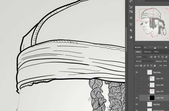
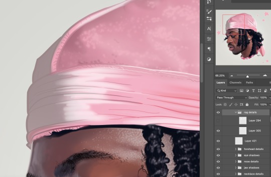
You can see the outline of the durag above the forehead here, and my navigation panel to the right that shows where in the piece this is overall. This canvas was 8.5x11 inches at 720dpi, so I think the size of this outline brush was 15px? I think the smaller lines were a 5px, used with a really low pressure.
Once everything is outlined, I add a base color layer underneath the outline layer. I try to match this color to the reference as best as I can just using my eyes, but sometimes I help myself out by color picking the middle tone. I'm still learning about color so this step is hard for me. Cheat when you can!!!!
Once the main color is under there, I look really carefully at my reference and block in the shadows and variations in the colors that I can see, checking myself with the color picker as I go. I'm sure someday I will get faster at this, but color theory is hard 😮💨

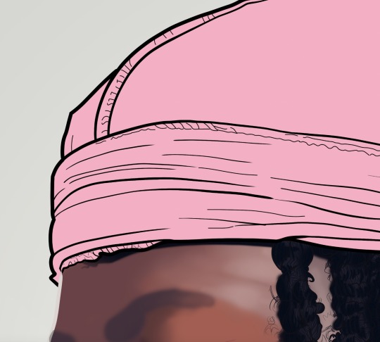
I noticed a gray reflective purple-y shadow at the front, but also that the velour/velvet is not uniform. I use a soft round brush at different levels of opacity to make little dots that really tell you what texture this is, and then make the brush bigger and softer to unify them with some longer strokes. There's no rhyme or reason to this part, I just flip really fast between my canvas and the reference image to try and paint what I see.
Once all these colors are more are less where they're supposed to be, I adjust the line art color with clipping masks to make the shape a bit more organic. I just match the surrounding colors I've blocked in so we have a smooth blend, also paying attention to edge highlights.

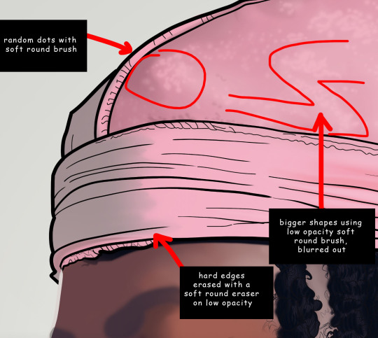
Time for the bigger and brighter highlights to make everything pop! I lay down some bigger shapes first, like these long strokes of white that I soften at the edges with a low opacity soft round eraser.
You can see on the navigation bar to the right what the zoomed-out piece looks like at this stage. It's getting there, but there's a lot more texture and brighter highlights on this area! To really make it look like velour, I zoomed in on the reference image and noticed that a lot of the highlights at the front here are actually more of those dot shapes. That's what makes it look soft to the touch. I use a really small soft round brush at full opacity to pop those in:

YEAHHHHH now we're talking.
I've spent a lot of time on this area, so I'm ready to move on! Once the whole piece is finished, I use a trick that I learned from Elicia by duplicating everything I've drawn, merging it into one layer, blurring it, and lowering the opacity.
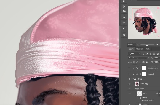
It might not be that noticeable here, but zoomed out it gives the whole piece a bit of a glow and softens up the lines. It makes the painting a little less crisp, a little more dreamy. I love learning tips like this from other artists I admire -- it doesn't always work out when you try to map someone else's style onto your own, but sometimes you find something that really sticks!
Finally, I put on some adjustment layers. I especially like to play with saturation since my color theory is still not that good, and I always worry about my contrast so I usually do a curves layer as well (lighten up the lights, darken up the darks). I'm also a fan of a nice pink overlay, but I didn't do that here. I don't think it needed it!

So now I'm done! And here's the finished piece:
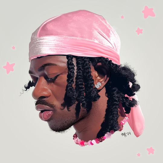
Looks great :) Hope this is cool to you!!!
#my art#replies#anon#lil nas x#it's been a while since i did a process walk-through! i hope this is good :)#i don't do progress videos because a) idk how to do that but also b) i zoom in likE CRAZY and also flip between canvases#and i just feel like that would be a nightmare to watch#so hopefully screenshots do it for you!#also please do not roast me on my layers i know that says layer 482#it's a big piece!!!!!!
6 notes
·
View notes
Note
Hey, just found ur tumblr after re-reading that best ygo/bnha fanfiction in the whole ao3 for the 3th time this month
And after stalking for a while, I came for the conclusion that, I correct me if I'm wrong, your the writer of this masterpiece!
So, after some time trying to overcome my shyness and lack of social skills (and my lack of trust on my own english) I came here to ask a biig thing about the history for me, it's really important...
Can u give me a full description of the best Yuuki that ever appeared in this history - AKA Yuuki Nagare, the superior cousin - because I spent months seeing his appearance in my head just like that one monster on the VR video game filler with the purple tuxedo that chained Kaiba/Did I just lost his description while I was reading?
I just noticed that when I was going to draw his yesterday I now I feel like a Fake fan 😭😭
(Looks at image of the Whitty Phantom, breaks down laughing) okay the vibes are there! I’ve described his appearance but in bits and pieces. Hmm, I don’t visualize people well. I guess in terms of body language or impressions like the Whitty Phantom or maybe Reno from FFVII with better behaved hair and no face markings. He does have a broken nose that healed wrong- look at Jon Bernthal who played Frank Castle in the Punisher to see what I mean when I keep describing it as having a bump. Someone in his mid to late twenties, wears suits in a Japanese professional way (default item of clothing for work rather than any real preference). Red hair (reddish brown as in more orange? Ichigo from Bleach? Than two toned or multiple colors) past his ears that’s spiky but more Mokuba spiky than Yuugi spiky. Always wears gloves but more driving gloves than generic winter gloves. Purple eyes that are more Aknadin than Yuugi, shapewise.
I’m glad you enjoy my story! And your English is fine! I guarantee it’s better than my fluency of whatever your native tongue is.
4 notes
·
View notes
Text
Helmet Watch 2023
So, I had way too much fun rating all the team’s liveries this year (if you missed any of it you can find my thoughts here), so much so that I’ve decided to rate all the driver’s helmets as well! (I’ve also had a helmet tag on my blog pretty much ever since I got back into watching F1 because I just love how much effort gets put into each drivers helmet design... and I’m a Seb fan. Stanning helmet designs is in my blood by default)
Under a read more bc we have A LOT to get through! (Listed in alphabetical order by surname bc that just felt the best way to organise it)
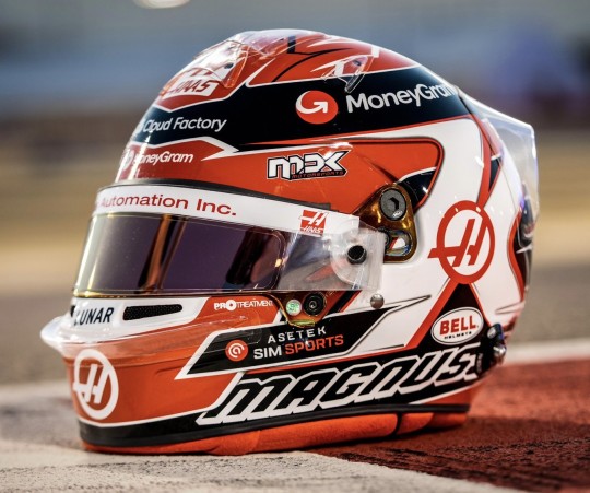
Alexander Albon (Williams)
Starting off very, very strong. I LOVE the blue and red pairing, it looks so clean but so eye catching at the same time. And the stripes of the Thai flag is a really nice touch. I’m not sure why there’s the odd flash of light blue though?? It kinda feels like an afterthought.
8.5/10
Fernando Alonso (Aston Martin)

I do like the colour scheme, it just feels a tad busy with all the various stripes. But it is a really nice update to his traditional helmet design. I wish the Aston Martin wings were in the darker blue though, they would stand out so much better.
6.5/10
Valtteri Bottas (Alfa Romeo)
I do love me a mix of metallic finishes. The colour scheme as a whole is also top tier, the softer metallic blue with the more glittery charcoal, paired with the crème white is excellent. The overall design is super clean and looks really slick, his partner Tiffany who designed it did a really nice job!!
8/10
Pierre Gasly (Alpine)
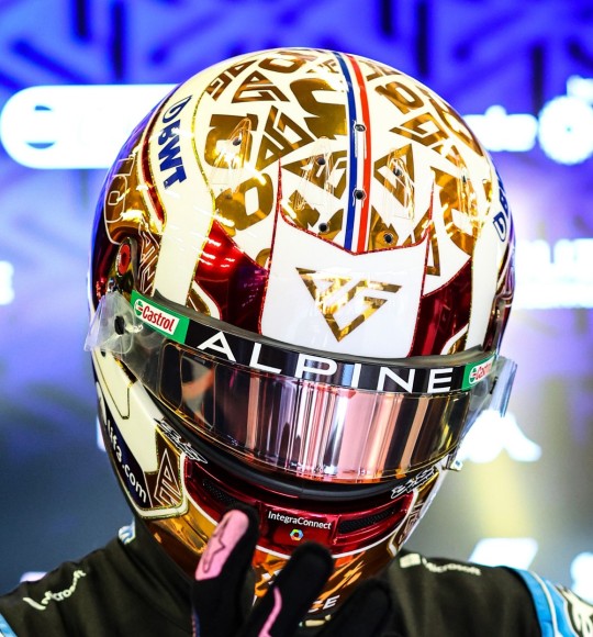
CHROME MY MOST BELOVED!!!
I really liked his Monaco helmet last year and his design for this year is almost as good. I am obsessed with mixed finishes so the chrome on the crème white base it so nice, I like the pops of red, and the thin French flag going down the middle is a nice touch.
9/10
Lewis Hamilton (Mercedes)

So so so so much yes. There’s just SO MUCH I love about his 2023 design. Echoing his original helmet design with the yellow, but mixing in the purple from recent years. And the subtle rainbow gradient lines are so pretty and so perfect. And it looks gorgeous with the black Merc livery, which is always an excellent plus.
10/10
Nico Hulkenberg (Haas)
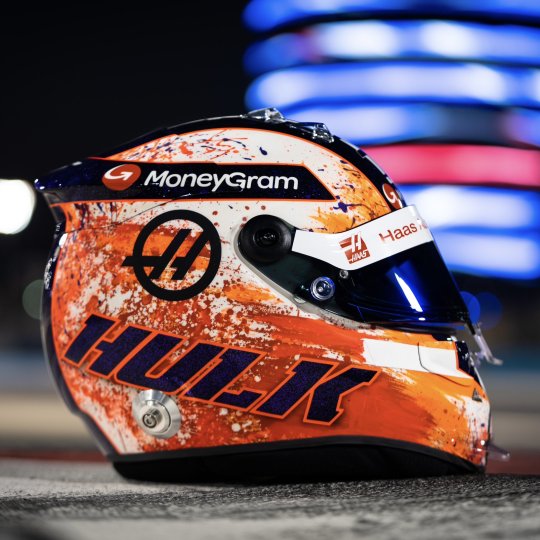
You know what... I really like it. The paint splatter effect is so pretty, I don’t recall seeing it on a helmet before and I think it looks great! It helps that there’s three different shades of orange to give some dimension. I am also obsessed with the glittery metallic purple. It works really well with the orange, and as it’s a warm-toned it should look somewhat coherent with the red in the Haas livery.
8.5/10
Charles Leclerc (Ferrari)
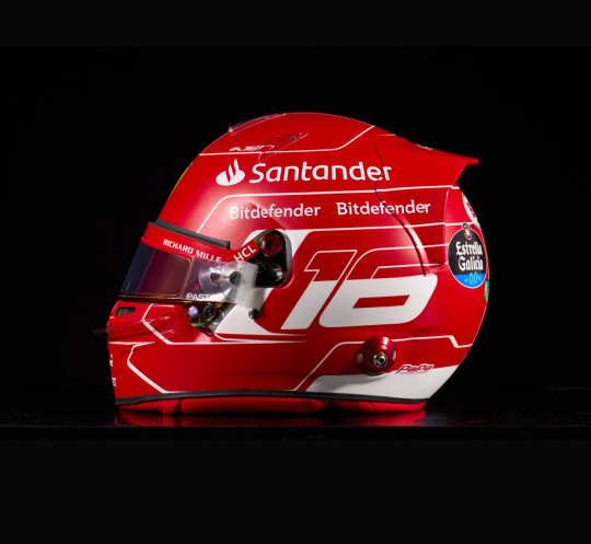
Not gonna lie, I got major Schumi vibes when I saw this. Which did make me every so slightly weepy, but he has made it slightly his own with the addition of the Monaco flag. It’s really simple, but it works. But like so much of F1 this year I really wish it was glossy instead of matte.
7/10
Kevin Magnussen (Haas)
Gotta respect the consistency Kevin has had with his helmet design since 2014. The colour scheme is also great, it’ll look really nice with the Haas livery, and stand out against his team mate’s (always nice to be able to tell the difference, looking at you 2013 yellow helmet Brocedes). I’m not overly wowed, but I also don’t hate it, it’s a really solid design.
7/10
Lando Norris (McLaren)

F1 teams take note bc THIS is how you make exposed carbon work!. The design feels properly thought out, so it doesn’t feel like anything is missing, as opposed to a few of the car liveries this year. And like Lewis’ helmet with the Merc livery, the simple two colour palette looks so good. Probably my favourite helmet design of Lando’s thus far.
9/10
Esteban Ocon (Alpine)

Yes. Absolutely no notes. Excellent work. Bloody gorgeous.
10/10
Sergio Perez (Red Bull)
It’s ever so slightly busy, but I still do like it!! The white and grey is the perfect base for all the bright pops of colour, and the pattern is very funky. Honestly it’s the Red Bull logo that lets it down for me with the different shade of yellow. If it was the same chartreuse as the accents it would look really good.
7/10
Oscar Piastri (McLaren)

I have mixed feelings about this one. One the one hand I love how bright and colourful it is (unlike the MCL60) and I think the colour scheme is really fun (peep the silver holo!!). On the other, the design and layout feels a little too busy. However I do think it will still look really nice with the car, and as always bonus points for not being matte.
6.5/10
George Russell (Mercedes)

I LOVE the shade of blue George picked, it’s really bright which will go really well with the black livery. Though it does remind me of the 2014 Malaysia helmet that Lewis never got to use (which, after 9 years, I’m still mad about) which colour scheme wise I definitely prefer. Overall it’s another super clean design which isn’t too simple that it looks plain.
7.5/10
Carlos Sainz Jr (Ferrari)

I find it a bit wild that Carlos and Fernando have done updates of their classic designs in the same year. Anyway, the geometric pattern is fun! It does make it look a lot more dynamic than just flat lines, though the black feels a bit jarring and out of place to me. I can only assume it’s to differentiate from Charles’ all red helmet.
6/10
Lance Stroll (Aston Martin)
Lance is once again staying true to the AM brand and I’m honestly not that mad about it. As a British Racing Green enthusiast I loooooove the base colour, especially bc it’s both glossy and has a super subtle sparkle to it!!! The Aston Martin wings looks great solid as opposed to an outline, but for me they’re a bit too big. And I’m not really sure why there’s a blue outline on the top, white or silver would have looked more coherent.
7.5/10
Yuki Tsunoda (Alpha Tauri)

I looooooooove this design so much!!! It’s so different, which I always appreciate, and I always enjoy it when a driver pays homage to their home country/heritage. I should add that we have a Japanese Maple tree in our garden (which is what the leaves are) and using different colour leaves is so so so pretty. I wish he had been able to put the Alpha Tauri logo in a different colour to make it look more coherent.
9/10
Nyck de Vries (Alpha Tauri)

I really like the colour scheme on this one, incorporating hints of Dutch orange into the navy and white AT colour scheme works so well, and I also like the flashes of lighter blue. And I especially love the slivers of silver holo, I just wish there was a tad more to contrast against the matte finish.
7.5/10
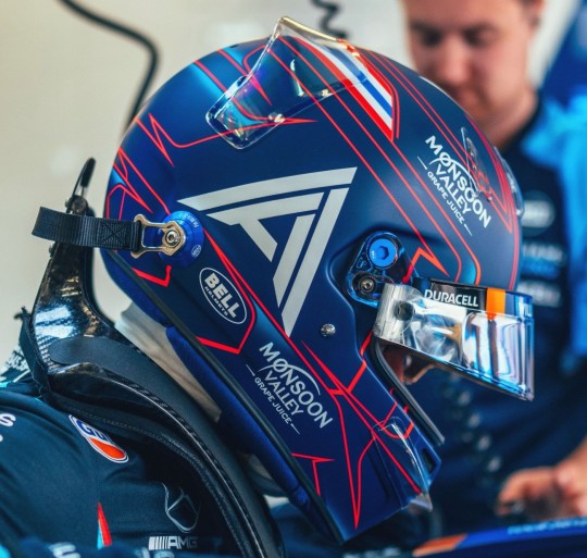
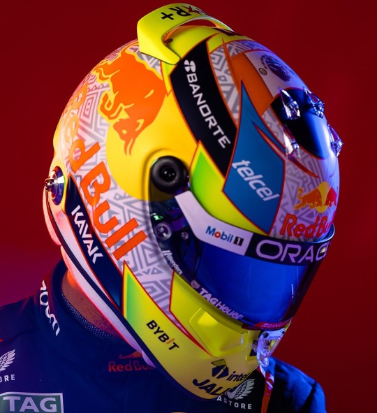
Max Verstappen (Red Bull)

Obviously, I do have my Seb fan bias of there only being one superior ‘white helmet with driver’s flag colours’ design, but this does look nice. It’s really clean, and unlike Perez’s the Red Bull logo feels like it fits in with the design much better. But, I do feel like it could use a little jazzing up, maybe making the dark blue stripes a glossy metallic.
6.5/10
Zhou Guanyu (Alfa Romeo)

Lad is really going for the paddock fashionista title and I respect that. I adored his porcelain design at Abu Dhabi, so the ode to that around the visor is really cool (peep the smidge of silver holo, more of that please!!). I like that it’s an overall warm toned colour palette that should complement the red and black Alfa well. It’s so bright and I think it will really stand out at both day and night races.
8.5/10
#so many helmets; so little time#Formula 1#2023#Helmet#Helmet Watch#Helmet Watch 2023#I've said it in the tags of a few posts; but the drivers have trounced the livery launches with their helmets this year#dare I say Ocon's is up there on my all time fave helmet list#it's just so so good
9 notes
·
View notes
Note
Could you share the issue regarding the inclusivity poll please? The one you said was resolved? Just so it helps other writers. I think it's important to share such information<3 or maybe do some notes us other writers should be aware of?
I didn't vote because I am not a poc but since we're on the topic of reader insert: the one thing I felt a bit uncomfortable with was "your mom's name" when reaper was visiting her mom. I personally don't have an issue imagining myself as an oc persona such as a ripped reaper but my mom is so nice and that part bugged me. For example, I feel like parents' names shouldn't be inserted or mentioned at all. OR give them a random name at the beginning as a starter disclaimer. Just a personal thought. Everything else is very much well thought through. Kudos as always 😉
hello!!
so the issue that was brought up from the poll was solved here, but i have so far not gotten a response for the "not good" answer. i suppose it could have been a misclick or perhaps someone just wanted to see the answers and didn't read the title first, but if there was an issue (or issues) that caused them to genuinely pick that answer, i'd love to be able to fix it!
some general notes when it comes to writing a race-neutral mc:
don't describe showers (or really, certain morning/night routines); it's important because a lot of people don't wash their hair every day. whether it be for preference, for hair type, or for how they wear their hair, it can be alienating to detail every shower as "washing your hair."
this mistake was actually corrected in the tagged post-- but be aware of how some skin scars! it had slipped my mind that not all scarring ends up pinkish-- it'll just be a dimmer version of the person's skin tone.
don't use major descriptors for hair. "billowing in the wind," "[your ponytail] pulled at your scalp," "curling around the face." all of these can be linked to a certain hair type, usually.
when describing skin, use vague terms. for example "the light from the shades dappled across your skin," instead of "the light sheened off your pale skin."
"your cheeks grew pink," "your face went red," can't always be applied to people with darker skin tones. but yk what can? growing physically warm, sweating, getting goosebumps, or feeling rushes of adrenaline! if you're gonna write something fluffy, make sure everyone gets included.
sometimes eyebags aren't easily seen, either. a lack of melanin means the purple under the lids sticks out more, but eyebags are also sometimes visible with creases, puffiness under the eyes, or a slight droop.
don't go into major detail with facial features. when describing reaper's facial scarring, i keep it general and try not to describe how lips look, whether freckles are cut up from the scarring, etc.
also, when i talk about reaper's mask, i don't talk much about her nose. obviously, larger noses might stick out more from the base of the mask, but plenty of people have flattened noses, so that wouldn't really work. instead, i used a general description (not verbatim) "fits perfectly to your nose."
bonnets and durags! people wear them all the time! in the house, out of the house, but for sleeping, too! mention them as an option for your readers to better immerse them.
really try to remember, especially as a white person, that most fanfics (intended or not) use white people as a default. there're probably a lot of people who will enjoy your fic more if they can see themselves in place of the mc. if you don't sit back, reread your chapter and think "yeah, i could picture anyone in this position" (unless the fic is specified to be black!reader x character or something of the variation), you might want to change it up.
thank you for the comment on reaper's moms name! i sort of can't change that much considering how far we are into the series, but I've removed the times where specifically "your mom/mother's name" (or a variation) was mentioned. (let me know if i missed anything).
sorry about dissing your mom, I'm sure she's lovely :) (/gen)
i also partially didn't add any details on reaper's mom's name because i didn't want to allude to any specifics on reaper's background
thank you so much for the support!
as a small disclaimer... i'm really grateful to get this kind of feedback, from my readers of color and not, it's great to hear how I'm doing because i want to make a fun fic for you guys! if the change is something quick and easy (like this and the tagged message), i don't mind it!
6 notes
·
View notes
Text
Weird little mini-rant here, but what is it specifically about Gacha Life / Gacha club edits of Mors and Korina that make people throw all common sense out the window?
Why do 90% of the Gacha edits I see of Korina give her the palest possible skin tone, straight hair, and no freckles? Why do a lot of people make her outfit so inaccurate as well? I know that Gacha Life / Club is limited in the outfit pieces, but the fact that the color schemes for some of them are black / gold rather than gray / blue / purple makes it seem like they’re trying to make her (admittedly very fan service-y) Atlantis Ball outfit rather than her regular one. Which wouldn’t be so weird if those edits didn’t treat it like it was her default outfit.
And why are edits of Mors always a) pretty decently accurate, or b) fairly accurate except for the fact that his skin tone is darker / ashier?
I think we all know the reason why but I really want to have hope in the fandom, especially with how much the people in it like to push for inclusivity. I’m hoping it’s just out of ignorance and not any serious attempt to “fix” the characters or whatever.
Anyways, it’s just weird seeing edits where Mors looks like he took all of Korina’s melanin, especially if there are other characters in it who look completely fine. I’ve seen like maybe 2 or 3 Gacha edits of Korina that don’t completely whitewash her, and this isn’t directed at them or the community as a whole. I’m just kind of disappointed because I know people can do better.
3 notes
·
View notes
Note
I want to preface this by saying that I really enjoy and look up to the work that you do. Do you have any advice for improving digital drawing skills? How you do anatomy, how you found and chose your tools and workflow, that sort of thing.
Hey thanks that means a lot, and I appreciate the questions!! I have a feeling this’ll end up being a long-winded explanation, so strap in.
To begin with I tried a lot of different programs, but I ended up on procreate because it just feels the most natural to me! I draw on an ipad with an apple pencil, pretty standard stuff there.
As for the specific tools I use in procreate I actually just use the default round brush under paintbrushes for pretty much everything. Aside from a few more technical brushes for effects and patterns and whatnot, but all those are default brushes too!
When I first started digital art a couple years ago I really had no experience with it whatsoever. I had done traditional art throughout my whole life up until that point, but digital was a whole new beast. A lot of my skills with traditional work definitely carried over, especially once I started to get more comfortable working in digital.
The main thing I can tell you, and which I’m sure you’ve heard countless times already is practice practice practice! You don’t have to slave away practicing eight hours a day and devoting your life to it, but make sure you’re drawing smart! Any drawing is good drawing, but if you really want to improve try and make your practice a bit more focused. Pick one specific thing you struggle with at a time and work on them individually. Drawing from reference is always a good place to start.
As for my workflow, it’s honestly pretty horrible, but it works for me, so that’s all that matters tbh. You just gotta mess around with different things until you figure out what feels most comfortable and natural to your process.
Typically I’ll start from a reference, then once I’ve got enought of the figure down I’ll start to make adjustments with the liquify tool and clean up lines. I personally don’t use any sort of gesture or skeleton when I sketch, I just go straight into the lines and adjust as I go, then clean them up to a point I’m happy with. I also use a ton of layers so I can move around parts easier.
After this I start painting in my flat colors on a layer below the lineart, pretty standard stuff there! Typically when I choose colors I try and keep them all in the same family or tones, so you’ll see all my vampires have very cool tones and a lot of purple. Even the black and white colors have some cool tints in them.
Once my flats are finished I move on to the shadows. I start with the biggest section of color first, usually the skin, and make a clipping layer above it. I set the clip layer to overlay, then depending on the skin tone I use a very dark blue or dark red color for the shadows. This also often takes a bit of adjusting transparency and other values, but I’ve eventually gotten a feel for it.
When actually painting in the shadows I start pretty basic just to block out shapes and get an idea of where I want the light source to be. Then I go back in finer detail. Once I finish with a pass of shadow, depending on how it looks I’ll duplicate the layer, adjust transparency, then use gaussian blur to soften the edges while keeping the original shapes in tact. I also use the smudge tool occasionally for finer adjustments as well.
I do a similar process for each block of color until it’s to my liking. Sometimes, especially on the skin tone, I’ll go back and add another overlay layer above the shadows to do some countershading, which just makes things look a bit more three dimensional.
Once all the shading is finished I go back on the skin very gently with a soft, red airbrush to give it a bit of warmth and life, especially around the face. After this I use a white noise brush on another overlay layer to add some subtle highlights and skin texture. For shiny things like hair I make yet another overlay layer, and use a random brush pack I found online that has some nice water effects.
Once all the rendering and other effects are complete I then go back to my lineart layer, make a duplicate, then color it in red with a clipping mask. I take this new red lineart and bring it all the way down to above where the skin tone layer is. This has a very subtle effect, but it makes all the difference imo. After that I go back to the lineart layer once again and make a clipping layer above it, then gently use a red airbrush around where the light hits brightest. I do the same with a dark blue airbrush on the parts with the most shadow. This gives the lineart a bit of variation in color!
Lastly I just sorta wing the background most of the time so I can’t give you much assistance there haha.
Again, apologies for the super long explanation that probably makes zero sense, but I hope you’re able to at least glean some amount of knowledge from my process!!
2 notes
·
View notes
Note
Hello! I love your gifs, they're so pretty! I've always admired your coloring and was wondering specifically how you colored the Yeonwoo/Seojoon set. I struggle with adding fun colors without obstructing the characters or blending weirdly. Would love to learn from you, no worries if not!
hello hello!!
first of all, thank you so much! this message is insanely sweet, & i really appreciate that you took some time out of your day to message me in the first place!
secondly, of course of course! i don't necessarily have a tried & true method that works for everything just because coloring is so dependent on the exact shot that you're working on a lot of the time, but i'll try to explain my process as best as possible!
the first thing that i usually do after getting my gif brightened with levels/curves/brightness&contrast/exposure is up the vibrancy slightly in order to see the actual colors that are present in the scene itself & then manipulate those using either selective color or color balance.
most of the time, i default to selective color & target colors that i know i can easily change. for example, if there's a lot of red in the background & i know that i want to make the gif primarily magenta, i'll go to red in selective color & up magentas/cyans while reducing yellows until i'm happy with the result. then i'll make another selective color layer to target magentas & up the magenta a ton / change other hues in order to fine-tune it. if there's a lot of green in the background because of foliage or whatnot & i know i'm trying to make the gif cyan, then i'll do the same thing with the green selective color layer (upping cyans, removing yellows, & adjusting magenta in whatever way it looks good LMAO) in order to change the color. then i'll make another selective color layer to target blues/cyans & up the intensity of blue/cyan however i'd like. i personally use a TON of selective color layers in order to get the colors to where i'd like them to be, so don't shy away from layering them in order to get the result you're happy with!
i like selective color the most just because it's the easiest imo to use, especially for any type of scene with a lot of movement. it targets specific colors instead of coloring the entire image, so you don't have to worry so much about it altering skin color / the overall hue of the scene, especially if your gif has a lot of contrasting colors in it already.
for scenes with a lot of white/grey in the background specifically, though, i like to play around with the color balance adjustment layer first (while making sure to mask any skin tones, of course). this works especially well when you're trying to change the background to anything in the blue/purple/magenta range, since shadows/greys are usually already tinted towards blue in the first place. once you have a base layer that's tinted, i just go back in with selective color & up the intensity of those colors until they're to my liking! i'll also often use the white setting in selective color in order to change whites to whatever color i'd like, but be careful with this one because it'll sometimes make your images look flat, so definitely make sure to use a layer mask on their face/eyes to make sure the highlights on their face / the whites of their eyes aren't changing color.
with all of this, my best friend is layer masking, which i use in just about every adjustment layer in order to make sure i'm not drastically changing a skin tone or anything! i also utilize layer masking a lot in order to target specific parts of the image. so if there's a random yellow object on the screen or something that i want to change the color of, i'll make a layer mask that applies only to that part of the screen, & change the color of smaller objects one at a time.
& that's the first part LMAO. technically, all of that is optional, & i know a lot of people skip all of that & go straight to a gradient fill, but i personally find that my colorings look more consistent if i've already adjusted the OG colors to match whatever i want the final color to be, so that the gradient fill isn't clashing with anything in the background. this also helps when you have gifs with slightly more movement in them, as you can get away with removing more of the gradient fill for layer masking purposes without the whole thing looking too strange.
so once i'm happy with how the base gif looks, for more vibrant colorings where i want to change the color of them completely (like i did for the seojoon/yeonwoo set) i'll add a gradient fill with whatever colors i'm looking for. i play around with the blending setting of the gradient fill a lot, & usually settle on soft light/overlay/screen, but it all depends on what i'm looking for! i personally like the look of the gradient fill showing the texture of the scene behind it, so i usually use a blending setting that melts into the scene as opposed to concealing it completely. then i, again, use a layer mask in order to cut out the subject's face / sometimes their clothing, feather the edges of the layer mask a ton, & sometimes change the layer mask density until i'm happy with how seamless the final product looks.
now, this works perfectly fine for gifs with little-to-no movement, but for gifs with more movement in them, a simple layer mask isn't going to work, so you're going to have to utilize keyframes instead. here's an amazing tutorial on using keyframes that probably explains the process better than i ever could LMAO. it's definitely slightly tedious sometimes, but it's the best option for making sure the subject's face stays unobscured in your gif even when you're using something like a gradient fill!
after i'm finished coloring both gifs separately, then i'll add them both into the same document & begin blending.
i actually blend in a slightly unconventional way, in that i very rarely actually change the blending settings of the gifs themselves. in fact, in the set you're talking about, the only gifs that i blended using a different blending mode were the 6th and last gifs, for the face in the middle in the 6th gif & seojoon sleeping in the middle in the last one (i believe they were both set to screen). for almost all other types of blending i do, i leave both of them set to a normal blending mode, move them to wherever i'd like them to be on the canvas, & then use a layer mask with a large pen size (usually between 100-200 px) to remove whatever parts of the top gif that'll reveal what i want to be shown from the gif underneath. then i'll feather the layer mask a ton in order to make the transition between them seem the most seamless! this is what allows me to keep the colors as true to the original coloring as possible, without muddying them by playing around with blending settings. in the 5th gif of that set, i also reduced the density of the layer mask of the cyan gif a little, in order to have part of that gif slightly layered on top of the purple side without having to use the screen/overlay blending mode!
after that, i'll add another overall filter layer to the whole blended gif & mess around with the curves/selective color/vibrancy adjustment layers until i'm fully happy with how they both look together!
one thing that i've personally found is that tumblr (especially tumblr mobile) almost always makes your gifs look significantly more muted than it shows on photoshop, so i would recommend making your gifs look more vibrant than you think they need to be on photoshop, then see how well that translates onto tumblr!
& that's about it! i'm sorry this got a little long & rambly LMAO but i hope it could be even a little bit helpful to you! for sure let me know if there's anything i didn't explain clearly enough or anything else you might have questions on!
& thank you again for reaching out in the first place! it made my day this morning when i opened tumblr & saw your message, so i hope i was able to return a little bit of that joy to you!
best of luck, & happy editing!!
2 notes
·
View notes
Text
Hello Wolfquest anniversary fans, I have a request of you. Please send in requests that the team implement visual indicators for auditory stimulus!
If you cannot hear the music changing comma you are losing so much information comma and I didn't even realize how much information was lost until I played with my laptop volume down on mute while recording the game. And I didn't know it, but when I'm recording if I have the volume off the gate the recording still includes the sound from the game somehow because I guess speakers are separate from whatever is making the noise.
So I rewatched my recording of me playing the game and I had it on mute but the recording includes the music so I kept running straight looking for deer and the music from mule deers playing indicating that there is one right around me somewhere just over the hill or behind some trees but I had literally no idea because the wind was going in the wrong direction and I had the audio on mute.
If they add visual indicators for music that plays when specific kinds of animals are nearby, if they include the howling icons on the map no matter how far away the wolf is or even if you've already completed the sound of main quest, people who cannot hear the game are going to get so much more out of it. Because if you were playing this game you haven't been able to hear it at all you will have no idea how much information you are missing out on.
They're definitely needs to be symbols that appear when elk make noises when the music changes to tell you hey there's elk nearby there needs to be a symbol for it maybe lying an elk with the same purple as the glow lying down showing that the elk are chilling because you're not chasing them yet and they don't know you're there yet they're not running away.
Then when the music changes that the deer are like oh fuck there's a wolf it can show like an exclamation mark over the icons head or something. They're little alarm chirping noises can be represented by symbols that show yes they are very alarmed they do not want you here
And etc.
You always hear the music before you see the animal that the music represents, but if you can't hear the music, you won't know the animal is there 90% of the time because it's just how the game is designed but the field of interaction or whatever you want to call it is so large because that's just how it works in nature, but that means that if you can't hear the music telling you hey there's a herd of alcohol over here or oh hey hey stop fucking going that way there's a fucking bear, you are going to miss out on so many potential hunts you are going to run into a bison at some point like I did (literally ran right into it and died) and it is just going to be a less a lesser game that you're missing out so much.
We also need to ask them for an option to turn off or at least tone down by magnitudes of degrees the lightning effects during thunderstorms because that much flashing is going to cause seizures or migraines or any other horrible effects in people with photosensitivity. That definitely needs to be toned down or an option to turn it off completely, and this option needs to be like separate from the rest of the graphics settings there just needs to be an accessibility panel.
There needs to be an accessibility panel where the lightning is automatically either turned off or toned way the fuck down and then you can turn it up to its current level if you want, but that will never be the default, because you can't know a game is going to give you a seizure until it gives you a seizure unless somebody else tells you ahead of time.
The icons for sounds should be also be a default setting and then I guess if you really wanted you could turn them off. But they should be included because I literally cannot stress how much information is missing from this game if you can't hear the changes in the music.
0 notes
Note
MAROON I REALLY LIKE COBOLT
can you like tell me more about it??? :D
SORRY THIS TOOK SO LONG TO ANSWER.. I was going to do little drawings of what I wanted to share because I thought it’d be easier to explain it that way since I’m not too good with words :”o i didn’t have the energy however so I’m just going to try to write it up instead aach and then I just kept forgetting.
Most of this is from its toyhouse. Which at the moment is hidden bc I’m still rly shy about the arca ocs. I promise I’m glad u asked though I rly like talking ab it when I get to <3
• I’m pretty sure I’ve talked about it before but It can control shadows/darkness or quietly move within them and may even sometimes switch consciousness with it. There’s a lot of mentions of darkness in both Aya’s PPQ dialogue and Dark Sig (though, not as much compared to Aya but I feel that the design on sigs part gets the point across) so I figured that Cobalt would be someone with the power of darkness. Cobalt kinda of just lurks in the shadows & I imagine it to be very illusive of people.

• Has a rather off putting personality, speaks rather cryptically and mysteriously yet monotonously. This often makes it come across as intimidating or uncomfortable to be around. Truthfully though, it likely doesn’t mean to do that on purpose and more often than not it doesn’t notice. This, its shadow manipulation, & tricks is what made most people in Arca afraid of it at the time.
• Like its name & the chloride, it can be red. Which is supposed to reflect the Red/Crimson part of its soul as it had two (the cyan & crimson one) inside of it in a sort of balance before being split by the Record of Sealing. You don’t really see Red Cobalt much however since usually the default is its darker blue! Aside from being shades of Reddish/Red purples it’s a bit more unpredictable in personality. Whereas, usually, the darker blue tones things down a bit. The change in color happens either under big emotions or if it’s just having the zoomies ❗️though it can also just happen with no rhyme or reason. Think of it as the balance between the crimson & cyan soul getting unbalanced on occasion thus influencing Cobalt when it does.
• It’s arms/claws feel like hard beetle shells & are very tough
• It’s hair tends to always have this glossy type of sheen? Like some beetles! In addition to the whole beetle thing, These two strands of it’s hair are suppose to resemble stag beetle antlers :)
• it was sealed on its Birthday
• Rumor has it that it always read a book before sleeping /silly
• ouhhh speaking of books, it had so many. It had a really massive interest in them & would collect all sorts of tomes, typically cursed ones out of total curiosity & fascinations or ones knowledgeable in magic. It liked showing Sereniti them a lot & occasionally lent them :) You’d think that because it knows so much about books it would’ve identified the record of sealing but uh. well.
• kitty
0 notes
Last Seen Blogs
molotowcocktease
Molotowcocktease

warrenkrogsgaard
The Love of Broe 165

thoromy
level 18

anh4k
Anh4k.com

princessrai
Princess Rai