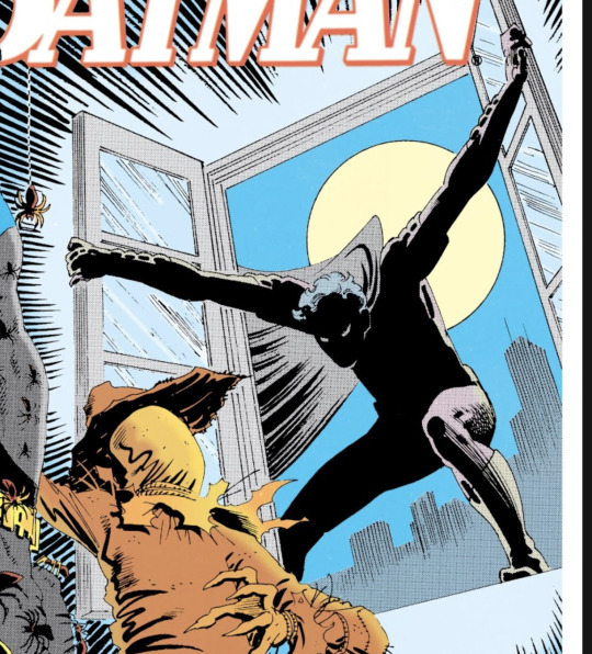
#i think it's usually that art tutorials tend to
Text
Idk if this is just me, but most (art) tutorials make me want to gnaw on drywall. However, watching artists create in their natural environment is like drinking from a cool natural spring.
#light's spot#i think it's usually that art tutorials tend to#a) sound very haughty and pushy and say if it's any other way then it *wrong*#b) tend to be very centered towards a static drawing style#like...#idk watching yt shorts or whatever has me so mad every time I see people talk about character weight#*yes* I know it's for a static style *but* it shouldn't discount styles that let charactrrs lean or be caricatures of real life#meanwhile I watched like 2 episodes of Drawfee and I just kinda... picked up on how they posed their figures abd did thumbnails etc#they got it all on screen and u can see tgeir whole thought process#idk this is just preference but istg#and this is coming from a guy who's not the best at art#and self-taught themselves based on Skeletons and Furries to take this with a grain of salt ig 👀#spot q
9 notes
·
View notes
Text
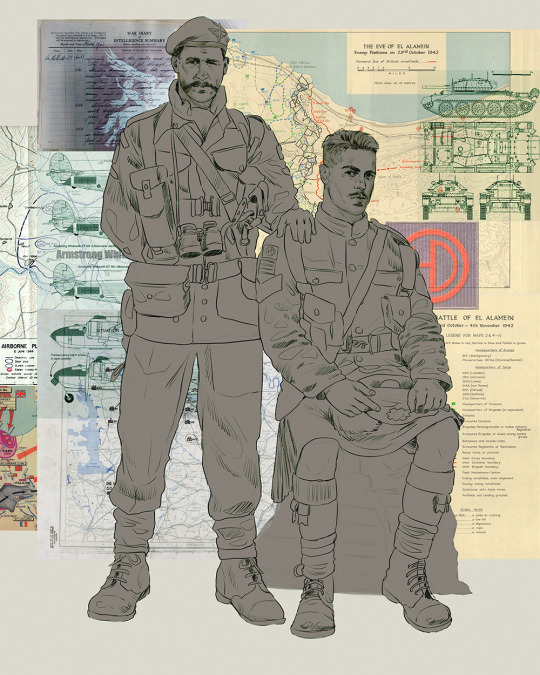
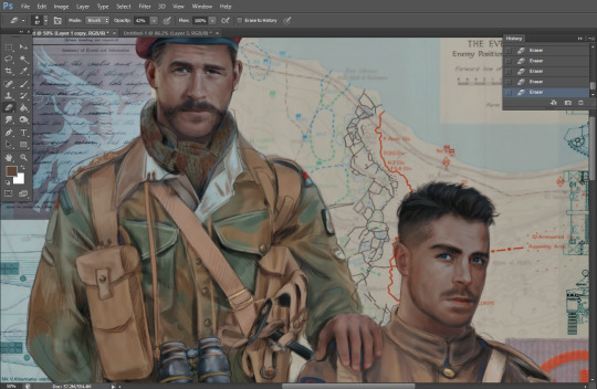
Ok! I've finally decided to put together a (somewhat) comprehensive tutorial on my latest art~
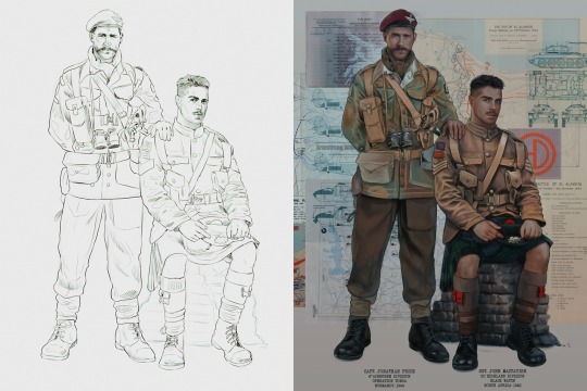
Please enjoy this little step-by-step 💁♀️
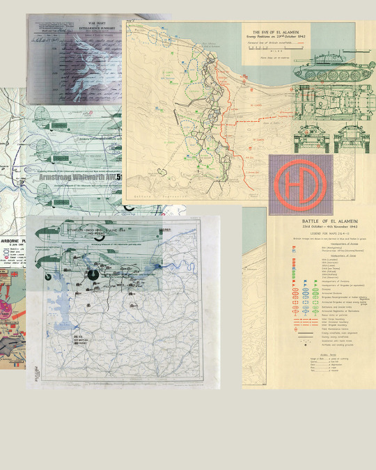
First things first--references!
Now I'm not saying you have to go overboard, but I always find that this is a crucial starting point in any art piece I intend on making. Especially if you're a detail freak like me and want to make it as realistic as possible 🙃
As such, your web browser should look like this at any given point:

Since this is a historical piece, it means hours upon hours of meaningless research just to see what color the socks are, but...again. that isn't, strictly, necessary 😅
Once I've compiled all my lovely ref pics, I usually dump them into a big-ass collage ⬇️
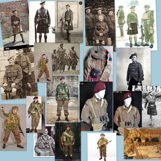
(I will end up not using half of these, alas :'D)
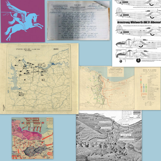
Another reference search for background material, and getting to showcase our models of choice for this occasion~
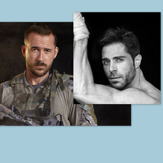
When picking a reference for an actor or model, the main thing I keep in mind (besides prettiness 🤭) is lighting and orientation. Because I already kinda know what pose I'm gonna go with for this piece, I can look for specific angles that might fit the criteria. I should mention that I am a reference hound, and my current COD actor ref folder looks like this:

Also keep in mind, if you're using a ref that you need to flip, make sure you adjust accordingly. This especially applies to clothing, as certain things like pants zippers and belt buckles can be quite specific ☝️
Now that we've spent countless hours googling, it's time to start with a rough sketch:
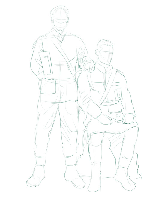
It doesn't have to be pretty, folks, just a basic guideline of where you want the figures to be.
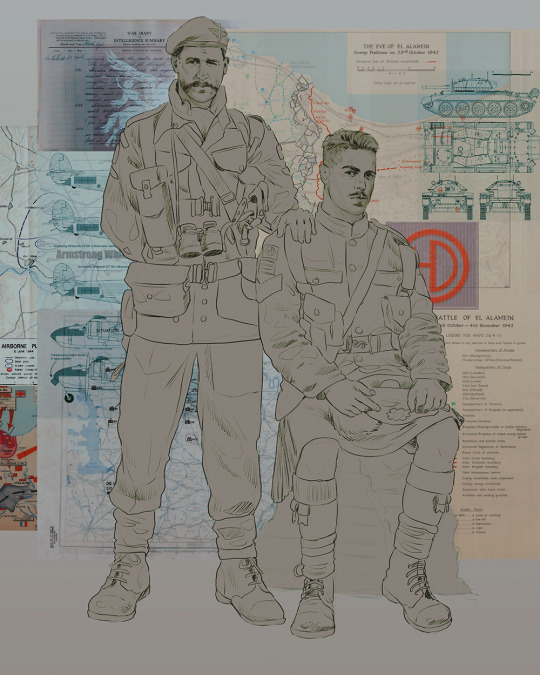
The next step is to define it more, and I know this looks like that 'how to draw an owl' meme, but I promise--getting from the loose sketch above to below is not that difficult.
Things to keep in mind are--don't go too in-depth with the details, because things are still subject to change at this point. In terms of making a suitable anatomically-correct sketch, I would suggest lots of studying. This doesn't even have to be things like figure drawing, I genuinely look at people around me for inspiration all the time. Familiarize yourself with the human form, and things like weight, proportions, posing will seem a little more feasible.
It's also important at this stage to consider your composition. Remember to flip the canvas frequently to make sure you're not leaning to one side too often. I'm sure something can be said for the spiral fibonacci stuff, which I don't really try to do on purpose, but I think keeping things like symmetry and balance in mind is a good start ✌️
Next step is just blocking in the figures. Standard. No fuss 👍
Now onto the background!
It's frankly hilarious how many people thought I was *hand-drawing* these maps and stuff 😂😂 I cannot even begin to comprehend how insanely difficult that would be. So yeah, we're just taking the lazy copy and paste way out 🤙
I almost always prepare my backgrounds first, and this is mostly to get a general color scheme off the bat. For collage work, it's really just a matter of trial and error, sticking this here, slapping this there, etc. I like to futz around with different overlay options until I've found a nice arrangement. Advice for this is just--go nuts 🤷♀️
Next, I add a few color adjustments. I tend to make at least 2 colors pop in an art piece, and low and behold, they usually tend to be red and blue ❤️💙There's something about warm/cool vibes, idk man..
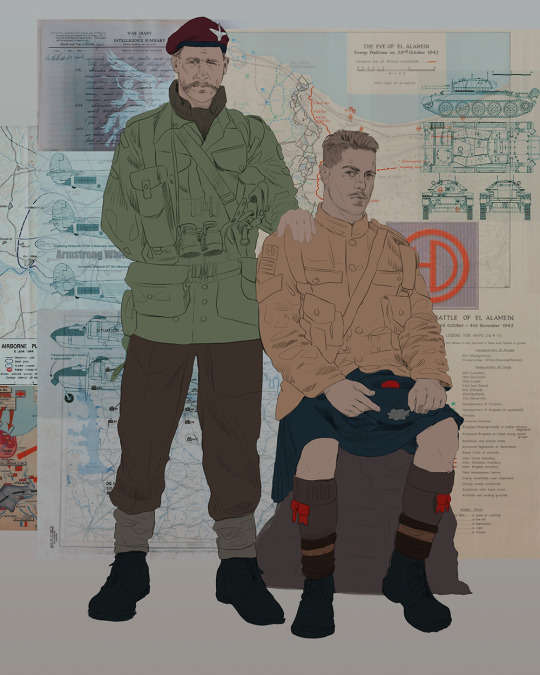
Now we move on to coloring the figures. This is just a basic block and fill, not really defining any of the details yet.
Next, we add some cursory values. Sloppy airbrush works fine, it'll look better soon I promise 🙏
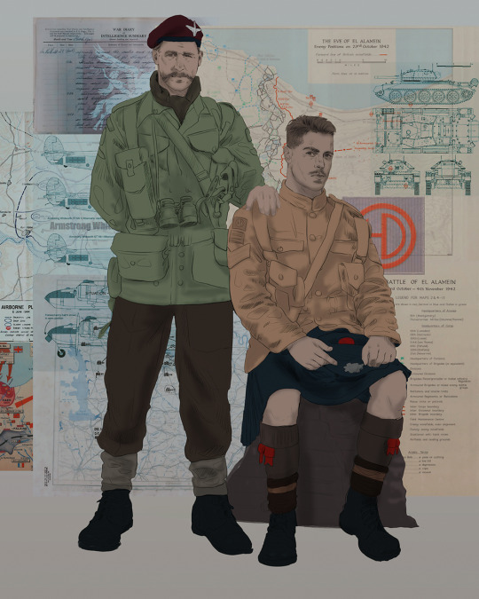
And now--rendering!
I know a lot of beginner artists are intimidated by rendering, and I can totally understand why. It's just one of those things you have to commit to 💪
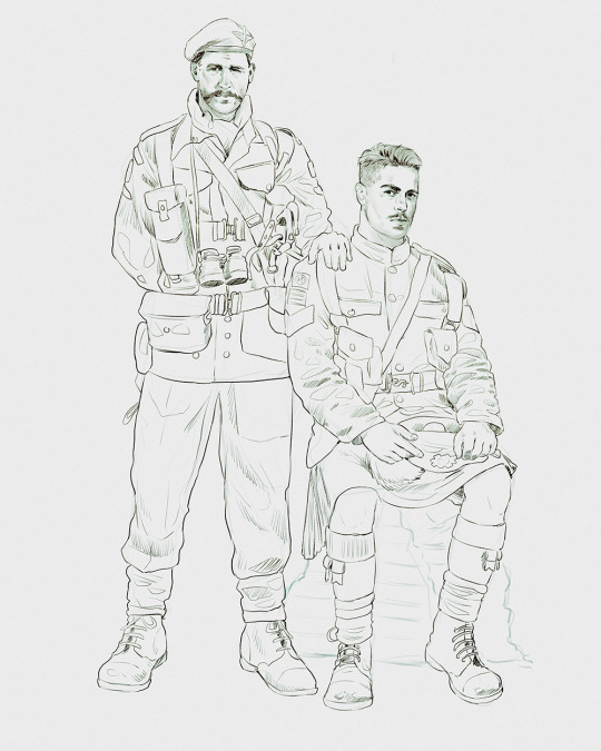
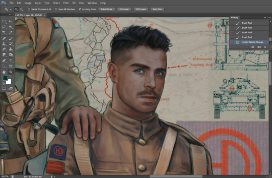
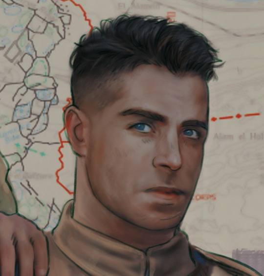
I've decided to show a brief process of rendering our dear Johnny's face here:
Starting off, I usually rely on the trusty airbrush just to get some color values going. Note--I've kept my sketch layer on top, but feel free to turn it on and off as you work, so as to not be too bound to the sketch. For now, it's just a guideline.
This next stage may look like a huge jump, but it's really just adding more to the foundation. I try to think of it like putting on make-up in a way~ Adding contours, accentuating highlights. This is also where I start adding in more saturation, especially around areas such as ears, nose and lips. Still a bit fuzzy at this point, but that's why we keep adding to it 💪
A boy has appeared! See--now I've removed most of the line layer, and it holds up on its own. I'll admit that in order to achieve this realistic style, you'll need lots and lots of practice and skill, which shouldn't be discouraging! Just motivate yourself with the prospect of getting to look at pretty men for countless hours 🙆♀️
I'll probably do a more in-depth explanation about rendering at some point, but let's keep this rolling~
Moving forward is just a process of adding to the figures bit by bit. I do lean towards filling in each section from top to bottom, but you can feel free to pop around to certain parts that appeal to you more. I almost always do the faces first though, because if they end up sucking, I feel less guilty about scrapping it 😂 But no--I think he's pretty enough to proceed 😚
They're coming together now 🙆♀️ Another helpful tip--make sure you reuse color. By that, I mean--try to incorporate various colors throughout your piece, using the eyedropper tool to keep a consistent palette. I try to put in bits of red and blue where I can
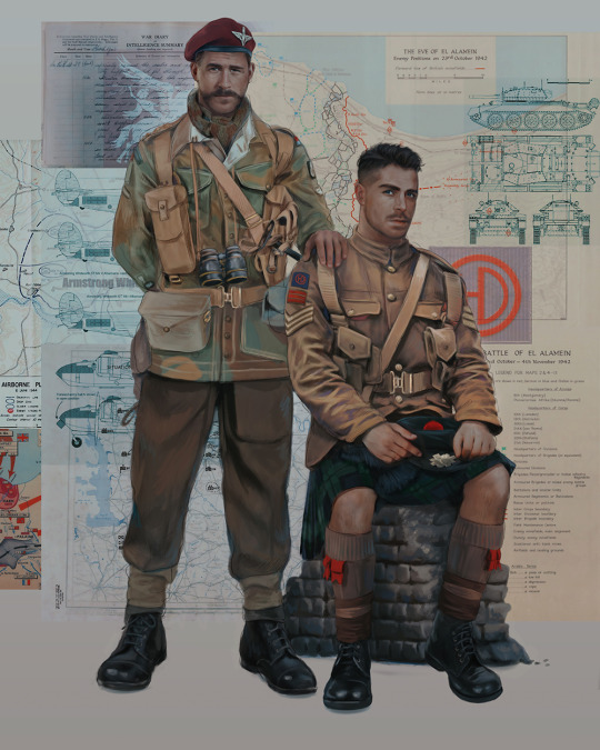
Here they are fully rendered! Notice I've made a few subtle changes from the sketch, like adjusting the belt buckles because I made a mistake 😬 Hence why you shouldn't put too much stock in your initial sketch~
The next step is more of a stylistic choice, but I usually go over everything with an outline, typically in a bright color like green. Occasionally, I can just use my initial line layer, but for this, I've made a brand new, cleaner line 👍
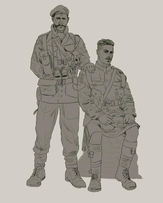
And the final step is adjusting the color and adding some text:
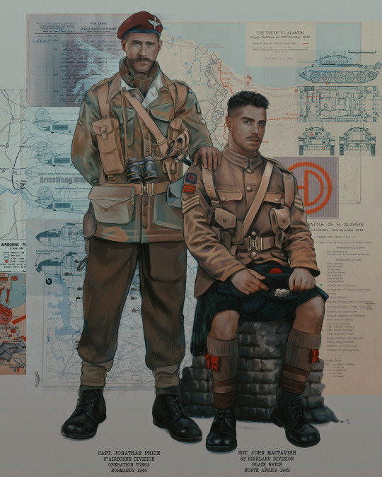
Tada!! It's done!
All in all, this took me the better part of a week, but I have a lot of free time, so yeah ✌️
I hope you appreciated that little walkthrough~ I know people have been asking me how I do my art, but the truth is--I usually have no clue how to explain myself 😅 So have this half-assed tutorial~
As a bonus, here is a cute (cursed) image of Johnny without his mustache:
A baby, a literal infant child !!! who put this wee bairn on the front lines ??! 😭
Anyway! peace out ✌️
#tutorial#my art#art tutorial#since people have been asking#I remembered to save my process from this latest work~#enjoy 🙆♀️
1K notes
·
View notes
Text
alright, here it is: ZENO'S COLOR GUIDE 3.0 !
here, i'll have three "chapters" regarding color:
CH1: how i color in illustrations
CH2: color and character design (in zeno's case)
CH3: how zeno makes his colors cooler
CH1: HOW I COLOR IN ILLUSTRATIONS
it must be noted that, as of lately, i heavily use halftones in my art and the way i use them for gradients effects my color choices. of course you don't need to use halftones if you don't want to, as it's just my personal choice, but anything regarding halftones here could (probably) also apply to regular gradients!
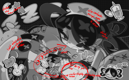
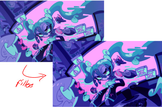
when choosing colors in an illustration, i usually have three things in mind: mood, character, and contrast. we'll be using "gloomy bunny naptime" as an example here.
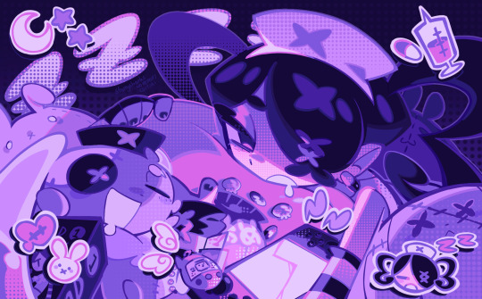
MOOD: what's the vibe of the piece? for example, here in "gloomy bunny naptime", wanted a mellow, sleepy vibe, so purples and pinks seemed like the best choice. these colors also have a dreamy effect due to being common in real-life early mornings/summer nights - basically, i tend to use associative colors in illustrations.
i usually only use a pallete of 3-7 colors, though of course more characters calls for more colors. for multi-character pieces, i would actually make a "rainbow" of colors based on the mood of the piece - essentially, a bank of colors to use for your colorful casts based on the actual rainbow. you can alter this based on the saturation levels you want! hope that makes sense. i'm not the best at this though, so i would heavily recommend looking for guides from artists who are more skilled in that department.
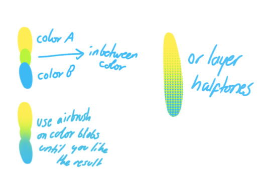
CHARACTER: velvet is the focus of the piece, and as a character her palette is made up of many purples and pinks. of course, it's easier because she and ribbon both have similar designs, but i would still recommend using colors based on/complementary to the focus character's pallete, though this is a rule that can and should be broken if needed. gradients can be used to provide a smooth transition from color-to-color and add depth to the piece, as well as showcase velvet's pallete. when making any gradient, you probably want to have a vibrant middle color. this is difficult to achieve in most art programs, so i'd do it like this:
you can use gradients in lots of cool ways to make stuff pop! (i think this collage shows i use too much purple and pink though.)

CONTRAST: the context of the piece also aids the color through contrast. (that's a lot of Cs!)- we see that velvet is just waking up, and the light from her switch is glowing brightly. i wanted to convey something like her switch suddenly turning on in the middle of the night, waking her up - so the console emits "light" in the form of illuminating the contrasting color of pink against the purples. it might seem specific to this piece, but what i'm trying to say is that contrasting colors can lead the eye to the focal point of the piece, that being velvet herself. because a great deal of the rest of the piece is dark, we look at the contrasting switch screen - the brightest thing in frame - and our eyes move around and up to take in the focal point character. at least that's how i wanted it to be ;w; i guess you could convey it as something like this?
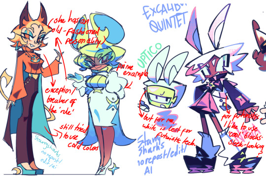
CH2: COLOR AND CHARACTER DESIGN (IN ZENO'S CASE)
this is where i start to get annoying, so stand back! when deciding on colors for a cast of characters, there are many factors: time period, variety, personality, and more that i can't think of.
TIME PERIOD: this one is simple. for example, a futuristic time period (such as that in x-calibur) calls for colder colors, such as greens and blues. for characters involved in futuristic professions such as space exploration, this works incredibly well. for modern time periods, less focus can be on colors and more on the shapes of the clothes, but this is not a shapes tutorial! i don't have any ancient times oc stories, but i'd probably use earthy and warm tones.
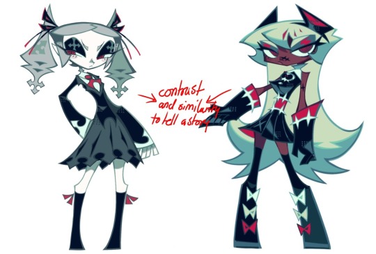
VARIETY: this is also rather simple. i try to be aware of the palletes that i used, and the similarities they might have with other characters. i try to use similar colors for characters who belong to certain organisations or have a uniform, but of course, it's not like catholic school students adhere their entire look to their uniform, so this is a rule that can be broken yet again. art is all about learning things and breaking them, remember that!!!
color can also be used for symbolism. my absolute fav example for this is vivica and octavia - the amount of red in their designs is supposed to represent the amount of freedom/passion/anger/confidence they have or are allowed to express under their different circumstances. as vivica belongs to a strict organisation, she has far less red in her design, showing her emotions are stifled - meanwhile octavia has it as her main complementary color because of her freedom to express her emotions, though those emotions may be destructive because of her circumstances.
PERSONALITY: what colors are associated with your character's personality? i actually usually refer to magical girl groups to see what's commonly associated with different colors. here's the main trend:
red: hot-headed, passionate, firey
orange/yellow: bright, happy-go-lucky, sunshine personality
green: wise, mellow, kind
blue: serene, graceful, elegant
purple: magical, regal, fancy
pink: usually the main character (though this because magical girl anime tends to be marketed towards young girls), sweet, relatable, determined
of course these are only stereotypes from one genre of anime, and different colors have tons of different meanings. color theory is the best way to learn this! these colors can also express different moods, which ties into ch1. i myself constantly ignore these rules - v-con, a bombastic hyper DJ, is purple (though he does have yellow accents) for example. basically, i just take them as a general rule and try to have them in mind while drawing.
CH3: HOW ZENO MAKES HIS COLORS COOLER
this might be the most important part of this guide. once again, there are a few things to consider here: filters, hue, overlays, and more!
FILTERS: for ibispaint, you can use an adjustment layer on your whole piece to use a filter. i usually only use brightness/contrast here - upping the brightness (or darkening it based on the mood of the piece) and upping the contrast. this helps to better express values and intensify the colors if that's what you want. i often use it in all my pieces to some extent.
hue/saturation/lightness is also helpful in moderation. you can alter the hue - though it usually only helps if you bring it back or forward by just a few points, or the entire pallete will change. saturation is what it sounds like, and slightly over/desaturating the piece can help with atmosphere. lightness is what it sounds like - lightens the colors in the piece. i don't use it at all.
posterize and sharpen mask are some that i've used recently. posterize can add some crazy effects to your art, but i'd probably need to edit it slightly after using it because it can mess with certain colors.
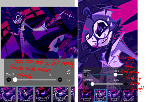
HUE: it's a layer type that can change the overall hue of the piece. i usually use it at a low percentage for atmosphere. kind of like a gradient map but nothing like it? idk
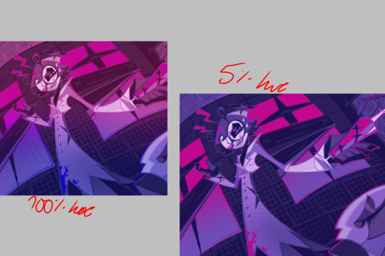
and OVERLAYS: i just use a very saturated blue/purple color over the entire piece at a very low percentage, around 5-10%. it can wash out the piece at too high a percentage.
and that's basically it! sorry it kind of derailed at the end i spent like 2 hours on this and got super tired. goodnight i'm going to sleep please also look at other artists etc etc. bye.
#zeno's art#long post#color tutorial#liar by korn is actually a really catchy song yea the lyrics are weird but its so good tbh#peak drums and bass and guitar and vocals and then the lyrics are hot booty. this is what nu metal's all about people#ask questions if you want#about nu metal or art i dont care
348 notes
·
View notes
Note
(sorry if you've gotten this before or if this is not the right kind of question for the blog)
Do you have any advice on HOW to make a comic series? From what I've seen your work is fantastic, well made and written! (Cool concepts, story, and character dynamics etc)
How did you start? How DO you start?? How do you comic lol
I'm glad you enjoy my work! I'll do my best to answer this question!
I could give the ol' "Just jump in! Get started!" But I don't think that's the answer you're looking for, here. Even if it's technically the correct one.
"How do you make a comic series" Is one of those questions where the answer is kinda difficult to summarize in a single ask, because there's a whole lot that goes into it, y'know? I'll give you a brief run-down of my process.
I figure an idea for a story. In the case of Infested, the whole story was written before I even got started on the script. This is an outlier in my usual process and I don't normally do this and definitely don't recommend it.
Figure the plot like how you would figure a regular story's plot; The beats you wanna hit, the way the characters develop, the beginning, the middle, the end. What's the point of the story? What, exactly, are you trying to convey here? Who's the target audience? All that stuff ought to be figured out before even picking up a [MEDIUM OF ARTIST'S CHOICE].
Script the story. If you've seen a movie script, these things look a bit like that. You wanna not skip this step because this is where you determine the visual language of each page. Comic script writing is a whole thing and a half but I do have some random tips regarding it.
-> When writing the beginning of a new scene, write down the time of day, the weather, and any important details about your setting (this is most important if you're working in a team).
-> Using storyboard/film language when trying to figure out a scene is very helpful. You're not gonna remember exactly how that scene looked in your head when you finally get around to penciling it. Trust me. Write it down. Or thumbnail it! Thumbnails are also very helpful!
-> Remember that you have very limited space for dialogue. Write with that in mind.
Figure the paneling on a page. I work at 11x17 and do my panel layouts based on those dimensions. I tend to make more important panels, or panels with PUNCH or SHOCK bigger than the others. Each panel is an individual illustration, but together they make a whole piece. You gotta treat it like that, y'know? Find the focal point on a page, find the most important element of it, and make that your focal point. Don't be afraid to get a lil wacky with panel shapes, either. They don't HAVE to be squares and rectangles. Check out what other cartoonists do! Get inspired! Paneling is an art-form within itself!
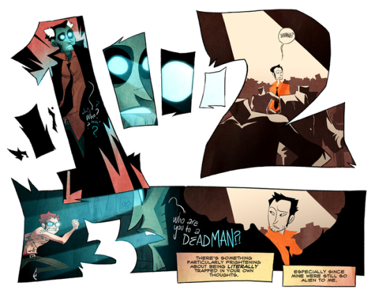
Page from "Hanna Is Not A Boy's Name" By Tess Stone
5. Penciling time! Get the perspective figured out, then draw the background, then draw the characters. Do it in that order. Trust me. With a background already set up, characters can be drawn more like they exist within that space, instead of floating in front of it. Also? Be aware that comic artists need to be ready to draw ANYTHING. You may have a great idea that you GOTTA put out into the world, but you have no idea how to draw, say, a car. Or debris. Or jungle foliage. There's no shame in using references, tutorials, or even doing a bit of tracing if something's outside your wheelhouse. Here's a bazillion tutorials from two guys who REALLY know their stuff.
6. Speech Balloons! Yes, really. In fact, you may want to do this and penciling at the same time. I certainly do. It's better to figure this out immediately so it doesn't hurt you later when it comes to getting your balloons to share a space with your art. Here's some great advice on the whole subject from a master of the craft
7. Inks! Line weight variation is key. Closer to the "camera" means thicker lines. If a part of a character is in shadow, that part is gonna get thicker lines, too. Personally, I make my background line art thinner than character line art. It helps the characters pop out!
8. Flats! Or flat colors if you wanna get specific about terminology. It's exactly what it sounds like -- Coloring the characters and backgrounds with the bare bones basic colors. I highly recommend keeping the character flats and bg flats on separate layers if you're working digitally.
9. Rendering! There's no hard and fast rule as to how a cartoonist ought to render their comic -- If they want to do that at all, even. Go with what you believe looks good AND is something you can do quickly. The "quickly" part is important. Heed my warning. Don't be like me.
And then I'd schedule the comic to be uploaded on whatever day suits me -- Thursday (usually) in Infested's case.
Of course, I kinda suck at relaying my process, so the final thing I can do for you is direct you to an extremely helpful book that really breaks it down in a way that may click with you as it did with me.
I hope this was in any way helpful to you!
118 notes
·
View notes
Note
Silver from Twst? No pressure or anything but I think he would look ethereal in your style.
Some. tips or advice for drawing men? I usually draw women often. As I entered the Twst fandom, I realized that it is difficult for me to draw boys. 😅🤔
Oh well, I love your art by the way. Have a good day, goodbye 💐🩷💕
of course ! im glad you think so : )
and, tips for drawing men ... i also used to struggle at drawing men before, and only drew women when i first started out.
i tend to draw men and women with rather similar features, as i think that features really only depend on the character. of course, doing studies of real people always helps! you can also study other people's art and see the differences in how they draw the characters. it's helpful to see how they stylize it.
here are how i draw women and men side by side (sorry for the quality difference, i had to just compile pictures of guys i've drawn)
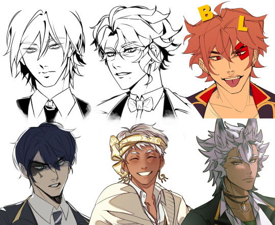
as you may notice, i gave some of the women softer cheeks, maybe longer eyelashes, and more defined lips. the men have higher cheekbones, thicker necks, slightly smaller eyes, etc.
this is definitely NOT a hard rule, because even when i tend to draw straighter noses for men, some of my women have straighter noses than each other, and some of my men have upturned noses. or even, at times my men have longer eyelashes than my women. it really depends on what you think suits the character (muscular women, feminine men, hooked noses, big lips, etc).
i think people can draw men however they'd like, so going completely off the script from what people think the average man looks like is completely fine, but if you would like a starting point, the "average" man is a good place to start (as much as people hate those tutorials that do side by side women and men comparison, those kind of helped me as a beginner).
i hope this helps even if it's kind of just my thought process, sorry for the long response !!
thanks for the ask and the kind words!! <3
#keybox#thanks for the ask!#this is just me yapping..#art#my art#doodle#twisted wonderland#twst#twst silver#❤️
123 notes
·
View notes
Note
do you have any tips for drawing dynamic poses? i always love the way you draw bodies!!
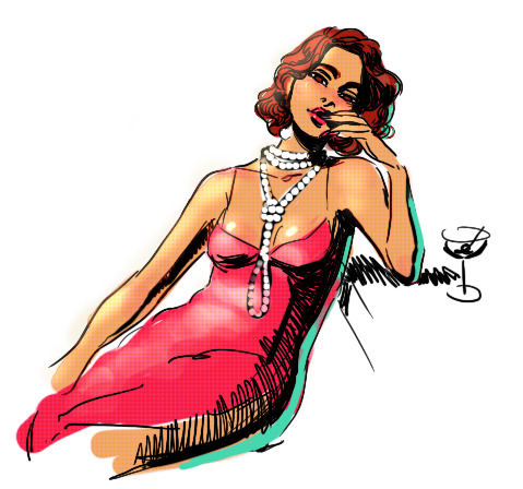
i know this has been said a million times but the way i draw bodies significantly improved after i started drawing more frequently from reference. if i cant find a reference for a pose on the internet, i'll just use myself or a friend. i spend an unfortunate amount of time just standing in front of my mirror looking at my own joints. pay attention to where your body curves!!
other than that though—honestly my anatomy/pose knowledge is a whack amalgamation of art tips i've accumulated over the years (i miss old school deviantart/tumblr style art tutorials). i also like to look at how artists i admire draw bodies—what details to they include, what anatomical short-hands etc
i think i'm still figuring out how to draw dynamic poses, but here are some cheats i've picked up (under the cut coz this got long again):
gonna use this stray!tim as a base
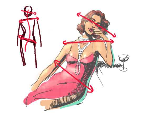
the easiest way for make up a pose is to start roughly with the head, collarbones, ribcage, and pelvis — you can build everything from there
here's a couple more of what i mean by the ribcage-pelvis deconstruction:
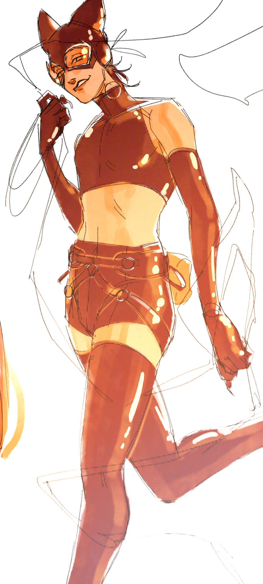
2. push your perspective a little!! imo things look more dynamic if you move your sight-line up or down—the horizontal orange line here. if you look at the panels above, the sight lines tend to be a little low, at around the character's torso or waist. i did the same below with stray!tim
to do this i usually try to get a sense of the space im working in by putting in some sloppy perspective grids
3. S curves!!! exaggerate the lines of the body. the body naturally has parallel horizontal lines—an easy way to get a body to look less rigid is to tilt those horizontal lines which in turn curves the vertical line of the body
this is what a mean by horizontal lines—usually i use the eyes, shoulders, and hips:
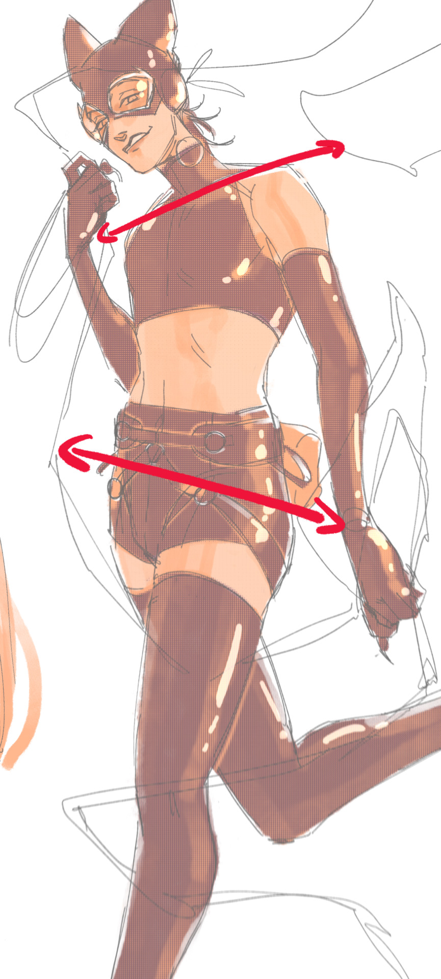
i'm gonna use caterina as a better example—usually you want the horizontal lines to sort of zigzag:
i've also picked up a couple visual tricks that don't exactly add dynamism to a pose? but they do give a static pose a little more oomph. a lot of this is done by visually highlighting one specific point of the body
for our purposes, i'm gonna make the focal point tim's face
motion blur! there are a couple ways to do this. i actually dont like working with traditional motion blur because you have to mess around with selections, so i usually fake motion blur using postional perspective blur:


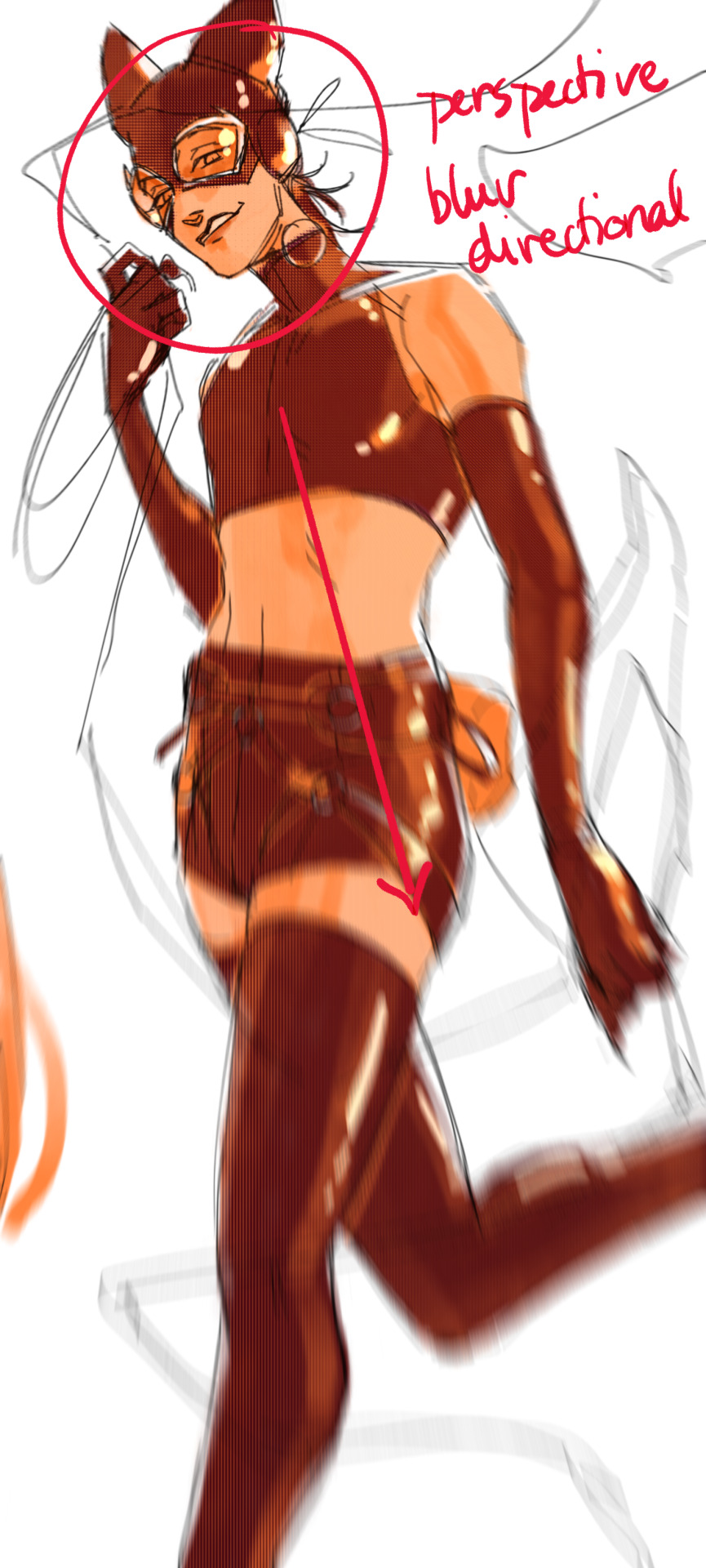
2. gradient lighting—you can add a lot of depth this way. usually i like setting the gradient in the direction of the focal point, e.g. tim's face
below, i added a layer above the base drawing, used an airbrush to get this gradient, and then set the layer to color burn and lowered the opacity. you can also clip the lighting layer to the base drawing and set it to multiply

below, i did the opposite—instead of adding a gradient shadow, i added gradient light. i set the layer to add this time (instead of color burn) and then lowered the opacity again.
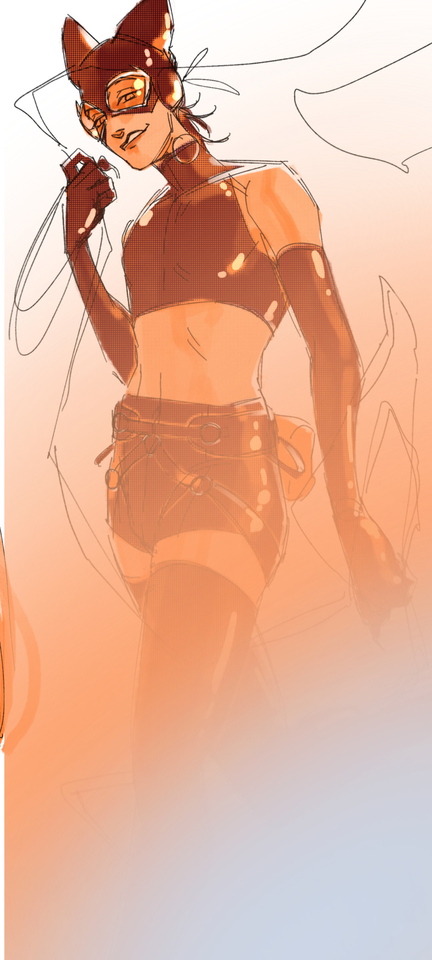
this kinda serves to desaturate the parts of the piece that are less important (ish i was kinda sloppy here), driving the eye to face—the most saturated. the motion blur does a similar thing, where the only thing "in focus" is tim's face
the gradient also sort of adds a directionality to the piece—it starts at the bottom right corner and goes up towards the upper left, causing your eye to follow that same path, which drags your gaze up tim's body
here's what it looks like when i combine 1 and 2:

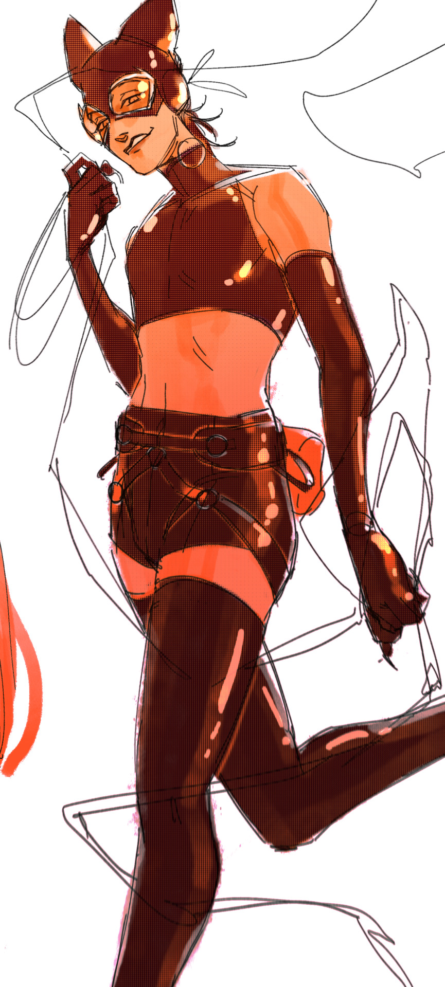
3. chromatic aberration's been pretty popular recently. it does a similar thing as perspective blur but with more eyestrain (although i went with a really exaggerated version below just to show you what it does) but it looks cool!
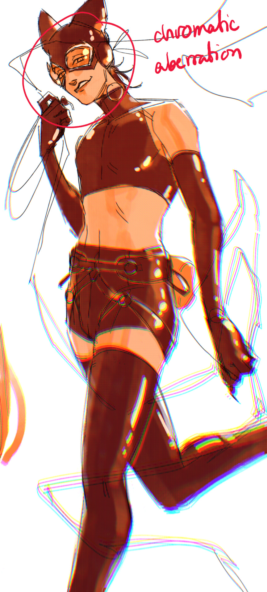
bonus cryptid tim as a reward for getting to the end :-)
#red talks#sart#art tutorial#YeAH UH this got long lmaooo i was on the bus for a Sec plotting this out so#also i am neck deep in a reincarnation/regression manhwa stress hyperfixation so i havent had the brain space to draw#so you get this instead!#if anyone wants recs lemme know lol#thank you anon :)))
56 notes
·
View notes
Note
if its not rude to ask i have a few questions. how did you learn how to draw fur? how often do you practice drawing? how long does a finish piece take? and a sketch? what kinds of other tips should i look out for? i love your art its gorgeous i wish to be more like you. thank you for your time!! :>
Fur: I never learned how to draw fur by itself, but learned as a byproduct of practicing drawing animals, but with any study I recommend grabbing a reference and breaking it down!

The actual stylization of fur is up to you. I tend to vary a lot depending of the size, texture, and subject I'm drawing. Try to implement what you learned into a more stylized subject once you finish your referenced one!
Practice: I tend to do it once per week-ish. If I have an art block, I tend to do studies to refresh my fundamentals. I recommend not being obsessed with studying: there's only so much you can learn without putting it into practice, which is applying your knowledge on your normal art.
Art time: I don't time myself properly, so this is hard to answer. Large pieces (background, shading etc) can take up to a week of work. Custom designs vary between a few hours to a week (but usually less), normal fullbodies I can do in a day or two (less if not human)
Tips to look for: I think it's always important to curate the tutorials and art tips you see on the internet (including mine). There's a lot of abstraction from how someone got to their specific process to what would be good if you're just starting the subject. I always recommend looking into respected art books and teachers if possible, and learning from life!
Thank you so much and sorry for the delay in answering your question LOL
207 notes
·
View notes
Note
mod, how do you edit your portraits? aka what program do you use :)

Hey!!! So glad you asked! I was actually talking to some friends on discord about this exact topic.
I'm gonna write the best tutorial I can for you anon. Other ask bloggers feel free to reference this!!
KEBBY'S STARDEW VALLEY PORTRAIT/SPRITE EDITING TUTORIAL!! 💪💪💪
Personally, I use Medibang Paint pro. It's a free art program that you can use to draw pretty much anything. Normally, I use it for regular, un-pixelated digital art.
(If you'd like to see some of that, my art sideblog is here!)
However, Medibang Paint also has a dedicated pixel brush! It comes in handy a lot with sprite editing.

Another suggestion is getting Aseprite. It's a program entirely dedicated to making amazing pixel art. If you want to specialize in pixel art, then you might prefer Aseprite over a more generalized art program like Medibang Paint. A lot of professionals highly praise it. The one catch is that Aseprite costs money.
Though I've been told that it's worth it, so it seems like a good investment to me!
Anyways!! Onto the sprites.
Here's every single one of Alex's sprites and portraits. I got this image from Spriter's Resource's website, where they carry high quality sprite sheets for every single character in the game. Clean and crisp 1x1 pixel ratio.

So for a lot of my custom Alex portraits, all I did was copy different facial features and paste them onto his face.
Take his happy portraits and his surprised portrait, for example.


Stealing the eyes from the surprised portrait and slapping them onto the happy portraits, we get these rather insane looking boys here.
I tend to use these edits whenever Alex is excited about something!


Though sprite editing can also get a lot more complex. There have been many instances where I've had to add something completely unique to his portrait.
Like these edits, for example!!!


What I'd usually do is choose which basic portrait I'd like to use as a base, and then start to draw over it using Medibang's pixel art brush. It's actually a lot easier than you think, as long as you study the portraits!!
Take a second to really analyze ConcernedApe's pixel art style. What do you see first? Well, the colour palette is already there! I already know what colour his skintone is, what colour his hoodie is, what colour the shadows are, etc.
I can also see that his hoodie is shaded with little specks of darker and lighter pixels. This gives his hoodie an interesting texture, so I tried to mimic it when drawing his sleeve for the facepalm edit.
I can also tell exactly where the light source is. It's off to the side! so I knew where to place the shadows and highlights when shading his hands or that egg he's holding.
I encourage you to mess around and do some practice edits until you get the hang of it! Again, it's a lot easier than you think. Most of my edits take either a few seconds or a few minutes.
Here's a collection of every single Alex sprite edit I've made so far!!!

Now, keep in mind, every Stardew Valley portrait is drawn on a 64x64 pixel canvas. That's teeeeeny tiny. If you posted your edits at that size, it would look a little silly. It would be hard for people to see!
So once I've completed a portrait edit, I'll resize it!! Luckily Medibang's got a handy resizing feature.
I go to the top of the screen, I click "Edit" , I click "Image size" , and right beside where it says "Set size to 200%" I click "Apply" , and then I click "OK!!"
Ta-daaaaah!!! Now you have a high-quality, high-resolution sprite of your goober!!! You can resize it more if you'd like it to be bigger, or you can size it back down by setting the percentage to 50%.
That's basically it!
I hope this helps somebody else in the community!! Thanks for the ask, anon. It was really fun to type this out and show off some of my work!
Wow... That's a lot of clones! Where'd they all come from!?
#kebby talks ooc#sdv ask blog#no need to credit me for the portrait edits you make BUT if you dm'd me to show me ur edits i would be very happy#stardew valley ask blog#stardew valley
24 notes
·
View notes
Note
hi dema! i’m learning how to do digital art, would you mind sharing your coloring process? coloring (and lineart) is the hardest thing for me to do T_T… what brushes do you use for coloring and how do you not make it look muddy? i’ve been trying to follow tutorials from different artists on youtube but i find my work to look so muddy… thank u in advance >__<
Hi, and thank you for thinking about me for advice! I'm honoured to share a bit of my process, nerve-wracking as that is for my shy self, and hopefully help you out as much as I can. Forgive me if I don't express myself very clearly—I have a bit of a hard time explaining these things. Now, let's get started, shall we?
I'll be using the first panel of this artwork as an example.
My process is pretty straight-forward for most artworks. Make a sketch, draw the lineart, and follow a self-made guideline for coloring and rendering.
Sometimes I'll throw the guideline to the trash bin and start experimenting with brushes and chiaroscuro and color palettes, but that doesn't happen most of the time and, when it does, it's more a challenge than anything else, and not really what I think you're looking for.
I'll include my usual steps here, however, and like I said earlier, these steps are more like what you'd call guidelines than actual rules.
(I just realized I didn't save the sketch for this artwork. Oops)
This is the lineart!
I tend to think that details bore me and are actually pretty exhausting to do, but then I go and make things as clear and detailed as I can. Because I'm a hypocrite like that.
I did try to keep things simple here, though, mostly because I had to go through three other panels and didn't want to burn out my fuel mid-process.
Base colors! The blush (and Zuko's scar!) I draw in a different layer in case I need adjusting the brightness or saturation later.
It's time for shadows!
Pick a color depending on the atmosphere you want the artwork to have. Is it a cozy, warm scene in a honey-tinted room, or is it a moment shared under the moonlight? The color choice should come as an answer to those questions—deep red for the first one and dark blue for the second.
Choose a color and make it dark and saturated. Then, play with the layer opacity! A darker shadow means harsher light, while less opacity works best for a softer look. See the difference? It's subtle, but it's there.
Of course, this is my personal choice. The way shadows are drawn and color is chosen depends on the artist and the artwork. I choose to play with a more simple coloring style, keeping shadows from blending into each other, but you may like a more realistic approach to shadows and colors.
My best advice? Try doing it every way you can, but in the end choose what works best for you. Whatever feels more comfortable, whatever you enjoy drawing the most. And then work to improve it. Love the little proof that you've gotten better, even if it's subtle.
And talking about subtlety...
I love to play with gradients. I use them mostly to give the artwork some form of atmosphere, and make it look cohesive and whole. A light gradient in the color and direction of the shadows will help the characters blend with the background, as will another gradient in lighter colors for the light.
Get creative with gradients! Use them so the lights feel brighter and the shadows darker.

Now it's time to work with the lineart again.
The pure black lineart makes the artwork look harsher, sharper, so I tend to give it some color to soften its edges and compliment the rest of the drawing. In darker shades as the rest of the colors, growing more saturated as the light comes closer.
I love to make the characters' eyes pop and glow! It's really fun what you can do by just messing a bit with the tones of the lineart.
Finally, I play with the level correction. A high contrast will help your artwork stand out and look brighter. See the difference?
And it's done!
Sometimes I like to add other effects or details, but this is the very, very rough shape of my usual process, and thus what I thought you'd like to see.
Once again, I'd like to point out that this is what works for me, and a large part of improving as an artist is just fooling around and messing up until you find the tools and tricks you're most comfortable with.
So keep drawing those muddy shadows and colors! They're only a step of the process.
#dema answers#zutara#art advice#art process#I hope this helped you anon#Tbh I have zero idea of what I'm doing most of the time#So don't worry if you don't#Worry instead the day you feel like a drawing comes easy and poses no challenge anymore#Always strive to do better to improve to fix that lighting or find a new way to depict a scene or find other filters and effects#No artwork is ever perfect and perfection itself should never be the goal#“Don't trust a song that's flawless”#Don't give up on the strain and the frustration of struggling against your own skills#Never fall out of love with the process#That's where art is
24 notes
·
View notes
Note
Hii! First off i just want to I'm such a big fan of your art and animatics! Your art is just so expressive and unique its addicting to look at 💞💞
I was wondering if you could go over how your process or tutorial in making an animatic? Whenever I try to start to make one, I get jumbled up and end up ditching it lol
I'm sorry if you get this question a lot 😭
So sorry it took me so long to answer this- I was in a Busy time (diseaseridden with covid and being punched by finals) when I got the ask and wanted to answer it with some stuff Im using for my next TOH animatic!!
I'll say one thing first: I get jumbled up and ditch so many animatics. For every one animatic I release, there are three to five more I have that have NEVER seen the light of day (yet). And that's okay!! It's fun just to make them for me, and I hope it is for you too!! Animatics are scary because if you're working on it alone, it can be really hard to be your own cheerleader to keep up the mojo to keep going. So that makes it really special when there is that project that makes it to the finish line- cuz you can look at it and go "holy crap I made this. holy crap i MADE that look how SICK that is dude!! all that work and look at the turnout!!"
The following stuffh is just my personal process and is by no means representative of a professional animation pipeline, but this works for me as a Lonely Artist! It all begins with the idea - whether it's a song, or just a story you wanna tell. In the case of the one I'm gonna demo here with , I wanted to animate Hunter's first day as Del's apprentice!
The first thing I did was write a script. Not fancy or AO3-quality, but enough that I understand the pacing and the visuals of each shot. I usually just put this in a doc or put it in a script format, if I feel fancy.
Then, I take that script and find music that I think would fit for it- and remix it (if needed) to fit the pacing/mood/etc! This is what this new animatic looked like before I began ANY artwork- this is a me thing because I'm super inspired by audio as opposed to visuals first. But you might be different- this is just how I like working personally!
Then begins the research! I find references for characters, background layouts, and create a style guide for the animatic that tells me how thick lines will be for characters, backgrounds, if there'll be tons of value or no. I make a turnaround for each character so I can refer to them because Im gonna be drawing them over and over a LOT and want to be consistent! Luckily TOH has no shortage of references, so I based my work off them.
THEN, I can begin drawing. I'm a little,,, (a lot) ADHD and may not always do this process, but if you're new to animatics or daunted by the task at hand, make beat boards of the entire project.
This is just a page of rough thumbnails that get your visual idea down - look how rough and quick these are!! I try not to spend over a minute on each beat board if I dont have to, unless it's a particularly complex shot.
When it gets to the stage where you're ready to begin the actual scenes, I personally tend to do backgrounds first because I like to set characters into backgrounds - and for every animatic, I have the Awkward Blue Sketch Stage which is basically my beat boards timed out as an animatic.
I used Storyboard Pro for this (Toonboom, not free ): icky), but the process can be replicated across most art platforms in whichever way you feel most comfy with! This is so I can time the drawings before I devote time cleaning them up-- which can make for some Pretty Funny looking little guys but theyre important!! trust!!
Once a big sequence of shots is cleaned up (I usually do 40-60 second chunks at a time), I export the .mov and send it to my editing program (which in this case is still Premiere Pro) - and then repeat this process again and again until.. it's done??
Here's like a TL;DR list of basically everything I said summed up:
• Make a loose script or bulletin of the idea! Do your research!
• Depending on what kind of animatic you're making, time it to music!
• Make a beat board of very loose gestures for your shots, and time them - then move on to refinement & cleanup!
• Combine all shots, refine music cues and timings, add any last needed VFX, and export!
There's no secret recipe or anything, it's just learning a pipeline that best suits you, whether it is for something professional or something you want to make for fun because you just love to make!!
#riley talks#long post#SORRY ITS LONG but i couldnt just put a bulletin list like “this is the ONLY method that works” bc thats not true!!!#everyone works diferently especially artists#and this is just my specific method of working#im very fortunate to have programs that make animatic-making a little easier#so i hope whoever wishes to make one in the future finds something that works well for them!! i have a blast making storyboards/animatics!!#text post#ask#tutorial#idk how to tag this lol
333 notes
·
View notes
Text
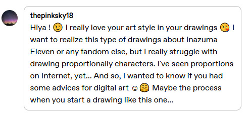
@thepinksky18 hello, and thank you sm!! <3 I hope it's okay to reply like this, I got kinda carried away with reference images..! I can try to share some things that help me with my art, hopefully they'll be of some help for you too!
when I do group pics like this, the thing I focus on the most is how everything looks and feels together! details and stuff can wait for later, first is to figure out that the overall picture works, and the characters are in balance with each other!
I'll use the Tenma horse pic you replied to as an example, will be continued under read more!
here's the sketches for the art! the very first sketch is very simple and blocky (I usually use a thick brush) to just settle everything in place and see how it all works out. the second sketch is more detailed and sometimes deviates from the first sketch a lot, if something seems to work better some other way.
depending on the complexity of the finished art, I do just these two sketches or add one more even detailed one, but the last sketch before lineart is the one I tweak the most! usually I draw characters on different layers so it's easy to select them separately and resize, fix proportions or positions, etc. to make the big picture look good to you!
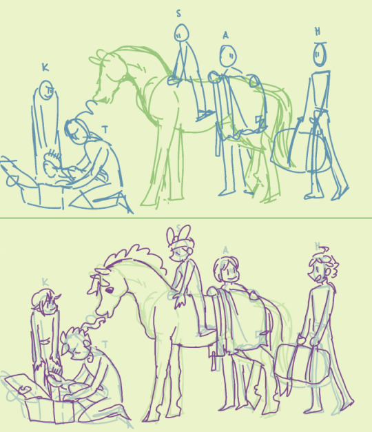
here's the lineart (which could also be the 3rd sketch) compared to the previous layer. now I'm adding more details, but I still keep fixing the overall image - you can see how the lineart doesn't quite match the sketch in places: hikaru is shorter, the position of aoi's feet and tenma's hind legs are different, etc. some people like to do a very detailed sketch and practically trace their lineart over it, and if that's what feels good for you, go for it! I'm the kind to just throw lines over vague sketch and call it a day, especially with more simple drawings like this :,)
there's good tutorials and studies on bodies and proportions online already so I'm not going to even try to speak about those, but I got a few tips! I tend to do them in my mind nowadays, but I tried to draw them out for easier visualization!
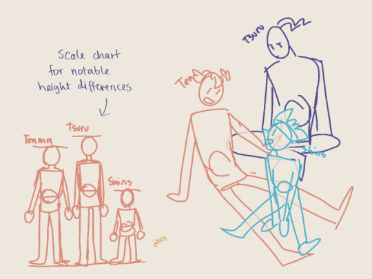
I mentioned earlier how for me the main thing is that everything's balanced, right? that also inclues characters and their proportions. I think that in group pics it's more important the characters work out together, not so much if their insividual proportions are perfect. especially if there's notable differences between them - height, bulk, lenght of limbs, and so on! a few pixels here and there don't matter in the overall image, but for example with Shinsuke who is Tiny, it's important for me to really make him smaller than others.
my most used tool is a scale chart! it helps to visualize the proportions for the characters, even when they're piled up like in the example doodle, or otherwise not in a neat row on the horizon line. (again, separate layers help you tweak them individually if needed! there's no need to get them right on the first try, especially when drawing digitally when there's layers.)
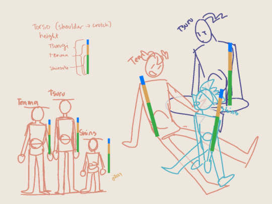
if your drawing eye hasn't gotten used to proportions, the chart can also be used to make a neat little ruler to check your sketch! the rulers over the sketch are all same size, just moved around; tsurugi and shinsuke fit in pretty well, and while Tenma's torso is a little long (even when taking into accound he's a little bent from waist, which makes him even taller when straightened out), it's not by much and it wouldn't bother my eye.
and while I myself sometimes tend to be a slave for the references and get gray hair over minor details, or of some part of the anatomy is off and I can't fix it the way I want, the overall feeling and style mean a lot more! I think it's important to put some thought into the proportions especially if you feel like wanting to make progress with your art, but if it's getting too stressful or draining the joy of drawing out of you, then screw it and just have fun! (I say this as someone who has learned not from studying anatomy and stuff, but instead just. has drawn a shitton and had fun while at it. I think getting comfortable with just creating is the bigges step you can take!)
...oops, sorry if this got too long or off the rails! and yeah hopefully you (and anyone else reading all this) got something out of it!
#me after writing all this: wow I hope I understood the request right and didn't just blabber about something unrelated for a long post#thanks for asking though!!#hmmm should i tag as art... maybe I will#own art
24 notes
·
View notes
Note
Woe, fan art be upon ye!
In all seriousness, I made this drawing to say and ask:
Your art is amazing, I aspire to become an artist like you!!!
A few questions... How do you usually shade and light? And what's the best way possible to draw backgrounds effectively? I hope you don't mind these questions!
On another note... I hope you have a good day
AAAAAAAAA THIS LOOKS AMAZING <3333 THANK YOU SO MUCH!!!!
This means so much to me THANK YOU 😭💕💕💕💕 you'll achieve that dream someday!! so keep up the good work!! and never stop the grinding 💪💪 !
as for how i usually render..i'm not the best when it comes to explaining things but i'll try to!
when i do shading i usually just mix and play around with the colors! blending them is super fun to do
i like to experiment around with the color wheel and not limiting myself with just one color! i tend to use different colors to make them pop out more
this also adds more depth into my pieces! notice how similar but different the colors looked yet they all appear to compliment well with each other? that also applies to lighting!
i mostly just winged them and do whatever that feels right
i think its already common knowledge about studying the light sources so i don't need to dwell into that! theres plenty of tutorials out there explaining better than i do
and as you can see i tend to just..scribble around and call it a day
this ones one of my best example in lighting! light affects the surroundings so they have these soft little 'glow' on them it's all about the details really
now as for the backgrounds:
values and composition! darker colors + light colors add some depth!
you'll notice how the choice of value affects the depth in this one!
im not exactly sure how to explain the compositions that well but if you study how i draw you'll notice how a composition can change the mood of the environment!
i hope this explains everything! i'm really bad with explaining how i do art but if you need more references just search more about color theories, values,symmetry and composition!
#asks#long post#if you have any questions or are confused on something please let me know!!#ill try to explain them as much as i could#fishdoestutorials#????
51 notes
·
View notes
Note
hi i just discovered your blog and i LOVE your art. can you do a tutorial on how you do your pop rocks colors? im OBSESSED with it.
(totally cool if not, no pressure! :] )
this is generally what i do , and it's rough since i rushed it , but this is generally how it goes
this is a normal sketch
messy lineart done with a deep blue hue
colors !!! with basic shadows included . shadows aren't done with multiply or any of that , i just make the color a lil more saturated and move the hue
on an (unclipped) layer on top of the lineart layer , i just color my lineart . very loosely . this whole style is loose most of the time . i also add highlights by lightening the base color and moving the hue in the direction that feels lighter . additionally , i outline my shadows with a slightly darker hue bc it looks cool
(on the same layer as step 4) this is where i go Nuts . the lightest colors of the highlights are always pure yellow and teal , as they're naturally lighter than the other colors , and the secondary highlights are usually a bit more saturated and are blue green and yellow green . for other colors that aren't highlights , i tend to mostly go over the shadows (and the shadow outlines we added in step 4) by picking a color i'm gonna be going over and shifting the hue until it's a similar value/until it doesn't seem lighter or darker to the color i picked . i usually stick to purples , pinks , and blues for this
other things to note:
i tend to stay away from pure red and pure green
i use firealpaca's marker brush , which is like your standard pen brush but it's shaped like a rectangle
i don't think too hard about where i'm placing colors . if i pick a new color in step 5 i'll just put it wherever looks good . don't think about it too hard
unless i'm trying to be cleaner with this , my stabilizer is usually pretty low . i have it set to 10 on firealpaca- for reference , my sketching stabilizer is around 5 (side note: i should also mention that comparing to a lot of my artist friends , i just have my stabilizer really low all the time . my lineart setting is usually like 15 and firealpaca can go up to 40)
^^ i should also mention that stabilizer levels are different between programs just go with what feels right for you
my colors here are always very saturated . they're always either tints or shades , but never tones . mostly tints
^^ i do make exceptions to this if i'm going for a less saturated look (like my gumigoo drawing)
#please ask me any questions you may have KJHDFKGJSFHDK i know i can be confusing at times#long post#bright colors cw#tutorial#kinda#anonymous#asked box#lightly salted art
27 notes
·
View notes
Text
How I color manga panels: a tutorial
I'm no expert at doing recolors, I'm simply an artist who's occasionally too lazy to do my own lineart, and uses that of my favorite mangaka's so I can focus on other styles to simply have fun with my colors. I always try and choose panels or pages that are high quality, to avoid too much pixelization. Often I end up sourcing these from scanners or google images.
As far as programs, I use Krita (a free software). This all can be done with the standard brushes and tools that come with the software. But for some of the coloring, I have brushes from brush packs i like to use, as well as a few brushes I have customized myself. The main ones I use are from David Revoy, so if you want a recommendation for a great free brush pack, that's mine.
For this example I'll be using this panel from Chapter 58 of Moriarty the Patriot (I believe this would be Volume 15 of the manga) that I posted earlier here.

I'm not including the step where I crop the image, but I personally chose to remove some of the white borders that are needed for a traditional volume's page borders. Since I'm doing digital art, I don't always include them.
My next step is always to outline and fill the individual base layers. This includes the speech bubbles, each character, any independent props, the panels themselves and the backgrounds. There's no correct way to do this, but personally I use a brush to outline the object, then fill tool to well. Fill it, as well as the rectangle tool for the panels or straight lines I need to do.
For layers, I usually put all of these color base layers in a single group that's set to multiply, and change the opacity of the base panel so that I can fill the blacked out areas with a solid color easily, here you can see I was working with the base panel at 50%, but honestly i just kind of turn it down to whatever I think looks good.
The colors I use for this step are usually brightly saturated rainbow colors so it's easy to tell the different elements apart from each other. So you end up with something that ends up looking rather horrific like this:
From here, I usually create a copy of the base panel to put over the top of the colors. This way I can have transparency for the colors on some of the blacked out parts, but don't loose some of the nuance of the shading entirely. Moriarty the Patriot is a very black heavy cell style, which is the style I find the "panel above, panel below" method works best on. However as I work on the colors, I tend to toggle between having it on or off.
It's about here where I start doing my coloring. Of course this will depend on your coloring style and art habits, however personally, I like to start with the characters. I use those colored layers as the base layer I can clip my coloring layers to.
I will often turn off the layers that I'm not currently using so I don't have to deal with eyestrain, and will change the base layer to something more suitable (often a grey or light tan) so my color theory doesn't get all messed up. The bright colors in previous steps are to make sure they're visually separate. Now they've been established, I don't have to worry about that.

I don't usually label my layers, but for the sake of the tutorial I have to make it clearer which layer grouping is which.
I find in this step because of the multiply layer the colors can be a bit washed out, so I tend to either use much more saturated colors than I usually do, or switch to another layer style like Linear Burn of the overall color group to make the colors pop more. Ultimately though this comes down to personal preference. If your coloring style is very de-saturated, you might not have any problems with it. (I do suggest making your base color white, so the coloring of the base panel isn't off, you'll see in the screenshots above I forgot to when working on Sherlock. Ignore my mistake)
For the parts of the image where it's primarily blacked out (such as Sherlock's hair or coat) I don't bother shading at all, and only do the highlighting, as the black takes care of the darkest tones anyways.
During my coloring, I also add a separate grouping above everything for adding rendering and details above the panels. This includes things like the eye highlights (which I always do in pure #000000 white) and making certain parts of the heavily blacked out areas pop more.
(those refs and paint layer 13 are what I'm using to color pick off of, and keep the shading colors consistent throughout the piece. There's probably a better way to do it, but I just paste them directly into the image and then delete them at the end, paint layer 43 is a color dodge layer, and so has to be outside of the layer grouping to work)
Comparison of the art without:

And with the top details and white highlights:

It's a pretty subtle difference, but I find it's the little things that truly make the piece. Especially with the strands going over the face, they need just a bit more to make them really pop. I also just really like my fancy eyes which is hard to do without the top layer.
Insert several hours of coloring here, and about another hour just trying to figure out what gradient to use for the background, and you end up with the the base colors. From here I usually mess with overlay layers as well to get the colors to all look fancy and nice together without having to do color theory (pro tip /lh).
I forgot to grab screenshots while doing the background, but for the top panel I essentially just used the [deevad 5c screentones] brush and a transparency mask to add a screentone gradient, and totally didn't google "splatter overlay" or something like that and picked something off of google, and added some borders.
Because both the base manga panel and manga panel over the top are both not at full opacity, if there is text in the page or panel (such as this one) I like to copy the just the text part of the panel and add it as full opacity in the "colors" folder to make sure it's legible and matches up the rest of the colors.
And after all that, its basically done. I'll sometimes continue to mess around with certain aspects to make sure I like how it look, but that's essentially it. This is when I add my signature, and then it's queued to post!

#krita#long post#eyestrain#art tutorial#tutorial#digital art#my art#manga recolor#manga edit#manga pannel#manga coloring#sherlock moriarty the patriot#moriarty the patriot fanart#yuukoku no moriarty#moriarty the patriot#james bonde#james bonde mtp#artists on tumblr#art resources#art help#art tips#drawing tips
70 notes
·
View notes
Note
Hii im the same anon who asked for the jewellery rendering tutorial. Sorry i keep asking for tuts but how do you render clothes,, it's currently my biggest struggle along with actually drawing the folds 😭😭
Hey there anon!! Don’t apologize!!! I actually really do enjoy answering questions, whether it’s drawing tips or my opinions and such on mammon!! It’s fun to talk to y’all when I can!
Anyways yeah I think I can explain my thought process when it comes to clothing and such!!
(Putting it under the cut cause it may be a bit long lolol)
So when I draw clothes, my main focus is to understand and be able to get across the texture/material of the clothes I’m making!! I find that when you can get across what material it is, other people will be able to fill in the blanks of what the clothes are supposed to be!!
For example, here’s my pool table mammon where he’s wearing a gold metallic puffy jacket:
For reference, I looked for a picture that had similar material and overall shape to what I was drawing.
But rather than trying to copy the shading and folds line for line (which wouldn’t have worked either way since the angle, pose, lighting is different and would change a lot of things!), I look at which places the material looks the brightest and darkest, as well as where the clothing puffs and where it sticks to skin to be able to accurately get across the kinda clothes I wanna put my subject (usually mammon for me 🫶🥰) in!!
A few other examples would be these two mammons:
In these two pictures, mammon wears clothing that have a very distinctive texture to them, leather and knit! Even though I don’t draw every line or fold perfectly, I try to get across that it’s a knit sweater or that it’s a tight leather material by either drawing the wool stitching/pattern or having the shininess of the leather come through the dark material!
Even though it’s messy, you get what I’m trying to convey when you understand that it’s wool or leather or whatever material I’m trying to convey at the time!
Once you understand material, I think it becomes easier to understand folds!
Take this mammon for instance:
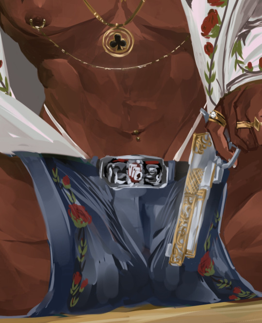
Because I understand denim fabric and because I looked at the jeans I wanna reference prior, I know that those folds/lines tend to be where the legs connect/around the crotch area, so I know to put those there! If it were a longer pair of jeans, I would put those folds around the knee areas, since there’s where denim tends to bunch up!
I think it’s very helpful to spend some time looking at fashion images online and when you’ve picked your clothing, to really look and see where clothes *tend* to fold into itself when it’s made of a certain thing! That way, when you draw something puffy, you know what spots is puffs at and where it sticks to, or if you’re drawing something that clings, you can see what spots cling to the skin and was spots have a looser fit!
I tend to spend a lot of time going on Pinterest lookin at fashion pictures and clothing and saving the ones I wanna draw mammon in, so I’ve built up my understanding of how material works! I still have plenty to learn, but I’ve built up my observation skills to a point where I can trust myself to get down a certain material once I’ve found a good reference!
Hopefully y’all found this helpful!! The way I draw is very much messy and only really drawing what I think is important and letting myself and others “fill in the blanks” when it comes to finer, finer details! My thought process is to draw enough to get the point across, even if it ends up looking more painterly and less clean than it should LOL but I’ve come to enjoy the way I draw :P!!
Anyways thank you so much for the question, I actually really love talking about my drawing process! I don’t tend to do it often, so when I do explain things, I think I also end up learning things myself when I look at my own art and explain it to all of you guys!!
#asks#mammon obey me#I used mammon for all my examples LOL#my little model helping me out 🫶🫶#isn’t he so cute and helpful 😍😍#it’s cause I love drawing different fashion types on mammon#I love playing Barbie dress up with my man 🥰
37 notes
·
View notes
Note
Just wanted to say that I love your Human Bowser comic! I specifically loved the colors chosen for pages 42-47! They’re so nice and satisfying it’s kinda hard to describe! What’s your thought process when choosing the colors for a particular scene if you don’t mind me asking?
I'm not sure if you want the emotional answer or technical so I'll just go with how I know how to answer art questions:
First I have a set color scheme for the flat colors. This doesn't change, but the coloring i do on top of that does. For example: human Bowser has set flat colors that have not changed since page one. But as I learned new techniques I changed the effects/mapping i add on top of it.
I learned a lot of different coloring techniques between pages one and the current pages. At first i was nervous to change how I colored the comic and I had a LOT of new things I wanted to try and was worried people would be upset at the drastic coloring change. But thankfully all the feedback has been positive.
After I do flat colors I then will choose various color gradient overlays that I feel suit the mood of the page/panel. I like to use a lot of dark-to-soft-light overlays to add depth to the base colors. I also sometimes add gradient mapping, which is a art technique where a set gradient is added on top that drastically changes the tones. I usually put this layer at a super low opacity so its just a hint of change.
For lighting I currently love added bursts of light where i can, and then softening the colors of the line layer to make it look like the light bleeds over. Some softer glowing effects also help with this.
A big change i also did since the beginning of the comic is I now soften the line layer and color layers to give it that 'dreamy' look.
For the emotional side of things, when I pick colors my attempt is to think of what color pallet fits the mood/environment. I'm still learning when it comes to coloring (it's a weak point of mine for sure) but everytime i think i learn something new that will help with a scene I'm doing I try it out now.
One of the biggest things I'm doing right now is watching a lot of youtube videos on comic storytelling/layout/coloring to really try my best to get better.
I have a obsessive disorder/condition so I often need to be doing something with my hands. Either gaming, cleaning, or drawing. So I currently draw 3-4 hours a day after work (while listening to music or youtube) to keep myself occupied or I get antsy. It's why I tend to look like i work 'fast'. I'm not really fast at drawing, but I draw every day, and certain scenes/characters are second nature now when drawing.
I still make a lot of mistakes and have a ton of weaknesses but I'm loving drawing this comic a lot so I'm doing my best to fill in my knowledge gaps as I go. Clip Studio also has a ton of amazing assets/tutorials that really help and I highly recommend the program, especially if you struggle with perspective.
I hope this answers your question and wasn't too long winded 😭
34 notes
·
View notes
Last Seen Blogs
an-albino-pinetree
Just A Tree
sesamum
Inori Negai

littlewildearthchild
ashely earthchild

littlexhatter-blog
His Little Hatter

jack-jackofxall-trades
Jack-Jack Parr