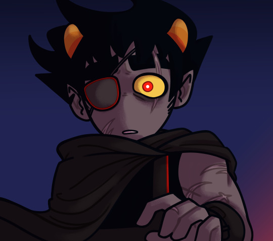
#lol at the size variation in the squares
Text
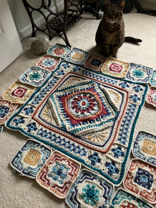
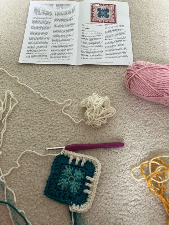
Theo is supervising the assembly of the afghan. Two squares left!! But I’ve only woven in the ends of 9 squares so far, so even after making these last couple squares I’ve got soooo many ends to weave in before actually starting to sew stuff together. After this there’s a nice thick border of mostly cream colored yarn, and some interesting textures. I know the border will take forever now that the project is this big, but I’m so excited to be done with the squares and see it come together.
#lol at the size variation in the squares#how can my tension be so irregular????#crochet#annie’s kit club afghan
10 notes
·
View notes
Text
SW Hades AU July Update
Other updates: May - June - July - August
I've made a lot more progress with my Star Wars meets Hades AU project than I'd imagined - and absolutely none in other aspects, so let's see how the past month has been!
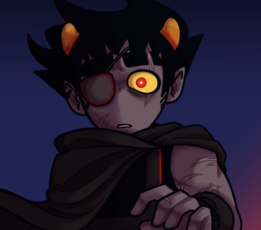
I have finished the character illustrations both for Maul

and Omega, (look how cute she is in her pocket sized version! ^^)

and I have also finally rounded out my Din collection, so that I now have 6 variations on his character art (helmet on and off, with Grogu and the darksaber, and with and without Grogu and the beskar spear in hand).

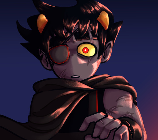
Aphra has lines and flat colours too, as well as the very basic lighting layers on her!

I'm real hyped to start working on her! I'm very proud of the dynamic pose I picked for her, too. I'll likely up the red in her jacket and gloves for a bit of a pop in colour, because all this brown everywhere is growing a little boring tbh. Like with certain other characters...
There has been some progress with Obi-Wan, but it's going suuuper slow, and I continue to preemptively worry about how I should completely redraw him for after his reunion with Cody, too. (Iirc Patroclus is standing with his spear in hand after he's reuinted with Achilles in Hades, and I also very badly want to draw him with his lightsaber ignited, but I feel that wouldn't be very good for him just, you know, hanging out in front of his little house on Tatooine...)

And now I'm going to add my first ever poll for the next month in case anyone wants to weigh in on the order in which I add characters to this project:
I'm making no promises, but I thought this could be fun :)
This post is growing a little long, so I'm putting the rest about Obi-wan's background re-draw, and some musings on picking colours for Omega under the read more ->
There was no room for it in the previous update, but I'd fully redrawn one background finally for Obi-Wan's chilling spot!
It is the same setup as where you can find Patroclus in game, with the walls and the chasm and the doors out, but I added Obi-Wan's hut and a desert envisonment. (I've watched so many videos on how to draw in an isometric grid, because there was always something that just wouldn't work... I'd thought there was a trick to drawing squares and circles in this grid that I just couldn't figure out for the life of me - and it turns out that I was just careless and my grid wasn't tight enough so I had to eyaball distances and the width and length of things too much lol.) And now I'm faced with the difficult task of picking colours and figuring out if the character shading tricks also apply here or not.

For now these colours are more for just to block in certain elements in the background, but I have some more desert/desolate looking backgrounds saved from other Supergiant games (they've got some really vibrant and dark colours, like wow!) as well to hopefully help me out moving forward.

I'd redrawn those bulbs you can find over the door leading out of various chambers in-game, because I might as well go in full re-design mode bit by bit, and after some deliberation and googling I picked the Mandalorian Crusaders symbol as inspiration for it.
And now back to Omega for a bit:

While I was working on the character illustration for Omega and Batcher I became very aware of how weird it is to pick colours for me. (I very heavily rely on preexisting colour palettes; I have multiple saved just for the Hades project like for Rex, Ahsoka, Cobb...) I'd been working on Rex and Cody last (Maul doesn't count because he doesn't have very human colours, so picking reds and purples and browns for him wasn't so shocking tbh), and aside from the armor paint and hair colour they very much share the very same colour palette. That was easy, I'd picked the skintones off Boba and the little portrait icons already, upped the saturation a bit because seeing the base skintone laid down scared me, and off I went.
(Laying down the first layer of flat colours is always super scary because they too often seem too dark and too grey/green, which I know will change after the complete shading is done but it still looks very off putting...)
So. The way the colouring in Hades made sense for me is that it works with pretty desaturated colours, there is a lighter shadow colour that's a bit more desaturated and the hue is shifted cooler but is still pretty cool to the original base colour (so much that I'd often have to turn it darker so that I'd see it laid down if I'm not sitting right), and another darker shadow layer that is a tad more saturated and warmer in tone. And there is also (a possibly slightly cooler shifted) and lighter highlight, and another more saturated colourful highligt (in the skin that is the bright, peachy orange for example). (and the little super bright pops of colour at the very very end. I hate adding them so much, but they are very important!)
But while I could pick the skin tones off of Rex, the problem I'd tumbled into was when it came to shading her hair (it's very important to me that Rex and Omega shared all these colours). Omega has a lot more hair (shocking, I know), and so shading that required a lot more than Rex's simple two-tones, and the "shadow" colour from Rex just didn't work, it was too saturated and warm in a larger quantity. So I tried to find another blond character in Hades, picked some colours off of Theseus... and those didn't work too well either, because those colours looked too pale and washed out compared to how lively her skintone was. There had been a lot of adjusting - I'd colour picked all of Theseus' colours and watched like a hawk where my colour marker moved both in hue and saturation a couple times in every which way and tried to mimic that in comparison to my base colour... and then you already saw how she ended up.
Here is the visual representation of the process:

I do a lot of these swatches.
You can see them there next to Omega with the blues and the gold/metallic detail colours (the latter of which I'd ended up using in her crossbow), and up above with the Obi-Wan wip as well (I needed to pick a lot of colours from Chaos and Aphrodite to figure out how to go about his pale skin), but I also worked like this with Din and Achilles in the beginning, as well as trying to pick the greens for Boba's armor. Usually the first and biggest hurdle I run into is choosing my base colours... that's something I really need to work on; but after that this method really helped me feel a lot more comfortable with cell shading.
I hope it made sense to you, and it was at least a tad bit entertaining (or if I'd ruined the word "colour" for you for a while, I'm sorry XD, I know I'd used it a lot). This was really the first time I'd truly seen how I changed around the colours I worked with in a piece, and also tried to go a bit more consciously about shifting them around here (that's why I have all the screenshots XD) and thought I might as well share them here in this monthly update.
I've also switched over to using CSP and a display tablet, in the hopes that I can familiarize myself with them without the pressure of needing some fancy or very specific brushwork and work process. No texture, little need for pressure sensitivity - I hope to slowly pspsps my brain into accepting working with these, and build up some success and good experiences before I try sketching and drawing on it and maybe trying out some new unfamiliar brushes as well ^^;
#my art#hades au#hades au update#long post#doctor aphra#obi wan kenobi#star wars#star wars fanart#sw fanart#din djarin#the mandalorian fanart#wip#work in progress#artists on tumblr#look I'm only like 2 days after mid-month I'm keeping on track wth these updates!#3rd month in a row hooray!#I won't make a habit of making the update so rambly this is an exception#I'm just oracticing putting my thoughts down in a somewhat coherent manner#since I stopped writing that has become somewhat difficult ^^;#I've never done any so this will be A First
126 notes
·
View notes
Text
How i make my drawings
Hello! Since @wolfsune09 asked how i make my shading and all that i decided to make a little tutorial on my shading style! (I draw in Clip Studio Paint)
Also english is not my fist language so i'm sorry if i make any mistakes or say weird sentences!
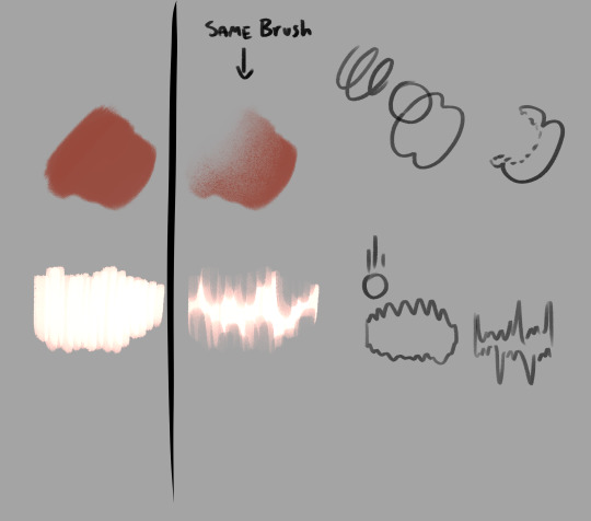
So let's start with brushes:
The brushes i mainly use are The Calliflakes brush, Soft square brush, and the regular Turnip pen and Design pencil from Clip studio
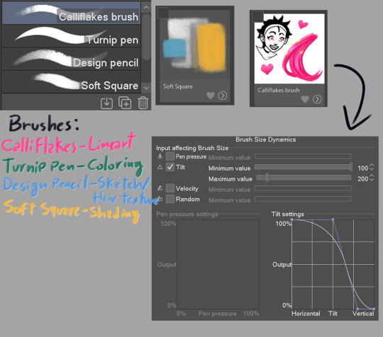
These brushes are like, MY LIFE i love them so much dfjsdbfhbsdb
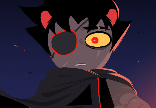
Anyway, the drawing i'm making is a screenshot redraw of a homestuck panel because i can
Get homestucked lol
Anyway after the sketch i make the shading plans, they are really important and will basically dictate if the drawing will be good or not

always make sure the light direction is the same throughout or else it will look lackluster, think about the character in they're primary forms(head is a square, torso is also a square, nose is a piramid etc.)
Now is the real kicker, plan the reflective light (i can't explain it really well so researching it is a better option)


I like to see the light sources with their correct blending modes before drawing to check if the colors look ok
In the end, the objective is to make it so the drawing still holds up without the sketch, if the light makes the pose readable, it's all good to go
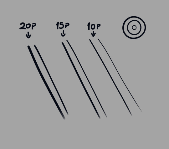
Finally, it's time for the lineart, i made the Calliflakes's brush change in size depending on the tilt, this is great for a dynamic lineart and a crunchy look
I usually use three sizes in the lineart, the main size, a medium size to make more detailed parts, and a smaller one for when i need even smaller details, tho it's good to use it sparingly since it might make the drawing look unbalanced
Also, i usually don't use black in my drawings, mostly because of the shading process
Looking good!
Now it's time for the flats! This part is pretty simple, this ios also the part where i paint the lineart, i ONLY paint parts that are INSIDE the silhouette, mostly to make everything blend more and also becuase i like it :)
What a handsome fellow!
Alright now for the part you came here for, the shading! Alright, remember the shading plan? Use that as a base for the actual shading.
First, since this drawing is in a dark place, i grouped the whole drawing in a folder, then made a multiply layer with the color closest to the original image, then i clipped it to the folder(this is a very common thing here)

(I didn't shade the eye since it is the main point of focus of the drawing)
Now let's see it with the lighting plan
nice
Now let's talk soft squares and design pencils
The way i shade with the soft square is that i make it mostly cell shaded, then i come with the same brush but transparent, and i VERY CAREFULLY make circular motions to erase part where i want the shading to make a gradient effect, the key to a good shading job is balancing the sharp shadows with the soft ones
Now with hair, i use the design pencil, i basically just make a bunch of close streaks, almost like painting with a paint brush, after that i make streaks with the same pencil but transparent, making variations in lenght so it looks natural and organic
Alright time for the first shade pass, this one is for the more general shadows, so it won't look that dynamic
Now you can see where the shadows are lacking and make the second pass to deepen the shapes
(P.S: all these layers are the same color, they are in multiply mode)
Alright time for the star of the show! The lights!!!
Using the shading plan i refined the shapes and put it on the add(glow) mode, a good tip i have for this stage is to make shapes shapes shapes! Also remembering that the farther the thing is, the least bright it will be.

Oh my! That changes the whole vibe!
Now i saw the hair was a little boring looking, so i added an extra layer of airbrush to make it more dynamic

Actually fuck it, time for some finger tip smudge
Now we're talking.
Alright, now it's time for the reflected light, make sure it's not too bright unless it looks like a second light source, also this layer is in glow dodge mode!
We could say it's done as it is...
BUT NOT BEFORE THE COLOR DODGE
It looks so muck better now! But that's not all!
Now that we have this beautiful boi, it's time for the finishing touches! These make ALL the difference in the drawing
There we go!
Well now it's my favorite part... the FUCK AROUND AND FIND OUT part!
This is where you add all the textures and special effects! I like mostly using a noise filter (so AI can't steal my stuff) and achromatic aberration, also adding some ashes and a nice metal texture in the background to make it nicer looking

Now, this is technically finished, but if you want to go the extra mile, you can do some color correction, i like doing it to give more contrast, also to make the piece more balanced, i also added some extra details on the eye and a blur last minute

And it's done!
As you can see my process is a little all over the place, but that's the fun part of drawing for me! It's always an adventure where you never know how it's going to end!
Anyway hope this helped at least a little!
#art tutorial#art advice#? kinda#homestuck#homestuck 2#commander karkat#shading tutorial#rendering#long post
97 notes
·
View notes
Text


Once again
LBT-1961AF Chest Rig, Gen.1, OD Green, 2002 Buckles, No Labels
Very similar to the AWS Strike Vest in terms of layout and construction, but definitely loaded with lots of little force multipliers and creature comforts that make this rig more contemporary despite being a 20+ year-old design at this point.
More capacity for mags, an 'okay' map pocket, and lots of additional pouches really push the format to its limit for the overall size. If one were to make a swiftclip-able/PC placard-style version of this design, it would not be out of place in the modern age.


The outer radio pockets each have a generously-sized utility pocket, which have a removable elastic 'lid' to use as a dump pouch as well as a small frag grenade pocket on the inner sides.
The rig has four double M4 mag pouches (holding 8 mags total in the dedicated pouches) and a double pistol pouch that can either hold two double stack or four single stack mags. Also good for holding multitools.

The 'AF' in the designation refers to 'Air Force' as this variation of the LBT-1961 was designed with three dedicated pockets for MS2000 Strobes for CCT guys to mark landing strips.
Also notice how the flaps are sewn with a box stitch to hold the velcro in place - later generations of these rigs would sew the flap velcro with a third horizontal line rather than an 'X' shape.

Inside the map pocket, there's an 'envelope'/EDC style holster that simply velcro's in place. An extended 'wing' off the leading edge of the holster holds one or two extra mags.
Honestly, this is probably the least usable feature on this rig given how awkward it is to access. Still neat that it was included all the same.

The H-Harness, while simple, was revolutionary for the time and elements of which like the velcro-adjustable rear cross-strap can still be observed with modern chest rig designs. The cable management flaps aren't spectacular, but it's good that they're there.
Note how the rear ends of the shoulder pads are 'squared' and simply terminate to 1" webbing, rather than folding off to the sides - this is another one of the ways you identify these as Gen.1 rigs.

Copious amounts of drain grommets on all the pouches.
It's very jarring to notice the difference in pricing for these rigs depending on the color you have - for instance, the 'pinky tan' versions of these oldschool rigs were used extensively by Navy Seals and AFSOC and currently go for several thousand dollars when they pop up.
But because this one is OD, and almost nobody has been seen using them, they're only worth about $300 at most and I actually ended up trading a helmet for mine lol.
#oldschool gear#vintage tactical#chest rig#lbt chest rig#london bridge trading#lbt-1961af#od green#special forces
6 notes
·
View notes
Text
Current WIP blankets!
I’ve been doing a lot of blanket-making in quarantine. Before April 2020, I had made a single blanket in my entire knitting/crocheting career. In 2020, I made four blankets and started five others!!! I have a friend giving me a lot of grief (in a loving way) about how many unfinished blankets I have laying around, and I took some photos to show them, and decided to turn it into a whole post because I never post anything original here. I’ll have to do a post about the ones I finished last year soon, too, because I’m really proud of them!
(Please don’t mind the mess of yarn on my floor; I was in the middle of reorganizing some of it when I took these photos. Also, my room is generally messy, don’t judge me.)

Ten-stitch blanket
The only knit blanket I’m working on right now! I’m about three cakes into this blanket, and am consistently surprised by how big it is every time I pull it out, because I don’t know when the last time I worked on it was (oops). I’m using Caron Chunky Cakes in Rainbow Jellies!

Granny Stripes
This blanket is absolutely massive. It’s over 8 feet wide and being worked flat, since it’s granny stripes. I’m using Red Heart Super Saver Stripes in Retro Stripe. I have a total of 33 skeins (I think) for this blanket. I’m only getting about three inches out of each skein, if that, so I honestly hope that it’s enough to make the whole blanket!!! I’d love to do some matching throw pillows for it at some point, but we’ll see if I ever get around to that lol. First I have to finish the blanket, anyways.

Granny Rectangle
This is a Yarnspirations pattern for Caron Chunky Cakes yarn, although I fully intend to make the blanket larger than what the pattern calls for. Since this photo was taken, I’ve worked on the blanket, and it’s noticably bigger already! I’m aiming for it to be the next one I finish. I’m planning to use about 9 cakes in the end (unless the rectangle-ness of the pattern makes it an absurd size with that many) even though it only calls for 5, because I like giant blankets. I’m currently finishing up skein 4, and it’s getting to a very comfortable lapghan size! I’m using Caron Chunky Cakes in Sweet and Sour.

Corner-to-corner Scrap Blanket
This is the third scrap blanket I started in 2020 (the other two were Not-your-granny’s square blankets) and the second c2c. When I was trying to figure out how exactly to use scraps for a c2c, I decided to just collect all of the yarn I wanted to use for the blanket and sort it into two piles, putting balls/skeins of yarn that were about the same size into each pile. I also have a few pounds (one-pound skeins I was gifted during spring cleaning at work in 2019) of some less-than-gorgeous green yarn that worked really well with many of the other colors I had pulled for this blanket, so I’ve been doing single-row stripes of that between every other color I use. When bringing a different shade of green into the blanket, I’ve been doing a stripe of the tie-in green, a stripe of cream or purple that I also have an insane amount of, the new color of green, and then another row of cream/purple before the buffer row of green into the next color. (You can kind of see where I used the cream between the grean and the cream/green/teal variegated stripe, and purple before the final very dark green stripe at my working edge). The blanket is currently about 4.5 feet-ish wide? and I’m aiming to end up with a 6x6 foot square at the smallest, because that’s about the size I aim for for my own blankets and the friend I’m making this for is taller than me!!! My scrap yarn (which isn’t entirely scraps, but is also just some leftovers that I don’t know what else to do with and yarn for abandoned projects that got absorbed into this one) is actually going a lot further than I thought it would, so hopefully this turns into a giant, cozy blanket!!!


Granny Square Quilt
Confession time: I love Caron Chunky Cakes yarn. Sure, it has a lot (and I mean a LOT) of flaws, like a lack of consistent strand weight, differentiation in colors within the same dye lot, variation in color order in skeins, and the fact that there’s at least one break where the yarn has been knotted together in EVERY cake, but it’s soft, comes in pretty colors, and is fairly hardy. The first quarantine blanket I made was out of the Ballet Sorbet colorway, and I’ve slept with that every night for several months (with a break over the summer because of the heat!) and, while it’s a little fuzzy, it’s not in particularly bad shape. Also, I machine washed AND DRIED it and it held up amazingly, so I really can’t complain.
I’m using all my Chunky Cakes scraps from other blankets (plus the blues/turquoises, which were leftover from a blanket my mom made) to make a granny square quilt. I can get two of these squares (often with a tiny bit left over) from each color stripe in a cake, so I can get about 18-19 squares from a single cake. I have 74 made as of this picture (I’ve made a few others since, but not many) from the colorways Ballet Sorbet, Cherries Jubilee, Blue Moon, and Bumbleberry. I need somewhere between 144-290 squares for the blanket I want to make (144 for a 12x12 square quilt, but I’m aiming for a giant one that’s more like 15x18) so uhhh I’m not even close. But they look really pretty all sorted out!!!
What have y’all been making lately? What are some of your favorite projects/finished objects from 2020?
#knitting#crochet#granny square#granny rectangle#caron chunky cakes#caron cakes#caron yarn#c2c#c2c crochet#corner to corner#granny stripes#retro stripe#red heart yarn#small potato knitwear#wip#blanket#afghan#ten-stitch#ten-stitch blanket#scrap blanket
24 notes
·
View notes
Photo

This was to practice body, shape, and silhouette variation. Who better than the Dragon Riders! And this is canon to Legacy as to what the riders are gonna look more like. My headcanons of course lol
Hic is lean with a more rounded square shape. Also tol of course!
Fishlegs is of course round and board. Don't let his softness fool you. He is the strongest person on Berk.
Tuff is more oblong and skinny. Pretty much the same as in canon body type wise. He also got pointed ears now ;3
Snotlout is square and buff. May get a belly down the road but that's more to love! He's short but his crown is tol!
Astrid definitely is more muscley than in canon. I need to work on that lol. But she has hips,thighs, and booty for daaaays
Ruffnut is slim, near identical to her brother with clothes on. She too has pointy ears. Her breasts are slightly different sizes, still a hottie tho!
I'm definitely gonna do these again down the road. And with their future kiddos!
#how to train your dragon#httyd#dreamworks#hiccup horrendous haddock iii#Fishlegs Ingerman#Tuffnut Thorston#snotlout jorgenson#astrid hofferson#ruffnut thorston#small artist#artists on tumblr#Character Design
18 notes
·
View notes
Text
Star Trek Gold Key #26: The Perfect Dream
Our issue begins with a bang. A planet-sized bang, to be precise.
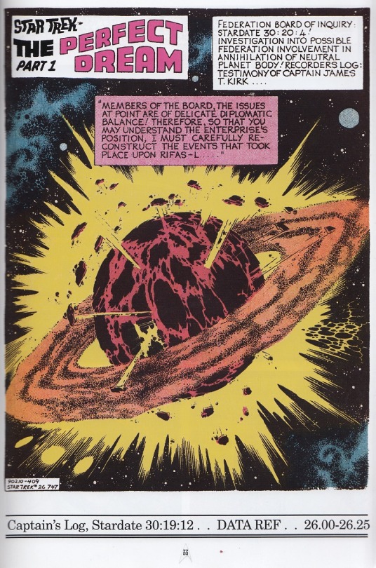
[ID: A comic splash page showing a ringed planet exploding in space. The title in the upper left corner reads Star Trek—THE PERFECT DREAM Part 1. Narration box one: “Federation board of inquiry: Stardate 30:20:4! Investigation into possible Federation involvement in annihiliation of neutral planet body! Recorders log: Testimony of Captain James T Kirk...” Second narration box: “Members of the board, the issues at point are of delicate diplomatic balance! Therefore, so that you may understand the Enterprise’s position, I must carefully reconstruct the events that took place upon Rifas-L...”]
Evidently Kirk is in some trouble about this, since he’s explaining it to a Federation committee. Y’know, they’re supposed to seek out new life and new civilizations, not blow them to smithereens. Bit of a faux-pas, that.
In flashback, Kirk describes how they found this weird planet, or at least something that looked like a planet, but was a bit lacking in some typical planet characteristics. Such as being in a solar system. Or being in orbit. Instead it’s just moving across space in a straight line, Great A’Tuin style, with all its light and heat apparently being provided by its rings.
Well, what’s a crew to do when confronted by a mystery planet but beam down to it and check out what’s going on. Kirk beams down with Spock, Sulu, Chapel, a redshirt, and...Uhuru?

[ID: A landing party consisting of [left to right] Kirk, Spock, Uhura, Sulu, a balding redshirt man, and Nurse Chapel, partway through beaming into a grassy space with some trees and rocks at the edges. Kirk’s narration: “The landing party I took down with me for observation purposes included Spock, Helmsman Sulu, Medical Officer Chapel, Communications Lieutenant Uhuru [sic] and Security Officer Manning!”]
As they start to look around the landscape, Kirk reminds everyone to be careful since they don’t know much about their surroundings, and Spock is like “lol humans can’t just appreciate something beautiful can they.” Immediately after he says this, the group is attacked by a wild mountain lion. Let that be a lesson to you, Spock.

[ID: Four square panels arranged in two rows of two. First panel, Uhura is saying, “Captain—it’s beautiful! I’ve never seen anything like it!” while Kirk, in the foreground, says, “Yes, stunning! Still, all the beauty could be hiding something—be alert!” Second panel, Spock, Kirk and Uhura are on the ground while the viewpoint shows a beige mountain lion-like creature poised in a tree branch above them. Spock: “Captain, I fail to grasp why humans cannot face beauty without doubting or destroying it...or both!” Third panel, the creature pounces onto the redshirt man with a “RRRROOOWWRR!” Sulu, in the foreground, is saying, “Manning! Captain! A carnivore attacking Manning!” while from offscreen Kirk says, “Set phaser on stun, Sulu, fire on my command!” Fourth panel, Sulu and Kirk fire their phasers onto the creature with a shout of “Now!” from Kirk, knocking the creature off of Manning.]
As if alien mountain lions weren’t bad enough, a giant flock of SPIES OF SARUMAN black birds also shows up. Uhura is somehow able to identify them as ‘like Earth ravens, but carnivorous’ from a distance.
Luckily, before our hapless crew can get Hitchcock’d, they’re rescued by a crowd of...Japanese people…? They yell at the Enterprise crew to drop to the ground while they take care of the birds.
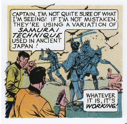
[ID: Three people in samurai-like armor and one in a short tunic fighting off birds and lion-creatures with katanas. In the foreground Sulu is saying, “Captain, I’m not quite sure of what I’m seeing! If I’m not mistaken, they’re using a variation of samurai technique used in ancient Japan!” and Kirk is replying, “Whatever it is, it’s working!”]
Ah yes, the ancient Samurai technique of ‘hitting birds with swords.’
Once all the birds have been driven off, the newcomers politely invite the crew back to their city, where they can treat their injuries with healing balm. Chapel gets unnecessarily hostile about this and snaps that, “I’m quite sure I have the proper supplies to care for my own patients, thank you!” Calm down there, Chris, they don’t know you’re a doctor.
So the crew take a hike back to this city with the mysterious Anachronism People. On the way, Spock and Kirk note that there are farmlands nearby, but they’re only cultivating wild growth instead of developed land, which they find odd since a planet this plentiful isn’t where they would expect to find nomadic farming. After all they’ve been there like, a whole five minutes, which is definitely enough time to do an in-depth analysis on local agriculture possibilities.
But the farming ruminations will have to wait, because they soon arrive at the city.

[ID: A large panel showing the Enterprise crew along with their armored guides approaching a Japanese-styled city by a river. In the background are indistinct shapes of buildings beyond an arched bridge over the river, with mountains in the distance; in the foreground is a while building with red roofs, where a woman in a short pink tunic is standing on the steps saying, “Welcome, travelers! I am Oshino of the Third Dan! This the imperial city of Shondo Ho! Come! We have quarters waiting—Yamoto saw your arrival!” Uhura is saying to Kirk, “Captain, it—it’s perfect! It’s like those enchanted cities I vid-sorbed as a child!”]
Like the what that you what now
Oshino introduces them to a guy called Ekoe of the First Dan, who’s supposed to ‘see to their needs,’ which he does precisely none of in this story but never mind that. Once installed in some guest rooms, Kirk and Spock talk over the situation. Spock thinks this is all weird because the people seem to be living in total perfect harmony with their surroundings, which he’s quite sure humans aren’t capable of. Really? That’s what you find weird about all this?
Kirk has a slightly more salient point: he’s noticed that of all the people they’ve seen so far, he’s only seen six distinct faces. It’s rude to call out the artist like that, Kirk. Anyway Kirk says he’d think maybe that meant everyone around here is an android, but they all show up on the scanners as human. Hm.
Oshino shows the group around the city some. Uhura notes that they all seem very relaxed and not rushed, and asks what their lifespan is. At this Oshino acts confused and says she doesn’t understand what this ‘lifespan’ thing is because they are ‘of Yamoto and the moment.’ Ekoe jumps in and says that maybe they should be thinking more about what happened before and what will happen after, for which he gets chastised for asking questions he’s not supposed to be asking. How, exactly, these people have managed to build up a society with agriculture and a developed city when they have no concept of past or future is...well, that’s, uh, that’s quite something.
But apparently asking “what happened before right now” is a hanging offense around here, because Oshino rats Ekoe out for incorrect thinking to some guy she calls ‘clan father’ who says that Ekoe’s going to have to be ‘dealt with’ for that. But not right away. We can have some dramatic passage of time first.
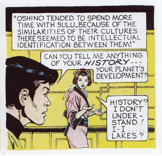
[ID: Sulu talking to Oshino, an Asian woman wearing a short pink tunic with flowers in her hair, inside a building with yellow walls. The narration box reads, “Oshino tended to spend more time with Sulu. Because of the similarities of their cultures there seemed to be intellectual identification between them!” Sulu is saying, “Can you tell me anything of your history—your planet’s development?” Oshino says, “History? I don’t understand! I—I...lakes?”]
LAKES?
Oh yeah, sure, Sulu’s from 23rd century Earth and she’s from an alien planet vaguely emulating ancient Japan, but their cultures are just alike!
Turns out this whole ‘lakes’ thing is Oshino getting a vision of something happening previously—aka ‘remembering’--specifically a bunch of people rising out of lakes. Huh. Weird. She shrugs this off and asks Sulu to tell her more about where he came from, so he tells her about concepts like ‘night’ and ‘stars’ and ‘other planets’. I’d fear for the Prime Directive, but I think that got busted quite a while back.
Meanwhile, Spock sees Ekoe constructing a cute little model house, but when asked about it Ekoe says that obviously he couldn’t be constructing anything because he’s a First Dan and his functions don’t allow for that. Then he destroys it in a rage. A...weird rage.

[ID: Ekoe, an Asian man in a belted green tunic with a green wrap tied around his hair, sitting at a table and angrily knocking apart a model house, saying, “What is this? This is merely a semi-quadrainial, psi-sided convertional nothing!” Behind him, Spock is standing with one hand thoughtfully on his chin, thinking, “Curious! Ekoe is unlike anyone we’ve met here...”]
A semi-what what-sided convertional what now?
Spock notes that Ekoe stands out around here, not just because he speaks in weird gibberish, but because he alone seems to be unsatisfied with his role in life and is questioning the whole society. When questioned Ekoe reveals that he also has the magical skill of ‘seeing the past’ but his memories don’t make any more sense than the lake thing.
Kirk takes Uhura and Sulu out to scout around for a bit. And he’s giving a captain’s log...during a flashback? Sure, okay.

[ID: Kirk, in the foreground, and Sulu and Uhura in the background, exploring a grassy wooded landscape. The narration box reads, “Stardate 30:19:15...continuing with our data collecting on Rifas-L...We have set out to explore surrounding wild areas!” Kirk is saying, “Sulu, I want samples of that glowing ore over there sent up to the Enterprise for analysis!” and Sulu replies, “Aye aye, Captain!”]
Sulu, I wouldn’t get too close to that glowing ore if I were you.
While poking around, Uhura notes that nearly all of the flora around here has food value, which allows for the prosperity the local people enjoy. Kirk also mentions that he hasn’t seen a single child anywhere around, causing Uhura to posit the existence of some kind of child storage institution.
Spock, meanwhile, is off somewhere else, wiping out the local wildlife.
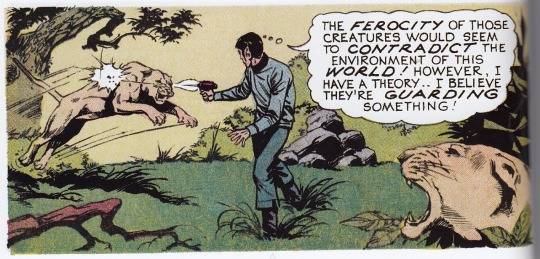
[ID: Spock standing in grass, shooting his phaser at a lion-creature leaping towards him while another one snarls in the foreground. Spock is thinking, “The ferocity of those creatures would seem to contradict the environment of this world! However, I have a theory...I believe they’re guarding something!”]
Leaving a trail of dead carnivores in his wake, Spock eventually happens onto an isolated building which is giving off weird ‘life force emanations,’ so naturally he goes inside to take a look. Evidently someone went to the trouble of getting a bunch of lions to guard the place, but didn’t think to put a lock on the door.
Back in the city, Kirk is talking about wrapping up this whole venture soon, when Ekoe comes in with another model house and asks if the Federation might have a place for him (and his little houses) somewhere, because he doesn’t fit in around here. Before Kirk can respond to this, a bunch of armed guys (whom Ekoe refers to as ‘collectors from the Garden of Eternity’) burst in to arrest him. Turns out Ekoe doesn’t fit in so much that he’s going to be executed for being a ‘mental deviant.’ The crew tries to save Ekoe, but sadly they’ve misplaced all their phasers—apparently--because they’re forced to resort to whacking the armored guards with their bare hands, which doesn’t work out so well.

[ID: Sulu ridiculously chopping a man in samurai-like armor with the back of his hand while exclaiming, “She’s right, Captain! We’ve got to stop them long enough to make them listen!” In the background, Uhura is pushing over another man in armor.]
Eventually Oshino bursts in and gets huffy at them for interfering in something they know nothing about, and tells them that if they don’t stop fighting they’ll get executed too. So the Enterprise crew just has absolutely no choice but to watch Ekoe, along with some other ‘deviants’ and the elderly, get hauled onto an execution platform and, well, executed.
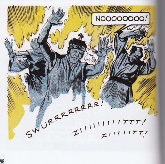
[ID: Three figures, one of them Ekoe, holding their hands up and crying, “Noooooooo!” while being incinerated with “swurrrrrrrr! Ziiiiiiiiittt! Ziiiiitt!” sounds.]
swurr ziit ziit indeed
Poor Ekoe! We hardly knew ye, and yer little houses. Also that execution platform seems mighty high-tech for this society. Does anyone make a note of that? Of course not.
Well, so much for this whole ‘perfect society’ thing. Uhura tries to explain to a confused Oshino why they disapprove of killing the unusual and elderly, prompting Oshino to have another attack of memory. This is observed by the clan father (I think—it’s pretty hard to tell who anyone is in this art style), who notes that Oshino is starting to get all deviant-y too.
Meanwhile, Spock, exploring the mysterious building, makes a shocking discovery—a cloning lab! That’s right, the identical people with no children are all clones! Man, who could’ve guessed.
While he’s looking around, he’s interrupted by Yamoto himself, who introduces himself as the creator and overlord of this world, which actually isn’t a planet but a giant spaceship (there are a surprising amount of those knocking around the galaxy). Evidently this is all just some big socio-scientific project of his, the reasons for which we are left in the dark about. He just wanted to make a planet, I guess. Anyway, he shows Spock around, talking about how he’s genetically programmed all these clones into three perfect ‘classes.’ Then he zaps Spock with a paralysis ray and says he’s gonna take samples from him to make a whole new, even better class of clones. I dunno how well an entire society of Spocks would function, but I guess Yamoto hasn’t known him very long.
Back in the city, the guards have burst into the room once again, this time to take away Oshino and those dang Federation newcomers who have been causing unrest. Fortunately this time Kirk and his crew have their phasers on hand and are able to take them all out in about two seconds. Kirk tries to call up Spock but can’t get an answer, so he proclaims that they’re going to find Spock—going to, one might even say, search for Spock—and then get the hell off this weird not-planet. Oh, and Oshino can come too if she wants.
Oshino thinks Spock might have gone to the ‘Palace of Life’ so she leads the crew there, taking out yet more lions on the way. Geez, those things must be respawning somewhere. In the lab, Yamoto has successfully taken all the cell samples he needs, so now it’s time to get rid of Spock. Luckily for Spock, Yamoto is distracted in the nick of time.

[ID: Spock laying on a table looking up at Yamoto, a man wearing a green tunic with very large yellow sleeves and a black flat cap, holding a phaser. Narration: “Suddenly...” Yamoto: “Intruders!” Spock, thinking: “He’s distractred—my Vulcan healing abilities have overcome the paralysis! I must act now!” A screen in the background is flashing and going, “woo-ah woo-ah woo-ah.”]
WOO-AH WOO-AH WOO-AH
The crew have found the Palace of Life and make their way inside, where they discover the Terrible Secret. Oshino reacts...not super well.
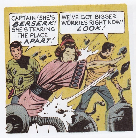
[ID: Oshino attacking and destroying machinery with one hand. Sulu, behind her, is saying, “Captain! She’s berserk! She’s tearing the place apart!” Kirk, looking offscreen, is saying, “We’ve got bigger worries right now! Look!”]
Yamoto sends some security robots after the intruders, but they’re easily dispatched. Spock shows up and suggests they perform an expeditious retreat—but before they can, Oshino grabs Sulu’s phaser and runs off deeper into the compound on a quest for vengeance. Kirk is reluctant to let her go, but she blocks the doorway behind her (with a bunch of giant boulders that conveniently fall from the ceiling), so they have no choice but to leave her behind. They run outside, where the collectors have caught up to them, but a quick beam-up solves that problem.
The Enterprise runs away, and Kirk narrates to the board what he thinks happened next: Oshino found Yamoto, kills him, and then presses a button that makes the whole not-planet blow up. Yeah, just one button. Evidently this place was designed by Dr. Doofensmirtz.
Kirk tells the board that clearly, Federation intervention can’t be responsible for what happened to the not-planet, even though Federation intervention was directly responsible for what happened, because it would have happened eventually anyway. The board is like “cool” so everyone leaves, but on the way out they’re interrupted by a space janitor.

[ID: Two panels. In the first, a man in a blue shirt and green cap is approaching Kirk, Spock, Uhura and Sulu as they exit a room, holding out a small model building to them and saying, “Captain Kirk, will you look at this! The space scooper picked it up as it was cleaning up Rifas-L...survived the holocaust like a straw in a tornado! You wouldn’t know what it is, would you?” Spock replies, “I think I can answer you, sir!” In the second panel, Spock, in the foreground, says, “It’s quite probably a semi-quadrainial, psi-sided, convertional nothing!” while the man looks shocked in the background. THE END is written in the lower right corner.]
Space...scooper?
I’m not sure if Spock’s end comment there is supposed to in some way be meaningful or pithy but it...it...yeah. One would expect something like “oh, a fragment of a civilization now lost, the last remnant of a man who had great hopes and dreams but is now gone and remembered by almost no one, let’s keep it as a reminder of this great tragedy” but no, Spock just smirks and spouts out a comment that seems snarky but doesn’t actually mean anything and walks off. At the risk of actually seriously analyzing these comics—most certainly a hopeless venture—this is a strong example of how shallow the writing in them is. There’s a sense to me here of someone trying to mimic good writing without any idea of how it actually works, so instead of actual emotional beats you just get this sort of weird nonsense. “Oh, it’s really clever to end a story with a smart call-back, right? This is clever, right? Right?”
I do love the space janitor’s mustache and look of comical surprise there though. And the idea that a straw surviving a hurricane is anything like a tiny model house surviving AN EXPLODING PLANET.
So that’s the end of that story. It’s probably racist? But to be honest I’m so confused at this point I wouldn’t even know where to start on that one. The moral of the story is, uh...don’t...make clones? Sure. Let’s go with that.
#star trek#star trek Gold Key#recap tag#star trek Gold Key recaps#GK 26 The Perfect Dream#GK 26 The Perfect Dream recap
27 notes
·
View notes
Text
Typografika Title
I really want to push this idea and further develop the layout of the individual characters. I want to fit the characters like they were a jigsaw puzzle becaues right now, they look too haphazardly positioned in accordance with each other. Here are some titles/type design I find super interesting from Behance (the links are all saved in an M&M moodboard folder):


I’m thinking, because the variation in this title lies in the actual style and tyepfaces, the constant that should ground all of them is the size (not just point size but the actual size of the characters’ outline):
Like thisss:

Creativity within constraints: let’s see how we can fit everything nicely within this square.

Lol well that didn’t really work did it XDXD
let’s keep experimenting


^Hmm I don’t want the A to be by itself...

^Nah it seems to boring idkkk, maybe I’ll break the rule and scale each character differently.

^ lolol I’ve spent too much time jamming out to the bee gees and the police with my dad but im back and here’s a more interesting layout of the characters - I will develop this tmr but rn i need to sleeeeeeep.

^Is it too difficult to read?


0 notes
Text
how i make moodboards!
If you want to start making aesthetics/moodboards, you’ve come to the right place! Under the cut is a foolproof step-by-step plan I always follow to make them! Trust me lol, I had to figure all of this out myself.
Step 1: Choosing a theme
The great thing about moodboards is that they can be based on so many things! The possibilities are pretty much endless. Typically, the theme of a moodboard is one of these, though:
* an object
* a period of time (ie. months/seasons)
* an event or historical occurrence (concert, women’s march, etc)
* a color scheme
* a specific aesthetic (ie. vintage, artsy)
bonus: moodboards can also be based on people’s names, which I find to be extremely cool!
Step 2: Collecting images
what pictures do I choose?
If you’ve taken photographs you’d like to include in a moodboard, that’s always a really good option! By doing that, you’re ensuring no one will get mad at your use of their photo in another post. What I typically find to be easier, though, is searching Tumblr or Google for photos of the theme I’ve chosen. (Tip: A good way to find nice, good-quality pictures of what you’re looking for is to add “aesthetic” at the end of your search.) Make sure to choose photos that go well together; usually, your moodboard will look nicer if the photos in it are similar in color/style.
how do i save images?
Usually, I get all of my photos from Tumblr. On mobile, there’s a very easy way to save pictures that you’d like to use in a moodboard (or just in general). Simply select the image by pressing and holding your finger to the screen, and your phone will give you the option “Save Image.” Voila! Your image has been saved!
stealing??
Important!! If you find a post that explicitly states “do not repost,” please don’t! It’s extremely disrespectful to them and their work. It’s sort of a known rule that you shouldn’t repost someone’s art, too, even if the caption doesn’t say anything against it. There can be exceptions, though, so if you’re worried about stealing art it’s always better to message the artist and ask for permission. I’ve posted art in moodboards before, but I’m always selective about the art I choose. Try not to do it at all if you can help it.
how many photos should I save?
You’ll need nine images to fill a standard moodboard, but Tumblr allows you to post 10 at a time. I always like to pick out around a dozen pictures just in case some end up not working out.
important note:
I didn’t realize this for so long, and I’d like to save you from the sinking realization that your moodboard isn’t a perfect square. It might just be something that bothers me, but there’s a definite way to ensure your board is perfectly positioned, and it’s just about picking the right pictures. Make sure you never choose any photos that are too wide and short to be a square. If the photo is too long vertically, that’s fine, because Tumblr will automatically format it to a square (so long as at least one image in the row is a square).
Step 2.5: People (Optional)
You also have the option of basing your moodboard off of a person, whose picture is typically included in it. Because my account is specifically for Dodie, all of mine are centered around her! You pretty much use the same process as you would finding any other picture, but it can sometimes be harder to find a picture of that person that fits your theme. If so, no worries! You can always edit the coloring of images, improvise with another picture, or change the type of photos you’re getting! (An example of the latter: changing the shade of pink you’re using, or the theme altogether)
Step 3: Formatting
Now that you’ve gotten your pictures and theme sorted, it’s time to put everything together! This is usually the point where I start to realize none of my pictures go together— If that happens to you, take a short trip back to Step 2 and get pictures that fit better.
As I mentioned before, a standard moodboard consists of nine pictures, arranged in a 3 x 3 form. However, it isn’t just “stick them all in and you’re done.” For me, at least, it definitely takes a bit of time to arrange everything the way I want it. I try to separate pictures that are too similar or have too many of the same colors because they can be distracting if they’re clumped in one spot. For example, this is a rose-gold moodboard I made the other day:

As you can see, the photos surrounding Dodie are all a little more pink than the outside ones are. I placed them like this to make it seem more intentional and symmetrical, and this way none of the pink pictures touch.
Step 4: Phone a friend (Optional but recommended)
Now, listen. This isn’t to criticize your work in the slightest, but you’ve been looking at the same set of photos for God knows how long. It always helps me to get a fresh pair of eyes to check the moodboard over. Usually, if anything’s wrong it will pop out immediately to your friend, because they’ve never seen it before (plus they didn’t make it!). They’re the betas of your work, and though it isn’t necessary to have one, it’s always helpful to spot errors you haven’t thought of/seen. If you don’t have anyone to check it over, I’d recommend leaving it be for a while. When you come back to it later, you might see things you hadn’t before. I tend to do the work at night and come back to it in the morning, but that’s just me! Find a system that works for you, and enjoy what you’re doing! That applies to everything in life, but like, you know.
edit: Many people also find it easier to use apps other than Tumblr to format their moodboards! They make sure all pictures are the correct size without the struggle Tumblr mobile presents. A life saver, @colorful-dodie, recommended Picsart, which I totally agree with! It’s what I use whenever I make split moodboards (look for a future post on that!) Also, they recommend you use Afterlight and/or VSCO to change the coloring of a picture!
Step 5: Tagging and Posting
(credit to @colorful-dodie for bringing this up!)
Tagging is quite possibly the most important part of the entire process! If you don’t tag your posts correctly, they may not get many notes and you won’t get the feedback and encouragement you need to make more! My advice: tag the heck out of all of your moodboards.
I will admit, I did go quite overboard in my first few posts (I spent more time tagging than making the moodboard!) but it was really helpful in getting my account discovered by other Dodie fans.
what should i tag my posts with?
Probably the most important thing to tag your post with is the topic or theme you chose, and the person or object you centered it around. That way, you can be found and supported by other aesthetic/fandom accounts, and it will motivate you to keep making your moodboards! Don’t be afraid to do strange variations of each and every tag, too- I spent my earlier evenings figuring out how else to say “dodie green aesthetic” and “dodie green moodboard” for a month before it really paid off.
so is it time to post?
Yes, if you’ve followed all of the steps listed above, you should be totally set! Good luck with your new hobby, and be sure to take advantage of all of the friends and tips it brings you! Have fun!!
46 notes
·
View notes
Text
Today for my lunch was a struggle I have to say, bc the other day I traveled to my fav restaurant JITTERS ON THE EAST SIDE OF JOLIET ! Long story long y’all , THEY DONT MAKE MY FAV CHICKEN CAESAR SALAD AND WRAP ANY MORE ! I was piss tf off , I was ready to square up on somebody . But think about ! Who won’t want to fight somebody after traveling 🧭 about 30 min from their house to get their all time fav chicken Caesar salad /wrap . So bc of tht horrible experience I am now gonnna be making different variation of my all time favorite da ..... Chicken 🐔 Caesar !
Today of day one, of my Chicken Caesar Series ! I made a chicken 🐔 Caesar salad wrap for one
(Dressing )
Combine lemon juice, oil, mayonnaise, garlic and pepper in a medium bowl (make enough for one )
2 us teaspoons lemon juice
1/2 tablespoon extra-virgin olive oil
1/2 tablespoon low-fat mayonnaise
* 1 /2 small clove garlic, minced
* 1/8 teaspoon freshly ground pepper
Add the 1/2 cup chicken, 1 cup lettuce and 1 T Parmesan to the bowl with the dressing; toss until well combined. Fill each wrap with the salad (about 3/4 cups for each wrap if your using two normal size tortillas ) and roll closed.
** Makes two normal wraps it STILL serves 1 SO CHILL TF OUT AND QUICK STRESSIN LOL or put everything in a Burrito wrap (this is always my go to 🤗)
No pic sorry ! God damn get it together Summer lol 😂 jk #sorrynotsorry

0 notes
Text
At this time of year, I love to crochet. It keeps me sitting still and not rushing, rushing, rushing. It’s also just something that I enjoy doing period. Just calms me. And trust meh, I need that at times.
I thought I would make this blog post though, to advertise at this time of year (when I share it) to see if anyone would like a homemade gift to share. OR for you to purchase for yourself. This is so I can do what I like and you can get a gift!
The cost for any project would be the cost of yarn & shipping + $10-$20 labor. Labor costs* depend on the project size, yarn I use, time it takes, etc.
*The cost will be also worked out depending on on you, me, where you live, etc. So if you can’t afford much, then I’ll work with you, try to find the lowest price for you. (With yarn cost, usually I do anyway.)
These are the types of yarn I personally enjoy:
Lion Brand Homespun (Can be expensive, changes prices depending on color, etc.)
Caron United
Caron Simply Soft
Lion Brand Jamie Yarn
I like those yarns because they are very soft.
#gallery-0-3 { margin: auto; } #gallery-0-3 .gallery-item { float: left; margin-top: 10px; text-align: center; width: 33%; } #gallery-0-3 img { border: 2px solid #cfcfcf; } #gallery-0-3 .gallery-caption { margin-left: 0; } /* see gallery_shortcode() in wp-includes/media.php */
Scarf in Caron Simply Soft Dark Country Blue
Caron Simply Soft in forgot color. Something Sparkle, lol
Stocking Hat in Caron Simply Soft Dark Country Blue
Caron United White (Cluster Cross Granny Square)
25 squares. Caron United White (Cluster Cross Granny Square)
25 squares laid out before I added the border and combined them. Caron United White (Cluster Cross Granny Square)
The fnished blanket (dog blanket.)
This is just one giant cluster cross granny square in two different colors. Maybe a 32″ square? Also dog blanket.
Newest project. Variation on the cluster cross. Doing 25 of these, combining, and adding dif color border. Will add more pics when done. Lion Brand Jamie Yarn blue stripes.
Double thickness of yarn with simple single crochet.
Basket weave crochet
Another dog blanket in Lion Brand Jamie Yarn (Twinkle Stripes).
Things I have made, and can make:
Hat and scarf set (week or two, depending on my schedule)
Dog blanket (perhaps a month’s time to make)
Throw/Afghan/Blanket (blanket would take a long time, be aware of that – two or more months)
Cat blanket (same as dog blanket, but also depends on the stitch and what I do)
Things I’m going to attempt to do in time and will add to this post if I do:
Cardigans (hooded, especially)
Socks
Sweaters
Hand warmers
If you’d like one of these projects for yourself, or for someone else in your wish list, feel free to use the contact me at the top of this site. Or leave a comment below with questions. Your questions and my answers may help someone else so don’t be afraid to ask. I’ll add popular ones to this post as I answer them too. 🙂
Homemade crochet gifts – want one? At this time of year, I love to crochet. It keeps me sitting still and not rushing, rushing, rushing.
#afghan#birthday present#cat blanket#christmas present#Crochet#dog blanket#granny square#homemade#homemade gift#homemade gifts
1 note
·
View note
Photo

Presently being a homeowner, inquisitive real estate “student”, & working in the building/construction industry I’ve noticed some of today’s builders are trying to squeeze every penny they can into their pockets by constructing subdivisions where you’re rubbing walls with your neighbor. And I’m not speaking about tract housing although I’ve noticed two new communities going up around me on top of the tiny pieces of land where “wild life” used to find refuge & the only differentials from your typical tract homes are the slight variations of the basic “cookie cutting” designs you’d normally see.. Some will angle the homes on the lots, add a little square footage, apply different paint/trim, roof pitch then Wa-lah! With the home prices the way they are right now it’s more practical to move into a home that was slapped together quickly with premature lumber & just keep your windows closed so (as a Realtor once told me) “you won’t have to smell your neighbors farts in the middle of the night” lol. The older homes with land/space are considerably less cost effective when it comes to energy saving/utilities, updates, repairs & convenient location when mapping out commutes/schooling in cases like mine. And one of my biggest peeves are the listings (as always) where they capture the home in photos that were taken when the grass was bright green, the paint was still fresh, & make the hallways, bedrooms/bathrooms “flat” to the facade that you’re looking at a 2,400sf gym sized restroom with a deluxe wide angel lens then drastically photoshopped. It’s not as if we won’t eventually see that the bathroom is actually a standard sized closet w/ a mini-toilet in it where your head touches the ceiling while using it. Grateful to be able to throw this out here & have some fun with it! Enjoy your weekend & love thy neighbors. #JLT https://www.instagram.com/p/Bx3FNd8JDFe/?igshid=g3uwiqd7nwh9
0 notes
Text
Flat Car Stake Pockets

Part of my free time in May was consumed developing detail parts for flat cars. It’s a subject that has interested a number of local modellers for many years and suddenly the time had come to give it a try.
During the steam era, most flat cars used by the Canadian Pacific Railway used pressed steel stake pockets that were riveted by the flanges to the side sills of the cars. There were a number of distinctive elements to the shape used by the Railway and for some of us, that makes them a signature detail.
Unlike some of the cast pocket designs used elsewhere, the CPR stake pockets were tapered. This helped to prevent stakes from dropping through to the roadbed. Perhaps even more distinctive, the pocket included pressed metal triangular “darts” that materially strengthened the pressed steel shape.
Even though the cars were painted black and much detail is lost in shadow, those darts can be seen in most photos as they catch the light in a distinct way. Its one of those things you see once you know it is there.
Pockets built to this design were not all alike, although most variations are subtle and only noticed when you start to take measurements and photos. As a pressed steel shape, there is some natural variability. In addition, they were made by different folks over many decades and so designs evolved. How do they vary?
They vary in size – with the largest being up to an inch taller and wider than the smallest versions. The pocket itself varies by fractions of an inch from one version to another.
And there are detail differences. Some have welded-on beads on top and bottom of the openings; others do not. The beading is approx. ¼” or 5/16” round steel wire, so is about the same thickness as the pressed steel.
On some, the top and bottom edges of the flanges do not look horizontal or parallel. Instead, they appear to be “taller” at the outer edges creating a very subtle bow-tie effect (no doubt this appearance arises from contraction of the height of the metal when pressing the darts into the pocket sides).
I’m told that some pockets include a small hole in the outer pocket face for nailing a stake into place.
Over many years, a few modellers have looked at how to model them. For me that started after reading an article in RailModel Journal by Richard Hendrickson that indicated the Tichy flatcar was a good stand in for CPR cars. A family trip with a lunch break at the Revelstoke railway museum took my interest further as I had my first “hands on” opportunity to photograph and measure a flat car. That was also the time when Brian Pate’s Norwest Kits became available, providing a greater level of accuracy for those who wanted it.
Initially, many of us simply carved the Tichy stake pockets to more closely look like the CPR design. That still works.
I spoke to a manufacturer about having them made as lost wax brass detail parts – but they were too slim to survive that process.
Another collaborator looked seriously at creating a stamp and die to form them from shim metal. But the costs and technology to have the tooling made was out of reach.
On one model, strip styrene was cut and glued to form the basic pocket shape, rivets were harvested from an Athearn boxcar model and glued on, and scale 3” square styrene strip was cut into dart shaped bits to form nice looking pockets. Not difficult, but wow, was that tedious! And no taper. Oops!
Several years later, another field trip resulted in 3D artwork for a CPR fishbelly side-sill flatcar. The model includes the stake pockets. (The project remains idle for now, but will have its day.)
Then along came the Chad Boaz kits – without stake pockets. I bought a few from Allen Ferguson of Black Cat Decals. He handles all the import hassle from the USA, includes his wonderful decals, and is a pleasure to work with.
http://www.blackcatdecals.com/product-category/other-products/rollinfstock/
That got me started thinking about how to secure good-looking pockets for the models. When an on-line conversation on the Canadian Pacific Historical Association Yahoo e-mail list asked the same question, I made the mistake of saying I could do it. LOL! And so the project started.
The pocket artwork already existed. In fact, I’ve drawn and re-drawn them several times, always trying to find the sweet spot between the technical capability of printed parts and the best possible appearance. Some versions had solid centres – no opening – as one way to ensure they are strong. When painted black, this is not really noticeable with the viewing angles we use in normal operation. But not practical if you want stakes in the pockets!
Other versions used hollow openings and experimented with more or less wall thickness inside the opening.
It’s at times like these I am no rivet counter. Instead of wall thickness of .002”, the parts have to be approximately .013” thick. Only 6.5 times scale! LOL! Even .013” thick is a test of the technology. I routinely have parts printed by Shapeways. But rather than using their (heavy looking to me) design criteria, I select their “print it anyway” function for my personal designs. That allows me to print finer parts – but only to the limits of the technology.
Another element of not being a rivet counter: the rivets on the pockets are not dome shaped. They are like hex nuts. And the inside of the darts is filled in – not “dart shaped”. Sorry!
For this project, the goal was to produce parts folks could order on-line. The design turned out to be too fine for Shapeways to allow me to offer direct sales from Shapeways. Instead, I collected requests from a number of modellers, ordered all the pockets in bulk, and then re-packaged them and sent them to each address.
The parts had some problems which will inform and improve future designs. To keep the cost down, the best way to do multiple parts is to combine them in sprues, so they are printed as a single part. For this model, the sprues were too narrow and were broken during the cleaning and packaging at Shapeways. Many of the pockets fell off the sprues. Similarly, some modellers wanted the pockets with mounting pins on the back. Those were also too narrow and broke when Shapeways cleaned and packaged them. Lesson learned.
Nonetheless, the look of the pockets is pretty good. The overly thick material is still very slim and the darts catch the light in a way that should enhance the models and say “CPR”.
I need to get some assembled and painted!
The sprues are available for sale on Shapeways in the larger scales. One of the benefits of a larger scale is that you don’t bump into the technical limits of 3d printing as quickly. Here’s an image: model pockets

0 notes
Text
When I am keeping to my established diet, here are the main food options I usually go for which I have found to be quite easy/doable in terms of maintaining a no sugar, no/low carb diet, which was daunting at first:
- Chicken salad: in the form of tawouk fattouch which is a common offering at Arab restaurants, and the one by my workplace has it on lunch special and the portion is huge, so for about $8 it’s a massive carton of fattouch (a Levantine salad) and a big piece of grilled chicken breast on the side. Fattouch normally comes with fried pita chips on top but I ask for it without. The amount of food is easily enough for two meals so I’ll have half for lunch and half for dinner, or leave half for the next day’s lunch and have something else for dinner. I get this quite a lot. Generally chicken and salad are big staples, whatever form that may take... most restaurants usually have a grilled boneless chicken item on the menu so that’s a great option, just get it with salad instead of fries. My “cheat” version of this is a buffalo chicken caesar salad which one restaurant around here does exceptionally well and also in a huge portion that I can cut into two meals, so I’ll “treat” myself with that every now and then; the buffalo chicken is breaded so it’s somewhat carby but I will get it without croutons, and not have any other carbs that day.
- Chili: I love this because it’s a hearty, filling, yummy food I really enjoy, without high fat or carbs, especially if it’s not too heavy on beans (which are carby but like, not the same as eating bread or rice or pasta, and are a good protein source). I make a big pot of it at home sometimes but also sometimes pick up a cup for a few bucks at a halal restaurant that’s between my home and workplace and theirs almost feels like a veggie chili, it’s not heavy on meat at all even though it’s labeled as a pastrami chili. It’s nice to have that because my own chili recipe is quite basic as I don’t have the patience to put a million vegetables in it; it’s just beans, beef, tomato, chilis, spices (no onions bc I hate onions but I’ll use onion powder).
- Chipotle burrito bowl: the greatest thing!! It’s convenient too because there’s a Chipotle near my house so it’s easy to swing by. I don’t eat meat from there bc it’s not halal but it’s fine because the (tofu) sofritas is soooo good; whatever your protein is though the burrito bowls are an awesome way to have your protein + veggies and other burrito fillings without a carby tortilla (I don’t get any rice or corn on it either).
- Spinach salad: that I make at home, it’s tons of fresh baby spinach, diced tomato, sliced cucumber, diced avocado, lemon juice and salt. Normally I’d add olive oil to a salad but the avocado is already fatty and dresses the salad to an extent that I don’t miss the olive oil there. Sometimes I’ll add feta and occasionally pecans, which I love but they’re expensive lol.
- Chicken: that I make at home, with boneless skinless thighs, chopped up carrots, a ton of peeled sliced garlic, maybe sometimes a little bit of chopped potato, and a Moroccan-influenced spice combination; it’s my mom’s recipe and she adds diced onions and peppers too but I hate onions and peppers. I love the flavor that this certain spice combo gives and this is really easy and quick to make.
- Steak: the halal supermarket by my workplace sells these packs of 6 long thin steaks for like $4, which is a great bargain for me even if they are really not real steaks at all but just these long thin pieces of meat - I’ll buy a pack and split it into 3 portions of 2 pieces each and freeze them for quick meals. They’re so thin that I just season them and fry them in a touch of olive oil for 1 minute on each side on high heat, and then have that with some salad or guac (that I make) or carrots that I slice and grill in a bit of olive oil and spices under the oven broiler.
- Stew: sometimes I’ll make Arab stews at home, namely a lima bean/tomato sauce/garlic/cilantro/ground beef stew or green bean/tomato sauce/garlic/ ground beef stew or carrot/pea/garlic/tomato sauce/ground beef stew, and make brown rice along with it and have it with just a bit of the rice or no rice at all. The pea/carrot one eats especially well with no rice, kind of like a soup. We really love making lamb karahi (Indian style curry) as well but not so often, as it has a high oil content (even though we cut that down from the original recipe), takes a while to make and it’s the one thing we exceptionally make with white basmati rice instead of brown, because you really need to enjoy that dish properly (and frankly it’s spicy enough that you really need the rice to balance it out).
- Ablama: a variation on the traditional Arab stuffed zucchini, this is basically zucchini stuffed with a filling of ground beef/pine nuts/spices and cooked in a tomato sauce or yogurt sauce, served with rice; however I skip the stuffing part and just slice the zucchini in half, grill it then top it with the filling, add the tomato sauce (I don’t like it in yogurt) and bake; so simple. I’ll have it with just a little bit of brown rice.
- Pasta: I make a quick and easy sauce which is basically a pasta sauce jar + cans of diced tomato and tomato sauce + ground beef + garlic + herbs/spices + diced sundried tomatoes if we have some in the house. No dairy or oil or butter at all, not even to fry the meat. Generally whether it’s for pasta or stew or chili or whatever we buy lean ground beef without much fat in it; you can still easily fry it in a nonstick pan without any oil. Wholegrain pasta with it - which I do not mind at all; it was very easy for me to get used to over white pasta, moreso than brown rice over white rice. Sometimes I’ll forego the pasta altogether and just have that sauce like a soup, maybe with some cheese on top, so kind of like an Italian chili.
- Kibbe: the love of my life, is an Arab dish which is basically a meat filling in a meat/cracked wheat shell; so it’s kind of carby but I’ll have it in moderation and it will be the only carbs of the day. It comes in different forms but commonly in egg-sized “footballs” which the deli at the Arab supermarket by my workplace sells at like 80 cents apiece so I’ll grab a few of them and some salad from there for dinner sometimes.
- Soup: so many non-carby soups you can go for! the restaurant by my workplace has the BEST lentil soup and a great chicken vegetable soup as well. The latter is a great healthy option to go for while the former is a bit carby what with the lentils, but I just love it so much. It’s enough all on its own as a light lunch for me. I love tomato soup as well so my “cheat” thing will be a bowl of that from Panera; it’s sooo good but more fatty bc of the cream and probably has a considerable sugar content too.
- If I do have bread: we only buy wholegrain bread, occasionally I’ll have a toasted piece of that with avocado spread (avocado/lemon/salt/pepper/crushed garlic) or peanut butter, which is the most amazing (non-carb/no sugar/good fat!) creation. Having it on celery instead of bread is also a great no-carb snack to go for. I avoid jams/jellies completely because of the sugar.
- Eggs: My kind of “cheat” thing that I occasionally make is poached egg + sliced avocado + sliced tomato fried in olive oil, all piled on a piece of toast. Not the most unhealthy combo ever but I consider it a cheat thing because it is a relatively high fat content, especially with the fried tomato (which I lovvvve). This is also a much healthier version of the way I used to make it years ago, where the egg and bread were also fried...... frankly terrible. Eggs in general are so great though and you can easily forego any kind of bread and have a great omelet with healthy ingredients, even throw some cheese in there, the fat content is fine as long as you’re avoiding carbs. Or poach the egg if you want to avoid frying and have it with fresh sliced avocado and tomato or whatever else you like.
- Fish: don’t eat as much of this as I should, but baked salmon or a shrimp stir-fry with veggies are a good way to go; tuna is also a quick fix I sometimes go for, without drowning it in mayo.
- Coffee: a bit of a struggle, because I lovvvve coffee and need it to be somewhat sweet, not overly but I can’t drink black/bitter coffee at all. What’s nice is that there is a regional Michigan coffee chain called Biggby that has sugar free flavoring options (so you could get a coffee with sugar free vanilla instead of sugar, or a sugar free mocha) and that’s what I opt for; a café au lait is a good option because being half coffee half milk it’s not so bitter. However the struggle for me, even with sugar free options available, is wanting coffee in the morning but resisting it to stick to my intermittent fast till noon. My night owl lifestyle has always worked out fine even if I have to be up early as long as I have coffee; sticking to the fast has made me actually need to start sleeping earlier lol. Which I guess is healthier anyway...
- Chocolate: No sugar and avoiding desserts is hard, even while I don’t have the hugest sweet tooth in general, sometimes it can be hard to resist. I do sometimes of course cheat, but try to keep it balanced. When I’m not cheating, for a leetle bit of indulgence, I have always loved dark chocolate anyway so a bit of that doesn’t hurt while I’m not having any other significant sources of sugar. Not all dark chocolate is created equal though, so I studied all the kinds at Target to find the one with the lowest sugar content without being too bitter. The winner is Ghirardelli Intense Dark 86% Midnight Reverie, a 90g bar of 8 large squares with 10g of sugar to the bar = 1.25g of sugar per square. That’s my go-to now and I usually have one square a night.
- Other snacks: peanuts!!! A great no sugar/no carb snack and I really love peanuts; it’s easy to go overboard on them so I bought like a box of the small individually packaged ones, the kind of thing you’d put in a kid’s school lunch, and that’s in my office desk drawer so I’ll have a pack as a snack occasionally. The small packs ensure sticking to a controlled portion, vs having a can of peanuts that you just dive into. Chips or cheez-its (which I adore) are not the worst thing on earth either in moderation, like those small 50 cent bags; there’s no sugar and a small serving isn’t the hugest carb intake so that’s something to occasionally indulge on. Plain tortilla chips with salsa also is better than like doritos or whatever - portion control is just the key.
#diet#diet blog#no sugar#no carb#low carb#I feel like I'm gonna hit post on this then recall a bunch of stuff I want to add but a n y w a y !
0 notes
Link
Origami SailBoat – Paper Boats
http://eng.origami-kids.com/paper-boat/origami-sailboat-paper-boats.htm
(adsbygoogle = window.adsbygoogle || []).push({});
Paper SailBoat
The Origami Sailboat is a very easy traditional origami model but the boat looks very realistic. If you use a sheet of paper with a different color on each side, the hull of the boat will be of one color, and the sail will be of the other color. The sailboat is an interesting model because it shows how to reverse a fold. It is a perfect model to play in the sand at the beach!
Difficulty level: Very Easy Time to fold 2 min. 12 steps. Folded from a one classic Single Uncut square paper, about 20cm x 20 cm.
You may use any kind of paper to fold the origami magic boat. It is a little easier if the front and the back side of the paper are slightly different whether it be in texture or color.
Posted in How to make a paper airplane > Hunters
Folding Instructions:
var max=4; var num=1; function fdisplay() { barra.T1.value=num; document.planos1.src="/images/barcos/sailboat1/"+num+".gif"; document.planos2.src="/images/barcos/sailboat1/"+(num+1)+".gif"; document.imagen.src="/images/barcos/sailboat1/"+"a"+num+".gif"}
(adsbygoogle = window.adsbygoogle || []).push({});
To fold the Paper Plane ‘Paper SailBoat’ you should follow step to step the following sequence.
On the Upper Left side appears the paper sheet before folding, on the Upper Right Side, appears the sheet after folding it. The left animation indicates how you have to fold the paper sheet.
After The folding you should click the button ‘Next’ to see the next step.
You have to repeat the previous step, until you finish folding the Paper Airplane.
With the button ‘Back’ you will return to the previous step.
The button ‘Start’ takes you to the step 1 and the button ‘End’ takes you to the last step.
You need to fold it accurately in order to have a perfect paper airplane which can fly well.
Origami Sailboat Decoration
(adsbygoogle = window.adsbygoogle || []).push({});
Interested in adding a sailboat decoration to your desk, or perhaps creating a gift tag? This article sets out how to make an origami sailboat which you can use in many different ways.
The term sailboat has a broad meaning generally including yachts, (large sailboats) and smaller vessels of many configurations, which use wind as the primary means of propulsion. Some of the variations other than size are: hull configuration (monohull, catamaran, trimaran), keel type (full, fin, wing, centerboard etc.), purpose (sport, racing, cruising), number and configuration of masts, and the sail plan.
Some of the terms below have had various meanings through history, but now have a specific meaning in the parlance of modern yachting. See also the articles on sailing ships and yachts; each of these terms generally describes a larger vessel than a sailboat; however, the distinctions are blurred and the definitions vary by region and culture.
At the smaller end, the distinction among sailboards, windsurfing, and dinghies can be vague. Paper Folding SailBoat.
This is the list of all Paper Boats in this Category
Easy Origami Catamaran
Paper Boat
Origami SailBoat - Paper Boats
Origami Steamboat
Category: Paper Boat.
BoatBox by Rachel Katz
Traditional Magic Boat
Origami Chinese Ship
A Giant Origami Boat
Traditional Paper Boat
Origami Catamaran
Comments
If you have any comment or suggestion about this paper boat, PLEASE, feel free to leave me comments. I am happy to listen to you and will improve my future animation tutorial
joana – [portugal – portugal beira alta]
excelente cristian – [utica – ny]
do you know how to make the easy catmaran ? follow steps 1-5, then u know how to do this yecgaa
martin cual es tu nombre Nelson
how do u do step number 3??? u fold the top left corner down and then how did u get the bottom left triangle piece back up there? Matthew – [lol – lol]
funny kevin – [califonia – Anaheim]
its hard when you the 2 jhon
that was a peice of cake baby Timmy
dude that was ez! and jim taddeeo i finished it and im a kid to. cody – [usa – ]
Jim Taddeo im a kid and i finished it easily henry – [U.S.A – Nasa]
How can we do the second part? Jim Taddeo – [USA – Sharpsville]
I would be interested to see how many KIDS actually pull this one off….LOL A Square piece of paper is essential to start with and pre-creasing of ALL of the necessary angles makes the transformational rotations much easier to do. My little one loves it. :-)Thanks. blkangel6 – [US – ]
You start with a square piece of paper. jack – [Scotland – ]
Do you start with a square peice of paper? steven – [USA – Ellicott City]
Mohamed, seriously, where r your manners? And needs more boats. Mitchell – [USA – ]
Mohamed! learn some manners. No one wants to listen to your c**p! amigafabiana
quiero aprender origami mi correo es [email protected] Binit saxena – [india – delhi]
i want to download a game Roxy – [Ontario – Canada]
METABOAT! JaJAJAJAJAJAJAJAJa….. Rachel Lee – [Vietnam – Hanoi]
That paprer boat can be metamorphosis into another style. So thats i call it “metaboat” Bryan – [USA – New York]
Wow, Mohamed really isn’t very nice, is he?
The post Origami SailBoat – Paper Boats appeared first on Origami Kids.
0 notes
Last Seen Blogs

little-woodle
Woodle's Doodles

r-r-l
| Rural Practices

isolatedoceans
◯ ◯ ◯

flanifans
Flanifans

hiimera
Screams in french