#memphis.
Text
Speaking of design in general, not necessarily graphic design, my wife sent me the most unhinged multi-level pun of a cosplay I've ever seen.
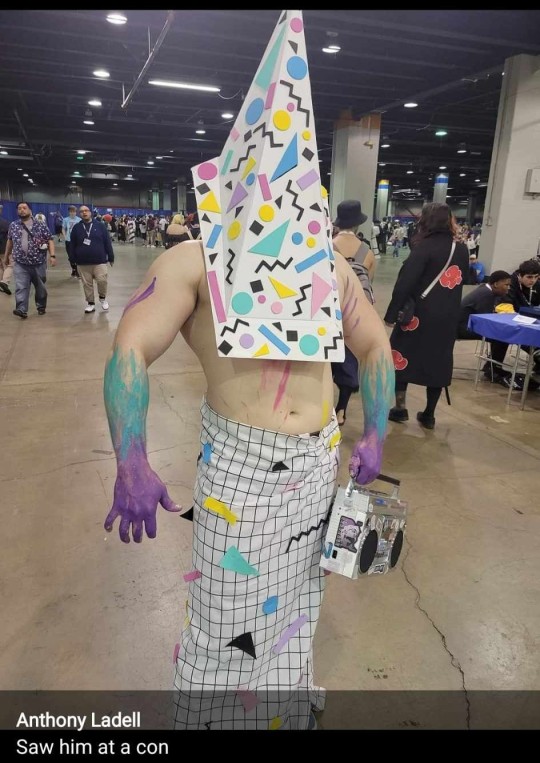
It's Memphis Pyramid Head
15K notes
·
View notes
Text
𝙼𝚎𝚖𝚙𝚑𝚒𝚜 “𝙸𝚣𝚣𝚢” 𝚆𝚢𝚕𝚋𝚘𝚞𝚛𝚗𝚎.
𝐁𝐄𝐅𝐎𝐑𝐄 𝐃𝐔𝐒𝐊 𝐒𝐄𝐓𝐒 𝐈𝐍
0 notes
Text
Jerma Memphis
1 note
·
View note
Text
Everyone gets “The 90s” look wrong and I hate it
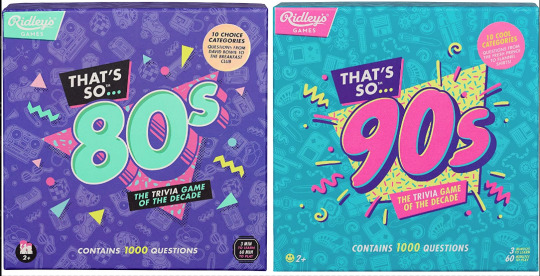
Couple years ago I saw these two board games at the store back to back. Well, not saw them per se, but ya know. Spied them out of the corner of my eye. And for a moment without reading the text, I couldn’t tell you which was which decade at first. Funny. Either they were in a rush to get these out the door or they wanted their throwback trivia game boxes to look uniform. I didn’t think too much of it.
Only, from then on I started seeing it MORE. Every time someone markets a 90s or 80s throwback...
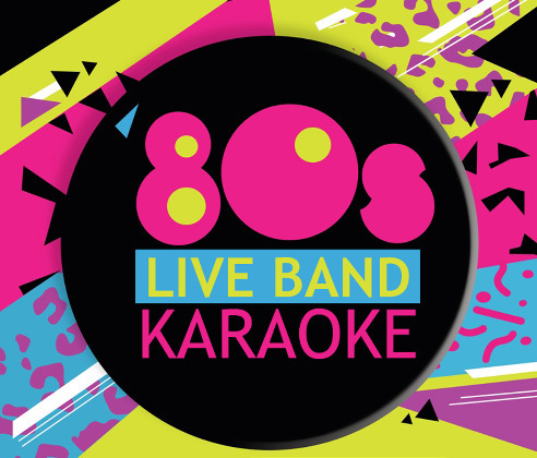
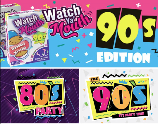
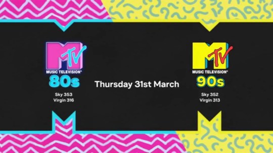
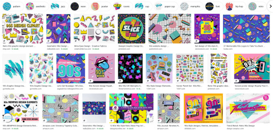
Goddammit they’re identical! What??! How did we let this happen? As a 90s survivor and a designer, this drives me up a wall.
Look, I know I’m late to the party to complain about “the 90s look” when we’re just starting to get sick of the Y2K nostalgia train. But c’mon, the 90s were not The 80s: Part Two™
Trust me when I say that we weren’t all wearing neon trapezoids up until the year 2000. The 90s look being peddled is so specific to the tail end of the 80s and an early early part of the 90s - a part of the 90s when it wouldn’t stop being the 80s. This is Memphis design being conflated with the wrong decade.

Keep reading for a long ass graphic design history lesson and pictures of old soda and fast food.
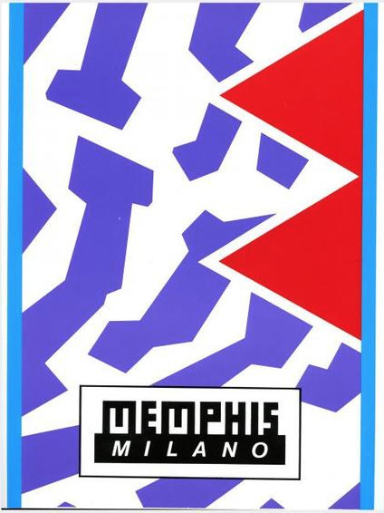
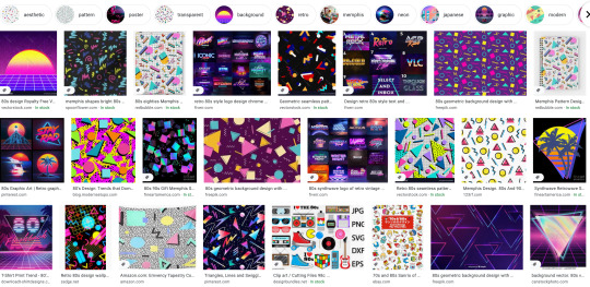
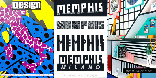
Specifically, the look is Memphis Milano, self-named by the Italian design house Memphis Group. Starting in the early to mid 80s, they made all sorts of furniture, fabrics and sculptures that were like a Piet Mondrian grid painting under heavy radiation. Their whole deal was defying the standards of existing industrial design up to that point on purpose. Chairs had weird arches, bookcases would be in strange alien colors, unusual materials like plastic or elastic were used in place of metal or wood, that sorta thing.
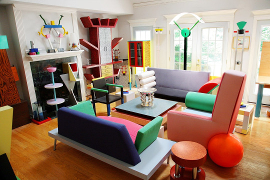
Memphis quickly became the signature look for the decade. You can tell something’s influenced by Memphis design from it’s telltale trademarks:
Clashing, neon colors.
Use of diametric shapes.
Contrasting patterns like zebra print stripes, confetti squiggles and checkerboards.
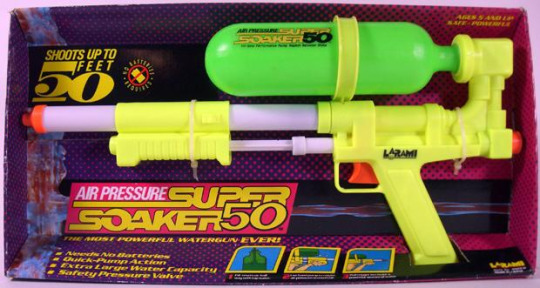
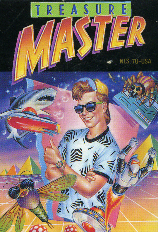
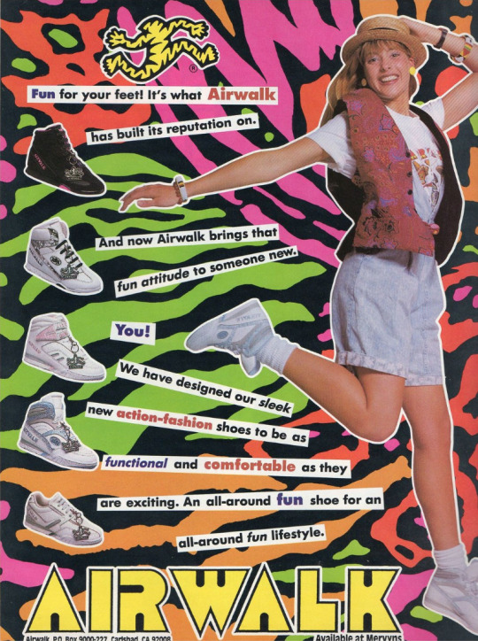
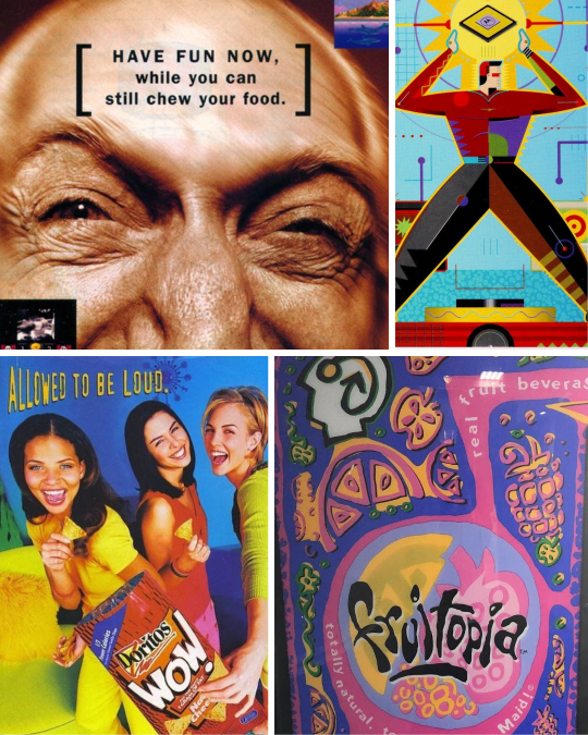
It wasn’t long before Memphis Milano-inspired design was everywhere in 80s pop culture:


It was a special time, yes.
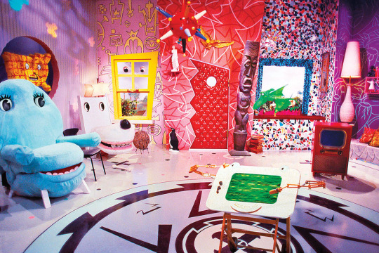
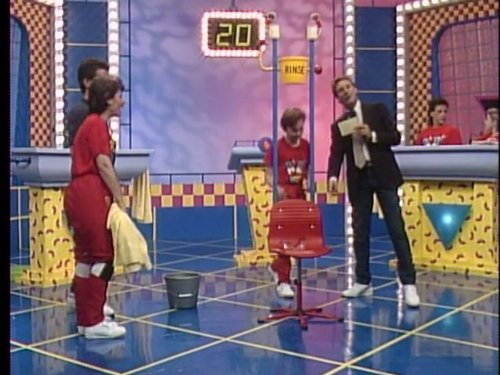
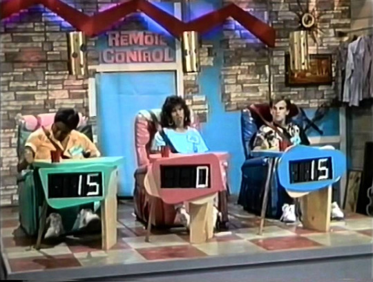
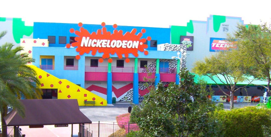
I was a kindergartener at the tail end of the 80s, so I knew Memphis mostly through the lens of kids media. Toys, clothes, games, tv shows used it like candy colored catnip. Cable channel Nickelodeon more or less adopted the Memphis aesthetic as their signature in-house style and practically built a monument to it at a Florida theme park:
I think this is why folks mistake what decade Memphis is representative of - 90s staples like Nick, Saved By The Bell, Fresh Prince - they all stayed around much longer than the design trend’s expiration date.


Couple that notion with the fact that companies are slow followers to design trends. Something gets popular and they want to get on the bandwagon? Gotta wait for the ink to dry, gotta wait for the production molds to be made. It would take a few years for them to completely work Memphis outta their system.
Now, this is not to say Memphis is bad! Personally I’m a fan of the aesthetic, if my neon-drenched artwork wasn’t a tip-off already. But it is a trend, and trends never last forever.
So what took the Memphis Milano look down for good? This part’s up for debate, but I personally think it had something to do with this dude:

It’s that grunge music from Seattle that’s so popular with the kids these days dontchaknow.
Once Smells Like Teen Spirit hit in 1991, the Nirvana tone drove the rest of the decade. Clean geometry became weathered, grainy and organic. Bright neon pastels became more bold. Bubblegum pop music sounded fake and manufactured. Attitude and apathy was authentic. Whatever.
Things got grungy. Things got grimy. Olestra was invented.
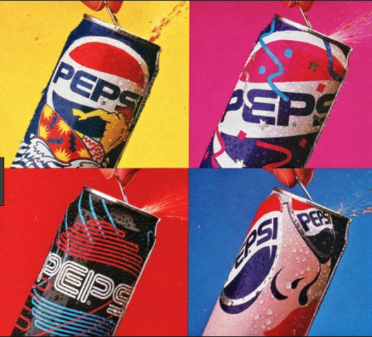
I think the best way to visualize this transition is how Cherry Coke entered the decade and how it left it:
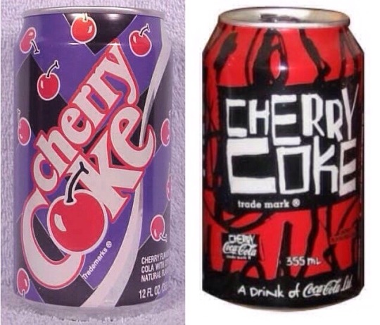
1992 Memphis on the left, 1998 grunge junkie on the right. Fitting that the 90s would end with a design that looked like Darth Maul’s lungs.
Okay, so what should 90s retro design look like?
Continue on to PART TWO! Spoilers: No VHS filters or vaporwave needed, but maybe bring an antacid.
16K notes
·
View notes
Audio
XXX; (Memphis.)
0 notes
Text

Interior Visions: Great American Designers and the Showcase House, 1988
#vintage#vintage interior#1980s#80s#interior design#home decor#track lighting#glass blocks#Memphis#style#furniture#chair#coffee table#TV#artwork#mantel#pottery#modern#home#architecture
863 notes
·
View notes
Text
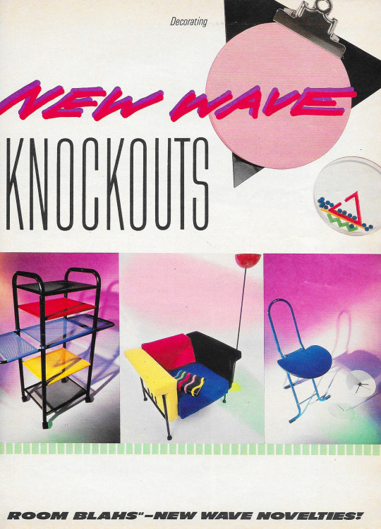
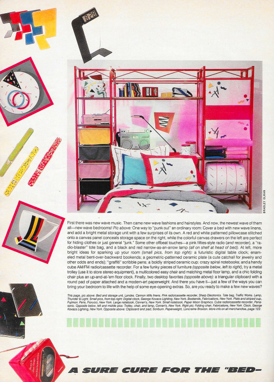
"January 1985. 'A Sure Cure for the "Bed Room Blahs" -- New Wave Novelties!'
1K notes
·
View notes
Text
(X) (X)
ALT TEXT:
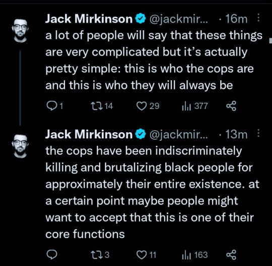
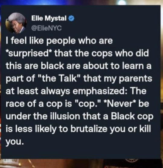
Jack Mirkinson on 27 Jan 2023 posted:
a lot of people will say that these things are very complicated but it’s actually pretty simple: this is who the cops are and this is who they will always be
the cops have been indiscriminately killing and brutalizing black people for approximately their entire existence. at a certain point maybe people might want to accept that this is one of their core functions
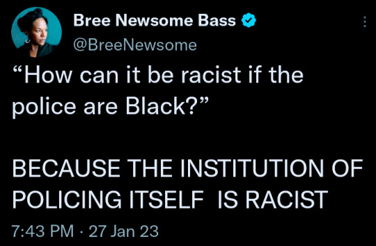
Bree Newsome Bass on 27 Jan 2023 posted:
“How can it be racist if the police are Black?” BECAUSE THE INSTITUTION OF POLICING ITSELF IS RACIST
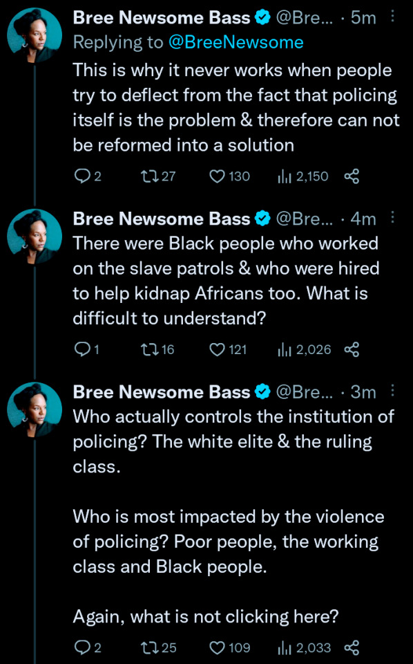
This is why it never works when people try to deflect from the fact that policing itself is the problem & therefore can not be reformed into a solution
There were Black people who worked on the slave patrols & who were hired to help kidnap Africans too. What is difficult to understand?
Who actually controls the institution of policing? The white elite & the ruling class. Who is most impacted by the violence of policing? Poor people, the working class and Black people. Again, what is not clicking here?
6K notes
·
View notes
Text


Summer 92
#90s#80s#pastel#memphis group#wallpaper#1990s#1980s#textile design#surface pattern#nostalgiacore#phone wallpaper#background#vaporwave#aesthetic#pattern#design#pastel colors
451 notes
·
View notes
Text
the hottest day in history
august 1st, 1969 at the international hotel ⚡︎


#elvis#1969#international hotel#las vegas nevada#vegas#elvis presley#elvis fans#elvis the king#memphis#tennessee#graceland
283 notes
·
View notes
Text
#experimental hip hop#memphis rap#southern hip hop#instrumental hip hop#slacker rock#neo-psychedelia#2010s#2020s#usa#poll#Spotify
448 notes
·
View notes
Text

The Plot Thickens
Part of my Memphis Noir Photography Series. Memphis, TN.
2024
Website Facebook Instagram Twitter Redbubble Prints
#anthony presley#anthonypresley#urban#photographers directory#architecture#photography#photographers on tumblr#lensblr#memphis#tennessee#moody#night#art#night photography#retro
264 notes
·
View notes
Text

The Memphis Belle taxis back to the ramp after a media flight from MCAS Cherry Point
#Warbird#Vintage Warbirds#Boeing#B-17#Flying Fortress#Memphis Belle#aviation photography#planes#movie aircraft#iconic planes
200 notes
·
View notes
Text
3K notes
·
View notes
Text

“Speaking to some french girl, who says she knows me well”
Bob Dylan & Françoise Hardy, 1966.
#RIP#Françoise Hardy#Bob Dylan#1966#1960s#Stuck Inside of Mobile with the Memphis Blues Again#Lyrics#Blonde on Blonde (1966)#So crazy I was listening to this song today and when it got to this line it made me think of Françoise...now I’m seeing the news
271 notes
·
View notes
Last Seen Blogs


