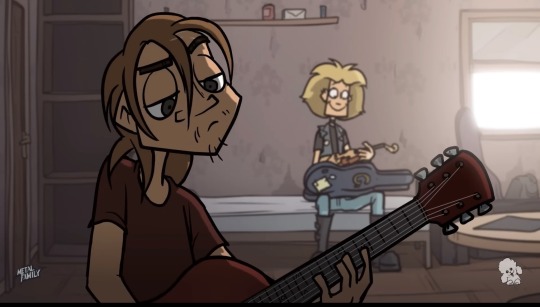
#metal family screenshots
Text
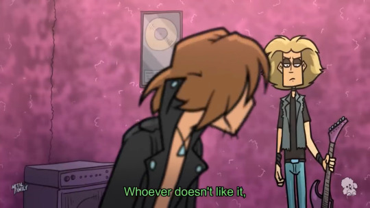
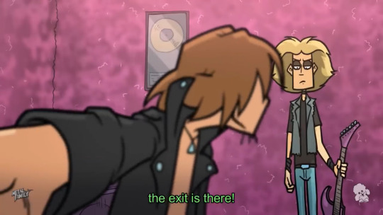

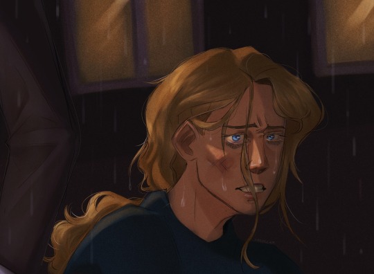
Ouch
1K notes
·
View notes
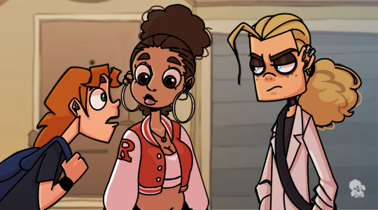
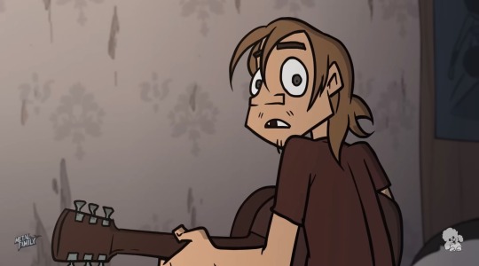
Text
her,,,,,, ☹☹☹☹☹☹☹☹

563 notes
·
View notes
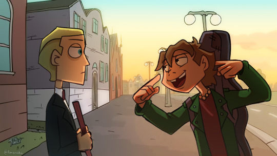
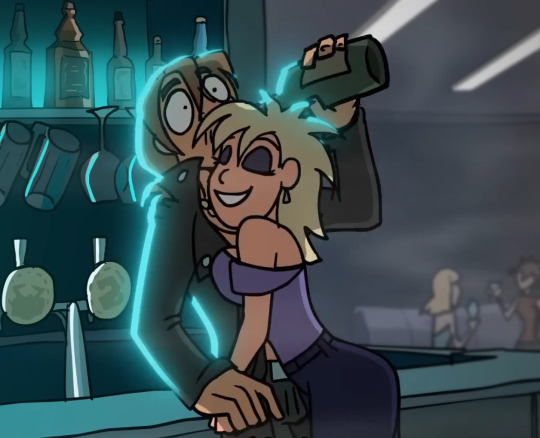
Text
Screenshot edit (w/ self-insert)!
I’m starting to get another hyperfiction 😅
#art#digital art#edit#screenshot edit#metal family#metal family heavy#metal family dee#self insert#self indulgent#oc character#shading#blender render
20 notes
·
View notes
Photo
Wanted to try my hand at a redraw
56 notes
·
View notes
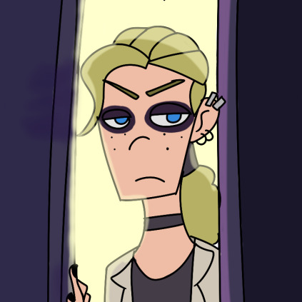
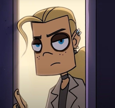
Text

Weird resemblance
[click for better quality plz <3]
#my art :)#yes the background is just a screenshot of super adventure rockman#I got lazy </3#light family adopts a kitty and oilman Did Not expect timeman would bother looking after it too#girl I don’t know how to shade metals </3#<- encouraging tag to see on the account that posts Megaman fanart /s#and why they so ourple#megaman#mega man#megaman classic#timeman#time man#oilman#oil man#don’t tag as ship pretty please <3!
22 notes
·
View notes
Text


Screenshot redraw
Credits to Metal Family Webserie!
#artwork#artists on tumblr#drawing#digital art#ibispaint art#character design#metal family ches#metal family fanart#metal family#screenshot redraw#redraw#my arte#my birthday#my fanart#2d fanart#digital artwork#digital fanart
19 notes
·
View notes
Text
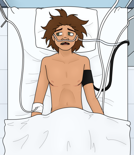
"I really am a crappy son"
Cool, the new episode won't leave my brain.
#metal family spoilers#metal family spoiler#batty draws#screenshot redraw#drawing#fanart#fan art#chive metal family#metal family chive#metal family ches#ches metal family#hospital tw
15 notes
·
View notes
Text
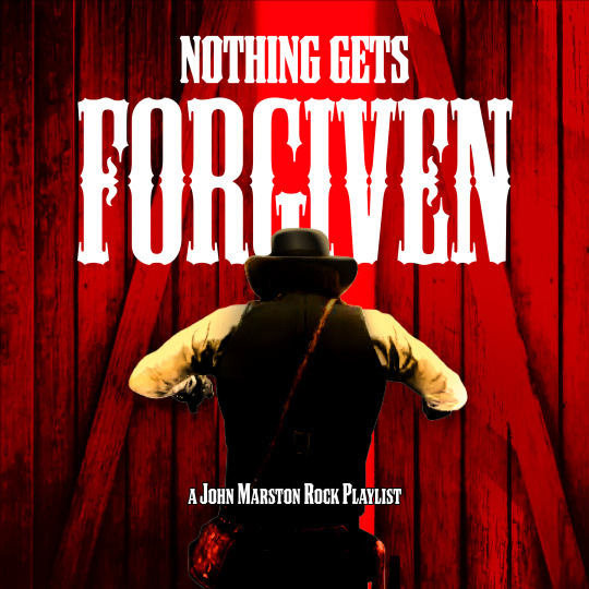
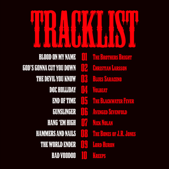
spotify | the tragedy of the gunslinger: chronicled through rock, alt country, and heavy metal.
#pardner playlists#john marston#red dead#rdr1#rdr1 spoilers#rdr2#this playlist is mostly rdr1-centric but also it references john's past so.. it involves rdr2 kind of ?#the imagery is a screenshot of rdr2 that i edited SEVERELY to make it fit the aesthetics of rdr1's graphic design elements#but the typography /isn't/ attempting to fit anything in the rdr graphic design canon#listen . i wanted an excuse to work with 'mesquite' bc its one of my favorite typefaces.#and i think the bold stylistic look of the typeface compliments all the bold rock music in this playlist#im actually Really Proud of how the playlist turned out. i wanted to:#1) make everything mesh with the sick guitar solos of the canon soundtrack#2) toe the line between '1911 gunslinger' and '2011 edgelord' for an aesthetic that i've mentally dubbed the ~Hot Topic Cowboy~#3) hit the key plot ideas of the reformed outlaw + bounty hunt premise + missing family + etc#4) fit into a circular narrative like the game does#the song sequencing is primarily chronological bc i wanted to convey a slow build to the inevitable.#also like . babes you will never understand the EXCITEMENT i felt finding a heavy metal cover of the 'gunfight at the ok corral' guitar rif#+ an ominous alt country johnny cash cover#anyways. john is my babygirl and i will make 5 billion playlists about him. this is just my rock-heavy one.#pardner posts
37 notes
·
View notes
Text
PROSHIP DNI

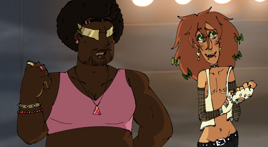
haiii here’s some metal family redesigns i made recently… xP
made the bob n lordi one when my power went out a bit ago, and randomly decided to make glam n ches out of impulse.
they r just fur funsies they don’t have much behind them (ches’s was heavily based on his older designs though)
#metal family#glam metal family#ches metal family#lordi metal family#bob metal family#uhhh what other tags can i use…#who are those freaks on stage#redesigns#screenshot edits
22 notes
·
View notes
Text


youtube
#metal family ches#metal family#omg the animation in this episode#was so awesome#metal family screenshots#go watch#it’s on youtube#Youtube#animation#cartoons
129 notes
·
View notes
Text
youtube
i heard that season 2 episode 5 may be coming out today!
#i've been seeing little spoiler screenshots the last couple days#i wonder what happens with ches#metal family#who are those freaks on stage#the monsters#light metal family#WhoAreThoseFreaksOnStage#metal family light#music
11 notes
·
View notes
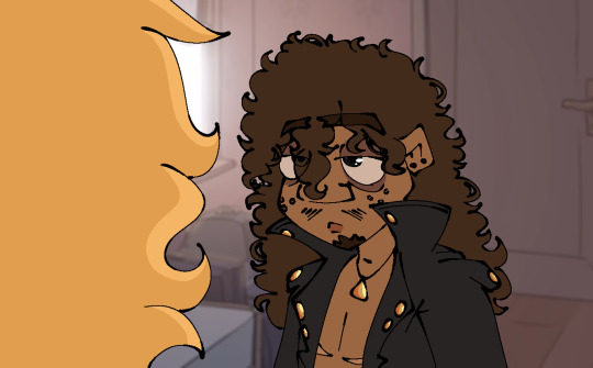
Text
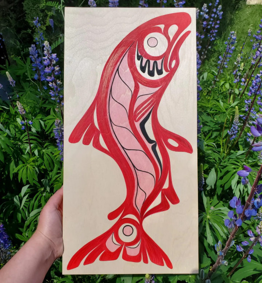
Screenshot Redraw Metal Family
This Pic goes hard. Feel free to screenshot. (redraw)
The brain Rot I have for Dee is unhealthy. I wish there was more people to ship him with that weren't his brother and that one girl who I can never remember.
2 notes
·
View notes
Photo

Another edit - i find colorsfun
15 notes
·
View notes
Text
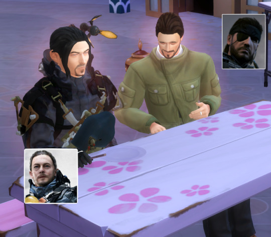
In the sims, this is what happens when you and your brother (I headcanon they are distant brothers from alt universe because Hideo is technically their Mom/Dad for creating them Snake is Big brother Sam is baby brother :3)
Are getting on mama kojima's nerves to the point he kicks you both out of the house to 1 get some peace and quiet while he makes death stranding two 2 Make you both get some time away from the PlayStation you both have been fighting over and 3 bond and get fresh air but the only thing available to do in the neighborhood is the romance festival in the sims and you both are single AF
Sam doesn't look like he's having much fun.
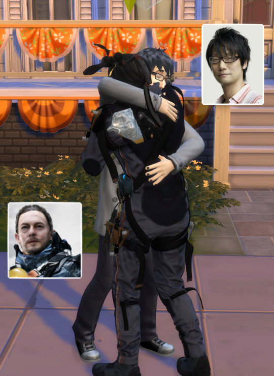
#ahideokojimafangirl#Sims4#sims 4 screenshots#hideo kojima#death stranding#metal gear solid#metal gear#sam porter bridges#Mama Kojima#venom snake#solid snake#family#video games
4 notes
·
View notes
Note
Have you seen the formline art in splatoon? It's present in a variety of salmon run decals and on some of the locker graffiti. Idk if the Devs just googled "salmon art" and got indigenous art and decided to copy it or what. Not sure how I feel about it personally.
Long post incoming, gonna put a break here. Also sorry for the late response, I wanted to take a couple days to formalize my thoughts together before responding fully.
I have, I remember noticing in 2018-2019 (when i first started playing splatoon 2) how much one of the decals/graffiti located on the ruins of ark polaris back in 2 sort of resembled a formline bear and salmon. (near the logo in this screenshot, I couldn't find a clear picture online)
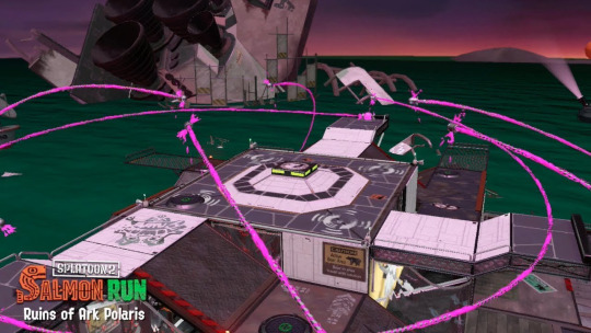
Back in 2019, it was pretty easy to think of it as coincidence or a stretch for a comparison. But with splatoon 3's salmon run decals, the resemblance is far easier to see, specifically with the TS-ORBRS graffiti and the TS-SCHL graffiti.


(also this was the best image size I could find for the graffiti images, sorry)
A couple of the banners have the designs on them as well:

The website Sealaska Heritage has info such as textbooks and an online doc about formline art (specifically geared towards Haida, Tlingit, and Tsimshian nations' style) with lots of info about formline art, and the Seattle Art Museum website has an info sheet (with credits listed as being from the Sealaska Heritage site as well) breaking down some of the basic shapes of formline art.

with this chart, you can definitely begin to notice the similarities between the Salmon Run graffiti and formline art. the ovoids, crescents, and u-shapes appear noticeably in some of the graffiti such as ORBRS and SCHL.
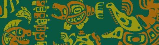
For perspective, here are some formline pieces featuring salmon or fish from various Indigenous artists from various nations.
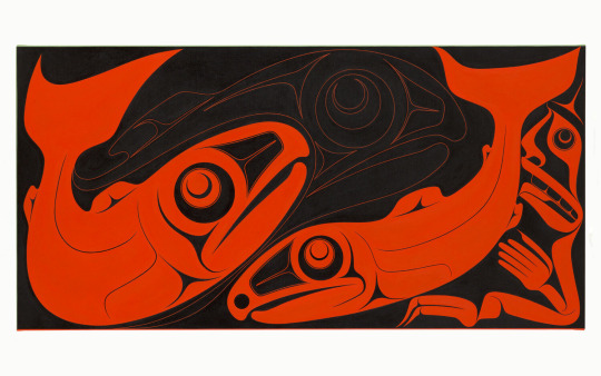
"sk’ug sdang" (Two Dog Salmon) by Robert Davidson (Haida)
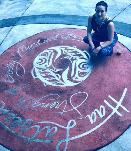
"metal medallion", by Crystal Kaakeeyáa Rose Demientieff Worl (Tlingit Athabascan)

"Salmon People" by Alano Edzerza (Tahltan)
"Jumping Chum" by Stephanie Anderson (Wet'suwet'en)

"Salmon" by Art Thompson (Nuu-chah-nulth)
And that's literally just the surface of dozens of Indigenous artists from the PNW.
With these pieces, you can begin to see the resemblance that the graffiti designs have. A lot of the heads follow the pattern of utilizing ovoids for both the head and eyes, and u-shapes for the bodies and crescents to fill in specific areas are also common. For example, TS-SCHL has a small school of fish where the bodies are entire ovoids.
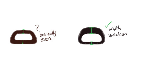
However, there are a couple flaws in the graffiti designs too. With a few of the designs, you can see they utilize the u-shape (see the formline shape breakdown from Sealaska again) in designs like TS-WHP and TS-SMFR. I can't speak for every Indigenous formline artist ever, but from how I've been taught to design formline art from my family, the u-shape should connect to the rest of the form instead of free-floating. I drew a quick example here:

you can see similar mistakes with a different kind of u-shape with TS-RLPL and TS-C0HK.
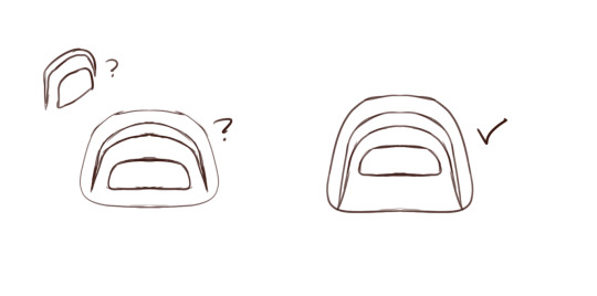
Another very specific mistake that takes a bit of squinting to make out is that ovoids are sort of top-heavy, for lack of a term I can't think of right now. The line or the area should be thicker on the top then the bottom. This mistake is frequent in the graffiti designs utilizing ovoid or ovoid adjacent face or body shapes, like TS-ORBRS, TS-C0HK or TS-SCHL.
Full disclaimer, I am not an expert at formline art. I've been practicing it under the tutelage of my aunt and father for about 3 or so years now, and there are definitely cultural variations that come into play as well. My culture's formline art style can look completely different from someone who is Haida or otherwise. This critique of the graffiti designs is based off my knowledge and skill at formline art, as well as critique and feedback that I've gotten from family. Formline art isn't just something you look at and replicate, there is a specific process of utilizing the shapes and negative space that you need to account for too. Some shapes have their own rules for how they're used as well.
Despite the beginner mistakes, the clear resemblances are pretty definitive proof that a good section of the sticker/graffiti designs for the salmonids are meant to be, or at the very least based off of or inspired by, formline art.
Splatoon's lore has a lot of elements of taking inspiration from real life culture (which is sort of one of the main elements of the story, the squids and octos are basing their society off long dead humans). Hell, Shiver and Frye are two prime examples of Splatoon working in real world culture into their setting and characters.
With that in mind, using an art style that's exclusive to an ethnicity of people as inspiration or baseline reference for the game mode that's all about taking natural resources from a species that in-game dialogue tends to treat as dangerous and lesser-minded is... not a good choice. Especially an ethnicity that has historically been ravaged and attacked by settlers for natural resources.
Now, technically if you do digging into lore for salmon run, you can find out that the salmonid are not as simple-minded as the dialogue in-game (I am staring directly at the deep cut big run announcement dialogue we've gotten so far -_-) makes them out to be. The salmonids do trades and commerce with the octarians for equipment and gear. That's why they have such technically high tech gear, like the scrappers with their shields that actually resemble octarian shields and the flyfish with their missiles and flying aircraft. That's also why power eggs show up in the story mode; they're from the salmonids' trades with the octarians.
So the salmonid could technically be as just as smart as the inklings, which is why the dialogue and some of the portrayals of the salmonid are confusing and contradictory (shiver's dialogue from the first big run, that one promo picture of an inkling walking a smallfry on a leash????). I think a good bit of the fanbase sort of thinks of the little buddy we get during the game as a pet, and I'm sure that much more of the fanbase/playerbase doesn't really care about the lore whatsoever. Salmonids sort of have a similar vibe to me as hilichurls from Genshin Impact, where the lore tells you that they're smarter than people assume while NPCs talk of them as less intelligent monsters. And you're also caught in this paradox where killing/fighting them feels morally wrong but the gameplay loop has you continuously doing that while also telling you on the downlow that you should sort of feel bad about it.
Rassicas did a really good video on translating salmonid lore from various interviews, which is where I learned a lot about the salmonid lore that doesn't really get explained/brought up in the game.
The usage of formline art in Splatoon has me sort of mixed on my opinion, because besides using an Indigenous art style for an enemy species that are considered lesser in intelligence by the NPCs, Indigenous art and culture as a whole has suffered a lot under colonialism. I don't know how much awareness whoever is reading this has about Indigenous history and colonialism, but Indigenous culture as a whole was banned in North America by the respective governments from being practiced by the respective cultural groups. Things such as ceremonies, regalia, and even practicing formline art were banned from being used by Indigenous people. Non-Indigenous people however were free to use it, which is why a lot of bastardized versions of Indigenous regalia and culture exists. You can see it in non-indigenous spiritual practices utilizing Indigenous practices and terminology like spirit animals and dreamcatchers, and sports teams utilizing Indigenous culture in its labelling and mascots. That is where cultural appropriation comes into play. And before I get anybody commenting about this, the salmonid formlines don't count as "cultural appreciation" because as far as the info available is concerned, there wasn't any Indigenous people that were consulted for the designs. And even if there were, I again have mixed feelings about Splatoon utilizing an Indigenous art style as a design piece for an enemy character in the franchise.
On another note, this isn't the first time Indigenous cultural appropriation has popped up in the Splatoon franchise. There was actually a headgear that was unreleased in the first Splatoon game called "Warrior Headdress", and you can guess what it looked like.

Yeah. That was all levels of yikes and I'm thankful as hell that it didn't make it into the game (technically it's not in the game as a wearable item, but you can spot it at the very back of the headgear shop ingame)

So Splatoon has utilized Indigenous culture as inspiration beforehand with the games, so it's not much of a stretch anymore to think that the salmon run graffiti designs were based off formline art or was an attempt at formline art.
I'm not really sold on the idea that the salmonid are meant to be representative of Indigenous people though, nor do I believe that utilizing formline art for the salmonid was a malicious decision. But it was a slightly ignorant decision at best, because again using Indigenous specific art for a species of enemies that gets fought for their natural resources and is referred to by some of the NPCs as basically being lesser-minded animals is really not a good decision.
This whole thread is not meant as a guilt trip for anyone who likes the salmonid lore, has bought any of the salmonid graffiti stickers, or enjoys salmon run, nor is it an accusation of the devs for maliciously misusing Indigenous culture. I actually really enjoy salmon run for it's PSP and concept, but this design aspect gives me mixed feelings as an Indigenous person. And to be honest it's hard to label intentions or the thought process because there isn't any info available on the development of salmon run and those graffiti designs specifically. So it's hard to know if the devs employed an Indigenous artist for feedback or if they indeed just looked at some formline art of salmon and tried to replicate it or used it as inspiration. I'm inclined to believe the latter judging by the beginner formline mistakes seen in some of the designs. There is an art book coming out soon for Splatoon 3, so maybe that will give more info.
To wrap this all up, I don't think there is really anything to be done about the designs. The game has been out for a while and I don't know if the game would change the designs at this point. I also don't think this should stop people from buying the sticker designs in game or playing salmon run. However, it is important to learn about the context of these designs so that you know why they exist and why they can be harmful, and so devs and creators can avoid making the same mistake in the future, and so Indigenous issues with cultural appropriation can be made more aware in the public space and not be ridiculed by non-Indigenous people. And again, I am just one Indigenous person so there may be other opinions from other Indigenous people on the graffiti designs and how they should be handled or viewed.
If you made it this far, thanks for reading and have a good day!! Be sure to check out some actual Formline art made by Indigenous people, like the ones I listed near the top of the post!
#long post#salmon run#indigenous discussion#cw cultural appropriation#whoof that took a while to write#I really don't think this whole situation is one of maliciousness#but one of ignorance.#the devs had the foresight to (almost completely) remove the headdress item from the first game#so good on them for that#I just sort of wish they'd thought through using Indigenous art for the salmonids a lot better.#I wish the salmonids had a different sticker design entirely tbh#graffiti is such an open-ended style concept so they could've found lots of inspiration there#instead of using an Indigenous specific art style#(and making beginner mistakes while doing it)#also if you're here to cry cultural appreciation or about how “oh this is preserving Indigenous culture actually” I'm gonna need you#to walk back out that door.#I did not spend four hours writing this whole post to deal with “but cultural appreciation actually!!!” chuds.#Look up the definition of cultural appreciation vs cultural appropriation and get back to me.
261 notes
·
View notes
Text
Mini costume meta
Gonna throw in a very mini costume meta because now I’ve got a proper look at Bucks velvet jacket I am having a lot - and I mean a lot of feelings about it.
For starters this jacket is not maroon - it is burgundy and that is an important distinction. maroon is a more brown toned colour while burgundy is a more red and purple toned colour and they have very different meanings.
I’m not sure how easily you can see it from these two pictures, but the tee Buck wears when he tells Christopher about Eddie getting shot - in 4x14 - is much more brown toned, while the velvet suit jacket has much more of a purplish tone to it (i’m hoping for better pictures of the suit jacket when the episode actually airs as the screenshots I grabbed are not the best!!)


So Like I’ve said in previous metas, maroon has been used in scenes where a character is taking on some form of parental role - this is something thats been going on since season 1 and its been used on pretty much all the characters. Buck telling Chris about the shooting is the most obvious example, but Eddie in the last episode when Buck went over to the Diaz house was making Christopher's lunch - a parental thing. We’ve also seen Bobby in maroon a fair amount when he’s needed to step into a parental role - think back to Bobby telling Harry he needed to clear the table - that he couldn’t be best buddy Bobby anymore, and needed to be step dad Bobby and so on.
Maroon is thought to promote comfort and warmth, it is also a colour of strength and maturity - all things associated with parenthood. It is also a colour often associated with drying blood which connects it to the idea of blood ties - which equals family ties.
Then we have burgundy - a colour of sophistication. It’s a powerful colour commonly associated with refinement - stemming from the idea that a Burgundy wine is among the best and most expensive in the world. This association also means Burgundy is associated with wealth - the perfect colour for Buck to be wearing while he’s winning at poker!
The other thing about burgundy though is that it is also associated with lust, passion and desire - it is a colour very much connected with romance and deep love as it is a deep form of red!
Combined with the black of the rest of the outfit, including the black wide peaked satin lapels, which is a colour of elegance, sophistication, power and seduction, as well as the choice of velvet and satin for the blazer - two fabrics considered to be symbols of wealth luxury and sophistication I think it’s safe to say that this outfit is very much an outfit one would chose for a date. Peaked lapels are an interesting choice - they are the most difficult lapel to achieve and are considered the mark of an accomplished tailor - hinting at the idea that Buck has been on a difficult journey, but will achieve success with it. it can also hint at him being accomplished at cards!
Its also worth mentioning that velvet as a word is a slang term for money acquired through gambling 👀👀👀
Last thing to note is that Eddie is not the only one wearing a new and more blingy watch - Buck is also wearing a new one - we only get a couple of very brief glimpses and I’m hoping we’ll see a bit more of it once the episode airs, but I am very literally screaming over it. (you can see a tiny glimpse in the still below)
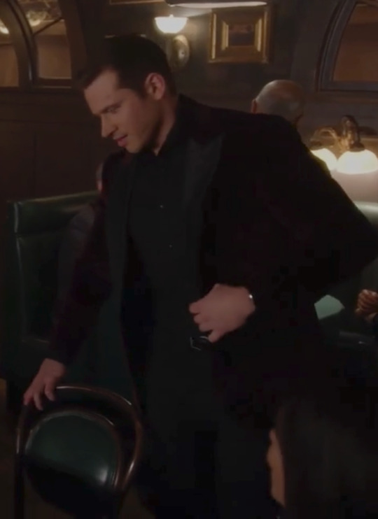
Buck has had the same watch since season 1 - no deviations, just the same watch! and now - now we get a new one! Post dying, post coma dream, post Buck going to the Diaz house and sleeping on the couch and post Buck appearing all contemplative and figuring things out at the end of last episode we see Buck in a new watch!!!!
The fact that they both appear to be wearing metal watches means we have the possibility that their watches are going to potentially match up, because metal watches are more showy and confident - they’re less practical (especially if you’re a fire fighter) and are therefore much more about making a statement of some sort. Them both wearing them for the first time at the same time is a choice! Not to mention the fact that while Eddies watch is out and proud - on display for everyone to see, Bucks is mostly hidden - we only get to see a tiny part of it for a moment. The idea that Eddie is confident and essentially putting this new version of himself out there for people to see, while Buck is ‘on the same page’ but still mostly hiding his new self - he’s still uncertain about it etc is a choice - especially as we’ve seen watch theory around Buck expand much more this season than previously! I should also mention the fact that the show very loudly made a big thing about Michael buying David a watch as an engagement gift - rather than a ring - and we don’t see any other (male) characters wearing metal watches, so for them to choose now to put Eddie in a metal watch as well as possibly Buck is making a very purposeful connection!!
I really can’t wait to see if we’re going to get more of these watches - if we do I’m expecting we’ll only see them connected to Buddie developments and that they’ll revert to their normal watches for other non work scenes (I’m expecting the brown leather strap watch for whatever date(s) Pepa has set Eddie up on!!)!
#this got way longer than I thought it would be when I started!!!#kym costume meta#mini meta#Buck meta#911 costume meta#911 on fox#911 spoilers#911 costumes#6x13#911 fox#buck#evan buckley#watch theory#costume theory#I cannot wait for the full context of this scene!
202 notes
·
View notes
Last Seen Blogs

watchinghallmark
Hallmark Channel Movies

buurnedergaard62
The Journaling of Byskov 658

gloriousmarey
Marey

memoirs-of-a-petty-bitch
Cicely Aurelia
egy-lany-blogja
2014.12.25