#microinteraction
Explore tagged Tumblr posts
Visit Tumblr Blog
Explore Tumblr blogs with no restrictions, modern design and the best experience.
Last Seen Tumblr Blogs


Fun Fact
Tumblr has a low social media market share in South America.
Text
In the Details: Assume Intent
There are two philosophies when it comes to keeping users from making mistakes. You can assume that they are going to make mistakes often and check every time. This is the approach that every video projector takes: “Press power again to shut down.” How many times have you accidentally picked up a projector remote, pointed it at the projector and pressed the power button and then thought, “Oh, what am I doing? I don’t want to turn off this projector.” I’ve never done that. Not once. And yet, I have to press the button twice every single time. It’s become a habit such that I automatically hit the button twice. If I were doing it accidentally, I’m sure I would accidentally hit the button twice.
The other approach is to assume that people usually mean to do what they do. This is the approach that the UI designer took in the video system in my classroom. When I hit the power off button, it displays a message indicating that it will shut down in some number of seconds unless I press a button to stop it. That’s a smart choice.
0 notes
Text
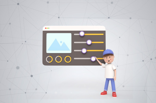
The Benefits of Using Micro-Interactions in Web Design
The Benefits of Using Micro-Interactions in Web Design
Small interactions, BIG impact! 🌟 Learn why Micro-Interactions are the secret sauce to a stellar user experience. 🖱️ Check out the blog now https://www.pgsuae.com/blogs/the-benefits-of-using-micro-interactions-in-web-design/
0 notes
Text


True Detective 1x03 The Locked Room
#true detective#rust cohle#rustin cohle#marty hart#kind of obsessed with this microinteraction#like Marty starts pouring it without asking and he for sure knows it's gonna get turned down??#then dumping it back super passive aggressively#and its not in the gifs but the girl also seems to notice this exchange and looks uncomfortable for a sec#like that was all so unnecessary whats his problem#also rust looks so awkward and uncomfortable in this whole scene ahhhhhhh
204 notes
·
View notes
Text
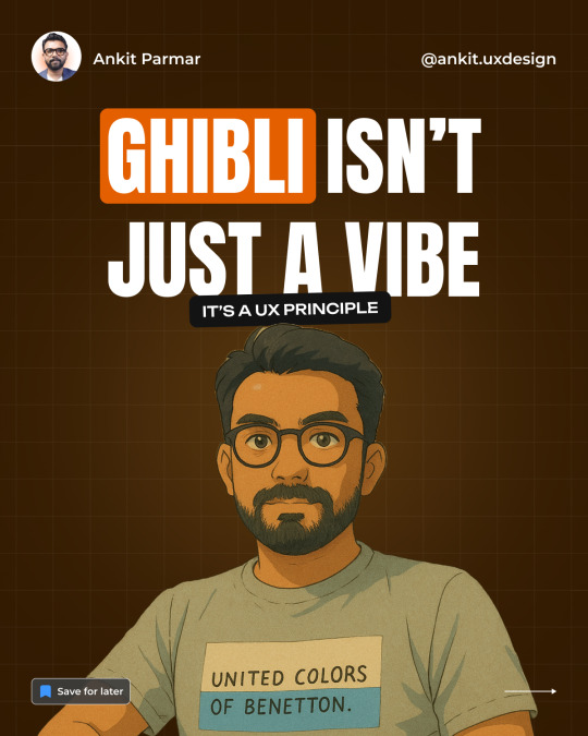
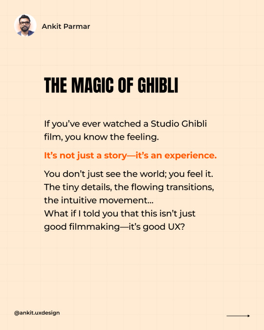
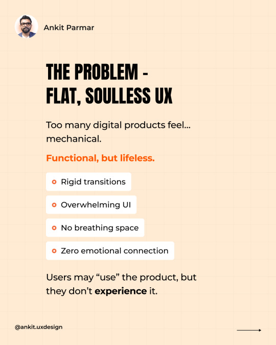
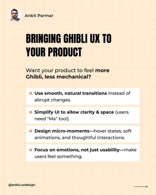
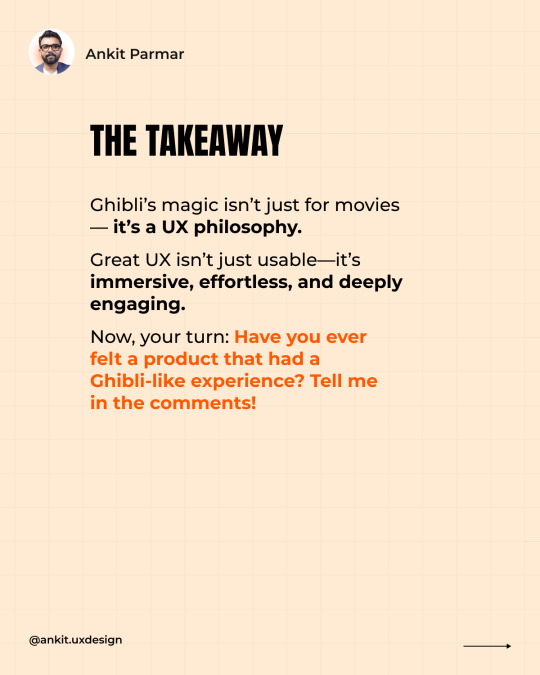
Ghibli Isn’t Just a Vibe—It’s a UX Principle
Ever watched a Studio Ghibli film and felt completely immersed? It’s not just the art—it’s the way the world moves, breathes, and flows. Now, imagine if your product’s UX felt the same way. Too many digital experiences feel... mechanical. They work, but they don’t feel. 🛑 Rigid transitions 🛑 Overloaded UIs 🛑 No breathing space 🛑 Zero emotional connection Users use them, but they don’t experience them. Ghibli teaches us a better way: ✅ Microinteractions – Subtle, natural movements that make UX feel alive. ✅ "Ma" (Negative Space) – The power of pauses, clarity, and letting designs breathe. ✅ Seamless Flow – Effortless navigation, like a perfectly told story. ✅ Emotional Connection – Because great UX isn’t just functional—it feels right. Want your product to feel more Ghibli, less robotic? 🔹 Use smooth, natural transitions instead of jarring shifts. 🔹 Let UI breathe—simplicity beats clutter. 🔹 Design for micro-moments—hover states, animations, thoughtful interactions. 🔹 Make users feel something, not just complete tasks. Because UX isn’t just about usability—it’s about experience. Have you ever used a product that felt like a Ghibli-level experience? Drop your thoughts below! ⬇️


2 notes
·
View notes
Text
every time im in public and men are acting weird towards me i should get financial compensation cuz i would be a billionare by now and take advantage of that to create a better world
#two freaks breaking their necks to stare at me today... one guy following me last friday... old man stopping me in my tracks to check me out#last week plus this freak who keeps having these microinteractions with me even tho hes scaring me so bad i wanna die whenever i see him...#ENOUGH !!
3 notes
·
View notes
Text
I will occasionally initiate conversation by making a funny observation about something in the grocery store. Please note this is not an attempt at flirting and the appropriate response from you is to laugh, perhaps make a similar observation that makes us both feel goof about sharing a human experience with a stranger, and then we both smile and walk off to continue our individual shopping.
"how do i know a woman wants me to talk to her in the grocery store" are you an elderly woman with valuable information about cooking, cleaning, or saving money? if you answered no, then women do not want to talk to you in the grocery store.
#advice for guys#I have had a number of microinteractions with people in the store#thankfully none kf them resulted in anyone thinking I was flirting#I am an oddity and most people dont do this#but it is very enjoyable and I want you to enjoy it too
54K notes
·
View notes
Text
The Evolution of Motion UI: Enhancing User Engagement with Microinteractions
0 notes
Text
Motion That Moves You | By Lollypop Design Studio 🎨
Design isn't just what you see. It's what you feel. At Lollypop Design Studio, we breathe life into digital interfaces through motion, emotion, and purpose-driven design.
This snippet showcases our latest work — a mobile-first experience enhanced by subtle, delightful micro-interactions that guide the user and amplify brand identity. Every swipe, bounce, and fade is crafted to keep users engaged and moving forward.
💡 What We Focused On ✔️ Human-centered design ✔️ Smooth, strategic transitions ✔️ Visual hierarchy through motion ✔️ Brand-consistent experience
🧠 Design that converts. Motion that matters. We don't just design screens — we create moments.
🔗 Want to elevate your digital product? Visit us → www.lollypop.design 📩 Let’s chat → [email protected]
For more, visit our site: https://lollypop.design/
Check out our Projects: https://lollypop.design/projects/
Get a free consultation: https://lollypop.design/project-enquiry/
#ui ux company#ui ux design#uidesign#ui ux development services#web development#web design#motion design#microinteractions#mobile ui design#LollypopDesignStudio#creative design#designinspiration#product design#digitalexperience#tumblr design
1 note
·
View note
Text
Tiny Touches, Big Impact: Microinteractions in Healthcare Apps – 2025
The smallest details often create the biggest user experience wins. In 2025, microinteractions—like button animations, subtle feedback, and gesture-based responses—are redefining how users engage with healthcare apps. Want to learn how these micro-moments can boost trust, clarity, and user satisfaction? 👉 Explore the blog here
🚀 Build intuitive healthcare apps with the perfect UI/UX strategy. 🌐 Visit us: www.naskay.in 📩 Email: [email protected]
#healthcare#artificial intelligence#health and wellness#microinteractions#uxuidesign#mobile app development
0 notes
Text
In the Details: Hint Text
Hint text is commonly used in web forms to provide a hint about what you should enter in a field. For example, it might show you the format of the data the field is expecting or an example. Hint text is usually a light gray so that the user doesn’t think that it is actual text in the field. It typically goes away when you click in the field.

I was recently setting up an event on Tito and filled out the date and time in this form. When I hit the button to save this information and continue to the next step, it told me that the time I entered was invalid.

This puzzled me, as it certainly looked valid. After a couple minutes of trying to re-enter the time, I realized that the “PM” show in the field is hint text. It expected me to click on the PM and type “P” or “A”. Once I did so, it looked like this.

Notice the difference between the “PM” in the Start time and End time fields. This is the first time I’ve encountered a time entry field that works like this. It was unexpected and confusing. If I had wanted to change it to “AM”, I may not have had the issue, as I probably would have clicked it to try and change it. As it was, I assumed that PM was the default, and the error message that was provided did not explain the problem.
0 notes
Text
Making Healthcare Apps Feel Human with Microinteractions

The future of healthcare is digital, but that doesn't mean it should feel cold. Microinteractions breathe life into healthcare apps, offering warmth and clarity through minimal design touches.
Employing microinteractions in healthcare apps can make users feel heard and cared for. A soft animation when sending a symptom report or a slight vibration when saving health information indicates that the app is paying attention.
These seemingly insignificant features can propel significant gains in user satisfaction and compliance.
Checkout this blog to learn more!
1 note
·
View note
Text

Rando Loops: Optimized Experience & Animations Update
#Rando Loops#UI Design#UX Design#Motion UI#Interface Animation#Smooth Interactions#App Update#Design Evolution#Playful UI#Mobile UI#Game Design#Dribbble#Creative Process#UX UI#App Experience#Interaction Design#Digital Product#Visual Design#Microinteractions#Mockup#Case Study Coming Soon
0 notes
Text
I don't know if I just need to get off of most social media (twitter, specifically) or what, but I just don't know what the fuck is happening anymore in reality.
#tw animal death#in tags#i replied to a tweet about someone reporting someone else for killing a bunny#the algorithm started showing me more stories about bunnies being killed#or other general animal abuse cases#and i'm just like that michael scott gif going NOOOOOOO#this is the opposite of what i want to see#then for some reason i'm getting several tweets in a row about some drama with kate and william's marriage?#like - the middle-aged royal couple no one cares about? why am i seeing conspiracy theories about william glancing at another female human#literally behind his wife's back - bc he was slightly behind her while she was doing some shit idk like talking to someone#it's not like the news cycle is so slow that these microinteractions need to be blown up into scandalous news stories#bc immediately after those tweets i then started seeing discourse about mein commandant making canada the 51st state like???#not to mention the alien invasion thing#oh and all the political fuckery nonsense#this is the timeline? really? and if this reality is so ridiculous at this point#why can't i just make up a new one to exist in bc what is anything really?#idk man#tumblr tags are my current therapy don't mind me#the charlotte lennox diaries
1 note
·
View note
Text
🎨 Ready to flex your web design skills? It’s quiz time! Put your knowledge to the test and see if you’ve got what it takes to be the ultimate design pro! 🖥️💡
What is a current trend in web design for enhancing user engagement in 2024?
A) Overuse of text-heavy pages B) Incorporation of dynamic animations and micro-interactions C) Ignoring accessibility guidelines D) Limited use of multimedia content . . ➡️For more information, please visit our website: https://zoofinc.com/ ➡Your Success Story Begins Here. Let's Grow Your Business with us!
👉Do not forget to share with someone whom it is needed. 👉Let us know your opinion in the comment down below 👉Follow @ZoofSoftwareSolutions for more information . . ✔️Feel free to ask any query at [email protected] ✔️For more detail visit: https://zoof.co.in/ . . .
#WebDesignTrends#UserEngagement#DynamicAnimations#MicroInteractions#ModernWebDesign#2024DesignTrends#UXDesign#InteractiveDesign#CreativeWebDesign#Devopsservices#WebappSoftwareDevelopment#BestITservice#ZoofUnitedStates#ZoofIndia#SoftwareCompany#StartUpTechnology#Mobilefriendlywebsite#TechnologyConsulting#GrowBusiness#WebsiteDevelopment#SoftwareConsultant#ZoofSoftwareSolutions#Zoof#Zoofinc#MobileAppDevelopment#AwardWinningCompany#BestSoftwareCompany#digitalmarketingtips
0 notes
Text
Looking for ways to enhance user experience on your website? 🖥️ Microinteractions are the small, subtle animations and feedback that make a big difference in how users interact with digital interfaces.
Explore how these details can transform your site in this insightful article on the Benefits of Using Microinteractions in Web Design
0 notes
Text
Advanced Webflow Animations to Wow Your Audience
In the ever-evolving world of web design, Webflow has emerged as a powerful tool that empowers designers to create visually stunning websites without needing to dive deep into coding. However, to truly captivate your audience and leave a lasting impression, advanced animations within Webflow are essential. These animations not only enhance user experience but also keep visitors engaged, increasing the likelihood of conversions. In this article, we delve into the intricacies of Webflow animations, exploring advanced techniques that will help you create dynamic, interactive websites that stand out in the digital landscape.
Why Advanced Webflow Animations Matter
Advanced animations in Webflow are more than just visual flair—they are a crucial part of the user experience. Micro-interactions, scroll-triggered animations, and page transitions can guide users through your content seamlessly, making navigation intuitive and engaging. In a world where users have limited attention spans, these animations can be the difference between a bounce and a conversion.
Key Components of Advanced Webflow Animations
1. Micro-Interactions for Enhanced User Experience
Micro-interactions are subtle, often overlooked, but they play a significant role in creating an intuitive user interface. These small animations occur in response to user actions—like hovering over a button or filling out a form field. They provide immediate feedback, making the user experience feel smooth and responsive.
In Webflow, you can create micro-interactions using the Interaction panel. By setting triggers such as hover, click, or scroll, you can design animations that respond to user input, making your site feel alive and interactive.
2. Scroll-Triggered Animations
Scroll-triggered animations are a powerful way to reveal content as users scroll through your site. These animations can range from simple fades and slides to complex sequences that build a story as the user progresses down the page.
In Webflow, scroll animations are set up by creating scroll triggers that activate at specific points as the user moves down the page. This method is particularly effective for storytelling websites, portfolios, or product showcases where revealing content in stages enhances the overall narrative.
3. Parallax Effects for Depth and Movement
Parallax scrolling creates a 3D effect as the background moves at a different speed than the foreground, adding depth and movement to your site. This technique can be used to create a sense of immersion, drawing users deeper into your content.
Webflow allows for easy implementation of parallax effects through the Interactions panel. By adjusting the movement of elements based on scroll position, you can create visually striking effects that make your site stand out.
4. Page Transitions for Seamless Navigation
Page transitions help maintain a cohesive user experience as visitors navigate through different sections of your website. Smooth transitions between pages can reduce cognitive load and make the site feel more polished and professional.
Webflow provides the tools to create custom page transitions, whether it’s a fade, slide, or more complex animations. By utilizing these transitions, you can maintain user engagement and prevent jarring changes that might disrupt the user experience.
5. Dynamic Content Animations
For websites with constantly changing content, such as blogs or e-commerce sites, dynamic content animations can make a significant impact. These animations can be applied to content that is pulled from a CMS, ensuring that new content appears with style and consistency.
Webflow’s CMS integration allows you to animate dynamic content easily. Whether you’re highlighting new blog posts, showcasing products, or updating portfolio pieces, dynamic content animations ensure that your site remains fresh and engaging.
Best Practices for Implementing Webflow Animations
1. Keep Performance in Mind
While animations are visually appealing, they can also impact site performance if not implemented correctly. Ensure that your animations do not cause lag or delay in loading times. Use Webflow’s performance tools to optimize your animations, compress assets, and test loading times to ensure a smooth user experience.
2. Consistency is Key
Maintain a consistent animation style throughout your website. This includes using similar motion paths, easing functions, and timing. Consistency helps in creating a cohesive user experience and ensures that animations feel natural and intentional.
3. Prioritize Accessibility
The user experience should be improved by animations, not hindered.Always consider accessibility when designing animations. Provide options for users to disable animations if they cause discomfort, and ensure that your animations do not interfere with screen readers or other assistive technologies.
Inspiration and Resources for Advanced Animations
To take your Webflow animations to the next level, it’s important to draw inspiration from various sources. The Webflow showcase is a great place to start, as it features projects from top designers who are pushing the boundaries of what’s possible in Webflow. Additionally, consider exploring platforms like Dribbble and Behance for innovative animation ideas.
Conclusion
Advanced animations in Webflow are more than just a trend—they are a powerful tool to elevate your website, engage your audience, and drive conversions. By mastering techniques such as micro-interactions, scroll-triggered animations, parallax effects, and page transitions, you can create a website that not only looks stunning but also delivers a seamless, immersive user experience.
Whether you’re designing a portfolio, an e-commerce site, or a blog, implementing these advanced animations will set your website apart from the competition. Remember, the key is to strike a balance between aesthetics and performance, ensuring that your animations enhance the user experience without compromising on speed or accessibility.
Website Here:- https://intorque.com/webflow-development/
#Webflow#AdvancedAnimations#WebDesign#MicroInteractions#ScrollAnimations#ParallaxEffects#PageTransitions#UserExperience#DynamicContent#WebDevelopment#Accessibility#CMSIntegration#StorytellingWebsites#EcommerceSites#InteractiveWebsites#ImmersiveExperience
0 notes