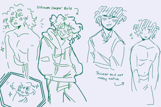
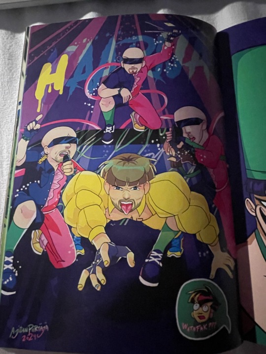
#my zine piece is looking pretty good
Text
in other news I made good progress on the zine piece I'm currently working on, and learnt about fluid dynamics in respect to formula 1 cars, so I think the distraction day has been a success
#and so much better than if I simply tried to go to work and work through it like I originally planned when I got the news#needed to be able to contact and be contacted by the family on my own terms rather than at work where I wouldn't be able to check my phone#and other than a silly structural error which I forgive myself for due to the circumstances#my zine piece is looking pretty good#and I can also now draw an airflow diagram of an F1 car
1 note
·
View note
Photo
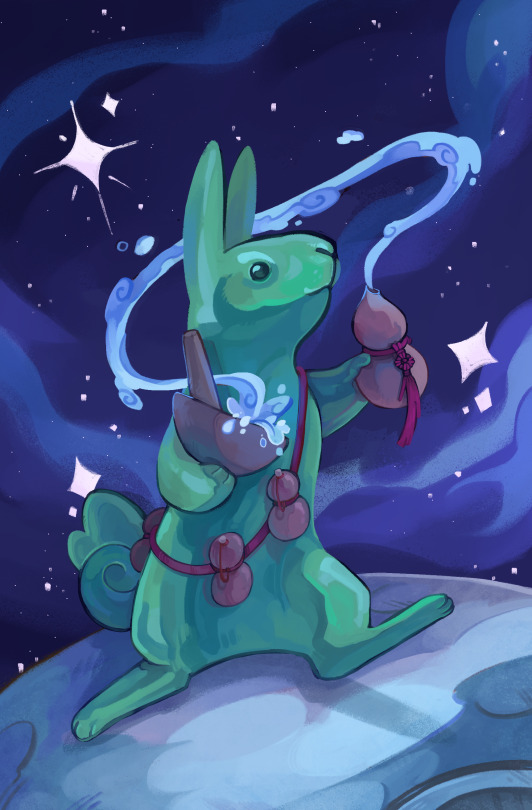
🐇Happy Bnuy Saturday!!🐇
Here's my piece for @/folkloretarot on twt centered around the Moon/Jade Rabbit from Asian (specifically, Chinese) folklore for the page of cups (Water)! You can catch this lil guy up on the moon making his elixir of life in our full KS proj!! :D
#folklore#fable#moon rabbit#rabbit#artists on tumblr#tarot#pspspsp ooo u guys wanna check out the full project on KS and potentially back it for a full tarot deck + zine of weird lil guys#but seriously though PLEASE check out the full deck + the twitter pg; everybody's pieces turned out SO GOOD!!!#this was my first time doing a restricted palette thing for a zine so im pretty proud of how it turned out!!!!!!#anyway yea uHHH in case any1's been wondering where ive been it's been zine + [redacted] projects city baybee!!!#but i've wrapped with regular work fr now (>back 2 being unemployed lmao) and im working on my final zine project atm#so please look fwd to that + some potential merch stuff i'll be doing in my downtime (day jobless) :)
103 notes
·
View notes
Text
been wanting to do a zine for ages but now that I finally applied to one and got accepted as a page artist, I don’t actually have any art for the promo image announcement 😭
#should I just rush and make something real fast?#but tbh if I did make a really pretty intricate piece just for the promo it’s like… I should’ve just used it as my zine piece#like the problem is I want it to look good and I do have art already made that I like but the stuff that’s relevant to the zine topic#is all just shitposts. so those don’t look as good#aghhhhhhhh
0 notes
Text
Recently I ran across an article about an art center that was doing creative expression classes for people with disabilities. Not that unusual, I've encountered that and trauma-oriented art therapy before, but it was the first time I'd come across the idea since getting diagnosed with ADHD. While the class was aimed more at high-needs disabilities, it occurred to me that I could -- if I wanted -- make non-prose art about being disabled.
Outside of my work in scene design I've never been much of a visual artist because I've never felt I had the combination of "something to say" and "a meaningful way to say it", but I started to question how meaningful and complex I really had to be to just make some statements about having ADHD. I can do it in prose, after all.
So I started thinking about how you would talk, in visual language, about things like time blindness, shame stemming from undiagnosed disability, the shift in behavior that medication can induce. Ways to express my condition to people who don't experience it. I still didn't really know how to build the pieces but whenever I went to an art museum I'd think about how I might do a gallery installation. The centerpiece of my mental gallery was a pair of barcodes, one marked "Neurotypical" and one marked "Neurodivergent".
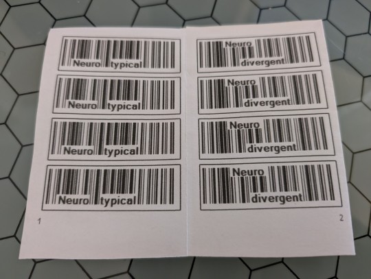
[ID: An interior view of a small booklet, with pages marked 1 and 2, showing barcodes -- on the left, labeled Neurotypical, and on the right, in slightly weirder configuration, labeled Neurodivergent.]
And then I thought, why not make a zine? Nothing you're thinking of couldn't be put in zine form instead of on a gallery wall.
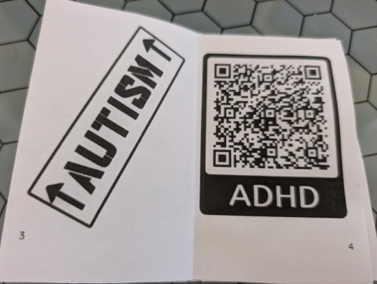
[ID: The booklet continues to pages 3 and 4; on page 3 is a postage-style label reading AUTISM with up arrows on either side, and on page 4 is a QR code labeled ADHD. The QR code technically should work but it just dumps a block of text I wrote about having ADHD into a browser.]
I grew up with zine culture in the 90s and I always wanted to make one but much like with visual art, I never felt like I had the right kind of thing to say; either I had too much to say or too little, and anyway I wasn't confident that what I wanted to do wouldn't just come off as trite and obvious. But you can make a six-page zine out of a single sheet of paper, so I did: I made Helpful Labels For Strange Brains by idab zines, a division of Extribulum Press. (i--dab is a term for a cuneiform tablet that contains a royal communication.)
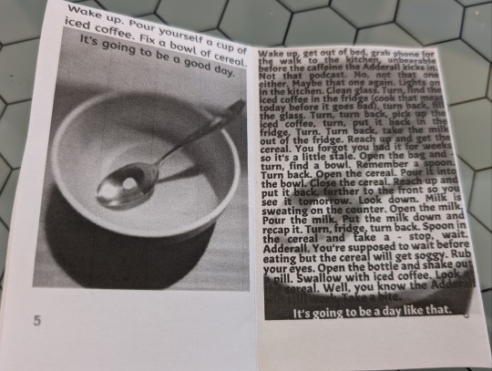
[ID: The last two pages feature the same image -- a cereal bowl with a spoon in it, the spoon containing a single Adderall pill. One image, however, is captioned "Wake up. Pour yourself a cup of iced coffee. Fix a bowl of cereal. It's going to be a good day." while the other is covered in a detailed ADHD-style step-by-step process for the same actions, culminating in "It's going to be a day like that."]
I'm pretty pleased with how it came out -- the art all looks intentional and it still has that "taped this together after school" aesthetic I remember fondly from the 90s. And the confines of six pages, each only a few inches square, offers a good structure to keep things clear, simple, and meaningful.
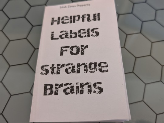
[ID: The cover of the zine, labeled "Helpful Labels For Strange Brains" in a kind of esoteric stampy font.]
Especially nice is that if you wanted to you could just hand out the flat sheet, and let folks fold it into a booklet or not -- there's instructions for folding it on the back of the zine. Additionally I have some sticker backed printer paper so I could print it such that you could literally turn the labels into real labels.
Anyway if you want it, here ya go. You can print it on a single sheet of paper and follow the instructions on the back to fold it. I thought about selling it but I do not have the spoons to do a bunch of printing and folding and shipping.
1K notes
·
View notes
Text
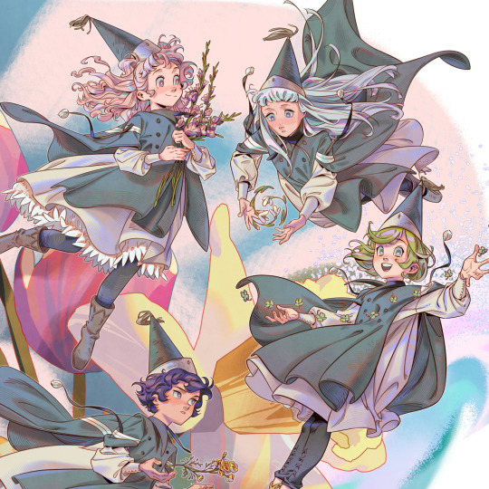
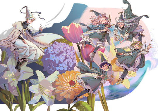
my piece for the Hemisphere: a Witch Hat Atelier seasons themed zine! thank you for having me! they're having a leftovers sale until stock runs out 🖋🍀🌷🍁❄🌧 WIPs + inspiration board + symbolism under the cut!
got some requests to put this on my inprnt! the site has sales very often & you can grab it as a small or big size print.
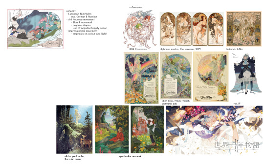
I had a pretty good idea of the composition from the get-go. I took inspiration from art nouveau (primarily Alphonse Mucha), German fairy tales, and some 1920s perfume ads. I wanted the girls to look like fairies, akin to The Root Children by Sibylle von Olfers.
Olly just didn't work out in this drawing due to time restraints. I do love him very much though.
I actually kinda stopped making illustrations like these (including the TGAA/DGS tarot card + TGAA/DGS zine pieces a while back) because they were starting to get very hard on my arm, as I had an RSI (repetitive strain injury) a few years back during school. (Not putting the onus on the zines at all ofc! I genuinely love working with zine projects! it's def a me thing WAHAHAHA. my style was getting too anime and too detailed for my liking and everything was just taking forever to finish ngl. but I didn't have time to experiment with a more simple style outside of all of my deadlines)
I think that realizing you need to stop is okay. It's something that Shirahama teaches us in her story and I want to learn to take it to heart.
---
MILD SPOILERS AHEAD
(for those who havent read the story I guess)
each character's symbolism:
- Coco - spring, clovers - Coco is the quintessential spring girl, and I wanted her to symbolize new beginnings, and oh boy did Coco bring a big one. The four leaf clover in particular symbolizes luck and good fortune - to some characters, Coco may have brought fortune, to others her presence brings misfortune, take that as you will.
- Tetia - summer, gladiolus - the name "gladiolus" comes from the Latin word "gladius", meaning "sword", based on the shape of the flower. you can interpret it as "you pierce my heart", perfect for a girl like Tetia, who has a contagious energy, with a romantic and grandiose nature.
- Agott - autumn, marigold - I read somewhere marigolds symbolize strength and power, perfect for our little magical powerhouse Agott. They can also symbolize jealousy (yellow flowers in particular have this association), which reflects on her rivalry with Coco in the beginning.
- Riche - winter, snowdrop - The white color of snowdrops has a strong connotation to innocence, which reflects on Riche's wish to stay a child forever. It can also symbolize rebirth and new beginnings (like Coco's clovers), as the snowdrop is the first flower to bloom in the spring, when the snow has not yet melted. I wanted the concept of "rebirth" to associate with Riche's friendship with Euini, and of his sort of "rebirth" into a new being.
- Qifrey - he does not have a flower per se, but as the caregiver and educator of the four girls, he represents the rainy season - precipitation being the one thing that binds all of these seasons together. (Note some areas of the world do not have a rainy season like where I live). I think somewhere along the line I wanted to put hydrangeas behind him, to really bring out the "rainy" theme, but the thought probably got lost somewhere in translation...
- bg flowers - honestly I just picked whatever. white lily, daffodil, hydrangea, zinnia, tulip
#witch hat atelier#tongari boushi no atelier#Δ帽子#coco (witch hat atelier)#agott arkrome#agathe arkrome#agott (witch hat atelier)#tetia (witch hat atelier)#riche (witch hat atelier)#richeh#qifrey#agott#tetia#riche#my art#i truly do not know how many tags show up in search anymore LEAVE ME ALONE#thank you for reading if you do - from the bottom of my heart#i am editing this post half asleep bc the full artwork refused to upload for like 2 days#and it finally worked now .#despite my struggles im very satisfied with how this one turned out#one thing that bothers me is qifrey's robe.. i wanted it to be like hes sitting on a flower#but i think the angle of the flower didnt work out LOL so it looks weird#*nitpicks my own art to hell as per usual. you know. the usual midnight thots*
3K notes
·
View notes
Text
hii im suuper late to my own week ik (i'll post the rest of the days from time to time, college applications were a pain </3 but i've got most of it down
This piece is a redraw of my very first post ! This has been a wip since the start of the year so my art style unsurprisingly changed a bunch as i tweaked the lines and colors. it's not the best but it's looking as good as it can be!
as for the zine, people are free to draw up pieces for the week up until the end of september and we can compile it all together! it's not really the usual zine format but who knows.. we can maybe try to figure out a way to formally start a more structured zine project for these two
Anyway! I've decided to dedicate my greenflower week posts to my headcanons I've made up for them from the past 4 years.. I figured you guys could take a peek into my brain since I haven't really been good at that unless you catch me in a vc :") there's a buncha hcs and old ass art i never posted finally unearthing under the cut if you wanna take a peek
So, first thing: Body headcanons..
i took super long getting what i want with this waay back when I started posting cause I was still figuring out a lot with my art. i couldn't get in good details/features that would properly differentiate them or make them fun to draw. I wasn't striving to be really innovative with the designs or anything, I just wanted them to feel like characters I like looking at and thinking about
finally, i'm somewhat able to settle on these as of right now! It will most likely update as the time passes and my art changes, but this is what I got!


basically the main idea is that i wanted Lloyd to be bulkier but sharper. grew up fast and has all these edges, but then you get to know him and he's just a big ol dork. Mostly wears loose-fitting clothes that hides his figure, but he's quite built underneath


Brad's a lil taller and pretty lanky. my art style may not be able to show that properly but lloyd can snap him in half <3 he also seems hella chill but that's probably cause he got balls of steel after living through a million ninjago invasions


This thing below is an old outfit concept I have for a project that I've been working on. does not reflect my current headcanons with his physical appearance but i do like his clothes
I think he loves his role as the green ninja, saving the world and such. it came with lots of baggage and reflection but i do promise that he enjoys it for the most part. I think him wearing green is kind of like wearing work clothes so he tends to avoid it on days when he's free to keep from being too ready to jump into ninja mode

i do tend to keep him in green though cause the fandom sure does love their color-coded ninja
anyway .. that's about most of what i've got for this that looks good enough to post, so here's a bunch of other doodles/sketches, both old and new ToT


oh and a quick comic too cause why not


one more: bonus greenflower yuri

thanks for coming to read this far :) there'll be more soon
#ninjago#lloyd garmadon#ninjago lloyd#brad tudabone#ninjago brad#lloyd x brad#ninjago greenflower#greenflowershipping#forgivenshipping#forgivenship#evan's art!#evan rambles!
199 notes
·
View notes
Text
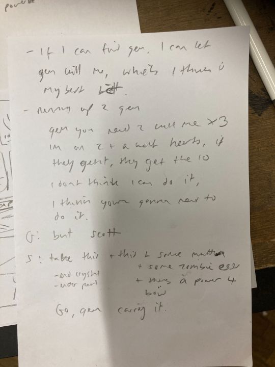
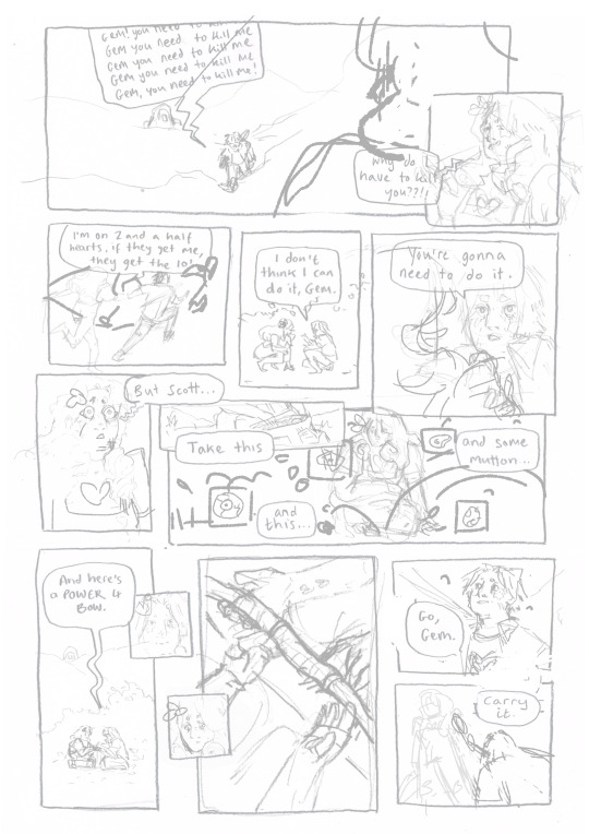
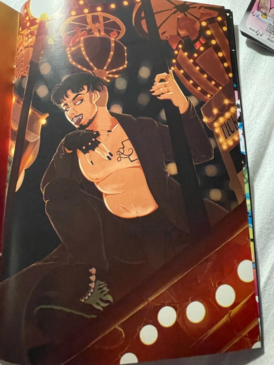
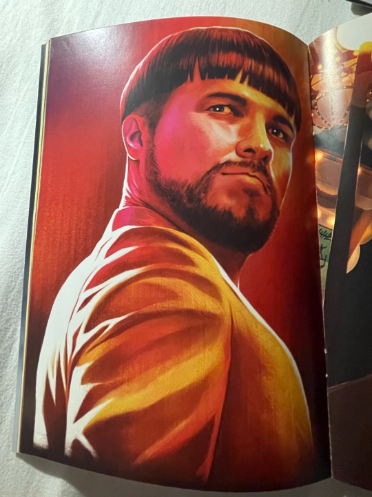
28th June ‘24 - [arch] One Page Limitation??? - My process for Traffic Zine #5

Hello All!
A couple months ago, I got accepted to @trafficzine, a digital anthology of pieces by a large group of artists and writers based on the most recent season of the Life Series. I made this piece back in April, but thankfully I kept some notes of my process.
Heads up - this contains spoilers for Secret Life :D
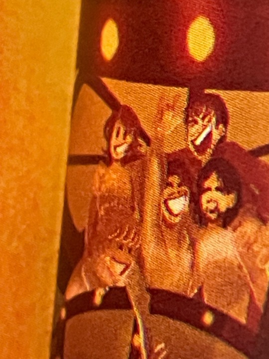
We were able to choose our own prompt from a list! For this project, I wanted to push my comic making - especially how to communicate a lot of information in a small space. I went through and watched a few clips from the series to see which prompt would fit a comic and settled on Scott’s death.
As usual, I began by getting some reference images and going ham on some big paper. This gets me excited about the project and helps generate ideas. I go for whatever interests me in terms of medium and subject matter, but I try to use a process that doesn’t let me control too much (in this case brush and ink)
initial sketches for fun and vibes :D
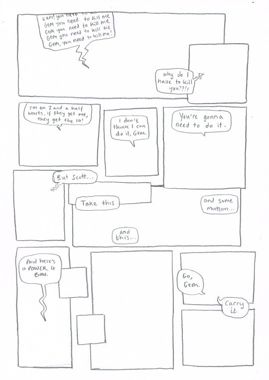
During this, I also took the time to transcribe the scene - I wanted to use the dialogue directly, and see how much I could fit into the single page that I was allowed for the zine.
In these early planning stages I make sure to do warm-up sketches to remind myself of the energy I want to communicate. This also keeps things fun and fresh so I'm not ONLY thinking about page composition and making things 'good'. (the expectation for it to be 'good' kills a project prove me wrong)
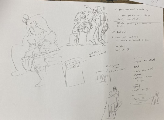
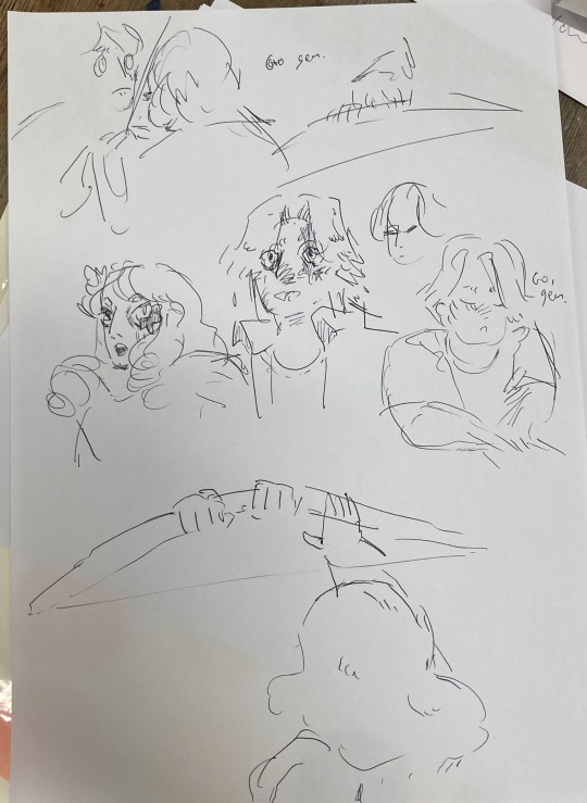
Dialogue from the clip + warm up sketches
Next up, I started to plan what panels I have on the page. At this stage, some panels might just be a box with some words, and some may have a sketch if I have a clear composition in mind. This stage is mostly for pacing and plot, so instead of focusing on what the panel and page will look like, I will think about:
what will happen in the panel
it's purpose and
what it will communicate
Sometimes I'll illustrate a string of panels that tell the story and fit them on a page after - but this depends on the project and my confidence with the size of it.
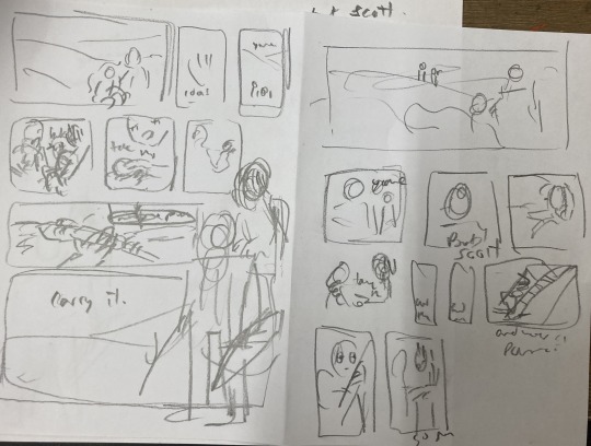
After messing around with these and coming up with a pretty clear direction, I draw a bunch of boxes to see how the panels could sit nicely together. At this stage I might realise I have too many panels, and need to cut a few or come up with a creative solution. Nothing is set in stone at this point.
sketching panel layouts
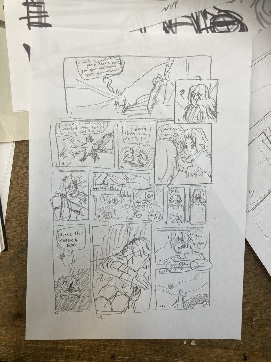
Now begins the fun! I decide on the layout I prefer and I can start putting planned compositions into the boxes. I often do this digitally, or a digital editing process will be involved.

Once planned, I print these out to do a more refined sketch over. I find that my traditional drawings have a lot more life and character to them than digital ones, so I try to keep the majority of the process traditional, with passes of scanning and digital editing.


I tried a version with her looking out at the distance - ready to face the oncoming battle. But it still felt off. So I turned to my slides to ask myself some questions!!

I tried to think of more things that were working - but I really felt like it was lacking a lot. I was going for this slower emotional feeling because that came more naturally to me, but it just wasn't working for this image. The original clip is quite rushed and chaotic - which would be harder to communicate in a comic format but the challenge interested me. Either way, I knew I wasn't happy with this direction so... i decided to start from scratch! Back to the drawing board!!!
In the previous version, I had cut out a lot of the dialogue, but I decided to go back to the original clip and use AS MUCH as possible. Since passing the bow was my favourite part of that first composition, I really wanted to lean into it as the emotional height and final goodbye before Scott's death. It's a moment to slow down and absorb the vibes :D

I made a list of panels along with their descriptions to refer to when trying to figure out the order of panels. there were SO MANY and it was VERY CONFUSING when they were too small to read.
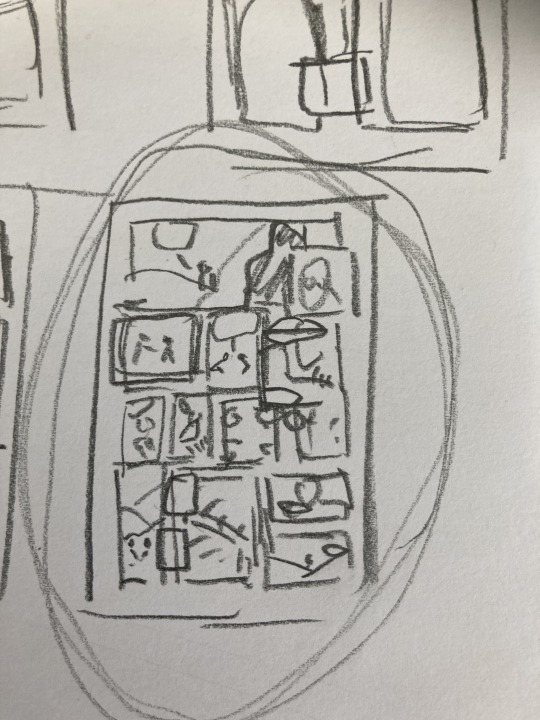
These thumbnails were super small and would not have made sense without my list, I swear.
I printed this tiny thumbnail out at A4, so I could sketch over it and get a clearer sense of flow. Then began a loooong process of printing out tiny photocopies and rearranging the panels to be legible. It was a difficult balance of communicating busyness while making sure the hierarchy/reading order made sense.


After some tweaking, i printed out an A3 copy to draw my panel borders and text.
Doing this on a separate piece of paper means I don't have to worry so much about messing up the text or borders when drawing the characters. This allows me to be more free and expressive with my illustration.
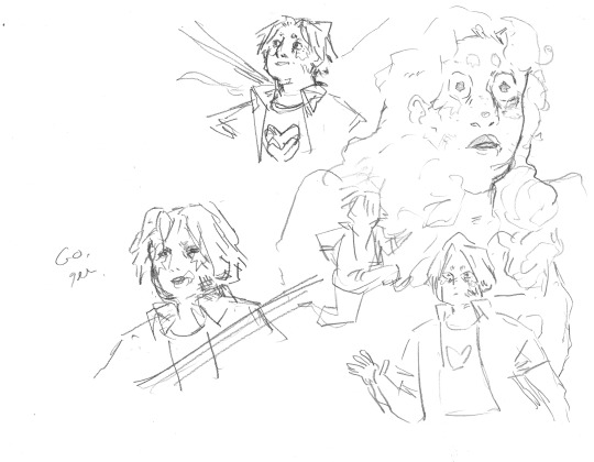
Woah! Quick trip back in time!! During the thumbnailing process I drew these warm up sketches! I looooved the way the linework came out. I drew this on an A3 piece of paper - and the shocked Gem would, in theory, be one of the smallest panels. So I decided to do a crazy thing.
I touched up the sketch digitally, compiling some of my favourite warm up sketches, some traditional sketches made for the panels, and filling the rest in digitally. Then I printed this image out in QUATERS at A3!! This meant the final sketch layer, printed out was A1!! (aka very large, considering the final file would be at A4, about 8x smaller)
I did this so I could get fairly small detailed lines with my pencil while being quite expressive and firm with my mark-making. Slowly, I dlined all of the panels traditionally and scanned them in. Then I assembled the finished linework on Photoshop, along with the text and panel borders and got to colouring :D

final linework :D
For colouring, I played a little bit with halftone but I found the texture made it feel a bit too busy - the panels are already doing enough. Because of this, I also decided to use a limited colour palette. Here are some images of the colouring process, which I won't go into today.


I'm really happy with how this came out - I think it captures the chaos of the moment, while taking time to linger on the emotion of it. Keeping that bow moment really made it, I think.
I think the last panel is still quite weak. Earlier in the process there was a low-angle shot of Gem about to kill Scott which may have been more powerful, but I think I was struggling with my actual drawing skill when it comes to perspective. A lot of learning how to draw, and in particular with comics, is about knowing where your skills are at, how to utilise them best and how to test and push them.
I'm glad that I started again, instead of finishing that composition I wasn't happy with. It was a tough project but I learnt sooooo much from it, and it's been essential skill-building for.... the current comic I'm working on (stay tuned!!! :0)
Thanks for reading this incredibly long post! Go check out @trafficzine and look at all the other cool art
Cool vibes and silly men,
Archie :D
#archillustrates#arch is learning#project development#art#art process#art resource#process#artists on tumblr#illustration#comic#picture book#art blog#illustration blog#queer artists on tumblr#illustrator#female illustrator#queer illustrator#comic artist#comic art#female artists on instagram#artists on instagram#procreate#digital artwork#artist blog#artist on tumblr#web comics#tumblr art#tumblr art blog#art on tumblr#life series
133 notes
·
View notes
Note
hey! sorry to bother you, but is there anything a teen without transportation in a rural area can do on their own? im pretty isolated, and theres barely anything around me.
Hey ya sprout 🌱
**A disclaimer Punk comes with some risk socially. Particularly if your in a rural area this risk goes up bc people Know You and also typically these spaces have a different vibe to alt ppl in general. Some activities are more or less risky and I'll try and do my best to give you a range of stuff from the whole spectrum! Of course this is a generalization of rural areas. Some palaces will be more cool then others depending in so many factors I couldn't go into here**

Rural solarpunk
Your gunna been to pick a topic, sorry babe. In order to not burn yourself out and in order to feel like you have an impact your gunna have to pick a cause to chip away at but I'll give you ideas! And remember just bc your focusing on one thing doesn't mean your ignoring or not helping others. Everything is interconnected and any help, helps all!
So let's give you some ideas to focus on:
Libraries- as a teen in particular you'll have access to a library at school, but depending on how big your town is you might have a public one as well. Become their biggest supporter! They are a great safe space, even conservative ones are still a good place to go for archiving/loitering purposes. They give you spaces to print stuff, to build clubs and community.
Archiving- if you cannot leave your house due to access you can always do stuff online and hear me out, i know when we do stuff online it feels like half points. Like we arent doing anything. I feel that with this blog, it feels so passive no matter how hard you work youll feel lesser. But Archiving is vital to humans! Think of the anthropologists wholl thank you down the road! Plus it does actually give you a way to have a physical representative of work your doing. Dvds, pirating media and archiving them to drives, collecting vinyls/tapes/cds!
DIY- To fight against fast fashion (although that barely exists in the towns I've been in tbh) and to stick out** you could make your own patches, battlejackets, gloves, etc.. They are statement pieces you can wear whenever your in town/at school/social spaces that ppl know what you stand for and who you are. Depending on who/where you are this might be risky so take what you can bare ok? You don't have to wear these items too you can just make them for later on!
Little libraries/little pantries- in a rural space you have more Gruella tactics you can take if you do them in random abandoned spaces. You could build a waterproof little pantry and stock it and leave info somewhere about it for ppl to drop off/pick up items. Stock it with mittens! With canned goods! With books! You might be able to do a space like this at school/library depending in how cool your town is too!
Zines- You could look into making a zine and even if it's digital you could have the QR code for download in places (stickers on lamp posts, flyers in school bathrooms, hidden in a churches pamphlet stacks >.>) making a zine is a cool task that is time consuming and informative and fun!
Vandalism- like I said you can often print off stuff at Libraries, or usually you can find a place to print stuff off near or at post offices depending on how modern your rural space is. if you have your own printer this will reduce your risk by quite a bit though! Create/find stickers or posters you want to toss across town or even school. I'd recommend starting off with some stickers and see how their handled, dipping your toes is important with these kinda things. If your really feeling it, and you know some abandoned places Moss Graffiti is also a good option! I've know ppl who have converted old abandoned stored to skate parks (I honestly have no idea how they built the ramps out of concrete but damn!! Good job guys!)
Also I'll leave you with 2 book recommendations as well-
Moxie - a RIOT GRRRL story about a girl who gets so fed up with her conservative town she makes a feminist zine and distributes it via girl bathrooms (even having a basically me too stickers and encouraging ppl to put it on boys lockers who have assaulted them). I know there's a movie, didn't seem to capture the same vibe tho so book!
Braiding Sweetgrass - this focuses a lot on reconnecting and adding story to nature around us and having science along side spirituality
#sporut guide#reaping week#solarpunk#hopepunk#anticapitalism#punk#rural#cottagecore#community#ecopunk#direct action
236 notes
·
View notes
Text
professor told me my bachelors thesis 'looks pretty good so far' AND i just submitted all zine pieces id been working on 💪💪 yeehaw
44 notes
·
View notes
Text
FAQ
What is a digital zine?
Just a zine in digital format :) This means there is no limit on length and will be distributed for free as a PDF. It gives more freedom in terms of content and allows many more people to participate both in production and reception!
Why is it free/will participants be paid?
It’s free because fandom is fundamentally about community and shared appreciation of a show/ship. The original property doesn’t belong to us, and I want this to be an endeavour done purely out of love. It’s entirely for fun, and no one involved will receive any monetary compensation.
Will there be print copies and/or merch?
No. Of course, you’ll be free to print the PDF file for yourself.
What SocMed do you have?
A tumblr, a twitter account, and a discord. If possible, please do join the discord as it will be most convenient for announcements, immediate questions/feedback, and also should be a nice place to interact with other radiostatic fans. :)
Discord: https://discord.gg/uwFz8NjjGG
Twt: https://x.com/RadiostaticZine
What dates will it run?
The plan is for sign-ups to begin July 28th and end August 18th, with final submissions by December 15th with check ins along the way. Release will be planned for mid-late January depending upon staff’s availability and workload.
Is there a limit on the number of participants?
Nope! No one will be judged on whether their work is “good” enough to be included. All works are welcomed.
Can I participate if I’m under 18?
Sorry, no. All participants must be over 18. If you sign up and are later found to be (or heavily suspected to be) under 18, you will be removed from the project.
Will I be able to post my fic/art to other sites?
Yes, although we ask that you wait at least one week after the zine’s release :)
Is there a length requirement for fics?
Please aim for anywhere between 1-5k. It’s not a hard and fast rule, but we’d like to keep each fic a manageable length for practicality.
Will the zine have a theme?
Given survey feedback and my own initial feelings, not this time! If this general zine goes well, perhaps subsequent zines might explore different themes. If you would like to participate but want specific inspiration, feel free to sign up and then chat with others in the discord to discuss fun prompts or ideas.
What kind of content is allowed?
Pretty much anything as long as it's about Vox and Alastor’s relationship! All fics and art will be required to submit a rating and appropriate tags/warnings. If you have any particular concerns or questions about something you might want to write/draw, please shoot me a message. But rest assured darker themes like unhealthy relationships, gore, vore, dub/noncon etc are all fine as long as appropriately and fully warned for. Of course, cute fluff is wonderful too! The zine will most likely be divided into sfw and nsfw sections.
Is one-sided/complicated/requited radiostatic okay? What about Alastor’s asexuality?
All forms of radiostatic are welcome! One of the best things about this ship is how much variation there is in the portrayals of their relationship, and you’re welcome to explore it as you like. Similarly, asexuality is a wide spectrum and I don’t feel that it’s our place to dictate how anyone explores that with Alastor in their own work. Aroace Alastor is also loved and welcomed :)
What about sideships and VoxVal?
Sideships are fine mentioned in passing, but please remember that the focus is radiostatic. This goes for VoxVal too - as they are canonically involved at least to some degree, it’s understandable if it is relevant in fic or affects the narrative. But again, the overwhelming focus should be the radiostatic interaction and relationship.
Can I contribute both art and fic?
Yes! However, each participant will be limited to one piece per medium.
Can I help out as a mod/staff?
Yes, we will be looking for volunteers to help out! Particularly for formatting, proofreading, and cover graphics/art. Please let us know if you’re interested in your submission form :)
If you have any other questions, please reach out at any time!
Thanks for your interest <3
#radiostatic#staticradio#voxal#onewaybroadcast#radiosilence#radiostaticzine#FAQ#hazbin hotel#hazbin hotel alastor#hazbin hotel vox
50 notes
·
View notes
Text
☆ Zine WIP Art Dump ☆
Hello everybody! So I'm currently participating in Harriertail's Warrior Cats Cover Zine as the artist for Leafpool's Wish (I got sooo lucky since she's my favorite character) and I just wanted to upload my unused concepts now that I've finally decided on the one that I want to use
Design —

The face is a bit wonky so please ignore that </3 but these were my concepts for Leafpool's design since she's the main focus for this piece!
The first one is just my current design for her. The second one though is based off of my oldest Leafpool drawing that I still have. Most of my old digital art is lost due to data corruption or just deleting posts and videos on the offchance I did post art online, but this is one of the few drawings that survived. It's from a MAP part in a MAP that was actually completed but was deleted sometime in 2016. The third design is me trying to combine what I liked about the old and new designs together

I couldn't see her face and there's this white glare that's meant to be moonlight that I airbrushed in on Paint Shop Pro 7 so I couldn't directly colorpick, but I tried my best for the second one. I'm also probably going to make her eyes a cooler shade of a green since I'm not sure how I feel about the more olive green color
Unfortunately, the concept I went with isn't even going to show her tail so it doesn't really matter which one I use outside of the exact shade of light brown she's going to be, so I'll probably go with the current design. But had that not been the case, I would've gone for either the old design or the combined design since I thought it would be fun to nod to my old art of her since she's been my favorite character for so so long
Cover Concepts —
These concepts were all very rough since I was just trying to scribble them out as fast as possible since I am a slow artist, but as a consequence the cats do not look good at all. My focus here was the scenery and general placement and colors
Before my book reread

After my book reread


The first one is similar to my old concept before my reread. I was mostly just trying to fix the composition here more than anything. The second one though is based off of a dream that Leafpool had at the moonpool where she and Crowfeather were climbing a tree together (and then both were blown off the branch because of a storm... there were so many storms in Leafpool's Wish for some reason). Had this been the one I went with, I would've centered Leafpool more and pushed Crowfeather more into the shadow
The one that I ended up going with (which isn't featured here) is pretty simple all things considered but it was the one that people generally liked the most when I asked around but it still will have it's fair share of little details I'll try to add. I am very very excited to work on it and be a part of this project :)
31 notes
·
View notes
Text
new year new news
hey everyone! wow! 2022 is over! what a year! i made a lot of art, had some cool opportunities (painting a mural!!!) and some challenging transitions (quitting my job, switching academic programs!) but i think, overall, i’m glad to put this one in the rear view mirror.
now, to get out of the rear view mirror and look forwards into the metaphorical windshield - my resolution this year is to MAKE MORE ART and to GET OUTSIDE OF MY COMFORT ZONE and with that in mind, my first actionable goal for 2023 was...
to start a patreon!
not gonna lie, i’ve been just as nervous as i’ve been busy setting this up the past few weeks (and the imposter syndrome has kicked in HARD), but hey, doing new things is always scary and awkward. and i really wanted a good excuse to put some time and energy into behind-the-scenes stories, progress shots, sketchbook pages that aren’t pretty enough to post on their own, and rambling talks about the winding path my own art tends to follow. so maybe check it out and throw some money my way, if you’ve got extra and are curious!
currently i’ve just got one $3 tier up, but i’m sure that will change and evolve as i figure out what i’m doing. but what can i access with three dollars, i hear you ask? well...
full digital copies of all of my zines! with transcripts, and personal commentary!
polls! maybe i'm making new stickers and don't know which design to go with, maybe i'm amassing work for an update and don't know if i should make some more selkies or some more sphinxes - these polls will help ME decide what to make more of, and help YOU ALL see more of what you want from me. win-win!
behind the scenes posts and videos! i have to admit that i harbor a secret love for video editing, but I have so far had no real outlet for it (aside from the AMVs that i occasionally make in a fugue state and NO i’m never showing them to a soul) - but i've just filmed and edited the first full start-to-finish process video for patreon! watch me make a ceramic beasty from sketch to glaze firing, with full voiceover commentary (my voice was once described by a child as “why do you sound like that? you sound like you’re going to cry” so look forward to that!) i have plans in the future for tutorial posts and videos, more process timelapses, and full behind the scenes zine-making retrospectives, from writing to illustrating to binding.
this month (january 2023) only, sign up as a patron and i will personally send a little doodle to your house! yes, like in the mail. feel free to send me a prompt with your pledge, otherwise it’ll probably be some sort of creature with a human face and stars on it. maybe it will still be that, even if you give me a prompt.
finally, you will get my eternal gratitude! i truly cannot thank you all enough for the support and love over the years. it's been such an amazing honor to find other people who like the wacky little critters i make, and whether you've purchased art from me, follow me, or are even just someone who's seen and liked a piece of mine, i am forever grateful to be able to connect across space and time, with you, over art.
whether or not you decide to pledge, from the bottom of my heart, thank you! i am so lucky to have this space on tumblr to share my work - every kind comment means the world to me, and i just hope my work can be enriching to your worlds in some small way, too! i know making it enriches mine :^)
562 notes
·
View notes
Text
Look who arrived :3
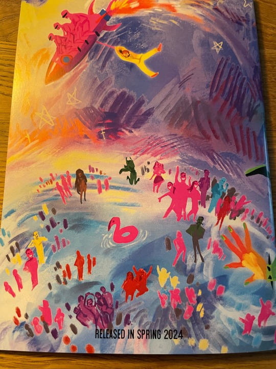
My @kaarijazineofficial arrived 🥹🥹🥹🥹🥹
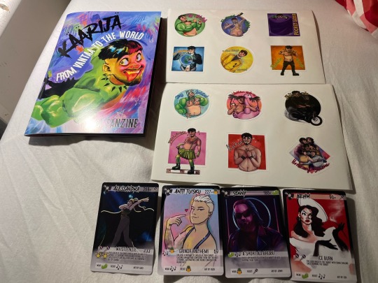
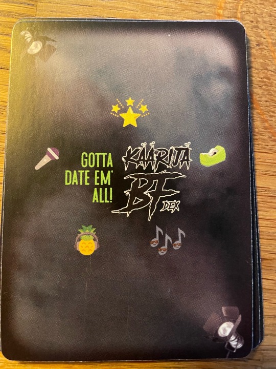
I absolutely love the cards, reading and looking at all the details and the backside is so pretty too 🥰🥰🥰🥰🥰🥰.
The art inside and outside the zine is insane too. Putting my gushing under the line in case you want to see it once your own zine arrives :3.
Gushing begins, weeeeeeeeeeeeeeeeeeeeee
The back of the zine is so pretty, look who is there 🥹🥹🥹🥹. They are all there 🥹🥹🥰🥰.
Oh same about the backside of the cards
The notes have sunglasses 🥹🥹🥹🥹🥰🥰🥰, also the tape is such a cute nod towards Jesse 🥰🥰🥰🥹🥹. The amount of detailing in the entire zine is so impressive. Was squealing all the time while opening and going through the pages.
The art inside is so edible like wow 🥹🥹🥹🥹. So much detailing, the colours are so fun and like wow the skill 🤯🤯🤯🤯🔥🔥🔥🔥🔥. The textures are so good 💛💛💛💛💛💛💛
Some examples:
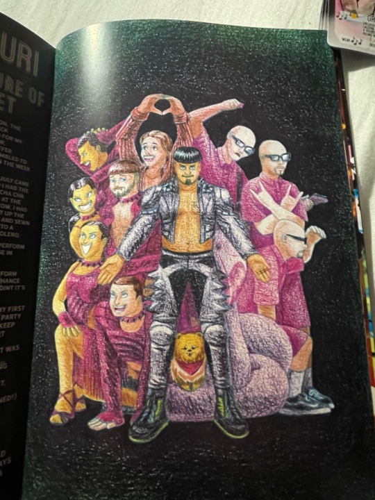
^Look at this, little chelsea 🥹🥹🥹🥹🥹🥹😻😻😻😻😻😻😻😻😻. The one and only. Awwwwwwwww her little bandana looks so cute and häärijä 👀👀👀🥰🥰🥰🥰. Insane how many people are in this without it being crowded 🥹🥹🥰🥰🥰🥰🥰🥰🥰. They are all there, the dancers, the daltons, frank 🦩, häärijä, the bojan and our fluffy queen chelsea 💛💛💛💛🥰🥰🥰🥰🥰🥰🥰.
^This piece even has joker out (they are adorable 😻😻😻😻🥰🥰🥰🥰🥰 and so small 👀👀), insanely detailed absolutely love the colours and the lighting. 👀👀👀🔥🔥🔥🔥🔥🔥 Also Jere has fangs 👀👀👀. The poses are so sweet and energetic.
^You can see the freaking texture in the fabric, i am going insane over it. Like aaaaaaaaaaaaaaaaaaaaaaaaaaaaaaaaaaaaaaaaaaaaaaaaaaaAAAAAAAAAAAAAAAAAAAAAAAAAAAAAAAAAAAAAAAAAAAAAAAAAAAAAAAAAAHHHHHHHHHHHHHHHHHHHHHHHH. Wow, also the eyes 🥹🥹🥹🥹. They hold so much light and warmth. The colours are so neat. 💛💛💛💛💛💛
^Hell yeah, Häärijä Show Time, i freaking love the mash up of the dancers and the daltons outfits, absolutely love that, also jere's watafak is everything. The colours are so good too. 💛💛💛💛💛💛🥹🥹🥹🥹. And all the little details like i want a pair of häärijä earrings as well 👀👀👀👀, love that they are in the style of häärijä's merch 😻😻😻🥰🥰🥰🥰
So many jere's/one john (who got a very fancy hat, seriously i love the hat💛💛💛💛)/ one häärijä 🥰🥰🥰🥰🥰🥰🥰🥰🥰🥰🥰. Absolutely lovely. So many memories come up seeing all the outfits 🥹🥹🥹. Love the colours too. 😻😻😻
The stickers from @mitamicah are super cool too🥰🥰🥰🥰. A sticker with Jure is there too, i absolutely love the honorary slovene piece 🥰🥰🥰🥰🥰💛💛💛💛💛💛💛💛💛.
Look at these, i am stunned and in awe. 🥰🥰🥰🥰🥰😻😻😻😻😻😻😻😻😻😻😻😻😻😻😻😻😻😻😻😻😻😻😻😻😻😻😻😻😻
#käärijä#käärijä fanzine#so freaking happy it arrived here#🥹🥹🥹😻😻😻😻😻#the art is amazing#this fandom is so talented#going a little insane#pretty art#🥹🥹🥹🥹🥹🥹🥹🥹#so very pretty#💛💛💛💛😻😻😻😻😻😻😻😻😻#absolutely love iz#🔥🔥🔥🔥🔥
35 notes
·
View notes
Text

I haven't done one of these in forever! I think the last one I did was... four years ago? I thought it would be fun to make one again with my improved art skills and show the work that was put into this piece.
The final piece was one of three idea prompts I submitted for the zine. I was already sketching out thumbnails while I was waiting for approval, but I did draw for one of the rejected prompts as well. (Unfortunately I don't have access to them at this time but I'll add at a later date).
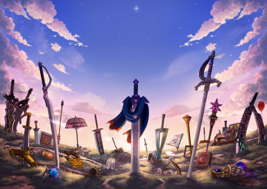
Once the weapon prompt was approved, I got started on a rough sketch. (The sketches were drawn cleaner than what I would normally do to make sure it was readable haha). The toughest part of the piece was its composition. Scattering the weapons was hard because I needed to make sure everything looked balanced and focus was placed on the master sword.
What ended up working for me was I managed to grab as many weapon models from the game as I could find, threw them into Blender, and arranged them until it looked good. A bonus of doing this was having good references for both the piece and the individual weapons themselves (which came in handy when I had to draw some of the detailing). The models were also size accurate so that helped a ton too. I did have to upscale the smaller weapons so they'd be more visible on the cover.
Some of the weapon placement was deliberate, others were put there to fill in space or for another reason. The majority of the characters wielded some variation of a sword so I sprinkled in different weapons and other things to break up the repetition. That includes stuff like the Fierce Deity Mask and Toon Zelda's helmet. The more sillier weapons like Tingle's balloon and King Daphnes' sail were placed in the back so they wouldn't clash too much with the other weapons.
I'll talk about some of the more of the symbolic stuff further down the post.

I also drew an alternative version of this piece with Link being in the center instead of the master sword.
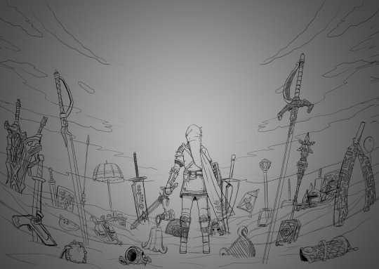
Fun fact: at one point I did consider including Ganon since he's technically playable, but realized he doesn't have a weapon. This would have meant I would also had to include the big Cucco from the cucco mode so neither were ever conceptualized.
I intentionally left the art's tone ambiguous just in case the mod team had something in mind. I did picture it having a dawn color scheme though, and the mods wanted the cover to have a peaceful/hopeful vibe so that worked out. I did however add some sunset choices in my color concepts for more options. The four I made also had sepia versions to fit with the aesthetics of the game.


8 was the one the mods chose. However, I did end up slightly adding 6's colors into it to make the sky pop. This ended up being the finalized color concept.
(It looks a little fuzzy because I ended up layering 8 and 6 on top of each other and I didn't position them correctly fghj).
When I do illustrations I start with the background first so I can use its colors for the foreground and midground. I normally don't draw clouds this big and up close so I had to be pretty delicate with how I rendered it. I'm glad I only had to do one side and just duplicate it to the other. Also I made the oranges in the sky and clouds subdued.
After the background was done, I tried rendering the ground and it was a disaster. This was early on in the rendering phase, but what was meant to be dirt started to look like sand. I tried to see if adding textures would help but it made the problem worse. I ended up taking a break from the ground and moved on to the weapons.
Next was the most grueling part of the piece: linearting. I am not kidding when I say doing the lineart took three whole days. I was also juggling with my other illustration I was working on for the zine so the timeline ended up stretching to a week. I'm a detail-oriented person and stuff like this isn't usually that bad for me but this one was pretty rough. The sweat and tears paid off, I think!
After lineart was done, I went back to render the ground again. It was becoming more polished and included more small rock formations, but the dirt-looking-like-sand bit wasn't improved. I opted to add grass instead since that would be easier to render. That was probably the right call because I think that helped with the desired tone for the cover.
I flipped-flopped between working on the grass and the weapons. This screenshot was when I had added the shading, textures, and some highlights. Oh, and I slightly tweaked the sky a bit.

With the grass and rendering done comes my favorite part: color editing. Started throwing overlays, soft lights, what have you on everything and used color balance to level out the colors. Also added light reflection on the ground for some of the weapons.
Something was missing from the illustration and I had no idea what it was. A friend had suggested particle effects and that did the trick! Everything was set and done and I submitted my illustration. When I saw the cover with the title for the first time, I noticed that the illustration was made a bit brighter than what I originally had (likely so the title stuck out better). I actually really liked that change and edited my own copy of my illustration accordingly.

With that said, now I want to talk about some of the more subtle details in this piece. You guys probably noticed these already, but I want to talk about them anyway! I mentioned deliberate weapon placements some ways up so let me go over that first.
Ghirahim's sword, Zelda's rapier, and the master sword are placed in sort of a triangular way meant to represent the triforce (although I think I messed up on the distance between them). I originally wanted Ganondorf's swords being in Ghirahim's spot but I was worried about contrast issues with the swords' darker color scheme and battling attention away from the master sword. I think the idea still works considering Ghirahim is Demise's sword (and Demise is like the Ganondorf of that game). Though Ganondorf's current placement can be viewed as him being a looming threat, for Hyrule Warriors and other Zelda titles.
I have Lana's tome and Cia's scepter close together to symbolize them being two sides of the same coin. Toon Link and Toon Zelda's were placed on opposite sides of the piece but slightly facing each other. Toon Link's and Tetra's are also diagonal from each other, both also representing a type of connection to each other. It's a similar deal with both forms of Midna's weapons as well as Yuga and Ravio. Speaking of Ravio, his weapon is the only one partially buried, sort of peaking over at the master sword to reflect his cowardice natureand being Link's Lorule opposite (at least the Link from a Linked Between Worlds). A similar idea with Fi is that she is somewhat of a silhouette behind the master sword to reflect her growth in Skyward Sword. (I know technically Fi is represented twice here, but her "weapon" in Hyrule Warriors is a different blade so that's why).
Like I said before not all weapons have symbolic placements like this, but a number of them do.
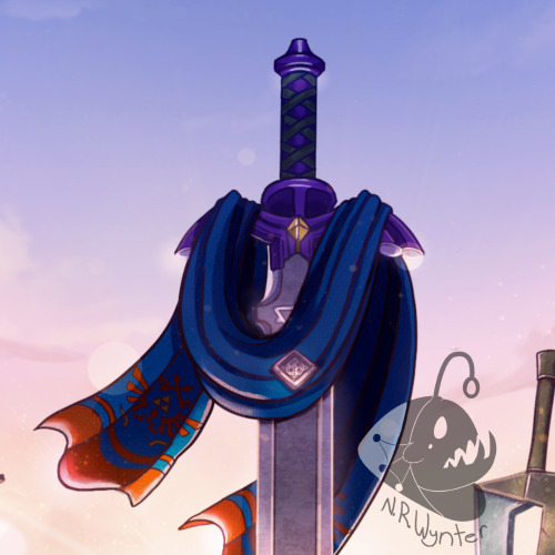
One more weapon detail I wanted to point out is on the master sword. I had this planned from the very beginning but I intentionally draped Link's scarf over the master sword so that the triforce of courage on the blade is the only one visible. I also intentionally highlighted the engraving to make it more prominent.
In the background, the sky is shaped in a way to resemble the Hyrulean royal crest. With the gap in between the clouds looking like the wings, the Master sword acting as the body, and the three visible stars as the triforce (but I messed that up slightly). Only thing I didn't include was the feet of the crest. It's not an exact 1-to-1, but here's an outline for a better visual:

On the topic of stars, there are 29 in total to represent all 29 characters. The brightest star above the master sword is meant to represent Link, but the other 28 are scattered around. Some are more visible than others so it may be hard to spot them all, but they're there.
Saving this last detail because it doesn't really have anything to do with Zelda and more to do with my art. I have always wanted to do this with my work for a while but haven't implemented it until now so I wanted to bring it attention.
From now on, all of my illustrations will have a hidden little angler fish blended into the scenery. I got the inspiration from Adventure Time's snail that appears in almost every episode incorporated somewhere and thought I could do something similar with my art. I'll show you guys where I placed this one, but you'll have to find the next ones on your own.
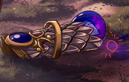
Not the clearest, but I promise in the future it'll be better drawn (and in case you're wondering, yes there are also little anglerfish in the other zine illustration too!). I just thought this would be a fun way people can interact with my art (and also act as an additional signature).
And that's it! If you have read all of my rambles, thank you!
30 notes
·
View notes
Text


My Contributor bundle of All Hail Shadow zine (@shadow-zine) has finally reached me! It went through 3 people on the way to me, and many hands added to it, but I will show these personal gifts some other time 💝
Everything is so pretty! Alex's cover keeps me in awe... So many fantastic pieces under it, too... And the merch! I've already went out wearing Yurei's pin, and it's sparkly-sparkly-sparkly ✨✨✨ One of the stickers from Avery found its place on my home office furniture, and I'm considering using the Contributors-exclusive notebook with their design for some serious business.
I'll admit, holding a hardcover book that contains my writing is an incredible feeling... And it's for a good cause, too! 🏥 This project was one of my first zine experiences, and looking back, this is what started my zine moderator journey as well – through the people I've met there.
#sth#sonic the hedgehog#sonic#sonic merch#Sonic series#Shadow the Hedgehog#All Hail Shadow zine#zine#merch#stationery#pins#charms#fanfiction#writing#writing by sonysakura#photo#by sonysakura#photos by sonysakura#I'm still holding onto my fic until the leftover sales sdfghjk#But here's a longer preview than before 😌✨#Though you can also just subscribe to my Boosty to read it
26 notes
·
View notes
Text
Replies
But also some news!
First of all, I wanted to remind you that my pricelist will be updated by the end of the week, so please feel free to message me if you want to take a slot to commission me with my current prices!
Second of all, we got our twitter account back! We ended up deleting that one post that twitter didn’t like (yes, the one that doesn’t have anything explicit or any nudity on it), which obviously sucks, but at least now we can jump back to posting more or less regularly.
And now that this situation is over, I can say about the thing that honestly tickled me: the last person who wrote a callout post on me right before our acc got locked (=the person who very likely caused the massreporting in the first place) got accused of grooming a 13 y.o. and had their account terminated the very next day. What a great illustration of how the fandom climate works, right? Hilarious.
Alright, replies replies. Some about Fellow and Gidel, some about Rook, Idia, a little bit of Lilia and some miscellaneous asks.
Anonymous asked:
wait, Fellow is it a good idea for Gidel to write?? Isn't he illiterate?? (I might be wrong on the writing part, but I'm pretty sure Gidel is said to be unable to speak because he didn't get an education :(, r.i.p to the poor boy)
But look at it, Anon! He clearly writes, and like a typical doctor as well! A highly educated man!

(Yeah, Gidel doesn’t know how to write lol I am not sure if Fellow is super literate either… just like the characters they are inspired by lol)
Anonymous asked:
I want to bite Idia’s thighs but I also want to nibble Lilia’s legs courtesy of your pic of him in those delicious Playful Land tights 😩
(this is about a sketch from ko-fi)
They really are nibbleable… nibbable… one would want to nib on them. And Lilia knows that :(
Thank you <3
irregardlessly-tish asked:
Since you started posting Fellow art I said to myself "I guess I'm watching that event now so I can look at the art and think yeah, he would totally get gang banged by them" lol
Tish! You’re great as always lol I hope you enjoy it as much as we did.
Fellow is so breedable it’s insane. I can’t help it.
unofficialwheatdog asked:
I'm gonna snatch Fellow away from everyone
Like that my husband, he fluffiness mine and mine alone
Mwah mwah to Fellow I wove him and the way you draw him
he's too good for them but ruined enough for me(lol me in my possessive era)
Omg real possessive era lol I get it, he really is fluffy to the point of leaving one speechless. But please understand, these boys can’t hold back at all… :( Be kinder them, they can’t help it!
I’m glad you love how I draw him <3
Anonymous asked:
Curious, u do non con/ rape art?
Pls tag if yes, I wanna see
I do, but I also don’t remember any recent noncon piece to tag anything lol I am definitely not opposed to it, and a lot of our nsfw pieces have at least dub-con vibes. I guess that one general!Lilia/Idia piece comes to mind first! And octopus!Azul/Idia that I drew for the same zine…
Maybe it would be easier to look through my pixiv logs; all the nsfw pieces are usually closer to the end of the log.
Anonymous asked:
You know I never had interest in drawing nsfw, I started a fanart blog with the intent of just making cute/cool sfw pieces maybe some ship stuff. However I am sick and tired of watching the twst fandom affect the mental health of my friends. And I know at least one of my ships will be threatened even if they just hold hands.
So here’s my plan: if I start receiving hate I will make an announcement: if I reach a particular milestone of hate I will learn to draw nsfw. I will make them kiss harder. Harass me and I will become worse.
Fr tho I want to be the brave idiot in the hope that others won’t feel alone.
Sorry for the late reply! Anon, you are already brave lol I like your plan. Become worse to spite them! And to support everyone who is harassed. And to have fun of course.
I wish you and your friends and anyone else didn’t have to worry about being harassed because of your ships. So please, take care of yourself, but also? Fuck them; draw and post whatever you want to make yourself and your friends happier and enjoy the fandom experience that you and your friends create.
Anonymous asked:
"something's missing..." might be your shirt rook, idk tho 🤔
(this is about this drawing)
Oh no, he forgot his shirt again. And no one at Savanaclaw is brave enough to tell him.
Anonymous asked:
I remember that Savannaclaw Rook only cut his hair with a knife, soooo, yeah. How do you think first year Rook would respond to first year Idia and vice versa?
Honestly it looks like it lol He and Lilia have something in common…
We love first year Rook with first year Idia so much, Anon, you have no idea! And Rook/Idia in general, this is one of the things that I really want to draw properly at least once. For now we only have sketches…
But to answer your question! I like to think that Rook was very intrigued by Idia right away; of course Idia isn’t a beastman, but he is not only super bright and shiny-looking (unusual! Interesting!), but also is a very rare pokemon to see. It’s very easy to picture Rook getting excited and charmed by him, maybe he even had a period of a little obsession~ But of course none of this is in any way returned by Idia; to him being suddenly surrounded by so many loud and annoying people his age is already stressful enough, but Rook is somehow worse than all of them combined. He hates everyone from Savanaclaw, but they’re usually just rude jerks, but Rook? If only he was a rude jerk…
Anonymous asked:
Chen’ya, are you flashing people on purpose? What are you gonna do if someone likes it?
(related to this post)
Knowing Che’nya, he’ll probably disappear lol Never let them guess your next move. They liked it? Too bad. They didn’t like it? Oh too bad… >:3
Sometimes he is in a flirty mood though~
Anonymous asked:
I’m surprised Lilia doesn’t also spank Idia to punish him
He really should, and his spanks wouldn’t be as murderous as Azul’s! Idia is going to receive punishment AND survive!
I can picture Lilia stopping mid-spank with the realisation though: oh right, this isn’t his kid, this is Idia…
Anonymous asked:
(tw: self-harm)
this might be a bit dark but i’m curious: do you think idia self-harms? every now and then, i see ppl draw him with SH scars. i’ve never been able to decide if it feels like him or not. punishing himself, hating himself, wanting to control this one aspect of his life bc he can’t control anything else sound like idia, but also, being too resigned, lazy, or phobic of pain also sound like idia… little nutjob he is 😒 thoughts?
This is such a good question, Anon. It’s honestly still kind of easy to imagine him doing that. He punishes himself constantly, and while I don’t think this is necessarily about control, this absolutely could be about wanting to make himself feel even worse or to distract himself from the other kind of deep pain he’s feeling. Since we’re talking about a character here, as an artist I can also add that seeing him this way could be aesthetically pleasing, there are some very good artworks with this theme.
That being said, we usually tend to think that Idia wouldn’t do that. I agree that Idia being phobic of pain sounds very like him, but also? He is very detached from the physical side of things in general, I think. He would rather torment himself mentally.
Another reason for Idia and selfharm not really working in our heads is that I don’t think Ortho would let him. He is very sensitive to changes in his health condition after all.
35 notes
·
View notes
Last Seen Blogs

sluria
Sluria
zerdo-bra
ZERDO

skyewatchesthings
Skye Watches Things

skovgaardnyholm35
The Life of Bruhn 222

perroloco123-blog
What does clipping path mean?