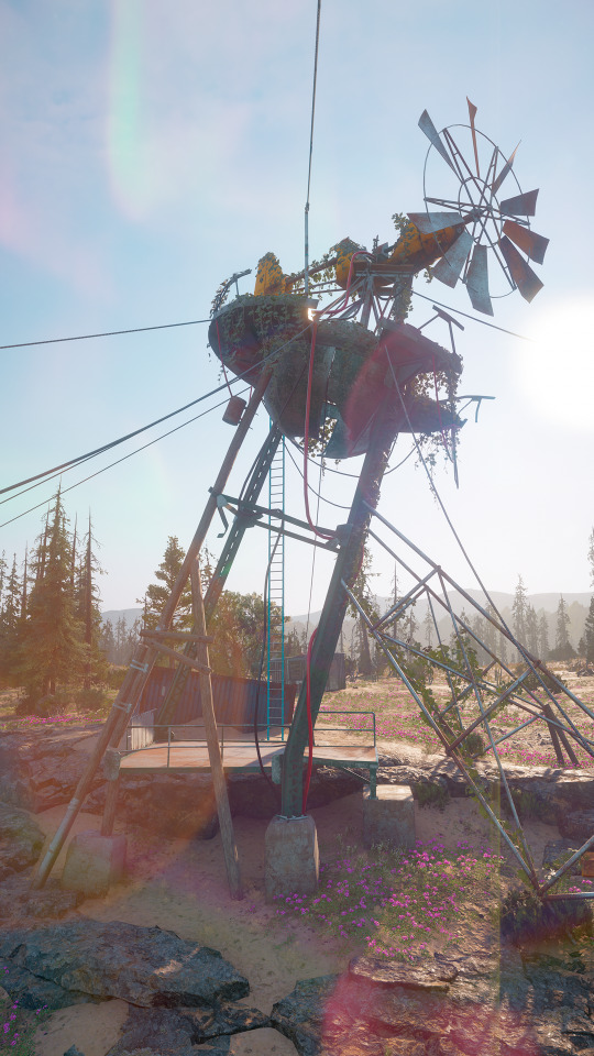
#new camera angle!
Photo
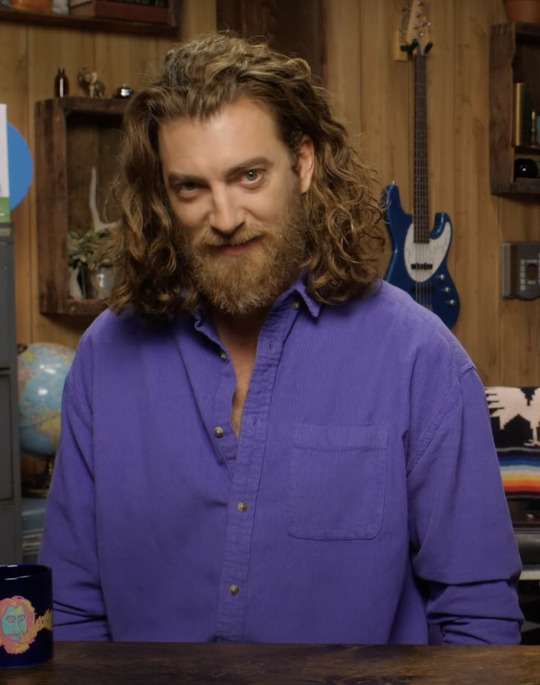


Daily Rhett Looks
40 notes
·
View notes
Text
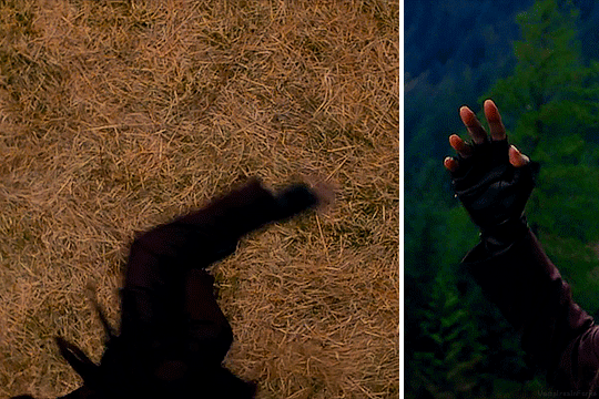
Turns out it's not just the romanceable companions who got shiny new kiss animations in the update.
#dame aylin#isobel thorm#baldur's gate 3#aylin x isobel#patch 6#bg3#kissing#bg3 spoilers#i guess?#thanks for the food larian#not super sure about all of the new camera angles in the reunion scene but#the kiss looks v. sweet love it
2K notes
·
View notes
Text

got carried away practicing in preparation to make something else
#yeah i stole this general format from some blog here that i can no longer find but it was cool#and i like the idea of having refs to make sure i stay as close to my stylized on-model as i can#that fucking part of the mantis arm was giving me a headache though#you change the angle even slightly and it looks like a whole new limb#its so complex and so hard to portray in 2d#the others are fine though except for my wrongness with the camera limb#i guess its technically not upside down depending on what angle its coming from but bite me#little stain there to fill space#might not even get to what i actually wanted to draw today. tired#art#absolutesolver#murder drones absolutesolver#murder drones absolute solver#murder drones#but i will make it eventually. you will see
224 notes
·
View notes
Text
i will love you til the end of time ♡
#cami sent the new pic and i realized i had an old pic of him saved in my camera roll from the same angle#you can really see how much he’s grown🥹🥹😭😭😭😭😭#HIS FACE STRUCTURE HAS MATURED BUT HIS FEATURES ARE THE SAME#AND HIS BABY EYES😭😭😭😭😭😭#my soulmate#jeon jungkook#jungkook
594 notes
·
View notes
Text


TWILIGHT SAGA APPRECIATION WEEK
DAY 7: free choice, layout: shots from above
The Victoria chase scene in New Moon is probably my favorite cinematic moment in the entire Twilight Saga and has a grip on me like you wouldn't believe. Yes, just because of the camera angles and editing.
#I'm a hoe for camera angles and scenery shots and this is my fave#will eventually dedicate a whole gifset to it#*#new moon#victoria#twweek22#twilight#twilight saga#the twilight saga#twilightedit#moviegifs#cinemapix#cinematv#filmedit#filmgifs#dailyflicks#tvandfilm#bella#edward#saga
693 notes
·
View notes
Text
huge shoutout to chip revvingtons animations ESPECIALLY in the ending cutscene. my god. like i had seen some of them by themselves but never saw them in action, before, during, and after the fight. never been so entranced watching a man have a mental breakdown
#toontown#ttcc#toontown corporate clash#chainsaw consultant#chip revvington#srry i just fought him for the first time yesterday after not experiencing a new manager fight for. months#cuz i stopped playing for a while#i am still so amazed by it#the overall presentation rlly adds to it too .. the animations and the music and camera angles and everything AUGHHH that ending cutscene#goes so hard#watching him stumble around and throw the chair and slam his fists on the table. got damn.#its all so expressive and well done
48 notes
·
View notes
Text
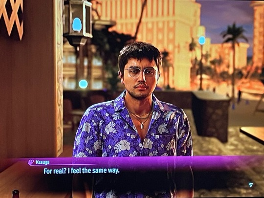
Fellas is it gay to elope across Hawaii with a man who pointed a gun in your face not once but twice and make plans to open a café together once this yakuza business is done with?
#like a dragon infinite wealth#eric tomizawa#THE CAMERA ANGLE CHANGE AND SPARKLES AROUND THE SCREEN IS SO DATING SIM IM HOWLING#the bromance with Tomizawa is so severe#I only just got to chapter 5 and if anything bad happens to Tomi I'm exploding the world#wanna squeeze him he's my new stress ball
44 notes
·
View notes
Text


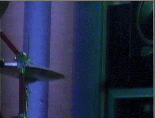
↪ 11/02/2023 ― post-practice ( rangers vs. hurricanes )
#mika zibanejad#chris kreider#new york rangers#hockey#hockeyedit#❝ edits#marrieds™#two for one post!! + questionable camera angles
63 notes
·
View notes
Text
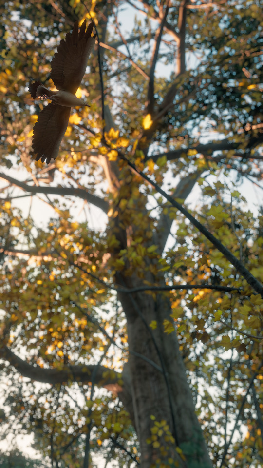

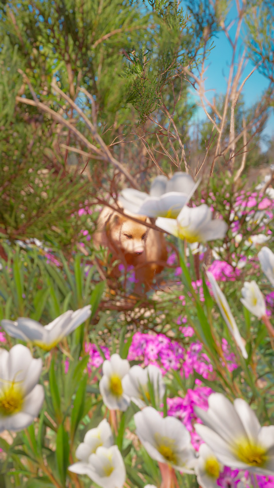

#surprise new dawn screenshots!#I love rolling the camera by 90 degrees to take 'fake' vertical pictures#in my opinion it’s better than using the 6x9 frame because the angle is wider#I just have to rotate my head and controller by 90 degrees too to accurately move the camera haha#far cry new dawn#the judge#new eden#bird#probably american crow but white#wolverine#my screenshots#far cry new dawn screenshots#far cry new dawn photo mode#photo mode
44 notes
·
View notes
Text


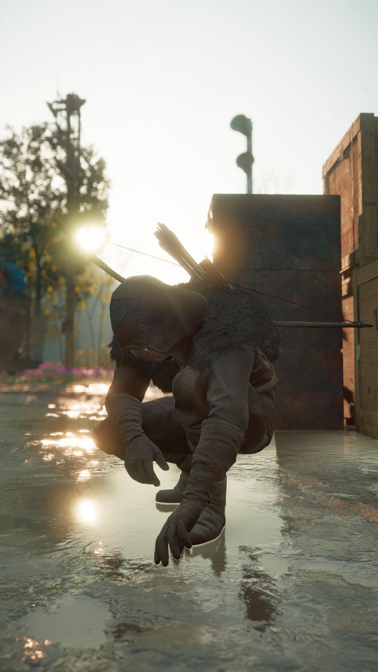
#dd2#dragon’s dogma 2#phaesus x arisen#dd2 arisen#oc: gwyn#I discovered some new camera angles#really like the Phaesus romance in my game#spicy#nsft#just to be safe#I’ll be honest kinda proud of these ngl
18 notes
·
View notes
Text

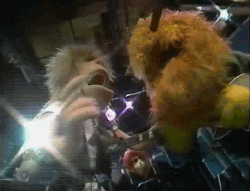

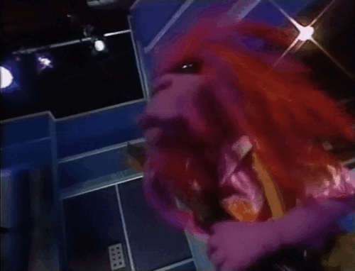
The music just keeps on rolling along
Yeah, I got my friends, and I got my song
I'm gonna be living for the rhythm, I can't go wrong
As long as the music keeps rolling along!
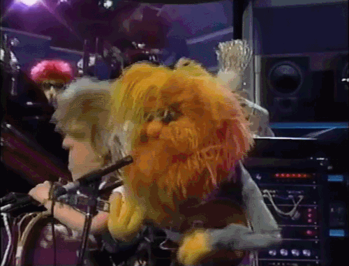
The Jim Henson Hour, Episode 8, Videotape
#the muppets#muppets#the jim henson hour#solid foam#clifford muppet#digit muppet#flash muppet#beard muppet#solid foam drummer#she has no name.....#bonus dr teeth looming in the background with no explanation!#anyways my first gifset!! shoutout to gifcam and ezgif (i will learn elaborate gif making/editing one day)#but i was surprised there were no gifsets of this. especially because of 1. the really fun camera angles and effects#and 2. prime muppet background content (including muppets falling over dramatically)#every time i paused i found new antics. they are the sillies#i wish they showed footage of the performers getting pelted with beach balls
62 notes
·
View notes
Note
i'm desperate to know how many notebooks you have filled with these drawings. i must know, please, i'm on my hands and knees
Most of my comics are drawn on standard letter paper (8.5"x11"), and to date I have filled 23 pages! I usually manage to fit roughly 6-8 comics per page.
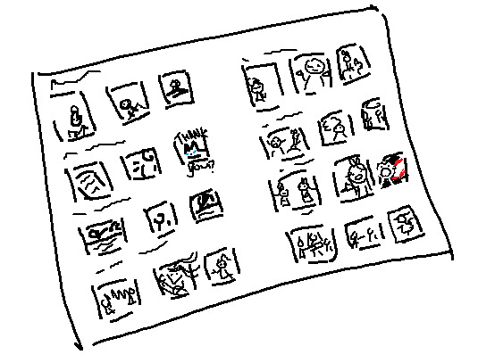
Mspaint recreation of the first page!
#ask#I have several more pages filled in a sketchbook for practice/studies and my 'better drawn' work#Each square panel is 1.5 inches (1/4 of a sticky note) and I use pretty small nub ink pens.#I actually hadn't counted how many I had filled (in my head it was roughly 1 new page a week) so this was a cool prompt to do so!#it's also wild to go back and look at my old comics! Really hits home how far I've come!#I felt so confident in my 3 panel format. Only to give it up by like... comic 11.#I meant to take a picture of the first early pages and compare it with the new comics but oh man taking photos was never my strong suit.#I hate shadows. I hate lighting. I hate angles. Defeated by the shadow of my hand and terrible camera quality.#I also do not have enough floor space to lay them all out... I Might need to ask a friend for their floor. And phone.#There's a little unused follower thank you i've never posted on the first page too! Argh...another time.#but yes! all of these exist in physical form. I need to invest in a little binder with protective sheets so I can flip through
113 notes
·
View notes
Text
i’ve stopped expecting interesting animation from bones. the star and stripe fight is cool but like every other fight/moment in mha, it’s only cool bc the source material itself is cool; bones does nothing to elevate the manga
they rarely try to experiment with colour and style. i saw so many colourings of the moment star and stripe made a giant version of herself out of the air; people made her look like a cosmos, like it reflected and bent the sky around her, doing so many inventive things and for the anime to just make her an outline against that godforsaken sky? i’m disappointed
but people will take me saying i’m disappointed and spin it to me saying the fight was bad. it wasn’t, just like most fights and moments in the anime aren’t bad but that’s all bc horikoshi knows how to draw. they never do anything beyond that; they never try and adapt it. whether it’s bc of time, direction, budget, or what have you, they will never do something truly inventive with their colouring
i’ve said this before and i’ll say it again, it’s not just that the sky is blue; it’s what the blue sky represents and that is an unwillingness to broaden their colour palette or atmosphere to support the changes in the tone of the story. the story isn’t just “will midoriya get into his dream high school and achieve his dream job?” it’s child abuse and societal systems and their dysfunctions, it’s racism and morality and is it right to try and save someone who’s determined to destroy the world just bc they are also a victim?
look at the finale of atla, a show that mirrors the narrative tone of mha; it starts out bright and colourful and vibrant to match the happy and small stakes nature of the story and as the tone of the story changes, the environment changes to reflect that. the siege of the north pole? everything goes blood red when the moon spirit is threatened, then goes completely desaturated when it is killed with only fire bending having any colour. the day of black sun? uses a solar eclipse to change the lighting. the entire sozin’s comet fight? has red skies and lighting to show the threat
bones abject refusal to change anything about the art itself is a detriment to horikoshi’s complex narrative
#its not just about the colour of the sky#lets get that straight#we’re doing some real the curtains arent just blue shit here so keep up#colour and lighting are a very deliberate choice in any visual medium#and choosing to ignore it and not take advantage of it will just be a detriment to whatever youre creating#i see so many colourings of manga panels where they do insane things and really do next level colourings#and to then see the anime that has so much money and talent behind it just for it to be flat and emotionless with no atmosphere?#it sucks#when you can pick out a scene from something called the WAR ARC and it looks the same as the sports festival arc? come on#and i know theres more to making a scene out of a panel then there is to colouring one#but when these indie creators doing visually gorgeous colourings its hard not to feel like the anime is lacking#and when your colours are flat and your camera angles are uninteresting then what is the point of an anime adaptation#even if they do change things here and there like the endeavour v hood fight or all might v afo#it doesnt change that the majority of the time its the exact same#and when the storm eventually comes round? that wont satisfy me either enless they change the colors of everything as well to be desaturate#and fully embrace the new atmosphere that horikoshi has very deliberately drawn#class a v deku is the one time they did a sustained colour difference and theres a reason that went over so well#coming out of my cage and ive been doing just fine.txt#go beyond plus ultra#mha#bnha#my hero academia#boku no hero academia#star and stripe#shigaraki tomura#izuku midoriya#bakugou katsuki
12 notes
·
View notes
Text

pai…🥰
#im going to be so obnoxious new nickname unlocked#cartoon proportions funny ass camera angle. this elongated little guy and his poor wrist has been getting me thru the day#media blitz
13 notes
·
View notes
Text
save me old flipnote studio MVs.......
#im going thru old flipnotes i used to watch years ago and ouggghhg so many good ones#is twenty one pilots still popular.... do people still remember the TRNDSTTER and marble soda meme.........#its like im unlocking some sort of primal part of my brain and everything is coming back to me. one of my biggest inspirations as a kid#i still remember thinking the final transmission lyrics were the coolest thing and watching =TopHat= Bee and Melissa over and over#theres a very specific feeling of longing and nostalgia looking back and watching these again years later#especially when there isnt anything genshin or mcyt and instead its either fnaf undertale eddsworld or another obscure#interest... and not even fnaf sister location its like fnaf 3 and 2. its THAT old. and a lot of oc MVs especially pokemon ocs and furries..#god but they were so creative u know. i still find it amazing ppl took this little lightbox animation on the fucking NINTENDO DS and#cranked it all the way to 11.. like if u look at the transitions and movement its so fucking fluid its insane..!! HOW DO YOU MAKE THE#CHARACTERS SPIN??? AND CHANGING CAMERA ANGLES??? and keep in mind youre doing this all with a shitty stylus#on a THREE BY TWO INCH SCREEN. you only get two layers you can go up to 29FPS and you only have 999 slides to work with#and 24FPS eats up a lot of that. absolutely insane it literally boggles my mind every time i think about it. AND SOME ARE EVEN FULL COLOR#i forgot how popular EDM was back then too...they were really good for timing beats though so you get a lot of MVs with#strobe last and marble soda. porter robinsons goodbye to a world was also popular with undertale and oc MVs. also a lot of vocaloid#someone made a flipnote abt the warner bros fnaf movie being announced EIGHT FUCKING YEARS AGO. it even used the stay calm audio from#the office.... i wonder how theyre doing now... i love you shitty grainy MV audio.. but i have mixed feelings abt the flashing colors#ppl LOVED animating the sans vs frisk fight. aishite and primadonna were also big ones they were SICK AS FUCK#lots of these inspired my old oc designs.. a lot of my characters had side bangs with one eye covered. animal ears and simple eyes too#now i kinda wanna try my hand at the marble soda meme cause i loved it as a kid lol.. i wonder if i should compare my old and new art here#UGHHHH IM SO NORMAL ABOUT NOSTALGIA. IM SO NORMAL ABT MY SCHOOL BOOK DRAWINGS WITH SHIBA BROWS#yapping#nostalgia
32 notes
·
View notes
Text

#grace talks#baldur's gate 3#bg3#astarion#bg3 astarion#astarion x dark urge#astarion x tav#astarion ancunin#I am so weak for this cutscene#out of all his romance scenes- the hug is one of my favourites#just so sweet and heart-warming#have i already used the camera mod to take screenshots of this? absolutely#but i changed my durge's hair and wanted to retake them with her new hair#and try out different angles/distances
24 notes
·
View notes
Last Seen Blogs

free-download-project-igipe
🏅 free download project igi game cheats (mod hac

zh-cable
无标题

xaedroto
X Blog

ally-era
Flywithalisea

raindropscc
Raindrops custom content