#or console font
Text
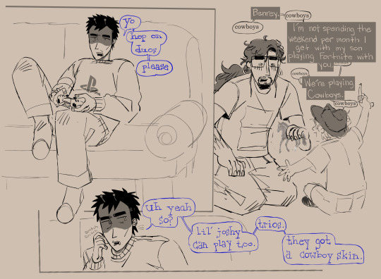
benrey moving in with gordon postcanon cliche
#hlvrai#gordon feetman#benrey#benry#joshua freeman#i dont know if you can do trios on one console. dont look into it too hard#i thought giving benrey little alien antennae would be cute so i DID IT!!!#i dont know why i wrote out benreys font instead of typing it.#symphonart
610 notes
·
View notes
Text

[ID: A ten-panel comic of Alice, Gwen, Sam, and Colin from The Magnus Protocol. Alice is at her computer as it reads a case, saying “Soon will the moment of reckoning come—” and she interrupts to say “oop! No thanks, Augustus </3”. She gets up from her desk and calls to Gwen who sighs in response and says “What is it, Alice?” Alice replies “Gwen do you think swans would be Tories.” Gwen says “What.” and Alice proceeds “You know, because the Crown owns them.” Raising an eyebrow, Gwen says “I don’t think swans would respect the processes of a constitutional monarchy, Alice.” Alice says “Nah, they’d be total bootlickers.”
Interrupting, Sam says “I think ducks would vote for Labour. They’re very polite and they’d want robust healthcare and education for their ducklings.” Alice looks amused while Gwen silently regrets the trajectory of her life. Coming in the door, Colin says “I think geese would be anarchists.” Alice turns to him and asks “How did you hear this vitally important discourse from out there, exactly?” to which Colin says “I didn’t. Why, what were you talking about?” End ID.]
i mean if wishful thinking can turn something into a workplace comedy once it can do it twice right. everyone’s gonna stay fine forever. right
#IF U TAKE THESE AS MY ACTUAL POLITICAL OPINIONS ILL BITE U#the magnus protocol#tmagp#magpod#alice dyer#sam khalid#gwen bouchard#colin becher#also! gwen is speaking in times new roman and colin is speaking in lucida console :3#which my wife informs me was The font for coding softwares in the 90s#hehehe :3#my#saint draws#ive been working on this for like two weeks#too long? Perhap#eye contact#ask to tag
171 notes
·
View notes
Text
I don't understand people who say things like 'but it doesn't matter if we don't pay artists/writers for their labour, or use free AI programs to replace artists/writers to improve our profits, because in a perfect world everyone would have UBI so it wouldn't matter xxx'
like. yes. but until we reach that perfect world, artists and writers need to eat?
why are you promoting AI replacement of creative people instead of working towards UBI? Until we have UBI, supporting generative AI in the creative field is no different to supporting supermarkets laying off all their till staff to turn to self-check out, or supporting factories who shut down and move overseas to exploit workers in countries with fewer human rights legislations?
Yes, in a perfect world, everyone would receive UBI. Therefore, people across the globe couldn't be exploited by corporations, and artists could create for the joy of it, in whatever way we desire - including with AI!
But we do not live in that perfect world.
Do you seriously expect this move towards generative AI to encourage people to support UBI, as opposed to people being forced into jobs they hate to make ends meet or no longer being able to support themselves financially?
Especially all the disabled people who make a living creating art and writing/editing, because that is, in fact, a career that is often far more available to disabled folks than a regular 9-5 or a retail job where you're expected to be on your feet all day (miss my disabled ass with the 'anti-AI = ableism' stance lmao).
This is not going to create your army of revolutionaries. This is just going to result in more independent creators being crushed under the boot heel of capitalism, as anyone who would've hired them flocks instead to the free alternative, and they're forced back into an incredibly exploitative labour market.
I agree that generative AI by itself is just a tool and is not inherently a problem.
But it is being abused, in ways that hurt creators.
If you support generative AI... what are you doing about that?
#generative AI#nanowrimo#seeing some real bad takes#and don't get me STARTED on the ableism take. I cannot hold a pen due to disability. I cannot do calligraphy.#I can use Dragon voice-to-text in a calligraphic font. That is not the same as doing calligraphy.#It's okay to acknowledge that.#If you pretend it IS the same and try to award me in a calligraphy contest...#that is in fact patronizing and - dare I say - ableist#if someone needs so many adaptations that they are no longer doing the same thing as abled people you don't have to pretend otherwise#like with my dancing! I can't dance in a way that would be recognised as such by abled people. but I don't want to be measured against them#even as a weird 'consolation prize' for not being able to master the same skills due to disability!#I'd much rather take part in a disabled dance event where we all do our own thing and celebrate that for what it is!#because IT *IS* DIFFERENT. DUE TO DISABILITY. and that's okay! that's not shameful!#hell make a generative AI celebration week where you support disabled creators! if you care so much!#but pretending generative AI is the exact same thing as plotting and writing a novel or learning how to draw#is really patronizing and not the hot take you think it is
47 notes
·
View notes
Text
Hey, the default Linux console fonts are kinda old-looking.
They also don't include Powerline support and box-drawing characters.
…anyway, I made a new one that does a better job. :)
(It's also in the AUR ^^)
33 notes
·
View notes
Text

#do you know this game#e.b.o.n.y. riddle game#browser games#other consoles#you know its good when its got that chiller font
8 notes
·
View notes
Text
head in my hands I have two papers to peer-review and the first is Already Bad
#distant citrus sounds#I have scrolled through it and read one full sentence and it's already not like. fulfilling the basic requirements autistic professor set#he went 'max four pages MAYBE five but I strongly recommend you don't' and this one is six pages#it's in a weird fucking font too? like it's legible but where tf did you find 'aptos'. what font is this.#at this point in college how do you not just default to times new roman for papers.#the formatting is all fucked too#my ONLY consolation is I can confidently say it's not AI generated
6 notes
·
View notes
Text
Wire Witch Hex - Wearing Many Hats (Font Design)
Lately most of the traffic I'm getting on this blog has been people stumbling onto my multipart series on how a computer works. Glad people are enjoying that as much as they seem to be. My reason for teaching myself all of that (besides just the joy of learning) is I'm very slowly working on designing a new video game console that anyone sufficiently motivated can build for themselves as a neat little DIY project. There are so many moving parts to this project that for now I'm focusing mainly on just the controller and its unique features. To avoid having to make a whole working console, with software, to test it, and make sure I have something to show for all this if the rest doesn't pan out, I'm designing the controller to also be more or less compatible with the NES and SNES (which secretly use the same input standard, just differently shaped plugs at the end of the cord).
This means all I'll need to test and demo my controller is an SNES ROM that knows what to do with my scroll-wheel outputs, a setup where an emulator accurately handles those signals, and later a cart I can slap a couple EEPROMs into and test on real hardware. Oh and I also need to teach myself enough about SNES development to actually create every demo I want to run, do all the art, code it up, and compile it. This is a big job, and I'm not getting paid, so maybe consider throwing me a little money before we dig into this?
Since... really the last time I reported in on this, I've been studying away trying to learn all this, and hey, have a compiled ROM image that'll display a blank screen in any color I want, and a third party program that IN THEORY with a bit of massaging will convert a 256x256 image into an SNES character ROM image. AKA the file with all the graphics. My ultimate goal for this demo cart is to cycle through several very simple games, showcasing how my controller works with each. So I need to cram every image any of these are going to need into my one big image file, which I'm slowly picking away at, but the one thing I knew from the start that I'd definitely need is to throw some text on screen explaining the controls for each demo. And since it's not like there's a built in font in in the system, I had to make my own.

This is not my first font-making rodeo. For this one, my thinking was, I'm going to be in a fixed 16x16 resolution per character (because I forgot the specifics of how the SNES actually tiles graphics), some built in spacing so I can slap them all right up against each other or some border and still be readable, and I wanted a nice little shadow built into every character in case they end up on a low contrast background. Let's zoom in on what I have here so far, in case you don't feel like downloading the file and blowing it up to something more readable.
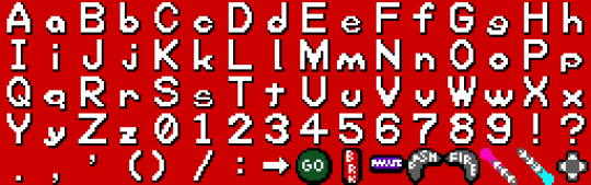
The first thing I want to note is that after finishing the first 4 rows of characters here, I double checked, and while the SNES CAN break backgrounds into 16x16 tiles, the absolute minimum is 8x8. If I were really trying to be space efficient, I should have designed around that. Several of these characters would easily fit into a 16x8 space, that level of compression would also let me have just the period and comma and be able to build a colon, semicolon, or apostrophe from those, and most importantly, I rendered this with all of the lowercase letters exactly 1 pixel too tall to fit into a 16x8 space and let me double up there. Since I'm rather happy with this font so far and I'd eventually like to make some version of it available for, if nothing else, other people writing software for my eventual console here, I will likely, at some point, make a more space-optimized variation. I'd also like to cover a wider range of characters. At the very least, have some accent marks, wouldn't be too hard to add support for Cyrillic. Pretty sure I can get Japanese and Korean text in keeping with this look. Maybe some other languages. Anyway though, let's talk about what I've got.
My general design rule here was, where possible, make lines 2 pixels thick, and have each white pixel cast a black pixel shadow immediately below, to the right, and the diagonal between them. This gives a pretty convincing relief effect in my opinion, and keeping the shadows this thick keeps a nice firm edge there so it's even generally readable on a pure white background. Within each 16x16 tile, I was extremely strict about keeping a 1 pixel margin clear at the top and bottom of each image, and 2 or 3 on the sides (often 3 on the left, 2 on the right. With capital letters, I went with a generally rigid and blocky style, trying to stretch things to my arbitrary margins. Lowercase letters I restricted to just 8 pixels tall, and those featuring tails are given special permission to drop down an extra pixel, leaving the shadow right on the edge of their true bounding box.
While it wasn't an intentional move at first, several lowercase letters ended up with a decidedly rounded, squashed look, particularly g and q. I found that to be both kind of cute, giving the whole font a real unique character, and eventually started to actively lean into it (which may not be super obvious, I started with W as it's kinda the letter than needs the most breathing room and worked outward from there), and did my best to distort all the rounder shapes and in particular the highly mirrorable b d p q set, as I seem to recall once reading the more you avoid identical shapes with those, the more legible the font becomes for people with dyslexia. Similarly, I made a point of distinguishing the shapes of the Ms and Ws, and added a little whimsy to the numerals. Overall I'm super happy with all the lowercase letters (except for e and s being too thin, but that was an inevitable compromise), and if I ever have the time to kill it's very likely I'll revisit this someday and apply this squishy rounded aesthetic to the capitals too.
Your eyes were probably drawn really quickly to the parentheses here, where for at least the moment I'm breaking my rules about blank space and shifting them inward quite a bit rather than centering them. That's going to look really bad if I use them in a sentence (like this), but the main reason I'm including them right now is so I can list button prompts with both the icons representing what's actually going to be on my controller, and the SNES buttons sharing the same signals. So something like: "GO (A) Jump" and I think the half-spacing and closeness to what they enclose will look pretty nice in this one specific case.
As a final note, the particular hardware I'm working with absolutely supports the ability to mirror any image horizontally or vertically, as well as change the palette. If I truly wanted to cram letters in as efficiently as possible at this font size, I could, for instance, have an 8x8 right-angle segment, build a whole H just from mirroring that, also use it for the legs of the A, P, F, the left side of the D, etc. This however is incompatible with the shadows I'm using for extra readability. And of course for other projects I HAVE made a perfectly legible 8x8 font before.
I'm pointing this out because hey, if you do the math, JUST these characters I've set aside for having arbitrary on-screen text, as is, are consuming 5/16ths of my total graphical memory, and I'm probably never even going to display most of these anywhere. Again, not a huge problem for the simple demo pack I'm making, and that 256x256 drawing space isn't a hard limit. Spending an extra processor cycle to change an index value and access a whole other page of image data is a pretty common practice on the hardware, but especially with older computers and racing to get things ready to draw before a screen refreshes, it's good to at least be mindful of the tradeoffs with that sort of thing.
And again, my sole source of income at the moment is patreon donations, so if you're excited about seeing updates to this weird project of mine or you're learning useful things from any of it, maybe consider throwing me a little support?
7 notes
·
View notes
Text
#sega saturn#trans#trans rights#queer#fake logos#my art#having some fun w/ these sega-themed fonts I found online#any console that has nights into dreams on it isn't cis that's a fact
93 notes
·
View notes
Text


#*becomes a space explorer just to download this font onto the ship's main console*#*also ignores all the men telling me it's a serious mission so i can't*#space#space girl#scifi#scifi aesthetic#aesthetic#star trek#star trek vibes#girly vibes#funny#cute
4 notes
·
View notes
Text
Really talked about Benjamin with my friend for an hour
#talking about the fact that in LC he legit said straight up that he wanted to be Ayin's special someone#and hold an absolute belief that Ayin's suffering and trauma doesnt mean anything in face of their bond together#and his big promise to Ayin is just that he wanted to stay by his side even if he think he isnt good enough#and him confessing in the end of LC that majority of his decision making was put on a vebrose font of ideal and redemption and protection#but in reality it mostly because he couldnt bear to part with Ayin again#him wanting to take care and be a consoling figure for ayin always and forever#and just#wondering how people reading into Benjamin's behavior if they dont believe that he is a gay man#normal straight guy who only wants to support his bestie on his grand ideal#while claiming that he has always wanted to be the most important person in his bestie life and he is the only person for him#like just bro thing ig
5 notes
·
View notes
Text
SICK and TWISTED that the console app won't let me spit out non-ascii characters. i thought that was what wcout was for. incredibly evil.
#this kind of makes me wonder what would happen if i made my html sanitizer convert a file w/a non-english name#it'll probably give it a mojibake file name in the output lol#anyway originally what i was going to do here was talk abt how after the discover of 'wcout'#(aka 'wide character out') in c++ i dared give it a try by doing `wcout << '可以嗎?' << endl` just to see if it'll print correctly#and in my vscode terminal it just printed out '可以' and i just thought that was hilariously apt#but then when i decided to check if the compiled .exe file did the same thing. i just got mojibake. SAD.#花話#well at least whatever's in the html file itself remains fine so maybe it really is just terminal/console font encoding
1 note
·
View note
Text

Sixteen instruments to find a level of agents, friends have the idea of cooperation can contact, we are the manufacturer of film thickness meter.
#Film thickness meter equipment technology#<font color=#9CA1B3 font size=2 >如想体验更多语种的文本翻译,文档、音视频翻译,请前往</font><font size=2>[讯飞翻译平台](https://fanyi.xfyun.cn/console/trans/doc)</font>
0 notes
Text
Honnêtement j'pensais j'manquais de débrouillardise mais depuis que ma job se résume (à nouveau) à entendre du monde pas mal plus bourgeois se débrouiller pire que moi...bah ehh...ça m'console fucking pas.
#autrement la job est chill mais mettons que j'comprend pourquoi les compagnies engagent des intermédiaires#autrement...😭#comme y'en a eu un que j'ai fallit interrompre pour lui texter le lien wikipedia sur le stalking pour lui expliquer pourquoi j'peux pas#donner les numéro personnels des résidents d'un édifice comme come the fuck on duuuude#mais la consolation c'est vraiment quand j'dois share d'l'info a mes collègues pis y font arke non po lui encore 😭
0 notes
Text
your phone pings with a couple times with multiple texts.
| come outside baby
| hurry
| i need to show you something!!
you huff and playfully roll your eyes as you pause your music and put down your pencil you were using to study. you send her a quick, ‘coming’ before throwing on a hoodie and your slippers.
when you step out it’s cold and you only have your sleep shorts on. so you dash to ellie’s beat up 90s car hopping in, hoping it’s warm. it is warm and ellie looks beautiful in the moonlight green eyes shining with excitement. you could practically see her vibrating in her seat.
“hey pretty girl,” you say leaning over the console, grabbing her chin and pulling her into a slow peck. you haven’t seen her in a couple days, school has been killing you lately and ellie’s been super understanding; giving you the space you need to focus on your studying.
"hey baby," ellie puts her face in your neck pecks it a couple times earning herself some sweet giggles. "i missed you," you mutter as she lets you go. "mhm~ missed you too. i have something i wanna show you." ellie pulls her hair up from her neck and shows you a tattoo thats under her ear.
it was roman numerals and your both of your initials tattooed under it. all of it in a very fancy font. "oh my fucking- ellie! this is beautiful!" you inch closer to get a clear look. the roman numerals were the day that you met. ellies always talking about how it was love at first sight, "its the day i fell in love with you." she said in a whisper.
your eyes get teary, "is it healed?" you ask reaching over to run your fingers over it. she nods and you run your thumb over the numbers and letters completely enraptured. you lean in to place a lingering kiss on it making ellie squirm.
"wanna come in?" you say with a tone full of adoration. "what about your studying?" she askes you. "ive done enough studying, come on."
#wlw#sapphic#lesbian#ellie williams x reader#ellie williams#ellie tlou#ellie x reader#ellie the last of us#ellie x fem reader
1K notes
·
View notes
Text
I made a Console-Style Splatoon Font
I had the idea to make pixelated console style versions of some of the Splatoon fonts and I started with the Alterna script
You can download it if you want to use it!

I based it off of the Fixedsys font, which is a computer font you're probably familiar with and also happens to be the oldest font that was part of Windows
557 notes
·
View notes
Text
Things in Zack’s ADHD apartment that are necessary for him to function (as implemented by Angeal.)
His toothbrush lives on his nightstand. Not in the draw, not in a cabinet over the sink, not in a little pot on the sink. On. His. Nightstand. Because in Zack’s brain, if the first thing he see’s in a morning is his toothbrush he thinks “I need to remember to do that, I’ll do it now” and then gets to the bathroom and thinks “I might as well shower and do my hair too…. Hey I need to pee!”
Everything he needs for meal prep goes in a little container in the fridge and is labeled with the days they are to be consumed by. Even the stuff that doesn’t classically live in the fridge go in to these cubbies. Angeal checks them every week and if there is left over stuff he takes it away, makes small lunch portions, freezes them and leaves a note on Zack’s fridge that says lunches are already there for him.
Speaking of, there is a dry erase whiteboard on Zack’s fridge door. It has a grocery list side and a calendar on it. Cloud tends to be the one who updates it when Zack forgets (which is a lot).
Zack’s game consoles are in a cupboard with his games to stop himself getting distracted while he typed up his reports. This was Zack’s own solution and it works semi well.
His sword hangs on a peg on the back of the door now.
Shoe rack. It’s messy but he can see all of his shoe options.
Files on his shelf that are clearly labeled: “pay checks, bills and taxes”, “letters from home”, “bills part 2”, “commission certificate and graduation paperwork”, “legal thingies”, “passport, birth certificates, and other Identification stuff”. The files were Genesis’ idea. They are written in fun fonts and in colourful felt tips, so he knows where they go.
If he forgets to put things in files they are usually on the coffee table and Sephiroth (the filing fiend) usually does a weekly sweep and sort of his documents.
Laundry basket hoop. Doesn’t always work but sometimes it gives him the dopamine.
A physical letter box on the wall by his front door. He gets a dopamine hit from using a key to check his mail…. Nobodies willing to question it.
The worlds most irritating alarm clock.
Cloud. Just Cloud.
Bottles and kitchen tools all hung at eye level.
Spiny spice rack. He could have had a shelf but the spiny one entertains him.
The smart watch Lazard had Reeve make him. It reminds him of basically everything.
Stamp the dog hydration app that makes sad puppy noises when he needs to drink water (he was irritated about it but he doesn’t actually like upsetting the dog.)
A roomba with googly eyes on it called George. George is on a timer.
Electric air freshener and automatic air filtration.
Kunsel.
#ffvii#zack fair#Zack Fair has ADHD#ADHD Zack#ff7#crisis core#cloud strife#genesis rhapsodos#angeal hewley#sephiroth
192 notes
·
View notes
Last Seen Blogs

chuck-arts
A Gentleman's Style

allcarewarehouse
Untitled
sadychan
Sady Chan
sadychan
Sady Chan

matthewpsd
Matthew Espinosa with PSD