#console design
Explore tagged Tumblr posts
Visit Tumblr Blog
Explore Tumblr blogs with no restrictions, modern design and the best experience.
Last Seen Tumblr Blogs


Fun Fact
US Tumblr user growth rate is estimated to slow down to 4.1%.
Video
tumblr
[ G4’s Countdown to XBOX 360 (2005) - The Design ]
66 notes
·
View notes
Text
Wire Witch Hex - Wearing Many Hats (Font Design)
Lately most of the traffic I'm getting on this blog has been people stumbling onto my multipart series on how a computer works. Glad people are enjoying that as much as they seem to be. My reason for teaching myself all of that (besides just the joy of learning) is I'm very slowly working on designing a new video game console that anyone sufficiently motivated can build for themselves as a neat little DIY project. There are so many moving parts to this project that for now I'm focusing mainly on just the controller and its unique features. To avoid having to make a whole working console, with software, to test it, and make sure I have something to show for all this if the rest doesn't pan out, I'm designing the controller to also be more or less compatible with the NES and SNES (which secretly use the same input standard, just differently shaped plugs at the end of the cord).
This means all I'll need to test and demo my controller is an SNES ROM that knows what to do with my scroll-wheel outputs, a setup where an emulator accurately handles those signals, and later a cart I can slap a couple EEPROMs into and test on real hardware. Oh and I also need to teach myself enough about SNES development to actually create every demo I want to run, do all the art, code it up, and compile it. This is a big job, and I'm not getting paid, so maybe consider throwing me a little money before we dig into this?
Since... really the last time I reported in on this, I've been studying away trying to learn all this, and hey, have a compiled ROM image that'll display a blank screen in any color I want, and a third party program that IN THEORY with a bit of massaging will convert a 256x256 image into an SNES character ROM image. AKA the file with all the graphics. My ultimate goal for this demo cart is to cycle through several very simple games, showcasing how my controller works with each. So I need to cram every image any of these are going to need into my one big image file, which I'm slowly picking away at, but the one thing I knew from the start that I'd definitely need is to throw some text on screen explaining the controls for each demo. And since it's not like there's a built in font in in the system, I had to make my own.

This is not my first font-making rodeo. For this one, my thinking was, I'm going to be in a fixed 16x16 resolution per character (because I forgot the specifics of how the SNES actually tiles graphics), some built in spacing so I can slap them all right up against each other or some border and still be readable, and I wanted a nice little shadow built into every character in case they end up on a low contrast background. Let's zoom in on what I have here so far, in case you don't feel like downloading the file and blowing it up to something more readable.
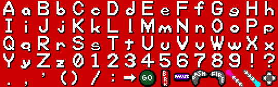
The first thing I want to note is that after finishing the first 4 rows of characters here, I double checked, and while the SNES CAN break backgrounds into 16x16 tiles, the absolute minimum is 8x8. If I were really trying to be space efficient, I should have designed around that. Several of these characters would easily fit into a 16x8 space, that level of compression would also let me have just the period and comma and be able to build a colon, semicolon, or apostrophe from those, and most importantly, I rendered this with all of the lowercase letters exactly 1 pixel too tall to fit into a 16x8 space and let me double up there. Since I'm rather happy with this font so far and I'd eventually like to make some version of it available for, if nothing else, other people writing software for my eventual console here, I will likely, at some point, make a more space-optimized variation. I'd also like to cover a wider range of characters. At the very least, have some accent marks, wouldn't be too hard to add support for Cyrillic. Pretty sure I can get Japanese and Korean text in keeping with this look. Maybe some other languages. Anyway though, let's talk about what I've got.
My general design rule here was, where possible, make lines 2 pixels thick, and have each white pixel cast a black pixel shadow immediately below, to the right, and the diagonal between them. This gives a pretty convincing relief effect in my opinion, and keeping the shadows this thick keeps a nice firm edge there so it's even generally readable on a pure white background. Within each 16x16 tile, I was extremely strict about keeping a 1 pixel margin clear at the top and bottom of each image, and 2 or 3 on the sides (often 3 on the left, 2 on the right. With capital letters, I went with a generally rigid and blocky style, trying to stretch things to my arbitrary margins. Lowercase letters I restricted to just 8 pixels tall, and those featuring tails are given special permission to drop down an extra pixel, leaving the shadow right on the edge of their true bounding box.
While it wasn't an intentional move at first, several lowercase letters ended up with a decidedly rounded, squashed look, particularly g and q. I found that to be both kind of cute, giving the whole font a real unique character, and eventually started to actively lean into it (which may not be super obvious, I started with W as it's kinda the letter than needs the most breathing room and worked outward from there), and did my best to distort all the rounder shapes and in particular the highly mirrorable b d p q set, as I seem to recall once reading the more you avoid identical shapes with those, the more legible the font becomes for people with dyslexia. Similarly, I made a point of distinguishing the shapes of the Ms and Ws, and added a little whimsy to the numerals. Overall I'm super happy with all the lowercase letters (except for e and s being too thin, but that was an inevitable compromise), and if I ever have the time to kill it's very likely I'll revisit this someday and apply this squishy rounded aesthetic to the capitals too.
Your eyes were probably drawn really quickly to the parentheses here, where for at least the moment I'm breaking my rules about blank space and shifting them inward quite a bit rather than centering them. That's going to look really bad if I use them in a sentence (like this), but the main reason I'm including them right now is so I can list button prompts with both the icons representing what's actually going to be on my controller, and the SNES buttons sharing the same signals. So something like: "GO (A) Jump" and I think the half-spacing and closeness to what they enclose will look pretty nice in this one specific case.
As a final note, the particular hardware I'm working with absolutely supports the ability to mirror any image horizontally or vertically, as well as change the palette. If I truly wanted to cram letters in as efficiently as possible at this font size, I could, for instance, have an 8x8 right-angle segment, build a whole H just from mirroring that, also use it for the legs of the A, P, F, the left side of the D, etc. This however is incompatible with the shadows I'm using for extra readability. And of course for other projects I HAVE made a perfectly legible 8x8 font before.
I'm pointing this out because hey, if you do the math, JUST these characters I've set aside for having arbitrary on-screen text, as is, are consuming 5/16ths of my total graphical memory, and I'm probably never even going to display most of these anywhere. Again, not a huge problem for the simple demo pack I'm making, and that 256x256 drawing space isn't a hard limit. Spending an extra processor cycle to change an index value and access a whole other page of image data is a pretty common practice on the hardware, but especially with older computers and racing to get things ready to draw before a screen refreshes, it's good to at least be mindful of the tradeoffs with that sort of thing.
And again, my sole source of income at the moment is patreon donations, so if you're excited about seeing updates to this weird project of mine or you're learning useful things from any of it, maybe consider throwing me a little support?
7 notes
·
View notes
Text
I too have smallish hands for an adult, and chronic pain flare ups (still investigating these diagnostically) in my joints that meant that for several years I had to choose between using my hands at work or console gaming as a hobby.
Then the Switch came out.
The small, lightweight controllers mean minimal strain and movement, and the split design allows me to comfortably set myself up at an angle that doesn't strain my elbows, shoulders or wrists. I often rest my hands on my knees or a pillow to game with joy cons.
For me the most comfortable position is elbows in, wrists angled out
\o/
Which is the opposite to the typical console gaming posture
/o\
Which would not be possible without the split design of the joycon.
I cannot express enough how much this has enabled me to return to a beloved hobby.
“I went to school for game design! I am highly qualified to talk about any game out there!”
I bet you don’t even know how big an 8 year old’s hands are.
59K notes
·
View notes
Text
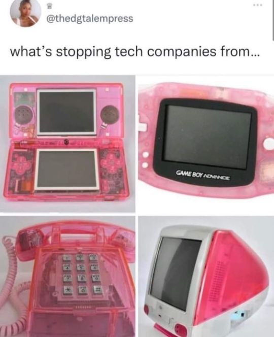
#apple#art#computer#console#cybercore#cyber y2k#design#gameboy#game boy#meme#nintendo#photography#pink#screenshot#tech#tweet#twitter#technology#y2kcore#y2kore#y2k aesthetic#y2k core#y2k cyber#y2k design#y2k futurism#y2k#y2k nostalgia
32K notes
·
View notes
Text
What We Know About the PS5 Pro
In the world of gaming, the anticipation for the next big leap in console technology continually builds. Among the forefront of these advancements is the rumored PS5 Pro, a potential successor to Sony’s highly acclaimed PlayStation 5. This enhanced version promises to push the boundaries of what gamers can expect in terms of performance, graphics, and overall gaming experience. As whispers of its…

View On WordPress
#2024 games#3D audio#4K gaming#8K resolution#adaptive triggers#advanced gaming#AMD Zen#console anticipation#console comparison#console design#console gaming#console release#CPU upgrade#deep learning#digital entertainment#display technology#DLSS#energy efficiency#enhanced visuals#entertainment hub#FPS boost#future gaming#game creators#game design#game developers#game development#game immersion#game performance#game titles#gaming community
0 notes
Note
Do you like any other video games? If so, do you like Zelda and whats ur favourite game?
i like LOTS of games!! i’ve only played a bit of BOTW but i got bored once i’d fully upgraded my house in that village and never defeated any of the divine beasts

#my ability to play every game as if its the sims or anicrossing is astounding#my brothers a crazy big LOZ fan tho so i’ve seen a lot of the games (he has loads of retro consoles and retro zeldas)#and i've read the botw artbook a lot too so i know a lot abt the games and lore from that and watching brotes LOL#legend of zelda#zelda#link#breath of the wild#oh lmao theres art in my legend of zelda tag i forgot abt that#i sold my switch to buy my screen tablet so my zelda's stuck fighting ganon while my link follows his passion of interior design#thanks for the ask!#askbox closed#my doods
1K notes
·
View notes
Text


Interceptor Mega Disk
#@japanretrogame#Interceptor Mega Disk#SEGA Mega Drive#Taiwan Sang Ting Co. Ltd#SEGA#Mega Drive#design#third-party peripheral#manufactured without a license#retro gaming#console gaming#video games#third-party#tech#hardware#ROM dumping#ROM dump#3½ inch floppy disks#SEGA Genesis
2K notes
·
View notes
Text
I kind of miss how pre-2000s JRPGs would just do the cutscenes with whatever characters happened to be in your party at the time – I mean the active lineup, no back-benchers teleporting in for the cutscenes bullshit – and they'd adjust the dialogue's diction and vocabulary to match whichever character landed in whichever speaking position, but not its substance. I'm not saying the result was high literature, but it never got old being able to arrange your party to produce a sensitive heart-to-heart between two characters who had literally never interacted prior to that point, or for a nuanced discussion of the nature of evil to be carried out by a cave-man and a dog.
2K notes
·
View notes
Text

In an Irish House, 1988
#vintage#interior design#home#vintage interior#architecture#home decor#style#1980s#Greek#key#floral#wallpaper#antique#porcelain#shells#portrait#daylily#console table#classical#country#Ireland
1K notes
·
View notes
Text
The more confidently certain Murderbot is that no bots have genders or any interest in sex or romance the less likely it sounds. Really? None of them?
Like how bot pilots can only communicate in images?
Or how a human could never really be friends with a bot?
Or how SecUnits are never friends with each other?
It keeps making these sweeping generalisations about things it doesn't have a lot of data outside of its own lived experience to support, and its experience is not universal.
At this point I would not be surprised if Iris hit MB in the face with the revelation that ART hates Holism because they were involved before Holism fucked around and left it for Sum Total.
#No dopamine = no point#My dude (gn) positive reinforcement is one of the three basic machine learning paradigms#You think there's no reward signal to be hijacked for getting nasty?#Be serious#All of these bots were designed by humans#Infinite monkey rules say some of the things we build with self-determination and curiosity will be curious about sex#Anyway Holism is lucky it doesn't have eyes because Iris would go for them#It knows what it did#And the University should stop trying to arrange missions so that Peri and Holism “just happen” to be assigned together#We all wanted it to work out but they have to let it go#Do you know how hard it is to console a spaceship through a break-up#It can't even eat ice-cream#Iris can't do this again#murderbot#the murderbot diaries#murderbot diaries#asshole research transport#perihelion#tmbd#secunit#Holism
316 notes
·
View notes
Note
Man, I was thinking of your Jazz mech au and then you called it Space Ratatouille and I was thinking. What if Prowl was Jazz's mech instead of Jazz having is own. Prowl is sentient but maybe he has a cockpit that allows Jazz to control his movements. Now that's some real funky ratatouille.
I just like the idea of Jazz poking and pulling random things in Prowl and poor Prowler is doing his best to look normal infront of others.
I NEED YOU TO HEAR ME OUT ON THIS ONE BECAUSE I HAD THIS IDEA SINCE THE VERY START OF THE AU
So!
Prowl can’t just be Jazz’s mech because he already established as a normal Cybertronian right
But you know what he can? He can scan a piece of technology and then transform into it. That means he absolutely can scan Jazz’s mecha. And then become mecha himself. You see where I’m going with it YOU SEE RIGHT?

#mecha pilot jazz au#imagine Prowl turning into mecha epic anime gundam style#the design choices would be immaculate#all traditional mecha anime stuff. Long ass legs. Stylish shoulder pads. Fucking gundam style heels and everything#and just like with Cybertronians turning into cars with all interior#Steering wheels and pedals and stuff that allows humans to drive them#He would have a cockpit with all controls and console and stuff
720 notes
·
View notes
Text
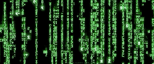
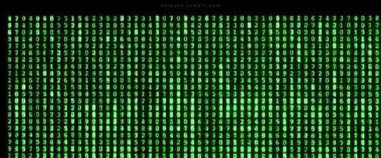
The Matrix (1999)
#the matrix#cyberpunk aesthetic#cyberpunk movies#follow the white rabbit#scifi#enter the matrix#scifi movies#command line#console#command prompt#gifs#gifset#opening sequence#graphic design
1K notes
·
View notes
Text
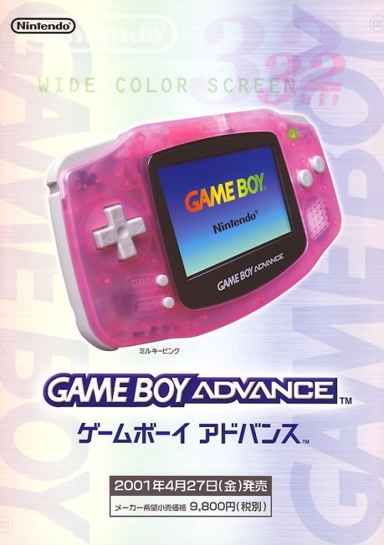
#nintendo#game boy advance#gba#nintendo gba#nintendocore#japanese ads#y2k#2000s#y2k aesthetic#early 2000s#frutiger aero#transparent tech#transparent console#transparent design#colorful tech#tech ads#technology#techcore#techcore aesthetic
2K notes
·
View notes
Text
A recent design for the amberwing server!!
#i keep saying im on haitus then coming back with small designs#my rat brain craves simple little designs it keeps my creative console running#this one was actually inspired by a color palette i saw on twitter#art#digital art#my art#drawing#original character#dragon#wof#wof fanflight#wof fantribe#amberwing#adopt#wof adopt
226 notes
·
View notes
Text

Pink Game Boy Advance SP
#art#console#cybercore#cyber y2k#design#electronic#future#futuristic#futurism#gameboy#games#gaming#graphic design#graphics#kaybug#kirby#nintendo#photography#pink#tech#technology#video games#y2kcore#y2kore#y2k aesthetic#y2k art#y2k childhood#y2k core#y2k cyber#y2k design
2K notes
·
View notes
Text

New DS Lite colors in Europe
#advertising#art#console#design#ds lite#electronic#frutiger aero#funky seasons#graphic design#graphics#nintendo ds#nintendo#objects#photography#tech#technology
651 notes
·
View notes