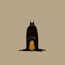
#or i guess facial expression redraw
Text
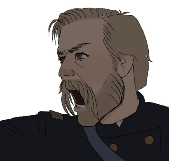

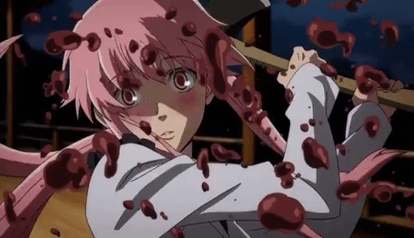
“CHAARGEEE!!” son or “BAYONEETS!!” daughter
#joshua lawrence chamberlain#scene redrew#or i guess facial expression redraw#gettysburg (1993)#gettysburg#american civil war#acw#i’m just obsessed with him
21 notes
·
View notes
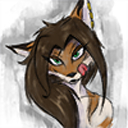
Text
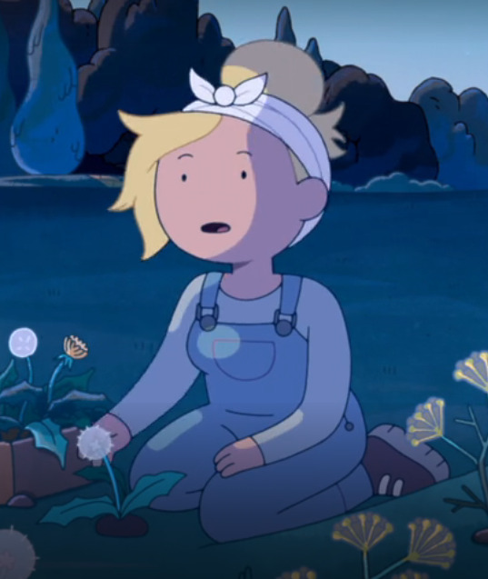

redraw kinda??
#art#my art#artists on tumblr#digital art#art test#fanart#fionna and cake#fionna campbell#cake the cat#fionna the human#adventure time fanart#adventure time fionna#fionna fanart#fionna and cake fanart#cake adventure time#fionna mertens#adventure time fionna and cake#kinda a redraw but not really#like shes sitting but like in a dif way and dif facial expression#so like i riffed off the pic i guess idk#anyways byeeeeeeeeee
10 notes
·
View notes
Text
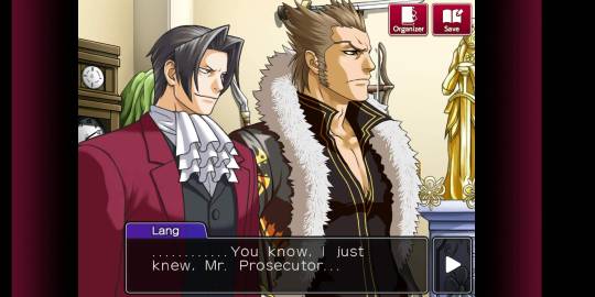
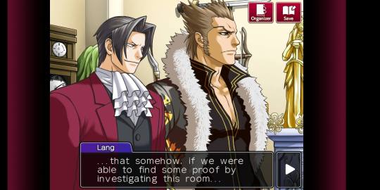
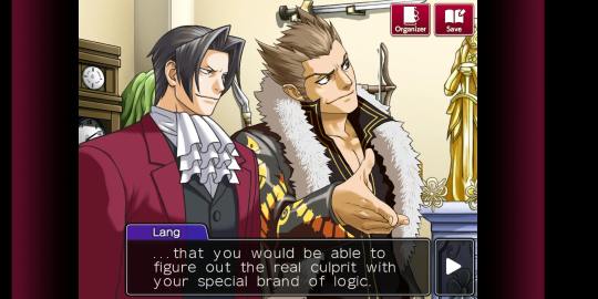
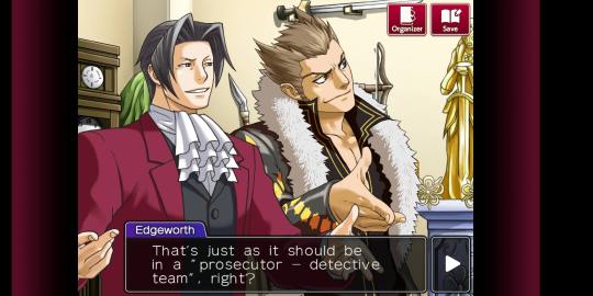
Okay, on the topic of artstyle let me say something about Ace Attorney Investigations.
Edgey there looks so much prettier than in the original trilogy.

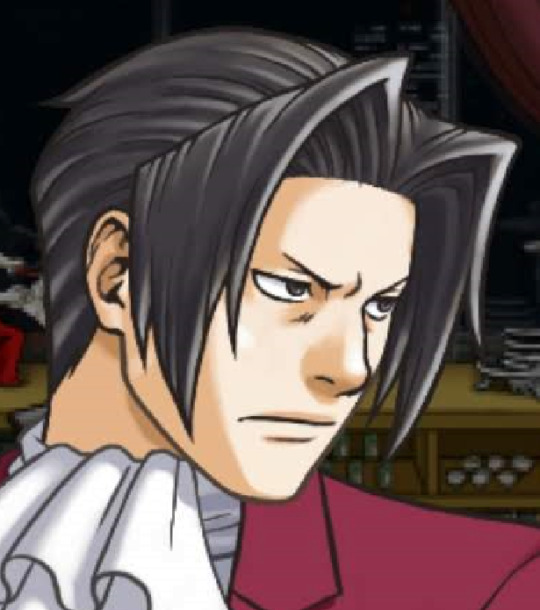

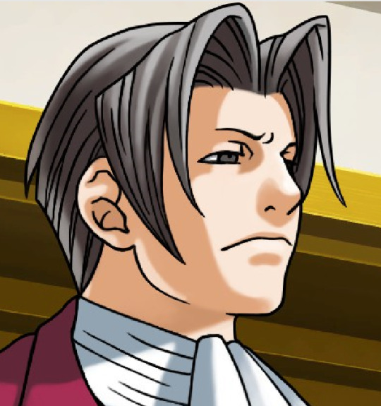

Take a look at this ugly ass ear in the original and refined pretty ear in AAI, for example, and a more precise lines for neck muscles. Nothing to say about much more competent shading and lineart.
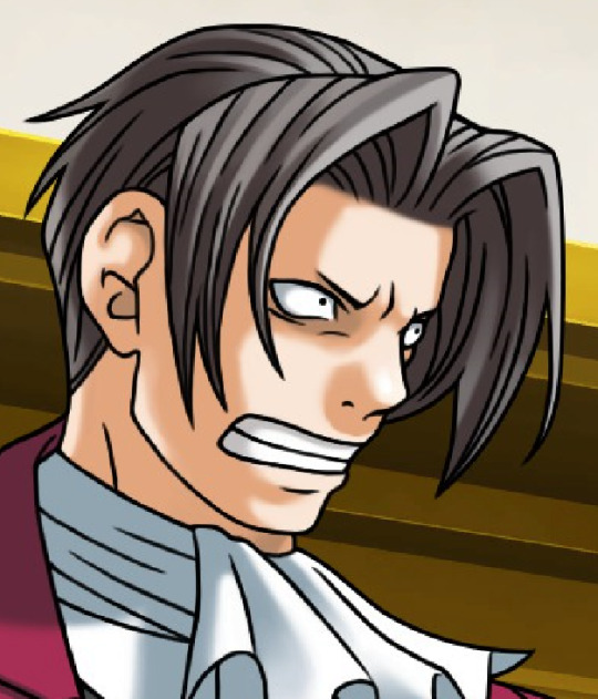

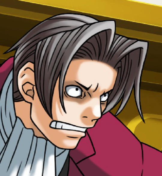

It's still cool to see how original trilogy's artstyle was clearly influenced by oldschool anime with its expressions and especially proportions.
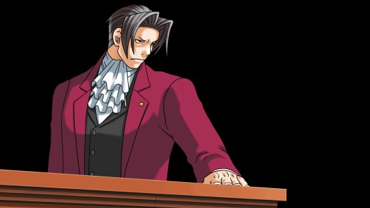
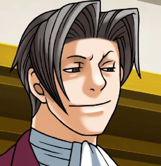
And that's where AAI struggles the most.
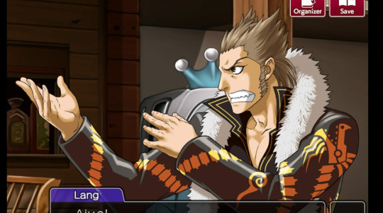
While I love Edgeworth's face in Investigations, his body proportions are killing me. Original trilogy gave him cupboard wide shoulders and yaoi shovel hands, BUT IT WORKED as Edgeworth's head was also more stylised.
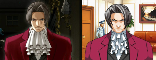
It DOESN'T WORK when you draw Edgeworth in a semi-realistic style. And as a professional artist myself I guess, that at first Edgworth's shoulders were drawn in normal human proportions until there weren't some artdirection notes to redraw them in this laughably bad way.
How could I know?
Because the gorgeous motherflipping Lang was drawn from scratch with proportions of an athletic wide-shouldered man - and this bs wasn't happening!
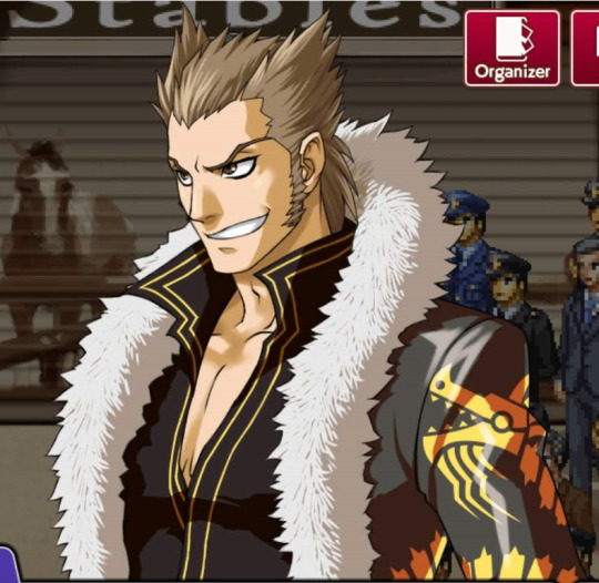
The same goes to Badd. He is very wide, but he doesn't look unnatural.
Come on, guys, Edgey already gave a flirty bottom energy near this hot mess, wider shoulders woud not help his twinkiness.
Ahem.
Also, jeez, can we appreciate the way how masterful the drawings of hands are?

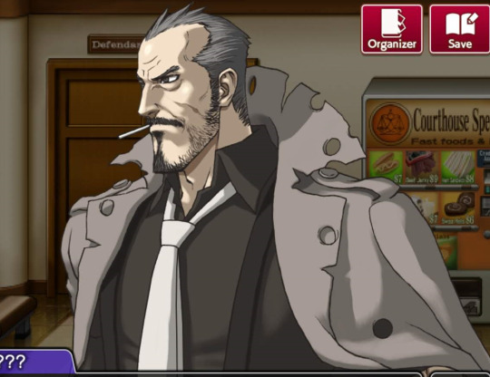
And this von Karma. Goddamit. Even if I am very vanilla, this is some hot daddy dom material. The facial structure, the precise shading, the detailes, the wrinkles, the hair, the smirk, the stare, daaaaaaaaaaamn that's a sexy drawing.
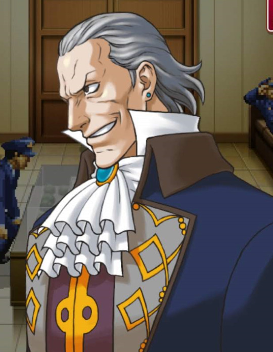
While here he looks like a f*cking toad.

That was my TED talk, thank you for reading.
#lang is... something else#am I shipping langworth? I won't tell you#ace attorney#not my art#miles edgeworth#ace attorney trilogy#ace attorney miles edgeworth#ace attorney investigations#manfred von karma#detective badd#shi long lang#tyler badd#gyakuten saiban#gyakuten kenji#mitsurugi reiji
803 notes
·
View notes
Note
Any advice on drawing McCoy? I’m not used to drawing ancient wrinkley bastards (affectionate) and it’s surprisingly tough v-v
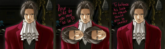
FOR SURE lmao i made. a diagram. just a warning that i am going to be irritating and long winded because u just hit a topic i really like sorry lmao
so first off i did some traces just to show whats there vs redraws to show my interpretation
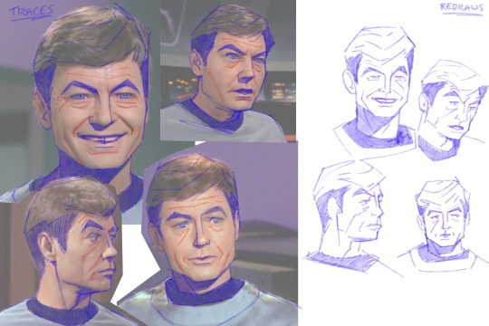
ive said this on other asks but again jsyk, tracing isnt bad!! its a tool. theres some stuff with intellectual property and whatnot but using tracing to study shapes and forms is a really valuable practice.
also just taking some time to learn facial structures and anatomy is super useful, reading what bones and muscles are where and how they interact with one another. taking this info and staring in the mirror and moving your face around and thinking about it. just really furthers understanding of how the face works. trying to sound normal about this but i love anatomy and motion and physics and whatever
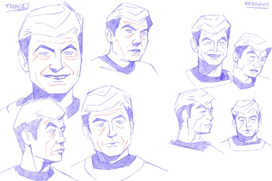
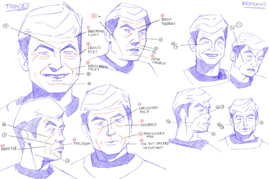
anyways im going to go through all the numbered points so there's no confusion.
1. forehead lines - self explanatory. more prominent when brows are raised
2. crows feet - at the outer corners of the eyes, more prominent when smiling or squinting
3. nasolabial folds - the folds that go from the corners of the nose to the corners of the mouth. more prominent when the mouth is wide, like smiling
4. brow furrow - self explanatory, most prominent when brows are furrowed. mccoy tends to have two right next to his eyebrows, kirk has one in the middle. everyones face works different lmao
5. chin crease - caused by how the chin and lower lip interact.
6. nasojugal groove - start from the inner corners of the eye and can extent over the cheeks. everyone has these and idk why people dont like them i think theyre really cool!!!! but Society. i guess. :/
7. eye bags - caused by the skin sagging beneath the eyes. mccoy isnt even that old in tos i think hes meant to be mid 40s by the end of the 5 year mission, hes just got really prominent eye bags lmao
8. idk what the name is for these, but when the mouth is wide and pushes the skin to the sides, these folds sometimes form outside of the nasolabial folds
9. philtrum - the groove above the upper lip. i dont usually draw this but mccoy's struck me as prominent enough that i usually draw it on him
10. masseter - the muscle that moves the jaw up and down. its a pretty rugged muscle and while i wouldnt say mccoy's is especially prominent, it kind of extends that nasojugal groove from certain angles/positions
11. orbicularis oris - mouth muscle, usually easier to see when lips are pursed or frowns are pulled. mccoy's is pretty prominent from 3/4ths or side, his mouth tends to protrude in profile
12. this isnt a muscle but more of a line defining the planes of the face, but since i drew it i felt i should explain lmao
a few points:
im an animator i tend to exaggerate and emphasize certain things so i usually make him more square.
i like to combine eyebags and crows feet for brevity/flow, same with nasojugal grooves, eyebags, and masseter lines. my approach is always subject to change based on pose, expression, reference image, etc.
i take out details that i deem redundant or cluttering and keep what details i need to make things feel Right
all this info is applicable to any character of any age, its just in how you apply it and facial proportions that willl change how old a character is perceived to be
there's a lot more with drawing a Character rather than an Actor, just because the features are there doesnt necessarily mean things will feel correct? its very much in the mannerisms and poses and expressions
i only went over my approach to his likeness but not really body type or posing or anything idk if u want that i could always try to answer that later haha
_______________
anyways all that info kind of exists nebulously in my brain while i draw its not like im sitting there thinking Must Draw. Nasolabial Fold...... i jsut do what feels right with the visual info i have. also i love specificity in faces.... i dont like to be a hater but when every character is drawn the same it pisses me off a little lmao. so
also dont take my word as The Only Way to do anything i just draw how i like to draw and no one should feel like these are things that Must be done to be a good artist or anything do whatever the hell u wanna do
#anyways my apologies that was. a lot#it will happen again if asked of me.#anon#ask#everyone has this stuff going on with their face and its really cool but capitalism and the beauty industry and whatnot#have been rotting peoples brains since the moment they came to be#the more u look at and appreciate how ur skin an muscles and bones interact with one another the more fine u are with your own face#trust me#because its really cool. like mechanically and stuff#idk if its like theraputic or something but maybe it is or maybe i think about it all way too much#how i draw#ive got some other similar things under that tag i think pertaining to merlin but still similar info
153 notes
·
View notes
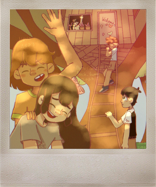
Text

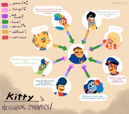
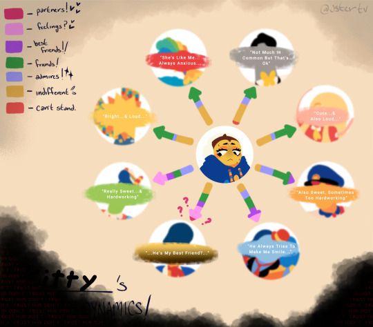

Hello you beautiful person you!
Here's some "draw your oc-!" Meme stuff and close ups of my art. I don't know how many other people do this, but when I draw fanart or stuff like the first meme, I try my hardest to match the original person's art style. Idk why, but I don't know what or how else to draw if I don't (give or take some scenarios). I also just really like the look of it if I'm able to successfully draw in their style, I hope it doesn't look to far off.
(Also wanna mention I didn't draw the heads from scratch in the "-neighbors dynamics!" Drawing, I traced over their and my oc's head so that I could make them flat colors and then drew their faces. since I wanted to change the facial expressions, but I couldn't be asked to redraw them since I did this RIGHT AFTER I finished the two "art gallery" pieces. I'll probably redo it since I drew it before the big update, and my thoughts on how kitty and her relationships with the puppets have changed, so that'll be fun :] just wanted to let ya know in case anyone came at like like "wait a minute! You traced these heads! >:(" I know! I also kinda did the same thing with the Kermit memes, I didn't know how to draw them on their own ;_; anyway! Just wanted to let ya'll know and be transparent about that! I'll put more effort into it next time!)
Any Anyway! Sorry for the long read, hope you like them! Think their cool or funny, and I hope you have an awesomely ok day! 😸💕
#welcome home original character#welcome home oc#welcome home wally#welcome home barnaby#welcome home howdy#welcome home poppy#welcome home eddie#welcome home frank#welcome home sally#welcome home julie
23 notes
·
View notes
Text
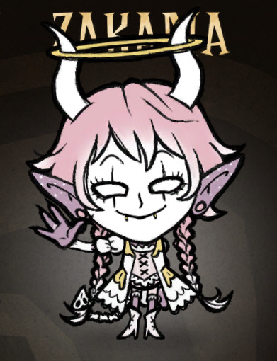
my journey in DST modding: day 5
the "Tale of Tails" continues. i decided to bite the bullet and just redraw Zakaria's tail to look exactly like the template's so the animation wouldnt break. and it looked terrible. i tweaked it a little so it didnt look as bad but it's still fucking weird.
i also remade the braids to look significantly shorter, but it also looks weird.
.
this is how she looks with the "proper" pivot points (not counting the layer thing):
.
and this is how she looks when i reset the .scml file:
as you can see, everything is all over the place, i still havent figured out HOW to change the layer hierarchy OR the pivot placement in a way that matters.
.
im kinda reaching my breaking point tbh.
i did some other stuff i didnt care to screenshot, like reposition the head a little higher (almost unnoticeable) along with the face, redid some facial expressions and made a horn-less version of the head so it didnt clash with the hats. does it make physical sense? not really, nobody takes their horns off so they can wear a hat, but im definitely not gonna bother coding her to "be unable to wear hats" or something like that.
.
i added her name in gold to the character page, it looked really good but suddenly it stopped showing up (i now know it's the autocompiler's fault, at least it's fixable)
.
this is how we're looking in-game now (i resized her but she still looks horrible with a hat):
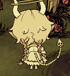
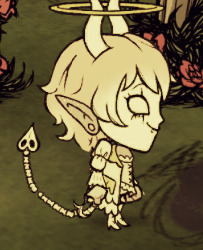
this fucking tail is getting on my nerves. i didnt wanna resort to this, but i guess im just gonna draw it on the tail-0 file and leave it as a single piece. it was worth the try, i guess.
.
but the "Tale of Tails" is not over!!!! i still have to fix the back view. i spent some more time searching in the Klei forums and while some posts were promising, most of them were just people with the same problem as me and no answer.
also, the braids count as pigtails i guess? theyre on the pigtail layer.
.
now, i found someone who said the only way to change layers is changing the animation itself. i have no idea how to do that but let's keep going i guess.
.
i sent the links i found to my friend in hopes that he can decode what the posters are saying cause my brain's already turned into a pile of goo.
.
probably the last thing i'll do for the day: redraw the tail, then take a textured brush and make the outlines of all the parts significantly thicker so she doesnt get swallowed by the environment.
.
so! end of the post, this is where im gonna stop. most of the art issues are fixed, i probably wont have to think about it two days from now.
#sorry this was mostly text im extra frustrated today#don't starve together#don't starve together mod#dst mod#dst modding#oc#original character#sunny speaking
6 notes
·
View notes
Text
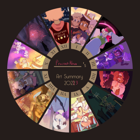
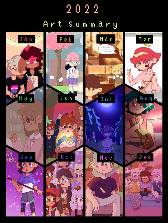
art summary 2022 vs art summary 2023
individual 2023 artworks below (plus some thoughts on them because why not. Said thoughts will include me critiquing some of the pieces, especially the ones from earlier in the year.)
also here's a link to all the artworks from my 2022 one if anyone wants to see them
JANUARY - Art piece i did right before For the Future aired of Luz and the rest of the hexsquad having a much-needed group hug. I didn't really look at any references for this one (apart from for the character's designs) so the poses look really awkward and stiff tbh 😭. That being said, I'm still glad I gave it a shot, and it looks a lot better than the one I did before Thanks to Them's release, since I was more used to drawing the characters.
I'm not going to go too much into some of the... questionable... anatomy choices I made, since they aren't exclusive to this artwork in particular, nor is this the worst example of them (*cough cough* my old King's Tide screenshot redraw).
Overall I think this is an okay art piece. Definitely could have been improved by actually using references for the pose though.

FEBRUARY - This one is actually another redraw of a REALLY old piece I drew in 2021. With my finger. Not a good combination to say the least. This one is miles better especially in terms of anatomy, facial expressions and composition.
That's not to say that it's without it's flaws. I do think that lining up Betty and Amber's poses better would have improved the overall look of the piece. Another thing that I did end up changing a little while after I drew this was removing the shine from the black parts of the mirror to make it look like it was actually cracked, which I didn't do in the original version (that one's on my scratch account if you want to see it). It's a subtle difference, but I think it makes the piece look a lot better.
Again, I think this is an okay piece overall. Looks like the mona lisa compared to the 2021 version, but honestly I think anything would.
MARCH - Yet another Owl House artwork (bet u guys cant guess what my favourite tv show is). This one I created for a zine which I was working on for my multimedia class (this artwork in particular was supposed to be an advertisement for the finale). You can kinda tell I still wasn't that confident in drawing King, since his pose is pretty stiff (I don't think I ever really got used to drawing him tbh).
I do think this piece would have benefited from some more shading and lighting that wasn't the singular multiply layer I placed over the characters then erased some parts of. (There is some other shading but there's no other lighting).
Most of the other issues I have with this pieces are just issues I have with my old art in general so I'll leave it there.

APRIL - This is the last Owl House artwork I promise. I made this one for Zeez Vov Gee 2's watching and dreaming art contest. I actually do still quite like this one, which might partly be to do with the fact that I really like all of the character's timeskip designs, but whatever.
Some of the proportions on the hands are a bit weird, and I REALLY wish I put the shading on the lineart as well, considering how light of a colour it is.
One thing I do really like which I didn't notice while I was drawing it, is the pose Luz and Amity are in forms a sort of heart shape, which is really adorable akdjfhskhdf ;w;
Anyway, overall a pretty good piece, might remake it later. Who knows 👀

MAY - as you may immediately be able to tell, I did not make that much art in May (I might've had a few tests on at the time. Or I was just lazy). This one is actually OC art for once (wow shocking never seen before).
It's kinda just a doodle/a more doodley art piece, but it's pretty alright. I actually really like the pose that Robyn (the OC in the drawing) is in. This is also kinda the first time I drew their design, so yeah. The background isn't great, but I can't really expect that much from a doodle -v-
overall, pretty decent doodle. (for anyone wondering if I'll ever post more about Robyn... maybe? I'm mainly using their story for writing practice, but I think I posted something from it on here)

JUNE - June was literally the polar opposite of May. I'm not kidding, there were like 3 artworks that I was debating putting for June (this one, some deltarune fanart and a TOH screenshot redraw). I eventually went with this one because HOLY CRAP am I proud of that background.
This one was really heavily influenced by cartoon backgrounds (in particular ones from Gravity Falls and Hilda), and while I do think there are a few things that could be improved (like some of the trees), this was the first time in a while that i'd tried drawing a background that wasn't grass and a couple of trees (and i think the first time ever that i'd done something this complex).
I think another reason that this one turned out so good is that it was a birthday card for a friend. And if there is anything that I am constantly trying to do better at every time I redraw it, it's birthday cards (probably bc they're for my friends, love you guys sm /p).
anyways, overall a really good piece, 11/10 background.
JULY - behold... the first artwork I posted on Tumblr! I drew this shortly after seeing Across the Spiderverse in cinemas (which I have to say was one of the greatest experiences of my life).
I wanted to mess around with lineless art a bit on this one, as well as sort of try to give it a watercolour feel like earth-65. And I gotta say, I think it turned out pretty good. Though I did spend a good 15 minutes looking for references because ATSV wasn't out digitally yet ;w;
overall, I like this piece, I tried something new and I made fanart for the greatest movie of all time (in my opinion)
AUGUST - I don't think I drew nearly enough Omori fanart when I was super into the game, so I'm making up for it now. I wanted to redraw one of my favourite photos from the photo album for this one.
I probably could have put a bit more detail into the background for this one, but I really like the warm lighting, and the dappled light effect that I used for the characters. The lineart is also a bit sketchy, but I was (and sort of still am) in the process of figuring out how I actually want my lineart to look.
overall, I really like this one, nice colours, nice lighting, has the omori characters being happy in it :]

SEPTEMBER - like in May, I didn't get as much Art Stuff TM done, so it's just a doodle of some of my OCS (except this time it's Copper, Lapis and Peg, who I have posted about before).
I kinda just wanted to draw something cozy, so I didn't put too much effort into the background and stuff. One thing I will say, is that I wish I drew them looking a bit older, since they are all 16-17 lol.
overall, this one's ok. Could be better, but it's just a doodle.
OCTOBER - ohohohohoho we are SO back. Yet another birthday card. I love the perspective and poses on this one (because, you guessed it, I used references for them). Everything about this artwork was really fun to draw (especially the characters).
Overall, really good artwork, 11/10
NOVEMBER - redraw of an artwork from 2021 part 2: electric boogaloo. I remember being so proud of the original artwork, so I wanted to make this one an artwork I was proud of too (which was a success).
One of the main things I wanted to do for this one was to actually draw a background, instead of getting one off google. The one I drew was simple, but I think it really works, because I wanted the focus to be on the character, not the background. I also added some slight perspective to the drawing to make it look a bit more interesting.
Overall, amazing, especially compared to the original
DECEMBER - and finally... December's artwork! Aka my banner. I wanted to do something kinda simple for this, because I'm probably going to redraw it or make a new one later. I really like the contrast between the colours in the foreground (which is supposed to be inside a train, but it's kinda hard to tell), and the background.
Also something I've started doing for a few artworks is making a duplicate of the artwork, blurring it slightly and lowering the opacity, which makes it look a lot more visually interesting :0
overall, love this one, good artwork to end the year off with :] (i'll prolly still draw more stuff tho)
(fun fact - I was going to put the redraw I did of the 'get in loser we're going shopping' scene with the characters from TMC for December because it's the highest quality meme i've ever made but it looked weird next to the other ones bc it was in black and white 😭)
#art evolution#art improvement#my art#nova.txt#long post#like seriously long post i should not be allowed to ramble about this much stuff sorry guys
2 notes
·
View notes
Text
Yuno's redrawn facial expression in OP 3
So @syrpai left this comment on the gigantic analysis of the three OPs that I posted yesterday, and I wanted to give it its own post to highlight their observation.

I'm so glad we have this community of fixated and observant experts, because I'd never noticed this before! And it's fascinating.
Here is how Yuno looks when she hits Twelfth/Yomotsu with her ax in episode 5 (an extremely memorable shot, IMO):
And now, here is how Yuno looks in the version of the scene that runs within the kanji in OP 3:
Yes, obviously the screen-shake/wobble and hair movement is VERY sped-up in the latter, but more importantly? Look at her mouth and eyes. That's where you see the altered expression which @syrpai observed and brought up. Between these two scenes, Yuno's mouth is completely different, and her eyes/eyebrows are also heavily altered.
So... why?
I don't imagine that they manually changed her face just for the flashing images in the kanji of the later OVA. While that's not 100% impossible, it's a tough idea to swallow. I can't imagine any studio justifying the effort that would go into such a redraw for something so briefly and partially glimpsed solely within a non-televised bonus episode. That's just too wild an idea for my taste. And even if they did somehow justify said redraw, I can't imagine any good reason WHY they'd choose to do so. As such, this other version is likely an alternate, unused "take" of the same scene from episode 5.
We can only guess as to why this exists. But here's my theory: The manga doesn't actually show us Yuno's face clearly at the moment she strikes Yomotsu, right? That means there was some room for the anime artists to interpret what she'd look like when they decided to change the composition of the shots for this moment in order to make the sequence more dynamic in motion. And sure, it makes a basic sort of sense for Yuno to look aggressive/determined while she's chopping someone in the neck. That's probably a very easy assumption to make about anyone in the midst of such an action. HOWEVER... ! The manga may not let us see her face in this precise moment, but it DOES show Yuno smiling calmly both immediately before and immediately after it (momentarily, in the latter case — just before she collapses from exhaustion). And based on those panels of smiles, the calmer expression used in episode 5 is likely more accurate to what Sakae Esuno intended Yuno to be expressing at the moment in question.
In summary: My theory is that the version they put into OP 3 was accidentally pulled from an early draft/cut of episode 5 — before either the episode director or the showrunner or Sakae Esuno himself requested a change to her expression so as to better reflect her intended mood/attitude in that moment.
Of course, I again remind you that this is all just my theory. I just think it's the most plausible source of the difference.
Sadly, even if we could somehow ask everyone involved with the production today, it's doubtful that they'd remember how this happened. Anime productions are frantic, and a ton has happened to all the artists involved since completing the anime a decade ago.
#syrpai#comments#mirai nikki#mirai nikki gifs#mirai nikki op#anime ops#future diary#the future diary#yuno gasai
10 notes
·
View notes
Text
What art demon is possessing me today. I actually am starting to think my art is really good DO NOT FEED INTO THIS DELUSION AAA /LH
Though if I have to tag this artwork as suggestive I will punch a wall /j. Like I KNOW the positioning leads to that easily but I don’t feel like that! I feel like suggestive work is contextual — it’s “Le//wd” if you frame it as such — particularly through facial expressions, colour, clothes, etc. I am aiming for the same vibe as Renaissance paintings (I am nowhere near that talented but it’s a vibe thing) — nudity and sexuality are not synonymous, though neither mutually exclusive. It’s FRAMING. Every way to Sunday, this thing doesn’t look sexual in the slightest. There’s no inappropriate touching or skin shown, and everything is light.
But I’m also open to being called wrong /srs. This is a redraw of one of my past drawings. It is one of my most popular sketches and wasn’t tagged, so I’m guessing everyone is in the same place of mind.
4 notes
·
View notes
Note
completely random ask that might be worthless idk but,
I really really like your style it scratches my brain nicely, if you could please tell me how you draw eyes/hair i would greatly appreciate it
okay have a great timezone goodbye
nO SELF DEPRECATING ON MY BLOG!!!!!
that’s like a huge area you’re asking about ummm... reference, default photoshop brush, and 20 years of practice?? I guess??
if it’s about my style specifically, a lot of it at its base comes from disney and anime/manga styles (general proportions & shapes, expressions, gender cues, etc), which works well for my comics & animator background: if someone else managed to draw the thing many times then that kind of design is likely easier to replicate en masse than high-detail illustration-y stuff. It's all about looking at reference, both from real life & other people’s work.
Ex. for fanart and meme redraws I often try and match the original art style as closely as possible (unless it is offensively far from my usual style and won’t be posable properly in which case I will take my liberties with some of it 😅), which is also great as a style study from reference!
(vv specific eye & hair advice under cut vv)
((yes I will be using this opportunity primarily to gush about my comic character designs))
generally what I think about for eyes is default eye shape (ex. Diego’s eyes are a different shape from Leon’s, the middle bit of the upper lid goes down earlier/at a different angle)
expression (what emotion are we experiencing, what are the lids doing, how do we stylise that (this is where I get a lot from anime/manga))
and other facial detail where applicable (ex. I made sure to include double lids or lack thereof in the style for my comic (which I often don’t bother with in fanart etc, cause lids is just another line to draw, ain’t got time for that x’D) in order to be able to better differentiate between different characters’ ethnicities (important when you’re stylising away a lot of information like colour schemes & various bits of face structure, I know many examples of both western & eastern cartoons that fail at communicating that stuff via design alone (which is obv not limited to eyes alone also)))

Also when in doubt: dot eyes are your friend!
for hair, think about hair texture (how do we stylise straight, wavy, curly, tight-curly hair?)
hair style (how does this person use their hair? how does their hair behave and what shapes does it make when you do that with it? various lengths of hair (really short hair like Zoros will look different than longer hair of the same texture)/hair sections (like undercuts), gel, straightening/curling, ponytails, various types and styles of braids/plaids, ex. I like to stylise protective hairstyles like on current-day Kelly & Nate’s designs as just nice big chunky shapes for each dread/twist/braid, etc)
and shape language you want to use (ex. both Leon & Al have a similar hair texture and length at times, but I use a pointy shape language for Leon (lots of strands sticking out from the main shapes, bangs, layers) and a rounder one for Al (she has very few strands separating out from her main chunk of hair, it’s a wavier looking shape instead) to differentiate more between them)

8 notes
·
View notes
Note
8, 14, 19 on the artist asks?
8. What do you like most about your own work?
The inner strength it took not to be like “nothing uwu uwu”. Drawing is incredibly difficult. I guess I would say that I like ummm. I think I have decent variety in terms of facial features like it makes them look distinct it gives them more personality. idk though I’m shy <3
14. How has your art changed over the years?
Definitely Ive gotten less afraid to try different things, I think usually I do aim pretty low but Im like doing more different/exaggerated expressions I guess? Like I used to do every drawing with a completely neutral expression, I still kind of do but it was even worse back then. That’s more relative to like when I first started drawing like really actively which was like 5 years ago :P relative to when I started doing digital art I care way less abt clean lineart and now mostly use the fine tip pen. And then ofc generally better proportions etc etc
19. Favourite character(s) to draw?
Different metrics I could use to answer it but I have to say @lycanthrology ‘s oc baize ross 😔✌️ typical I know. she’s fun to draw and pretty easy but more importantly I have no respect for her so if I draw her badly I don’t feel embarrassed. because I don’t feel the need to represent her well through drawings. which is what makes her fun to draw. also because she’s a fun and expressive character or whatever

This is an utena screenshot redraw Im not posting the whole drawing bc that IS embarrassing lol
#I would like to get better @drawing different body types as well#but in order to do that you have to be willing to draw full body characters in the first place instead of just head and shoulders#who’s got time#this made me realize that I literally only ever draw people’s ocs no existing characters whatsoever#thanks sm for asking :)#my art
3 notes
·
View notes
Text
Obey Me! Moin MC Masterpost
( long post )
Part 1 || Part 2
Alternative Ending
+ Hide and Seek
+ First Kiss || After the Rain
+ Got Caught
+ Her Worse Anxiety Attack
+ Farewell
+ Her 2nd Death
+ Corruption Arc (prototype)
Self-Indulgent Mafia AU
+ Mafia
+ Mafia AU The Royals
+ Mafia AU Don D's Crime Family
+ Mafia AU Other Characters || Don S
+ Don S’s story (1)
+ Recovery (comic) || O w O
+ Asmo and Satan
+ Mafia!Asmo || Seducing OC Luzi
+ Comm-ed Art
+ Gifts: [♥]
Paws and Claws AU
+ The Plot || (1) (2)
+ Captive (Beastars Crossover)
+ Comm-ed Art for Characters (1)
+ Ending
Prince of the Shadow Elves AU
+ DiaMoin initial design
+ Their Vow
Random Shenanigans
+ Lamp Event Mammon || Redraw WIP (event story)
+ Pulled Into His World
+ Dango Plushies
+ Pocky Day
+ Choc Nut feast
+ MC Dakimakura Part 1 || Part 2 || Part 3
+ Winter Item
+ Diner Theme
+ Devil Hoodies || Glowstick Time
+ A smoothie?
+ Squishing Satan's Cheeks
+ Squishing Diavolo's Cheeks
+ Swap AU
+ Aladdin AU idea || Moin MC's design
+ Using Hair Iron
+ Putting Makeup DiaMoin
+ Models
+ Kid Diavolo: What If || A Dream || I Kid You Not event || Kindergarten
+ Human World Dance?
+ Kigurumi Event with Satan || with Diavolo
+ Kabedon-ning Diavolo || Redraw
+ Valentine's Day Fun
+ White Day Fun
+ White Day Diavolo
+ Summer Beach Battle || RashGuard Team || Sparklers
+ Beach Event || Pillow Chest || Summer
+ Rainy Scenarios
+ Detective Satan and Moin MC
+ Piggyback Ride (fanfic) || Guess Who?
+ Human World Date DiaMoin
+ Picture Taking DiaMoin
+ Shrunk Diavolo || Shrunk DiaMoin
+ Maid Moin MC and Diamrowlo
+ Manga-inspired DiaMoin
+ Grown-Up Luke
+ Close call! (Get Artsy With It event)
+ Paws and Claws 2 Violence End
+ My First Mammon UR (gacha exp) || Black Panther Diavolo
+ (S4 Look) Wedding Photoshoot || Dia’s Bday
+ Kiss Meme DiaMoin || Facial Expressions
+ Yokai Event Drinking
+ Hug Bug
+ Thankful to Have You || Thank You Bestfriend
+ DiaMamMoin (1) (2)
+ Honey
+ Dame Diavolo
+ Pillow Chest Meme
- - - - -
About Moin MC
Obey Me MC Title Screen
Obey Me Character Sprite
Their Sin
All About Her Past
Part 1
Part 2
Part 3
Part 4
Part 5
Outfit Idea 1
Outfit Idea 2
Outfit Idea 3 (Halloween) || Sharpshooter MCs
My Love for Dia (1)
57 notes
·
View notes
Text
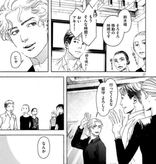
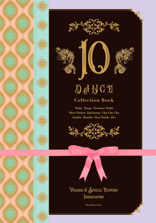
10 Dance Vol. 6 Special Edition overview
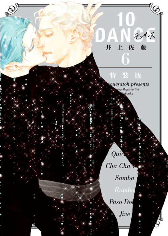
Volume 6 of the 10 Dance manga was released in Japan on March 18th, 2021. As with volumes 4 and 5, there are both regular and special editions available. In this post, I will provide an overview of the release, including observations on changes that were made to the chapters compared to how they were printed in the magazine, plus summaries and select scans of content from the special edition booklet.
It is often the case that when chapters come out in the manga magazines, they aren't always fully polished, and since I became highly familiar with this run of chapters from the summaries I made, several things immediately jumped out at me as I went through the book. First of all, though chapter 29 was split into two parts and released in subsequent months in the magazine, these two halves were combined into one chapter, with no indication they had ever been separate. I assume that they were always intended to be one chapter, but since the full chapter was not completed before the deadline (and it was a month when 10 Dance was being given the cover image, so not possible to delay its release), it was simply split over two months instead.
For visual changes, the most common alteration was scenes that originally had little or no screentone having it added in:
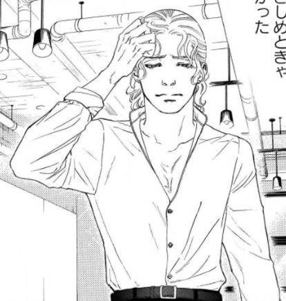

There were also some instances of either slight panel redraws, or complete replacements with new panels. None of these were from particularly important scenes, so it could just be Inouesatoh or someone on her team didn't like the look of the original panels and wanted to change them. The following example has a bit of both, with Suzuki in the upper left corner being replaced, and his eyes being redrawn in the lower panel:
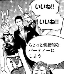
Personally, the most amusing addition I noticed was when Max was thinking about throwing a party. Originally, we didn't see what he was envisioning, but in the volume, an addition has been made in the background: the New Year's piece Inouesatoh drew with sexy men dressed as cows, except now they're bunnies!

As for dialogue, it appeared to be almost the same in both versions throughout. Some minor exceptions include a spot I found where the dialogue was put in a different order, swapping Sugiki’s lines between this panel and his first line on the following page (in addition to another altered panel example):

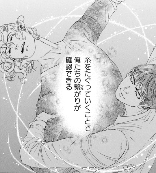
As well as in this shot of Suzuki describing how they tug at the thread that connects them through their dance. Whereas before it put the word “dance” next to the part about tugging on the thread to specify what was meant by that, it was deleted in the volume. And while it was originally described as “affirming that we’re connected”, this was also tweaked a bit to be, “affirming our connection”.

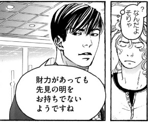
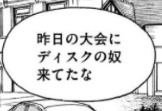
There were a couple instances of character names being different from when they appeared earlier in the story. In this volume, two characters who were last mentioned back in volume 2 (Lucas Calvo, one of the champions at the table in Blackpool, and Deeks, who Ernie said hated Sugiki because he "stole" his girlfriend), either from typos or intentional changes, weren't the same as before. Lucas' last name was written with a 'g' sound (ガルボ) instead of a 'c' (カルボ), and this change carried over to the volume. On the other hand, Deeks' (ディクス) name got transposed as Disc (ディスク) in the magazine, but was fixed in the volume.

There was a typo that unfortunately made it through to the volume (but could perhaps be fixed in future printings). In chapter 34, when Norman is testing Suzuki's skills, he flashes back to Sugiki taking the national title from him several years earlier. The text in this scene, written in English, incorrectly states that Suzuki won the championship, rather than Sugiki.

The volume also includes the usual additions that are not present in the magazine, such as the under the cover flap comic, and Inouesatoh’s notes about each chapter.
The cover flap comic (which looks very much like a sketch, compared to previous ones that have had more complete art), features the Shinyas during a practice session earlier on in the series in December, where Suzuki complains that Sugiki’s Latin just isn’t sexy. Sugiki suggests that he can practice being sexy by wiggling his butt around to write a message in the air. Suzuki worries that if he starts writing out “love” or something, he’ll have to run away and escape. Sugiki gets started, and Suzuki calls out each letter that he can make out from his elegant butt bouncing. After figuring out he’s written “M-E-R-R-Y”, Suzuki guesses that he’s writing “Merry Christmas”. Sugiki gets mad that he said it aloud before he finished writing his message, and says he’s going to leave. Suzuki says, “Wait, I love you,” as narrative text says that this somehow turned into a love story in one panel.
And here are some tidbits I found interesting/amusing from the chapter notes:
She thinks readers who are fans of pecs will like Saichi.
She’s not sure if readers will love Max or hate him, but she personally likes him (sorry Sensei, I kinda hate him lol)
As of chapter 32, a portion of the art is now done digitally.
The epic “last dance” scene from 33 was something that she had planned since the beginning of the series, and it ended up being 8 times the cost for a typical chapter.
Special edition booklet:
The special edition comes with a 48 page hardcover booklet that includes a variety of different extras, divided into 8 sections called “heats”.
Heat 1 is a newly drawn, 12 page parody manga. Back in September 2020, Inouesatoh put out a request on Twitter for fans to send in their suggestions for an erotic side story. Putting the characters in a high school setting was the most requested scenario, so she chose this idea as the basis for the story. The title is “And All That Jazz” (the premise makes this somewhat confusing to summarize, so keep in mind that I’ll mostly be describing their actions based on the soul rather than the body, but will use quotation marks if it’s about other characters and who they think they’re addressing. It’ll all make sense, I promise...I think :P)
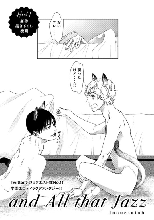
(The title page actually depicts the ending of the story, so I’ll come back to it later). It starts with Suzuki narrating his introduction, saying that he’s a transfer student to the Standard Academy. He really doesn’t get along with a guy named Sugiki, but for some reason, the two have now switched bodies with each other. Sugiki opens his shirt and inspects his new physique in front of other students, as Suzuki yells out asking what the hell he’s doing to his body. They look at themselves wearing each other’s expressions, Sugiki seeming surprised his mouth can gape open like that, and Suzuki wondering what happened to his body’s facial expression muscles. The bell rings and Sugiki heads off to class, as Suzuki is baffled that he can act so calm about this.

Sugiki perfectly reads a passage aloud in English class, something everyone (including the teacher, who looks like Norman) find unusual coming from “Suzuki”, as they wonder where his usual hearts are. Suzuki makes the decision to enjoy living as Sugiki for a bit, and is shown getting flirty with several girls. He notes that the more serious personality in his regular body is also strangely popular, though with a very different crowd.
A student named Alberko (Alberto in a girl’s uniform) shows up and says that “Sugiki” was supposed to have lunch with her(?) today. Suzuki says that he thought Alberko was going out with Dorou (a masculine alteration to Dolores’ name). Ernie and Suzuki watch as his harem falls apart with Alberko running amok. Ernie comments that both “Sugiki” and that transfer student have been acting weird all week, and he asks if something happened. Suzuki internally reflects back to one week earlier, when he was relaxing in bed in the infirmary. Sugiki comes in and accuses him of skipping class, and Suzuki tells him to mind his own business. He thought this would turn into one of their usual fights, but he can’t believe that actually happened instead...

After school, Sugiki asks Suzuki if they can go home together today. As they’re walking, Suzuki asks if Sugiki realizes what it was that made them switch places, and Sugiki says he does. Suzuki says that in that case, they know how they need to fix it, and they should go over to his house. Sugiki asks for clarification of whose house exactly he means by that.
As they start to get undressed, Suzuki says that he always thought his mom and sisters were annoying, but after a week apart he really misses them. Sugiki promises that he’ll make sure he can see them soon. Suzuki claims that he’ll be the one making Sugiki come, and Sugiki asks how he can talk like that when he was the one who looked like he was about to cry when Sugiki first touched him in the infirmary.
Sugiki peeks into Suzuki’s pants and wonders if he won’t get hard unless he touches him. Suzuki thinks it’d be weirder if he could get hard while looking at his own face, and wonders if Sugiki has AI in his crotch or something (Sugiki contends that it’s not his body). They fool around with each other until they finish, and Suzuki wonders why they didn’t change back yet. Sugiki suggests that maybe it needs to be just like the last time to count as a complete set, when they went at it until they fell off the bed, so both agree that they need to go for one more round. This then ties back to the title page, where they’ve finally managed to get back into their old bodies, but have now sprouted cat ears and tails.
Heat 2 of the booklet is 8 pages long, and contains short comics and illustrations that were not previously included in the volume releases. The comics include “How to 10 Dance”, a one-page comic with the Shinyas demonstrating the tango. Their privates end up touching, and Sugiki seems highly amused, gleefully asking Suzuki how it feels. Suzuki says that he was the one who got all bent out of shape over that back in volume 1, and tells him to lay off the sadist mode since they’re not dancing Latin right now. The second comic is “2nd Step”, and shows a glimpse of how the Shinyas were with each other after Suzuki gave the go-ahead for kissing. In fact, Sugiki ends up kissing him so much that Suzuki’s lips get sore and swollen. Sugiki then tries to kiss his neck as an alternative, but Suzuki’s not having it. The third comic depicts Suzuki’s first time in a public bath, where he realizes that Japanese people aren’t fully shaved everywhere like he is. Some of the old guys talk to him and slap their balls with their towels, and Suzuki, seeming a bit confused, gives his own balls a slap, too. After the comics are a selection of illustrations that were never used in the volumes, including this one from a Real 10 Dance event in 2018:

Heat 3 is 18 pages, and contains a variety of colored versions of both chapter covers and scenes from the manga, a couple of which I’ll share below:

Heat 4 includes 3 pages of insight from the professional dancers who consult for the manga, in which they explain the moves shown in specific panels.
Heat 5 is a single page look at Inouesatoh’s work space.
Heat 6 is 3 pages worth of advertisements that have been used to promote the series, including things like ads that were posted in subway stations:

Heat 7 is a single page look at the storyboard for chapter 1 of the manga.
Heat 8 is a single page showing the covers for foreign editions of the manga (Taiwanese, Korean, North American, and French).
Finally, there’s one last page with a thank you message from Inouesatoh, including an absolutely precious illustration of the Shinyas in happier times.
And that’s that! This really is an incredible release, and I’d definitely recommend picking up the special edition if you can. CD Japan offers direct international shipping, and I’ve also seen that Kinokuniya lists it as “available to order” currently (though they don’t appear to have stock on hand, so might take longer).
33 notes
·
View notes
Note
17-21
Thanks, @femalegothic for responding to my hankering to talk about fan art tonight.
17. Who is your favorite character to draw on Good Girls overall?
I haven’t drawn everyone yet but I have a couple of Ruby/Retta WIPs that have been a lot of fun. She’s the first character I drew when I started to pick up fan art last Fall. I generally love Retta’s makeup both on and off camera -- especially Season 1 Ruby.
18. Who do you prefer to draw: Beth or Rio? What’s your favorite thing about them to draw? Least favorite?
Lol at me putting this question on the list and not having an answer.
UM...
Rio? I guess? I spend a lot of time admiring his face and fan art seems like the natural progression of that.
Favorite thing: Oh god, how do I answer this without sounding ridiculous? Um, something I’ve noticed lately is how naturally pink Rio’s lips are and I’m kind of obsessed. It’s a detail that brings me joy along with those thick eyelashes and brows. It’s a double whammy, Rio is pretty and he’s so expressive! Drawing him is fun.
Least favorite: Definitely, the facial hair.
That being said, I also love drawing Beth happy. Beth/happiness is my true OTP.
19. Of your GG fan art, which is your favorite?
I had a lot of fun with the portrait of Rio I posted earlier. But, I also love this Get To Be Mine thing. It was my first finished fan art and it’s kind of terrible and difficult to look at now. But! They’re so cute in this and one day I want to draw more of these dummies being happy and cute.
20. Who/what would you like to draw more of in the future?
Ugh, I have this whole idea around drawing throwback pictures of the various characters. But, it’s SO ambitious. I want to do:
Mall photos of teenage Beth and Ruby
Pictures of Beth and Ruby at each other's weddings
BABY Mae Whitman and young Christina as like the cutest pair of siblings
Ruby/Stan in their early 20s
and highschool aged OT3: Rhea + Rio + Mick (I’m wildly excited about this one and it actually might be the one I try first)
Thinking about the project is immediate serotonin but I don’t quite have the digital skill to do this yet without making it an ugly mess.
I realized I needed to start simple. I’m redrawing some of the scenes/still of the show -- taking it step by step. I’m hoping I can end up at my #tbt photostream eventually.
21. Do you have strong feelings about the Eagle/Hawk/Owl/Phoenix bird of prey tattoo?
I was really nervous to draw the bird tattoo for the first time but it honestly wasn’t that bad.
That being said, it’s like a bogus extra challenge right when I’ve finished rendering everything else. Oh, you’re basically done? Yeah, well now you have to go shade in that shadow you smeared on Rio’s neck. Here’s another half-hour to an hour to render this last obnoxious and unfortunately necessary detail.
Fan Art Ask Meme
4 notes
·
View notes
Text
The Untamed vs MDZS Anime: Which is better?
Going to japan now. Currently in the plane. The in flight tv is broken. So... ive been watching mdzs on youtube!
Hot damn the animation is beautiful. Every frame is a work of art. How the hell. Its so beautiful. I mean they use 3D a lot for the backgrounds and boats but its still gorgeous and not too jarring. The lighting is so realistic, scenery too. All the fighting choreography is beautiful. The way the swords swing in the air looks so fluid, and when swords clash its in flashes of light the color of their sword. Such a tasteful yet stylistic choice. Everyone's, esp wwx, hair is so flowy, so detailed every strand sways in the wind. The waves reflect light and move smoothly. How the hell did they do that. How. I was thinking of doing those screencap redraw thingy with the scene when wwx whacks lwj's boat. (they also emphasised how far lwj's boat was sinking into the water, which makes it more convincing how wwx can deduce that theres something underneath vs the live action where lwj's boat looked normal..) it was damn beautiful. The thing is, the point of these redraws is that the animation looks simple, so the redraw would enhance the scene. But for mdzs, everything is already in peak quality, redrawing it will only look worse. Its like writing fanfiction of books. The original writing is so damn beautiful, fan fiction ends up being such a stark difference that the reader cant help but compare the 2.
Drama, as everyone says, shows better facial expressions due to the live actors, so emotions hit harder. But anime def LOOKs way better in all action scenes. Angles that follow the characters are used to emphasise scale between enemy and chracters, and all the movements feel so dynamic, and i love how when they use talisman spell thingies they got a circle of light in an intricate pattern thats super beautiful. In the drama, its just a piece of paper.
However, i prefer drama's lwj. Maybe cos wyb looks so young, its more believable when he freaks out over the adult book that wwx gives him in the library scene. In the anime, he looks 20+-30+. Its a bit hard to believe that he'd be worried over that. Idk theres a kind of innocence and naivety that leads to the stubborn refusal to express emotion that young lwj is plagued with that we have in the untamed (was this intentional on wyb's part or is it because the teenage lwj wig made his eyes look floaty, so he seems more like a teenager and naive, less experienced as a cultivator vs lwj 13 years later? Dk but it works!). In the anime, he looks like an adult thats calm and level headed already from the get-go. Idk maybe i just havent watched enough (only seen up til the water demons in caiyi town). In both anime and drama, everyone and i mean EVERYONE besides the fricking babies looks the same 13/16 years later. It doesn't feel like time has passed at all. I wish they would have maybe a change in costume, or hairstyle in the anime. The drama at least changes their costumes a little and neatens the hairstyle of jiang cheng and lwj to indicate maturity.
Btw i love that in the anime for the water demons section they had wwx and jc casually chatting (though its a blatant cornetto ad which is fricking weird. How can there be frozen treats back in those days), then wwx beautifully catapulting himself onto a boat and rowing away showing the unique and romantic af mode of transport in caiyi town, then smoothly transitioning to the lan bros on the bridge right above them with lwj asking why lxc decided to bring them along. Its just tying together so many scenes, quickening the plot along and yet doing it so naturally and seamlessly compared with the novel and drama.
Though i like that the drama involved wn and wq and have wwx save wn, and makes way more sense why wn would want to risk his life to help wwx recover his parents fricking corpse illegally right under the nose of wen chao and wen zhuliu.
The anime removed the entire mystery plot of a yan and the fairy goddess statue and thats honestly the best best best choice to make. In the drama, it was one of the worse sections ever cos i didnt understand who all these random ass characters were (it was one of the first mysteries in the drama) and yet it didnt go into detail like they did in the novel, so not only did i not know what was going on, i also didnt give a single shit about the characters. When i saw that they completely did away with the random passer bys who screwed around with the fairy statue, i was thoroughly impressed.
I liked that the drama let nhs have his own trouble making moments tho, like having him sneak a live bird into class. It makes it more convincing that wwx would be friends with him because they both have a mischievous side that they can both appreciate in each other. In the anime, nhs just looks like a loser nerd thats weak in swordplay and does wwx's homework for him, without a will of his own. It doesnt make sense why wwx would keep him around. Then again, maybe itll make the reveal that nhs is a conniving mastermind more impactful for the anime, oh well only time will tell.
I liked that lxc and lwj look similar in the anime. Its more convincing when people call them the twin jades of the lan clan. In the drama, they hardly looked like brothers. Lxc looks more like lwj's mentor or teacher rather than an older brother. In the anime, they look more siblingy.
I miss drama wen ning. I rmb when he looked so fierce and terrifying in his first appearance. I was legit intimidated. Oh how hes changed! Hes so fluffy now. In the anime hes equally menacing. His fight scene with the statue goddess was so beautiful. Doesnt it take a long time to animate the chains moving so fluidly yet dynamically yet somehow looks like it can disintegrate rock in an instant? The lighting on it too, how it reflected the fire of the forest around them. Have i mentioned how beautiful having that fight scene at night was? It was dark and ominous looking, yet the fire cast an epic looking light over the scene with warm orange glows. And the animators had that fiery light reflected in anything they could find: eyes, chains, swords.
Ooh but jiang cheng's whip looked prettier in the drama than in the anime, which is kind of weird given they were both cgi-ed. Somehow the lighting of the whip in the drama was brighter, looked more like real lightning vs the whip in the anime looking a little dull, like they colored it then added a gray filter. This is kinda bizarre given the laughably bad effects of the effects for everything else in the drama. Visuals for non human things is not the drama's strong suit, so it makes u wonder what happened for the anime whip. Maybe in the dark, the lightning would have to look hella bright and reflect on the surroundings (tedious to color) more so than in the day, hence why it looked worse in anime vs drama. Oh well.
As for lan sizhui, its weird that his voice is so deep in the anime (and audio drama!). Ive always seen him as a kiddo thanks to the live action, so hearing him sound mature is kinda off-putting. He sounds like a leader, and gives off lwj vibes vs in the live action where he gives a goody two shoes studious nerd vibe, whos just trying his best. Maybe this is better, he feels way more like a lwj-raised child(serious and business-like) which makes more sense. Live action lsz feels like a wwx(optimistic and intelligent) AND lwj(well-behaved and sensible)-raised child. Anime lsz looks like hes got his shit together. Jinling is fairly similar in both, maybe less prideful in the anime (in live action theres the scene where im pretty sure he indirectly kills one of his men by wishing for the fairy goddess statue to come to life. That was a hella asshole move. This was omitted in the anime.) Jingyi in the anime somehow looks snarkier. Maybe cos he straight up duels with jinling and kicks him down a dark cave. Ive been wondering why all the tumblr posts depict ljy as this sassy ass short tempered kid when he was quite tame (though sassy by lan standards) in the live action. Now i know.
The costumes for the drama is better, more detailed though thats expected i guess. I just love that they have little white gusu lan clan uniforms that wwx jc and friendos are required to wear. Its so cute and such a cool detail. In anime, theyre all in their usual garb, and they just look like random people who decided to turn up at lan qirens class. In the drama, it looks more like a school that they have to attend for half a year and it feels characteristic that gusu lan clan would require their students to have a uniform, given their incredibly strict regime type. It also serves to separate the happy carefree school days from all the other tragic af events in wwx's life. His costume starts out white showing innocence and purity of his naiive teenage years who had yet to experience hardship and still feels invincible as a youth. After school, he wears dark blue, as he goes on an adventure with lanzhan and experience how important the yin iron is (gives up the joking light hearted nature as a teenager by realizing the gravity of situation if the wen clan gets their hands on it) and maybe that hes not truly part of the jiang clan who wears purple. Then his costume eventually becomes black as he experiences his first life and death situation that he isnt sure he can handle. That child like assurance that "oh the seniors will let me off" or "im sure jiang fengmian will come to my rescue" gets demolished when he undergoes cruel indoctrination at the wen clans. This visual development may be a bit on the nose, but personally i love subtle representations.
Overall, the anime does do a better of job of explaining the world's mechanics, which is quite important. The drama is quite faithful to the book, at times even more so than the anime, so it irks me that this is the one thing they decide to skim on. The god damn premise, the first thing the audience needs: why the hell is wwx alive again and what is mo xuanyu doing?? I guess the drama thought that it explains itself but it doesnt really. It was really confusing. The anime, though somehow faster than the drama, still has the time to properly explain mxy. A technique ive noticed is that they do exposition during the fight scenes, which is so ingenius. Its visually appealing, as always, so its not boring, the viewers gets to understand whats going on AND it gives the sense that the characters are so skilled that they carry causal conversations while fighting supposedly weak enemies like zombies and water ghosts, which is accurate seeing how wwx and lwj and friends are supposed to be one of the most powerful cultivators.
TL;DR both are good lol
#the untamed#mo dao zu shi#wei wuxian#lan zhan#lan jingyi#lan xichen#lan wangji#jiang cheng#nie huaisang#lan sizhui#wei ying#jin ling#analysis#rant#thoughts#grandmaster of demonic cultivation#mo xuanyu
59 notes
·
View notes
Photo

28!
If I didn’t have work in eight hours, I’d probably redo this and pretend it never happened. Alas, I do.
FUCK IT, I’M NOT LEAVING THAT UP THERE. HERE, HAVE SOMETHING LESS MEDIOCRE (Not exactly good, the arms and hands are especially bad but better than the first drawing). Still rushed because work looms, but whatever.
#Hey Butterfree do you have any particular pose or scene or expression you'd like me to draw May with?#I was thinking of redrawing her for my one month... anniversary? Since that's what all this started with#Any real difference in quality is probably just gonna be because I planned it out better not because I've grown that much in just a month#So I'm not gonna be picky about recreating the original 100% or anything#otter's daily doodles#Uhh anyway about today's drawing! Mateo's really hard to get consistent#I also don't really have a strong handle on his character in general so i guess that fits#But anyway I need to study some round faces and small noses so i can draw him better because unlike Lyra#Who started with a specific facial reference that i just deviated from over the years#Matt's pretty much all from imagination
3 notes
·
View notes
Last Seen Blogs
daysofyellowroses
Yes Chef, Fuck Me
mira-blue
blue & gold
leoleolovesdc
I ramble on tumblr bc no one irl listens to me
slapfuzzy-art
Slapfuzzy's Art
itshaneri
itshaneri