#or maybe don't since i'm enjoying it
Text

(It's ok Yurgir will respawn in Avernus)
| First | | Previous | | Next |
[[ All Croissant Adventures (chronological, desktop) ]]
[[ All Croissant Adventures (app) ]]
#...right- LOL#I was so scared of losing anyone I pretty much only summoned Yurgir!#ok let me ramble about this fight in the tags#I.....listen. Listen. I love this game with my entire heart. It's one of my favorite games of all time.#.....the final battle took me out of it a little bit ngjfkdlnshjk#It introduced a bunch of new mechanics and maybe I'm dumb but it felt like it wasn't super clear how everything worked#First I restarted it because I dropped a globe of invuln on the starting area thinking Orpheus could just activate the stones from that far#Then I restarted it bc I basically ran out of time on the rounds...except I didn't realize the fight would continue since every other-#-turn-based round counter was usually a game over#THEN I actually summoned the flaming fist to help clean up right at the end which made the camera SUPER confused when I went in the portal#It was a mess.#I still give the game an 11/10 tho lmao#Oh also Orpheus did something - I don't know what - and then the dragon just died with 120hp left. So. Good job buddy LOL#Lae'zel ended up killing the Emperor - I'm sure she enjoyed that#bg3#baldur's gate 3#bg3 spoilers#act III spoilers#croissant adventures#tav#prince orpheus#yurgir#shadowheart#lae'zel#gale#breadweave#comics
173 notes
·
View notes
Note
uuuumm for the request thing maybe pastel gaster? maybe with the evil goatparents or evil alphys, haha. or maybe even evil temmie lol.
Day 29 - He's studying you with a smile...
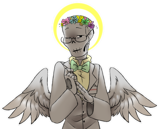
#My art#Requestober#UT#Handplates#Fellplates#Gaster#Fellplates!Gaster is weird :) I like that about him#Man it's been a heck-while since I've draw him!! He's still heckin' cute - I will always be biased towards wings haha#Didn't have any hair to shade this time so had to give them a little extra attention hehe ♪#The whole shading everything - I've just been really into backlighting lately haha#The halo is a great excuse ♫#I also like how in searching for his refs they were paired to the note of ''Don't think about it for too long it all comes crumbling down''#But now I'm thinking about it!! Oh no!! Lol#Like for example I know there are Mercyplates iterations where the Skelebros never get the plates#But the intention was still there at some point (maybe? It's been a while lol)#Basically my point is - I think Gaster's two hand hole-punches would garner the attention of Someone#Since they were brought up how about Alphys or the Goatparents' - and he gets some accessories to cover up with ♪#Anyway that's all just errant-thought fun to think about Gaster getting hurt lol - even this Gaster?#:3c Maybe#I trust him about as far as I can throw him as much as I thoroughly enjoy him hehe ♪#It was tempting to do something with Alphys and the others as well - the image of him picking up Fell!Temmie and resting her on his lap lol#But I've never drawn any of them and I couldn't find any agreed-upon references so I opted for He Alone#It would be fun to see him interacting with others tho :)#Hardly topical but I think my favourite iteration of AU Alphys is SwapFell?? She's very cool in Swap but hnnrh the armour is so cool#Anyway lol ♪
319 notes
·
View notes
Text
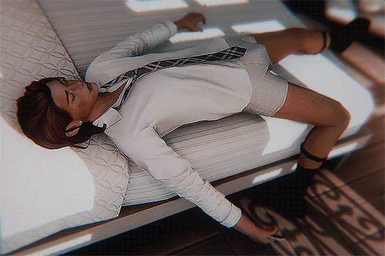
he's waiting on a call he's planning to send straight to voicemail
#sorry matthias </3 maybe he'll pick up the next time you try calling............ <- me when i lie#river dipping#ts4#ts4 edit#gifs#theodore doe#echthroi#hi friends and lovers hope everyone's doing well <3#i got my old laptop to work so i have a laptop again even if the battery on it is messed up#but still#i haven't been online much bc i've started getting dizzy from staring at computer/phone screens for too long#and in particular the act of scrolling either on mobile or desktop makes my head spin and my eyes hurt :/#but i powered through it yesterday so i could get in game with theo (and matthias) since i missed him really bad... oc plague be upon ye#i took... well. like five hundred screenshots and forty videos... i was in the soup. the mattodore soup. what can i say?#i don't like posting too much on here bc. i'm crazy (<- has avpd) so i probably won't post much from yesterday's fun here#but i'll post whatever i want on pillowfort <3 pic of jerma holding out his hand captioned let's take mattodore together#what else should i say before leaving... right my inbox... well i'll get to it eventually <- have been saying this since october sorry#but okay i've been staring at my screen too long so i need to go lay down for a bit#enjoy theo in motion!! if you’re a theo-head like myself#theodite à la jermamite? hm. its in the works. i’m workshopping.#mentioning jerma twice in these tags… busting a cyanide pill onto my tongue i’ve said too much#i have to go now mwah mwah mwah bye warmth and love to you mwah
249 notes
·
View notes
Note
happy birthday! 💕🎉🌻
I really hope it’s a lovely one!!!
Oh thank you! ;-; 🧡
#answered#cursehole#the latter part is an idiom so you don't need to listen to this but let me ramble a little since it's been on my mind all day#birthdays always unnerve me for some reason#it's not even the getting older part#I just get hella tense about the pressure to make the day *special* in some way because that's how it's supposed to go#and I often just don't wanna do anything too out of the ordinary I'm pretty happy with mundane forms of enrichment#but I can't enjoy those boring things I actually like to do since they don't have that “special once-in-a-year” feel to them#so it's more of an annual mandatory “survive through the executive dysfunction" day#I know the curse will be lifted overnight so maybe tomorrow will be better
76 notes
·
View notes
Text


:D
MADE SOME THINGSSS
if you want to use them as actual cake topper images or other decoration, you have my full permission to! that's why i made them! (i'd love if you tagged or messaged me if you do!)
if you do want to use these for cakes, i also made several other versions and have notes under the cut
OKAY SO FIRST OFF I'M NOT AN EXPERT ON PRINTING STUFF. the (very) short version is, purples and pinks don't show up well in the most common printing method, and that "most common printing method" is used in edible printing, like what's used for cupcakes and cakes
(most printing uses a color model called "CMYK," if you want to look it up)
so!! maybe you can use the images above the cut and it'll be fine, or maybe you need to give the printers these versions. these colors were picked because it lets the images turn out like the ones above the cut, NOT how they're shown here:


i'll find out if giving the printers either version works or what in a few months, and i'll update this section then (or sooner if someone fills me in), since i'm planning on getting myself a Lucifer ducky cake for my birthday :3
i'm including versions with circles because many cake designs are circular -- including the one Lucifer used in-show lol and what i plan to print -- and the circle is placed relative to where i intended the image to crop and how i intended its composition. (if you'd like the circle to be placed a bit different, you can do so using the square version)
i included a bunch of variations where Lucifer's not holding anything, if you want to add a number for someone's age for a birthday cake or your own object or some phrase or whatever you please
again, idk how printing works, so i might swap these out for the more vibrant versions depending on what i eventually learn. i'm just prioritizing these less bright versions basically so everyone remembers these are the intended / expected colors


AND A LAST TOTALLY UNRELATED NOTE:
if anyone wants to take a crack at making the image as show-accurate as possible, BE MY GUEST. SHORT VERSION IS, I DID A GOOF WHEN TAKING THE BASE IMAGE OUT OF PERSPECTIVE, SO IT CAN'T BE CROPPED TO LOOK HOW IT DOES ON THE CAKE LUCIFER CANONICALLY USES, WHAT WITH LUCIFER'S HAT AND ALASTOR'S EARS GETTING CROPPED OUT

(i wanted to make a "complete Lucifer hat and complete Alastor" version as well as a cropped version for the pedants [affectionate] out there. but the second version didn't work out when the time came 😔)
it'll probably take some artist's license to get everything to fit in a perfect circle, but here's two versions where i actually did the first step more correctly, using my programs "mesh transform" to get it circular
in the first image, Lucifer is more accurate, and Alastor is more accurate in the second, in case anyone wants to use these (no obligation; you can do your own thing if you'd prefer).


the mesh is still visible in the second image because i hadn't intended to keep the screenshot -- i just thought the mesh looked wild, so i screenshotted, but it was a lucky save since Alastor looks decent there. (it might also be preferable if you use a mesh with more points than in that screenshot)
again, some artist's license will likely be required to get them both looking good. have fun with it! i might try this project again in the future, but for now i'm done lol. (it'll probably be at least a few months or a few years if i do try again, and no guarantee that i will)
#hazbin hotel#lucifer morningstar#hazbin hotel lucifer#hazbin lucifer#hazbin lucifer morningstar#hazbin hotel lucifer morningstar#nooooot really wanting to put the 'rexan's art' tag on here since it's almost all traced#and i'm such a small artist i doubt anyone will try and find this through that tag#but hey! if i'm wrong please do tell me. i'll be flattered lol#and -BIIIIIG EXHALE- OH MY GOOOOOOSH THIS PROJECT WAS 90% DONE FOR MAYBE WEEKS. IT WAS SO DIFFICULT TO GET MYSELF TO FINISH AAAAAAAAAAAAAA#BUT NOW IT'S /DOOOONE/#ENJOY#i really want to put 'birthday' and related tags on here but i don't want to jumpscare anyone who's#not aware of Hazbin Hotel with a decapitated cartoon character LOL#...OKAY YEAH AND COMBINE THAT SENTIMENT WITH THE MANY 'LUCIFER' TAGS SFJKSKSKSKSKKS
40 notes
·
View notes
Text
So no sskk?

#😭😭😭 C'mon 😭😭😭#We deserved it!!! After what the anime did to us!!!!!!#On a different note Dazai finally died 🥳🥳🥳 Love wins#I guess I'll look at that panel of Akutagawa carrying Atsushi bridal style (not really but I'm coping) till the new chapter comes out. Eh#I wanted them to fight... We really can't have nice things#Ugh. WE REALLY CAN'T HAVE NICE THINGS I'm okay actually I just. Nnnggggggghhhhhhhh#I /know/ the manga doesn't revolve around sskk (unfortunately) but I can't help but wish they'd have more screentime...#By the looks of it. Since Dazai absolutely can't die. Some ada ally is going to write on the page to rewrite everything soon#(page that they acquired somehow in the meantime. Don't ask. I just don't think there's any other way this could go.#A Ranpo ex machina or something)#And the arc is going to be soon done with. But I don't want it to end yet I want my juicy sskk conflict...#I wanted them to deepen the “I know you're still in there” “Why did you save me” plotlines... C'mon...#(((I wanted homoerotic bloodsucking)))#(((If we have a whole vampire arc ending without even a single scene of homoerotic bloodsucking in it#you're never going to hear the end of me)))#Alas... Maybe there's still hope.#I hope the skkers enjoyed the skk (╥﹏╥)#random rambles
175 notes
·
View notes
Text
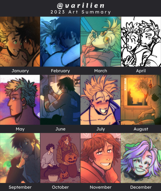
welp that's a wrap for this year ig. it's funny i think this year would have been another oops all trigun except that whenever i got really super busy FAR too busy to make trigun art i did usually end up doodling something else lmao
december's spot is @stardvst-diving's lysithea :)


#art summary#2023 summary of art#2023 art summary#txt#honestly. i think this is the first year in a long time where i really don't feel that happy with the progress i've made with my art#like in 2020 i finally got comfortable with drawing digitally after SO MANY YEARS of chipping away at it#and 2021 i finally pinned down some stylistic choices i enjoy working with and figured out how to color#and 2022 i mostly just pushed the limits of what ''finishing'' art even looks like for me#since in the past i'd tend to leave everything pretty half baked#2023 was SUPPOSED to be the year i started into things like comics and composition and increasing dynamism#but i think mostly i just ended up hammering out more stuff in regards to color and line confidence#which are both good. i'm glad i made that progress#but it's a little disappointing i didn't finish the year with the specific takeaways i'd gone into it wanting to have#sighhhhhh maybe next year idk
53 notes
·
View notes
Text
Honestly I really want to be able to side with Solas in dreadwolf. I think it'd be super interesting to play as an elf in Tevinter and be able to just go "yeah actually I think Fen'Harel is right let's tear down that veil." I mean I assume the main conflict will be Solas trying to convince your character to join him, or your character being told they have to try and stop him, and there are not enough games that let you side with the presented "villain" character. I want to see what the world is like with no veil I'm so interested. Also so interested to see what full-on Fen'Harel Solas is like. Is he still as empathetic? Or is he more conniving and distanced from "mortals" like the old stories would have us believe?
#side note it's been a hot minute since I've played trespasser I've been obsessed with origins and anders and justice recently ok#i don't have super high hopes cause bioware sucks ass#Idk if they'll have the balls to introduce the player to that level of moral nuance#i just think it would be fun and cool to have some choices on the final outcome#*with the main villain character I should say#instead of 'player character who is awesome hero defeats evil mean bad guy'#i feel like the past games have always tried to paint a very clear target of who the 'bad guy' is#when in reality that's rarely ever so simple#i want a story that lets you decide if you actually think the bad guy is bad or not#and then lets you choose what to do about it instead of directing you to kill this one guy to save the day yknow?#and I think this would be a wonderful opportunity to explore that#and I mean we did get this is 2 if I'm honest#there's not really a singlular villain#you can choose if you think the mages or the Templars are right and side with one or the other#dragon age dreadwolf#fen'harel#solas dragon age#i just like complications in stories that make decisions very hard#make solas the players friend or something again make him seem like a person and not an evil mage entity bent on killing everyone#maybe I'm just tired of how often the writers have done moral gymnastics and tried to swap it around#to make it seem like actually the mages should all be locked away and treated like shit cause they're all egotistical maniacs#and that the Templar/mage issue is a both sides have a point thing when it is clearly not#maybe I just want them to direct us towards taking the side of the oppressed instead of the oppressors for once#Hope you enjoyed my longish rant I hide in the tags as usual
18 notes
·
View notes
Text

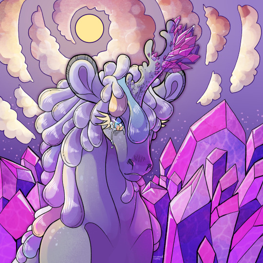
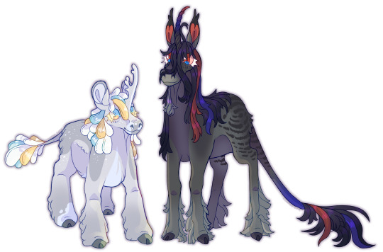
I felt the need to draw my unicorn boys after a long period of not doing that. I'm actually super happy with these, I feel like the two headshots of them are one of the best lined drawings I've ever made.
#I don't know why I drew Nightlight with such an edgy expression#the same goes for Melty crying#both of them are normally really silly#or in Nightlight's case shy#I kind of blame Nightlight's case on Lynxfrost's amazing artfight attack of him#that drawing unlocked his edgy potential for me#anyways i loved lining these?#I don't know what happened since normally I don't enjoy doing lineart as much as sketching#but these two headshots were super pleasant to line and shade#and I feel like maybe it shows in the end result? I don't know I'm just really proud of these#cinnamon's doodles#unicorn#unicorns#nightlight#melting scale#oc
70 notes
·
View notes
Text
hello... (and bye ig 👋)
#👋😭 hi...#i haven't come on in about a month and i didn't realize a month passed by like that... i've kinda stopped using any apps on my phone#i barely even talk to my friends anymore lol 😭#i just saw my follower count this morning and realized i hit 13k and i was like 🥸 huh...#uhhhhhhh 😭 idk i wanted to say thank you i guess 🫂#i'm done with stayblr and tumblr in general 😭 this much has been obvious for a while now... i tried to fit myself back in during 5star but#i think i realized i've outgrown the vibes here and in online spaces in general... i don't really enjoy it anymore 😭 which is weird cause#i've used tumblr since i was in middle school so 🫡 end of an era some would say...#i think it sucks because i don't have the same feelings about this place or skz or anything in my life right now... i tried to ignore it bu#it's so obvious now that the entirety of december passed without me really talking to a single person / without me using social media /#without me really doing much except for like homework and assignments lmao#i think genuinely i've stopped enjoying everything i used to like and i don't know why 😭 it hit me the other day bc i don't even enjoy#pc collecting anymore which is CRAZY considering how much time and money i've put into that hobby so 👋🥸 who knows what goes on#i haven't consumed any skz content since rockstar dropped 😭 and that also feels weird to me... idk... i would say maybe i'm going through a#depressive episode but i don't really feel how i do then... i think i'm just tired like i always am and that's just how i am now .. i think#i'm just not really interested in things anymore? weird but .. yeah idk😭 if i knew what was wrong i would Fix It sndjdndkd mostly i'm just#sad because i haven't been talking to friends... i keep ignoring everyone and not replying to any texts from anyone because ????#i tell myself i will do it later but i know i won't ... idk i genuinely don't know why i'm struggling to talk to ppl anymore 😭 i've become#even more of a reclusive hermit than i already was 💀 and the worst part is i feel normal abt it#i don't feel /bad/ i just feel guilty that i'm not replying to ppl bc i don't want to hurt ppls feelings... on my end i feel Normal abt it#like i ??? is it weird that i'm so detached from everything that not even a month ago made me so happy..? that's weird right 😭 like idgi#i don't feel (as) depressed (as i usually do) but clearly ?? smth is wrong ?? like ik i'm not a clingy sentimental person but ? it kinda#makes me sad wondering if i really don't care abt ppl anymore ... but i think 😭 it's also the object permanence issues that come with adhd#not seeing or talking to the ppl i love . not doing my hobbies or seeing the groups i care abt . makes it easy to not care or forget what#they make me feel etc etc ... i get it... but idk 😭 if that's what this is . well wow it sucks ASS.. cause i feel guilty for not feeling#anything at all ... 😭 idk how to explain that HENSKDNISJS anywayyyy 💀#i came on cause i wanted to say thank you for 13k followers 😭‼️ and that i probably will not be online anymore unless i really want to say#this was a really long winded way to say i feel bad but i'm done with stayblr fr 👋🥸 i tried so hard for the last 2 years to make it feel#like home again but it stopped ages ago so 🥹 that's ok.. i still cherish my memories here 🫂 anyway thanku and sjsjsksksks bye i guess 😭#who knows maybe i'll enjoy it one day again and come back :') never know what the future holds 🫡
21 notes
·
View notes
Text
As someone who likes to focus on character design in my art and frequents a lot of character creation spaces because of it, I feel I can say with confidence (Most of) the characters in The Amazing Digital Circus have commonly-used-online design traits and sources of inspiration, which make their designs feel not too exciting and maybe a bit uninspired.
HOWEVER, What makes these guys more unique lays in their personality, voice acting and animation, which perfectly fits the narrative of the story (imagine being stuck in VRchat). And It's literally perfectly fine to like the designs as they are. Their character designs have good colour contrasts which balance nicely over the design, a good weight distribution, strong shape language AND have an overarching style that ties them all together while also distinctly being based on different things and looking like they all come from a different genre of entertainment. For what these characters are, they are DESIGNED REALLY WELL.
I feel the character with the most unique and self-contained (for lack of a better word for "visually not directly inspired by something") design by far is Pomni. Literally chef's kiss. I love her expressions, love her strong colour scheme and I love how her jester's hat is stylised to be sometimes almost completely straight at the top. Her flat hat together mixed with the straight-cut strands of hair peeking out from under it are such a good and subtle contrast to her other round features that I'd dare to say they reflect her seriousness through the forced silly get-up put onto her by this digital prison. And her whole clown outfit is a really good contrast to the genuine dread and existential horror she's feeling in general. I can't get enough of it. Her design is perfect for her role in the story and also as introduction to the world we as the audience are new to.
That's why I'm honestly absolutely appalled by the amount of bad faith and horrible posts I've seen towards this project as a whole. It's one thing to not like it, but a totally whole other thing to actively make it (and the fans) out to be the worst most offensive creation to have ever touched the eyes of mortal men. It's not. And remember, people can be trolls to make a fandom look worse.
Online we have a fondness for kidcore and weirdcore aesthetics based on vague familiarity and nostalgia. It's OKAY to like a story/characters INSPIRED by these things. You are allowed to indulge on your own interests. Don't take these mean spirited posts to heart. If they don't respect your positive opinions of the show, you don't have to respect their negative opinions of it either.
#honestly the lot of these people sound like my parents telling me how bad everything I liked as a kid is bc they had it better#and ykw maybe they did. but I like the things I like anyways and I'll always hold a fondness for it because it was MY youth#I refuse to be that person for the generations after mine.#and honestly lately i've just seen a trend of mean posts scaring away interest from a topic in general... which is so sad :o(#don't let these posts scare you into disliking something you enjoy#long post#talkies#the amazing digital circus#tadc#tadc pomni#tadc jax#gooseworx#digital circus#character design#ramble#character design analysis#because i'm a nerd for character design#sorry but i had to talk about it since i'm seeing people say the designs are bad. which they aren't.#so I thought with my knowledge on character design i'd give my insight#design
43 notes
·
View notes
Text
it's kind of weird to me that they didn't bother releasing sushi and tempura internationally at all but at the same time i'm kinda glad they didn't cuz like. yo-kai watch was financially failing in the west by the time 3 released. i feel like if they had released sushi and tempura the franchise would've completely tanked before we got sukiyaki which would've sucked. honestly if anything i feel like it's more surprising that we got all three versions of 2 instead of them just releasing psychic specters but tbf i think yo-kai watch was doing well in the west when 2 released. 2 is just inexplicably what killed the franchise despite being a masterpiece-
#puppy rambles#yo-kai watch#yw3#yw2#idk. i have a lot of thoughts on this stuff#still upset i didn't find out 3 released in america until a while after it did :/ could've gotten a physical copy if i'd found out earlier#but alas. i'm just stuck with a boring digital version. i mean the digital versions of yo-kai watch games are better but like. still#i never got maginyan in blasters even though i could've. the code or whatever was on the receipt but my mom bought it for me#from the nintendo website. and i don't think she checked it and i don't think i found out that was where it was until a bit after i got it-#i did get machonyan and jibanyan t/komasan t's codes entered though so i can get them on any playthrough now#unless i put the sd card in another 3ds since apparently it's system-based instead of sd card based??? which is really stupid#but you can probably bypass that with cfw and i do plan on modding my 3ds eventually#it'll just be a process cuz i don't have an sd card slot on my computer and idk if my moms would be willing to help#so i'll probably have to get a separate sd card reader or whatever. which i do think my moms would be okay with i mean#it's my system and they're cool with piracy lfskdjfjkfsdkljfd-#my moms are so cool <3 i just wish i could get them interested in yo-kai watch but they don't seem to care lfskdjfkjsfdjlksfd-#they determined the battle system doesn't sound fun but i might've just described it badly#i mean tbf. it is very annoying sometimes. especially when my healer just will not heal the other yo-kai#''DO YOUR FUCKING JOB TATTLECAST STOP LOAFING'' -me playing 2#that being said if 1's switch port ever releases in america i am totally playing it on the tv#i WILL force my moms to watch me play funni ghost game whether they like it or not /lh#if we do ever get 1's switch port i hope they make it a collection of some kind with 2 and 3 remasters too i would buy that in a heartbeat#i mean obviously i will buy any american-released yo-kai watch stuff in a heartbeat aside from maaaaaybe y-school heroes#(i'm sorry y-school heroes fans i just cannot get into it. from concept alone it sounds like i would not enjoy it)#maybe sangokushi too if we ever get that but i feel like we probably won't#idk if the franchise it's a crossover with is popular enough in america for that#i hope we get more english yo-kai watch content once ghost craft releases. kinda feel like it's testing the waters tbh#i know it's seemingly just a spiritual successor but still#i do hope that it being a spiritual successor doesn't mean yo-kai watch is over. i doubt that it will since like#punipuni still gets semi-frequent updates
10 notes
·
View notes
Photo

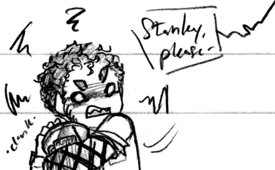


Bucket Bucket Bucket ♥ (Patreon)
I literally gasped, my original Bucket <3 <3 It was all worth it
#Doodles#The Stanley Parable#TSP#Technically a spoiler under the cut but it's a drawing of an optional route so lol#I assume double optional! Gosh this game's beautiful event-flag system <3 <3 <3#Me when the Stanley Parable: ❤️💖💕💗💞❤️#Anyway! To the Very Important New Character! Lol#It's very funny to me since I knew there Was a Bucket in Ultra Deluxe but I really didn't know anything else about them#And now here I am anthropomorphizing them so much! I was just like ''Ah. Bucket'' and now it's like ''BUCKET!! YES!!'' lol#I understand the hype now#Although now that I've found the 3 Button ending I'm sad! Then again Stanley's relationship with the Bucket is very full of strife haha#The Bucket embodies all archetypes and character relationships <3 Bucket GOAT lol#The first two were mostly my reaction to the Narrator being against Stanley keeping the Bucket haha - he gets so jealous ♪#The second was from the Apartment ending - that new Apartment is so nice! Nice layout very spacious#The image of Stanley sitting with the Bucket on his lap enjoying TV together <3 Innocent!#I wasn't specifically thinking of where Stanley would end up if he followed the Adventure Line™ while holding the Bucket but uhhh#Just don't worry about it lol it'll be fine maybe probably#But gosh the amount of time and effort put into the new locations and objects hhhh stop I'll cry if I think about it too hard#More silly Bucket spacefillers haha ♪ Don't trust them they've got a knife!#Look at all those characters that love Stanley haha ♫ New and old faces alike! He's just very lovable#Employee 416v2 cameo for funsies >:3c#Oh yeah and I didn't mention it in the other ones but I think it's more noticeable in this one :0 -#I was a little lighter on editing for this page haha#My attention hasn't been great lately >:P I /want/ to edit things so they're nice and pretty but it takes too long and I end up frustrated#There's a lot of things I can see here that I'd change if I had more patience but I just want things OUT already hgg#And I'm not really sure how noticeable it is to not-my-eyes haha#If I hear dissent maybe that'll be a good motivator ♪ No way to know!
53 notes
·
View notes
Text
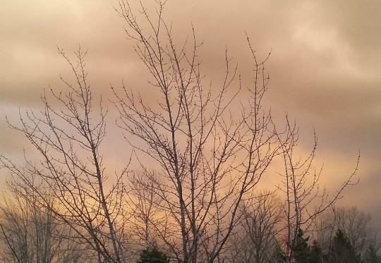
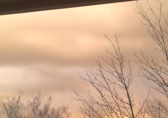
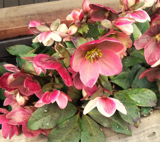
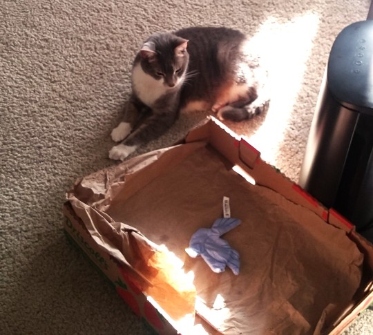
misc photo diary stuff.. also this unintentionally all matches sort of lol.. warm toned photos?
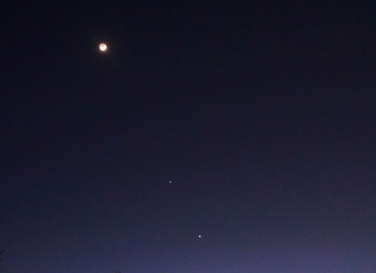
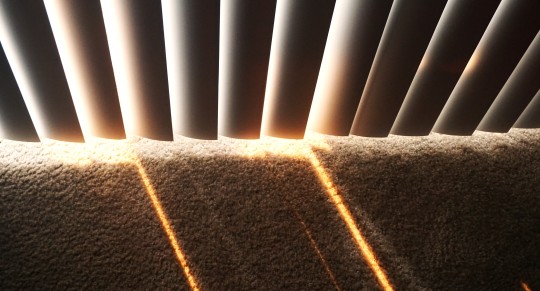
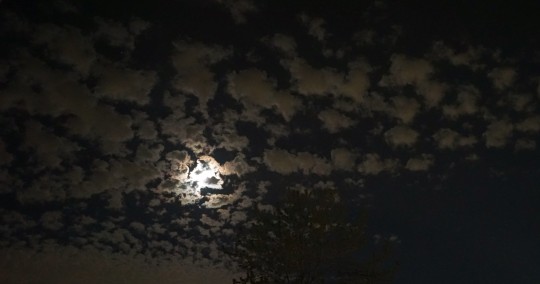
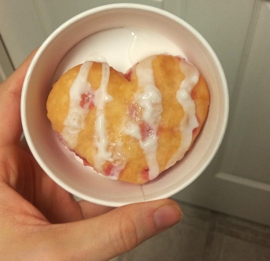
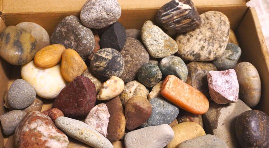
#image commentary in tags once again since they don't allow captions anymore and I feel weird using the alt text for that --#1 & 2. A very pale dusty warm sort of sky. Love the tone of it. All shades of gray skies are amazing.#3. Some flowers outside of a building I walked by. I like the chunky petals and interesting muted color#4. bapy son enjoying the sunlight#5. Picture of a moon and I think two stars or maybe planets or something near it? :0#6. little lines drawn onto the carpet with sunlight from the window blinds#7. The moon illuminating the clouds to an unuusally bright degree. Very inchresting.. It isn't even captured well in photos but in real lif#it kind of looked like everything in the sky was glowing#8. They had heart shaped strawberry biscuits at popeyes this February (I think for valentines day month?)#9. All of the various rocks I've picked up on the ground outside over the past few months. Now that I have a rock tumbler I'm always on the#lookout for interesting ones. Though I'm not sure what all of them are or how well they'd actually polish. I know there are rules about tha#and stuff lol. I do think it's neat how when they're all next to each other there's so many different patterns#and colors and stuff even though they were all taken from basically the same small span of just sidewalks and places along the city#I never travel to different states or anything or even go hours away within my own state.#photo diary
8 notes
·
View notes
Text
Never have I been more grateful that time travel exists in the X-Men universe.
#marvel#x-men 97#spoilers#...don't read my tags XD#most of the spoilers will be down here#i liked the x-men cartoon since i was a kid in the 90s#but i can't lie i mostly watched it for specific characters#if an episode didn't have any of those characters involved the chances of me enjoying it went down significantly#wasn't universal but a pretty darn good bet you know?#they gave me morph back for which i am grateful#and rogue has been my Best Girl TM for decades#but i swear i would be developing a sudden loss of interest after the latest episode if not for the whole#'this sort of thing almost never sticks in comics' and we literally saw cable right before crap hit the fan#now maybe it won't be time travel#maybe there's some other comic book story that could be used here that i'm unfamiliar with#(i know very little in regards to x-men comics - my heart resides with the batfam)#but either way being Old and Jaded is seriously working in my favor right now so i'll take it XD#(the end totally got me though like uuuuuuuuuuugh noooooooooo whyyyyyyyyyyyyyyyy *cries*)
14 notes
·
View notes
Text
finished rereading mxtx's novels and I knowwwww I should Expand My Danmei Horizons like I've wanted to but I'm so stuck on what to actually read first ;;
#z.txt#like maybe tyk since I've already watched woh and I did read part of it but ended up not finishing bc like. listen.#my adhd is a fucking nightmare#and i sabotage the things I want to do CONSTANTLY#but anyway enough about that#atm I feel like it's between tyk and 2he AND I CAN"T PICK#so now I'm just reading fanfic I saved for years#bc my adhd + inferiority complex has kept me from properly enjoying fanfic for years too#the lesson here is don't be like me kids fucking pursue therapy and medication !!!!!!!!!!
4 notes
·
View notes
Last Seen Blogs

dortetheweirdwriter
Szia, Dörte vagyok
autism-wolf
Stimboard Requests: Open!

jnamakkal-blog
jeccablog
lunaticwitchthoughts
Lunatic Witch Thoughts

orikoaurora
Head in The Clouds