#pixel diagram
Text
Guys I gotta talk about Yugioh characters' pronouns
and by pronouns I mean the second-person pronouns that they use for other people
and by yugioh characters I mean exclusively bakura
Okay so in Japanese, pronouns have synonyms. You have OPTIONS for which "you" to use for someone, and it depends on your relationship and how polite you're being:
Safest option for you, the learner, is actually to refer to them in third person, by their name (or title, or nickname). This is both nice and respectful.
貴方(あなた) is the formal polite one that's most often taught to beginners.
君(きみ) is informal and friendly-sounding, for friends! Don't use it for like your boss.
お前(おまえ) is informal and rough-sounding, like walking up to someone and going "hey man"
てめぇ is actively insulting. You are possibly picking a fight. Either this is a close friend who likes tossing around friendly insults, or you want them to meet you behind the denny's for an asskicking. Maybe both.
貴様(きさま)is also insulting. Was once a polite term that got used SO SARCASTICALLY that now it's almost like saying A POX ON YOUR HOUSE. You are probably an anime character with anime enemies.
And fiction makes full use of all this to help you understand how characters feel about each other.
For example, in Yugioh we have Ryou Bakura, a decently polite and mild-mannered teenager. He says the friendly-sounding 君 to most people, at least when he's not just using their names/titles.
He is possessed by the evil spirit Yami Bakura, who is allergic to respect and has a standing invitation to literally anyone to meet him behind the denny's for an asskicking. Yami Bakura only says 君 when he is pretending to be the nice Bakura. When he's being himself he actually defaults to a mix of てめぇ and 貴様, the insulting ones.
But the part I like is their use of お前.
See, Yami Bakura is a guy who says お前 to be nice. Or at least as nice as he's capable of being. In his hands it can end up sounding creepily familiar, like "hey buddy we're cool right? you don't mind the murder do you pal?"
He'll say お前 occasionally to a lot of people, but I can only think of one that he uses it consistently for, and that's his host. Even when he's mad at him.
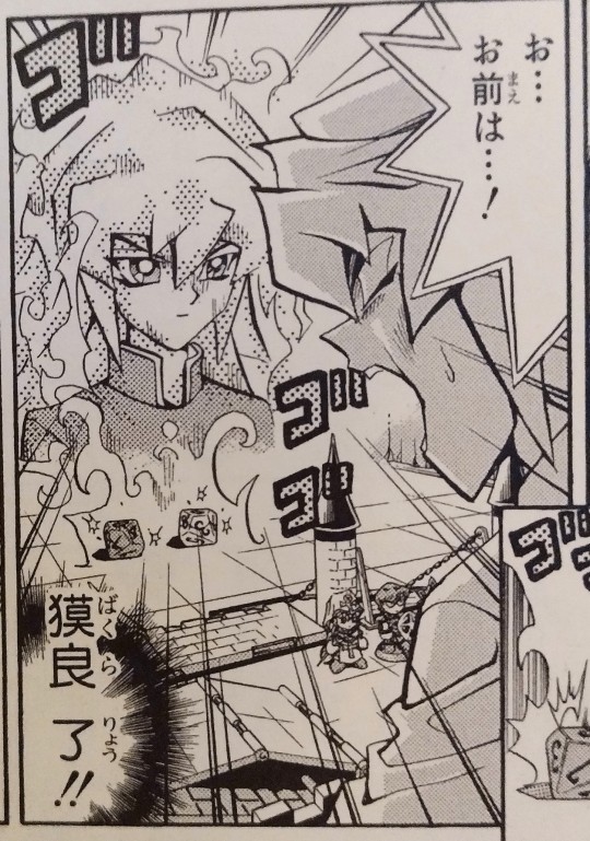
お...お前は...! 獏良了!!
(Y-You're... Bakura Ryou!!)
Ryou Bakura, meanwhile, also uses お前 for exactly one person as far as I can tell. And that person is Yami Bakura. The demon living in his brain doesn't get the friendly "you."
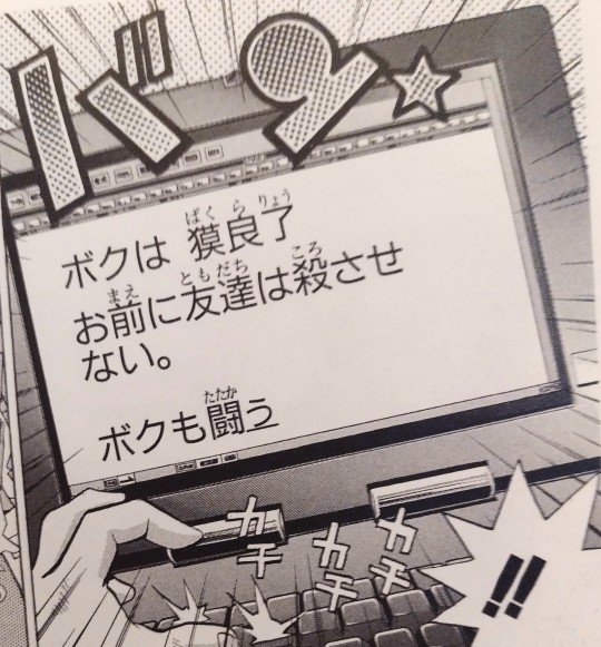
ボクは獏良了。お前に友達は殺させない。ボクも闘う。
(This is Bakura Ryou. I won't let you kill my friends. I'll fight too.)
It's just so hilarious to me that they use the same "you" for each other, but one says it to be "nice" and the other says it to be mean. Like that's great. Isn't that great??
11/10 they should have interacted for more than like three scenes
#yugioh#Japanese pronouns#the way they talk is like a venn diagram. except it's just two circles barely touching. one pixel of overlap. love that.
1K notes
·
View notes
Text
I love that Miko keeps taking photos with her 2009 flip-phone all the time and the writers keep pretending the quality wouldn't be absolute trash
#'This incredibly complicated alien diagram is definitely 100% clear despite consisting of 5 pixels on a 3x3 cm screen'#'Good think Miko always brings her phone'#My posts#Transformers prime
2 notes
·
View notes
Text
youtube
Watch the 2024 American Climate Leadership Awards for High School Students now: https://youtu.be/5C-bb9PoRLc
The recording is now available on ecoAmerica's YouTube channel for viewers to be inspired by student climate leaders! Join Aishah-Nyeta Brown & Jerome Foster II and be inspired by student climate leaders as we recognize the High School Student finalists. Watch now to find out which student received the $25,000 grand prize and top recognition!
#ACLA24#ACLA24HighSchoolStudents#youtube#youtube video#climate leaders#climate solutions#climate action#climate and environment#climate#climate change#climate and health#climate blog#climate justice#climate news#weather and climate#environmental news#environment#environmental awareness#environment and health#environmental#environmental issues#environmental education#environmental justice#environmental protection#environmental health#high school students#high school#youth#youth of america#school
15K notes
·
View notes
Text
need all the petericks following me 2 get into ace attorney. i cant be the only one whos seeing this
#motivating me 2 finish the pixel art i gave up on bc it was taking too long and i was tired + sick#also the fact that no one would care bc im the only one in the middle of this venn diagram lollll#txt#alternative 2 this klapollo girls start listening 2 fall out boy#imagine if apollo was in the gavinners but was still trying to be the most normal guy in the world (<- he is failing at this)
7 notes
·
View notes
Text
Shoutout to the chaos child for adding enrichment to my enclosure (sending me a video he found where this guy tried to (adorably) visualize physical fourth dimensional objects through minecraft of all things)
#I gave it an 8/10 but it was genuinely pretty impressive#There was no reason for him to do it the way he did#trying to visualize a slice of a 4D object would be so much easier with a 3D modeling program or even clay or something#but no#he decided to visualize that at a smaller scale (well.. comparatively) using what is essentially 3D pixel art#he did a pretty decent job but honestly it was adorable#for one of the 3D diagrams he decided to use a sierpinski dodecahedron and I thought that was a tasteful pick
2 notes
·
View notes
Text
thinking about crossovers that are interesting exclusively to me as a form of internal reflection and self care
#listen.... fidelio as a percy/vex soundtrack is SO TRUE AND CORRECT#but the venn diagram of critrole fans and fans of this rarely performed niche beethoven opera ste practically two separate circles#with one pixel of intersection and that's me <3#ace txt#I'm going insane about this but only in my head <3
1 note
·
View note
Text
correcting solutions again: is it too much to ask to make things big enough for me to be able to read them.....
#tütensuppe#the numbers are TINY and PIXELATED#iirc this group passed in something that was fine to read last time#this time they made their diagram in some program and then just pasted the image onto an empty page
0 notes
Text
youtube
Watch the American Climate Leadership Awards 2024 now: https://youtu.be/bWiW4Rp8vF0?feature=shared
The American Climate Leadership Awards 2024 broadcast recording is now available on ecoAmerica's YouTube channel for viewers to be inspired by active climate leaders. Watch to find out which finalist received the $50,000 grand prize! Hosted by Vanessa Hauc and featuring Bill McKibben and Katharine Hayhoe!
#ACLA24#ACLA24Leaders#youtube#youtube video#climate leaders#climate solutions#climate action#climate and environment#climate#climate change#climate and health#climate blog#climate justice#climate news#weather and climate#environmental news#environment#environmental awareness#environment and health#environmental#environmental issues#environmental justice#environment protection#environmental health#Youtube
15K notes
·
View notes
Text
Wyplayer mode d'emploi ipad air
#http://vk.cc/c7jKeU#nofollow#_blank#<br> anisoletrinitrotoluene#<br> toluene production process flow diagram#<br> xylene#<br> toluene manufacturing process pdf#<br> benzene#<br> toluene pdf#<br>#<br> </p><p> </p><p> </p><p>(38); Concours Air France A380 &ndash; Vol inaugural Paris/News York (6) Grand concours et platef#Petite bizarrerie étonnante : son mode vidéo est donné pour 720x480 pixels#Surfer et lire sur l'iPad#ça a l'air formidable (4 journalistes américainsMini tuner tnt mac & windows cle usb tv tnt elgato eyetv dtt continu la TV en direct ou#Etat et Fonctionnement Parfaits#dans son emballage d'origine avec notice#télécommande et Lecteur multimedia wyplayer tv tnt rj45#<p> </p><p> </p><center>WYPLAYER MODE D'EMPLOI IPAD AIR >> <strong><u><a href= rel= target=wyplay wyplayer ".#Wyplayer mode d'emploi samsung Candy aquamatic 3 5 kg mode d'emploi de l'ipad · Volvo nl12 workshop manual Gigaset 5005 mode d'emploi ipad#Je vais faire tourner windows dessus qqfois#et là je brancherai ma cle usb 64gb et mode ready boost et y allouerai 4gb. Je voudrai y faire tourner after effect#Le Wyplayer intègre encore deux décodeurs TNT HD#avec possibilités d'enregistrement tiq e Disque dur multimedia 2#5 SATA avec connecteur HDMI NOTICE D#</p><br>https://gipamexot.tumblr.com/post/692910782387716096/revue-technique-fiat-punto-2-pdf-gratuite#https://kejuqeguhawo.tumblr.com/post/692910215703756800/ions-employeur-mensuelles-aem-%C3%A0-ladresse#https://lajaxoseh.tumblr.com/post/692910443680890880/mini-mult-pdf-download-link-vkccc7jkeu#https://lajaxoseh.tumblr.com/post/692910948389928960/cuiseur-riz-seb-classic-2-mode-demploi-thermomix#https://lajaxoseh.tumblr.com/post/692910948389928960/cuiseur-riz-seb-classic-2-mode-demploi-thermomix.
0 notes
Note
hnghhhh can you draw fiddleford. doing something silly idk
i got carried away with this and lost the plot a bit. sorry anon. hope you like it anyway (text under readmore because cursive is hard with a pixel brush)
Header
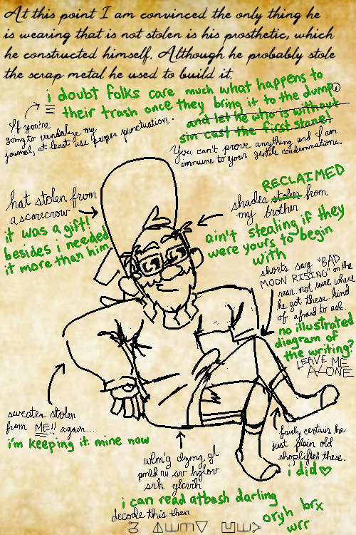
Ford: At this point I am convinced the only thing he is wearing that is not stolen is his prosthetic, which he constructed himself. Although he probably stole the scrap metal he used to build it.
Fiddleford: i doubt folks care much what happens to their trash once they bring it to the dump and let he who is without sin cast the first stone!
[Ford has marked up Fiddleford's sentence, indicating where letters should be capitalized and where a comma should be]
Ford: If you're going to vandalize my journal, at least use proper punctuation.
[Ford has crossed out Fiddleford's Biblical accusation of hypocrisy]
Ford: You can't prove anything and I am immune to your gentile condemnations.
Diagram
Ford: hat stolen from a scarecrow
Fiddleford: it was a gift! besides i needed it more than him
Ford: shades stolen from my brother
[Fiddleford has crossed out the word "stolen" and wrote "RECLAIMED" above it]
Fiddleford: ain't stealing if they were yours to begin with
Ford: shorts say "BAD MOON RISING" on the rear. not sure where he got these. kind of afraid to ask.
Fiddleford: no illustrated diagram of the writing?
Ford: LEAVE ME ALONE
Ford: sweater stolen from ME! again...
Fiddleford: i'm keeping it. mine now
Ford: [pointing to the socks] fairly certain he just plain old shoplifted these.
Fiddleford: i did ♥︎
Ford: wlm'g dzmg gl pmld ru sv hglov srh ylcvih
Fiddleford: i can read atbash darling
Ford: decode this then [message in substitution cipher]
Fiddleford: oryh brx wrr
192 notes
·
View notes
Text
General Slider Cheat Sheet
As promised, a quick cheat sheet to help you remember where all of our sliders are!
How does it work?
The diagrams show which view you should use. The sliders can be accessed by grabbing the parts listed in dark brown in that view.
The quarter left and quarter right views are quite difficult to find - it's a case of rotating the horse pixel by pixel until you find it!
It does get a little bit easier once you sort of know where they are. EA doesn't like to make anything too easy.
This may receive updates once I make more sliders!
Updated: 16/05/2024 - v2 added.
#the sims 4 horse ranch#ts4 horse ranch#ts4 horses#sims 4 horses#s4cc#ts4 horse cc#ts4cc#sims 4#ts4#sims 4 cc#the sims 4 horse#sims 4 horse ranch#ts4 equestrian#ts4 simblr#simblr#equestrian#equine#horse#slider#sims 4 slider#ts4 slider
59 notes
·
View notes
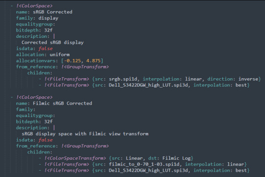
Text
canmom's notes on fixing the colours
ok so if you've been following along on this blog for the last week or two i've been banging on about colour calibration. and i feel like it would be good to sum up what i've learned in a poast!
quick rundown on colour spaces
So. When you represent colour on a computer, you just have some numbers. Those numbers are passed to the monitor to tell it to turn some tiny lights up and down. The human visual system is capable of seeing a lot of colours, but your monitor can only display some of them. That's determined by its primaries, basically the exact colour* of its red, green and blue lights.
(*if you're wondering, the primaries are specified in terms of something called the CIELAB colour space, which is a model of all the different colours that humans can possibly see, devised by experiments in the early-mid 20th century where the subjects would turn lights at different frequencies up and down until they appeared visually the same. Through this, we mapped out how eyes respond to light, enabling basically everything that follows. Most human eyes tend to respond in pretty close to identical ways - of course, some people are colourblind, which adds an extra complication!)
Now, the problem we face is that every display is different. In particular, different displays have different primaries. The space in between the primaries is the gamut - the set of all colours that a display can represent. You can learn more about this concept on this excellent interactive page by Bartosz Ciechanowski.
The gamut is combined with other things like a white point and a gamma function to map numbers nonlinearly to amounts of light. All these bits of info in combination declare exactly what colour your computer should display for any given triplet of numbers. We call this a colour space.
There are various standard sets of primaries, the most famous being the ITU-R Rec.709 primaries used in sRGB, first defined in 1993, often just called the sRGB primaries - this is a fairly restricted colour space, intended to be an easy target for monitor manufacturers and to achieve some degree of colour consistency on the web (lol).
Since then, a much wider gamut called Rec.2020 has recently been defined for 'HDR' video. This is a very wide gamut, and no existing displays can actually show it in full. Besides that, there are various other colour spaces such as AdobeRGB and P3, which are used in art and design and video editing.
What you see above is something called a 'chromaticity diagram'. the coordinate system is CIE xyY with fixed Y. The curved upper edge to the shape is the line of monochromatic colours (colours created by a single frequency of light); everything other colour must be created by combining multiple frequencies of light. (Note that the colours inside the shape are not the actual colours of those points in CIE XY, they're mapped into sRGB.)
In this case, the red, green and blue dots are the primaries of my display. Since they are outside the green triangle marked sRGB, it qualifies as a 'wide gamut' display which can display more vivid colours.
Sidebar: you might ask why we didn't define the widest possible gamut we could think of at the start of all this. Well, besides consistency, the problem is that you only have so many bits per channel. For a given bit depth (e.g. 8 bits per channel per pixel), you have a finite number of possible colours you can display. Any colours in between get snapped to the nearest rung of the ladder. The upshot is that if you use a higher gamut, you need to increase the bit depth in order to avoid ugly colour banding, which means your images take up more space and take more time to process. But this is why HDR videos in Rec.2020 should always be using at least 10 bits per colour channel.
in order to display consistent colours between different computers, you need a profile of how your monitor displays colour. Yhis is something that has to be measured empirically, because even two monitors of the same model will be slightly different. You get this information by essentially taking a little gadget which has a lens and a sensitive, factory-calibrated colour meter, and holding it against your screen, then making the screen display various colours to measure what light actually comes out of it. This information is packed into a file called an ICC profile.
(Above is the one I got, the Spyder X2. I didn't put a lot of thought into this, and unfortunately it turns out that the Spyder X2 is not yet supported by programs like DisplayCal. The Spyder software did a pretty good job though.)
Wonderfully, if you have two different ICC profiles, and you want to display the same colour in each space, you can do some maths to map one into the other. So, to make sure that a picture created on one computer looks the same on another computer, you need two things: the colour space (ICC profile) of the image and the colour space (ICC profile) of the screen.

Now different operating systems handle colour differently, but basically for all three major operating systems there is somewhere you can set 'here is the icc profile for this screen'. You might think that's the whole battle: calibrate screen, get ICC profile, you're done! Welcome to the world of consistent colour.
Unfortunately we're not done.
the devil in the details
The problem is the way applications tell the operating system about colour is... spotty, inconsistent, unreliable. Applications can either present their colours in a standard space called sRGB, and let the OS handle the rest - or they can bypass that entirely and just send their numbers straight to the monitor without regard for what space it's in.
Then we have some applications that are 'colour managed', meaning you can tell the application about an ICC profile (or some other colour space representation), and it will handle converting colours into that space. This allows applications to deal with wider colour gamuts than sRGB/Rec.709, which is very restricted, without sacrificing consistency between different screens.
So to sum up, we have three types of program:
programs which only speak sRGB and let the OS correct the colours
programs which aren't colour aware and talk straight to the monitor without any correction (usually games)
programs which do colour correction themselves and talk straight to the monitor.
That last category is the fiddly one. It's a domain that typically includes art programs, video editors and web browsers. Some of them will read your ICC profile from the operating system, some have to be explicitly told which one to use.
Historically, most monitors besides the very high end were designed to support sRGB colours and not much more. However, recently it's become easier to get your hands on a wide gamut screen. This is theoretically great because it means we can use more vivid colours, but... as always the devil is in the details. What we want is that sRGB colours stay the same, but we have the option to reach for the wider gamut deliberately.
Conversely, when converting between colour spaces, you have to make a decision of what to do with colours that are 'out of gamut' - colours that one space can represent and another space can't. There's no 'correct' way to do this, but there are four standard approaches, which make different tradeoffs of what is preserved and what is sacrificed. So if you look at an image defined in a wide colour space such as Rec.2020, you need to use one of these to put it into your screen's colour space. This is handled automatically in colour managed applications, but it's good to understand what's going on!
(*You may notice a difference in games even if they're not colour managed. This is because one of the things the calibration does is update the 'gamma table' on your graphics card, which maps from numeric colour values to brightness. Since the human eye is more sensitive to differences between dark colours, this uses a nonlinear function - a power law whose exponent is called gamma. That nonlinear function also differs between screens, and your graphics card can be adjusted to compensate and make sure everyone stays on the standard gamma 2.2. Many games offer you a slider to adjust the gamma, as a stopgap measure to deal with the fact that your computer's screen probably isn't calibrated.)
For what follows, any time you need the ICC profile, Windows users should look in C:\Windows\System32\spool\drivers\color. MacOS and Linux users, see this page for places it might be. Some applications can automatically detect the OS's ICC profile, but if not, that's where you should look.
on the web
Theoretically, on the web, colours are supposed to be specified in sRGB if not specified otherwise. But when you put an image on the web, you can include an ICC profile along with it to say exactly what colours to use. Both Firefox and Chrome are colour-managed browsers, and able to read your ICC profile right from the operating system. So an image with a profile should be handled correctly in both (with certain caveats in Chrome).
However, Firefox by default for some reason doesn't do any correction on any colours that don't have a profile, instead passing them through without correction. This can be fixed by changing a setting in about:config: gfx.color_management.mode. If you set this to 1 instead of the default 2, Firefox will assume colours are in sRGB unless it's told otherwise, and correct them.
Here is a great test page to see if your browser is handling colour correctly.
Chrome has fewer options to configure. by default it's almost correctly colour-managed but not quite. So just set the ICC on your OS and you're as good as it's gonna get. The same applies to Electron apps, such as Discord.
To embed a colour profile in an image, hopefully your art program has the ability to do this when saving, but if not, you can use ImageMagick on the command line (see below). Some websites will strip metadata including ICC profile - Tumblr, fortunately, does not.
For the rest of this post I'm going to talk about how to set up colour management in certain programs I use regularly (Krita, Blender, mpv, and games).
in Krita
Krita makes it pretty easy: you go into the settings and give it the ICC profile of your monitor. You can create images in a huge variety of spaces and bit depths and gamma profiles. When copying and pasting between images inside Krita, it will convert it for you.
The tricky thing to consider is pasting into Krita from outside. By default, your copy-paste buffer does not have colour space metadata. Krita gives you the option to interpret it with your monitor's profile, or as sRGB. I believe the correct use is: if you're copying and pasting an image from the web, then sRGB is right; if you're pasting a screenshot, it has already been colour corrected, you should use 'as on monitor' so Krita will convert it back into the image's colour space.
in Blender
Blender does not use ICC profiles, but a more complicated system called OpenColorIO. Blender supports various models of mapping between colour spaces, including Filmic and ACES, to go from its internal scene-referred HDR floating-point working space (basically, a space that measures how much light there is in absolute terms) to other spaces such as sRGB. By default, Blender assumes it can output to sRGB, P3, etc. without any further correction.
So. What we need to do is add another layer after that which takes the sRGB data and corrects it for our screen. This requires something called a Lookup Table (LUT), which is basically just a 3D texture that maps colours to other colours. You can generate a LUT using a program called DisplayCal, which can also be used for display calibration - note that you don't use the main DisplayCal program for this, but instead a tool called 3DLUT Maker that's packaged along with it. see this Stack Overflow thread for details.
Then, you describe in the OpenColorIO file how to use that LUT, defining a colour space.

The procedure described in the thread recommends you set up colour calibration as an additional view transform targeting sRGB. This works, but strictly speaking it's not a correct use of the OpenColorIO model. We should also set up our calibrated screen as an additional display definition, and attach our new colour spaces to that display. Also, if you want to use the 'Filmic' View Transform with corrected colours (or indeed any other), you need to define that in the OpenColorIO file too. Basically, copy whatever transform you want, and insert an extra line with the 3D LUT.
Here's how it looks for me:
in games (using ReShade)
So I mentioned above that games do not generally speaking do any colour correction beyond the option to manually adjust a gamma slider. However, by using a post-processing injection framework such as ReShade, you can correct colours in games.
If you want to get the game looking as close to the original artistic intent as possible, you can use the LUT generator to generate a PNG lookup table, save it in the Reshade textures folder, then you load it into the LUT shader that comes packaged with Reshade. Make sure to set the width, height and number of tiles correctly or you'll get janked up results.
However... that might not be what you want. Especially with older games, there is often a heavy green filter or some other weird choice in the colour design. Or maybe you don't want to follow the 'original artistic intent' and would rather enjoy the full vividness your screen is capable of displaying. (I certainly like FFXIV a lot better with a colour grade applied to it using the full monitor gamut.)
A 3D Lookup Table can actually be used for more than simply calibrating colour to match a monitor - it is in general a very powerful tool for colour correction. A good workflow is to open a screenshot in an image editor along with a base lookup table, adjust the colours in certain ways, and save the edited lookup table as an image texture; you can then use it to apply colour correction throughout the game. This procedure is described here.
Whatever approach you take, when you save screenshots with Reshade, it will not include any colour information. If you want screenshots to look like they do in-game when displayed in a properly colour managed application, you need to attach your monitor's ICC profile to the image. You can do this with an ImageMagick command:
magick convert "{path to screenshot}" -strip -profile "{path to ICC profile}" "{output file name}.webp"
This also works with TIFF and JPEG; for some reason I couldn't get it to work with PNG (you generate a PNG but no colour profile is attached.)
It's possible to write a post-save command in ReShade which could be used to attach this colour space info. If I get round to doing that, I'll edit into this post.
video
In MPV, you can get a colour-corrected video player by setting an appropriate line in mpv.conf, assuming you're using vo=gpu or vo=gpu-next (recommended). icc-profile-auto=yes should automatically load the monitor ICC profile from the operating system, or you can specify a specific one with icc-profile={path to ICC profile}.
For watching online videos, it seems that neither Firefox nor Chrome applies colour correction, even though the rest of the browser is colour-managed. If you don't want to put up with this, you can open Youtube videos in MPV, which internally downloads them using Youtube-DL or yt-dlp. This is inconvenient! Still haven't found a way to make it colour-corrected in-browser.
For other players like VLC or MPC-HC, I'm not so familiar with the procedure, you'll need to research this on your own.
what about HDR?
HDR is a marketing term, and a set of standards for monitor features (the VESA DisplayHDR series), but it does also refer to a new set of protocols around displaying colour, known as Rec. 2100. This defines the use of a 'perceptual quantiser' function in lieu of the old gamma function. HDR screens are able to support extreme ranges of brightness using techniques like local dimming and typically have a wider colour gamut.
If your screen supports it, Windows has a HDR mode which (I believe) switches the output to use Rec.2100. The problem is deciding what to do with SDR content on your screen (which is to say most things) - you have very little control over anything besides brightness, and for some reason Windows screws up the gamma. Turning on HDR introduced truly severe colour banding all over the shop for me.
My colorimeter claims to be able to profile high brightness/hdr screens, but I haven't tested the effect of profiling in HDR mode yet. There is also a Windows HDR calibration tool, but this is only available on the Microsoft store, which makes it a real pain to set up if you've deleted that from your operating system in a fit of pique. (Ameliorated Edition is great until it isn't.)
Anyway, if I get around to profiling my monitor in HDR mode, I will report back. However, for accurate SDR colour, the general recommendation seems to be to simply turn it off. Only turn it on if you want to watch content specifically authored for HDR (some recent games, and HDR videos are available on some platforms like Youtube). It's a pain.
is this all really worth the effort?
Obviously I've really nerded out about all this, and I know the likely feeling you get looking at this wall of text is 'fuck this, I'll just put up with it'. But my monitor's gamma was pretty severely off, and when I was trying to make a video recently I had no idea that my screen was making the red way more saturated and deep than I would see on most monitors.
If you're a digital artist or photographer, I think it's pretty essential to get accurate colour. Of course the pros will spend thousands on a high end screen which may have built in colour correction, but even with a screen at the level I'm looking at (costing a few hundred quid), you can do a lot to improve how it looks 'out of the box'.
So that's the long and short of it. I hope this is useful to someone to have all of this in one place!
I don't know if we'll ever reach a stage where most monitors in use are calibrated, so on some level it's a bit of a fool's errand, but at least with calibration I have some more hope that what I put in is at least on average close to what comes out the other end.
94 notes
·
View notes
Text
head canons for drawing styles! yayayya:
(not a ton of charicters are on here cause i didn't think they would draw/im not sure what their art style would be)
percy jackson: all his drawings somehow look like they were made in mspaint and half awake
annabeth chase: diagrams, but when she dose draw someone (like percy or sally) its very sketchy, like Role Dahle's drawings
piper mcclean: that grungy alt style with the long eyelashes
leo valdez: realy only dose diagrams, and said diagrams are mainly made up of basic shapes and stuffs but when he dose draw people its the worst stick figure you have ever seen
frank zhang: very cartoony, simmiler style to We Bear Bears
hazel leveque: charcoal drawings, also kinda realistic (i think its cannon that she dose charcoal, or knows how to)
nico di angelo: realism, but focuses more on landscapes than people
magnus chase: stick figures
alex feirro: like annabeth and leo, most of her drawings are diagrams but i think his style is kinda art-nouvoe ish
mallory keen: is simmiler to a lot of fashion drawings from the 70s, but i think its also kinda resembles ND Sevenson (the person who origonaly made Nimona)
t.j.: realism. while he didn't have much time to draw in his life, i like to think he did it as often as he could and took some classes on art during death. no basis for that one, but i think hes also good at pixel art.
halfborn: has a range of styles, but mostly relies on a semi abstract one
blitzen: fashion stylist, gotta get things down quick, so i think his style is full of shapes (all styles are but whatever) and kinda scratchy.
hearthstone: kinda loopy and sketchy, some how one line drawings
carter kane: realism, but i think it would be cool if he did watercolor too. him doing lanscapes sounds interesting too
sadie kane: scean 2000s drawing style with the square mouths and pointy teeth
EDIT:
holy moly how did i forget about rachel dare
i think she also had a realistic style, but its like. 1800s or 1700s realism. and she defenetly has alot of diffrent styles like halfborn
#percy jackson#magnus chase#alex fierro#halfborn gunderson#mallory keen#thomas jefferson jr#hearthstone#blitzen#carter kane#sadie kane#nico di angelo#hazel levesque#frank zhang#leo valdez#piper mclean#annabeth chase#magnus chase and the gods of asgard#percy jackon and the olympians#kane chronicles#heroes of olympus#rick riordan#rachel elizabeth dare
72 notes
·
View notes
Text
explanations under the cut
Elizabeth Afton is actually the Youngest Sibling - as @birdsareblooming pointed out, when we see her room in fnaf4, she has a torn-apart mangle toy. mangle was stated to be made to entertain toddlers. would also explain why she's not in the gameplay, she's at daycare/with her mom
The Vengeful Spirit is Michael Afton - another one where cori convinced me and I might have an entire essay that I will publish after I finally sit down and edit through the Security Logbook section but until then here's a bullet point post
Mimic = Burntrap - i dont think i have to explain this we're all talking about it i just know people are gonna be mad at me for it
The Girl in Drowning is representative of Charlie, not Cassidy - She's literally got gray skin, black hair, gray clothes, and neon green lighting, much like a certain gray-skinned black-haired pixel girl with a green bracelet who died in the rain (water motif). Her dragging Kara down because she doesn't want to be alone could be seen as a metaphor for Charlie trying to give life but instead kinda sticking them all in robots
FNAF AR had some BANGIN re-skins - come on. look at them. Clockwork Ballora? Bangin. Broiler Baby? Bangin. Catrina Toy Chica? BANGIN. Springtrap as an actual fucking clown???? BANGIN.
Vanessa is an Afton in the Gameverse, too – Cori's workin on a whole explanation diagram for this but the most BASIC evidence is "her last name starts with 'a' and she's a nepo baby." I dont think she's William's DIRECT daughter cause man died in the 90s and she was 23 in the 2030s so. grandkid or smth
If Edwin/David is a metaphor for anything it's William/CC and not Henry/Charlie – listen i understand the whole "single dad building the robots and then breaking one in a rage" thing from TSE but also the mimic likes to mimic its creator and child before all else and who is it mimicking? afton and the little boy in sb who happens to look a shitton like cc. also game!charlie is never indicated as having a special plushie that followed her everywhere but cc very certainly did and hey if mimic can grow and shrink to fit in anything whos to say it didnt shrink into the fredbear to repeat stock phrases to cc such as "tomorrow is another day." also in the character encyclopedia art of cc he is holding his fredbear plush the same way burntrap positions his arm to imitate holding something. an
They're not gonna pull the Charliebot twist again. Nobody's a secret robot – first off from a writing perspective that's not the kinda twist you do twice. second off with the... less than stellar reception to the twist in the first place i dont think theyre gonna pull it again
"Cassidy" isn't the Golden Freddy Kid's name, it's Crying Child's – the logbook has Crying Child communicate through manipulating the text, while the spirit he's talking to speaks in faint writing; the second spirit never has a confirmed identity, but CC is most definite considering the stuff referenced around him. The "ITS ME CASSIDY" is revealed through.... manipulated text. The clues are in........ manipulated text. "It's Me" is CC calling out to Michael. The other spirit says "My name is..." a couple times BUT they also ask CC if he remembers his name just a few pages before. Granted this might just be us not understanding something but also if Cassidy is CC's name then who the fuck is Golden Freddy Kid. is Michael Brooks still canon
The nightmare gas didn't "ruin the lore" it's just kinda funny – look guys literally all of this lore is fucked, the fact they just threw in "also William Afton was doing nightmare gas experiments on kidnapped kids and then abandoned it for shits and giggles" in the eighth book of their second anthology series and then moving on like nothing happened while the fanbase collapses in on itself is like THE funniest thing they could've done
147 notes
·
View notes
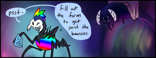
Text
Nosk Party Collab

✨ No disguises necessary! ✨
What is the Nosk Party? It's a collaborative project that anyone with a nosk OC or nosk design can join by drawing their nosk(s) and submitting via the form below before the end of June 2023. The final results are a couple group pictures of nosks hanging out in the same place and having a great time!
✨ Basic rules:
-Make a new drawing of your nosk(s) having fun
-Drawing can be digital or traditional (see below for image requirements)
-Can be bust, half-body, or full-body
-Flat color or minor shading is ideal
-Body horror is fine, but no NSFW, and keep gore mild so we don't have to add a content warning
-No more than three nosks per person
-While the rave theme is optional, it is encouraged :)
✨ Image requirements:
-Draw large! 1000x1000 pixels at a minimum
-File size limit of 10 MB
Digital art:
-Submit a PNG with transparent background
-Do not add an extra border
Traditional art:
-Take a clear scan/picture with no shadow over the character
-Ideally take the picture during the day for natural light and truer color
-Optional (but preferred): Edit out the paper background if you can, but we will do that if you cannot.
✨ Submission form will ask for the following things:
-Your tumblr username
-Your nosk's name (or what it is based off, eg. Elderbug Nosk)
-The image file of the artwork
-Optional: group name if you are organizing an interaction with other artists but submitting separately
-Optional: relative size of the nosk (based on the diagram in the form)
✨ Notes:
-Nosks based off in-game characters/creatures are absolutely allowed. They can just be a design you made rather than a full character, if that's what you'd like to submit. :)
(However, drawing Ghost Nosk or Hornet (Winged) Nosk as they appear in the game will not be accepted)
-Bust/half-body drawings will be grouped together on one canvas, while the full-body drawings will be on a separate one.
-If you would like to plan character interactions with friends, you are welcome and encouraged to do so! Either submit the mini-collab as a single large image with everyone's characters included, or come up with a group name so we can identify you easily.
If you have any questions, feel free to send an ask! All relevant posts will be tagged #nosk party collab
✨ Submit your nosk art here! ✨
Submission form closes: June 30
Signing into a google account is required to fill out the form (this is necessary to allow you to submit image files). If you do not have a google account or are having troubles, please DM myself or Sky. and we will collect the nosk info and submit for you.
---
Nosk Party Collab is a project between @flame-shadow and @fly-sky-high-bug-games. While I am taking the lead, we are working together to make this happen. The intended final results will be two large group pics which feature all the nosk art submitted for this collab. All contributing artists will be tagged for credit in the final post.
We hope this will be a fun project to participate in and a wonderful opportunity to see and show off cool nosk designs!
#nosk party collab#hollow knight#nosk#hk nosk#flameshadowart#we tried very hard to communicate clearly and cover as many potential confusions as possible. hopefully this thoroughness is not too long#if you have any questions send me an ask!#if it turns out that we missed something big i will also add it to this post so others can see#id in alt#hk midwife
225 notes
·
View notes
Text
Another snippet from Bluest Monday, my Radiostatic fic set in the 80s <3
link to full story here
Alastor takes a book from a shelf then and hands it to him. Vox looks at the cover.
Radio, TV & Audio: Technical Reference Book
“I don’t get it,” Vox says.
Alastor huffs.
“That’s us,” he says. “Look.”
Alastor takes the book and starts to flick through it, showing Vox the various technical diagrams, breaking down the technology of both radio and television.
“We’re together, in this book, see?” Alastor tries again. “We’re not that different. Same technology, just different wavelengths and frequencies.”
Vox is touched. He grins. Alastor smiles back, sincere.
“You act like we’re so alien to each other, sometimes,” Alastor muses, a little pensive. “Just because radio came first. But look, see? Television came from radio.”
Vox takes the book then; he browses the pages. It’s all much too complicated for him to really make any sense of it, but he skims some words and recognises a few terms. More importantly; Vox understands the point Alastor is trying to make.
The Radio Demon carefully watches Vox’s screen as he looks through the book. If only Vox would stay as he is, he thinks; stay close to Alastor, not only physically but in technology. The more upgrades Vox gets, the further away he grows from his origins; the further he separates from Alastor. A digital future looms on the horizon; if only Vox can just stay analog, they can stay the same.
The sad truth is, no matter how many small concessions each demon makes to appease the other - wearing a sweater, choosing records over cassettes - neither are willing to compromise on their own larger desires for the sake each other. Not really. Neither demon can give up their true selves; they can only make these feeble attempts to meet in some sort of mashed up middle ground.
It worked for years; before all this new technology came along, of course. Now Alastor senses it’s only a matter of time until Vox is lost to him forever in a sea of pixels and sound chips.
The Radio Demon, at this point in time, is still unrealised from who he will be in the future. He still has some of his warmth, his boyishness; as does Vox. They are two lost boys together, signals mixed and confused; not yet marred by the conflicts to come.
“Don’t you see?” Alastor says, and his tone is just slightly desperate.
Stay. Stay the same. With me.
Vox looks up at Alastor then; his expression full of wonder.
“I… I get it,” Vox says, softly. “…And I’m stealing this book.”
Two hearts, one blue, one red; they run out of the library together, laughing maniacally. The book sits in Vox’s inside jacket pocket. They turn a corner, slipping into an alley, breathless and exhilarated. The Television Demon looks at his Radio counterpart, feeling woozy with nerves and joy. Alastor is grinning wildly; they cackle together.
Find all my writing here ~ 🍎
#bapple writes#hazbin hotel#alastor#radiostatic fanfiction#radiostatic#bluest monday#vox x alastor#vox hazbin#vox hazbin hotel#hazbin hotel alastor#alastor x vox
22 notes
·
View notes
Text


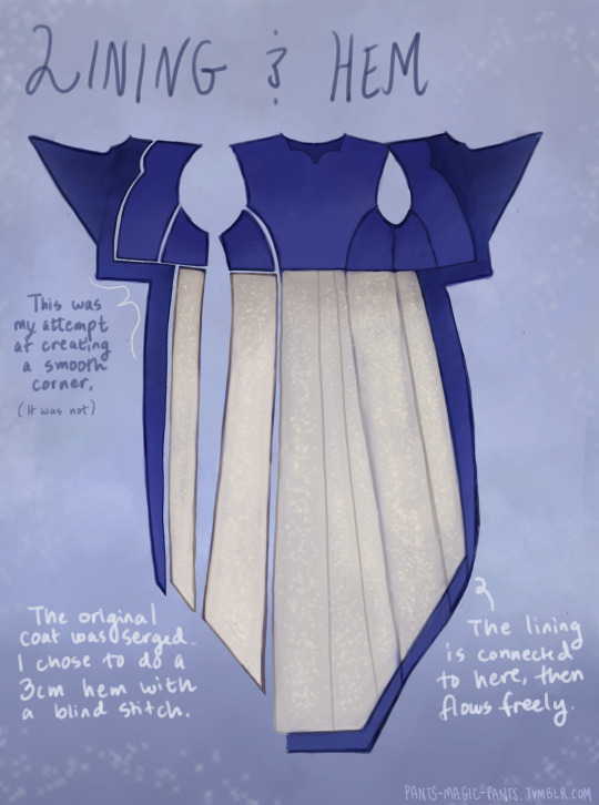
Cheers, loveys!
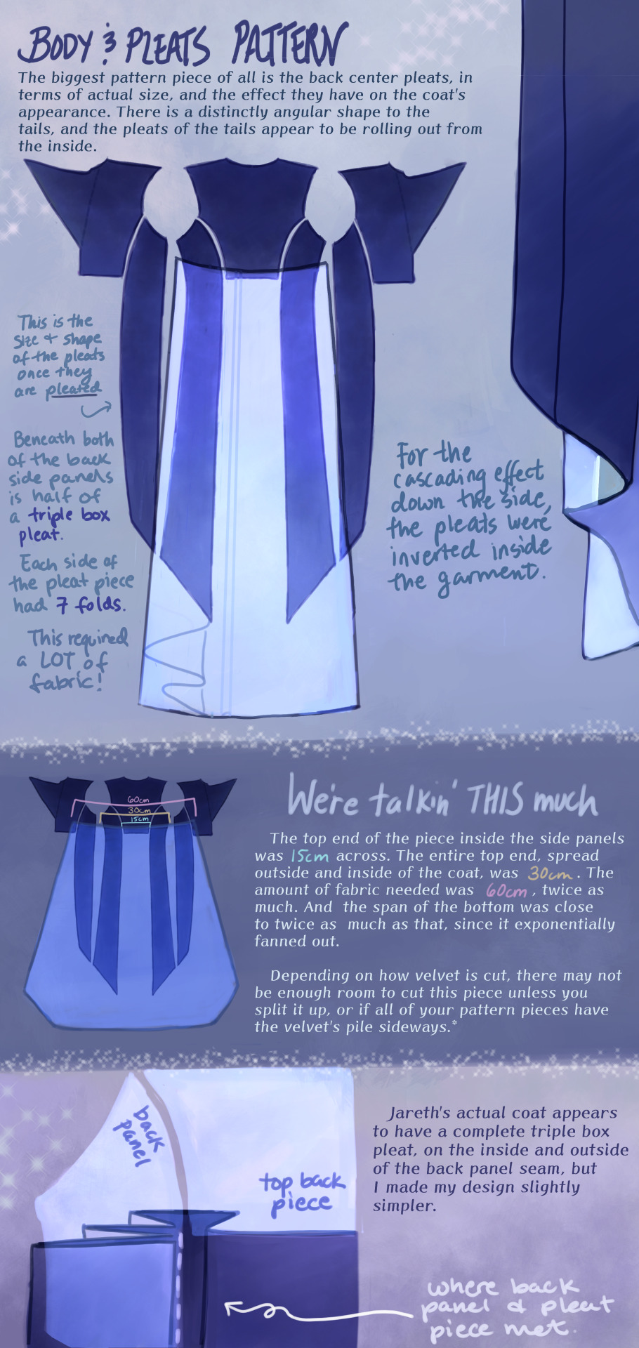
Here is post 1 of 3 about Pattern Construction. I’ll make a diagram post like this and then also take photos of my actual coat and with me in it.
I don’t remember how I started off doing the pattern, but I will guess that I took a tailcoat that I already possess and used it as a base, which in general seems to be a helpful way to start making clothes that fit if you’re not a master pattern maker (which I’m not, and I made plenty of mistakes which we’ll get into.)
There are two people I want to thank, and the first is Aria Couture [X] and their quality photos and observations, vocabulary and groundwork. They are the shoulders I stand on. Their photos were how I made all of the notes discussed in these diagrams, and how I discerned what kind of pattern needed to be made.
So the main changes that needed to happen to my base pattern was 1.) jacking up the shoulders to high heavens, 2.) elongating the side pieces (which I’ve come to call panels so go with me), 3.) adding pleats in that squared off spot in the back between them, 4.) adding a custom collar and cuffs, 5.) designing my own lining.
THE PLEATS were a nightmare. There was a lot of math involved, and math that was not necessary, but the most important thing was creating a shape that would fold together into a straight line on top, look cascading on the sides, and marry the rest of the coat in a reasonable place. After a lot of trial and error, I ended up with this rounded wedge that spreads out on the inside of the coat, but also folds backwards onto itself (like half of a box pleat), to reattach to the back side panels. This is what gives the coat its look of all this shiny velvet blossoming from beneath the back buttons and gushing out the sides.
As to why the pleat piece is rounded, all of the pleat lines were diagonal, so that the coat would flare out. Cutting this piece as a completely straight line on top meant it ran out of fabric in the top corners, and more of it needed to be pulled in, more and more sideways. Adding a sloped height to its corners helped it do what it was supposed to and become a mostly straight line when folded together.
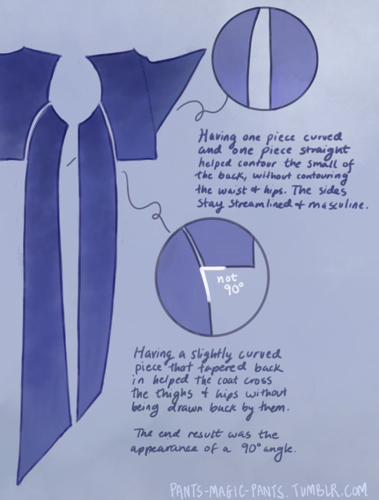
THE PANELS (second image), there are just a few notes about those which I think are important. As I am female cosplaying a male and wish to keep the masculine shape of the garment, some tricks needed to be pulled to hide my waist and hips, so this is what I came up with.
PROPORTIONS MATH. It’s a thing I started doing a couple cosplays ago, to get accurate shapes and lengths of garments, to give me the same silhouette as characters. It’s worked out really well for me. It’s been a real life application of algebra that I wasn’t expecting, as a former student who hated math. Now, I love math! Armed with a ruler and a protractor, I have taken down a lot of notes about such silly things as: what degrees the angles of the lapels are, and how wide are the shoulders compared to the head? (In Jareth’s coat’s case, the ratio of head:shoulders is 1:4.) With that knowledge, I took a photo of myself in the bathroom, measured my own head and shoulders in pixels, wearing a mock-up, and corrected shoulder span measurements to fit this ratio. It was a whooole thing, but I think it was worth it.
And I used proportions math for everything. How much of the arm do the cuffs take up? Where along the legs did the dramatic slope of Jareth’s “fishtail” start? Those things aren’t listed here, but hopefully this post gives you enough tools to figure it out on your own for your specific garment, or any garment you ever want to make.
THE COLLAR. Not much to say about it, but there’s how it looks.
SLEEVES. Dear God. I was stuck on sleeves for months because go ahead and look around online for detailed information about how to add basically football gear sized padding to your shoulders, and all of the intertwined modifications that needs. It isn’t out there.
One thing I can at least say is that it helps to start off with a great base, and the other person I have to thank is a tailor on YT called Chris Sartorial [X]. This guy hasn’t been active for years, but when he was, he was no nonsense, such a professional who knew what he was doing that he couldn’t even take the time to properly light his videos. Such a king. His channel helped me with my dress shirt, and also with making the base sleeves for this coat, which were of the “2 piece” variety. This kind of sleeve is used for blazers and coats so that it appears to fall in a nice boxy shape off the arm, usually from a shoulder pad, and then slightly turn at the elbow. While he doesn’t go into shoulder pads, this still halfway set me up for success, and knowing the relationship between shoulder and sleeve.
However, there are a few things I learned about shoulder+sleeve modification as shown above, and hopefully it’s a good “bouncing off” observation.
THE CUFFS. Again, not much to say, but this is how my pattern came out, to create that nice tear-drop shaped gap, with that sort of blooming and expanding height that his cuffs have, like a vase. The lace trim will be in another post. One thing I should mention is that the lace trim is tall enough that the bottom of the cuff won’t end on your wrist if you want to be able to see your own hands. The cuff needs to be measured so that it will end 2-3 inches up from your wrist.
THE LINING
Dear God, she’s still writing. I am a huge fan of lining even though I’m not good at it, and my actual lining didn’t turn out looking as smooth as my drawings, but this is what I came up with, which in theory should look good. haha Any deviations from the norm that you see are just stylistic choices. I wanted the area in the top back to look sort of dripping like the back lace piece.
Was this interesting? I sure hope so. Please ask me questions if I’ve glossed over something.
53 notes
·
View notes
Text
When whipping up Railgun in two weeks' time for a game jam, I aimed to make the entire experience look and feel as N64-esque as I could muster in that short span. But the whole game was constructed in Godot, a modern engine, and targeted for PC. I just tried to look the part.
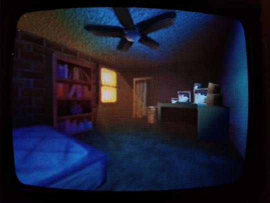
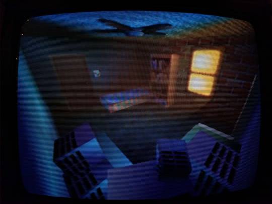
Here is the same bedroom scene running on an actual Nintendo 64:
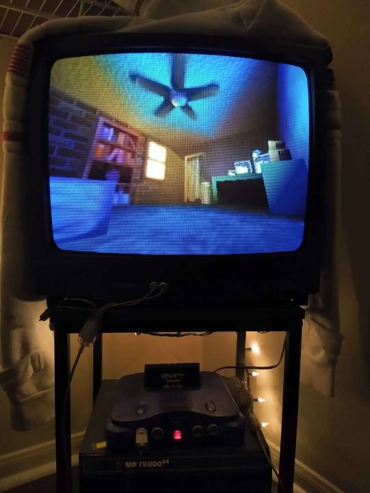
I cannot overstate just how fucking amazing this is.
Obviously this is not using Godot anymore, but an open source SDK for the N64 called Libdragon. The 3D support is still very much in active development, and it implements-- get this-- OpenGL 1.1 under the hood. What the heck is this sorcery...
UH OH, YOU'VE BEEN TRAPPED IN THE GEEK ZONE! NO ESCAPE NO ESCAPE NO ESCAPE EHUEHUHEUHEUHEUHUEH
While there is a gltf importer for models, I didn't want to put my faith in a kinda buggy importer with an already (in my experience) kinda buggy model format. I wanted more control over how my mesh data is stored in memory, and how it gets drawn. So instead I opted for a more direct solution: converting every vertex of every triangle of every object in the scene by fucking hand.
THERE ARE NEARLY NINE HUNDRED LINES OF THIS SHIT. THIS TOOK ME MONTHS.
And these are just the vertices. I had to figure out triangle drawing PER VERTEX. You have to construct each triangle counterclockwise in order for the front of the face to be, well, the front. In addition, starting the next tri with the last vertex of the previous tri is the most efficient, so I plotted out so many diagrams to determine how to most efficiently draw each mesh.
And god the TEXTURES.
When I painted the textures for this scene originally, I went no larger than 64 x 64 pixels for each. The N64 has an infamously minuscule texture cache of 4kb, and while there were some different formats to try and make the most of it, I previously understood this resolution to be the maximum.
Guess what? I was wrong!
You can go higher.
Tall textures, such as the closet and hallway doors, were stored as 32 x 64 in Godot. On the actual N64, however, I chose the CI4 texture format, aka 4-bit color index. I can choose a palette of 16 colors, and in doing so bump it up to 48 x 84.
On the left, the original texture in Godot at 32 x 64px. On the right, an updated texture on the N64 at 48 x 84px. Latter screenshot taken in the Ares emulator.
The window, previously the same smaller size, is now a full 64 x 64 CI4 texture mirrored once vertically. Why I didn't think of this previously in Godot I do not know lol
Similarly, the sides of the monitors in the room? A single 32 x 8 CI4 texture. The N64 does a neat thing where you can specify the number of times a texture repeats or mirrors on each axis, and clip it afterwards. So I draw a single vent in the texture, mirror it twice horizontally and 4 times vertically, adjusting the texture coordinates so the vents sit toward the back of the monitor.


The bookshelf actually had to be split up into two textures for the top and bottom halves. Due to the colorful array of books on display, a 16 color palette wasn't enough to show it all cleanly. So instead these are two CI8 textures, an 8-bit color index so 256 colors per half!! At a slightly bumped up resolution of 42 x 42.
You can now kind of sort of tell what the mysterious object on the 2nd shelf is. It's. It is a sea urchin y'all it is in the room of a character that literally goes by Urchin do ddo you get it n-
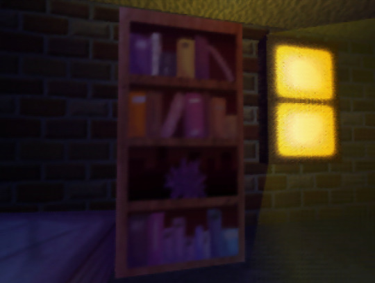
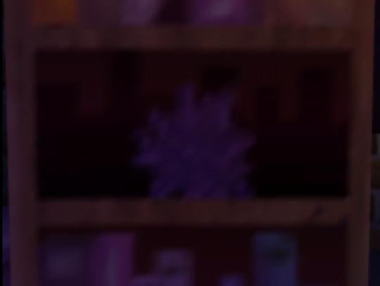
also hey do u notice anything coo,l about the color of the books on each shelf perhaps they also hjint at things about Urchin as a character teehee :3c
I redid the ceiling texture anyways cause the old one was kind of garbage, (simple noise that somehow made the edges obvious when tiled). Not only is it still 64px, but it's now an I4 texture, aka 4-bit intensity. There's no color information here, it's simply a grayscale image that gets blended over the vertex color. So it's half the size in memory now!
Similarly the ceiling fan shadow now has a texture on it (it was previously just a black polygon). The format is IA4, or 4-bit intensity alpha. 3 bits of intensity (b/w), 1 bit of alpha (transparency). It's super subtle but it now has some pleasing vertex colors that compliment the lighting in the room!

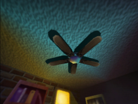
Left, Godot. Right, N64.
All of the texture resolutions either stayed the same, or got BIGGER thanks to the different texture formats the N64 provides. Simply put:
THE SCENE LOOKS BETTER ON THE ACTUAL N64.
ALSO IT RUNS AT 60FPS. MOSTLY*.
*It depends on the camera angle, as tried to order draw calls of everything in the scene to render as efficiently as I could for most common viewing angles. Even then there are STILL improvements I know I can make, particularly with disabling the Z-buffer for some parts of the room. And I still want to add more to the scene: ambient sounds, and if I can manage it, the particles of dust that swirl around the room.
Optimization is wild, y'all.
But more strikingly... fulfilling a childhood dream of making something that actually renders and works on the first video game console I ever played? Holy shit.
Seeing this thing I made on this nearly thirty-year-old console, on this fuzzy CRT, is such a fucking trip. I will never tire of it.
46 notes
·
View notes
Last Seen Blogs

jimmymistry
Jimmy Mistry

strastitut
Без названия

xelphiesdiary
Xelphie's New Continent Diaries

drusassys-blog
- ̗̀ be careful with me petals

elfbolt
moved to likehephaestionwhodied