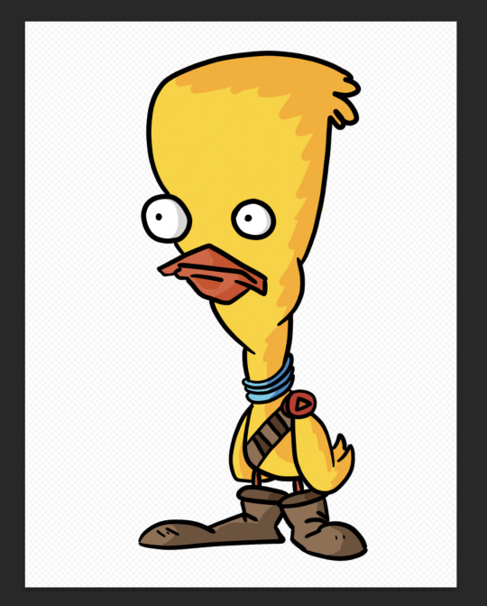
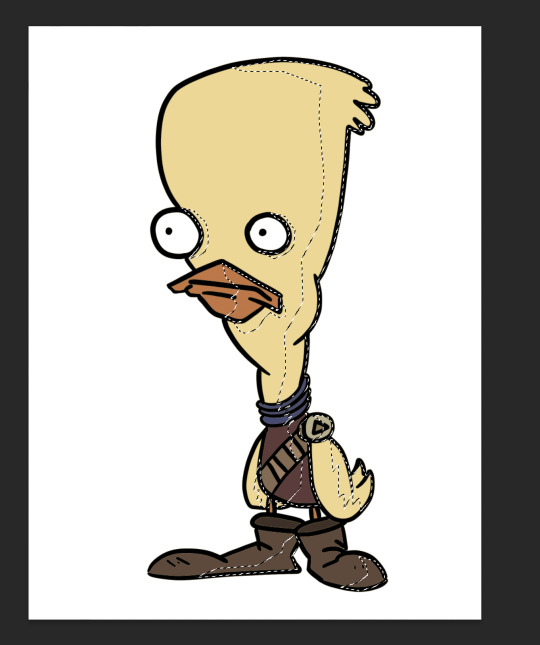
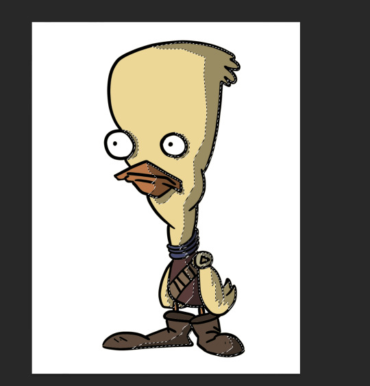
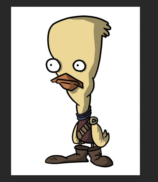
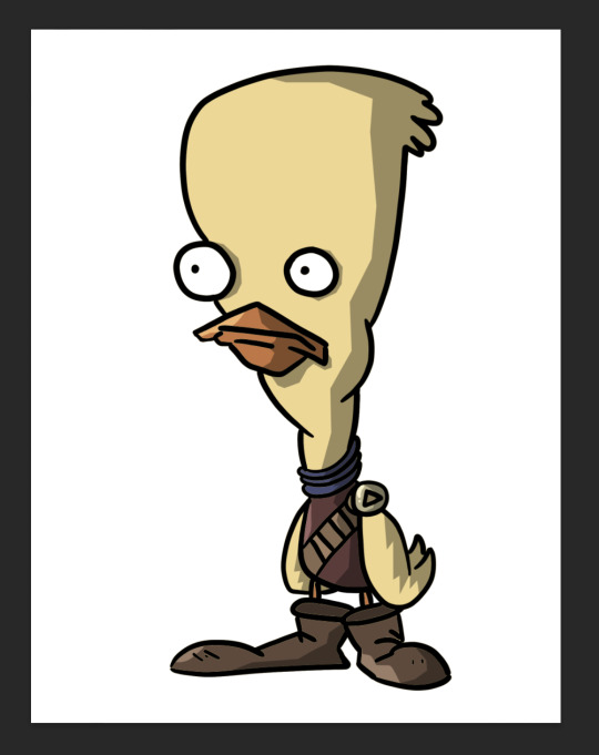
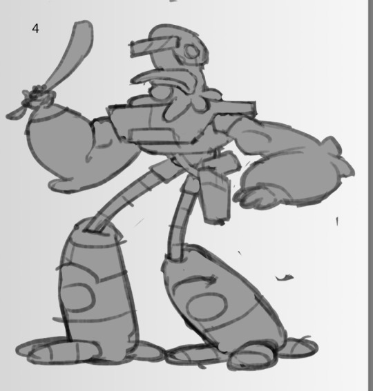
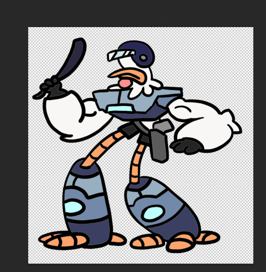
#playing with the lasso and gradient tool
Explore tagged Tumblr posts
Visit Tumblr Blog
Explore Tumblr blogs with no restrictions, modern design and the best experience.
Last Seen Tumblr Blogs


Fun Fact
Tumblr was acquired by Yahoo for $1.1B in 2013.
Text
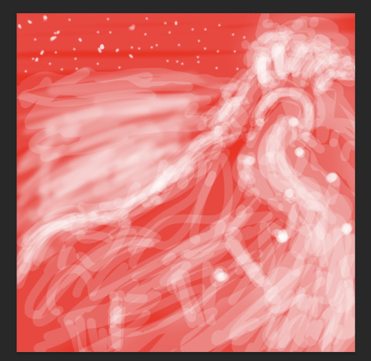
Chillin'
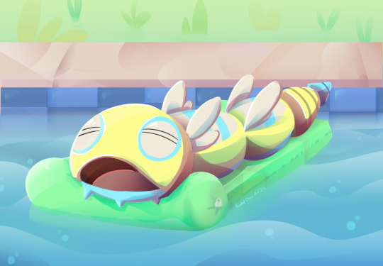
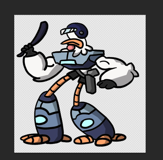
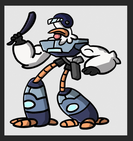
#playing with the lasso and gradient tool#Dudunsparce#as chosen by the good old random pokemon generator#pokemon#pokemon Dudunsparce#pokemon fanart#digital#digital art
5 notes
·
View notes
Note
your rendering is so good how do you do it
Thanks, I love your rendering too!! Gonna try and make a tutorial ^^
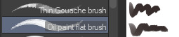
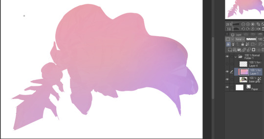
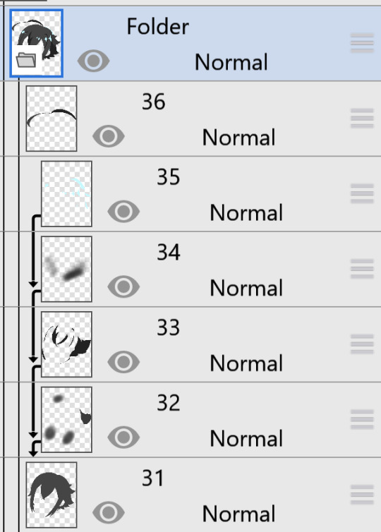
To start off, I'm on Clip Studio Paint and these are the brushes I use! First two for rendering characters (round brushes) and the other two for mostly backgrounds (square brushes)

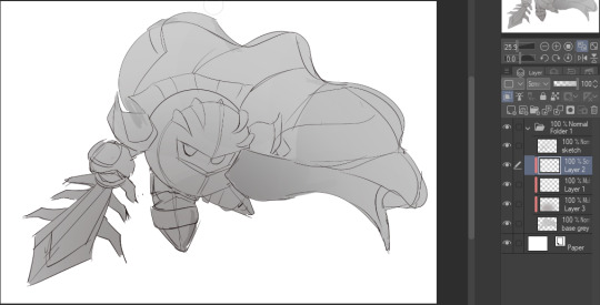
I used to do lineart, but it takes too long >:( now I just make a sketch and sorta clean it up!

Next I fill it in with a gray color. For simpler pieces I just put in the flat colors, but for more paint-y pieces I do grayscale -> color! I'll be doing that here :)
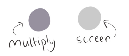
Also, I make 3 clipped layers on top of the gray - two are multiply, and the top one is screen. On the first multiply, I do a soft gradient using an airbrush
On the next multiply layer, I fill everything in with either a cool-ish or warm-ish gray, depending on the mood ^^
I also determine a light source, and use the lasso tool on the screen layer to block out where (I think) the light hits! Tbh I just do wherever feels right lmao, but I recommend having a reference! I like doing it in triangle patterns
Then adjust the opacity of each layer to whatever feels right, and merge everything (I don't merge the sketch/lineart yet, I do it before adding colors in!)
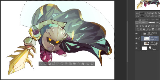
Now... rendering. Some tips I have are color pick (greys) off of the canvas and use them to paint! Clean up the sketch more, erase edges, but I save details (like Galaxia's red gem, his eyes, etc.) for the end, or during coloring.
After I'm sorta happy with it, I merge the sketch layer, then duplicate it, and add a gradient map! I did this sunset-y one but changed the hue to yellow-ish, then lowered the layer's opacity ^^
Play around with the hue-saturation-luminosity setting!

Now go crazy with blending modes! Multiply, overlay, color, glow/color dodge, etc. Feel free to layer them up on top of each other too, and this is to add the character/piece's actual colors in. For example, I used a white-blueish overlay layer for his mask and glove, blue for his cape, blah blah
Now I clean the sketch up/refine it more. Also, to "harmonize" the color palette, you can add a colored gradient on top. Then set it to multiply, and add overlay/glow dodge layers with any colors you see fit! I like using teal and light/warm orange! Here is an example of a colored gradient:
Another tip is to add saturated colors on the edges of both lighting and darker shadows, before blending it:

Also I usually add in a light blue/grey in shadowy areas, and lower the opacity for reflective light:

Also! You can lasso + use an airbush with a light blue to block out parts of the background (his cape here, for example). It helps with more depth!
Finally, I like adding sparkles on low opacity :3 And gaussian blur to certain areas! I'm using radial blur on this piece though ^^

For the background, I like doing blocky shapes!! I use my square brush on 90% ish opacity, to color pick different hues from the piece. For lighting I use a glow dodge layer, here's a mini timelapse as well as the finished art!
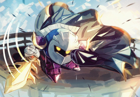
At the very end, play around with the hue/saturation and contrast tools to change the colors :)
#iiii hope this helped??#first time making a tutorial sorry!!#art tutorial#kirby meta knight#meta knight fanart#meta knight#nintendo kirby#kirby nintendo#kirby fanart#kirby series
589 notes
·
View notes
Note
How do you get your grainy gradient in ur art???? its really cool and i was trying earlier before i even found ur account lmfao but it didnt turn out how i wanted
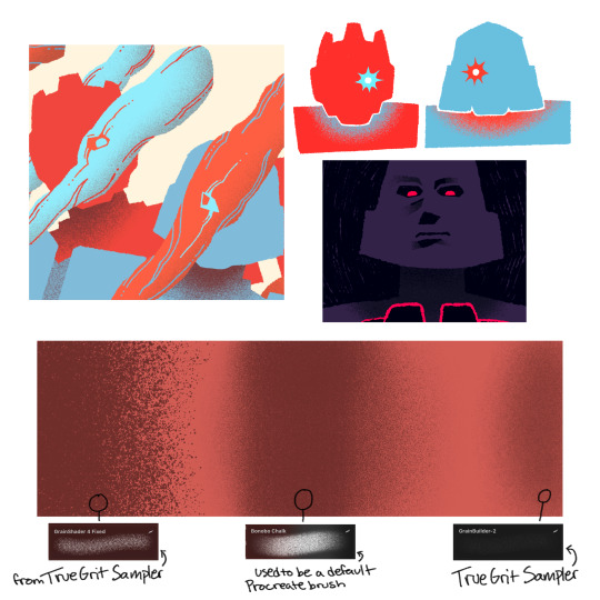
I hope this lil image below helps! I usually utilize a couple brushes I got from a TrueGrit Procreate brush sample pack, along with Bonobo Chalk, which used to be a Procreate default brush. I lasso tool off the area I want to shade so that I have a clean line where it starts and it can fade out. I also set the layer I’m coloring to ‘Alpha Lock’ if it’s one the same layer or ‘Clipping Mask’ if I made a layer above it so that the shading stays in the drawn shape.
I usually layer in a couple different grain/noise brushes for more texture and play with opacity of the brush to get a better gradient. :)
41 notes
·
View notes
Note
🔆anon
Hi, if you don’t mind me asking, how do you make Vinny’s sprites? They look like they’re from the game itself and it’s really cool
Ah, hello! First of all, thank you!! That's really flattering,,
Tbh, idk if I'm the right person to go to- I've seen some super cool artists who have outright made rigs of theirs, so they can move n stuff, plus there are people who take commissions and add way more detail. My process is kind of convoluted and not the cleanest per say, etc etc BUT!!!
(I use Ibis Paint and a pen set up btw lol, that might have some effect?)

It's a whole lot of tracing and referencing! I started with merging Azul and Riddle's sprites together. For Vinny, it was easy since he's supposed to be a blend of Azul and Riddle's traits, which means it's easier to just mash them together to get a result. (Like you can see here, it's Riddle's main body with Azul's background arm and smile and his tie/chest plastered on to get rid of the bow.)
A completely original character like Corwin was a little harder to do, since he has his own personality that's supposed to show through his pose- a lot of characters just have a hand on their hip while the other relaxes, though!

And then I block out the main parts! Each color seen here is a different layer in accordance to what they are, I guess- the shirt collar, the jacket, the vest, the shirt itself. I do this by outlining the edges manually and then filling them in. It's not exactly shown here, but I start with the head as well!
For the face itself, I used a thin brush for the mouth and additional details, but I used the lasso fill tool to wing my way with the eyebrows and lid creases- I did have the reference face beneath it, but it came out more naturally to me to make a few quick swipes following the guide and erasing any excess.
For Vinny's face, I copied Azul's eyes but made the "irises" bigger, like Riddle's, just by rounding them out. Ibis paint has a brush shape that looks exactly like the pupils the sprites use, so I only pasted them on and adjusted them.

I'm ngl I mixed up the order at some point. While the first Vinny sprite has a dark base with lighter highlights, the newest one has a light base with dark shading. But I locked the layers, color picked the lightest shade from my reference sprites and filled the layers in. The tie may be tricky since it doesn't really stand out unless you're doing a bow.
From there, I added smaller details like the buttons, the crease lines, the belt, etc, then color them in as well.
twst sprites have a lot of gradients to them, so this is where I pull out the airbrush lol- this time picking the darkest color on my reference and using a clipping layer/mask to add the color. The gold trim and buttons on Vinny's vest are also a clipping layer/mask, for convenience.

For the hair, I... kind of just went for feeling? (And a lot of referencing the original sprites) Using the lasso fill tool, I used a multiply layer in places where the hair is darkest and overlaps, then played with the opacity until I was satisfied, then did the same thing but at an even lower opacity. Did it a third time, but this time with an airbrush. The highlights are pretty simple, but you'll notice more complicated hairstyles like Azul or Epel's have more highlights around the edges of their hair to help distinguish the layers. I used the lasso fill tool for these again.
The face/neck is kind of like this too- shading color for the inner ear/neck, some slightly along the "jaw", and a lighter layer with airbrush where the nose should be.

I do use folders! This is why Vinny's hair remains the same throughout the three I've made— I copied the hair folder to make it easier on myself lol. In theory, you could make folders for each body part and have an actual posable sprite instead.
I do hope this wasn't too rambly anon!! 🛐 I may make more sprites in the future so maybe writing down my process will help me in the end too lol.
17 notes
·
View notes
Text
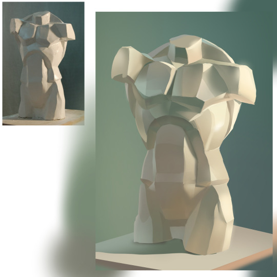


torso study + playing with gradient maps
For this one, I limited myself to only using the lasso tool and a soft round brush. I want to use the lasso more confidently in my future works. Right now, I often just forget it's even an option and end up painting like I would on a real canvas.
6 notes
·
View notes
Note
your lancer edits are absolutely AMAZING!!! i've done edits for non-lancer stuff, so i'm curious, what is your process usually like?
Thank you! The process is, admittedly, VERY time consuming. (which is why i haven't done any recently, it's just a massive time investment) My workflow exists entirely within Photoshop I start off with an image of the base mech I rip off of Comp/Con, and I spend a few hours meticulously isolating every part of the mech by hand (polygon lasso tool my beloved). I found that the automatic solutions like magic wand tool & such just. aren't very effective when it comes to holding together detail. Too much or too little is lost in the process, and it usually requires manual touchup anyway, so I just decided to do the whole thing by hand to save the tedium. This usually takes anywhere from 1-3 hours? It's hard to say. But, the catch is, once i've done it once for a mech, I don't have to do it ever again. Once i'm done with separating the pieces i want to color/reuse individually, I move on to base coloring. I usually have some idea in mind, but sometimes I just freestyle it. I usually use pretty simple color palettes, and I work almost exclusively in Photoshops Blending Options panel to get those colors to work. Having a non-destructive workflow is..vital. Mixing types like Overlay, Hue, Color, and Multiply are my favorite toys during this process. I also make sure to give everything a 2px black stroke, usually internal, to better match with the base art & clean up any of my mistakes. When i'm ready to go for the more advanced edits (where i need to add stuff instead of just change things), I spend a little while scrolling through C/C like i'm at a shopping mall looking for parts. Anything interesting, I play around with. I like to rip various greebles off of mechs like the Tortuga, Caliban, Kidd & Nelson the most, but every one of em gets time in the spotlight. At this point, I have most of the parts I could need memorized quite well, and if something calls for a certain shape, I'll know where to find it & take it from. Trying to get each asset to fit the style of the base frame is quite easy, and adding a simple 2px internal stroke does miracles. When i'm happy with most everything, i'll play around with gradients to highlight the most interesting parts, give it a flashy name stolen from some album i've listened to Twice, and send it on it's way.
I have an upload of all my raw .PSDs available for download if you're curious- do be warned though, my layer organization sucks and i didn't plan for anyone else to be looking over my work.
I hope that helped!
31 notes
·
View notes
Text

Designing with Adobe Photoshop
Adobe Photoshop is a cornerstone in the world of graphic design, renowned for its versatility, user-friendly interface, and powerful features. From creating stunning visuals to refining intricate details, Photoshop has become the go-to tool for designers across various industries. For those aiming to excel in this field, joining a graphic design institute can provide the necessary skills and insights to harness the full potential of tools like Photoshop. This article explores the capabilities of Adobe Photoshop, its core features, and how designers can maximize its potential to produce compelling and professional designs.
The Role of Adobe Photoshop in Modern Design
In today’s digital landscape, design plays a crucial role in communication, branding, and storytelling. Adobe Photoshop empowers designers to bring their ideas to life through its wide array of tools and functionalities. Whether you’re designing for print, digital media, or social platforms, Photoshop offers a comprehensive solution for all your creative needs.
Core Features of Adobe Photoshop
Adobe Photoshop boasts an extensive set of features that cater to designers, photographers, and digital artists. Here are some of its standout functionalities:
1. Layers and Masks
One of Photoshop’s most powerful features is its layer-based editing system. Layers allow designers to work on individual elements of a composition without affecting the rest of the design. Masks, on the other hand, provide precise control over the visibility of specific parts of a layer, enabling non-destructive editing.
2. Advanced Selection Tools
Photoshop offers various selection tools, such as the Magic Wand, Lasso Tool, and Quick Selection Tool, that make it easy to isolate specific areas of an image. The introduction of AI-powered tools like Select Subject and Object Selection has further streamlined the process, saving time and effort.
3. Brushes and Painting Tools
From creating realistic textures to adding artistic flourishes, Photoshop’s brush engine provides endless possibilities. Designers can customize brushes or download pre-made sets to suit their specific needs. The ability to control brush dynamics, such as pressure and flow, adds depth and dimension to artwork.
4. Typography and Text Effects
Typography is a vital aspect of design, and Photoshop excels in providing robust text tools. Designers can experiment with fonts, adjust kerning and tracking, and apply effects like gradients, shadows, and textures to create visually appealing text elements.
5. Photo Editing and Retouching
Photoshop’s photo editing capabilities are unparalleled. Tools like the Healing Brush, Clone Stamp, and Content-Aware Fill allow designers to remove blemishes, repair damaged images, and seamlessly blend elements. Color correction features, such as Curves and Hue/Saturation adjustments, ensure that images look their best.
6. Smart Objects and Filters
Smart Objects enable non-destructive editing by preserving the original quality of images and elements. Filters, ranging from artistic effects to advanced blurring techniques, provide designers with creative options to enhance their projects.
Applications of Adobe Photoshop
Photoshop’s versatility makes it suitable for a wide range of design projects. Here are some common applications:
1. Graphic Design
From creating logos and banners to designing posters and brochures, Photoshop is a staple in graphic design. Its precision tools and customizable workspace allow designers to craft visually stunning compositions that align with brand aesthetics.
2. Web and UI Design
Photoshop is widely used for designing website layouts and user interfaces. Designers can create wireframes, mockups, and interactive prototypes to visualize the final product before development.
3. Digital Art and Illustration
Photoshop serves as a digital canvas for artists, enabling them to create detailed illustrations and concept art. Its painting tools, combined with the flexibility of layers, make it ideal for producing complex artworks.
4. Photography
Professional photographers rely on Photoshop for post-processing and retouching. The software’s ability to enhance colors, remove distractions, and add effects ensures that photographs achieve a polished and professional look.
5. Social Media Content
In the era of social media, Photoshop is invaluable for creating eye-catching visuals. Designers can tailor content for different platforms, ensuring that brands maintain a consistent and engaging online presence.
Tips for Designing with Adobe Photoshop
To maximize the potential of Adobe Photoshop, consider the following tips:
Master Keyboard Shortcuts: Familiarize yourself with essential shortcuts to speed up your workflow.
Leverage Presets and Templates: Use Photoshop’s built-in presets or create your own templates to save time on repetitive tasks.
Experiment with Blending Modes: Blending modes allow you to combine layers creatively, adding depth and interest to your designs.
Keep Your Workspace Organized: Arrange panels and tools in a way that suits your workflow, and use layer groups to keep your files manageable.
Stay Updated: Adobe frequently releases updates with new features and enhancements. Stay informed to take advantage of the latest tools.
Conclusion
Adobe Photoshop remains a cornerstone of modern design, offering unparalleled tools and functionalities that cater to a diverse range of creative needs. Whether you’re a beginner or a seasoned professional, mastering Photoshop can unlock endless possibilities for your projects. This is why many aspiring designers consider enrolling in a graphic design institute in Pune to gain comprehensive training and expertise in this industry-standard software. By understanding its core features and applications, designers can harness the full potential of this powerful software to create impactful and memorable designs.
0 notes
Text
Photoshop Graphic Design Tutorial
Introduction
Graphic design has become an essential skill in today's digital age, and Adobe Photoshop stands out as one of the most powerful tools for creating stunning visual content. Whether you’re a novice or looking to refine your skills, this tutorial will guide you through the essentials of Photoshop, helping you bring your creative visions to life.
Understanding the Basics of Photoshop
Before diving into complex designs, it's crucial to understand the basic interface and tools that Photoshop offers. The workspace in Photoshop consists of panels, tools, and menus, each designed to help you work more efficiently. Key tools include the Move Tool, the Brush Tool, and the Eraser Tool, each serving a unique purpose in your design process. Familiarizing yourself with basic navigation and shortcuts can significantly enhance your workflow.
Setting Up Your First Project
Creating a new project in Photoshop is the first step towards bringing your design ideas to life. Start by choosing the right canvas size and resolution for your project. For web graphics, a resolution of 72 PPI is typically sufficient, while print projects require a higher resolution of 300 PPI. Setting up grids and guides can help maintain alignment and structure in your design. Remember to save your project frequently to prevent data loss.
Working with Layers
Layers are fundamental to Photoshop, allowing you to organize and manipulate different elements of your design independently. Each layer acts like a transparent sheet, stacking on top of others without affecting them. Understanding layer basics, such as creating, deleting, and managing layers, is essential. You can also apply layer styles and effects, such as shadows and glows, to enhance the visual appeal of your elements.
Essential Tools for Graphic Design
Photoshop offers a vast array of tools, but certain ones are indispensable for graphic designers. The Move Tool allows you to reposition elements within your canvas. Selection tools, like the Marquee and Lasso, enable you to isolate parts of your design for editing. The Brush Tool, with its customizable brushes, is perfect for adding artistic touches. The Pen Tool, though advanced, is essential for creating precise vector paths.
Creating and Editing Text
Text is a vital component of many graphic designs, and Photoshop provides robust text-editing features. Adding and formatting text is straightforward with the Type Tool. You can customize fonts, sizes, colors, and apply text effects such as shadows and gradients. Working with typography in Photoshop allows you to create visually appealing text that complements your overall design.
Applying Color and Gradients
Color plays a significant role in design, and Photoshop offers extensive options for applying and manipulating color. The Color Picker and Swatches panels allow you to choose and save your favorite colors. Gradients can add depth and interest to your designs, with customizable gradient tools at your disposal. Adjusting color balance and tone helps you achieve the desired mood and feel for your project.
Using Filters and Effects
Filters and effects can dramatically enhance your designs by adding unique visual elements. Photoshop provides a variety of filters that can be applied to images and layers to achieve different looks, from blurring to sharpening. Blending modes offer creative ways to combine layers and produce interesting visual results. Exploring Photoshop's built-in effects, such as drop shadows and glows, can add professional touches to your work.
Photo Editing and Retouching
Photoshop is renowned for its powerful photo editing capabilities, perfect for enhancing and retouching images. Basic photo corrections, like adjusting brightness and contrast, can make your images pop. Removing blemishes and imperfections is easy with tools like the Healing Brush and Clone Stamp. For more advanced users, photo manipulation techniques, such as compositing multiple images, can create striking visual effects.
Exporting and Sharing Your Work
Once your design is complete, it's essential to export it correctly for various platforms and purposes. Choosing the right file format is crucial; JPEGs are great for photographs, while PNGs are ideal for images with transparency. Export settings for web and print ensure your designs look their best on different mediums. Sharing your work online is easy with Photoshop’s integration with social media and portfolio platforms.
Conclusion
Mastering Photoshop opens up a world of possibilities in graphic design, enabling you to create professional-quality visuals. This tutorial has covered the basics of Photoshop, from understanding the workspace to exporting your final project. As you continue to practice and explore, you’ll discover even more features and techniques that will enhance your design skills. For further learning, numerous online resources and communities can provide additional support and inspiration.
#Photoshop graphic design tutorial#Photoshop graphic design course#Photoshop graphic design tips#Photoshop for graphic design#Graphic design in Photoshop#Photoshop graphic design projects#Photoshop graphic design ideas#Photoshop graphic design software#Photoshop graphic design examples#Photoshop graphic design course online#Photoshop graphic design techniques#Learn graphic design in Photoshop#Graphic design using Photoshop#Photoshop graphic design free#Photoshop graphic design app#Photoshop graphic design templates#Photoshop graphic design posters#Photoshop graphic design books#Photoshop graphic design lessons#Photoshop graphic design services
0 notes
Text
Digital Character Illustration - Class One
For the first part of this class, we pretty much just went over the basics of drawing on Photoshop with a drawing tablet. We learnt/relearnt many commands and learnt new techniques to better our drawing and colouring.
Commands include: B = Brush E = Eraser CMD + Z = Undo Shift + CMD + Z = Redo OPT + Delete = Fill selection with foreground colour Number Keys (1 - 0) = Opacity CMD + A = Select All
There are even more helpful commands, but these are the ones we used the most.


First we did some page setup, distinguishing between layers and background. The layers are created by clicking the plus icon in the lower right of the layers menu. The background is the only layer present when a new file is made, and has a solid white background, unlike layers created afterward which are transparent.

We then tested lots of brush and eraser types. For example, there are hard and soft brushes, which refer to the rigidness of the lines edge when drawn. There are many other types of brushes, but we just used these for the example. We also played with the sizes of the brushes and erasers, as shown.


Next we tried changing the opacity of the brushes and eraser. I found this very interesting, especially the eraser, as it led to some cool gradients by just making very simple strokes. I think I'll keep this technique in mind when designing my characters.

After that, we messed with the colour wheel, and did some more of everything else over again, just to see how everything meshed together.
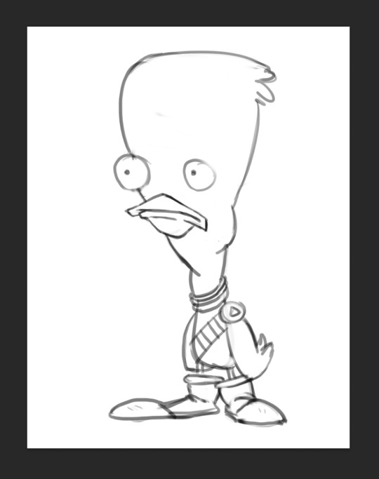
After we had finished getting used to Photoshop, we got our first character template to practice drawing over.

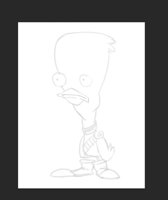
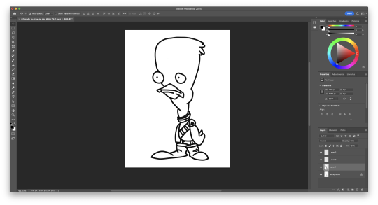
We then setup our layers, so we could draw overtop on a white layer whilst still being able to see our template. We did this by creating a second layer that was filled in with white, and dropping its opacity a little bit, so we could see the template. I drew my first outline, was happy with it. I think I'll be able to get used to the drawing tablet pretty soon.

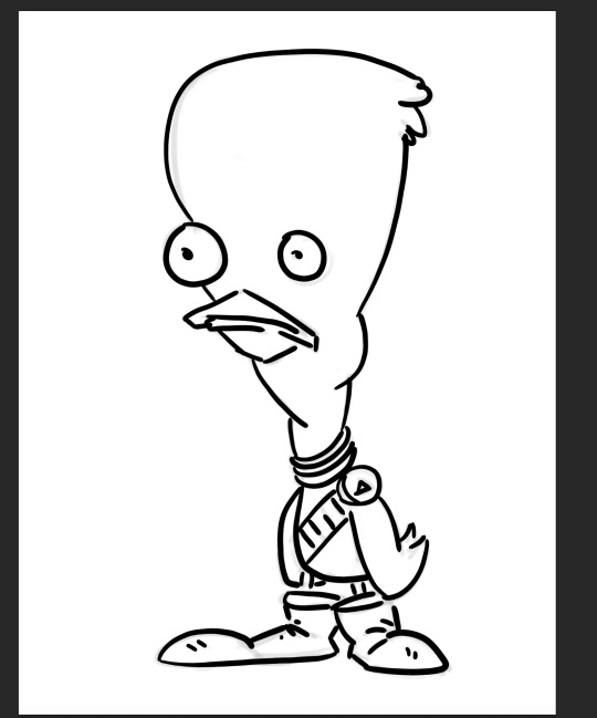
Next, we started using the pressure brushes, which change thickness depending on how much pressure you put on the drawing tablet with your pen when drawing. I like this brush type a lot, it looks more like a manual drawing, which I think is really cool.
I also coloured it in for fun.
We then learnt a process for designing characters and colouring them, the process was made by Tom Garden, or at least that's what the slideshow said.
It pretty much consisted of choosing a design, drawing line art over your sketch, filling that line art with a base colour in grayscale, then making a new layer for each section of the design that needs a different colour, and adding a different grey to it depending how light/dark you want it, then adding colour to each section, and then adding shadows and highlights on individual layers as well.
Here's my attempt below

Here is my greyscale of the duck character. Each different type of grey was on it's own individual layer, so I could colour each section individually.
I then used the hue menu (CMD + U) to colorise each section of the design.
Next I used the polygonal lasso tool to select areas I wanted to add shadow to, on an individual layer, I filled the final selection with black, and made the opacity of the layer 35%, as it said in the instructions.
Finally, I added a couple highlights to the design, such as on the badge, shirt, shoes and beak. This added a little extra tone which I thought was nice. Overall I'm way happier with this one than the original one I coloured, so I'll definitely be using this process in the future.
I did this process again for another template we got:
This was a little more intricate of a design than the duck was, so it was a nice step up to see how I would do. I think it turned out pretty good, since I''m doing pretty much all of this for the first time.
Overall this first class was very helpful, I learnt a whole bunch of new things and I can already see the improvement in my digital art compared to my previous stuff.
1 note
·
View note
Text
Editing Process + Feedback Session Reflection
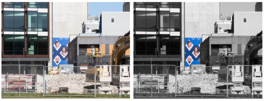
I am making this post to reflect on some of the key learnings from my editing process. My initial creative vision was to leave the focus of my images, the artwork, in colour and leave the rest in black and white. I trialed this style of editing using photoshop. I did so by using the Polygonal lasso tool and playing with the saturation of the foreground and background of the images. Here are some before and after of this first trial process;

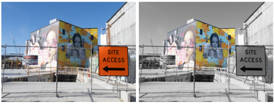
I was relatively happy with the outcomes of this editing process but felt like my images were not quite matching my intended vision. I was able to sit down with Laine and get some feedback on my images and editing. Laine suggested trialing an editing process in which I lowered the saturation but not to the full 100% like I had been previously. This is the before and after trials of how only lowering the saturation 50% - 75% turned out;


In the end I have made the decision to include a variety of both visions in my final image selection. It could be cool to layout my images in a gradient of colours in which I start out displaying the full colour images and then slowly transition to the black and white edited versions.
0 notes
Text
Illustrator 2 Induction - Catchup ( from 24.10.23)
I missed this session so here is everything that was covered:
Shapes and Corner Radius Options
Transformation Tools
Repetitions
Intertwining Objects
Blend Tool
Image Tracing
Illustrator Effects - 3D and Materials - Warp
Envelope Distort
During this session I was ill and couldn't make it in so I will going over the steps and what was learned in the session for future reference and better my understanding.
Shapes: You can either freeform draw shapes using the shape tool and input your desired values for dimensions, or if you want polygons and stars, you can input your desired sides or points or use the freeform tool and then edit that by using your up and down keys to increase or decrease the number of sides or points you want. For corner radiuses, corner widgets lets us change the the corner curve of a shape. Done by Direct selection tool and live corner widget or using the transform panel and input your own variable(mm). To change the corner radius of only one corner, use direct selection tool.
Transform Tools: To transform an object, go to Object>Transform to move, rotate, shear, flip or scale (also featured in panel).
Repetitions: Grid Repetitions - Object>Repeat>Grid to duplicate object in grid formation. To change singular objects within the repetition go to Object>Expand and double click on the object you want to change. Radial Repetitions - Object>Repeat>Radial which duplicates the object in circular formatting. Mirror Repetitions - Similar to a reflection line/mirrors the image. Object>Repeat>Mirror. Intertwining Objects - Object>Intertwine, then select areas using lasso curser it gives us and this will change the arrangement of that selected area. Allows us to weave shapes, paths, letters, etc. Blend Tool - This can make one objects transform and into another can can be used to create gradient blends using more steps in between. To create text blends, convert text to outlines, duplicate it, change the colour of one of them, select both, use blend tool, and the selecting specified steps in the drop down, change it to 200 steps. Lastly clock one object and then the other to blend them in between.
Image Tracing: Can be used for creating vector artwork from a raster image and play around with different presets. Object>Image Trace>Make to trace original photo. Then Window>Image tracing for the image tracing panel and change the preset depending on how many colours you want in your trace, or change mode, greyscale or black and white (have preview ticked). You can make each section its own colour selection by using 'Expand' tool in the top bar.
Illustrator effects: Edit/Undo - Use appearance panel and select object to view the effect listed. Double click to bring up effects dialogue box. 3D&Materials - Helps to create 3D objects and can be applied to text, shapes, etc. It can also add materials onto the obejct and change the objects lighting. Done by Effect>3D&Materials>Extrude&Bevel/Revolve/Inflate/Rotate. After creating the 3D object we can expand it so you don't have to constantly keep re-rendering when you move the object. However, if the 3D object is text and you already expanded it, it will be no longer editable. Warp - Can control and manipulate an object. Go to Effect>Warp and select the effect you want.
Envelope Distort: Envelopes are objects we can pack another object into to distort or reshape. Mesh - Lets us create a grid on the object to then distort. Warp - Object>Envelope Distort>Make with Warp. Similar to warping in the effects panel. To undo the warp, Object>Envelope Distort>Release. Top Object - The top envelope distort tool can fit text or objects into an object that is on top of it. Select both then Object>Envelope Distort>Make with Top Object.
0 notes
Text


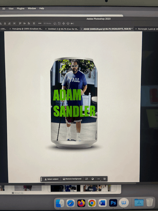


11/10/23 Photoshop and adobe dimension workshop 2
In this weeks workshop, Jordy showed us how to apply duotone and gradient filters onto photography to create different colour ways and different effects onto imagery. I think these were very successful and these skills can be applied to my own work. For example, to magazine, editorial images and my own photography.
I also developed my skills of creating mockups on photoshop. I used a drink can shape to create my own drink. I applied imagery of Adam Sandler onto this mockup using polygonal lasso tools and different layers to create shapes to insert images. I also learned how to apply smart filters to create shadows, highlights and midtowns to make the can shape seem more 3D and more realistic. I enjoyed this process and I'm sure I will use these skills again throughout my degree to create my own work designs and mockups.
I also experimented with adobe dimension for the first time. I experimented with the tools available and just played around with what I could find on the app. I didn't learn many skills as such, but I am excited to in the near future.
0 notes
Text
I FINALLY FINISHED IT!!!!!!!! (about three months late lmao)
I'll probably keep my ramblings short today because my brain's fried. (mostly burnout from school, but also I'm still processing the Rolling With Difficulty finale)
Decided to play around with some photomanipulation techniques I've been experimenting with. I swallowed my pride and finally downloaded photoshop since Krita's photomanipulation tools were acting funky (and that's not what Krita's designed to to anyhow)
I wanted to push the exaggerated nature of the pose in the shapes of the body, idk how successful I was. But I did play with simplifying the candles with good ole poly-lasso tool, which was nice.
I also decided to push the "camera" even more, using a canted angle on top of the super distorted pose. I played around with warping the bg into a fisheye effect, but that wasn't super successful. I think I'd have to plan that out more concretely if I really wanted it.
I also used a different approach to colour: blocking in values in greyscale then using a gradient map and some masking layers to throw some color back in. It's still super desaturated, but I think I'm satisfied with it, I think it fits with the mood of the piece.
I feel like there are still things I could "fix" with it. But I don't want this sitting in my to-dos for another three months lol. And for the most part, I am satisfied and happy with the photobashed effects, the smoke and mirrors are doing what I want them to.
If you're still reading this, go read Rodney R. Rodney! It's a delightfully charming and just plain fun comic, that is more than worth your time!
Go read that instead of listening to me rambling about lens choices or whatever nonsense I'm going on about (this is a loving jab at myself, and also you. why are you still here?).
#my art#finished art#process reflection#drawn with krita#digital art#krita#illustration#adobe photoshop#rodney r rodney#dtiys
72 notes
·
View notes
Note
hi!! can I ask how do you take and edit your dollhouse screenshots? they look absolutely gorg x
Hey hey! Apologies for the late response. I suppose this question prompts a mini-tutorial!
Software I use:
Greenshot to take screenshots
Adobe Photoshop CC (latest version) to edit images
Note: this tutorial requires basic knowledge of the standard Adobe Photoshop tools. I will however provide links to Adobe help pages throughout this tutorial.
1. Take a screenshot
First things first: take a screenshot of a build you'd like to edit. I use Greenshot instead of in-game screenshot capture because I use ReShade to adjust the exposure levels.
I try to mimic the isometric projection when I take the screenshots.
This is the original screenshot:
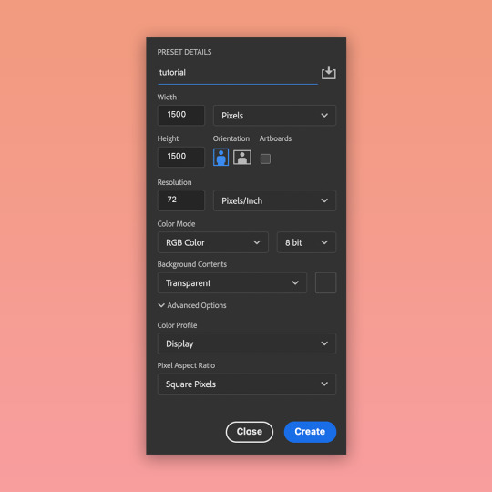
2. Create a new Adobe Photoshop file
Create a new file in Adobe Photoshop. Don't forget to save the file as .psd so that you can save your progress. For this tutorial, my preset settings are as follows:
3. Add the screenshot as a Smart Object layer
Drag & drop the screenshot into the file you created. This adds the screenshot as a Smart Object layer. This means that you can apply different adjustments to the layer with the ability to reverse any changes.
Resize the layer according to your preference.
4. Remove the background
I use gradient or solid backgrounds in my build edits. This means that I need to isolate the build from its original background. To do that, I use the Polygonal Lasso tool. The edges of the build in my screenshot are mostly straight, so this tool is sufficient.
Once the selection is complete, press the "Select and Mask..." button which should be visible in the top toolbar.
In this workspace, you can play around with selection settings to refine the edges. In my case, I don't need to do a lot of adjustments (I only increased the "Contrast" property).
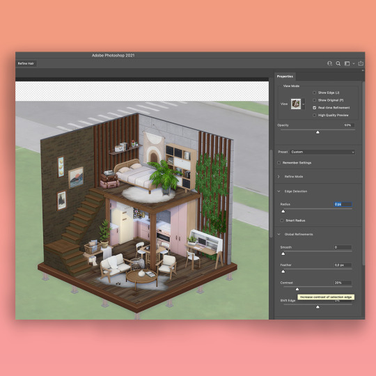
In the same Properties toolbar, under "Output Settings", select "Layer Mask" as the Output To option. Press "Ok" to exit the Select and Mask workspace.
5. Ta-daa!
The background is now not visible. In the "Layers" tab, you can see that your screenshot layer now has a mask applied to it. It's always better to "cut out" parts of images using masks - this way you can re-adjust visible parts of the image and reverse any previous actions.

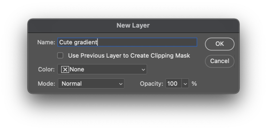
6. Create a new background
Now for the fun part - creating a new background for your edit. You can do it via the top toolbar by selecting Layer -> New Fill Layer -> Solid Color or Gradient. For this tutorial, I selected "Gradient" and picked some lovely pink shades.
7. Adjust brightness, contrast, etc.
Finally, I add some layer adjustments to the screenshot layer. I typically adjust brightness/contrast, color balance and saturation settings.
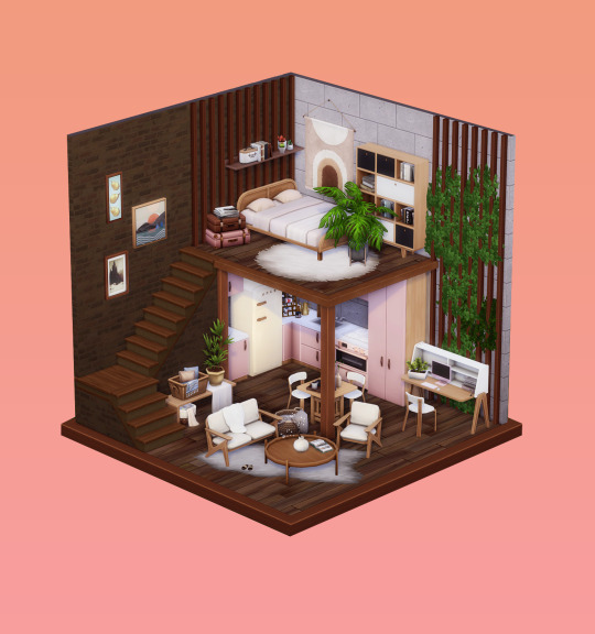
And that's it?? Hope this was useful!
A couple of notes:
Make sure that the in-game lighting matches the overall vibe you're going for with your edit. I found that harsh sunlight doesn't work too well as some areas of the light-colored objects become overexposed. I like to take my screenshots in cloudy weather conditions :)
I don't use any camera mods.
423 notes
·
View notes
Note
What's your rendering process?

I'm not very good at explaining but I'll give it a shot. This isn't how I always render but it's my most complicated one. Lately I like to start with darker colors, usually on the lower 2/3's of the color square which would later end up as the shading, since for me its easier to paint in the light rather than find the shadows from scratch, but it really depends on what vibes you're going for, if you dont want to have much shadow in the drawing, it's probably easier to start with light.
I'm quite new to it but i like to block in my lighting with a lasso tool, it gives it nice sharp lines and is faster than a brush, but you can also block it in with a brush if that's more comfortable, try to keep in mind the direction of the light source and look at the overall picture rather than zooming in for details. After that it's time for a little blending and bounce light, for blending use whatever painting brush you like (I use CSP default guache brush) and try to keep a mix of smooth and sharp edges without overblending it, the bounce light depends on the enviroment but is often blueish, you can get it by shifting the color to a more gray one, it can be darker or lighter, different tones work for different colors, play around, see what looks good to you. And then finally its the small things like loose hair strands, I might add another darker shading color to some places that feel like they should be darker like under the chin and tighter folds, might add some subtle coloring to the lineart, and very faintly subsurface scattering where the light and shadow meet on the skin, most of the time I like adding a rough highlight on the parts of the lineart which are towards the light, sometimes in brighter color of what im coloring, sometimes plain white. (this last layer is on top of the lineart and color layers and I call it the overpainting layer cus sometimes I also just full on overpaint some small things I want to change) Finally you can add a gradient map at a low % (i like to use 10-20%) or some other color filter adjustment. Feel free to change, add, or leave out any of these steps by how you see fit for your art, just do what you like and enjoy the process :D
72 notes
·
View notes
Note
hii! this is the mac/vanilla anon. may i know how did you make your build/gameplay screenies looks so pretty, vibrant and looks like they have dof? your screenies straight up look like you have reshade on and im so. WOAH<333 sorry if this ask sounds so weird but i play on mac too and my game looks so atrocious HSJFKEJFJ
oh my gOD thank u so much that is the nicest compliment i could ever receive 😭<3 i totally understand the game looking like pure garbage it's tough out there for mac players 💔 here's my
~editing process of a sad mac user~

i use Photopea to edit everything. free and online, what's not to love!
oil paint filter with a radius of 0.8 to 1, lighting off
smart sharpen with a radius of 1.4 (these first two steps don't often do too much but can smooth out the edges of the pixels without having to play with edge smoothing on)
i like a bit of chromatic aberration so i go into channels, select red, and apply a lens correction filter of 3 (go back to regular channel afterwards)
to fake DOF - i use the quick selection tool and mess around with it until the foreground or preferred focus of the image is selected (doesn't have to be totally perfect, often times people won't be looking that close). then inverse the selection and apply lens blur, typically with a radius of 12 to 15 ----- (the selection part can be a real bitch - sometimes there just isn't enough contrast between the foreground and the background for Photopea to understand which specific section ur trying to select. in cases where it rlly refuses to work i've had to go in and use the polygonal lasso select tool and manually trace what i want to be in focus akjsdhfj)
apply photoshop actions to adjust colours - lately pretty much the only one i've been using is wooldawn's warmerfalls sometimes combined with intramoon's bright and saturated
sometimes i will apply a gradient fill layer (often the purple to orange one) and set the blending mode to luminosity, opacity 12 if there's a light source that i want to emphasise a little more. it also just adds a nice softening effect
for funky rainbow effects - look up "rainbow light leak overlay" and download any u like the look of. open and place them on top of ur image, fit them to size, change the blending option to exclusion, lower the opacity to desired outcome. to make the colours of the rainbow *pop* a lil more i like to duplicate the layer and change the blending option to overlay, though u may have to lower the opacity of this layer even more as it darkens the image quite a bit
i add a film dust texture over a lot of my posts! i downloaded a set a while back but i don't remember where from, sorry :( there are a bunch out there if u look it up i'm sure!
and that's about it! it seems like a lot written out but i'm self taught and technologically inept so it's all actually pretty basic when u know where all the buttons are in Photopea heh ;D thanks again for liking my posts!! it means the world u have no idea <3
#sORRY this is so long i had no idea how else to format it otherwise it would just be a mess of a paragraph jfhkjsdfh#answered
30 notes
·
View notes