#publishers' bindings
Text


Publishers' Binding Thursday
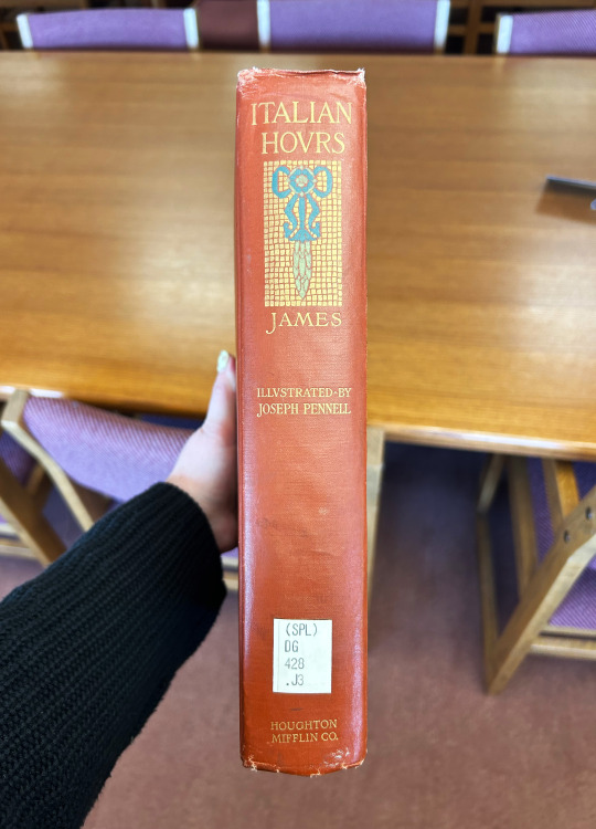
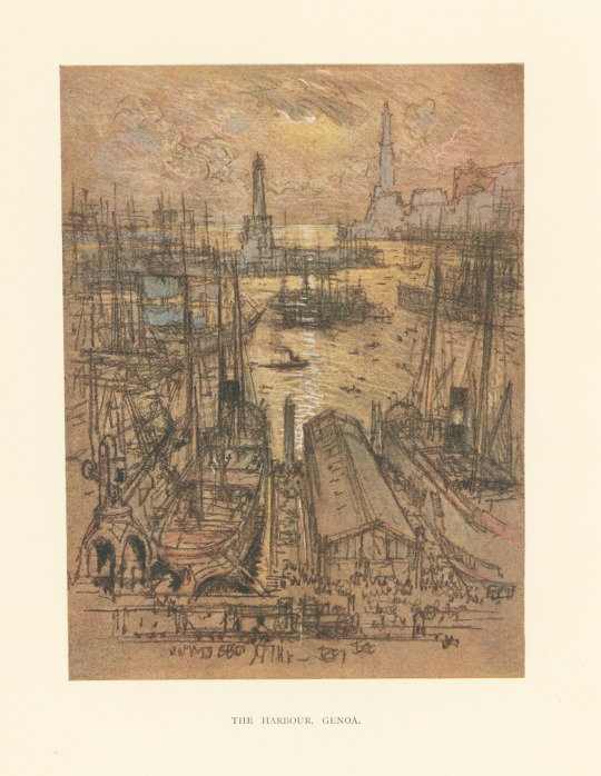
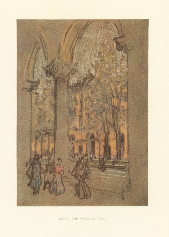
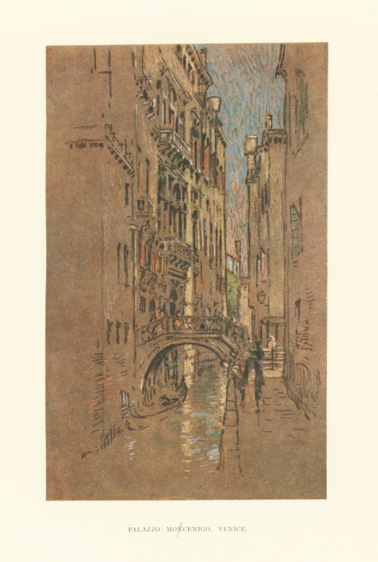
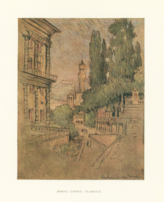
I found this book while browsing the stacks in search of a good publishers' binding. This one does not disappoint! This is Italian Hours by American-British author Henry James, published in 1909 by Houghton Mifflin Co. Italian Hours is a book of travel essays about Italy, a country that James loved, that are considered very charming but not unrealistic. This edition features illustrations of Italian scenes by American etcher, lithographer, and illustrator Joseph Pennell.
The cover features a mosaic-esque design stamped in gold with a blue florals and flourishes and leafy green patterns. The book cloth is a brickish red-orange color and the spine features a motif similar to that of the front cover. There's nothing special about the endsheets, which is always a disappointment to me. I just wish more people paid attention to the endsheets! But otherwise it's a very nice binding.
View more Publishers' Binding Thursday posts here.
-- Alice, Special Collections Department Manager
#Italian Hours#Henry James#Houghton Mifflin Co.#Joseph Pennell#illutrations#publishers' bindings#Publishers' Binding Thursday#gold stamping#Italy
103 notes
·
View notes
Text


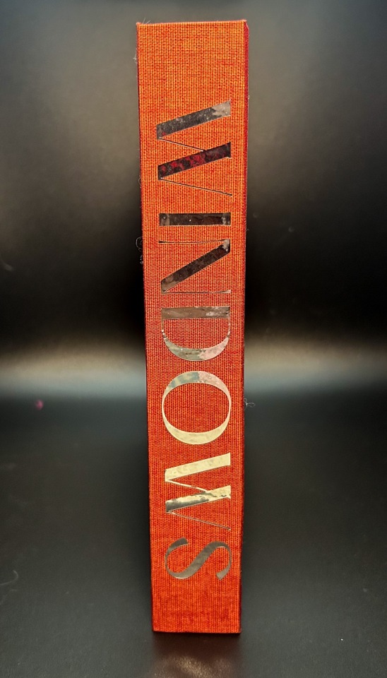
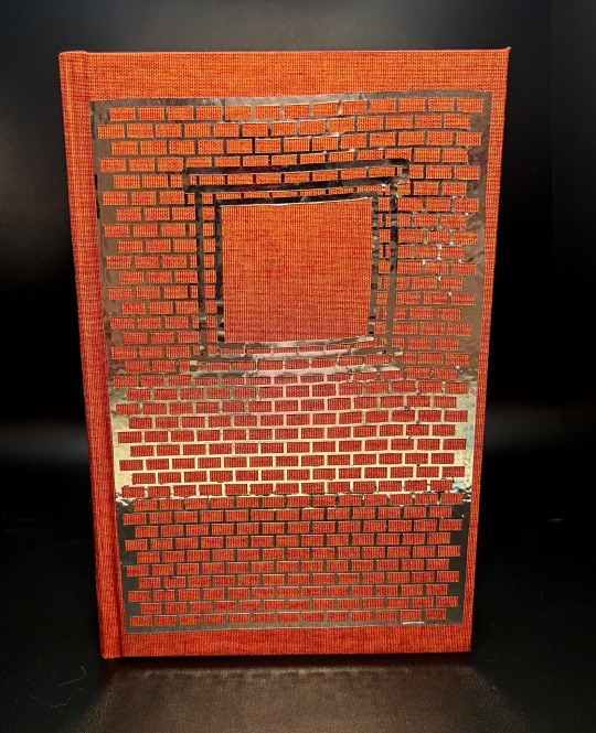

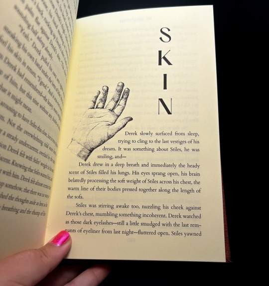
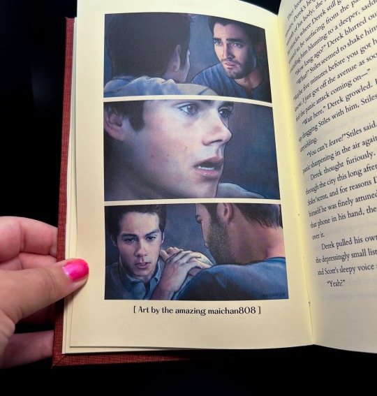


Windows by @drgrlfriend
Derek has a new neighbor who won't stop looking.
fic by @drgrlfriend
art by @maichan808 & @andavs-main
368 pages / 83,266 words
Title Font: PP Hatton
Body Fonts: Cardo, Geo
HAPPY FFWAD!!! Thank you @renegadepublishing for putting on this event in celebration!
More on the process below the cut!
I'm so excited to be posting this book! Super grateful @drgrlfriend was so down to let me bind Windows for Fan Fiction Writer Appreciation Day. This is one of my all-time favs, and I was thrilled to give it the treatment it deserves! @maichan808 & @andavs-main were also incredibly kind to allow me to include their stunning art pieces in the book <3 And thank you @renegadepublishing for putting this event together!
I wanted the typeset to be visually interesting and move around the page, without making it difficult to read. I created unique headers for each of the 28 chapters with royalty free art, and varied placement on the page in six different configurations. I also played with the text warp to make the text work as part of the image - one of my favorites is chapter 26, "Banshee", pictured above!
I used Brick duo for this bind, as part of the vision for the front cover, which was done in silver permanent vinyl. I think the rich rust color is perfect for how I would imagine Stiles & Derek's apartment building, and the silver is incredibly reflective - my favorite part is how the vinyl catches the light on the spine, and can reflect "Windows" on whatever surface it's on (pictured above). That's not an added effect, it's just doing that!
I did @tankbredgrunt's faux double-core headband with some Sulky Gutermann I bought at a secondhand store for $0.25, and it's so pretty! A bit thin to work with, but totally worth it for the multi-color effect it gives off.
And I finally got a proper crisp hinge! I think it really brings the whole book together, thank you knitting needles (even though you were a pain in the ass).
This project also marks my 100th book! I'm rapidly approaching the two year mark of my fanbinding career with no sign of stopping; thank you to this entire community, and all of the fandoms I've been able to bring this hobby to. I love how cross-fandom it is; and for an old floater like me, it's wonderful to bring all of my interests together and have something that transcends those lines.
HAPPY FAN FICTION WRITER APPRECIATION DAY!
#fanbinding#bookbinding#fanfic binding#fanficbinding#me myself and i#fanfic#ficbinding#renegade publishing#teen wolf#derek hale#sterek fic#sterek#stiles x derek#stiles stilinski#derek x stiles#drgrlfriend#ffwad#fanficwriterappreciationday#renegadelovesfic
526 notes
·
View notes
Text
@lieutenantkim replied to your post “hi freya! your work with the TLB series is...”:
I'm a little confused, what do you mean by "start as late as possible in the story" and then "have the main inciting incident take place within the first scene"? Did you mean the other way around or?
nope, I mean exactly that!
the TLB books are slightly unusual in that the real inciting incidents for all three involve the murder (even if obliquely, in book 3) of a third party, so they all begin with a kind of BBC-crime-drama pre-credits-scene chapter in which the murder occurs.
but the first chapter from a protagonist's perspective begins as close to the thing that Starts Their Story as possible. even after it. I could have showed you robin's daily home life, his parents' death, and then his receiving the notification of his new job at the home office. instead I started it RIGHT where he is introduced to the existence of magic, and then only introduced his home life & maud once he was already embroiled with worrying about magic and the curse.
I could have started ART with maud and mrs navenby getting on the ship, or even with maud on her initial voyage out to america. I started the moment AFTER her discovering the dead body: the plot is off! immediately! at once!
there is a tendency for first drafts to start with a character on their way to the plot: waking up on the day in question, or on a train to somewhere new, so the author can get comfy and wriggle around with some narration telling you who they are at the start of the story.
nope. start when they get off the train. or later. by the end of the very first scene, something new should have happened to them which gives the reader the story's first (or even central) unanswered question or point of conflict. you can fill in their backstory and personality and pre-story-status-quo in the narration as you go.
finding the right starting point is often a second-draft thing. and that's fine! but it gets easier with practice.
#writing advice#the last binding#is this a hard and fast rule for every story ever?#no#no piece of writing advice ever is#but if you're aiming for traditional publishing#having a fast-moving opening scene#that sets up the story and character/s well#can make a huge difference
144 notes
·
View notes
Text
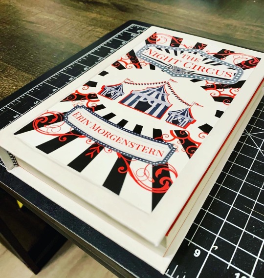
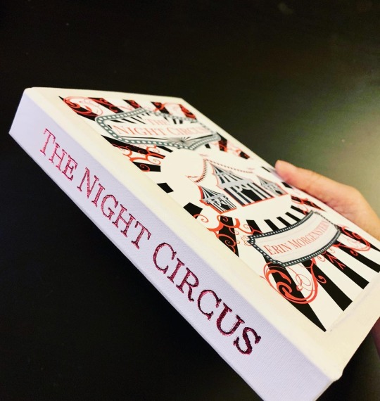
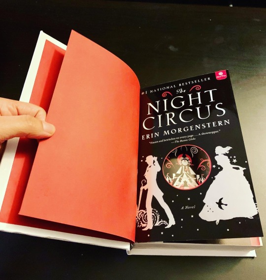
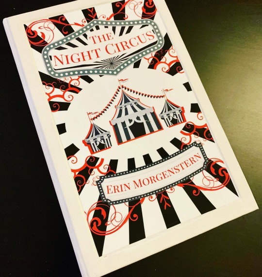
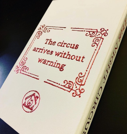
The Night Circus
By Erin Morgenstern
🎪
A rebind that I will be gifting to a friend as a Christmas present.
I read this book when I first started college, I think. The thing that stuck with me since reading it has always been the beauty and magic of the circus itself. Normally, I’d get lost or bored of extensive detail or descriptions about the setting, but the Circus of Dreams was an ✨aesthetic✨ that stirred my imagination. I was surprised at how much I loved it.
🎡
Regarding process:
So I recently rewatched the DAS video about paper labels, and creating a “well” for the label to sit in. And I thought to myself, what if I made the entire cover design the “label” and centered it on the cover?
The design was printed on vinyl adhesive paper, and it’s pasted right in the center of a large recess on the cover. Spine and back was hand foiled.
🎠
Well, it’s seems I’m on a roll. There will be many more rebinds to come before the end of the year, if I don’t lose momentum. I’m excited to see my projects take flight, but it’s also honestly quite daunting as well. 😮💨
As a side note…
When I first started this hobby, I was ambitious to achieve a level of quality comparable to many IG and tiktok bookbinders I’d been seeing out there. Many of them were binding fanfiction or doing rebinds of popular fiction, fantasies and romance.
And a LOT of them (or at least the popular accounts) were using special cutting machines like cricut, and heat transfer vinyl to create clean, professional looking designs. Shiny and metallic seems to be a highly sought after look, and admittedly it is attention grabbing for many casual viewers who stumble upon these videos. The same can also be said of the more traditional binders who make leather books and use special techniques for embossing and foiling.
While those beautiful machines and materials and tools like htv or leather-working aren’t NECESSARY for the hobby, it’s clear that any simple amateur bookbinders trying to build their accounts and show people their work really won’t be getting as much reach without making books that are as shiny and attention grabbing in the same ways.
And trying to achieve those looks of metallic vinyl, or beautifully embossed leather, felt pretty inaccessible to me. I’m sure many other amateur binders feel same the way.
That’s why I’m glad I can demonstrate how to achieve beautiful, high quality looking books in alternative ways. Feel free to reach out and ask me about my techniques! I’m no expert, but I’d be happy to help you find solutions and new methods.
12/15/2023
#bookbinding#handmade#erin morgenstern#the night circus#handbound book#book binding#arts and crafts#bookbinder#hand bound book#ficbinding#renegade bookbinding#renegade publishing
77 notes
·
View notes
Text
Original Work Binding: When You Are Old

an anthology of works by me, my siblings, and my parents, created for my mom for mother's day!
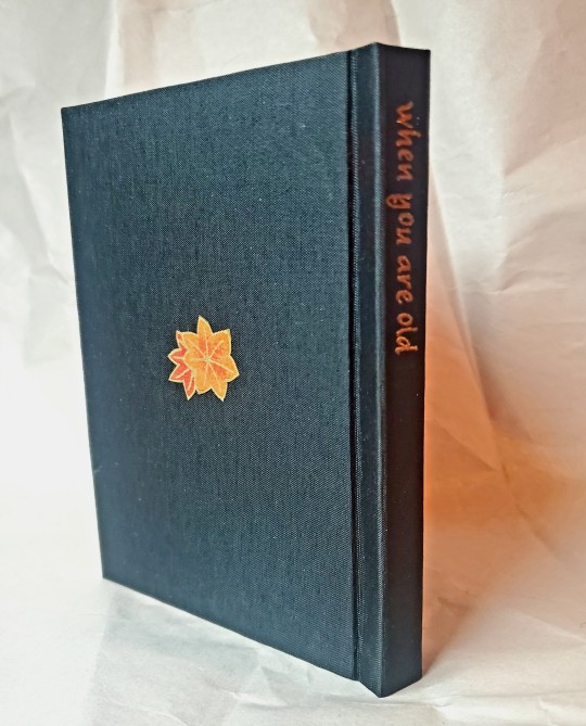
I really wanted to use this pretty fall chiyogami paper for the cover, so I leaned hard into that motif for the design. In searching for a title, I found the William Yeats poem by the same name, and decided to use that (and included it as a preface).

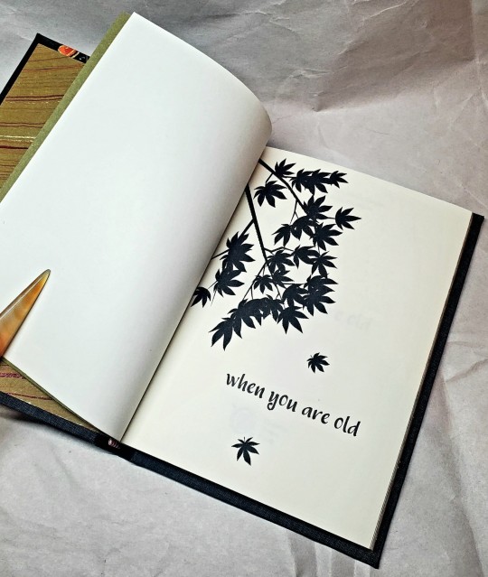
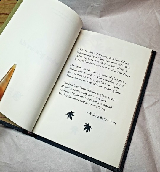
I continued the maple leaf pattern throughout, and I did gold acrylic splattered edges, which I felt came out very nicely! They look a bit like sunlight dappled through leaves.
The cloth for this project is black colibri, which I think came out very well and foiled fairly nicely.
I do think one of the really cool things about this hobby is being able to go: yes, I *can* choose to elevate whatever writing I want to the level of Published Book.
#bookbinding#celestial sphere press#original work binding#yes yes back to the 'bookbinding is a political statement about the value of non-traditionally published writing'
222 notes
·
View notes
Text
I've just released my first novel and the first in a trilogy! The Bonds That Bind Us is a story of trauma, healing, found family, and growth. It is a literary fiction with a gay romance plot, and is currently FREE ON KINDLE FOR EVERYONE!
#writing#writers on tumblr#writeblr#writeblr community#lgbtqia#tbtbu#the bonds that bind us#forever bound trilogy#debut novel#self publication#self published#kdp publishing#amazon kindle#kindle#kindle unlimited#ereader#ebooks#paperback#gay romance#literary fiction#found family#healing#trauma healing
40 notes
·
View notes
Text
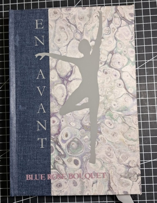
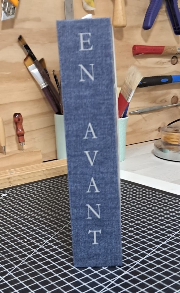
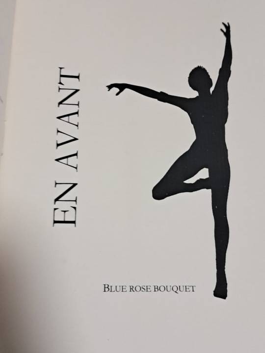


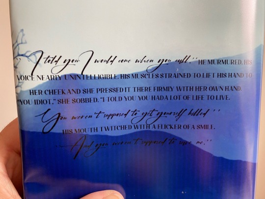
Binding of En Avant, a fic by BlueRoseBouquet.
Why did I bind it?
The novel is beautiful, with great character development. It's a muggle AU, in which James must deal with widowhood in what I think, it's a realistic approach. It's a story that touched my heart and I wanted to have it near me.
Read it at AO3
How did I bind it?
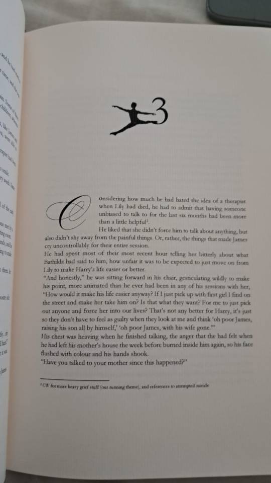
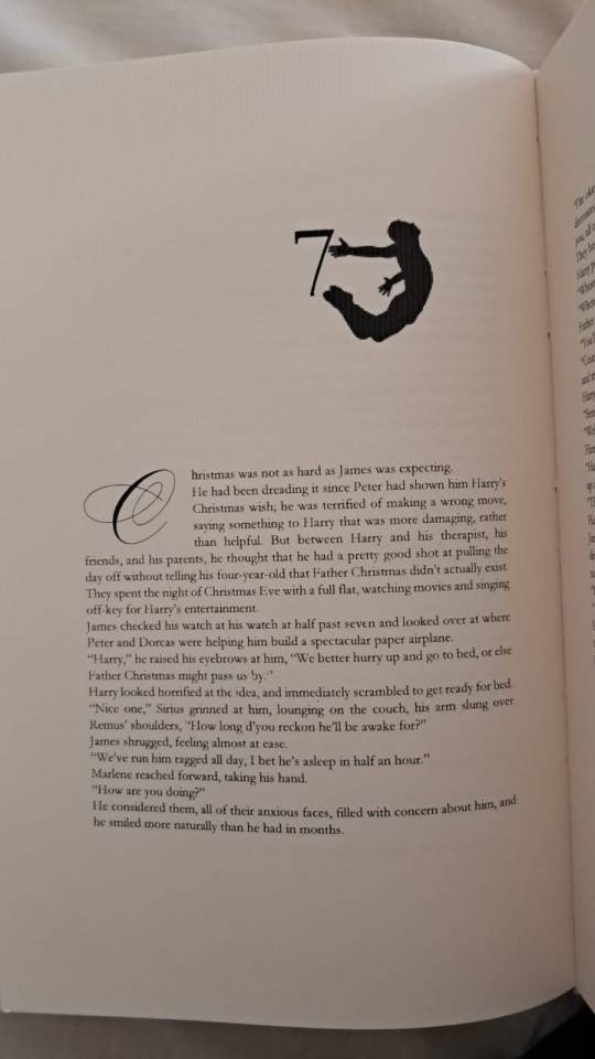
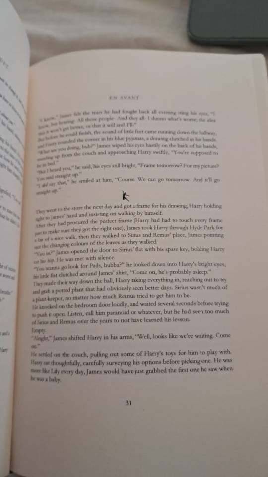
Although the novel takes James' point of view, the figure of Regulus, who is a ballet dancer, is very important. Therefore, I organized the design with the idea of classical dance. I use dancers in the chapter titles and as scenes breakers.
Homemade book cloth.
I used PVA-coated paper for the spine.
For the shape and titles, I used HTV.
Fonts: Ballet [For drop caps] and Garamond family.
It is not perfect, but it makes me proud.
@sortasirius
#renegade bindery#sortasirius#BlueRoseBouquet#fanbinding#fan art#ficbinding#ficbook#bookbinding#fic binding#fic binders#fanbind#renegade publishing#En Avant#jegulus fic#jegulus fanfiction#ao3fic#my art#my stuff#made by me#my progress#hp fic rec
59 notes
·
View notes
Text
Tiny Book Bang 2023!
So this year is Renegade Bindery's first Tiny Book Bang. Typesetters formatted typesets to be any size smaller than a quarto, and binders later bound up those books!
I made two typesets for the Bang this year: the Kaer Morhan Bookclub by Jack Ironsides, and Gilded Chain by Sroloc_Elbisivni. I am delighted by both books I received from other binders! I learned so much from seeing the bindings that other folks completed! I felt very connected to our fan community, crafting across fandoms and international borders!
But this post is mostly about the book I bound for the Bang: Toy Soldiers by Copperbadge!

@mourningmountainsbindery made a delightful octavo-sized typeset of this story, "lightly comic-book themed" as described by the typesetter. There are three books because I bound for myself, my typesetter, and I always like to tempt the author with a book if I can. Both mourningmountainsbindery and @copperbadge have received their books, so I am free to share!
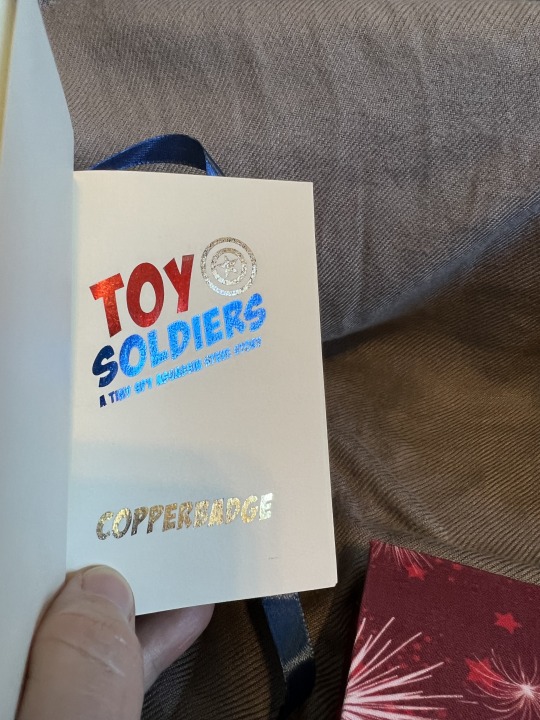
I tried to sneak in as many fun things as I could. Here we have some shiny foil on the title page.

The endbands are red/white/blue for Steve and red/gold for Tony.

I was incredibly fortunate that 4th of July was right around the corner when I shopped for materials. I found very appropriate cloth for the bookcloth cover ;) And the endpapers I have had for a very long time (a decade?!), so I was definitely glad to find them a home!
Thank you mourningmountainsbindery for the lovely typeset, thank you copperbadge for a lovely story! And thank you mods for all the hard work you do in the background.
#book binding#my books#Cat's Paw Bindery#Toy Soldiers#copperbadge#Renegade Bindery#Renegade Publishing#Tiny Book Bang 2023#MCU#mourningmountainsbindery#fic rec
128 notes
·
View notes
Text
It’s a little hard to read the faded text on this flag, but back in 1965 someone checked the “Bind in buckram” option on it. They then stuck the flag into the middle of the book, but somehow this lovely publishers’ cloth binding was NOT sent to the bindery for an ugly buckram binding. Instead it was sent back to the stacks, where it remained until I pulled it for a project. I found the flag wedged deep inside the middle of the text, which is why I suspect it evaded such an unfortunate fate as being sent to the commercial bindery!
Talk about a near miss!

#original content#bookbinding#library books#preservation#publishers binding#found in a book#german books#trains
80 notes
·
View notes
Text


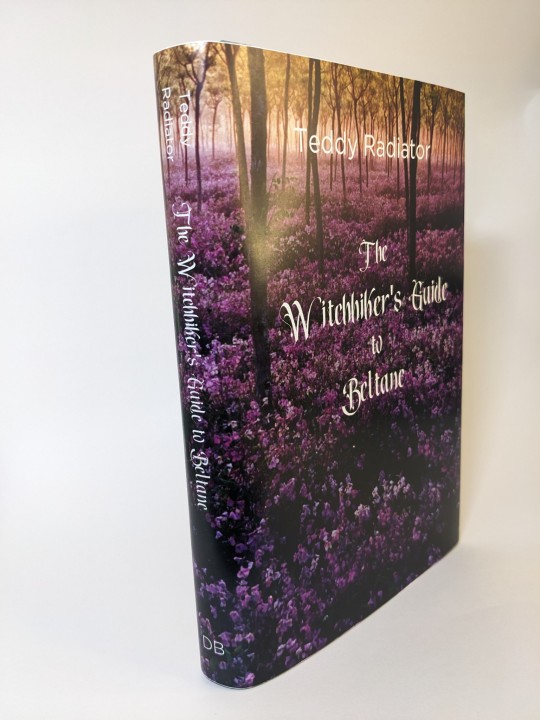

I had a lot of fun participating in @renegadepublishing Fanfiction Writer Appreciation Day (FFWAD) this year!
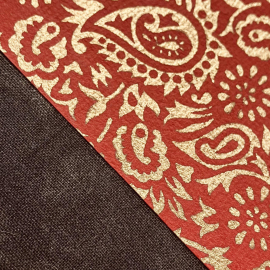
The Witchhiker's Guide to Beltane by Teddy Radiator. This story has a lot of Spring (Beltane) vibes and I wanted to bring that to life in the binding of it.
This is an in-boards bradel bind. (My first) The paper is a lokta that's beautifully textured. The spine is made of green & purple color shifting duo "Skarabaus". The edges have been sprinkled with ink and the headbands are soie perlee thread. (That handles beautifully, I understand why it's a favorite now)
#bookbinding#sevmione#snamione#fanfiction#fanfic binding#fanbinding#renegade publishing#renegade loves fic#renegadelovesfic#harry potter#beltane#ffwad#fanfictionwriterappreciationday
144 notes
·
View notes
Text


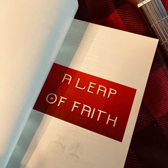
A Leap of Faith by Misery_C_Epicaricacy & Ynnéalay
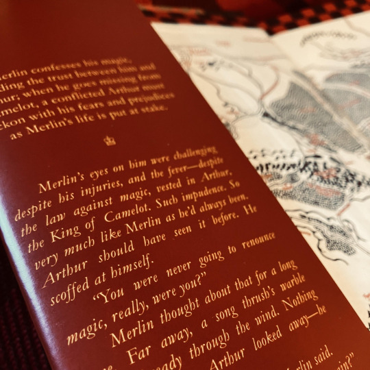
Merlin confesses his magic, upending the trust between him and Arthur; when he goes missing from Camelot, a conflicted Arthur must reckon with his fears and prejudices as Merlin’s life is put at stake.
Fandom: Merlin (TV)
Rating: Teen And Up Audiences
Archive Warning: Graphic Depictions Of Violence
Category: Gen
Relationship: Merlin & Arthur Pendragon, Minor Gwaine & Arthur Pendragon, Minor Gwaine & Merlin
Words: 40,475
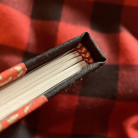
Fanbinding of A Leap of Faith.
Process, commentary, and additional pictures under the cut ♥
First of all, thank you to all the lovely folks from the @renegadepublishing discord for enthusiastically encouraging me to fanbind my own work, though this is not entirely just-mine. This fic was co-written with the awe-inspiring @whoawhataconcept (Misery_C_Epicaricacy on AO3) and this binding is as much a love letter to her writing, her mind, and our creative collaboration as it is to my own contributions.
On: Textblock & Typesetting
I've bound a couple fics at this point, but was saving Garamond for this one because I fell in love with how these particular words look set in Garamond. The headings are done in a simplistic all-caps Calibri with expanded spacing to pay homage to how many hours editing this damn thing were spent looking at the font in question. I've also used font 'Merlin' for the front title page—which I got linked out of the @merlinbingo discord server—and Felix Titling for the interior title page.
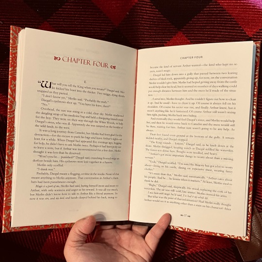
The body is printed on EarthChoice colour cream paper, and stitched with red crochet thread.
On: Endpapers
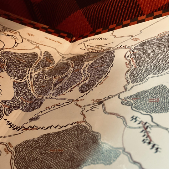
The endpapers were a tricky one for me! They are prints of my own fanart which was not the correct aspect ratio to use as endpapers for a book printed on letter paper. This was also the first large map I created, and if I could go back, there are things I would do differently. But in the end, I decided to use it as-is because I'm proud of it. To fix the sizing issue, I up-sized the map so the width was correct for a letter-sized print, which left a border on the top and bottom of the image—this I filled in with black and red checkerboard pattern to match the banners and standards of Camelot.
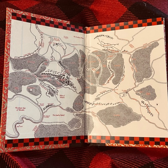
Originally, I wanted it printed on this textured, pearl-finish linen paper, but then the print shop I use didn't have it in a large enough size to do endpapers on and I was heartbroken. I ended up using topkote gloss paper by Oji.
On: Endbands
Hand-sewn in red and gold crochet thread. I redid these like three times to find a core I liked, and ended up doing them over tightly rolled paper.
The Dust Jacket
I'm not a graphic designer, so the jacket design is simplistic. It includes a cover, back cover (with a 'praise for' section), and two inside flaps (which contain the fic summary and author bios). I took some cues from this dust jacket post. It's printed on a thicker weight of topkote paper by Oji, this time with a dull finish.
Closing Thoughts
I'm so proud of how this turned out! It's my best work yet in terms of straight-ness of the spine/cover paper, and I learned a lot about printing. Lots of firsts for me here, and I feel that every time I make a book, I improve. I've gifted this copy to my co-author, Misery. Seeing her flip through it, and seeing it on our shelf, is giving me a lot of joy today!
#Withy Bindings#fanbinding#fic binding#ficbinding#fan binding#book binding#bookbinding#fanfiction#whoawhataconcept#Misery_C_Epicaricacy#Ynnealay#renegade bindery#renegade publishing#bbc merlin#merlin bbc#merlin fanfiction#bbc merlin fanfic#A Leap of Faith#The Weavings of Destiny
181 notes
·
View notes
Text

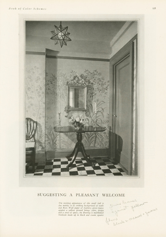

Decorative Plates
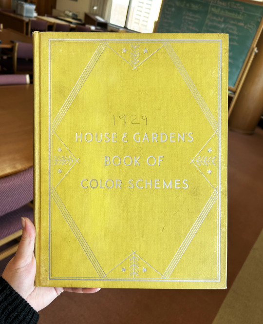
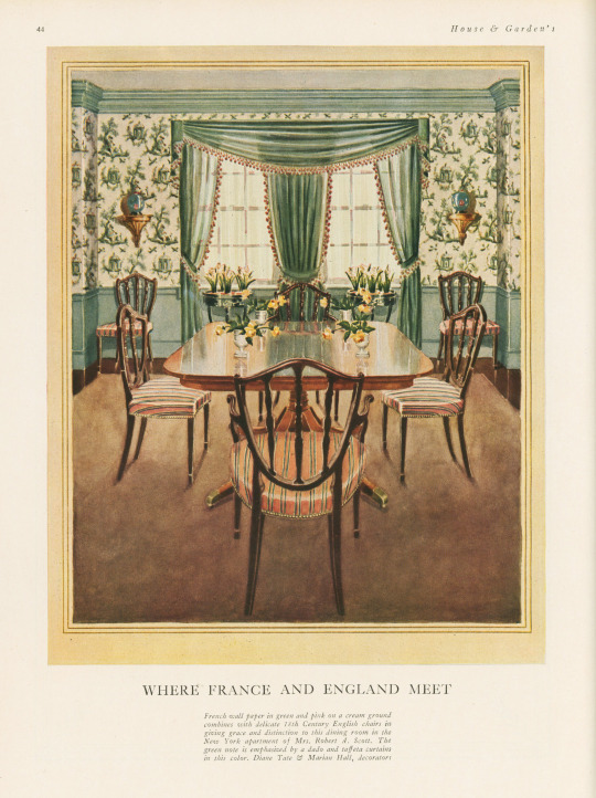
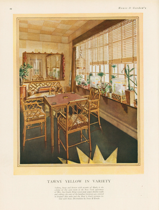
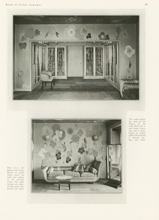
It's been awhile since we last posted something on the theme of the decorative arts, so I'm happy to have found this book—especially because it was mis-shelved in the stacks! This book is House and Garden's Book of Color Schemes, which contains "over two hundred color schemes and three hundred illustrations of halls, living rooms, dining rooms, bed chambers, sun rooms, roofs, garden rooms, kitchens and baths; the characteristic colors of each decorative period; how to select a color scheme, with unusual treatments for painted furniture and floors; a portfolio of crystal rooms and eight pages of unusual interiors in color." It was edited by long-time editor of House & Garden Richardson Wright (1887-1961) and Margaret McElroy, associate editor, and published by Condé Nast Publications, Inc. in 1929.
The book includes a large number of photographs of rooms, however, they are mostly in black and white—an unfortunate thing for a book about color! The promised eight color illustrations of rooms are not all present in our copy, but the five that are still in the book are shown here, alongside some of their black and white compatriots. I especially love the one titled "Tawny Yellow in Variety" that features a shocking amount of leopard print.
If you've read any of the posts I usually write, you know that I love a good binding—this one is a publisher's binding in a chartreuse-y yellow book cloth with art deco-style silver tooling featuring stars and leaves. Somebody took it upon themselves to write the publication date on the cover above the title—how thoughtful!
View more posts featuring Decorative Plates.
-- Alice, Special Collections Department Manager
#Decorative Sunday#Decorative Plates#decorative arts#House and Garden's Book of Color Schemes#color schemes#color#decoration#home decor#interior decorating#Richardson Wright#Margaret McElroy#Conde Nast#Conde Nast Publications#art deco#chartreuse#Publishers' bindings
73 notes
·
View notes
Text

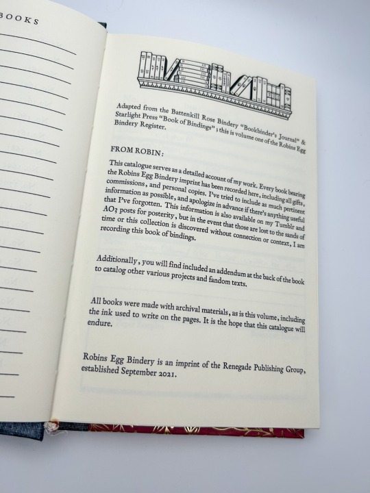


Bookbinding Register by @robins-egg-bindery, adapted from @chocolatepot's "Bookbinder's Journal" & Starlight Press' "Book of Bindings"
228 pages
Title Font: Sughayer Separates
Body Fonts: 1782 Thurneysen
More on the process below the cut!
I never posted about my bookbinding register! I adapted it from two free-to-use templates provided generously by @chocolatepot and Starlight Press (I apologize, I could not find Starlight's Tumblr!)
I added enough space for 200 books, but I'm about 60 deep already; probably going to need a new register by 2025, I'm betting? I like the cover paper and book cloth sample areas; it's nice to have a physical record of the books, something tactile!
I also have space in the back for any additional fandom texts in my collection (that's where I write down my zines and exchange books!), or anything else that I create under my imprint (sketchbooks, journals, etc). When I'm gone, there will be a complete record of every book I made, and everything in my personal collection.
I also write in this with an archival ink pen; everything I make is built to last, and this register is no exception! What we're doing as fanbinders is important, it's both a profound act of love as part of the gift economy of fandom, and also an archival endeavor (as if archival endeavors aren't inherently profound acts of love <3 )
#fanbinding#bookbinding#fanfic binding#fanficbinding#me myself and i#fanfic#ficbinding#renegade publishing
115 notes
·
View notes
Text


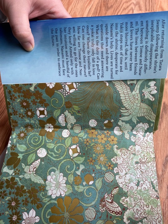

I bound Secrets and Devotion! It’s a little fucky. The spine is off center and the page numbers are borked, but it’s mine and I made it with my brain and my hands 😌
#kamisama hajimemashita#kamisama kiss#kh fanfiction#tomoe x nanami#kamisama kiss fanfic#secrets and devotion#book binding#guerrilla publishing
20 notes
·
View notes
Text


SoCal Renegade Bindery
📚10/22/2023📚
At today’s SoCal @renegadepublishing meet up, I shared my Little Prince rebind with many other incredibly skilled binders who in turned shared their gorgeous handmade books. We all got lunch together before going to the International Printers Fair in Carson.
#bookbinding #thelittleprince #bookbinder #bookstagram #classicbooks #rebinding #antoinedesaintexupery #papercrafts #bookart #renegadebookbinding #renegadepub #renegadepublishing
#bookbinding#book binding#handmade#bookbinder#arts and crafts#bookstagram#artsandcrafts#diy#diybook#handboundbook#renegade publishing#papercrafts#handbound book#hand bound book#handcrafted#book art#diy book#towns end bindery#book binder#townsendbindery#fanfiction
53 notes
·
View notes
Text
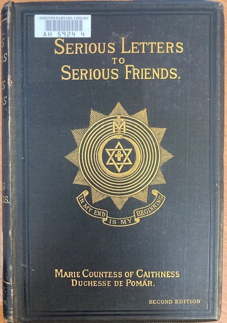

We're Serious. It's Publisher's Binding Thursday!
We came across this striking publisher's cloth binding on an 1895 book on theosophy. The front is decorated with eye-catching symbols of theosophy, but the back cover also bears a serious looking fellow with a serious sort of message.
Sinclair, Marie, Countess of Caithness. Serious letters to serious friends. 2nd ed. London, C.L.H. Wallace, 1888.
67 notes
·
View notes
Last Seen Blogs

wwednesdayaddamss
Wednesday.
hankhillhugebenis
Piss Boy Gravel Pants

kitybur
K I T Y B U R !

racingprox66
Untitled
mirrorlight-sundancer
beneath the marble tiles, something begins to sing