#roman szmal
Photo

🇬🇧 English Text
Note: Very sorry for reposting this again, I tried the new post editor and it broke my theme. I’m reposting this with the old editor.
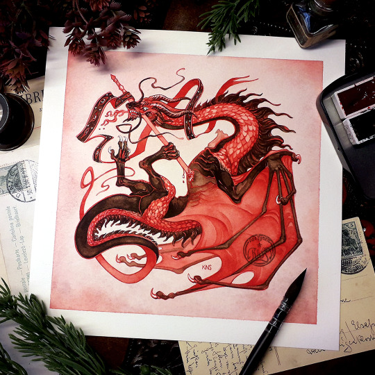
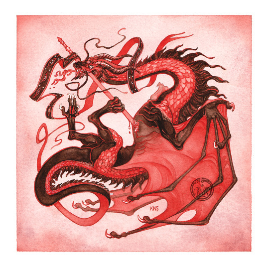
A second update within the same month?! Shocking, I know! 🙃 I just finished this watercolour painting of a dragon for the DTIYS by the incredible @/putrid.hound on Instagram! The original image is a stylised dragon in two stark contrasting colours, bright red and black. To match, I chose a vibrant quinacridone scarlet and a dark, almost black shade of burnt umber. All of my painting was done using these two shades, with a little bit of Potter's Pink for some subtle texture in the background. I hope you'll like it! I had a bit of trouble balancing this intense red between all of my screens. 😅
As usual, take care, and stay safe, everyone. 🖤
~~~~~~~~~~
🇫🇷 Texte en Français
Un deuxième post en moins d'un mois ?! Surprenant, je sais ! 🙃 Je viens de terminer cette aquarelle d'un dragon pour le DTIYS de l'incroyable @/putrid.hound sur Instagram ! L'image originale est un dragon stylisé de deux couleurs très contrastées, un rouge vif et un noir profond. Pour m'en rapprocher, j'ai choisi deux couleurs, un rouge de quinacridone écarlate et une terre d'ombre brûlée très sombre, presque noire. Toute ma peinture a été réalisée avec ces deux couleurs, ainsi qu'un peu de rose de poterie dans l'arrière-plan pour un effet subtil de texture. J'espère que vous aimerez ! J'ai eu du mal à équilibrer ce rouge pétant entre mes divers écrans. 😅
#dragon#putriddtiys5#mythology#watercolorist#aquarelle#roman szmal#blood red#my watercolours and ink tag#artistic shenanigans
28 notes
·
View notes
Text
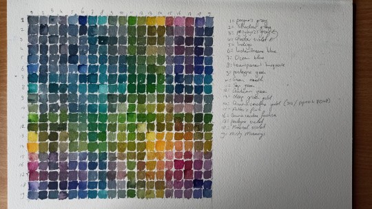
Colour grids are extremely satisfying to look at. Also kinda satisfying to make, but they definitely be testing your patience, wow.
2 notes
·
View notes
Text

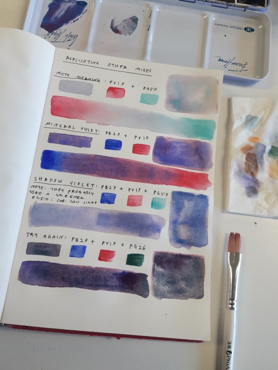
got a few new Roman Szmal paints through the post yesterday, so I spent the afternoon rearranging my palette and making mixes
#sketchbook#watercolour#supplies#watercolour supplies#anyway I would really recommend the Roman Szmal paints especially if you're a fan of granulation and interesting pigments#they're such high quality too especially for the price I wish I could own all of them#behind the scenes
15 notes
·
View notes
Text

TopDeck, 2023
Another Dog Portrait
#art#traditional art#watercolour#pet portraits#dog painting#watercolor#painted with a mix of roman szmal and like two daler rowney colours lol
6 notes
·
View notes
Text
I love painting I love colouring I love layering paints I love watercolour
#today it hit me I got my current watercolour set like... 3 years ago?#and the paints I got that day I still have sooo much of? even though I use them for literally everything?#it is true what they say.......... your watercolour set /will/ outlive you.........#the one I have the least of atm is the Roman Szmal Ultramarine Violet that I got waaaay later#but to be fair it's a really faint pigment so whenever I want to mix it with something#I have to use a lot of it#also Aliexpress metal watercolour case my beloved she's literally perfect#there's only one or two scratches on the paintjob and this set literally goes everywhere with me#anyways back to painting#I will never finish that Raorin piece I started#something else got my attention#sometimes your class doodle is sooo cute that you have to line it and colour it
5 notes
·
View notes
Text
laughing sadly a little every time people talk about 'budget film' because yeah kodak color plus is ~$10, yeah, but In Them US. here it's like $15. kodak gold is closer to $16, and if i teleported to the us i could, with that money, obtain cinestill 800t. such bliss would cost me $25 in my sweet motherland. i miss the times when i thought watercolor painting was an expensive hobby
#shrimp thoughts#i mean. if you use w&n or daniel smith then it kinda is but i have roman szmal so ^__^;;#okay fuck i looked up some random store in austria because i was curious what the prices are like in other eur countries and#these madmen are selling kodak gold for 18 euro. do they know it's not made of actual gold i wonder
4 notes
·
View notes
Text
the superhuman effort it’s taking me to not eat these watercolours as i unwrap them:

5 notes
·
View notes
Text
Endings and Beginnings
"Trust that an ending is followed by a beginning."
- Naveera Salam
“Trust that an ending is followed by a beginning.”
– Naveera Salam
It is momentarily hard to believe that we are already turning another page on the calendar and getting ready to begin a new year.
I say, “momentarily” because when I really take a few moments to think of the past twelve months, I realize that much has happened. Many changes have occurred in my life this past year. Friends and…
View On WordPress
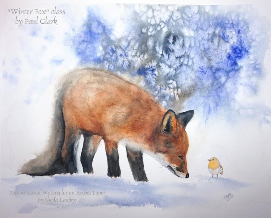
#Arches paper#botanical painting#Decorative Painting#Painting#painting tutorial#roman szmal watercolor#Tutorial#watercolors#wildlife painting
1 note
·
View note
Text

When you're tired of sitting in bed. I finish the play when I feel better. I don't know if this is a good idea, but I need it. Watercolors by Roman Szmal, natural W&N sable brushes and 100% cotton paper 300 g.🥰💙
27 notes
·
View notes
Note
do you have a watercolor brand rec? 👀
i'm actually a really big proponent of using whatever's convenient for you, fr. brands vary in price depending on where you're buying them/where you live, what's available, etc. sure there are definitely differences between them, but especially when you're using professional materials it's actually more rare to pick something bad than to stumble on something serviceable.
(whoops this one got long too. under the cut it goes.)
some brands do, admittedly, do certain things better than others. sennelier (a french brand) is known to go down kind of pale/less saturated on the first wash, but they build really really well in glazes and have a luminosity to them that gives paintings a really interesting depth.
daniel smith (an american brand) has one of the largest collections of colors available i've ever seen and their earth tones are gorgeous and really unique.
QOR (not sure where they're based?) has WILDLY saturated colors that bloom so much it kind of looks like fireworks, same with roman szmal.
holbein (a japanese brand) doesn't move much in water at all and thus offers a lot of control to the user instead at the cost of more abstract or dynamic movement in water.
schmincke horadam (a german brand) was hailed as the holy grail of watercolors for a while for their fine pigments and wild dispersal, but that's kind of chilled out these days since so many new players became beloved staples, and some people aren't fans of wild blooming to begin with. in a similar vein, winsor and newton (english brand) has a very extensive history and honestly works as a super "traditional" pick with few surprises but a solid foundation—and none of that is considering the wild variations in properties between student grade paints or the many types of handmade ones that hit the market lol. some brands make great pro but weak student lines, and vice versa.
buuuuuut.
all of that is pedantic when you're starting out, and honestly if you're asking this you're probably looking to get into watercolor. at beginning or intermediate stages where you haven't gone down the fixation rabbithole, all of tha information is more likely to confuse you than help, especially if you don't know what you like or dislike about watercolor yet.
at beginning stages whatever established pro or student brand is available to you is probably good enough to build fundamental knowledge on.
my actual, legit advice is to pick a few colors you like, then if another brand has what you want get it from them. get a small set if that helps and just build with whatever you find lacking, whatever you aren't using can be replaced with something that appeals to you more. there's no need to stick to one specific brand name just because. just don't pick the super chalky ones that come in those huge art packs with the round pans, and you should be fine (and even then, i've seen some people do great art with those! i just don't like when it comes off like dust on my fingers lol.) general rule of thumb i follow is that if they have accurate pigment and lightfastness information, you're going to be fine.
art isn't really all that exclusionary when you do it for fun, it's just an environment where people started making stuff for smaller and more specific audiences to cater to preferences lol. hell, paint with coffee if you want to. life's short and painting is fun, might as well enjoy it for a while.
oh, but do use good paper. blah blah, you've probably heard it before, and trust me we're all just as horrified as you that watercolor paper is so goddamn expensive. but you could literally have The Nicest Paints In The World and they'd look terrible on bad paper that won't let you use the techniques people try to teach you. if you have to pick between good paper and mediocre paints vs bad paper and excellent paints, pick the paper. trust me.
#ney's art tips (art questions)#ney's chatter (ask answers)#wow this got long too#can't believe i'm talking about traditional art so much lately when basically all i post on here is digital#mainly bc trying to take a picture of traditional art without a scanner is a HELLHOLE#orz#genuinely i'm not even all that GOOD at watercolor#i'm just a massive nerd (and i mean RIDICULOUS) when it comes to everything that makes them/how they work/the super small details of brands#literally to the point where i memorized pigment code charts. where i know the differences in binders.#the difference between honey-based paints and those without it#not even a bee joke fr#my first watercolor set was...#eh. story for another time i think lol this is already too long
10 notes
·
View notes
Photo

pocket sized


initial sketch + original pic. testing out some sample paper from a few years ago i recently found again lol. paper is nice when you don’t layer too much. i really like how yjh came out
the pencil i used is a half blue half red colored pencil from Koh-I-Noor and i used Roman Szmal watercolors for these. my scanner sucks ass so i had to take several pics w my phone in order to capture them all without any blur around the edges.
#omniscient reader's viewpoint#kim dokja#yoo joonghyuk#han sooyoung#sketchsketchsketch#in other news so many artists are coming w such good orv merch i got inspired lol#stop! being so talented! im getting broke
39 notes
·
View notes
Photo
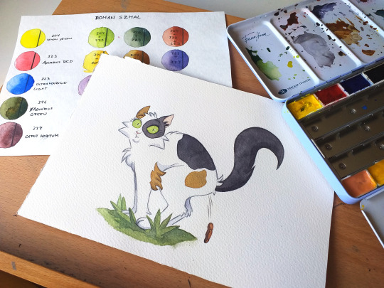
A couple of days ago I surprised my neighbor's cat trying to poop in the garden, but my presence cut off her inspiration. And since I had no idea in mind to prepare my new Youtube tutorial, I decided to make an illustration to immortalize that moment ... poor kitty XDXDXD
#watercolor#illustration#roman szmal#cat#pets#calico cat#gato#catsoftiktok#gatasdoinstagram#ilustracion#ilustração#anime#manga#otakuanime#painting#cats#dogs#garden
0 notes
Text

Xenk Yendar ⚔ a study from reference // roman szmal watercolour on 100% cotton hot pressed paper, A5 size
played around with a slightly different colour palette (quin maroon and phthalo green blue shade my beloveds) and working slightly looser than usual, and I'm really pleased with how he turned out
#xenk yendar#xenk the paladin#dnd honor among thieves#dndhat#dnd movie#dungeons and dragons honor among thieves#regé jean page#my art#my dndhat art#watercolour
939 notes
·
View notes
Note
what brand of watercolors do you typically use?
jacksons, white nights, roman szmal and the prima marketing essences palette!! out of all of these, roman szmals are definitely my favourite
14 notes
·
View notes
Note
what art supplies do u use? i rly like ur doodles ....
first of all, thank you!
this is gonna be a long one. and hey, before I get into this: getting better tools does not make you a better artist. I'm serious. Please don't get things from this list to improve your art, and especially if they're just gonna languish in a drawer because you're afraid of wasting them. I love you and you deserve nice things, but they are not the key to becoming a better artist.
I've also had many, many years to collect and curate stuff. A lot of it I gave away to friends because I didn't use it. If you're new to this, don't worry about getting "all the best things". It's a little silly, and can hold you back.
Especially for sketchbooks, exploration and just messing around, quality stuff isn't necessary. if you're selling commissions or making stuff that will be hung up, yeah, quality matters, but it's mostly about how archival/lightfast stuff is, not price. you won't catch me with caran d'ache or prismacolor stuff, nuh-uh. Only one of these is good and worth the price, and spoiler, it's not the prismacolor.
also, if I catch you hanging up alcohol marker originals, I will personally come into your house and put them into a safe drawer. that shit fades, and fast.
with that out of the way:
digital: clip studio paint + wacom intuos pro medium (circa 2017?). Don't bother with wacom tho, a huion is just fine. I do recommend not getting a small one though, your wrists will thank you. I use whatever brushes i like atm, usually default or custom-made by me.
watercolor: a mix of roman szmal + renesans paints, because they're high quality and extremely local (and thus cheap!!) to me. Currently I'm using arches 185gsm cold press (100% cotton). I chose it over 300gsm because it's cheaper, and thus feels less precious, so I'm not afraid to "waste it", whatever that means. for brushes, I use a #6 kolibri pure red sable round and a really, really old #2 cotman round (111 series). I would recommend synthetics due to environmental and ethical concerns over how sable hair is harvested. I also have a #16 flat somewhere, but I have no f%$#ing clue where it is. Do note that watercolor is rarely a vegan medium, as the sizing in watercolor paper is usually gelatine. I'm sure you can do it, but idk how.
for gouache i use the watercolors mentioned above + white gouache because I'm a rebel. I do have a renesans gouache set tho, and will use it up because I hate wasting things.
ink: winsor&newton black and white shellac ink. I discovered G-pen nibs like a week ago and they're my jam, but I used a LS40 nib before (too flexy). FWIW i also use a white sakura gelly roll for white highlights sometimes, and sakura pigma microns in various sizes and colors (usually 003, 01, PN). I also use regular fountain pen ink in a fountain pen because it's fun.
sketchbooks/paper: royal talens art creation. they are the superior affordable sketchbook, no contest. I love the 12x12cm size and A5 bound on the short side. I'm also using a 12x12cm sakura sketchbook with black paper for gouache doodles.
for watercolors, I use 100% cotton as mentioned before, as that is the only medium I ever consider selling to people. Everything else I don't bother keeping archival, so it's in my sketchbook or on cheap-ass copy paper. go nuts.
pencils: I prefer a 2H for layouts on watercolor paper and a HB for sketching, usually either a faber castell 9000 (the dark green ones) because idk they make me happy and are nice and smooth. Usually it's "whatever" though. as long as it writes and doesn't scratch I can use it.
colored pencils: a 36 set of faber castell polychromos and i refuse to elaborate
misc. sketching supplies: uni nano dia color mechanical pencil leads. My #1 most used is pink and I plan on getting more colors. for normal mechanical pencil lead i use a HB refill in whatever brand i can find (I'm even less picky than with wooden pencils). All of these are in 0.5mm size. oh, and tons of misc. cheapo colored pencils I have laying around, like most artists.
for erasers, usually it's "whatever" but I do carry several with me at all times. current faves are colored kneadable erasers (ooo pretty colors!!), milan tri jet, pentel hi-polymer in green, pentel hi-polymer slim.
pencil sharpeners are also a whatever as long as it doesn't break my pencil, but I do really like the derwent long point (i have the mini, its cute)
for cute accents of color i use whatever pastel highlighter i have at hand, or a crayola supertip. I sometimes also use alcohol markers, but rarely.
alcohol markers: copic ciao, but don't bother buying them. ohuhu has refills now and copics lost their only advantage.
acrylic paint: renesans flowacryl, but I do plan to switch to golden fluid at some point. this is exclusively for mtg alters, btw. in terms of brushes, I use a #0 milan round (golden taklon i think but idk and I don't have any at hand rn to check) and a #6 oval (it's flat but with rounded off corners) in whatever brand is available.
i think i covered it all! now go grab a pencil and copy paper, and have fun. this is a threat.
3 notes
·
View notes
Photo
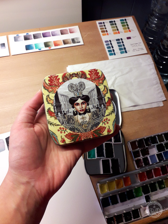

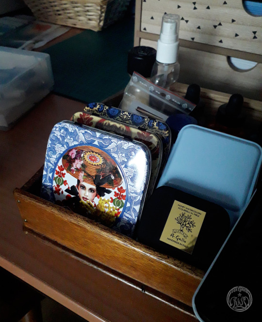
🎨 One of my favourite watercolour discoveries of this year came in the form of these metal boxes! The way I came upon them might amuse you.
When I was younger, there were free promotional tins included with purchases of period pads. They came in a variety of designs, making them collectibles, and were rather flat, to be kept in a handbag unnoticed.
Some of them were quite pretty. We kept about 10 or so of them, only the nicest ones, hoping they’d be useful someday.
As it turns out, they’re the perfect size to hold 11 full pans of watercolour paint. The edges have a lip, which makes them safe to handle, unlike some older vintage boxes I’ve come accross (I own an old cigar tin that is uncomfortably sharp) or even the sides of my main metal palette, which is only a few years old. And! If you have several of these and want to use them at the same time, you can slip the bottom part into the lid of the next tin and make a line of tins to save space.
Boy do they make me feel FANCY! Watercolour boxes in art stores are typically fairly standard and boring, but these? These feel special. And they were free. My family had them lying around for years, unused. I found so much joy in repurposing them.
The only downside I could find: my Roman Szmal Aquarius pans are a little bit tall. Magnets any thicker than the thin thrifted sheets I taped under them wouldn’t allow me to fit three rows in there, as I could no longer slip them under the metal lip at the top and bottom edges. Thankfully, my magnets are thin. They’re not tough enough for travel boxes, but I only paint in my office, so it doesn’t really matter!
#watercolors#reduce reuse recycle#aquarelle#metal box#painting tips#practical#watercolorist#art supplies#thrifting#my own posts#I actually really like nerding out about supplies and my paint setup#but I'm never sure if people want to hear about it
12 notes
·
View notes
Last Seen Blogs