#since there's some RGB shifting
Text
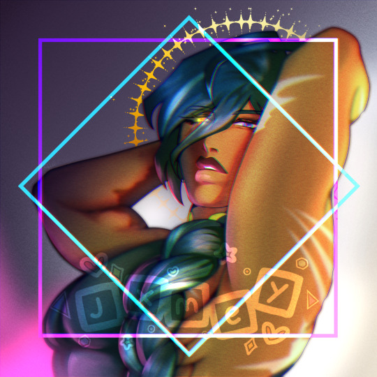
been a second so have a kaeya :)
#my art#kaeya#kaeya alberich#genshin impact#eyestrain#since there's some RGB shifting#plus bright colors#im not Too Happy with this piece but happy enough to post#i havent rendered in years so im very rusty#i need to watch more tutorials#and study more references
31 notes
·
View notes
Note
💙 drunken kiss / tipsy for nortrell pleaaaase?
tyyyy this was a fun one! 💕
Lando’s a handsy drunk.
It’s something Max has always known about him, ever since they were 15 and sneaking their first drinks out of Max’s mum’s collection in the fridge. Giggly, red-faced, high-pitched. Leaning all over him. Petting his fucking hair. Touching his face. It had only been a matter of time, really, until it escalated. They’re good at that.
Max isn’t fucking stupid, so he’s never let it progress any further. He’s got some sense of self-preservation. But once he’s had a couple of drinks, a bit of a snog never really feels like that much of an issue.
They’re drinking the same thing they always used to: pre-mixed cans of mojitos from the local M&S, the taste of teenage regret and an excuse to order an illicit McDonalds breakfast tomorrow. It’s been months and months since Lando’s had the time to come and stay like this, between the racing and his endless fucking holidays.
No matter how much time passes, it always ends the same way. The music on the CoD pause menu looping endlessly in the background, the RGB lights from Max’s keyboard shining green and blue against the side of Lando’s face. The armrest of his gaming chair digging into his chest as he leans over it, pulling Lando half into his lap.
Lando’s giggling into his mouth. He tastes like mint and sugar, fingers fumbling clumsily at the neckline of Max’s polo shirt. He’s balanced on the edge of a fold-out chair from the kitchen; he’s been whinging about how much it’s hurting his back for the last half-hour, but Max isn’t giving up his comfy desk chair in his own fucking house, thank you.
Max wobbles in his seat, head swimming briefly as the chair shifts and threatens to spin with their combined weight leaning against it.
The entire thing could fall to the ground right now and they’d just keep on kissing. The thought comes to him fully-formed and startingly clear amidst the rum-soaked fuzz of his mind. Lando’s making quiet noises into his mouth, little exhaled moans. He can't tell if it's the alcohol or Lando anymore, making him light-headed.
When they draw apart, Max wipes his mouth with the back of his hand, trying to calm the pulse of blood in his throat.
His bed’s right there. There’s another two cans unopened, sweating on the table next to it.
Surreptitiously, he shoots a glance at the clock on his stream deck. It’s still early. Plenty of time to make bad decisions yet.
74 notes
·
View notes
Note
Computer q. For otherwise identical monitors, is a 4000:1 contrast ratio noticeably better from 1000:1? I don't mean for fancy art but like if I'm watching a movie, could I see the difference in a dark scene? I looked into oled's, but those are expensive and I think the way I use my stuff would cause burn in.
I hope you don't mind, but I got carried away and answered pretty much every computer monitor question anyone has ever had. And since this turned into a whole thing, I thought I'd share it for everyone to benefit.
For a computer monitor I would say the most important aspect is actually the viewing angle. This is how far off-axis you can look at the monitor before the image degrades.
We sit very close to our displays and at that distance, even a change in height in your chair can affect the image. Move a little bit left or right and a cheap display could completely wash out and look terrible. And if you get a display that is 27" or above, even if you sit dead center, the edges of the screen will appear dark and washed out with a bad viewing angle.
The two best display technologies to get a good viewing angle are IPS (in-plane switching) and OLED. If you are interested in a display without these technologies, be sure it has a decent viewing angle. You can read more about viewing angles here and here.
IPS has very little concern for burn-in, but it is still a concern with OLED. In recent years OLED has greatly improved and image retention and burn-in can be avoided with regular maintenance. Displays will have pixel shift features and noise modes that work out all the pixels evenly. You can run these features every once in a while to prevent burn-in. You can also play special anti-burn-in videos on YouTube (full screen) to exercise the pixels to uniformity.
So if you don't mind the hassle, you can manage an OLED with low risk.
That said, OLED was almost exclusively for TVs and has only recently been introduced for computer displays. The current options are quite large and fairly expensive, as you alluded to. So if you are trying to stay within a budget, it might be best to seek out an IPS display.
Another consideration is resolution. Everyone is obsessed with everything being 4K now. But I think increasing the resolution brings diminishing returns with regard to increased detail you can actually notice. So if you don't mind going with a 1440p monitor (about 2.5K), you can save some money on resolution and get higher quality in more noticeable areas. Personally, I feel 1440p gives you a nice, noticeable bump in detail over 1080p. Whereas going from 1440p to 4K (2160p) is less noticeable unless you have very good vision.
Another benefit to 1440p is that video games are much easier to run on high quality settings with a reasonable GPU. And you can use technologies like super sampling (Nvidia calls this DLSS) to increase the detail you may lose from not going 4K.
The only concern I'd have with not going 4K is if you edit 4K video. It will be difficult to do a pixel level analysis of your footage otherwise. But other than that, you can still watch 4K content on a 1440p monitor and because it is being downsampled, you will still notice a nice bump in detail.
So if you don't have a reason to get a 4K display, I think 1440p is worth considering.
The next concern would be color. Or color gamut. This is how many colors the display can accurately reproduce. If you don't do any art or video color grading, you'll at least want something that does 95 to 100% of sRGB. That is the color space the entire internet uses. And if you are going to be watching HDR movies, you might want a display with a decent percentage of the P3 color space as well. Doesn't need to be 100%, but the higher the better. And for those who do art, a good percentage of Adobe RGB is recommended.
Also, many manufacturers offer displays that come pre-calibrated from the factory. If color accuracy is important, I would seek out one of these displays with a Delta E rating of 3 or less (lower is better).
A newer factor in displays is peak brightness. This is measured in "nits." In standard dynamic range (SDR), video only needed to reach 100 nits. Most HDR content is mastered to reach 1000 nits. In the future, that number will be 4000. And if micro LED technology ever becomes affordable, we may go up to 10,000 nits. But almost everything is around 1000 at the moment, so that is a good number to shoot for.
HOWEVER, because HDR is tone mapped (the brightness of your display is factored in and the content is adjusted accordingly), you can still get some benefits of HDR, even if you cannot do the full 1000 nits.
All monitors can do 100 nits for SDR content. But with more things being displayed in HDR, having more nits will give you a better experience. This does not mean your display will blind you. Usually bright stuff only takes up a small portion of the screen. But having more nits allows highlights to really pop and feel immersive. A lightsaber might actually feel hot and dangerous on a bright enough screen.
Computer displays are often rated as HDR400 or HDR600 or HDR1000 based on their nits. The HDR400 isn't great for HDR content. If you can do 600 or above within your budget, you'll get a better experience. If you are going to watch movies, this may be a feature you prioritize.
I know you mentioned contrast ratio, but I'm afraid that is a little complicated to answer. It can depend on other aspects of the monitor and the viewing environment. So I'll try to give you the info you need to figure out if the display you select will suit your needs.
Manufacturers can use tricks to fudge their contrast ratio in product descriptions, so it is best to go to an independent review website like RTINGS to see what they measured. (They do good TV and monitor reviews too.) You'll see that OLED displays are said to have "infinite" contrast ratio, due to being able to turn off pixels completely. Which means it is probably time to move to a new metric because that gives very little info on the dynamic range of the display (the difference between the darkest and brightest thing it can show).
You definitely want a decent contrast ratio for your display, but this can be subjective. If you have a nice bright screen, your brain may feel the contrast is fantastic, even if the actual darkest black point of the monitor isn't great. If something is really bright, then dark things will *seem* darker by comparison. And if you are viewing in a dark environment, the contrast will look even better. So this is where seeking out a professional reviewer's experience of the monitor can be helpful. One monitor's 4000:1 ratio might be a different experience than another with the same measurement.
Because TVs are generally larger and can have more backlighting zones, they can get decent black levels without OLED. But smaller computer displays have more difficulty in reasonable price ranges. So manage your black level expectations if you go with an affordable IPS display. They can get bright, but they aren't great at blacks like OLED. I'm afraid that is just a limitation of the tech. In fact, getting a brighter display might be preferable to a better contrast ratio. And it will be easier to see if you are in a bright environment.
Most IPS displays are going to be between 1000:1 and 5000:1 and while it does make a difference, if you sit it next to an old plasma or an OLED, you're going to be disappointed. So I would not make contrast ratio a super high priority with IPS, because non-OLED computer displays just aren't going to give you inky blacks. I would say 2000:1 or better is going to give you a decent experience. But, again, I would seek out reviews rather than trust the official product specs when it comes to the quality of the blacks.
And one final consideration you may want to factor in is the refresh rate. This is mostly for gaming. Most displays will give you at least 60 Hz or 60 "refreshes" per second. Gamers tend to like 120 Hz or higher. This won't affect movie watching very much as nearly everything except Gemini Man is 24 fps.
TLDR overview...
Get an IPS or OLED display for a good viewing angle. I personally feel this is the most important feature.
Choose a resolution. 1440p can allow you to increase quality in other areas to maximize your budget. Only get 4K if you have a legit reason or you have fighter pilot vision.
Color gamut or number of colors. Try to get 100% of sRGB for web content, 90% or above of Adobe RGB for art/photography, and 90% or above of P3 for HDR movies and video editing.
If color accuracy is important, look for pre-calibrated displays that have a Delta E of 3 or less. (Lower is better)
HDR brightness. If you want to experience good HDR, you'll want the brightest screen possible (measured in nits). HDR600 or HDR1000 are great. If you don't care about HDR, then don't worry about the rating.
Contrast ratio and black levels. It's going to be meh on pretty much anything but OLED. 2000:1 or better is a good goal to shoot for, but be sure to check independent reviews for the subjective experience of the black levels. Dark viewing environments help too.
Refresh rate. 60 Hz is fine for most things. Gamers prefer 120 Hz or faster. And if you are a competitive gamer, you may want to seek out more info on "variable refresh rate" and "pixel response time."
Pick the variables above that seem most important to you and then seek out a display that does those things decently within your budget.
77 notes
·
View notes
Note
Hello! If it’s okay, I’d like to know your thoughts on the Trikoto theory (3+ alters). I think it’s a cool theory! And pretty likely, honestly. (Here’s a document about it in case you don’t know what I’m talking about. I didn’t make it, and I unfortunately don’t know who did, I just found it in another blog)(I really hope that link works lol)
Hey FF! I was wondering when you might send something in. Not the topic I expected, but I'm here for it!
I've definitely heard of this theory before. I can't say I know for sure where it originated, but I've always been under the impression that a blog called @bertrandcaillet started it as they're the first one I saw talk about that theory and they told me about it a while ago. They've since deactivated, though, so I can't really check with them to see if that's true.
I think the trikoto theory is interesting, and I fully agree with what's said on the document about how it would be nice if Milgram is showing a system with more nuance than just having two alters.
That being said, I personally don't believe this theory for a number of reasons. I'm going to do my best to explain why here. I do want to say going into this that while I do have extremely minimal psychology teaching (as in, undergrad psyc MINOR), I do not claim to be that educated on DID or similar struggles. So, anything that I say will be focusing much more on Milgram as a piece of media from a writing standpoint, because that's what I have much more extensive experience in.
I will say that I am very aware that most systems have more than 2 alters. That being said, I think I also remember from my psyc class that the average number is, like... 16? I'm not at my dorm right now and that's where my notes are, so I can't check, but I remember specifically thinking about it in the context of Mikoto and trikoto theory, so I'm pretty confident it's Above Three. That means that either way, it's not like we're doing The Most Common Number, so I think two versus three is largely irrelevant on that point.
For the sake of clarity, I'll be using the names in the doc (Akakoto, Midokoto, Aokoto), but I only personally believe that two of them (Akakoto, Aokoto) exist. I've taken to calling them Orekoto and Bokuto, but for this post, Akakoto and Aokoto it is.
At its base, my problem with trikoto theory is that I don't see a lot of evidence for it. Most of what I've seen has been talking about the implications of it if you assume it's true, but I've just never really been convinced in the first place. I'll just go through some of the main reasonings real quick:
The RGB Colors
I do acknowledge that I'm very much not a visually oriented person, so the color shifting is something I'm less inclined to notice. However, while the background of the room is blue and the train station and apartment are pretty green, I don't feel like there are ever really any red backgrounds (other than when the headspace becomes red as ooposed to blue). Because of that, I have a hard time believing that the backgrounds themselves contribute to the idea that there are three. I definitely think the red/blue coloration in the eyes and such are indicating different alters, but I don't think that specific fact supports there being three of them.
The Voice Changes
This might be a me issue, but I only really hear two different vocal inflections. I understand the point about there being some harsher (?) sounding vocals that don't have the growl, but personally, I still think the tone matches the one described as Akakoto enough to count. Similarly, the parts towards the end that are picked out for Midokoto ("I'm probably not to blame," etc.) actually sound more like Aokoto to me even if I do try to track the three voices.
I'm hesitant to go too hard in believing the different voices because to me, doing so would severely limit the amount of control Natsuki Hanae would have over the emotions he wants to put into the song. The vocalists in Milgram do a fantastic job at using specific vocal intonations to convey deep layers of emotions in their songs. I feel like it would be very limiting to only be able to use certain vocal effects (ex. growl) in specific places due to the limitations of the characters. If there are two, the two voices are far more separate, which gives more space for customization within the bounds of each voice.
This is also a little bit iffier on evidence, but there's the Es cover of MeMe. I don't know how much Yurina Amami knows about Mikoto's story and the entire video is in grayscale, so take all of this with a grain of salt, but to me, I feel like Es uses two voices here, not three. Notably, they even have a bit of vocal growl on the "switch" and on "split and half, make that heart beat," which are both squarely in the Midokoto tone. They do still have the two voice split, sounding a bit more apathetic and aggressive in the Akakoto parts and cuter in the Aokoto parts. To me, that signifies that there's suppose to be two voices going on, not three, but you could argue that that's just Es' perception of Mikoto, so it's not decisive or anything.
Mikoto Fighting Es
Yes, in his first audio drama, Mikoto is able to beat Es up until Kotoko stops him. Yes, that's inconsistent from what we've seen from Futa and also t2 Amane. I agree that that's because the Milgram rules only apply to one or more alters, and thus any others that may exist can get around the rulings. We saw this between trials, too, with how Mikoto (seemingly Akakoto at the time) was able to avoid being restrained despite his guilty verdict, likely through the same loophole.
(Side note: this implies to me that Milgram's system for restraining guilty prisoners is, like the protective barrier around Es, somewhat magical and isn't a physical thing. Thus, if we were to, say, vote Amane as guilty, I am fairly confident she would be unable to harm any other prisoners, as we've already seen the barriers are able to prevent her from attacking others. I still lean Amane innocent anyways, but I wanted to point this out.)
Anyways, I don't think that this is actually evidence towards trikoto theory because it works perfectly fine with just the two of them. Aokoto is the prisoner in Milgram and Akakoto isn't. This doesn't necessarily mean that Aokoto is the one who was fronting while the murder happened, though; the rules of Milgram just necessitate that the prisoner is involved in/related to a death. It can be indirect.
I think that that's exactly what Milgram is asking us with Mikoto. The question is, how do you fairly hold a system accountable? Can you blame one alter for the other's actions?
Milgram loves to complicate these, and I can see the appeal of a complication being learning about a third alter. Personally, I think it's much more likely that the route Milgram is taking is looking at how much knowledge the alters have about each other and asking how much Aokoto would have to know to make him an accessory to Akakoto's murder plans. It could go either way, though.
Some Bonus Points
I think the strongest piece of evidence brought up is the use of threes in Mikoto's design. Other than "they just liked it aesthetically," there isn't much of a counterargument I can make about it. My best one would be that they might be going for a "switching between black and white" type of thing, which would work better with more stripes, but that's pretty weak. I also had the idea that the first character of his name looks like three stripes, which might be a better or worse explanation! You get to decide, I have no idea.
The cake sells me less, though. It's true that Kazui's is a perfect 50/50 and that Mikoto's isn't, but that's because they're representing different things.
Kazui's is half and half because his song is called half, and it could also be a sign of how he and his wife didn't actually connect more in a marriage sense; they're still two fully separate people rather than being a unit.
Mikoto, if he has two alters, is still physically one guy. Mikoto is mostly sitting on the flower designs. I'd argue that the flowers are meant to show Mikoto as a whole: the connection point of the two alters.
That's pretty much all of what I have to say on the doc (in terms of the trikoto aspect, whether I believe it or not there's some good work done in character/lyric analysis that applies to two or three alter theories), but I'll go over some of my reason for why I actively believe there to be two, because there are some reasons.
Reason 1: The Song Titles
The doc explains what the meaning of MeMe is in trikoto theory, but it definitely still works with two, more obviously so. That's not evidence, though, because the trikoto theory has a viable explanation too.
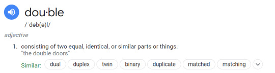
I have no idea what they'd be doing with the song title Double, though. I guess it would be a play on somebody being someone else's double, meaning they're someone like them, which is no doubt part of the song title either way, but I think it's difficult to ignore the meaning of Double that means, y'know... multiplied by 2, or:
But that could very easily be a diversion and we haven't seen the second video, so I'd let that slide. However, that brings me to the bigger problem:
Reason 2: Upright Versus Reversed
AKA, the tarot cards.
Tarot cards can be read two ways, Upright or Reversed, based on the orientation of the card when it's placed/picked up/whatever. I already went over in my original theory (which is pretty outdated, I could do a way better job but I wrote that one literally first out of my milgram thoeries and I hated not having a good name scheme for the various alters) why I believe Akakoto to be the Hanged Man (Upright) and why I believe Aokoto to be the Hanged Man (Reversed).
I struggle to imagine why the devs would pick tarot, something that clearly has two meanings to it, when there are actually three alters. Maybe it'd just be to throw us off the scent, but it feels a bit too intentional to me.
Plus, if it was meant to throw us off, I'd expect we'd get a different metaphor/symbol for the second MV (as we have been with pretty much everyone). However, the association between Mikoto and "reversible" things has continued into trial 2, even before his MV has come up.
I say this because of his trial 2 cover song: Reversible Campaign. Funnily enough, I actually thought this song would go to Kazui before it was announced as Mikoto's, but then I looked again and understood why they wanted it for Mikoto.
My thoughts get confused and fight with each other
Very Mikoto, works for either two or three alter theories. However:
I just want to waver between black and white
It's turned me upside down
There's more that seems to paint Mikoto's mind as a dichotomy, not a... trichotomy? Is that a word? I don't actually know.
The Song Lyrics of MeMe
This is sort of an extension of the above part, but there are also definitely song lyrics in MeMe that sound like they're heavily implying two. Again, you could argue that that's trying to throw us off the scent, but some of them are, in my opinion, actively difficult to justify for trikoto theory.
Split in half, Make that heart beat
I cannot for the life of me understand why any of the three alters would say "split in half" if there are three. I guess if any of them were aware of one of the other alters, but not the other? I don't think that's what was being argued, though, sorry if I missed that.
I’m already the fake one
Little harder to argue this one because I don't know how definite versus indefinite articles work in Japanese, but saying the fake one really sounds to me like there is one fake and one real. If you were just having a moment of existential crisis, in most situations, I think you'd opt for "I'm already fake."
The Mirror
This is sort of the same argument as the tarot cards, but there's also the use of mirror imagery in Mikoto's MeMe MV. Mirrors have two sides and are a reflection. You could use Haruka logic and say that it depicts self reflection, I guess, but considering the reflection acts differently, I think it's much more likely that this is meant to show the two alters.
Conclusion
Hopefully this all made sense? I respect trikoto theory and I could easily be super wrong about it (see also: my original opinions on gay Kazui theory and police Kazui theory), but I've just never really been sold. It's possible my opinion would change if I saw evidence that I felt worked better for trikoto than... twokoto? theory, but personally, I feel like most evidence I've seen for it is still better explained by there being two alters. Let me know what you think, though :)
#milgram#ミルグラム#mikoto kayano#milgram theory#admin venus#we talking about mikoto again!#makes sense considering his video's coming up next#MeMe was the first video that i saw the day it came out#so that's kinda exciting for me#also i strongly doubt you're out there anon who asked about mikoto having potential childhood trauma bc DID is VERY heavily related#but if you are i'm sorry i haven't responded i am so no thoughts head empty on what it would be#i suspect there probably is trauma there bc DID is SO frequently connected to childhood abuse but i simply don't have any answers in my min#also hi ff welcome to milgram again :D
59 notes
·
View notes
Note
Hey sorry if someone has already asked this but how do you get your photos to have the black background and then it look pink? And do you use a hq mod to get high quality?❤️❤️
hello, I hope all is well and you're perfectly fine asking this! 🤍
so how I achieve the black background and vibrant color photos is from a tutorial by the talented @nectar-cellar , which you can find here! In this tutorial, he details how to achieve this setup in-game, which is so good! you can find the lights that were used here and here, I have them reuploaded due to them being hard to find!
Another thing I want to note is that I use custom light colors sometimes, which are relatively easy to set in-game, since these lights are invisible in live mode you have to do it in build/buy mode, to do this:
Shift-click on a light > click set color > it'll ask if you want this color for all lights in the room, on the lot, or just the one light (this is complete your choice here) > then click custom color in the options area > here it will be asking for a color that is based on RGB, some examples:
crimson (220, 20, 60) | orange-red (255, 69, 0) | indigo (75, 0, 130) | lawn green (124, 252, 0) | These of course are just examples, but you can make any color you want here!
When it comes to setting up my "high-quality" game, even though I feel like it runs like a potato most days, you can follow this tutorial here! HQ mods are just a matter of switching a couple of numbers around in your graphics rule to create a better-looking game!
One last thing I want to mention is that Gshade/Reshade can be a lifesaver for helping the colors become more vibrant, so I do recommend exploring those programs and seeing what you can come up with!
I hope this long-winded explanation helps! If you have any questions, please feel free to message me! 🤍

13 notes
·
View notes
Text
Day 11- Escape:
This is an alternate end to day 8’s prompt of ‘role swap’ with Click and RGB; and a bit of Dial.
Note: aka what if Click didn’t abandon RGB in the role swap. I’m still fascinated by Click and RGB’s interactions and the swapping the role thing was making me think some more so this happened.
~
Click had grown accustomed to his hero’s eccentric ways.
And since the hero was able to keep up with what was thrown at him, despite his cowardice flaring up now and again, Click continued to cover for him when faced with the enemies of this world with his long range weapon attacks.
However, the longer they travelled, the more a sense of unease rose up, which Click mercilessly shoved down. But he couldn’t deny that while things were going well, it was unfortunately almost exactly the same as Click’s own journey as a hero.
It didn’t bode well for them, but there was no turning back now.
Click continued to watch his hero’s back. At times, the hero was able to point things out in a new light that Click himself hadn’t noticed the first time around. Sometimes it led to easier paths to take. But nothing either of them did was enough to save the world as it fell apart around them, and sooner than Click liked, he and his hero faced Her.
They failed.
Click and his hero both were broken.
Click wasn’t certain what it was that made him act as he did next. All Click saw was his hero in danger of being completely removed from this world of make believe, instead of being merely trapped within this place. Most unfortunately, the hero’s words had run away from him, angering Her at the daring this hero still held.
Perhaps being erased from the world would have been a kinder fate, were it not for that irritating fondness for the fool that Click had been unable to shake off entirely.
This foolishness allowed Click to get up despite his broken body not cooperating with him, weapon dangling from one of his arms. But move he did, Click’s good arm unfolding to allow it to help launch himself haphazardly through the air toward his downed hero and Her.
A wild daring had enter him with this stupidity.
Click didn’t think too deeply on it as he snapped his false head backward to shoot a blast at the ground close to his hero, in order to send him tumbling back a short distance. Click himself landed where the hero been before, metal creaking throughout his body.
Despite his injuries, Click’s hero still had enough left within him to speak cheerily, if deliriously.
“That’s the flair you needed!” The hero exclaimed, before he groaned and rested his head on the ground, prone.
“You never know when to shut your mouth.” Click jammed his broken arm weapon-first into the ground in order to keep himself upright and not falling over like a broken toy. “It doesn’t help that I’ve unwillingly grown fond of your inane chatter.” Golden button eyes glow, Click’s body shifting as he turned to face Her. Multiple mouths twist in pain and distaste. Click did not speak; his actions should be clear enough, and She seemed understand what he wanted, yet She waited for Click to say it himself.
“I will be heard.” Click straightened up as best he could, shoulders held as straight as the metal allowed, chest tilted up so Click could look at Her properly. “I am the one who failed to choose a hero who could do what I was unable to. If there won’t be any further chances to find another, then take your frustrations out on me however you need.” Click’s arm trembled, but he held firm. “If my hero is unable to return, then perhaps keeping him here could serve a purpose? Either in my roles, as a kind of guide to a hero, or someone who can assist a hero alongside me.”
A long shot.
Click doubted he could sway Her one way or another. His and his hero’s fate had already been decided the moment they failed.
She is quiet, until She told Click to come forward.
Click noticed with trepidation that his hero is gone from the immediate are, but said nothing as he approached and waited.
Sheer agony and relentless pain assaulted him from out of nowhere as the agony wracked him so terribly his vision whited out.
Click thought he may have heard Her tell him to not fail again, or he’d face a final end instead of his next hero. When Click came to, he’s missing his right arm.
A reminder.
The tin soldier moved slowly at first as he went on his way to go back to find another hero. While Click travels, he ended up coming across his former hero.
No words are spoken apart from a tip of that dragged boater hat, while Click gives a jerk of his false head in a nod.
His hero did not recognize him.
Click wasn’t certain why that bothered him so much. His former hero was alive, in a sense. Wasn’t that better than the alternative?
It was an escape of sorts, to be ignorant of how you came to this place and failed, despite trying the best you could.
Unlike Click, who remembered everything, unable to barter memories away. It was as if they were locked in place within him.
The pain of being torn up.
The agony of metal being ripped apart.
The current state of his body made it difficult to maneuver about, gaping holes in Click’s body here and there.
Tattered, worn out.
A visit to the Market was necessary, but after he fetched a new hero.
Whether it was his last chance or not, Click went on to find another hero. When he came back, Click brought with him someone almost as insufferable as his former hero (now going by the name RGB, Click had been told). The man with Click now was tall, wore a golden necklace, loose clothing and held a laid back attitude with the addition of being a chatty bastard just like RGB had been, though the inflection and mannerisms were different.
When the two visited the Market, Click chose to ignore the pang of disappointment and twinge of guilt over RGB not recognizing him.
A price to pay, to keep his former hero safe from Her.
As an entertaining little bonus, RGB and Click’s current hero absolutely loathed one another, despite the general pleasant demeanor when the two spoke to one another before continuing on. But the amusement did little when Click began to see more and more the futility of being the ‘hero’ of this world. And Click was trapped within this world of make believe along with whoever he ended up bringing back with him as the hero.
A small part of Click still wanted to have that ‘hero’ title for himself again.
And he would.
Click would take it when the moment seemed right, with the hero who would come closer to bringing Her down, and preventing this world from coming to an end. His current hero wasn’t going to cut it; as good a people person as this man was, and as adaptable as he was, there was doubt and uncertainty growIng, and taking root. He may last until the end, but Click wasn’t holding his unneeded breath.
…Click hated it here, but he would be patient. He had all the time in the word, and so long as he could prevent himself from being erased from this world if he failed again, he could have that chance to hold the title of ‘hero’ again, and end this nightmare.
#the property of may#the property of hate#tpoh fanfic one shot#tpoh click#tpoh rgb#role swap au#Oop falling behind the days again#tpoh dial
12 notes
·
View notes
Note
how do you do your sparkly gifs? they are so cute!
thank you!! (I think someone asked a similar question in an ask I haven't awnsered yet but I'll awnser this now 🤔💗:) so first I take a mlp episode & clip the moment I want to make a gif of (usually export as mp4 just 'cause I think it's easiest) (I use shotcut) then I:
open the clip in photoshop, put a pretty gradient over the the clip, set the blend mode to linear light and adjust the opacity
then put a matching solid colour over that and set the blend mode to hue & render/export the mp4 clip
throw some glitter on it! ✨✨✨✨ (I usually go to giphy and type in glitter/sparkle/snow/stars or something like that + transparent) throw it in a video track over the clip and adjust the size/position of the gifs and copy paste it like a billion times so it's the same length as the clip, perhaps adjust the blend mode of the track to screen or something (I use shotcut for this as well)
export the clip again :D
open a new project in shotcut and drag the clip with glitter on it in ♡ then I use a rgb shift filter and adjust it how I want, then export again (still as mp4 because if you export as gif animation in shotcut the file size will be ginormous for some reason)
go over to ezgif.com and convert the video to gif (yessss I know I could use photoshop for that but that's way to slow and I'm impaicaint)
post on tumblr! or bring it back into shotcut and put a song over it or something (but in that case I'd skip the conversion & just use the mp4 since it's higher quality)
so that's pretty much it! ^^🔮💖🔮💖🔮
I came up with it because I was making a slowed version of becoming popular and I wanted the video to look cool so I meesed around with it in photoshop and made it like all purple and then at first I made it look like an old vhs tape by adding noise and stuff but then I was like nah I already did that with the flawless song videos I want to do something different and then I was like hm when you put too much reverb on stuff it kinda reminds me a bit of snow globes because it sounds kinda spacey and all jingle bell like and when snow falls in snow globes it falls like... slowly! or something so it fits! and I was like hm if I put glitter over this it'd look kinda like snow! 🌨 so I did that and I thought it looked pretty but it felt like something was missing and then I thought about the "you're a toy maker's creation trapped inside a crystal ball" lyric from pinkie's bard ('cause crystal ball & snow globes are kinda the same thing almost in a way I think) and crystal stuff is pretty!! (and reminded me of rarity so it fit her song well 💎💎💎💎💎) how do I make this look crystal-y & as if it's inside a crystal snow globe thing?? 🤔 and then I was like AHA! the rgb shift thing that I had almost used for the vhs effect! THAT looked kinda like crystal!! and then I put it on the video and I thought wow! this is pretty cool isn't it?! 🔮🔮🔮🔮🔮
p.s. sorry for rambling incoherently and overusing a bunch of words but I was just really excited to talk about this and I don't feel like proofreading and correcting today 😅😊
♡ sfw interaction only ♡
21 notes
·
View notes
Text
Hey, you. Yeah, you. The artist in the back with the wack-ass color theory. I'm talkin' to you.
Let's talk, for a moment, about complementary colors. A lot of people get taught a really dumbed down version of this concept when they're new to art, and I wanna expand on it for anyone who may need it. So, the way it's typically explained to new artists is as follows:
Complementary colors are hues that have the highest possible contrast to each other, and thus reside on opposite sides of the color wheel. When they are mixed together, they produce a gray color. Following a color wheel with the distinct colors of red, orange, yellow, green, blue, and purple, the complementary pairs are:
Red - Green
Orange - Blue
Yellow - Purple
The thing is that this is an oversimplified model that is primarily based on mixing paint using red, green, and yellow as primary colors. Things shift quite dramatically if you look at an actual smooth color wheel incorporating the full color spectrum, or you utilize the standard printing dynamic of cyan, magenta, and yellow as the primary colors. Here is a true additive color wheel, like you might find in some art programs:

If you look closely, you'll notice that the pairs depicted here are actually the following:
Red - Cyan
Green - Magenta
Blue - Yellow
So does this mean that the previous, simplified model is incorrect? Well, kind of, but not necessarily. It really depends on what you're doing, and I don't feel like I have a strong enough grasp on that part yet to do a full breakdown of specific use-cases for each model. I'm pretty sure the difference mostly has to do with medium, since the former model is based very specifically off of mixing paint with an RBY primary color setup, while the latter is based on how monitors work and the standard printing model for color mixing. At any rate, if you've been trying to make complementary color palettes and they've felt off, this is likely the precise reason why.
I don't really have any further conclusion or specific thing I want you to take away from this post, by the way. This is just a little piece of color theory that I think all artists should know, but many don't. Color theory is a very complicated and interesting part of art that I think a lot of people take for granted and don't understand well because they didn't have teachers that bothered to explain it in enough detail.
P.S. - If you haven't already, look into different color models, how they work, and what makes them functionally different from each other. RGB vs. RBYK vs. CMYK, and additive vs. subtractive color. Also look up color relativity. It's extremely useful to know these things, I swear. You may not understand yet, but you will in due time, once you have become acclimated to the dark sciences of color theory.
I may or may not write rambling posts about how light and pigments work, and how colors change when they are put next to other colors some other time, but not right now. This post is long enough as is, so for the time being, telling you to do your own damn research will have to be good enough.
#art#not a personal work of art but rather a post about art sorry#color theory#complementary colors#my favorite complementary pairing is probably fuchsia and teal
3 notes
·
View notes
Text
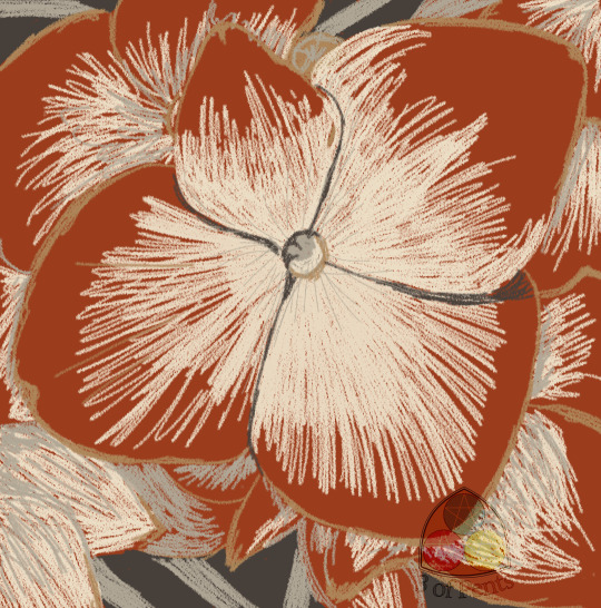
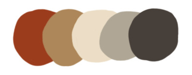
100 Palette Challenge // Palette #9 // Blood Red Hydrangea
Today's palette comes from a poster for Cornell University from 1908.
This is an interesting one because you can compare it to Cornell's current branding colors.
Babbling about branding and my blood red hydrangea bush under the cut.
You can see all of these colors except for the tan included in that guide, though the RGB/CMYK values are different. For totally understandable reasons. The palette in the book was color-picked directly off of the poster, and on the one hand, the artist who designed the poster would've had to mix their paint or ink to match Cornell's signature red as closely as possible, without having the precision of just digitally color-picking. On the other hand, the poster, like I mentioned, was printed in 1908, and it's entirely possible that the brand colors have shifted and been refined over 100 years later, especially once color printing became more standardized and digital design tools became easier and more popular to use.
But that's really about the red, what they refer to as carnelian. What interests me even more are these secondary colors that appear in this 115 year old poster, that appear in Cornell's present-day brand book.
The "sea grey" (the second-to-last color) I can explain, since the poster is of a baseball player, and the grey is the main color of their uniform and, looking at some photos, it's very similar to their current uniform. And since sports uniform colors are branding, it makes sense that they would've incorporated that into their brand book.
The other two, though? I do wonder if their sense of branding was that strong even in 1908 and it hasn't fundamentally changed in all that time. Or if this poster artist just chose colors that would make that red really pop, and whoever did their current brand book had similar thoughts.
Anyway, that's enough musing on branding. I bring you another flower from my garden.
We planted a baby hydrangea bush when we first moved into this house. When we bought it, it had these dark, rusty, dark red flowers, and the tag claimed that it was a red hydrangea! I love hydrangeas, they were the main flowers in my wedding bouquet, and I desperately wanted a hydrangea bush. And while I love the pink/purple/blue classic hydrangeas, this one was so unusual that I couldn't resist it.
Now it's typical for a newly planted hydrangea to not bloom for a couple of years, so while it grew a lot, we didn't get any flowers. Until this year! There are two little bunches of flowers that just started opening last week.
And they're purple.
Now I'm not disappointed! They're beautiful. And it's not like we paid more for this bush than we would've for a normal bush (they were selling both for the same price). I'm just confused. Because it absolutely DID have red flowers when we bought it and it didn't say anything about special care to keep them that color like you need to do if you want specifically pink, blue, or purple. It's just odd.
But so I took a picture of the flowers (because they're so pretty!) and since that original red color was so similar to the one in this palette, I decided to redraw them as they might have looked if they'd come in the way they were expected to.
Overall I'm really satisfied with this piece, I really enjoyed playing around with the charcoal pencil brush. I wish I'd treated the tan and dark grey as more shading than an outline. But that's all part of what this challenge is for.
4 notes
·
View notes
Text
Brushes I use!
Couple of people on tiktok asked me abt my brushes settings and such, and I tought it would be a good idea to have a list of my most used brushes and resourses here, since even I forget what I use to draw some specific things [I download hundreds of brushes and then forget wich ones i liked the most u u]
Some of the following materials are listed an linked, others you can get them by clicking on the images!. I recommend to check this post on desktop instead of mobile because of it.
Brushes I made:
I mostly use these to sketch! specially the crispi one and pynk for coloring. The deco dots one is a must on muy works


These are some of the gradient maps and autoactions I like to use the most!
tokki assets: 1735477
Raiku RGB Shift: 1751433
Heaven gradation: 1898960
Yunywave★ Gradient Set: 1721414
Auto Line Color: 1914696

I really love bunnyclvb brushes and use the most of them to doodle or paint on some of my sketches:

Sunday being one of my favorites.

For patterns/tones/and other manga efects I mostly use these:
By 苺あんここ : Material
Hand-drawn Shadow set: 1966096
Brush collection to fill the margins: 1758934
55 kinds Retro Pattern: 1946890
Paint seamless with brushes 56 species: 1946152
Doodle G: 1860221 <- Edited it with a custom brush tip to give texture
Pens & Brushes_Ver.1.10.9: 1842027


And lastly some other resourses I found useful:
Planar Head: 1978967
3D Women's Hands: 1977398
3D Male Hands: 1970713
The Only Perspective Grid You Need!: 1807950
No gaps close and fill: 1759451
Materials by: 쿠키베리

Im really bad at explaining things but hope this list can help!
4 notes
·
View notes
Text

Huevember 2022 day 21. Self-care dragon reminds you to drink water.
My sister told me in a message that I should design more dragon stickers, but ones that say "drink water".
Used an Asian dragon since they are more associated with water and can breath mist/water in mythology/folklore.
11/21/2022. Sketched in Platinum Preppy fountain pen, using Noodler's Ink. Text written with Copic Gasenfude brush pen.
.
11/21-22/2022. Practicing learning digital drawing and Krita. Started with 3000x3000px canvas, 300dpi, CMYK color mode. Used color picker on a Huevember 2020 reference chart of each day’s challenge color to get #2CA4D9. Even though I had recently learned about and started using the Bezier tool, I drew this with Stabilized freehand brushstrokes instead. Still using my cheap, wide-tipped, capacitive stylus, since my active stylus is out of batteries and my mouse is inconvenient to dig out. Uploading to Tumblr automatically changed the image to RGB mode and shifted the colors to a different set of colors.
EDIT 6:46 AM 11/24/2022: Replaced previous CMYK image with an RGB version. I'll keep the CMYK version for printing, but I wanted to post something nicer for online. Also raised Saturation levels of some lineart colors, to match the new RGB version of Huevember day 21's challenge color #16b4fe. Also changed background color to a pale blue that better matches RGB: #93eeff.
#huevember#huevember2022#dragon#drink water#water#self care#drawing practice#asian dragon#cloud#dragons#md3origart#bichrome
3 notes
·
View notes
Text
Ummm so I fell asleep high the other night and ended up having a pretty fucking realistic lucid dream?? Weed usually keeps me from dreaming and I haven’t went lucid during a dream since I was in like 2nd grade? More about it under the cut, ig
I’ve never attempted lucid dreaming before because I find it a pretty daunting task for some reason. It just never interested me, which most would maybe find surprising. But I did do a short mindfulness meditation before falling asleep, so maybe that had something to do with it. Wild. I literally never do sleep methods during shifting attempts, as I prefer awake methods + I’m taking a break from shifting rn.
Okay, so, I fell asleep high as giraffe pwu$$ay on edibles this past Friday night after surviving a stressful week + working fulltime. So, then I begin to dream, which is surprising asf! Weed usually keeps me from dreaming (or it just keeps me from remembering my dreams if it’s true that we dream every night, but ANYWAY -) it’s a surprise to me that I didn’t just fall into a dreamless sleep like always. Or when I do dream, it’s just some nonsense. I did do a 10 minute meditation shortly before falling asleep, so I guess that had something to do with it.
So, my lucid dream begins with a pinprick of bright white light in the darkness. Then it gradually increases in size and brightness until it completely overtakes my vision! It didn’t even hurt my eyes?? My eyes are usually pretty sensitive to rly bright light, so this would have hurt. But it was just pleasantly warm??? And it oddly had an old analog tv screen overlay? Like when u stare at it for too long and you can see the RGB color overlay. And then, the bright light lasted for a short while but I still got to rly gaze at it.
This is when I went lucid! Something then told me to start visualizing and affirming and then, gradually, a variation of one of the scenes I usually visualize during my shifting attempts gradually began to fade into view, starting in the dead center of the white light. Something told me to just let go and I just did. Without a second thought. I then began to speak, and guess what! I spoke in my desired voice! And one of my comfort characters was there! And it felt so realistic for a dream. It only lasted for a few minutes but yeah, I genuinely think this dream was from my guides letting me know exactly how easy shifting is and that im over complicating it!
DISCLAIMER: YOU DO NOT NEED DRUGS TO SHIFT, I AM A MEDICAL MARIJUANA PATIENT WITH AuDHD
#dream tag#dreams#reality shifting#occult tag#bleats#law of assumption#astral projection#holy shit I hope this inspires someone I guess?
1 note
·
View note
Text
End of the Year 2023! The Games I thought were kind of bleh.
The Mehs of 2023
I decided to start things off with a relatively inoffensive idea. Once again for your personal enjoyment and perusal I offer you the Top Ten Meh Games I played in 2023.
10:BlazBlue: Entropy Effect
It's a side-scrolling hack n' slash roguelite affair. It's pretty decent, and I check it every couple months to see what changes they make, and it's been pretty good with the most recent updates. Admittedly I played this for very shallow reasons. It's got Blazblue characters in the game, and that was enough for me to give it a shot. If it didn't have them I probably wouldn't have given it the time of day, but it's got Ragna, Noel, and Hakumen in it, so I was interested. Sure, I apparently am not "a real Blazblue fan," (my favorite Blazblue game is Crosstag, and the only other one I played was Continuum Shift way back on the Xbox360, I think I played one on the 3DS as well?) but I enjoy this game pretty decently.
09: The Callisto Protocol

I played this one at the very end of 2022, and I actually had some small consideration to putting this on my top ten. In the end I decided against it, because I played it a little bit more at the start of 2023 and I felt myself getting more and more fed up with the game as I played it. It's fine. There are some rather amusing combos you can execute over the course of the game, but overall I just recall feeling basically nothing as Callisto went through its story. I don't know if there's any real intention to make a franchise of The Callisto Protocol, but if they do I feel pretty confident in saying there's nowhere to go for the series but up. The game has a very solid foundation it can build off of, and I would be interested in seeing where a potential sequel would go from the first game. Not every horror needs to be a psychological horror thing, sometimes it can be just as effective to have gross goopy monsters try to violently and bloodily murder you.
08: Diablo IV
I admit that I went into this one expecting it to not be particularly great. I haven't been a particularly big fan of the Diablo games for the past decade and a bit if I'm being perfectly honest. Around the time of Diablo IV's release I distinctly remember being particularly let-down by Diablo III, and being absolutely flummoxed by Diablo Immortal. So morale wasn't particularly high for IV upon its release. Despite knowing full well I probably wasn't going to have a wonderful time with it I bought Diablo IV regardless. My problem with the gameplay of Diablo IV is it's just kind of dull. In the thirteen years since the release of Diablo III there has been a lot of improvements that other Action RPGs have made to the genre. Diablo IV plays its own game it seems and largely just plays a lot like D3 while ignoring advancements that other games in the genre have implemented. I admit that maybe my issues largely stem from the fact Diablo IV decided to go entirely open-world and try to lean on an MMO style of gameplay. Although there was one thing the game did that I found genuinely neat. If you have an RGB keyboard the game actually takes advantage of that to dim and illuminate keys when your abilities are either on cooldown of available for use. This is another one of those "I'll probably go back and finish it next year," games.
07: Atomic Heart
More like Atomic Fart! I then proceeded to spend the next eleven hours patting myself on the back for this masterful display of wit that has never before been seen on the internet. Really though I tried playing this game for over two hours, and every time I played it I was just overcome with an intense desire to be doing literally anything else. What didn't help was that every time I played the game the thought of "man, I wish I was playing a game that didn't have bullshit gun leveling in it" also entered my mind. Yet every time I wound up playing Resident Evil 4 instead, shrug. Who the hell knows, maybe I'm doing myself and the game a disservice by stopping at two hours and fourteen minutes, and the game will be an absolute masterclass of wonder and design. But given how every single thing I've ever heard about the game is simply the horny fridge I don't think I'm losing anything by cutting our time short.
06: Hololive Error
Perhaps it's because I'm getting older but I don't really have a lot of patience for the walking sim variety of horror that crops a lot these days. At least it's not a jumpscare marathon where every time you get caught by the ghost vtuber the game screams at you. I just don't jive with these types of horror games I think, I just don't find them particularly scary. They lack that certain energy that really lends a game a sense of dread. There's also the fact the game glitched out and broke a few times across my playthrough that I think affected the spooky ambience it was trying for.
05: Fairune
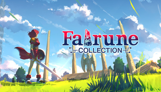
It's fine. Kind of boring if I'm being perfectly honest and I absolutely hated the final boss because it changes to a completely different type of game than it had been up until that point. I bought it as part of a collection with the other Fairune games, but if I'm honest I probably won't play those. It's a retro style RPG sort of in the visual style of one of the oldest Zelda games. Instead of having to actually press a button to do combat, or getting into a battle system you simply instead run into your enemies. If you can't hurt them, you bounce off, if you can hurt them, but you're underleveled you take some damage, and if you're stronger than them you just plow through them with nary a pause in your stride. Since it styles itself like a retro game the game is cryptic and vague about what to do, and where to go. Even with this lack of handholding however you can and probably will finish the game in less than five hours. The problem is I just found it pretty dull, and felt it wore out its welcome by the final boss. I briefly entertained this for the bad games list, but honestly it's not really, I just wouldn't recommend it for anything above a sales price of five dollars.
04: Starfield
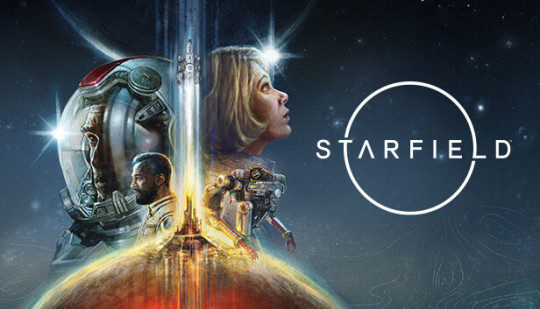
I kind of feel like this one is cheating because I admit I really didn't put too much time into it. Perhaps the game really picks itself up after the opening five hours, I don't know, and I really have no intention of finding out. After the first time you find yourself in a space dogfight I was hit with a sudden and intense feeling of dear god I would rather be playing literally anything else. Because I know that the game is not going to be just this, it's going to be the usual boring Bethesda first person shooter combat they've been putting out for their last three games. I don't want boring ground combat I want thrilling space combat, and I know I won't get that here either. So after another couple of hours of trying to find the fun in this game I decided simply to move on. I wonder if my feelings would've been stronger in either direction if I'd been anticipating the game at all. Nothing about any of what they had shown prior to release made me excited, it just made me give it a dismissive "okay," before moving on to something else. Usually the next announcement or teaser trailer for whatever game was coming up next, because I never searched out Starfield information I only ever saw anything during the various video game presentations.
03: Ghostwire: Tokyo

I feel bad relegating this to the list of the mehs. For the first few hours I was having a grand old time with it. The combat was smooth, the graphics were nice, the atmosphere was lovely. Problem is that eventually I just hit a point where I decided I was done with it. Some of the monster designs are neat, but really that's all that stands out as particularly good here. The gameplay is fine, I remember the movement feeling really nice as you make your way around Tokyo. But it's a bit thin, and I don't think it was very fun.
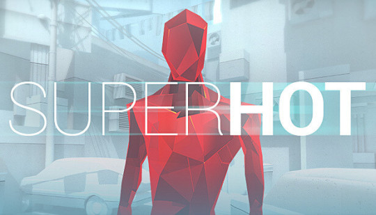
02: Superhot
A controversial statement to be sure. Superhot, in the meh games list?! Why with its unique gameplay how could I dare? Because I didn't like the story constantly interrupting the gameplay that's why. If there were less story and more shooting I think I would have liked it a lot more.
01: Tron: Identity
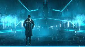
It really breaks my heart that the game is simply… fine. It truly does. It has so much going for it! A wonderful art style, a good premise, a nice ambient electronic soundtrack, but unfortunately it doesn't save this game. The story is a moderately interesting one, but the game really doesn't use it to any great effect. It just sort of meanders around until you stumble your way into one of several very unsatisfactory endings. I don't know what it was specifically that hampered down the story, because the writer for the game, Mike Bithell, has written some amazing video game plots in the past. Perhaps the game would have been better if the puzzle mini games were more interesting and varied, I can't say. As it stands this is just a crushing disappointment. The seeds of something great are there, it just didn't do anything to actually make it good, and that's incredibly disappointing.
0 notes
Text
+ go to test out keyboard, it doesn't work. Think it's the computer because the "gamer mouse" that Jamie unearthed (and refuses to use because it's a wired mouse) just stopped working. Nope. My dumb ass forgot to cut the keyboard on.
+ I wanna art. But I don't wanna art. I don't know what to art.
+ Jamie's bonus mom kept apologising yesterday for not having my gift (delayed shipping) and I'm like "but I don't need anything??? isn't seeing y'all for five minutes gift enough???" Especially recently since we haven't been able to go up and see them. And then she turns around and hands me a bag with fuzzy socks. Fuzzy socks! I love fuzzy socks.
+ Looking for the Golden Girls pens we'd purchased...years ago...for a friend and I found the giant Cheshire funko pop stuffed in the tote with a bunch of random shoes. Why do we have a tote of shoes?
+ Have finally taken the little wireless usb thingies out of the back of the computer for the keyboard and mouse. I'mma miss that mouse. That was a cool fucking mouse.
+ Jamie is very much weirded out by the "gamer mouse" because it's got shifting RGB lights in it.
+ I have been spending time just going through buckrec's blog and re-reading a bunch of stuff they have linked up. Which is super awesome for when you can't sleep for shit.
+ I'm really, really hoping that some of the work crazy slows down a bit. But, as the local cave goblin, I know that the following days (couple weeks) is going to suck for me. But, hopefully there won't be as many tv returns as there are right after the Superbowl.
0 notes
Text
thinking out loud about art process/medium
pros of tablet (screenless):
-no art supply costs after initial cost (in my case it was like 80 bucks cause i use an old bamboo pen&touch)
-hand doesn't get in the way of seeing
-1 physical tool for everything (pen)
-can resize, undo, erase ink, and very importantly use bucket tool
-coloring is easier (see bucket tool)
-hotkeys (ctrl-z....)
-no need for scanner, digital only takes up less physical space
-pattern brushes! 3d models! assets!
- rulers, grids, snapping etc. shift for straight line, line tools
-change colors easily
-choose canvas size arbitrarily and at any resolution i want, plus cropping and cutting, copying, pasting etc.
-screen doesn't need a light on to see (at least not these days lol)
-text tool
-some tablets come with free software bundles (mine came with photoshop and corel, though not the new ones lol)
-if tablet is durable, may be cheaper in the long run (my first lasted about 5 years? i think? only busted because cable got damaged; current one is still fine)
-weird filters and effects, blur, etc.
-bitches love layers (i'm bitches)
-i can resize shit when i inevitably fuck up proportions
cons:
-upfront cost is expensive if it breaks (tho there are more cheap options on the market now)
-less intuitive for my brain-to-hand connection and coordination personally... harder for me to recreate lines digitally --always impressed by people who can follow their sketch precisely cause it's literally impossible for me 😂 i've gotten better at the intuitive stuff since i first started 10 yrs ago but it's still always a liiiittle awkward haha... but tbh this is still true for traditional to a lesser extent
-i get tangled in my cables a lot 😂
-digital storage on pc only, have to have printer for physical copies and colors can come out weird since i draw in rgb lol, risk of deletion or file loss or corruption
-using refs can get cluttered on only one monitor
-handwriting becomes even more illegible and calligraphy pens are kinda meh (at least defaults are)
-hand hurty because cramped space
-future...? longevity not any clearer than physical media tbh. might last forever or might be gone in an instant, even before considering future of technology... shrug! lol
-screen colors and brightness?! girl help my art looks different on every device i own 😂
-if you forget to save it's gone (luckily i save compulsively)
-csp text tool kind of mediocre tbh
-companies want you to buy new programs, stop supporting old ones, charge subscriptions, etc etc etc....
pros of traditional art:
-tactility and naturalness of hand on paper makes lineart and stuff a little easier--i'm still not very coordinated though so i still have issues with this regardless of medium...
-can look at reference on screen separate instead of swapping between tabs or cramming on one screen or canvas (physical references like books or objects make this moot for either medium tbf)
-medium experimentation easier than digital in that it lets you feel the different textures and behaviors in a way that's less functional digitally (tho there are some great brush sets) and more tactile or even potential 3-dimensional (ie thick layers of oil paint or mixed media painting with sculptural techniques)
- handwriting is (marginally) more legible...
-physical object, already exists, cannot be deleted (but ...)
-color not completely dependent on screen (but can still be affected by lighting or fading, in fairness)
-i like doodling with ballpoint pens (i do all my thumbnails with bic pens and yellow legal pads or sketchbooks lol)
-if you don't save, nothing happens because it's just an object you made irl lol there's nothing to save; it exists (see physical object)
-no cables
-no download or program (or subscription) required (not that i use Photoshop except the free copy that came with my tablet but it's relevant as a digital artist)
cons:
-buy new art supplies constantly cause stuff runs out; markers are expensive (though ink refills in long run less expensive than buying new markers, still needs frequent replacement for certain colors such as skin tones, still adddds up)
-have to buy or otherwise acquire everything separately, can't experiment in different mediums without buying more stuff... different paper.... different pen types... ink types.... etc. and then if you don't like it or use it, it's like.... ok i'm out $20 (or more)
-hand is always in the way! ahh!
-no undo or any of that and no saving copies unless manually tracing or you scan it first
-if you are bad at letter placement you can't move or resize 😂 i def have trouble with this sometimes lol
-i don't like coloring in traditional mediums and filling large inks is time consuming and generally unpleasant... alcohol markers are better but i am just not a colorist at the end of the day... obviously other people like it more (i enjoy abstract watercolor though)
-can't change colors after the fact... (probably good to swatch huh)
-erase erase erase ugh i hate erasing...
-can't hide layers or group together cause it's all one layer (at least, in practice. i'm sure it's technically scientifically in layers of ink, paint etc.)
-white gel pens never work 😂 and i can't do large areas of white on top unless I'm using opaque paint (not always feasible) (maybe i should have become a painter, huh)
-shitty or cheap materials feel tangibly worse to use; also my inking pen of choice is microns and similar felt tip technical pens, and they can feel unpleasant on a lot of paper types, plus fast lines are harder to do without skipping and scratching, and larger nibs often aren't very good tbh (maybe my pens are just cheap?)
-have to manually measure out frames, panels, borders, use physical ruler for straight lines, often with pen bleed if you do it wrong....
-doesn't have any of those easy assets, models, pattern brushes etc. (well, partially; they do make stuff like screentone, manga background assets, and you can do collage in theory or trace stuff if you have a lightbox)
-messy or smelly depending on what you use (paint pens, alcohol markers etc), sometimes requires extra ventilation or working outside for safety (tho really at that point you probably wouldn't be using a technique that works digitally anyway so i guess it's an inevitability lol)
-some materials take longer to dry than others, need protective coating or are not archival/will fade
-physical object, requires scanning and editing (esp to make copies), takes up space, can be destroyed or lost (not so different from digital in that regard) also takes up more physical space to store lots of drawing or paintings, art supplies, etc.
-requires working space especially if you work larger or are using lots of colors etc.
-needs light (... usually. i did make a painting in the dark once but that's usually not practical lol)
-cannot type on drawing (well. you CAN but it's less straightforward than clicking a text tool)
-hand still hurty
-no resizing! have to live with fucked up proportions 💀 (i'm working on it)
no point to this just thinking about things i like and dislike about both ways of creating
when it comes to writing i will take typing over handwriting any day though
0 notes
Text
Xterm versus uxterm

XTERM VERSUS UXTERM MANUAL
XTERM VERSUS UXTERM PATCH
XTERM VERSUS UXTERM WINDOWS
While the name of the program is xterm, the X resource class is XTerm.
XTERM VERSUS UXTERM MANUAL
Most of the command-line options correspond to resource settings, as noted in the manual page. ~/XTerm, ~/.Xresources), or command-line arguments. usr/lib/X11/app-defaults/XTerm), per-user resource files (e.g. xterm color numbers and RGB values are shown for each.Īs with most X applications, xterm can be customized via global X resources files (e.g. Most terminal emulators for X started as variations on xterm.Ĭhart of the 256 colors available in an xterm with color support. As Gettys tells the story, "part of why xterm's internals are so horrifying is that it was originally intended that a single process be able to drive multiple VS100 displays." Īfter many years as part of the X reference implementation, around 1996 the main line of development then shifted to XFree86 (which itself forked from X11R6.3), and it is now maintained by Thomas Dickey. It rapidly became clear that it would be more useful as part of X than as a standalone program, so it was retargeted to X. It was originally written as a stand-alone terminal emulator for the VAXStation 100 (VS100) by Mark Vandevoorde, a student of Jim Gettys, in the summer of 1984, when work on X started. Xterm originated prior to the X Window System. Those options have limitations, as discussed in the xterm manual. Normally focus switches between X applications as the user moves the pointer (e.g., a mouse cursor) about the screen, but xterm provides options to grab focus (the Secure Keyboard feature) as well as accept input events sent without using the keyboard (the Allow SendEvents feature). Each xterm window is a separate process, but all share the same keyboard, taking turns as each xterm process acquires focus.
XTERM VERSUS UXTERM WINDOWS
An X display can show one or more user's xterm windows output at the same time. If no particular program is specified, xterm runs the user's shell. It allows users to run programs which require a command-line interface. In computing, xterm is the standard terminal emulator for the X Window System. It can manage bitmap fonts, but the available information suggests that it will attempt to scale those, making the result worse than just selecting bitmap fonts directly. That's what fontconfig attempts to do (not always successfully). The reason why there is no font-set support for bitmap fonts is that someone would have to manage the data to show which fonts are compatible and would be suitable. Here's a screenshot of Arabic using the ncurses test-program (page at U+0600):
XTERM VERSUS UXTERM PATCH
Since late 2018, xterm provides font-set support for TrueType fonts you would need xterm patch #338 or later, e.g.,.Since font-set support by the X libraries used by xterm is less than adequate (see FAQ regarding Xaw's use of the feature), that means xterm would have to provide its own implementation of font-sets.The existing bitmap fonts with good coverage are for small fontsizes (and perhaps not good enough).To get "good" coverage of the Arabic, etc., would either take a large font or font-set support: The resources indicated in the question are for bitmap fonts. Xterm (uxterm is a script) uses either bitmap fonts or TrueType fonts. I think I read somewhere that (u)xterm is supposed to use a default font and then if it needs to display some glyph or character that isn't in that font, it falls to a second choice. I am also very fond of xterm's default font for English characters and I'd like to keep that. The issue is that I can't figure out a font which can display both Arabic, English and the rest of the unicode like the original fixed font did. This worked and I got some Arabic to be displayed in uxterm. I suspected the font being used by uxterm didn't have the Arabic glyphs However, if I try any other unicode text, uxterm is able to display it normally. I need to be able to deal with Arabic file names and directories from terminal and I'd like to achieve that with xterm but instead of displaying Arabic characters it shows dotted rectangles (whether I type them in the prompt or they are being output).
0 notes
Last Seen Blogs

shiruslayer
This is my design

denae-sommerfield21qk8
My Cool Blog
smokingdragons
Raghuraman R

soapox1
제목 없음

money-deck
Shashi