#so I used overlay instead
Text
Single Out the Shadows
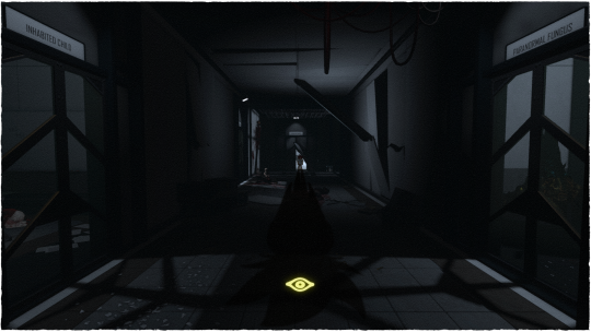
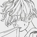
[Image ID: A tiny Yugi stands, backlit and barely visible, at the end of a long, dark hallway. Most of the lights and parts of the walls are broken, with loose wires hanging in loops from the ceiling. Nearest the camera, on the left side of the hall is a room labeled "Inhabited Child," and through its glass door a small, hunched-over girl in tattered clothes can be seen. The room across from it is labeled "Paranormal Fungus," in which a large, bizarre pod is visible.
Strewn across the floor of the hall is broken glass and debris, as well as a few facility members' corpses. One has a creepy doll sitting on its torso, and another is pinned up on the far wall by rebar. Stretching along the length of the floor, starting at Yugi's feet and ending in the light cast by the closest rooms, is the ominous shadow of Yami Yugi. His Eye of Anubis, used for judgement and Penalty Games, is glowing bright yellow within the shadow's head.
/End Image ID]
~
Bakura: Where's Your Heart That Beats for Me?
Yugi: Single Out the Shadows
Marik: Waiting Silently for Hours
The Nursery in Secret World Legends is a horrible nightmare facility, with plenty of places to put poor Yu-Gi-Oh! kids, via "possessed child" crossover shenanigans. So after I did the screenshot edit with Bakura, I figured I'd go ahead with doing Yugi and Marik, as well. After all, they each fit the "Inhabited Child" experiment.
There is actually a tiny child that stands in that doorway in-game, I just drew Yugi over her. She also doesn't have the dramatic magic shadow…just hovers ominously, and skitters off when you step into the hallway proper. If you were to turn and look over your shoulder here, you could see the last remaining bright section of this hallway, and the isolated room Marik is in.
For those unfamiliar, Sleepless Lullaby is the quoted song—and is the only thing that plays in the Nursery, on loop, as a way to (try to) condition and pacify the kids.
(As you can see, it did not end well for the folks running the facility.)
#secret world legends#swl#yu-gi-oh#ygo#yugi mutou#yami yugi#fanart#my art#rebelle 6#fun fact: I used the 'item interaction' outline color for his eye#so there's a bonus meta layer of it not being 'really there'#I also could've used luminosity layer style for the shadow#to have it blend in with the others#which looked less magic/more natural#but also made it hard to see with how much of this hall is shadowed#so I used overlay instead#also this is not my normal crossover situation between these settings#normally I'm yelling about Akhenaten making the same Bad Decisions in both#and what the implications are if they're the same universe#given that Tiye is Yami's grandma and Someone Significant in SWL#but that's a whole dissertation
7 notes
·
View notes
Text

jellie is the kind of cat that would scratch at the door when you're in the bathroom
sepia version

#I LOVE THE NEW SKIN SO MUCH ASDFSGADFKA#goodtimeswithscar#gtws#mcyt#goodtimeswithscar fanart#gtws fanart#mcyt fanart#jellie the cat#my art#me chanting to myself thisisnotlatetheresnoduedateonfanworkthisisnotlatethisisnotlate#also i typed grian instead of grain when i was trying to find a film grain overlay for this lol#gtwscar#gtwscar fanart#hi this is called i use gtws more than gtwscar and did not know that more ppl use gtwscar#new life scar#new life smp
213 notes
·
View notes
Text

new eyes+eyebrows for my babygirl
#need to lower the gloss on the irises though theyre a little too flashy#my mods#eyebrows are based on the skyrim system of using a separate mesh instead of an overlay like fo4 does. i think thbrows does it the same way.#so im not limited to only using like 5% of the uv on the already limited face textures#unfortunately as i am the modding equivalent of a monkey with a keyboard i have no idea how to make a nice clean way to get them in game#without requiring fucking around in xedit for each character you want to give them to
46 notes
·
View notes
Text
i knew something was off about that one popular post about the op's training module for their job which featured dean winchester as the poster boy for emotional harm
someone matched it up to the 15.18 "i love you" scene but it's not... it's when dean is crying about lucifer possessing sam in 5.04 the end

#supernatural#this has been bothering me ever since i first saw someone overlap the 15.18 screencap but i couldn't figure out why#but look!!!!! the tear streaks are the same. direction of the eyes. facial expression. it lines up perfectly#i don't have the post on hand and i can't find it to link it or overlay the images myself so please imagine instead#i grabbed this cap from a screencap website... so i don't think it's the exact frame the customer service job used. but it's close enough#i told my friend and he said big win for wincesties. i'm inclined to agree#.txt
10 notes
·
View notes
Text
I'll say it: "Oh all AI artists do is write a stupid description and immediately get an image with no effort, there's no art in that" is the new "Digital painting doesn't count as art because it takes no effort"
#Look I'm aware there're moral reasons to criticize AI art such as how corporations will use it#and the fact lots of models (not all however) use stolen content#But all you have to do is visit a forum dedicated to AI art to quickly realize it actually takes some effort to make quality images#And honestly from what I've seen those guys are often very respectful of traditional artists if not traditional artists themselves#Not a single bit of 'haha those idiots are working hard when they could simply use AI!' that Tumblr likes to strawman them as#Lots of 'So I did the base with AI and then painted over it manually in Photoshop' and 'I trained this model myself with my own drawings'#And I'm not saying there aren't some guys that are being assholes over it on Twitter#But when you go to an actual community dedicated to it. Honestly these guys are rather nice#I've seen some truly astounding projects#like there was this guy that was using people's scars to create maps of forests and mointains to sort of explore the theme of healing#And this one that took videos of his city and overlayed them with some solarpunk kind of thing#And this one that was doing a collection of dreams that was half AI amd half traditional painting#Anyway the point is you guys are being way too mean to a group of people that genuinely want to use the technology to create cool art#And while I'm aware there are issues related to its use#it's actually really fucked up you're attacking the individual artists instead of corporations???#It's as if you were attacking the chocolate guy over the systemic problems related to the chocolate industry!#And also tumblrs always like 'Oh AI is disgusting I hate AI art so I'll just hate in it without dealing with the issue'#While AI art forums often have posts with people discussing how go use it ethically when applied to commercial use!!#Honestly these guys are doing way more about tackling the issue than tumblr and you should feel bad!!!
15 notes
·
View notes
Text
I hate the new image viewing on mobile. Why can I scroll to completely different posts. I just want to get a closer look at the image. Who thought that was a good idea????
#its so awful. theres also like an overlay now instead of just displaying the image file.#and its just worse in every way.#i used to swipe up to close the image file but now i just end up scrolling to a new posts image. not even the next one on my dash.#i havent even updated my app to the latest version. its been implemented anyways. hate it when that happens.#i avoid updating for a reason :/#batty blogging#text
8 notes
·
View notes
Text
every youtube art tutorial is like SECRET COLORING TUTORIAL they DON'T WANT YOU TO KNOW! LEVEL UP YOUR ART, YOU STUPID FUCK. YOU FUCK. YOU POOP. and then you look at it and it's them talking about blending modes like it's lost Atlantean technology they're benevolently telling you about
#posting#or they're whipping up fast and loose color schemes from grisaille w/ gradient maps#sidebar i hate it when these people market to beginners and tell them to use gradient maps or blending modes only like#that's great for professionals streamlining their process#but beginners benefit hugely from like... understanding color theory#instead of putting a purple overlay layer on as shadows#bc then they don't know how to adapt the technique for other compositions#but of course professionals already know about these shortcuts so art youtubers with no helpful insights are left with this
2 notes
·
View notes
Text
noctis overlay incoming. you’ve been warned
#i had big plans today but instead i am doing this#i just want him to stylistically align with my prom so i can take pics of them together#idk that i’ll do overlays for the others…. i’m not even certain i’ll use the overlays all the time#my love for them shifts frequently i’m sorry#lian blabs
7 notes
·
View notes
Text
[professional artist on tumblr voice] excuse me, tumblr? excuse me. i’m trying to weed out anyone who’s not feverishly dedicated to me. I need a theme that’s either impossible to navigate, unnecessarily busy, completely eye-searing, or incredibly unintuitive. i would prefer if it could fit two or even three of those categories at once if at all possible. do you have a theme that does all four? you do??! i’ll take it!
#this isn't aimed at anyone off the top of my head#it's just a general frustration with artists who seemingly just#are TRYING to hide their art#behind the worst possible tumblr themes they can find#i saw an artist whose blog has infinite scrolling but every layer of new post overlays the old layers instead of appearing below them#so you can't actually scroll back up to see any of the posts once the next page has loaded#you have to refresh#it's so fucking dumb why do these themes exist#and why do people use them
7 notes
·
View notes
Text
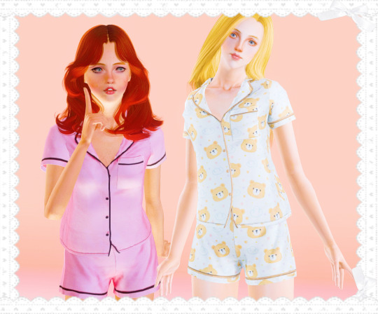

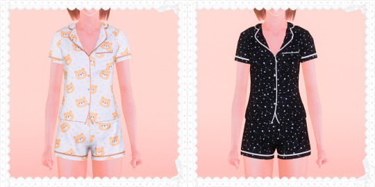
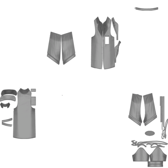
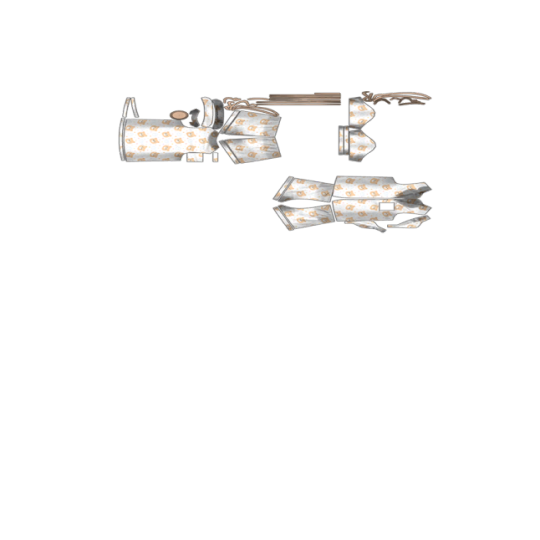
Elliesimple - 4t3 Two-Piece Pajamas (UPDATED)
I'm very happy how these turned out!! The textures are so... *chef's kiss*
This is a brand-new re-conversion of my first CC I released almost exactly 3 months ago, in late August (it was posted August 29th, and today just happens to be November 29th!). It wasn't even that long ago, but it feels like it, especially since I have a lot of experience now! Compare those screenshots to this new style I'm trying out!
I've added a new overlay, which are star constellations! There is now a maternity morph for both!
I've also tried a new technique, something I've thought of, to reduce button morph mishaps, which is using a second group in TSRW to put the buttons in separately from the pajamas, then making the morphs by hand. Therefore, it will not replace the original, and it has custom thumbnails!
Last difference is that it now has 4 channels instead of 3 - the buttons are separate from the lines! Other basic info should be the same. See below the cut for comparisons!
For: TF, AF
Categories: Sleepwear
Polycount: 8k
1 Recolorable Preset - 3 Non-Recolorable Patterned Overlays
4 Channels - Top, Bottom, Lines, Buttons
The links are the same as the original post, but updated, so that if someone sees the old post, they won't get a deleted link error!
Download - SFS
or
Download - Simblr.CC
---
@xto3conversionsfinds @pis3update @sssvitlanz @wanderingsimsfinds @gifappels-stuff
Left is original, right is updated:


1K notes
·
View notes
Text
my nails are pink and sparkly but im not happy with the shaping..i can't wait until im better with acrylic
#not sexy but here we are#my acrylic overlay is coming a long tho#maybe instead of a fill i'll start fresh and do an acrylic set#i feel like shaping is easier with that than with builder gel#a clear nail and then gel color wouldn't be too bad#ofc just..going to get them done would be easier but i don't wanna deal with people anymore#low-key wish i had someone to pick out my nail color#idk why i think it would be so cute to have someone to tell me what color to do#or if i should use glitter
0 notes
Text
Maybe it's rude but sometimes I think about signing on to do typesetting for small scanlation groups so I can fix the poor quality that some have. Hell, I'd learn to redraw things just to make it neat
#when the text is outside of the bubbles it just 😤#or when they overlay english with the original text and its all messy and hard to read#or they use overly flowery fonts instead of letting the panels effects speak for themselves#or just generally use a poor font for readability i mean theres standard manga fonts for a reason#i dont have any sort of reading issue like dyslexia but it really chaps me when people put all that work into translating#and then pay no attention to the typesetting or quality of the pages#it feels so disrespectful to the people that worked so hard to make it in the first place#spiced#manga
0 notes
Text
Oh fuck yeah my like favorite wxs cover has a full version hashtag winning
#rat rambles#sekai posting#Im gonna be real I have no idea what its called in english but just trust me bro its good#the corus is rly what does it for me like damn is that actual good harmonisation in sekai impossible /j#not that sekai covers that dont harmonise super well are bad it just oft feels like its just each member individually singing overlayed#which tbh it probably is how theyre put together but yknow#its just nice to hear the occational sekai cover where they actually sound like theyre performing together instead of individually#but just like in the same space hdjdhdj#again not that those covers are inherently bad I just prefer the covers with more vocal cordination personally#but yeah the groups with the guys tend to have some of the most mixed covers in my opinion because the mix of vocal ranges can both result#in some wonderful harmonisation and some just very messy bad sounding covers gdjhdkdydh#vivid bad are especially a wild card here they have some genuinely amazing songs and also some fucking jokes of covers#but I feel like at least they have some ironic enjoyment in them so good for them#my actual least favorite sekai covers are the ones that are just. bad in a boring way#like the teo covers I dont feel even a little bad calling them bad lol#that being said kanade has some of the objectively best solo covers sorry I dont make the rules#maybe one of these days I should make a sekai originals tier list thats way more managable then a bndori one dhdmydjd#that being said Id have to decide if Im using the vocaloid or sekai versions since my opinions on em varies heavily between the 2 for some#like I fucking love vocaloid lower 25ji lower can die
1 note
·
View note
Text
writing cheats
i know i’ve probably written about these all individually but i’m putting them together in one post. these are writing tricks that are extremely cheap and dirty; when you use them it feels like cheating and honestly by posting them i’m probably exposing all the easy moves in my own work, but more than a writer i am a teacher, so here you go, some writing cheats that have never steered me wrong.
quick character creation
what’s really annoying is when you have two characters sitting at a restaurant or something and the server has to come by. to what degree do you describe the server so that it’s clear they’re just a background character but that they’re not just a faceless form, so that the world has texture without taking up too much space on the page? rule of three, babeyyy: two normal things and a weird one.
she had pale skin and blue eyes but her hair was dyed black like a 2010 emo kid.
he was tall and broad, and he wore a sweatshirt with an embroidered teddy bear on it.
the woman stood there comparing the prices of toilet paper. she had a short angled bob and carried a keychain the length of a trout.
why does it work? it gives the reader something to hang onto, a brief observation that shows the world exists around your narrator. it also works when introducing main characters, but there’s so much action going on that you can’t take time to write a rich long paragraph about them. all you need is a little hook.
quick setting creation
i used to TOIL over descriptive paragraphs. for years i was like, description is my weakness, i must become better at developing imagery. i believed this because a famous writer once projected a paragraph i had written onto a screen and asked my cohort, “count how many images are crafted in this paragraph.” there were none. none! my friends were sitting there like, “we are TRYING” but they couldn’t find any.
i would say that after years of studying imagery development at the sentence level, i am, perhaps, competent at it, but what was more helpful was for me to shrug and tell myself, “i’m just not a writer who does that.”
anyway. my cheat is thus:
there’s not much you can assume about your audience. the audience is not a homogenous whole. but your ideal audience is something you can guess at, and that means you can play around with their existing knowledge and expectations.
if you say your characters are in a tacky shit-on-the-walls restaurant, if your ideal reader is an american who went to restaurants during the maximalist era of franchise design, they will conjure their nearest memory of one of those places. and for those readers who aren’t familiar with it, they’ll use other context clues to conjure that space. the point is, you don’t have to list every single stupid license plate nailed to the wall. you can leave it as one detail of one sentence and let your reader extrapolate from there.
if i say the dentist’s office looked like a gutted 90s taco bell, maybe no ideal audience would have ever seen a place like that, but a lot of people can mentally conjure a dentist’s office and a 90s taco bell and overlay them together to create a weird and fun image.
you can go even simpler than that: a bathroom the size of an airplane lavatory. a tiny studio apartment with a hotplate instead of a stove. a mansion with a winding stairwell. the point is that you want to define the size of the space and its general vibes.
in some ways detailed description can be overrated, because your reader conjures images even in absence of them on the page. and for those readers who can’t mentally conjure images, it doesn’t matter anyway; they take you at your word. the trick is to figure out what details are unexpected, relevant to understanding the story and its characters, and those are the things that you add in.
one other note: after working with hundreds of writers on drafting, for *most* of us it’s difficult to develop images and establish setting in a first draft. it’s nearly always something to be saved for a second or later draft. i think it’s because while we’re writing we tend to put character and action first.
nail the landing
there’s a joke i heard once from a writer i really admire: “you know it’s literary fiction if the story ends with a character looking at a body of water.”
and god it’s so painfully sad and true how easy it is to nail the landing of a given story by ending on a totally irrelevant piece of imagery. the final beat of a story followed by your character looking up at the sky and seeing a flock of birds in the shape of a V flying past. or maybe they’re sitting in their car and they count the rings of a nearby church bell. or maybe they watch an elderly couple walk down the sidewalk hand-in-hand. i don’t know!! when in doubt shove an observation, an image, whatever, something neutral at the end and it’ll sound profound.
(this cheat is the only one that can really bite you in the ass because if the image is too irrelevant you risk tonal incongruity. for use only in the most desperate of times.)
sentence fragments
when writers ask me how to punch up their writing or start developing their own style, my go-to advice is to give up the idea of a complete sentence. fuck noun-verb-object. if you have a series of character actions, knock off the sentence subjects like in script action. if the clause at the end of your sentence is particularly meaningful, don’t separate it with a comma but a period and make it its own thing. if your character is going through something particularly stressful or heinous, that bitch is not thinking in complete thoughts so you don’t have to convey them that way. make punctuation bend to your will!!
rhetorical moves
this one opened a lot of doors for me stylistically. remember that famous writer who called me out on my lack of imagery? i always thought his prose was beautiful, that he’s one of the best living prose writers, etc. once i learned more about rhetoric though, i realized he just employed it a lot.
usually when we talk about beautiful sentences it means a sentence that uses rhetorical devices. the greeks were like, you know what, when we give speeches there are certain ways to phrase things that make the audience go nuts. let’s identify what those things are and give them names so we can use them intentionally and convince people of our opinions.
i love shakespeare, i really do, but one of the big reasons he’s still a household name today and his plays are still performed is because every sentence of every goddamn play utilizes a rhetorical device. the audience is hard-wired to vibrate at the sound and cadence of his writing, like finding the spot on a dog that makes their foot thump. for five hundred years, william shakespeare has been scritching that spot for us.
i have no idea why, cognitively, rhetorical devices are so effective. i’m no rhetorician. all i know is that well-deployed anaphora makes a reader want to throw their panties on stage. my intro to rhetorical devices was the wonderful book the elements of eloquence by mark forsyth, a surprisingly fun read! hopefully that will open some doors for you the way it did for me.
the downside to this is that once you know rhetorical devices, it’s like learning how the sausage is made. on one hand, as a writer, you’ll have a lot stronger grasp of style, but as a reader good prose loses some of its magic.
pacing it out
many writers, myself included, rely on the tried and true “he bit the inside of his cheek” or other some such random action to help pace out dialogue. one time my thesis advisor sat me down and said “you’ve got to take all of those out.”
“all of them?” i said.
“all of them,” she said.
i thought, but that will weaken the text! it didn’t. once i cut what i came to call cheek-biter sentences i never went back. and now when i edit for other people i’m like, look i know where you’re coming from but just cut all these out and see how the scene stands. if it doesn’t feel right you can put some back in. a lot of times when you’re drafting you put those in the way some people say “um.” they’re just sentences you jot while you’re thinking of what the other character says, so from a writing perspective it seems like you’re pacing, but readers don’t read it that way. they just want to get to the next line of dialogue.
but sometimes you really do need to pace out a scene and i think there are other ways to do that that don’t rely on banal physical movements, such as:
interiority: a sentence or paragraph of relevant cognition, bonus points if you weave in background context. good interiority defines the voice of your writing.
observations: i know i just said description is overrated but idk sometimes you just need a character to note the back and forth clacking of one of those desk ball toy things.
character texture: maybe your character notes something about the person they’re talking to. a wilted pocket square. a mole that looks like it needs looked at by a dermatologist. a scar on their forehead. some detail that deepens or complicates our understanding of a character.
narratorial consciousness and access
this one is less a cheat and more a problematic opinion i have that doesn’t win me any popularity in writing circles.
i believe that if you’re writing in first person or close third or any narration which is dedicated to the mind of one character, you are only ever obligated to convey the experience of that character’s consciousness. and nothing else.
by that i mean, if your point of view character is unobservant? then they’re not going to even notice the flight attendant is missing one of their canine teeth. if your pov character is focused and obsessive, they’re going to think lavish, detailed paragraphs about that which they’re obsessed with and have no acknowledgement of the rest of the world. if your pov character has no understanding of time, does your story even need to be linear?
defining the scope of a narrator’s cognition early on can give you parameters in which to work. even if you don’t consciously do this, you still do it. if you write in third person limited present tense without really thinking about it, that’s your scope. i’m just pointing out you can choose to do it differently. you get to define your narrator.
whenever we talk about narration we also talk about information access and the order of information being revealed/conveyed. writing must always be in order; even if you’re writing multiple concurring things, it still has to be rendered on the page in order one after the next, because the human mind can’t read two sentences over top of one another.
if we’re restricted to the mind of a character, that means we’re also restricted by their knowledge and experiences, and this can be used to your benefit. i don’t want to take too much space for this but i do talk more about the relationship between narration and reality here.
in short, you the writer get to choose
what the reader knows,
in what order they know it, and
its relationship to the presumed real events of the story, which develops the (un)reliability of your narrator
okay going to cut this off now before i go on more rants about narrative scope. i hope you found this helpful and go on to put some of these nasty lifehacks in your own writing!!
7K notes
·
View notes
Text


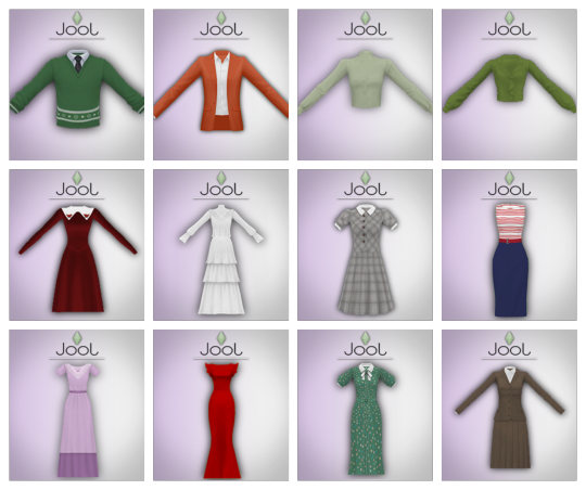
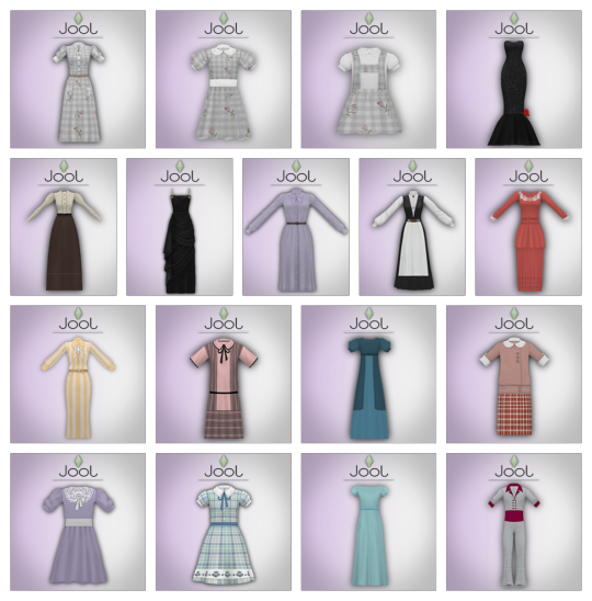


4T3 Conversion of TwentiethCenturySims' Catalogue
A 4t3 conversion of (most of) twentiethcenturysims' catalogue for all your sims! I truly hope you like it! Enjoy! <3
In this compilation are included sets, mini-sets and standalone pieces that the original creator made! Recolors, posepacks, fantasy items, repeated pieces (things very similar to what I've already converted in the past), and pieces categorized as "timeless" are not included!
This is what I've been working on haha! My last statement for some time... thank you all so much, once again! 💖
————— —————
Known Problems:
The trim on the "Wilma Casual Dress" (purple dress with bow) gets a bit wonky at the end of the skirt! I tried to fix it in many different ways, but this is what I got!
The pleads on the "French Hen Dress" also get a bit wonky, same as above!
LIGHTING GLITCHES ONLY APPEAR ON CAS!
* Note that teens and elders have neck gaps. This is sadly the price for having them available! For teens, try using this and this slider by gruesim!
————— —————
ALL OG CREDITS GO TO @twentiethcenturysims! IT’S NOT MY MESHES, AND IT’S NOT MY TEXTURES, I JUST CONVERTED THEM TO THE SIMS 3!
————— —————
NOTES:
Because TwentiethCenturySims is a great creator, his whole catalogue is quite low-poly and gameplay friendly, so don't worry about that!
All 3 hats are hat-slider compatible and unissex, as always!
The Ida, Annie and Elsie dresses (gingham and flowers pattern) all have 11 presets. First 10 are overlays, having multiple floral options, but with collars, buttons and bows being recolorable. Last one is completely recolorable!
The "baby sweater" (green sweater with black tie) has 4 presets, first two having christmas-like patterns, third one having a knitted pattern, and last one being completely CAStable!
The "baby dress" (red dress with white collar) has 12 presets. 6 first presets have a velvety texture which is recolorable, with 5 flower options to the collar, and one without the flowers. Same applies to the other 6, but they don't have the velvet texture to the dress!
The "baby hat" also comes with 2 presets, one having a velvety texture, and the other one not!
The "Havana jacket" (orange jacket with white shirt) has 31 presets. First one is completely recolorable, and the other 30 are a variety of overlay patterns to the white shirt. The jacket stays recolorable in all of them!
The "Eleanor 1930's Dress" (green dress with bow) has 6 presets. First 4 have overlay patterned presets to the dress, but the bow, collar and trim stay recolorable. The last 2 are completely CAStable!
The "Piper Dress" (kids' dress with blue bow) has 4 presets. The first 4 have overlay patterned presets on the dress, but the rest remains recolorable! The last one is completely recolorable!
The "Goose Suit" (kids' gray suit) has 3 presets. First two have different patterns checkered patterns, and the last one is plain. In all of them the collar is an overlay texture.
The "Ruffles the Clown Costume" has 2 presets, having two different stripe options.
The "Billy Sailor Suit" (Toddler's sailor-inspired outfit) has 2 presets, with two different mask options. The second one has three little recolorable circles on the belt.
The "Darlene Sailor Dress" is the same as the above, but reversed haha!
The "Swan Suit" (houndstooth patterned suit) is totally recolorable, though it may not seem like it lol! I added the houndstooth pattern from CAS, which you can remove and put anything you want instead!
The "Bonnie Two-Piece Dress" (checkered dress with buttons) has two versions: the AF-EF version, as usual, and a teen-age conversion, just because I feel like it'd be useful to you!
The "Viola 1930's Dress" (yellow stripes and brooch dress) has 5 presets. The first, second and last presets are totally recolorable, having different mask options! Third and fourth presets have floral patterned overlays on the dress, but the collar, belt, etc. remains recolorable! The brooch looks a bit off without the accessory overlay, which is the next note!
There is an overlay/color mix accessory for the brooch on the "Viola Dress, which can be found in the socks category. It gives a multiplier (details) to the brooch, as well as making it fully recolorable! If you're going to use the dress, I highly recommend only using it with the accessory activated! It has a separate thumbnail, as seen in the previews!
As you saw on the previews, there are two buy mode objects: a highchair and a potty, both for your babies! They're found where these objects are usually found (Kids -> Baby Furniture). The potty costs §30, and the highchair costs §100!
You probably noticed the 4 skirt thumbnails (with its half options) at the bottom. Because I don't want this post to be gigantic, I'll link to the original post where twentiethcenturysims explains how to use them and their purposes: HERE! Yes, they're found under "accessories"!
I think that's all haha! Now to the download! <3

SimFileShare | Dropbox
☕ buy me a coffee or become a patron!
————— —————
Credits:
@twentiethcenturysims for all the meshes and textures; you can find everything here!
💖 @katsujiiccfinds @emilyccfinds @kpccfinds @xto3conversionsfinds
681 notes
·
View notes
Note
im not sure if youve answered this before, but im really curious about how you decide which contrasting colors to add where! i know about adding a reflected color of something next to it (idk how to explain that sorry) but i always find when i try to add little splashes of color while shading a piece, they look out of place!!
heres a rough general explanation feat. Beato + some extra stuff!

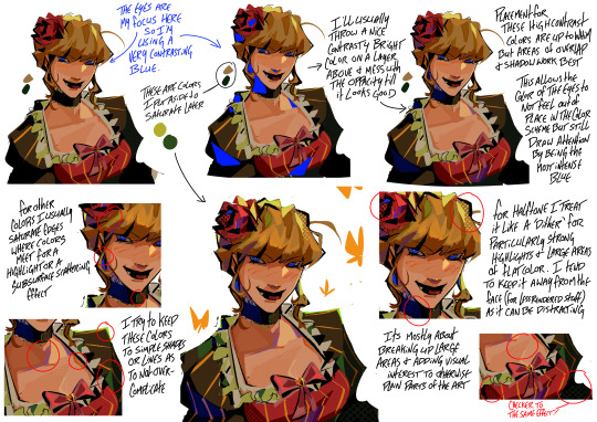
What I focus on with making a color feel cohesive is seeing where exactly i can use that color again through out the piece that way it balances everything out. To choose the colors themselves i normally just take the base color and saturate it in my preferred direction (i.e. parts of her blonde hair becoming green, her headpiece becoming hot pink)
for something with a Lot of added/different pops of color I tend to unify the whole thing by throwing a layer of overlayed color jitter on like 10% or less which helps those colors not feel so out of place (also this piece you can see more of where im adding color at overlaps or areas of interest instead of just the shadows)

something that can also help if you are going a more painterly route is having a base layer of a bright color and then laying down your flats lightly over top allowing the under layer to peak through which is what i showed in this breakdown (which you can also see me adding a complimentary color to areas of visual interest)

And lastly a lot of this is just kinda trial and error! as I said before i tend to work on one layer but for these final embellishment type things (added pops of color, halftone, patterns, etc.) i mostly save that for last and keep them on a layer above the piece because a part of the process is just messing around with a bunch of stuff and seeing what looks good
#art help#hopefully that all makes sense! this is such a gut feeling based thing for me that its hard to put it into words#but like i said just fuck around and find out#the halftone bit in the beato breakdown was cuz i initially tried to answer both this ask and an ask about halftone#but i decided to make a seperate thing for that later#lizard inbox
443 notes
·
View notes
Last Seen Blogs
bestjeanistmonster
My Pencil Is My Sword
gabeszblr
Buborék a mentes vízben ...

omegamotel
The Omega Motel (WIP)
kurahara
moved to @seishue
paradiselost15
The Negative One