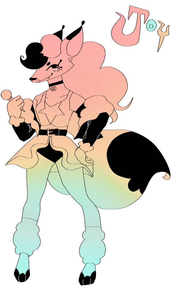
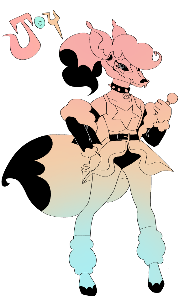
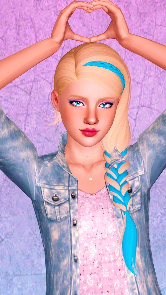
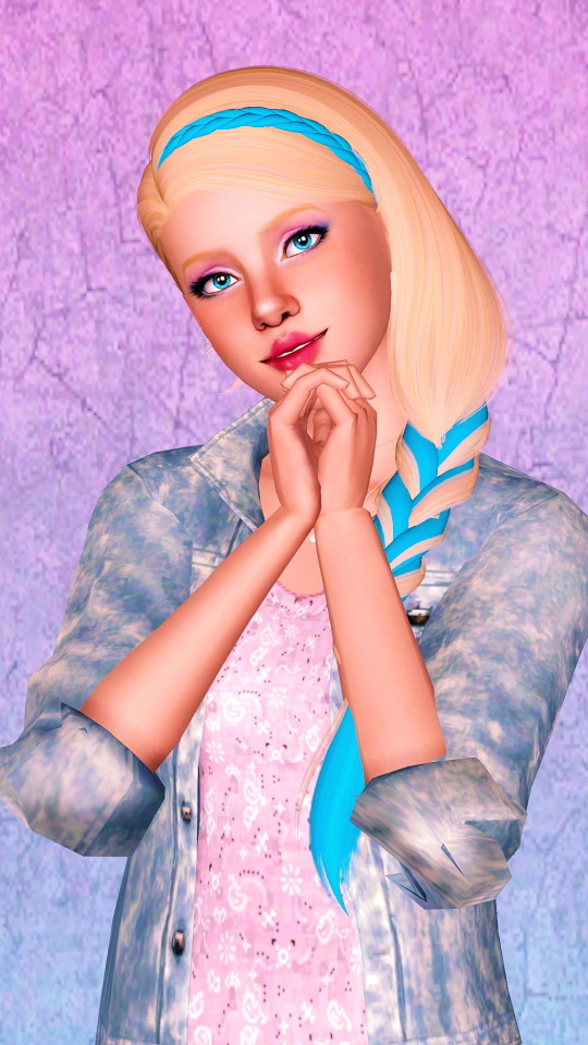
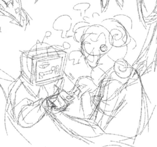
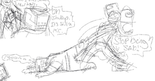
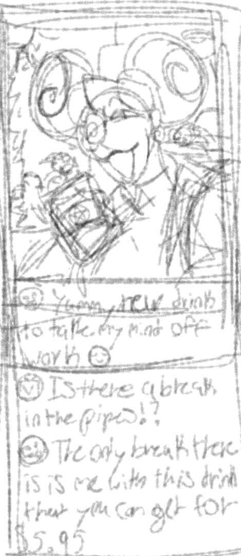
#so much is based on vibes and color schemes
Text
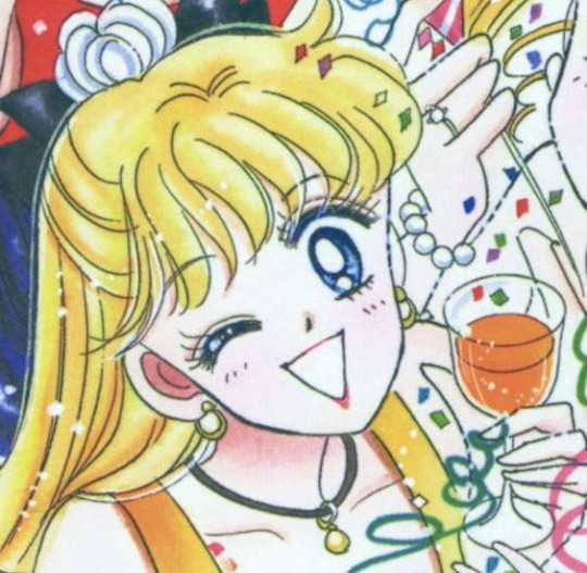
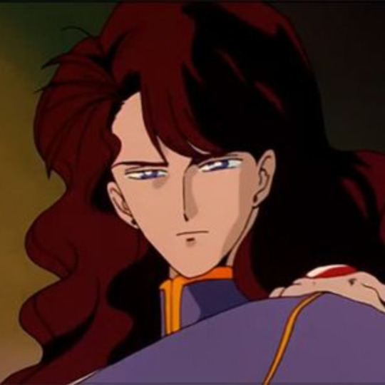
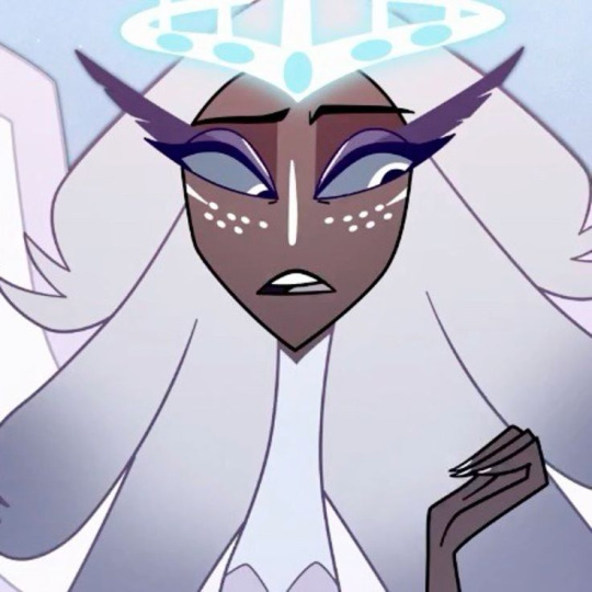
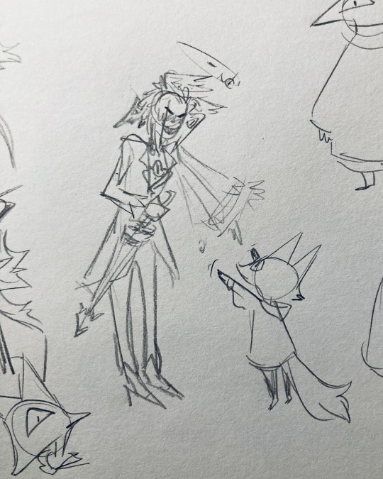
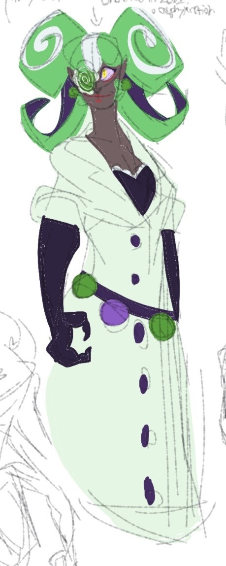
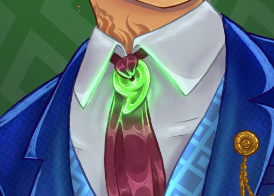
Given how tightly plotted previously installments have been, I have to admit I was caught off guard by the seeming introduction of new characters in the Walpurgis no Kaiten trailer. However, on reflection (heh), it makes sense if one of the themes of the movie is indeed opposites/doubling/mirroring. After all, if Homura has a double for a narrative foil, why shouldn't the rest of the main cast have one, too? Prior to the second trailer, I had assumed this role would be filled by the "new girl" in the first trailer, who appears to be a Homura/Mami/Madoka hybrid, but it seems that's just the tip of the iceberg.
That said, it's also clear to me from the second trailer that this mirroring, if that's what's really going on here, isn't going to always literal as it is with Homura. The girl paired with Nagisa in the ball pit in the second trailer doesn't look exactly the same as Nagisa, but it's clear from the framing that the two of them are being deliberately juxtaposed, and will likely serve as narrative foils to each other. My guess is that this girl is the humanized form of Nagisa's witch Charlotte, just like I think that the most likely candidate for Homura's double is her witch Homulilly, (because the metaphorical almost always becomes literal in this series, even though the movie may or may not name them directly as such), but my point stands regardless of their exact relationship to each other.
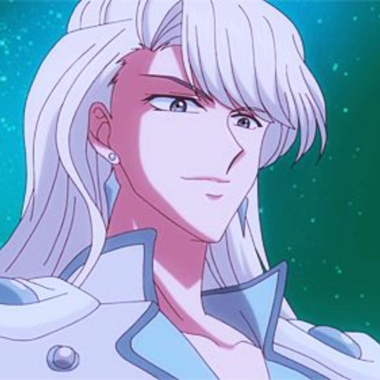
If that's the case, then who in the Holy Quintet is the counterpart for the other new character--the green-haired girl in the trailer?
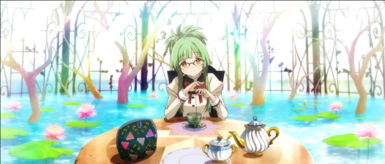
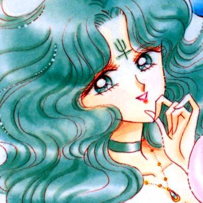
The obvious answer is "Mami"--partly because of the tea party and general vibes, and partly because of the color scheme (green and yellow go well together and the girl has golden eyes like Mami's). This is especially true if fan theories are right and this girl is the humanized form of Gertrud the Rose Witch, whom Mami faces off against in episode 1-2 of the original series, and who serves as a deliberate counterpoint to Mami there.
Having a more human Gertrud as foil to Mami would make sense because unlike Homura and Nagisa, Mami never becomes a witch in the original series; while she does have a witch form in the PSP game and other spinoff media, I think we are unlikely to see it in this installment and thus her most likely counterpoint would then be Gertrud. Gertrud's familiars are also visible in Homura's new world at the end of Rebellion, suggesting she might turn up in some fashion in Walpurgis no Kaiten.
(This also raises the interesting question of whether Mami's VA would voice this character or not. Considering that Kaori Mizuhashi also voiced Walpurgisnacht and Tatsuya in the original series, it's not impossible than she and/or other voice actors might play one or more roles in this new installment. As a bonus, this would also mean that SHAFT could get away with not announcing the minor roles before the release, as they would probably have to if they were adding completely new voice actors to the cast. Until we get more news, I'm assuming that Chiwa Saito is voicing both Homuras, though everything else is more speculative.)
However, it occurred to me that based on her ponytail and her position in this shot, she could also be Kyouko's foil (red and green being opposing colors); this is less likely, but I figured I'd mention it as a possibility anyway, since the second trailer appears to be leaning heavily into Rebellion parallels. TBD. Like Mami, Kyouko doesn't have a witch form in the original series, so her most likely parallel is another established witch character, although nobody from the original series immediately leaps to mind.
(By the way, this would mean there are more new characters--or new versions of established characters--we haven't seen yet, so, uh, hold that thought.)
After that, it gets a little more complex and murky. Sayaka's most likely foil should be her witch Oktavia, but it's unclear to me from what we've seen so far how much that particular conflict manifests internally or externally. I think Sayaka is going to be extremely conflicted in Walpurgis no Kaiten, and it will be interesting to see how her arc develops. Based on the original series, however, I would say that the other logical witch counterpart for her is Elsa Maria the Shadow Witch, whose labyrinth mirrors Sayaka's black and white thinking during a particularly dark period for her, though I suppose H.N. Elly the Box Witch who attacks Madoka in Episode 4 is also a possibility.
Madoka also has a witch form, Kriemhild Gretchen, who is absorbed into the Law of Cycles, though I think her foil is most likely the Law of Cycles itself. We'll have to see.
You may have noticed that I am limiting myself solely to witches from the original series rather than spinoff media. The first reason is that I'm skeptical that SHAFT would bring in a witch that general audiences who have only followed the main series have never seen before (except for maybe a brief cameo). The second reason is that the Law of Cycles' motif in Rebellion explicitly shows only those witches from the original series, and we see only a select group of these witches and/or their familiars during the battle against Homulilly's familiars.
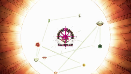
All these witches are potentially fair game to appear in WnK, making nine in all, though I doubt more than a handful would have more than a few lines, let alone a major role. Also this diagram does not appear to incorporate Walpurgisnacht unless she turns out to be the Law of Cycles after all.
Somehow, I can't imagine SHAFT pivoting in mid-stream to bring up something completely new or even a more obscure witch from another spinoff, especially when so much of the main series focused on reliving and re-experiencing the same events over and over again. Sorry, fans of the Madoka PSP and slot machine games, I think you're destined to be disappointed in your wish to see any of those game-only witches on the big screen, but I suppose we'll see.
This is all just speculation for now, but I'm excited and intrigued to see where this goes!
45 notes
·
View notes
Text
acotar sailor moon au
So, so far, who's who?
*I decided to end up switching Cresseida and Nesta because of the vibes
The only rule here is that when the Transformation happens, they gender swap (for shenanigans) + plus Japanese terms and vague setting
Also y'all, I'm not a zodiac person, I just did this for fun, don't take it too seriously okay?? Okay???


Sailor Moon (Purple) Cancer = Rhysand
Cancer: emotional, intuitive, sometimes insecure, associated with water and the moon (misting and stuff)
bocchan, spoiled, flirtatious
Thinking of having the sailor uniform be a mix of yellow, dark blue, and switch out the red for purple. Princess Serenity transformation is similar: white hair, white clothes, but violet eyes.
Was thinking maybe (as a hc) when Princess Serenity went to the human world, she used a different identity maybe?? Maybe a name like Rhiannon??? (aka similar to how Rhys looks now with black hair)
A spoiled rich kid, went to private school until he weaseled his way into public school (with his cousin Mor) and met Cassian. Az tagged along.

Sailor Mercury (Blue) Virgo = Azriel
Virgo: humble, practical, sympathetic, water sign (blue siphon + also associated with mist)
secret bodyguard to bocchan Rhys, a smart kid, straight A student, pushes up glasses with a glint, has those thin sleek glasses, tsundere chuuni otaku, has a knife somewhere, used to clash with Cassian, very protective of Rhys, learns to open up as a friend, always takes the mission serious
fights a lot against Zoisite-Eris (as Sailor Mercury) and also has lessons with Teacher Eris (as a regular college student)

Sailor Mars (Red) Aries = Cassian
Aries: wants to prove himself, values strength, competitive, impatient, active, fire sign (red siphon)
a high school delinquent, once had a pompadour, in a biker gang for sure, made fast friends with Rhys, Azriel saw Cassian as a safety risk, now they just bicker, fought in a gang war with Mor once and they came out bros, sees Rhys as his brother (Rhys definitely calls him Aniki just because it's hilarious how quickly it goes to his head), likes attention, a bit arrogant
was thinking to originally be Mor cause red, but idk vibes??? tbh you could switch around Rei, Mako, and Minako and they would all work in some way (but I'm adding a bit of OOC since I'm character building them)
I personally think Cassian should have had a goofy prince like personality in the book (for compensating for being a 'bastard') and actually accepts that he's people's hero while also being deeply insecure about it (and that's why Eris's barbs about him would hit harder)


Sailor Jupiter (Green) Sagittarius = Mor
Sagittarius: faithful, intelligent, forceful, sympathetic, values freedom, fire sign
a ex-sukeban, got into a lot of fights with Cassian's gang, used to smoke until a pretty girl said they hated the smell, eats pocky instead, has gotten expelled a few times, bubbly, used to carry a bat around, first girlfriend was in elementary school (except she didn't know they were Dating until the Incident), also has a bike, likes partying, has the highest alcohol tolerance but is confused how she's beaten by a talking cat, teases everyone (no one is safe)
the only one to gender swap into a guy, flirts with all the women she saves, ends up coming off as a playboy, saves Nesta once and fell in love, Nesta hates her flirty attitude as Sailor Jupiter but slowly becomes friends with Mor because Clare suddenly starts hanging out with Mor
Clare ends up finding out her identity and it causes Problems

Sailor Venus (Orange) Libra = Lucien
Libra: extroverted, friendly, has always wanted peace (with family, with life choices), honest, blunt, persuasive, charming, charismatic
grew up in a strict home with Eris, the problem child, seemingly very open with people but can close up if he's insecure, had a close relationship with Eris until Beron strained their relationship, was a solo Sailor Senshi with Varian (cat form) until joining everyone, has angst with fighting against Zoisite Eris

Tuxedo Mask (Leo) = Tamlin
Leo: compassionate, big-hearted, natural leadership, self-assured, fire sign
This guy has three outfit ideas: Civilian Mamoru - wears a dark green suit like in the anime, thinks he's cool but is not, is cool when he's not trying to be, has chin length hair with those round spiral glasses, goes from Clark Kent to Superman basically, instantly clashes with Rhys / Tuxedo Mask - the traditional black tuxedo, roses, roses everywhere, has a mask too, this time his hair is tied back and grows out to his shoulders (because anime logic), Sailor Moon Rhys and Tuxedo Mask Tam have a very obvious Thing going on / Endymion - the completely white outfit, this time his hair gets extra long because it's his Final Form but it's not tied, flows in the wind very majestically (Pantene commercial esque, very angst)

Zoisite = Eris
the vibes mostly (the hair)
but fun stuff is that Zoisite was with Kunzite in the 90s anime but was hinted in the manga to be with Sailor Mercury (not really but)
Kunzite was originally Nesta but now it's Cresseida, so ship vibes?? But the only ship that's set is tamsand rn (and tarlain)
Started working with Queen Beryl (Amarantha) because she promised to punish his father (something Eris didn't have the power to do without causing a lot of trouble)
Also works as a teacher sometimes now that his father is out of commission

Jadeite = Feyre
pretty boy, grey eyes
but was recruited by Amarantha to save their father's life (who's human), contrasted with Cassian, once Feyre 'dies' and was forced to give up the power Amarantha gave her, she meshes really well with the gang
Nephrite = Nesta
the first picture gives me Nesta vibes
has a romance arc with Naru Clare because I'm personally sweet on Nesta/Clare, but angst because Clare doesn't know Nephrite is Nesta, is trying her best to save their father (currently held hostage by Amarantha)
Was originally Cresseida to opposite Mor but I changed my mind (my intuition said so)

Kunzite = Cresseida
I was convinced by the white hair and cresseris possibility but
she's forcibly recruited by Amarantha unlike the others that 'willingly' work for her, but eventually defects with the help of Tarquin after she finds out about his other identity

Sailor Pluto (Scorpio) = Jurian
for laughs mostly
but also because I needed a milf/dilf in here fr
and Jurian in canon also finds himself out of time from being an eye


Sailor Uranus (Aquarius) = Elain
trans Elain agenda always
watches over her father while her sisters are being evil, ends up getting recruited by Varian to save them

Sailor Neptune (Pisces) = Tarquin
sea vibes (my sign, so best)
uhhh has cute moments with Elain
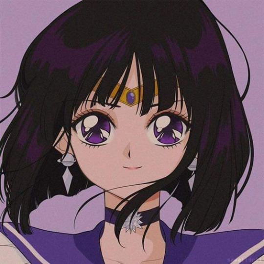

Sailor Saturn (Capricorn) = Emerie
literally the last one, and we need more Emerie content
(based off their hair color)


Luna (Black Hair) = Amren
Artemis (White Hair) = Varian
Naru = Clare
Queen Beryl = Amarantha
#i did this while listening to Moonlight Densetsu#fun times fr#gonna be honest#so much is based on vibes and color schemes#are general vibes#I have funny situations in my head#acotar sailor moon au#as a genderfluid person#this whole hc is my darling#but also#yuri yaoi and yaoi yuri vibes aplenty#lots of ships#all the ships#nvm everyone is in a polycule#acotar#tamsand#tarlain
11 notes
·
View notes
Text
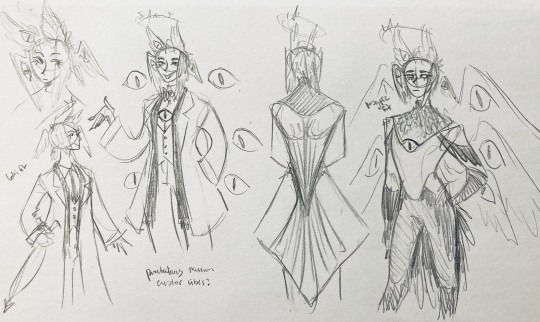
Ɗᥙҽ 𝜏σ ᙏყ Ɲҽɯ⨍σᥙɳԃ Ƒιχα𝜏ισɳ... ♚
⋆⋆⃟⊱✪⃝⃞⃝⊰⋆⃟⋆ ⋆⋆⃟⊱✪⃝⃞⃝⊰ ⋆⃟⋆⋆⋆⃟⊱✪⃝⃞⃝⊰ ⋆⋆⃟⊱✪⃝⃞⃝⊰⋆⃟⋆
Specifically with the Gluttonous Sin of Beelzebub being my favorite Sin of the group (not necessarily in Helluva Boss, but just in general), I wanted to make a ranking list of my favorite Queen Bee redesigns and their creators for really no other reason than I just feel like it. Now, this is all personal opinions and should not be taken to heart by any means, it's just for fun:
#1. "Beelzebub & Bibi" by @gravcore

♡ In terms of an actual redesign of the original, I love how this artist made "Bibi" because, for one thing, they made sense of the originals hair by giving her a ponytail since way too many characters have a mohawk style (Loona included); two, I cannot explain just how much I adore the clothes they gave her. The top is actually insect based and gorgeous, and not some recolor version of Loona's outfit; and third, they made canon Bee her own character rather than a royal because nothing about the OG read "Ancient Sin" to anybody.
♡ Now, in terms of the actual Beelzebub, here, she's legitimately stunning. Rather than a redesign, I can tell this was the original long before the Queen Bee episode came out, and I love how it reads both "70's party girl" and "regal ruler" all in one. That, and the actual bug design aspect and the color scheme. Above all else, I love how they incorporated the lava stomach in her design, too.
#2. "Beelzebub" by @s3tok41b4
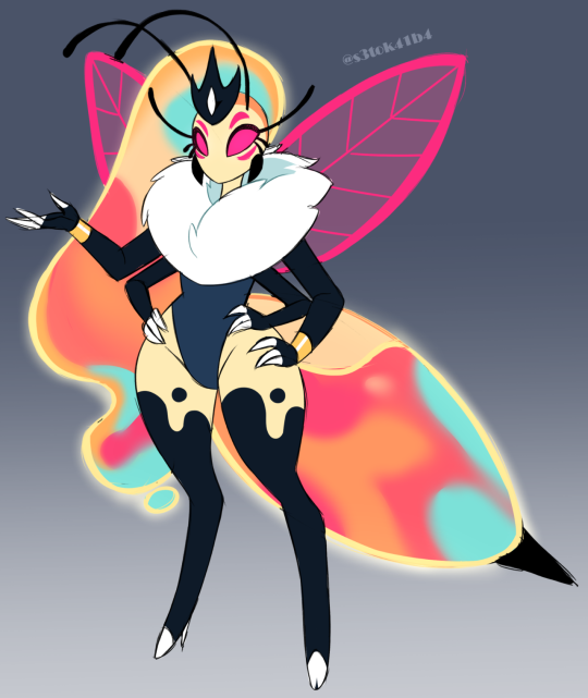
♡ This design can best be described as a literal re-imagine of the canon Beelzebub as it shares almost all her similarities with the actual bug aspect to it that it desperately needed. It's legitimately simplistic but still appealing to the eye, futher showing us that Viv was perfectly capable of making something so simple, but actively chose to make it more confusing than it had to be.
#3. "Beelzebub" by @ruinxl0ve
♡ Similar to the first two, this shares both a regal and party girl bug aesthetic with the added bonus of actually being beautifully emotive despite not even having a mouth. I feel this beautifully differentiates the design from the original while also making it recognizable and I feel that it kinda feeds into the original concept that Queen Bee could literally "feel the vibe", hinting to her being an empath in some manner.
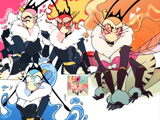
#4. "The Three Bees" by @onehelluvatime
♡ Long story short, these are three individual versions of the Queen Bee and her new placing within the Hellaverse outside of the canon one. For more in-depth explanation of these interpretations, it's best to check the blog yourself. Truly, I love these designs not only because of the visual redesigns themselves, but also the well-crafted and creative explanations and backgrounds regarding these characters. I especially like the idea that the hellhounds within society are half-undead with skull-like appendages and facial aspects.
#5. "Spontaneous Beelzebub" by @redd-byrd


♡ I know it's essentially the same as the canon design, but with the small tweaks that were made to this one (the giant "Bee Butt", the added black lines, the actual bug-like wings, the blue-thin eyes), all of them give a more clear indication (at least to me) that this Bee is more higher up than her fellow hellhounds, meaning she looks a lot more like a hybrid thus making her more grand. It's nice how they added these small details for improvement while still essentially leaving the design like its original.
⋆⋆⃟⊱✪⃝⃞⃝⊰⋆⃟⋆ ⋆⋆⃟⊱✪⃝⃞⃝⊰ ⋆⃟⋆⋆⋆⃟⊱✪⃝⃞⃝⊰ ⋆⋆⃟⊱✪⃝⃞⃝⊰⋆⃟⋆
Anyway, thanks for listening to my Ted Talk. Have a nice day!
#helluva boss critical#vivziepop critical#helluva boss criticism#helluva boss#helluva boss critique#hazbin hotel critical#helluva critical#hazbin hotel#hazbin hotel critique#vivziepop criticism#personal opinion#pls dont hate me#pls dont be offended#credit to artist#credit to artists#helluva boss redesign#beelzebub#queen beelzebub#queen bee
846 notes
·
View notes
Text
Aw hell yeah iterator oc drop!!
they don't exactly have a very deep lore so far since they're just a fairly recent character so all you have to know about them is that they are indeed a cunning little shit and loves antagonizing other fellow iterators for the fun of it.
also their design is based off of a bearded vulture! i tried to atleast implement the bearded vulture's color scheme to their design as much as possible
Their local group are all birds of prey inspired iterators! but uh the rest aren't very important unless im bored enough to actually design them
- Nine burning skies or just nicknamed 'Skies' is located at the far up north, between the tall rocky mountains
- their antennae's pretty expressive! they can bend it at will
- skies and their partner owns a pet cyan lizard named shrike (i would draw the guy but i can't draw lizards)
- they LOVE fashion,history,jewelry and golden trinkets and another way for them to preserve the old forgotten memories from the past
- don't separate them from silence. do not separate them.
they have some girlboss,gaslight,gatekeep vibes and honestly??they kinda do LMAO i think they would be leaning more towards gatekeeping
oh and didn't i mention that they are gay and inlove? YES they are gay AND in love!! the iterator shown at the bottom right side is Languid Silence @strandedaylily 's oc hi hello stares at you intensely i love xemm,,
oh also some extra additional art for them! the reason why i made this ref sheet is solely for artfight thanks artfight for making me make ref sheets of my ocs more often
they STARE
#rain world#fishdoesart#rw ocs#rainworld oc#rw iterator oc#rain world original character#rain world oc#rw oc#the birds frfr
172 notes
·
View notes
Text
Let's talk cover art!


Firstly, here is the first official look at the full jacket for my new book!
Camp Daze has had a really wandering path to publication, which I'll talk more about later, but back when I still didn't know what I wanted to do with it exactly, I got this crystal clear image of what I wanted the cover to look like. So I created that cover, just the front cover at the time, as more of a portfolio piece than anything. But even though it was meant to just be a portfolio piece, I loved it so damn much, and it stuck in my head hard. When I did finally decide to self publish the book, I knew I had to use this cover.
Usually, I go through a lot more iterations for my covers when it comes time to finally publish things, but this one has just stuck with me over the years as I tried to bring this novel out into the world. Back in 2023 some of you may remember I tested another cover featuring two of the main characters, and did some tumblr polls to see what people liked most, and the tent cover won by a LANDSLIDE each time. (That other cover, or the art from it anyway, will still be available other ways! Just not as THE cover for the book.)
I think the very stark, simplistic nature of the cover fits the themes of the book really well. It's do or die and all they've got is the resources in their camp--represented by the tent, the resources of the wilderness--represented by the mountains/forest, and the looming/hovering threat of a nuclear war that they don't actually know that much about. When it came time to create the full wraparound version of the cover, I added in a little archery target on the back cover because archery plays a major roll in their survival as well.
Colors wise, everything was built around the green tents. The tents are based off of the ones at my own childhood summer camp, and they play a big roll in how the camp manages to create better shelter for themselves. I think found a purple that worked well with the green because, well, they're in Colorado and "purple mountains majesty" and all that. Then it was just filling in other areas with colors that fit within the scheme. I kept everything a little more muted mostly because I just like more muted color schemes.
For the back cover I picked a few lines from the book that, I think, capture the overall vibe of the book which is "if we try, we MIGHT die, but if we DON'T try then we WILL die, so we may as well try."
And shoutout to @gallusrostromegalus for helping me write a new author bio while I was flailing around in the discord chat having a minor identity crisis, lol. The new bio kicks ass, even in this shortened version.
Something that is very important to me is to make sure cover artists are always credited, so I do have a credit for that under my author bio even though my cover artist is also, ya know, me. Just trying to set precedent so more people will start doing things like that.
So yeah! That's how this cover came together. I think it's one of my favorite covers I've ever done.
You can back the Kickstarter here to get your own special edition copy of this book!
302 notes
·
View notes
Text
CORNELIA ARCHER’S BC (attempt 2.0...)
I announced this BC almost three years ago but overestimated myself with the ambition and just wasn't in a good place mentally in the following months (to put it mildly), but now I feel like I've missed projects like this a lot and am still vibing with the idea of this BC. Also my ts3 is running so much better now, which was one of the initial reasons for cancellation, but now it's a lot easier for me, woo!
Before it got cancelled, I've got a few contestants. I think some of them were given for public download since, but it's really not a problem for me, I can still use them. Right now I'm thinking of still using the same contestants and maybe accepting a few more. I also asked a few people on discord who said it's fine to use the same sims.
In case someone would like to join and make a contestant, let me know under this post or in an ask! The catch of the BC is that the contestant should be based on a song/album (of any artist), as Cornelia herself is very Taylor Swift inspired and is a Lover girlie, actually made on the singer's 30th birthday in 2019 as a tribute sim (she and the winner may even appear in the Lover gen of my swiftacy if I get there hehe) (yes I'm an absolutely hopeless swiftie, all of my saves have some inspo from her) (and what about it).
I don't know how many sims I would accept (11 would be perfect... I'd dress her as one of the eras for every episode). But it would be fine for me if I got less than that, realistically the simblr climate isn't the same as back when BCs were more popular, I guess.
Contestants:
@vintageplumbobs - Lucy Starr
@poisonfireleafs - Laura Oak
@dragonplumbobs - Carson Lake
@cloudberry-sims - Aella Wonders
@tosimornottosim
@arogaba - Sara Nix
@berriespunches - Lara Mooney
@blurrypxls
@bellakenobi - Lilian Pendragon
Rules:
Your sim must be YA vanilla or banilla.
All genders are welcome. Cornelia is pansexual.
Occults allowed (except ghosts)
No Irresistible trait, please.
CC is allowed, though don’t go overboard with it. I mostly use Chazy/Poisonfireleafs hair retextures, and I may change makeup and eyebrows to similar ones because I like keeping everything in my style, unless it’s something that makes the sim unique and is a part of them.
No custom sliders, please.
I have all the packs. You may set all outfits for your sim so they can match their color scheme, but it’s fine if you can’t.
Private download, but it's okay if you decide to make it public (to those who already made it public, don't stress).
Please write a bio for your sim. It doesn’t have to be long, just basics of their personality.
The most important aspect of this BC: it’s not a regular one, it’s a music-inspired BC. Therefore, your sim must be inspired by a certain song, music video, artist, or music album - it could be whatever you wish! (absolutely no pressure if you can't think of anything and would just want to make a regular sim, but I just thought it would be a fun prompt)
The deadline for making a sim is September 30 (flexible). The faster I get all the sims, the better, but no pressure!
55 notes
·
View notes
Text

i heard the words hermitgals and precure and then did not think about anything else for like 4 hours straight.
@riacte 's idea and au, except i got tunnel vision and didn't read any of their worldbuilding posts and this is entirely different from all their stuff...but please go see their hermitgal precure au cause it's much more interesting and developed than this!!!
also i have never actually watched precure except some of smile precure many years ago. so. this is so deeply inaccurate to the show im so sorry. More explanation under cut
I don't know how but I ended up with a sky theme with these? Even though I think that's also the theme of the current precure season if i'm not mistaken. I almost called False Cure Wing before I remembered that little orange guy.
Cure Dawn has a little sun badge, and her color scheme is meant sort of a purple to reddish-pink sunrise type gradient without being too obvious.
Cure Horizon has a kind of outdoor adventure/explorer theme like Gem's cottagecore vibes.
Cure Cloudy is..... cloudy lol. Her floaty hair is supposed to be a bit like Cleo's snake hair.
Cure Feather is sort of based on False's whole eagle thing she's got going on. It sort of ended up ballet-looking though.
And Cure Crescent is of course moon and space themed! Her gloves and boots are meant to be like a spacesuit, and her hair is kinda crescent moon shaped if you squint.
Also I tried to add one sheer/sparkly element to unite the costumes, but really they're very different from each other... oh well
Anyway this is all just thorough silliness thanks for reading
#geminitay#pearlescentmoon#stressmonster101#falsesymmetry#zombiecleo#hermitcraft#hermitcraft fanart#hermitgals#precure au#mpka art
142 notes
·
View notes
Text
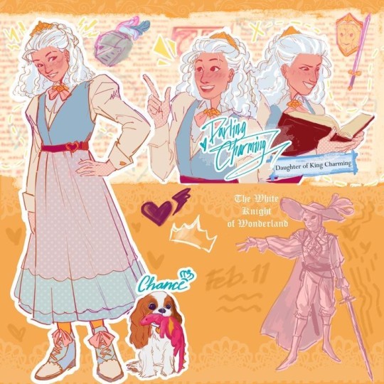
EAH was one of my very favorite cartoons as a kid, and I've been enjoying it's renaissance very much, so REDESIGNS!!! (I've done a bunch over a couple months and put them on Instagram, but I figured I'd move them here cause Instagram sucks, so if you've seen them before over there that's why)
I think the original designs are aesthetically pleasing, but they're not super practical for the characters- case in point! Gay icon Darling Charming
I'm gonna put all my design notes under the cut so if you don't care about that carry on, have a nice day
Darlings original design is fun, but it doesn't serve an obvious purpose, at least not that I can see. She clearly wears armor on the outside of her outfit, the Marie Antoinette poof is a bit strange to me, and she has very little visually tying her to Dexter and Daring. I wanted to emphasize her secrecy, but also her passion for puzzle solving, riddles, combat tactics, ect. when she's around the people she trusts (as if the queer metaphor wasn't obvious enough)
Here are some details that just make me happy
-First, the hair. I knew I wanted to give the White Knight a more unique look, and I wanted to simplify it overall. I LOVE the original armor, but it would be a huge pain to animate, and I don't have the patience for that, so I went for a masquerade-ball-three-musketeers-vibe. The braided bun is still a fancy, regal style, but it's a lot easier for her to manage in her uniform
-I tried to synthesize the color schemes of the Charming siblings. They all have a pit of yellow, a bit of pinkish red, a bit of blue. The twins lean heavy into yellow and blue, with splashes of red where thematically appropriate. Darling doesn't really communicate with Daring much, so she has the least amount of red. I think having more muted colors in comparison to her brothers also emphasizes the fact that she's hiding herself. She is very much defying her family with her ambitions, and she has to work hard to keep it under wraps. Sort of related, I gave her a tooth gap, because it's a cute design detail, but also to act as a "flaw" to contrast with Daring. Daring's primary physical trait is his ungodly perfect teeth, so I thought it'd be fun to give her an "imperfect" trait, like Dexter and his glasses. There's nothing actually wrong with them, but it's a failure to reach the insane expectations that the Charming family has cultivated over the generations. Basically the Charmings are petty and I feel bad for the youngest generation.
-Speaking of concealment! There are a couple bits that I thought would be fun to hide throughout her outfit. First, the skirt is flowy enough and the shirt is positioned just right so that you can't tell, but she has pieces of leather armor on at all times. She saves the plates for wonderland. She also wears gloves to hide the callouses on her fingers from swordfighting! She also probably keeps knives in her hair somewhere. Pulling a small switchblade out of the base of her bun just seems like something she would do
-Final thing, I gave her a scar! From what I can tell, she's always been very rough-and-tumble, so I gave her a scar over her brow. She likes to pretend it's from a Mysterious Incident to mess with her friends, but really she was wrestling Daring when they were like, 4 and 6, and she bonked her face into a table. She got over it real fast, but Daring got a long lecture about it, and that's when he started getting over-protective about her
#eah headcanons#eah#ever after high#ever after high art#eah fanart#darling charming#eah redesign#coffeepaintart#yes I have thought about this cartoon for children designed to sell dolls from almost a decade ago for far too long why do you ask
825 notes
·
View notes
Text
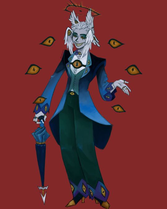
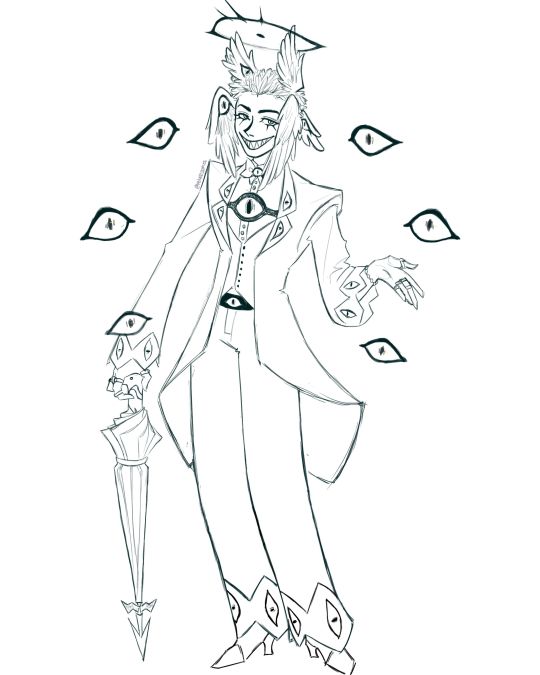
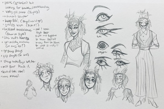
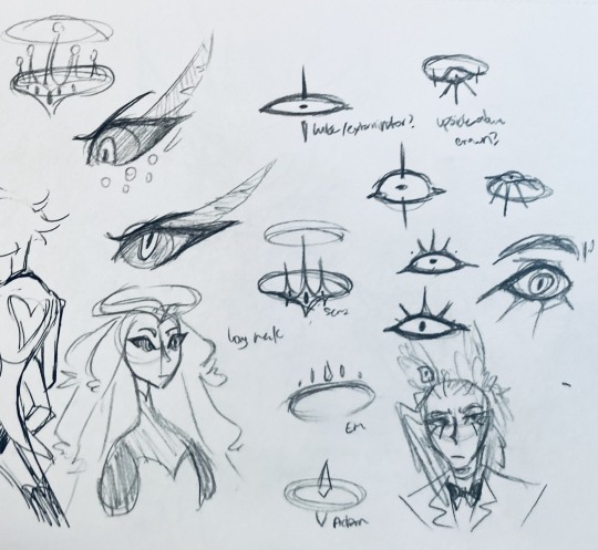
I finally finished the piece for @prince-liest's OC, Tzafael! this really reminded me of how fun character design is (and also that I've completely forgotten how to make digital art, but that's besides the point...) <3
credit to @hogbogglerspirits for the umbrella design! I kind of butchered it so please look at the original and throw lots of love at them
LOTS of notes, draft sketches, brainstorming, etc. below the cut. enjoy!
(note: a lot of what I'm talking about is based on posts prince made under their #tzafael tag, so take a look at those if you haven't yet!)
thanks for joining me below the cut! here's the sketch without the colors as a treat (in case you want to color it yourself or something, idk).
notes about making the digital drawing:
holy shit this took me forever -- I was not kidding about forgetting how to make digital art lmao. I forgot how much less forgiving digital lines are and genuinely lost the spoons to even attempt lineart, hence just a sketch below the colors.
some of you might've seen the original sketch I sent to prince, which the digital version diverges from just a little. it's mostly the halo which I'll explain later, and I finally caved and drew the sixth eye (you can tell I drew and erased it multiple times in the sketch lmao -- still don't know if I prefer it with or without)
here's the original color ref by the lovely @gendermeh! my color scheme ended up looking really different, so some notes about that:
I was looking at references for magpies like this
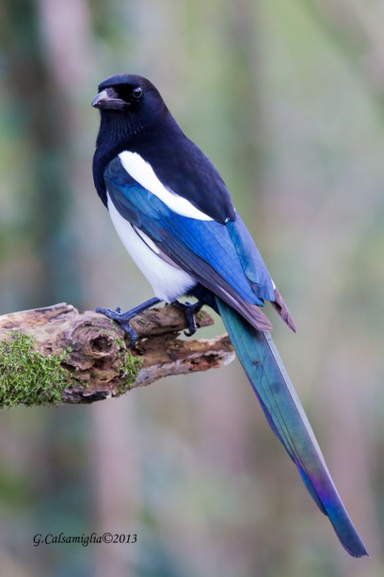
and I wanted to basically follow that color scheme while also being somewhat similar to the original -- dark head/shoulders --> dark top of the jacket, bright blue wings --> bright blue bottom of the jacket, greenish tailfeathers --> green pants, hints of purple --> purplish sleeve and pant ends
I also tried (and mostly failed, let's be real) to capture the iridescence of the feathers -- they look like oil spilled on the pavement or iridescent hematite to me! I think the key ended up being adding bright greens/purples and roughly blending them into the blues or vice versa but I didn't really figure that out until I got to the pants lol.
I'm gonna be honest; I don't remember why I went with this shape for the tailcoat. I just remember being unhappy with the sketch and then trying a bunch of different shapes that mostly looked worse lol -- I think I landed on this because a split tail kind of looks like wings?
KEPT the shoes -- absolutely magnifique. I wish I knew how to color gold better.
added lots of jewelry! they like shiny things :)
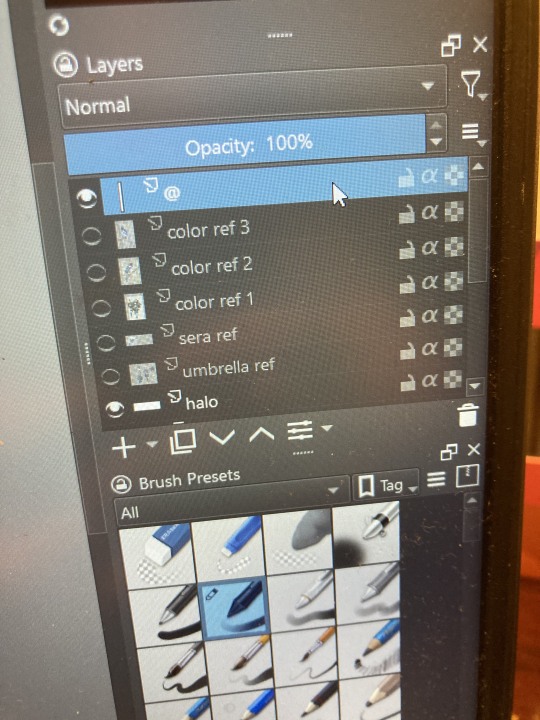
ALSO PLEASE LOOK AND APPLAUD ME. I FINALLY REMEMBERED TO LABEL MY LAYERS!! NO I DON'T REMEMBER WHY THE HALO HAS ITS OWN LAYER.
alright, time for some more design notes/explanations + draft sketches!
but first, a couple disclaimers:
I want to make it very clear that I LOVE everything about the original design. I made a lot of changes based on personal preference/the way I interpreted the character. I was actually planning on making a digital piece that was more faithful to the original design too, but I was just out of spoons for it cause of life stuff.
you probably shouldn't try to read the notes I made in the sketches I'm about to show you unless I say otherwise. most of it is incoherent brain vomit in illegible artist handwriting and I'll transcribe/explain the stuff I think is important :) (the stuff in quotes are direct transcriptions of my notes)
I know my sketches are very messy lol. I only draw for fun, so I usually don't force myself to make stuff any neater than necessary unless it's supposed to be a formal piece. try to bear with me.
1:
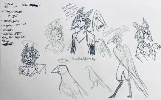
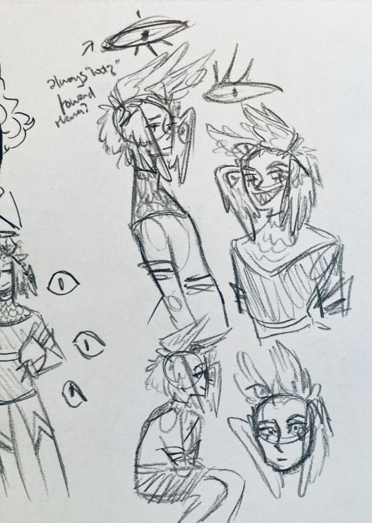
my first few sketches of them! (I think?) this was before I sent prince a laundry list of questions so I was still trying to get a vibe
"magpie -- beak lips?" -- you'll see this in a few sketches; I considered giving them the lipstick design that velvette has since it looks like a beak. I still kind of think it's cute, but 1) I'm pretty sure velvette is the only character that has them, so I didn't want to make it seem like they were related somehow and 2) I thought it might be distracting with how much other crazy stuff I ended up including in their head/face
also, sidenote since it's relevant to what I said about vel: something I realized was important is how one character's design relates to the designs of the rest of the cast. I wasn't sure how much I should've gone for what looked good in a vacuum, how much should be based on what other characters looked like canonically, or what other characters would look like if I also designed them. it ended up being mostly the second option, but it was honestly still a struggle. should I take away some of the tumblr-sexyman-ness (no shade to tumblr sexymen; I love them) because there are other characters that already have it? should I relate their design to sera's and emily's in the show or should I think about how I would've designed sera and emily? should I follow some of the design philosophy of the original show and just throw stuff on there because it looks cool (the answer is yes btw)? decisions, decisions ...
I don't think this showed up really well in most of the drawings, but they actually have a black line down their nose! let's take a look at sera:
since they're siblings, I wanted to include some similar facial markings. the nose line ended up being the only thing I kept though -- I was going to include freckles, but I have a compulsive need to give every character giant bottom lashes so there ended up being no room T.T I like that the magpie's hints of purple kind of match hers tho!
the wingification of the hair begins! I was still unsure of it at this point, but it was an idea I had since I was kind of struggling with how straight the feathers were in the original.
"maybe the ones on their head count as wings (so only one main pair)" -- I originally just had the 2 pairs of wings on their head, so I was thinking of just giving them 1 pair on their back so there would be still be 6 total. also this middle drawing of them is meant to be their exorcist outfit (I wanted it to be a cross between what the other exorcists wear and sera's outfit)
at this stage, I was thinking of giving them more magpie-like characteristics, so I looked at some references and tried to emulate them in a more human design. this ended up being really awkward so I scrapped it, but I still like the idea that their exorcist mask looks like a bird (kind of like a plague doctor's)
2:
peekaboo! I love the idea of them using the wing hair to cover their eyes lol. (ended up using that idea for my own seraph OC since that's their biblically accurate purpose: to cover their eyes/faces in reverence/humility -- doesn't really fit with tzafael tho lol, so they show their face most of the time)
an eyeball in the bowtie -- pretty self-explanatory. the eyeball motif is important.
the one in the middle is just me practicing drawing the original design, and the one on the right is another exorcist outfit I think. I wanted to include the diamond motif/points that sera has on her dress (the diamonds on the bottom turn into eyeballs, which is why the final design also has eyeballs on tzafael's sleeves/pants)

3:
lots of notes on the side based on what prince said in response to my ask
"localized omniscience (power of sight) -- cool + ironic that their sight was supposed to serve God but made them see Heaven for what it really is instead"
another exorcist outfit, this time including the feathers
I was also experimenting with the halo; I was trying to make it look sort of like sera's crown, but that didn't feel right ...
some practice with eyes -- my style is pretty flexible with eye shapes, so I try to make them suit the character. I drew lute's eye and also an actual magpie's as references -- lute's because of the exorcist background and also because they looked appropriately sharp, magpie's for obvious reasons. once again, my compulsive need for giant bottom lashes strikes
there was honestly a lot to balance with the eyes -- I wanted them to look condescending/bored (lowered top lid) but also amused (raised bottom lid) and like a magpie (round) but also harsh/mischievous (sharp, maybe slit pupils like a snake) and similar to sera's (but not too decorated -- also does it make sense for them to look like sera's if emily's don't even look like sera's?)
considered having wings on the shoulders -- the magpie pattern is super cool, so it would've been nice to have that somewhere more explicitly in the design. I still think that might fit in an outfit they would wear in heaven (maybe for formal occasions)
the introduction of the sweatervest! honestly I kind of love this for the way it captures more of the preppy, spoiled old-money upper-class vibe some heaven residents have, but it was scrapped since I couldn't imagine them wearing that while trying to scare the denizens of hell. maybe something they wear casually though.
"yes nictating membrane (on every eye!)" -- AHH I'm so sad I didn't end up putting this to use. I just feel like the whole effect is based on actually seeing them blink, and I don't animate lol.
4:
ugh, the nefarious laughter one ... don't worry I tried harder on a sketch later on lol.
"like the diamonds on Sera + Em" + "diamonds turn into eyes?" -- I draw the diamonds on the sweatervest turning into eyes later.
tried an actual bow instead of a bowtie -- very cute but didn't fit the vibe.
a skirt! I think they would wear a skirt sometimes.
5:
"FUCK ASS BOB" -- asghdk the wingification of the hair continues. unfortunately, I'm realizing at this point that the silhouette of the hair is starting to look a lot like alastor's. I gave a very half-hearted attempt at mitigating this, but it goes back to the thing of how much I am obligated to the original show's designs and what looks cool to me -- I think the wing hair fits them and I didn't want to change it because of alastor, plus my alastor design actually has completely different hair anyway. I did add a third pair to the back to look like a ponytail though.
introduction of the scarf! I was actually going to include this in the final design but uh,,, I forgor. are you starting to see a pattern.
the reason for the scarf is that the "tzafael going to places they know they'll draw attention/can incite chaos" reminded me of that scene in avengers where loki walks into a fancy building looking pretentious af and just casually stabs a guy's eye out. not really the same thing but I felt like the vibe matched. hence, loki's funny little scarf fit.

6:
uaoughdfjh it was SO FUN to draw the wing hair, and it was at this point that I realized they had to stay even though I wasn't sure if it was too different from the original.
gossiping with rosie cause that's the first person I thought of -- tzafael also summoned a pearl necklace to clutch because of the sheer drama of it all (your ex-husband did what??)
also started drawing the rings on their hands. magpie like shiny.
7:
lots of notes cause I was trying to compile the things I still needed to think about/incorporate into the final (I thought this was gonna be the last draft ... haha)
trying to include more bird/eye motifs
"fish ... purse?" -- ha! I forgot I was gonna give them a fish purse. I think I drew that in a later sketch, but not them wearing it.
"picked up Hellish traits bc of extended stay -- existential crisis?" -- I asked prince about the sharp teeth, and their answer implied that they became sharp as they stayed in hell longer, which got me thinking ... I feel like that's actually a great body horror concept. lucifer falling and looking like a normal angel at first, eventually waking up to more and more devilish features and feeling more and more like he's lost his home and his past self ... spooky.
another exorcist outfit -- I actually really like the eyes on the ribs! I never made a final draft for the exorcist uniform, but it would probably look close to what I drew here.
the one on the bottom was meant to be similar to the feathered shoulder pad idea, but this time with the whole magpie (with giant eyes). tried putting the "freckles" (really just dots in this case) over their brows, but that ended up looking kinda weird.
the eye is pretty close to the final design
the one on the right was supposed to be the full final design, but I was totally off lol -- the long trench coat really doesn't give off the right vibe at all
8:
playing around more with the loki vibes of the scarf, also added an eyeball to the chest
I never got happy with the design of the back of the coat -- I think it should probably just be blank at this point. but the sketch here is meant to look like wings/tailfeathers.
yet another exorcist outfit, this time with more magpie motifs. I actually like this one a lot, but I probably should've added the eyes on the ribs from the last sketch. I think I also considered giving them actual tailfeathers at this point.
9:
thanks for sticking with me! I promise we're almost done. have a trans dinosaur I saw while I was travelling as a treat <3
10:
this is after I finished the sketch for the final piece and realized I didn't like the halo design. I drew lute's, sera's, em's, and adam's as refs. (honestly I love the show's idea that each person/people of each rank have a different kind of halo -- I wonder if they can switch them out?)
my main inspiration ended up being the exorcist halo, but I made it look more like an eyeball -- since it always points toward heaven, we can say it's always "looking" at heaven.
(also sera's feather lashes! they're so cute)
11:
EVEN MORE EXORCIST DOODLES
12:
tzafael shooing away my fox demon OC
13:
these are actually sketches for my own seraph OC (raguel), but I wanted to include it since it has even more wing/feather hair variations. I also think the idea of the eyelashes being feather-like could've been cool for tzafael.
14:
some more OG design doodles
tzafael and raguel together because self-indulgence is the name of the game babey (also wanted to draw tzafael freaked out with their wings flared)
(raguel's blind btw, hence asking for eyes -- tzafael has so many!)
you can probably read the dialogue here so give it a shot. I believe in you.
15:
you know what? the fish purse deserves some doodles
16:
putting them in Situations! I was reading over prince's posts again and I realized there were some funny things I could draw them doing/saying
again you can probably read the words here
angel dust also loves fish (but is apparently bad at taking care of them, hence the suffocating blobfish), so tzafael shows him their aquarium (complete with live fish and flora ofc)
I thought alastor was 8 ft but apparently he's 7.3 ft? so tzafael is enjoying the .2 ft they have on him
trying and failing again to come up with a design for the back of the jacket lol
THE crowley quote
apparently the halo still sends signals from the exorcists -- thought their reaction to the battle at the hotel would be funny
the nefarious laughter (take 2) that I promised -- based on a doodle of alastor viv did that I found
them being sad and curling up in a pile of shiny things like a dragon
OKAY I'M DONE. huge, huge thank you to prince for sharing their OC! this was a lot of fun and clearly inspired me a lot haha. please check out their writing; it's literally so good that I can't read anything else these days. I am chewing on their thoughts constantly.
this was an absolute monster of a post, so if you're still reading, I am both impressed and bewildered at your patience. I hope you enjoyed! (I certainly did!)
#prince (because they are very sweet): I'm excited to see your thoughts!#my thoughts: magpie like shiny hehe#hazbin hotel oc#prince-liest#hazbin hotel#my art#character design#sera hazbin hotel#em hazbin hotel
56 notes
·
View notes
Note
Do you think you could post a list of what characteristics you used from each actor? This is so cool!! :D
Sure!! Thanks for your interest!
1. Karna and 2016 Karnak were very close in the polls at pretty much all times from the beginning so pretty much Karna but with 2016 Karnak vibes, like the gold and violet color scheme and wood-carved texture. We have her a lot of jewelry like Karna had in Majestic Rep. Also, we have her a tiny Virgil who is dressed all punk like 2016 Virgil. The aesthetics of her box borrowed a few tiny bits and pieces from Station Theater Karnak also.
2. Ocean is based mainly on Gianna from Majestic rep but with her hair dyed red and a dusting of freckles as a nod to Tiffany Tatreau. We thought giving her dyed hair could be a nice little "best friends" link to Constance as maybe something they decided to do together, and so Ocean has dark roots showing.
3. For Noel we tried to blend features from Wyatt Hatfield from Chance Theater with Kholby Wardell. We liked Wyatt's wardrobe so we did that in the 2016 uniform colors. He has Kholby's hair and eyebrows and brown eyes.
4. Mischa is a blend of Gus Halper and David Sommer's face and body features, with some details taken from Ray Winters like the tattoo sleeve and eyebrow slit. He also has wavier hair like David.
5. I like to describe our Ricky as part Yannick, part Alex, part Ciara, ALL bachelor man (and he has Scott's eyes!!). I noticed Ciara had this shoulder length straight hair and thought Ricky would look cool with longish hair. The rest was basically just Yannick and Alex Animorphed together and it worked surprisingly well. Also, Scott's hazelish green eyes are quite striking so we included those.
6. Jane takes a lot of influence from Ashlyn Maddox (like in her facial features and one bright blue eye) but with curls, a lacey blouse, and a blacked out eye like Emily, pigtails with ribbons like Maggie, and cracks in her face like Jenelle. We imagine her having little mannerisms borrowed from each.
7. Constance is a mix of Lillian Castillo and Zoë Lewis-McLean with her hair style being a blend of them plus Tiffany Polite. Her uniform is a blend of Zoë's and Lillian's with the 2016 colors.
We're really proud of what we've come up with and look forward to more and more actors' influence coming through as we put the characters into action.
28 notes
·
View notes
Text

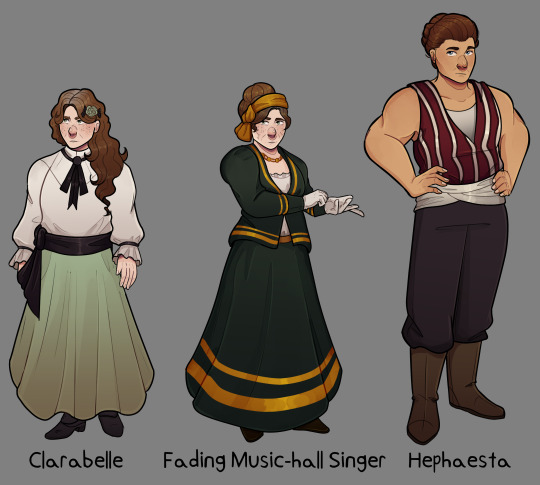

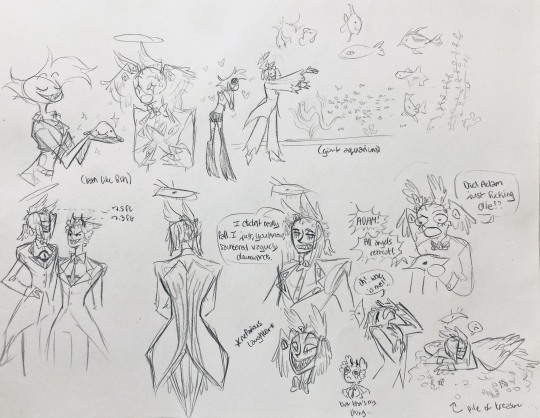
Finished drawing my character designs/ line up of the Light Fingers Crew to formalize my drawing of them
Overview/ Design talk under the cut if anyone is interested in that sort of thing
For all the designs I used the art given for them in the game as a starting point and then went from there. For all but Hephaesta of course that means using a non character specific art. I also wanted all the colors to sort of fit together so where i would have done more vibrant stuff and i strayed away from that.
Clara and Her Sister
Putting the discussion for these two together, as their designs recieved similar thoughts because they are identical twins. ('She is wearing the Fading Music-Hall Singer's face, which seems rude.')
The basic art of the bohemian faction is used to depict the sisters.

So this was my basic starting point for the visual design. I ended up diving further into research into bohemian fashion, which of course lead to me reading up on the history of the term and the connection to the Romani people. According to wikipedia, the word comes from the french term 'bohémien', which was the word for the Romani people.
This of course put a complex spin when i looked into the clothing used in the time, as theres a question between cultural appropriation and cultural appreciation, and one I don't have the full understanding for.
Nevertheless i did take some inspirtation for the clothing here, Clara with having her hair loose and down and looser clothing, the singer with the hair scarf and the necklace among some inspirations.
Inbetween the two I imagine the singers appearance to be more reserved then Clarabelle's. For one, my interpretation of the singer is as someone who uses her singing as a backdrop for sneaking and gathering information (per her role as a 'contact' of the player). The other being that we are told Clara's title is the 'eccentric opera singer' to me implies a grander sense of creatativity and wilder clothing. In less stressful times I imagine her wearing brighter clashing colours and skirts with patterns on them and jewlery (which i intend to draw at a later time when i get better at adding patterns to clothes lol).
We also know the two of them are 'not young' so i attempted to not make them appear so.
Hephaesta
Heph is of course the one character of the group with a personalized art, which i used as the base for my design.

Hephaesta is supposed to be a large figure, as she is a strongwoman, and is described as towering over even jasper and frank. So of course I had to make her tall compared to the others of the group.
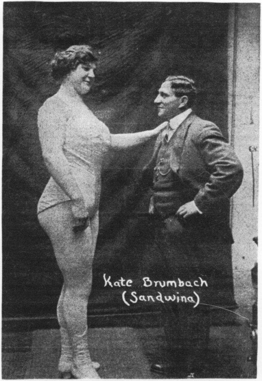
And of course i can't go without bringing up Katie Sandwina (again), a real strongwomen of the time who serves as a great inspiration both in body type and height.
What a woman huh.
Dr Vaughan
The Campaigner template art was the one used to depict her when you first speak to her and was a starting point here.
To me i always pictured her as a fairly older women given her experience and amount of time she's been researching. Clearly someone with a lot of exprience. And also i just vibe with it.
I kept her outfit simple, as i dont figure her as someone to put too much into the latest fashion given her focus on her work. I took the green from the art to use as her skirt to tie in that colour. I also looked up some photos of female doctors of the time and that partially influenced my art direction here.
Obliging Silverer
I debated including him or not given that you only have him as part of the team if you use the light fingers exclusive option to access the parabolan basecamp. But given the fact that he literaly dies defending the camp, I think its only fair that he gets included.
i just had a bit of fun with the design as there wasnt too much to restrict off. I dont draw a lot of characters with mustaches depsite them being a thing of the time, so I figured this was a good excuse as any. I kept with some orange colours within his colour scheme for further callbacks to parabola and his work.
Also hey did you know that people of an ashkenazi background can also have red hair? Fun fact heh.
#hello i hope u all have it in ur hearts for some non event art right now because i just finished this drawing#me starting a piece with 5 full bodies: how much work could it really be#ANYWAY this is all liable for change of course but this gives me somethin to ref for future drawings lol#hope y'all like#fallen london#my art#light fingers#light fingers crew#clarabelle#the fading music hall singer#dr vaughan#hephaesta#the obliging silverer
175 notes
·
View notes
Note
What do you think the personality and appearance of Smoky Quartz and Sunstone would look like, being fusions with Rose? I really wanted to see them in the series, just like we saw Rainbow Quartz with Rose and Steven.
I'm not really sure. Despite the fact that I enjoy analysis of characters, I don't usually feel that comfortable with speculation on characters I haven't met, and Rose!Smoky and Rose!Sunstone would definitely be very different people even if we apparently have precedent for expecting them to share some elements (including names). I very much would have wanted to see the original Rose Fusions of those characters, and would have very much wanted to spend time with more of the Steven Fusions (including with a longer build-up and reserved special time with each Fusion).
I don't develop a lot of convictions when it comes to speculating on stuff like this, so consider this pretty loosely held, but if you want to know what I think about this, I'll try!
Smoky 1.0
Appearance-wise: She'd keep the skin color and the freckles/flecks, keep the body type and same facial features, keep the arm arrangement and the weapon. I think her hair would be pink, straight, and longer--maybe in pigtails. She'd get some kind of cute ruffled jumper, I think--like overalls with a fluffy skirt--and have tights and bare feet. She'd kinda be the kid Rose never got to be, and enjoy the "childhood" she always wanted for Amethyst.
Personality-wise: She would have some inadequacy issues but they would be buried deeper and probably would not come out in self-deprecating jokes the way Smoky 2.0's did. She'd have a genuine version of Rose's calculated gregariousness. She'd give love freely in a sillier way than Rose did; she'd want to play around and be rambunctious, maybe a prank here and there. She'd enjoy binge TV with Greg and helping Pearl with tasks (if requested). She'd be good with eating and would probably laugh at burp-and-fart jokes. I think she'd enjoy building sandcastles and knocking them down.
Sunstone 1.0
Appearance-wise: She'd have the same weapon and color scheme and still have four arms, but I think her upper body would be less exaggerated and she'd have four arms all the same thickness, without the broad chest. I think her top section would be more like Garnet's except she'd be wearing something sleeveless. I think her flame hair would be big and curly OR maybe totally round like a perfect ball-shaped afro, with an overall effect of more hair/less head. She'd probably have some kind of flexible shoes with the toes showing. She might have one of those leotard-type outfits with a little ruffle depending on if the figure she's based on was maybe an exercise guru or fitness coach. Given that Sunstone 2.0 is influenced by Steven's conception of PSA-spewing mascot vibes, we would have to figure out what Rose's less childish contemporary-to-her equivalent of that is, and I think it would end up modeled after a motivational speaker or guru who was popular during whatever time period Rose and Garnet first formed her, so the clothing details would depend on that. The alternative to this is if Sunstone 1.0 first formed during the war and Sunstone could have been an extremely charismatic commander, but that would very much change the vibe. I could still see her charging into battle leading Crystal Gems with a flag, all hyped up on pep-talk juice, with Bismuth at her side.
Personality-wise: Rose and Steven are pretty different people but they were both given to "motivational" statements, and Garnet is good at boosting confident delivery of whatever primary elements her Fusions absorb, so Sunstone 1.0 would love hyping people up, dropping philosophical and exciting speeches whenever possible, and encouraging people to be their best selves. She'd be far more forward about it than Rose was. She'd use her fourth-wall-breaking/Future Vision type powers to give people reassurances that they would achieve their dreams if they followed their hearts (and maybe give them little prediction hints to give them hope). She'd be extremely outgoing but never say much about her own feelings, always focusing on others. She'd be loud and kinda give Pearl a headache, but Greg would enjoy the hype in small doses. She would not replicate the sometimes physical comedy Sunstone 2.0 does, but she'd be flexible and willing to do acrobatics, and I think she'd like to go surfing.
20 notes
·
View notes
Text
This one's kinda funny, I went into affixing that patch SO sure that the design of that sword of mine, Arma, would be plenty for that patch, but the longer I stared at it doing other mends for these pants, the longer I felt it needed _something_ else, you know?
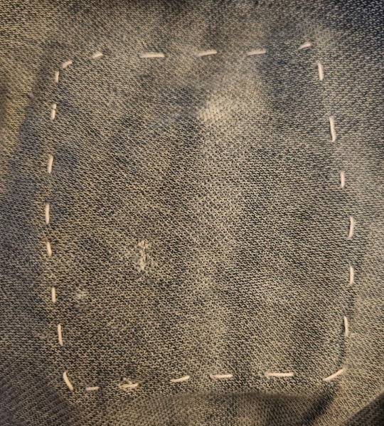
First up, we've got to stitch on the patch itself! I did some nice even straight stitches, because initially, I was planning on a little area of sashiko mending.
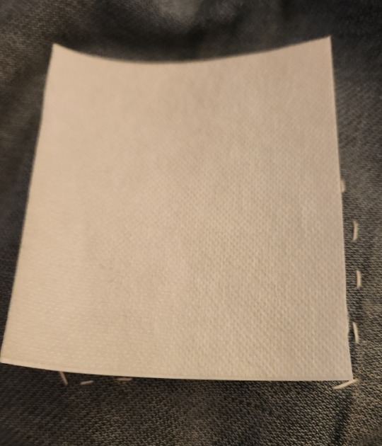
But, in looking at the size of the chunk of dissolvable backing I had cut, there wasn't really any patterns immediately springing to mind that'd work at a scale that small, or, so I thought after seeing how that basketweave pattern came together on an earlier piece. For context, the whole patch is roughly the size of the palm of my hand, at 3.5 inches square.
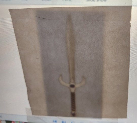
So, instead, I decided to try something a bit more complex to render than I'd really tried out before, this art of Arma! (Despite the sword's design being my work, the art in question is by @razzmatazic, who I did ask if I tried to trace, and she had no problems!) And so trace I did, tracing the outlines of the major features of the piece, namely, the outer lines, and the shapes of the gemstones.
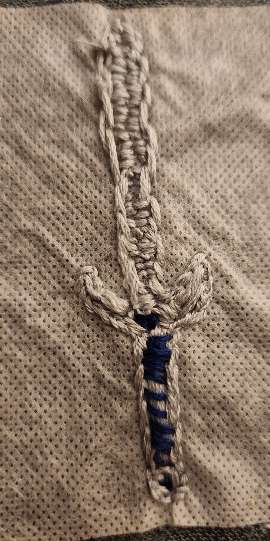
Unfortunately, in my haste (and, admittedly, my focus, since this was much higher detail than I normally tackle around here), I didn't grab any in-progress shots of this. Still, I actually really enjoy how this came out looking, even if it doesn't perfectly evoke the design or detail of the original piece, it certainly emulates the look of Arma well enough I recognize it, and very visibly reads Cool Sword, y'know?
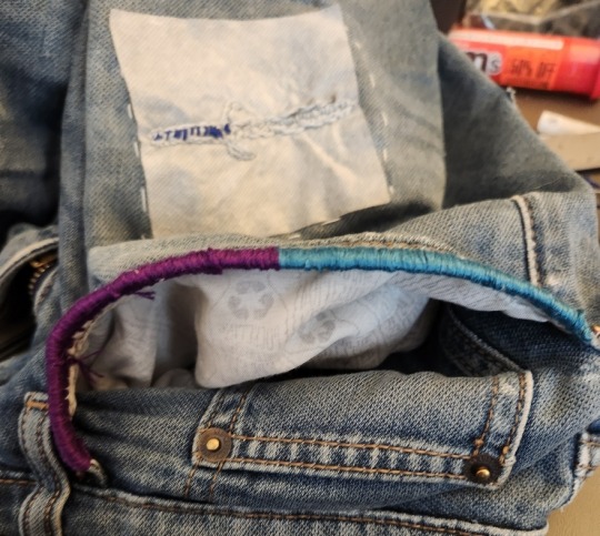
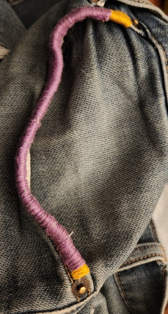
Next up were a few colorful rims around the edges of the front pockets! They were fraying pretty significantly, so not only does this add a fun splash of color, but it keeps me from picking the edges of these seams apart while I'm not thinking about my hands. Initially, I was going to pick a different set of colors than that turquoise and purple, based on a fun fact about my hometown, but that color scheme was just calling out to me! I decided to lean into the somewhat royal vibes and went for a different, lighter purple, with two little bits of yellow thread, which, fun fact, I actually dyed with some yellow flowers I foraged back in the boston area!
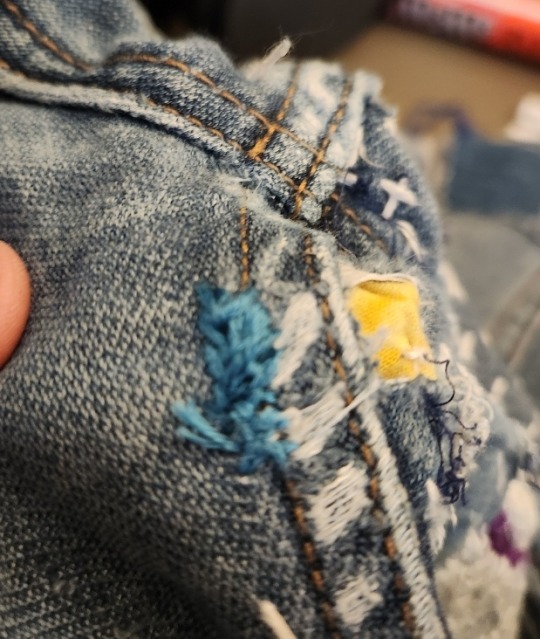
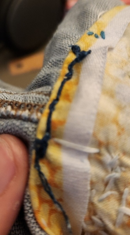
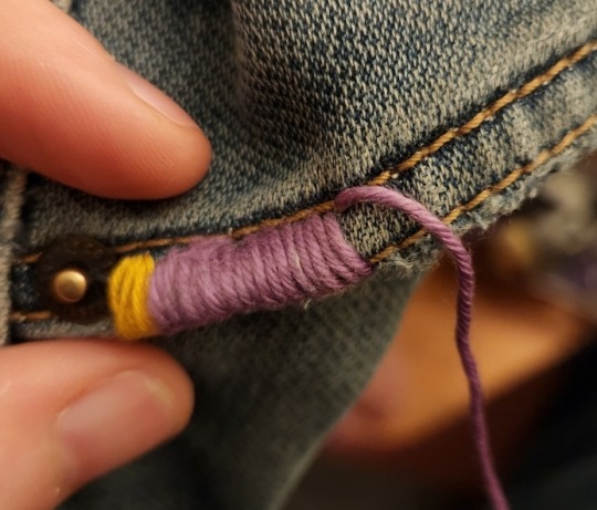
As for these two little spot-mends, they were really more an exercise in frustration. Really, I'm mostly miffed the thread broke on the original patch in the one place the hole kept trying to expand through, but hopefully that little bit of randa stitching (which looks MUCH more like randa stitching should than my previous efforts, namely on my wallet and that previous pair of pants that we detailed, the ones with the segaihana sashiko) alongside some additional reinforcement along the edge of that original yellow patch, made from some thread I scavenged from a fraying bit of denim, should keep this particular pair of shorts from getting any more fixes right on the edge of the patch that has misbehaved TWICE now!
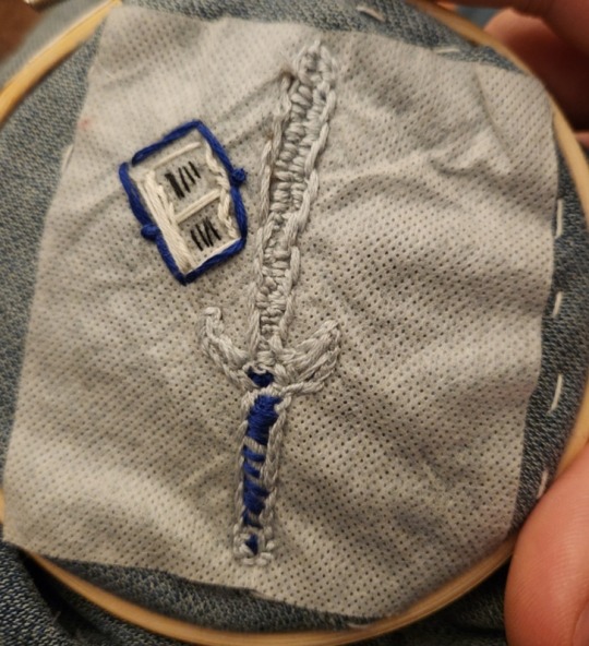
Last but not least, while I was wrangling those pocket rims and the spot mends, I really just had the feeling that Arma would look kinda... lonely, I suppose? Centered in the framing straight stitches like that, so I improvised a little open book next to her! (She's not a sword-girl, promise, it's she/her like you'd she/her a boat) There's actually some really nice dimensionality to the book, too, with some looser stitches to emulate ruffle-able pages, and those two knots along the spine make for a pleasant, crinkled texture to the cover lines! Can you tell I'm pleased with myself for getting that just so, without any guides?
All that said, hopefully that's all the mends my poor poor jean shorts need, I swear, just as I get one set fixed, the other winds up with another hole! Don't get me wrong, I'm starting to enjoy the whole almost boro-like vibe they're developing, with all these overlapping mends, but I'd like them to develop it slower, thanks! (And yes, I do plan to wear these at LEAST until they look like I've quilted them back together, they're comfy!)
#Solarpunk#Embroidery#Stitching#Visible Mending#Ecopunk#Slow Fashion#Fiber Arts#Textile Arts#Wearable Art#Fix your Clothes#Mending#Making#denim#split stitch#outline stitch#satin stitch#green fashion#sword#fantasy sword#Arma#The Silvered Sword Arma#(her name initially was just Arma and if I need it to come across quick that's her name)#(but if I have time or want to be sufficiently flowery and dramatic she gets that Longer Name)#I'm still working on the project that she's from#who knows if that one will see the light of day#you all know me I save my Biggest Ideas to chip away at slowly#the projects y'all see are me going 'eh let's try this because I wanna learn how to do X or see how much I've progressed in Y'#if these jorts disintegrate further in the area of that patch I'm gonna try to add some lilacs#plus the longer I wear this pair in particular the longer I keep that hunk of macroplastic outta the landfill#since fun fact: these jorts are made out of nylon they spun from post-consumer plastic bottles!
22 notes
·
View notes
Text
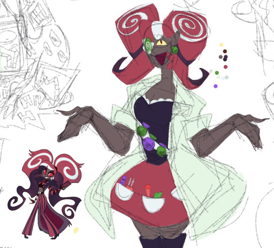
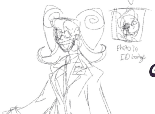
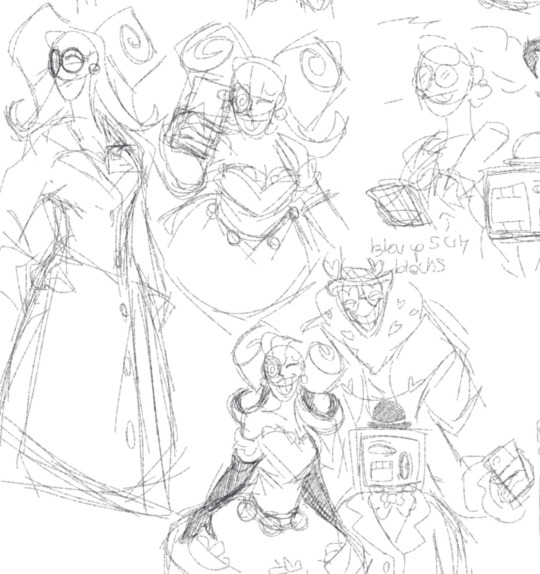
Velvette redesign and rewrite!
Out of all of the redesigns she’s the one I changed the most. I originally started making her redesign before the actual show came out, so I mostly went off of her bare bones wiki description. Mainly the fact that she makes love potions, which I incorporated more into her design (although I’m still trying to find a good balance without making it obvious).
I changed her from being a doll into being made out of chocolate and various types of candy to fit with her new position. The vibe I was trying to go with was mint chocolate and sour candy, which probably doesn’t show much in the design. And although it’s not shown much in these images, most of her outfits would probably be centered around some kind of candy or dessert.
Loosely based on Sour Belt Cookie and Chocolate Bon Bon Cookie from Cookie run.

Still working on better colors, but her color palette is mostly going to be green to complement and contrast Valentino’s mostly red palette and Vox’s blue palette. Especially since it fits with the new nerdy personality and position I’ve rewritten for her.
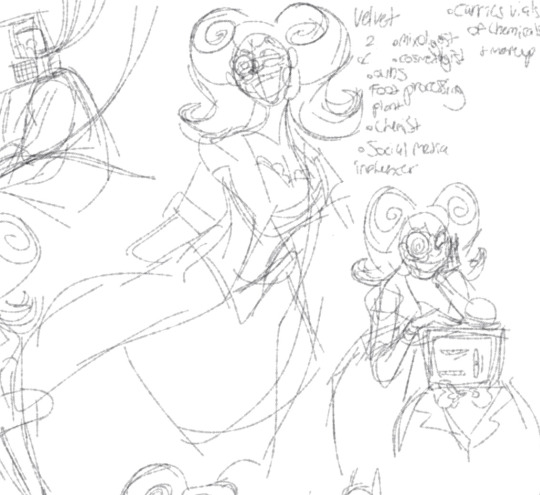
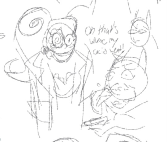
On that note of new position, she’s a social media influencer with her own makeup and clothing brand. She’s built up this false persona of being a ditsy air-headed fashion guru, whereas she’s actually a brilliant chemist who commits frequent assassinations with makeup products. Along with also running a food processing plant in gluttony where she’s able to secretly test different chemicals and potions on her unwitting employees.

There’s also her relations to the other Vees. She’s the closest with Vox as they both have an understanding of technology, and Vox is always curious to hear about her scientific endeavors. Especially if it will mean more profit. She also helps Vox with his upgrades and repairs, since although she doesn’t know much about the inner workings of pcs or tvs, she is the only one he trusts not to kill him. And it’s shaky trust at that.

Overtime Vox does learn to genuinely trust Velvette and they build a friendship of sorts by just annoying each other with whatever scheme they’re trying to pull for the week.
They are both on shaky terms with Valentino. Velvette is able to distance herself from him and only keep their relationship to a professional standard, unlike Vox who has to act like his on-call handyman at times. She uses her schemes as an excuse to distance Vox from him.

Definitely going to workshop her design a bit more, but this is the general gist of her redesign and rewrite.
Also it should be noted that my design for Valentino is outdated, going to post about his redesign and rewrite tomorrow.
#hazbin hotel vox#hazbin hotel#hazbin hotel velvette#hazbin rewrite#hazbin redesign#character redesign#sketch dump#digital sketch#character rewrite
46 notes
·
View notes
Text
I will never forgive capcom for naming this guy Phoenix and not making him a little magical
Closeups and symbolism under the cut, you guys know me, I gotta ramble

Lie detector mode activated, I just think it would be neat if people could tell when he can see people’s lies, make him a little unsettling, just for funsies
Idk I’m just real proud of the magatama and its lighting, also I gave him burn scars from The Bridge, there’s just no way he came out of that with just a cold.

Bisexual color scheme let’s go, when Mia adopts him as her little brother he gets one of her magatamas to symbolize his connection to the Fey family. Also bc it confused me as to why she’s depicted with two different colored ones, so she has a spare that she hands off to Phoenix lol.


Close ups bc I wanted to talk some more, firstly the symbolism of the star earring, so the WAA has their own obvious celestial thing going on, Sun- Apollo, Moon- Athena, and so I decided that the Stars- the Wrights. I like leaning into the idea that both him and Trucy are at their core, performers. There’s also the association of luck and wishes that come with shooting stars that I think vibes with him idk.
Also I gave him sectoral heterochromia in the shape of the magatama so it can glow when he uses it and it just looks cool man
One more thing, his hair. I like the idea that when he ate the necklace he didn’t just get scars on his lips from crunching the glass as frantically as he could manage, but the poison left behind bleached his hair and fucked him up a little more than what’s in the games. Also it looks kinda cool. I love permanent effects (physical or otherwise) of traumatic experiences!
Another magatama color but I also wanted to talk about his clothes, the buttons are based off of the sparkle in the ace attorney logo and the buttons on Ryunosuke’s clothes in TGAA
And bc I like connecting characters to each other, the diamond pattern is obvious Trucy coded. I also like the idea that his waistcoat is something of a mix between a corset, a back brace, and a bullet proof vest. I think that would be nice for him. That didn’t do much to change its design I just thought about it.
#his big puppy eyes are so important to me#he is yet another casualty of my attempt to draw men and accidentally making them look like lesbians#Phoenix is a Fey in my heart#he deserves to be a little magical with that kind of name#my art#artists on tumblr#ace attorney#phoenix wright ace attorney#phoenix wright#Fey!Phoenix#pwaa#character design
72 notes
·
View notes
Note
i think string gummy and energy drink would have one interesting kid

Maybe I went a bit too much on the colors, but this is Fizzle Rock Cookie
Yet again, I don’t have too much on Fizzle Rock. Not even sure what gender they are, since sometimes I think girl, sometimes I think boy. We’ll just go with nonbinary for now
I think Fizzle Rock is a student in a school somewhere. Like, despite their parents having such fantastical lives, they live a pretty mundane one. Which was probably intentional on their parents’ parts. They’re pretty tech savvy, and probably have a good relationship with Croissant, though they’re more digital while Croissant is more analog
They get bored easily, so they’ll end up causing mischief or getting into shenanigans just so they can do something. Which can be a nuisance for their parents, but they don’t really care
One thing I will note is that this is pretty much the opposite of what I was originally planning for them. Because one of their parents from another time and the other from another universe, they were gonna have some other time-space related job, and also a weapon on their arm that looked like a leaf blower. But then I decided “normal person with a normal life” and that’s what we got
So Fizzle Rock’s name comes from Pop Rocks, but I couldn’t name them that because that’s a brand, and “popping candy” is already taken. I kind of just decided it based on vibes and being bright colors. Also it’s a very sugary candy
Pop rocks:

So I decided to do Fizzle Rock here because of a previous ask suggesting I try to make a more vibrant colored fankid, and I thought this was the best place to do it
The hair was actually the last thing I decided on, since they originally had different hair

I like that old hair, but I thought that it didn’t really fit the name. I was considering changing their name, but I decided to maybe make an alternate that looked sharper and closer to the name, and we got the above. I actually do like how the hair turned out
The main idea in my head for this one was to go with a contrasting red/green color scheme. But then I kind of ran out of ideas of what else to do for the colors that wouldn’t make them look like a really saturated rainbow, so I just kind of stuck with only that
I also just kind of guessed around the outfit. The backpack is a carry over from the original design, I just refitted it to be a backpack. I’m not too sure about the final outfit to be honest, but I don’t really know what else to substitute it for
I’m not really sure how I feel about Fizzle Rock. I like their hair and they didn’t turn out half bad, but I also feel like the outfit isn’t great and I should have done more with them
But yeah, that’s Fizzle Rock. Not really as interesting as you’d think, but they’re here
#cookie run#cookie run ovenbreak#string gummy cookie#energy drink cookie#cookie run oc#fankid#fanchild#fizzle rock cookie#my OCs#my art#requests#answers
32 notes
·
View notes
Last Seen Blogs

altese
One of these days...
louiseverneuilevents-blog
Untitled
mk3nai-blog
Dead Inside

blume-being-blume
Trash, Trash And More Trash

bellakubo-blog
Deep Breathing