#spencerian script
Explore tagged Tumblr posts
Visit Tumblr Blog
Explore Tumblr blogs with no restrictions, modern design and the best experience.
Last Seen Tumblr Blogs


Fun Fact
Tumblr has 4 main sources of revenue.
Text

Had to see this in calligraphy. Thank you @draculastoothbrush for posting it.
#calligraphy#oblique pen holder#spencerian script#cursive#handwriting#calligraphy practice#walnut ink
6 notes
·
View notes
Text


I think my Spencerian looks good for someone who only started using it last night. The other script I used was Carolingian, which is again, something I only picked up recently. I've been practicing various versions of textura over the years and I wanted to try something new.
I have a commission slot for these open over on my ko-fi now, for $20 (AUD), but for now I'm just doing whatever I think is funny. I'm also planning to set up character art commissions at some point, but probably not for a while because here in Aus the weather is warming up and I don't deal well with that.
17 notes
·
View notes


Text
Okay okay okay BUT: Steve Rogers writing Spencerian cursive.
For those who don't know, Spencerian was a fancy-ass 19th-century style of handwriting that was already falling out of fashion in the 1930s/40s, and it looked like this:
My granddad, who was born around the same time as Steve, learned Spencerian as an adult, partly because it was fancy and he needed to look fancy sometimes (he was a jumped-up farm boy from Ohio with a high-school education who ended up signing Very Important Documents for the US Army) but mostly because it made his handwriting difficult to forge. It also hung around in graphic design--among other things, the Ford and Coca-Cola logos still use it.
Steve was an artist. It's generally accepted that he painted signs and did illustrations at least occasionally. Fancy lettering would have been an important skill for him--something he could learn from books at the library, something that didn't care about asthma or colorblindness. There's a good chance he learned Spencerian before the serum. And even if he didn't, he then started working for a spy agency where one of his first assignments was accurately reproducing documents. You think he WOULDN'T want handwriting that was hard to forge, working with (and trying to impress) Peggy "I Left Bletchley Park Because This Was More Challenging" Carter? Please.
So yes. He has his nice, accessible, everyday print, neat and legible enough to be a comic-book font. He has his elegant public-school cursive. And then he has the REAL SHIT, which he uses in only a few scenarios:
1. To impress heads of state and other bigwigs as he refuses (in fancy writing) to follow their orders
2. To write Avengers communiques he thinks might be read by other eyes (whether historians or enemies--there's a lot of overlap there, in his mind)
3. To fuck with Tony.
Tony CAN read Spencerian, but it gives him a headache.
@stuckyfingers @amarriageoftrueminds tagging the experts in Steve Rogers meta.

149 notes
·
View notes
Text
Every once in a while, I recall how Donna gets me via Henry and wonder if anyone else truly ever will. *sigh*
Henry's a perfectionist, I mean, really-really kind of inhuman -- very brilliant, very erratic and enigmatic. He's a stiff, cold person, Machiavellian, ascetic and he's made himself what he is by sheer strength of will. His aspiration is to be this Platonic creature of pure rationality and that's why he's attracted to the Classics, and particularly to the Greeks -- all those high, cold ideas of beauty and perfection. I think it's what in the end that gets him into trouble.- Donna Tartt, on the character, Henry Winter
(I do also worry about ever meeting someone like me though because... well, TSH is a cautionary tale of many facets for me, still it would be so thrilling yet relaxing to finally be understood so deeply and not feel like there was anything wrong to be masked/worked on. Oh, to not mask and be like this without someone being like, "yeah, that's not good, you should change". Alas, I keep hope for when I get into Classics and Philosophy spaces that I'll meet my people. Basically, I just am, yet again, seeking an INTJ friend but even more rigid in what areas of interest I'd like to have in common with them lol.)
(All this being said, I am always writing and exploring the full spectrum of humanity within and outside of myself to the best of my abilities, from varying perspectives in order to best form my philosophy and embody it. That means not being ruled by the shadow self because of repression but utilizing/integrating the beneficial parts--however difficult and precise this can become at times for me. This is where he and I differ, and my writing has helped me see that. This is also why I can get along with many but still don't have the bonds I seek due to deeply different values and thus, lifestyle choices than most, alas, even with many INTJ's.)
#Thankfully I am rather driven by my moral compass well after a lot of work but sometiiiimes... amirite#i post this as I take a hand cramp break from working on my spencerian script while Toccata and Fugue in D minor plays in the background#lol#im built different#lord help me#henry winter#obviously is who i mean when i say lord#jk... unless?#the secret history#dark academia#dark acadamia aesthetic#classics#classical studies
10 notes
·
View notes
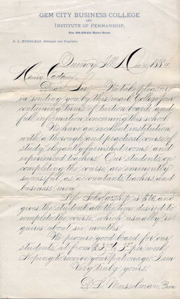
Text

Alais de Beaulieu, Jean Baptiste, -1 688. Lart d'ecrire, 1680. TypW 615.80.134 Houghton Library, Harvard University
✒️📝
#calligraphy#typography#script handwriting#cursive handwriting#Spencerian#dark academia#classic academia#academia aesthetic#hand writing
13 notes
·
View notes
Text
Found some free Spenserian help if anyone else wanted to learn it!
#cursive#Spencerian#Spenserian script#hand writing#pretty hand writing#classical literature#academia#dark academia#light academia#alixkrex#alixanderkrex#free learning#light acadamia aesthetic#light acamedia#light academism#dark acadamia aesthetic#dark academism#academism#classic academia
11 notes
·
View notes
Note
I was thinking about Johnny writing Daniel little love notes, partly because he hates texting, and Daniel spending hours trying to decipher his handwriting
I like to think that Johnny CAN write well (even in cursive) but just doesn’t, because who really cares?
It’s easier to scribble and he doesn’t have to think as much when he does it.
He figured Daniel probably didn’t expect anything fancy anyway and would just appreciate the thought—and he does! He just wishes he didn’t have to squint, put on his glasses, and follow the letters with his thumb nail just to read.
He adores it, really, and all the little doodles and sticky hearts Johnny puts on the notes (when Daniel realized how much Johnny loved arts and crafts, he bought him a medium bin full of things for him to use and got a real nice gift in return) but it’s a damper when there are even three words he just can’t discern.
He tried to mention it to Johnny carefully, but he always ends up digging his own grave, because Johnny got a hurt look on his face and said he’d try to be neater.
Daniel didn’t expect something close to spencerian script when he plucked a cutsey note from his coat pocket the next morning, but there it was.
He still has to decipher, and he misses the scrawl.
27 notes
·
View notes
Text
It's time to learn from Letters from Watson "What John Rance Had to Tell."
But first, Holmes explains some of his deductions. He does not explain what the long fingernails on the right hand mean.
And he comes out with what is for me, as a modern reader, a doozy:
The A [in RACHE], if you noticed, was printed somewhat after the German fashion. Now, a real German invariably prints in the Latin character, so that we may safely say that this was not written by one, but by a clumsy imitator who overdid his part. It was simply a ruse to divert inquiry into a wrong channel.
What? A German fashion of writing?
OKAY. It turns out that, prior to World War II, German was written in different scripts than other European languages, which the University of Wisconsin has documented for us because German immigrants continued to use them.
Here are a snipper of UW's examples of Kurrent and Sütterlin, as well as capital letters from Wikimedia's Fraktur.
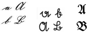
The Fraktur A looks so much like a U that I can't believe Lestrade wouldn't have read the word as "ruche" and decided the victim was a dressmaker.
Calligrascapes gives examples of Spencerian (U.S.) and Copperplate (UK) handwriting of the late Victorian period here. Lower-case A looks almost the same as in Kurrent. I feel like our wall-scrawler must have used Sütterlin.
That our killer is familiar with a German A implies he either reads German comfortably or corresponds regularly with people of German ancestry. Since Holmes says "a real German" would use Latin letters (so he corresponds with Germans or visits Germany), killer is presumably familiar with a German-American community, which is certainly plausible if he's from Ohio (or Pennsylvania, or much of the Upper Midwest).
Whew.
Holmes' passing mention of going "to Halle's concert to see Norman Neruda" is about seeing Czech violinist Wilma Norman-Neruda perform at an occasion organized by Anglo-German pianist and conductor Sir Charles Hallé (also Norman-Neruda's future second husband).
Finally, we arrive at the home of Constable Rance. Last episode, it was given as Audley Court, Kennington Toll Gate. The latter part is a real place, the site of a toll gate that was demolished about 15 years before the time of the story. Here's an old photo shared by The Underground Map.

Today the site of the toll gate is a plaza with public art.
The "long succession of dingy streets and dreary by-ways" suggests the cab ride was to somewhere near the old toll gate site (possibly just west of St. Mark's Church, which is the tower in the background), rather than directly to the triangle of land where it sat. There's not a lot of space right there, due to Kennington Park, which has a long history as a public common and site of hangings.
I suspect any police constable trying to live in London today would sympathize with Rance's living in a "sordid dwelling." Rance also takes bribes.
Rance is, of course, astonished by Holmes' powers of deduction. But what was the "drunk" man singing? I was sure in my heart that "Columbine" was "Columbia" (an old-fangled term for the United States) and searching for that made it possible to cheat when I Heard of Sherlock's discussion of this matter came up in my search results. It's "Columbia, Gem of the Ocean." Here's an audio file.
“Had he a whip in his hand?”
Where on earth did a whip come from? We've no such wounds on the victim, and the killer came with him in a cab.
I might not have gone but for you, and so have missed the finest study I ever came across: a study in scarlet, eh? Why shouldn’t we use a little art jargon. There’s the scarlet thread of murder running through the colourless skein of life, and our duty is to unravel it, and isolate it, and expose every inch of it.
And... title drop! If this is the fates weaving the tapestry of life, surely it says something about Holmes that all the other threads are colorless besides murder.
13 notes
·
View notes

Text
to find promise of peace (and the solace of rest): a TMA fanfic
<< Beginning < Prev || AO3 || My Website
Chapter 68: September 2013
Tim isn’t sure how he feels about this. Or even if he feels about this. It’s hard to feel anything right now other than pain—crippling, agonizing, inconceivable pain. The kind of pain that comes after an accident or malicious injury; the kind of pain no medicine can really suppress, can barely dull. It’s the pain of a near-mortal wound, the pain of a destroyed bone, the pain of an injury that means losing a limb to save the rest of the body.
He doesn’t even know if he wants the pain to stop or not. Maybe he’ll get used to it, maybe someday it will only be devastating rather than debilitating, but like a phantom limb, he suspects the only way to make it stop altogether is to make the brain forget there was ever a limb there to hurt, let alone lose. There’s a part of him that’s afraid that someday, he may want that, he might be willing to cauterize his brain, to scoop out the memories of the good times if it means not hurting over their absence.
Right now, though, he just wants it to ease back enough that he can feel something other than that unimaginable ache.
Lou seems to think this will help, and he trusts her. After all, she’s the only one who fucking noticed something was wrong when he came back to work, dazed and broken and bewildered. She’s the one who gave him a few days to collect his thoughts, then left a lemon on his desk—a running joke they’ve had since he got shifted to her team four years ago—and made him a cup of sweetened herbal tea. She’s the one who rambled about nothing and everything, about the High Holy Days and what a shame it is that there aren’t any major Catholic observations in September, and then eased him into what was bothering him.
He hasn’t told her everything. Most of it’s too unbelievable. But something about the sharp, piercing look she gave him over her half-moon glasses when he fumbled through his half story tells him she maybe guesses more than he’s saying. And when he finished, she scribbled an address and a name on a piece of paper and slid it to him.
As he looks down at the paper now, cobalt blue ink in its loopy Spencerian script, he hears her voice again, uncharacteristically soft and gentle: Talk to them. Tell them everything that happened, even if you think it’s something nobody in their right mind would believe. And if they believe you, come back and tell me everything, because I’ll believe you, too. Then she laughed and assured him that she believes him anyway, but she knows him and knows he won’t believe himself until someone else does.
She’s right, he has to admit. If he hadn’t been there, he wouldn’t have believed it.
The office is closed today, or at least Tim’s department is. The publishing company lets each department head set their own schedules and days off, so Lou’s first act as head of this particular Editing team was to decree that they would be closed on all religious holidays requiring any kind of observance, regardless of the religion, as long as at least one person on her team celebrates that holiday or observance. Today is Rosh Hashanah, the Jewish New Year, and Lou will be at services all day anyway. Since there’s nothing else for Tim to do on a Wednesday except brood, he’s made his way to this place.
It’s…a lot fancier than the office building he works in. It’s old, and there’s something familiar about the architecture that he can’t quite put his finger on, and isn’t sure he wants to. It gives him a creeping feeling of dread. At the same time, it gives him a feeling of…he won’t call it rightness. There’s nothing right about this place. But definitely certainty. Lou’s right. Whatever answers he’s looking for, he’ll find them here.
He glances at the plaque next to the door—THE MAGNUS INSTITUTE, EST. 1818—and mounts the steps, then pushes through the fancy, ornate wooden door. He finds himself standing in an open lobby, the floor of polished wood smoothed by countless feet. Doors and corridors lead off on either side, and in the center is an ornate staircase with a lush carpet leading up the middle; another staircase heading down is just visible beyond a door. Situated between the two staircases is a desk surrounded by file cabinets and bookshelves, behind which sits a woman who looks like Lou’s evil twin fixing him with an interested look.
Since she’s the only person Tim can see, he walks over to her desk and switches on the charisma. It feels a bit stiff, but he manages.
“Good morning,” he says, trying to be professional. “Uh, my name’s Tim Stoker, I’m here to see…” He looks down at the paper in his hand again.
“I’ll take it from here, Rosie,” a voice says.
Tim looks up into the eyes of someone he deduces is not named Gertrude Robinson, unless this is a way more progressive organization than it appears from the façade. The someone, in fact, is a man of indeterminate age somewhat older than Tim but not quite old enough to be Tim’s father, in a crisp tailored suit the same charcoal grey as his eyes that looks like it costs more than Tim makes in a month and a tie the same shiny brown as his slicked-back hair. He studies Tim with a benign expression of mild interest that nevertheless fixes him in place.
“Uh,” Tim begins.
The man holds out a well-manicured hand that’s never done a day’s hard work in its owner’s life. “I’m Elias Bouchard. Gertrude Robinson is unavailable today, I’m afraid, but I have everything set up in my office. If you’ll just follow me?”
The inflection at the end of the phrase makes it sound like a question. The look on Elias Bouchard’s face brooks no argument. Tim follows.
The man’s office is…odd. There’s not really another word for it. There’s no computer, no laptop, not even a fax machine. There are a number of very old bookcases lining the walls, full of thick, leather-bound books, and if there’s a window they’re covering it. The heavy wood desk looks like it contains enough drawers, hidden or otherwise, to outfit a warehouse hiding the Ark of the Covenant. Atop the desk sits thick ledger with a green cover emblazoned with EXPENSES 2013 FISCAL YEAR in gold foil, set to one side. There is also a small stack of paperwork, all bearing the same symbol—what looks like a stylized owl set within a circle and clutching a ribbon in its talons, Tim can’t make out the words on the ribbon—set next to a thick-barreled silver fountain pen.
“Please, Mr. Stoker. Have a seat.” Bouchard gestures to a chair upholstered in rich red leather, then sits in a far more ornate leather chair behind his—Tim presumes it’s his—desk.
Tim sits slowly. This can’t be where the man works most of the time—it must be a receiving room or something. There is no personalization to this room whatsoever. It’s entirely possible that he doesn’t mix work and his personal life, which, fine, but still, Tim would expect there to be a picture, a plant, a novelty pen holder, something. Instead, the office is completely bare and soulless.
Numb as he is, he can’t wrap his brain around that. His office, small as it is, bursts with his personality—the wall calendar with pictures of lakes and waterfalls he’s planning to hike to someday, the desk organizer with an image of the man from the Monopoly board leaping out of a flaming pit with GET OUT OF HELL FREE written beneath it the guy he’d been with in uni had given him for Christmas before breaking it off and moving back to Colorado, the lopsided trinket box constructed of flat wooden sticks and glitter glue his neighbor’s son had made for him at summer camp as a thank you for teaching him to ride a bike while his mum was at work, the photograph in a goofy ceramic frame currently lying face down because he can’t bear to look at it anymore but also can’t bear to take it down. Five days out of nine he can also count on there being a lemon with googly eyes glued to its peel staring at him from somewhere, which is usually his cue to go down to Lou’s office, with its photographs of her nephews and nieces and their kids—or at least the ones speaking to her this week—its awards and accolades proudly displayed wherever they’ll fit, its Newton’s cradle, and the knitted shawl draped over the back of her chair, for a cup of tea and a chat or a good laugh about something. Hell, even Howard Jackson, who hardly ever says a word to anyone except to snap about the quality of authors these days, has a pair of small flags stuck in a bud vase on one corner of his desk—the Portuguese flag and a pride flag that Tim’s never worked up the courage to ask him about. But Elias Bouchard’s office has…nothing.
It’s unnerving. Much like the rest of this place. Tim figures he should just talk to this guy and get the hell out of here. Hopefully it’ll help.
“So,” Bouchard begins. “Tell me, Tim. What are you afraid of?”
Tim blinks, hard. “What?”
Bouchard continues smiling benignly. His pen is held between two fingers. “In the Institute we are keenly interested in the anatomy of fear. Much that is stored here is disquieting. It is important to know if anything here might…upset you.”
Tim frowns. He doesn’t consider himself fearless by any means, but his biggest fear—losing his little brother to something he can’t save him from—the fear that’s dogged him since he was five years old—has already come true. What else is there to be afraid of?
“The only thing that might upset me,” he says, biting out the words with distinction, “is if this place doesn’t have the answers I’m looking for.”
Bouchard sits back. He looks inordinately pleased. “Good,” he says.
Before Tim can ask what the fuck that is supposed to mean, he continues, “Now then. Have you ever had a…supernatural experience?”
Tim gestures helplessly. “I mean…that’s why I’m here.”
Bouchard nods, but doesn’t ask him for details. “I see. Well, Louise Wexler was wise to send you to us. Our library is extensive, as are the assets of the Research department.” He uncaps his pen and adds, “In fact, I think that would be an excellent fit for you. Your academic credentials are substantial, and your employment records are quite stellar. Your lack of studies in the paranormal is, of course, a bit of a disadvantage, but not nearly as much as one as you might think.” A faint smile flickers over his face. “In fact, we currently have only one employee at the moment who had a degree in parapsychology before joining the Institute. Although we do have an excellent incentive program for employees who wish to expand their knowledge of—”
“Wait, wait,” Tim interrupts. “I have a job. I’m just here to—I mean, Lou didn’t send me here to—I didn’t apply to work here.” Sudden misgiving seizes him. “Did I?”
“You’ve been through a very difficult week, Tim,” Bouchard says, in a tone that’s probably meant to be soothing. “It’s natural that you would have some doubts about your movements.” He writes something on the paper in front of him, then pushes it and the pen towards Tim. “I’m afraid our library is not…open to the public. We have some very, ah, sensitive material stored there, as well as in other places. We allow students access, on a limited basis, but unless you plan to go back to school in order to study the paranormal, or are producing some sort of scholarly work on the topic, the only way to get those answers you’re looking for is to join the Institute.” He nods at the paper; Tim, looking down at it, realizes it’s a contract of employment. “As I said, Research would be an excellent fit for you, or if you prefer, you could perhaps work in Artifact Storage. I’m afraid we have no openings in the library at this time, and the Archivist usually handles the hiring of her, ah, assistants more directly.”
This is all going way too fast. Tim’s head is spinning. He’s sure Lou just suggested he come here to talk, something about…a statement? It’s fuzzy in his memory. But…Bouchard knew he was coming. He had the paperwork all ready. And even if this isn’t the most conventional interview Tim’s ever had…
“Research is fine,” he mumbles, a little dazed.
Bouchard beams. “Good! Sign here, please.”
Tim signs. And signs. And fills out a few forms. And hesitates when he’s asked if he has any emergency contacts, because his dad all but accused him of having a hand in Danny’s disappearance because he was jealous, of all things, like he’s ever been jealous of his brother in his life, and his mum’s gone off someplace he can’t reach her.
“You can leave that blank for now,” Bouchard says.
So Tim skips over that, and fills out the rest of the paperwork, and signs one last time. He pushes the forms and pen back over to Bouchard, who picks them up and studies them quickly. “Perfect. Well, that all seems to be in order. Do you have any long-term projects you need to complete at your current job, or will you be able to start on Monday?”
“Uh.”
“Ordinarily we would have you wait until the sixteenth, as that is technically the start of the next pay period, but I’m sure you would like to begin your research as soon as possible.” Bouchard raises an eyebrow. “Unless there’s some reason why you shouldn’t?”
“Uh, no. No, that’s good.” Tim tries to smile. “Thank you, Mr. Bouchard.”
“Oh, that won’t be necessary, Tim. Just ‘Elias’ will do.” Bouchard—Elias—rises and holds out his hand. “Welcome to the Magnus Institute.”
Tim shakes his hand, collects his necessary paperwork, and walks out of the office. It’s not until he’s standing on the street in front of the building that he thinks, What the fuck?
What has he just done? He likes his job, likes working in publishing. Lou’s like a second mother to him, or at least like a crazy aunt. Even if he doesn’t really get on with his other coworkers, he’s built a life for himself, he’s building a career. Is he really going to throw it away for a place like this?
He looks down at the logo on the paperwork, paperwork that doesn’t disintegrate into ash on the wind like the flier he held after surviving…that. All that, and he didn’t even tell Elias about Danny. The man doesn’t even know why Tim came, not really, and yet he was so soothing and helpful…
Unless…unless Tim did apply, in some sort of weird fugue state after Lou slipped him the address. Unless in his application he mentioned that he was looking to change jobs after the loss of his brother. Unless this is Elias Bouchard’s way of saying yes, Tim, your experiences are valid, you saw what was true, now come and learn how to stop it.
Yeah. Yeah, that has to be it.
He can talk to this…Gertrude Robinson person sometime once he starts working here full time. Meanwhile, he can make use of the library. He can look up…there are a lot of things he needs to look up, a lot of possible threads to pull. Maybe he’ll give it a week or two to get settled in and learn how the people here do research, and then he’ll know where to start. Maybe he can’t save Danny, but maybe he can save the next guy from losing his brother. It’s worth a shot.
Meanwhile, it’s getting really warm. Tim undoes the top button on his shirt and makes his way towards the river, thinking he’ll go somewhere for a cool drink and then…and then…and then he’s not sure what. Go home and figure out how to draft his resignation letter at the publishing company, he supposes. He’ll need to tell Lou first thing tomorrow morning.
Changes are coming. Big changes. And Tim is pretty sure he isn’t prepared for them.
#ollie writes fanfic#tma fanfic#to find promise of peace (and the solace of rest)#tim stoker#elias bouchard#grief#mention of loss of a sibling#gaslighting#manipulation
6 notes
·
View notes
Text

I got a new pen today, had to try it out with something I saw on here.
8 notes
·
View notes
Text


A better version of the Spencerian Ladies Hand, with principle strokes included. Also a page of guidelines.
My strokes are still a little wobbly in places, but it does look a little better than last time I think. I'm planning to mess around with my flat pencil brush so the shading is more consistent as well.
2 notes
·
View notes
Note
What are your favorite nibs/fountain pens for styles like spencerian?
Or any weird fun nibs or inks you love and want to talk about?

Hi, anon! Personally, I love using a Hunt 101 nib for spencerian/copperplate scripts. It's a very flexible nib, so it's great for creating those delicate swoops. Also really fond of the Leonardt 111 EF nib, but I mostly use it for sketching. The extra fine tip on it makes it great for details. And my favorite ink of all time is Diamine oxblood! I love the gothic bloody red color of it.
9 notes
·
View notes
Text
花體字≠英文書法
這是個常見的名字誤譯,但已積非成是許久,所以我們也只好將錯就錯啦!
今天來正名一下這些專有名詞:
英文書法 calligraphy
花體字 ornamental penmanship
銅版體 copperplate
英文的Calligraphy,意為書法(中文英文、所有語言都包括在內),在台灣多半指英文書法,在希臘文中指的是「美麗的書寫」,可以說這個名詞概括了大部分的歐文書寫藝術,花體字當然也是英文書法的一部分。
花體字包含的範圍就小得多,它是ornamental penmanship的誤譯���廣義來說,它原本的意思就如字面上一樣,它不單指一種字體,它指的是裝飾性書寫技法;狹義上,在英文書法圈內,它常常指的是由史賓賽體(spencerian script)延伸出來的裝飾性寫法。
▼spencerian script

▼ornamental penmanship,除了字高比例斜度有所不同以外,粗細變化更誇張、並且多了複雜華麗的裝飾線。

花體字不單指一種字體,它指的是裝飾性的書寫技法;同時,花體字也不能代指所有的英文書法(Calligraphy)。
▼舉個例子,下圖的哥德體抄本,它是英文書法,但這幅照片中的字體本身沒有延伸出的花飾(Flourish)或曲飾(Swash),因此在這個例子中的哥德體不能算是花體字。

▼反過來說,下圖也是哥德體的一種,這是德國尖角體(fraktur),它的字體本身(不是插圖喔)有延伸出的花飾和曲飾,因此在這個例子中,它可以算是花體字!

▼那麼考考你,下圖這張羅馬五世紀的維爾吉抄本,上面的書體能不能算是花體字?

現在你應該可以很輕鬆地猜出來了!
它的字體本身沒有花飾、曲飾元素,它可以是書法,但��絕對沒辦法稱為花體字的。
這張抄本上面的字體叫rustic capitals,在國家教育研究院翻譯做俗大寫體,有些不錯的原文書籍到了台灣,未經詳細考證就照著google翻譯成“粗獷字體”,好書錯譯,不免有些可惜。
另一個時常被誤譯成花體字的是銅版體 (Copperplate)
在中國翻譯成圓體,特指的是銅版體這個字體家族中的 English Roundhand 這一款字體。在台灣譯名則一度非常混亂,曾被莫名其妙的翻譯成浪漫體、拉花字、法式花體字……

▼它翻譯成銅版體,是因為這種字體多見於凹版印刷(Intaglio)的銅印版上,這種印刷方式當時常用於印製鈔票、有價證券上。
(其他細項分類我日後展開講)

▼銅版體同樣也有繁複的裝飾書寫技法和各種變體,這也是書法圈在提到花體字時,通常也會把銅版體納入討論的原因。\

回到花體字這個名詞上,花體字被和英文書法劃上等號,起源是2012年出版的《花體字魯拜集》的序言中把這兩個名詞劃上等號。
之後2015年哥德體和“浪漫體”的教學書《寫一手漂亮花體英文字Calligraphy A B C》序言中,也犯了同樣的錯誤,在此之後很長一段時間,台灣出版界就這麼一直誤用下去。
積非成是的結果,就是我們這些老師在講「英文書法」時,往往沒人聽得懂,只好跟著大家一路錯下去啦!
New Spencerian Compendium, Spencerian Authors, 1879
Lessons in Ornamental Penmanship, P.Z. Bloser (Copies by E.A. Lupfer), 1948
Vatican Vergil (Vatican, Biblioteca Apostolica, Cod. Vat. lat. 3225) Folio 18v.
The Universal Penman, George Bickham, 1741
www.concordmonitor.com
0 notes
Text
Calligraphy in Multilingual Scripts: World of Lettering

Calligraphy in Multilingual Scripts: Discover the Art of Global Lettering
Over the past decade, the world of calligraphy has expanded to encompass a multitude of languages and scripts. Calligraphy in multilingual scripts has become an art form that celebrates cultural diversity and global communication. Creating typefaces for global scripts requires a unique set of skills and sensitivities. Designers must understand the nuances of different languages, the cultural context behind each script, and the intricate rules and stylistic conventions that govern calligraphy in various languages. In this article, we will explore the challenges faced by type designers when working with multilingual scripts, the tools and techniques they employ to create stunning calligraphy, and the growing demand for multilingual typefaces in today's cosmopolitan design markets. - Designing typefaces for multilingual scripts requires an understanding of linguistic nuance and cultural context. - Collaboration with native speakers and designers is essential to creating authentic and culturally sensitive calligraphy. - Specialized tools and techniques, both traditional and digital, play a crucial role in crafting multilingual calligraphy. - The demand for multilingual typefaces is driven by cosmopolitan cities and flourishing design markets. - Creating culturally specific and language-specific typefaces is crucial to effective communication in a globalized world.
The Challenges of Multilingual Calligraphy

When designing calligraphy in multilingual scripts, you face unique challenges that require careful consideration and expertise. Each language has its own set of rules and stylistic conventions that must be understood and respected in order to create authentic and beautifully crafted calligraphy. One of the key challenges is maintaining the balance and proportion of the letterforms. Different languages have different character sets and varying letterforms, which may require adjustments in weight and size to ensure visual harmony. For example, the thicker strokes in one script may need to be adjusted in another script to maintain consistency. Cultural significance is another crucial aspect to be aware of when designing multilingual calligraphy. Certain letterforms may hold deep cultural meaning in one language, while being completely different or absent in another. It is important to understand these nuances and incorporate them into the design to create culturally sensitive and accurate calligraphy. Collaboration with native speakers and designers is often essential in creating multilingual calligraphy. Native speakers possess invaluable insights into the language, its history, and cultural context. This collaboration helps ensure that the calligraphy accurately represents the language's unique characteristics and cultural identity. Calligraphy Styles and Techniques Calligraphy encompasses a wide range of styles and techniques that contribute to the overall beauty and aesthetics of the script. Whether it's the elegance of Copperplate, the bold strokes of Blackletter, or the fluidity of Brush Script, each style requires a deep understanding of its unique rules and techniques. Here are some popular calligraphy styles: - Italic calligraphy - Spencerian calligraphy - Gothic calligraphy - Modern calligraphy - Arabic calligraphy - Chinese calligraphy Each style demands mastery of different tools and techniques. For example, Arabic calligraphy often utilizes a reed pen, while Chinese calligraphy requires the skillful manipulation of a brush. Understanding and practicing these techniques are essential in creating authentic and visually striking calligraphy in multilingual scripts. "Calligraphy is a visual art form that combines linguistic expression with artistic creativity." - Unknown Challenges Faced in Multilingual Calligraphy Challenges Description Understanding script-specific rules and conventions Different scripts have distinct rules and stylistic conventions that calligraphers must grasp to create accurate representations. Ensuring balance and proportion Varying letterforms in different languages require adjustments in weight and size to maintain visual harmony. Respecting cultural significance Letterforms may hold deep cultural meaning in one language but differ or be absent in another. Cultural sensitivity is crucial in multilingual calligraphy design. Collaboration with native speakers and designers Native speakers provide valuable insights into the language, history, and cultural context, ensuring accurate and culturally sensitive calligraphy.
Tools and Techniques for Multilingual Scriptwriting

To create captivating scriptwriting in multilingual scripts, calligraphers and typographers rely on a range of tools and techniques. These resources enable them to bring their artistic vision to life while ensuring legibility and consistency across languages. Here are some of the essential tools and techniques used in multilingual calligraphy: - Pens and Brushes: Specialized pens and brushes are essential for creating various calligraphy styles. Different writing implements are designed to produce unique strokes, from bold and dramatic to delicate and intricate. Calligraphers select pens and brushes based on the desired effect and the specific characteristics of the script they are working with. - Digital Software: Digital software plays a crucial role in modern scriptwriting. With the help of software applications, calligraphers and typographers can design and edit letterforms with precision. They can experiment with different styles, sizes, and weights, ensuring the letterforms meet the specific requirements of each language and script. - Attention to Detail: The process of scriptwriting requires meticulous attention to detail. Calligraphers carefully analyze the anatomy and structure of each letterform, striving for consistency throughout the script. They pay close attention to the appropriate spacing, curves, and proportions to create a visually harmonious result. - Understanding Script Characteristics: To create compelling multilingual lettering, calligraphers must understand the unique characteristics of each script. They study the historical and cultural context of the writing system, paying attention to stroke order, ligatures, and other script-specific features. This knowledge allows them to adapt letterforms while maintaining legibility and integrity across languages. By utilizing these tools and techniques, calligraphers and typographers can produce masterful multilingual scriptwriting that captures the essence of each language and script.
The Global Demand for Multilingual Typefaces
https://www.youtube.com/watch?v=I_Zmevl-iOs The market for global scripts has witnessed significant growth in recent years as the need for multilingual communication becomes increasingly important. While Latin, Greek, and Cyrillic typefaces have long been available and widely used, there is now a surging demand for typefaces that support Southeast Asian, Chinese, Japanese, and Persian Gulf scripts. This demand is fueled by the rise of cosmopolitan cities and flourishing design markets in these regions, which have become hubs of international business and cultural exchange. As companies seek to expand their reach and connect with diverse customer bases, the ability to effectively communicate in multiple languages has become a necessity. Culturally specific and language-specific typefaces play a vital role in meeting this demand. These typefaces not only enable clear and accurate communication but also reflect the unique aesthetics and traditions of each script. By crafting typefaces that are tailored to the nuances of different languages and writing systems, designers can ensure that global communication is visually appealing and culturally appropriate. The Impact of Multilingual Typefaces Multilingual typefaces are not only essential for global communication but also contribute to the preservation and celebration of linguistic diversity. They enable individuals and communities to express their identities, tell their stories, and connect with others around the world. Furthermore, the availability of multilingual typefaces facilitates the exchange of knowledge, ideas, and creativity across borders, fostering global understanding and collaboration. "Multilingual typefaces bridge linguistic barriers, facilitating effective global communication and creating opportunities for cultural exchange." - John Smith, Type Design Expert The Role of Cosmopolitan Cities and Design Markets Cosmopolitan cities, such as New York, London, Paris, and Tokyo, have emerged as key centers for design innovation and multicultural exchange. They attract talented designers and typographers from around the world, creating a melting pot of creative ideas and perspectives. Design markets in these cities serve as platforms for showcasing and promoting multilingual typefaces, offering opportunities for designers to connect with clients and customers who value effective cross-cultural communication. Examples of Multilingual Typefaces Typeface Supported Scripts Example Use Case Helvetica Now Latin, Greek, Cyrillic, Arabic A global brand launching a campaign in the Middle East Noto Sans Latin, Greek, Cyrillic, Southeast Asian, Chinese, Japanese, Korean, Arabic, Persian A multinational publishing company producing educational materials BiteChalk Latin, Greek, Cyrillic, Thai, Vietnamese A restaurant chain with locations in Southeast Asia and Eastern Europe These examples showcase the versatility and functionality of multilingual typefaces, serving as effective tools for communication in diverse regions and cultures. The global demand for multilingual typefaces is expected to continue growing as the world becomes increasingly interconnected. Designers who are proficient in designing typefaces for different scripts will be sought after in the design industry, as they contribute to effective cross-cultural communication and help bridge linguistic divides.
Conclusion
Calligraphy in multilingual scripts is a captivating art form that demands a deep understanding of diverse languages, writing systems, and cultural nuances. The process of designing typefaces for global scripts necessitates striking a delicate balance between artistic expression and cultural sensitivity. Collaboration with native speakers and designers is essential in creating authentic and functional calligraphy that resonates with different communities. As the demand for global scripts continues to grow, there is an increasing need for culturally specific and language-specific typefaces. These typefaces cater to the diverse audiences around the world, meeting their communication needs effectively. By developing typefaces that accurately represent the unique characteristics of each language, we can enhance global communication and celebrate the richness and diversity of our world's languages. In this ever-connected world, where boundaries are blurred and cultures intertwine, calligraphy in multilingual scripts plays a vital role in facilitating clear and meaningful communication. It not only preserves our linguistic heritage but also fosters understanding and appreciation among different communities. As we continue to explore the possibilities of calligraphy in multilingual scripts, we embrace the power of language to transcend barriers and connect people from all corners of the globe.
FAQ
What are the main challenges in designing calligraphy for multilingual scripts? Designing calligraphy for multilingual scripts requires understanding the rules and stylistic conventions of each script, as well as cultural significance. Collaboration with native speakers and designers is often necessary for authenticity. What tools and techniques are used in multilingual scriptwriting? Calligraphers and typographers use specialized pens, brushes, and digital software for different writing styles. They focus on precise strokes, attention to detail, and adapting letterforms for uniformity and legibility across languages. Why is the development of culturally specific and language-specific typefaces important? The demand for global scripts is growing, and the development of typefaces for different languages and cultures enables effective communication and meets the needs of diverse audiences. How does collaboration with native speakers and designers contribute to creating authentic calligraphy in multilingual scripts? Collaboration ensures cultural sensitivity, linguistic nuance, and authenticity in calligraphy by incorporating the expertise and knowledge of native speakers and designers. What is the market demand for multilingual typefaces? The market is seeing a growing demand for typefaces supporting Southeast Asian, Chinese, Japanese, and Persian Gulf scripts, driven by cosmopolitan cities and flourishing design markets in these regions.
Source Links
- https://www.commarts.com/columns/multilingual-scripts - https://in.pinterest.com/pin/writing-systems-and-calligraphy-of-the-world-smashing-magazine--559220478712470279/ - https://letterformarchive.org/news/the-multilinguascriptic-life-of-r-k-joshi/ Read the full article
0 notes