#the font is a placeholder for sure i just needed the text in place
Text
so i had a thought the other that made me cry and i'ma try to explain it bc i need someone else to know of it. it's two am i havent slept and i'm ✨emotional✨ so idk if this'll make any sense. over explaining incoming
tw for brief mention of abuse, homophobia and death, specifically of trans people but i'm not gonna talk about that like, explicitly. and also spoilers for the raven cycle
so. there's a quote for the raven cycle that i 100% want as a tattoo. it's "if you can't be unafraid, be afraid and happy." (henry cheng in the raven king). it's so so important to me and i'ma explain why:
i started reading the raven cycle the same year i realized i wasn't straight. the series immediately became my favorite books Ever (this was in 2016, and they're still my favorite today). adam parrish was the first bisexual character/person i'd ever known. i didnt even know bisexuality was an option before this, and i related to his situation (abusive family) and i ended up id'ing as bi for, like. i think like a year after that (until i found out what aro/ace was).
and i was scared. i was 14 and living in an abusive household with homophobic family members. and i read that line in the raven king: "if you can't be unafraid, be afraid and happy." and it stuck with me. it's stuck with me for six (6) years now.
because as a queer person, specifically as a trans person (even more specifically as a nonbinary person) i'm so scared. i'm so scared all the time. i'm very out, and that's how i want to live my life but there are times- just the other day i was downtown when it started getting dark and i was wearing a big trans flag button and i could see it so clearly, a thousand deaths i could suffer for being myself (i took the button off and put it in my pocket).
i don't think i'll ever stop being scared but i am proud of who i am. i'm happy as myself, i'm happy being nonbinary.
if you can't be unafraid, be afraid and happy.
they can't take that from me. the minute i trade my pride for fear they've won.
if you can't be unafraid, be afraid and happy.
and i am.
and i was explaining this the other day and i got hit with this thought.
that scene in the raven cycle, when they write "remembered" on noah's carr
to do both. "if you can't be unafraid, be afraid and happy." for me, and "remembered" for the ones that didn't make it. for the trans people who fought for us, for the trans peoplewho just tried to live their lives.
i'm not explaining this as well as i'd like but i really hope it makes some sort of sense
i made a mock up type thing for what i was thinking of:
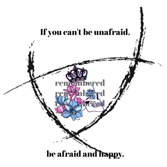
(please dont like, use this anywhere)
its not perfect but im calling it quits for the night
the flowers are amaryllis (for pride) and forget me nots (for remembrance)
#emery.exe#putting this at the top: ill edit in the morning w an image desc but i dont think itd make any sense if i tried to write it tonight#this is almost def incoherent but i needed to get it out#the font is a placeholder for sure i just needed the text in place#also this is all made of free clipart stuff bc i cannot draw but i had to like. be able to see it yknow? i did do the coloring tho#if anyone wanted to make their own version of this for me to possibly get a tattoo of..... they'd be free to...... jk jk..... unless? 👀#this is too personal to put in the fandom tag feel free to rb to like reply but pls pls pls dont tag this for fandoms thanks ily#ask to tag
2 notes
·
View notes
Note
hello, i ADORE the way you use and pair fonts. i was just wondering if you had any tips for using more than one font in an edit? (Such as mixing cursive and non-cursive, etc.) if you've answered something like this before, my apologies!
nonnie!! literally never apologize for asking me to scream about fonts; they live in my mind rent free. 💜i’ve mentioned a vague collection of fonts i like here, but i’ve been meaning to do a post on how to combine them for awhile so thanks for giving me an opening to do so! so, without further ado, a few tips & tricks.
1. FIGURE OUT THE VIBES OF YOUR SET FIRST.
Like colours, fonts have a certain feeling/energy to them and should match the emotion you want your set to communicate. Cursive fonts tend to suggest a more gentle, relaxed, or fragile emotion; brush fonts convey a sense of movement, excitement, or freeness; heavy-weighted fonts have a sense of power, abruptness, or impact; and so on, and so on. For example:

Although they’re both using the same kind of alignment, the combo on the left is far less in-your-face as the option on the right would’ve been. Using a handwritten font for the accent feels a bit more contemplative or personal, like an awed whisper; whereas the all-caps bold font is more like it’s coming to kick your door down in celebration. Either option works well enough as a font combo, but in terms of working together towards the theme, the left one matched what I wanted. So—always prioritize emotion in font choice, even if another option looks just as cool.
2. STYLE YOUR OTHER FONT(S) AROUND THE ACCENT FONT.
With “the accent font” being the “fancy” one, in this case. It’s going to be the centerpiece of your set, so you don’t want to have picked a supporting font first only to discover it doesn’t actually go with your main font. I usually type the text in a placeholder font (like Helvetica or let’s be real, my faves Gill Sans or Futura), then figure out my accent font for the Main words, then go back and find a supporting font & weight that I like.
You also, like me, might just stick to 3-4 “basic” fonts and never change them, because it’s much simpler that way and also Futura is such a pretty font y’know??
3. COMBINING FONTS IS ABOUT CONTRAST.
For fonts to work together, they have to contrast in (at least) two ways—in weight, in style, in size, or in colour. Similar to picking out an outfit, if a font is too similar to its neighbor it’ll clash, but they do still need to be living in roughly the same neighborhood or it won’t fly. For example:

Only two fonts are used in each set (and only one in the last one—the contrast is made through negative space rather than font type), and contrast comes through 1) size (note how the accent font is always bigger—I usually aim for about double), 2) style (block, handwritten, brush, sans serif vs. serif), and in the case of the bottom left one, 3) tracking (“bumps the needle” is the same font [gill sans] as “my heart” is; the difference is the distance between letters is set at like 1500 vs about 75).
While there’s plenty of contrast in the examples above, there’s also harmony—in the top left example, the Accent font for “My God Does” is a thick, rounded font, so the supporting/plain font is also fairly rounded and a medium weight. Compare that to the middle bottom set, where since “Wolf” is in a tall, thin font, “Leading” is also in a tall and thin font.
Without harmony, the fonts start warring against each other. Taking that last set as an example:

On the left, we have the original—“Wolf”/”Leading” pairs Onyx/Acumin Variable Concept (Extra Condensed)—and on the right, Gill Sans has replaced Acumin Variable as the secondary font. Because Gill Sans is so much rounder and bigger (this is despite my taking the pt size down by about 6), it reads as thicker. That added horizontal weight takes away from the very concentrated vertical weight of the Accent font, and therefore doesn’t work as smoothly.
You can get away with pairing rounded/thin letters or heavy/light letters, and in fact you should try it! Just make sure there’s a significant contrast between them, not just a minute one.
4. TYPOGRAPHY NEEDS AN ANCHOR.
Once you’ve picked your fonts, there’s another problem: placement. One of the difficulties of text in a gif is that it can go anywhere, and so sometimes we get carried away with the arrangement. That’s where anchoring the text—placing it in alignment with something else—comes in. Let’s zoom in on two of the examples above.

While the arrangement is playful in both, the text doesn’t feels lost because even when it’s unusual, it’s still directly aligned with some part of another word. In the left example, “The,” “Wolf,” and “Wolves” are all aligned with their first letter to the left, whereas the word “Leading” is aligned to the right with its last letter matching the “S” in wolves. Thus, while it breaks up the left-alignment of the rest of the set, it still feels like it belongs because it’s attached on the other side. It doesn’t “break the box,” so your brain doesn’t get confused.
With the set on the right, a similar thing is at play. First, the alternating pairs are aligned either to the left or the right so it still reads as a unified rectangle (don’t break the box!), and second, each time the text switches sides it’s placed directly on the line below the last word. So even though they’re not aligned on the left or right, they are aligned from top-to-bottom. The negative space is also key to breaking up the text in a pleasing manner, as seen in this comparison:
The original version on the left creates a smooth river or “S” shape, with each line break also making sense for the rhythm of the sentence. The one on the right, however, breaks the text up uncomfortably, the lines are jagged and bump up against each other unpleasantly, and “the scratching” stretches far out into the negative space, tripping up the flow. When and where you chop up a text matters not only for how you read it, but also how you feel about it.
5. A QUICK WORD OF WARNING.
Obviously no rule is a complete absolute, but I think this one holds up under most circumstances so here it goes: do not put two different fonts of the same genre in the same gif. If you have Cursive Font A already, you very likely won’t be able to successfully implement Cursive B right next to it without causing confusion (see rule 3 about contrast). You might be able to get away with two accent fonts (e.g., a nice cursive font + a thick impact font), but it’s a lot harder for the reasons mentioned above about clashing/warring for attention. Basically, make sure you’re adding, not subtracting, to the overall statement.
6. PRACTICE!!
The best way to figure out what style works best for you is to just go mad with it. I’ve been doing typography work of one kind or another for about a decade and yet even looking at some of my sets that are just a few months old I’m surprised by how much my style has grown & expanded! The more you use it, the more you’ll find certain fonts, styles, and tricks to your liking, and seeing what other people do with their sets is a great way to expand your repertoire, too.
Go forth and have fun. 💜
951 notes
·
View notes
Note
Hi Sammy! Sorry if this has been asked before, but I'm trying to work on my first digital comic and I was wondering if you have any tips to share? Your work is so beautiful and the composition is amazing and so inspiring! I usually work in CSP when I draw, and I've done some paper drafts, I'm just starting the digital process now :) thank you so much! And I hope that mine will come out to be even remotely as incredible as yours!
hi there, omg thank you so much!!
for me, the process i’ve usually been doing for digital comics goes like this:
1. planning/research - this can go on throughout the entire process of making the comic, but it’s a good idea to get a big chunk of it done before you start so you have ideas and know what you’re doing! grab ref photos if you need, look stuff up on the internet, do whatever
2. write script and create characters (usually i write scripts in microsoft word, but for “dream” i worked off of an account i wrote up on the notes app of my phone after i woke up from the dream, and improvised the script page by page) - i frequently make up characters before i even have a story, but if i do have a story in mind i tend to do the characters at the same time as the script
3. sketch comic, insert placeholder text - i do all of my comics in FireAlpaca! i use the box/shape tool to lay out where i think i want panels to go and what size they should be. i usually work at the same size i would be printing at, but you could work bigger! i usually combine the sketch stage with the thumbnail stage because it’s easier for me to layout panels on the actual page so i can see how they fit instead of tiny thumbnails. here i sketch out placement of objects and poses, and make sure perspective makes some kind of sense, and any other important things i don’t want to forget in the lining stage (or coloring, like lines where i want certain shading to go). i also include placeholder text that may or may not be final, but i highly recommend laying out words as early as possible bc they can take up a lot of space you need to account for
4. draw comic - i go right into ink/lines! i don’t do a pencil stage (the pencil stage is the same as my sketch stage). to start i always draw the panels by hand (i don’t use a tool because i like an organic line, but to make sure they’re somewhat straight i use the boxes from before as a guide). i also do the word balloons by hand, and then i do figures/backgrounds. sometimes i leave out details that i will include in the coloring stage, like certain textures (texture of trees or grass, for example)
5. color - i start with flat color and then shade! usually i hand pick the colors i want to shade with instead of using a multiply layer or something like that, but for really complicated things i do tend to use different kinds of special layers.
6. (this is throughout the process) but sometimes i will take the FireAlpaca file and put it into photoshop to use their guide tools to adjust things, or use a textured brush for something, or to insert text. for “dream” i went back and forth regularly with FireAlpaca and photoshop
TIPS
- for composition, i like to consider mood and keeping the eye interested. lately, i don’t tend to break the mold of the grid without a reason (this is just me, you can do whatever you want!! tons of people don’t adhere to the grid and do other really cool stuff. i’m still learning!). the reason for breaking it could really be that i just need more room for words or to show something and i’ll extend the panel into the margins or bleed area. or maybe the shape of a panel needs to be changed bc it’s a dream or a flashback, or maybe you need to go into the bleed area bc something dramatic is happening! you can also mess with the colors of your panels, and the colors of the margin space. consider too, if you like the look of the page overall as an individual piece!
- if you plan on printing your comics, make sure you print out your sketched pages/layouts at actual size so you can make sure the panel sizes and font sizes are legible when a person is going to read it! this can take a lot of attempts, but once you find what you like hopefully you won’t have to do it a million times again
- for longer comics, i recommend creating a palette of colors that include all the ones you use most frequently so you don’t have to constantly eyedrop them from other pages
- don’t get too hung up on any 1 panel, remember that the average person spends something like 6 seconds (probably less) looking at one panel before moving on
- i work at a very high dpi, like 400, which has always been fine (so far), i always recommend working higher bc i think it’s safer, even tho it does make bigger files
- remember to save your work, and save it in MULTIPLE places!! back it up!
- this is just a taste thing but i love comics with custom type/handwritten type styles! you could try out doing a handwritten font or something! i used Calligraphr for mine, and i’ll prob use it again to make more
- i think it’s important to try and best recreate how your audience will experience reading your comic! since it’s impossible as the author/artist to see your own work for the first time as a finished piece, make sure that before you call it done, you give it a couple days without looking at it, and then come back to read it with fresh eyes. see if you think you’re getting the effect you want and if you like the flow! sometimes this can be hard to see/feel though, so you’ll have to just trust your gut sometimes haha!
that’s all i can think of for now but you can always ask me if you have more specific questions!! good luck with your comics!!
7 notes
·
View notes
Text
Day 9 - Unity & DoozyUI - Practicing Menus
So today, I opened Unity and most likely lost all my work more than once.
Please forgive me.
First things first, I noticed that Unity had yet another version out. Unity 2019.2.8f1. Of course, being the junkie that I am I immediately decided to upgrade the project and supersede the previous one. Something I shouldn’t be doing, but will likely continue doing until major progress is made on the project. Or so I tell myself.
Upgrading
Upgrading is just the click of the button. While I waited for this process, I moved onto to working on the projects GDD, also known as a Game Design Document. This is because you’d be surprised how much functionality you just ‘assume’ will work a certain way. It’s always better to plan these things and see the problem ahead of time.

When Unity finally did open, it opened on a very empty scene. The menu and menu scene I had created previously, was not there. (I later realised it was probably on a different branch that through my own dumbness was also destroyed.)
For reference, above is the last simple menu I implemented. I managed to learn about canvases, and buttons and played around with them being responsive. It was actually relatively simple.
Fixing the broke
I noticed some packages I had were now out of date. These were default packages that the project just happened to have. The Test Framework Package and the Rider Editor Package. I assumed the best thing to do was make sure everything I had was now up to date, whether I needed it or not. You never know.
Of course, the first thing I did once this was all done was try and build it. It was now an empty scene, but the project would not build. Strange.
And a little scary.
The debug log showed me that the Rider Editor was causing a lot of issues. I had no idea what I needed it for, so I searched it up. It was a package that allowed a better workflow between the Rider IDE. I don’t use this, and probably never will. So it’s now gone. With that out of the way I installed DOTween and DoozyUI 3.
The game finally built. Sure it was an empty blue screen, but at least all the errors were out of the way.
I updated the .gitattributes and .gitignore files to stop giving me crlf to lf errors and allow me to submit onto github, and I drew up a main menu mockup that ended up being a little too spooky.
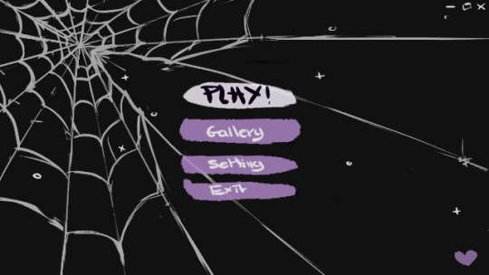
Placement wise though, I think it’ll be okay. For the title font, in this placeholder at least, I wanted something a little quirky and ended up going for the font Pacifico. It’s a free google font, meaning its good for both commercial and personal use.
Next I changed my Master Canvas to be relative to screen size and set its anchors to the center. This means whatever screen size you’re viewing on, it should scale to the right dimensions instead of trying to stay in a fixed place and look awful. To make my life easier, I’ll be creating this project in a 4K resolution, so I only have to deal with scaling down instead of scaling up - to preserve quality. I really have a problem with wanting everything to be the best quality it could possibly be.

Then I reopened Github, and saw a lot of conflicting files. Was I on the right branch? I don’t know, it was all a terrible mistake.
Of course, after trying to fix up this mess something broke and things won’t build. I managed to restore the main menu set up from the bin, but was going to have to set up the connections again.
I reimported all my external assets (DoozyUI and Discourse) just to be on the safe side of things.
Then it broke again. By broke I mean I messed up by switching branches, mid project, while it was open and it became a real mess full of conflicts. I should know better.
The solution here is probably to not work on something so infrequently you forget about another branch and potentially lose all your work. So my new approach, is now that I’ve got this out of the way. To make every fortnightly build, its own branch moving forward. Originally, i wanted to split branches up by features, but I imagine I will wait until the very base of the game’s functionality is complete, and all that’s left to implement is the content heavy events. Such as dialogue and art. Those can be split into event specific branches.
Needless to say, if you do it wrong. Version control can be a real fickle bitch.
On the other hand, it’s probably my saving grace. I can recreate the menu much cleaner now, and have some better ideas on how I would do things. I also really could have rolled back to a previous version.
Reviewing the build
I checked out the build, the framerate was perfectly fine, but it felt a little slow. I probably needed the transitions to come in a lot faster. 1-2 seconds can feel awfully slow when you’re used to an immediate response.
The last unity build was only 83 MB. This might be a lot to some, considering all I put in was a fancy menu, but I appreciate how Unity strips out everything it feels isn’t being used. Somehow my previous build was actually bigger at 90 MB. I’ll have to see how it runs on other machines, and make use of loading screens. I’ll also have to get familiar with the Unity Profiler, but this may be a Unity Pro only option - something I’ll have to look into.
The unity documentation does have a few guides to optimising for mobile, which while not a goal currently -it’s not something I want to rule out just yet.
What’s Next?
Next on my To Do List for build 0.1.2 is:
Complete more UI visual concept.
Including an about/social media toggle button on the main menu.
Re-do the main menus in grayscale, so it doesn’t impact the design choices. Right now I’m focusing on placement, not colours.
Main Menu
Settings
Gallery
Remove menu/slide backgrounds and keep all main menu transitions on a low opacity alpha.
Remove button text from heart, possibly change it to an exit menu.
Implement a windowed mode, and include choices for this in the settings menu.
Allow options to change screen resolution
A help tutorial when you press play, and a help button to access it at anytime from then on.
Set up Graphics Quality toggles
Add in a splash screen scene (other than the Unity opening screen).
Add a Do you want to Quit? Popup, and code it in so it’s functional.
Toggle this so the popup comes up when you press escape, rather than ESC leading straight to quitting the application.
Do some research on existing GUIs from things like visual novels. Iv’e received recommendations such as:
Will: A Wonderful World
My Only Sunshine
The Shadows That Run Alongside Our Car.
Which should be due on the 19/20 of this month. See you then!
1 note
·
View note
Text
Here's to 2021 and New Beginnings!
Happy 2021!
Can you believe it's over? Glad? Sad? Ready for the newness? We are ready to start off 2021 together in our little house, enjoying simple stuff and being grateful for everything we have.
2020 was filled with so many bad things that it's just too long of a list, right? 2020 was the first year in 2 years that I haven’t lost a parent, so that’s a win, I suppose. And we’ve definitely had our share of sad/angry reactions to what has gone on politically, racially, globally and more. It’s astounding to think of all the things that occurred in 2020 that weren’t related to Covid-19. And I’m sure I’ve probably forgotten a bunch of things to, but I'm choosing to look at the positives that came out of this year:
1. More time together as a small family unit of 5.
2. More time at home cooking, baking, arting, relaxing, reading, playing, laughing.
3. Saving money not going out at all! With restaurants closed and then the numbers rising, we’ve cut out dining in restaurants and only occasionally enjoy take out.
4. Seeing the kids gain independence with distance learning and remote/hybrid schooling. The management and scheduling of their online classes and Zooms was mind boggling in the spring. But seeing how far they’ve come and how independent they are, it’s awesome!
5. Getting rid of one of our cars we no longer need since hubs works here now. Who needs the excess payments, insurance, gas and all that that goes along with a second car. Not us, for now!
6. Meeting a wonderful vet who has made significant achievements with Mirabelle's health struggles. He works so closely with our primary care vet to keep Mirabelle on a healthy regimen and is truly concerned about her well-being (as well as ours!)
7. Not having anyone in our family contract or die from Covid-19. That being said, we know people who have had it and have died from it, which is devastating. But we’re considering ourselves extremely lucky that none of the 5 of us have gotten it.
8. Finally having time and inspiration to begin teaching online classes. I’ve only put this off forever and was finally able to pull the trigger on it, thanks to my friend Susan for pushing me!
9. Watching my kids be able to enjoy old fashioned fun and not be so consumed with having to go places and over scheduling activities. With sports and extra clubs canceled, these kids were able to just be kids: Going on nature hikes in our back woods, having picnics in the backyard, swimming, reading on the porch, doing art projects and playing with toys. Not being held captive by busy schedules was such a blessing!
10. Having wonderful family and friends that keep in touch regularly. While we can’t physically see each other, we still all maintain online contact and text conversations, which is awesome. I’m so thankful for that!
Here's to a wonderful year ahead of health, happiness and joy! Let’s make 2021 the antithesis of 2020, filled with hope, joy, thankfulness, love and health!
Happy New Year!
Ready for Joyful Inspiration?
Join me today to be inspired to live your most creative life!
Get Inspired!
We won't send you spam. Unsubscribe at any time.
Built with ConvertKit
.formkit-form[data-uid="7d3a5fe4c6"] *{box-sizing:border-box;}.formkit-form[data-uid="7d3a5fe4c6"]{-webkit-font-smoothing:antialiased;-moz-osx-font-smoothing:grayscale;}.formkit-form[data-uid="7d3a5fe4c6"] legend{border:none;font-size:inherit;margin-bottom:10px;padding:0;position:relative;display:table;}.formkit-form[data-uid="7d3a5fe4c6"] fieldset{border:0;padding:0.01em 0 0 0;margin:0;min-width:0;}.formkit-form[data-uid="7d3a5fe4c6"] body:not(:-moz-handler-blocked) fieldset{display:table-cell;}.formkit-form[data-uid="7d3a5fe4c6"] h1,.formkit-form[data-uid="7d3a5fe4c6"] h2,.formkit-form[data-uid="7d3a5fe4c6"] h3,.formkit-form[data-uid="7d3a5fe4c6"] h4,.formkit-form[data-uid="7d3a5fe4c6"] h5,.formkit-form[data-uid="7d3a5fe4c6"] h6{color:inherit;font-size:inherit;font-weight:inherit;}.formkit-form[data-uid="7d3a5fe4c6"] p{color:inherit;font-size:inherit;font-weight:inherit;}.formkit-form[data-uid="7d3a5fe4c6"] ol:not([template-default]),.formkit-form[data-uid="7d3a5fe4c6"] ul:not([template-default]),.formkit-form[data-uid="7d3a5fe4c6"] blockquote:not([template-default]){text-align:left;}.formkit-form[data-uid="7d3a5fe4c6"] p:not([template-default]),.formkit-form[data-uid="7d3a5fe4c6"] hr:not([template-default]),.formkit-form[data-uid="7d3a5fe4c6"] blockquote:not([template-default]),.formkit-form[data-uid="7d3a5fe4c6"] ol:not([template-default]),.formkit-form[data-uid="7d3a5fe4c6"] ul:not([template-default]){color:inherit;font-style:initial;}.formkit-form[data-uid="7d3a5fe4c6"] .ordered-list,.formkit-form[data-uid="7d3a5fe4c6"] .unordered-list{list-style-position:outside !important;padding-left:1em;}.formkit-form[data-uid="7d3a5fe4c6"] .list-item{padding-left:0;}.formkit-form[data-uid="7d3a5fe4c6"][data-format="modal"]{display:none;}.formkit-form[data-uid="7d3a5fe4c6"][data-format="slide in"]{display:none;}.formkit-form[data-uid="7d3a5fe4c6"][data-format="sticky bar"]{display:none;}.formkit-sticky-bar .formkit-form[data-uid="7d3a5fe4c6"][data-format="sticky bar"]{display:block;}.formkit-form[data-uid="7d3a5fe4c6"] .formkit-input,.formkit-form[data-uid="7d3a5fe4c6"] .formkit-select,.formkit-form[data-uid="7d3a5fe4c6"] .formkit-checkboxes{width:100%;}.formkit-form[data-uid="7d3a5fe4c6"] .formkit-button,.formkit-form[data-uid="7d3a5fe4c6"] .formkit-submit{border:0;border-radius:5px;color:#ffffff;cursor:pointer;display:inline-block;text-align:center;font-size:15px;font-weight:500;cursor:pointer;margin-bottom:15px;overflow:hidden;padding:0;position:relative;vertical-align:middle;}.formkit-form[data-uid="7d3a5fe4c6"] .formkit-button:hover,.formkit-form[data-uid="7d3a5fe4c6"] .formkit-submit:hover,.formkit-form[data-uid="7d3a5fe4c6"] .formkit-button:focus,.formkit-form[data-uid="7d3a5fe4c6"] .formkit-submit:focus{outline:none;}.formkit-form[data-uid="7d3a5fe4c6"] .formkit-button:hover > span,.formkit-form[data-uid="7d3a5fe4c6"] .formkit-submit:hover > span,.formkit-form[data-uid="7d3a5fe4c6"] .formkit-button:focus > span,.formkit-form[data-uid="7d3a5fe4c6"] .formkit-submit:focus > span{background-color:rgba(0,0,0,0.1);}.formkit-form[data-uid="7d3a5fe4c6"] .formkit-button > span,.formkit-form[data-uid="7d3a5fe4c6"] .formkit-submit > span{display:block;-webkit-transition:all 300ms ease-in-out;transition:all 300ms ease-in-out;padding:12px 24px;}.formkit-form[data-uid="7d3a5fe4c6"] .formkit-input{background:#ffffff;font-size:15px;padding:12px;border:1px solid #e3e3e3;-webkit-flex:1 0 auto;-ms-flex:1 0 auto;flex:1 0 auto;line-height:1.4;margin:0;-webkit-transition:border-color ease-out 300ms;transition:border-color ease-out 300ms;}.formkit-form[data-uid="7d3a5fe4c6"] .formkit-input:focus{outline:none;border-color:#1677be;-webkit-transition:border-color ease 300ms;transition:border-color ease 300ms;}.formkit-form[data-uid="7d3a5fe4c6"] .formkit-input::-webkit-input-placeholder{color:inherit;opacity:0.8;}.formkit-form[data-uid="7d3a5fe4c6"] .formkit-input::-moz-placeholder{color:inherit;opacity:0.8;}.formkit-form[data-uid="7d3a5fe4c6"] .formkit-input:-ms-input-placeholder{color:inherit;opacity:0.8;}.formkit-form[data-uid="7d3a5fe4c6"] .formkit-input::placeholder{color:inherit;opacity:0.8;}.formkit-form[data-uid="7d3a5fe4c6"] [data-group="dropdown"]{position:relative;display:inline-block;width:100%;}.formkit-form[data-uid="7d3a5fe4c6"] [data-group="dropdown"]::before{content:"";top:calc(50% - 2.5px);right:10px;position:absolute;pointer-events:none;border-color:#4f4f4f transparent transparent transparent;border-style:solid;border-width:6px 6px 0 6px;height:0;width:0;z-index:999;}.formkit-form[data-uid="7d3a5fe4c6"] [data-group="dropdown"] select{height:auto;width:100%;cursor:pointer;color:#333333;line-height:1.4;margin-bottom:0;padding:0 6px;-webkit-appearance:none;-moz-appearance:none;appearance:none;font-size:15px;padding:12px;padding-right:25px;border:1px solid #e3e3e3;background:#ffffff;}.formkit-form[data-uid="7d3a5fe4c6"] [data-group="dropdown"] select:focus{outline:none;}.formkit-form[data-uid="7d3a5fe4c6"] [data-group="checkboxes"]{text-align:left;margin:0;}.formkit-form[data-uid="7d3a5fe4c6"] [data-group="checkboxes"] [data-group="checkbox"]{margin-bottom:10px;}.formkit-form[data-uid="7d3a5fe4c6"] [data-group="checkboxes"] [data-group="checkbox"] *{cursor:pointer;}.formkit-form[data-uid="7d3a5fe4c6"] [data-group="checkboxes"] [data-group="checkbox"]:last-of-type{margin-bottom:0;}.formkit-form[data-uid="7d3a5fe4c6"] [data-group="checkboxes"] [data-group="checkbox"] input[type="checkbox"]{display:none;}.formkit-form[data-uid="7d3a5fe4c6"] [data-group="checkboxes"] [data-group="checkbox"] input[type="checkbox"] + label::after{content:none;}.formkit-form[data-uid="7d3a5fe4c6"] [data-group="checkboxes"] [data-group="checkbox"] input[type="checkbox"]:checked + label::after{border-color:#ffffff;content:"";}.formkit-form[data-uid="7d3a5fe4c6"] [data-group="checkboxes"] [data-group="checkbox"] input[type="checkbox"]:checked + label::before{background:#10bf7a;border-color:#10bf7a;}.formkit-form[data-uid="7d3a5fe4c6"] [data-group="checkboxes"] [data-group="checkbox"] label{position:relative;display:inline-block;padding-left:28px;}.formkit-form[data-uid="7d3a5fe4c6"] [data-group="checkboxes"] [data-group="checkbox"] label::before,.formkit-form[data-uid="7d3a5fe4c6"] [data-group="checkboxes"] [data-group="checkbox"] label::after{position:absolute;content:"";display:inline-block;}.formkit-form[data-uid="7d3a5fe4c6"] [data-group="checkboxes"] [data-group="checkbox"] label::before{height:16px;width:16px;border:1px solid #e3e3e3;background:#ffffff;left:0px;top:3px;}.formkit-form[data-uid="7d3a5fe4c6"] [data-group="checkboxes"] [data-group="checkbox"] label::after{height:4px;width:8px;border-left:2px solid #4d4d4d;border-bottom:2px solid #4d4d4d;-webkit-transform:rotate(-45deg);-ms-transform:rotate(-45deg);transform:rotate(-45deg);left:4px;top:8px;}.formkit-form[data-uid="7d3a5fe4c6"] .formkit-alert{background:#f9fafb;border:1px solid #e3e3e3;border-radius:5px;-webkit-flex:1 0 auto;-ms-flex:1 0 auto;flex:1 0 auto;list-style:none;margin:25px auto;padding:12px;text-align:center;width:100%;}.formkit-form[data-uid="7d3a5fe4c6"] .formkit-alert:empty{display:none;}.formkit-form[data-uid="7d3a5fe4c6"] .formkit-alert-success{background:#d3fbeb;border-color:#10bf7a;color:#0c905c;}.formkit-form[data-uid="7d3a5fe4c6"] .formkit-alert-error{background:#fde8e2;border-color:#f2643b;color:#ea4110;}.formkit-form[data-uid="7d3a5fe4c6"] .formkit-spinner{display:-webkit-box;display:-webkit-flex;display:-ms-flexbox;display:flex;height:0px;width:0px;margin:0 auto;position:absolute;top:0;left:0;right:0;width:0px;overflow:hidden;text-align:center;-webkit-transition:all 300ms ease-in-out;transition:all 300ms ease-in-out;}.formkit-form[data-uid="7d3a5fe4c6"] .formkit-spinner > div{margin:auto;width:12px;height:12px;background-color:#fff;opacity:0.3;border-radius:100%;display:inline-block;-webkit-animation:formkit-bouncedelay-formkit-form-data-uid-7d3a5fe4c6- 1.4s infinite ease-in-out both;animation:formkit-bouncedelay-formkit-form-data-uid-7d3a5fe4c6- 1.4s infinite ease-in-out both;}.formkit-form[data-uid="7d3a5fe4c6"] .formkit-spinner > div:nth-child(1){-webkit-animation-delay:-0.32s;animation-delay:-0.32s;}.formkit-form[data-uid="7d3a5fe4c6"] .formkit-spinner > div:nth-child(2){-webkit-animation-delay:-0.16s;animation-delay:-0.16s;}.formkit-form[data-uid="7d3a5fe4c6"] .formkit-submit[data-active] .formkit-spinner{opacity:1;height:100%;width:50px;}.formkit-form[data-uid="7d3a5fe4c6"] .formkit-submit[data-active] .formkit-spinner ~ span{opacity:0;}.formkit-form[data-uid="7d3a5fe4c6"] .formkit-powered-by[data-active="false"]{opacity:0.35;}.formkit-form[data-uid="7d3a5fe4c6"] .formkit-powered-by-convertkit-container{display:-webkit-box;display:-webkit-flex;display:-ms-flexbox;display:flex;width:100%;z-index:5;margin:10px 0;position:relative;}.formkit-form[data-uid="7d3a5fe4c6"] .formkit-powered-by-convertkit-container[data-active="false"]{opacity:0.35;}.formkit-form[data-uid="7d3a5fe4c6"] .formkit-powered-by-convertkit{-webkit-align-items:center;-webkit-box-align:center;-ms-flex-align:center;align-items:center;background-color:#ffffff;border:1px solid #dce1e5;border-radius:4px;color:#373f45;cursor:pointer;display:block;height:36px;margin:0 auto;opacity:0.95;padding:0;-webkit-text-decoration:none;text-decoration:none;text-indent:100%;-webkit-transition:ease-in-out all 200ms;transition:ease-in-out all 200ms;white-space:nowrap;overflow:hidden;-webkit-user-select:none;-moz-user-select:none;-ms-user-select:none;user-select:none;width:190px;background-repeat:no-repeat;background-position:center;background-image:url("data:image/svg+xml;charset=utf8,%3Csvg width='162' height='20' viewBox='0 0 162 20' fill='none' xmlns='http://www.w3.org/2000/svg'%3E%3Cpath d='M83.0561 15.2457C86.675 15.2457 89.4722 12.5154 89.4722 9.14749C89.4722 5.99211 86.8443 4.06563 85.1038 4.06563C82.6801 4.06563 80.7373 5.76407 80.4605 8.28551C80.4092 8.75244 80.0387 9.14403 79.5686 9.14069C78.7871 9.13509 77.6507 9.12841 76.9314 9.13092C76.6217 9.13199 76.3658 8.88106 76.381 8.57196C76.4895 6.38513 77.2218 4.3404 78.618 2.76974C80.1695 1.02445 82.4289 0 85.1038 0C89.5979 0 93.8406 4.07791 93.8406 9.14749C93.8406 14.7608 89.1832 19.3113 83.1517 19.3113C78.8502 19.3113 74.5179 16.5041 73.0053 12.5795C72.9999 12.565 72.9986 12.5492 73.0015 12.534C73.0218 12.4179 73.0617 12.3118 73.1011 12.2074C73.1583 12.0555 73.2143 11.907 73.2062 11.7359L73.18 11.1892C73.174 11.0569 73.2075 10.9258 73.2764 10.8127C73.3452 10.6995 73.4463 10.6094 73.5666 10.554L73.7852 10.4523C73.9077 10.3957 74.0148 10.3105 74.0976 10.204C74.1803 10.0974 74.2363 9.97252 74.2608 9.83983C74.3341 9.43894 74.6865 9.14749 75.0979 9.14749C75.7404 9.14749 76.299 9.57412 76.5088 10.1806C77.5188 13.1 79.1245 15.2457 83.0561 15.2457Z' fill='%23373F45'/%3E%3Cpath d='M155.758 6.91365C155.028 6.91365 154.804 6.47916 154.804 5.98857C154.804 5.46997 154.986 5.06348 155.758 5.06348C156.53 5.06348 156.712 5.46997 156.712 5.98857C156.712 6.47905 156.516 6.91365 155.758 6.91365ZM142.441 12.9304V9.32833L141.415 9.32323V8.90392C141.415 8.44719 141.786 8.07758 142.244 8.07986L142.441 8.08095V6.55306L144.082 6.09057V8.08073H145.569V8.50416C145.569 8.61242 145.548 8.71961 145.506 8.81961C145.465 8.91961 145.404 9.01047 145.328 9.08699C145.251 9.16351 145.16 9.2242 145.06 9.26559C144.96 9.30698 144.853 9.32826 144.745 9.32822H144.082V12.7201C144.082 13.2423 144.378 13.4256 144.76 13.4887C145.209 13.5629 145.583 13.888 145.583 14.343V14.9626C144.029 14.9626 142.441 14.8942 142.441 12.9304Z' fill='%23373F45'/%3E%3Cpath d='M110.058 7.92554C108.417 7.88344 106.396 8.92062 106.396 11.5137C106.396 14.0646 108.417 15.0738 110.058 15.0318C111.742 15.0738 113.748 14.0646 113.748 11.5137C113.748 8.92062 111.742 7.88344 110.058 7.92554ZM110.07 13.7586C108.878 13.7586 108.032 12.8905 108.032 11.461C108.032 10.1013 108.878 9.20569 110.071 9.20569C111.263 9.20569 112.101 10.0995 112.101 11.459C112.101 12.8887 111.263 13.7586 110.07 13.7586Z' fill='%23373F45'/%3E%3Cpath d='M118.06 7.94098C119.491 7.94098 120.978 8.33337 120.978 11.1366V14.893H120.063C119.608 14.893 119.238 14.524 119.238 14.0689V10.9965C119.238 9.66506 118.747 9.16047 117.891 9.16047C117.414 9.16047 116.797 9.52486 116.502 9.81915V14.069C116.502 14.1773 116.481 14.2845 116.44 14.3845C116.398 14.4845 116.337 14.5753 116.261 14.6519C116.184 14.7284 116.093 14.7891 115.993 14.8305C115.893 14.8719 115.786 14.8931 115.678 14.8931H114.847V8.10918H115.773C115.932 8.10914 116.087 8.16315 116.212 8.26242C116.337 8.36168 116.424 8.50033 116.46 8.65577C116.881 8.19328 117.428 7.94098 118.06 7.94098ZM122.854 8.09713C123.024 8.09708 123.19 8.1496 123.329 8.2475C123.468 8.34541 123.574 8.48391 123.631 8.64405L125.133 12.8486L126.635 8.64415C126.692 8.48402 126.798 8.34551 126.937 8.2476C127.076 8.1497 127.242 8.09718 127.412 8.09724H128.598L126.152 14.3567C126.091 14.5112 125.986 14.6439 125.849 14.7374C125.711 14.831 125.549 14.881 125.383 14.8809H124.333L121.668 8.09713H122.854Z' fill='%23373F45'/%3E%3Cpath d='M135.085 14.5514C134.566 14.7616 133.513 15.0416 132.418 15.0416C130.496 15.0416 129.024 13.9345 129.024 11.4396C129.024 9.19701 130.451 7.99792 132.191 7.99792C134.338 7.99792 135.254 9.4378 135.158 11.3979C135.139 11.8029 134.786 12.0983 134.38 12.0983H130.679C130.763 13.1916 131.562 13.7662 132.615 13.7662C133.028 13.7662 133.462 13.7452 133.983 13.6481C134.535 13.545 135.085 13.9375 135.085 14.4985V14.5514ZM133.673 10.949C133.785 9.87621 133.061 9.28752 132.191 9.28752C131.321 9.28752 130.734 9.93979 130.679 10.9489L133.673 10.949Z' fill='%23373F45'/%3E%3Cpath d='M137.345 8.11122C137.497 8.11118 137.645 8.16229 137.765 8.25635C137.884 8.35041 137.969 8.48197 138.005 8.62993C138.566 8.20932 139.268 7.94303 139.759 7.94303C139.801 7.94303 140.068 7.94303 140.489 7.99913V8.7265C140.489 9.11748 140.15 9.4147 139.759 9.4147C139.31 9.4147 138.651 9.5829 138.131 9.8773V14.8951H136.462V8.11112L137.345 8.11122ZM156.6 14.0508V8.09104H155.769C155.314 8.09104 154.944 8.45999 154.944 8.9151V14.8748H155.775C156.23 14.8748 156.6 14.5058 156.6 14.0508ZM158.857 12.9447V9.34254H157.749V8.91912C157.749 8.46401 158.118 8.09506 158.574 8.09506H158.857V6.56739L160.499 6.10479V8.09506H161.986V8.51848C161.986 8.97359 161.617 9.34254 161.161 9.34254H160.499V12.7345C160.499 13.2566 160.795 13.44 161.177 13.503C161.626 13.5774 162 13.9024 162 14.3574V14.977C160.446 14.977 158.857 14.9086 158.857 12.9447ZM98.1929 10.1124C98.2033 6.94046 100.598 5.16809 102.895 5.16809C104.171 5.16809 105.342 5.44285 106.304 6.12953L105.914 6.6631C105.654 7.02011 105.16 7.16194 104.749 6.99949C104.169 6.7702 103.622 6.7218 103.215 6.7218C101.335 6.7218 99.9169 7.92849 99.9068 10.1123C99.9169 12.2959 101.335 13.5201 103.215 13.5201C103.622 13.5201 104.169 13.4717 104.749 13.2424C105.16 13.0799 105.654 13.2046 105.914 13.5615L106.304 14.0952C105.342 14.7819 104.171 15.0566 102.895 15.0566C100.598 15.0566 98.2033 13.2842 98.1929 10.1124ZM147.619 5.21768C148.074 5.21768 148.444 5.58663 148.444 6.04174V9.81968L151.82 5.58131C151.897 5.47733 151.997 5.39282 152.112 5.3346C152.227 5.27638 152.355 5.24607 152.484 5.24611H153.984L150.166 10.0615L153.984 14.8749H152.484C152.355 14.8749 152.227 14.8446 152.112 14.7864C151.997 14.7281 151.897 14.6436 151.82 14.5397L148.444 10.3025V14.0508C148.444 14.5059 148.074 14.8749 147.619 14.8749H146.746V5.21768H147.619Z' fill='%23373F45'/%3E%3Cpath d='M0.773438 6.5752H2.68066C3.56543 6.5752 4.2041 6.7041 4.59668 6.96191C4.99219 7.21973 5.18994 7.62695 5.18994 8.18359C5.18994 8.55859 5.09326 8.87061 4.8999 9.11963C4.70654 9.36865 4.42822 9.52539 4.06494 9.58984V9.63379C4.51611 9.71875 4.84717 9.88721 5.05811 10.1392C5.27197 10.3882 5.37891 10.7266 5.37891 11.1543C5.37891 11.7314 5.17676 12.1841 4.77246 12.5122C4.37109 12.8374 3.81152 13 3.09375 13H0.773438V6.5752ZM1.82373 9.22949H2.83447C3.27393 9.22949 3.59473 9.16064 3.79688 9.02295C3.99902 8.88232 4.1001 8.64502 4.1001 8.31104C4.1001 8.00928 3.99023 7.79102 3.77051 7.65625C3.55371 7.52148 3.20801 7.4541 2.7334 7.4541H1.82373V9.22949ZM1.82373 10.082V12.1167H2.93994C3.37939 12.1167 3.71045 12.0332 3.93311 11.8662C4.15869 11.6963 4.27148 11.4297 4.27148 11.0664C4.27148 10.7324 4.15723 10.4849 3.92871 10.3237C3.7002 10.1626 3.35303 10.082 2.88721 10.082H1.82373Z' fill='%23373F45'/%3E%3Cpath d='M13.011 6.5752V10.7324C13.011 11.207 12.9084 11.623 12.7034 11.9805C12.5012 12.335 12.2068 12.6089 11.8201 12.8022C11.4363 12.9927 10.9763 13.0879 10.4402 13.0879C9.6433 13.0879 9.02368 12.877 8.5813 12.4551C8.13892 12.0332 7.91772 11.4531 7.91772 10.7148V6.5752H8.9724V10.6401C8.9724 11.1704 9.09546 11.5615 9.34155 11.8135C9.58765 12.0654 9.96557 12.1914 10.4753 12.1914C11.4656 12.1914 11.9607 11.6714 11.9607 10.6313V6.5752H13.011Z' fill='%23373F45'/%3E%3Cpath d='M15.9146 13V6.5752H16.9649V13H15.9146Z' fill='%23373F45'/%3E%3Cpath d='M19.9255 13V6.5752H20.9758V12.0991H23.696V13H19.9255Z' fill='%23373F45'/%3E%3Cpath d='M28.2828 13H27.2325V7.47607H25.3428V6.5752H30.1724V7.47607H28.2828V13Z' fill='%23373F45'/%3E%3Cpath d='M41.9472 13H40.8046L39.7148 9.16796C39.6679 9.00097 39.6093 8.76074 39.539 8.44727C39.4687 8.13086 39.4262 7.91113 39.4116 7.78809C39.3823 7.97559 39.3339 8.21875 39.2665 8.51758C39.2021 8.81641 39.1479 9.03905 39.1039 9.18554L38.0405 13H36.8979L36.0673 9.7832L35.2236 6.5752H36.2958L37.2143 10.3193C37.3578 10.9199 37.4604 11.4502 37.5219 11.9102C37.5541 11.6611 37.6025 11.3828 37.6669 11.0752C37.7314 10.7676 37.79 10.5186 37.8427 10.3281L38.8886 6.5752H39.9301L41.0024 10.3457C41.1049 10.6943 41.2133 11.2158 41.3276 11.9102C41.3715 11.4912 41.477 10.958 41.644 10.3105L42.558 6.5752H43.6215L41.9472 13Z' fill='%23373F45'/%3E%3Cpath d='M45.7957 13V6.5752H46.846V13H45.7957Z' fill='%23373F45'/%3E%3Cpath d='M52.0258 13H50.9755V7.47607H49.0859V6.5752H53.9155V7.47607H52.0258V13Z' fill='%23373F45'/%3E%3Cpath d='M61.2312 13H60.1765V10.104H57.2146V13H56.1643V6.5752H57.2146V9.20312H60.1765V6.5752H61.2312V13Z' fill='%23373F45'/%3E%3C/svg%3E");}.formkit-form[data-uid="7d3a5fe4c6"] .formkit-powered-by-convertkit:hover,.formkit-form[data-uid="7d3a5fe4c6"] .formkit-powered-by-convertkit:focus{background-color:#ffffff;-webkit-transform:scale(1.025) perspective(1px);-ms-transform:scale(1.025) perspective(1px);transform:scale(1.025) perspective(1px);opacity:1;}.formkit-form[data-uid="7d3a5fe4c6"] .formkit-powered-by-convertkit[data-variant="dark"],.formkit-form[data-uid="7d3a5fe4c6"] .formkit-powered-by-convertkit[data-variant="light"]{background-color:transparent;border-color:transparent;width:166px;}.formkit-form[data-uid="7d3a5fe4c6"] .formkit-powered-by-convertkit[data-variant="light"]{color:#ffffff;background-image:url("data:image/svg+xml;charset=utf8,%3Csvg width='162' height='20' viewBox='0 0 162 20' fill='none' xmlns='http://www.w3.org/2000/svg'%3E%3Cpath d='M83.0561 15.2457C86.675 15.2457 89.4722 12.5154 89.4722 9.14749C89.4722 5.99211 86.8443 4.06563 85.1038 4.06563C82.6801 4.06563 80.7373 5.76407 80.4605 8.28551C80.4092 8.75244 80.0387 9.14403 79.5686 9.14069C78.7871 9.13509 77.6507 9.12841 76.9314 9.13092C76.6217 9.13199 76.3658 8.88106 76.381 8.57196C76.4895 6.38513 77.2218 4.3404 78.618 2.76974C80.1695 1.02445 82.4289 0 85.1038 0C89.5979 0 93.8406 4.07791 93.8406 9.14749C93.8406 14.7608 89.1832 19.3113 83.1517 19.3113C78.8502 19.3113 74.5179 16.5041 73.0053 12.5795C72.9999 12.565 72.9986 12.5492 73.0015 12.534C73.0218 12.4179 73.0617 12.3118 73.1011 12.2074C73.1583 12.0555 73.2143 11.907 73.2062 11.7359L73.18 11.1892C73.174 11.0569 73.2075 10.9258 73.2764 10.8127C73.3452 10.6995 73.4463 10.6094 73.5666 10.554L73.7852 10.4523C73.9077 10.3957 74.0148 10.3105 74.0976 10.204C74.1803 10.0974 74.2363 9.97252 74.2608 9.83983C74.3341 9.43894 74.6865 9.14749 75.0979 9.14749C75.7404 9.14749 76.299 9.57412 76.5088 10.1806C77.5188 13.1 79.1245 15.2457 83.0561 15.2457Z' fill='white'/%3E%3Cpath d='M155.758 6.91365C155.028 6.91365 154.804 6.47916 154.804 5.98857C154.804 5.46997 154.986 5.06348 155.758 5.06348C156.53 5.06348 156.712 5.46997 156.712 5.98857C156.712 6.47905 156.516 6.91365 155.758 6.91365ZM142.441 12.9304V9.32833L141.415 9.32323V8.90392C141.415 8.44719 141.786 8.07758 142.244 8.07986L142.441 8.08095V6.55306L144.082 6.09057V8.08073H145.569V8.50416C145.569 8.61242 145.548 8.71961 145.506 8.81961C145.465 8.91961 145.404 9.01047 145.328 9.08699C145.251 9.16351 145.16 9.2242 145.06 9.26559C144.96 9.30698 144.853 9.32826 144.745 9.32822H144.082V12.7201C144.082 13.2423 144.378 13.4256 144.76 13.4887C145.209 13.5629 145.583 13.888 145.583 14.343V14.9626C144.029 14.9626 142.441 14.8942 142.441 12.9304Z' fill='white'/%3E%3Cpath d='M110.058 7.92554C108.417 7.88344 106.396 8.92062 106.396 11.5137C106.396 14.0646 108.417 15.0738 110.058 15.0318C111.742 15.0738 113.748 14.0646 113.748 11.5137C113.748 8.92062 111.742 7.88344 110.058 7.92554ZM110.07 13.7586C108.878 13.7586 108.032 12.8905 108.032 11.461C108.032 10.1013 108.878 9.20569 110.071 9.20569C111.263 9.20569 112.101 10.0995 112.101 11.459C112.101 12.8887 111.263 13.7586 110.07 13.7586Z' fill='white'/%3E%3Cpath d='M118.06 7.94098C119.491 7.94098 120.978 8.33337 120.978 11.1366V14.893H120.063C119.608 14.893 119.238 14.524 119.238 14.0689V10.9965C119.238 9.66506 118.747 9.16047 117.891 9.16047C117.414 9.16047 116.797 9.52486 116.502 9.81915V14.069C116.502 14.1773 116.481 14.2845 116.44 14.3845C116.398 14.4845 116.337 14.5753 116.261 14.6519C116.184 14.7284 116.093 14.7891 115.993 14.8305C115.893 14.8719 115.786 14.8931 115.678 14.8931H114.847V8.10918H115.773C115.932 8.10914 116.087 8.16315 116.212 8.26242C116.337 8.36168 116.424 8.50033 116.46 8.65577C116.881 8.19328 117.428 7.94098 118.06 7.94098ZM122.854 8.09713C123.024 8.09708 123.19 8.1496 123.329 8.2475C123.468 8.34541 123.574 8.48391 123.631 8.64405L125.133 12.8486L126.635 8.64415C126.692 8.48402 126.798 8.34551 126.937 8.2476C127.076 8.1497 127.242 8.09718 127.412 8.09724H128.598L126.152 14.3567C126.091 14.5112 125.986 14.6439 125.849 14.7374C125.711 14.831 125.549 14.881 125.383 14.8809H124.333L121.668 8.09713H122.854Z' fill='white'/%3E%3Cpath d='M135.085 14.5514C134.566 14.7616 133.513 15.0416 132.418 15.0416C130.496 15.0416 129.024 13.9345 129.024 11.4396C129.024 9.19701 130.451 7.99792 132.191 7.99792C134.338 7.99792 135.254 9.4378 135.158 11.3979C135.139 11.8029 134.786 12.0983 134.38 12.0983H130.679C130.763 13.1916 131.562 13.7662 132.615 13.7662C133.028 13.7662 133.462 13.7452 133.983 13.6481C134.535 13.545 135.085 13.9375 135.085 14.4985V14.5514ZM133.673 10.949C133.785 9.87621 133.061 9.28752 132.191 9.28752C131.321 9.28752 130.734 9.93979 130.679 10.9489L133.673 10.949Z' fill='white'/%3E%3Cpath d='M137.345 8.11122C137.497 8.11118 137.645 8.16229 137.765 8.25635C137.884 8.35041 137.969 8.48197 138.005 8.62993C138.566 8.20932 139.268 7.94303 139.759 7.94303C139.801 7.94303 140.068 7.94303 140.489 7.99913V8.7265C140.489 9.11748 140.15 9.4147 139.759 9.4147C139.31 9.4147 138.651 9.5829 138.131 9.8773V14.8951H136.462V8.11112L137.345 8.11122ZM156.6 14.0508V8.09104H155.769C155.314 8.09104 154.944 8.45999 154.944 8.9151V14.8748H155.775C156.23 14.8748 156.6 14.5058 156.6 14.0508ZM158.857 12.9447V9.34254H157.749V8.91912C157.749 8.46401 158.118 8.09506 158.574 8.09506H158.857V6.56739L160.499 6.10479V8.09506H161.986V8.51848C161.986 8.97359 161.617 9.34254 161.161 9.34254H160.499V12.7345C160.499 13.2566 160.795 13.44 161.177 13.503C161.626 13.5774 162 13.9024 162 14.3574V14.977C160.446 14.977 158.857 14.9086 158.857 12.9447ZM98.1929 10.1124C98.2033 6.94046 100.598 5.16809 102.895 5.16809C104.171 5.16809 105.342 5.44285 106.304 6.12953L105.914 6.6631C105.654 7.02011 105.16 7.16194 104.749 6.99949C104.169 6.7702 103.622 6.7218 103.215 6.7218C101.335 6.7218 99.9169 7.92849 99.9068 10.1123C99.9169 12.2959 101.335 13.5201 103.215 13.5201C103.622 13.5201 104.169 13.4717 104.749 13.2424C105.16 13.0799 105.654 13.2046 105.914 13.5615L106.304 14.0952C105.342 14.7819 104.171 15.0566 102.895 15.0566C100.598 15.0566 98.2033 13.2842 98.1929 10.1124ZM147.619 5.21768C148.074 5.21768 148.444 5.58663 148.444 6.04174V9.81968L151.82 5.58131C151.897 5.47733 151.997 5.39282 152.112 5.3346C152.227 5.27638 152.355 5.24607 152.484 5.24611H153.984L150.166 10.0615L153.984 14.8749H152.484C152.355 14.8749 152.227 14.8446 152.112 14.7864C151.997 14.7281 151.897 14.6436 151.82 14.5397L148.444 10.3025V14.0508C148.444 14.5059 148.074 14.8749 147.619 14.8749H146.746V5.21768H147.619Z' fill='white'/%3E%3Cpath d='M0.773438 6.5752H2.68066C3.56543 6.5752 4.2041 6.7041 4.59668 6.96191C4.99219 7.21973 5.18994 7.62695 5.18994 8.18359C5.18994 8.55859 5.09326 8.87061 4.8999 9.11963C4.70654 9.36865 4.42822 9.52539 4.06494 9.58984V9.63379C4.51611 9.71875 4.84717 9.88721 5.05811 10.1392C5.27197 10.3882 5.37891 10.7266 5.37891 11.1543C5.37891 11.7314 5.17676 12.1841 4.77246 12.5122C4.37109 12.8374 3.81152 13 3.09375 13H0.773438V6.5752ZM1.82373 9.22949H2.83447C3.27393 9.22949 3.59473 9.16064 3.79688 9.02295C3.99902 8.88232 4.1001 8.64502 4.1001 8.31104C4.1001 8.00928 3.99023 7.79102 3.77051 7.65625C3.55371 7.52148 3.20801 7.4541 2.7334 7.4541H1.82373V9.22949ZM1.82373 10.082V12.1167H2.93994C3.37939 12.1167 3.71045 12.0332 3.93311 11.8662C4.15869 11.6963 4.27148 11.4297 4.27148 11.0664C4.27148 10.7324 4.15723 10.4849 3.92871 10.3237C3.7002 10.1626 3.35303 10.082 2.88721 10.082H1.82373Z' fill='white'/%3E%3Cpath d='M13.011 6.5752V10.7324C13.011 11.207 12.9084 11.623 12.7034 11.9805C12.5012 12.335 12.2068 12.6089 11.8201 12.8022C11.4363 12.9927 10.9763 13.0879 10.4402 13.0879C9.6433 13.0879 9.02368 12.877 8.5813 12.4551C8.13892 12.0332 7.91772 11.4531 7.91772 10.7148V6.5752H8.9724V10.6401C8.9724 11.1704 9.09546 11.5615 9.34155 11.8135C9.58765 12.0654 9.96557 12.1914 10.4753 12.1914C11.4656 12.1914 11.9607 11.6714 11.9607 10.6313V6.5752H13.011Z' fill='white'/%3E%3Cpath d='M15.9146 13V6.5752H16.9649V13H15.9146Z' fill='white'/%3E%3Cpath d='M19.9255 13V6.5752H20.9758V12.0991H23.696V13H19.9255Z' fill='white'/%3E%3Cpath d='M28.2828 13H27.2325V7.47607H25.3428V6.5752H30.1724V7.47607H28.2828V13Z' fill='white'/%3E%3Cpath d='M41.9472 13H40.8046L39.7148 9.16796C39.6679 9.00097 39.6093 8.76074 39.539 8.44727C39.4687 8.13086 39.4262 7.91113 39.4116 7.78809C39.3823 7.97559 39.3339 8.21875 39.2665 8.51758C39.2021 8.81641 39.1479 9.03905 39.1039 9.18554L38.0405 13H36.8979L36.0673 9.7832L35.2236 6.5752H36.2958L37.2143 10.3193C37.3578 10.9199 37.4604 11.4502 37.5219 11.9102C37.5541 11.6611 37.6025 11.3828 37.6669 11.0752C37.7314 10.7676 37.79 10.5186 37.8427 10.3281L38.8886 6.5752H39.9301L41.0024 10.3457C41.1049 10.6943 41.2133 11.2158 41.3276 11.9102C41.3715 11.4912 41.477 10.958 41.644 10.3105L42.558 6.5752H43.6215L41.9472 13Z' fill='white'/%3E%3Cpath d='M45.7957 13V6.5752H46.846V13H45.7957Z' fill='white'/%3E%3Cpath d='M52.0258 13H50.9755V7.47607H49.0859V6.5752H53.9155V7.47607H52.0258V13Z' fill='white'/%3E%3Cpath d='M61.2312 13H60.1765V10.104H57.2146V13H56.1643V6.5752H57.2146V9.20312H60.1765V6.5752H61.2312V13Z' fill='white'/%3E%3C/svg%3E");}@-webkit-keyframes formkit-bouncedelay-formkit-form-data-uid-7d3a5fe4c6-{0%,80%,100%{-webkit-transform:scale(0);-ms-transform:scale(0);transform:scale(0);}40%{-webkit-transform:scale(1);-ms-transform:scale(1);transform:scale(1);}}@keyframes formkit-bouncedelay-formkit-form-data-uid-7d3a5fe4c6-{0%,80%,100%{-webkit-transform:scale(0);-ms-transform:scale(0);transform:scale(0);}40%{-webkit-transform:scale(1);-ms-transform:scale(1);transform:scale(1);}}.formkit-form[data-uid="7d3a5fe4c6"] blockquote{padding:10px 20px;margin:0 0 20px;border-left:5px solid #e1e1e1;} .formkit-form[data-uid="7d3a5fe4c6"]{border:1px solid #e3e3e3;max-width:700px;position:relative;overflow:hidden;}.formkit-form[data-uid="7d3a5fe4c6"] .formkit-background{width:100%;height:100%;position:absolute;top:0;left:0;background-size:cover;background-position:center;opacity:0.3;}.formkit-form[data-uid="7d3a5fe4c6"] [data-style="minimal"]{padding:20px;width:100%;position:relative;}.formkit-form[data-uid="7d3a5fe4c6"] .formkit-header{margin:0 0 27px 0;text-align:center;}.formkit-form[data-uid="7d3a5fe4c6"] .formkit-subheader{margin:18px 0;text-align:center;}.formkit-form[data-uid="7d3a5fe4c6"] .formkit-guarantee{font-size:13px;margin:10px 0 15px 0;text-align:center;}.formkit-form[data-uid="7d3a5fe4c6"] .formkit-guarantee > p{margin:0;}.formkit-form[data-uid="7d3a5fe4c6"] .formkit-powered-by-convertkit-container{margin-bottom:0;}.formkit-form[data-uid="7d3a5fe4c6"] .formkit-fields{display:-webkit-box;display:-webkit-flex;display:-ms-flexbox;display:flex;-webkit-flex-wrap:wrap;-ms-flex-wrap:wrap;flex-wrap:wrap;margin:25px auto 0 auto;}.formkit-form[data-uid="7d3a5fe4c6"] .formkit-field{min-width:220px;}.formkit-form[data-uid="7d3a5fe4c6"] .formkit-field,.formkit-form[data-uid="7d3a5fe4c6"] .formkit-submit{margin:0 0 15px 0;-webkit-flex:1 0 100%;-ms-flex:1 0 100%;flex:1 0 100%;}.formkit-form[data-uid="7d3a5fe4c6"][min-width~="600"] [data-style="minimal"]{padding:40px;}.formkit-form[data-uid="7d3a5fe4c6"][min-width~="600"] .formkit-fields[data-stacked="false"]{margin-left:-5px;margin-right:-5px;}.formkit-form[data-uid="7d3a5fe4c6"][min-width~="600"] .formkit-fields[data-stacked="false"] .formkit-field,.formkit-form[data-uid="7d3a5fe4c6"][min-width~="600"] .formkit-fields[data-stacked="false"] .formkit-submit{margin:0 5px 15px 5px;}.formkit-form[data-uid="7d3a5fe4c6"][min-width~="600"] .formkit-fields[data-stacked="false"] .formkit-field{-webkit-flex:100 1 auto;-ms-flex:100 1 auto;flex:100 1 auto;}.formkit-form[data-uid="7d3a5fe4c6"][min-width~="600"] .formkit-fields[data-stacked="false"] .formkit-submit{-webkit-flex:1 1 auto;-ms-flex:1 1 auto;flex:1 1 auto;}
0 notes
Text
Lecture Three - What Should be in a Lookbook
This lecture was focused around the content that should be covered within my lookbook. It explored the categories that should be included within the lookbook, such as colour palette and fabrics.
The first section of the lecture focused on the narrative of the trend, looking at ways that other people have demonstrated a theme through their imagery and text. An example we looked at was a WGSN mood board based around the theme ‘The Haunted’. This particular trend focused on a darker take on summer trends, with highlights of dark florals and tarot cards. The use of the photograph of tarot cards illustrates a link to the spiritual side of the world and how they are used to ‘predict’ the future. They link heavily to the them of ‘The Haunted’ as spirits and ghosts are frequently linked to places or objects being haunted, making the mood board clearer to understand. The word ‘haunted’ can be linked to ghosts and paranormal activity. The use of dark florals may demonstrate the mourning of those spirits that are associated with paranormal activity, as flowers are usually placed at a grave to mourn that person. The first sentence describing the trend states “a fascination with the paranormal”, meaning that this mood board would be linked to paranormal entities, such as ghosts and spirits, which is therefore communicated through the photographs.

WGSN (2019)
To further my understanding in the narrative of a trend, I looked at other mood boards to see if the message behind them was conveyed clearly, and how it could improve if not. I looked back to WGSN to find a mood board for ‘Summer of Love’. Without reading the text, it is easy to understand what the trend is about. Jimi Hendrix at Woodstock festival is the first inclination as to what the trend is based around. Him playing his guitar in his patterned and flowy clothing is an iconic picture from the 70′s and is easy to identify. The photograph next to him seems to be a poster from around a similar time, as the font is classic to that time period and is seen in many posters from that time. The graphic design of the photo below keeps a similar colour scheme running through and seems to be focused around space and the stars. This photograph does not have such a strong link to the trend and seems to be there for more of a colour palette than a direct link to specific areas within the trend. The Versace photograph illustrates those bold prints that are heavily associated with the 70′s and the bold contrasting of the colours links back to the patterns that Hendrix wore when he performed at festivals. The last two images are seeming to try and link the trend to current times, one of looking as if it is taken at a festival today and the other seeming to illustrate a toned-down version of the trend. Both of these images do not add much to the narrative and seem to be placeholders in the mood board. Overall, this mood board does illustrate what the trend is quite clearly, but all the images need to have a clearer connection to the narrative, not just a few of them. This is something that I am going to take with me to my look book to ensure all of my images link to my theme and have a clear purpose for being there.

WGSN (2020)
The next section of the lecture was about the layout of the content within the look book. The power of negative space was discussed and how there should not be an overwhelming amount of content. The reasoning behind this is that there would be too much to focus on within the page and the narrative of the content may get lost due to too much going on in the page. Another point made was that the look book does not have to follow a strict layout through the whole book and should have some variation between pages. This would be to keep the reader interested in the content within the look book and keep them immersed with the narrative that is being displayed. The variation of layout is something I am going to use throughout my look book to make it interesting for the viewer. When I am reading a magazine or another similar type of media, the variation of the pages is what will keep me reading, so is something that I feel is needed in my own content.

Colour Archive, Mix Magazine SS 2022 Part Two (2020)
Colour and fabric forecasts are important within a look book. Both of these forecasts set the tone for the type of clothing that will be used and can have a big impact on the narrative. Therefore, the colours and fabrics I will choose to display in my lookbook will heavily impact how my narrative is translated through the pages. To make sure that the forecasts are displaying the correct narrative, I will carefully construct a colour palette and fabric forecast that directly link to the trend I am trying to display.


Another area that should be explored within my look book is the garment types that are featured within the trend. For example, if I were to focus on a trend that had a heavy focus on structured silhouettes, this is something that I would have to illustrate in my look book. We looked at examples of how different brands had illustrated their garment types to show the structure and how it would look on the models. An example below is taken from Joanna Wawrzynczak’s collection from 2016. She took photographs of her models and then simply drew on top of them to show how the garment should sit on their figure. This clearly shows how the garment will be structured onto the model. The way this is demonstrated is something that I am going to take inspiration from for my own look book, by drawing onto models to get the exact silhouette that I want to display.

Text and keywords have a big impact on the narrative of a lookbook. There does not have to be a lot of text for the point to come across, simple keywords to describe the structure of a garment of the detailing on a pattern will give the viewer information on the topic without going into too much detail. This will keep the pages simple and easy to look at, rather than having an overwhelming amount of information that may make the viewer unlikely to engage in the content.
The background is another integral part of the lookbook. The background has to link to the trend without it overpowering the images that are on the page. The image or illustration used in the background should reinforce the narrative of the trend and can even add to the imagery or text to make the viewer more interested. An example of this is the Carhatt AW 2015 campaign. The campaign pictures overlapped the background image with the campaign image to make them connect. This background has added to the formation of the image, highlighting the model and adding focus to the image. Within my look book, I am going to create some images that take this form to ensure that the backgrounds are linked with the photograph and interest the viewer.


A strong focus of the look book should be the historical/ subcultural references. Images to illustrate where the trend originated from or where the influence of the trend has surfaced from should be included in the look book. This adds to the narrative of the look book and gives context to the designs that have been used throughout it. A good example of this would be linking back to the WGSN ‘Summer of Love’ trend forecast. Within that mood board, there is a clear contextual reference with the photograph of Jimi Hendrix and the poster that displays a font that was used consistently throughout that time period. With those pictures, the viewer will instantly know where the trend has originated from, displaying clear historical references. This is something that I need to focus on with my look book, as the influences of the trend are a big part of how it has developed. To do this I will integrate photographs that link to my narrative from a historical and contextual point of view.
1 note
·
View note
Text
Font workshop
For our project we have to produce images for either ‘Gentlewoman’ or ‘Fantastic Man’ therefore we got given a font workshop to understand how to produce an image and an editorial page that is suitable for these magazines. There are specific elements of each magazine that needs to be taken into account. Gentlewoman uses elements such as a one colour selection, one strong image, simple graphics and minimal text with a San Serif font where as Fantastic Man uses 3 size fonts for the title, subtitle and main context, a balanced layout, block fonts and a one column text box. (examples below)

To practise this we set up our own test magazine editorial. The processes are seen below.
After setting up your InDesign workspace into a booklet, insert an image on to the first page by using the frame tool and then going to file>place>choose your desired image>open. Then click object>fill frame proportionally and drag/drop where you want your image to be placed. Make sure your workshop is set to ‘advanced’ so that you have all the elements around your document that will allow you to edit properly.

Fantastic Man and Gentlewoman both use columns in their edits; Fantastic Man uses one column text boxes where as Gentlewoman aren't as structured. To add columns on to the photo follow the steps below.


When adding text to the documents it is important to remember that the font used depends on the magazine you are editing for as both use very specific types (Serif and Sans Serif). Fantastic Man use block font similar to ‘Helvetica’ and Gentlewoman use san serif fonts such as ‘Futura’. We experimented with these two fonts and other similar ones to create these test pieces that would fit into both editorials. For my test piece, I used the Fantastic Man text ‘Helvetica’ as I am planning on completing my final editorial for this particular editorial therefore it will be good to practise the layout and get some inspiration. In my opinion, I prefer the San Serif fonts such as Futura as they look slightly more elegant and sophisticated.

Once you have selected the font to use you can then fill the columns that you have created however as this was a test piece we used placeholder text to fill the columns.

One of the typical elements of both magazines is that they use drop cap at the start of their sentences. To do this go to the type tab and click paragraph and then follow adjust the bottom bar on the left hand column to make the letter your desired size.

Both magazines also use different shaped frames such as circular when inserting their images. To do this select the shape tool and draw a circle and then follow the regular process used when inserting an image in a frame.
We then experimented with text wrap to add extra skill and attraction to the page. To wrap the text around the image you select image > window > text wrap object icon. I plan on using text wrap for my editorial as I think that it makes the text look more interesting and appealing instead of just being placed in columns. Once you reach this point set up the options as seen below.

After this, select both the text box and the image which will mean that the text will wrap around it (as demonstrated below).

My final outcomes that are created for Fantastic Man are seen below and I have included examples of each editorial:


0 notes
Text
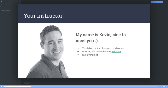
How to build and deploy your own personal portfolio site
Hello! My name is Kevin Powell. I love to teach people how to build the web and how to make it look good while they’re at it.
I’m excited to announce that I’ve just launched a free course that teaches you to create your very own fully responsive portfolio website.
After you’ve finished this course you will have a neat-looking portfolio site that will help you land job interviews and freelance gigs. It’s also a cool thing to show to your friends and family.
We’re going to build the portfolio using Scrimba’s interactive code-learning platform, and then deploy it using DigitalOcean’s cloud services.
Also, DigitalOcean has been generous to give everyone who enrolls a free credit, so it won’t cost you anything to get it up and running.
This post is a breakdown of the course itself, giving you an idea of what's included in all the lessons. If you like what you see, make sure to check it out over on Scrimba!
Lesson 1: Introduction
In the first lesson, you’ll get an overview of the course so that you know what to expect, what you should know before taking it, and what you’ll end up with once you're finished. I also give you a quick intro to myself.
Lesson 2: Setting things up - HTML
In part two, I’m going to show you around in the Scrimba environment and we’ll also set up the project.
All the images are supplied, so you won’t need to worry about looking for the perfect photo just yet. We can focus on building the portfolio!
Don’t forget that you can access everything you need from text and colors to fonts and much more at our dedicated design page.
Lesson 3: The header area - HTML
It’s finally time to start building out the portfolio. In this lecture, we will create the header section. We will brush up on the BEM methodology for setting class names in CSS, and I think you’ll find that this makes the navigation simple and straightforward to create.
Lesson 4: Intro section
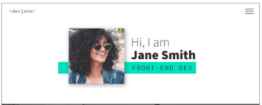
Next up is the Intro section of the portfolio. This is where we will introduce ourselves and put a picture of ourselves.
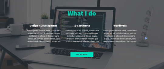
In the end, we add a section about the main skills/services we can do. For the moment we can just fill it all in with “Lorem ipsum” text as a placeholder, until you're ready to fill it in with your own text.
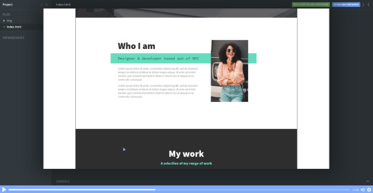
In this chapter, we’re finishing off the rest of our HTML with the last 3 sections: About me, where we’re going to introduce ourselves in greater detail; Work, where we’re going to add some of our portfolio examples, and our footer.
Footers are ideal for linking to email addresses and I will show you how to do that with an <a> tag. We can also add our social media links there too.
For now, it all looks a bit raw and all the CSS fun is ahead of us.
Lesson 6: Setting up the custom properties and general styles
Alright, time to get make that page look amazing!
In this part, we’re going to learn how to add custom properties.
While setting up CSS variables can take some time, it really pays off as the site comes together. They're also perfect for allowing you to customize the site's colors and fonts in just a few seconds, which I take a look at how to do once we wrap up the site.
Lesson 7: Styling the titles and subtitles
Having set all the needed typography, I will walk you through the subtitles of designing and styling the titles and subtitles in our sections.
Lesson 8: Setting up the intro section
Over the next few chapters it’s going to be quite hands-on, so no worries if you feel like rewatching the screencasts a couple of times.
We're keeping everything responsive, using CSS Grid and taking a little dive into using em units as well.
This is the perfect example where CSS Grid shines through and we’re going to learn how to use properties like grid-column-gap, grid-template-areas and grid-template-columns.
Lesson 9: Styling the services section
To add a little bit of interest, I look at how we can add a background-image to this section of the site. It's a nice way to break up the second and avoid just having solid color backgrounds everywhere, and I also look at how you could use background-blend-mode to change the color of the image to help keep the look of your site consistent.
As a bonus, we’re also going to learn how to style out buttons when they are hovered over or selected when we tab through the page.
Lesson 10: The About me section
Great progress! So this is the all-important About me section. This one is pretty similar to the Intro because we’re going to use CSS Grid, but move the picture to the right side and find a useful example for CSS fr unit.
Lesson 11: The portfolio
In this screencast, I will show how to build our portfolio section to display some of our great work. And we’re even going to learn how to use cubic-bezier() to a great and impressive effect with some hover styling!
Lesson 12: Adding the social icons with Font Awesome
This cast will be sweet and short, so you can rest a bit and learn some quick tips and tricks.
Adding social media links with Font Awesome icons is a breeze. We can do it with an <i> tag and then adding a class name of an icon you wish to add.
As an example, here’s how to add an icon for GitHub once you have Font Awesome linked in your markup.
<i class="fab fa-github"></i>

While the icons are in place, we do need at add more styling here to get them to be set up the way we need them to be.
With a little use of flexbox and removing the styling from the list with list-style: none it's relatively straight forward.
Lesson 14: Setting up the navigation styles
We have left the navigation to the last because very often it’s one of those simple things that can take the longest to set up and do correctly.
Once completed, the navigation will be off-screen, but slide in when a user clicks on the hamburger icon. The first step though, is to get it styled the way we want it to look, then we can worry about actually making it work!

Lesson 14: Creating the hamburger
In this screencast, you’ll learn how to add a hamburger menu to transition to the navigation view. It’s not an icon or an svg, but pure CSS.
We’re going to have a chance practice ::before and ::after pseudo-selectors, transition, and, since it's not a link but a button, we also need to define the different cursor when we hover over the hamburger icon to indicate that it can be clicked with cursor: pointer.
Lesson 15: Adding the JS
With a little bit of JavaScript, I will walk you through the implementation of a really nice and smooth transition from our main screen to the navigation window on click of the hamburger menu.

I also take a look at how we can add in smooth-scrolling with CSS only by using scroll-behavior: smooth. Yes, it really is that simple! It also makes a great tweet for Today I Learned (TIL). Feel free to send you TILs to @scrimba and I’m sure they will be really happy to retweet them!
Lesson 16: Creating the portfolio item page
With the homepage wrapped up, it's time to work on a template portfolio page that can be used to give more details on each of the projects that you are putting in your portfolio.
We're also going to learn how to link it seamlessly with our main page for a nice user experience.
Lesson 17: Customizing your page
This is where the magic of CSS custom properties comes in!
In this video I look at how we can customize the custom properties that we set up to change the color scheme of your site within seconds, and how we can update the fonts quickly and easily as well in order to make the site your own!
Lesson 18: DigitalOcean Droplets - What they are and how to set one up
In this screencast, we're going to explore DigitalOcean droplets. They are Linux-based virtual machines and that each droplet is a new server you can use.
It can seem daunting, but they are super easy to set up, very customizable and come with a lot of useful features, like a firewall automatically.
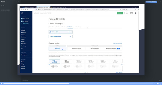
I'll talk you through every single step of the way so that you know exactly how to set a droplet up.
Lesson 19: DigitalOcean Droplets - Uploading files via FTP
To finish the whole process off, let me show you how we can upload our portfolio to the droplet we've created in the previous chapter and now it's online for others to see!
Lesson 20: Wrap up
And that's it! Your next step can be to make this page all about you, add all the relevant examples, tell us about you and make it live in a DigitalOcean droplet.
Once you've put yours together and got it online, please share your portfolio with Me and the team at Scrimba! You can find us at @KevinJPowell and @scrimba on Twitter, and we would be really happy to share what you're up to!
Check out the full course
Remember, this course is completely free. Head on over to Scrimba now and you can follow along with it and build out a fantastic looking site!
via freeCodeCamp.org https://ift.tt/2QwcP6z
0 notes
Text
All you need is data
Interview Jan Kratochvil / Simon Denny for Rajon 5

I read in the interview of Hans Ulrich with Julian Assange about his concept of three types of history: First, knowledge, like how to refine oil for instance or how to make a plastic bottle and so on, which are maintained and sustained by production, economy around it. Second, historical records, telling us various stories from the prehistory till today, being always present, slowly disintegrating or being reinterpreted, thus manipulated, but without an existing intention to get rid of them. Last type is something people put lots of energy and economic power to willingly destroy it or keep it as a secret. The last type is obviously something Assange is interested in.
In your case it’s more complicated I would say, even though you were working with Snowden files, these leaked informations are not the single core of your interest. Compiling past and present, even if past means yesterday and present possibly could be perceived as tomorrow. So what highlights topics of interest for you work?
First of all thanks for the careful questions - they are complex, so my answers might also be. I hope you'll forgive that! Secondly I love that interview, its my 2nd favorite Assange and my favorite Obrist interview. I also read in the "When google met Wikileaks" book that it was an interview Assange also felt very happy with.
I am very interested in the way organizations, particularly tech-related organizations, present themselves to each other and to the world. I'm interested in the language they use and the information they prioritize, as well as they way they use images, objects and systems in service of these priorities. This usually involves telling stories of some kind. If we want to relate it to your interpretation of Assange's three histories, maybe this activity relates more to the second and third kind of history you identify here. We could also say most tech companies implicitly or explicitly have claim on the first kind here too. I guess if I had to choose, I am most interested in your/his second kind of history. I feel like the kind of history-storytelling my exhibitions hover around and frame is about imaging the way we might see recent history through characters from the present. So in more concrete terms, my exhibitions often involve picking a organization, a practice or an individual, and reiterating or recontextualizing an existing story through them. With the Snowden-related material, I chose a Creative Director to recast as an artistic master in a longer lineage of state-commissioned images, using themes and aesthetic memes to unpack the value systems that might be found in the intelligence community's visual choices. In my Serpentine exhibition, Products for Organizing, I played many voices against each other, trying to visualize the relationship between a marketing-oriented view on the history of hacking and how that might be used to service commercial and governmental organizational innovation. In both cases histories of a present were told from a biased position. As you say I compile recent history and kind of posit a view on the present and past that demonstrates its interests.
Tell me more about this always present durational aspect of your work. Passage of time around us is super fast nowadays and iOS6 (was it 6?) with skeuomorphic design already looks like an antiquity when you’re using iOS9. More subtle changes in UI like the change of the typefont in case of Apple from Helvetica to San Francisco is less visible for most of costumers, still you reflect on it. What does this timeline you’re creating actually saying besides the obvious?
I believe in design as a time-stamp. I think objects, graphics, fonts and GUI's capture a moment in a very rich way. Popular interfaces to communication carry something of a worldview and a representation of what's possible and what's important at a certain moment. In this way Tim Cook's decision to have a custom typeface not a modernist classic as the universal system font of one of the world’s most dominant platforms says something about the world in 2015. Maybe this could represent a look inwards for the powerful tech giant? The fact that iOS was skeuomorphic also says something about 2007-2012. Maybe we were learning to use and carry touch screen portals or learning to want them.
Environments you’re forming holds the essence of some utopian repositories of knowledge. Very specifically selected knowledge. Do you relate to some ancient utopian urban plans and structures? I mean, besides the Tower of Babel. Thinking about New Atlantis, De Civitate Dei, Moore’s Utopia, Civitas Solis, Civitas Veri and so on. In other words, is there a long-term political ambition behind organising all that data into exhibition set-ups? (Funny thing is that you’re mentioning in youtube guided tour through “Babel”, that the idea of a tower came from the curator, so I’m just not sure if it’s something you would yourself find interesting or if it comes out of a process of preparing the show with another person).
Yeah in this case, the babel commission really came out of a conversation with Daniel Birnbaum and Hand Ulrich Obrist, along with Luma, where me and Alessandro Bava worked on researching and reinterpreting not only the tower of Babel but also a history of radical exhibition making and design at the Moderna Museet. So that was really a very group-authored thing - which also involved performances and poetry crated by Simon Castets and Giovanna Olmos and many more people. So while it was an amazing project that I am really proud of, and I took it in directions close to my personal interests where it made sense, it was also about learning from other voices and approaches, and the Babel proposition was one of those things that originated with another voice.
Can you please elaborate more on the question about the tower. i’m interested in a way how you think about those specific set-ups of your work with changes and differences you’re making for different shows.
do you consider those changes (for example different statues in exhibiting dotcom project etc.) to be a result of some specific system which develops the narration or are those mostly random? and what about reiterations of projects in different context: “venice” in kunsthalle vienna for instance?
Changes to how my material is presented in different situations aren’t random Exhibitions appearing in different venues are also not based on a system of rules that carry across every presentation. I look at each exhibition opportunity as it comes up and think what fits best, within what’s possible in terms of time and resources and also what the situation demands or proposes. A group show with a curatorial voice is not the same as solo presentation.
With the Personal Effects of Kim Dotcom this was kind of written into the work – in that case, the reiteration was kind of a system. Each time the show is made, the host institution and I gather material as best one can, according to the list of confiscated Dotcom possessions. That always reflects a budget, time, ingenuity, and effort – all sorts of factors that change from place to place. The contrast with what it would be to present the “real” collection is always huge. But this discrepancy is folded into the logic of the project, where the gap between the crazy value of Dotcom’s collection is always underlined. He is a very wealthy man and his business and lifestyle have always been about performing material success to a certain extent. Art budgets from New Zealand to Austria cannot match this, at least not within the framework I have been able to create. That is part of a work that is about articulating copies and placeholders for value.
With my Venice project’s sister participation in a group show at the Kunsthalle Wien it was also a lot about what the curator Nicolaus Schafhausen was interested in and what worked within the constraints of what he had in mind. It was a much more general presentation, with less of the pointed tensions of the presentation in Venice emphasised – but that’s what the show seemed to require.
So its different in each an every situation. But that doesn’t mean what is presented is random.
What about the idea of constructing repositories of knowledge? how could this gathering of data work much later when those informations are not current any more?
just basically if you’re thinking about it as a statement of here and now or if you think about a universally usable system of data distribution and interpretation.
I think this relates to your question earlier about design for me – what about when design ages and looks out of date? For me this question about data and relevance of events and data of another time is the same. We value cultural objects of the past that contain beautiful reflections of the place/time they were created in. The logic of those objects becomes a summary of what is important to the people/forces that made them. Reflecting current events and ideas and the way things change for me is about that entering into the presentations I make. If something has a strong resonance now it will be valuable in some way in a future that cares about the past.
Do you write? I mean in terms of essayistic format. (Haven’t found anything, but it could be really interesting).
Unfortunately not so much. Most of my writing is inside my artwork - I very often write or contribute significantly to press releases and wall texts/didactics. There is also increasingly a lot of text annotation on sculptures and paintings, which I have been co-writing with Matt Goerzen.
More long form essays are something Ive not really had the time to write up until now. And its a craft I don't really know, nor have I worked on.
You were saying once that visitor can interpret your work in his own way, obviously, that one can interpret it either as a serious political/ economical critique, and also just as a parody or some kind of nostalgia-aesthetics joke. Well, Simon, tell me please, where is the boundary in between joke and critical work? That’s obviously a quite an issue in realm of “post-postinternet”. With an obvious example of Hito Steyerl and difference in between her original documentary work, her essays, lectures and…for instance Factory of the Sun.
I think I would define my terms a bit here before I comment on this. I think ultimately the viewer always completes the artwork in the act of experiencing it, which is a conventional assertion in contemporary art, right? I also would say that I find the tone of other artist's work addressing similar topics is often divergent. I am a fan of Hito Steyerl, I think she does an amazing job. I don’t read humor in her work as something that obscures critique. I also see her work as something that contains critique as a central structural element.
Now to the question whether my work is a joke or not I would firmly say no it is not. I think any kind of exploration of a topic can involve humor, or elements that propose unlikely assertions. That doesn't necessarily follow that the whole endeavor is therefore a joke. It’s just a language of exhibition making that has a range to it. I am always a fan of the material I use in my work though - and if any humorous elements emerge its always out of playful admiration rather than anything close to sarcastic critique.

Simon Denny (b. 1982 in Auckland, New Zealand) is an artist working with installation, sculpture and video. He studied at the the Elam School of Fine Arts at the University of Auckland, New Zealand and at the Städelschule Frankfurt. selected solo exhibitions include: Serpentine Gallery, London (2015); MoMA PS1, New York (2015); Portikus, Frankfurt (2014); MuMOK, Vienna (2013); Kunstverein Munich, Munich (2013); and Aspen Art Museum, Aspen (2012). In 2012, Denny was awarded the Art Basel Statements Balouse Preis. Selected group shows include: After Babel, Moderna Museet, Stockholm (2015); Europe, Europe, Astrup Fearnley Museet, Oslo (2014); Art Post-Internet, Ullens Center for Contemporary Art, Beijing (2014); Speculations on Anonymous Materials, Fredericianum, Kassel (2013); Image into Sculpture, Centre Pompidou, Paris (2013); and Remote Control, ICA, London (2012). Denny represented New Zealand at the 56th Venice Biennale (2015) and was included in the central curated exhibition in 2013. He participated in the 13th Lyon Biennale (2015), Montreal Biennale (2014), as well as the Sydney Biennale and the Brussels Biennale (both in 2008).

1 note
·
View note
Text
Version 373 (Qt)
youtube
windows
zip
exe
linux
tar.gz
source
tar.gz
The Qt update is ready for Windows and Linux!
This week's release is for all users, but please bear in mind it has some small layout and positioning bugs, such as subscription popups sizing a little strangely. If you would rather wait a week or two for these last issues to be cleared (and any others that pop up as more people play with this), that is totally fine.
Qt background
Since hydrus began as an application, it has used wxWidgets to draw all the windows and buttons on screen. wx has served us well, but hydrus has grown to be a complicated program with hundreds of different custom things going on, and it was starting to show. Lots of windows were flickery, modern tech like 4k screens were not excellently supported, and operating systems and window managers were unstable. If I could have moved to a more flexible and more frequently updated UI library by snapping my fingers, I would have, but the total UI code is almost three megabytes, far too much to reasonably convert as I kept at my normal weekly schedule.
A user contacted me I think about a year ago talking about Qt and possibly making some scripts to automatically convert hydrus's wx code to Qt. I said it sounded like a good idea, and he worked in the background trying to figure it out and add manual tweaks. He was very successful, ultimately getting an essentially functional build going a couple of months ago. He passed the code to me four weeks ago, and I have since crash-learned Qt and fixed the great majority of the bugs that slipped through the automatic conversion process.
I am extremely grateful for this user's work--this would not have happened otherwise--and I am very happy with the result. Qt is a nicer library than wx for our purposes, runs faster, has much less flicker and related jank, and provides many new options for future extensions and customisation. I also enjoy working with Qt--the library is good.
hydrus Qt
There are no critical differences between the wx and Qt builds. Every label and button is where it was before. Fonts and colours and sizes and margins are all slightly different, but nothing has been taken away. Also, there do not seem to be any dll-style conflicts with a previous installation, so you should just be able to install or extract as you would any other week without any problems.
One particularly nice thing is that Qt is overall faster. Video animations and thumbnail fading should be a little smoother. Another is that compatibility with different Linux distros is much better, so Linux users who have had crashes or drawing problems should now have an easier time.
Also, tag autocomplete dropdown result lists can now float for non-Windows. They can also float on dialogs like manage tags. Options on whether they should float or embed are now under options->gui.
Hydrus is a big program, however. I have done plenty of testing and fixed hundreds of things, and advanced users have tried out some early builds and helped me out more, but there are surely some odd layout and display bugs we have not found. There are also some that we found but I could not fix in time--for instance, sometimes the new page tab drag-and-drop does not do its new 'live' page navigation correctly, discord drag-and-drop file export is unreliable again, the duplicate filter's right-hand hover window sometimes positions incorrectly, and subscription popups will change size too often due to some unusual text handling as they work through their network jobs. If you encounter your own issues, I am interested in all feedback. For now, issues that affect usability are of higher priority than a couple of pixels out of place, but I am open to all reports.
If you use IME text input, let me know how it works for you now!
I regret that I was unable to get a release-ready macOS build out for today. macOS has some important UI differences to Windows and Linux, and there are still some significant things--like maximise/borderless fullscreen support for the media viewer--that were causing stability issues. I will keep at it next week.
Users who run from source will need qtpy and either PySide2 (default) or PyQt5. Check https://hydrusnetwork.github.io/hydrus/help/running_from_source.html for more information.
misc
I also did some normal work, mostly quality-of-life ui stuff:
The 'archive/delete' menu option now shows up when you have nothing selected, and will do everything.
Some of the system predicate edit panels now show quick-select buttons--for instance, if you hit 'system:duration', you'll now have two extra buttons for 'has duration' and 'no duration'.
I fixed an important CPU inefficiency in the new files maintenance manager that was affecting some users with large file maintenance queues and large gui sessions. It was causing juddery UI, which should be completely fixed now.
Clients with large sessions that include 'collected' media thumbnails with hundreds or thousands of files should experience less UI judder as they browse the files within those collections.
full list
qt:
hydrus now uses Qt for its client's user interface, migrating from wx. this is thanks to a huge effort by a user, who delivered converted code for hydrus dev to finish off
a number of hacks and patches remain to compensate for old systems, which hydrus dev will slowly clean up in normal work. ui bug and layout issue reports would be greatly appreciated
shortcut storage had to be converted from fixed wx enums to an independant system. there is a small chance that one of your shortcuts, particularly if it is on the numpad, may have been converted wrong (unusual Enter/Return buttons may be hit here). if one is not working, please check what hydrus thinks it is and try re-entering it
added tentative support for 'Mode_switch' keyboard modifier, for X11 users (and perhaps some users' AltGr?)
autocomplete results can now float in a popup window in dialogs like manage tags! they'll still embed by default, but there are now separate float/embed options for 'main gui' and 'other frame' a/cs
autocomplete results can now float in linux and macOS ok!
page drag and drop now navigates as you drag, so dropping into a page of pages works by you hovering over it and then dropping in the tabbar below, inserting exactly where you want the page to be
a couple of text inputs in the program--the watcher and gallery search pages' text inputs, particularly--now use nicer 'placeholder' text, which isn't real and only shows as grey text when the input is empty
for now, moved to icons for thumbnail 'has audio/duration' indicators, rather than the custom labels
to run the hydrus client from source, qtpy is now needed. either pyside2 (default) or qtpy5 is needed. QtCharts is optional. wx and matplotlib are no longer needed
.
misc:
'archive/delete filter' now appears even when no file is focused. it also appears when no files are selected--and will apply to everything
the system predicate edit panels now support static buttons for easy one-click select for common predicates. duration, has audio, limit, and num tags now have these
system:duration and system:num tags now render a special label if they are >0 or =0
system:untagged is now removed from the normal list
fixed a critical cpu inefficiency in the file maintenance manager's new always-on maintenance, which was lagging several users' browsing sessions while it was working
fixed ctrl+mousewheel tag autocomplete results navigation to skip over multirow parent results
fixed an issue where resetting to default bandwidth rules for a network context would not update the ui properly
fixed a bug when adding a parent/sibling from autocomplete results list
the serialised png export folder now catches when a manually inputted export path's directory does not exist
reduced metadata update lag of pages with very large media collection groups
the inaccurate 'add tags based on filename' button is now called 'import with tags'
fixed a database UNIQUE issue when two duplicate gui session save calls happen within one second
the server's lock_off command now works with the Hydrus-Key header auth (rather than hanging indefinitely wew)
the server now caches hashed access keys in the session manager, in memory, to avoid a db hit on access-key based reauthentication, and in instances where this authentication requires a db hit, now cleanly provides an appropriate 'serverbusy' error
improved some media object memory management and speedy cleanup
improved boot fail graceful exit
removed a bunch of defunct flash (swf) hacks from media viewer code
bunch of misc non-qt cleanup as I went through the code
fixed a bug with rendering network credentials for human display
cleared out the ancient tag archive sync advanced help and added a stub for the new tag migration window
various help updates around wx->Qt
next week
This took a lot of work, more than I thought. I am really pleased, but also exhausted. I am going to take an easy week of fixing little layout issues and try to add system tray minimisation and css theming (which will eventually lead to 'proper' nightmode or any other theme users can work out). I'll also see if I can get the macOS release working better.
Once the Qt-issues rush has eased, I will return to the big tag work and Mr. Bones' normal schedule. I'll also test out adding an mpv video player into the media viewer, so we finally have proper video (and audio!) support.
In the longer term, I have probably a hundred Qt-cleanup jobs to catch up on. There are many behind-the-scenes hacks to get wx-specific code to talk to Qt, so I need to clean up that old bad code into something neater. I will spread this work out into my normal schedule.
0 notes
Text
Create a Stylish Dark Contact Form with HTML, CSS, and JavaScript
In this tutorial, we’ll walk through the process of styling basic contact form elements. We’ll examine different ways for making a form beautiful and fully functional at the same time.
Here’s the form that we’re going to build:
Note: this contact form is perfect for any dark mode UI! Learn more about how you can switch between dark and light mode using nothing but CSS:
CSS
Quick Tip: How to Implement Dark Mode in Your Website Using Media Queries
Adi Purdila
1. Begin With the Page Markup
We’ll start from scratch with a form element which contains a heading and an unordered list. We’ll use a .container for setting a maximum width to the form and horizontally center its contents:
<form class="my-form"> <div class="container"> <h1>Get in touch!</h1> <ul> <li>...</li> <li>...</li> <li>...</li> <li>...</li> <li>...</li> <li>...</li> </ul> </div> </form>
Inside the list we’ll place the form elements.
The first list item, for example, will contain a select element with four options. By default the first option is selected, yet disabled:
<select> <option selected disabled>-- Please choose an option --</option> <option>Request Quote</option> <option>Send Resume</option> <option>Other</option> </select>
In the second list item we’ll place two required input fields:
<div class="grid grid-2"> <input type="text" placeholder="Name" required> <input type="text" placeholder="Surname" required> </div>
The third list item includes a required and an optional input field:
<div class="grid grid-2"> <input type="email" placeholder="Email" required> <input type="tel" placeholder="Phone"> </div>
The fourth list item holds a textarea:
<textarea placeholder="Message"></textarea>
The fifth list item contains a checkbox along with its label:
<input type="checkbox" id="terms"> <label for="terms">...</label>
Finally, the sixth list item contains a div element and two buttons (types submit and reset):
<div class="grid grid-3"> <div class="required-msg">REQUIRED FIELDS</div> <button class="btn-grid" type="submit" disabled> <span class="back"> <img src="IMG_SRC" alt=""> </span> <span class="front">SUBMIT</span> </button> <button class="btn-grid" type="reset" disabled> <span class="back"> <img src="IMG_SRC" alt=""> </span> <span class="front">RESET</span> </button> </div>
2. Define Some Basic Styles
Before having a closer look at the individual form elements, let’s first define some CSS styles. These include a few custom variables to give us our color scheme, and some reset rules:
:root { --white: #afafaf; --red: #e31b23; --bodyColor: #292a2b; --borderFormEls: hsl(0, 0%, 10%); --bgFormEls: hsl(0, 0%, 14%); --bgFormElsFocus: hsl(0, 7%, 20%); } * { padding: 0; margin: 0; box-sizing: border-box; outline: none; } a { color: inherit; } input, select, textarea, button { font-family: inherit; font-size: 100%; } button, label { cursor: pointer; } select { appearance: none; } select::-ms-expand { display: none; } select:-moz-focusring { color: transparent !important; text-shadow: 0 0 0 var(--white); } textarea { resize: none; } ul { list-style: none; }
Note: for simplicity I won't walk through all the CSS rules in the tutorial. You can check the rest of them by clicking the CSS tab of the demo project.
3. Build the Form Layout
On small screens all our form elements will be stacked:
However on viewports 600 pixels wide and above, the form layout will change. More specifically:
We’ll arrange the elements of the second and third list items into two equal width columns.
The elements of the sixth list item will be arranged into three columns.
Thanks to CSS Grid, we can easily build the desired multi-column layout. We begin by declaring our .my-form .grid container as being a grid, then we define the columns on the grid items we need to change:
@media screen and (min-width: 600px) { .my-form .grid { display: grid; grid-gap: 1.5rem; } .my-form .grid-2 { grid-template-columns: 1fr 1fr; } .my-form .grid-3 { grid-template-columns: auto auto auto; align-items: center; } }
All of these rules are placed within a media query so they only take effect on viewports 600px wide and above.
4. Style the Form Elements
With our structure sorted out, we next add some initial aesthetic styles to all form elements:
/*CUSTOM VARIABLES HERE*/ .my-form select, .my-form input, .my-form textarea, .my-form button { width: 100%; line-height: 1.5; padding: 15px 10px; border: 1px solid var(--borderFormEls); color: var(--white); background: var(--bgFormEls); transition: background-color 0.3s cubic-bezier(0.57, 0.21, 0.69, 1.25), transform 0.3s cubic-bezier(0.57, 0.21, 0.69, 1.25); } .my-form textarea { height: 170px; } .my-form ::placeholder { color: inherit; opacity: 1; }
Note: alternatively, for setting the textarea’s width and height, we could have used its cols and rows attributes respectively.
Add “On Focus” Styles
Each time a form element is in focus, I’d like its background color to change. Furthermore, some elements scale up a little bit, just for emphasis:
Here’s how that’s done:
/*CUSTOM VARIABLES HERE*/ .my-form select:focus, .my-form input:focus, .my-form textarea:focus, .my-form button:focus { background: var(--bgFormElsFocus); } .my-form select:focus, .my-form input:focus, .my-form textarea:focus { transform: scale(1.02); }
Add Custom Icons
All required elements contain an icon (asterisk) positioned in the center right corner:
Similarly, the select also contains a custom icon (arrow) positioned in the center right corner:
We achieve that by applying an SVG icon as the background image:
.my-form *:required, .my-form select { background-repeat: no-repeat; background-position: center right 12px; background-size: 15px 15px; } .my-form *:required { background-image: url(asterisk.svg); } .my-form select { background-image: url(down.svg); }
Style the Buttons
As already discussed, in our form we have two types of buttons: a submit button and a reset button. If you revisit the form markup, you’ll notice that each of those buttons contains two elements: the .back element and the .front element.
By default only their .front child appears:
But as we hover over a button, or when it’s in focus, magic things happen. Specifically, its background color changes, the .front child disappears, and at the same time the .back child appears with a slide-in animation:
Here are the styles responsible for that behavior:
/*CUSTOM VARIABLES HERE*/ .my-form .btn-grid { position: relative; overflow: hidden; transition: filter 0.2s; } .my-form button:enabled:hover, .my-form button:focus { background: var(--bgFormElsFocus); } .my-form button > * { display: inline-block; width: 100%; transition: transform 0.4s ease-in-out; } .my-form button .back { position: absolute; left: 50%; top: 50%; transform: translate(-110%, -50%); } .my-form button:enabled:hover .back, .my-form button:focus .back { transform: translate(-50%, -50%); } .my-form button:enabled:hover .front, .my-form button:focus .front { transform: translateX(110%); }
5. Create a Custom Checkbox
If you look again at the markup inside the fifth list item, you’ll see that the checkbox’s id value matches the label’s for value. That creates an association between the two elements which gives us the ability to build a custom checkbox.
As a first step we visually hide the default checkbox:
.my-form input[type="checkbox"] { position: absolute; left: -9999px; }
Then we take advantage of the label’s ::before and ::after pseudo-elements to generate our own checkbox.
So, first we use the ::before pseudo-element to configure its unchecked state:
And then the ::after pseudo-element along with the :checked pseudo-class to implement its checked state:
As we did with the other form elements, we add some extra styling when the checkbox is in focus. Lastly, it’s wise to make sure users can access our form through keyboard navigation.
Check the associated styles below:
/*CUSTOM VARIABLES HERE*/ .my-form input[type="checkbox"] + label { position: relative; display: inline-block; padding-left: 2rem; transition: background 0.3s cubic-bezier(0.57, 0.21, 0.69, 1.25); } .my-form input[type="checkbox"]:focus + label { background: var(--bgFormElsFocus); } .my-form input[type="checkbox"] + label::before, .my-form input[type="checkbox"] + label::after { content: ''; position: absolute; } .my-form input[type="checkbox"] + label::before { left: 0; top: 6px; width: 18px; height: 18px; border: 2px solid var(--white); } .my-form input[type="checkbox"]:checked + label::before { background: var(--red); } .my-form input[type="checkbox"]:checked + label::after { left: 7px; top: 7px; width: 6px; height: 14px; border-bottom: 2px solid var(--white); border-right: 2px solid var(--white); transform: rotate(45deg); } @media screen and (min-width: 541px) { .my-form input[type="checkbox"] + label::before { top: 50%; transform: translateY(-50%); } .my-form input[type="checkbox"]:checked + label::after { top: 3px; } }
It’s worth mentioning that we could have also used some custom icons to build the desired checkbox.
6. Toggle the Buttons’ State
Initially the form buttons are disabled. That means we cannot click on them or select them:
In our CSS we add a few styles specifically targeting these disabled elements, making it clear to the user that they cannot be interacted with:
.my-form *:disabled { cursor: default; filter: blur(2px); }
The buttons become active as soon as the checkbox is checked:
The JavaScript code that handles this functionality is shown below:
const checkbox = document.querySelector('.my-form input[type="checkbox"]'); const btns = document.querySelectorAll(".my-form button"); checkbox.addEventListener("change", function() { const checked = this.checked; for (const btn of btns) { checked ? (btn.disabled = false) : (btn.disabled = true); } });
Conclusion
That’s it folks! Here’s what we’ve built!
In this tutorial, we covered plenty of different tips and tricks for styling contact form elements. Although we concentrated on a dark mode aesthetic, you can apply any kind of UI design using these same principles.
Hopefully you enjoyed the contact form we built here and you’ll use it as inspiration for developing your own forms. As always, thanks for reading!
Learn More About Designing Web Forms
Accessibility
How to Make Custom Accessible Checkboxes and Radio Buttons
Sami Keijonen
Form Design
Best Practices for Displaying Form Errors
Adi Purdila
Flexbox
How to Build a Responsive Form With Flexbox
George Martsoukos
Bootstrap
Building a Bootstrap Contact Form Using PHP and AJAX
Aaron Vanston
0 notes
Text
5 Email Opt-in Designs You Can Create with Divi’s Email Opt-in Module
We all love new subscribers to our email list. And one of the primary ways to get new subscribers is to provide your visitors with a well designed email opt-in form. That’s why in this tutorial, I’m going to show you how to achieve five different designs with the Divi email opt-in module to help spark your imagination as to what is possible with this powerful and flexible module.
Sneak Peek
Here is a preview of the five Divi Email Opt-in Module designs we will be tackling today.
#1 Shadow Stacks Opt-in
Start Designing #1
#2 Big and Minimal Opt-in
Start Designing #2
#3 Skinny Opt-in
Start Designing #3
#4 Book Offer Opt-in
Start Designing #4
#5 Cut-out Frame Opt-in
Start Designing #5
What You Need to Get Started
For this tutorial, all you will need is Divi. We will be building each one from scratch so no need for a premade layout. However, I will be using a few images from some of our layout packs but you can use your own if you want.
Also, it is important to know that you will not be able to see the optin form fields on the live site until you assign an email provider/list to your email opt-in module. You can do this in your email optin settings under Email Account.
Now let’s get to those designs!
#1 Shadow Stacks Opt-in
This design adds two box shadows to the Divi email opt-in module for a unique stacking effect that makes the form pop. The first box shadow is added to the email opt-in module and the second box shadow is added to the row which has a custom size and border to make it work.
Here is how it’s done.
First create a new section with a one-column row and add the email opt-in module to the row.
Open the email opt-in settings and update the following:
Background Color: #1a0a38
Layout: Body On Top, Form On bottom
Fields Rounded Corners: 0px
Text Orientation: Center
Title Font Weight: Light
Title Text Size: 36px
Button Text Color: #ffffff
Button Background Color: #00ac69
Button Border Width: 0px
Button Border Radius: 0px
Custom Padding: 3vw top, 3vw bottom, 5vw left, 5vw right
Now let’s add our first box shadow layer behind our email opt-in module.
Box Shadow: see screenshot
Box Shadow Horizontal Position: 25px
Box Shadow Vertical Position: -25px
Shadow Color: rgba(26,10,56,0.82)
Now let’s add a small snippet of custom CSS in order to take out the left padding that is added to the form by default. Go to the advanced tab and add the following CSS under Opt-in Form.
padding-left: 0px !important;
That takes care of the email opt-in module settings. Now let’s edit our row. Open the row settings and update the following:
Custom Width: 600px
Custom Padding: 25px top, 0px bottom, 25px right
Bottom Border Width: 25px
Bottom Border Color: rgba(0,0,0,0)
Left Border Width: 25px
Left Border Color: rgba(0,0,0,0)
Now we can add the box shadow to the row.
Box Shadow: see screenshot
Box Shadow Horizontal Position: 50px
Box Shadow Vertical Position: -50px
Box Shadow Spread Strength: -25px
Shadow Color: rgba(26,10,56,0.55)
Now let’s check out the final design.
#2 Big and Minimal Opt-in
This email opt-in design is minimal, clean, and big. The form fields scale with the size of the browser so that it looks great on all devices. And it’s not too big that it forces the user to scroll.
Here’s how to do it.
First create a new section with a one-column row and add the email opt-in module to the row.
Open the email opt-in settings and update the content to include your Title and Footer text.
Then update the background with a dark color or image:
Background color: #121212
Background Image: This is optional. I’m using one from the Podcast Layout Pack
Before we continue over to the design tab for more customization, we need to make room for the large form elements we will be adding. To do this, go to the row settings and update the following:
Custom Width: 100%
Tip: Using a 100% custom width is a great way to make sure your design doesn’t get any right or left margin on mobile. If you use the “Make Fullwidth” option, your max width will be 89% so you will still have margins on mobile.
Now jump back into the Email Opt-in Module Settings and update the following design:
Layout: Body On Top, Form On bottom
Form Field Background Color: rgba(0,0,0,0)
Fields Rounded Corners: 0px
Fields Bottom Border Width: 2px
Fields Bottom Border Color: #ffffff
Text Orientation: Center
Title Font: Lato
Title Font Weight: Light
Title Font Style: TT
Title Text Size: 4vw
Title Line Height: 1em
Field Text Color: #ffffff
Field Font: Lato
Field Font Weight: Light
Field Text Size: 3.5vw
Field Letter Spacing: 0.1em
Field Line Height: 1.3em
Body Letter Spacing: 0.5em
Button Text Size: 4vw
Button Border Radius: 0px
Button Letter Spacing: 0.1em
Button Font: Lato
Font Weight: Light
Custom Padding: 10vw top, 10vw bottom, 10vw left, 10vw right
Notice the use of the vw length unit for font size combined with the em length unit for line height and letter spacing. This allows the text and design to scale seamlessly when adjusting your browser.
The last step is includes a few snippets of custom CSS to polish off the design. Go to the advanced tab and add the following Custom CSS under Opt-in Form Fields:
font-size: 3.5vw;
This will allow the size of the text when typing to match the placeholder text in your form fields.
Then let’s add some custom margin above the button to give it a little breathing room. Add the following under Subscribe Button:
margin-top: 3.5vw;
Now let’s check out the final design.
#3 Skinny Opt-in
This next design is sure to be a popular solution for companies and blogs looking to save some vertical space on their posts or landing pages. Even though Divi’s Email Opt-in module is best for more traditional vertical forms, you can actually convert the form to a skinny horizontal form with just a small snippet of CSS.
Here’s how to do it.
Create a new section with a one-column row and add the email opt-in module to the row.
Open the email opt-in settings and update the content to include a Title but nothing else.
Then update the design with a background and a button color as follows:
Background Color: #54677d
Layout: Body On Top, Form On Bottom
Text Orientation: Center
Button Background Color: #b0c94f
Button Border Width: 0px
Now it’s time for the custom CSS. Since we want the skinny form design only on desktop (and not on mobile), we will be adding the CSS to the page (under page settings) using a Custom CSS ID to target the form style.
To do this, go to the advanced tab and give the opt-in module a custom CSS ID.
CSS ID: skinny
This will be used to target this form with the external CSS we will add to the page.
Now open the Divi Builder page settings and add the following CSS under the Advanced tab.
@media (min-width: 980px){ #skinny.et_pb_newsletter .et_pb_newsletter_fields { flex-wrap: nowrap !important; } #skinny.et_pb_newsletter .et_pb_newsletter_fields>* { flex-basis: 23%; } } #skinny .et_pb_newsletter_form { padding-left: 0px; }
Since Divi already uses flex to style the form on the backend, this CSS takes out the flex-wrap property that causes the form fields to align vertically. The result is a horizontal layout of the form fields. Adjusting the flex-basis property to 23% basically sets the width of each of the form fields. And because we added the CSS inside a media query, the design will only happen on desktop with the default layout of the form displaying on mobile.
Here is the final design.
#4 Book Offer Opt-in
This design incorporates a few images within the email opt-in module for the purposes of promoting a free book offer for signing up. To do this, all you need to do is add an image using the built-in wysiwyg editor for adding description and footer content. It is true that you can accomplish this same design by combining the email opt-in module with other modules in a two column row, but I thought it would be helpful to show how to do it all in the same module.
Here’s how to do it.
Create a new section with a one-column row and add the email opt-in module to the row.
Open the email opt-in settings and stay in the content tab.
Under description, shorten the default text to only a couple of sentences. Then add an image from your media library by clicking the Add Media button.
You want to make sure the image is no more than about 200px wide. For this example, I’m using the medium size of the image.
Under Footer, add a few sentences for the footer text content and then click the Add Media button to add a logo image under the text (this is optional of course).
To make sure the image is centered, set the alignment option to center when adding the image from the media library.
Now you are ready to update the rest of the design. Start by giving the module a background image and a background gradient above the image to make the text more readable.
Background image: [add image]
Background Gradient Left Color: rgba(0,0,0,0.5)
Background Gradient Right Color: rgba(0,0,0,0.5)
Place Gradient Above Background Image: YES
Then update the rest of the design as follows:
Button Text Color: #333333
Button Background Color: #ffcb7a
Button Border Width: 0px
Button Letter Spacing: 5px
Font Weight: Ultra Bold
Font Style: TT
Width: 700px
Module Alignment: center
Custom Padding: 3vw top, 3vw bottom, 3vw left, 3vw right
Here is the final design.
#5 Cut-out Frame Opt-in
This simple design technique is a great way to give your email opt-in a unique look. The trick is to use section dividers that have the same color as the section background. Then by adjust the height of the dividers, you can overlap the email opt-in form in order to cut out the edges in a unique way for nice framing effect.
Here is how to do it.
Create a new section with a one-column row and add the email opt-in module to the row.
Open the email opt-in settings and give your module a background gradient.
Background Gradient Left Color: #8300e9
Background Gradient Right Color: #06c8ff
Gradient Type: Radial
Radial Direction: Top Left
Then update the rest of the design as follows:
Title Font Weight: Bold
Title Text Size: 36px
Width: 70% (desktop), 100% (tablet and smartphone)
Module Alignment: center
Custom Padding: 6vw Top, 6vw Bottom, 6vw Left, 6vw Right
Rounded Corners: 50px top left, 0px top right, 50px bottom right, 0px bottom left
Save your settings.
Then update your row settings with a custom width.
Custom Width: 100%
Now we are ready to customize the section setting to add our cut-out frame effect with those section dividers.
Open the section settings and update the following:
Background Color: #222222
Top Divider Style: see screenshot
Top Divider Color: #222222 (make sure this matches the section background color)
Top Divider height: 12vw (desktop), 150px (tablet and smartphone)
Top Divider Arrangement: On Top Of Section Content
Bottom Divider Style: see screenshot
Bottom Divider Color: #222222 (make sure this matches the section background color)
Bottom Divider height: 12vw (desktop), 150px (tablet and smartphone)
Bottom Divider Horizontal Repeat: 0.8x
Bottom Divider Flip: vertical and horizontal
Bottom Divider Arrangement: On Top Of Section Content
Now let’s check out the final design.
Check out post on creating unique frame designs for more on this design technique.
Final Thoughts
These email opt-in designs are really just the tip of the iceberg when you think about all the style options available within Divi. I purposefully kept the designs simple enough to give you the broad strokes of what you can do. Feel free to explore more polished designs on your own by adding new fonts, colors, and hover effects. And don’t forget to have some fun in the process.
I look forward to hearing from you in the comments.
Cheers!
The post 5 Email Opt-in Designs You Can Create with Divi’s Email Opt-in Module appeared first on Elegant Themes Blog.
😉SiliconWebX | 🌐ElegantThemes
0 notes
Text
Master the Captivate Universe With Master Slides
In a webinar about Captivate 2017 that I recently presented, there were a lot of questions that came in about Master Slides and how to use them. I addressed most of those at a high level in the webinar recap that we published on our blog, but I wanted to go a bit more in-depth on the subject.
To lay some groundwork let’s clarify a couple of terms:
Theme
A Theme, in Captivate terminology, is a way of keeping a consistent design throughout a project. The great things about a theme are that it can be applied “on the fly”—aka while you are in the middle of your project (though you have to make sure the project and the theme use the same resolution).
A theme controls the colors, fonts, placeholders, and general look and feel of your project. Most themes will be designed using a master slide set.
Themes can be used with either responsive (Fluid Box or Breakpoint) or non-responsive projects. A theme is saved with the file extension .cptm
Captivate has some built-in themes, and there are dozens more available through our interface.
To download the great eLearning Brothers themes you open your Asset panel by clicking the Assets button on your Ribbon, then selecting Get Free eLearning Assets. Once you log in to the eLearning Brothers interface you’ll see the categories across the top, just select the Themes > Captivate category.
Template
A template is also a way to control the look and feel of a project, but unlike Themes, Templates must be selected at the start of the project.
A template is also specific to the project type: responsive or non-responsive. A template is saved using the extension .cptl.
A template is usually created with a theme and can be useful when you want to create a corporate style across all your projects. When you create a template the theme and master slides are saved with it.
When a project is created from a template it will be saved with the normal project file extension (.cptx) unless you specifically save it as a template again.
The fact of the matter is that most templates you can find (including in the eLearning Brothers library) are actually just Captivate projects (.cptx) rather than actual templates.
(For a much deeper dive into these terms, check out this blog post from Lieve Weymeis, a renowned Captivate expert: http://blog.lilybiri.com/whats-in-a-theme-a-template).
Skin
A skin is just the look and feel of the player that is the frame for the project. This includes the Table of Contents, the built-in navigation tools (Next and Previous, Scrub bar, Volume Control, etc) and the frame around the project.
Master Slides
There are essentially two types of Master Slides.
The Top-level Master controls all the base elements seen on the layouts or Content Masters that sit beneath it. If you want a unified background color, logo, etc throughout your slides, you can place them here.
Content Masters (also called Layouts) are specific to certain slide types. You can create a Content Master for any number of slides.
To create a new Content Master, you need to select the Insert menu, then select Content Master Slide from the menu.
With a Content Master, you can add placeholders for text, titles, images, and so forth.
Placeholders do just what their name implies, they hold the place until you fill it in with the content, object or image that you choose.
You can also create Quiz Master Slides.
A Quiz Master Slide can be used for either question slides or for a Results slide.
Harnessing the power of Themes and Slide Masters can really help you unify the look and feel of your eLearning projects and can greatly reduce the amount of time you spend building your project.
Because Themes contain Master Slides, you can always retrieve and apply them later to any project you are working on. And they can be shared with other Captivate users in your organization.
If you’re not currently using Master Slides or Themes, give it a go and see how much easier your course design can be. And don’t forget to check out all the Themes, Layouts and other eLearning Assets in the eLearning Brothers Library.
Template Library
The post Master the Captivate Universe With Master Slides appeared first on eLearning Brothers.
from Free Online Courses http://elearningbrothers.com/master-captivate-universe-master-slides/
0 notes
Photo


Final Piece - The Process
Step 1 - First I shot my images in the studio using a top down rig and 70mm prime lens. I also used an even and constant light setup as I wanted to get a correct exposure on all parts of the clothing I was shooting, as well as retain a small and light perimeter shadow around as much of the jackets as possible (one light either side, slightly diagonal angle).
Step 2 - Next I took my images into post production. It was here I began to bring the cubism art movement into the work, I had roughly pre planned which parts of the one composition I needed to source from which images of which jackets. The trick was ensuring that any compositions I create, looked good together as a single piece and being careful not to make any two look the same. I made a standard A3 size document on Photoshop with 300 DPI and began to import the images one by one, cropping and transforming them to get what I needed. I then used layer masks to ensure the crops were non destructive, along with the pen tool to cut and manipulate the images until they took on a natural appearance and fit. I repeated this process 3 times gradually increasing in the compositions complexity each time.
Step 3 - After finalising the 3 individual pieces I began to contemplate their sizing and where they should go on the page, giving consideration to title and text space as well as trying to keep the image as balanced as possible.
Step 4 - I then added triangular block filled colour sections using the pen tool, keeping to a triangular fashion, again using layer masks to edit and bring in extra accents such as the white strip on the blue section. (For pen tool use, use anchor points to select shape - right click go to make selection then use fill tool to colour) The blue and brown colour scheme came initially from the fact that they were two of the most common colours used in my images, I used the colour picker tool to get the correct shade.
Step 5 - Now I began to add the title text, focussing on ensuring the key working was they eye was drawn to first, I did this by making “Jacket” & “History” the largest font at around size 70, additionally when I later went back and added a shadow effect with a grey coloured duplication of the layer, I made the shadow appear thicker than on the other words for that extra 3D, pop effect. I thought the corner and vertical text style fitted in well with the triangular theme I seemed to be going with, I also didn't want my text to cross any of the colour lines to maintain a clean, clear cut theme throughout.
Step 6 - I then went back to my composition to bring in my secondary style inspiration from the likes of Will Reid. I started by highlighting significant areas of each of the jackets using layer mask and marquee tool to create a box around the area, then another box inside to create a border, along with the brush tool to erase parts of the line giving the appearance of a dotted line (as you would see in a sketchbook etc). Felt like a crude and long way of doing it but was unsure about any alternatives. I also made a duplication of the highlighted sections and placed them around the edges of the main pieces, creating secondary and tertiary focus points for the image (added a white border to them to make them stand out a little more against backdrop).
Step 7 - Using the Pen tool I then layer out areas for each of my individual 4 text boxes, I wanted the text to fit seamlessly with the graphic designs on the page so I created them free hand by using the pen tool, making sure its set to shape and not path as when i made the selection all I had to do was press ‘T’ (text shortcut) and then click inside the shape to enable my custom made text box. I filled the text box with place holder text initially but then went back and filled it in with an article related to my pieces as I thought leaving placeholder text there would spoil the authenticity of my work.
Step 8 - Finally I revisiting my main images and added key work texts behind and around the pieces to again contribute to that informal style I was looking to integrate. I made the text similar colours to the backdrop they were placed on but either a slightly darker or slightly lighter shade just enough so that you can see them but they do not distract you from the pieces. Additionally I finished up my highlighting of specific areas and made minor alteration to text box sizes and added the custom large first letter text on the 3rd paragraph which is typical to this style of article writing.
All images shot for this project were shot at 1/160 (no need to be 125 as were not using flash) f/9.0 and above to keep all of subject in sharp focus and ISO 100 as is standard when working in the studio to maximise image quality.
0 notes
Text
watchOS 4 Tutorial Part 1: Getting Started
Update Note: This tutorial has been updated to Swift 4/watchOS 4 by Audrey Tam. The original tutorial was written by Mic Pringle.
In this watchOS 4 Tutorial, you’ll build a simple but fully functional watchOS 4 app. Specifically, you will work on a Watch app for a fictional airline called Air Aber.
In the process, you’ll learn:
How to add a watchOS 4 target to an iOS app.
How to share data across the two targets.
How to add a watchOS 4 interface controller to the Storyboard, and lay out the interface objects.
How to create the WKInterfaceController subclass, and wire everything up.
Let’s get started! ┗(°0°)┛
Getting Started
Start by downloading the starter project for this tutorial.
Open it in Xcode, and build and run. You should see a blank white screen:
There’s not much to this project as it stands: it includes a few helper files you’ll need, and not much else. You’ll address that now!
Adding the WatchKit App
Select File\New\Target…. In the dialog that appears, choose watchOS\Application\WatchKit App, then click Next:
In the following screen, set Product Name to Watch, make sure Language is set to Swift, and uncheck any checkboxes that are checked. Click Finish:
You’ll be asked if you want to activate the watch scheme, which you do, so make sure to choose Activate:
Congratulations, you’ve just created your first Watch app! It really is that easy.
You’ll notice this action actually created two targets, not one, and two corresponding groups in the Project navigator. This is because the code of a Watch app actually runs as an extension bundled within the Watch app, in much the same way Today extensions on iOS work.
Expand the Watch and Watch Extension groups in the Project navigator, and you’ll see that the storyboard is in the Watch group, and the classes created by the target template are in the Watch Extension group:
Here’s the pattern you’ll follow moving forward: any code you add must reside within the Watch Extension group, and be added to the Watch Extension target, whereas any assets or storyboards must be added to the Watch group.
A Little Housekeeping
Before continuing, you need to remove a couple of things added by the target template that you’re going to replace.
Right-click on InterfaceController.swift in the Project navigator, and choose Delete. When prompted, choose Move to Trash to make sure the file is actually removed from the project:
Next, open Interface.storyboard, select the only interface controller in there, and hit the delete key. This should leave you with an empty storyboard, or as I prefer to think of it, a blank canvas.
Sharing Data and Code
The starter project includes a JSON file containing all the Air Aber flight details, and a model class that represents that data. This is exactly the kind of thing that you should share amongst targets, since it’s highly likely the iOS app and the Watch app will use the same model class and data – you do remember DRY, right?
Expand the Shared group in the Project navigator, and select Flights.json. Next, find the Target Membership section in the File inspector, and check Watch Extension:
The file is now included in both the AirAber and Watch Extension targets.
Repeat the process for the other file in the Shared group, Flight.swift.
And with that done, you can finally begin building the flight details interface!
Building the Interface
Open Watch\Interface.storyboard, and drag an interface controller from the Object Library onto the storyboard canvas. With the interface controller selected, open the Attributes inspector, and set Identifier to Flight, and check Is Initial Controller. Uncheck Activity Indicator On Load:
Here, you’ve set the identifier so you can refer to the interface controller in code. Checking Is Initial Controller simply informs WatchKit this is the interface controller you want to display when the Watch app first launches. This interface doesn’t download any data, so it doesn’t need to display the activity indicator.
In order to simplify this tutorial, you will build your layout only for the 42mm watch. For your own apps, you’ll want to verify that they work properly on all watch sizes. At the bottom left of the storyboard pane, ensure that it says View as: Apple Watch 42mm.
Watch app layout is completely different from iOS layout. The first thing you’ll notice: you can’t move or resize UI objects by dragging them around in the interface controller. When you drag an object onto the controller, it slots in under the previous objects, and the screen fills up pretty fast. To organize objects side-by-side, you use groups, which are a lot like stack views in iOS and macOS.
So first, drag a group from the Object Library onto the interface controller:
Although it doesn’t look like much now, this group will eventually contain the Air Aber logo, flight number and route.
With the new group selected, head over to the Attributes inspector, and change Insets to Custom. Four text fields appear, where you can manually set the top, bottom, left and right insets of the group.
Change Top to 6:
This simply gives the layout group a little extra padding at the top.
Next, drag an image into the group. If your group shrank in response to changing the top inset (thanks Xcode!), drag the image into the document outline instead, making sure it’s a child of the group, rather than a sibling:
Now you need an image to display. Download this logo image and drag it into your Watch\Assets.xcassets. This creates a new image set called Logo, with the actual image in the 2x slot:
You want to tint this image to Air Aber’s corporate color, so select the image, then in the Attributes inspector, set Render As to Template Image.
Re-open Watch\Interface.storyboard, and select the image. Using the Attributes inspector, make the following changes:
Set Image to Logo – if it doesn’t appear in the dropdown, simply type it in.
Set Tint to #FA114F (you can type this in the Color RGB Sliders panel).
Set Width to Fixed, with a value of 40.
Set Height to Fixed, with a value of 40.
The Attributes inspector should now look like the following:
Don’t worry if you can’t see the logo: it turns out Xcode doesn’t tint template images at design time! Trust me, it’ll be a vibrant pink when you build and run!
Next, drag another group into the existing group, making sure it appears to the right of the image, and use the Attributes inspector to change its Layout to Vertical. Also, change Spacing to Custom\0 and Width to Size to Fit Content.
Next, drag two labels into the new group. Because you set layout to vertical, the labels appear one above the other:
Select the upper label, and use the Attributes inspector to set Text to Flight 123 and Text Color to #FA114F (instead of typing this into the RGB panel again, you can select the pink color from Recently Used Colors in the Color menu).
Next, select the lower label, and set its Text to MEL to SFO. Your interface controller should now look like the following:
This text is simply placeholder text that’ll be replaced when you hook the interface up to its controller class.
Next, drag another group onto the interface controller, but this time make sure it’s a sibling of the very first group you added. If you can’t get the group positioned at the correct place in the hierarchy, use the document outline instead.
With this new group selected, set its Layout to Vertical and Spacing to Custom\0.
Next, drag three labels into this new group:
Check in the document outline to make sure all three labels are inside the group, not siblings of the group!
Select the top label, and use the Attributes inspector to change its Text to AA123 Boards.
Next, select the middle label, and change its Text to 15:06. Next, change Text Color to #FA114F and Font to System, with a Style of Regular and a Size of 54. Finally, change Height to Fixed, with a value of 44.
Select the bottom label, and change its Text to On time and Text Color to #04DE71.
Your interface controller should now look like the following:
Now you only have to add one more group, before you create the outlets, and have this interface display some real data.
Drag a new group from the Object Library into the lower group, this time making sure it’s a child rather than a sibling, and that it’s positioned at the very bottom of the containing group. Next, add two labels to it. Your complete interface object hierarchy should now look like this:
Use the Attributes inspector to set Text to Gate 1A for the left label. For the right label, set Text to Seat 64A, and set Horizontal Alignment to Right.
The completed interface should now look like the following:
Congratulations, you’ve finished laying out your very first Watch app interface! Now it’s time to populate it with some real data, and get it up and running in the simulator.
Creating the Controller
Right-click on the Watch Extension group in the Project navigator, and choose New File…. In the dialog that appears, select watchOS\Source\WatchKit Class, and click Next. Name the new class FlightInterfaceController, making sure it’s subclassing WKInterfaceController, and Language is set to Swift:
Click Next, and then Create.
When the new file opens in the code editor, delete the three empty method stubs, so you’re left with only the import statements and the class definition.
Add the following outlets to the top of FlightInterfaceController:
@IBOutlet var flightLabel: WKInterfaceLabel! @IBOutlet var routeLabel: WKInterfaceLabel! @IBOutlet var boardingLabel: WKInterfaceLabel! @IBOutlet var boardTimeLabel: WKInterfaceLabel! @IBOutlet var statusLabel: WKInterfaceLabel! @IBOutlet var gateLabel: WKInterfaceLabel! @IBOutlet var seatLabel: WKInterfaceLabel!
Here, you’re simply adding an outlet for each of the labels you added to the interface earlier. You’ll hook them up in just a moment.
Next, add the following property and property observer below the outlets:
// 1 var flight: Flight? { // 2 didSet { // 3 guard let flight = flight else { return } // 4 flightLabel.setText("Flight \(flight.shortNumber)") routeLabel.setText(flight.route) boardingLabel.setText("\(flight.number) Boards") boardTimeLabel.setText(flight.boardsAt) // 5 if flight.onSchedule { statusLabel.setText("On Time") } else { statusLabel.setText("Delayed") statusLabel.setTextColor(.red) } gateLabel.setText("Gate \(flight.gate)") seatLabel.setText("Seat \(flight.seat)") } }
Here’s the play-by-play of what’s happening:
You declare an optional property of type Flight. This class is declared in Flight.swift, which is part of the shared code you added to the Watch Extension target earlier.
You add a property observer that is triggered whenever the property is set.
You make sure there’s an actual flight rather than nil in the optional property. You only want to proceed with configuring the labels when you know you have a valid instance of Flight.
You configure the labels using the relevant properties of flight.
If the flight is delayed, you change the text color of the label to red.
Now you need to set flight when the controller is first shown. Add the following below the declaration of flight:
override func awake(withContext context: Any?) { super.awake(withContext: context) flight = Flight.allFlights().first }
In the next part of this series, you’ll change this implementation to use the context that’s passed to it, but for now, you simply load all the flights from the shared JSON file, then take the first one from the array.
Note: awake(withContext:) is called after the controller is loaded from the storyboard, and all its outlets are set up, so it’s a great place to set flight.
Now, there’s one final step before you can build and run, and that’s to connect the outlets.
Connecting the Outlets
Open Watch\Interface.storyboard, and select the interface controller. Using the Identity inspector, set Custom Class\Class to FlightInterfaceController.
Next, use your favorite method to connect the outlets according to the list below:
flightLabel: Flight 123
routeLabel: MEL to SFO
boardingLabel: AA123 Boards
boardTimeLabel: 15:06
statusLabel: On time
gateLabel: Gate 1A
seatLabel: Seat 64A
Before you hit run, there’s just one more thing to do. The sample app you’re building throughout this tutorial has been designed for the 42mm Apple Watch, so you need to make sure you have the correct watch simulator set up, otherwise some things may look a little off. For a real world app, you’d want to make sure your interfaces work equally well across both sizes of watch, but that’s outside the scope of this tutorial.
Open the Watch scheme menu, and select one of the 42mm simulators:
Build and run. Once the simulator has finished loading, you should see your elaborate layout, with the logo tinted Air Aber pink. The Flight object generates random values for boarding time and seat number, so you’ll see different values there:
Note: If you receive an error message stating the installation failed, then you can either try again with Xcode, or manually install the app in the watch simulator. To do this, open the Watch app in the iOS simulator, tap on AirAber, and then flick Show App on Apple Watch to On. Once that’s done, jump back to the watch simulator, tap the Digital Crown to navigate to the home screen, and then tap the AirAber icon to launch the app.
Congratulations! You’ve now finished implementing your very first WatchKit interface, and got it up and running in the watch simulator using real data — nice work. :]
Where To Go From Here?
Here is the finished example from this tutorial series so far.
In this exercise, you’ve learned how to add a Watch app to an existing iOS app, how to create an interface controller, and lay out a pretty complex interface using nested groups, and how to tie the whole thing together using a WKInterfaceController subclass. So, where to next?
Part 2 of this tutorial series, of course! In Part 2, you’ll learn all about tables and navigation in WatchKit.
If you have any questions or comments on this tutorial, please join the forum discussion below! :]
If you enjoyed this tutorial series, you’d definitely enjoy our book watchOS by Tutorials.
The book goes into further detail on making watchOS apps and is written for intermediate iOS developers who already know the basics of iOS and Swift development but want to learn how to make Apple Watch apps for watchOS 4.
It’s been fully updated for Swift 4, watchOS 4 and Xcode 9 — get it on the raywenderlich.com store today!
The post watchOS 4 Tutorial Part 1: Getting Started appeared first on Ray Wenderlich.
watchOS 4 Tutorial Part 1: Getting Started published first on http://ift.tt/2fA8nUr
0 notes
Text
Storyboards Tutorial for iOS: Part 2
Storyboards, Segues and Static Cells
Update note: This tutorial has been updated for Xcode 9, iOS 11, and Swift 4 by Nicholas Sakaimbo. The original tutorial was written by Matthijs Hollemans.
If you want to learn about storyboards, you’ve come to the right place!
In the first part of this series, you covered the basics of using Interface Builder to create and connect various view controllers, along with how to make custom table view cells directly from the storyboard editor.
In this second and final part of this storyboards tutorial series, we’ll cover segues, static table view cells, the Add Player scene, and game picker scene!
We’ll start where we left off last tutorial, so open your project from last time, or download the example code from the previous tutorial here.
OK, now you’ll dive into some of the other cool features in storyboards!
Introducing Segues
It’s time to add more view controllers to the storyboard. You’re going to create a scene to add new players to the app.
Open Main.storyboard and drag a Bar Button Item into the right slot of the navigation bar on the Players scene. In the Attributes inspector change System Item to Add, and set its Style to Bordered.
When the user taps this button, you want the app to pop up a new modal scene for entering details of a new player.
Drag a new Table View Controller into the canvas to the right of the Players scene. Remember you can double-click the canvas to zoom out so you have more room to work. With the new Table View Controller selected, choose Editor\Embed in\Navigation Controller.
Here’s the trick: Select the + button you just added on the Players scene and ctrl-drag to the new Navigation Controller. Release the mouse button and select Present Modally from the popup menu:
This places a new arrow between the Players scene and the Navigation Controller:
This type of connection is known as a segue (pronounce: seg-way) and represents a transition from one scene to another. The storyboard connections you’ve seen so far were relationships and they described one view controller containing another. A segue, on the other hand, changes what’s on the scene. Segues are triggered by taps on buttons, table view cells, gestures, and so on.
The cool thing about using segues is you don’t have to write any code to present the new scene, or hook up your buttons to IBAction methods. What you just did, dragging from the Bar Button Item to the next scene, is enough to create the transition. (Note: If your control already has an IBAction connection, the segue overrides it.)
Build and run the app and tap the + button. A new table view will slide up from the bottom.
This is called a modal segue. The new scene completely obscures the previous one. The user cannot interact with the underlying scene until they close the modal scene first. Later you’ll see “show” segues that push a new scene onto a Navigation Controller’s navigation stack.
The new scene isn’t very useful yet – you can’t even close it to go back to the main scene. That’s because segues only go one way – so while it can go from the Players scene to this new one, it can’t go back.
Storyboards provide the ability to ‘go back’ with something called an unwind segue, which you’ll implement next. There’s three main steps:
Create an object for the user to select, usually a button.
Create an unwind method in the controller you want to return to.
Hook up the method and the object in the storyboard.
First, open Main.storyboard and select the new Table View Controller scene. Change the title of the scene to Add Player (by double-clicking in the navigation bar). Next, add two Bar Button Items, one to each side of the navigation bar. In the Attributes inspector, set the System Item property of the left button to Cancel, and the right button to Done.
Next, add a new file to the project using the Cocoa Touch Class template – name it PlayerDetailsViewController and make it a subclass of UITableViewController. Next, open Main.storyboard and select the Add Player scene. In the Identity inspector set its Class to PlayerDetailsViewController. I always forget this very important step, so to make sure you don’t; I’ll keep pointing it out.
Now you can finally create the unwind segue. Open PlayersViewController.swift, add the following extension above your UITableViewDataSource extension:
// MARK: - IBActions extension PlayersViewController { @IBAction func cancelToPlayersViewController(_ segue: UIStoryboardSegue) { } @IBAction func savePlayerDetail(_ segue: UIStoryboardSegue) { } }
cancelToPlayersViewController(_:) is simply a marker for the unwind segue. Later you’ll add code to savePlayerDetail(_:) to allow it to live up to it’s name!
Finally, open Main.storyboard and hook up the Cancel and Done buttons to their respective action methods. Ctrl-drag from the bar button to the exit object above the view controller then pick the correct action name from the popup menu:
Note the name you gave the cancel method. When you create an unwind segue, the list will show all unwind methods (i.e. ones with the signature @IBAction func methodname(_ segue:)) in the entire app, so create a name you can recognize.
Build and run the app, tap the + button, and test the Cancel and Done buttons. A lot of functionality for very little code!
Storyboards Static Cells
When you’re finished with this section, the Add Player scene will look like this:
That’s a grouped table view, but you don’t have to create a data source for this table. You can design it directly in the storyboard — no need to write tableView(_:cellForRowAt:) for this one! Static cells is the feature that makes this possible.
Open Main.storyboard and select the table view in the Add Player scene. In the Attributes inspector change Content to Static Cells. Change Style from Plain to Grouped and give the table view 2 sections.
Note: When you change the value of the Sections attribute, the editor will clone the existing section. (You can also select a specific section in the Document Outline on the left and duplicate it.)
The finished scene will have only one row in each section, so select two cells in each of the sections and delete them using the Document Outline.
Next, select the top table view section (from the Document Outline) and set the header value to Player Name.
Drag a new Text Field into the cell for this section. Stretch out its width and remove its border so you can’t see where the text field begins or ends. Set the Font to System 17.0 and uncheck Adjust to Fit.
You’re going to make an outlet for this text field on the PlayerDetailsViewController using the Assistant Editor feature of Xcode. While still in the storyboard, open the Assistant Editor with the button from the toolbar (the one at the top right with two intertwining rings). It should automatically open on PlayerDetailsViewController.swift (if it doesn’t, use the jumpbar in the right hand split window to select PlayerDetailsViewController.swift).
Select the new text field and ctrl-drag to the top of PlayersDetailViewController, just below the class definition. When the popup appears, name the new outlet nameTextField, and click Connect. Xcode will add the property to the PlayersDetailViewController class and connect it in the storyboard:
Creating outlets for views on your table cells is exactly the kind of thing I said you shouldn’t try with prototype cells, but for static cells it’s OK. There will be only one instance of each static cell so it’s perfectly acceptable to connect their subviews to outlets on the view controller.
Select the second section of the table view in the Document Outline and delete the placeholder “Section-2” text in the Header field in the Attributes Inspector. Set the Style of the static cell in the second section to Right Detail. This gives you a standard cell style to work with. Change the label on the left to read Game by double clicking it and give the cell a Disclosure Indicator accessory.
Just as you did for nameTextField, make an outlet for the label that says Detail and name it detailLabel. The labels on this cell are just regular UILabel objects. You might need to click a few times on the text “Detail” to select the label (and not the whole cell) before ctrl-clicking and dragging to PlayerDetailsViewController.swift. Once done, it will look similar to the following:
The final design of the Add Player scene looks like this:
Note: The scenes you’ve designed so far in this storyboard all have the width and height of the 4.7-inch screen of the iPhone 7, which is 667 points tall. Obviously, your app should work properly with different screen sizes, and you can preview these sizes within your Storyboard.
Open the Assistant Editor from the toolbar, and use the jump bar to select Preview. At the bottom left of the assistant editor, click the + symbol to add new screen sizes to preview. To remove a screen size, select it and hit the Delete key.
For the Ratings app, you don’t have to do anything fancy. It only uses table view controllers and they automatically resize to fit the screen space. When you do need to support different layouts for different sized devices, you’ll use Auto Layout and Size Classes.
Build and run the app. You’ll notice the Add Player scene is still blank!
When you use static cells, your table view controller doesn’t need a data source. Since you used an Xcode template to create the PlayerDetailsViewController class, it still has some placeholder code for the data source and this prevents the static cells from working properly. Time to fix it!
Open PlayerDetailsViewController.swift and delete everything from the following line down (except for the class closing bracket):
override func viewDidLoad() { super.viewDidLoad() }
Build and run the app. Now the new scene displays the static cells, and all without writing a line of code.
One more thing about static cells: they only work in UITableViewController. Even though Interface Builder will let you add them to a table view inside a regular UIViewController, this won’t work during runtime. The reason is UITableViewController provides some extra magic to take care of the data source for the static cells. Xcode prevents you from compiling such a project with the error message: “Illegal Configuration: Static table views are only valid when embedded in UITableViewController instances”. Prototype cells, on the other hand, work just fine in table view’s placed inside regular view controllers.
Note: If you’re building a scene with a lot of static cells — more than can fit in the visible frame — you can scroll through them in Interface Builder with the scroll gesture on the mouse or trackpad (2 finger swipe).
You can’t always avoid writing code altogether though, even for a table view of static cells. When you dragged the text field into the first cell, you probably noticed it didn’t fit completely. There’s a small margin of space around the text field. The user can’t see where the text field begins or ends, so if they tap in the margin and the keyboard doesn’t appear, they’ll be confused.
To avoid this, let a tap anywhere inside the row bring up the keyboard. Open PlayerDetailsViewController.swift and add the following extension to the end of the file:
// MARK: - UITableViewDelegate extension PlayerDetailsViewController { override func tableView(_ tableView: UITableView, didSelectRowAt indexPath: IndexPath) { if indexPath.section == 0 { nameTextField.becomeFirstResponder() } } }
If the user taps the first cell, the app should activate the text field. There’s only one cell in the section so you only need to test for the section index. Making the text field the first responder will automatically bring up the keyboard.
Note: when adding a delegate method, or overriding a view controller method, just start typing the method name (without preceding it with “func”), and you’ll be able to select the correct method from the available list.
You should also set the Selection for the cell to None in the storyboard Attributes Inspector, otherwise the row appears highlighted when the user taps in the margin around the text field.
All right, that’s the design of the Add Player scene. Now to actually make it work!
The Add Player Scene at Work
For now you’ll ignore the Game row and just let users enter the name of the player.
When the user taps the Cancel button the scene should close and the data entered should be lost. This already works with the unwind segue.
When the user taps Done, you should create a new Player object, fill its properties and update the list of players.
prepare(for:sender:) is invoked whenever a segue is about to take place. You’ll override this method to store the data entered into a new Player object before dismissing the view.
Note: Never call prepare(for:sender:) yourself. It’s a message from UIKit to let you know a segue has just been triggered.
Open PlayerDetailsViewController.swift, and add the following property at the top of the class:
// MARK: - Properties var player: Player?
Next, add the following method below your IBOutlets definitions:
// MARK: - Navigation override func prepare(for segue: UIStoryboardSegue, sender: Any?) { if segue.identifier == "SavePlayerDetail", let playerName = nameTextField.text { player = Player(name: playerName, game: "Chess", rating: 1) } }
prepare(for:sender:) creates a new Player instance with default values for game and rating. It does this only for a segue with the identifier SavePlayerDetail.
Open Main.storyboard, find the Add Player scene in the Document Outline and select the unwind segue tied to savePlayerDetail:. Change Identifier to SavePlayerDetail:
Next, open PlayersViewController and replace the unwind segue method savePlayerDetail(_:) with the following:
@IBAction func savePlayerDetail(_ segue: UIStoryboardSegue) { guard let playerDetailsViewController = segue.source as? PlayerDetailsViewController, let player = playerDetailsViewController.player else { return } // add the new player to the players array players.append(player) // update the tableView let indexPath = IndexPath(row: players.count - 1, section: 0) tableView.insertRows(at: [indexPath], with: .automatic) }
This obtains a reference to the PlayerDetailsViewController via the segue reference and resolves the Player object. Next, append the new Player object to the players array. Finally, inform the table view a new row was inserted at the bottom, since the table view and its data source must always be in sync.
You could have invoked tableView.reloadData() but it looks nicer to insert the new row with an animation. UITableViewRowAnimation.automatic automatically picks the correct animation, depending on where you insert the new row.
Build and run the app, you should now be able to add new players to the list!
Performance
Since you have several view controllers in the storyboard, you might be wondering about performance. Loading a whole storyboard at once isn’t a big deal. The storyboard doesn’t instantiate all the view controllers right away – only the initial view controller is immediately loaded. Since your initial view controller is a Tab Bar Controller, the two view controllers it contains are also loaded (the Players scene from the first tab and the scene from the second tab).
The other view controllers are not instantiated until you segue to them. When you close these view controllers they’re immediately deallocated, so only the actively used view controllers are in memory.
To see this in practice, open PlayerDetailsViewController.swift and add the following below your IBOutlet definitions:
// MARK: - Initializers required init?(coder aDecoder: NSCoder) { print("init PlayerDetailsViewController") super.init(coder: aDecoder) } deinit { print("deinit PlayerDetailsViewController") }
You’re overriding init?(coder:) and deinit, and making them log a message to the Xcode Debug pane.
Build and run the app. Open the Add Player scene. You should see the print() log statement from init?(coder:).
When you close the Add Player scene, either by tapping Cancel or Done, you should see the print() log statement from deinit. If you open the scene again, you should also see the message from init?(coder:) again. This should reassure you that view controllers are loaded on-demand only.
The Game Picker Scene
Tapping the Game row in the Add Player scene should open a new scene to let the user pick a game from a list. This means you’ll add another table view controller, although this time you’re going to push it on the navigation stack rather than show it modally.
Open Main.storyboard and drag a new Table View Controller into the canvas. Next, select the Game table view cell in the Add Player scene (be sure to select the entire cell, not one of the labels) and ctrl-drag to the new table view controller to create a segue between them. Select Show under Selection Segue in the popup, not Accessory Action.
Select this new segue and give it the identifier PickGame in the Attributes Inspector.
Select the new table view controller in the Document Outline and in the Attributes Inspector, name this scene Choose Game.
Next, select the prototype table view cell and set the Style of the prototype cell to Basic, and give it the reuse identifier GameCell. That’s all you need to do for the design of this scene:
Add a new Swift file to the project, using the Cocoa Touch Class template and name it GamePickerViewController, subclass of UITableViewController.
Next, open Main.storyboard and select the Choose Game Scene. In the Identity Inspector, set its Custom Class to GamePickerViewController.
Now you’ll give this new scene some data to display. Open GamePickerViewController.swift, and add replace everything in the class definition with the following:
// MARK: - Properties var games = [ "Angry Birds", "Chess", "Russian Roulette", "Spin the Bottle", "Texas Hold'em Poker", "Tic-Tac-Toe" ]
Next, add the following extension to the end of the file:
// MARK: - UITableViewDataSource extension GamePickerViewController { override func tableView(_ tableView: UITableView, numberOfRowsInSection section: Int) -> Int { return games.count } override func tableView(_ tableView: UITableView, cellForRowAt indexPath: IndexPath) -> UITableViewCell { let cell = tableView.dequeueReusableCell(withIdentifier: "GameCell", for: indexPath) cell.textLabel?.text = games[indexPath.row] return cell } }
Here you’re setting up the data source to use the games array and placing the string values in the cell’s textLabel.
Build and run the app and tap the Game row. The new Choose Game scene will slide into view. Tapping the rows won’t do anything yet, but because this scene is presented on the navigation stack, you can always tap the back button to return to the Add Player scene.
This is pretty cool, huh? You didn’t have to write any code to invoke this new scene. You just ctrl-dragged from the static table view cell to the new scene and that’s it. The only code you wrote was to populate the contents of the table view, which is typically something more dynamic rather than a hardcoded list.
Currently, this new scene isn’t very useful since it doesn’t send any data back. You’ll have to add a new unwind segue.
In GamePickerViewController add the following properties below the games property:
var selectedGame: String? { didSet { if let selectedGame = selectedGame, let index = games.index(of: selectedGame) { selectedGameIndex = index } } } var selectedGameIndex: Int?
Whenever selectedGame is updated, didSet will locate the game string in games array and automatically update selectedGameIndex with the correct index from the table.
Next, replace tableView(_:cellForRowAt:) with the following:
override func tableView(_ tableView: UITableView, cellForRowAt indexPath: IndexPath) -> UITableViewCell { let cell = tableView.dequeueReusableCell(withIdentifier: "GameCell", for: indexPath) cell.textLabel?.text = games[indexPath.row] if indexPath.row == selectedGameIndex { cell.accessoryType = .checkmark } else { cell.accessoryType = .none } return cell }
This sets a checkmark on the cell containing the name of the currently selected game. Small gestures such as these will be appreciated by users of the app.
Next, add the following extension below the UITableViewDataSource extension:
// MARK: - UITableViewDelegate extension GamePickerViewController { override func tableView(_ tableView: UITableView, didSelectRowAt indexPath: IndexPath) { tableView.deselectRow(at: indexPath, animated: true) // Other row is selected - need to deselect it if let index = selectedGameIndex { let cell = tableView.cellForRow(at: IndexPath(row: index, section: 0)) cell?.accessoryType = .none } selectedGame = games[indexPath.row] // update the checkmark for the current row let cell = tableView.cellForRow(at: indexPath) cell?.accessoryType = .checkmark } }
This method is called whenever the user taps a row. First deselect the row after it was tapped (makes it fade from the gray highlight color back to white). Finally, remove the checkmark from the previously selected cell, and puts it on the just tapped cell.
Build and run the app. Tap the name of a game and its row will get a checkmark. Tap the name of another game and the checkmark moves to that row.
The scene should close when the user taps a row but that doesn’t happen yet because you haven’t hooked up an unwind segue. Sounds like a great next step!
Open PlayerDetailsViewController.swift, and add the following below the player property:
var game: String = "Chess" { didSet { detailLabel.text = game } }
This property will hold the selected game so it can be stored in the Player object later. didSet will display the name of the game in the static table cell whenever the name changes.
Still in PlayerDetailsViewController.swift, add the following extension above your UITableViewDelegate extension:
// MARK: - IBActions extension PlayerDetailsViewController { @IBAction func unwindWithSelectedGame(segue: UIStoryboardSegue) { if let gamePickerViewController = segue.source as? GamePickerViewController, let selectedGame = gamePickerViewController.selectedGame { game = selectedGame } } }
This method is executed once the user selects a game from the Choose Game Scene and updates both the label on screen and the game property based on the game selected. The unwind segue also pops GamePickerViewController off the navigation controller’s stack.
Open Main.storyboard, ctrl-drag from the tableview cell to the Exit as you did before, and choose unwindWithSelectedGame: from the popup list:
In the Attributes Inspector give the new unwind segue the Identifier SaveSelectedGame.
Build and run the app. Create a new player, select the player’s game row and choose a game.
The game is not updated on the Add Player scene!
Unfortunately, the unwind segue method is performed before tableView(_:didSelectRowAt:), so the selectedGameIndex is not updated in time. Fortunately, you can override prepare(for:sender:) and complete the operation before the unwind happens.
Open GamePickerViewController, and add the following method below your property definitions:
override func prepare(for segue: UIStoryboardSegue, sender: Any?) { guard segue.identifier == "SaveSelectedGame", let cell = sender as? UITableViewCell, let indexPath = tableView.indexPath(for: cell) else { return } let index = indexPath.row selectedGame = games[index] }
The sender parameter of prepare(for:sender:) is the object that initiated the segue, which in this case was the selected game cell. You can use the indexPath to locate the selected game in games array then set selectedGame so it’s available in the unwind segue.
Build and run the app and select the game, it’ll update the player’s game details!
Next, you need to change PlayerDetailsViewController‘s prepare(for:sender:) to return the selected game, rather than the hardcoded “Chess”. This way, when you complete adding a new player, their actual game will be displayed on the Players scene.
Open PlayerDetailsViewController.swift, replace prepareForSegue(_:sender:) with the following:
override func prepare(for segue: UIStoryboardSegue, sender: Any?) { if segue.identifier == "SavePlayerDetail", let playerName = nameTextField.text { player = Player(name: playerName, game: game, rating: 1) } }
When you complete the Add Player scene and tap done, the list of players will now update with the correct game.
One more thing – when you choose a game, return to the Add Player scene, then try to choose a game again, the game you chose before should have a checkmark by it. The solution is to pass the selected game stored in PlayerDetailsViewController over to the GamePickerViewController when you segue.
Still in PlayerDetailsViewController.swift, add the following to the end of prepare(for:sender:):
if segue.identifier == "PickGame", let gamePickerViewController = segue.destination as? GamePickerViewController { gamePickerViewController.selectedGame = game }
Note you now have two if statements checking segue.identifier. SavePlayerDetail is the unwind segue going back to the Players list, and PickGame is the show segue going forwards to the Game Picker scene. The code you added will set the selectedGame on the GamePickerViewController just before the view is loaded. Setting selectedGame will automatically update selectedGameIndex which is the index the table view cell uses to set a checkmark.
Awesome. You now have a functioning Choose Game scene!
One More Thing: Storyboard References
Open Main.storyboard and zoom out. You’ll see the complete project has several scenes.
This bird’s-eye-view of your project is nice, but you can imagine a large number of scenes could become unwieldy to navigate. In addition, multiple people working in the same storyboard file can lead to nasty merge conflicts in version control.
To mitigate these issues, you can use Storyboard References to split up an existing storyboard into one or more smaller storyboard files, separated by logical areas of functionality. Let’s see how this works by refactoring all view controllers from the Players tab into their own storyboard.
To do this, click + drag to select all view controllers starting from PlayerViewController‘s containing navigation controller to the Choose Game scene (you may need to zoom out sufficiently to do this). Alternatively, you could also use Command + click to select view controllers in the Document Outline.
Next, select Editor\Refactor to Storyboard to consolidate the selected scenes into their own storyboard.
When prompted for a filename, type “Players” and hit “Save”. You’ll see a new Players.storyboard file in your project containing all the scenes you just built. In addition, back in Main.storyboard, you’ll see the tab bar controller now points to the Players Storyboard Reference and not directly to the Players scene.
Build and run the project to confirm everything works as before. Voila! Refactoring storyboards is easy and could save you down the road – it’s a great tool to have in your toolbelt.
Where To Go From Here?
Here is the final Ratings example project with all of the code from the above tutorial.
Congratulations, you now know the basics of using the Storyboard Editor, and can create apps with multiple view controllers transitioning between each other with segues! Editing multiple view controllers and their connections to each other in one place makes it easy to visualize your app as a whole.
One item you didn’t add as part of this tutorial is the ability to change the player rating, but you now know enough about storyboards to implement this yourself for practice. :]
You’ve also seen how easy it is to customize table views and table view cells. Static cells make it easy to set up an interface without implementing all the data source methods.
If you want to learn more about storyboards, check out our book the iOS Apprentice.
If you have any questions or comments on this tutorial or on storyboards in general, please join the forum discussion below!
The post Storyboards Tutorial for iOS: Part 2 appeared first on Ray Wenderlich.
Storyboards Tutorial for iOS: Part 2 syndicated from http://ift.tt/2uHrXAJ
0 notes
Last Seen Blogs

egoeimaicollective
'egó eímai' collective

jfleurcannon
the F ward.

ask-numberjacks
Ask the Numberjacks

zeewhatiwrote
Here we use books & writing as a coping mechanism