#the grass and lineart tho?
Text
Crisp those Lines!
Or: a small collection of suggestions for a crispy, neat lineart.
SO MANY OF YOU ASKED FOR THIS (it feels absurd to say, yes), so here you go.
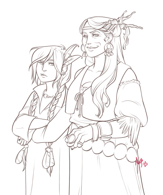
A premise: there's no right or wrong way of inking, and some of the following tips entirely depend on the type of inking I do. Which is neat and clean, with no blacks, and moreover: digitally. More under the cut because it's gonna be long and full of explanatory pictures. Here's an example:
SOFTWARES AND BRUSHES:
Let's address the elephant in the room: Photoshop SUCKS for inking and linework. The stabilisation of the brush there is SHIT. Good for colouring and painting and doing photobashing, but for Lineart you want it to be precise. Do yourself a favour and don't use Photoshop.
I generally use Clip Studio Paint, but i have to say that the best program for it that I've tried keeps being Paint Tool SAI 2. It has few functions, it's true, and I use CSP because it has more instruments. But if you don't want to pay much, SAI is incredible as for brush rendition and stabilisation.
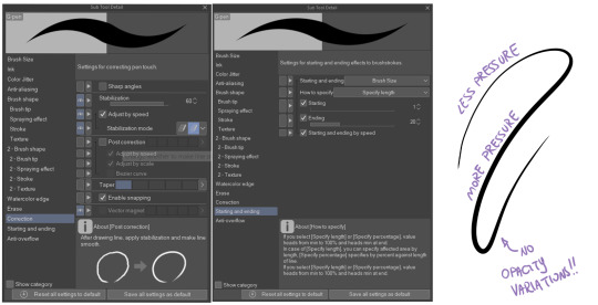
As for the brush: you don't need a fancy brush, anything in your software will go. What I use and what works best tho must have:
Tapered start and end.
High stabilisation (I go from 60 upward, lower it down for trees and grass or anything more natural that needs to be less neat and flowy)
Low tapering.
It must be set so that pressure controls only the dimension. The more you push on your pen, the bigger the line gets. No colour or opaciy variation!
On Clip Studio Paint, I use the G-Pen in the program. It's good as it is, but I think I did some variations as per here:
FILE DIMENSIONS:Better work larger and then resize down. Sizing files up digitally is possible, but it leads to unfocused images.
I generally work on files at 600dpi (300 is fine too, but don't go any lower. Particularly if that's something you want to print later on, any printing wants a minimum of 300dpi). in roughly an A3 format (bigger dimension is 43cm). Most pictures I upload here are 6000x5000 pixel.
A bigger file will give you more possibilities with brush sizes, and it'll be easier. Remember: digitally, sizing down is ok, sizing up is not something you should do.
SKETCH:
This is the suggestion I should follow but never do.
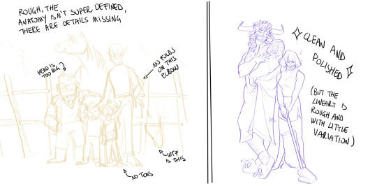
Having a clean, polished sketch simplifies your life A LOT. This is because if you don't have to worry about drawing details and fixing the anatomy of your drawing during the lineart, and doing it so GOOD because it's the lineart... You'll go that much slower and your life will be more complicated (it's not impossible, my sketches usually are very rough. I am ok with it, the most I do drawing wise is during the lineart... But I'm lazy, don't do like me. A good sketch will help you out.)
Compare the two sketches below:
Another note about your sketch layer: you know those memes that complains that the sketch looks good but when you hide it the lineart is shitty? That's easily solvable.
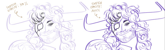
When you're inking, lower the opacity of the sketch layer down, A LOT. I generally go for a 30 or 40% opacity (depending on the colour of the sketch. the yellow sketch will go around 40% because it's less visible, the purple one lower).
When you're inking, you MUST see clearly the lineart you're doing. If the sketch isn't contrasting enough, you won't see clearly what you're doing... It's like trying to sketch with a dim light, not seeing the paper clearly. See the difference:
BEFORE YOU START:
You probably have read it everywhere, but it bears repeating: warm up your hand.
You're using muscles and for more than five minutes. The warmer they are, the firmer your hand is, the easier it gets controlling your lines. It also prevents you from damaging your wrist. Stretching is also great, and grippers are nice to have. Keep your hand fit!
As for warming up: I usually do some calligraphy exercises, practicing on flowy cursives. You want to practice varying the pressure of your lines in a single trait, hence why calligraphy is good. But generally, what you can do is...

PRESSURE VARIATION AND LONG LINES:
So. My main tip and trick is to vary the pressure of your lines. In the same line, and between different details. This will help making the lineart more dynamic and interesting.
A note: this works for semi-realistic styles. If your goal is obtaining a Cartoon Network style: they have generally little to no variation and it works. My suggestion would be to study the kind of style and effect you want to obtain, different styles will work best with different linearts. If you're aiming at hyperrealistic painting, there's no point in spending time over a lineart, for example, I inked the same lineart, but with a brush that doesn't vary it's dimensions with pressure, and not changing the dimension of the brush.
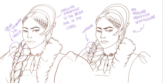
What makes my linearts look "flowy" and "neat" is the fact that I tend to draw less lines and longer, and pay attention when I stop, to start the line where I end it. This will give the impression of one continuous, single line, and make everything more fluid. See above in the french hood: on the right, I left the line rough on purpose, you can see where I stopped and started again. On the left, where I took care of it, you can't.
Generally speaking:
Thick, dark lines communicate that the object is close to the viewer (always keep the viewer in mind!) or in shadow. Lines should be thicker on the outside of your objects, to separate two planes, and in stuff closer to you.
Thin lines are delicate, they should be used in the background, for small details (see the hair, the lips, the small wrinkles around her eyes.)
As for line continuity: in both cases, the line of her face is one single line I drew. This can be obtained with a smooth result, particularly in curved lines, by getting the brush stabilisation on higher settings (80-100): sacrifice speed for accuracy.
MORE IS MORE, WHEN IT COMES TO LEVELS:
Particularly when there are two objects intersecating, or more characters interacting… Instead of inking all on the same level, I always do one level for each object, trace the WHOLE line as if there was nothing above, and then erase where it's not shown. This is a little thing, but pays off. Always in the drawing of above, the feather and the hem of the bodice were on separate layers, and then I erased the bodice under the feather. Take advantage of being inking digitally and not traditionally!

For many characters, here's an example of a vignette of a comic page before cleaning it up and erasing. Every single character and the weapons are on separate layers

For this it's very useful knowing your recurring mistakes. For example, I tend to draw heads bigger than they should. I know I do, so generally I keep the head on its own level, and the body on another, so it's easier to modify and size down just the head without getting crazy selecting only the lines you want with the lazo.
Again, you're inking digitally. It's not easier than traditionally necessarily, take full advantage of your instrument!
OTHER TIPS AND TRICKS:
High brush stabilisation sacrifices speed for accuracy. The line will lag a little from your cursor. Get used to watching the cursor and not the line, and trust that the line will follow.
GO SLOW.
Rotate and flip the canvas. Don't ask me why, but tracing long lines towards me is always easier than not the other way around.
Use the Free Transform, Warp, Distort etc etc and the Liquify to your heart's content if you notice the lineart has something wrong. The only cheating in art is using fucking AI generators (and AI pictures are not art, sorry not sorry)
References are your friends. Study how an artist you like does the lineart. Try and imitate them, and if you can and need to post them: tag them! (don't trace and sell it as your own)
Experiment with brushes, find one that you like for the effect you'd love. You do you, there's no right or wrong way of inking.
Remember to breathe when you trace those lines! (and to drink and do pauses and stretch, you don't want a tendonitis!)
Have fun. Lineart is not evil, lineart is your friend!
I hope this essay is exhaustive enough. I'm tagging ALL THE PEOPLE that requested it (and giving each of you a muffin).
@ndostairlyrium @narina-gnagno @salsedine @whimsyswastry @layalu @n7viper
If you have any questions, don't hesitate in asking!
#tutorials#lineart#inking#digital inking#digital art#tips and tricks#petrel explains#COME LO FECI (cit)#listen if we're mutuals and we chat... ask me to share my screen I don't mind the company when I work if it's not something I can't show#or if it's not too late at night for me#also I unironically like how Alyra inked without variation looks even angrier and more judgemental than normal LOL#also some spoilers for The Last Bacchae if you follow that#“Marmotta” means “Groundhog” in italian#art ref
132 notes
·
View notes
Text
she haunts the narrative. to me
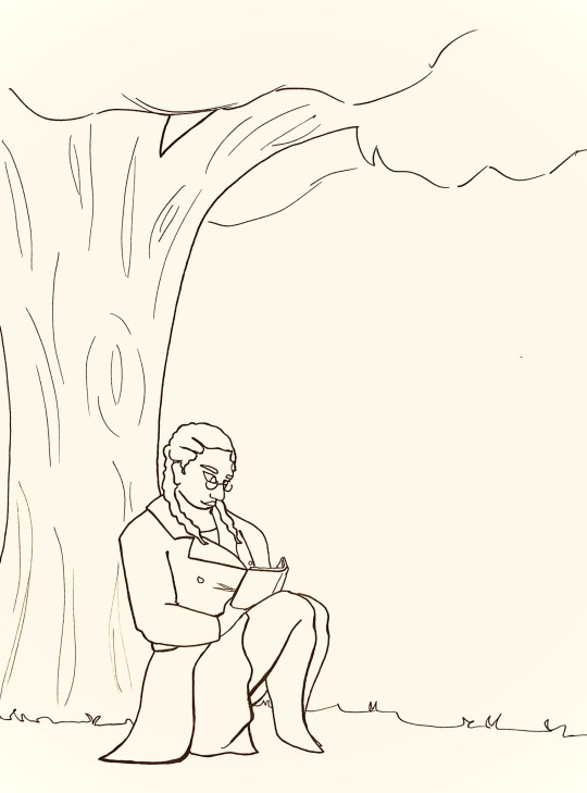
[ID: Pen-on-paper lineart of Penelope from Ulysses Dies at Dawn. Penelope is a thin Black woman in her 30s or 40s. she wears small, round glasses and her hair is in thick, loose braids with two pigtails draped over her shoulders. she sits on the grass and leans against the trunk of a large oak tree. she is relaxed and reading a book. penelope is wearing a trenchcoat and a skirt that ends just above her knees. she is barefoot. she smiles softly as she studies the book. End ID]
ough for real tho i need more people to talk about penelope bc she is just so crunchy. interesting
#she is the driving force behind the narrative! but also she never existed within it in the first place!#she drove the lives of everyone in the story whether they knew it or not but she was dead the whole time!#we know nothing about her except that#she was ulysses’ wife#she died#and she was never in the acheron#and that’s so much! that is so much to happen to someone! but we don’t even know who she was!#anyways#the mechanisms#my art#the mouse squeaks#ulysses dies at dawn#udad#penelope udad#fanart#the mechanisms fanart#ulysses dies at dawn fanart
36 notes
·
View notes
Text
Day 2 of Repostober!
Taking a majority of my art off tumblr for now. Fuck AI
#RPG au#fantasy au#Still pretty proud of the flower ruffle#the grass and lineart tho?#Leaves something to be desired#leaves get it get it#Repostober#Fnaf Sun#fnaf Sundrop#Sundrop#fnaf#five nights at freddies#fnaf sb#Sundrop sb
333 notes
·
View notes
Photo

goin hog wild. brainworms
#tsurumi tokushirou#golden kamuy#gk#golden kamuy spoilers#kinda??#this is an extremely self indulgent draw holy shit#not sure abt the colors tho hmm#also a sloppy one bc not spending hours on lineart is v freeing#ive just been thinking........#manga ending soon.... this is gonna be the last arc#many thots#who will be the last person whose finger tsurumi will gnaw on#will he finally get the diseases he deserves#get dehydrated from all that leakage#get alcohol poisoning from consuming 1(one) praline with liquor?#only time will tell#havent read the last chapters tho im busy moving. touching grass havin a gf. winning
389 notes
·
View notes
Photo

"The feast of nightmare's flames heralds the rise of the scarlet moon."
It is that time again, October, Halloween, Samhain, and so of course it is time for another Grimm drawing to celebrate it. Even more so because we're having a full moon tonight, a blue moon at that, though over here it shines scarlet, and the flames carry promise of even greater things to come.Now for those wondering about the shadow, this is part of my personal headcanon and story for Grimm. I was eventually gonna introduce it like this at some point, and tonight felt most fitting. What you see there is the shadow of his old self, his true form, which was... compromised... a long time ago, before the Troupe came into being, before he even came to the mortal plane. So it is not a separate being, just a callback to what once was... and will be once again.
As for the actual design of that form, that's still a long time coming because I do not have a clear image yet, but I can tell you it's not just gonna be RadianceButRed, just the fact it's only a shadow here is very deceiving. And honestly I always preferred Grimm having had his own form rather than just being some sort of recolored copy of Radiance, even though I do headcanon them as siblings, they are still vastly different beings. (And you bet your ass goth dad's got some high end body horror shit going when he wants to.)
Not sure if I will be able to keep the tradition every year but as long as I'm still in bug fever and have inspiration I sure will. Just wish I'd started on this one earlier, but honestly I just didn't have any good ideas for a long ass time so I didn't actually start this until a few days ago. So once more I barely managed to get it done on time. Also rip my wrist, imma go rest that now.
I hope you all have a wonderfully spooky season, and don't let the nightmares get you.
#hollow knight#hollow knight fanart#grimm#troupe master grimm#primal grimm#lore ramblings#minor tho#f that grass#also the staff lineart was a pain#f dem twisty things#srsly rip my wrist
119 notes
·
View notes
Note
Hi! Sorry if you've been asked this already 😅 but I was wondering what brush you use? And if there is an equivalent that you know of on CSP (clip studio paint)? No worries if you don't! Thank you so much for all your amazing art :]
hi!! unfortunately i've never used csp and don't know anything abt the brushes but these r the main ones i use in medibang :]


lineart: these two or the default pencil brush. always one or the other tho, never both (the oil pastel has a softer feel while the g pen is very solid)


painting: mainly these three! i have the colour mixing level turned to 0 for a heavier paint feel


texture n details: just a couple brushes - the hard pastel i use as individual brush prints (below) and the g pen for stuff like strands of hair and grass

#i have anti alias turned off too! <- for a (although subtle) pixel crunchy feel#anons my beloved#asks!#art advice
18 notes
·
View notes
Text
Into the light


Speedpaint on YT~ https://youtu.be/KRPQ6MOmVy4
I…. FINISHED IT AHDKAK
Oh man, I think I went a little too crazy with the effects, but overall, I think I did a pretty decent job at capturing the image (although not fully) I had in my head.
Anyways, on to my art notes! (If you guys know me through my IG, you know I tend to talk A LOT on this segment, so just a heads up!)
This artwork was inspired by the gorgeous OSTs “Into the light” and “My burden is light”.
Into the light has to be one of the most… Feeling provoking music I have ever heard. It’s not too complicated in tune, (Though, I can imagine the work that must’ve been put into making it sound like this) but it’s very rich in atmosphere, and I suppose it serves it’s purpose to put the players in the right mood.
It sounds… Nostalgic, yet far away. The otherworldly tune remind me of vast space. It’s something that feels foreign, and unknown. But you can feel the underlying beauty and wonder of it all. It drags out your curiosity to explore the vast unkown.
Though you’re curious, can you actually bring yourself to explore it?
When Niko wakes up from their dreams, and we see beautiful scenes with bright warm colors, it’s kind of a stark change when we wake back up in this dark dying world, which ripped Niko away from their own one.
I kind of feel disconnected with world. And I can imagine myself being uncertain if I was in their place.
Niko decides to ease themself by talking to the player, reminiscing about their home and wonder at how different everything is here.
It’s obvious they feel uncertain.
But, I feel like having the player there lessens the uncertainty. It’s nice to have someone they can relate to… uh, somewhat. To talk to about how otherworldly and foreign this world is, and their feelings of home with someone who’s always there with them. Literally.
I suppose, it feels like no one else in this world can understand what Niko is feeling.
An illustration popped into my head.
Niko kneels on the ground, as they look up to talk to ‘god’. Everything is dark, and the world’s residents surround Niko, as they stare a their light of of hope in their little hands… or paws.
It looks like some kind of religious ritual, now that I think about it lol.
Niko holds the sun in their hands. Though it’s just a little too big to fit snugly, they dealt with it. It shines the world around them, but not enough.
….
Whoo, that was long. It’s about to get even longer tho!
I wanted to try some composition/perspective advice I saw on Youtube and IG. And, I wanted to also use the things I’ve learnt from my artist reference : Achooshi (Check em out on IG seriously-).
I was kinda stuck on the lineart for a bit of time. Though, at that time I still had my gripes with the composition I picked.
I kinda dropped it, and only got back to it after I… felt like it lol.
I was kind of winging the coloring, but I had some cloudy ideas.
As someone pointed out, the characters behind Niko was a little distracting, and yeah, I totally agree ahskaksc
But I felt strongly about having the peeps there, bc of the initial idea that I had. So, I thought about tweaking with the colors to keep Niko as the main focus.
Originally, I was gonna leave it after coloring Niko and the peeps, with a black/dark blue background. But then I thought about my reference artist, and thought “Y'know what? Achooshi would’ve tooootally put a background here. So you know what? I’ll push to having a background!! … somewhat."
The grass and wheat stuff was another addition I added near the end.
I was kinda uncertain, because I never draw grass/plants, ever. But, thanks to the knowledge from Achooshi and Ross draws, I decided to be time and resource efficient by using textured brushes and making things more organic with the flat pen.
After going crazy with the effects and lighting, I felt like it was enough, and stopped it before I accidentally over polish it.
All in all, it was pretty fun!
I might do little quick sketches and brainstorm more illustration ideas on more Oneshot osts (I’m looking at you, eleventh hour 👁👄👁)
344 notes
·
View notes
Photo

They do be makin flower crowns tho
My lineart for this one is done and I’m really excited to put in some color!! BG will probably be kinda flat, just a few colors but dude im so excited to get it done soon! However I will proabbyl be taking a break for most of the rest of the night. And also yea I gotta put some flowers in the foreground among the grasses!
13 notes
·
View notes
Note
i have the Vergil motivation to start doing digital drawing. But its kinda intimidating. I mean I've always done things traditionally and I do know how to make designs on Adobe software but not drawing. I was wondering if you have a software that you prefer or would recommend; or just tips in general.
Hello anon! how are you doing? :D
Thank you for asking, I’m not en expert, but I’ll try to help you as much as possible :D. Also, bear in mind that english is not my mother tongue, so there may be some mistakes (ans I’m also a idiot who types really fast without re-reading xDD).
First of all, I assume that you own a graphic tablet, this tool is essentioal for digital art, as they have pen pressure and helps a lot to create unique effects! The brands I’ve seen people recommending the most latelly are Wacom and Huion. I can only give you my opinion about the first one though, I’ve owned a Wacom Intuos 4 for over 6 years and it has never failed me ♥ not even when I accidentally threw the pen inside my tea xD.
Now, speaking about software, I have tried 3: Paint Tool Sai (1 and 2), Clip Studio Paint and Photoshop. Each one has their pros and cons, and you also have to bear in mind what your computer can handle.
1. Paint Tool Sai:
This is the one that I use and like the most, the interface it’s quite simple and the only thing that may cause you trouble may be the brushes settings, but once you have created you own ones, the only preset you’d probably need to change is density.
This software comes with a pen stabilizer, which is very handy if you do linework, I always set mine to S-3 so it’s easier to get more accurate and less “crispy” lines, you may also notice that the pressure works a bit different, like it’s a bit more sharp.
For colouring I always set my flats with selections and the bucket tools, and then I add layers for shadows ans highlights. I always start with flat shadows and blend them using both the Brush and the Water tool. I may share my brushes presets for Sai 2 if you like. This software also includes a “transparent” color, which is really useful when you need to fix some blended areas or softly remove part of the colour.
I have used bot Paint Tool Sai 1 and Paint Tool Sai 2, I have noticed that in the second version brushes work a bit different, specially when it comes to using the transparent color. But Sai 2 comes with many enhacements which makes it more enjoyable, thing such as:
Elipse Rulers
Linear Rulers
Perspective Rulers (they work wonders even if you know 0 about perspective)
Text
Shapes
Gradients
Better compatibility with Photoshop’s layers
It seems that Sai 2 is going to be on Beta forever, but you can still download (illegally, lol) and use it, It’s my fave one, so I really recommend this one.
If you want to see more about its interface, I highly recommend you to take a look to my youtube channel, I tend to upload there some of my drawings speedpaints, I hope they can help you to understand hot it works.
2. Clip Studio Paint
I haven’t used this one that much, I only made my first V drawing with it, as well as some headshots for practicing.
This also comes with a pen stabilizer, but I noticed it didn’t worked the same way as Sai’s, it took me a while to get a level of hardness that I liked. The good thing is that it comes with a wide variety of pens, and I really recommend G-pen when it comes to making linearts, it has a nice and sharp finishing.
It also comes with poseable 3D models to use as references, I don’t really like to use them as they have anime-ish proportions and such, but some people may find them handy I guess. CSP also has a wide variety of resources such as premade images (grass, dust, floers, manga panels, halftones…) so this one may be a good option if you also plan to create comics and such.
If you are going for the paid version, you also get access to a marketplace in which people uploads their resources, and you may find some interesting ones there for free.
CSP also has rulers and perspective tools as far as I remember, but I haven’t tried the new ones (this software used to be called Manga Studio, and that was the first time I used it xD).
You can see me struggling with it in this video.
3. Photoshop
I think this is the one that everyone knows the most, right? xD. Though the use of Photoshop has been widely spreaded, we have to keep in mind that this software is very heavy to handle for some cumputers, you’ll probably need over 8GB of RAM memory (I have 16 GB and it still crashes some times) to make it run “properly”. I am isung CC 2015, since I don’t have enough space in my HD for CC 2019, and I would probably need an SSD to make it work smoothly.
I find it really difficult to do linework with Photoshop, it doesn’t have a pen stabilizer (unless you pay for the lazy nezumi plug-in), so the pen usualy “slips” more, I don’t really know how to call this, but I don’t like the feeling I get when I do linework with it. On the other hand, I find it really funny to sketch with it, don’t ask me why xD.
When it comes to colouting, you have to find the brushes that appeal to your style the most, and it’s also really easy to make your own, you can also make patterns and such. Bad thing that you have to use the sampler a lot, in the end you have to use 3465654 tools to blend properly in photoshop, when in either Sai or CSP you only need two, and this is depending on your style.
I have seen many people doing wonders with realist style in PS (you may take a look to @i-have-no-name-v‘s works, they are awesome!) though!
Other thing I don’t like about PS is their color wheel…It works totally different to Sai’s or CSP’s, and most of the times I find it hard to pick the tone I really need. You may also need a plug in tho swap your color wheel too.
I like to use Photoshop when it comes to adding effects to a drawing, be it lightin, particles, color corrections, etc. It’s very handy for this, and it’s also a good thing that both Sai and CSP allow you to save in .psd format.
I hope this long post has been helpful to you or to anyone that needs it, as I said, I have no problem in sharing my Sai 2 brushes presets if you want, you can either reply here or send me another ask ;D
8 notes
·
View notes
Text
HI HERE IS EVERY SAI BRUSH I OWN
sooo I tend to horde brushes, like, a lot. it’s been a slowly growing collection here, but now I’ve gotten to the point where I literally have next to no room and I desperately have to delete some. BUT I’m too paranoid of the fact that I’ll need one of them again some day. so I decided to dump ‘em all somewhere!
this is basically a reference for me in the future in case I need to remember That One Brush That Did A Thing that I may have deleted, but I figure I might as well also share them all since I’m saving them anyway and maybe someone will find something they like. you can take any of them if they interest you, and feel free to change ‘em as you see fit.
most of them aren’t mine, as I’ve basically always just swiped settings from a bunch of different places, so I have no idea where most of these came from. whoops!!
if you don’t have the texture/blotmap/whatever: I unfortunately don’t have a link to where I got all of mine, but most of them are here. if something’s missing, well, google’s your pal and I’m sure you can find ‘em.
anyway they’re under the cut. warning: there is. a lot. let’s go.

Brush
blotchy and neat. doesn’t blend much, but you can turn up “Blending” if you want it to. it’s pretty good for far away trees and bushes and all

Water
my usual blender, but I don’t really use it much anymore since I prefer manually blending nowadays?? still okay to smooth stuff out though

SpaceFoam
a really nice feelin’ brush!! I don’t even know what “space foam” means but it just ~feels~ it. just has this nice, dusty, foamy texture to it. I have another version of this brush that uses “Noise” instead of “Fine Flat 2″ if you want it more round instead of square.

Crayonz
used to be a general brush for sketching/doodling, but I don’t really use it much anymore. maybe you’ll like it.

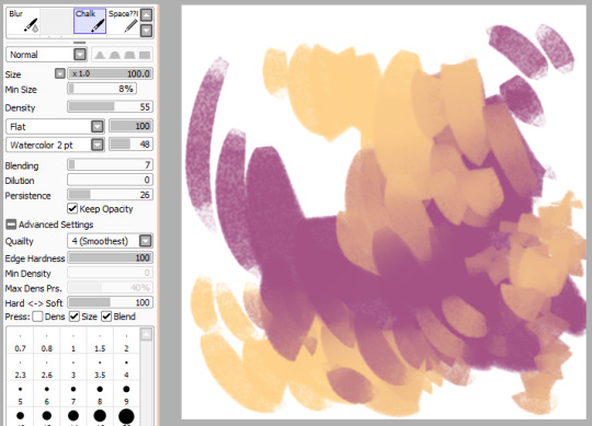
Rough Chalk
super chunky, rough, and dry chalk brush

Speckle
self explanatory I guess! pretty good for texture or large skin blemishes

Chalk(Standard)
I really like this brush-- it’s great for making simple, blended backgrounds! keep in mind, because it’s a marker, changing its opacity works differently than other brushes, ie it doesn’t “layer”, it’s just a continuous tone

Badass Inker
OKAY I ACTUALLY DO KNOW WHERE THIS ONE IS FROM it’s here. mine is changed slightly but you figure out what you like. this was my main brush for lineart before I started inking in firealpaca. very sharp and crisp.

Marker
yep
RoughBrush
PKbrush
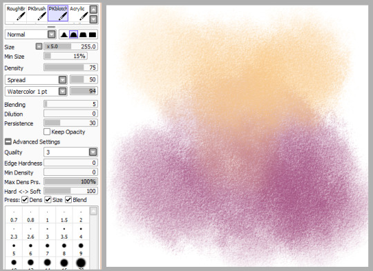
PKblotch
usually used it for a light, textured swash of color for an overlay layer or something. it’s supposed to be a big brush, but you can have it smaller I guess??
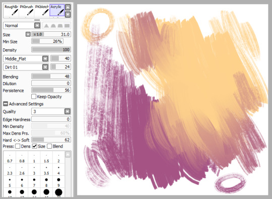
Acrylic
except it doesn’t really resemble acrylic at all, lol. in this state I use it as one of my blenders. BUT ALSO FUN THING: set that “normal” dropdown to multiply to get a subtle darkening effect. sometimes I use this for “lineart” in paintings.
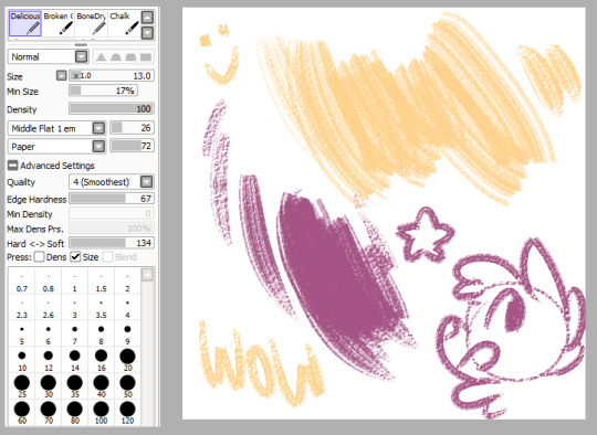
Deliciously Dry
another brush from here. very nice rough texture.
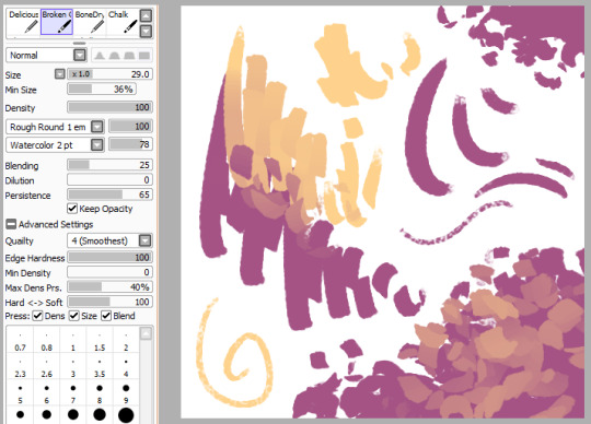
Broken Chalk
I looove this weird little guy, lol. acts normal if you just go in a line, but it’ll get all “blocky” like that if you jitter your hand. because of this, it makes a pretty interesting leaf brush! it blends pretty cool, too.

BoneDry
aaaand ANOTHER from here.

Chalk
Chalk (... again)

Grass
it’s called grass but I honestly can’t imagine using it as a grass brush, lmao. stringy and soft though, may work as the flats for hair??

Clouds
this brush is...... kinda weird?? I mean, it’s clouds I guess. it’s not really perfect, but it’ll work if you spend enough time on it. I feel like it works better painting on the same layer than its own.

Gore
this brush is awfully light and soft for something called “gore”! actually I assume it’s called that cuz you use it as a patchy effect for wounds and stuff.

CG Smooth
named so because I think it’s supposed to resemble a brush used for very smooth, glossy, cg painting. (please excuse the shitty nose, I’m way rusty)
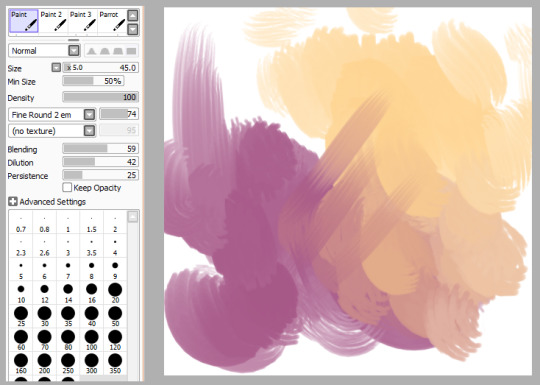
Paint
do you know how many random generic paint brushes I have

Paint 2
cuz it’s a lot

Paint 3
a loooootttt

Parrot
I’m weirdly fond of this one even though it’s not super special. I feel like it’d be good for smooth, bright, poppy blending.
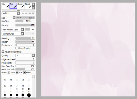
Tint
this is another weird one. it’s like..... if you wanted to do a painty wash, I guess?

Chunky
like Broken Chalk above, this is another one that gets cool things when you jitter it. this one is a little more... jagged? reminds me of broken glass
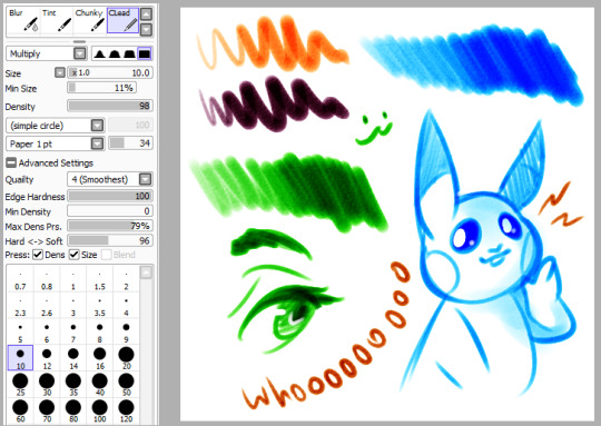
CLead
this one works weiiirdly and maybe I should make a whole separate post about it?? well for now, this one’s basically like a dry marker or highlighter or something. I like it a lot.
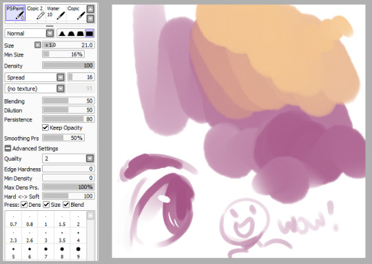
PSPainting
I think it’s called that cuz it’s supposed to emulate painting in photoshop, even though it...... doesn’t, really, at all.

Copic 2
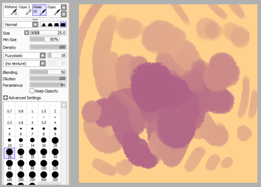
Water 10
another random blender. it doesn’t work on transparent areas though! (bring its dilution down if you want it to)

Copic
I have no idea if this is even remotely close to how a copic works (probably not)

TraditionalPencil
I’m never really 100% satisfied with most “pencil” brushes in sai, but here’s one anyway I guess.

Lead
and here’s another. this is the one that I actually tend to use

Acrylic (....... again)
and like our first acrylic, this is not really acrylic at all. super soft and light blender

BrushPen
SUPER rough and textured pen kinda thing
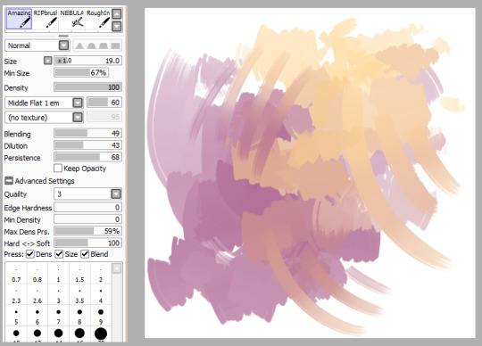
AmazingAcrylic
if you say so, name! actually this does look like it blends p cool

RIPbrush
why is it called this. what am I even doing with half these brushes. why am I here.
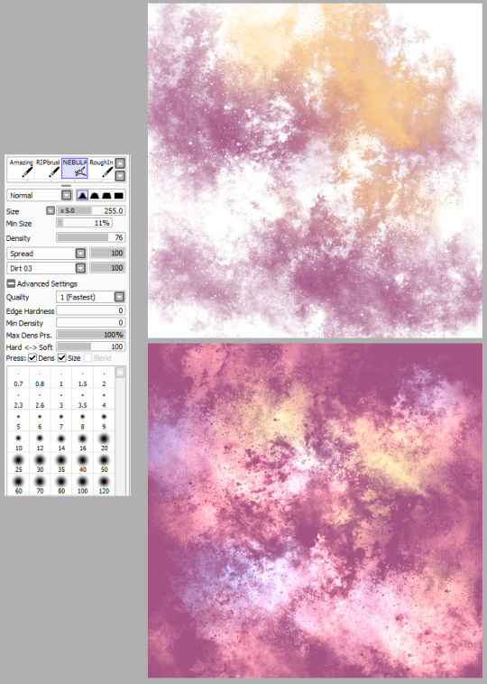
NEBULA
oh wait this one’s neat (neat enough to make two images even). good for all your spacey needs! the second one is a bunch of colors and set to “luminosity”, so you can get some cool effects.

shrugs (great name)
the marker tool is a strange being but I’ve really learned to love it lately. the key to this brush is setting that drop down up there to “multiply”, so you can get really deep darks with your base color where you need it. the downside to this being that you can’t really use preserve opacity to change it to a different color or you’ll lose the effect of those darks (you can use hue/saturation/brightness shift tho, but it might be a lil weird)
aaaand everything else I didn’t post were accidental duplicates! so that’s it!! that sure was a lot but maybe you found something in here you liked ;0
350 notes
·
View notes
Last Seen Blogs
marinagail
geronimo

themelonspeaks
A Little Tough Love

selmaries
you are rare♡

poiserps-blog
Poiserps

kaismith740
Kai